
|| Image Making through Type ||
In this first project for Graphic Form, we have to translate the essence of a job (that can be imaginary) into visual, typographic forms of our names using any sort of media.
Since the jobs we chose were not specified to be pragmatic/realistic, I started off by brainstorming up some ideas for imaginary jobs that are grounded in the essence of real jobs that exist in reality. I came up with a list of existing jobs and modified them by merging them with each other. This would not only help me come up with much more interesting outcomes, but also give me a wider range of job fields and their nature to explore. Thereafter, I searched up the jobscopes and items that are iconic to these jobs to make them easily identifiable.
Initial Shortlisted jobs:
- Baby DJ
- Pool Colourist
- Professional Liar
- Alien Communicator
——–
-
Baby DJ
Original job inspirations: DJ, Infant care nurses
Jobscopes
DJ: to play music at events entertain, mix beats to hype the crowd up. Has to be well-versed in different sorts of music. Usually playing loud music at social events to give enhance the lively mood/atmosphere.
Infant care nurses: Caring, patient, organised, responsible, nurturing, taking care of delicate babies
Objects
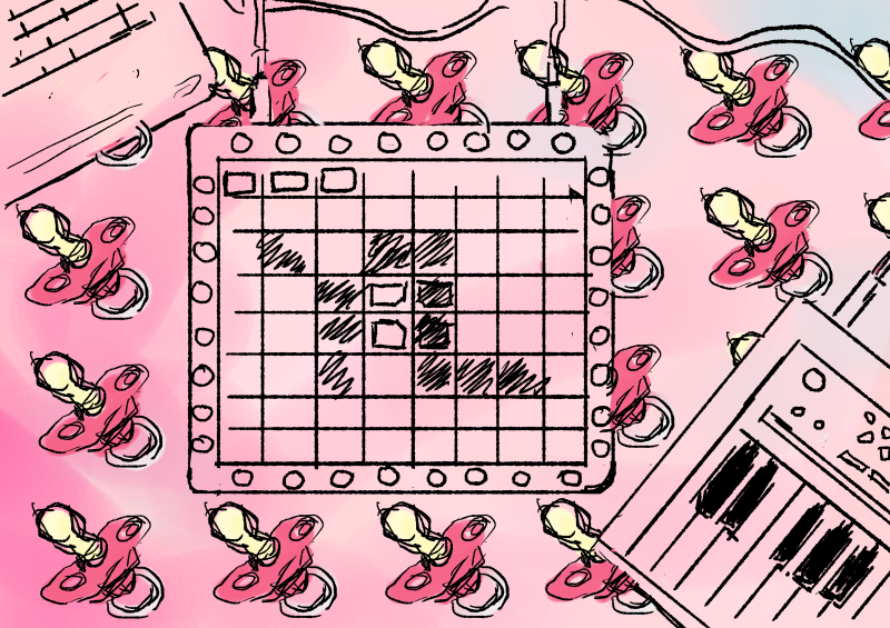
DJ:
Turn table, disco ball, headphones, vinyl records, MIDI keyboards, audio editing softwares, bright neon lights, Launchpad device

https://media.giphy.com/media/lf5JWi7T3b9Wo/giphy.gif
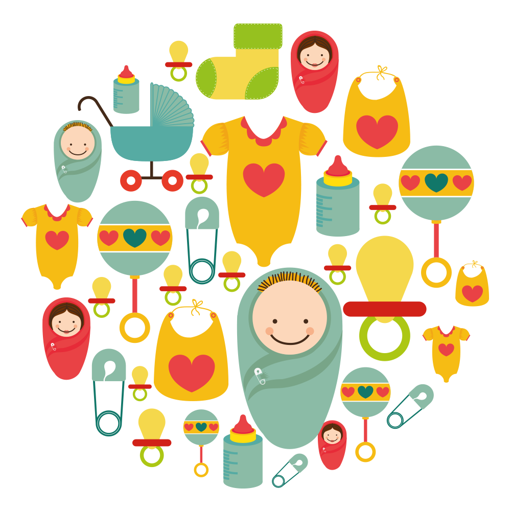
Infant care nurses:
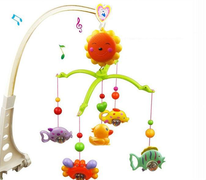
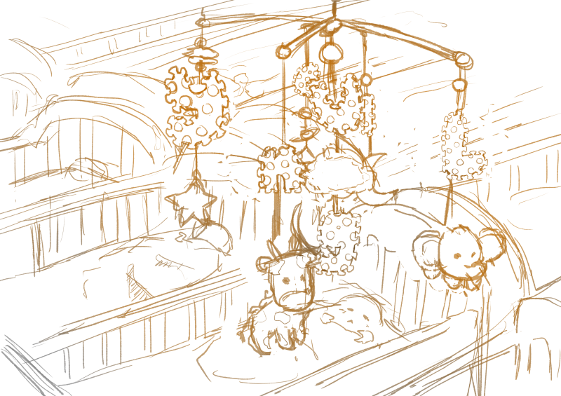
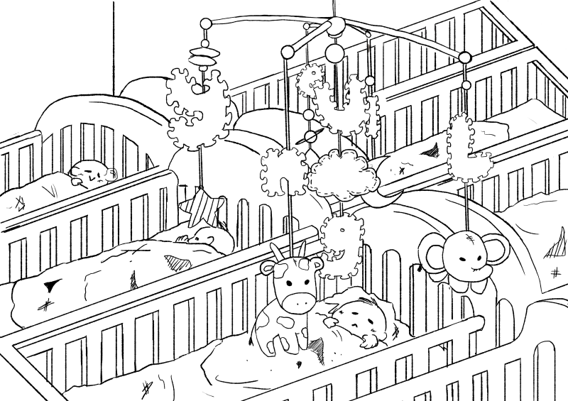
Babies, cribs, cots, toys, wooden blocks, soft toys, pacifiers, mobile toys, diapers, blankets, nurse uniforms, needles, diapers
Idea Generation:

https://www.youtube.com/watch?v=A0M0p7d1MTM
This example of a Launchpad light show demonstrates that users are able to intentionally program the sequence of lights on their device to form different images.
Words like “lightness” and “ease” come up a lot in conversations about pastels. Sallie Harrison, the designer and photographer in L.A., says that pastels evoke a sense of “calmness and balance.” Stewart points to light blue and its connection with spirituality and heaven; (Leatrice) Eiseman at one point related soft colors to infancy, when there was a sense of ease and safety because all of our needs were taken care of. These feelings can be connected to the social and political factors at work, as Eiseman pointed out while listing her considerations for color of the year.
(Leatrice Eiseman is an American color specialist, who assists companies in their color choice in a range of areas, including packaging, logos, and interior design. She is the executive director of the Pantone Color Institute, a division of Pantone, Inc.,[1] and the author of six books on color, one of which won an award from the Independent Publisher’s Association.)
https://www.fastcodesign.com/3063771/how-pastels-became-a-cultural-obsession
However, this draft did not really display the elements of the job in the letters, rather, they put the letters into a context. When the letters are taken out of context, they do not effectively portray the essence of the job of a Baby DJ anymore.
Therefore, I embarked on a mission to try to integrate the essence of both a DJ and a infant care nurse together into my type.


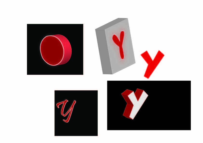
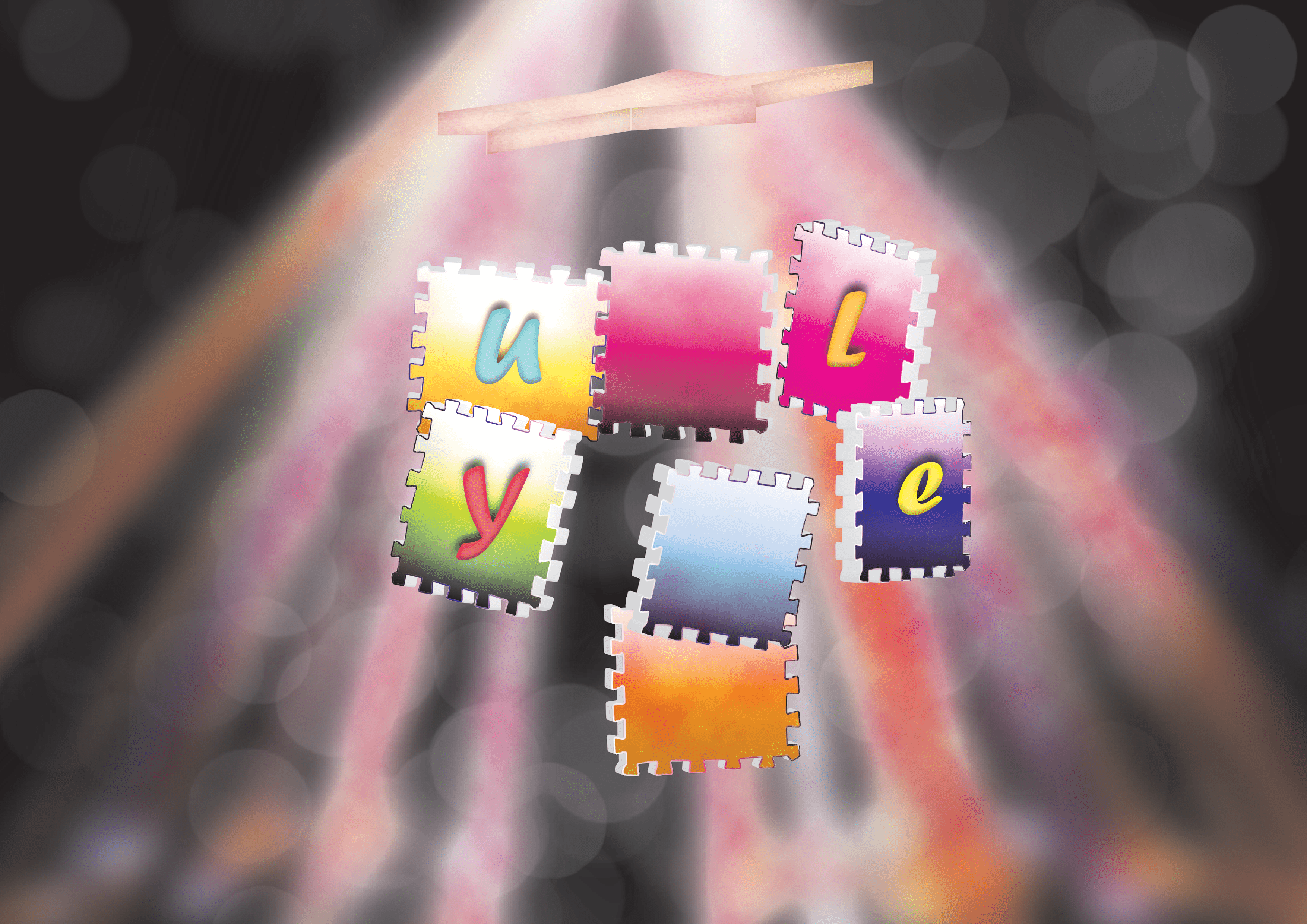
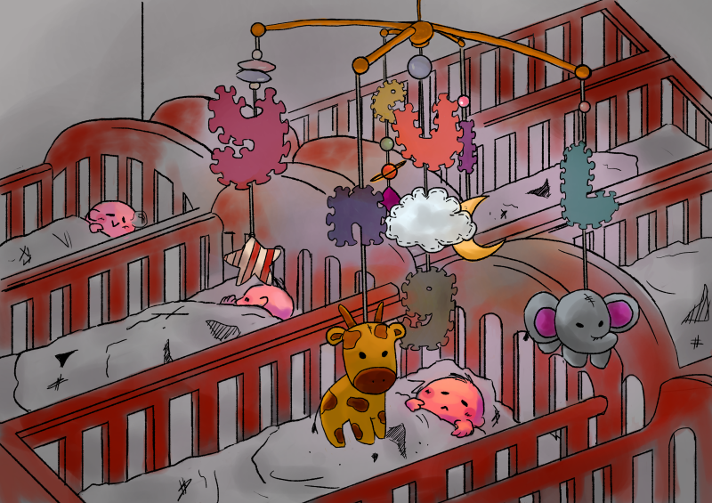
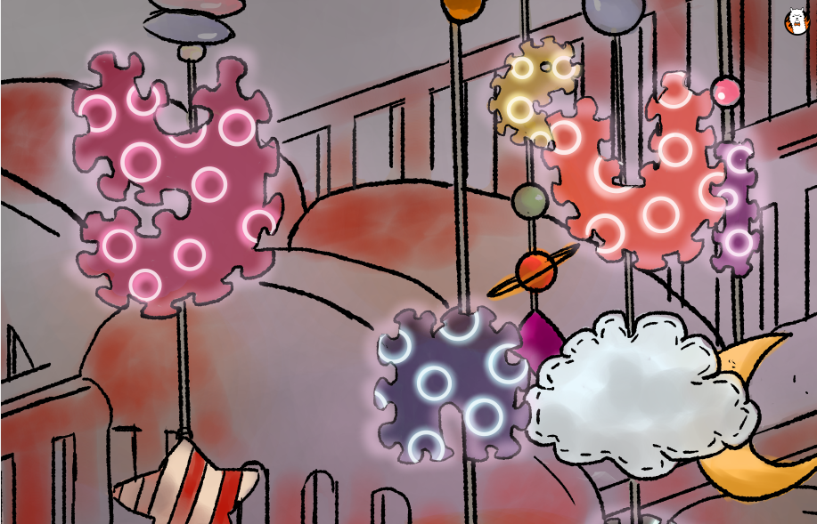
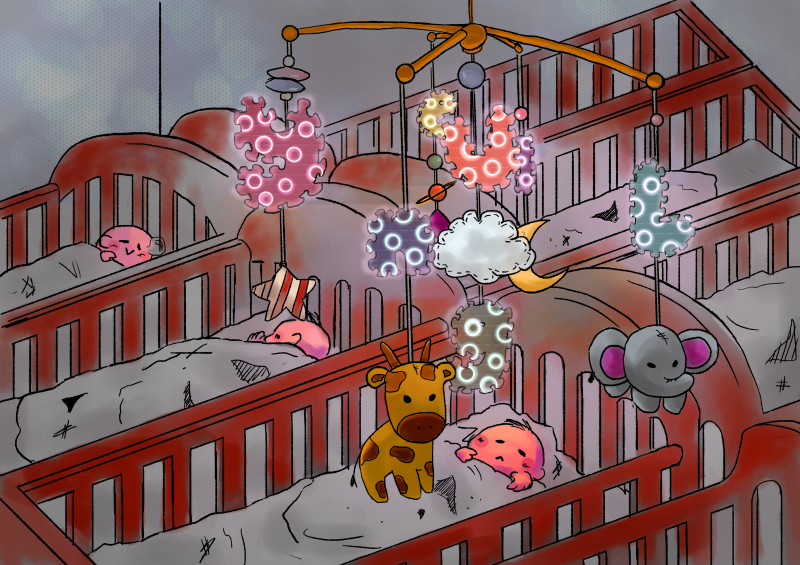
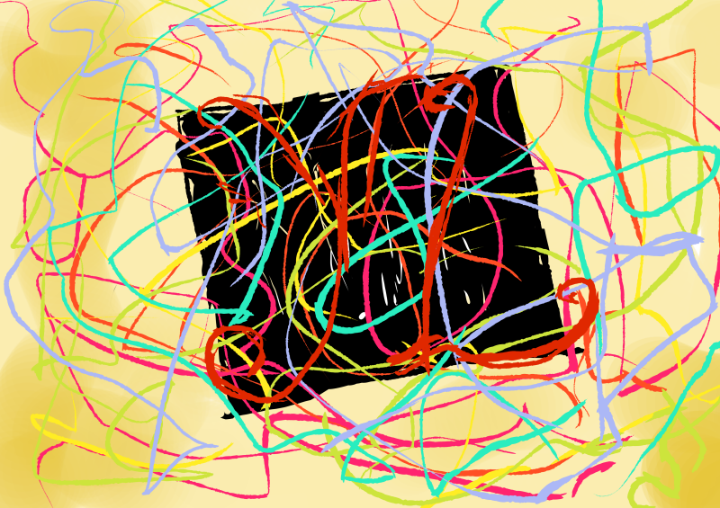
It was really difficult trying to recreate the multiple button effect in Illustrator because the 3D extrusion function and art mapping was not exactly user friendly. It took a pretty long time trying to render every single 3D object as well. Thus, I tried only extruding the foam toy square, while leaving the neon letters on the square. In the draft below, I had mapped a wooden texture onto a star shape. I tried to map a foam texture onto the foam squares to recreate a more accurate foam effect as well but there were way too many surfaces, so I stuck with a gradient effect. The background has several layers of lighting effects as well to try to recreate that of a dance club.
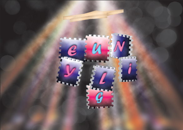
After relooking and consultation, I felt that the bokeh, strobe light and cloud effects were too strongly suggestive of a DJ instead of babies and did not convey my intentions accurately since I wanted to be a DJ that could put babies to sleep. Not make babies get up and dance. And so, I embarked on quite a different mission to change the composition to a more child-friendly one.
Final
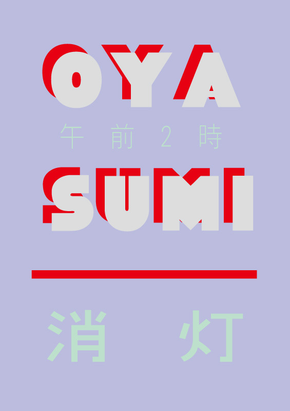
I happened to chance upon this poster which I thought was very interesting because of the use of contrasting colours that added energy, and yet was mellowed down by the use of dimmer colours to show that the lights are off and it’s time to sleep.
I wanted to use the colour schemes of artworks used for lo-fi hiphop videos on Youtube since they’re really pretty and also make me feel calm and relaxed looking at them. Usually, there are pastel, mellow, analogous and warm colours.
Art by: saree @sarlisart on Twitter
Art by: himmoon (https://virink.com/himmoon)
https://www.youtube.com/watch?v=_xF3pxNp0Do&t=1550s
Art by: Pierre Broissand (https://www.artstation.com/artwork/KWxJW)


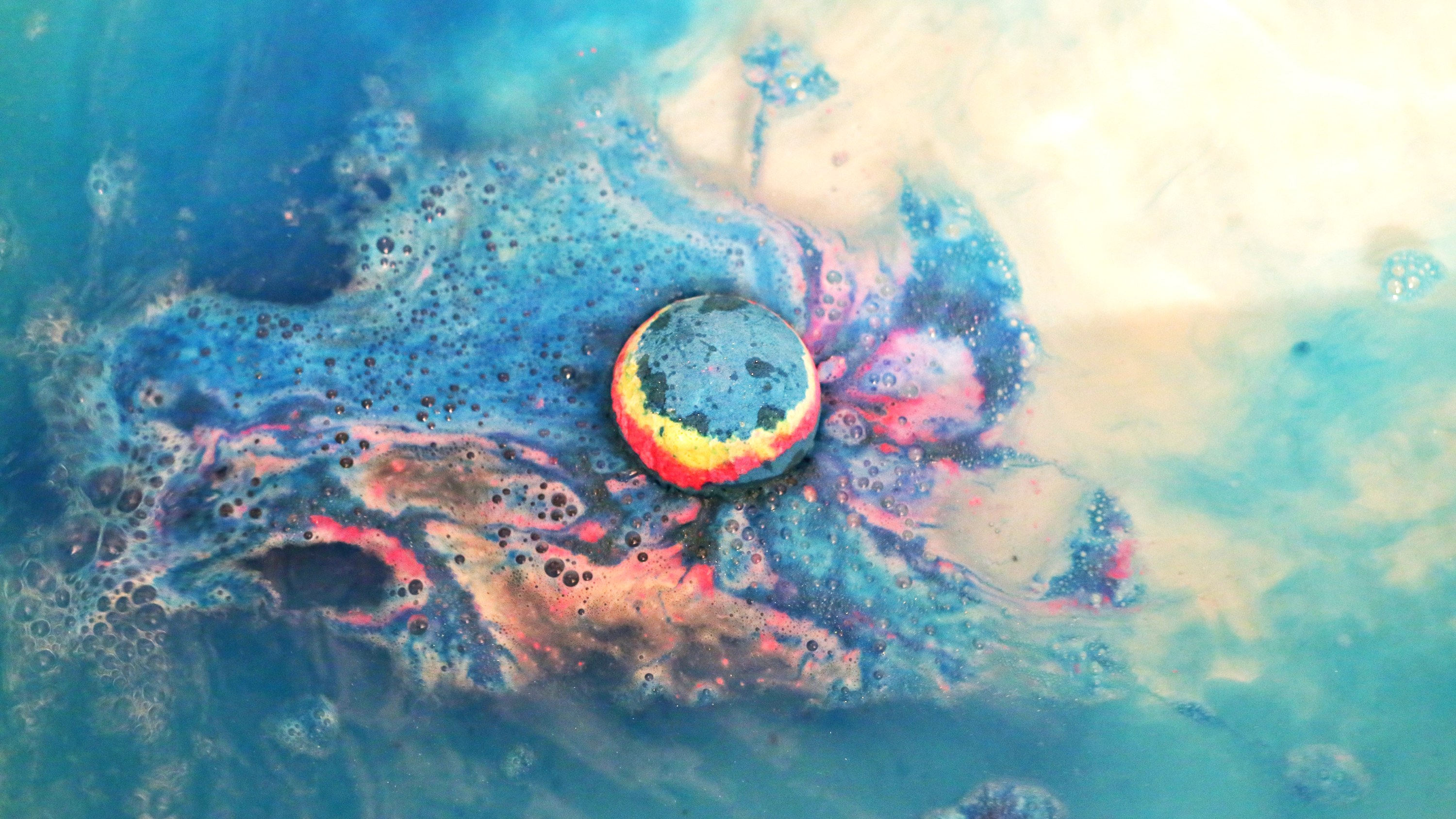
2. Pool Colourist (abandoned D:)
Original job inspirations: Pool maintainer, bath bomb makers
Jobscopes
Pool cleaner: Needs to be committed, works on a regular basis, cleans the pool by throwing chlorine in
Pool cleaning machine?
Bathbomb makers: Manufacture bathbombs by compacting colourful powdery compounds into spheres to be thrown into water and dissolved to colour the water in bathtubs
Objects
Pool cleaner: Water ripples, Pool tile patterns, pool cleaning machine, lifebuoy


Bath bomb makers: Bathbombs, rubberducks
Emphasis on the CHANGE of colour
Mediums for consideration:
Use marbling technique/ decalcomania] put something when pressing down to form letters
(non-stick paint?)
Marbling plus splatter using wet on wet technique
Letters will be ripples
Test wet on wet
Dripping technique
Attempt at marbling!
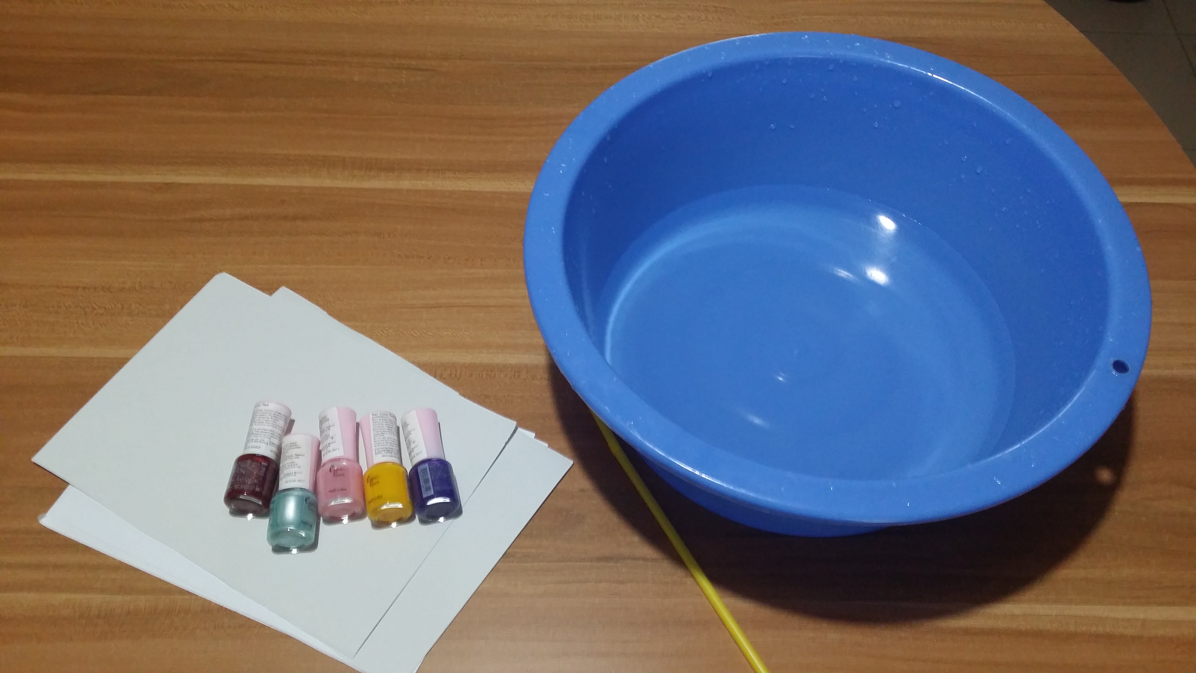
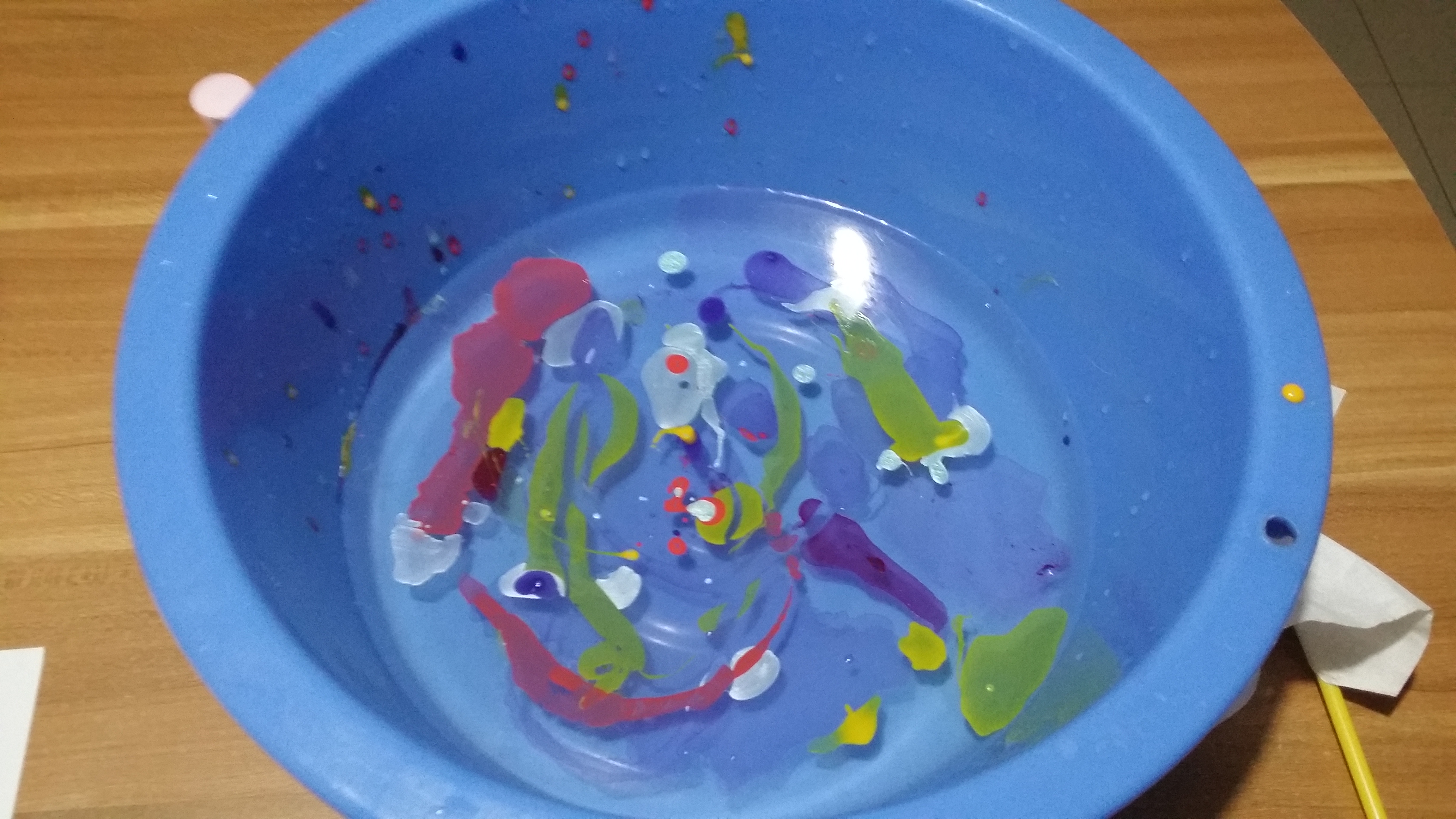
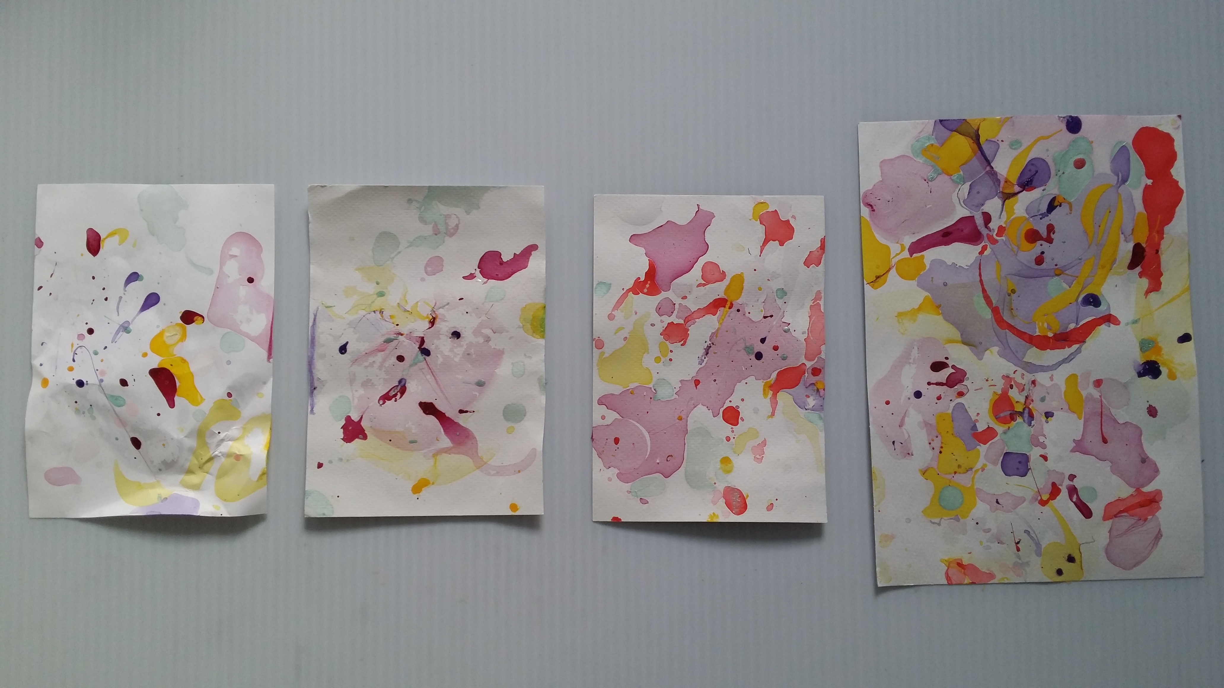
Medium: Nail Polish
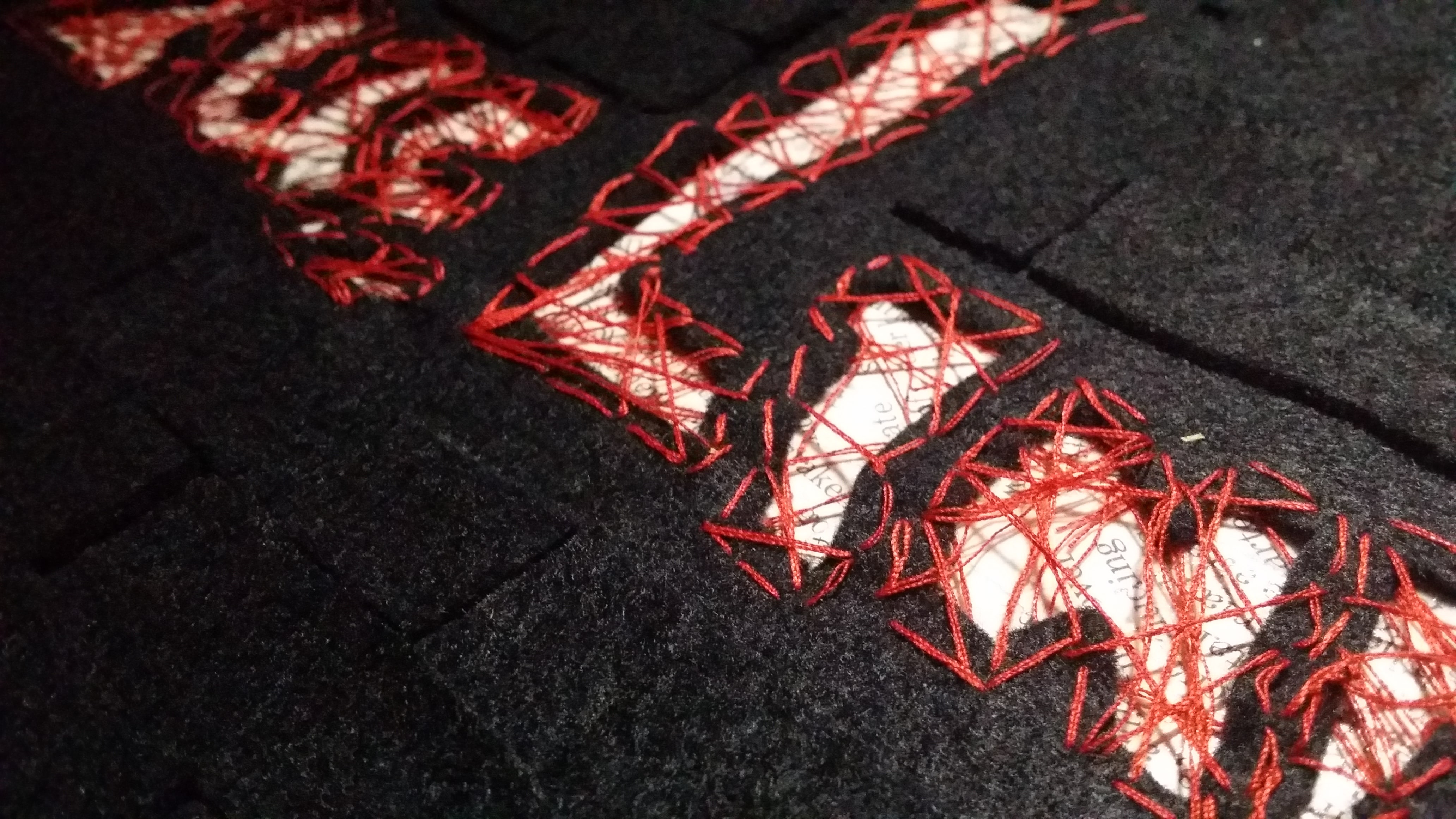
3. Professional Liar
Inspired by: Detectives, police officers, interrogators, investigators, compulsive liars
Jobscopes:
Investigator: Find out the truth about a situation by sieving through documents, going onsite to find clues for cases.
Compulsive liars: Can make up a tall story about anything at anytime. Might be useful in some situations to get away with something for the time being. Hiring someone that knows exactly what to say could be really useful. It’s definitely a dirty job.
Objects:
Investigator: Magnifying glass, newspapers, files, Sherlock fedora, briefcase, mugshots, interrogation table
Compulsive liar: words, speech, Pinnochio nose, Suprematist/De Stijl works to represent the truth
Ideas:

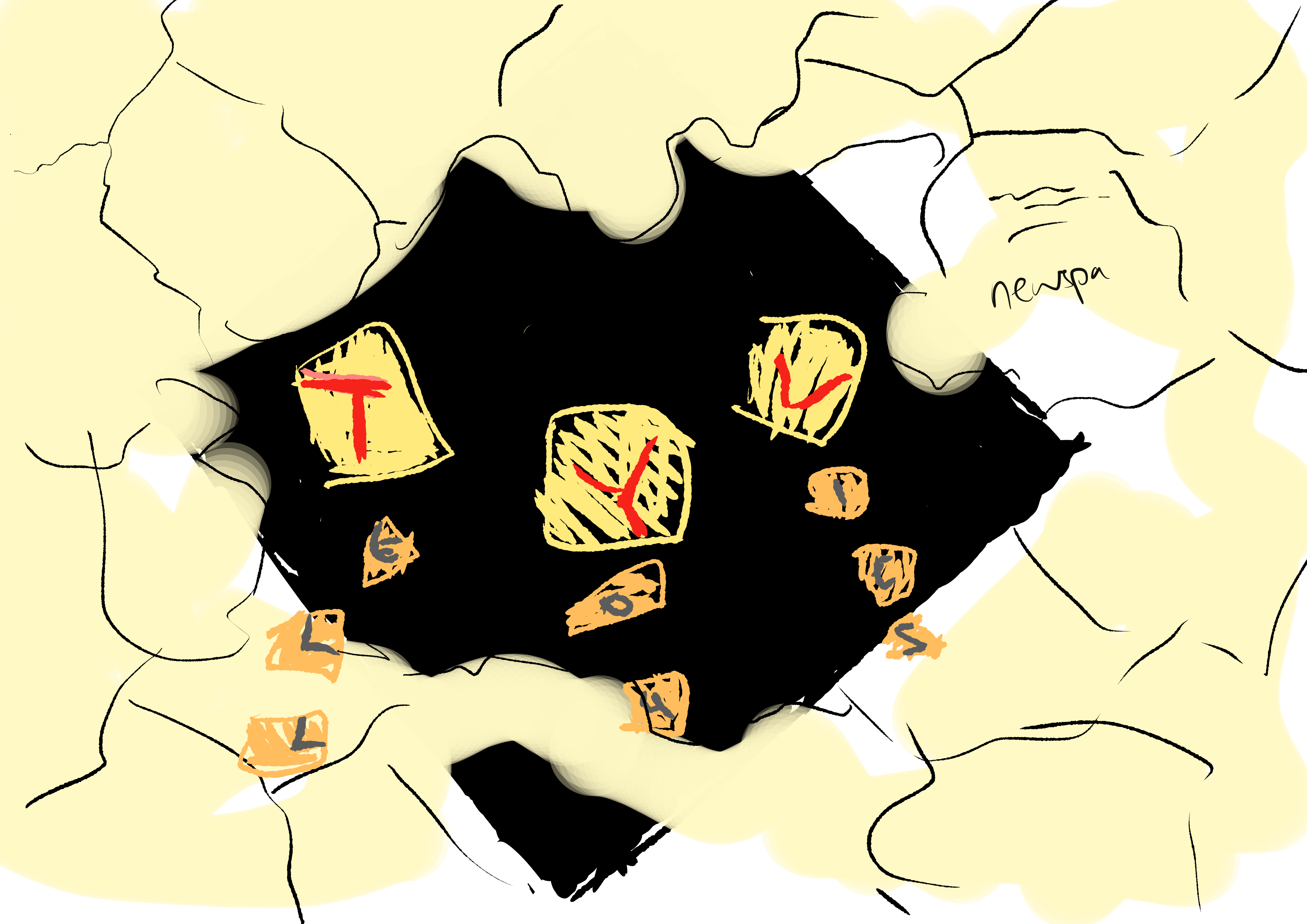
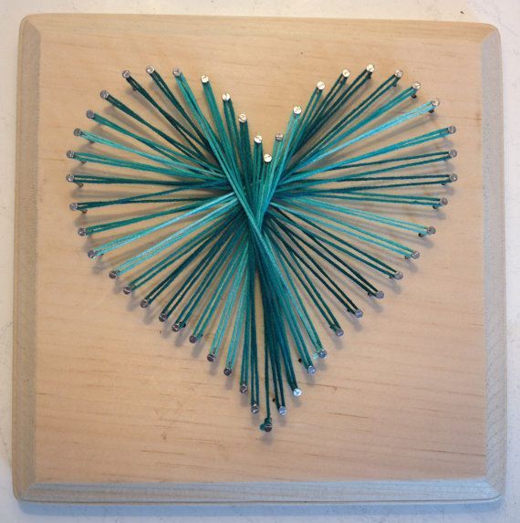
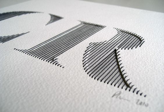
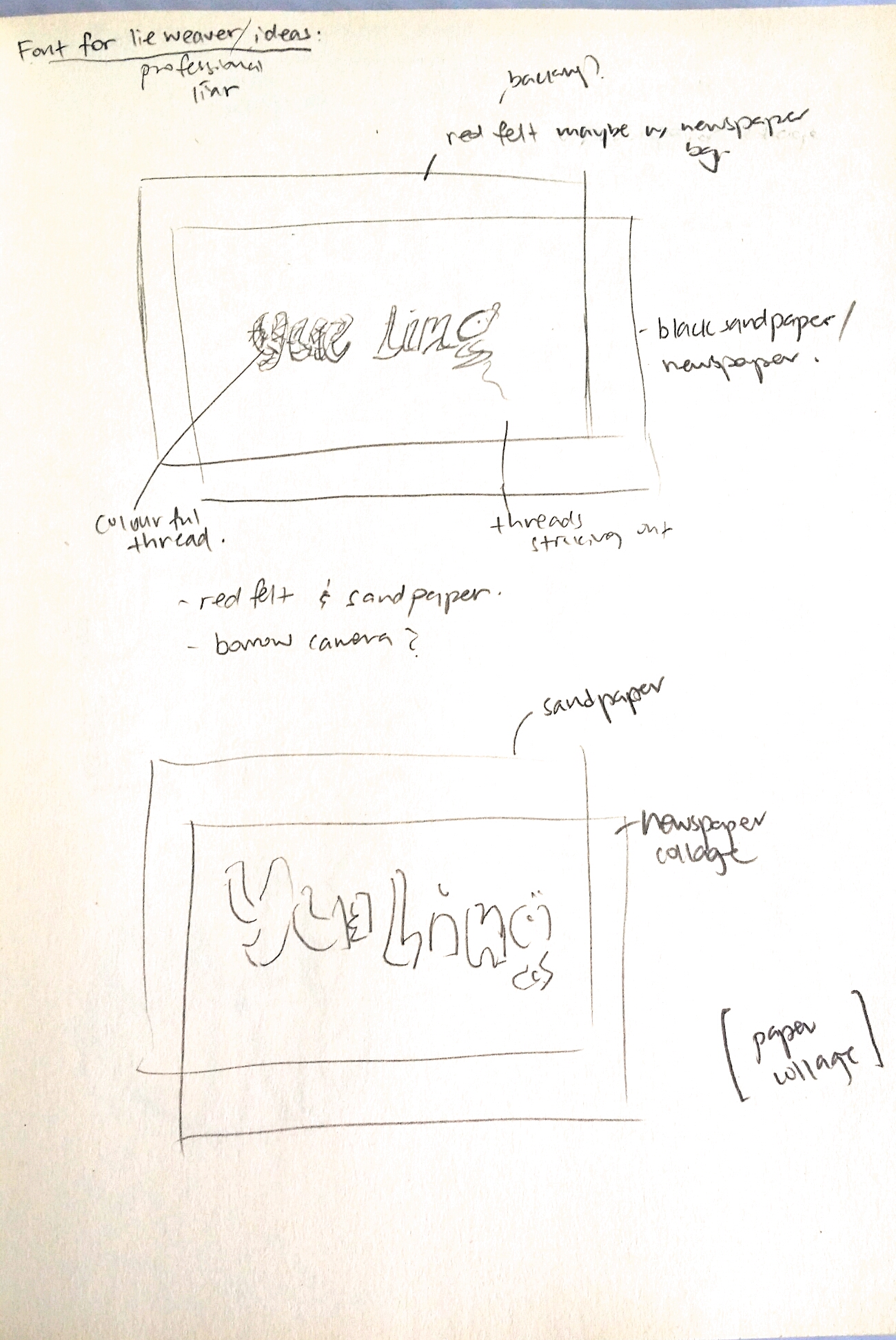
Medium: String, Paper, Newspaper

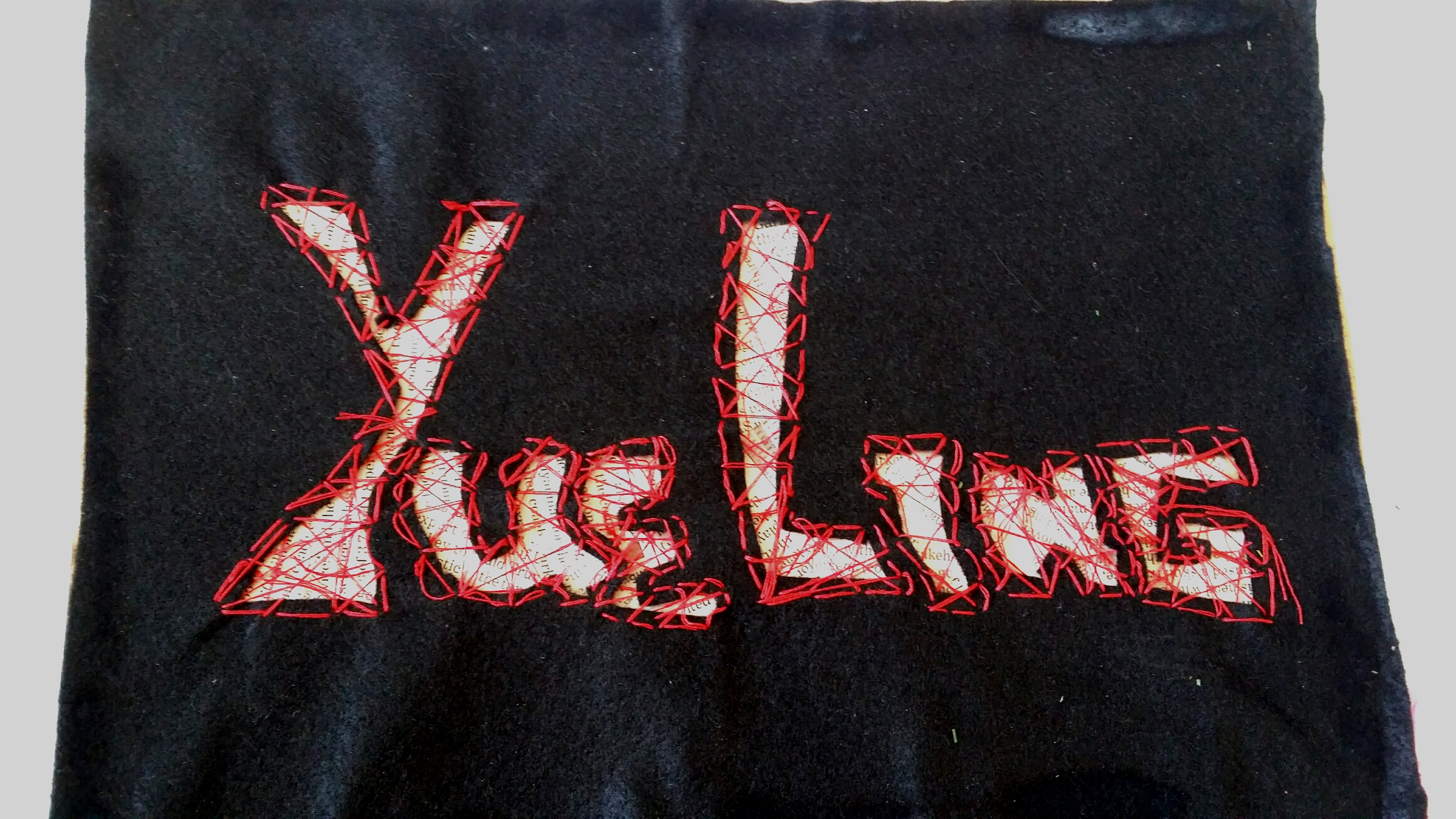
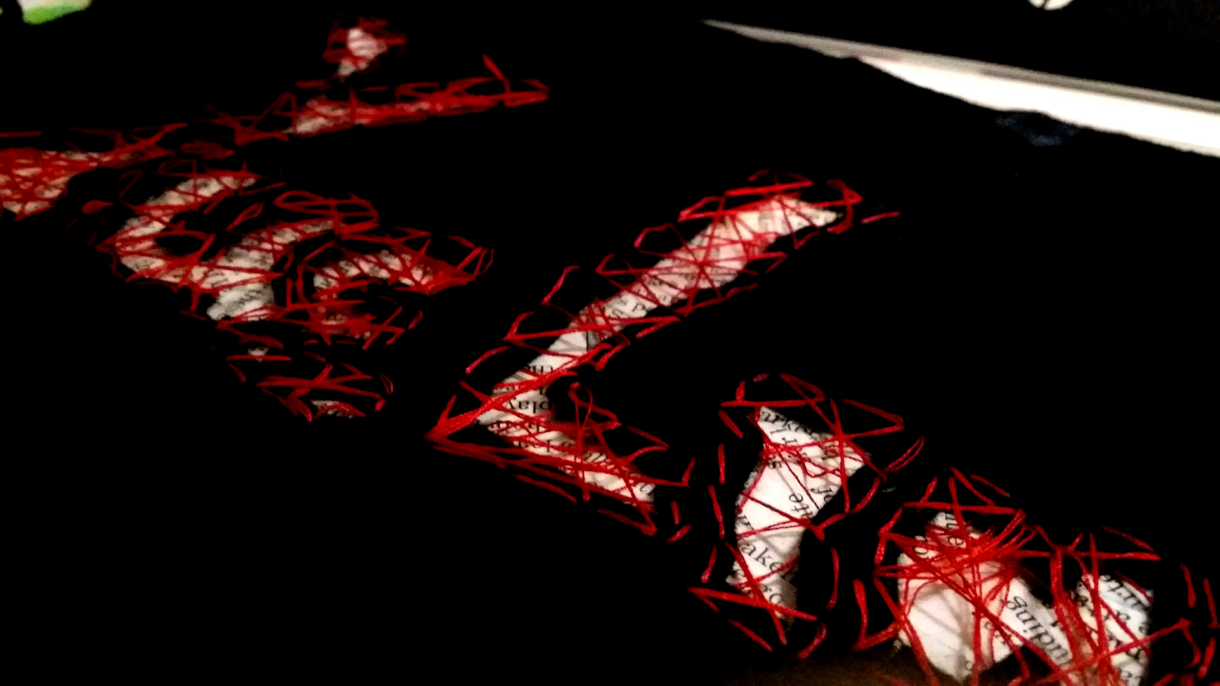
Final

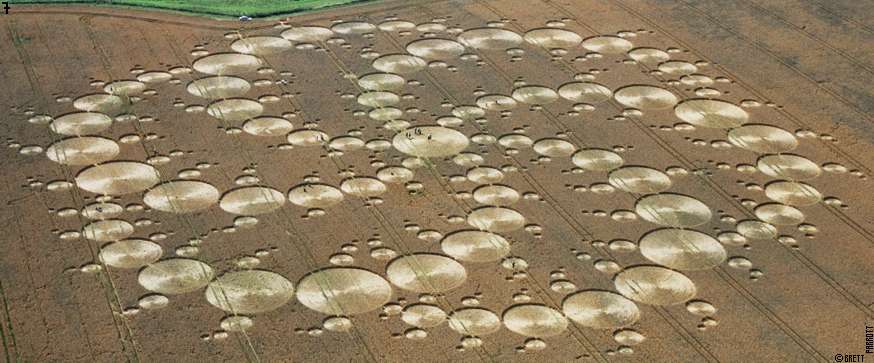
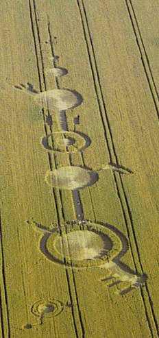
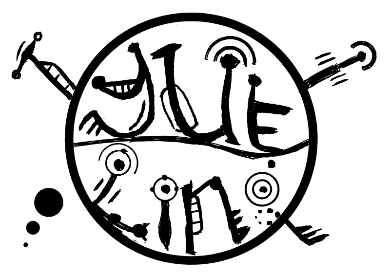
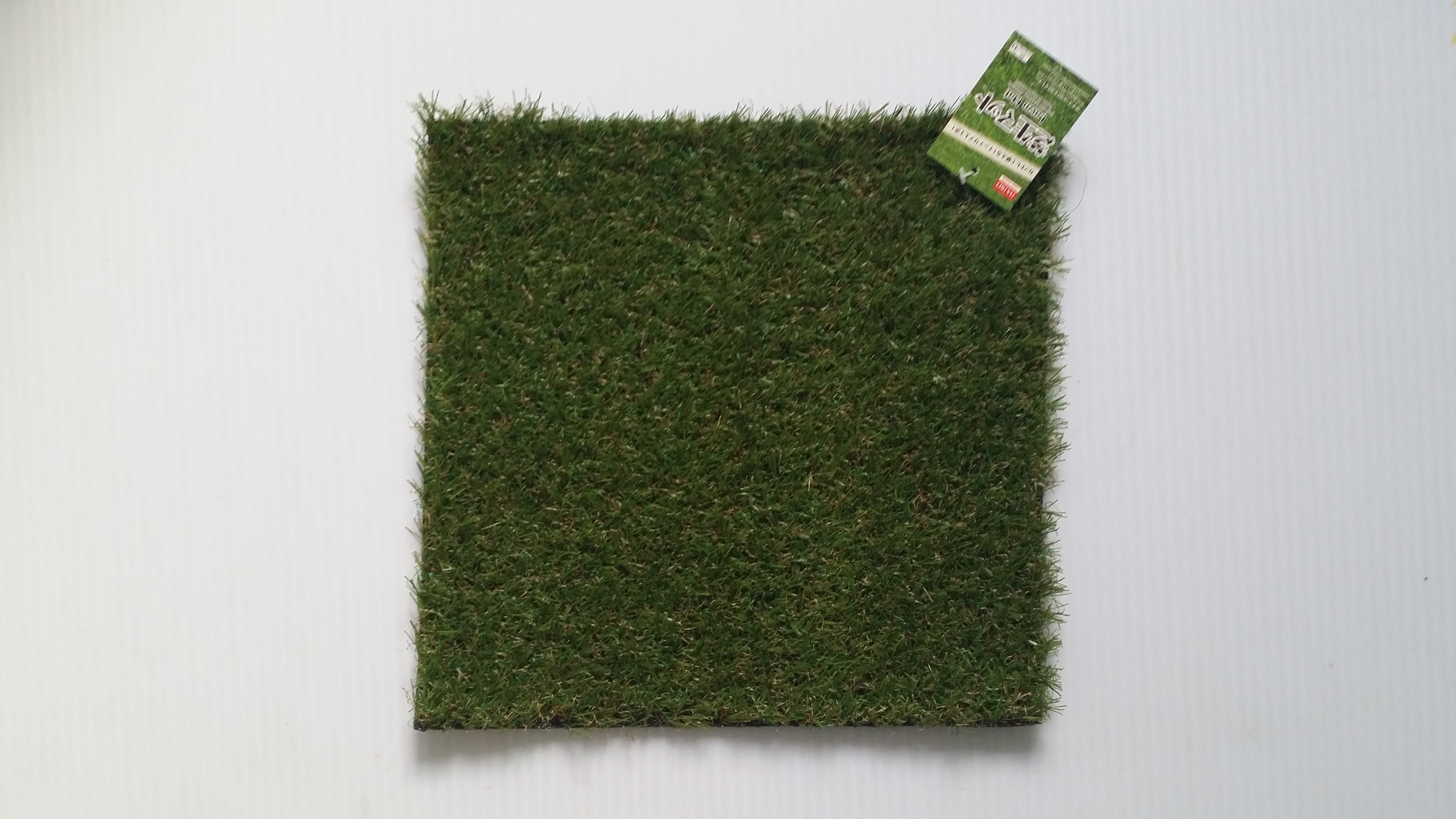
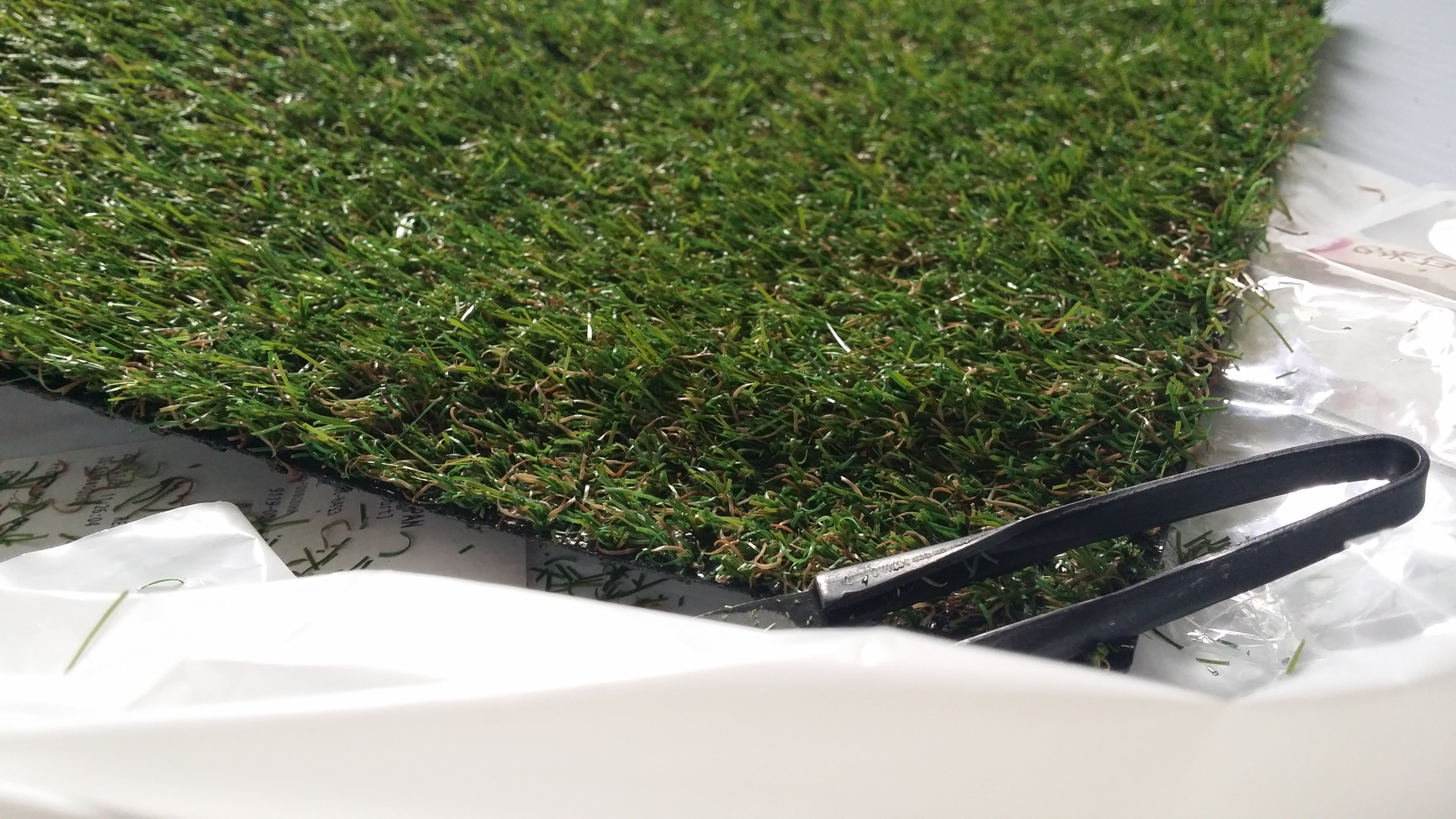
4. Alien Communicator
Inspired by: Astronomers, Crop circle artists
Jobscope:
Astronomers: To study outerspace; investigate the presence of life-forms on other planets.
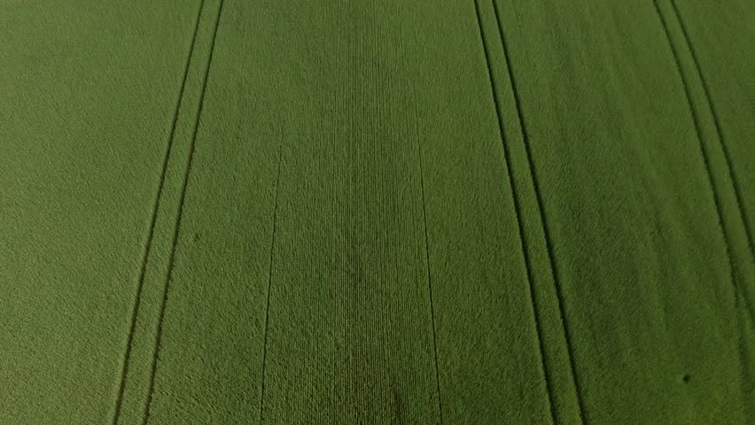
Crop circle artists: Create geoglyphs on large expanses of crop fields to trick the public into thinking that aliens are real. Also to practice an impressive new art style.
Objects:
Astronomers: Satellites, space suits, rockets, shiny metallic objects, outerspace themes, solar system
Crop circle artists: Crop fields, lawn mower, felled grass, alien motifs
Some brainstorming thoughts for style/mediums:
Photography?
Very circular designs
Design in firealpaca first
Paper cuts?
Light shining down
Digital 8 bit style?
Sleek font
Minimalist
Wacky colours-futuristic
Metallic colours?
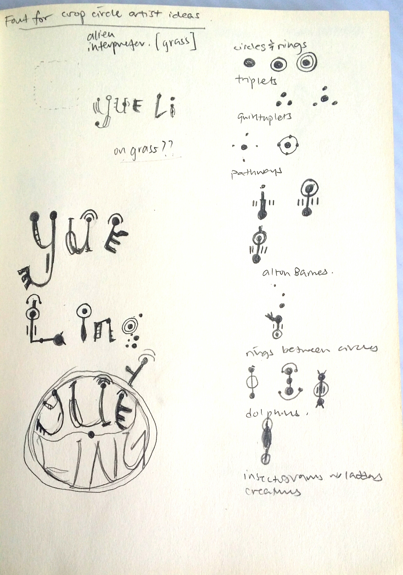
After brainstorming, I settled for doing a crop circle artwork myself!
But first, I had to do some research on the patterns of crop circles. And so I did.
Crop Circle Fun Facts!
Crop circle art is a relatively new art form. In crop circle art, crop is bent and not harmed in any way. Most crop circles have either laterally symmetrical or radially symmetrical art. They could also be completely unsymmetrical and representative. The possibilities are endless.
The most telling feature of crop circles are their stunning geometric shapes and patterns that make it hard for people to believe that they were really created by human beings on such a large scale, and so a lot of people would rather believe that aliens did it.
I borrowed a book on crop circles by Michael Glickman to study the common features of crop circles:
[Glickman, Michael. 2005. Crop circles. n.p.: Butleigh : Wooden, 2005., 2005. NTU Library Catalogue, EBSCOhost (accessed February 10, 2018).]
Common features of crop circles:
-Circles and rings
-Triplets
-Quintuplets
-Pathways
-Alton Barnes (enigmatic keys/claws)
-Rings Between Circles
-Dolphins
-Insectograms
-Creatures
-Whirlpools
others like -orbits,snowflakes, triangles and squares


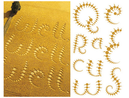

SOMEONE DID A TUTORIAL ON IT!!!
This tutorial was absolutely FANTASTIC. It was clear to follow and produced a really realistic effect. You can also use any stencil with a transparent background you have created, and following quite a long but comprehensible procedures of producing a screen, bevelling and embossing and tweaking lighting settings, you can create your own realistic digital crop circle artwork as well. By following this tutorial, I managed to play around with the blending effects a lot more, which I had always been quite unfamiliar and apprehensive about touching before this project.
Final

5) Local Pastry Chef
Inspired by: Chefs, Singaporean Hawkers
Jobscopes:
Chefs: Professional chefs that pay close attention to the process of cooking, as well as garnishing and presentation of food.
Singaporean hawkers: Specialise in catering to the Singaporean palate, making local cuisines like Chili Crab, Bak Kut Teh etc.
Objects:
Chefs: Chef hat, wok, spatula, frying pan, ingredients
Singaporean hawkers: Chili crab, bak kut teh, kueh, fried rice, hokkien mee, yong tau foo
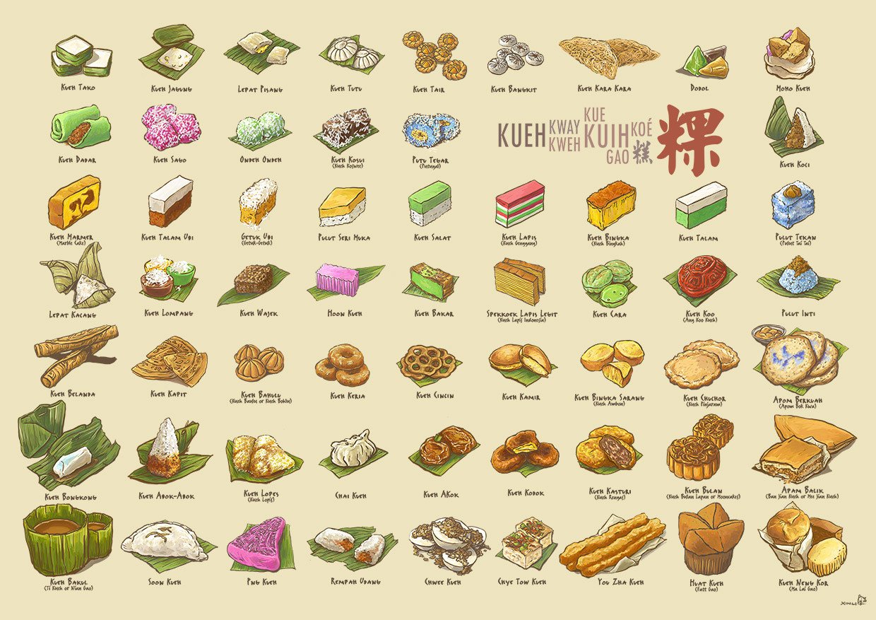
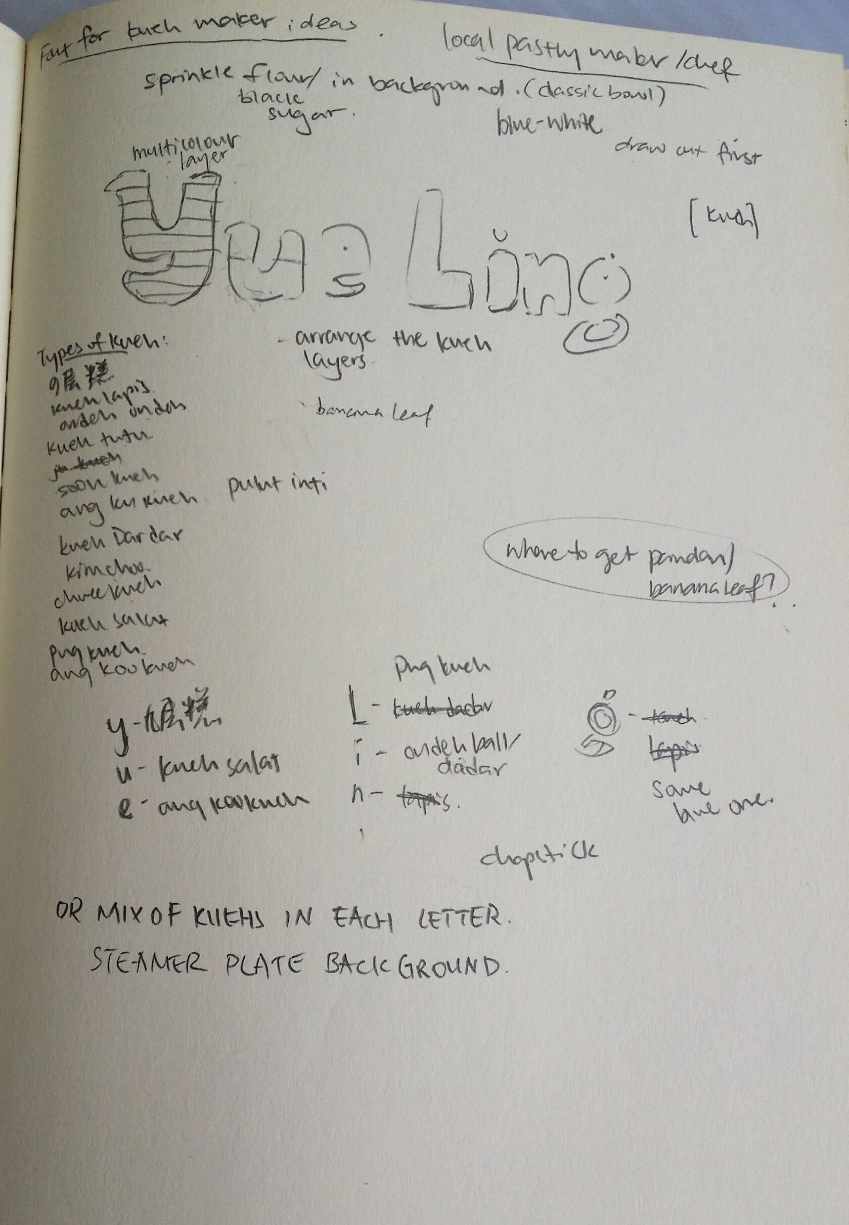
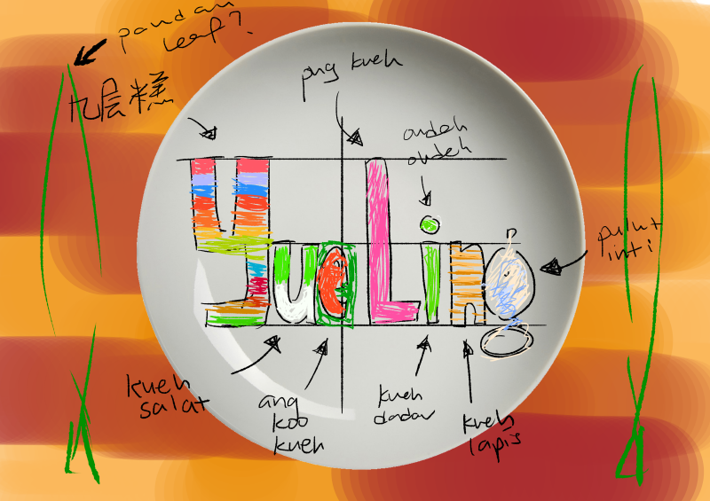
It was decided that I was going to use kueh as a medium since there are so many different types and they are all really colourful (and tasty). Recalling that Naiise has a lot of products designed based on local pastries, I decided to search up references and low and behold, there was an entire catalogue of kuehs to choose from! I didn’t even know some of these kuehs existed. https://cdn.shopify.com/s/files/1/0175/9848/products/KuehUltimaxwithnamessm.jpg?v=1495785705
Medium: Kueh, Photography
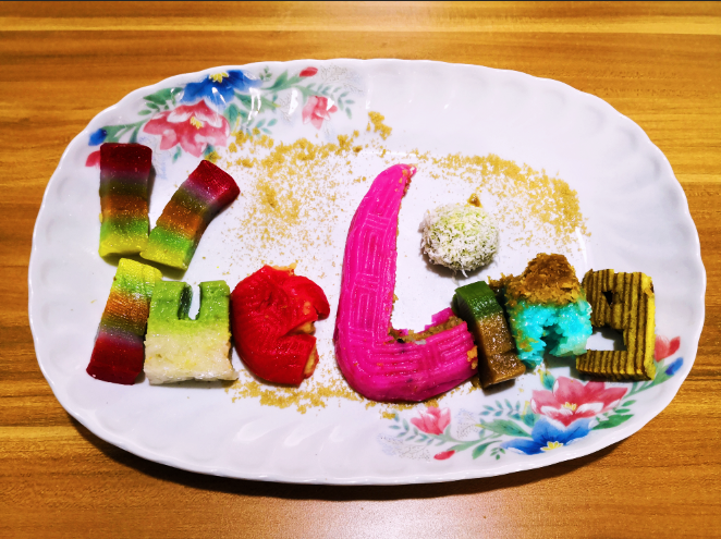
Kuehs used:
Y- Kueh lapis sagu (Jiu Ceng Gao in chinese)
U – Kueh salat
E – Ang Ku Kueh
L- Png Kueh
I – Ondeh ondeh and kueh talam
N – Pulut Inti
G – Kueh Lapis
Reflections:
This project was pretty challenging in the sense that we had to create letters that could easily communicate the essence of our jobs. Since I also decided to go with jobs that are inspired by at lease 2 traditional/existing jobs, it was tough trying to incorporate elements of both jobs to balance out the elements equally. However, through a rigorous process of refining my designs, I would like to think that I have managed to do so. ;;; XD
With this project I also wanted to explore the use of other mediums, which I think I managed to do successfully! Although it was not a smooth process throughout, with many failures and disappointments, I always recall the saying that artists should “Fail faster” so that we learn from mistakes faster and can get on with improving our projects. After failing with the intended mediums, I tried to find alternate options that could express my intentions on the same level, if not, surprisingly better.
Through this project, I was also able to get more comfortable with Photoshop blending modes that I have never ventured to touch before. Fiddling around with the settings for making the neon glow and crop circle really taught me the massive capacity Photoshop has for creating realistic illusions.
All in all, I really enjoyed this project and had fun trying out different mediums instead of just ink/paint. Looking forward to the next Zine project!