Hey guys!
After experimenting with different styles and arrangement, and with my upmost best on trying to not making the image look too “clean”, here are my final four compositions.
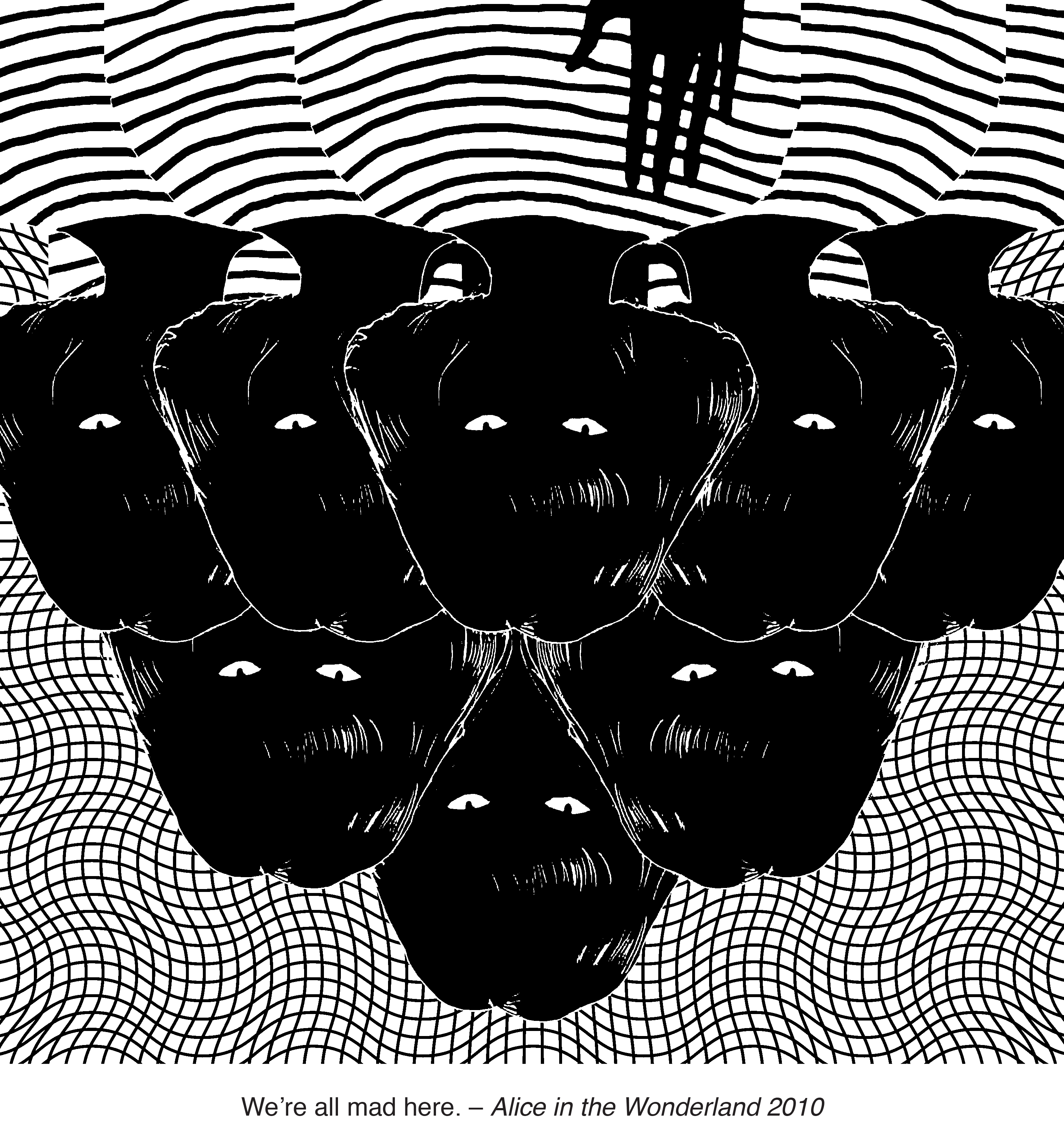
As the quote says – “We’re all mad here”, it reminded me about a cult, trapped in a small compact area which makes me feel claustrophobic, unpleasant and distressed. My main focus was – how do I make the viewers feel uncomfortable while looking at my artwork?
The girl with the “glowing” cat eyes is the perfect fit as she seems to be looking right at you and straight into your soul. In order to amplify the feeling of uneasiness, I duplicated the girls to mimic a cult and placed them close to one another to give a claustrophobic feeling. With the similarity of the girls, it gives an illusion of a group, as if they belong together. They all looks as though they are in a trance because the girls are looking at the same direction. By placing them behind one another, it gives depth and it seems as though they are “queueing”, waiting to get you – this is hoping to make the viewer feel anxious and overwhelmed. The hand at the front causes them to look trapped in the artwork, it also implies “connection”, as if they are trying to connect to the outside world. To enhance the hypnotising feeling, I placed an optical illusion image as the backdrop hoping to be able to entrance the viewers into the artwork.
Principle of Designs
Unity/Harmony: Repetition of the girl is being used to give a claustrophobic feeling. Perspective is used by placing the girls behind one another to show depth.
Similarity/Contrast: The duplication of the girls make it seem as though they are a group, which I hope to show it as a cult. The foreground and background elements vary in textures, thus giving a contrasting effect.
Balance: Symmetry makes the entire composition looks organised which gives off a hypnotising feeling.

The human world is a mess. Society has created an image that we all must be. Be it your sexual orientation, your body shape, your looks or even your clothes. We all must be what society views as “normal”. If you’re not, it seems like you’re shunned from society. Why is society so afraid of a little difference? It seems as though the society is trying to mold every human being into its own little puppets; tying the strings to your arms and legs, and surgically removing your personality until you’re a mindless and opinion-less puppet. As if trying to create a human artificially.
The society controls us all, and we begin to lose our own identity. We’re like a marionette display, waiting to be controlled and manipulated puppeteer.
Principle of Designs
Unity/Harmony: Repetition is used to give a robotic stagnant vibe, as they are all the same. Perspective to show depth which gives a feeling of a “broad” sea, as though they are many more like them.
Similarity: The duplication make it seems as though they are all the same, which leads back to how society causes us to lose our identity and mold us into their desired beings.
Scale/Proportion: Scale of the girl is used to give an illusion of depth, as if you are there witnessing the scene.
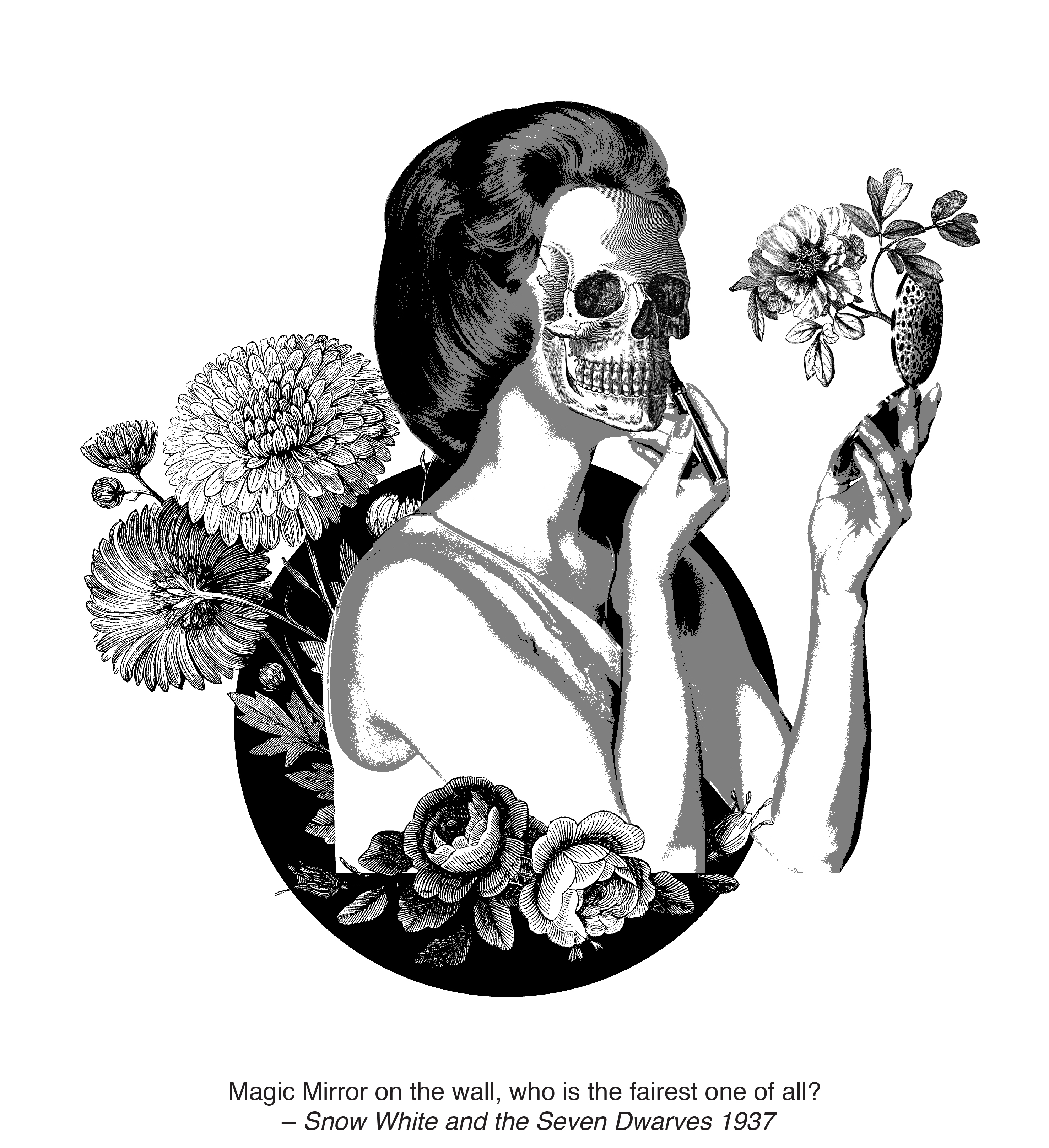
Magic mirror on the wall, who is the fairest one of all? It was said by the Queen, who wants to be the fairest lady on the planet, and from that, vanity, obsession, beauty standards rises up the surface.
Our constant obsession with our appearance is affecting everyone. How much does your self-worth and self-confidence depend on your physical appearance? Do you only feel good about yourself when you feel pretty? Why do we care so much about our appearance? It is because other people opinions and judgement matters. We feel better about ourselves when we look better because we feel like others perceive us better. We want others to accept us and we think the only way they will do so is if they think we adhere to standards of beauty in society.
I tried to exaggerate how serious the beauty standards in our society is by morphing the woman’s face into a skull, to show that although they may look pretty on the outside, but they are dying in the inside. However, they still have to keep up with the facade in order to be perceive as “pretty”. The flowers around her is to represent the beauty standards of the society, and how they are overwhelming her.
Principle of Designs
Hierarchy: The woman is more dominant in the composition due to it’s scale, followed by the flowers.
Balance: Elements are arranged in a circular form which gives an invisible line of sight.
Similarity/Contrast: Even though the flowers in the image are placed at different positions, it still made them seem like a whole due to their similarity.
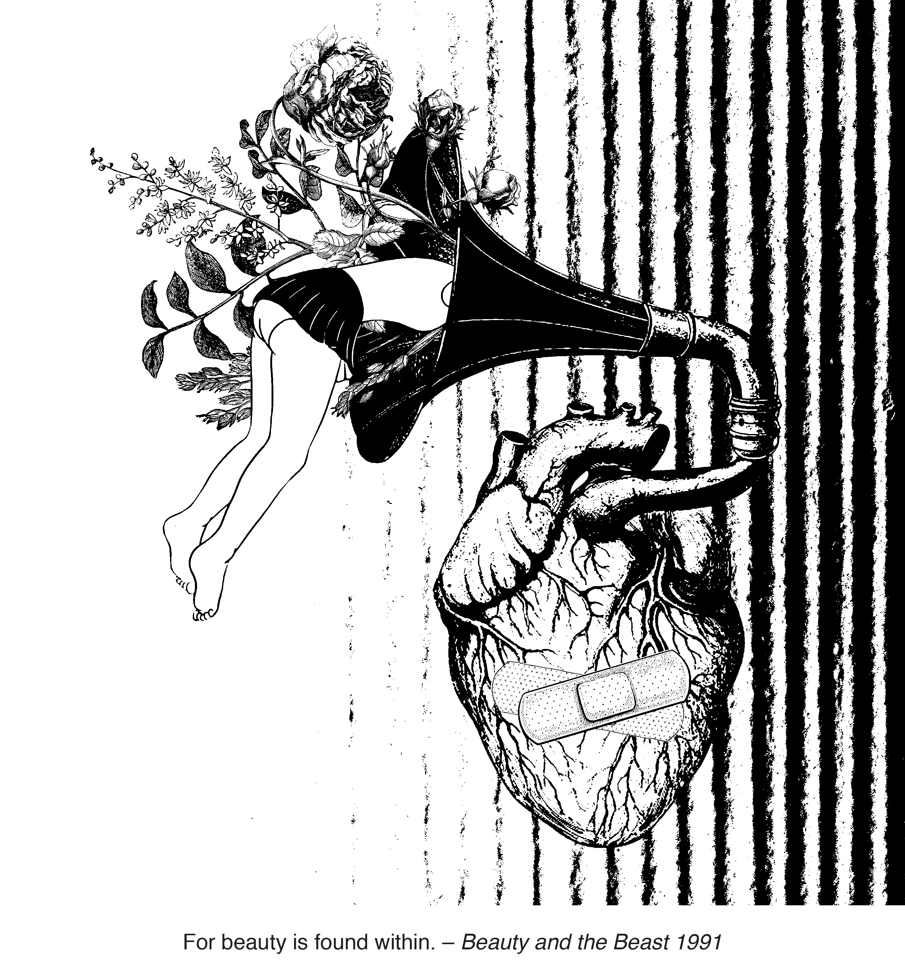
Beauty is a funny thing. The vast majority of us spend a lot of time focused on the external appearance – arguably, with the goal of looking more “beautiful.” But what does it really mean to be beautiful? Where can it be found? I can assure you, it isn’t hidden in the words of any beauty, numbers or shape. Beauty is what lies within you. Real, natural, strong and powerful beauty comes from within. It blossoms like a rose in spring and an alluring, captivating spirit cannot be contained.
The heart belongs to the girl who in the gramophone and I wanted to exaggerate the term “found within” by putting the girl into the gramophone, as if searching deep down for something. She may have went through many ups and downs and may be kinda broken on the outside, but she is trying to find her own beauty, deep inside her. Flowers which are used to represent her beauty are flowing out and she may have found her “beauty” one point or another. Everyone will be able to find theirs one day,
As the saying goes – “Do not judge the book by it’s cover”. One may look all broken and torn up on the outside, but deep inside, holds something special and beautiful waiting to be unleashed.
Principle of Designs
Balance: This composition is asymmetrical, yet it still looks balanced due to the scale of the gramophone which contains the flowers and the heart. Hence, providing an invisible radical line of sight due to the arrangement of elements. It starts from the girl, down to the gramophone and to the heart.
Similarity/Contrast: The type of lines used on the girl is different from the flowers, gramophone and the heart. The variation of lines gives a contrasting effect and allows the girl to stand out.
Reflection
Honestly, the favourite part of this project is the silkscreening! I really loveeeee it though it was quite tedious. The most important thing that I’ve taken away from this project is, to be more decisive. Even though only four compositions is needed for the submission, there are ENDLESS interpretations. However, I am glad I managed to come up with the compositions that I’m satisfied with.
The most difficult part of this project is trying to not make the composition symmetrical, neat and CLEAN. Being too minimal has always been my issue since I started studying design as it always make my work look too balance, boring and not dynamic. I’m not really a fan of adding background to my graphics and therefore I found that adding textures to my composition was a challenge. However, I guess I’ve found a new love on asymmetrical designs and gritty background textures, (I love the threshold effect).
Shirley mostly commented on my work saying it’s too clean, and minimal, which makes it look flat and less dynamic. Now I understand what she meant. And I will definitely try to practice making my work look less symmetrical (ok maybe offset a little?), and have more textures.
This marks the end of Project 2: Forrest Gump. It was fun.