1. Limbo
Description
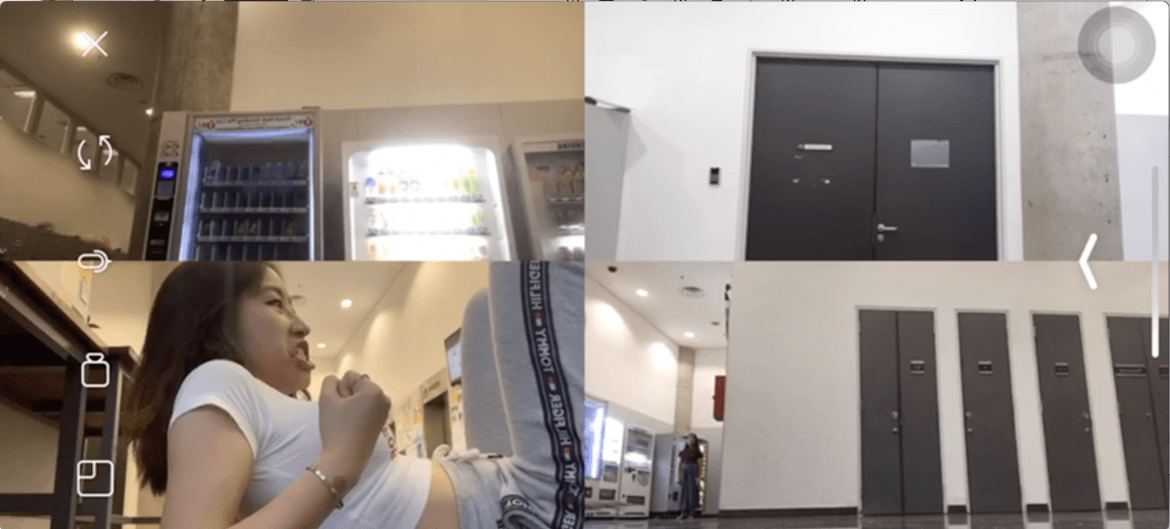
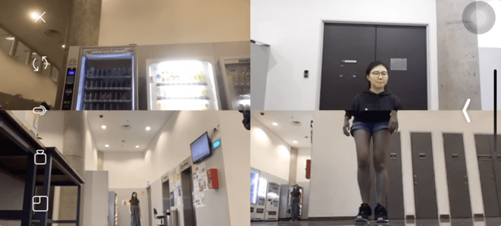
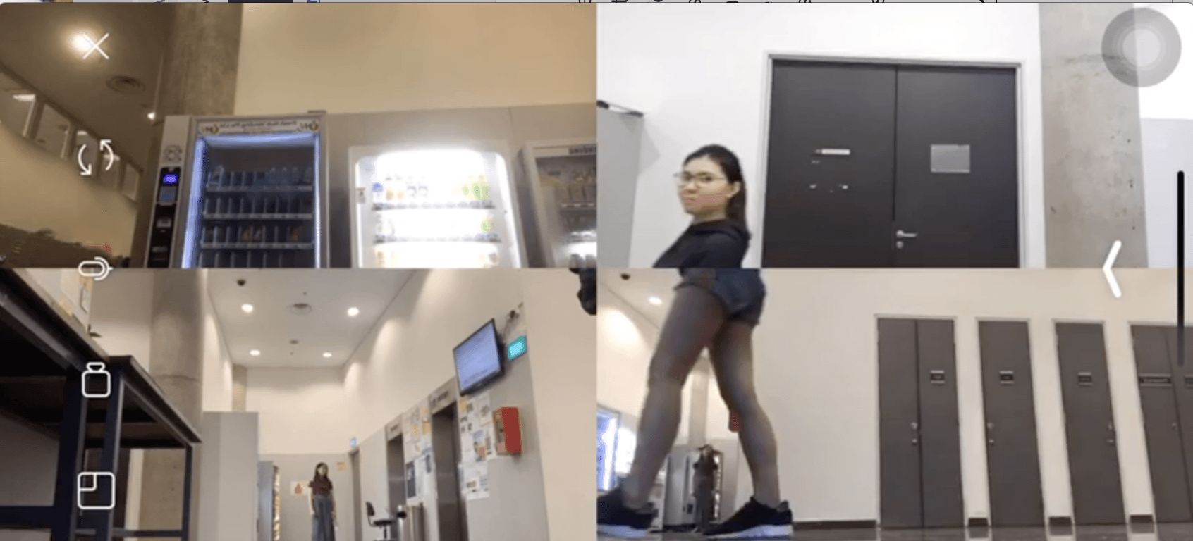
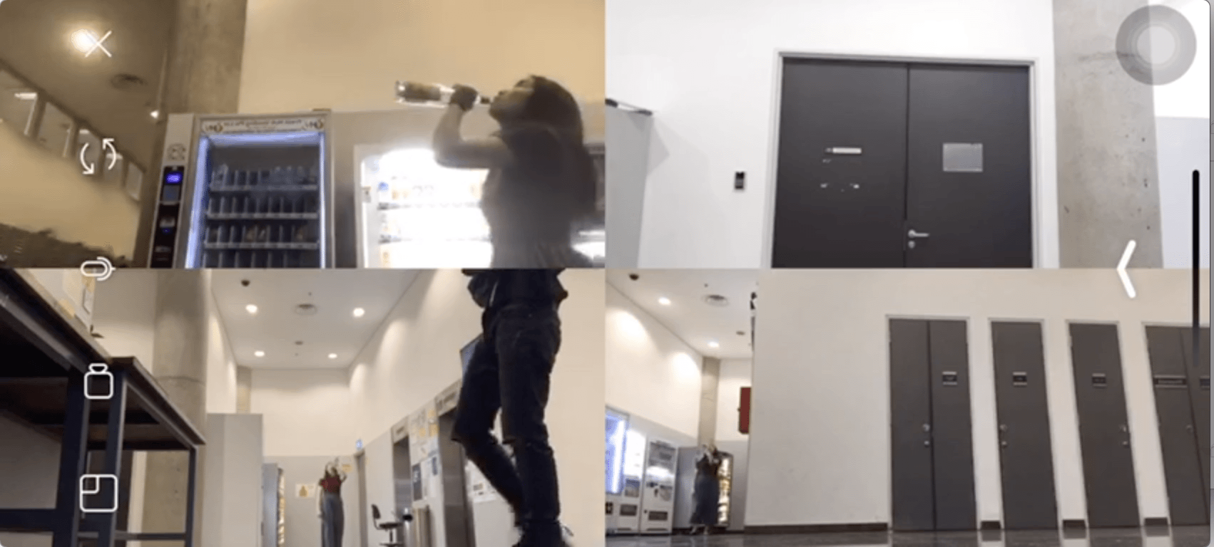
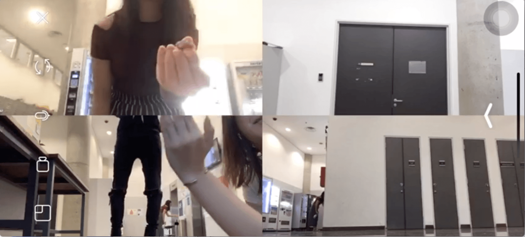
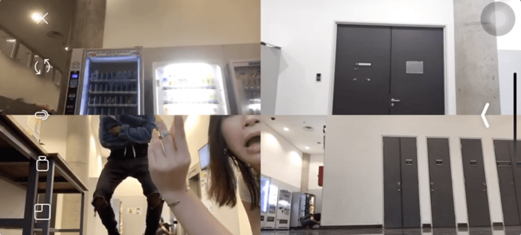
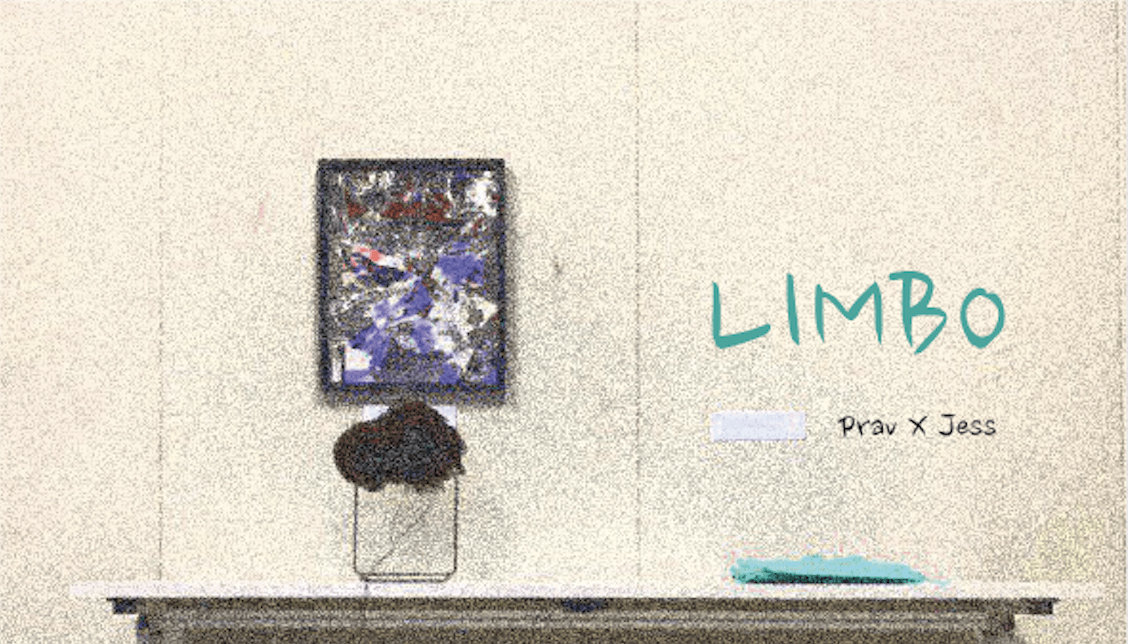
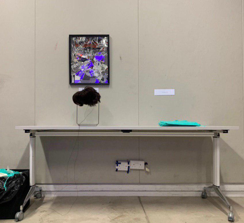
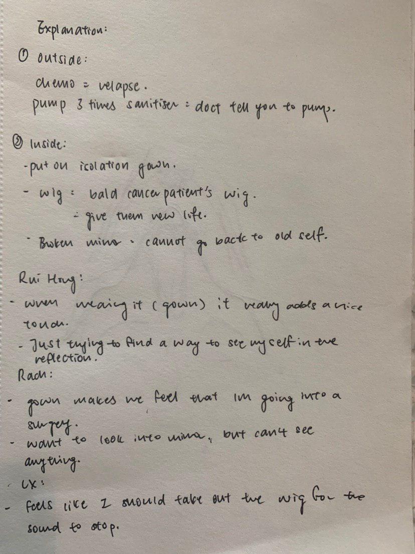
Limbo is an interactive space and a journey that invokes the idea of recurrence among cancer patients and portrays the inevitability and ambiguity of their eventual delirium and death due to sickness in a clinical way. It comprises of a start, middle and end. Start: where everyone approaches a clinical and minimalistic set up with detailed and specific instructions. They queue up and go step by step, making it methodical and prescribed. This is symbolic of hospital visits. They clean their hands, and wear masks. Middle: When tester wears isolation suit, he or she is stripped of their identity and becomes a patient while everyone else with their mask on become voyeurs (Doctors, nurse, friends, family). When they put on wig and look in the mirror, reflection is fragmented/distorted and flatline emits after a standard heart rate. Shrill sound of flatline forces ‘patient’ to remove ‘liberating wig’ exposing their scars while everyone else is relieved that sound has stopped. Enforces the idea of accepting death. End: eased out by disposing of props in trash can.
2. Inspiration
Statistics
The following table shows the relatively significant and high recurrence rate.
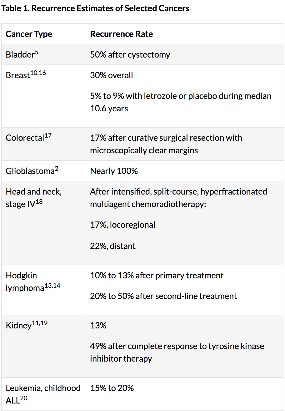
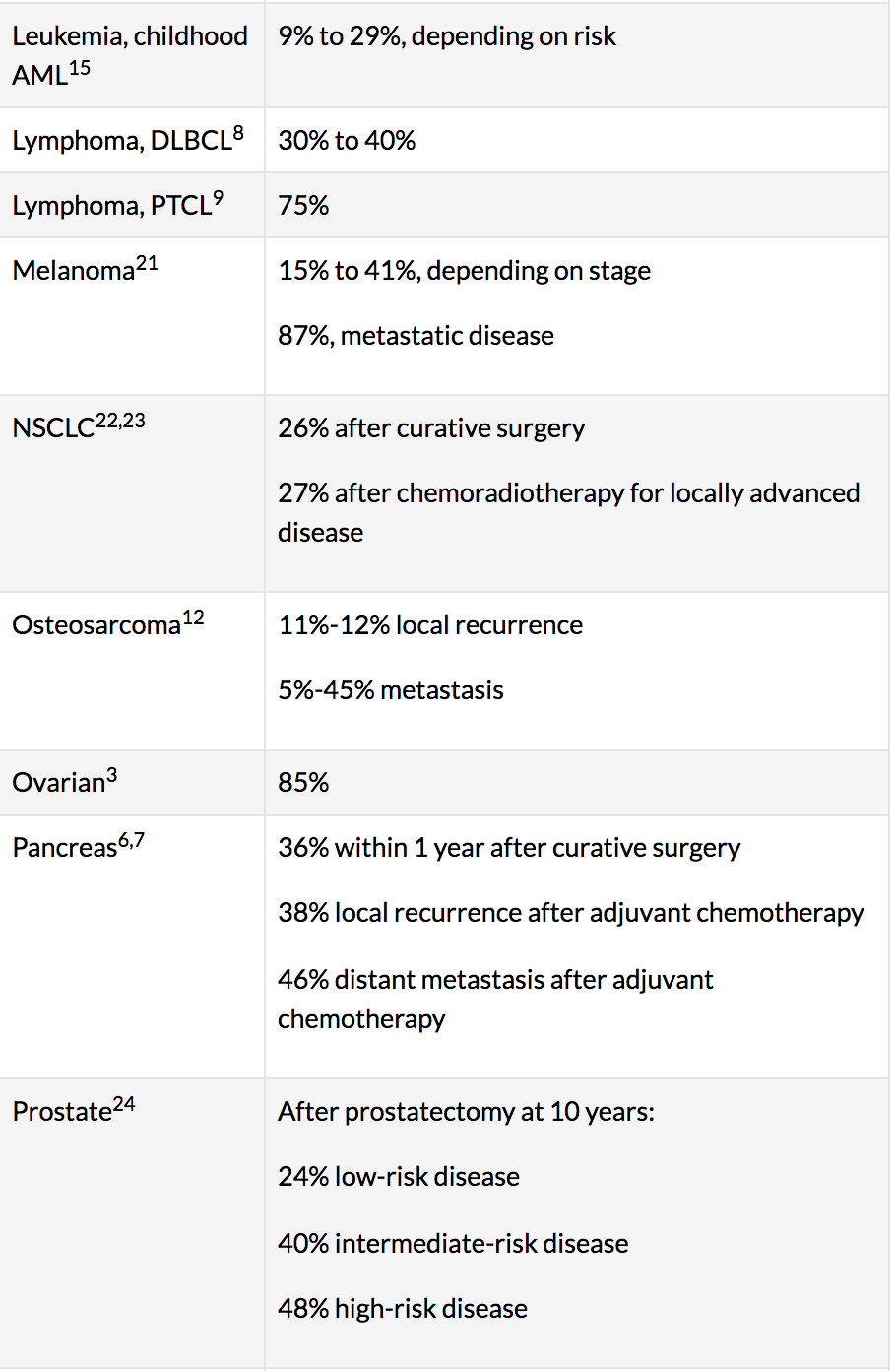
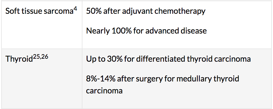
Source: https://www.cancertherapyadvisor.com/home/tools/fact-sheets/cancer-recurrence-statistics/
Personal Thoughts
I have relatives and close friends who have experienced the loss of someone because of cancer. Psychologically it is a disease that not only affects the victim but their close ones as well. Many of them told me that as much as they were sad when their loved ones passed in the final stages, they were relieved to watch their pain come to an end. The final stages of cancer, coupled with the strong doses of painkillers such as Fentanyl, causes one to hallucinate and lose their identity. They become unrecognisable physically and mentally fragmented. The only pieces left of them lie in the hearts and the minds of their loved ones — Only the audience could see the clear face of the tester/patient — patient was only able to see their reflection through the fragmenting mirror. Hence this was the overall sentiment and ‘vibe’ I wanted our interactive piece to emanate. It was important that not only the tester was involved.
“Delirium is the most common sign of medical complications of cancer or cancer treatment affecting the brain and mind. It is a common problem for people with advanced cancer or those at the end of life.” — https://www.cancer.net/coping-with-cancer/physical-emotional-and-social-effects-cancer/managing-physical-side-effects/mental-confusion-or-delirium
3. Ideation Process
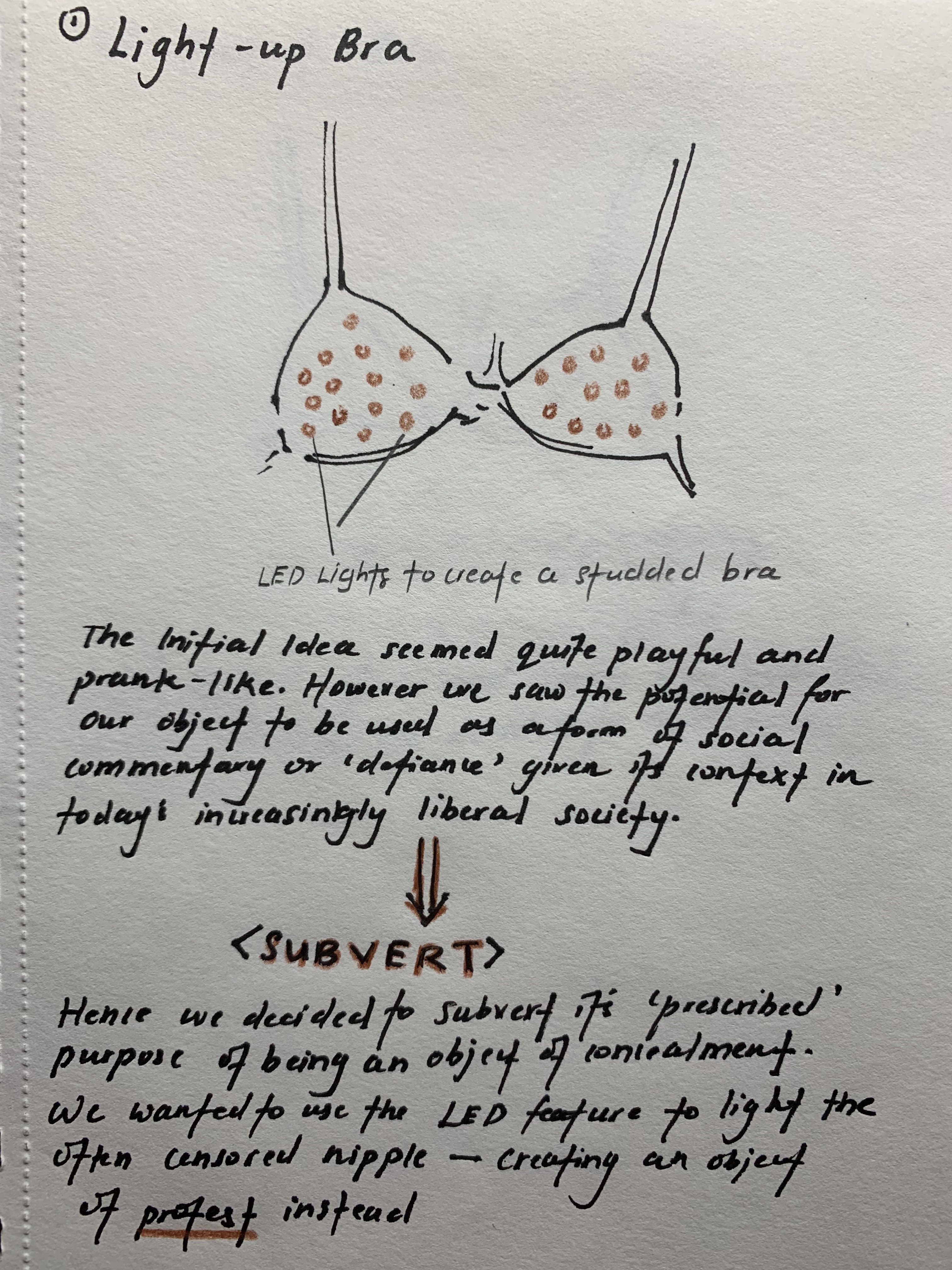
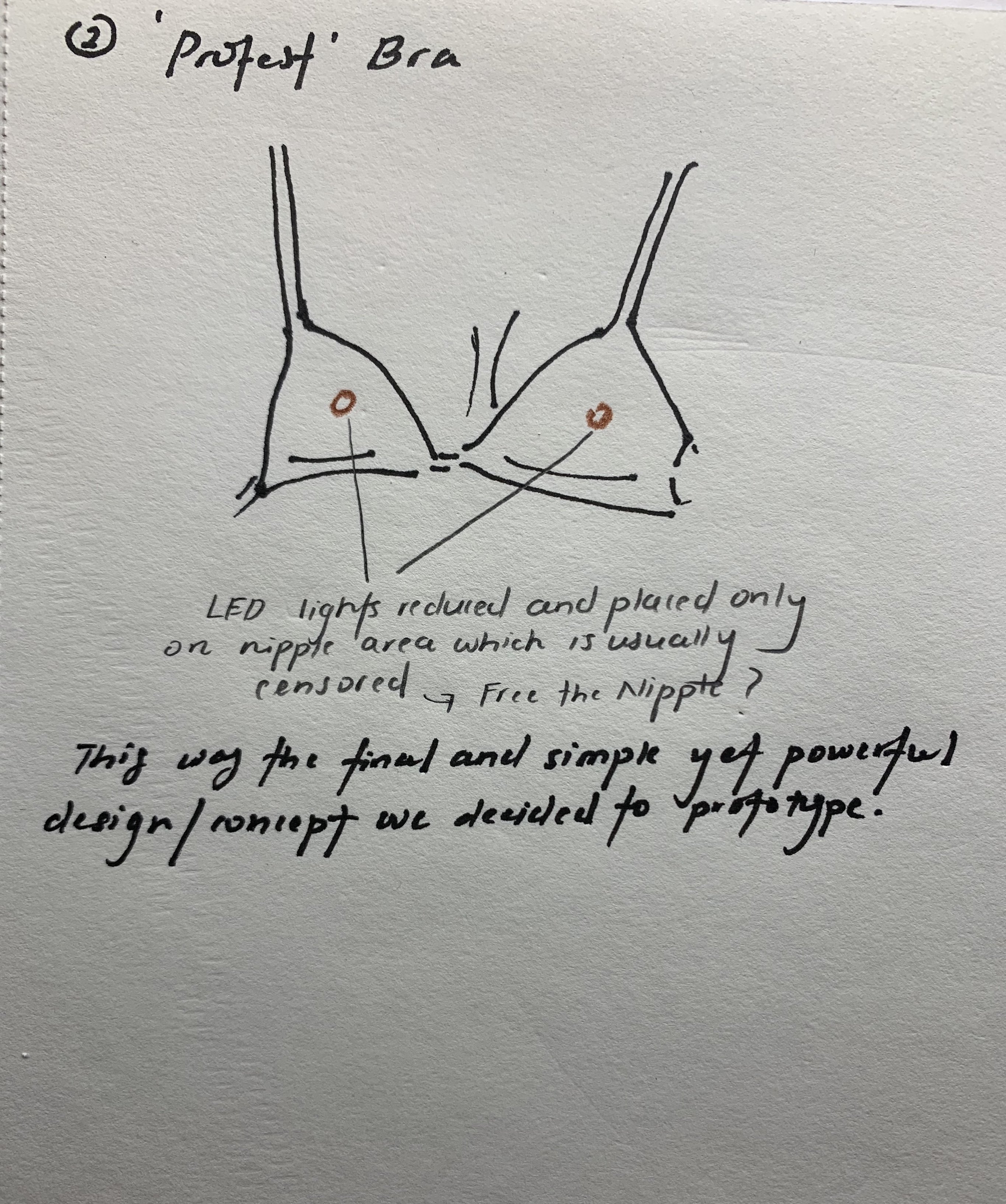
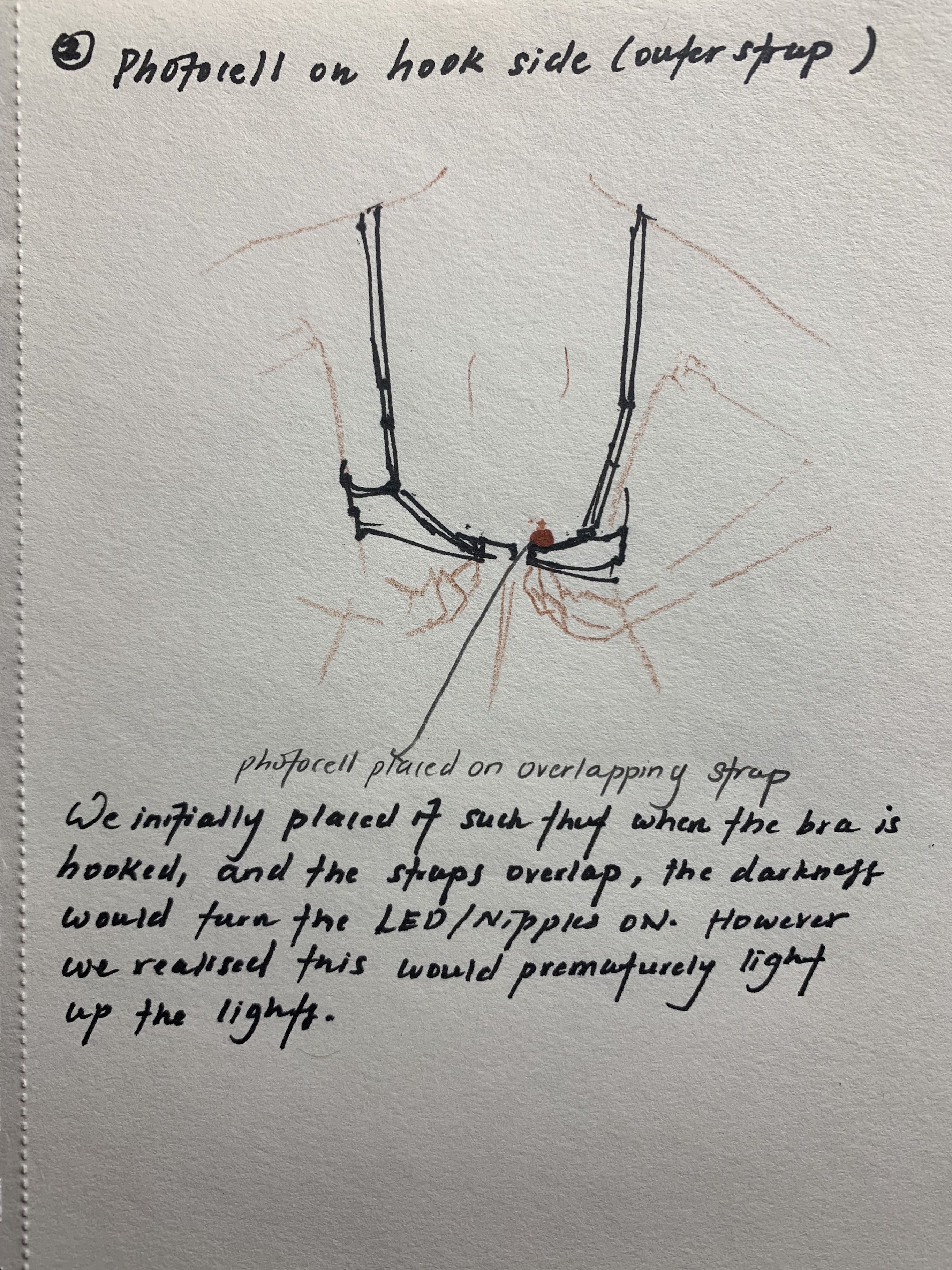
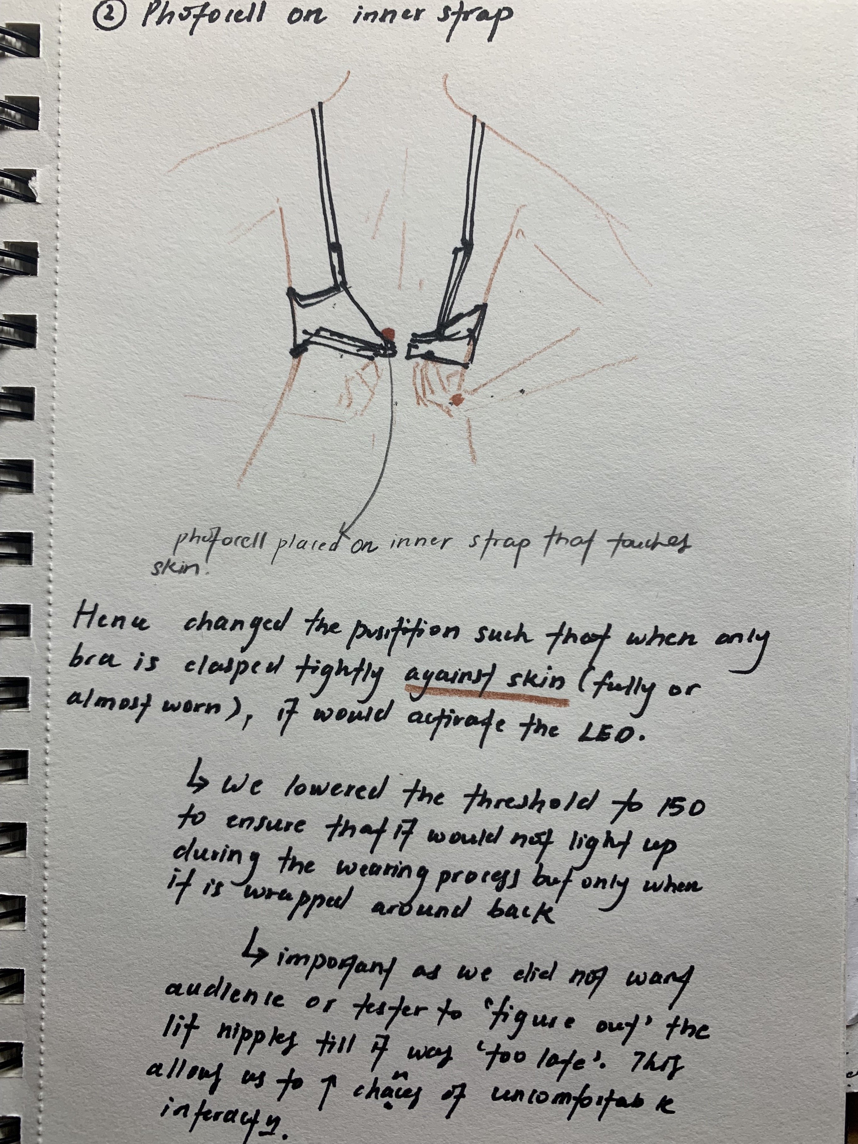
1.Degrading Mirror
Body Dysphoria, Using a wig that emits male guttural noises when worn. To induce body dysphoria. We realised that this was too niche of a topic to evoke and many would not be able to relate to it, making it seem contrived.
2.THINNING Mirror
Second idea was to use a mirror that would make whoever who looked into it feel like they’re perpetually sick. Incorporated with a wig that emits heart beat followed by a flatline. We wanted to use a concave mirror for this. However sourcing for one was extremely hard and we felt like we could narrow it down further. We also decided to use a pixie cut wig instead so that it would be more androgynous and inclusive.
3.Distortion Mirror
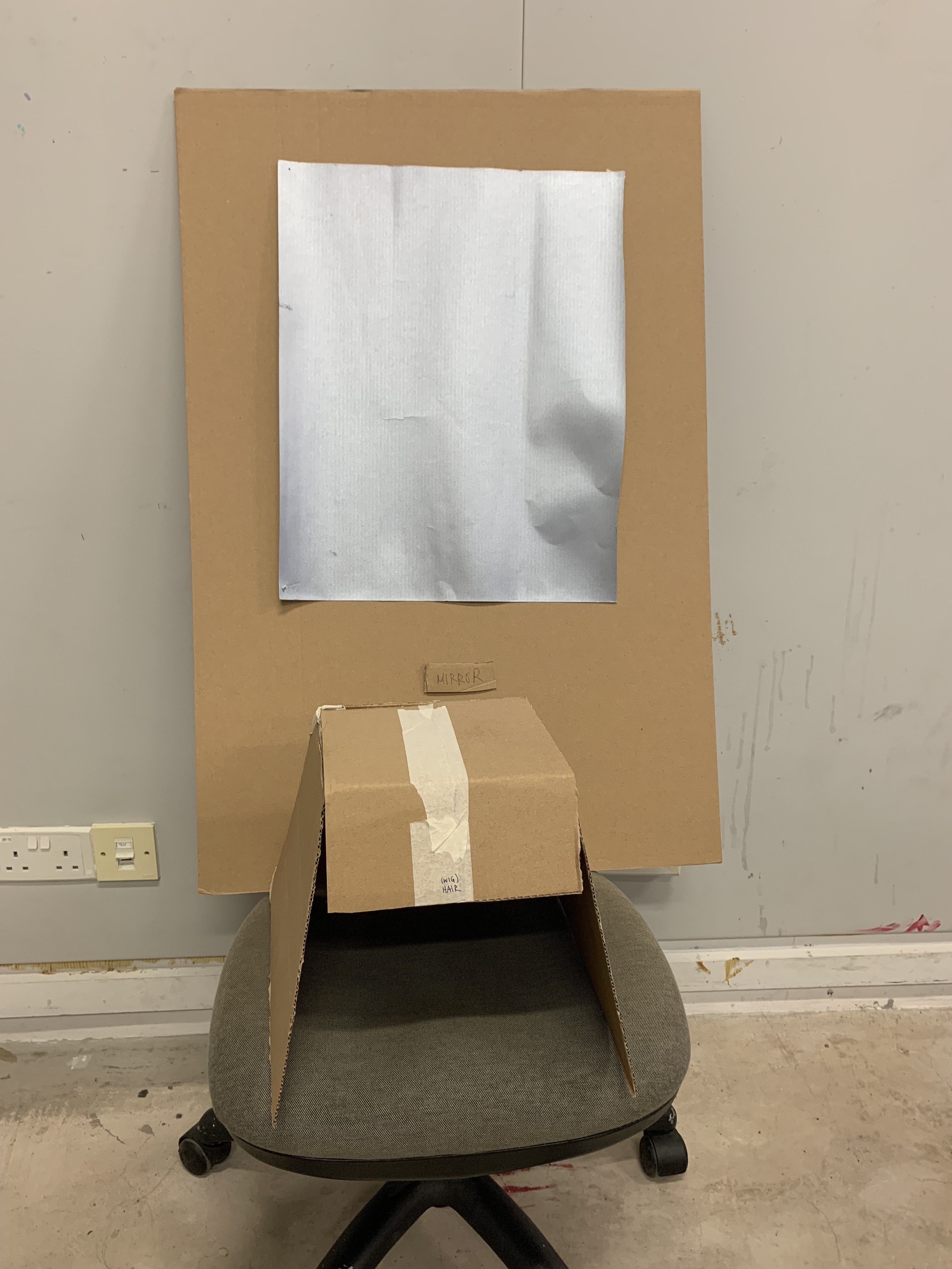
Final Idea that translated into ‘Limbo’ was a fragmented mirror in which a person’s reflection, looked from any angle would always be fragmented. We used a plain mirror form but altered it and guised it in a vanity table set up. We also expanded the interaction to include a beginning to ease the testers and voyeur audience into the interaction ‘space’ and ‘psyche’. Wig would be triggered upon wearing and would beep for 5 seconds before flatlining for two minutes straight unless removed. We wanted this to be reminiscent of people with cancer who have to visit hospitals time after time for surgery all while constantly preparing for a relapse even after recovery. The wig which is liberating object for them, then becomes a dark object since whenever it is put on, it reminds them of their possible death rather than injecting a sense of hope or life into them. Complemented by the mirror which reflects the delirium cancer patients go through during their final moments.
4. Instructional
Physical Set Up:
Pre-Installation Interaction (Start)
Materials Needed:
Hand Sanitiser
Surgical Mask
Isolation Gown
Instructional Signs
Steps:
1. Buy medical supplies from a walk in medical supply store.
2. Set up a convincing clinical and minimalistic table set up. Orderly and cold. Lay out in a line, equidistant to condition audience’s mind to think of queuing up when admitting to hospital.
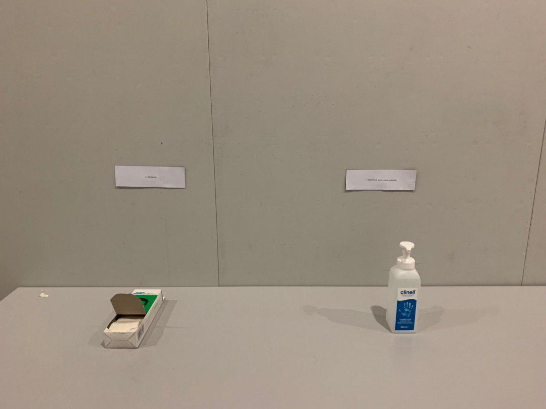
3. Sanitiser with signs. (Pump 3X thoroughly) Specify number to bring out the idea of prescriptions and steps. Prepare clear clinical like instructions.

4. Mask (Involves voyeur in interaction, discomfort not only for tester but for audience), apart from discomfort from interaction, tester will also be surrounded by everyone else with masks on.
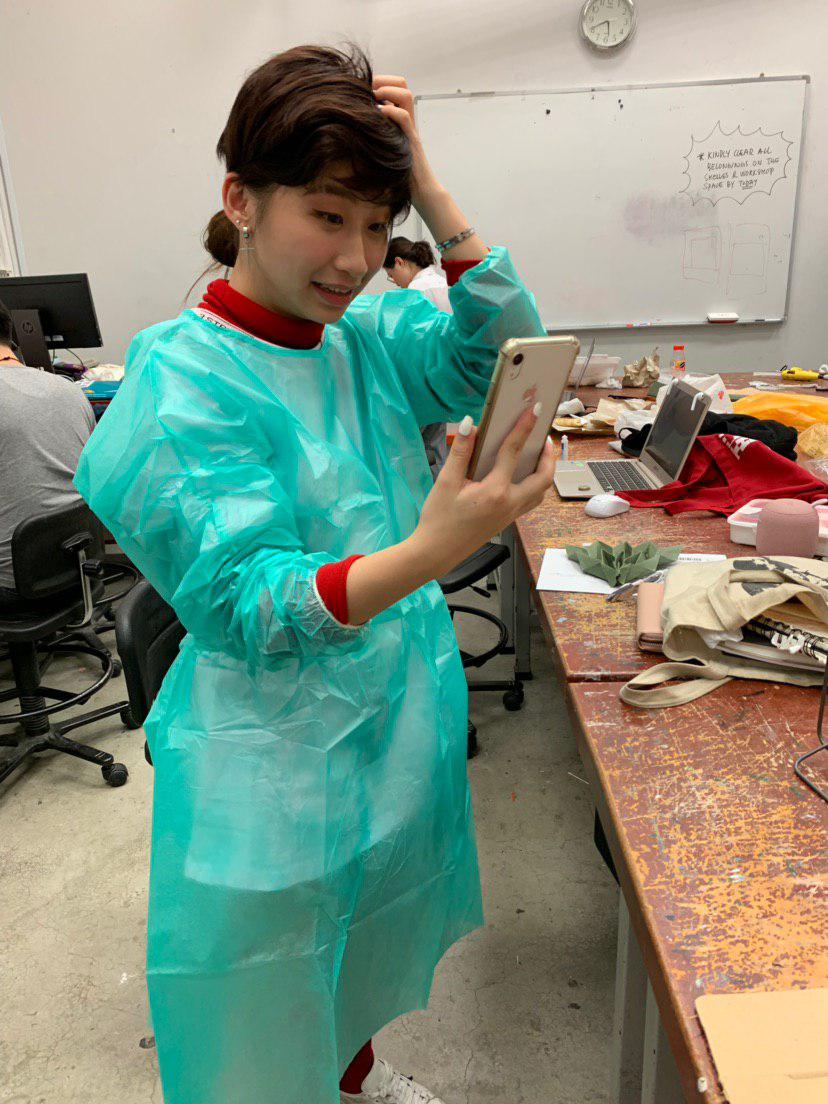
5. Tester will have to put on an isolation gown before proceeding to interact with the main object. This is to ensure the identity of the tester is stripped away for the duration of interaction.
Installation Interaction (Main)
Materials Needed:
Vanity Mirrors
Photo Frame
Storage Box
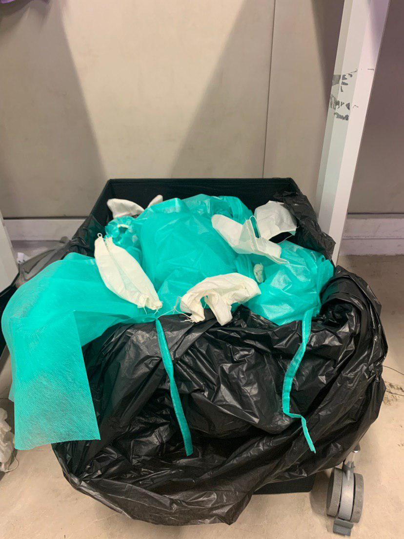
Trash Bags
Stand
Mounting Tape
Glue Gun
Steps:
1. Buy items from hardware store or relevant beauty shop. Buy isolation gown from medical supply store.
2. To create Topographic, Fragmented and 3D mirror, buy separate pieces of mirrors. Seal them in a tight plastic bag or protector. Use hammer and hit hard to shatter the glass into small pieces. Lay out pieces.
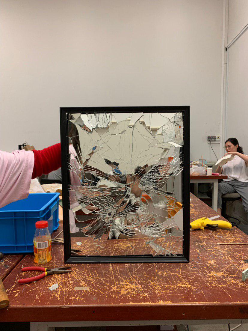
3. Detach Photo frame backing and lay out first layer of glass pieces to form a flat layer of support. Use glue gun to secure heavy pieces. Layer slowly and build up with different heights to achieve intended areas of concavity or convexity. Use fabric as a filler and support to hold denser areas of layers.
4. Finish with photo frame. Use pliers to secure heavy mirror piece. Glue gun to ensure further support. Mount the back with strong mounting tape and mount on the wall
5. Place Necklace stand directly in front of mirror.
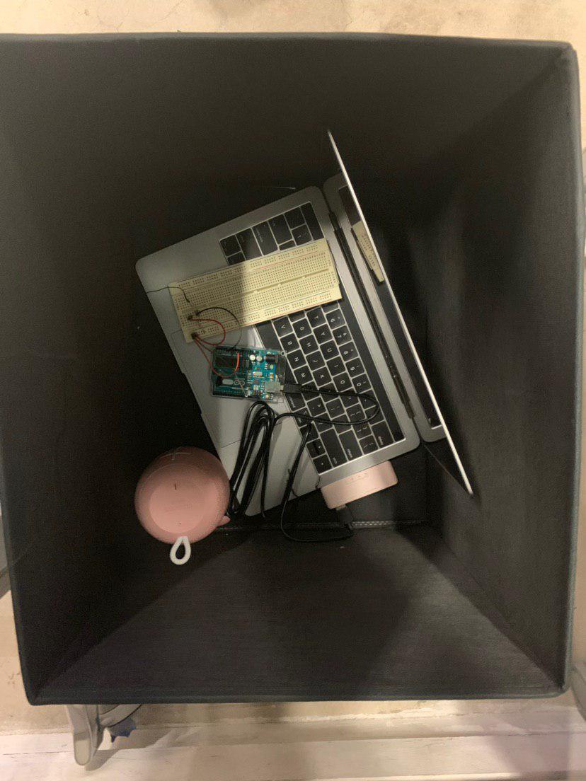
6. Place storage box beside with laptop and circuit beside table. Line with trash bag to conceal circuit. Instruct testers to throw gowns and mask into bin as away of stepping out of interaction space and also to enhance discretion of circuit and appliances.
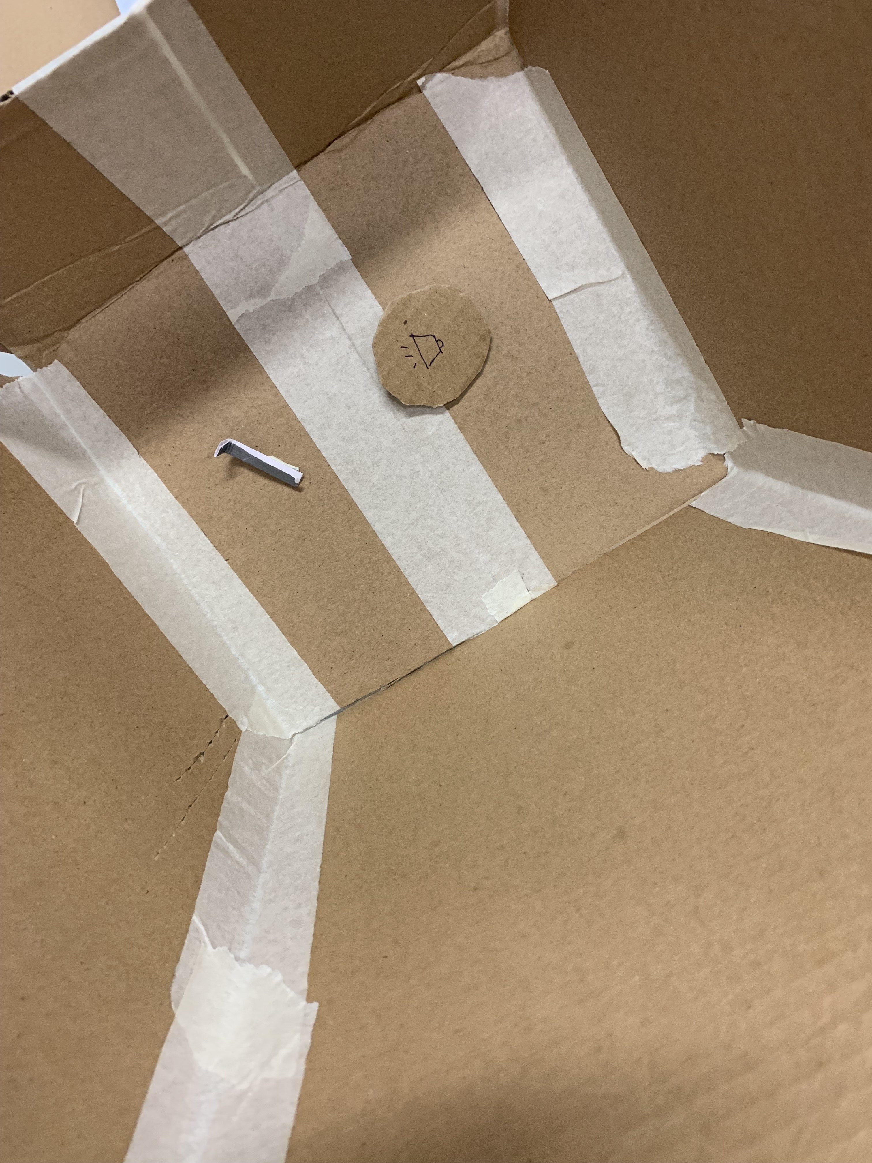
Arduino and WIg (Main)
Materials:
Wig
Arduino
Photocell
Bread Board
Resistor
Processing App
Speaker
Needle, Thread
Soldering Kit
Thin Wires
Steps:
1. Buy androgynous wig with lining
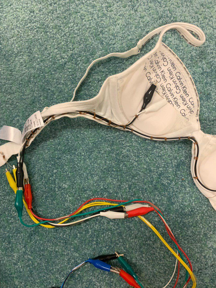
2. Buy long wires, at least 2.5 metre to give allowance for tallest possible tester. Use thin wires to make set up more sleek.
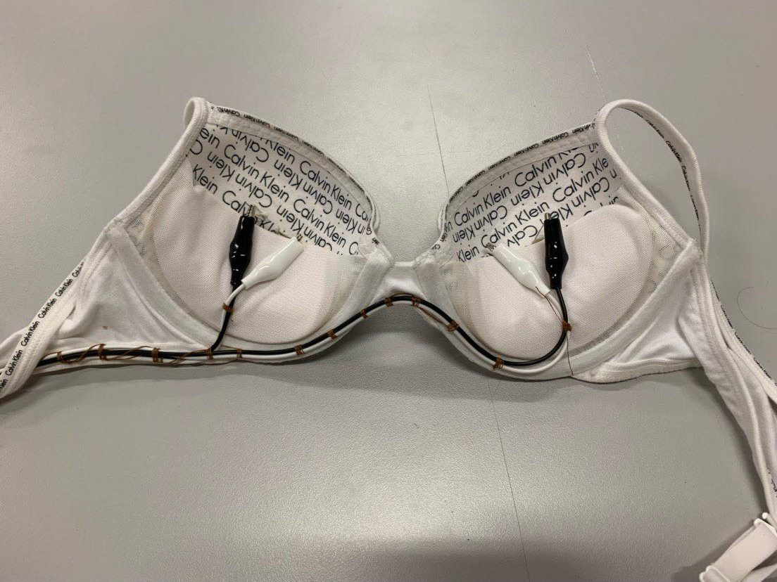
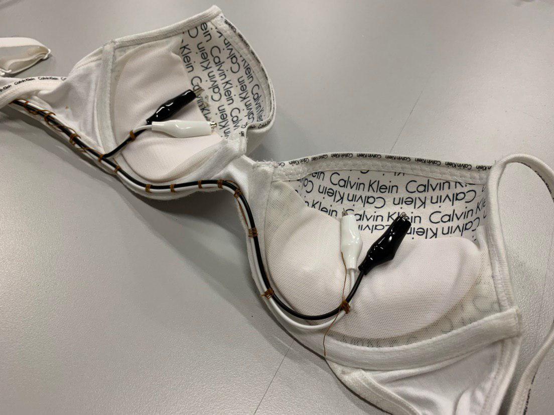
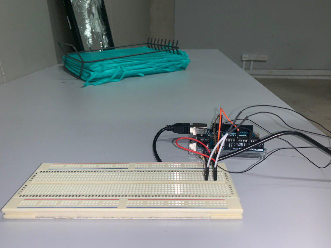
3. Solder Wire to each end of photocell and set up circuit as shown below.

4. Thread wire ends to photocell legs to secure and prevent breakage. Thread photocell onto lining of wig to hide it.

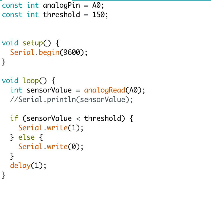
5. Arduino Code — Use low threshold to prevent wig from emitting sound before intended interaction
6. Processing Code
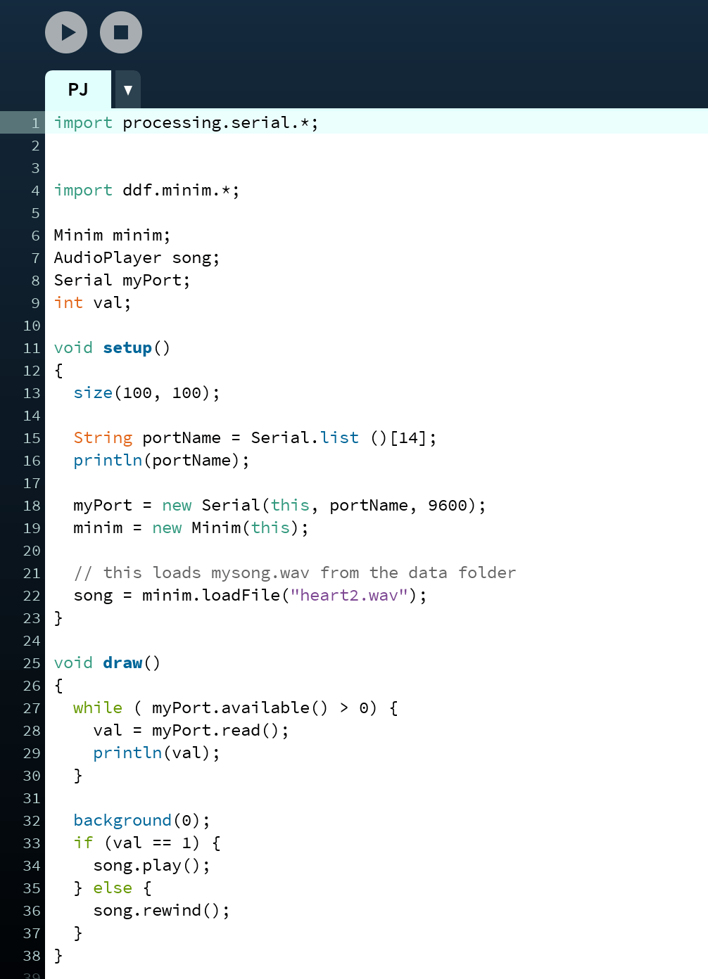
7. Upload Arduino Code then press run on Processing
8. Leave all items in the storage box and proceed to hide.
9. Place wig on necklace stand
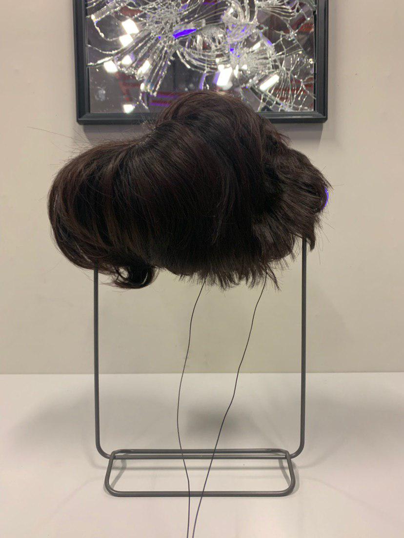
10. Let interaction begin
5. User Tests
Body Storming
(Read Micro Project Post)
Testing Code
6. Final Interaction
Interaction
Feedback
7. Reflection
Observations
All the testers were compelled to remove the wig relatively quickly due to the high pitch sound of the flatline. They were wary of annoying the rest of the audience and were troubled by the sound itself. However upon viewing the interaction I realised that maybe forcing them into this choice of removing the wig, was ‘too easy’.
Improvements
Incorporate a sensor within the wig that heats up upon wearing. However upon removal, it starts beeping and then flatlines. This would be symbolic of burning or heat and hence death/cremation. And it would then cause a conflict where users would have to decide if they wanted to let their scalp be uncomfortable and hot or let the shrilling sound play. This is symbolic of the idea of having a choice to go for chemo or other form of therapies yet still facing the high possibility of recurrence — No matter what they choose it will still lead to a ‘negative’ outcome.