The Color Spectrum

how-women-and-men-see-colors

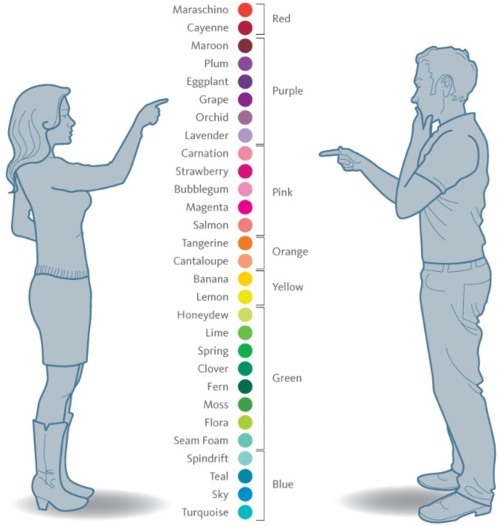
It’s funny how one’s perception of color could differ to others. For me personally, I associate myself to be just like the man in the picture above. I am sensitive to colors and I am fully aware that there are millions of them visible to the human eye. However, I prefer identifying colors in a more generic way, classifying the different shades and tones of these colors to their more commonly-known terms.

These are the colors I would generally identify:
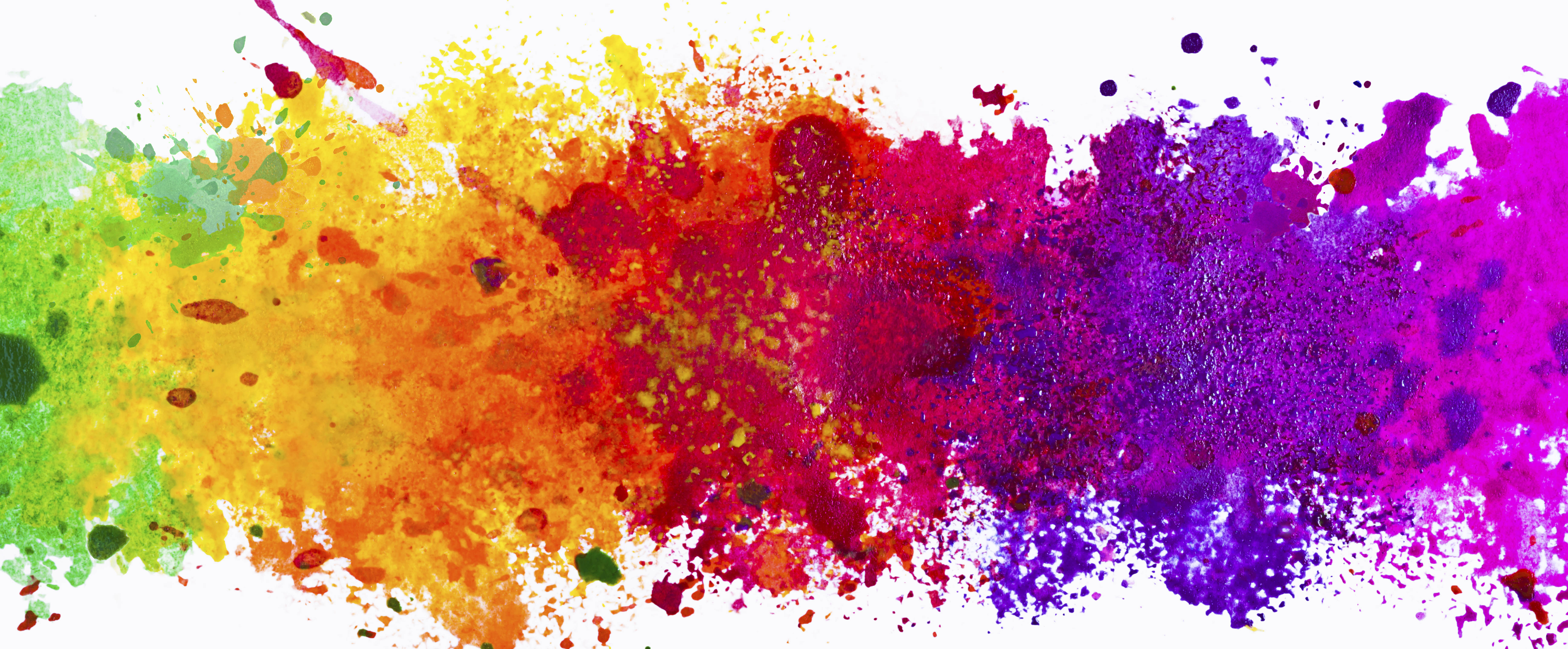
Red, Yellow, Blue
Orange, Green, Purple
Brown, Pink
White, Gray, Black (Yes, black is a color and chemists have proven it! Your argument is invalid.)

Colors and Their Meanings

Red:
Love, Immediacy, Energy, Sale, Passion, Anger, Hunger

Yellow:
Cheer, Attention, Childish, Fresh, Warmth, Energy, Optimism

Blue:
Trust, Smart, Calm, Faith, Natural, Stable, Power

Orange:
Health, Attraction, Stand Out, Thirst, Wealth, Youthful, Happiness

Green:
Soothing, Eco-friendly, Natural, Envy, Jealousy, Balance, Restful

Purple:
Royal, Mysterious, Arrogant, Luxury, Childish. Creative, Sadness

Brown:
Organic, Health, Comfort, Nature, Durability, Order, Casual, Reliable, Genuine

Pink:
Tenderness, Sensitive, Caring, Emotional, Sympathetic, Love, Sexuality

White:
Freshness, Hope, Goodness, Light, Purity, Cleanliness, Simplicity, Coolness

Gray:
Security, Innovation, Neutrality, Enhancement, Future, Self-control

Black:
Sophistication, Power, Mystery, Formality, Evil, Death

Nursery Rhyme (Project 2)

In this assignment, I have carefully thought about how I could play around with the elements in the given nursery rhyme while staying true to the integrity of its design. I envisioned my work to be portrayed in an out-of-this-world context and have a little fun in recreating the original story of the rhymes.

The 4 examples that I am about to share are amongst the best out of the several drafts and experimentation I have done. The design elements and principles were never neglected in the process of creating these images.

The main theme and highlights of my artwork is the energy and level of activity present in the following imagery. I hope to direct the flow of the eyes for the people who view my images by the use of lines, tones and textures. Each of these images has it’s own special texture.

Print

  1. “The cow jumped over the moon.”
    from the nursery rhyme “Hey Diddle Diddle”.

    In this design, I have employed Hierarchy and used it to the very best. Notice that your eyes are more glued to the cow placed in the bottom left of this image despite having other cows filling up the remaining parts of the canvas? That’s because I have intentionally enlarged the size of that cow to give it a higher hierarchical importance.It is even placed on a third, so naturally your eyes would be more drawn to it. Additionally, that cow is placed exactly at the center of the moon (a circle) as opposed to the rest being arranged along the rims. This adds to its importance in comparison to the others.

    I have also incorporated some Rhythm into the design. I have multiplied the cows and arrange them along the curve of the moon creating a repeated pattern. And that pattern has been repeated to additional curves that pulsate outwards. It is literally music to the eyes.

    Project 2_05

  2. “There was an old woman who lived in a shoe.” 
    from the nursery rhyme “There was an old woman who lived in a shoe”.

    For this design, I have decided to focus more on Symmetry. The shoes that were arranged to form a shelter for the old woman is mirrored to create a balance on both axis. This image feels rather harmonious creating a sense of home for the old woman who resides in it. The symmetry also gives a sense of familiarity and comfort, which further represents how a home should feel like.I have played with the transparency of the inner shoe-pillars to create a sense of depth and space. With it being shrunken and faded, it fools the eyes into creating perspectives in the imagery.

    I have left the center white to play with space and give contrast to the old woman so that her silhouette becomes even more prominent. The difference in tonality also plays a huge part in determining which objects are closer.

    Project 2_08

  3. “Then whipped them all soundly and put them to bed.”
    from the nursery rhyme “There was an old woman who lived in a shoe”.

    I have made the usage of Axis more pronounced in this artwork. I have used the whips and have arranged them in a circle around the old woman. Since these whips are arranged in such manner, it portrays a sense of stability and order around the old woman. Symbolizing power and authority over the children. The whips were also used as movement for the eyes. You could see that they act as leading lines to bring the old woman into focus.I have also used imaginary lines from the arrangement of the objects to create Reinforcement. The bed, the children, and the old woman are placed in a way that they form a triangle/pyramid. And as we all know, triangles are often associated to power and fear. And since the old woman is at the top of the pyramid, it puts her at a much higher level of authority.

    Negative space has also been implemented here to further bring out the silhouettes of the characters and objects present in the artwork. It also portrays the night sky, showing that it is bedtime for the children.

    Project 2_11

  4. All the king’s horses and all the king’s men.”
    from the nursery rhyme “Humpty Dumpty”.

    Rhythm plays an important role in this image. The king’s men and horses were arranged repetitively in a staggered manner and the silhouette of buildings in the background is also arranged orderly within the quadrant. However, the king is placed in the bottom right, breaking the chain of repeated patterns. When patterns are broken, it makes the subject much more special and important.The king is also enlarged to symbolize power and order over the men and the horses. He appears to be in charge of everything that is going on in the image.

    And if you notice, the staffs, buildings and the king’s eyes are all directed out of the canvas. It leaves some sort of mystery on what they are about to uncover. But due to the way they are arranged, it generates a lot of energy from inside out.