The ideation process was key to how I was able to diversify my styles in the 4 final designs for my typographic portrait, all of which were entirely worked in Photoshop. As mentioned in my research, I did not wish to maintain the same boring style throughout like how I did for previous projects. I wanted to do something out of my comfort zone. After all, I am all about experimentation.
1. Astronaut: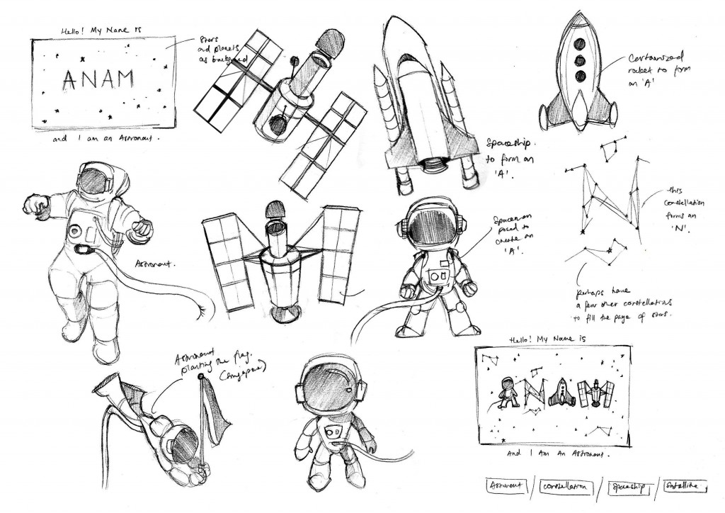
For the Astronaut idea, I aimed to go for a playful and sleek look to my illustrations. I wanted the typeface to be fused with astronomical features so I began drafting out rough sketches to see how they could be incorporated in my typography. I took a lot of inspiration and references from Ralph Cifra so that I could create something that is bold, easily identifiable (in terms of silhouette), but simple and clean. My sketches mostly consist of my attempts to force objects such as a satellite, an astronaut suit, and space shuttles, into my typeface.
Composition Breakdown:

Once I had a solid idea of which direction I was heading to, I began looking up for fonts that would best suit the characteristics of an Astronaut. It should be a sans-serif font since I wanted that “Space Invader” kind of look. So I finally settled with a font called Spaceport One. As seen from the image above, this is how I have constructed the composition. I altered the overall silhouette of the type and went to add on the essence of an astronaut with a dark starry background to complement the brightly-lit word. The ‘a’ is of a space helmet, the ‘N’ is of a constellation, the other ‘A’ is of a space shuttle, and the ‘M’ is of a satellite. I was heavily influenced by the works of SNASK.
2. Gambler:
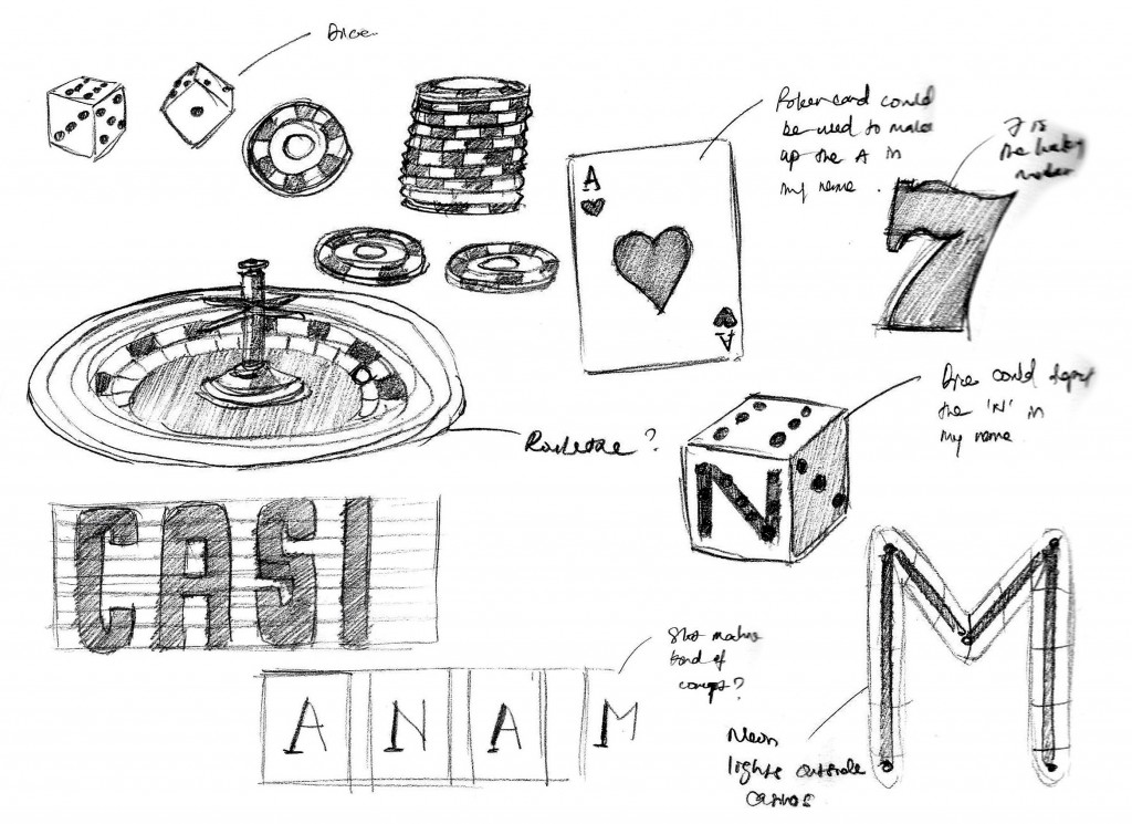
For the Gambler portrait, I had a casino theme in mind where all the objects should revolve around poker cards, poker chips, dice, roulette, slot machines and neon lights. I initially wanted to have different objects to represent each letter of my name but thought that it would be too similar to my Astronaut portrait. Then I decided to go with a style that looks more photo-realistic and more “in the moment”. However, I find the need to force my personal touch into it.

So I took a template of poker cards from the internet and alter the characters in these cards to look like my own. Much like how Mattias Adolfsson did with his illustrations. These characters are better representations of me, having a more friendly and jolly outlook. The Jack and King of Hearts were replaced with ‘N’ and ‘M’ instead to spell out my name in the deck. The difference is shown in the image above. The font used was
Composition Breakdown:

After getting all the source images in, I arranged them in a manner where it appears like I am playing the game. It is more of stacking the objects on top of one another, starting from the “carpeted” table top all the way to the realistic lighting. I added shadows to bring out the objects to focus.
Insights:
The objects are arranged to be translated metaphorically, where the cards are what I have to offer (my personal strengths and attributes) in exchange for the reward of chips (success and monetary gains in life), while the dice represents the risks that I dare take to accomplish and win the game. The cards take a heavier portion of the composition to show that no amount of rewards could overwhelm my qualities (staying true to oneself and not sell out).
3. Editor-in-chief (Journalist):
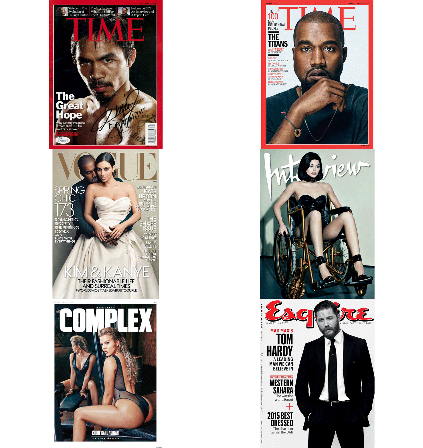
When you think about an Editor-in-Chief, you think of somebody in control of what he/she does and what he/she wants their readers to see or read. Power and influence com to mind when I was generating ideas for this typographic portrait. And what could be more powerful and influential than the massive number of highly controversial magazine covers of our time. I have pieced up and made a collage of magazine covers that has trended and became the hottest topics of discussion among the youths of our generation, be it good or bad. I have adopted the style of Hannah Höch of photomontaging for this piece of art.
Composition Breakdown:

Upon compiling the magazine covers, I made cutout templates with the effect of ripped paper for the images and arranged them in a disoriented manner across the page. This was then enhanced with a crumpled-paper texture and sepia-tone filter to give it an old and vintage feeling. I have cut out letters of different fonts from several publications such as Maxim, The New York Times, Paper Magazine, and Times Magazine, to spell out my name in the typographic portrait. I’ve added shadow and tape to make the texts stand out.
4. Architect:
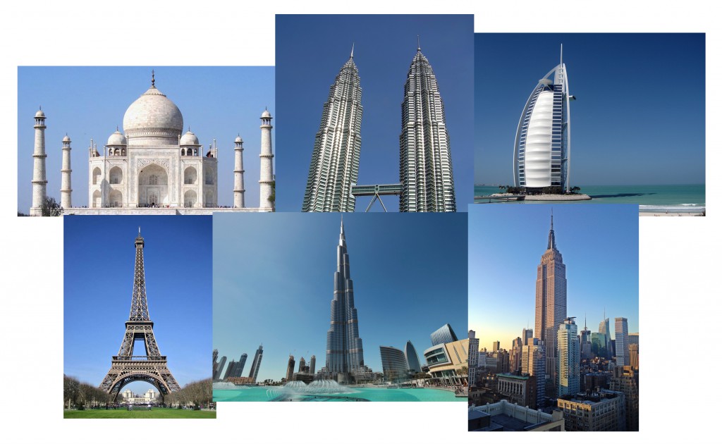 I had a clear idea of how I wanted to portray the Architect in me. I wanted the text to be written on a blueprint like how floor plans are done. But I felt the need to add more to the overall aesthetics. So I listed out some of the most iconic works of architecture in the world such as the Taj Mahal, The Eiffel Tower and Burj Khalifa. I also wanted it to look very tedious and detailed in terms of the textual information that is accompanied by the main typeface. I was also going for a sketchy texture to it.
Composition Breakdown:

After much thought put into it, I stuck with the integrity of a genuine blueprint where it is white ink over a blue background. The font that I started with was called Architecture, a sans-serif typeface. Once that was done, I blocked them out into simplified and unified shapes before adding the silhouettes of the iconic buildings which I have mentioned above. I went on to add the “sketchy” texture and overlaid the blueprint (with the grids) on top of the text before adding the accents such as lines, arrows and actual measurements of the buildings.
Thank you for taking time to read on my process & execution, do check out my
Research and Final Work here.
