Nursery Rhyme (Project 2)

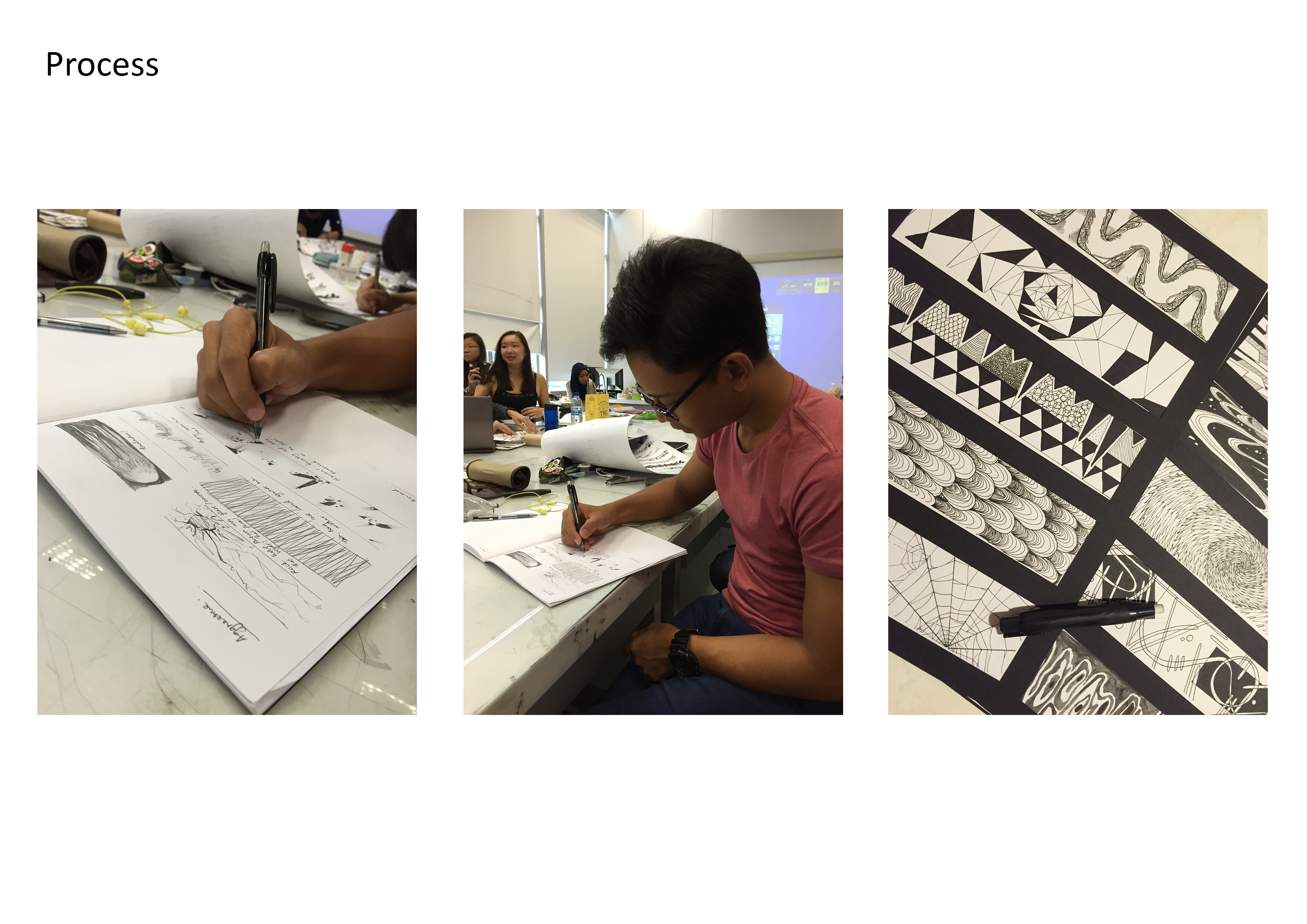
In this assignment, I have carefully thought about how I could play around with the elements in the given nursery rhyme while staying true to the integrity of its design. I envisioned my work to be portrayed in an out-of-this-world context and have a little fun in recreating the original story of the rhymes.

The 4 examples that I am about to share are amongst the best out of the several drafts and experimentation I have done. The design elements and principles were never neglected in the process of creating these images.

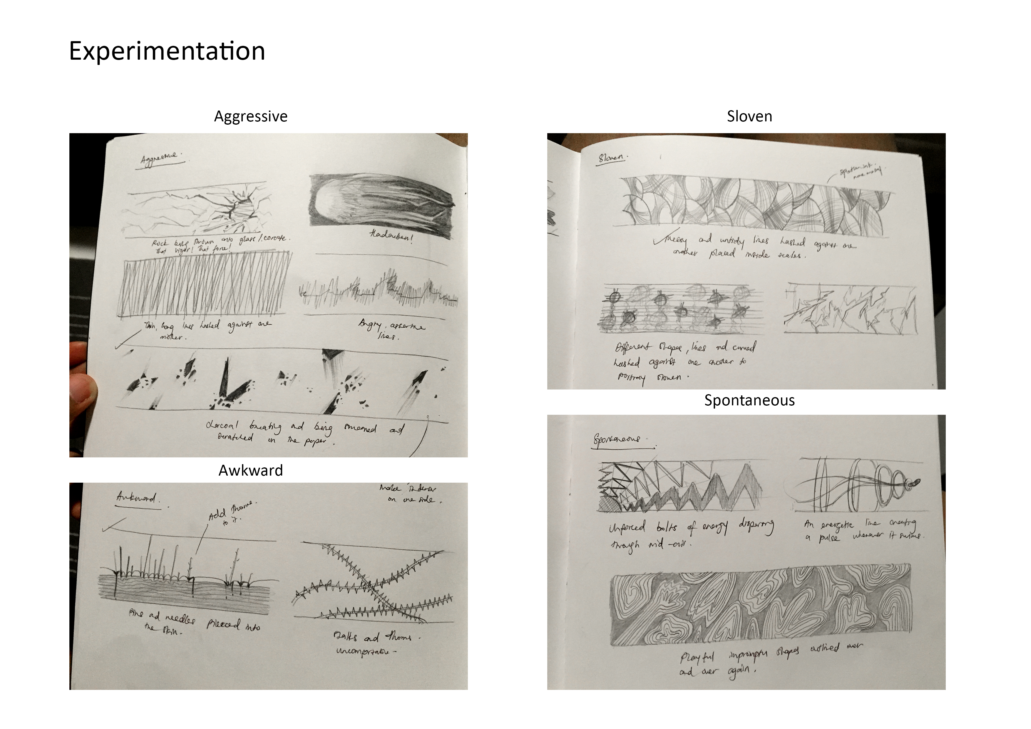
The main theme and highlights of my artwork is the energy and level of activity present in the following imagery. I hope to direct the flow of the eyes for the people who view my images by the use of lines, tones and textures. Each of these images has it’s own special texture.

Print

  1. “The cow jumped over the moon.”
    from the nursery rhyme “Hey Diddle Diddle”.

    In this design, I have employed Hierarchy and used it to the very best. Notice that your eyes are more glued to the cow placed in the bottom left of this image despite having other cows filling up the remaining parts of the canvas? That’s because I have intentionally enlarged the size of that cow to give it a higher hierarchical importance.It is even placed on a third, so naturally your eyes would be more drawn to it. Additionally, that cow is placed exactly at the center of the moon (a circle) as opposed to the rest being arranged along the rims. This adds to its importance in comparison to the others.

    I have also incorporated some Rhythm into the design. I have multiplied the cows and arrange them along the curve of the moon creating a repeated pattern. And that pattern has been repeated to additional curves that pulsate outwards. It is literally music to the eyes.

    Project 2_05

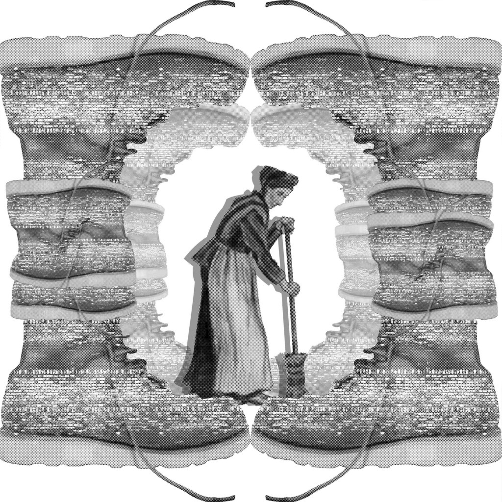
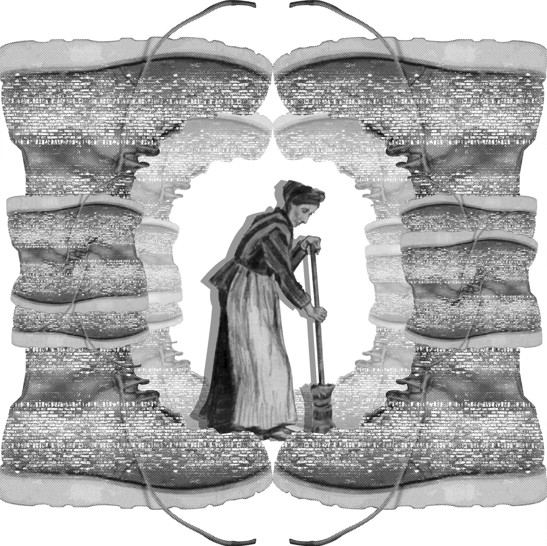
  2. “There was an old woman who lived in a shoe.” 
    from the nursery rhyme “There was an old woman who lived in a shoe”.

    For this design, I have decided to focus more on Symmetry. The shoes that were arranged to form a shelter for the old woman is mirrored to create a balance on both axis. This image feels rather harmonious creating a sense of home for the old woman who resides in it. The symmetry also gives a sense of familiarity and comfort, which further represents how a home should feel like.I have played with the transparency of the inner shoe-pillars to create a sense of depth and space. With it being shrunken and faded, it fools the eyes into creating perspectives in the imagery.

    I have left the center white to play with space and give contrast to the old woman so that her silhouette becomes even more prominent. The difference in tonality also plays a huge part in determining which objects are closer.

    Project 2_08

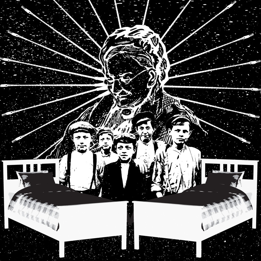
  3. “Then whipped them all soundly and put them to bed.”
    from the nursery rhyme “There was an old woman who lived in a shoe”.

    I have made the usage of Axis more pronounced in this artwork. I have used the whips and have arranged them in a circle around the old woman. Since these whips are arranged in such manner, it portrays a sense of stability and order around the old woman. Symbolizing power and authority over the children. The whips were also used as movement for the eyes. You could see that they act as leading lines to bring the old woman into focus.I have also used imaginary lines from the arrangement of the objects to create Reinforcement. The bed, the children, and the old woman are placed in a way that they form a triangle/pyramid. And as we all know, triangles are often associated to power and fear. And since the old woman is at the top of the pyramid, it puts her at a much higher level of authority.

    Negative space has also been implemented here to further bring out the silhouettes of the characters and objects present in the artwork. It also portrays the night sky, showing that it is bedtime for the children.
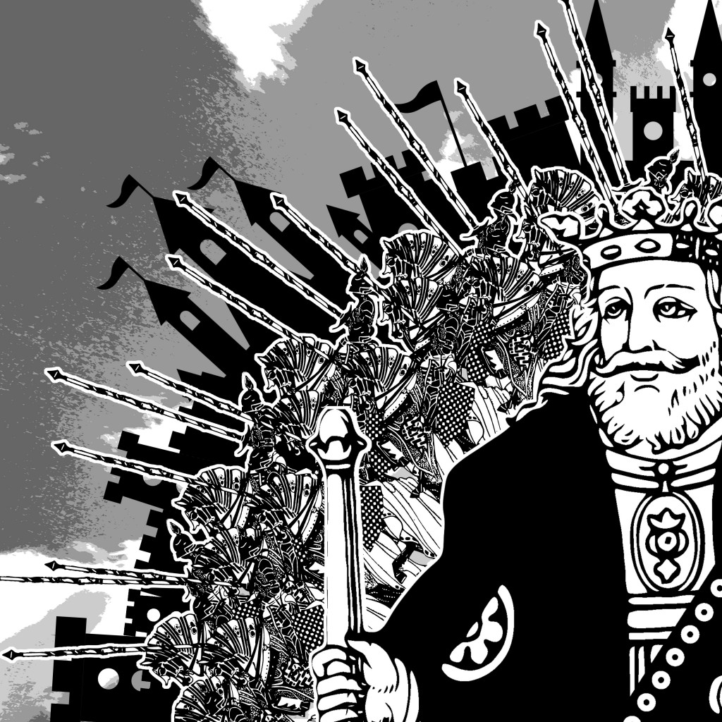
    Project 2_11

  4. All the king’s horses and all the king’s men.”
    from the nursery rhyme “Humpty Dumpty”.

    Rhythm plays an important role in this image. The king’s men and horses were arranged repetitively in a staggered manner and the silhouette of buildings in the background is also arranged orderly within the quadrant. However, the king is placed in the bottom right, breaking the chain of repeated patterns. When patterns are broken, it makes the subject much more special and important.The king is also enlarged to symbolize power and order over the men and the horses. He appears to be in charge of everything that is going on in the image.

    And if you notice, the staffs, buildings and the king’s eyes are all directed out of the canvas. It leaves some sort of mystery on what they are about to uncover. But due to the way they are arranged, it generates a lot of energy from inside out.

Design Principles

  1. Axis

    1

    Axis is the most basic and most common organizing principle. Simply stated, axis is an imaginary line that is used to organize a group of elements in a design. In diagrams, axis is represented as a dashed line.

    • Alignment

      Axis is mainly used to align elements. When elements are arranged around an axis, the design feels ordered. As with most things in life, we enjoy things that are ordered because they feel more stable, comfortable and approachable.

    • Movement

      When we encounter something linear, such as an axis, we naturally follow the line in a direction. If we arrive on a street, we walk down the street. If we open an elevator into a long hallway, we walk down the hallway. Lines prompt movement and interactions. The direction of movement depends on the end points. A defined end point signals a place to start or stop.

    • Reinforcement

      Although axis is an imaginary line, you can make it more apparent if the edges of surrounding elements are well defined. A common example of this concept in architecture is a city street. The city street is an axis that is reinforced by the buildings on both sides. If a portion of the street is missing a building on one or both sides, the street’s axis would not feel as strong.

    • Continuous

      If an end point is undefined, you will follow the axis until you reach something of interest or are tired of interacting with the axis. While the concept of an undefined end point in architecture is uncommon since it’s difficult for something architectural to go on forever, it’s becoming more popular in product design with infinite scrolls.

  2. Symmetry

    2

    Symmetry is when elements are arranged in the same way on both sides of an axis. Perfect symmetry is when elements are mirrored over the axis and exactly the same on both sides.

    • Balance

      Symmetry adds balance to a design. When elements are the same on both sides of an axis, the design feels harmonious. If we design a street with five houses on one side and five on the other, walking down the street would feel comfortable because the arrangement of homes is balanced.

    • Asymmetry

      Designs are asymmetrical if the arrangement of elements are different on both sides of an axis. If we design a street with five houses on one side and one on the other, the street will feel unbalanced and perhaps uncomfortable.

  3. Hierarchy3

    Hierarchy is when an element appears more important in comparison to other elements in a design.

    • Size

      An element will appear more hierarchical if it is larger than other elements in a design. We naturally look first at the largest element in a design. If there are five windows on the front of a building, and one is twice the size of the others, our attention will focus on the biggest window first.

    • Shape

      An element can also appear more hierarchical if it is different than other elements in a design. We naturally look first at the irregular shape in a design. If there are five of the same windows and one door on the front of a building, our attention will focus on the door first.

    • Placement

      Last but not least, we can place elements in more hierarchical positions. Within a circle, the center is the most hierarchical. The end of an axis is naturally more hierarchical than points along the line.

  4. Rhythm

    4

    Rhythm is the movement created by a repeated pattern of forms.

    • Pattern

      The best way to understand rhythm is to think of a song. Songs have rhythm when a piece of the song repeats. When listening to a song with good rhythm, we recognize the pattern and begin to expect beats.

    • Breaks

      A break in rhythm will appear more hierarchical. Think about a song. When a song has a repeated rhythm and the rhythm is broken, something quite special usually happens.

Experimentation, Process & Documentation

The initial stages of this project consisted of the methods that has led to how I would achieve the results that I have envisioned to express the 18 different emotions. I have decided to go with a flatter, much cleaner way of translating these emotions onto paper.

The concept behind the designs was how the physical body reacts and feel in coherence to evoking these emotions. For instance, when you’re anxious, you tend to scruff your hair, grit your teeth, bite your finger nails, your cheeks would blush and you might have that tingly, uneasy feeling in your skin. With these reactions in play, I have portrayed them with the simple use of lines and tones.
Mediums & Materials
For this project, I have worked with Chinese ink, brushes, straws, 0.1mm & 0.5mm graphic pens, brush pens, markers, pencils and ball-point pens to achieve the final results.

Exp_1Exp_2Exp_3Exp_4Exp_5Exp_6I have drafted out three or more sketches of the each emotion in my journal to bring out the best aspects of that particular design and develop further on the final ideas. After much consultation, some ideas were scrapped while others were combined and cross-incorporated to become my finalized design.

With each design, I have given a brief explanation as to why I chose to express the emotions in that particular way.

Process