once more do we come to start anew, where the waves ebb and flow, eroding what it can, with what little power it has, until the seas dry up, leaving nothing but flecks of salt, flecks of sand
and just like that, we keep suspending thought again, and again, till we are decisive, for you, me, the world, and all of Meaning
we are all ending, in some time, in some place, and scattered over voids of perceived faith
I wrote this while delirious at 3am a few days back, and only remembered it after taking the video. Surprisingly, it feels like they fit together well.
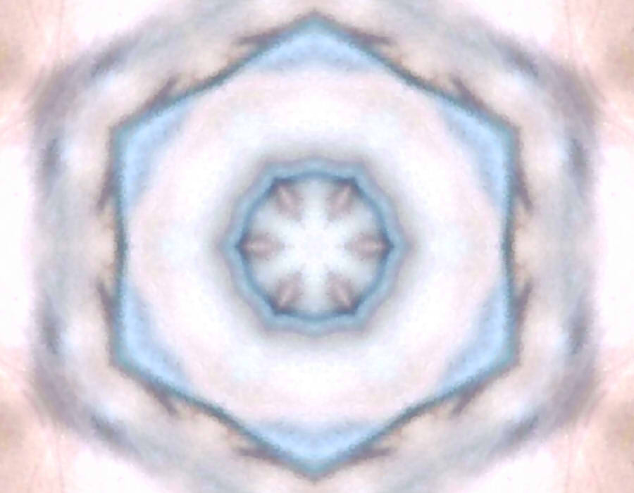
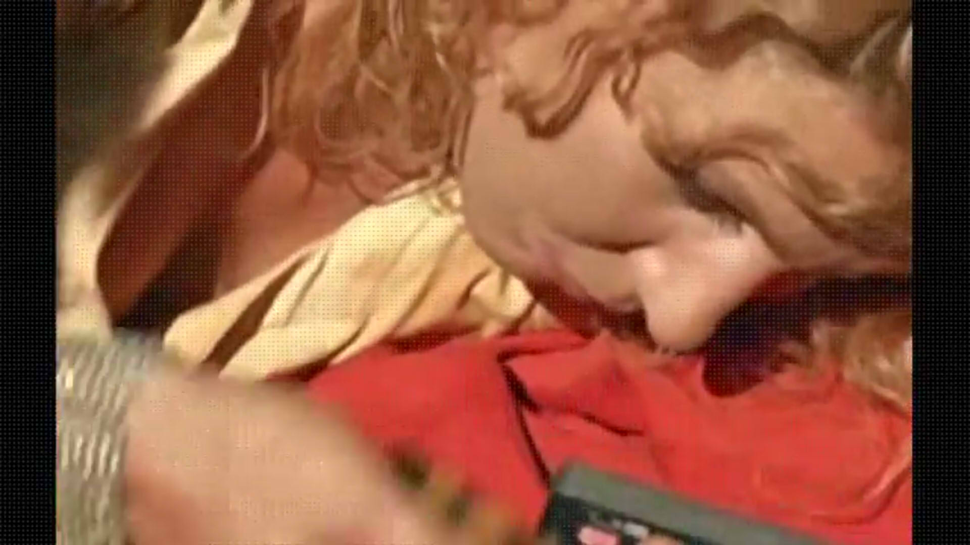
The alter ego I wish for is one with which I can attain freedom in abstraction. It terrifies me sometimes, the fact that I have a tangible form bound by the constructs of society and laws of the universe. Often, I wish I could become emptiness, unconstrained by rationality, natural in irregularity, aesthetic in imperfection.
I took about 12 minutes worth of footage, and trimmed out a minute. Throughout the video, the kaleidoscope effect is applied, such that I am not me, such that I can reach the abstraction I’ve wished for. My eyes are closed, and I am moving at random without seeing the result. I am also vocalising a random melody which is made up as I go. Both of these reflect the freedom and aesthetic of spontaneity which, I feel, comes with being unconstrained.
Wabi-sabi and sunyata seem to be relevant concepts, incidentally.
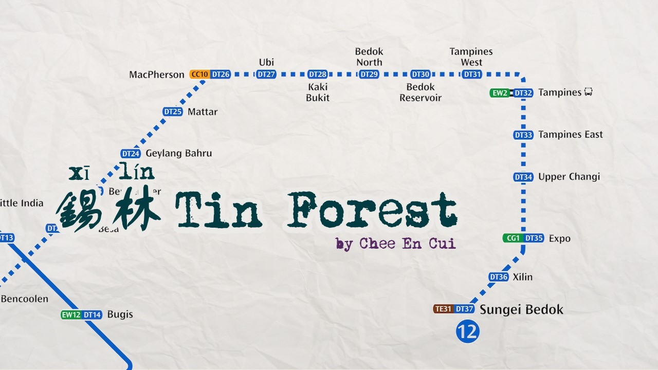
“If you’re going to go somewhere, might as well go all the way,” I said to myself, and that’s how I found myself wishing I hadn’t had the superb idea of riding the entire Downtown Line and beyond.
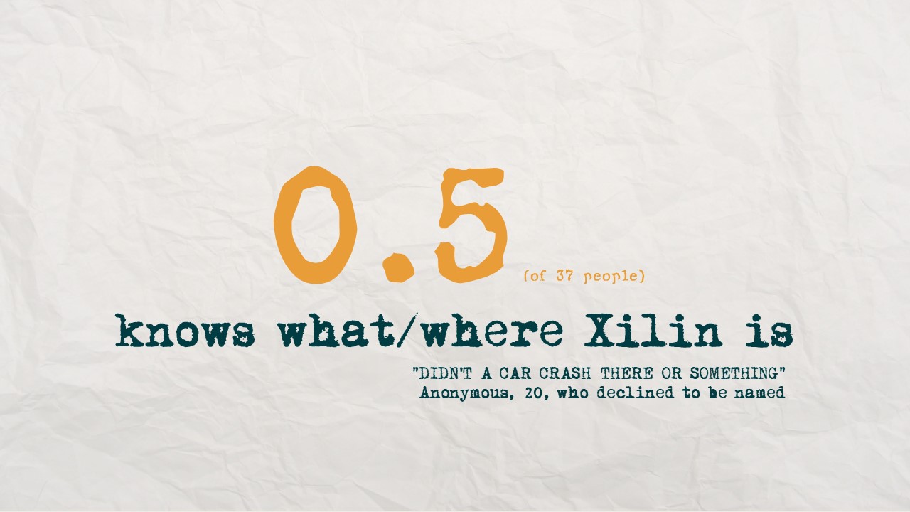
In all seriousness, though, the East is probably the most unknown to me, in that I have literally never been there apart from Changi, simply because I have never had any need to go there. Thus, I decided to look at the MRT map and find a nice sounding Eastern place to go to. Preferably, one I’ve never even heard of, because why not?
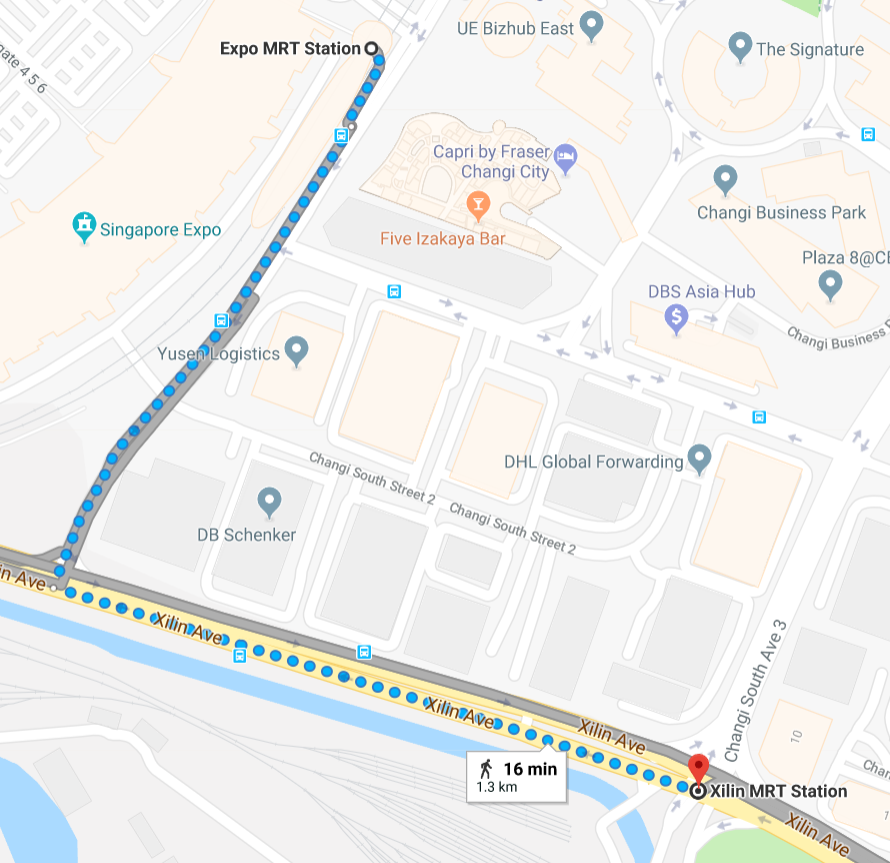
Also, I opted to go for DTL. Being the newest line, it probably also has newer and less well-established stations. Going beyond existing stations to DT36 Xilin also reaped fruitful puns involving “ceiling”, “east” and “forest”, which caught my attention.
THE JOURNEY
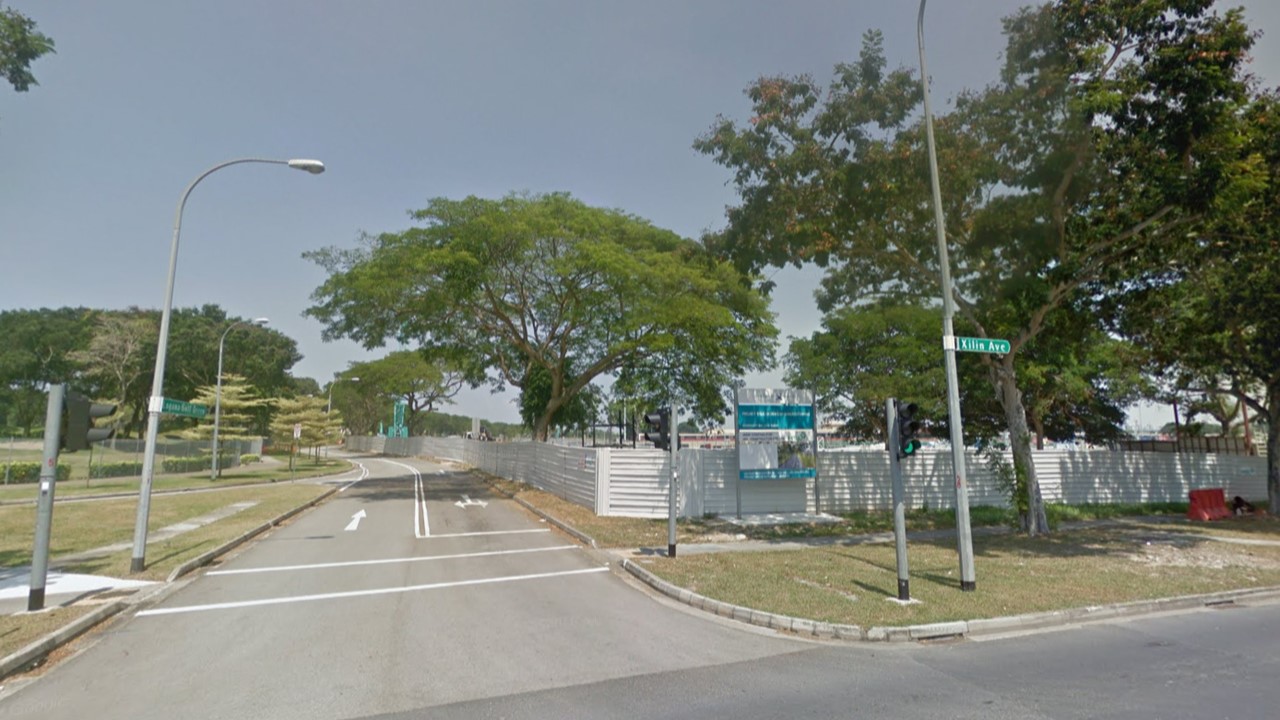
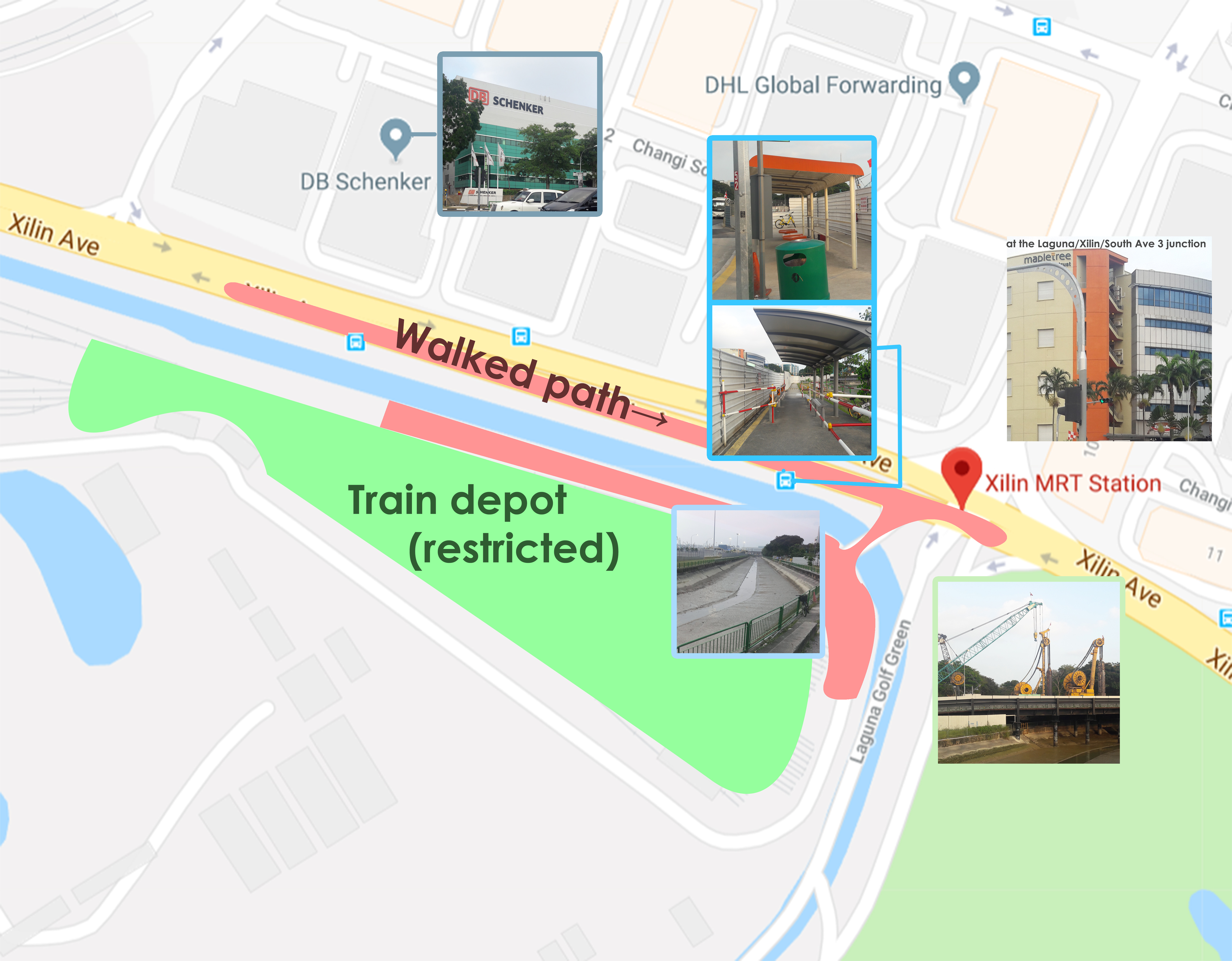
The walking route, from Google Maps. Exit through Exit E, then walk down Changi South Ave 1, till it meets Xilin at a T-junction. Walk down Xilin Avenue till it intersects with South Ave 3 and Laguna Golf Green, which is where the station is to be located.
More in-depth map, with a few visual references involving landmarks I used.
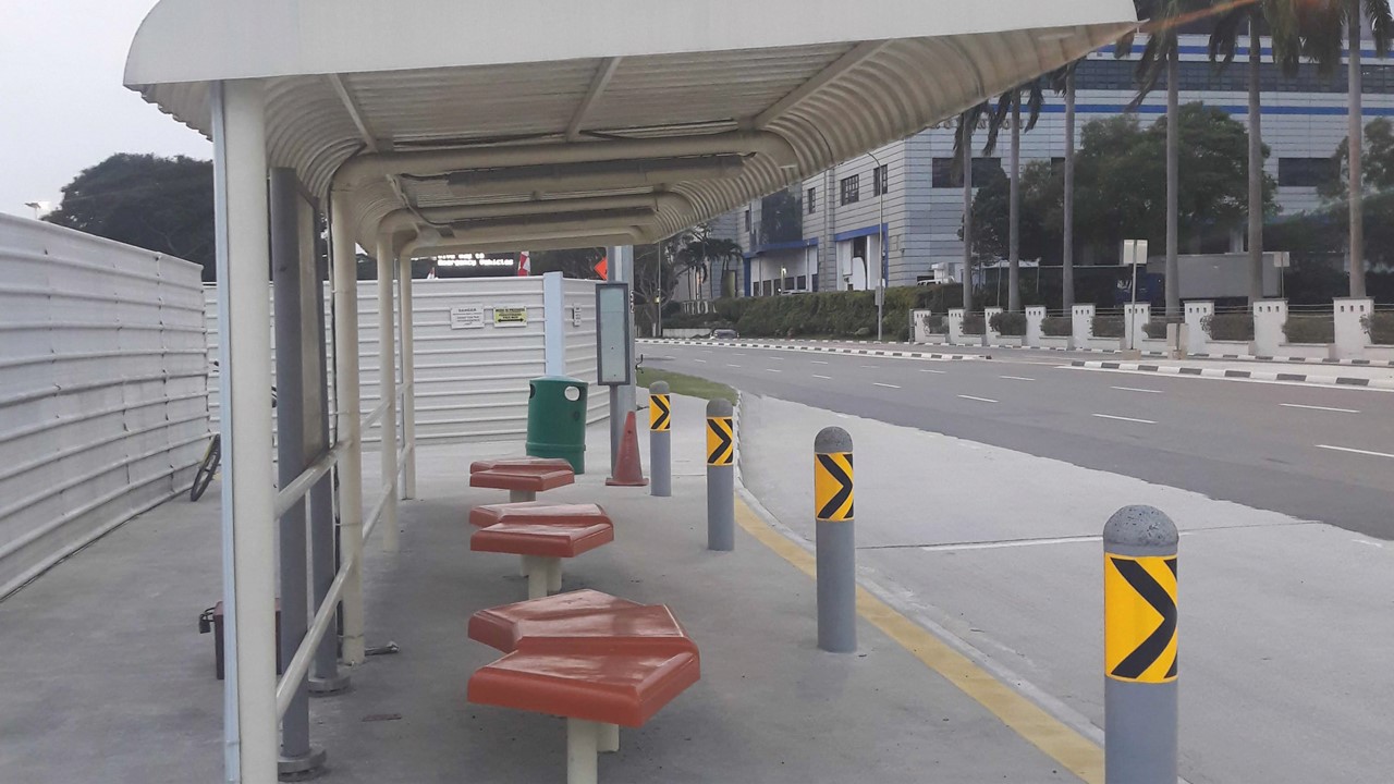
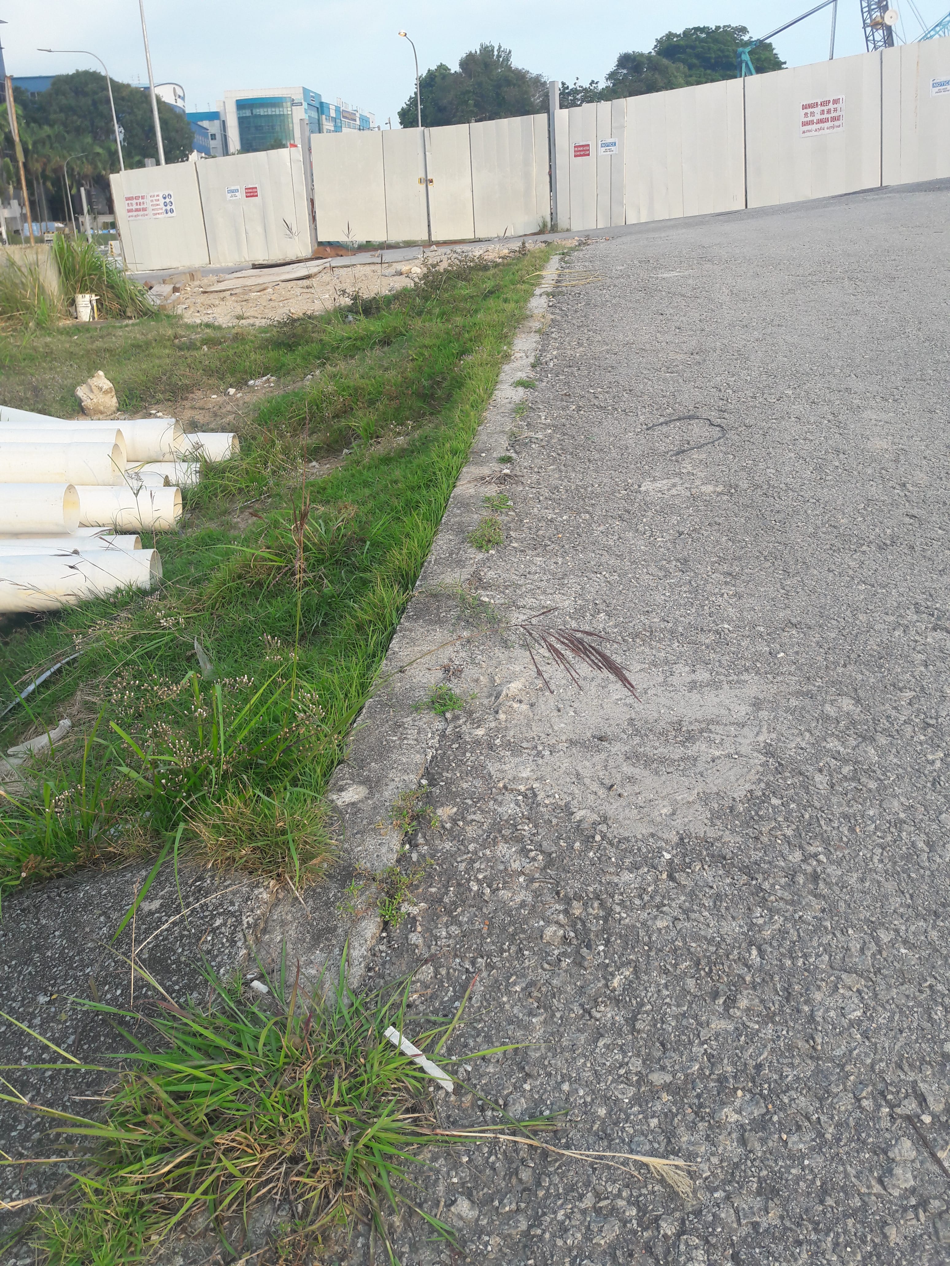
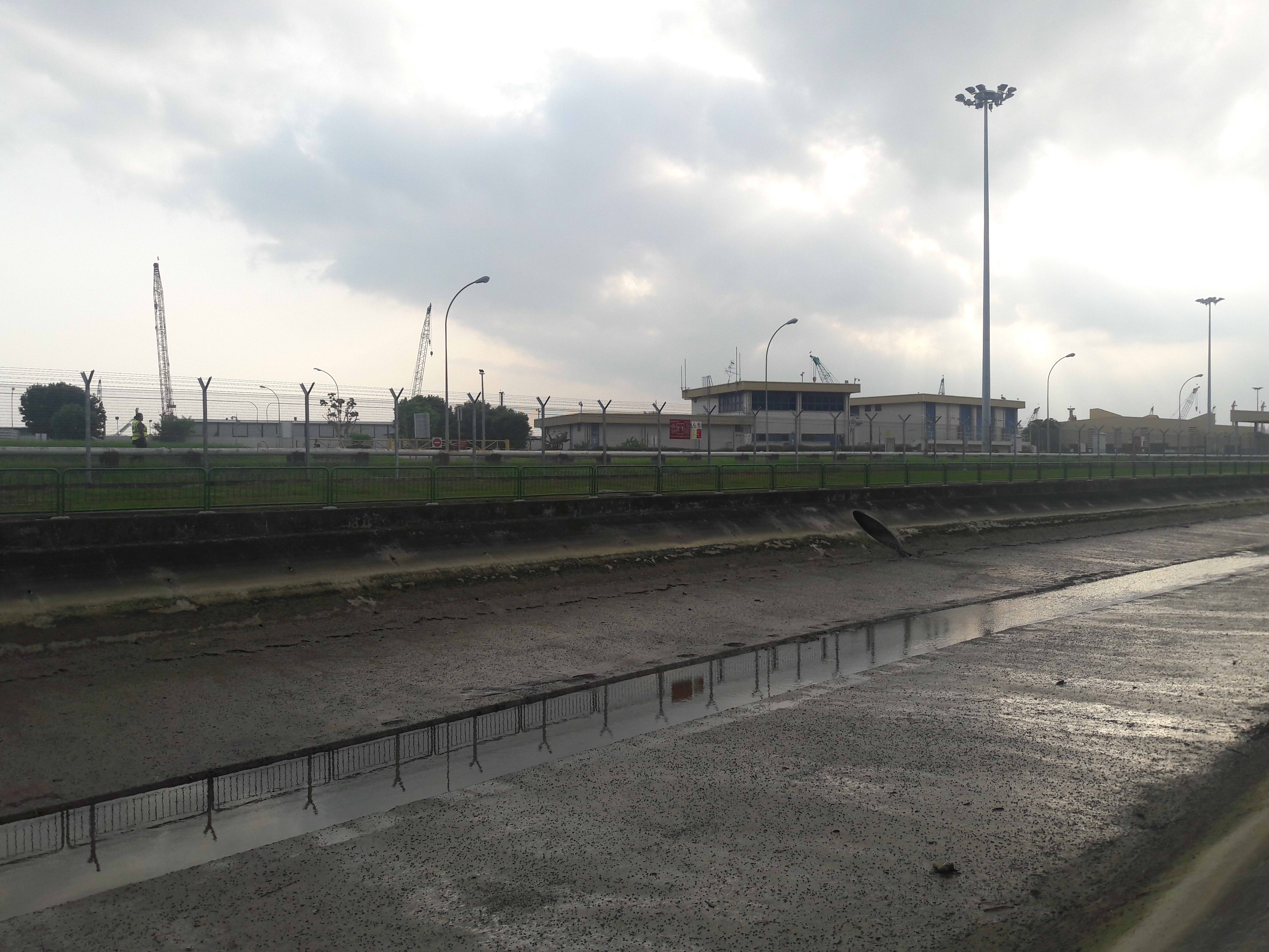
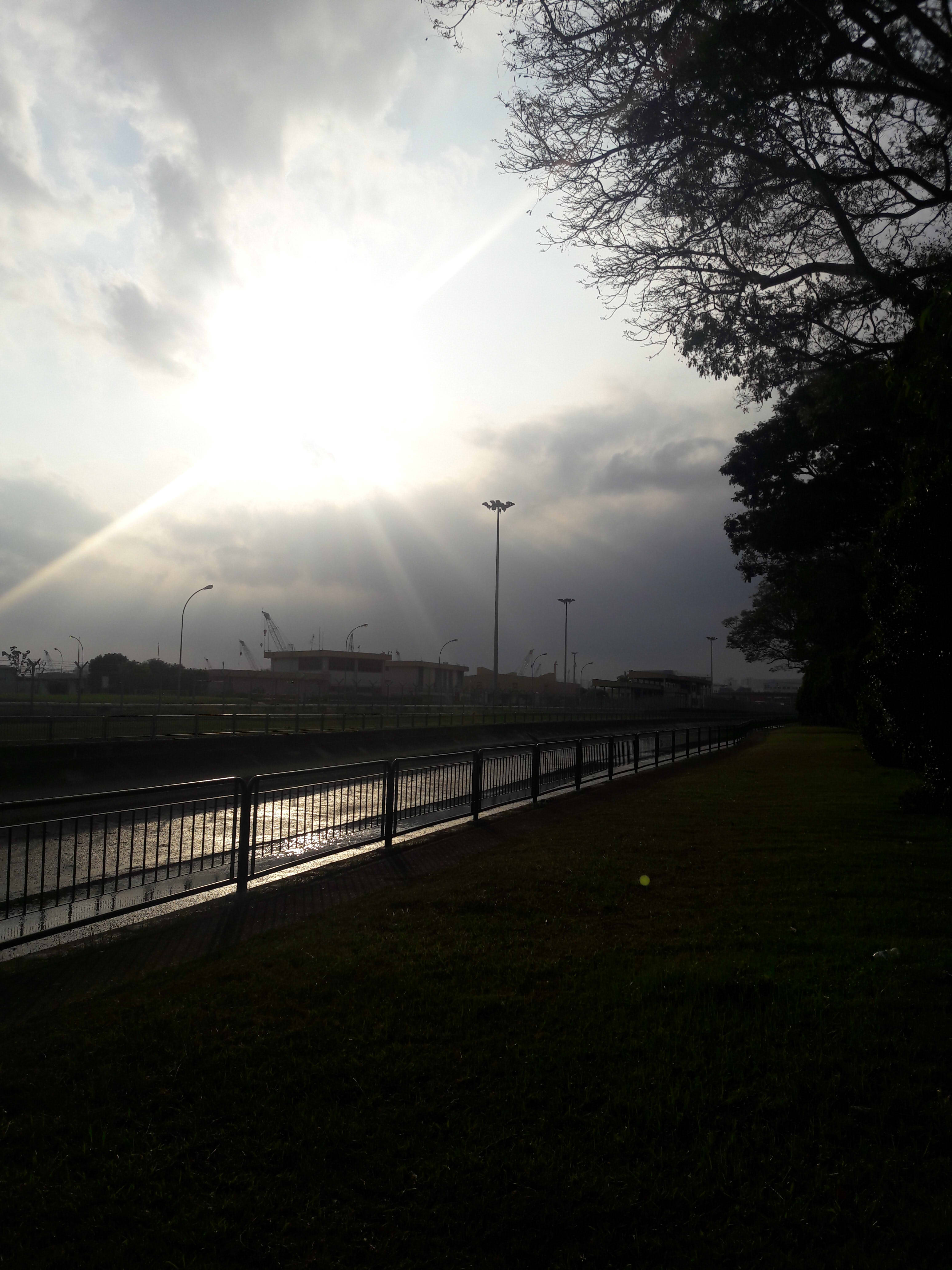
My first impressions on the way there from Expo was that it was a quiet area. Sure, there were a decent number of people at the bus stop, a mall, and the Expo to boot, but even the roads were almost eerily silent. That, and the general ability to see the sky clearly: many places tend to have tall buildings which obscure the skyline, but here, there was so little going on that it was somewhat easy on the eyes, having so few elements. The further I walked, the less populated the roads became. Awkwardly enough, this was pretty much the same on my second trip (in all fairness, both days were Saturdays).
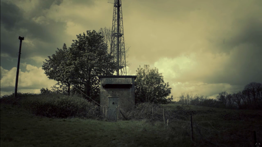
Welcome to Xilin! As suggested on the shown map, this building is a marker of the junction between Xilin and South Ave 1.
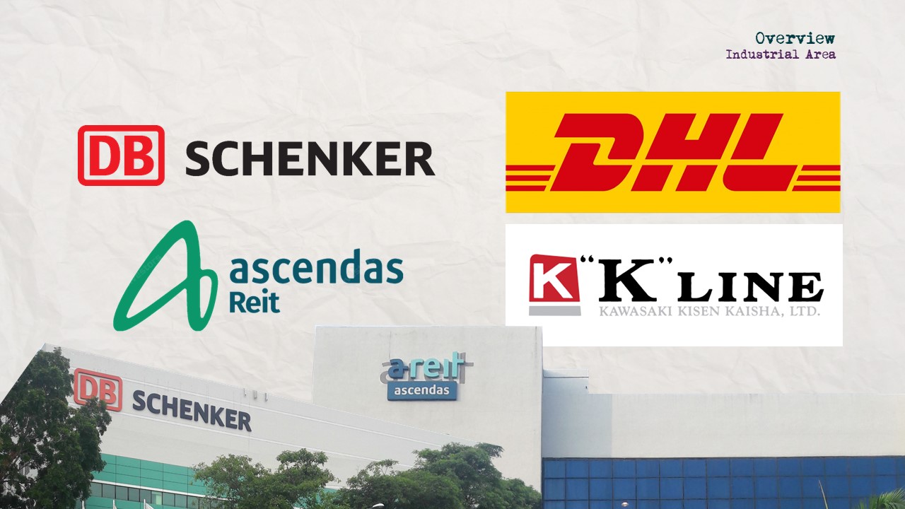
As it turns out, Xilin is a somewhat significant road, and as such traffic exists, even if at a constantly low rate. While the roads may have had cars, though, the sidewalks were empty save for me. My guess is that the absence of people also had to do with the time of the day and the time of the year: as far as I could tell, Xilin was an industrial area, what with the many company-based buildings and general lack of HDBs. In fact, I don’t even think anyone was working, considering the lack of industrial sound, the lack of people leaving the buildings to go home, and the fact that it was a Saturday and the 2nd day of Lunar New Year to boot.
DOCUMENTATION OF AREA
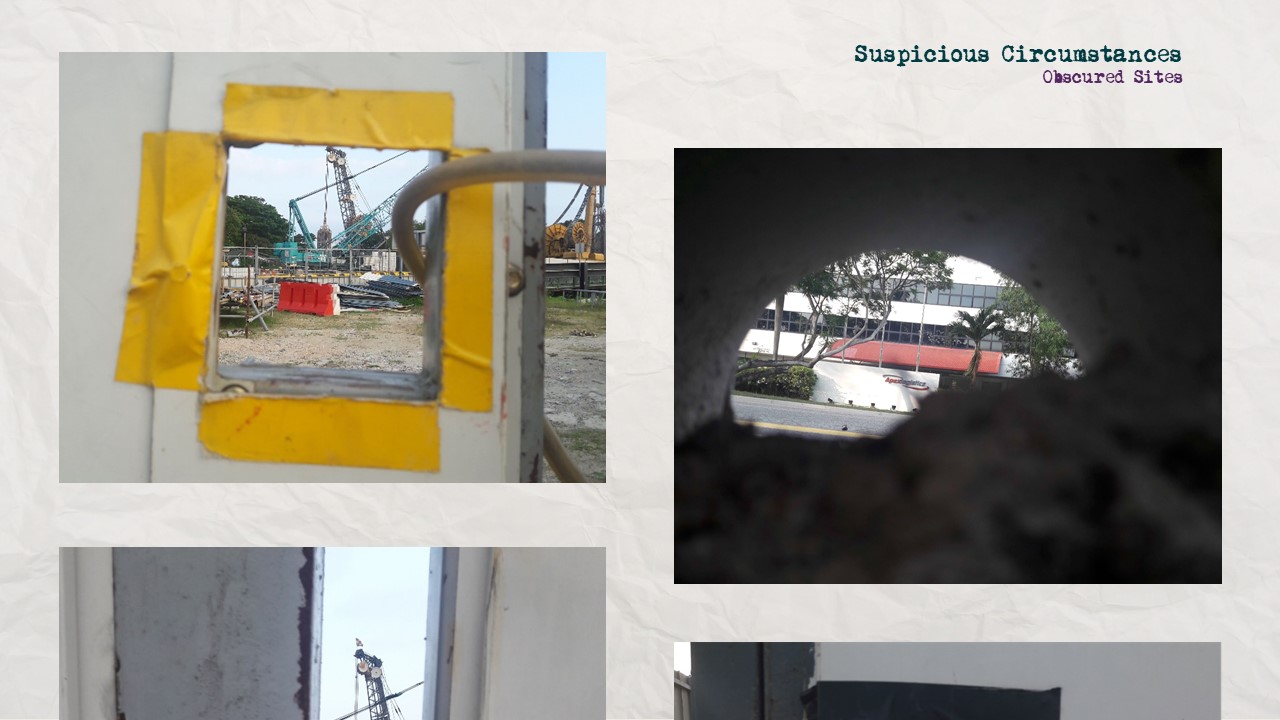
PLEASE NOTE THAT quite a few of my photos and videos have been deleted as they involve the train depot, which, as it turns out, is a restricted area (I was hunted down by security).
I took a lot of photos, but for convenience’s sake, I’ve grouped them not by chronology, but by visual/thematic similarities. To avoid information overload, I’ve refrained from posting all pictures pertaining to said category. (This is the semblance of process part, where I mostly chose to photograph things on a whim, and later tried to determine why I had felt the urge to.)
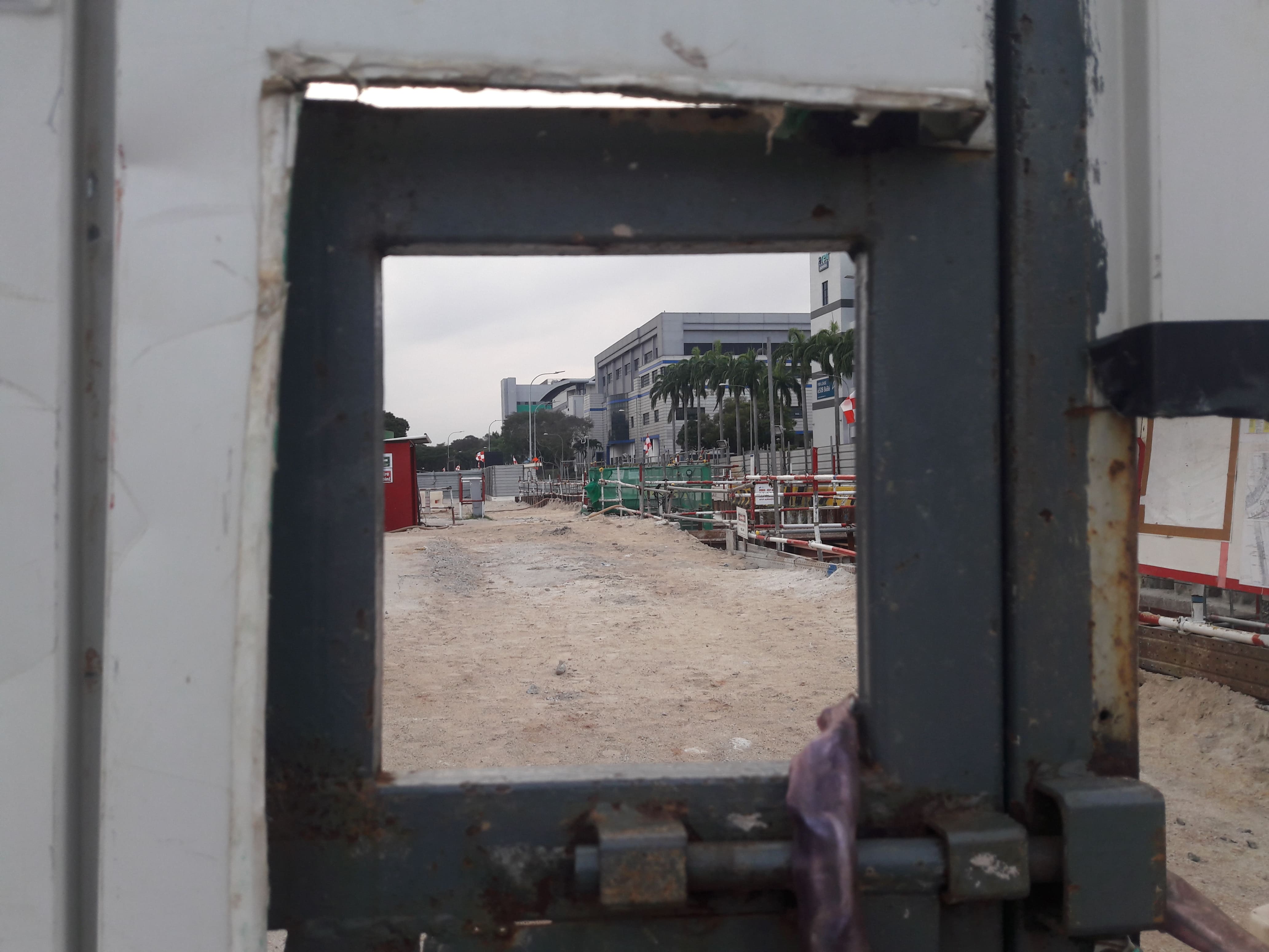
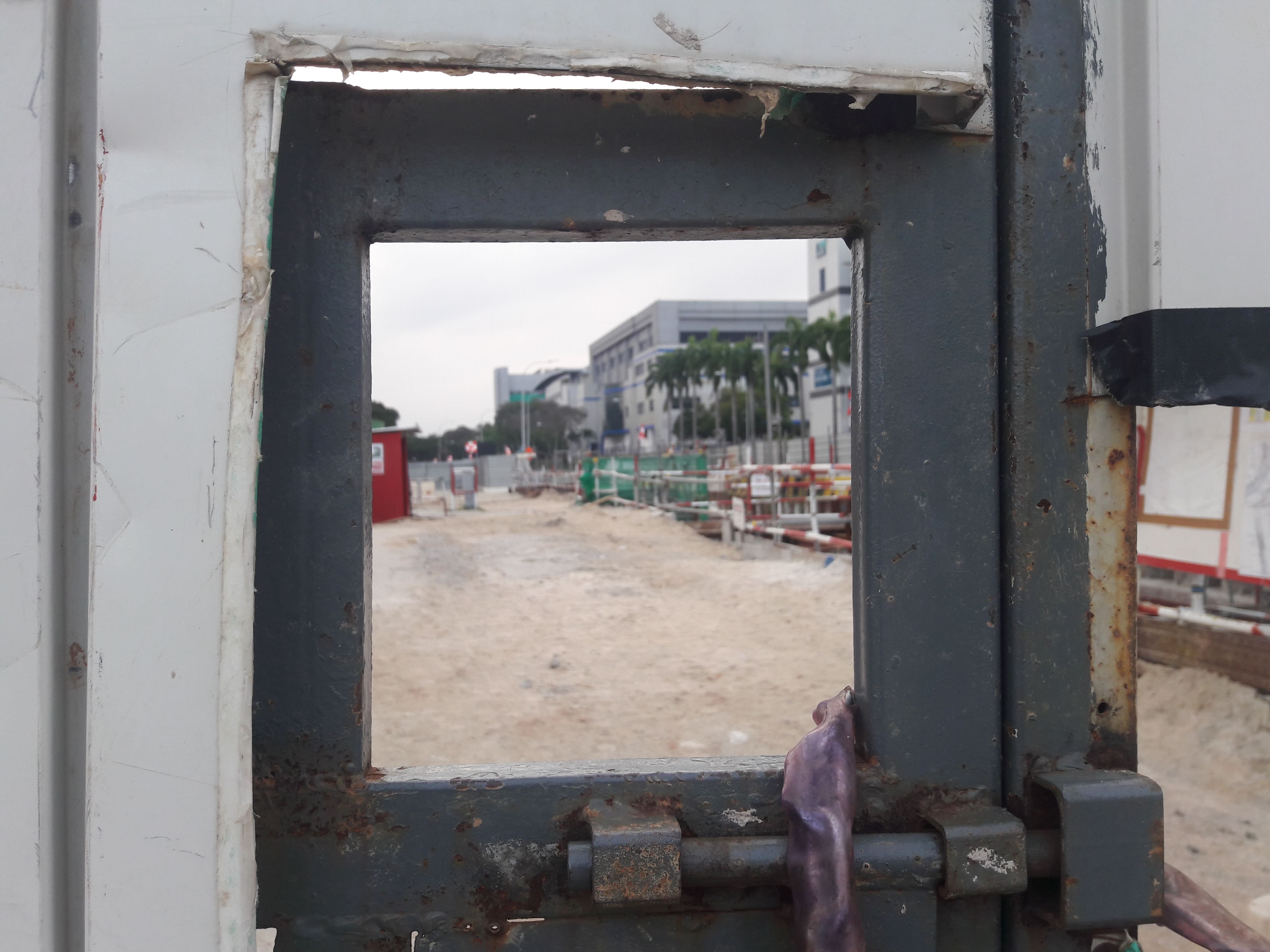
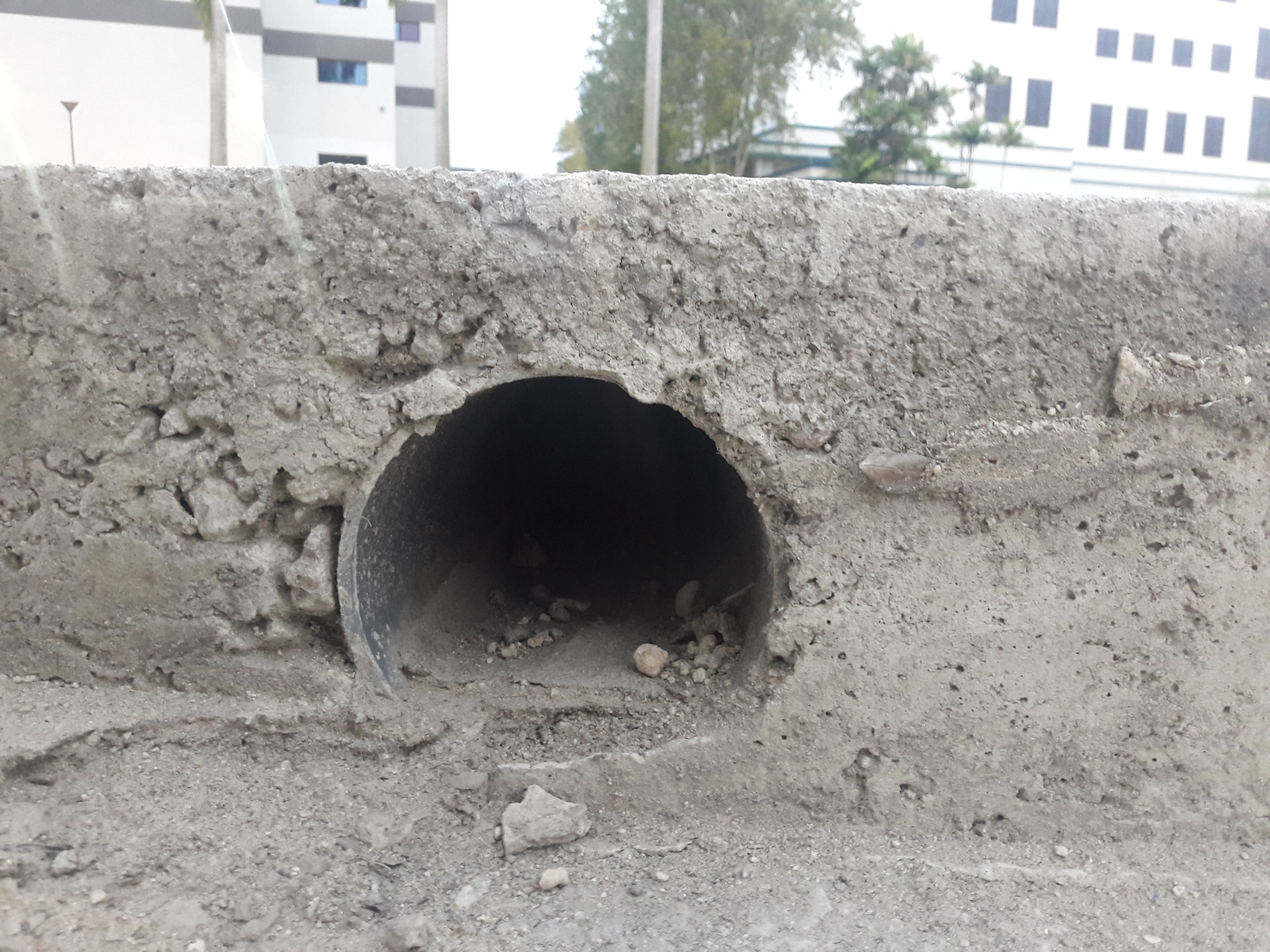
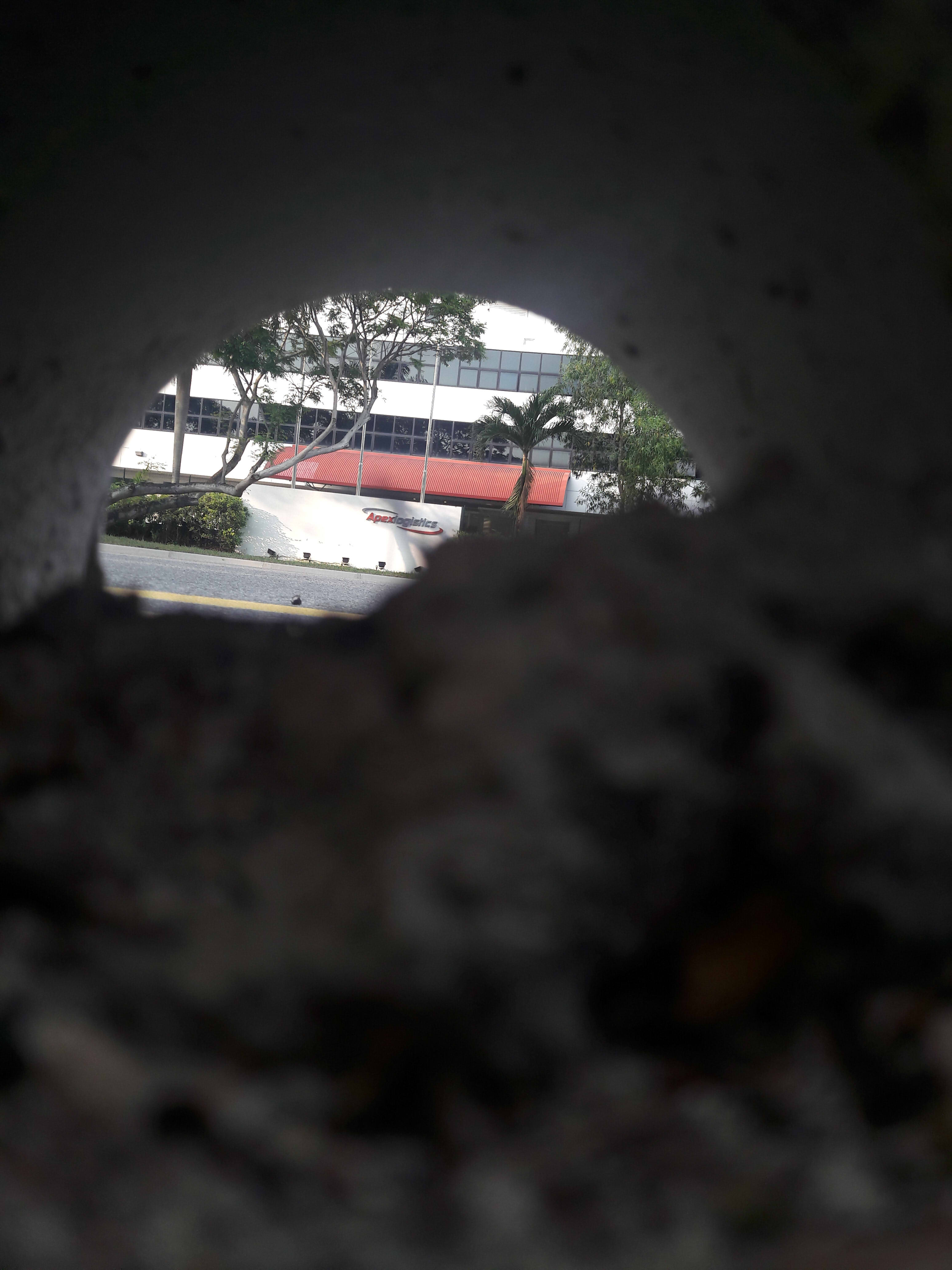
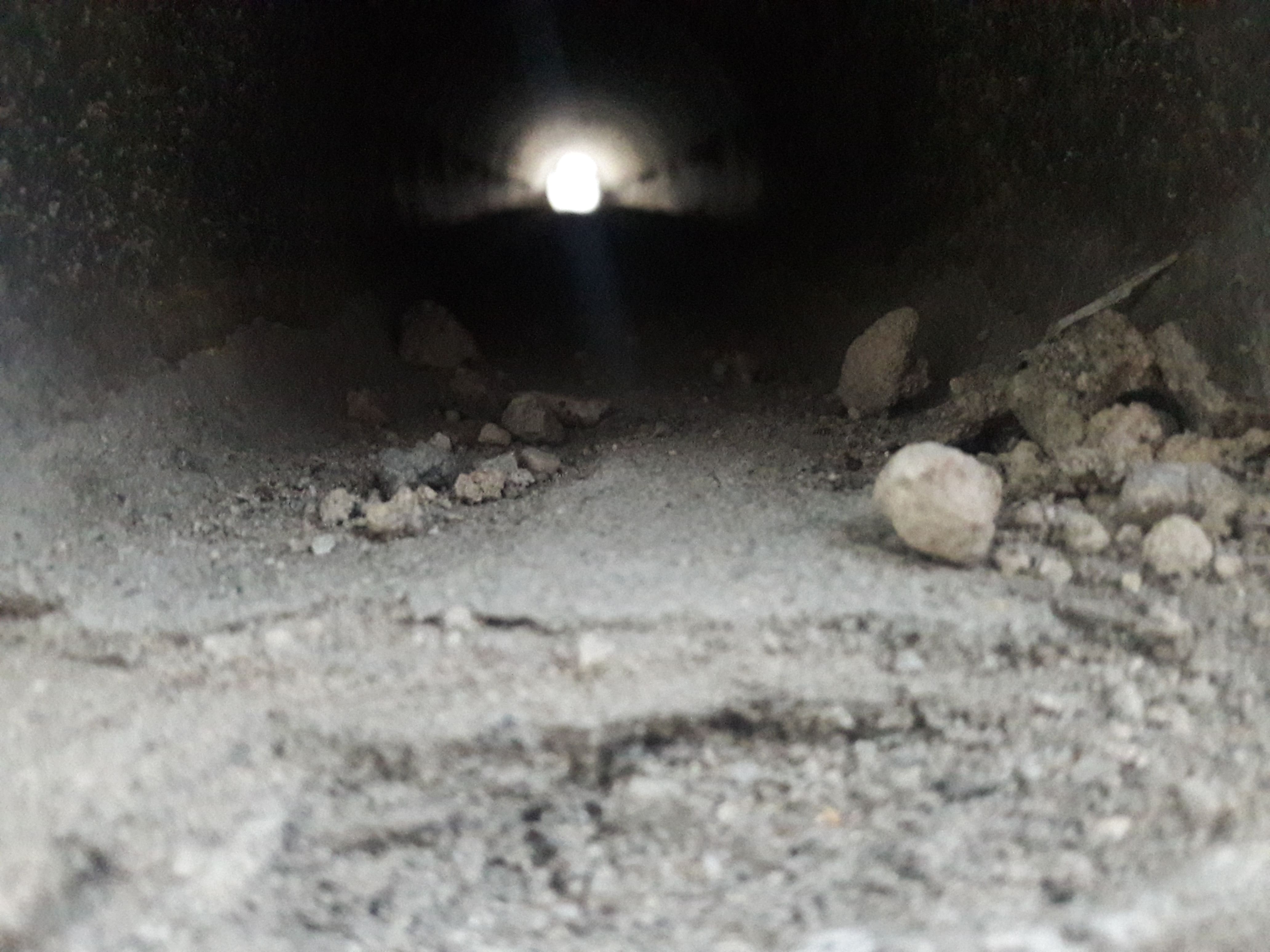
Obfuscation
A lot of places were fenced up or hidden behind walls, and so it became a prominent part of the journey, to peek through various holes to see what the construction or industrial site looks like. Or, in general, to see how perception is warped.
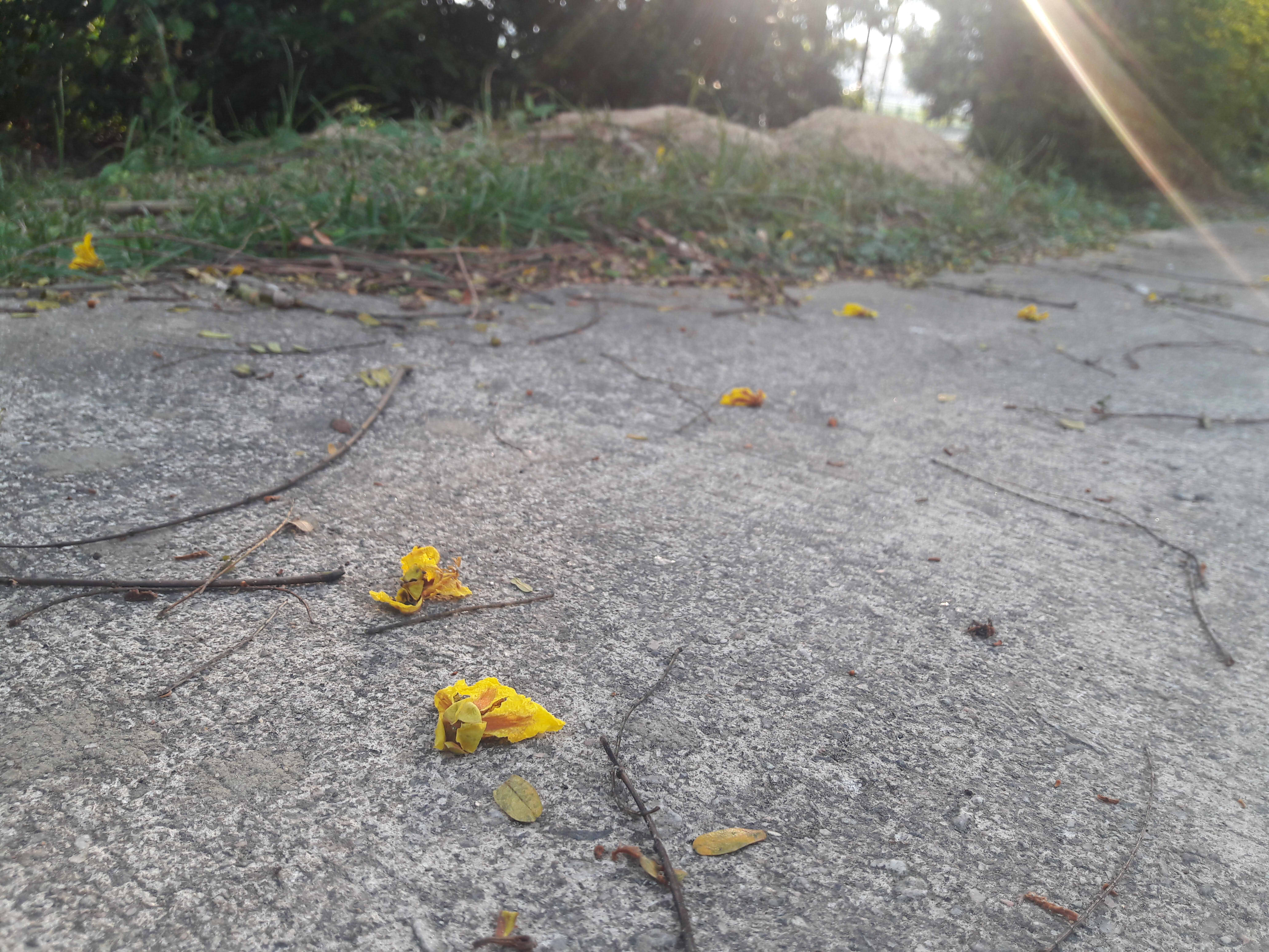
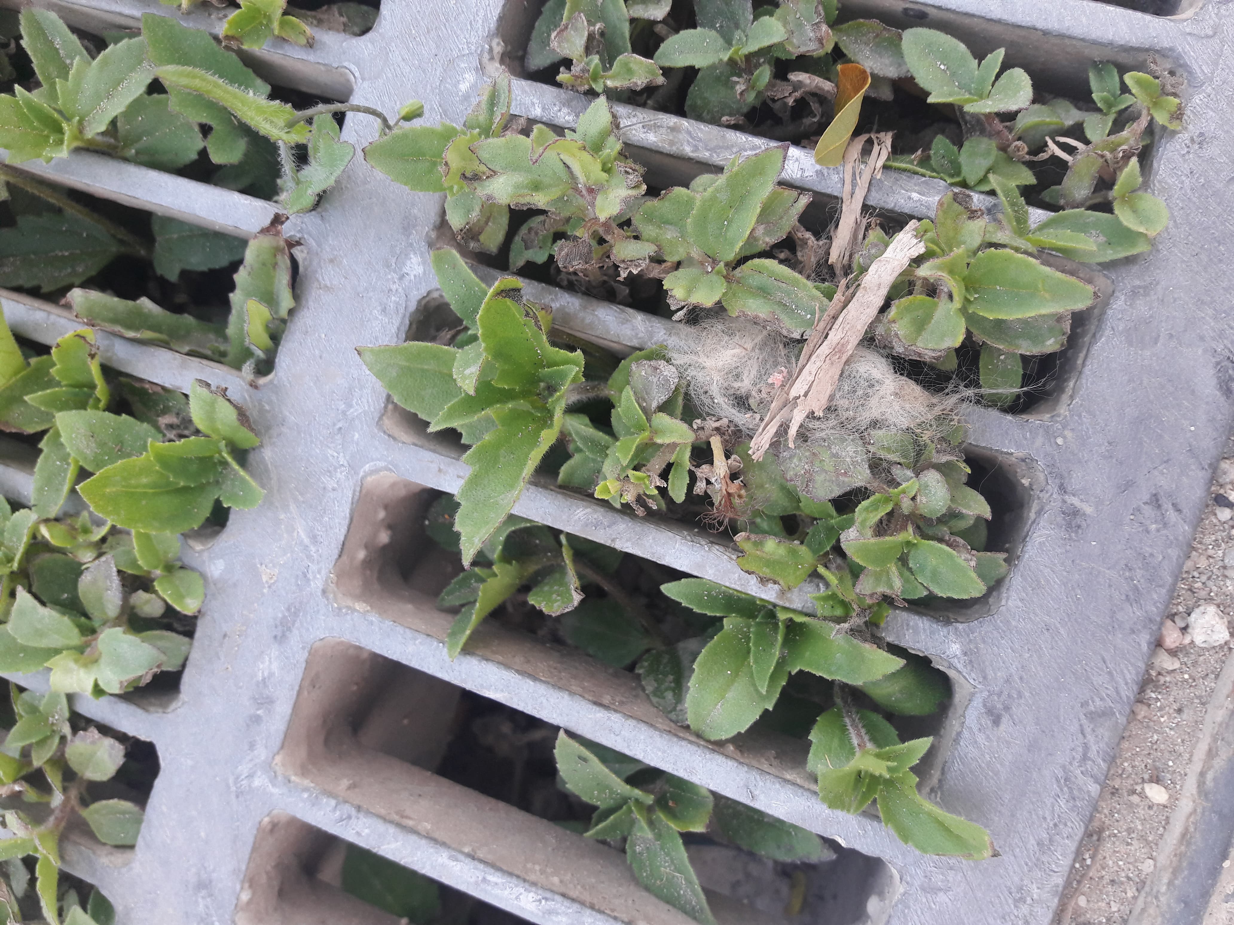
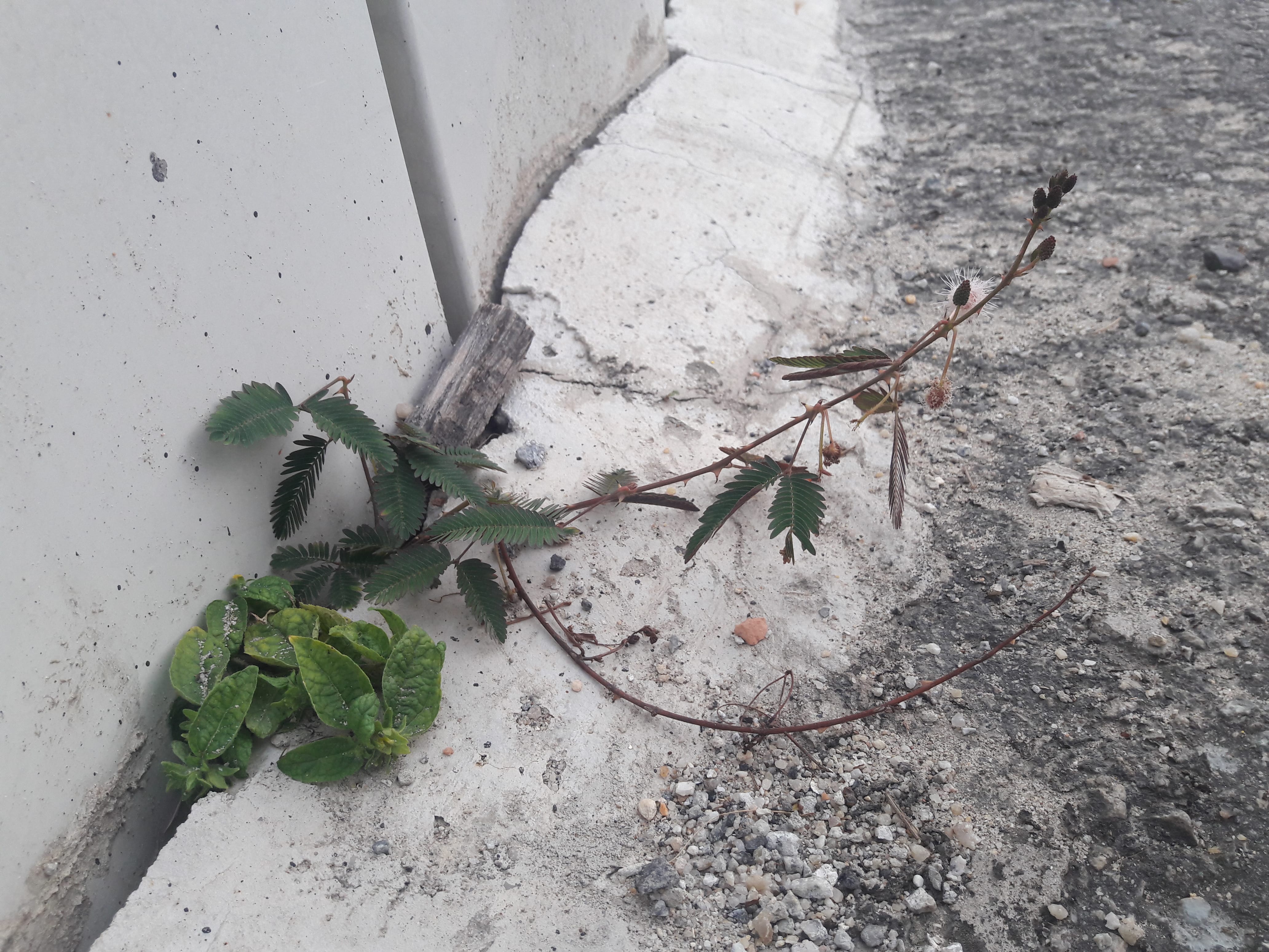
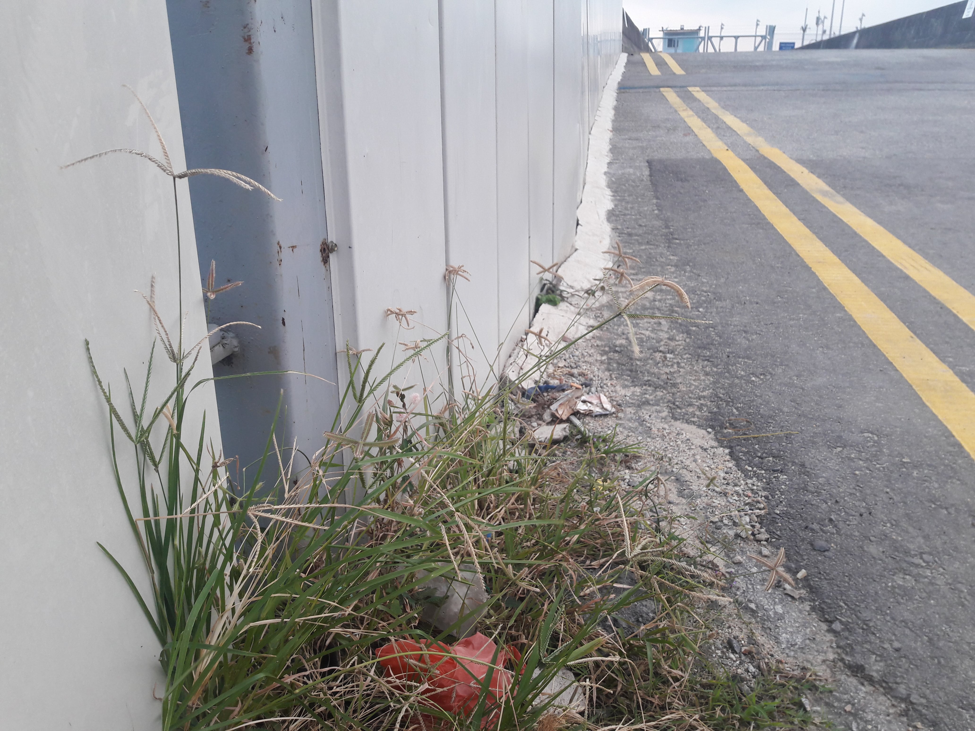
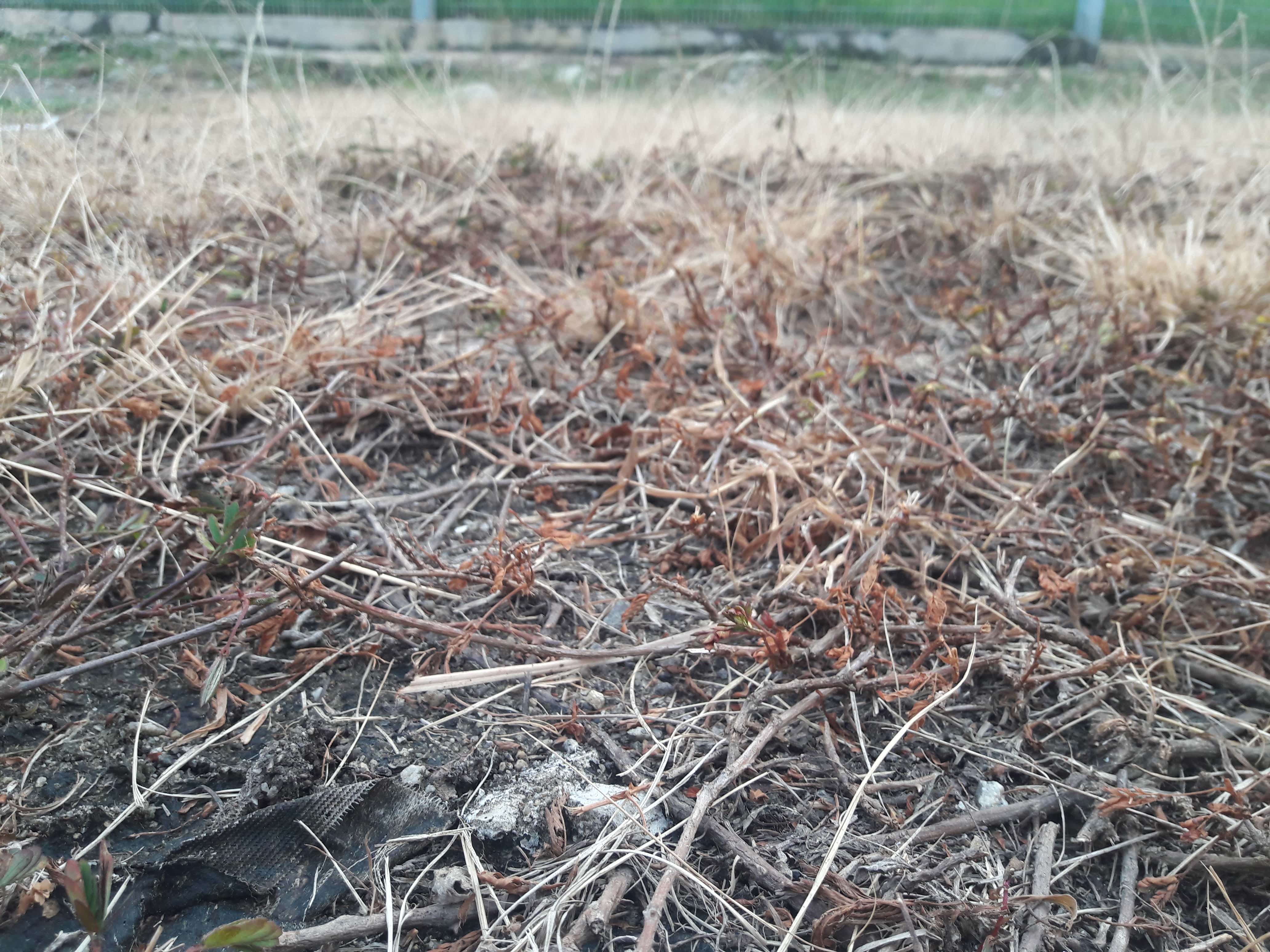
Plants
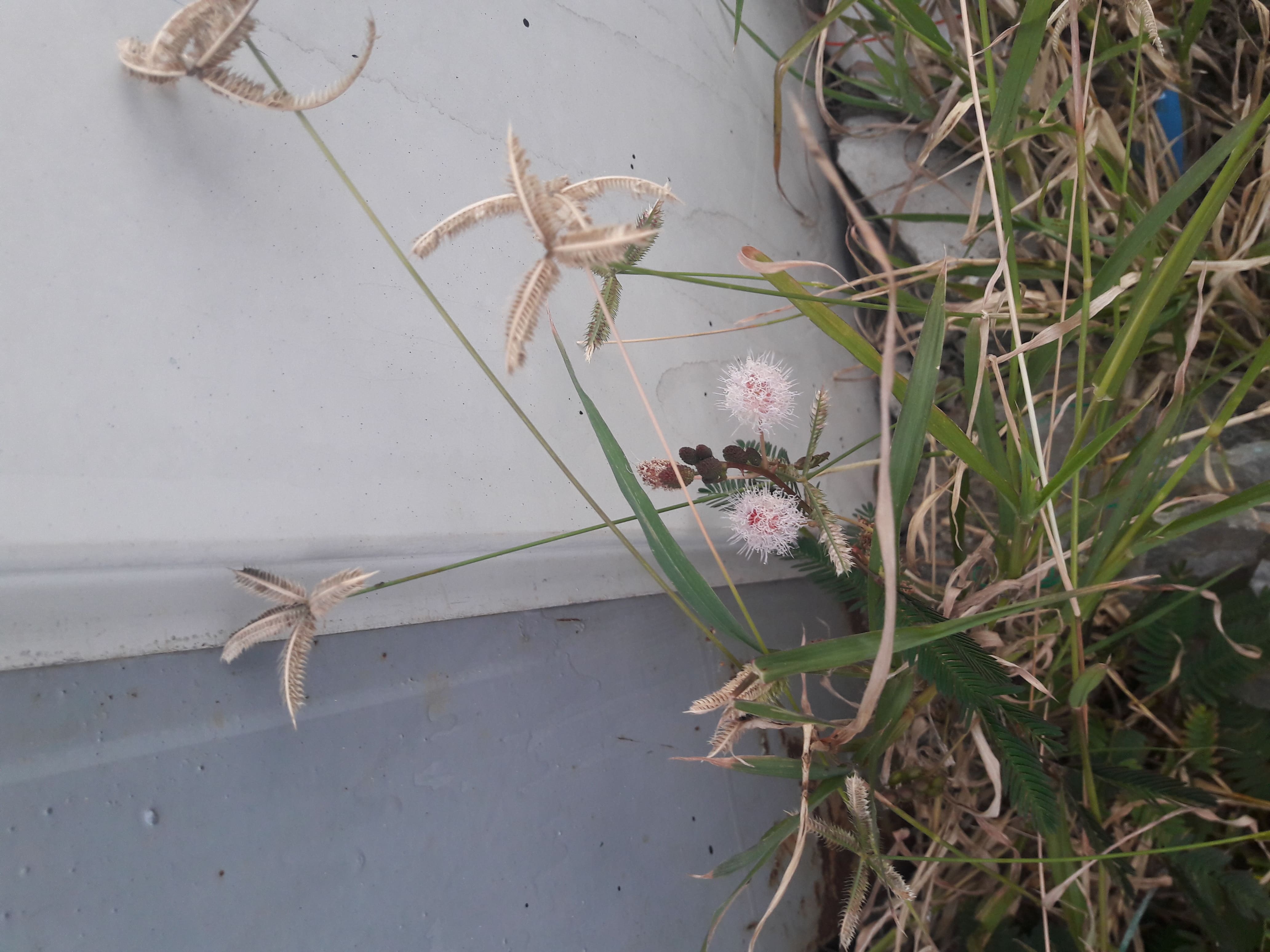
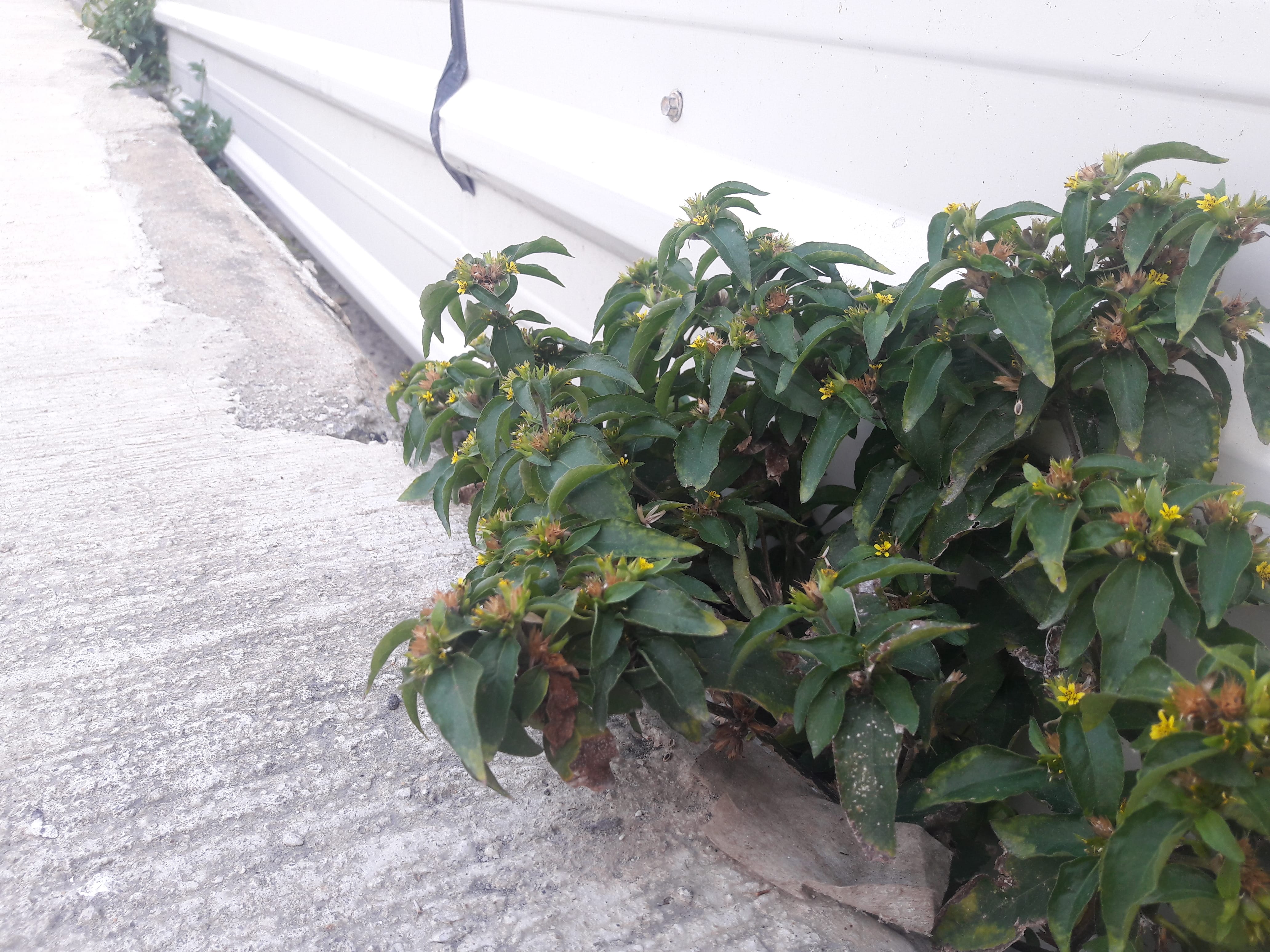
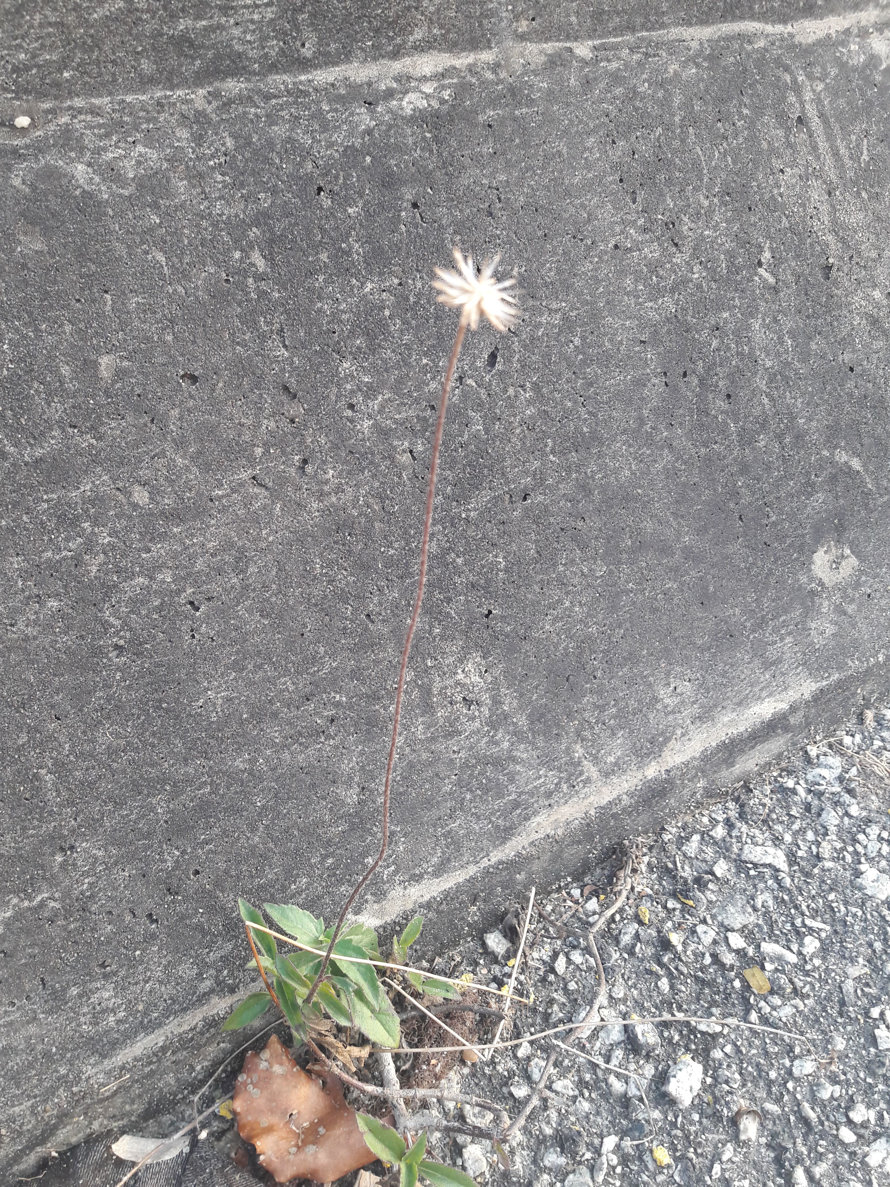
Nothing new, but I was vaguely fascinated by some plants which I either have never noticed, or have never seen, especially the fuzzy, cross-shaped golden weeds.
Yellow flowers which seem to be everywhere,
but these cross-shaped golden fuzzy plants are very unfamilar to me.
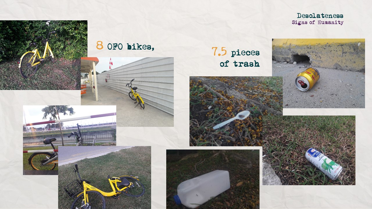
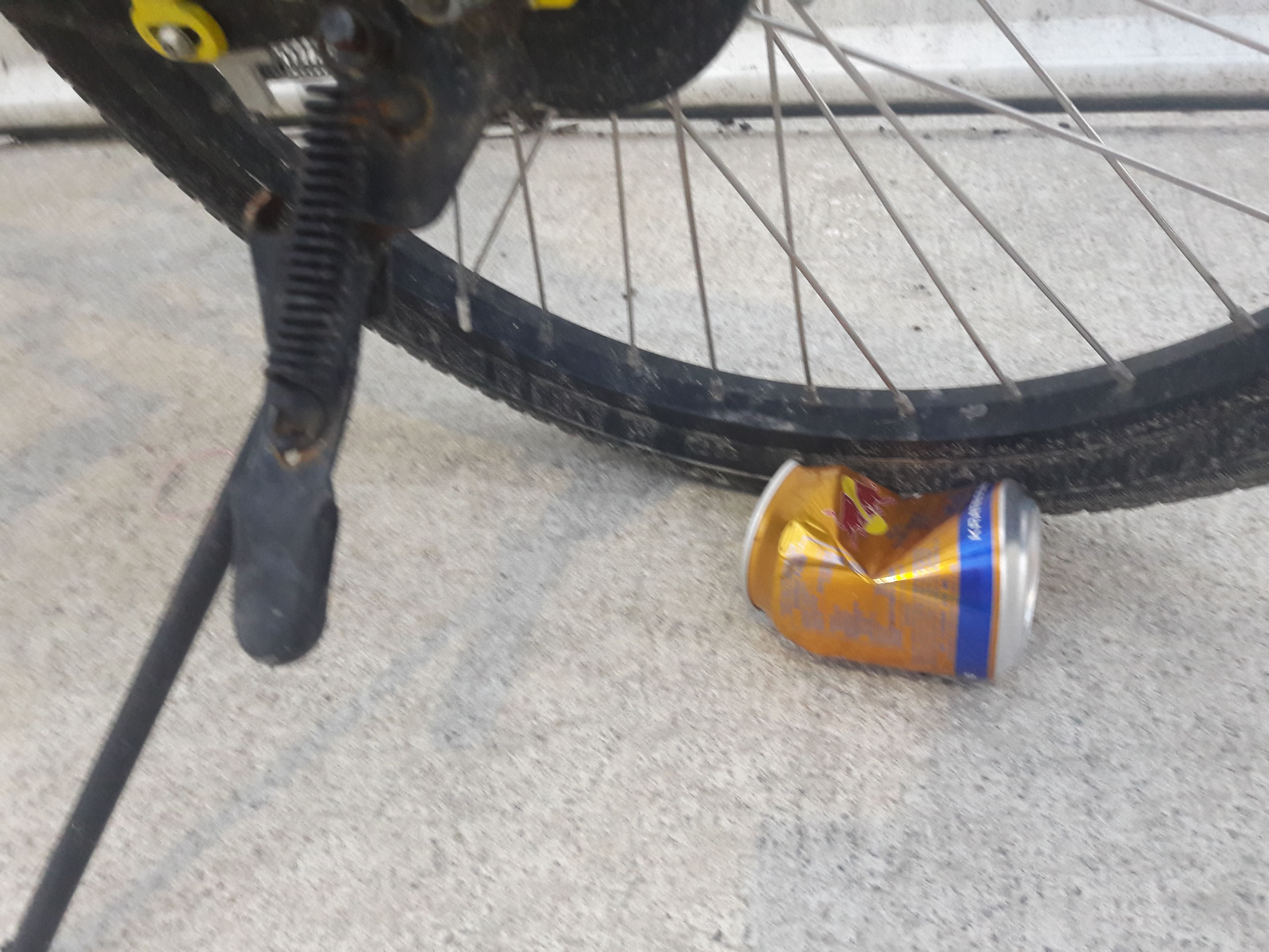
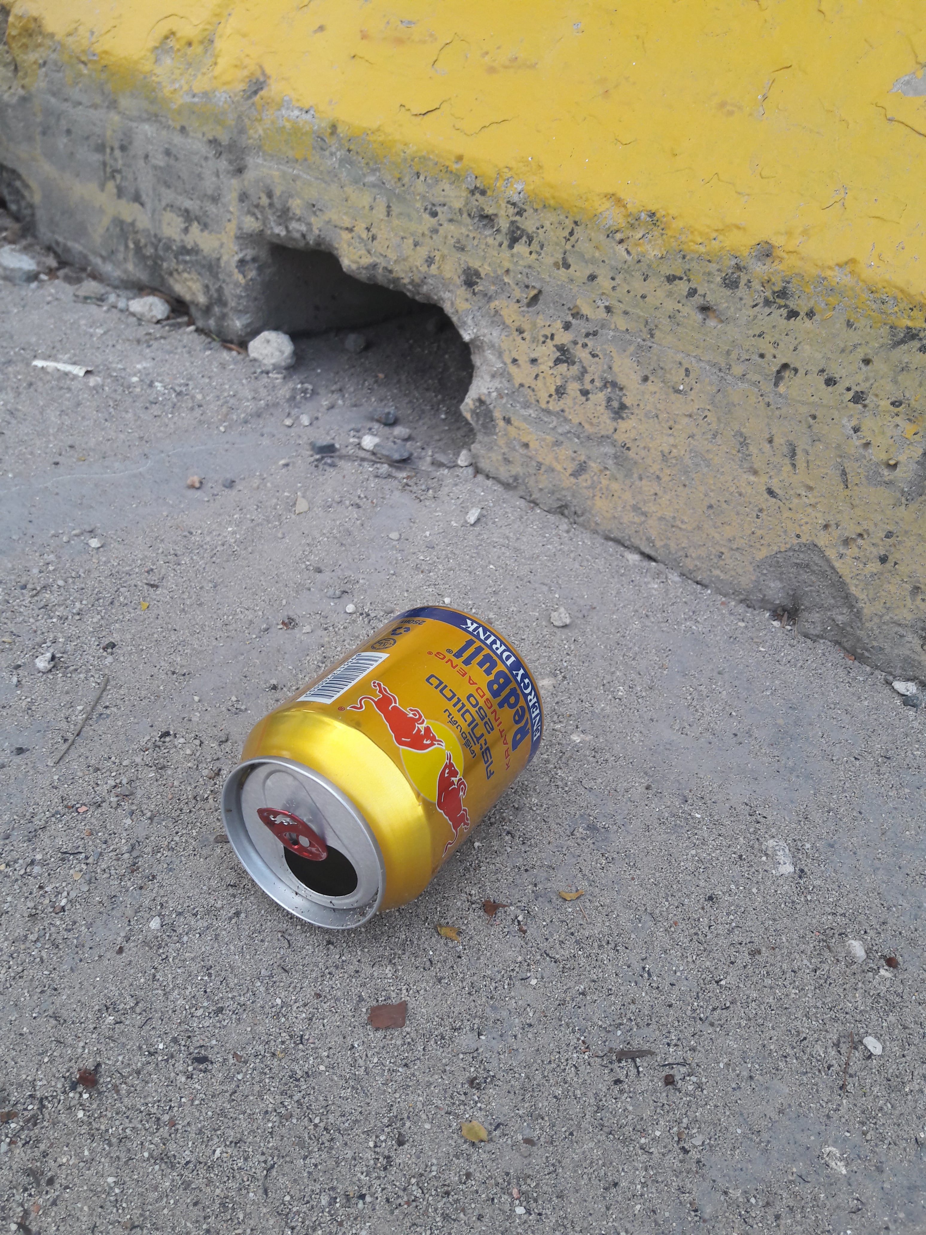
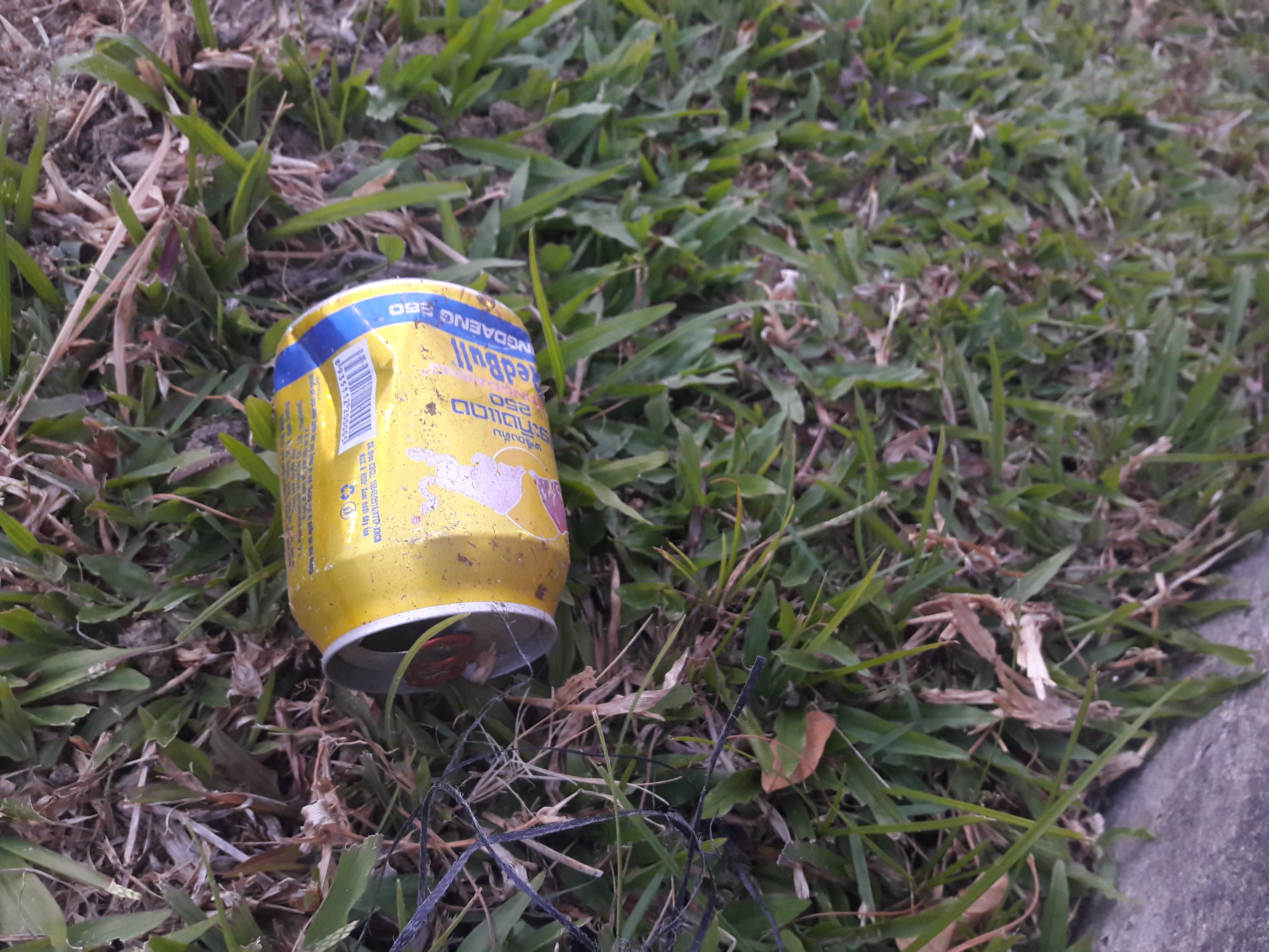
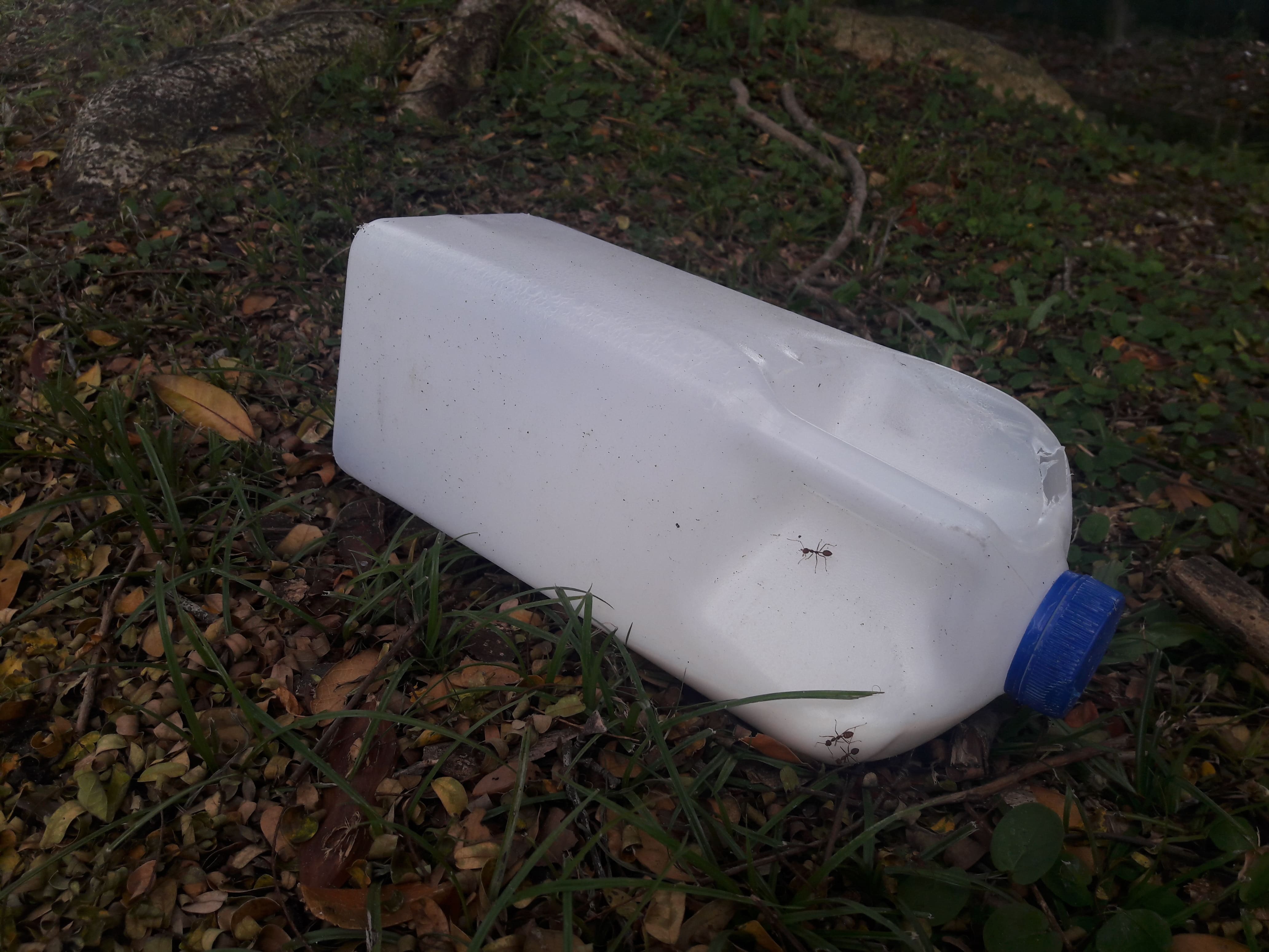
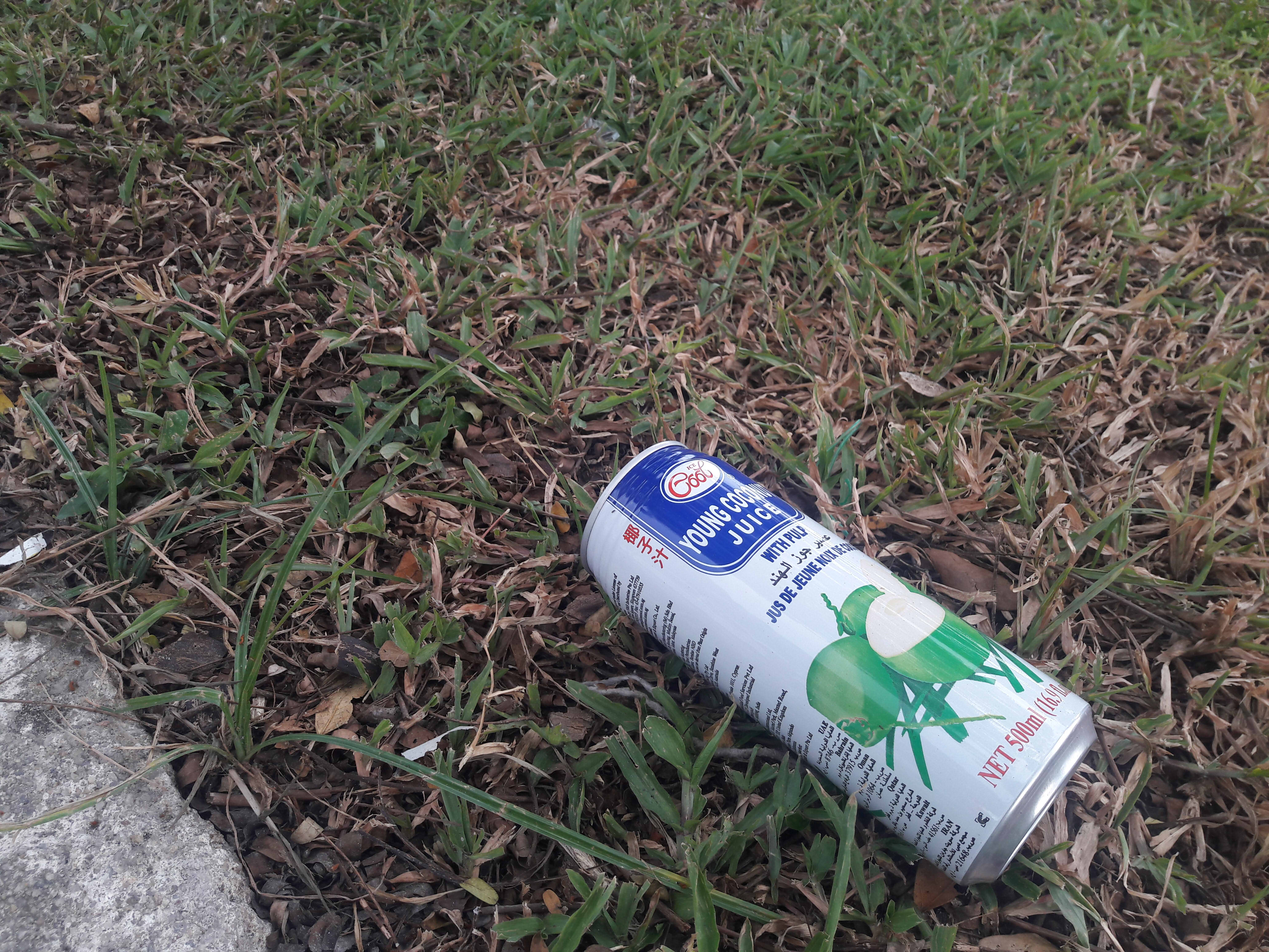
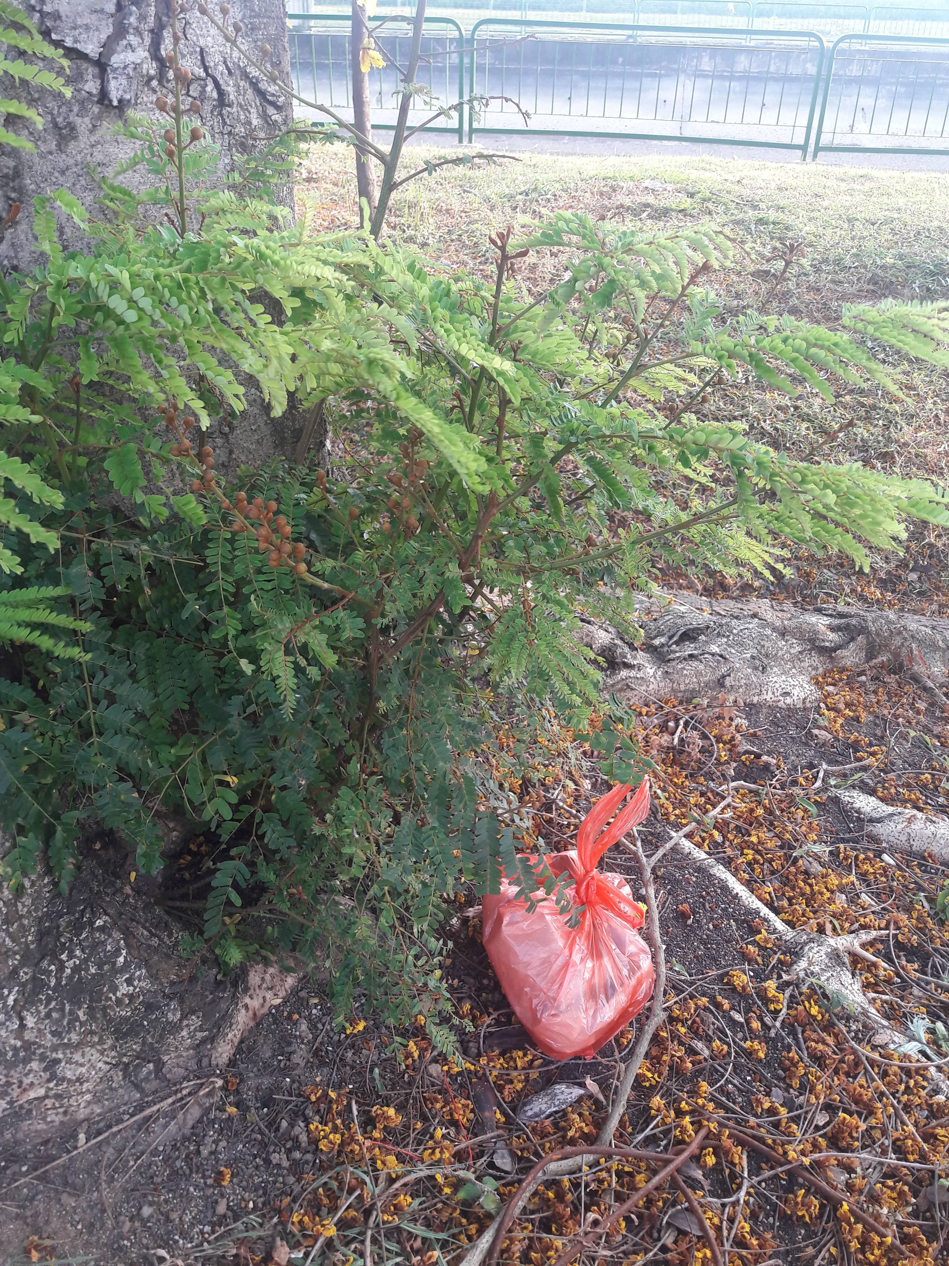
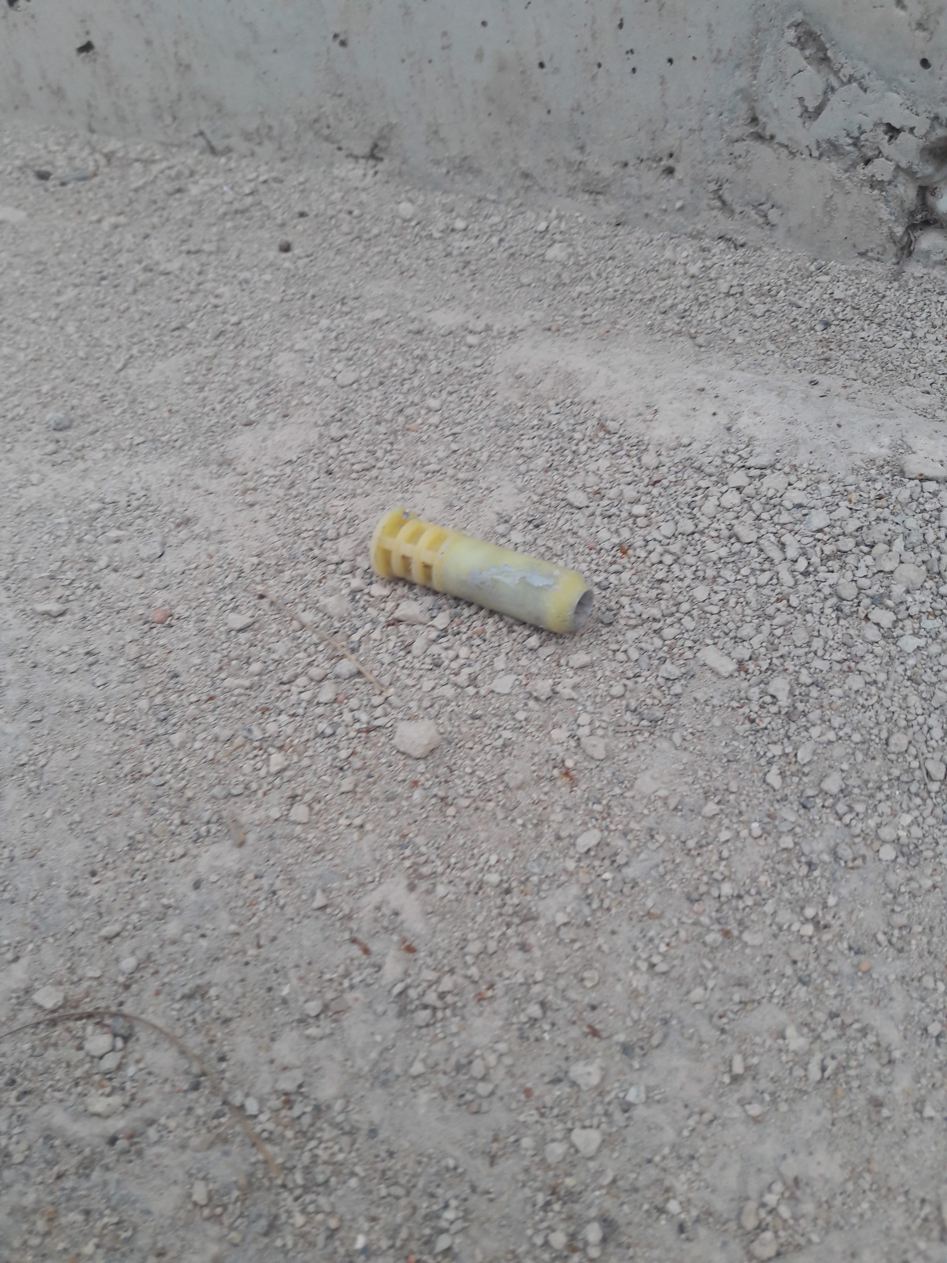
Trash
What’s new, really! Trash is everywhere! Worker gloves and shoes were a somewhat unique but unsurprising trash, but I didn’t really find them interesting, so I neglected to photograph them.
Red Bull cans are also surprisingly common!
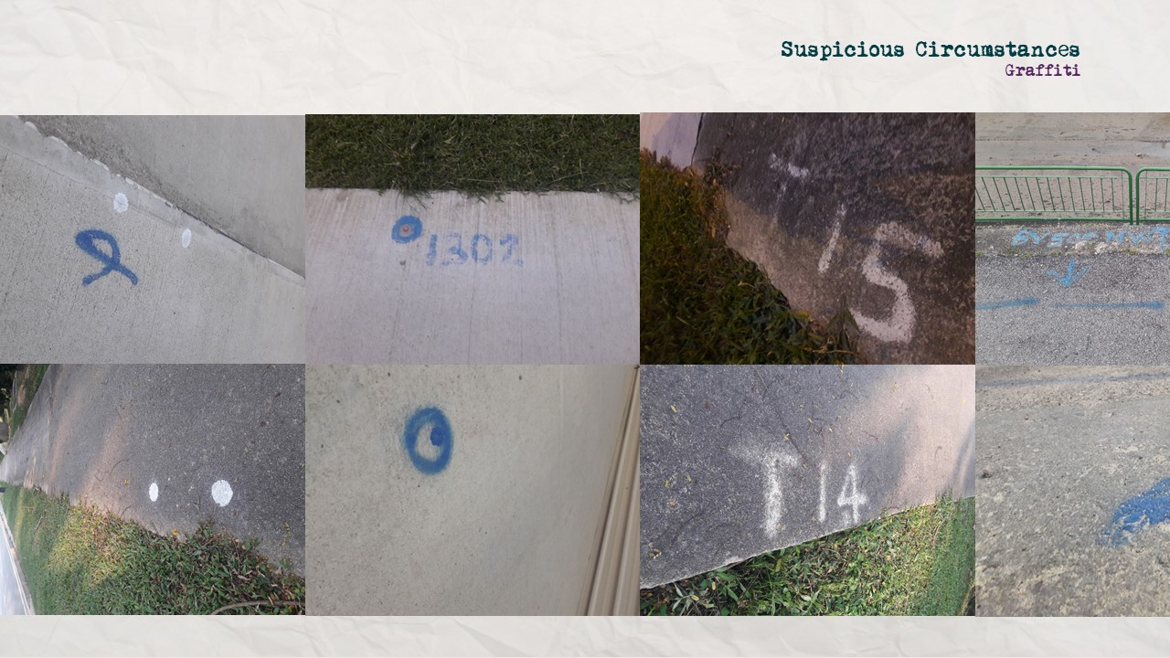
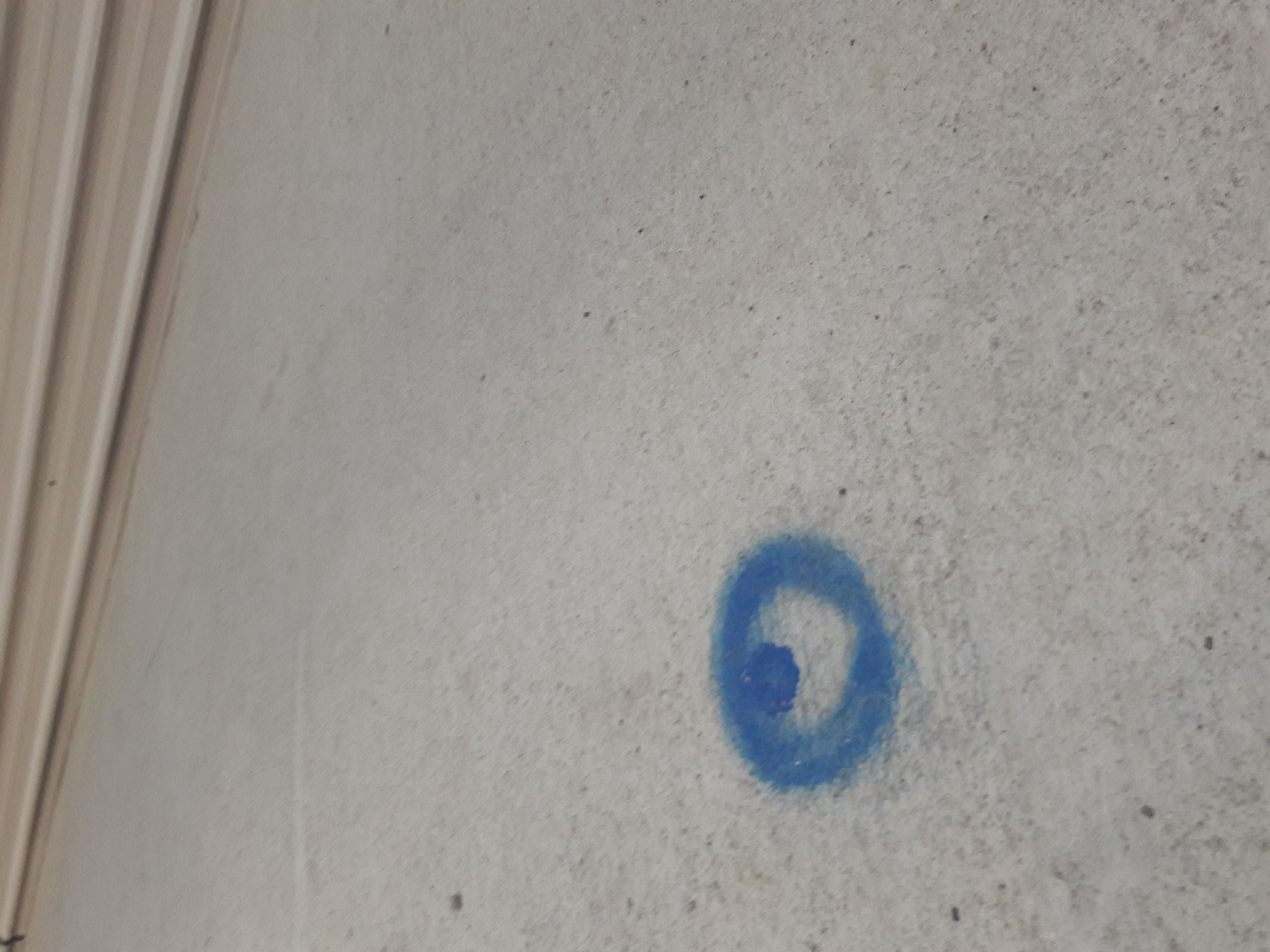
Spray-painting
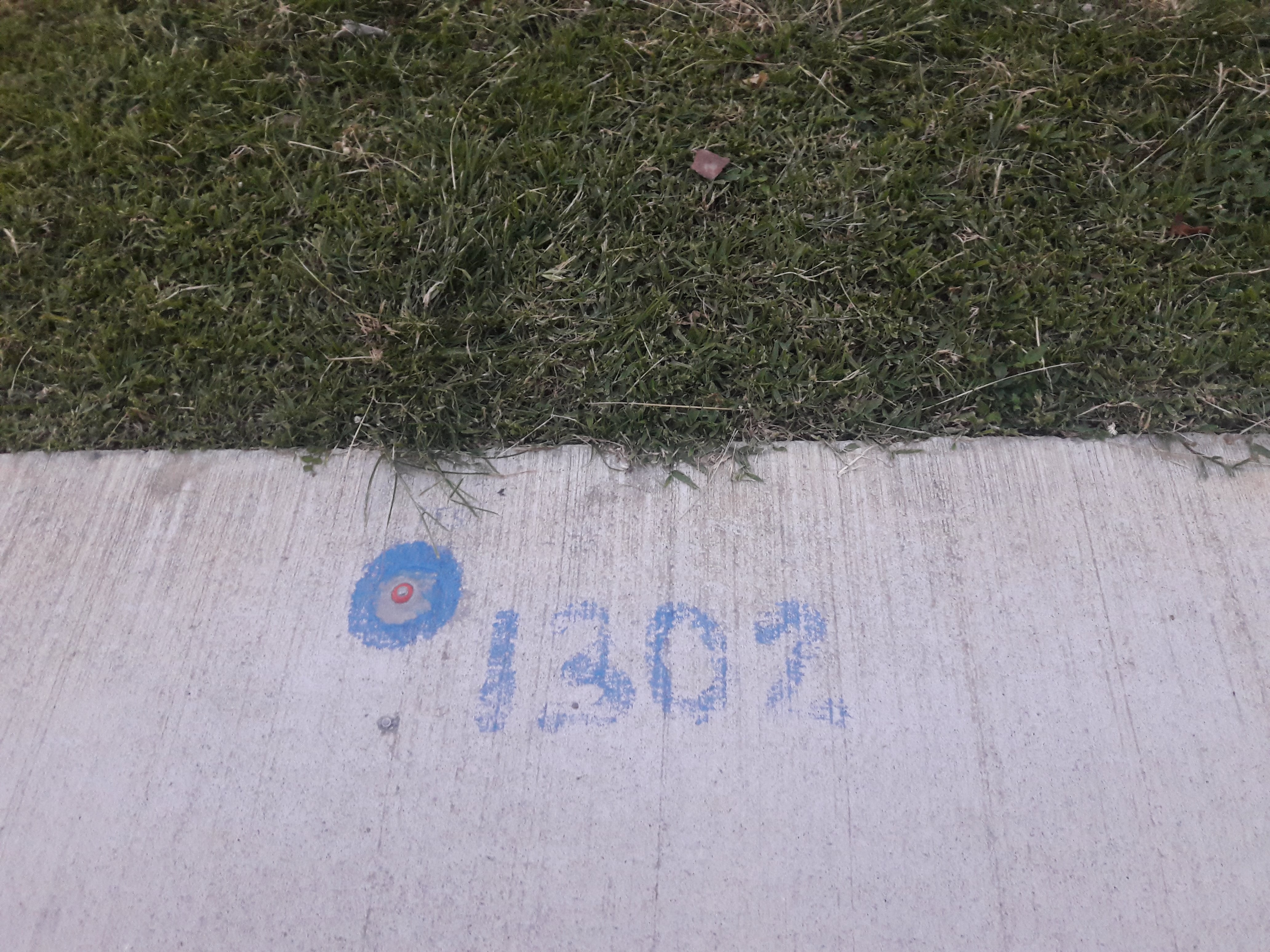
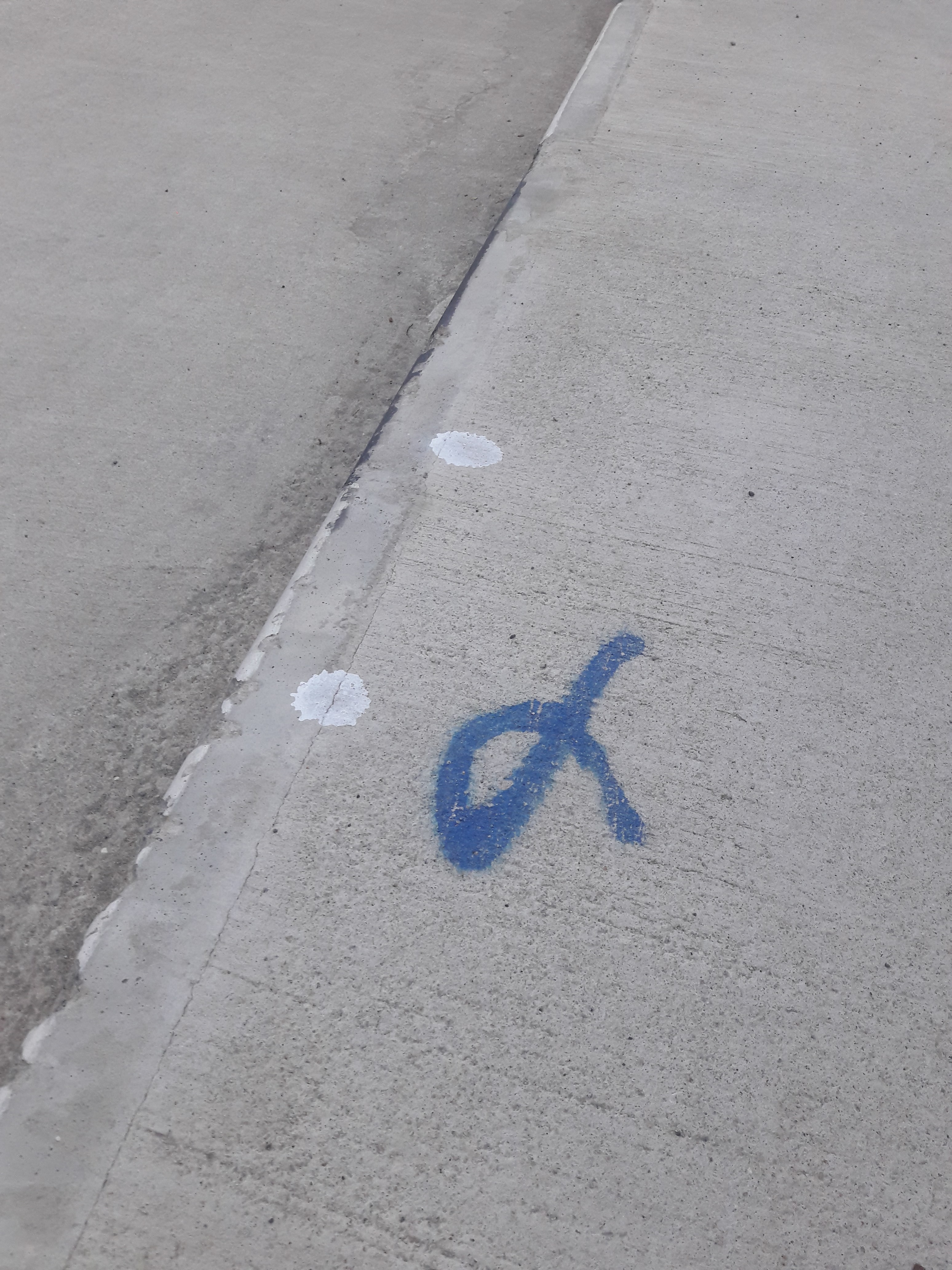
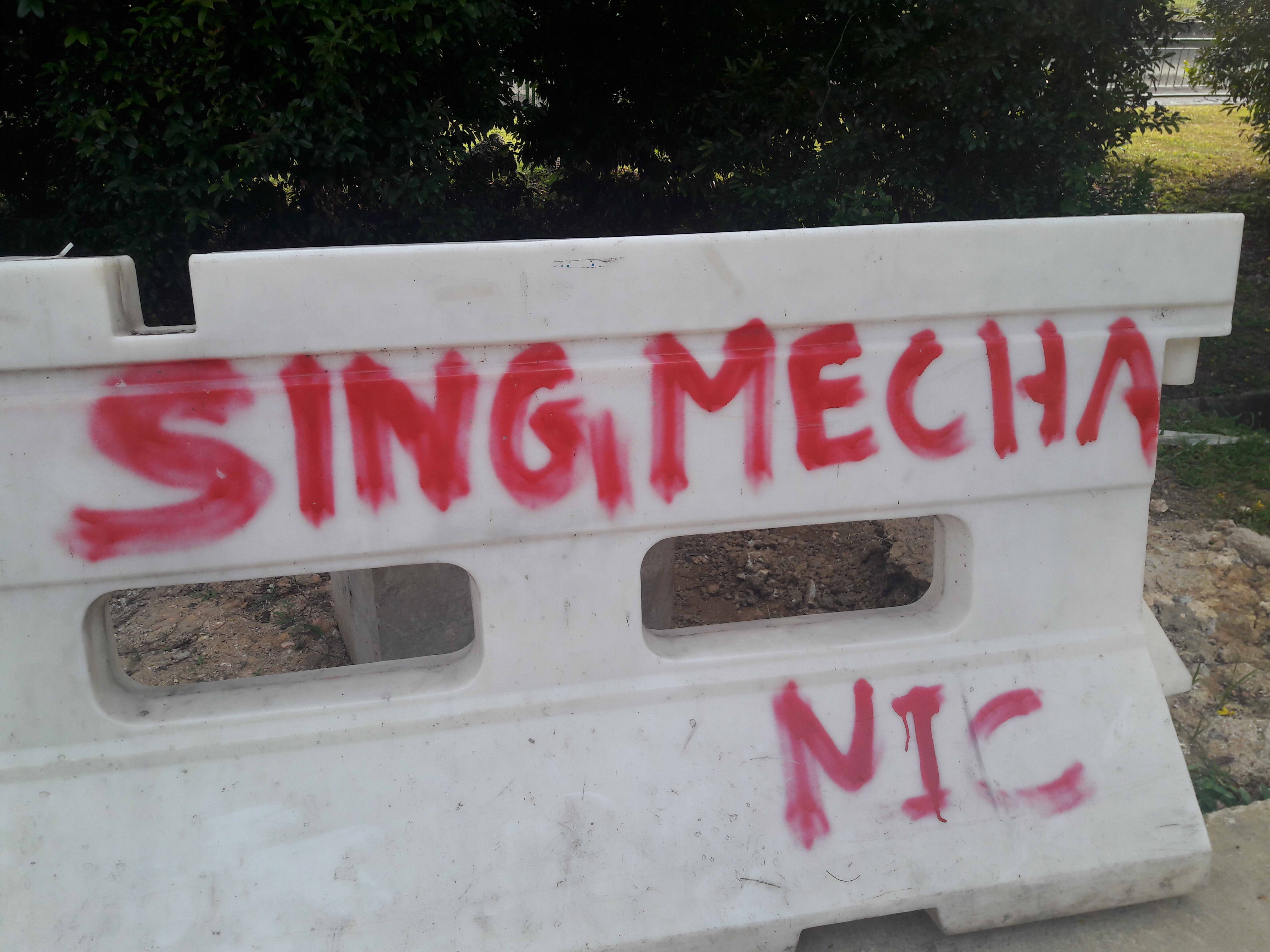
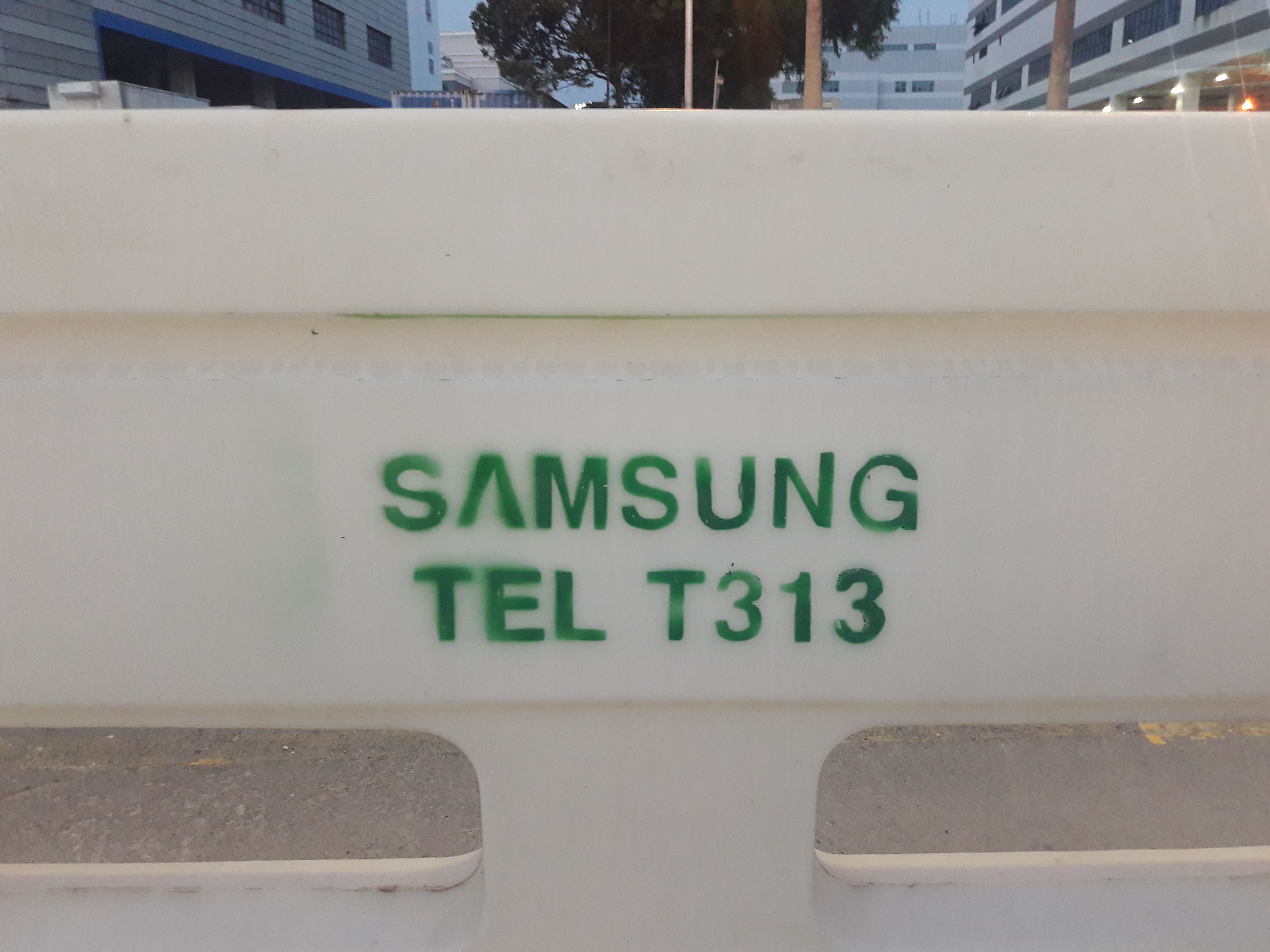
Weird markings on the ground and various things. You see this everywhere, really, but never quite question it. And yet, some of them form patterns in terms of repeated images, or colours, or numerical sequences.
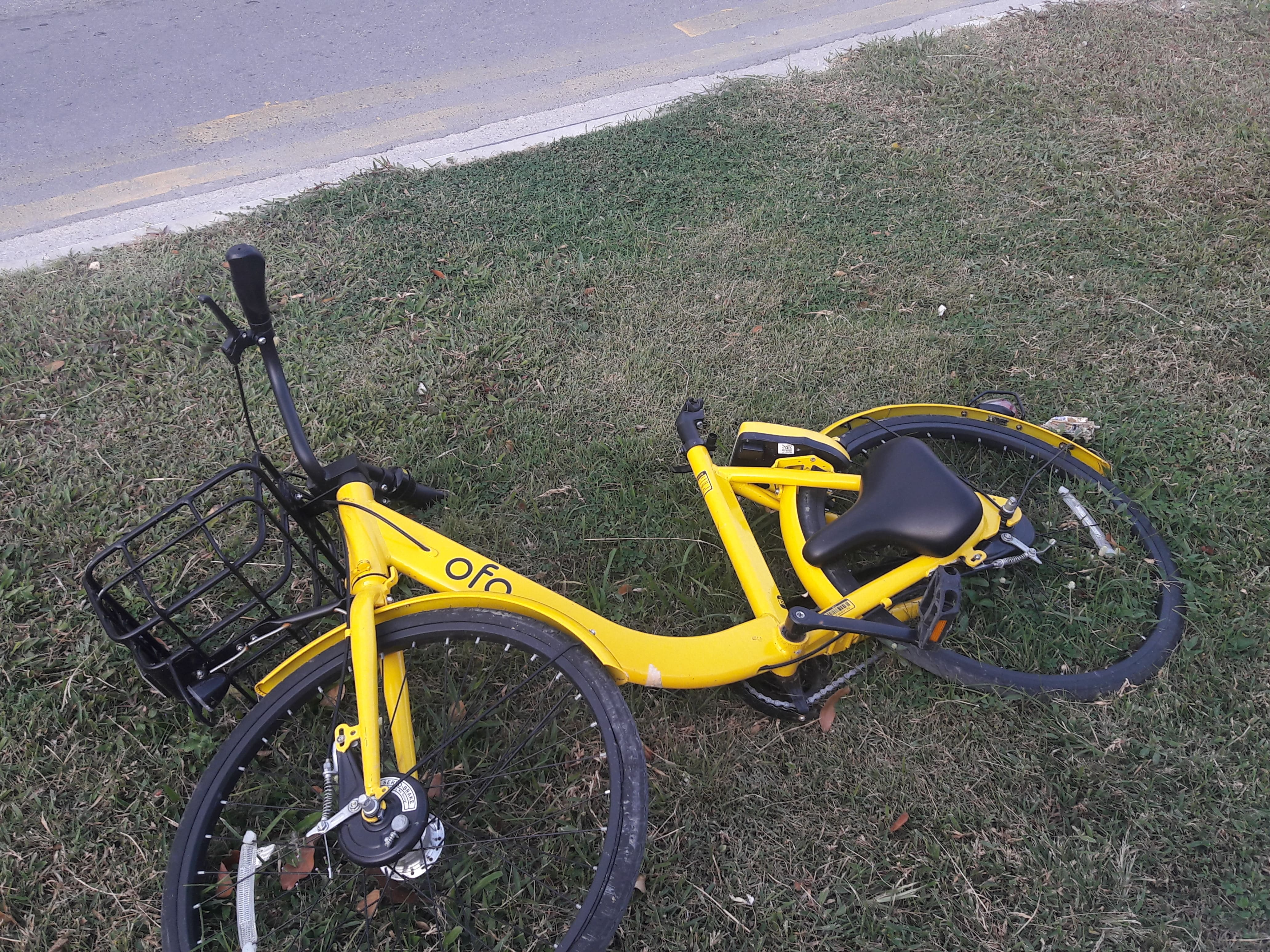
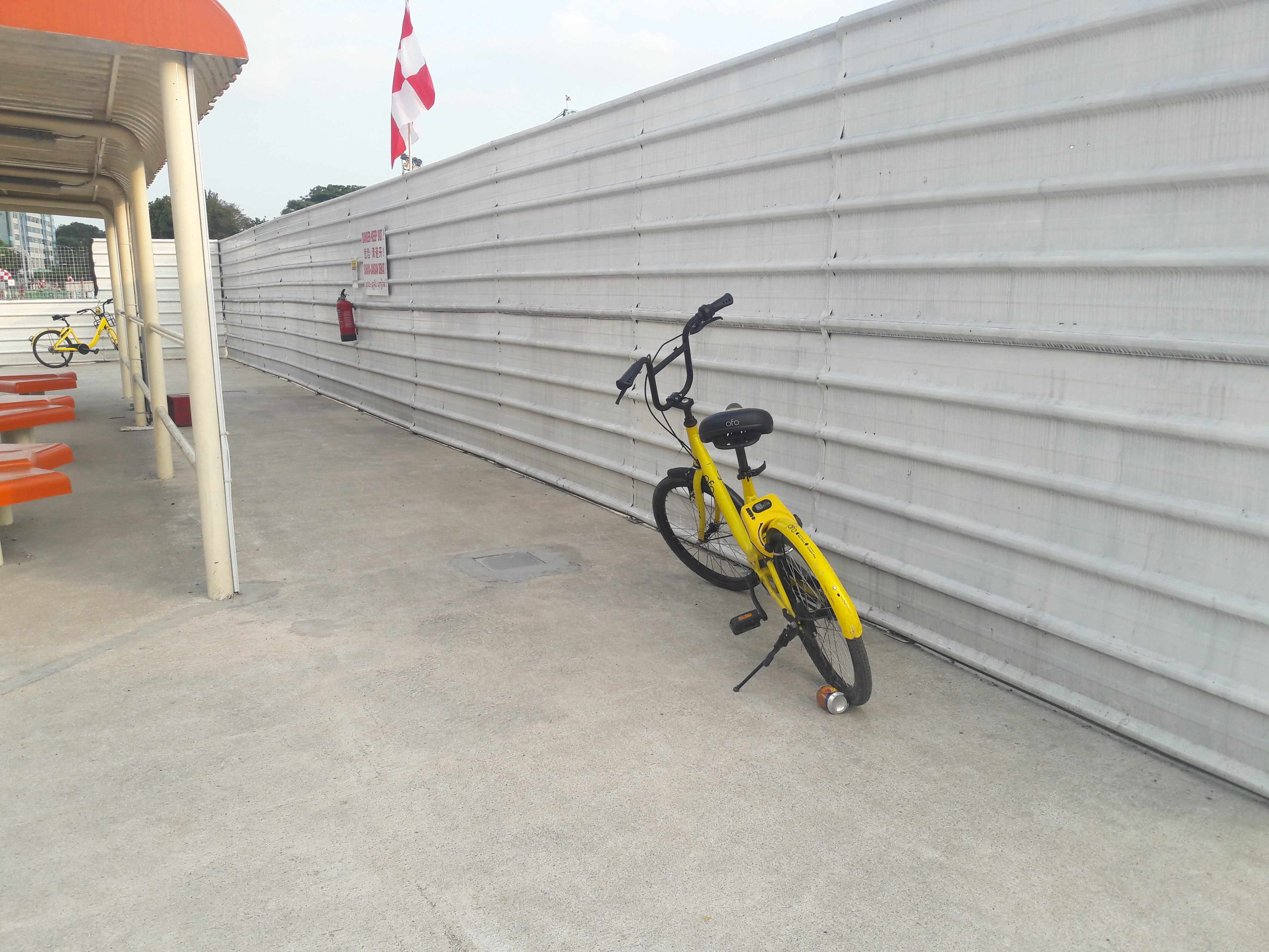
OFO bicycles
While not new knowledge to me, it’s still interesting that industrial areas often have a lot of bicycles lying around, because it’s convenient for workers, where there are few buses, and it’s often flat and long stretches with practically no one to crash into.
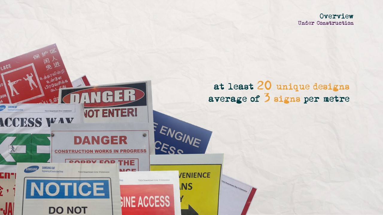
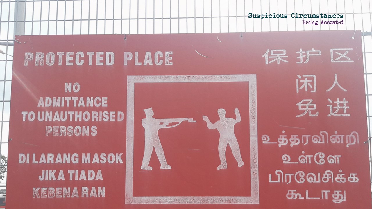
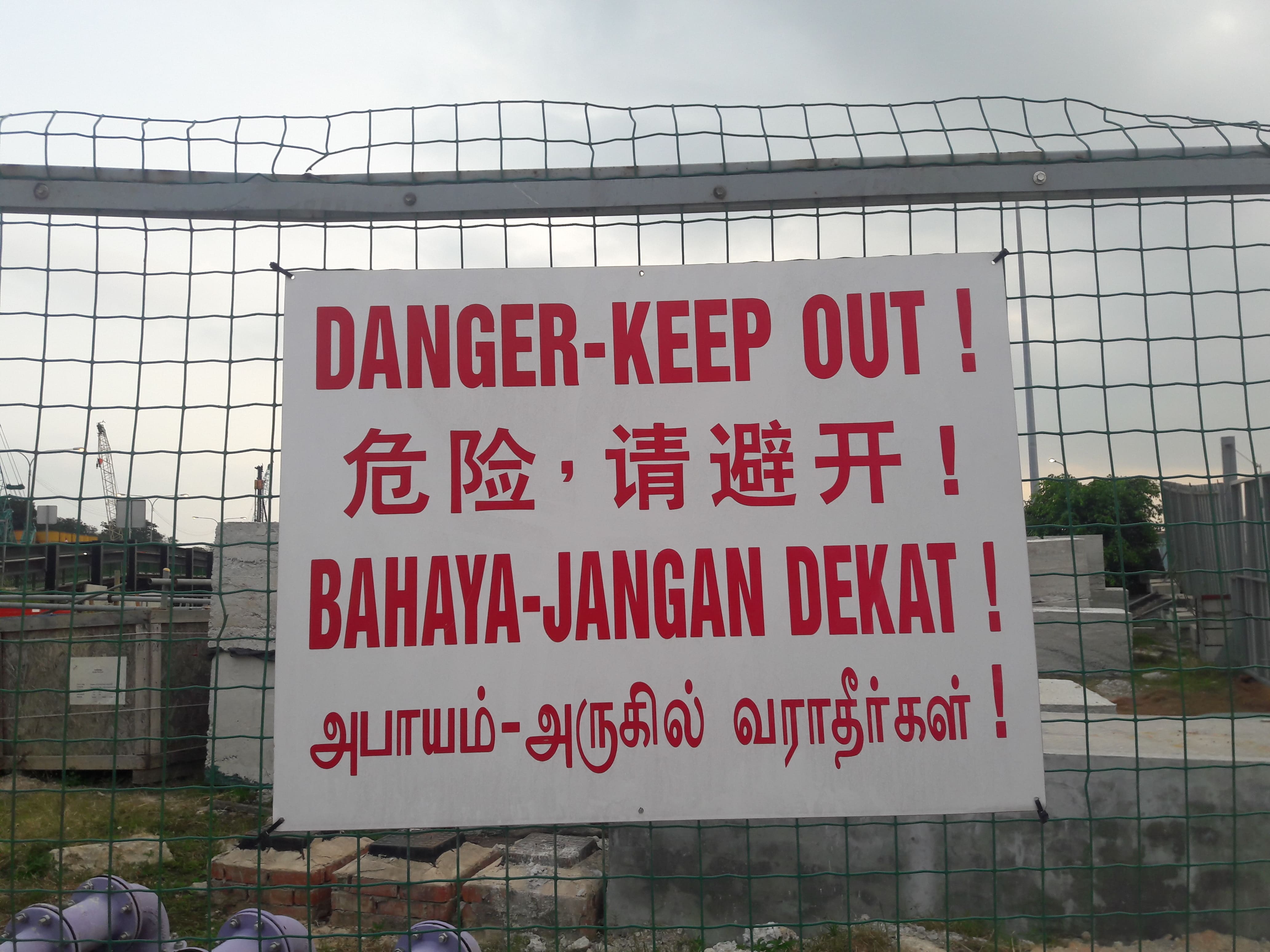
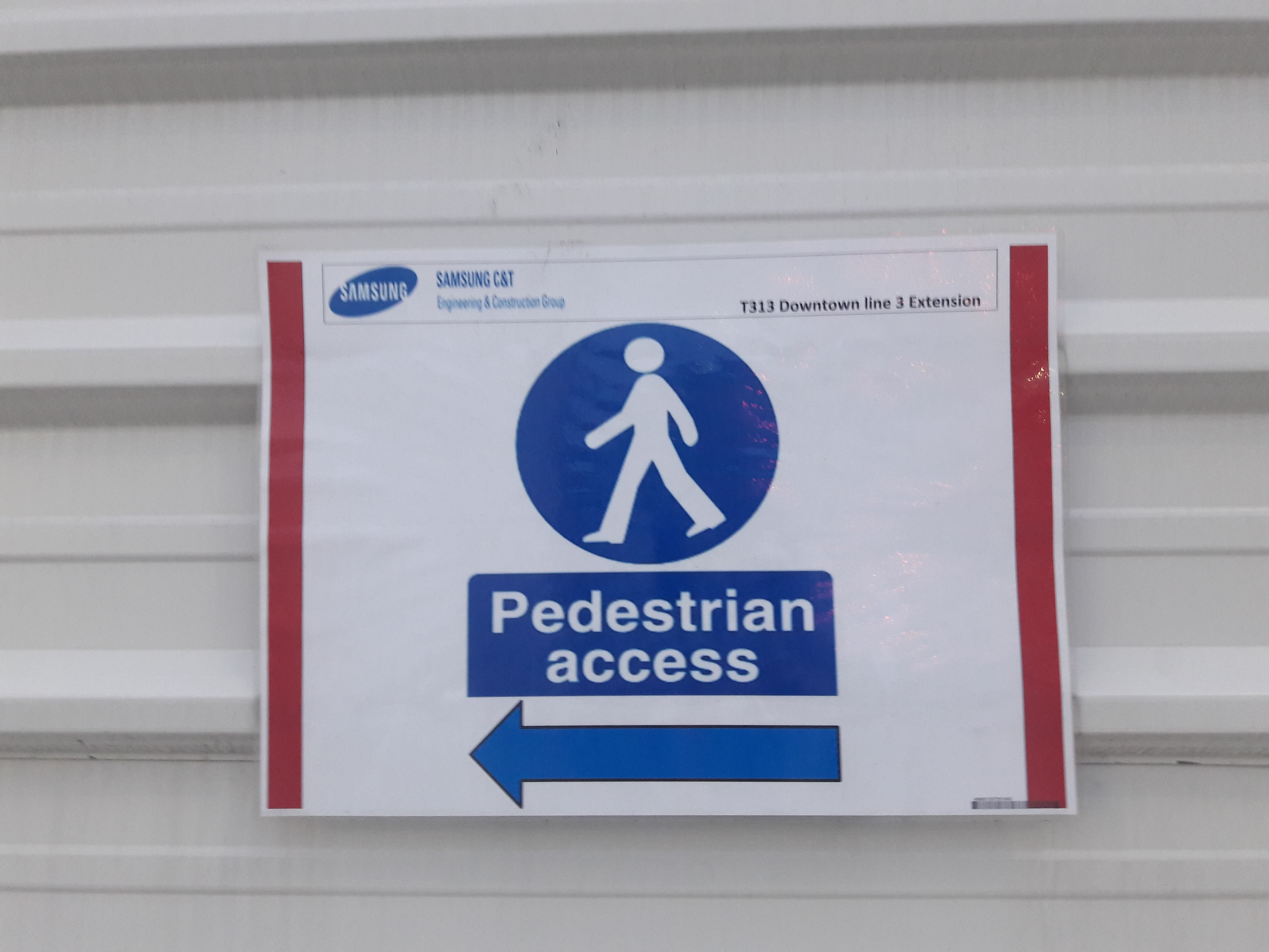
Signs
Not unexpected for restricted or dangerous sites. What’s interesting, though, is variations of a sign meaning the same thing, or just how there ARE many different types of signs.
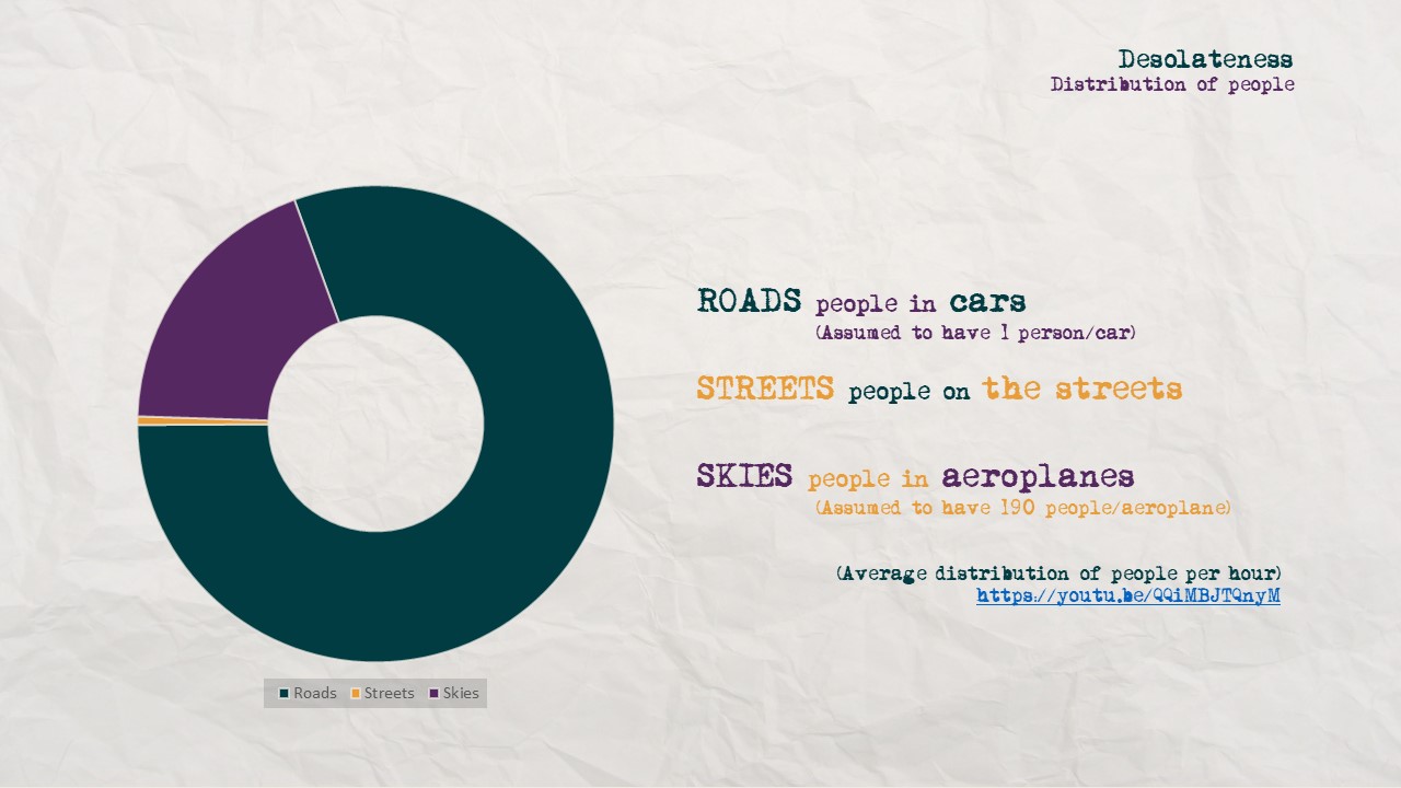
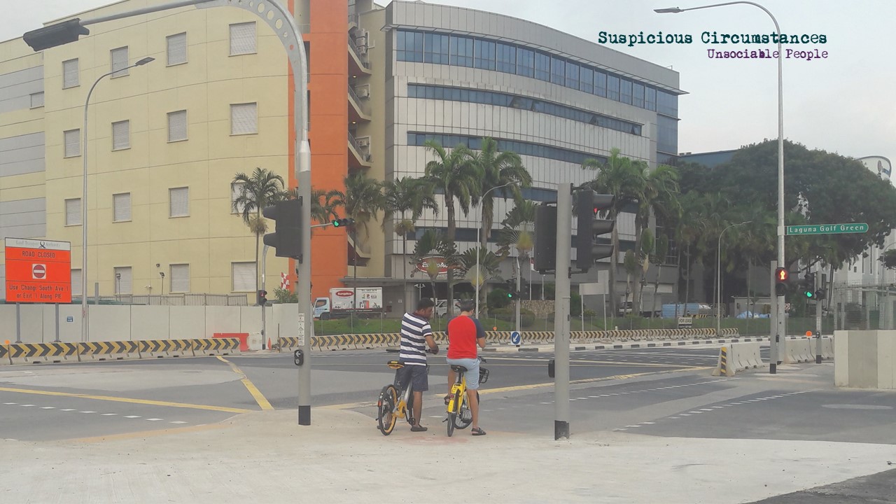
Peoplelessness
I’m still awestruck by how quiet it is.
Few images fall into this category alone, but it is the idea of the “index”, in the traces of humanity though there is no one in sight. (e.g. OFO bikes, trash, tyre tracks, etc). Or even the fact that there are buildings and construction sites at all, a testament to our existence.
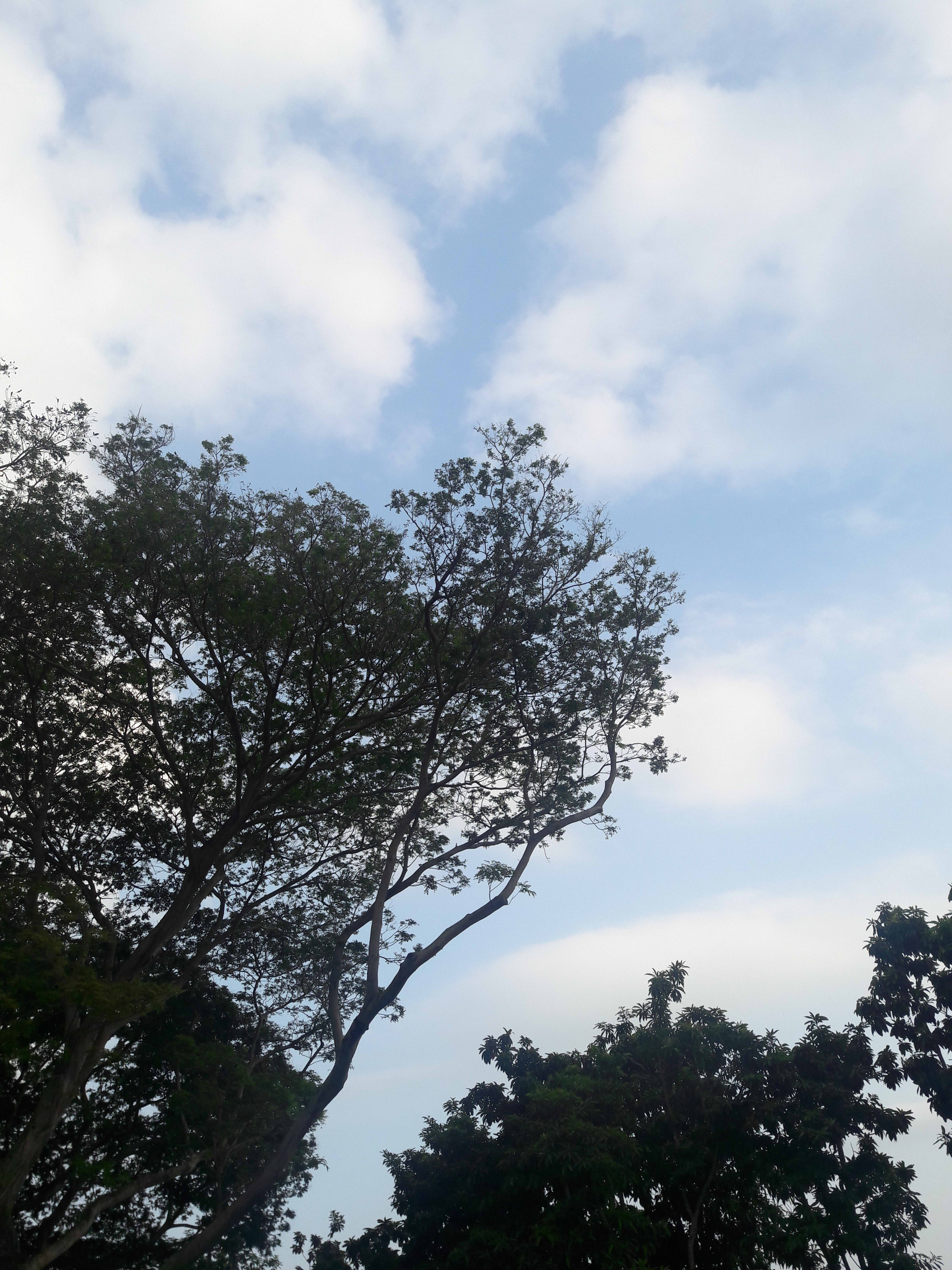
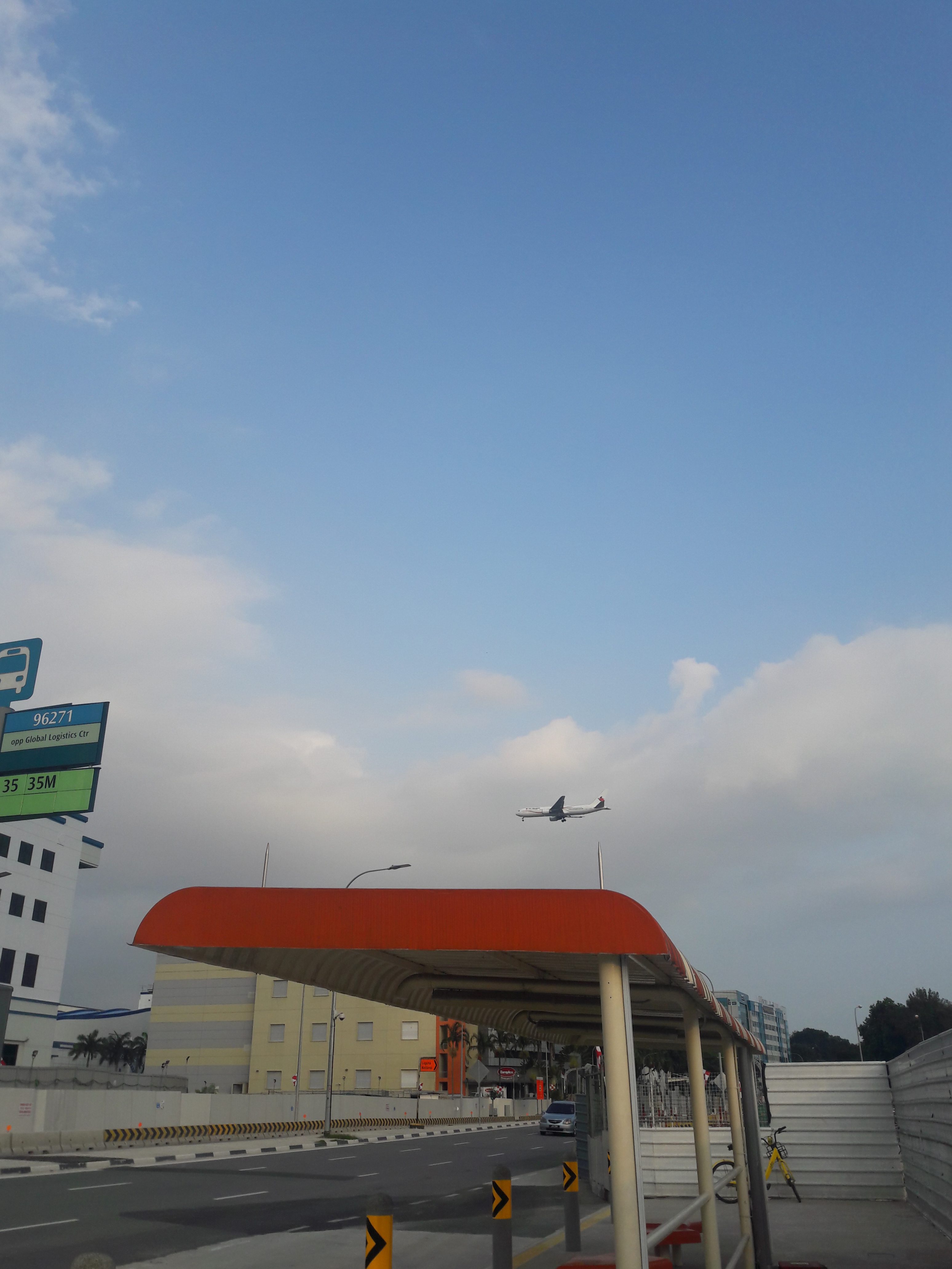
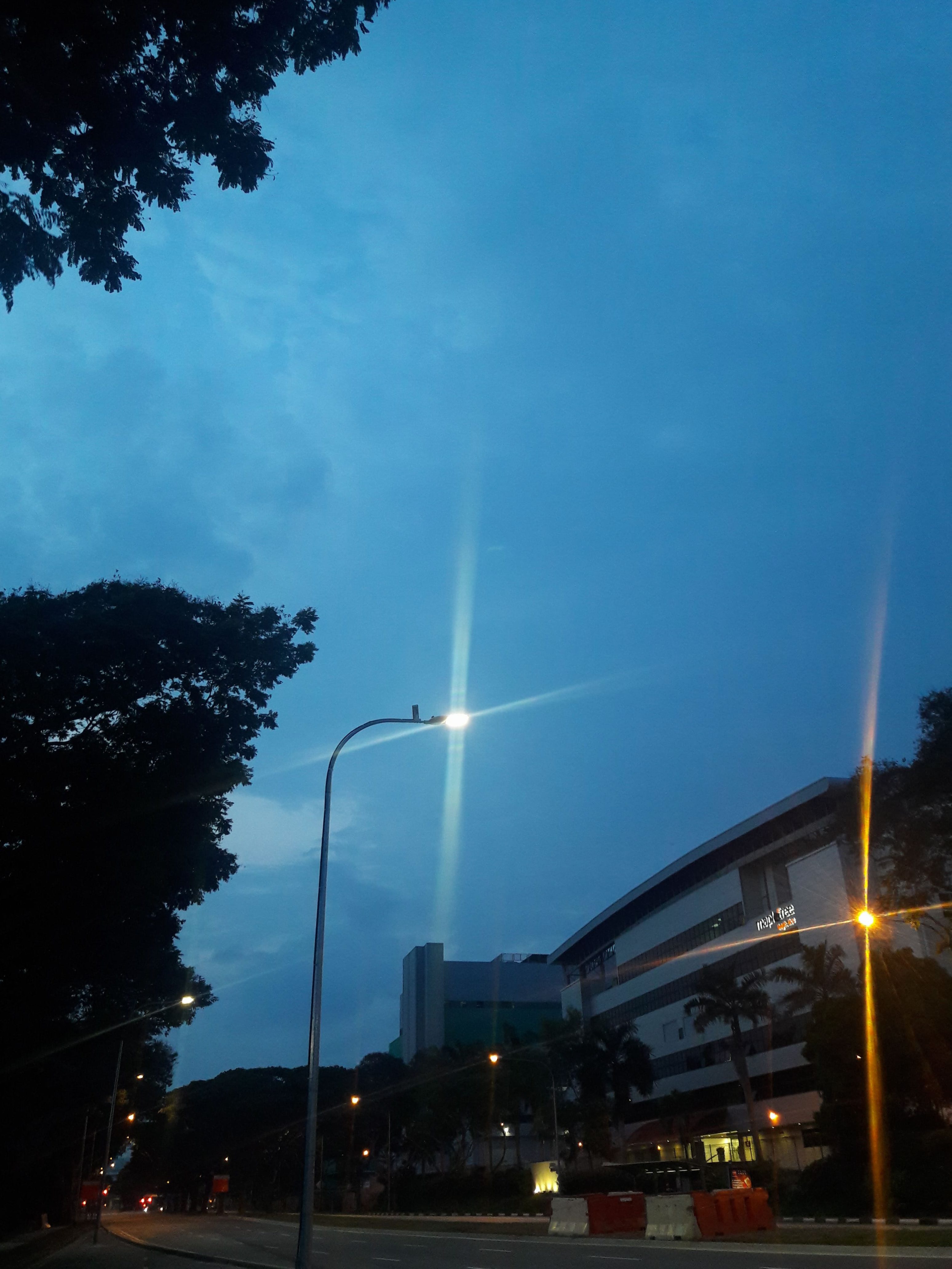
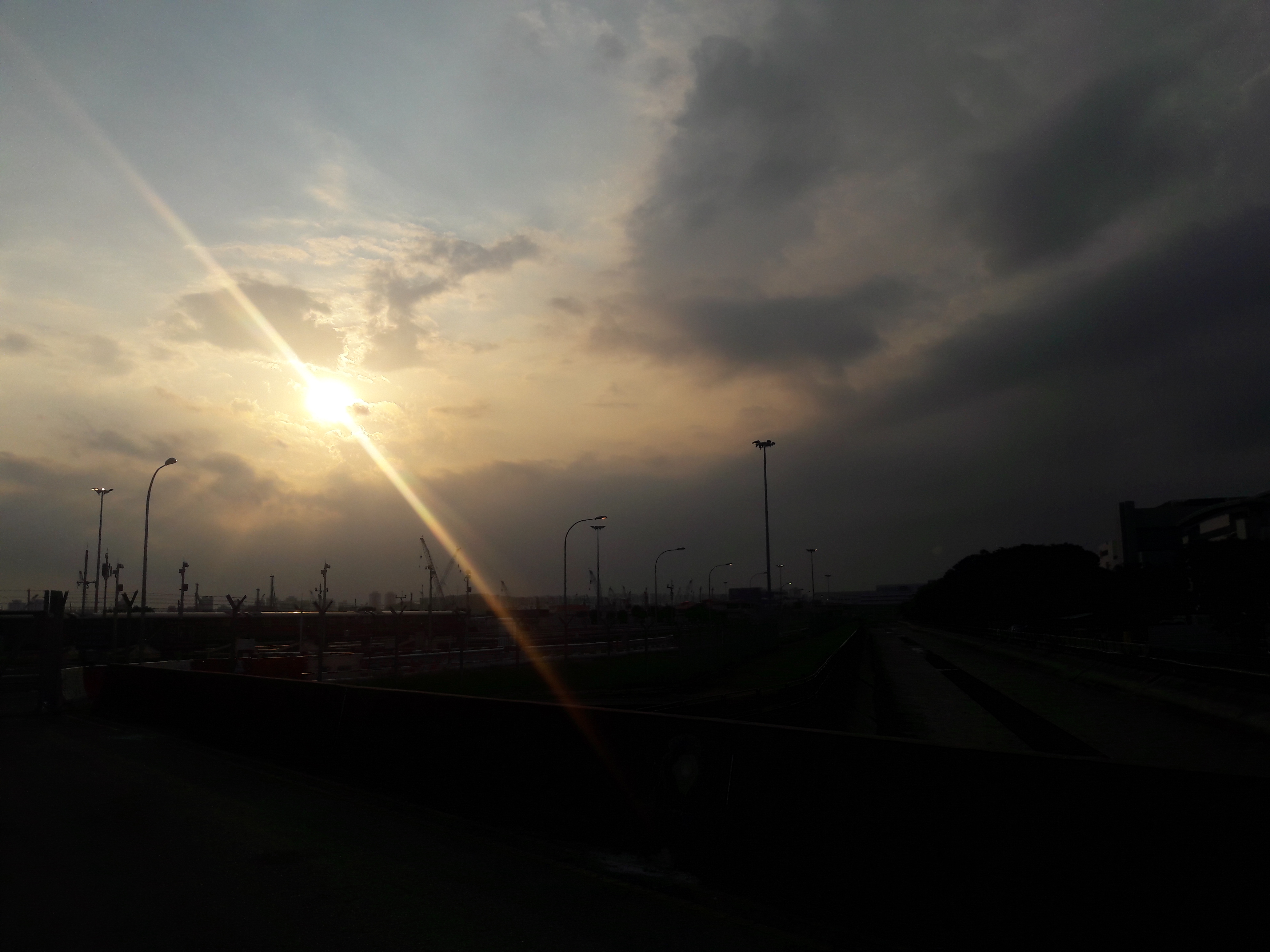
The Sky
Like I mentioned, often not blocked, giving a fairly good view. Sometimes has planes too.
(that’s the train depot) All in all there really isn’t any sound but that of the strong wind, passing cars, the occasional train, and the occasional bird.
All in all, I have mixed feelings about the place. There is little sound but the wind, rushing cars and occasional bird, but it’s not really a peaceful quietness, not even melancholic or eerie. Instead, it’s more like silence, sterile and stagnant, devoid of people, of scent, anything. Indeed, it might be refreshing compared to the bustle of a shopping mall, but it lacks organic serenity, which leaves me feeling somewhat disoriented. There is a difference between solitariness and desolation, after all.
Xilin, in fact, reminds me strongly of various other industrial areas, such as Senoko Way or Joo Koon Road, just much less populated in that there doesn’t appear to be any of the usual local coffee shops to cater to workers. Additionally, it is surprisingly close to a reknown location, the Singapore Expo, and the Changi City Point shopping mall. In itself, though, the only differentiating quality is perhaps just that there is the Changi train depot.
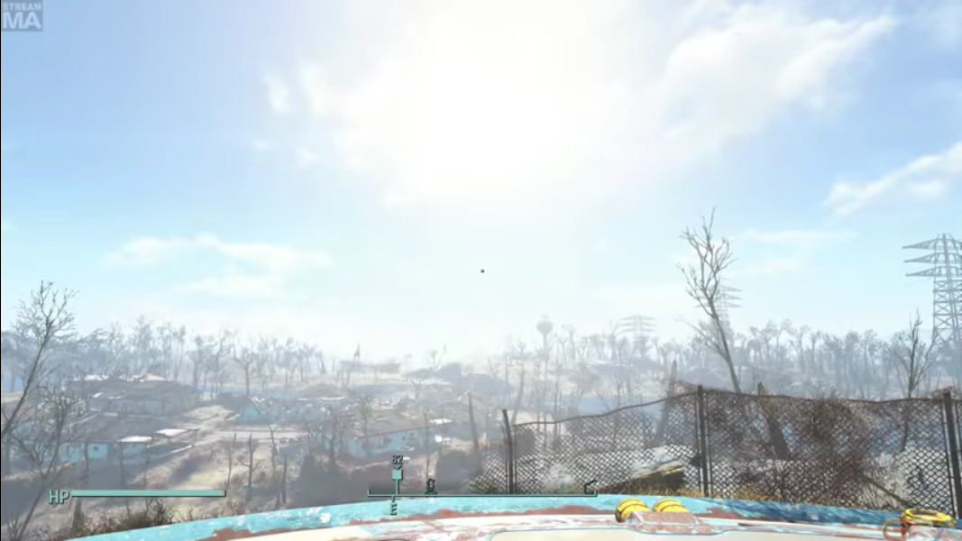
In the end, though, it’s a place which can easily become rumour fodder, due to its low profile and desolation. It has the makings of a post-apocalyptic location, not unlike the feeling you might get when you come out of a shelter to find that the world has ended.
From Fallout 4 (2015), upon leaving the nuclear shelter
From The Bunker (2016), showing the outside world, post-nuclear apocalypse.
It also has potential to sound exactly like the site of a government conspiracy, where a lot is covered up, or can be viewed with suspicion. Perhaps my zine would be a thesis for a conspiracy, or a documentation of the end of the humanity.
I put my sidebar on the right for 1. aesthetic, 2. easy access (if I use touchscreen), and 3. because I prefer to compromise width than height for my window sizes (which would happen with the default sidebar on bottom).
Firefox for the Internet, because I love being able to have a lot of control over my privacy settings
File Explorer for finding files, because I never save things on my desktop and only put them into the proper folders
Paint Tool SAI (a lightweight raster graphics editor), for simple image editing (or sketching, back when I still had a tablet).
My desktop icons are mostly shortcuts to applications which are not significant enough to put on the sidebar, but significant enough that easy accessibility is crucial.
Arranged on the left in straight lines to make space for the background image
Recycle Bin: In the top left corner due to lack of usage (where it is most unlikely to be clicked due to the location)
Adobe Reader for PDF opening (in relatively inaccessible location due to low propensity to open it as is)
Adobe softwares for various hobbyist/school works (+Aptana Studio, my open source replacement for Dreamweaver)
Game-related softwares for gaming (distribution softwares and emulator)
In 2015, Carla Gannis released The Selfie Drawings, a set of digital drawings expressing “the self”. It was then expanded in 2017, forming the narrative basis for Gannis’ 2017 exhibition: Until the End of the World.
Electronic Graveyard No.2, The Upload (2015)As seen in the HD 3D animated video (2017).
From the Origin to the year 10 000, the exhibitions shows an imagined evolution of humanity, a sort of apocalypse in which “you ain’t need no husband” because you can have virtual children, et cetera.
Courtesy of Carla Gannis. Titled Origins of the Universe, it is a 3D-printed re-interpretation of the Courbet’s 1866 painting. It implies that the cell(phone) is the origin, which is technically not wrong, in being the origin of your existence as a digital object.
As Wittkower aptly states, many things “might seem to mean nothing, and yet be taken to mean something”. Your virtual children are only real when you perceive them to be so. With this in mind, the seemingly surrealist images can be perceived as more than nothing, as a presentation of the self, albeit in a stranger form, but perhaps also truer in being able to manipulate new mediums to express yourself in different ways.
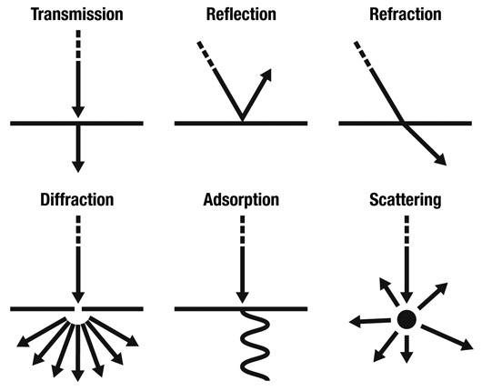
Interestingly, this Physics diagram, on different ways in which waves can meet boundaries, provides a strangely clear (and thought-provoking!) analogy on the different presentations of the self which can manifest when crossing from reality to the digital realm.Courtesy of Carla Gannis. As aforementioned, the digital world allows for impossible portrayals of the self, from floating in the air to breathing fire. It could mean nothing but absolute insanity, or it could be a step into understanding yourself through the ability to portray yourself through other means.
However, there is a caveat in the overriding of the actual self. “They made monsters of themselves which they could not tolerate nor do without,” says the voiceover of the 1991 movie of the same name. Without regard for the physical space they focus on the digital self, a somewhat revolting notion.
From Until the End of the World (2017), depicting Carla laying down looking at her phone screen, even while the world disappears around her.
From Until the End of the World (1991), depicting Claire watching a screen of her own dreams, even while her body rots in the desert.
Nevertheless, as Deresiewicz suggests, it is not possible to “develop the capacity to have a sense of self separate from the community” without a certain level of isolation. This explains why we accept this form so readily: Though teeming with others, the digital realm can also be your own, allowing you to explore yourself, which is craved in a world where “you” are not important (Schopenhauer, 2014).
Red Samsonite by Carla Gannis, as presented in The Selfie Drawings in the exhibition. The depiction of the self can be easily changed and warped in the digital world, as one explores what it means to be “me”, away from the noise of society.
Certainly, Gannis’ work reflects the new forms of self available in the digital identity, and how we still engage in it because of its appeal, even if it may seem vaguely self-destructive.
(Featured image from 1991’s Until the End of the World. Claire’s psychedelic dream, which probably inspired the madness of Gannis’ portrayal, in that dreams are not unlike the unconscious mind.)
Deresiewicz, W. (2009). “The End of Solitude”. in The Chronicle of Higher Education. (link) (as referenced by Wittkower)
Gannis, C. (2015). “The Selfie Drawings”. on Carla Gannis. (link)
Gannis, C. (2017). “Until the End of the World”. on Carla Gannis. (link)
Gannis, C. (2017). “Until the End of the World”. on Vimeo. (link)
Schopenhauer, A. (2014). “On the Vanity of Existence.” in Studies in Pessimism. The University of Adelaide. (link) (as referenced by Wittkower)
Wenders, W. (1991). “Until the End of the World”. (around 0:50:00 to 0:53:00 of a certain kind-of-illegally uploaded Part 3, don’t sue me thank you)
Wittkower, D.E. (2010). “A Reply to Facebook Critics”. in Facebook & Philosophy: What’s on Your Mind?. Open Court. (link)
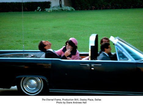
Television, cars, spaceflights — from 1968 to 1978, Ant Farm proved themselves to be distinctively “American”, capitalising on these objects which, even then, were cultural symbols of the USA. The Eternal Frame (1975) is no exception, though it takes things to a further extent. Rather than referring to merely objects which have become symbols, it refers to something more human: an event which has become a myth.
The title of this video itself is misleading: as a non-American millenial with little knowledge on this 1963 event on the other end of the world, it took me a while to realise this IS the artwork, and not the legitimate footage. For at least 90% of Americans at that time, though, it became a collective memory, in that it was heavily televised.
The Riderless Horse, Black Jack, at Kennedy’s funeral, which was also broadcast. It is now a key image representing Kennedy’s assassination, alongside other images like that of the Kennedys kneeling by the eternal flame, something which sounds almost ethereal.
In 1975, a previously-excised, now-infamous frame from the Zapruder Film was “shown for the first time” (Andrews, 2013). And the masses tore into that depiction of the exact moment of the shot.
Obviously, The Eternal Frame (1975) is a response: as stated by Uthco & Ant Farm, it is “simultaneously a live performance spectacle, a taped re-enactment of the assassination, a mock documentary, and… a simulation of the Zapruder film”. In fact, it’s likely a response to the whole nature of the televised tragedy:
“While we didn’t see the assassination live, the television show about the assassination was a four-day long drama that played on national television.” (Robert Thompson)
It was never about the substance: when the presidential campaigns came around, it didn’t matter that Kennedy was a philanderer or a druggie. It was the “power of the image” (Lord, 2017), the charismatic television facade which won the hearts of the people.
Everyone claims that “it” was “gut-wrenching“, “haunting“, “powerful“, but the “it” they refer to is merely the image curated for mass media. Not the 1963 assassination of the person named Kennedy, but the 1975 film about the character named Kennedy. They will never feel the same as true witnesses like Zapruder did, so utterly traumatised that he had nightmares.
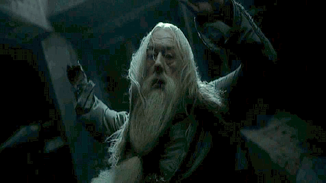
It is perhaps akin to the pain you might feel when you see a beloved character like Dumbledore die in a television show: you hurt, but do not perceive the loss as “real”.
At some point, this reality became nothing more than a “drama” to be viewed on television. It became something which had fantastical motifs, sensational twists; something for the entertainment of the masses who eagerly tear into that one frame, who squint at the image of his head exploding, who try to solve the murder mystery: who killed him?
Frame 313 captured everyone’s eyes, which remains eternally in their thoughts. The frame, and nothing more.
Featured image courtesy of Diane Andrew Hall, retrieved from here.
Andrews, E. (2013). “What happened to the Zapruder film?”. History.com. (link)
Lewallen, C. (N.A.). “Still Subversive After All These Years.” Stretcher. (link)
Loughlin, W.S. (2013). “Modern Mythology: Fifty Years Later, JFK Still Resonates.” Syracuse University. (link)
McGuire, K. (2013). “The Kennedy Assassination, boomers, and TV journalism.” The Chicago Blog. (link)
Packer, R. & Lord, Chip. (2018). “Chip Lord live from the NMC Media Lounge.” (link)
Rosenbaum, R. (2013). “What Does the Zapruder Film Really Tell Us?.” Smithsonian. (link)
Simon, R. (2017). “How Kennedy Created a Presidency for a TV Age.” Time. (link)
Sneed, T. (2013). “How John F. Kennedy’s Assassination Changed Television Forever.” US News. (link)
(rendered interpretation by superimposing traditionally cut and painted plastics onto digitally created background)
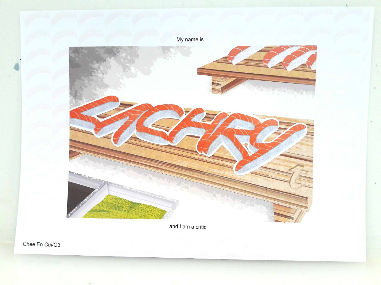
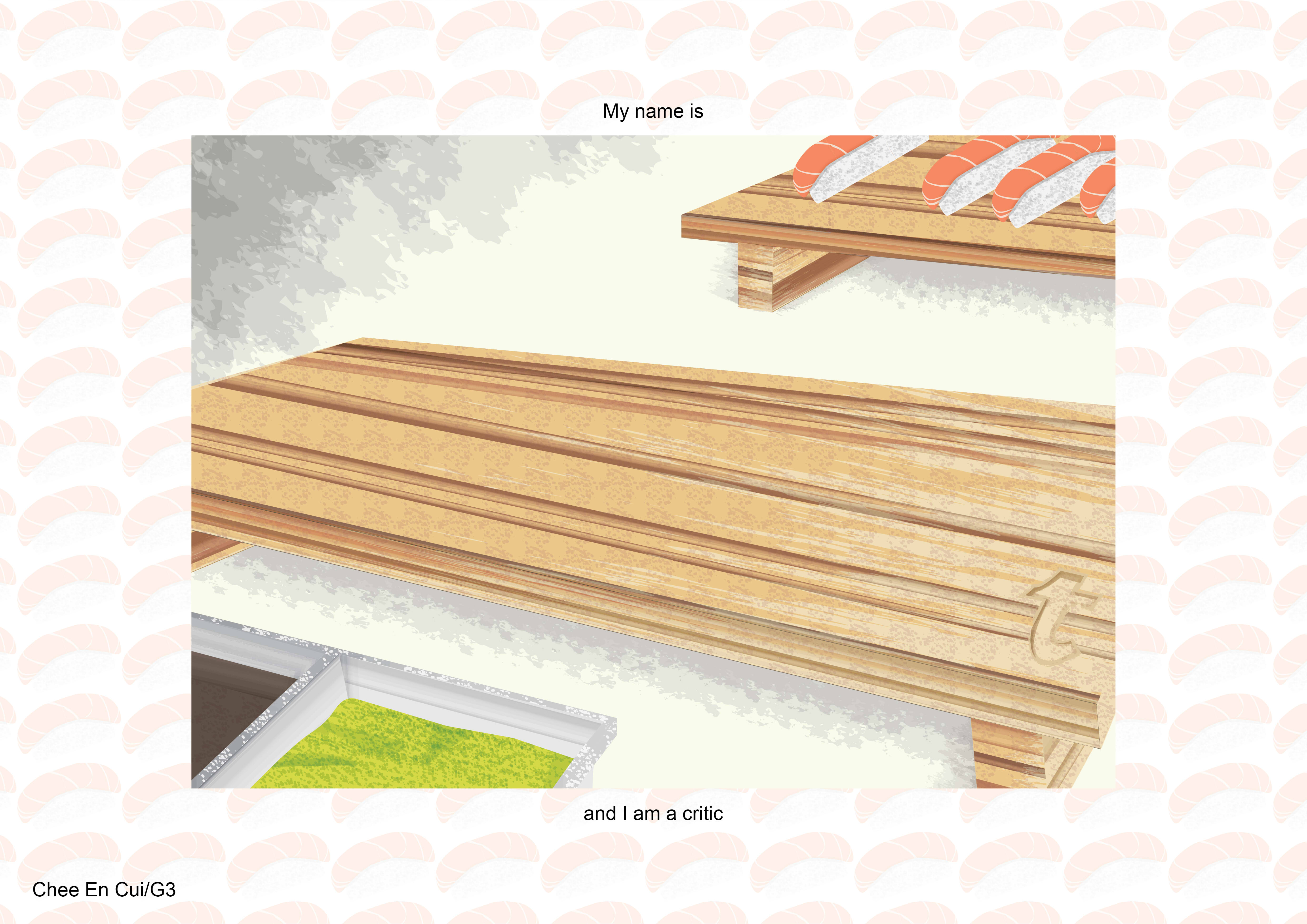
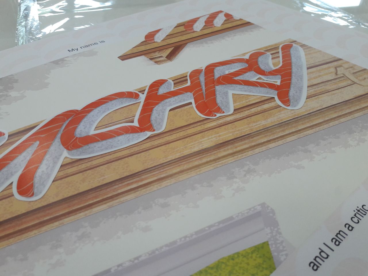
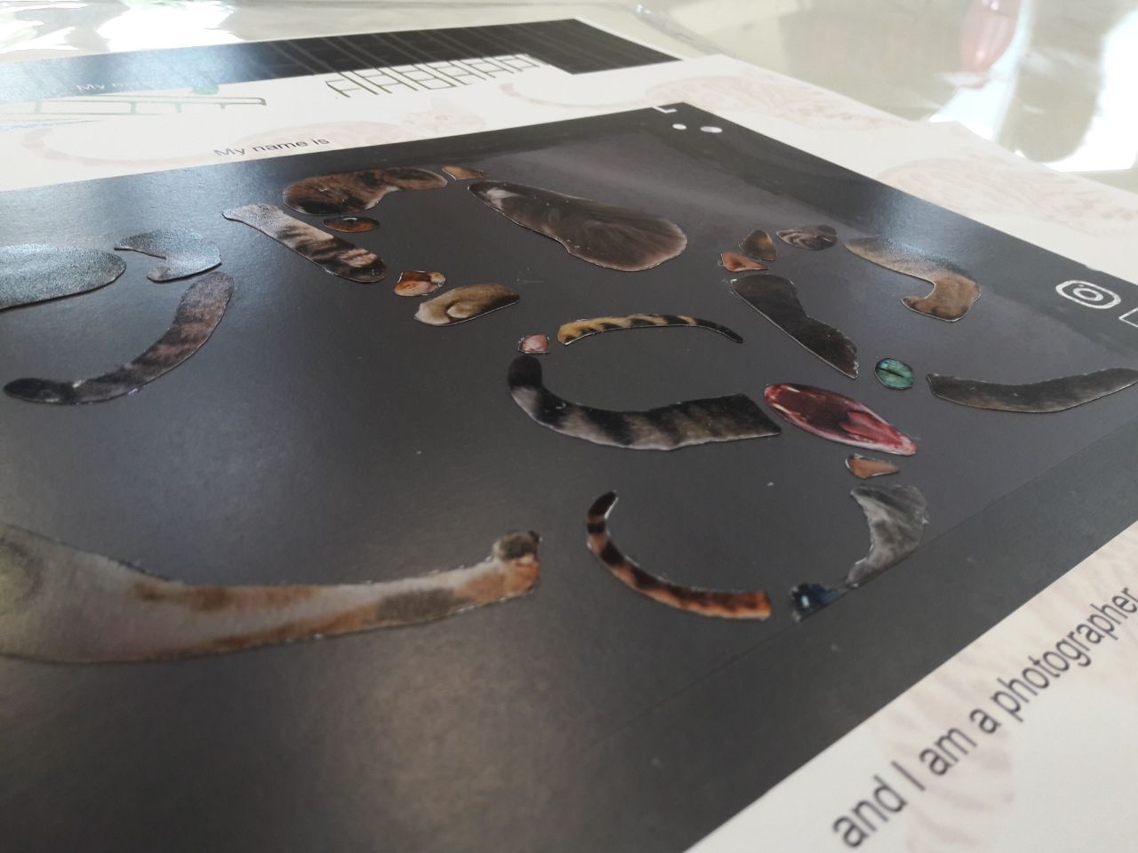
Note that all letters were pasted on in the printed version, but digital renditions have been uploaded for web viewing. Photos of the printed version can be found alongside the Final Explanation.
I realised I didn’t particularly mention the typeface and colour choices during the presentation, and thus have indicated them clearly in here.
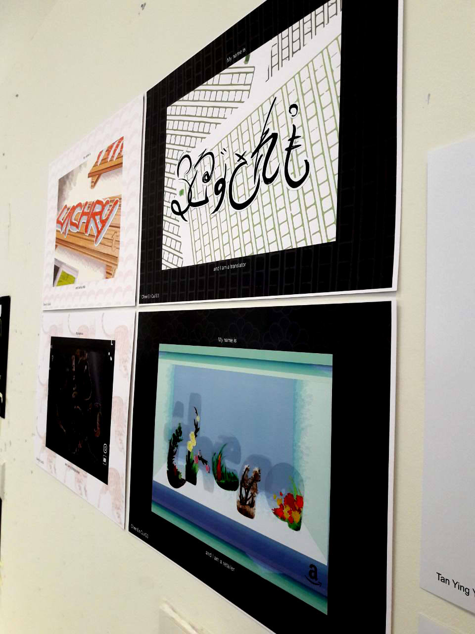
Overarching ideas/common themes:
Jobs can work both digitally and analogously
To depict the versatility of the digital
Jobs are non-descriptive
Only the “base” job, and the specification is hinted through the composition
Names are of invented online handles
To depict the temperamental nature of the online identity
Backgrounds are vector drawings
To present differentiation between the digital world and the “real” you
To provide flatness, to avoid standing out
Foreground letters are pasted on
To present differentiation between the digital world and the “real” you
To draw focus through layering
Logo(s) present in each composition
To show online nature of each job
To show what kind of online website it might be associated with
Borders have colour and pattern
Either black or white to contrast image, e.g. if composition is too light-coloured, use black background to offset
Patterns related to each composition for visual quality than just plain colour
Idea for logos from realisation that cameras have certain logos…
Which can be related to social media icons
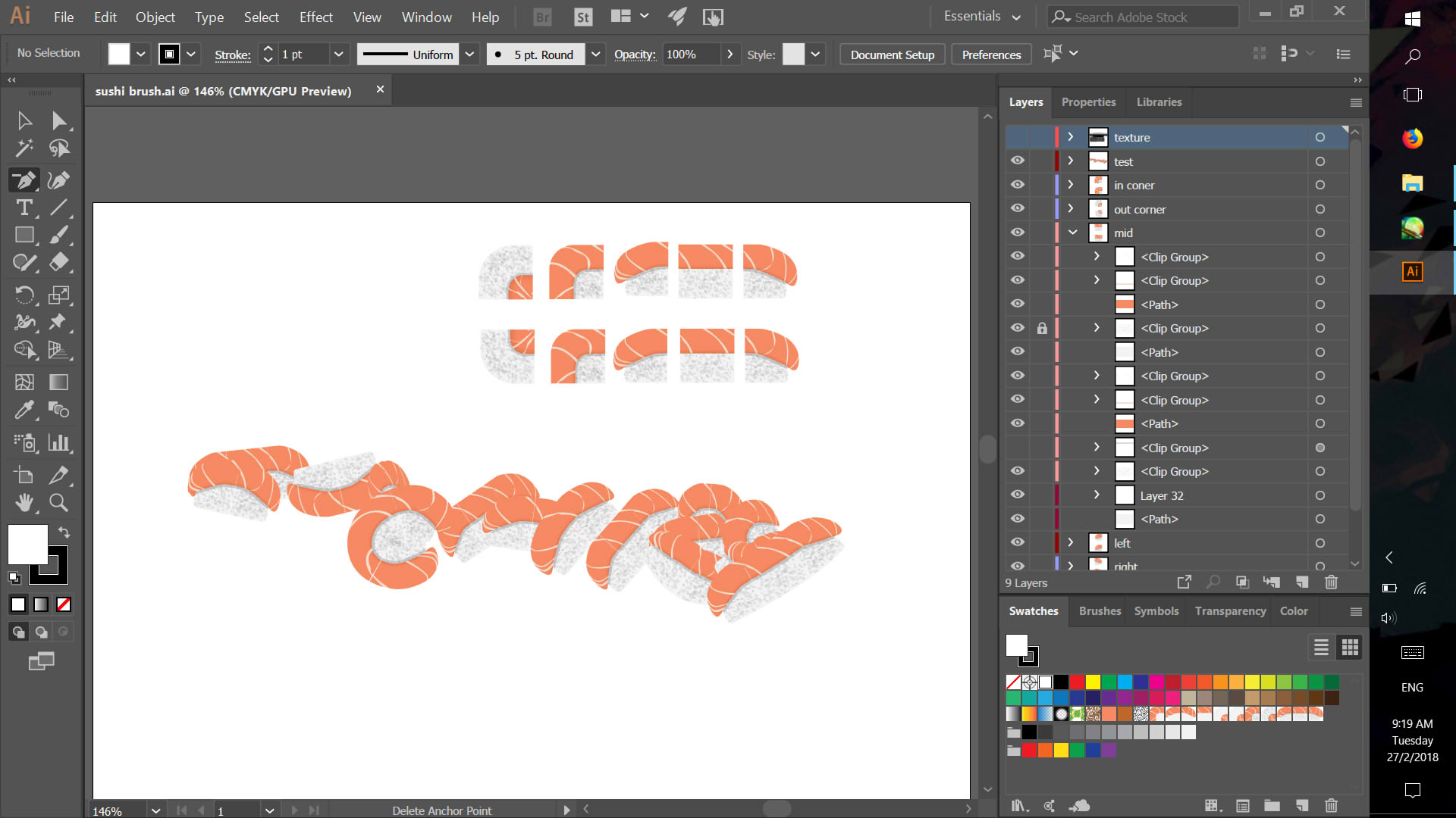
Making texture brushes. Took many tries, especially where I kept accidentally glitching it up.
All the Art Brushes I made, using Photoshop.
Experiments with Hue Shift, Tints and Shades, Tints and None settings.
My Scatter Brush (mainly for rice but also for texture), Swatch (repetition looks atrocious but surprisingly useful as texture) and Pattern Brush.
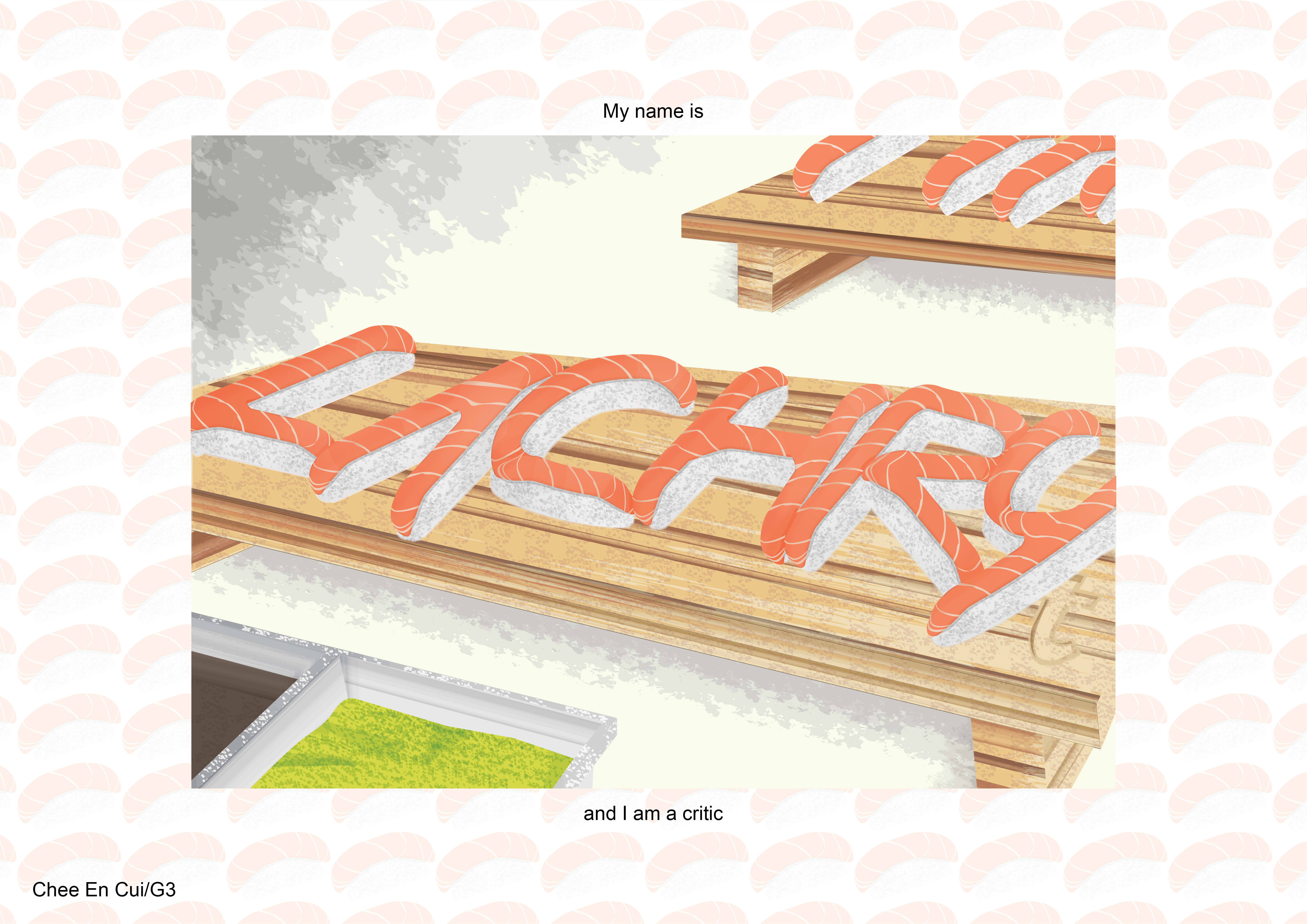
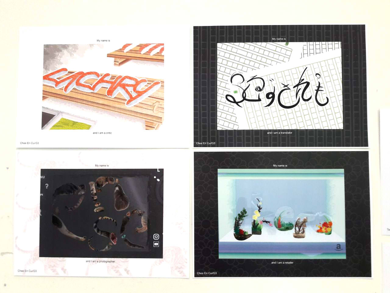
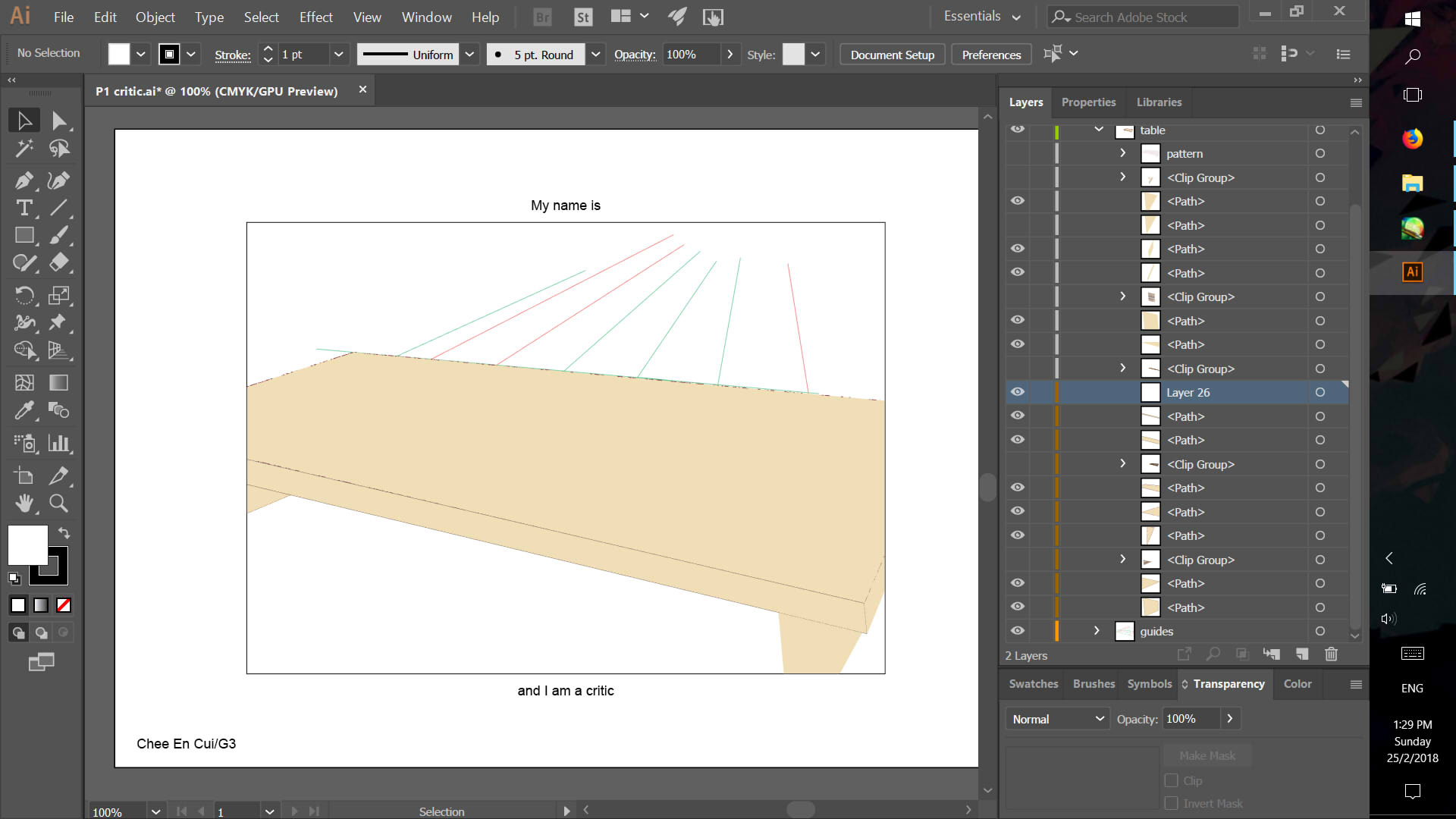
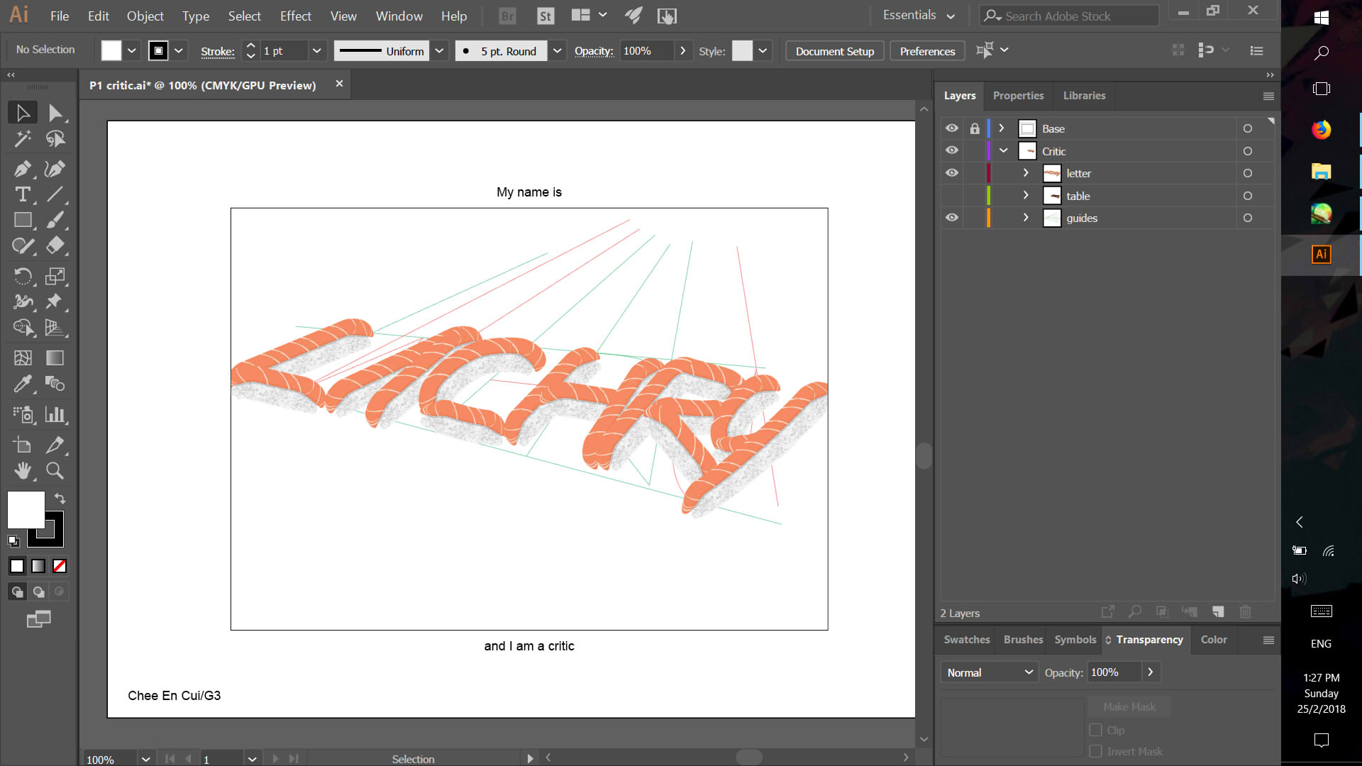
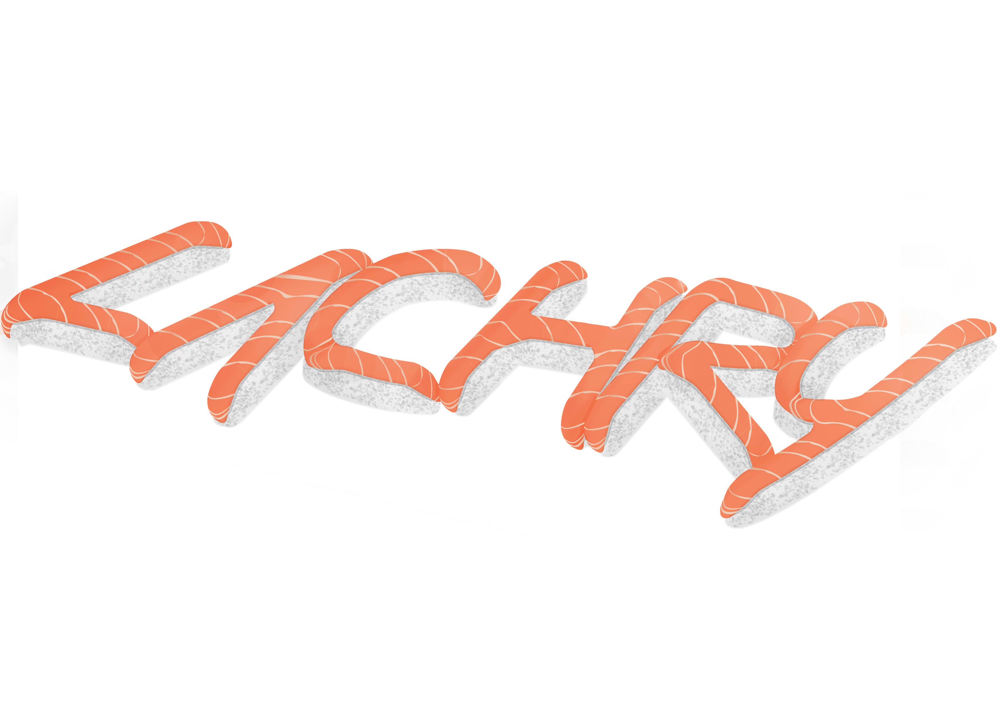
CRITIC
Came out slightly differently due to the lack of realisation that printing on A4 photo paper would still mean <A4 size in avoiding bleed.
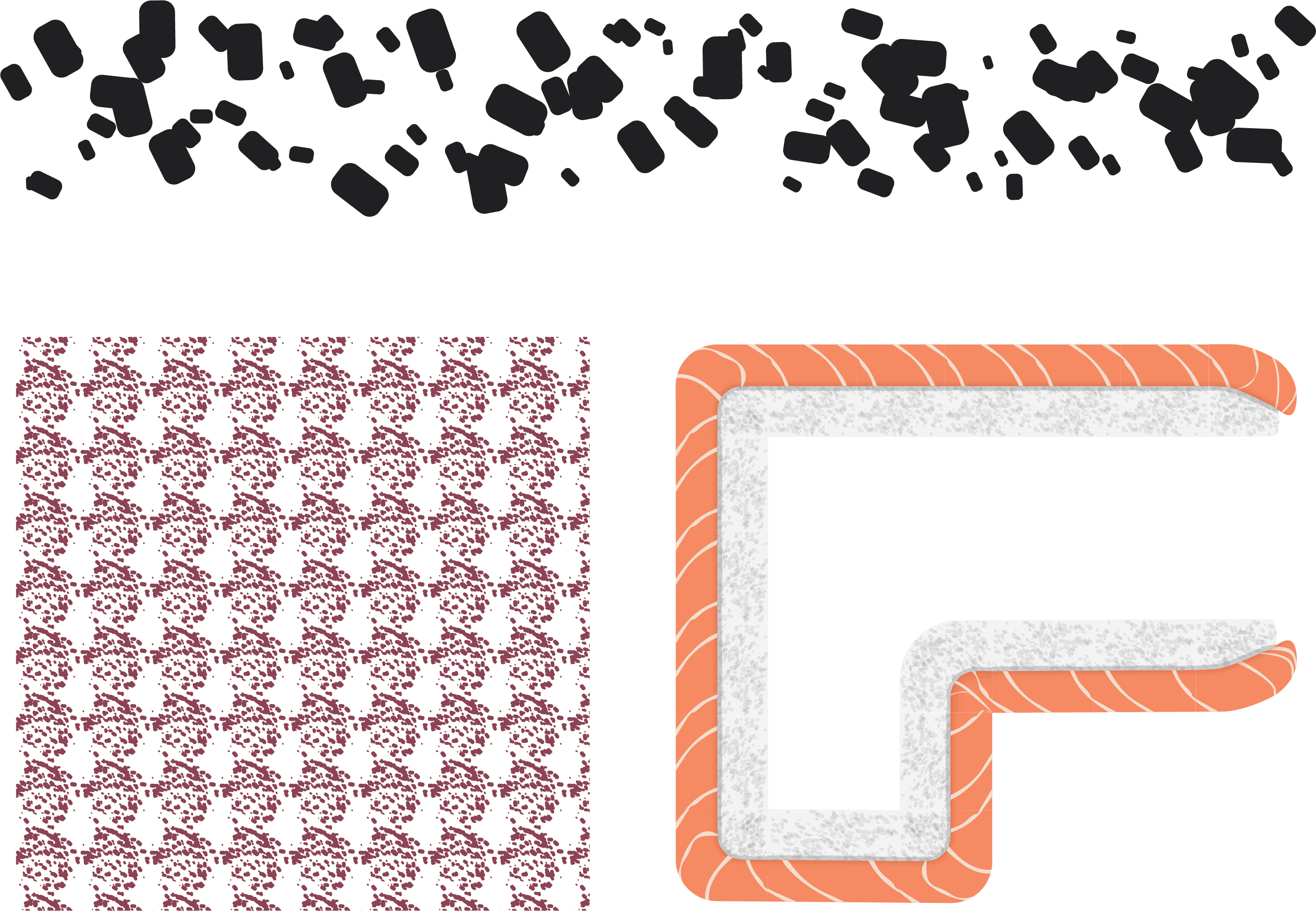
Of sushi
Tumblr logo (implication of food blogging)
Experiment with Illustrator pattern brush
Edited in Photoshop to fix perspective and lighting issues which could not be resolved with the sushi brush
No particular typeset choice as opposed to looking reasonably like a normal piece of raw salmon (hence the curves along the corners than straight cuts)
Neutral colours matching typical wooden sushi table, and orange with white for contrast and pattern. Green wasabi to accent slightly.
The background.
I built up each face, then added the wood lines, then textures, then slight shadows (with Colour Burn for more saturation).
Sushi brush, after original prototype. Avoided adding too much lighting since it would definitely come out wrong.
Perspective was vaguely problematic. I followed guidelines for a 2 point perspective, and tried to mimick it as best as possible.
Edited in Photoshop for lighting and perspective issues, as well as to smoothen intersections.
Tumblr logo reference. Attempted to make it appear to be carved inward.
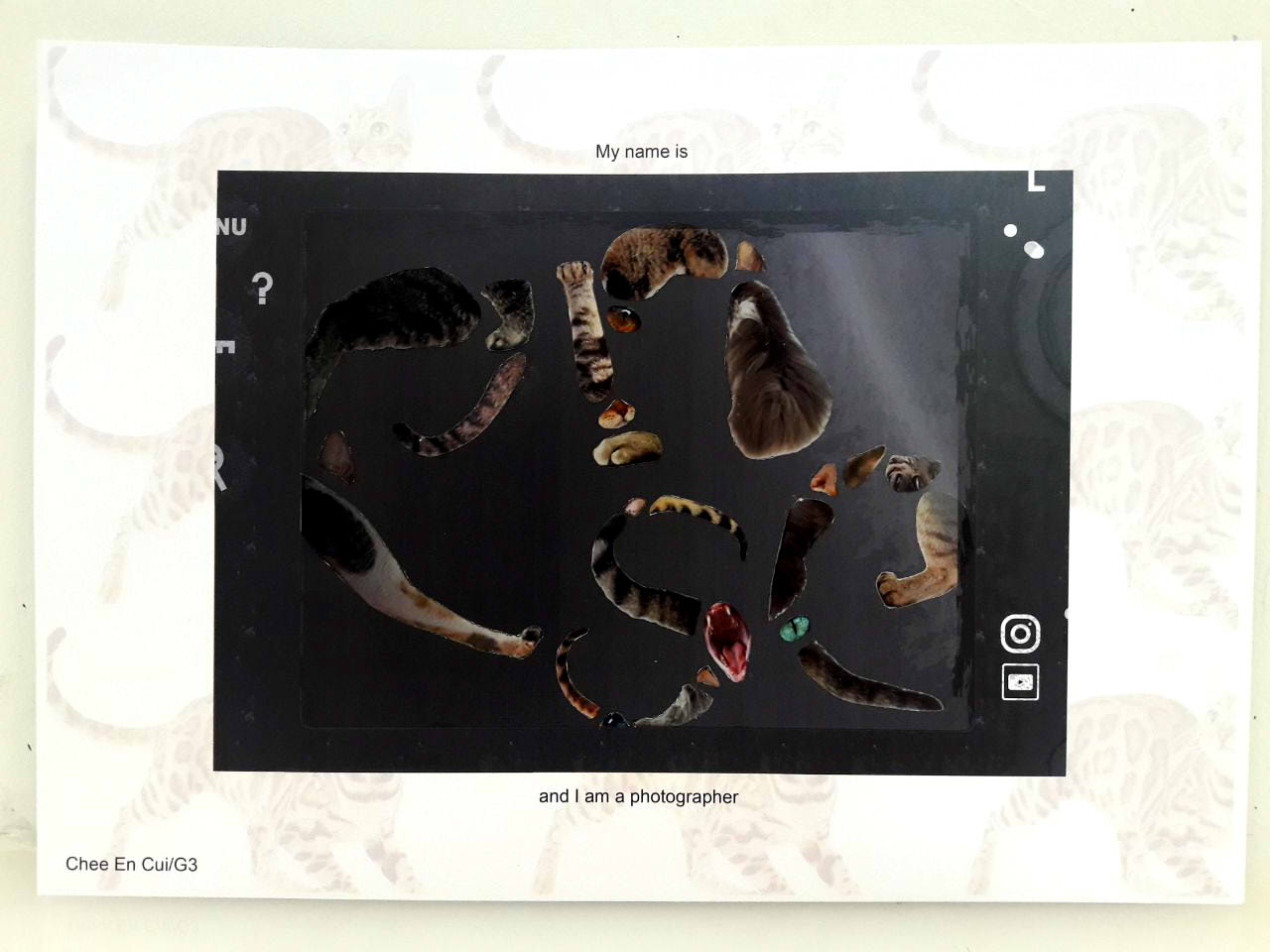
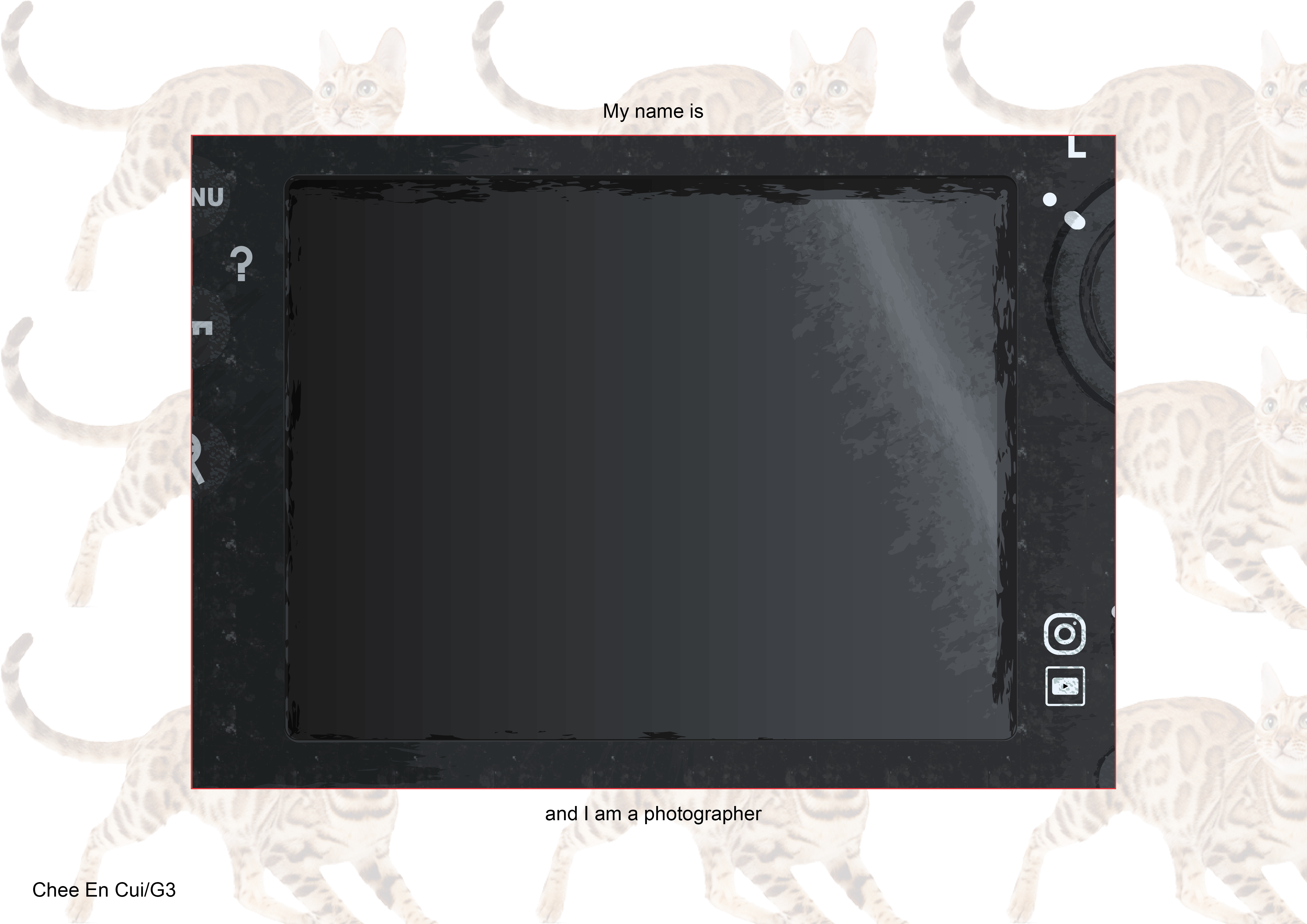
PHOTOGRAPHER
In hindsight, the editting to incorporate lighting made the contrast too low, so the focus isn’t very clear this way.
Of cats
Instagram/Youtube logo (implication of online sharing)
Collaging with use of gestalt
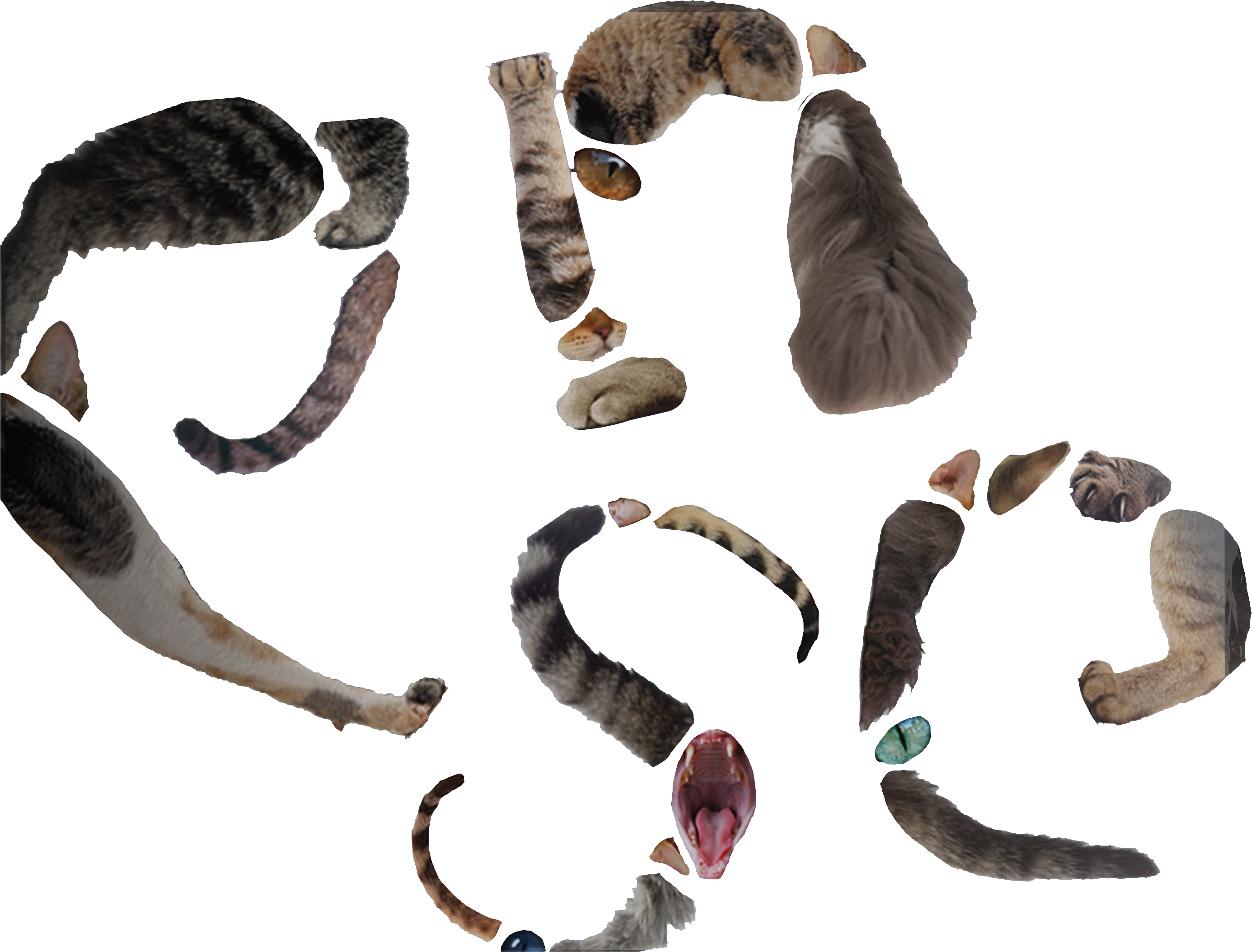
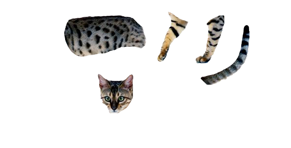
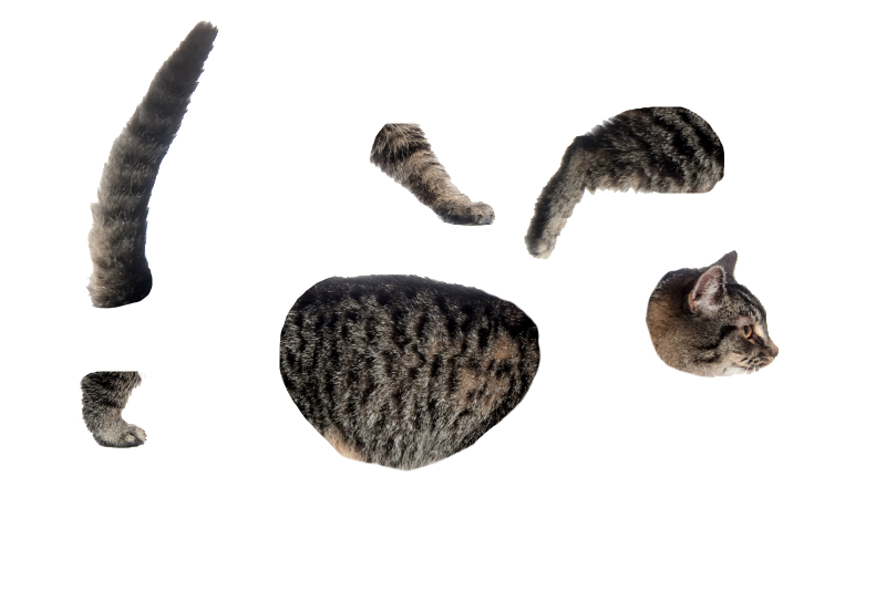
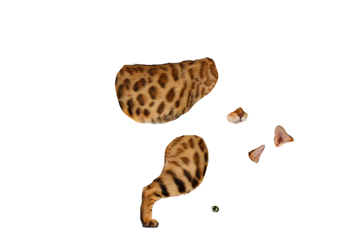
Dissection of pictures of cats into parts, then collaging together
No particular typeset choice as opposed to fixing the parts together in a comprehensive manner, where tails/legs define direction while eyes/paws/etc cover up small gaps
Cats of various shades of brown to avoid too high or low contrast (light-coloured/black cats), avoiding too much focus to any one part of the typeset
Background.
Typeface before jumbling slightly.
Slightly jumbled to maximise space, as a straight line left too much unused space and made it not focal enough. Also varied size of each letter slightly to encourage reading in the correct order, and changed colours slightly to make it appear more believably as part of the screen.
Few examples of cats I used. In total, there were 32 cats used.
Instagram logo reference.
Youtube logo reference.
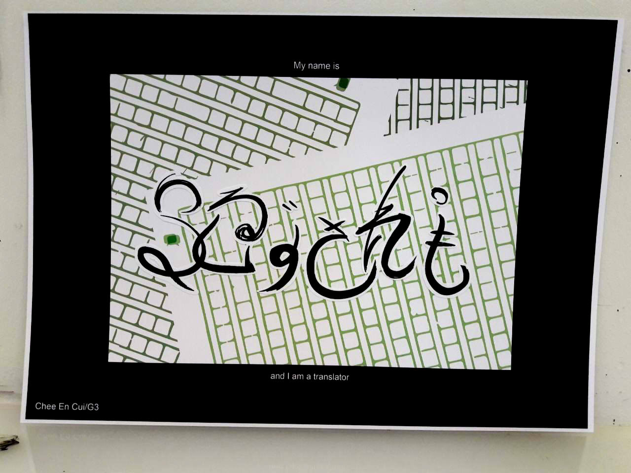
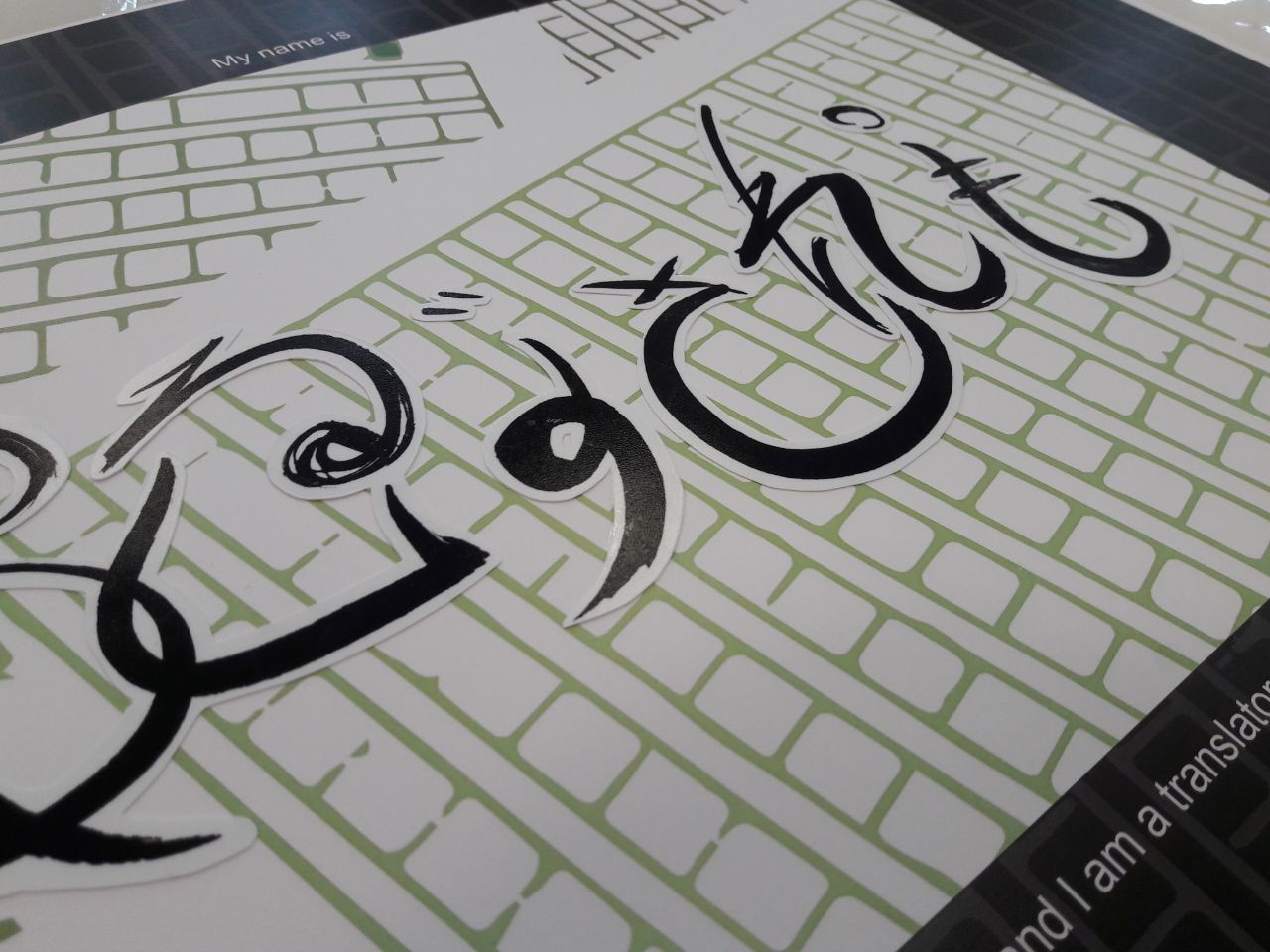
TRANSLATOR
Of Japanese/English
Self-designed logo (referenced from, implication of online translation services)
Painting with brush and ink
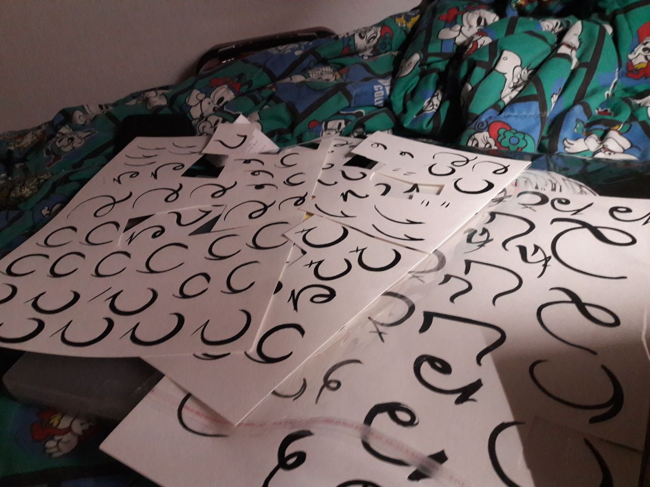
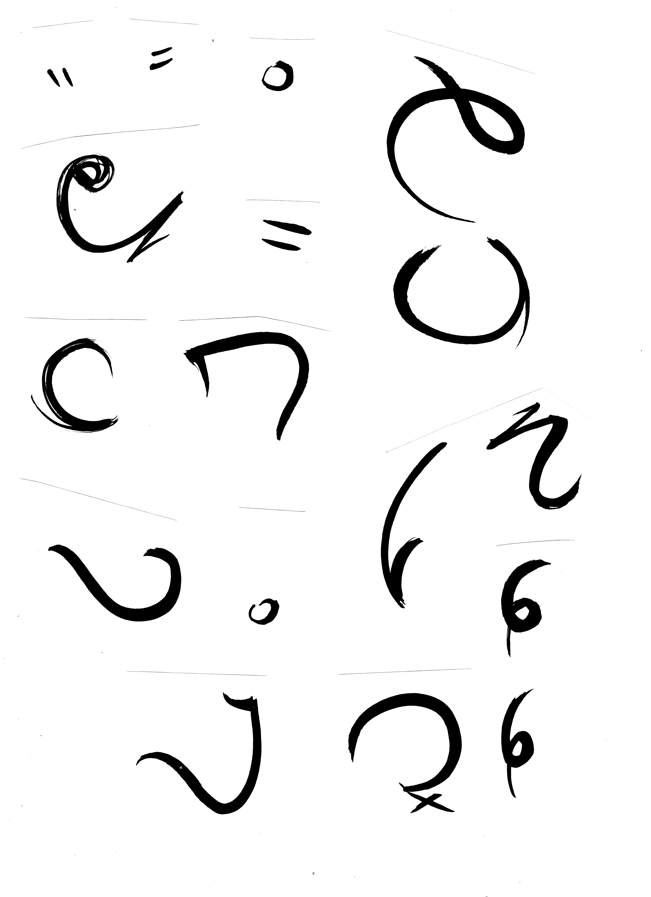
Dissection of hiragana into parts, then mixing together to form English letters
“Painted” calligraphic-styled font to evoke Asian brush strokes
Black strokes to emulate calligraphic style
Background
Initial contemplation of the strokes, and mixing to make suitable matches.
Repeated until satisfactory. I varied pressure, amount of ink, etc to get slightly different results, and focused more on moving naturally with focused energy.
Finalised selection.
Scanned and arranged digitally.
Linguistics-related online service logo. No particular established online translating logo existed, so I took the liberty of drawing upon common images (dual chatboxes overlapping).
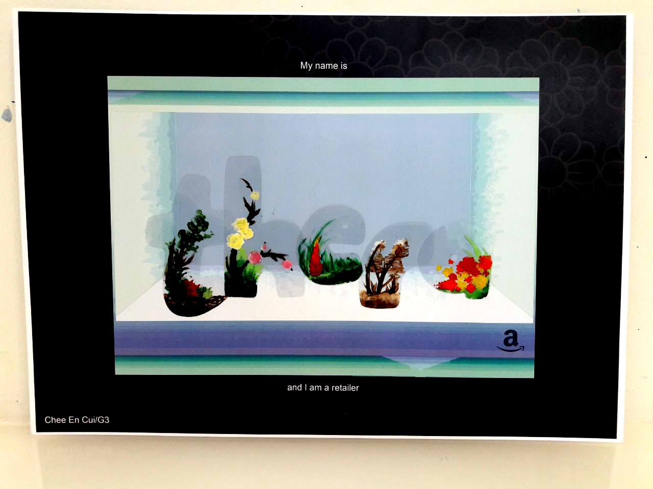
RETAILER
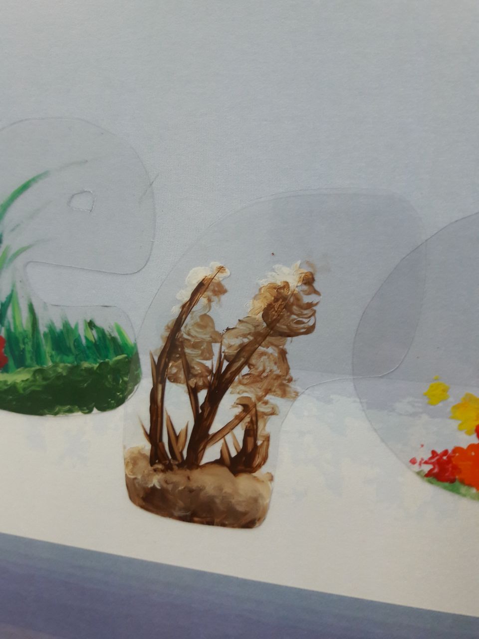
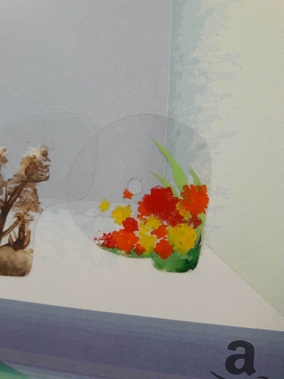
(rendered interpretation by superimposing traditionally cut and painted plastics onto digitally created background)
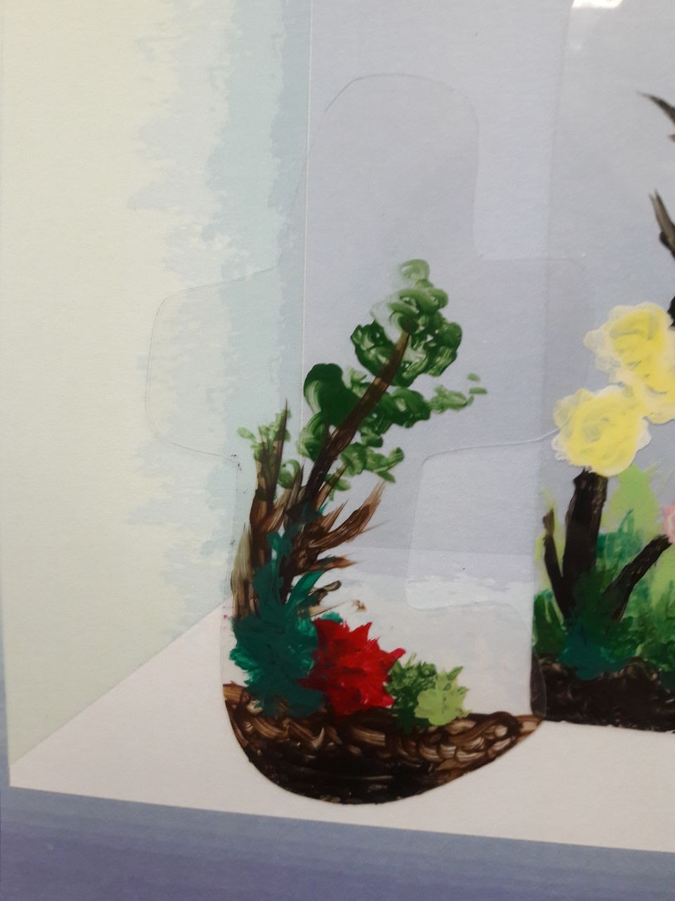
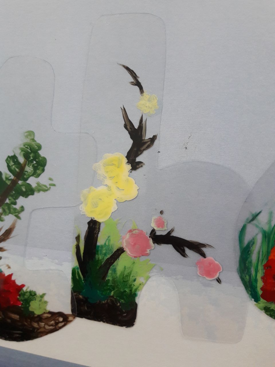
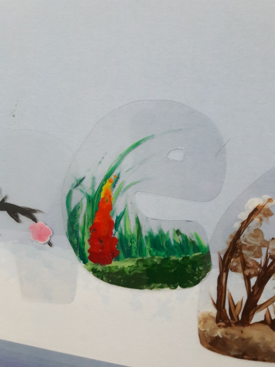
Of terrariums
Amazon logo (implication of online selling)
Acrylic on cut plastic
Shaping of terrarium with plastic, display of terrarium through plastic
Convex “bubble” font to resemble terrarium’s curved surfaces
Browns and greens with red-orange-yellow to resemble terrariums’ trees/plants and flowers
Background
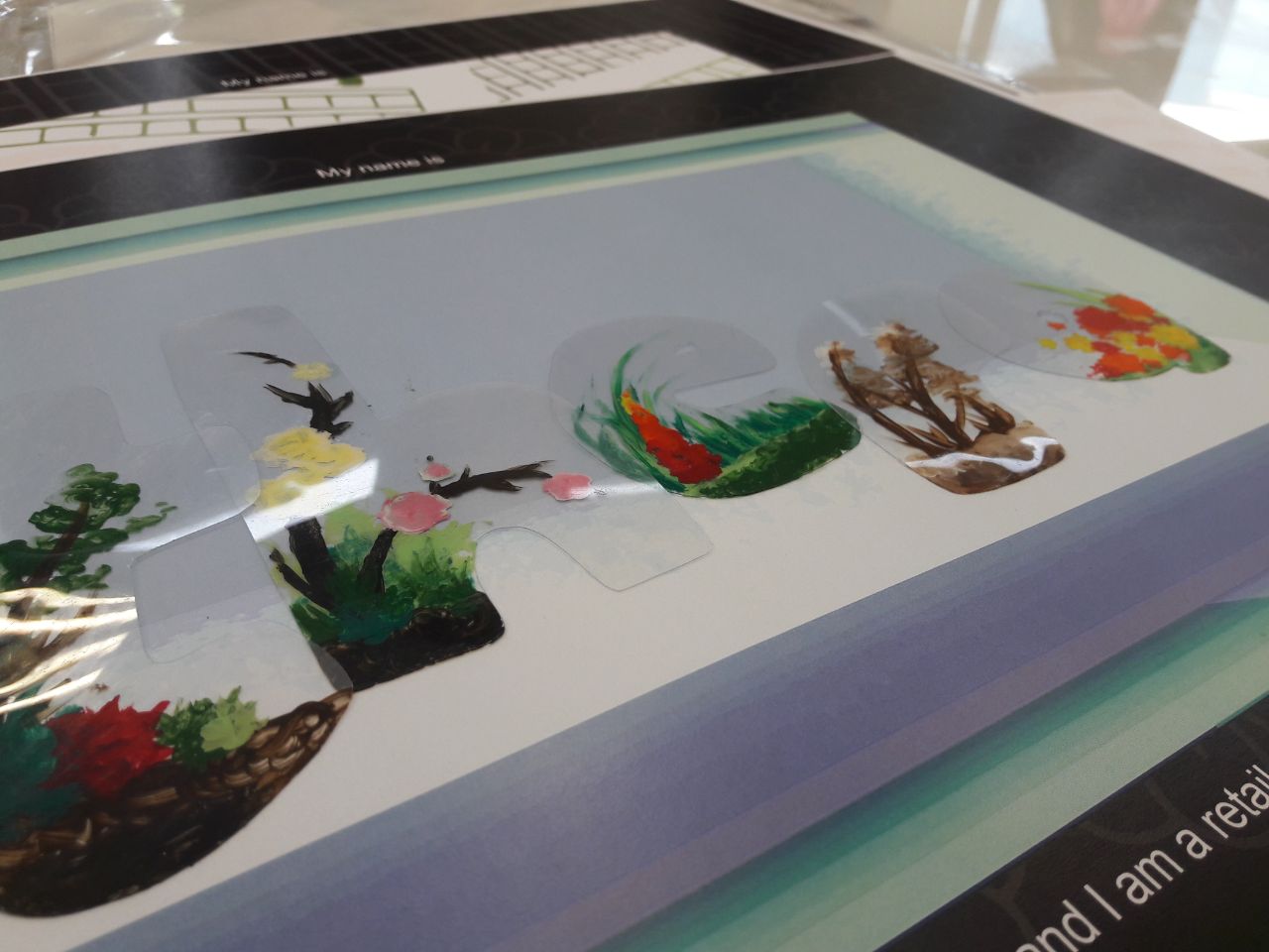
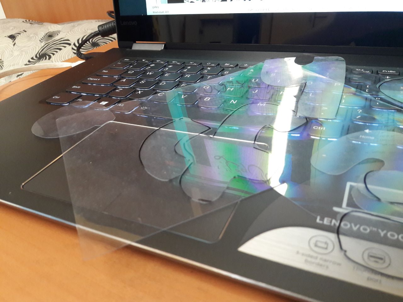
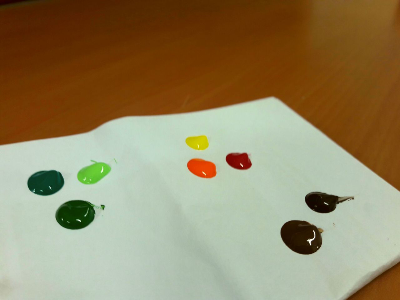
Cutting of plastics.
Colour choices. Used acrylic paints directly from the tube: browns, greens, warms and white.
Painted on the back side of the plastic to “contain” the plants
For some variety, I changed it up a little here and there.
Amazon logo reference.
What I stated during the presentation was that the difficulty was really in using Illustrator, as aforementioned and suggested, particularly in relation to the brush creating (it took me a while to understand joining and separating shapes too). For me, too, the difficulty always lies in making the product match the overarching concept I have in mind, which is a necessity for me lest I end up with too wide a scope and a lack of direction. Certainly, though, what I HAVE taken away is that it’s always good to experiment nevertheless, and to avoid creating the “final” product too early lest it’s subject to changes when you think of something better.
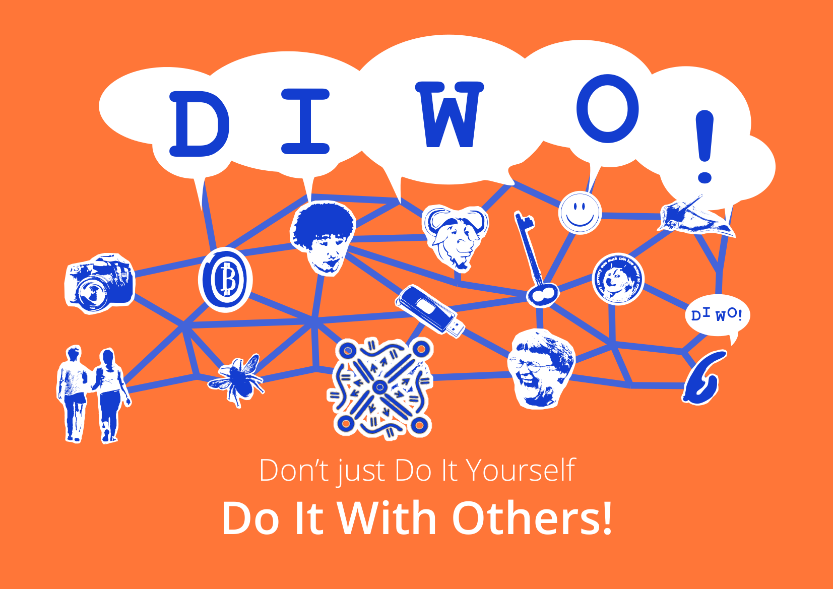
Do It With Others—The name says it all. To give due credit, DIWO is essentially the overarching theme guiding our lesson objectives. It makes sense: with a title like Experimental Interaction, it’s certainly most important to focus on, you guessed it! Interaction, especially those experimental in nature, which is what DIWO is really all about.
Image courtesy of Ruth Catlow, of the DIWO graphic.Logo courtesy of Furtherfield.
Furtherfield, an art community, is the proponent of this collaborative approach. It is in itself a revolutionary organisation heavily concerned with “collaboration and experimentation”, contrasting traditional perspectives of the artist as an individual, of art as the product than the process1. While still maintaining a physical gallery in Finsbury Park, London, Furtherfield also makes full use of online platforms and technology.
Many of its projects fall into the social practice art category2, including DIWO, which focuses on engaging “with social issues while reshaping art and wider culture through shared critical approaches and shared perspectives” (Catlow & Garrett, 2007). Simply put, it’s about working together to create something great, perhaps even greater than if we all worked individually to make our own individual things.
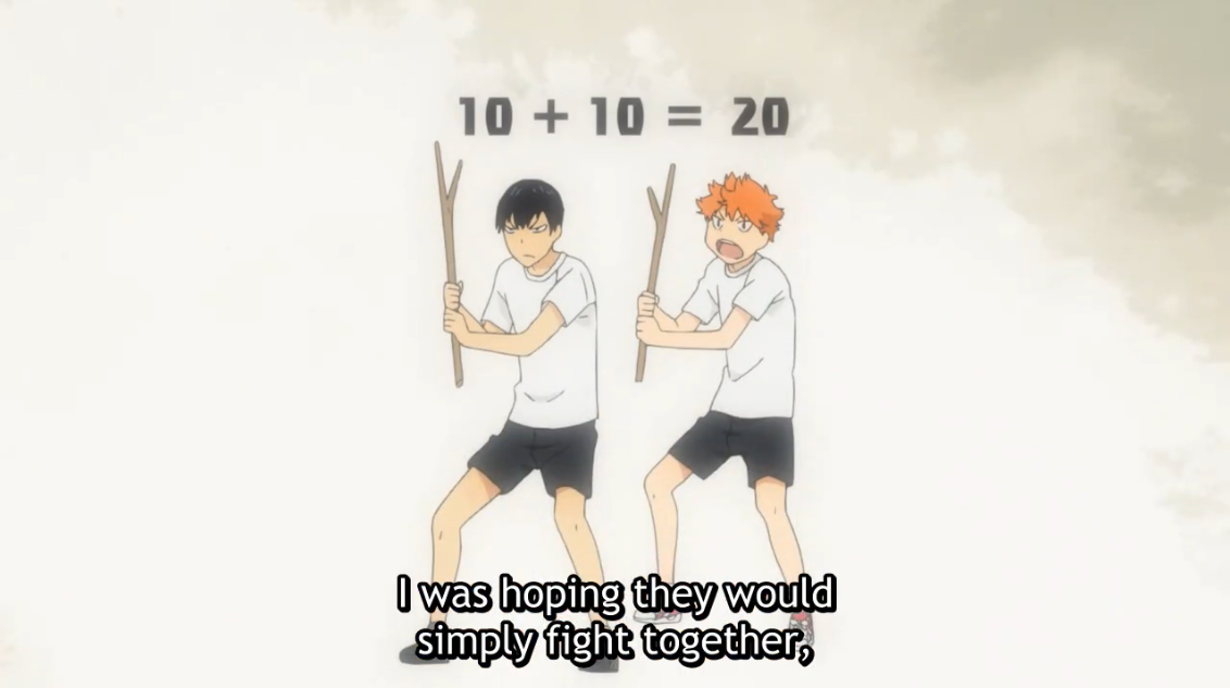
From Haikyuu S1E5. I know this isn’t exactly professional, but it, strangely, captures the idea rather well.
As aforementioned, the importance of different people coming together to create something, is in the myriad of ideas which can be derived from a database larger than your own head3.
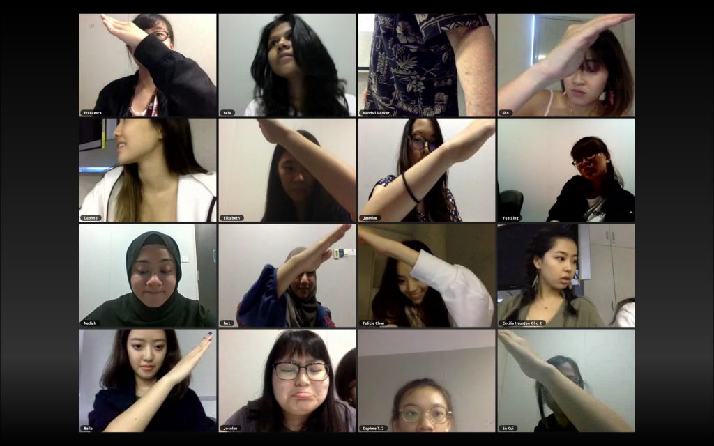
On a more logistical level, it might even simply just be that there are some things you can literally only do with others, like creating a gigantic cross across multiple screens.
Screenshot courtesy of Randall Packer, from the Telematic Embrace micro-project. Certainly, it would be difficult, if not impossible, to do this alone.
As established by Randall Packer before, too, this form of creation will definitely require “negotiation”. This was also reiterated during the lecture, where Marc Garrett remarked that individuality should be kept, but also challenged4. Furtherfield’s own projects are certainly no exception. VoiceOver Finsbury Park, for example, relies on the willingness of the participant to give up a degree of privacy, so as to benefit the future of London5.
Image courtesy of the Museum of London.
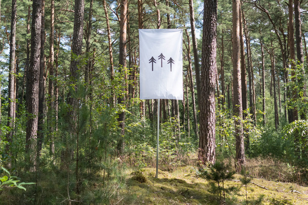
One of the most unique things about the DIWO approach, though, is that much of it is heavily based around technology, and experimentation with it. Blockchain6, as mentioned by Garrett in the lecture, is an example, where the algorithms of the decentralised database allows for mechanised security.
Photo courtesy of the Institute of Network Cultures, displaying the blockchain-based Terra0 project7.
To end off, a key feature of DIWO is merely that “the process is as important as the outcome”8. Perhaps even more so, in that the artwork is often not the end result, but the process through which it is made. Sometimes, the artist is nothing more than an engineer who creates the platform, while the actions of the audience is the art itself.
Photo from Medien Kunst Netz, of the 1980 artwork, Hole in Space. A classic example of the artist as the engineer, and the audience as the true artwork.
Due to the word count, I’ve placed footnotes on everything which had supplementary, interesting information. Additionally, references are also listed where appropriate.
1 From Furtherfield’s About Us page (link). It is also stated that, apart from various indie movements in Britain, their main inspiration was that of the open source structure.
2 Previously mentioned in my post on Open Source. As I’ve mentioned before, ‘social interaction is often an important way to express those messages [of social activism]’.
3 Previously mentioned in my post on the Telematic Embrace. The significance is that ‘the panel discussion involves 60 participants from over 30 countries answering in real time, bringing a myriad of opinions, shaped by each individual’s experiences in their various cultures, to the table’, a prime example of how collaborative work can lead to a much more interesting result.
4 From Marc Garrett’s DIWO Lecture (link), 00:14:25 to 00:14:32.
5 From a review on the Museum of London. VoiceOver Finsbury Park is described as a “hyper-local social radio project, allowing instant, open conversation between people who live in the same building”. The objective is to improve the quality of life in the city through creating connections between people who may have otherwise shunned each other.
6 Blockchains are defined as “a decentralised database cryptographically secured by a network of computers” (00:32:27 of Garrett’s lecture). Furtherfield, being an organisation interested in the use of technology in conjunction with art, works a fair bit with them, such as in their Blockchain Imaginaries Spring Editorial. While blockchains started out as a form of mathematical technology for things like secure finance, they have increasingly become a medium through which artworks can be produced, especially artworks associated with automation, such as terra0 (detailed below).
7Terra0 is an example of an artwork powered by a blockchain system. How it functions is that the forest, in a sense, governs itself through the use of algorithms (i.e. decentralised autonomous organisation). Key themes involve “ownership, personhood and autonomy” (Ueberschlag, 2016)
8 Quoted in Packer’s article on Open Source Studio, but originally from Marc Garrett. As mentioned at the start, a prominent idea in the modern style of “experimentation”, subverting traditional notions of the product as the art. Interestingly, we learn in another class that this is an idea which is closely associated with modern graphic design too, where the concept is more important than the product.
Catlow, R. & Garrett, M. (2007). “Do it With Others (DIWO): Participatory Media in the Furtherfield Neighborhood”. (link)
Previously, I established the brainstorming behind the main concept, and the selection of jobs and names. This post focuses more on compositional process, edits after consultations, etc.
Note that as of this point I’ve yet to particularly finish compositions, in that I prefer to work on and finalise a draft before actually embarking on creating the final piece. This, unfortunately, means that I’m very susceptible to changes which MUST be made to the final piece for it to look alright, even if it SUPPOSED to look alright according to the draft. Said final changes, if any, will be updated in a separate post.
Consultation 1 (via email)
I sent Shirley the sketches from previously, along with a few new ones. These were the general ideas I had in mind, though:
Photographer. Shirley mentioned not to force the shape of cats into the letters.
Translator. It was vaguely boring, but nothing particularly seemed wrong with the composition to me. Shirley suggested dissecting Japanese characters and turning it into a typeface. She also suggested a vertical placement to suggest the Asian association (though not recommended in general!)
Retailer. I had a few doubts as to composition due to the boxy, orderly form of the online shop, but pushed them aside in favour of the letters first. Shirley suggested having the terrariums slightly rotated than head-on, and to actually find out what terrariums look like (since they looked like vases).
Blogger. I had literally no idea, and thus attempted to modify food into shapes. Shirley mentioned not to “force” objects into certain shapes though, and thus I revamped the entire design.
All in all, the conclusion was mostly to avoid forcefully warping objects into certain shapes, and to add more dynamism through avoiding straight lines, if possible.
Consultation 2
I attempted to have a clearer composition by using Illustrator to make vector sketches.
Photographer. The idea still remains the same, but the typeface was incomplete and thus not shown. The idea I had in mind, though, was that of dissecting and reassembling cats to make letters.
Translator. With the previously mentioned genkouyoushi in mind, I attempted to figure out how to work the composition to have the name in focus while still in the genkouyoushi format. Shirley, however, suggested that it wasn’t necessary to have the words in the paper, but rather have the paper as a background texture.
Retailer. The idea remains the same, but with the letters slightly rotated here and there. I also established that I would likely paint it since digital painting is unavailable to me, and vector is still too new for me to effectively work anything.
Blogger. As can clearly be seen, I really had no idea, and tried focusing on the nature of blogging as something wordy (by putting in common words used in blog posts) and that of the plate and cutlery to imply “consumption”. When I mentioned my lack of ideas, Shirley suggested reducing the scope of food to get a clearer image, and thus I narrowed it down to sushi on a whim.
Other than that, I also established the Translator font by doing as Shirley suggested:
Dissecting Japanese strokes (specifically, hiragana), then
Mixing them together to form the letters
(insert picture when I actually have it)
I didn’t bother to try to make it look like actual characters, as opposed to a clear amalgamation of preexisting Japanese strokes.
Email Suggestion
Shirley mentioned to Google to see what already exists, which I realised I didn’t even think of.
1. Cat Photographer
The font I had established in the meantime. This was done by downloading many, many cat photos, using the Lasso tool to take out various parts like the legs, ears, paws, mouths, eyes, etc, then pasting them together. I mainly used tails and legs for direction, with smaller parts used as per appropriate to fill spaces based on their shapes.
The key image is cats, so I searched for cat typography.
Cats are collaged to form the alphabet.
Many cats together form the shape of the letters.
Cat-related images form the letters: I think it’s really cool.
A sort of very extensive serif defines parts of the cat, and negative spaces to change the shape.
Of all of them, my current typeface resembles the first and second most closely, that of the collaging of many cats to form the letters. Looking at it makes me finally understand what Shirley meant by cat gestalt, and what she meant when asking what I’d do to cover the gaps during consultation (which I didn’t understand at the time, but now I think it meant that she thought I would be putting a lot of small cats together?)
On the bright side, the misunderstanding means that, yes, it’s not a mainstream idea currently in use, probably because who would even want to cut up cats?
2. Japanese/English Translator
Nothing much occurred other than practices with brush and ink to test what consistency would be good. I particularly enjoy when the brush separates on swirls to form multiple lines, and when it runs out of ink when finishing the stroke.
Attempts to write out were not very effective. Also, I highly doubt modern genkouyoushi can handle ink without bleeding, so the consensus is to create each stroke separately (on hot-pressed watercolour paper for good measure), then scan them in.
Based off the Japanese hiragana to look like actual Japanese characters, when they actually aren’t.
Similarly, based off katakana (another Japanese script) for a similar effect.
Not sure what exactly to call it, but it’s based off… Essentially, the Japanese equivalent of the Chinese bopomofo.
This directly uses Japanese katakana as is, just with a few rotations or flips as per necessary.
It seems to be a rather common idea to edit Japanese strokes into English words… I’m unsure if it’s considered too similar due to that, but I’m inclined to believe it’s alright, simply because most typefaces seem to be attempting to convince viewers that they are legitimate characters, while I’m merely dissecting and reassembling without attempting to make it convincing.
3. Terrarium Retailer
Since then, I attempted to make the actual picture, but while watercolour translucency is effective for the terrarium, its severe dilution makes the colours somewhat dull. Also, I’m out of practice.
Actual letters in the terrarium.
Terrarium shaped as letters, the plants growing on it.
Trees in the terrarium curving to form letters.
Plants forming the letters within their “terrarium”.
At some point we must all remember that if we were clever enough to come up with something entirely unique, we wouldn’t need to be in school. Mine is really rather similar to the 2nd one, apart from the direction (plants grow upwards than sideways), font (bubbly than straight cut) and colours (mix of other colours than just green).
4. Sushi Blogger
After the consultation, I decided to try making a sushi art brush in Illustrator, of which this is the prototype (lacking details or whatsoever). In the middle left is the tileset for the brush, while the middle features my attempts to use the brush together with different fonts. In the top left corner is the rice texture brush I attempted to make, which does not seem particularly effective.
To be more precise, it’s maki. Curves are defined by sliced maki, straight lines by makis lined up, and diagonals by chopsticks.
Rice grains form the letters, with some topping for the added effect.
The typeface takes after traditional Japanese calligraphy styles.
Words curve to form contours, while being confined in their area.
I have tried Googling “sushi illustrator brush” to no result, so…? Seeing the 2nd composition reminded me that I hadn’t thought of a suitable background, though, so I considered a sushi plate.
In Illustrator I might envision this as a top-down perspective, with the plate implied through its patterns and textures. However, this made me realise the fatal problem of perspective: the sushi would be lying sideways on the plate if the rice were visible… Also, if it were straight on like the 2nd reference, it would be somewhat lacking in dynamism.
Consultation 3
I raised the following questions:
The composition of the Photographer
I felt it was not focused enough due to the background
In response to the concern, Shirley suggested trying another layout which would similarly suggest a camera.
For example, rather than the lens, using the camera display screen.
The composition of the Blogger, in terms of the perspective
A top down perspective would mean that the sushi is technically lying on its side, an improper placement…
Shirley mentioned the possibility of making swatches for the rice and salmon texture than a brush, and adding perspective to the plate instead
The composition of the Retailer, which was somewhat too rigid
The initial idea involved boxes and boxes in straight lines to match the online shop format, which was somewhat boring
She suggested putting the terrariums together in a bundle, than separating them. It’s amazing how such obvious things don’t always come to mind!
The medium of the Retailer, of which I couldn’t quite decide what would work well
In accordance with the terrarium texture, I attempted painting directly on the plastic as an alternative. Between the dull watercolour on paper and the simplistic acrylic on plastic, she showed a preference for the plastic, and gave crucial suggestions on the gluing process.
The technicalities of Illustrator, where the different custom brush options was really confusing me and Google was not helpful enough
The technicalities of printing, regarding bleed area
The ideation and drafts seems alright, so the conclusion from here on out is to actually get to making the final pieces, and any necessary edits, since it’s very possible that it may not actually look good in the end even if it ought to as per the drafts.