Assignment 01: Human Emotions with Digital Images

For this assignment, we were tasked to create a series of images that would evoke or express various emotions.

Final Images

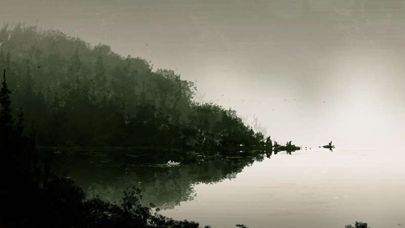
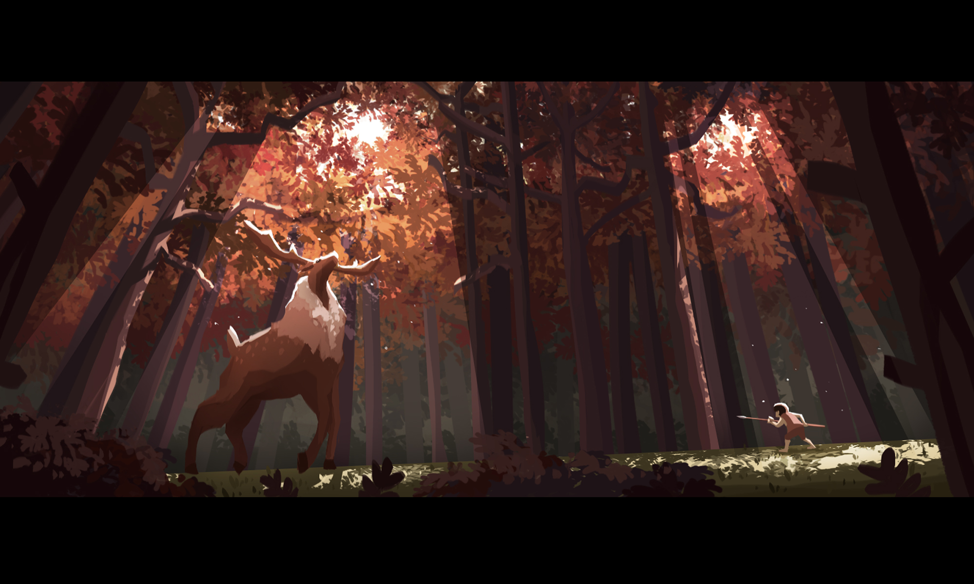
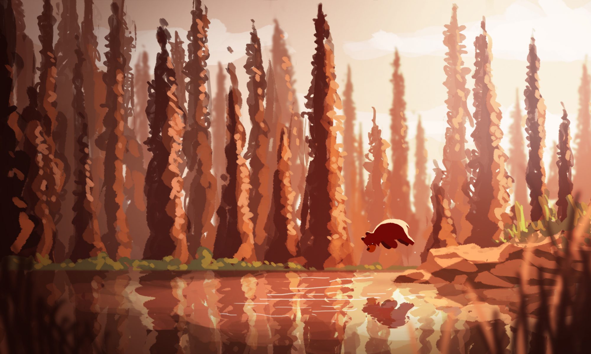
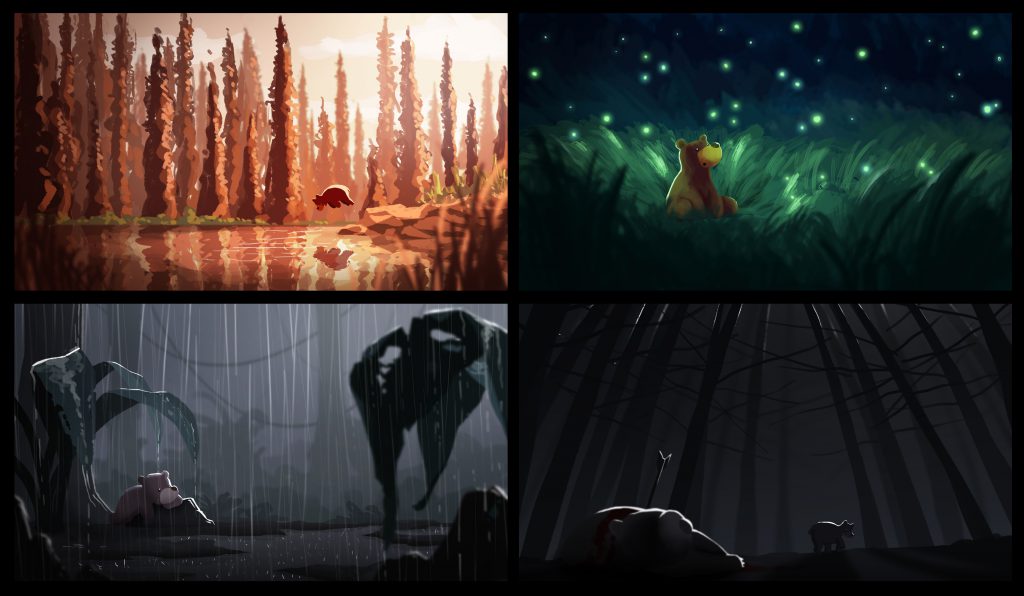
I have created a series of four images which depicts the emotions of happiness, surprise, sadness, and fear. The series revolves around a bear and his interaction with different environments, each evoking a different emotion  to the viewer based on colours and lighting.
Final Images

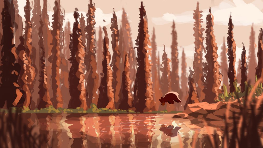
For Happiness, I picked a sunset, autumn-like colour scheme of warm orange. I wanted to evoke a sense of tranquility along with happiness; the bear jumping into a calm lake in a seemingly peaceful forest.
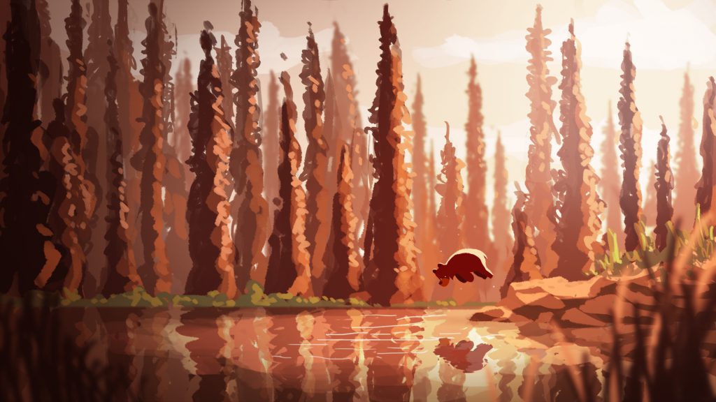
Image 1 – Happiness

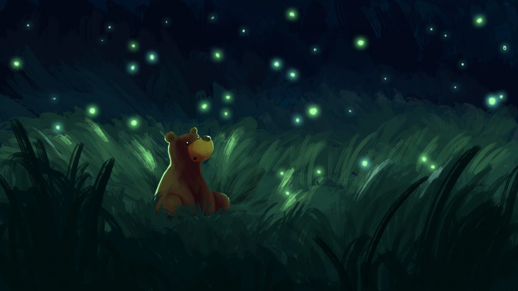
For Surprise, I wanted to express this emotion by introducing specks of light in a dark environment. A field of fireflies in the dark creates a sense of wonder and mesmerisation.
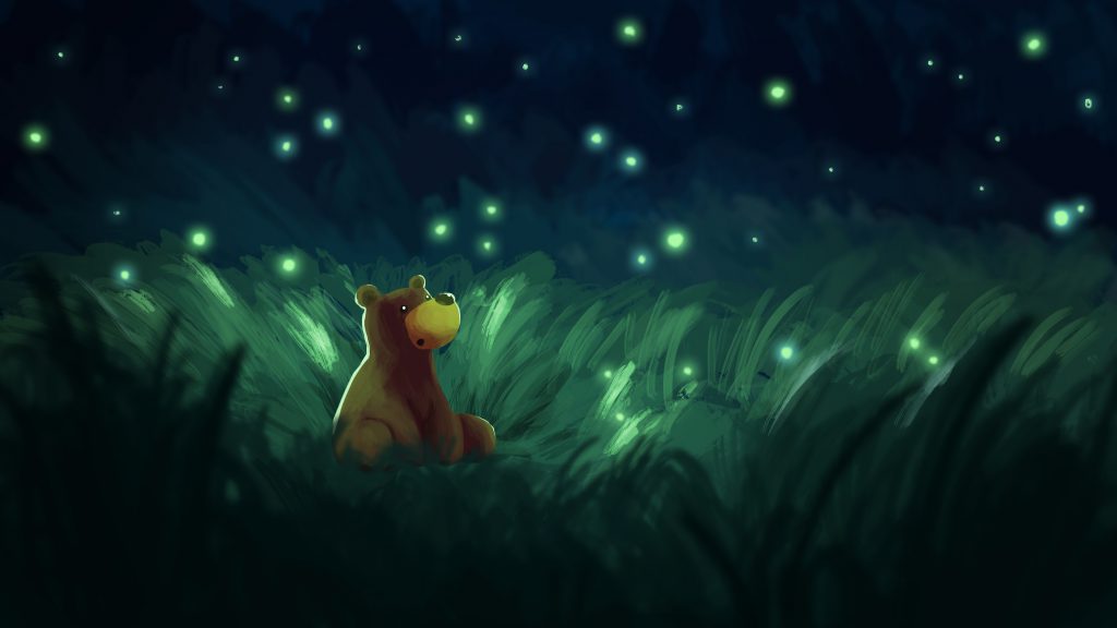
Image 2 – Surprise

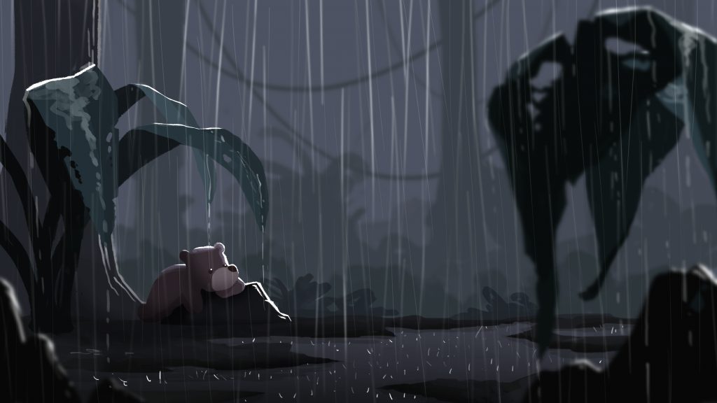
For Sadness, two things came to mind, dull muted colours and rain. Rim light was included to  add some brightness to the otherwise dull image and to separate the various elements from the background. Rain was added to give the illustration a more gloomy feel.
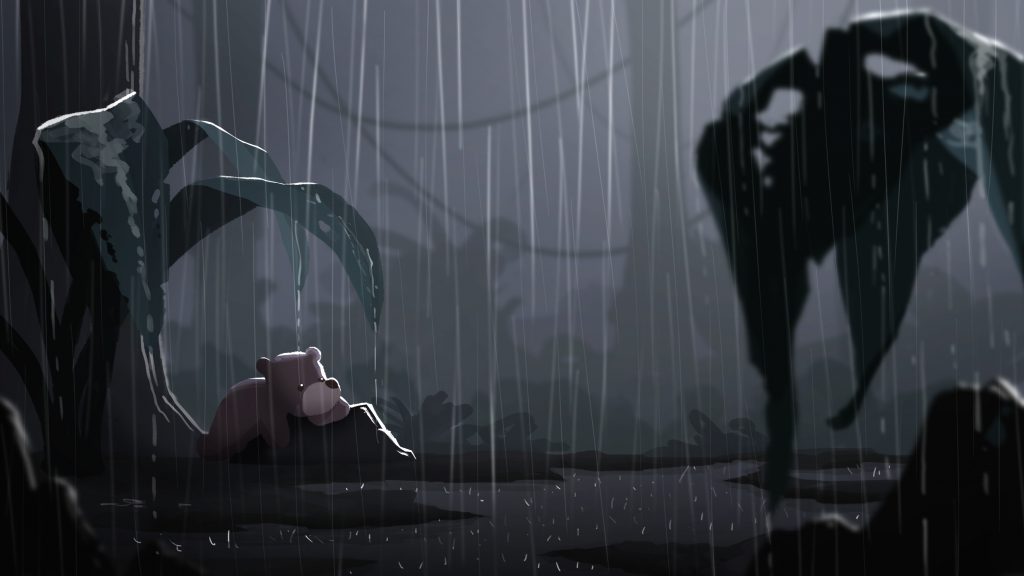
Image 3 – Sadness

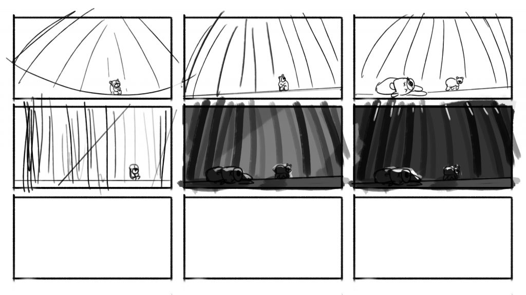
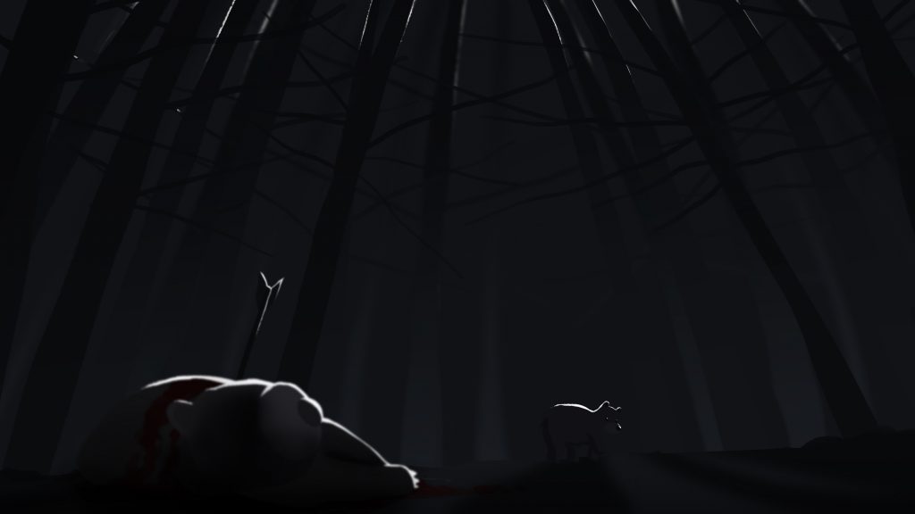
For Fear, I initially pictured the bear alone in a dark forest, but I thought that if there was another bear which had been shot dead in the scene, it would evoke a stronger sense of fear for the bear. Rim light was very important to distinguish the characters and trees as I wanted minimal light in this scene to evoke this emotion. A dutch tilt was also incorporated to create a sense of uneasiness in the scene.
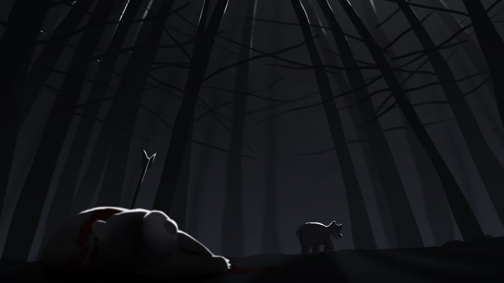
Image 4 – Fear

Thumbnails & Colour tests

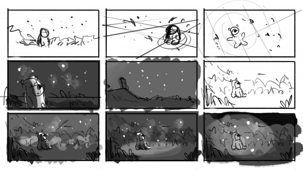
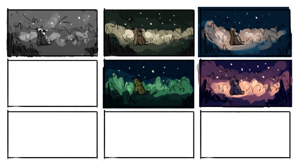
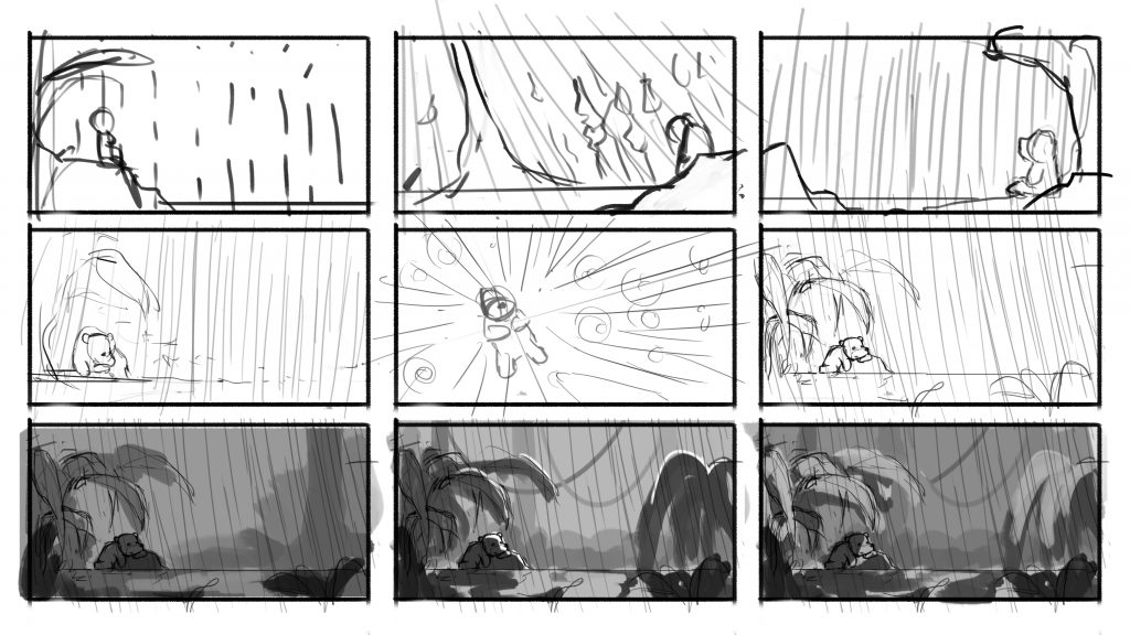
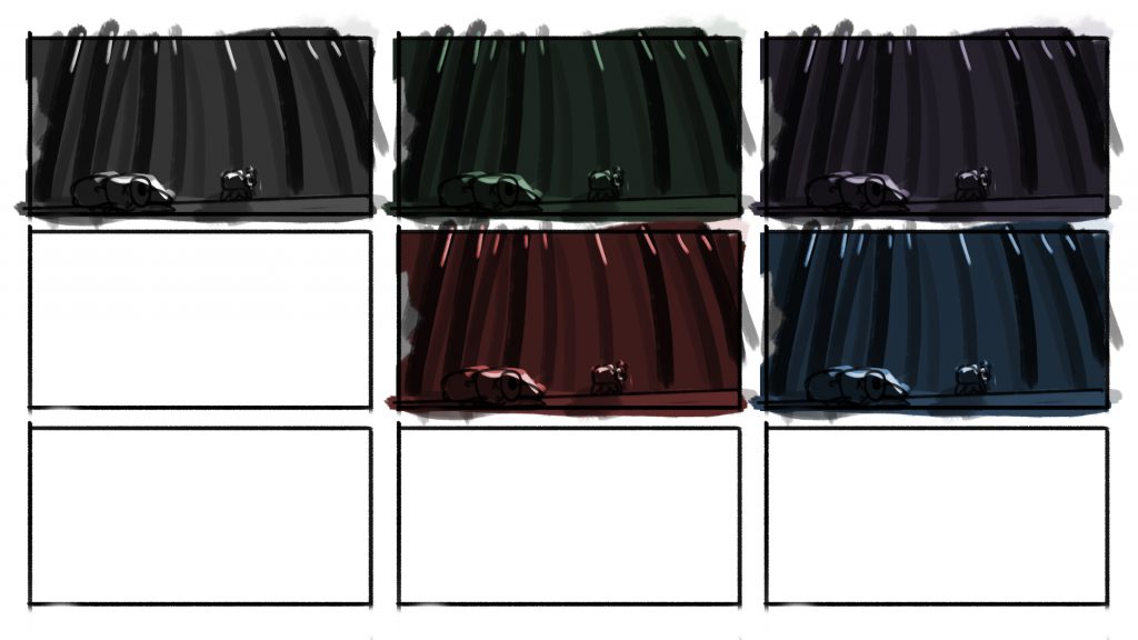
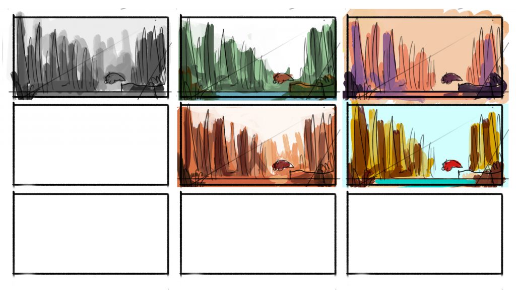
I started by sketching out thumbnails of different compositions for the various emotions. I then blocked out the values in grayscale. After which, I experimented with a few colour schemes and selected the one that best portrayed the particular emotion.
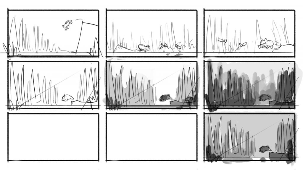
Thumbnails (Happiness)
Colour test (Happiness)
Thumbnails (Surprise)
Colour test (Surprise)
Thumbnails (Sadness)
Colour test (Sadness)
Thumbnails (Fear)
Colour test (Fear)

Final edits

The final step was to add a subtle filter of light to enhance the image, creating the glow from the light sources.
Happiness (Before final edit)
Happiness (Final)
Surprise (Before final edit)
Surprise (Final)
Sadness (Before final edit)
Sadness (Final)
Fear (Before final edit)
Fear (Final)

Research and references

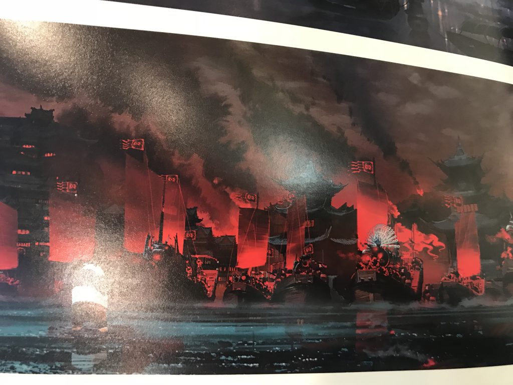
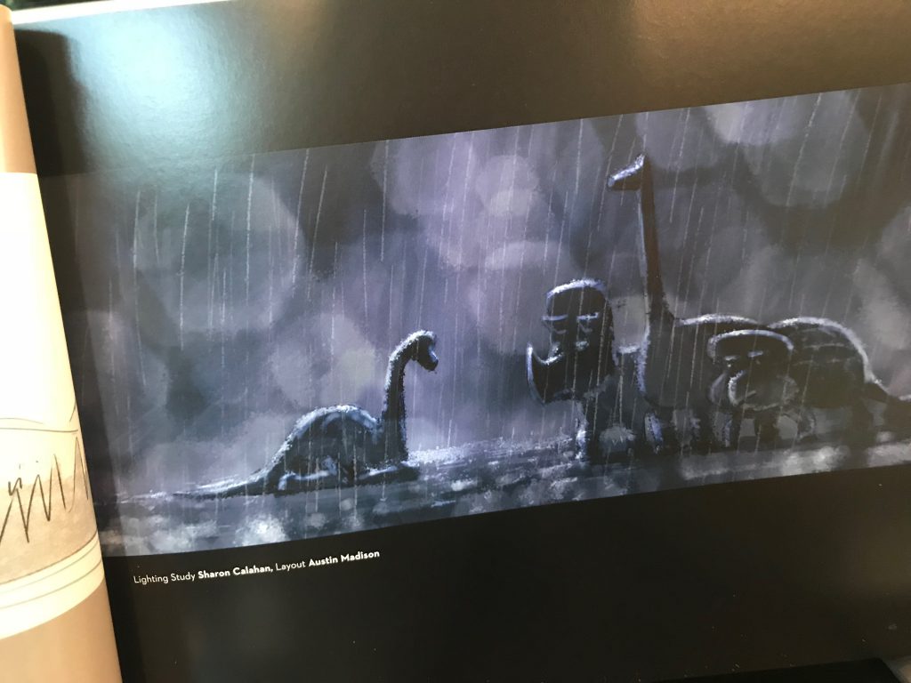
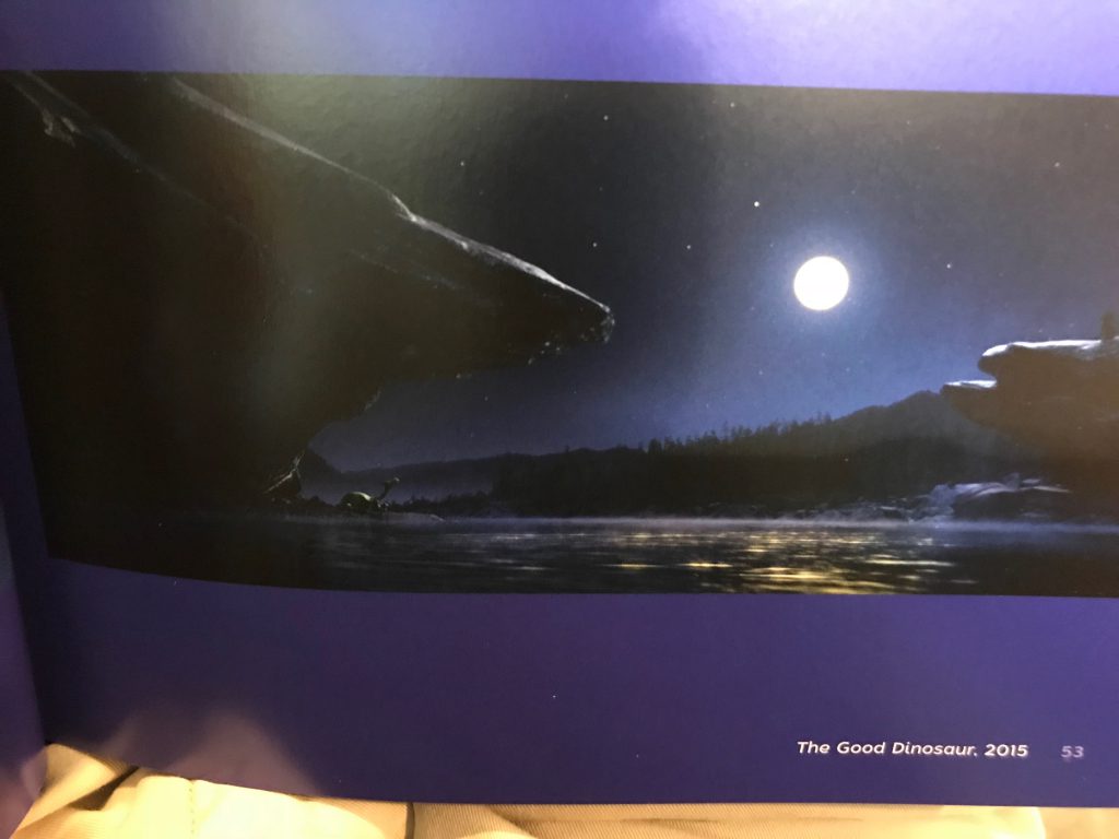
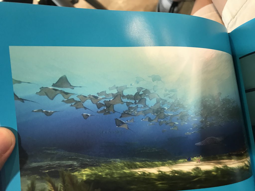
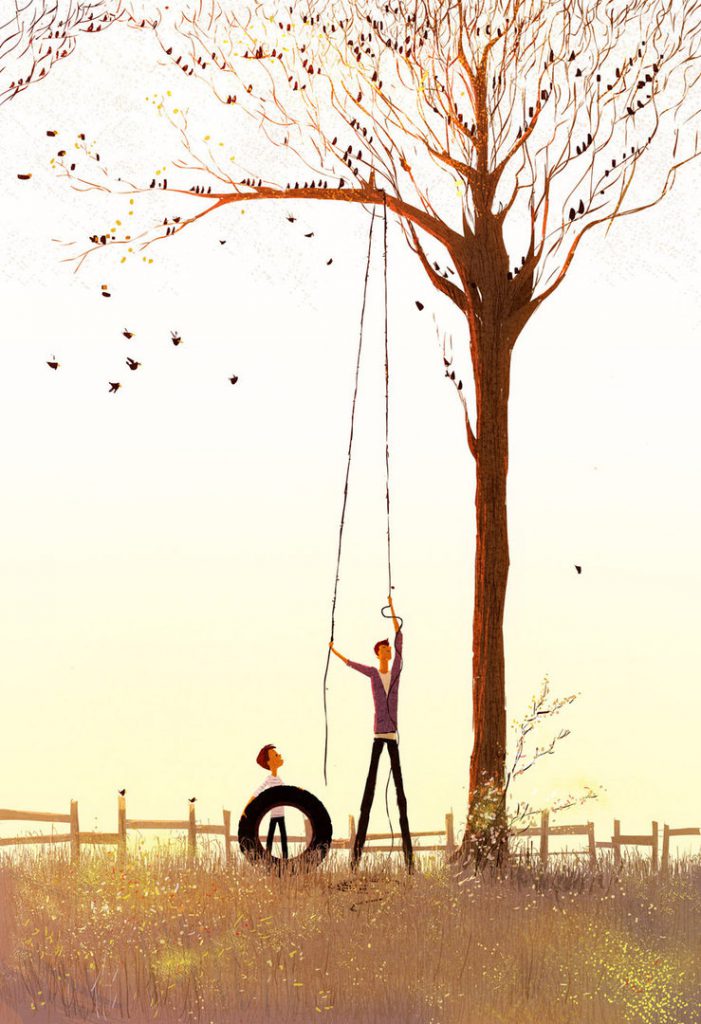
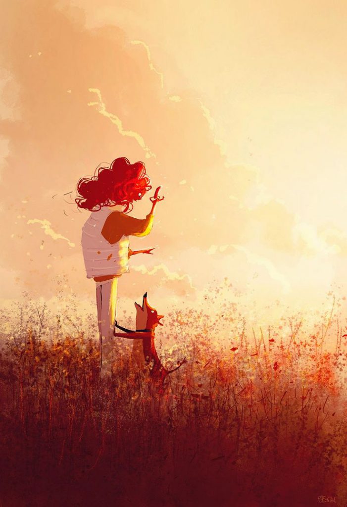
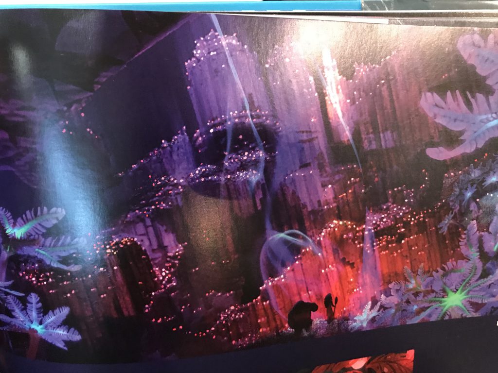
For my research, I looked at the concept art of various animation films, as well as a book called The Colour of Pixar, which contains scenes from various Pixar movies catalogued by colour. I also referenced Pascal Campion’s style of illustrating, his use of colours and the way he uses lighting to enhance his illustrations.
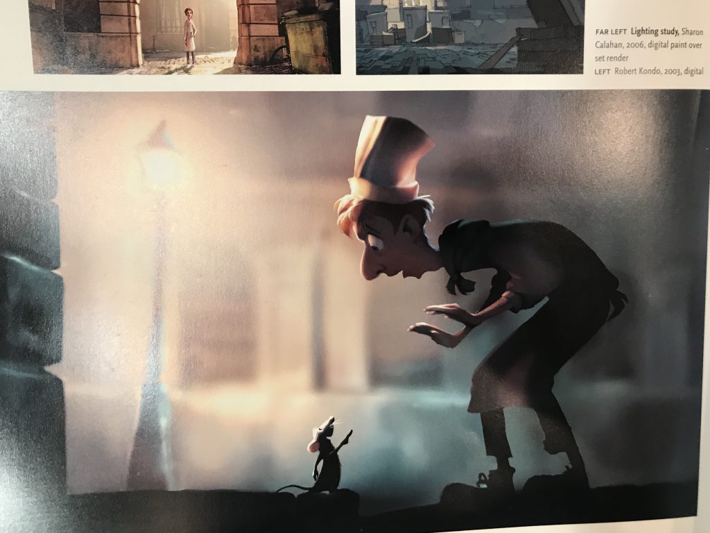
Art of Ratatouille
Art of Moana
Art of Kung Fu Panda 2
Art of The Good Dinosaur
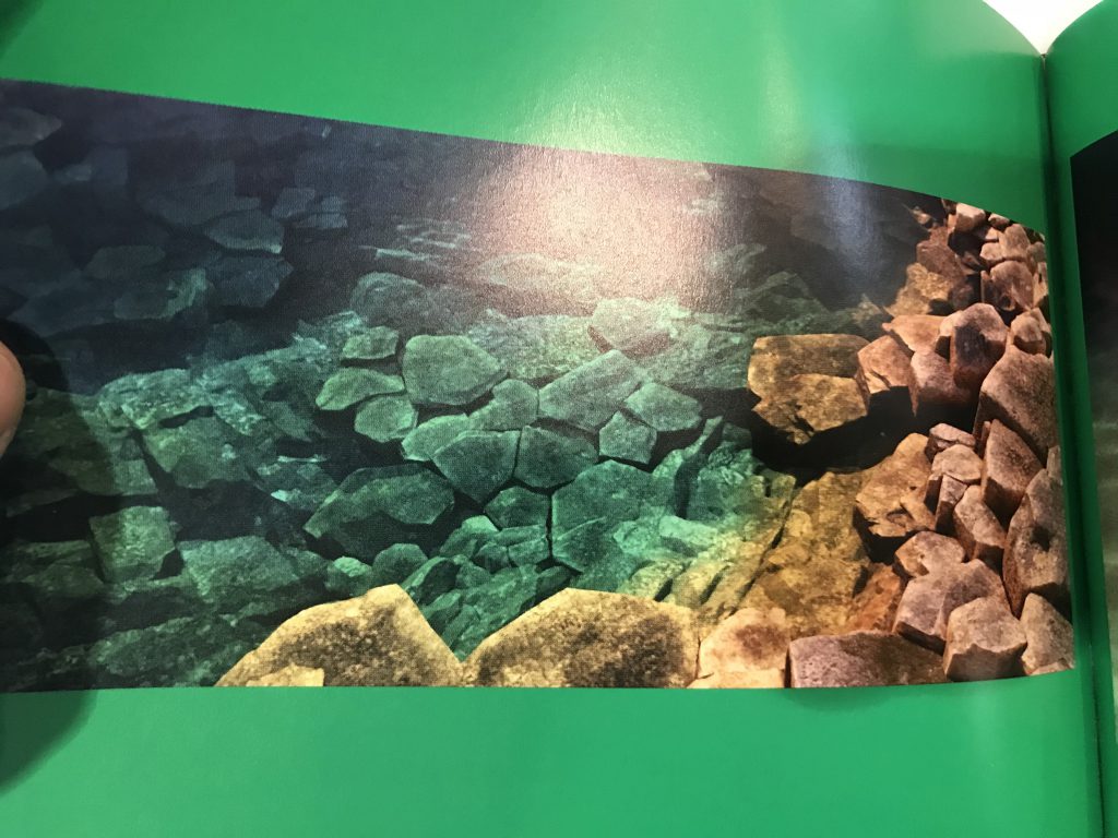
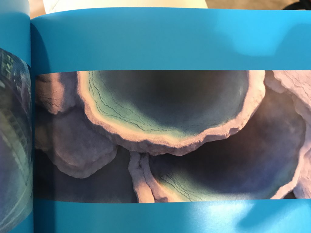
The Color of Pixar
The Color of Pixar
The Color of Pixar
The Color of Pixar
Artwork by Pascal Campion

2D Project 1 : My Line in Emo (Final Project)

The aim of this project is to visually convey six different emotions by exploring expressive mark making through the use of traditional tools.


Project 1 – My Line is Emo


OUTRAGE

Definition

An extremely strong reaction of anger, shock, or indignation.

Rationale

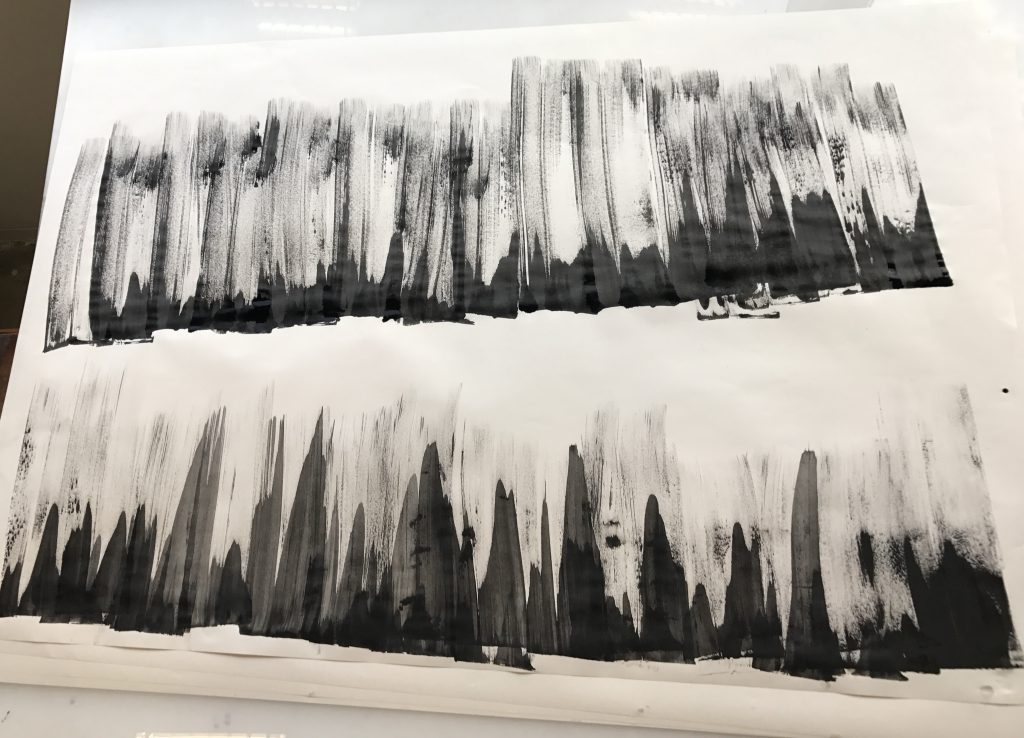
Portrayed by sharp and crisp lines swooshing by in a swift manner. When one is outraged, he would go out of control and unleash his fury in all directions, similarly, the lines seem to be flying in random directions as if in a pit of rage. The trails of ink give the lines a sense of movement and the direction they are moving in, making them look more dynamic in nature. The thick trails of ink also gives a contrast to the more thinner lines.

METHOD

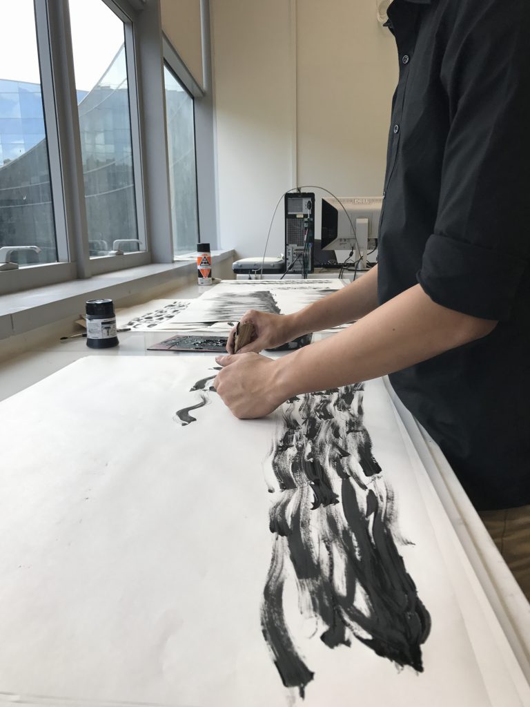
Created by chopping satay sticks dipped in Chinese ink onto paper. Trails of ink are created by simply dragging the satay sticks across the paper.

JUBILATION

Definition

A feeling of great happiness and triumph.

Rationale

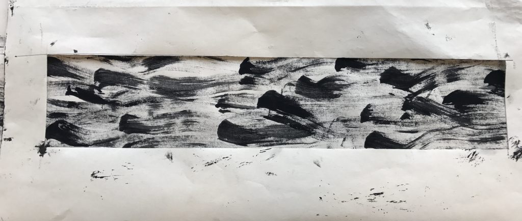
For happiness, I imagined little children playing in a playground, and therefore it inspired me to portray the emotion as little sprites, who are known to be playful creatures in fictional tales, jovially whizzing through the air. The trail the sprites leave behind creates a sense of movement and direction. The angle of which the sprites are facing creates a sense of randomness as they are not bouncing in sync but at their own pace, making them energetic and full of life.

METHOD

Created by dragging a scrunched up ball of paper dipped in Chinese and monoprint ink across the surface. I had to make sure there wasn’t too much ink on the ball of paper or else the ink trails will be too concentrated and the texture wouldn’t show.

ANGUISH

Definition

Severe mental or physical pain or suffering.

Rationale

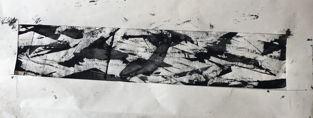
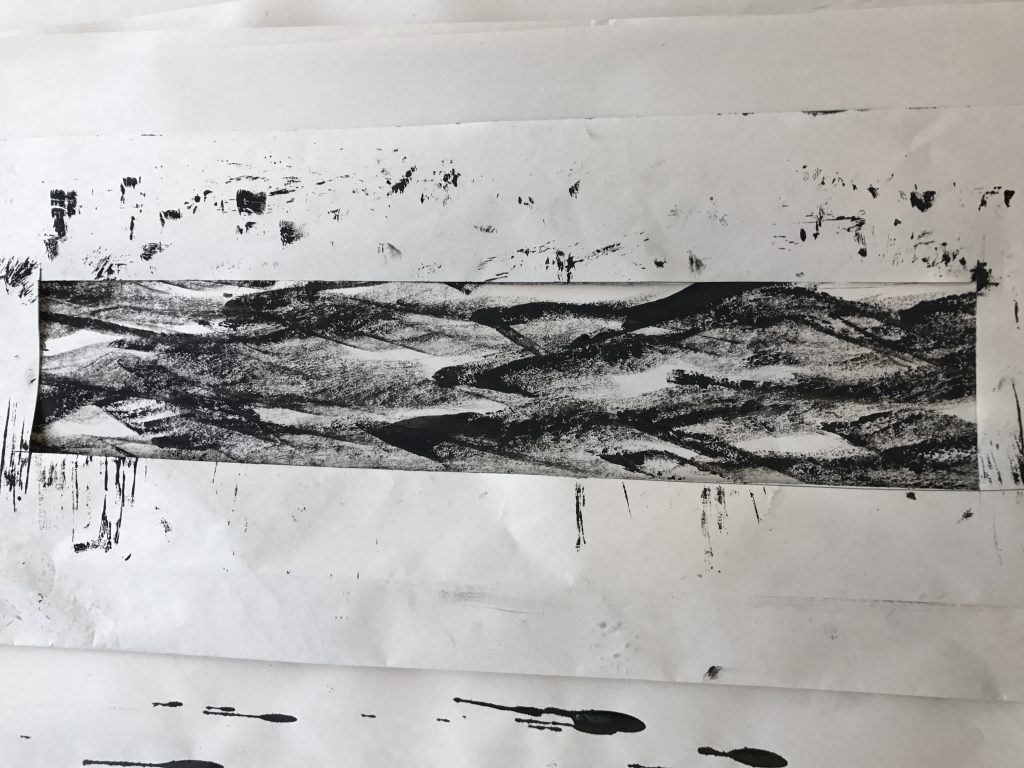
The texture immediately reminded me of the sky from ‘The Starry Night’ by Vincent van Gogh. More specifically, I once heard Beethoven’s Moonlight Sonata, which is a slow and sad piano piece, in a video online with this painting as the background. The rough and uneven texture gives a feel of desolation, the way the ink trails in one specific direction and amplitude gives it a sense of lifelessness, reflecting pain and suffering.

METHOD

Created by dragging charcoal dipped in Chinese ink across the paper. The characteristic of the charcoal gives the print a rough texture while the Chinese ink smoothens it out and blends the two.

FEAR

Definition

An unpleasant emotion caused by the threat of danger, pain, or harm.

Rationale

With sharp and jagged elements from the top and bottom closing onto each other, creating little negative space, there is a sense of claustrophobia and uneasiness in this print. The more rough and faded ink give it texture and makes the silhouette of the jagged elements less crisp and clean, and also reduces the negative space in between, creating a greater sense of melancholy.

METHOD

Created by dipping the edge of a piece of cardboard in Chinese ink and monoprint ink. The more watery Chinese ink gives a more textureless result and more crisp lines, while the thicker monoprint ink gives more texture, creating a rough trail of ink that bleeds out.

ASTONISHMENT

Definition

An overpowering wonder or surprise.

Rationale

I portrayed this emotion by having a dense vertical disturbance suddenly interrupting the steady flow of horizontal lines. It shows how something smooth sailing can turn into a nightmare in an instant due to an external force.

METHOD

Created by dragging a scrunched up ball of newsprint dipped in monoprint ink across the surface.

LOVE

Definition

A great interest and pleasure in something or someone.

Rationale

The lack of negative space gives a sense of darkness, with small specks of light whirling around like candlelights and also to give the scene a sense of movement. I wanted to make this an intimate environment with two ‘lovers’ in a dimly lit space. It also looks like an aerial shot where the camera pulls out up into the sky during a kissing scene.

METHOD

Created by painting with a paintbrush. I did not use too much ink at once as I wanted more control so as to be able to leave tiny areas unpainted. The more narrow area around the two central elements area painted using the end of the paintbrush.


Scene from Ratatouille

PROCESS

Process Parts 1 and 2 can be viewed in the links below:

2D Project 1: My Line is Emo (Process Pt.1)

2D Project 1: My Line is Emo (Process Pt.2)


2D Project 1: My Line is Emo (Process Pt.2)

Process – Part 2

Before the start of this week’s class, I did several different prints during my spare time. They turned out quite well and I saw potential in some of them for my final submission.

Dripping ‘tears’
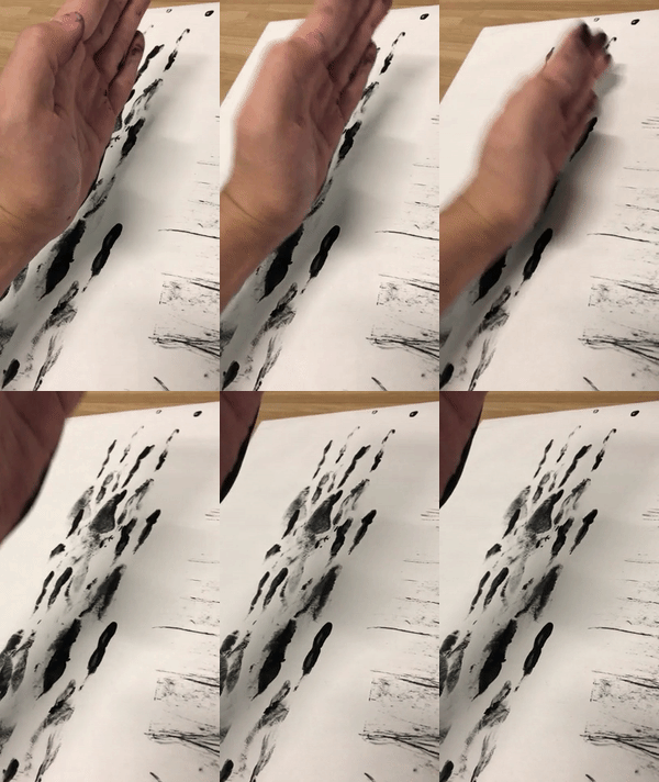
Karate Chop!
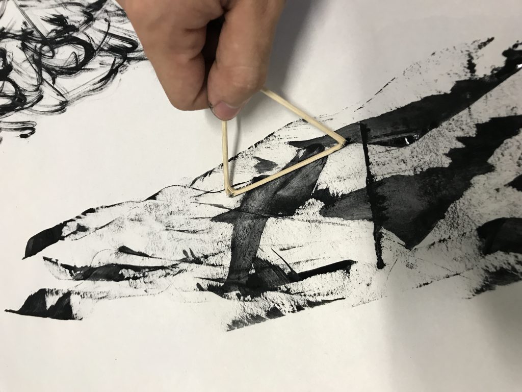
Exploring different methods of using satay sticks
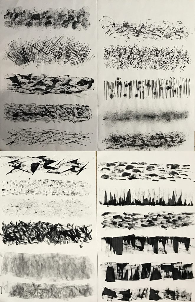
Results of the various prints

During the consultation with Joy in class, she suggested that I try using different inks, such as Chinese ink, to replicate those prints that I have made previously which I saw potential in. She also suggested making the prints much bigger so that I have more freedom to choose which parts looked better.

Upsizing
More upsizing, using different inks.

After upsizing a few, I actually found that the previous smaller versions of the prints looked better, it was probably because the patterns looked too huge when placed in the viewfinder I created, which was the size our final ‘strips’ were supposed to be. It didn’t work out, but at least I tried it.

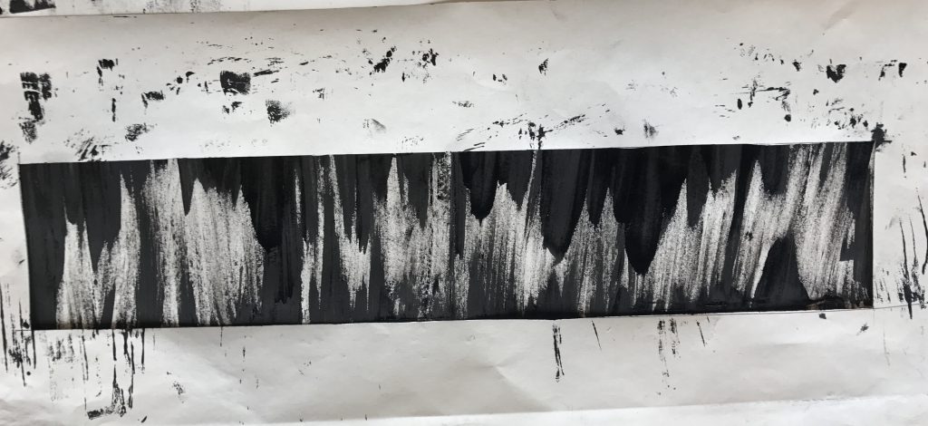
Below are four prints that I found ‘successful’ in displaying some of the emotions.
Joy – More towards cheerfulness and joviality, this print looks like little sprites playfully whizzing through the air.

Anger – Swords swooshing through the air with the blood of those killed trailing along…

Fear – A sense of uneasiness, this looks like a cave where stalagmites and stalactites are closing in on you, the minimal negative space makes it look claustrophobic.

Sadness – Melancholy, this print immediately reminded me of ‘The Starry Night’ by Vincent van Gogh. More specifically, I once heard Beethoven’s Moonlight Sonata in a video online with this painting as the backdrop. You can listen to it here hahaha –  https://www.youtube.com/watch?v=iVfPt8jgWOY


There is still ink in my fingernails.