The Brief: Hospital can be a stressful environment. What roles can graphic artist and designer play to create a welcoming and soothing environment that can potentially promote healing?
Task: To develop graphic forms that convey the notion of hope. The graphics created will be assembled into a hanging mobile for application in a healthcare environment to lighten the atmosphere of the hospital.
Brainstorming and Preliminary Ideas
I’ve mind-mapped down my definition of hope in this picture below!
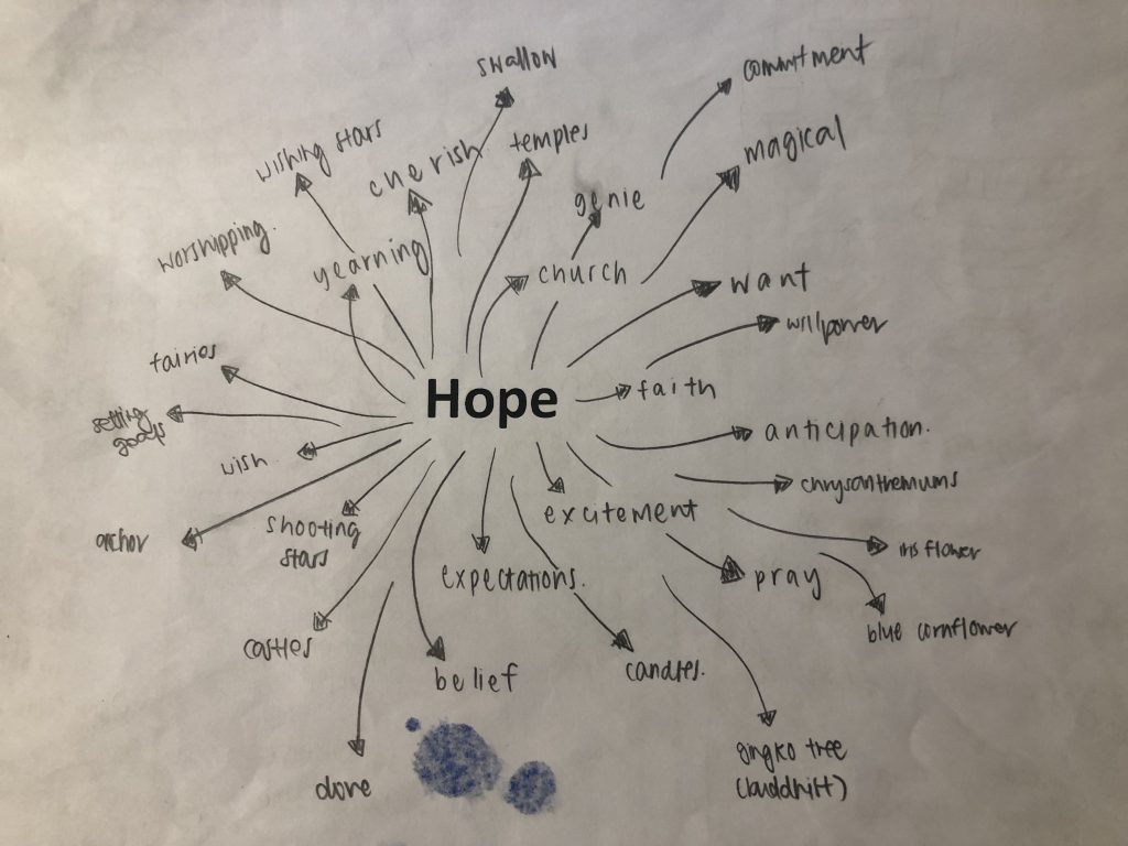
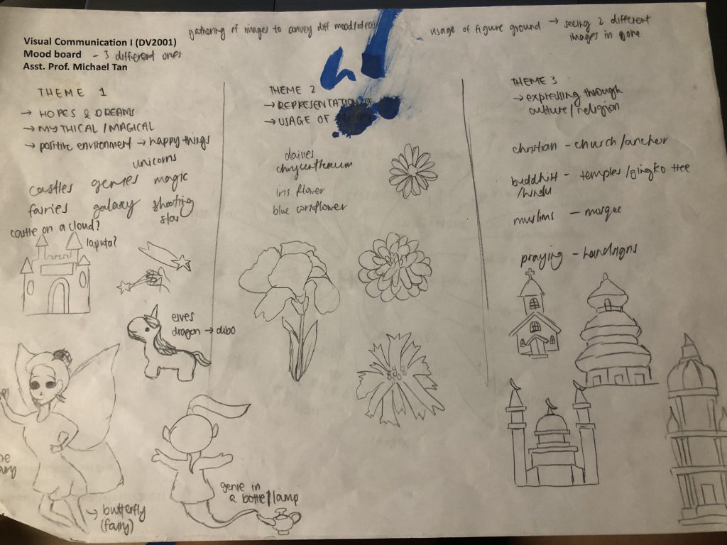
The 3 themes I’ve decided to come up with was:
- Castle / Fairyland
- Representation of Hope through flowers
- Representation of Hope through religious architecture
To me, hope was something that I dream of and envision it to be true. With that, I’ll try to think of ways to make it come true.
As the mobile was for a hospital environment, I wanted it to be something lighthearted and not serious, as I feel that the hospital itself has negative connotations to it. Thus I decided to narrow down to the theme of fairyland. It has a magical and positive feel to it, so that when patients see the mobile, it cheers them up because it reminds them of happier and younger days!
The theme revolves around the song Castle on the Cloud, from Les Miserables. The song was about a young girl Cosette, whom hopes to live in the castle on the cloud, where it’s all happiness and trouble free. With that, I went to come up with some graphics that you will see, once you stepped into the castle.
Design Development
I proceeded on to work on the graphic forms digitally and came up with a few forms.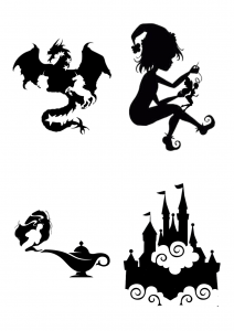
I searched for magical / mythical elements which can help me to further explain Hope. These are the elements I’ve used:
- Dragon + Unicorns + Stars
- Elf + Pixie
- Genie + Lamp
- Castle + Clouds
Upon showing it to the class, many agreed that forms 1 & 3 don’t really work out, and form 4 was the best amongst all. From there, I worked further into exploring form 4 and to come up with forms that gives off a similar vibe and style to it!
Next, I came up with another set of graphic forms and consulted Michael via email to ask for his opinion about it!
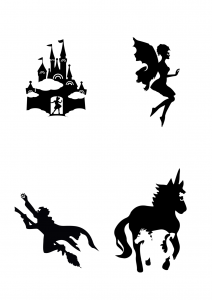
For these 4, the elements I used are:
- Castle + Clouds + Rainbows (as windows) + Girl at the door welcoming visitors
- Pixie + Rabbit (at wings) + Girl’s upper body (as face mask)
- Flying Wizard + Cat at cape + Catching a star
- Unicorn + Dragon + Girl as mask
The feedback I got from Michael was that form 1 & 3 worked better than the rest! And all forms showed consistency in theme except for form 4, and form 4’s negative and positive play wasn’t as well shown as the rest.
The presence of the girl in every graphic form was questioned as well.
With that, I tried to create more graphic forms for individual consultation the following week regarding colour play!
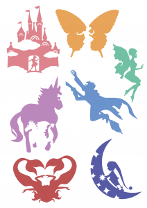
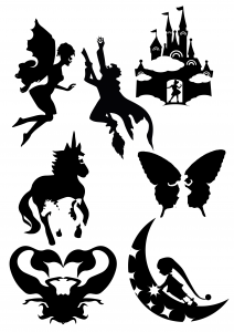
I added 3 more graphic forms from the 4 I had prior to consultation.
The 3 I added are:
- Butterfly + Girl
- 2 flipped mermaids with the tails joining together
- Pixie grabbing a star from a crescent moon
Colour Scheme
I decided to go with pastel colours as it suits the theme that I was going for – young, magical, mythical and fairyland-ish!
From the consultation I had with Michael, I realized that I don’t actually need to have that many graphic forms and could’ve easily settled with 2, as there are more than 2 graphic forms in my final form (hahaha lol)
So from there, I decided to cut down to 3 final forms, and tweak them a little more.
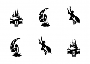
I settled on these 3:
- Castle on Clouds
- Elf Picking out the star from the Moon
- Wizard Soaring into the sky with his Cat
Each final graphic form, I came up with a few variations!
Form 1:
I contemplated on the usage of rainbows for the castle’s windows or crescent moons. I felt that by using the rainbows it will add more mess to the current elements and the moon showed consistency.
My conclusion was to use the moon in the end!
Form 2:
I used 2 different stars one with just a star, and the other with a star inside the star. Feedback I got was that either or seems fine, but there might be too many stars right now! & the girl is very redundant.
So my conclusion was to remove some stars and remove the girl cos she wasn’t really needed to show consistency.
Form 3:
The main difference was the broom, one of thicker strokes and one of lesser! Feedback I got was that the broom seems to not show the flying movement, and in general the graphic form seems to show a static movement instead of intended – the flying wizard. Also the cat can be more incorporated into the cape!
Therefore, I concluded to use the broom with thicker strokes and try to show more flying movement of the wizard.
Final Draft
After making the changes, I added in colours and tweaked the colours around so that there’s differences in the forms.
I planned to hang my mobile with reference from this image below!
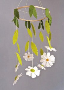

4 vertical lines were hung (to form an X) and there was a longer string in the middle of the X, which only hung the castle. For each vertical line, I used the same colour scheme (of 3 colours) along the same side of the form! I used quite a lot of colours as I think it suited my theme as people will associate it to being colourful and bright!
Here’s the colours and forms I used in digital copy!
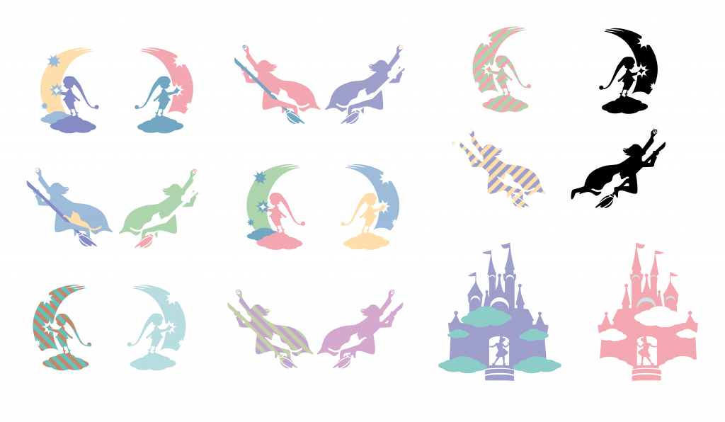
I believe the wizard flying was my strongest form that shows the positive and negative as the cat was really incorporated pretty well!
I placed the forms in alternatives (Wizard > Elf or Elf > Wizard) at the 4 vertical lines. The castle which was hung in the middle was bigger than the rest. It was to show that the castle is the main element of this project, as all the other elements exist within the castle.
I placed the castle at the lowest point, without any other forms blocking it.
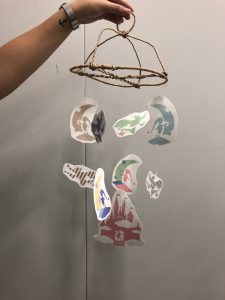
But due to my very bad worksmanship, it turned out pretty bad! I didn’t know how to cut the forms out from the paper properly as I used scissors, but was then introduced by the class to X-acto knife!! The top was also pretty badly done as I didn’t buy a circle ring and used wire to form it instead.
I also felt that the forms I originally printed were a little too huge and should probably be smaller. Also, comments I got was one of the sides were black and black was totally misplaced with the rest of the pastel elements. The elements hung on the mobile didn’t move naturally as there were too much weight for the fishing line!
Overall, the bad worksmanship made the whole mobile look bad, and its tough to look at the graphic forms with all the mess.
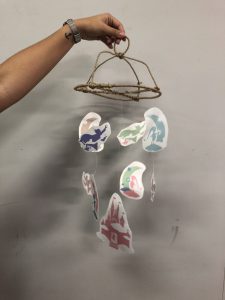
But thankfully I was given the chance to redo the mobile!
After redo-ing, comments given by my classmates were that the workmanship was actually way better and they can focus on the graphic forms instead of the bad cutting 😡
I also edited my final graphic forms colors to show more consistency amongst all the forms, and switched up the black!
Next, I will be posting my final forms and mobile!
Till then,
Flazéda!
jamz
x
