ILLUS | sexercise research

For the final assignment, we were tasked to come up with an event and were allowed to get creative with it! With that, I decided to work on a theme which will probably NEVER be allowed in Singapore HAHAHA.

The event is called SEXERCISE, and the theme revolves a sex festival where people loves sex and sees it as a form of exercise, rather than just being a form of affection of love.

Target Audience of event:

  1. Adults aged 21 to 30 years old
  2. Love having sex or the concept of sex
  3. Workout fanatics
  4. Interested in meeting other like-minded individuals who are sexually active
  5. Interested in knowing more about sex positions / trying to lighten up sex life
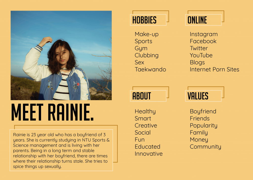
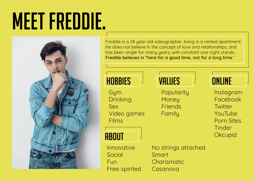
These are the 2 personas I came up with whom will be interested in the event.
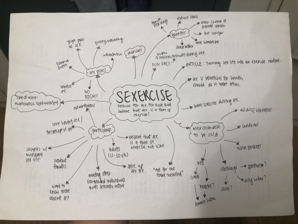
I was thinking of having a festival kit for anyone whom signed up for the event / purchased a ticket. Within the festival kit, there will be the invite cards and some essentials that they will probably need during the event! I started conceptualizing on what items to be placed there, and elements for the illustration.

The illustrated items I will be doing are

  1. Invite Card
  2. Festival Kit Box
  3. Wrapping Paper (to wrap the goodies in one)
  4. Condom Boxes
  5. Indiv Condom Packaging
  6. Tissue Box
  7. Guidebook

From there, I came up with a moodboard of the overall vibe I wanted this theme to give off, as well as the illustration style.
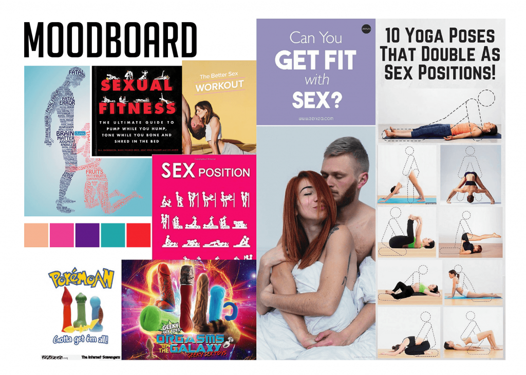
The overall vibe I’m going for is a play on sexual humour, adding a little quirky treats here and there. The colour scheme I’m going for is abit “crazy” and vibrant, creating contrasts. I also included a colour of skin, to retain the “human-ness”.
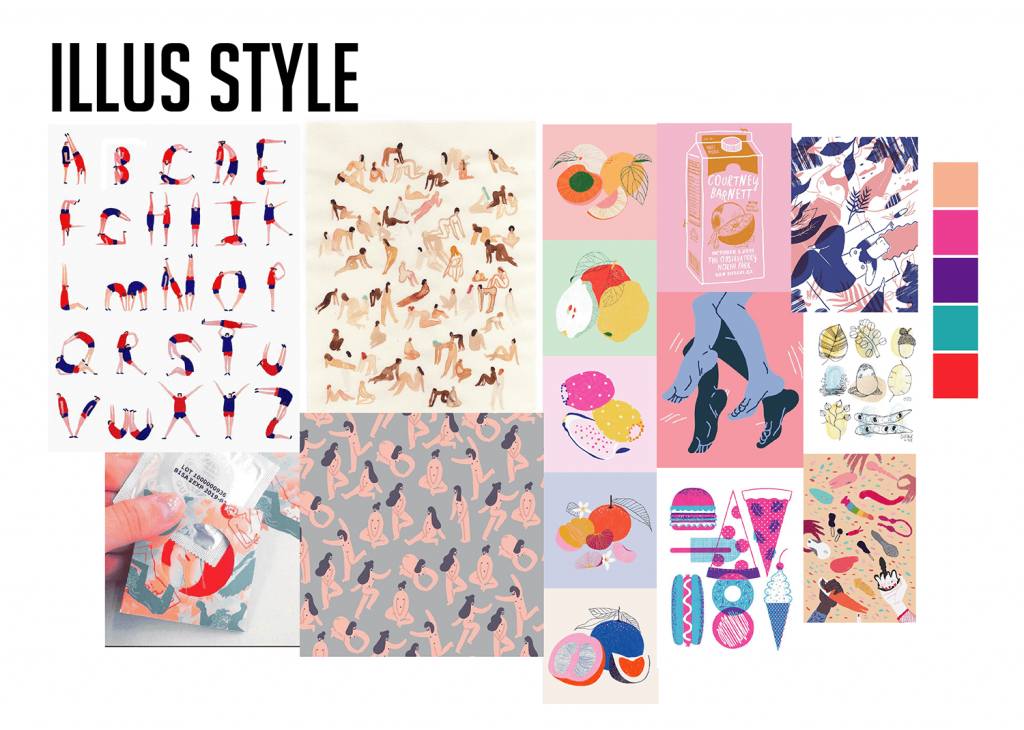
The illustration style I wanted to go with was with the usage of strokes linework and texture in the colouring of the elements. I wanted to show it looking more organic, looking like it’s hand drawn.

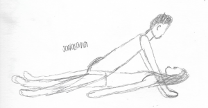
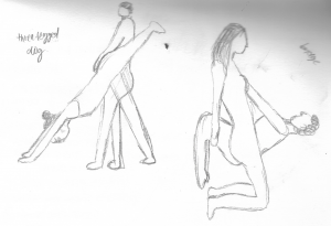
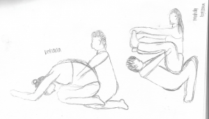
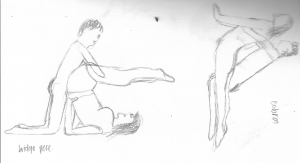
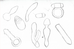
I found a variety of sex toys and a photo which shows yoga poses which can also be sex poses. I wanted to use these elements to create patterns for my applied illustrations.

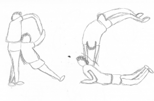
I also found an illustration of alphabets formed by humans, and wanted to reference “SEXERCISE” from there!
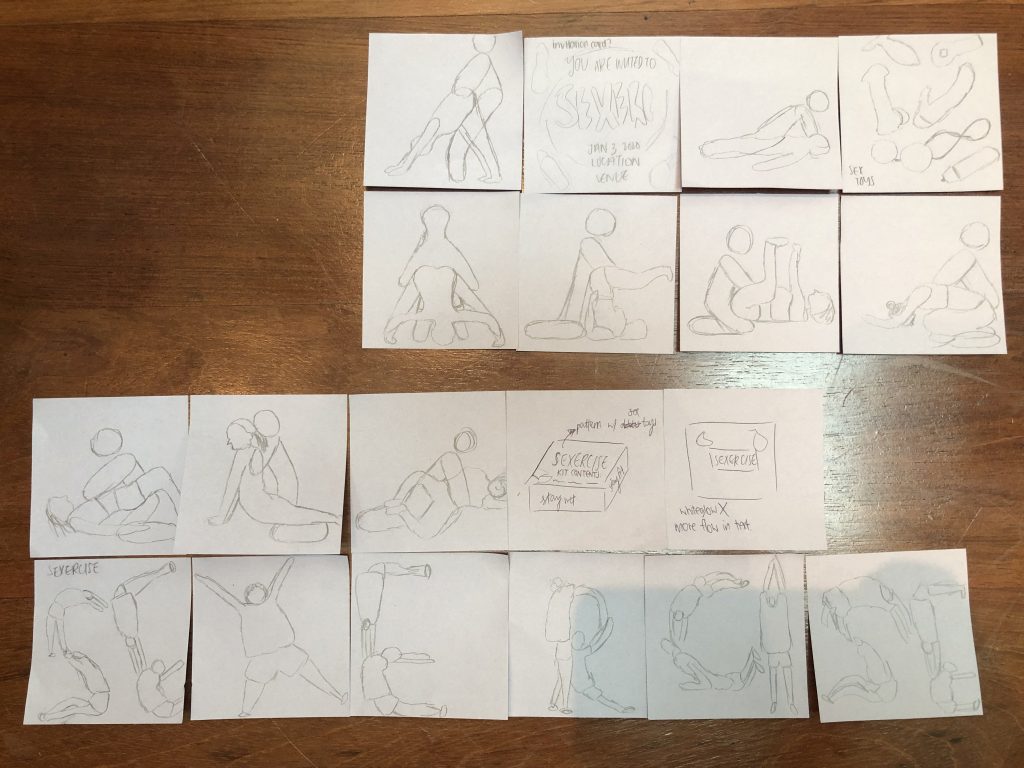
I came up with some thumbnail sketches of how my illustrations was going to be, and proceed to develop them.
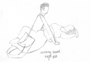
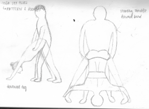
As I am thinking of doing patterns for my applied illustrations, I didn’t come up with pencil compositions for my items, but pencil sketches of the elements I wanted to input in my illustrations.

From there, I started digitalizing them! Click here for my process!

Till then,
Flazéda!
jamz
x
ILLUS | varoom research

Before working on my digital composition, I did a bit of research and did up a moodboard.

My moodboard consists of the colours I wanted to use for the illustration, as well as some keywords I wanted to convey through the illustration. For the images I found on the right, there were just some images of how coffee made me feel / how I wanted coffee to be like. There are examples of the coffee bag and inhaler which is pretty similar to the things I want to have in my coffee crackhouse illustration.

ARTIST REFERENCES
KATE PRIOR

My first artist reference is Kate Prior, whom using flat colours and simple line in her illustrations. I wanted my illustration to have a similar style to hers as I think being a flat illustration shows the “crazy yet going to be crazy”

However I wanted a crazier colour scheme with bright colours and I felt that the colours she used was too pastel. Hence, I went to look for another artist to reference.

LILI DES BELLON

The next artist I referenced from is Lili Des Bellon, whom uses lines in her works as well. I really like the colours that she used, as it’s really striking and I wanted the bright colours to bring out the crazy adrenaline look.

Note: The top left picture is not her work, it’s a graphic style I wanted to adapt for the eyes of my characters (bulging, veiny eyes)

Next up, I drew up a few characters I wanted in my compositions, to draw them in digitally.

I had them in different positions, and also a few elements I wanted to add in the composition.

Following after, I started a rough digital composition of how I wanted the background to be.

draft 1

This was a simple composition, with the bottom half being a coffee cup and the back being the background. However I think it was overall a little flat.

draft 2

I roughly included some elements of what I wanted to put inside.

draft 3

I added in the characters that I’ve illustrated digitally, alongside some coffee crackhouse elements. I also used a bunch of crazy colours to show the adrenaline, except for the characters. however, I felt that the characters should be brightly coloured too to show the craziness.

draft 4

I added the characters in front to being brightly coloured, but with the background more toned down. I also added in outlines for the whole composition. Feedback I got was that the background can also be brightly coloured too, showing the whole “crazy” feel, while leaving the coffee in brown, actual coffee colour.

draft 5

This was one of my final draft compositions, which I brought to consult Lisa with. She recommended me to drop one of the characters behind as it now seems too big and cluttered. I should also put the crazy Starbucks lady bigger, showing focal point. Lastly, at the right, I changed it to a ladder into the coffee pool, instead of the jumping board.

That’s it for my draft compositions and click here for the final!

Till then,
Flazéda!
jamz
x