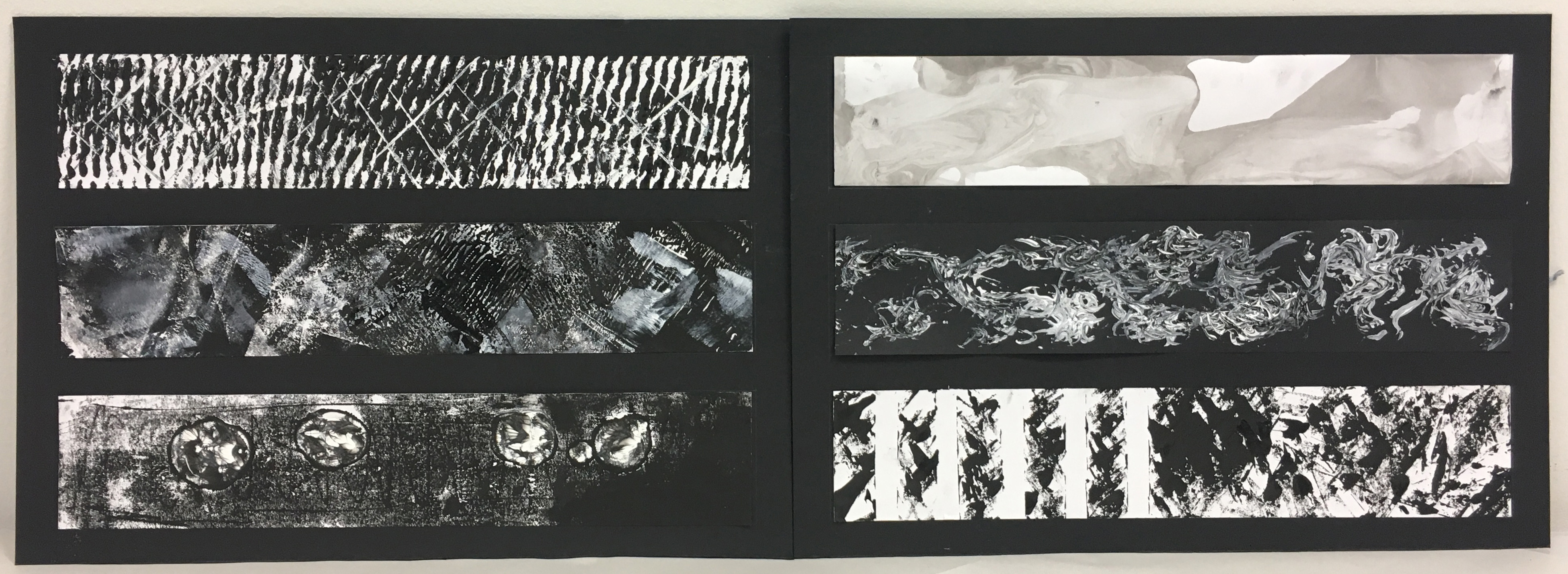
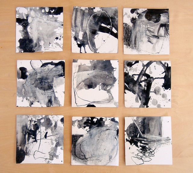
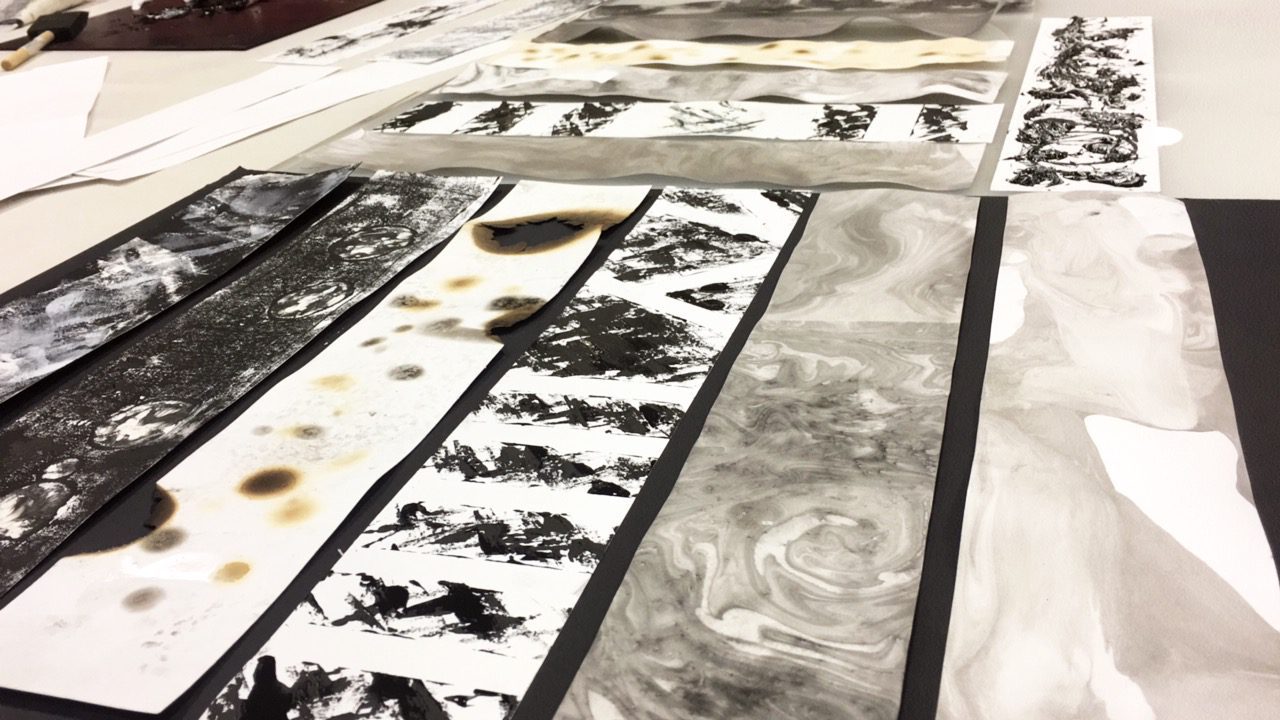
After much research and exploration, I finally came up with the final 6 emotions I decided to work on. The emotions are Anger, Fear, Passion, Depression, Passion & Ecstasy.
My emotions do not have an over-arching concept, but instead, each have a story to tell.
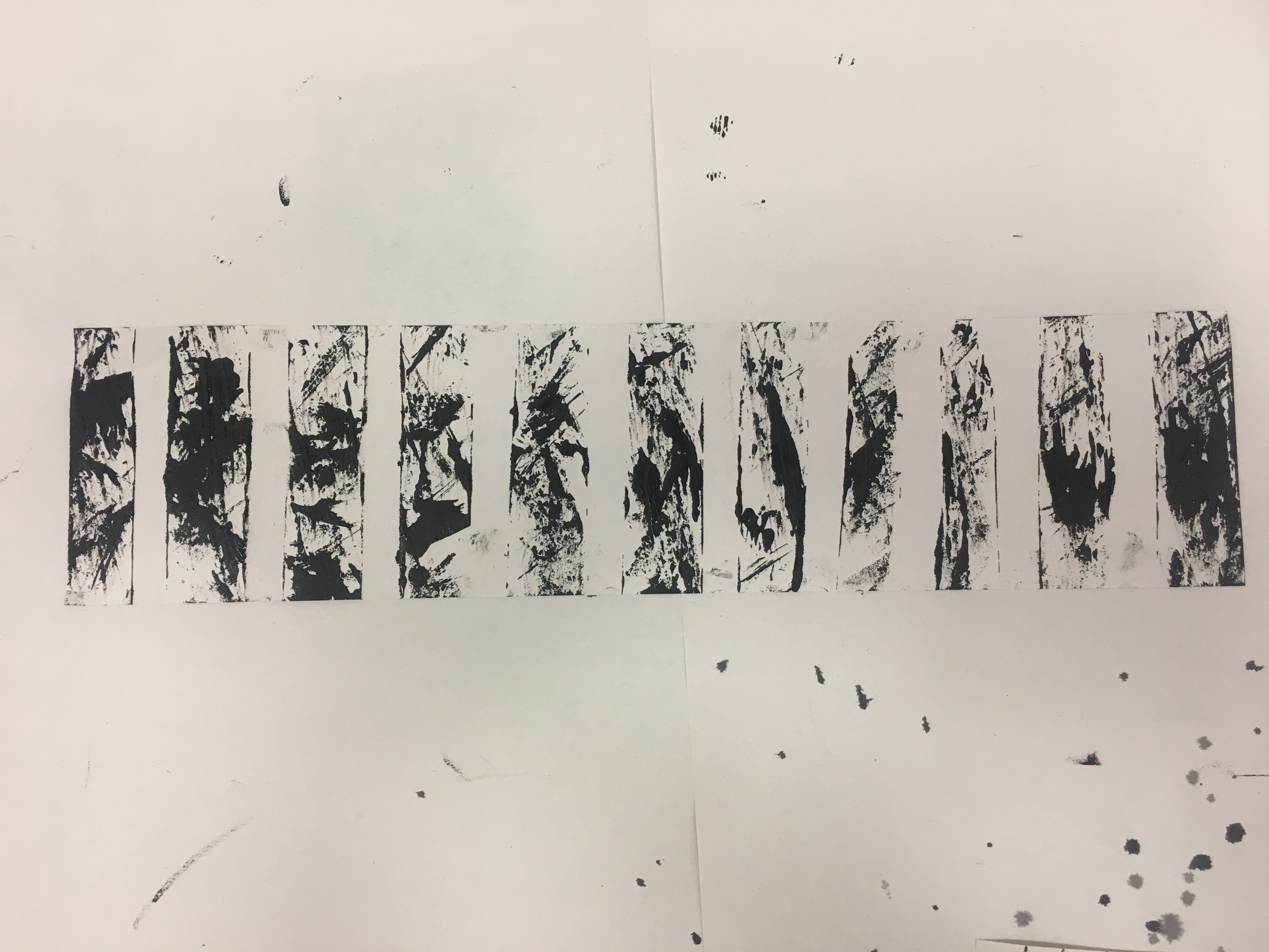
Each strip relates to an incident that happens through the past years of my life, or how I feel when I look at the strip. The picture below are the six strips i’ve done!
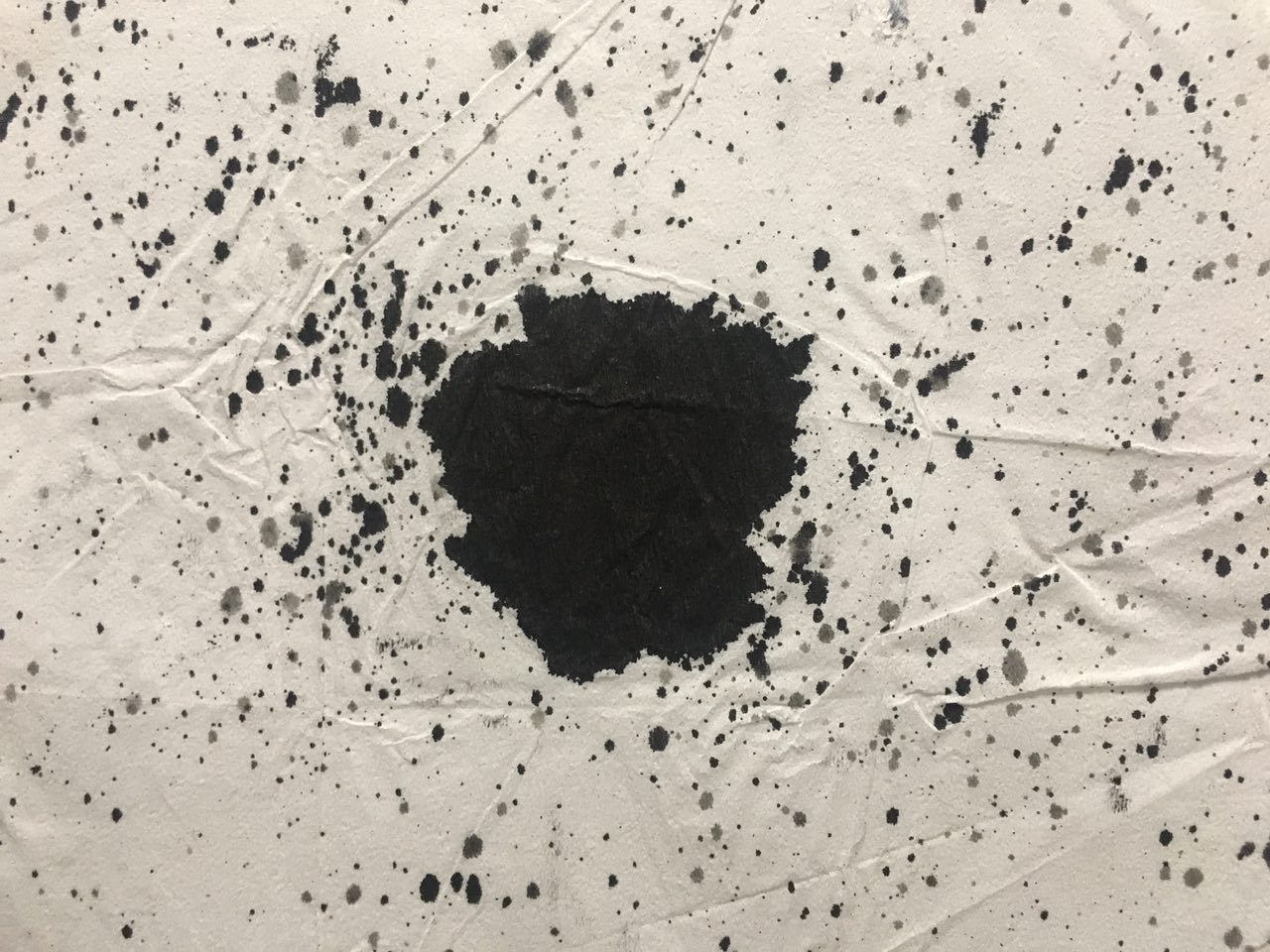
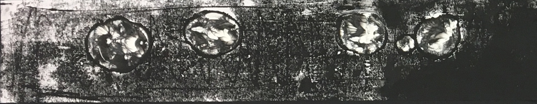
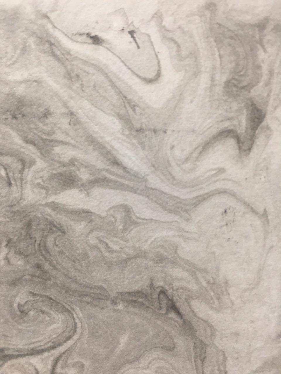
Ecstasy
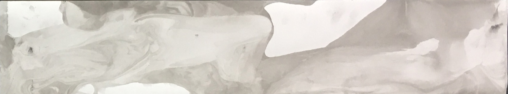 Done by Calligraphy Ink, Calligraphy Brush, Aluminium Tray & Water.
Generally, I am not a very happy person.
I tend to remember sad incidents more than happiness.
Thus to me, happiness is always a blur (especially when you’re high).
This strip was firstly a mistake, as when I was experimenting marbling, I initially did mark-making on the other side. However, upon seeing the outcome, I felt that the reverse side fitted the emotion ‘Ecstasy’ really well.
For marbling, I researched that there were other ways of doing, but i felt that using calligraphy ink and water complemented well with my rationale behind ‘Ecstasy’. The colour of the strip is way lighter than using shaving cream, but it worked well for me, as the light tone reminds me of how I tend to not remember happy memories.
Firstly, I filled an aluminium tray with water, then I dropped a few drops of calligraphy ink into the tray, and swirling it with a brush. Afterwards, I took the whole strip and soaked it into the water. After lifting it up, the marbling effect was formed.
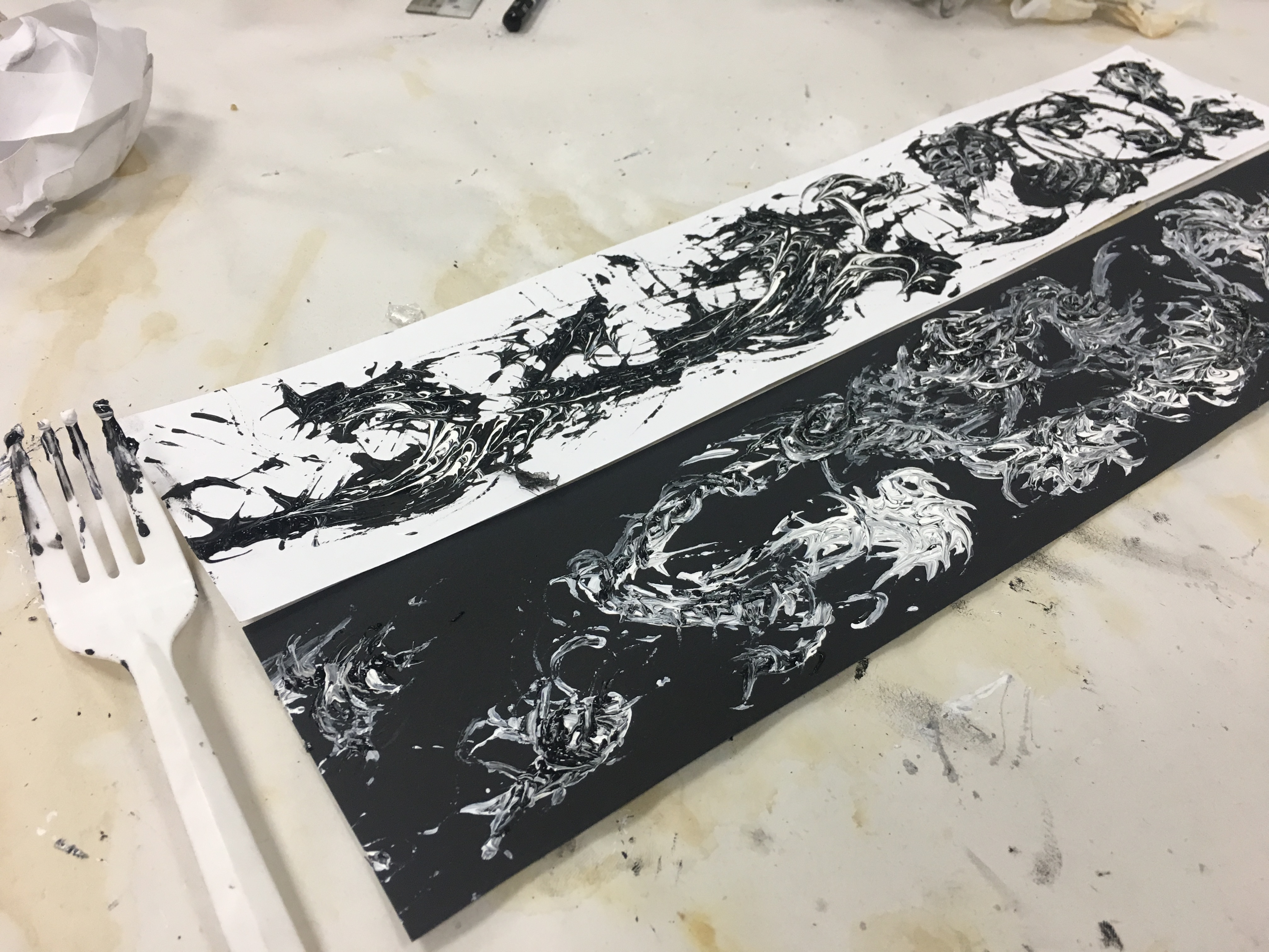
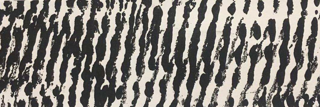
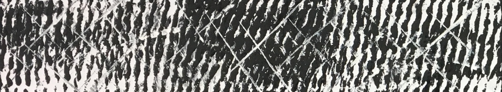
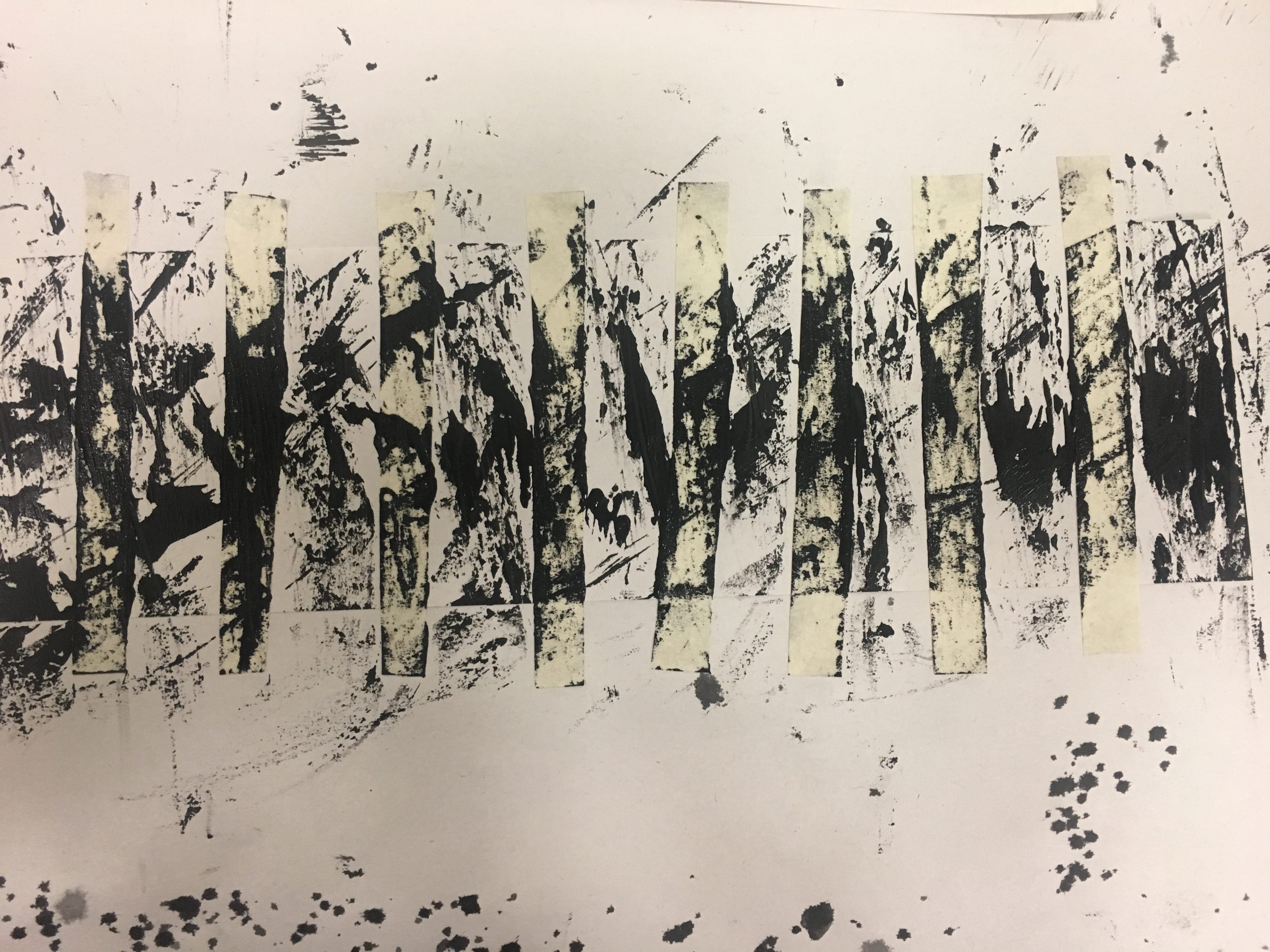
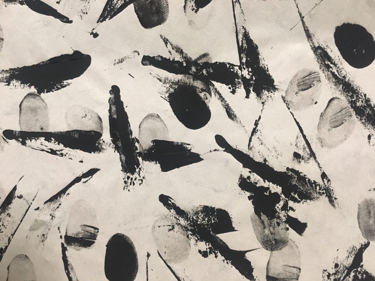
Passion
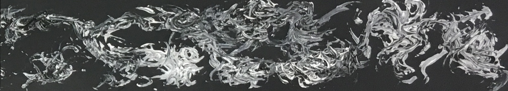 Done by black and white paint, with a fork.
I’m actually a musician, and music is my passion. I’ve been in a symphonic band for slightly over 10 years and up till now, I am still playing music. However, the journey wasn’t easy. I started during the later years of my primary school days, and I was young back then. So I mainly joined the band for fun, cos my friends were inside. Same goes for secondary school. However, when I was sec 4, I developed a passion for music, thanks to my conductor back then. He taught me that there was more than just playing notes to music, but you can express emotions through the way we play too. I was so heavily involved in music during that time, and I practiced almost every day, for about 1-2 years. But cos I was too involved, it killed my passion for music in a way too. There was tremendous stress being a musician and playing, as in my perception, there will always be people better than I am, and I need to improve to be better. Due to the stress I gave myself, I started losing my passion and I was so sick of it. There was a really long period of time that I didn’t go for band, as I didn’t want to stress myself, and wanted to put the thought that it is just for fun. And after some time, I really missed making music, so I went back and I didn’t feel as stress anymore.
I expressed it in a way that the passion is flowing, from a direction – left to right.
It represents my passion for music. And within, there are some spaces that ‘attempts’ to flow back, representing the stress I had for my passion and how it was pulling me back.
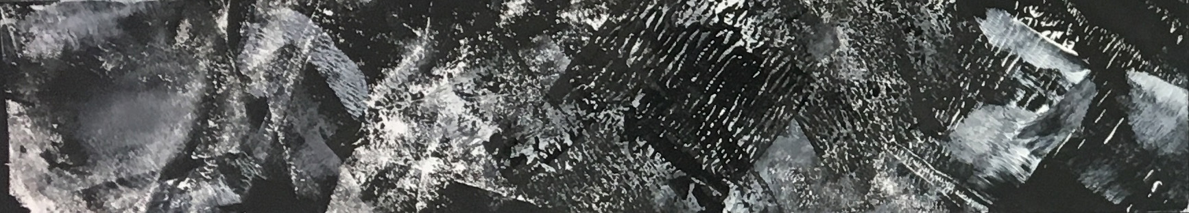
Surprise
 Done by Scalpels, Black Paint & Masking Tape.
My past relationship took me by surprise. I never expected him to come into my life, let alone fall in love. My life was fine and normal, till I met him online, where everything changed. To me, it was really surprising, as I was playing around the online applications for fun, and I started talking to him. I started falling in love, and sunk deeper in, till we got together.
To show surprise, I used the Gestalt Principles of Closure. I made use of consistency at the beginning, by taping some parts to leave it blank, and painting the rest with 2 scalpels.
Afterwards, towards the middle, there was no more blank strips, and instead, a bunch of random mark-making done by the scalpels, to show the surprise.
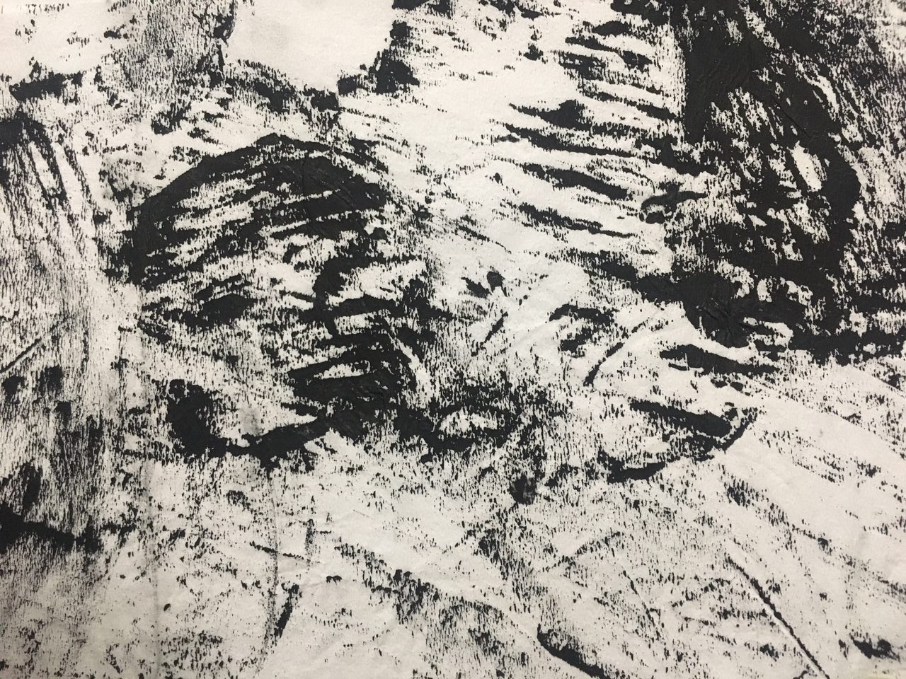
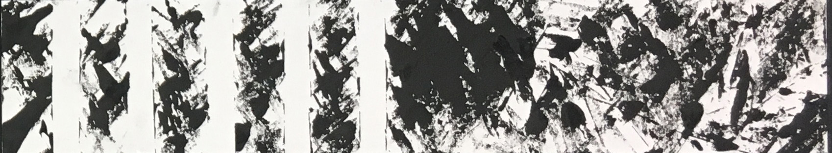
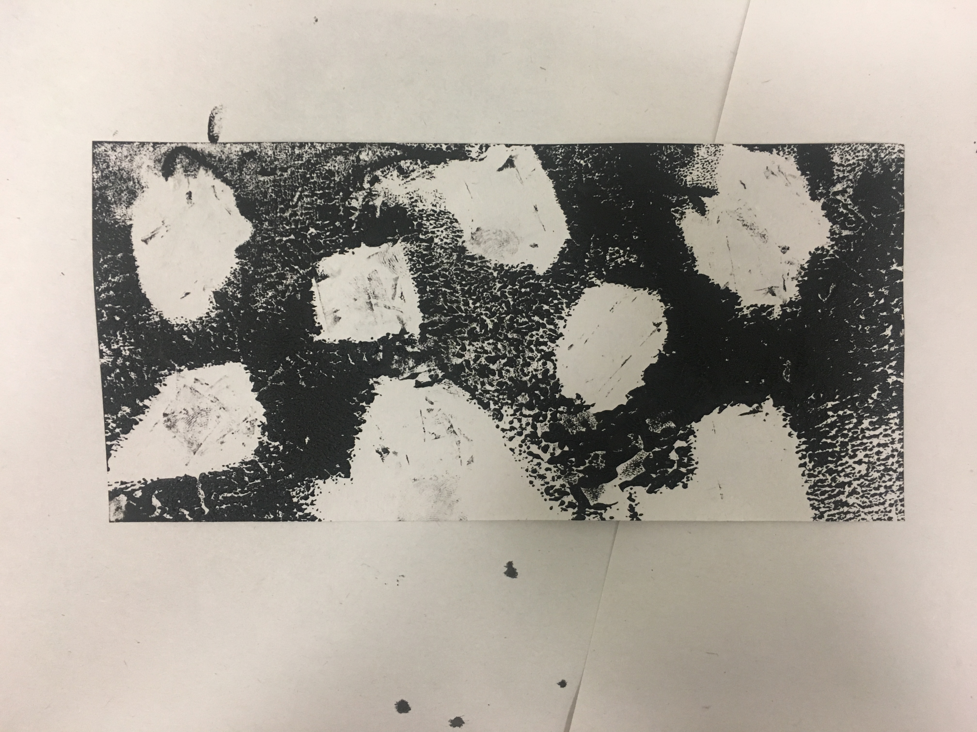
Fear
 Done by using white and black paint, Painted styrofoam fruit wrap and twine.
I have a fear of commitment, consistency and getting restrained. I tend to classify myself as a free spirit, and I hate getting tied down. Since young, my parents have always given me tons of freedom, letting me do whatever I want.
Thus when it comes to getting tied down, I am really scared of it. I hate the feeling of getting cooped up and being confined. I also have a fear of consistency, as I hate regularity. I’m not one that’s able to do the ‘same-thing-everyday’ job.
To represent it, I painted the styrofoam fruit wrap with black paint, and stamped on the paper. I did so as the styrofoam had lines that were consistent, of equal space apart. It also looked like a jail to me (hahaha).
To show the fear I was facing, I painted twine with white paint, and stamped crosses all around the paper, showing how I am rejecting it to happen on me.
Depression
 Done by Lino, white and black paint.
For depression, I wanted to talk about how one gets into the depression state with relevance to people around me. I once saw how my friend got depression and how hard he took it upon himself. It first started okay, he was normal, but he always talked to me about his problems. To him, even the smallest problems are huge to him, which he can’t deal. Gradually, more problems popped up along the way and it was a huge deal to him, which he couldn’t handle, and eventually broke down. He fell into this black hole and was in a very bad state.
I expressed it in a way that the white circle/bubble was the problems that he was facing, and the black background, gradually gets darker, symbolizing how his depression got worse.
Anger
 Done by using white and black paint, Painted by the roller.
I was inspired by times whereby I was angry. Whenever I am angry, I will find ways to physically vent my anger, like using the stress ball, cutting paper etc. Thus I wanted to express my anger by rolling the roller back and forth, to show how annoyed I am. And when I am angry about something, I will always try to think straight about why am I angry. But anger clouds my judgement and I often have a biased opinion due to that. Thus I used black and white paint. Black paint to represent my anger and white paint to represent that I am trying to think in a clear state. With the mixture of both, there are parts which are grey, which represents my clouded judgement.
Review Objectives:
Instructor’s Feedback:
Good use of rhythm for surprised.
Depression is unique.
Wonder what the concepts are.
Anger & Depression looks alike
For Anger, there is no distinct pop-up. It needs something thicker, maybe adding impasto gel.
For Surprise, it is easy to connect.
Classmates’ Feedback:
Ecstasy – Should have adopted another word as it doesn’t look ‘high’ or excited enough.
Feels that ecstasy looks very lethargic – is this the dry ecstasy?
Interesting works
Like how surprised was introduced by creating an adnormally. Love the texture of the paint too.
Passion is amazing and depression speaks to me,
Depression is real. That play of dark tones on different sides! Good job.
Fear is really scary. They very thick black lines have a sense of depression.
Love the technique for ecstasy & anger! Also fear!
Reflection
Overall, I really enjoyed doing the assignment, ‘My Line is Emo’. Not only does it touches on the basics of Design Principles, it also allows us to explore and express in a more abstract way. While doing abstract art, communication skills is essential as we have to present our artworks to the audience, or else, they might not understand the rationale behind it. However, I felt pretty restricted to the theme, as we have to choose one emotion from each category, instead of having the freedom of choosing whatever emotion I want. But on the other hand, it might be a good thing too. I’m naturally a sad person, so the emotions that I might end up using are the sad/angry ones, which might not show the contrast between emotions.
Well, if one thing that I have to point out that’s bad about this project is that, while doing mark-making on the paper, I seem to be doing mark-making on myself too! My whole body will be stained with ink whenever I leave the 2D studio.
Maybe that’s something I should work on. Being less of mess.
All in all, I’m really pleased with the outcomes of my strip!
The journey sure wasn’t easy, but it was really worth it!
From this project, I felt that I’ve enhanced my abstract thinking, and my interest in 2D is increasing too!
& I’m just really happy that the first project is over!
Time to catch up on my very deprived sleep…zzz..
Till then,
xoxo,
jamz


 Leaves
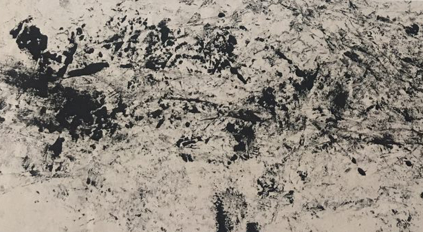
 Cling Wrap Blade
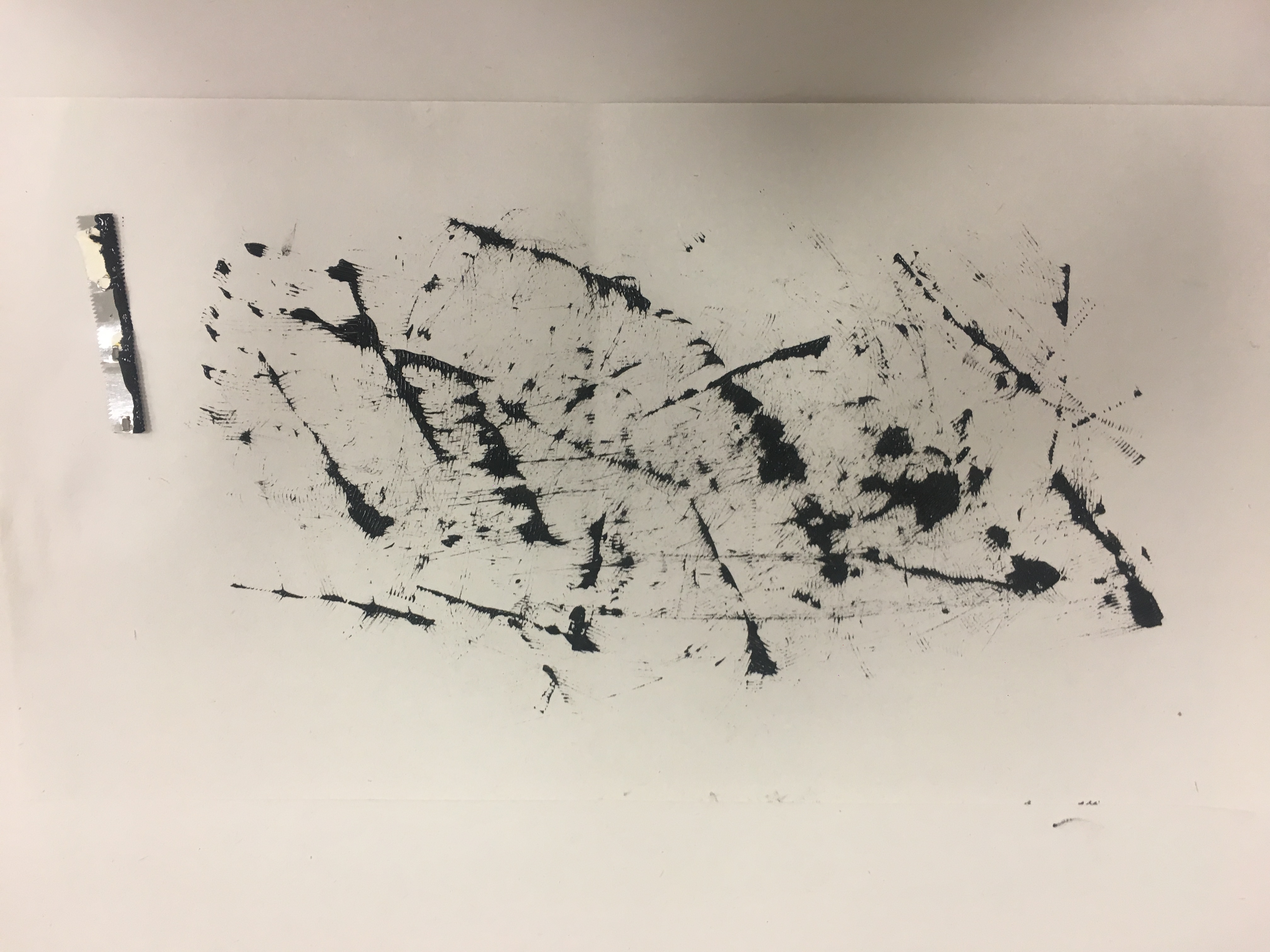
 Candle
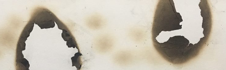
 Lighter
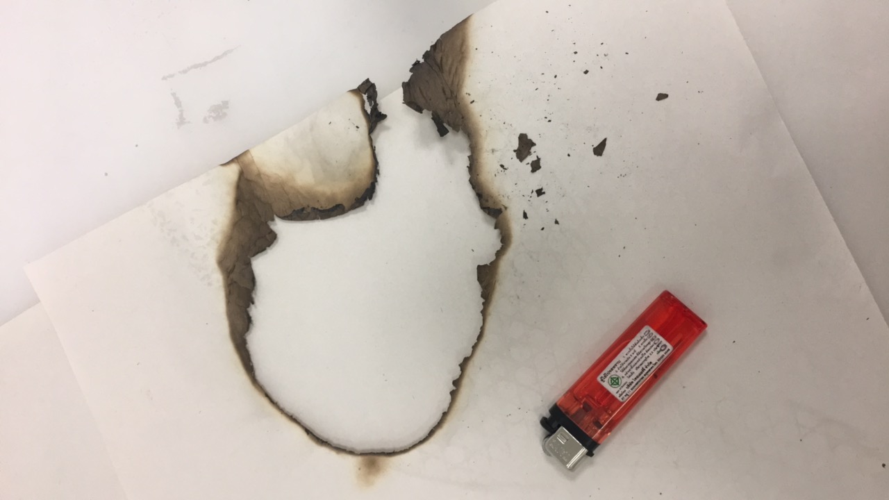
 Toothpick