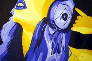
For this final Goldberg machine project, I have chosen the scene from MULAN where she makes the decision of replacing her father to serve the army. It was an intense scene, it was raining and she took a lot of courage to cut off her hair and leave her home. For the structure, I have inserted a rain stick to represent the sound of the scene. The bell representing the decision she has made followed by a hair dropping down which is the moment she cuts off her hair. The stairs at the end depict the scene where she goes off with the horse. As you can see the Goldberg system starts off with a white marble which represents Mulan and it ended off with a metal ball which represent her already in her father’s armor suit.
Process
I started off with cutting and drilling of wood to build the frame of structure.
Then I build the content of the structure according to the scene of the movie. wood blocks, wire cage, and wire casing were used in the development.
Finally, added some aesthetic touch to the structure to make the scene more visual.
The product I got is an Ayam Brand Tomato Sardine. I wanted to create an advertisement poster that people will keep in mind when they think of sardine. So, I decided to use a pun in my slogan give it a greater impact on the audience.
Ad references:
I then researched on the product listed out the words that I can use for this Ad to direct me. Below are the words I listed out:
Sardine
Tomato
Wild catch
Calcium
Iron
Magnesium
Zinc
No msg
No preservative
Ayam brand
I then work on a few slogans for the ad
“From the top of my head To-ma-toes… I mean tail”
– The sardine
This slogan, I want to emphasize on the product that comes with tomato sauce. Telling viewers that its covered fully and the freshly squeezed tomato is to represent the quality of the tomato sauce.
“Sardine(sudden) hunger? Ayam(I am) the one you need”
This slogan, I want to promote on how fast and easy to overcome a sudden case of hunger. The fact that sardine in a tin can be the easiest food to have.
“Sardinely(certainly) what you need!”
This slogan, I want to get it to the viewer that the sardine is what they need.
SKETCHES
I then make some sketches of how I want the visuals to represent the product/slogan
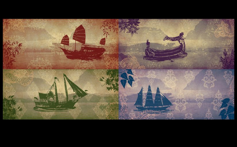
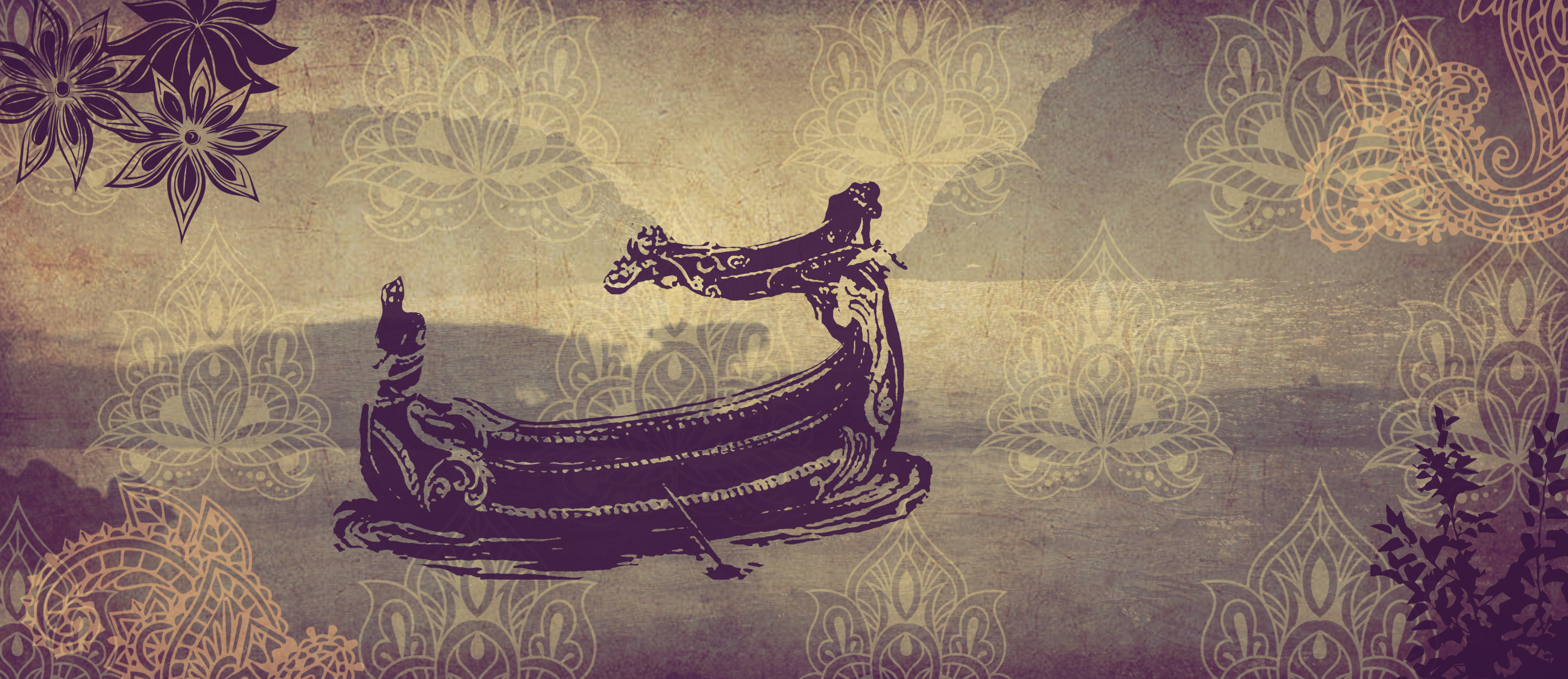
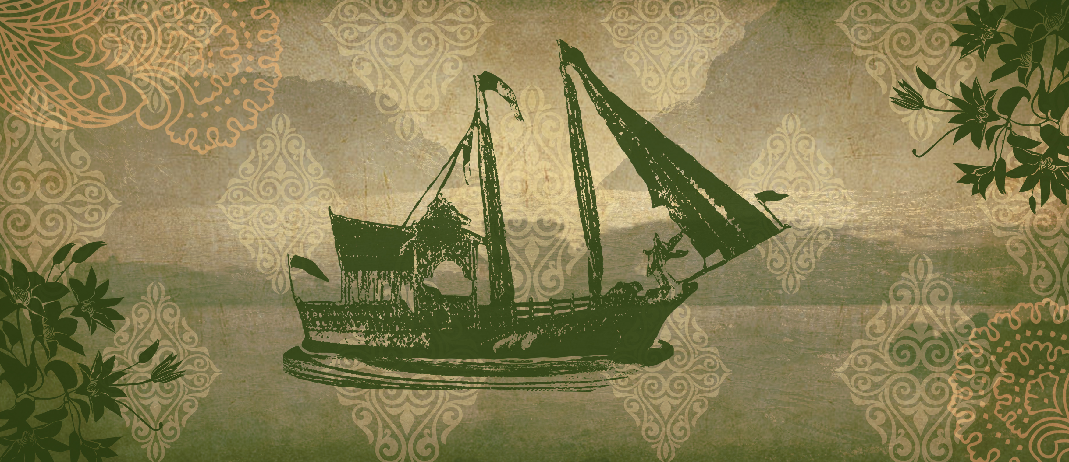
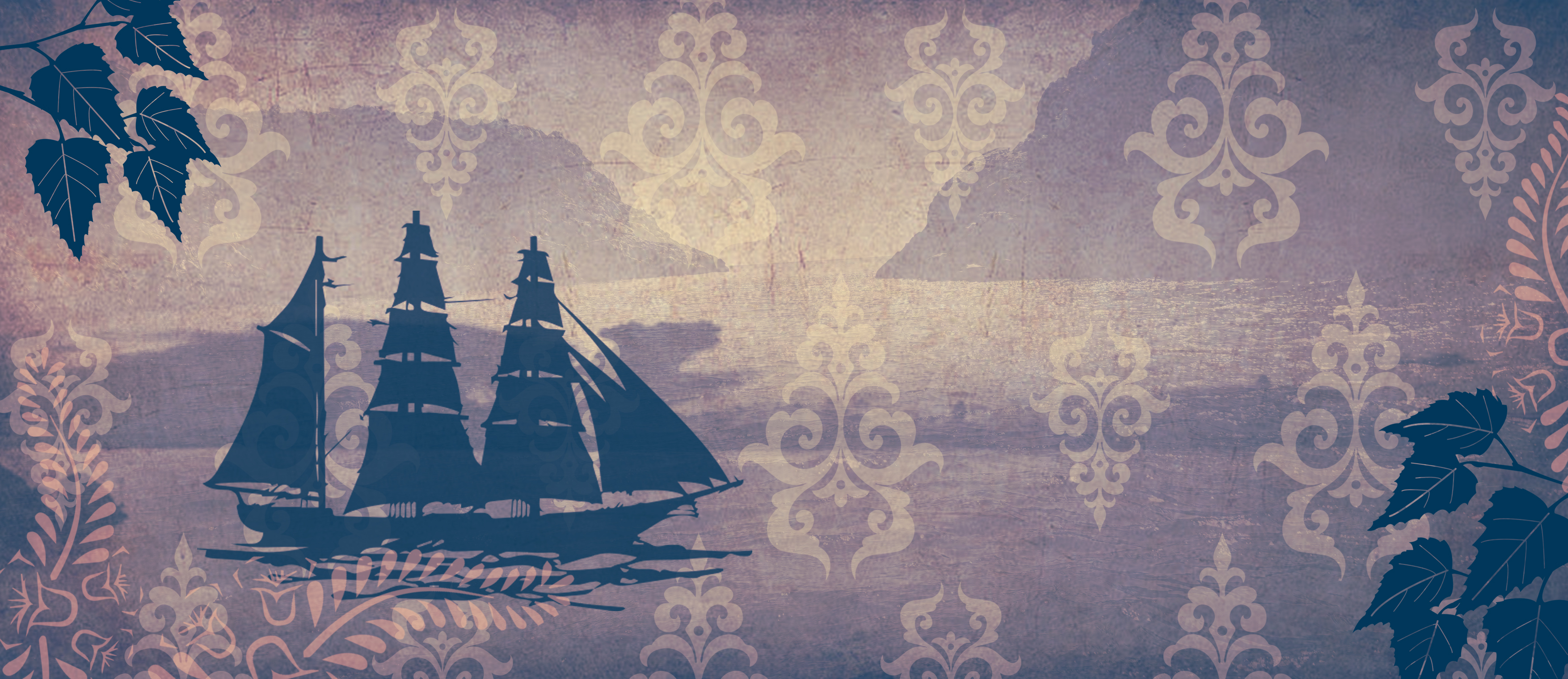
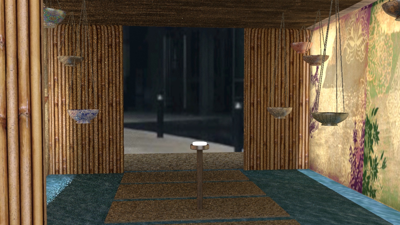
Sounds of Singapore is an interactive installation that shares a part of Singapore history and identity. Singapore, being a trading port, it is known for its multiracial community. Having the 4 main culture/race in Singapore, Chinese, Indian, Malay and Eurasian, this installation is to project the different identity of each race.
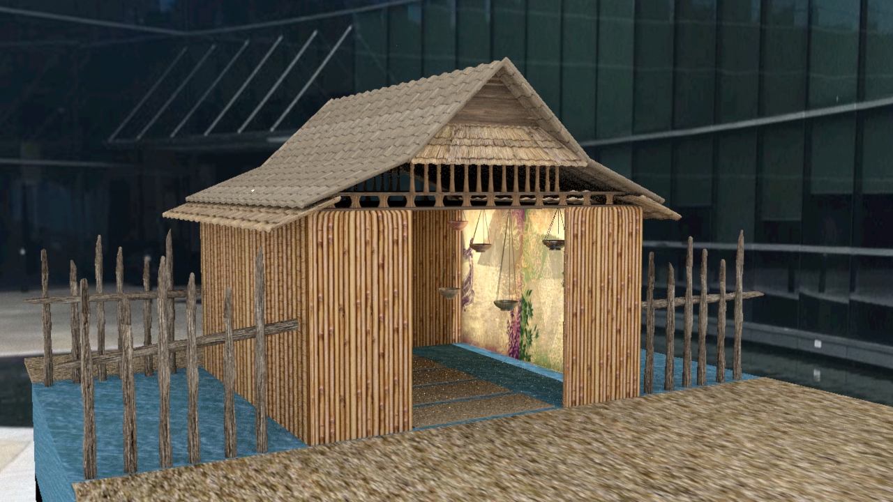
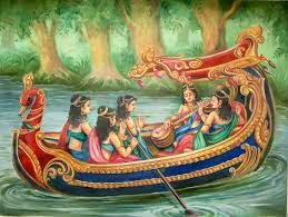
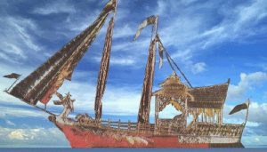
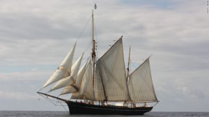
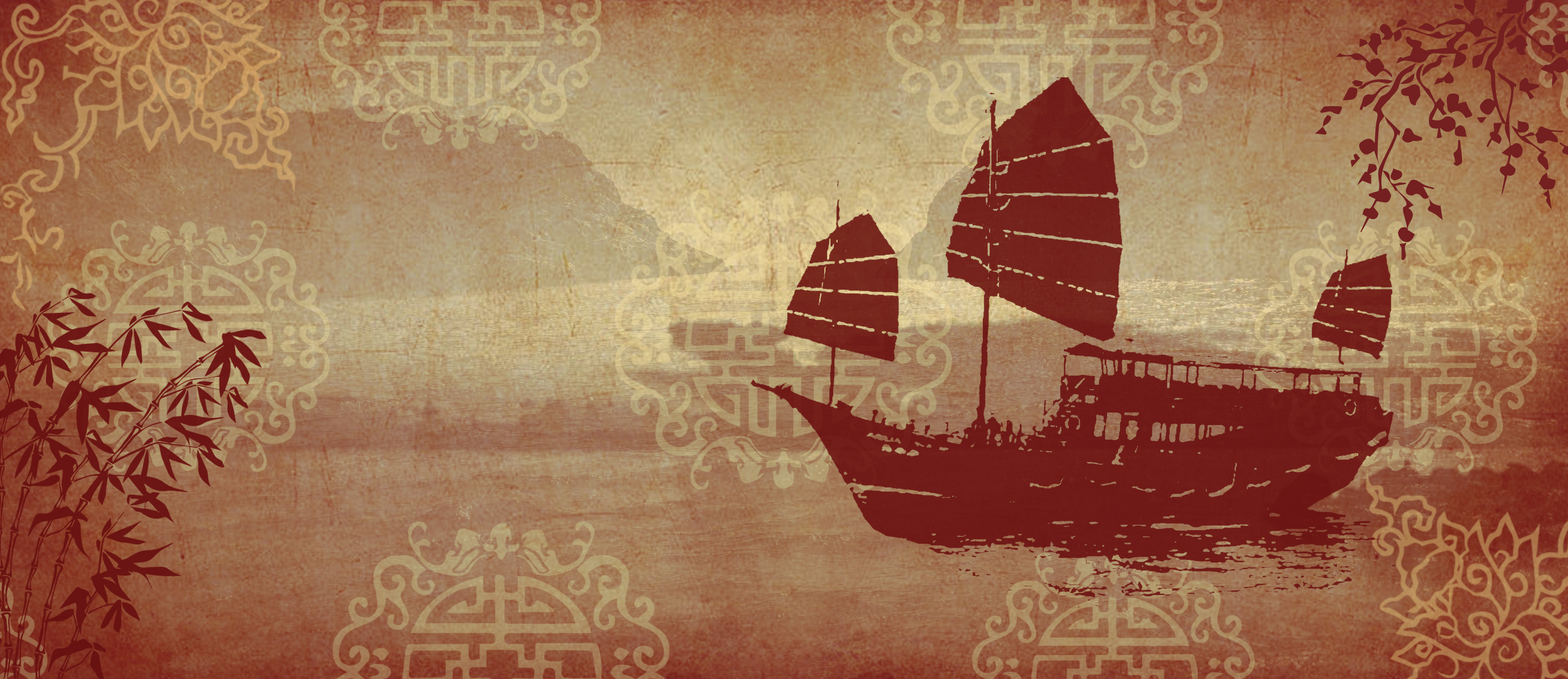
Choosing the pond area of ADM, we decided to focus on the idea of boats as one of the visual representation of each culture as it is relatable to the water.
Research
Cultural boats
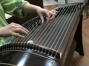
Traditional Instruments
Chinese: Guzheng
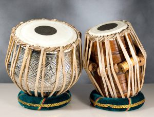
Indian: Tabla
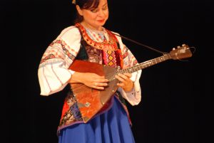
Eurasian: Balalaika
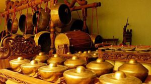
Malay: Gamelan
Process
Visual and sound projection
Chinese
Indian
Malay
Eurasian
Visual and sound Projections
Final work
How it works.
The moment user steps in the installation, it will activate. And a scenery of a jetty can be seen projected on the walls of the hut along with the sound of ocean. There will be bowls/ pottery of the different culture hanging in the hut. The moment users touch the bowls/pottery, a visual projection, representing the specific culture will be projected and the traditional instrumental music will be played along. (As shown in video above)
A particular order in which related things follow each other.
A set of related events, movements, or items that follow each other in a particular order.
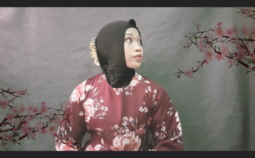
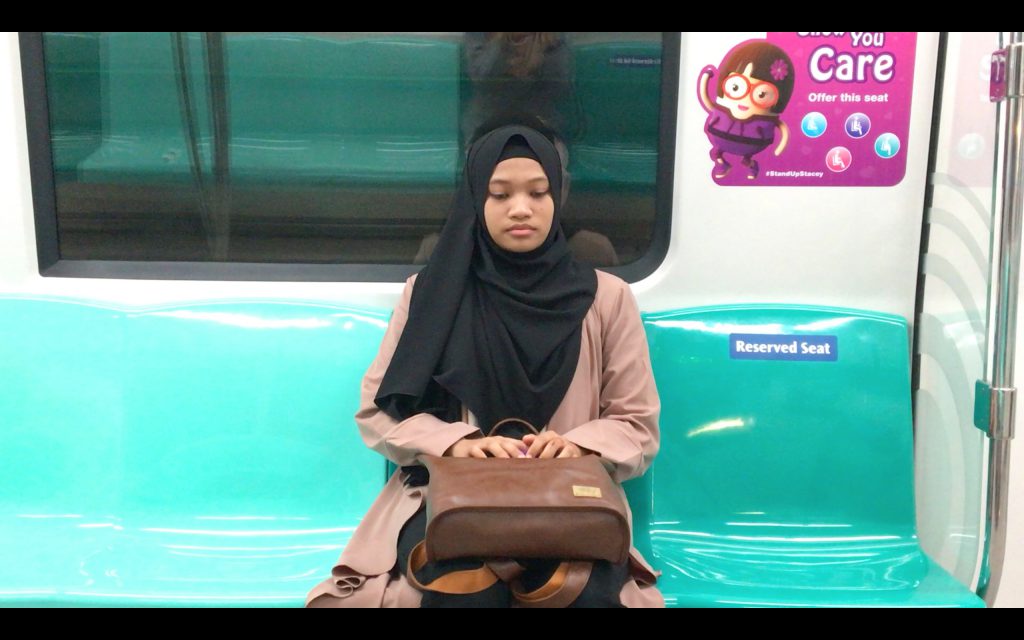
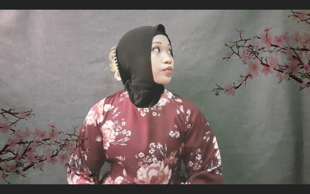
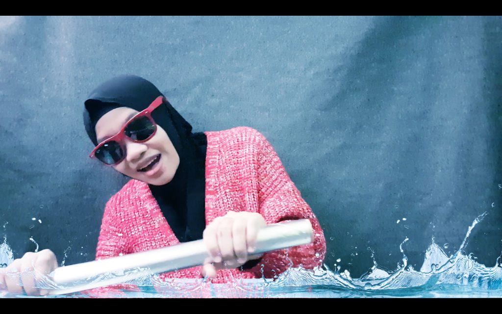
Upon receiving this project, the requirement of ‘sleep’ immediately reminds me of people sleeping on the train. So, for this project, its a storyline I wanted to portray the motion of people when they sleep on the train, we usually notice them nodding their head, bowing and swaying to the sides. Therefore, this sequence started off with me falling asleep on the train where I then traveled to 3 different events in a dream. A rock concert, a Japanese geisha position and a water park where I took a ride.
As you can see all these events contributed to the motion/movement of head and body which relates to how people sleep on the train.
Rock concert: Headbanging
Geisha: Bowing
Waterpark: Swaying to the right and left
Besides the trouble of taking a lot a lot a lot of images, I really enjoyed the process of this project. Role-playing the different characters and putting the image together as a sequence, I’m happy with the end product of the project.
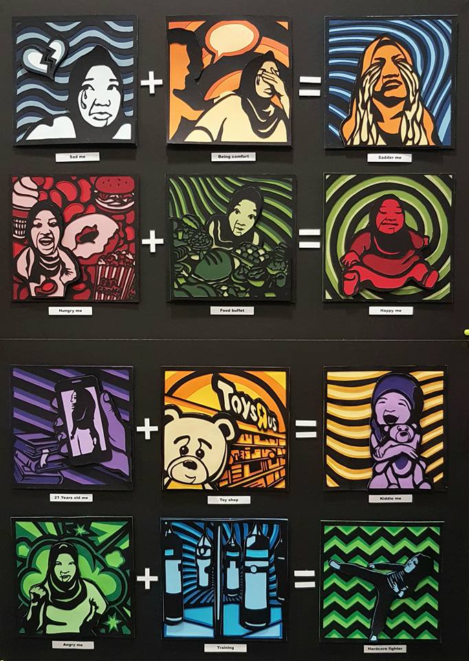
In this work, the equations tell the audience a story of me being in different situations, displaying my characters.
——————————————————
References & Research
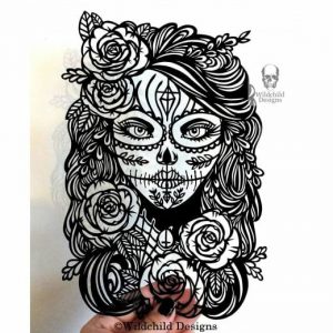
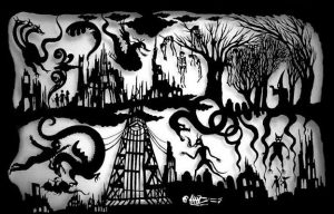
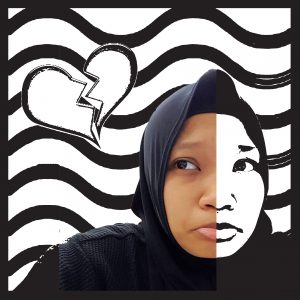
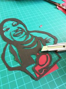
Upon receiving the brief, I’m determined to work on a paper cut work as I want to challenge myself and I want to work with a traditional medium. I manage to search for a few references of paper cut works which further motivates me to go with the medium.
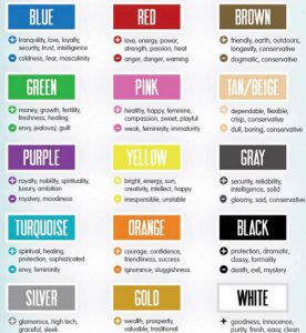
Not to forget, research on the meaning of colors. The emotions and meaning each color gives plays a part in this work.
COLORS
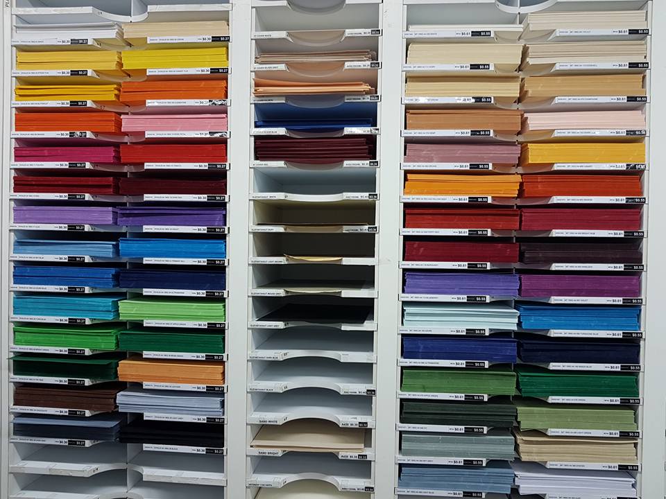
Selecting colors are the hardest part of the process, as it requires detail and using the paper cutting method, papers used are mostly colored paper/ construction paper which leaves me with minimal choices when selecting the specific shades of color.
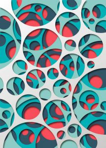
The color combination I decided to use is complementary and analogous colors as it gives the contrast I want my work to have, which is the ‘ Pop-art’ style. Below are references for the color combination selected.
These are the shelves of color paper at Artfriend, I spent about almost an hour just selecting the right shade of paper.
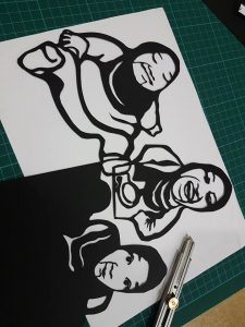
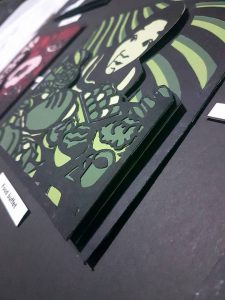
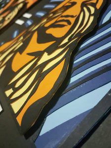
Process
Images are selected to narrate different situations for each frame. The threshold effect is added to bring out the outline for the paper cutting process of the images, and give it a ‘pop-art look’.
After being printed, the images are paste onto a black card paper. Frames are then cut out individually divided into layers, backgrounds, and pop-ups elements.
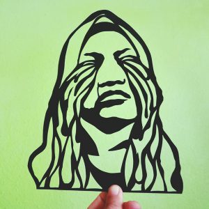
Color paper are then pasted and further cutting is done. This process are repeated in layers until all the colors are filled in.
Pop up method are used for the main characters/elements that I want the audience to focus on. This gives the work the extra height/depth which pushes the ‘Pop-art’ style more.
Final Work
1
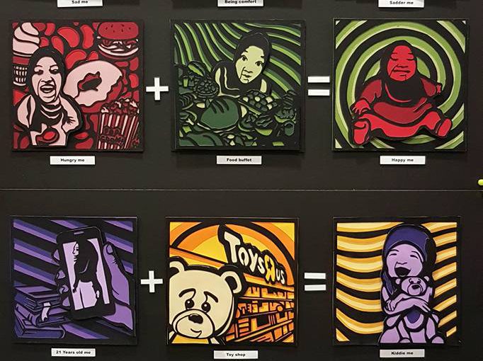
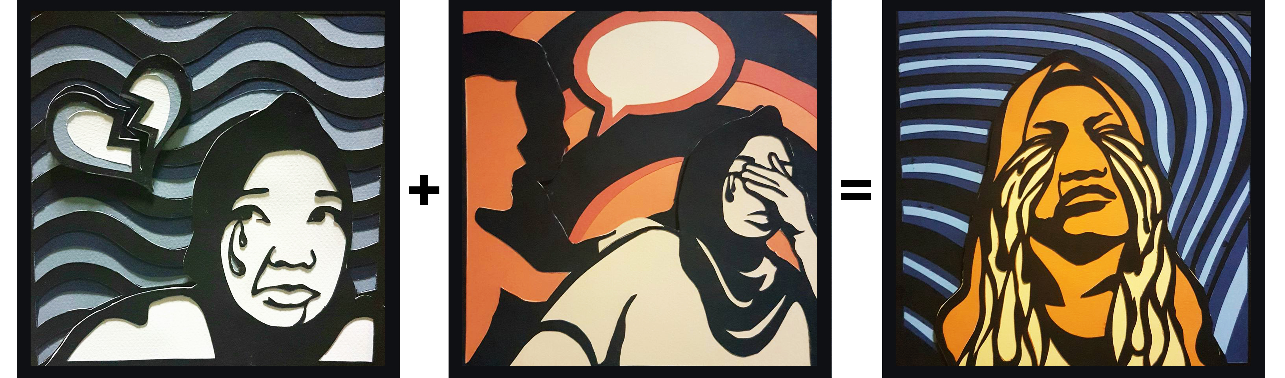
In the first set, colors used are complementary color. Blue(represents coldness & sad) + Orange (Sluggishness). The combination of the two colors is shown at the final product of the sad, ‘ Sadder me’. Frame 1 has the monochromatic color of blue and Frame 2, monochromatic color of orange which then results in Frame 3, which is the combination of both colours.
Sad me + Being comfort = Sadder me
——————————————————
2
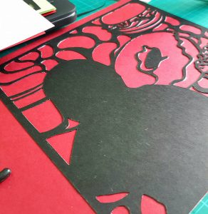
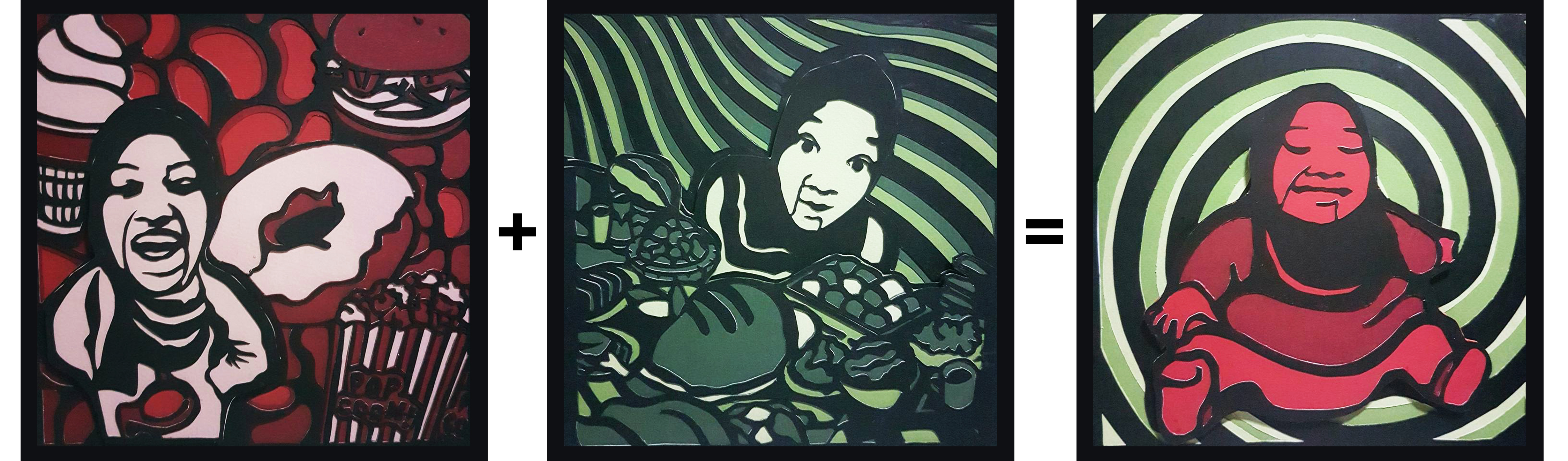
The second set, the complementary color of Red (represents danger and warning) and green are used. In this set, I’m trying to portray how food buffet actually makes me happy when I’m hungry. Frame 1 has the monochromatic color of red and Frame 2, monochromatic color of green which then results in Frame 3, which is the combination of both colours.
Hungry me + Food Buffet = Happy me
——————————————————
3
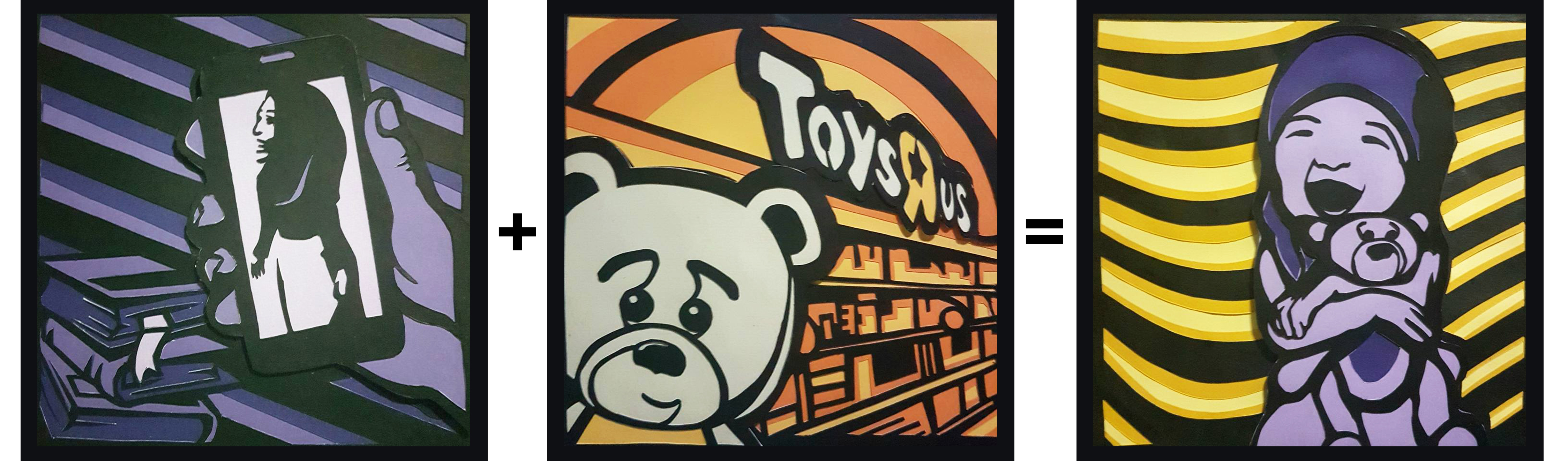
The third set, the complementary color are also used which is the complementary of purple and yellow. This set depicts me and my love for toys. Frame 1 has the monochromatic color of purple (represents ambition) and Frame 2, monochromatic color of yellow (represents bright and happiness) which then results in Frame 3, which is the combination of both colours.
21 Years old me + Toy shop = Kiddie me
——————————————————
4
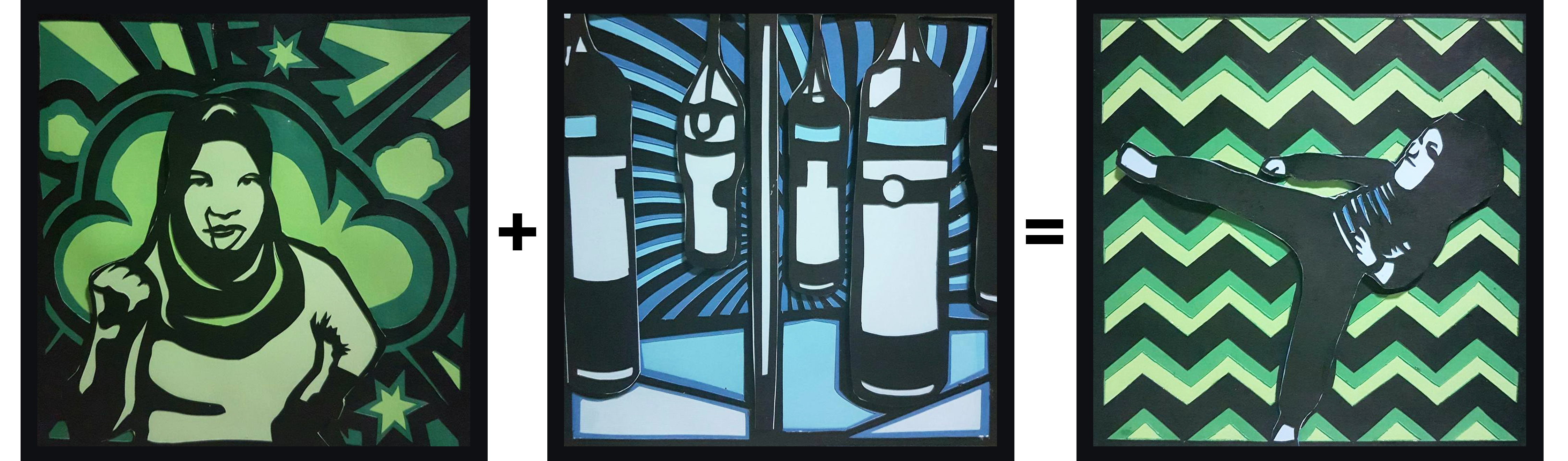
Lastly, for the 4th set, I decided to apply analogous color to the frames, the colors of green(discord / jealousy) and blue(represents spirit and determination). Frame 1 has the monochromatic color of green and Frame 2, monochromatic color of blue which then results in Frame 3, which is the combination of both colours.
Angry me + Training = Hardcore fighter
Reflection
Overall, I really enjoyed the process of this work. Even though it was very detailed and a lot of strength and patience needed in cutting out the frames layer by layer, portraying myself in the work, I really am proud and happy with the final outcome. And I believe there are some areas that I can improve on, based on the reviews given by the lecturer and my classmates. Some areas that I can improve on are the illustration of the different situations so that it is clearer for the audience to understand and the presentation of the final outcome, having the right colored backboard to push the contrast of the work more.