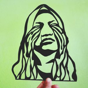
The Artist that inspires me with her work is Polly Nor. Born and raised in London, Polly is a contemporary freelance surrealist artist that graduated with a degree in illustration from Loughborough University in the UK. The design works she is most known for are her hand-drawn and digital illustration works on social media. She is even commissioned to work for well-known brands such as Gucci, Dr Martens. The Illustration style she goes for, warts- and -all drawing style that portrays features or qualities that are not appealing or attractive. The Images are bold in their colours and strong in their use of black line works. Documenting her relationship with herself, by visualising thoughts and feelings as physical beings ‘demons’
Images from pollynor.comImages from pollynor.comImages from pollynor.com
Her drawings of women and their demons entwine themes of identity, sexuality and emotions. Her Illustrations often tell stories of complicated relationships, mental health and the struggle for self-acceptance in the internet-age using negative emotions such as Frustration, anxiety, and sadness to fuel her creativity. Polly expands her works to various forms, from accessories, books, stickers and T-shirts. She even has three solo exhibitions in London. In one of the exhibitions called “It’s Called Art Mum, Look It Up” included a full collection of the digital illustrations, alongside original ink drawings, sculpture work and an immersive installation room. Her exhibition was a success. What I have learned from Polly are, not all designs are created based on something perfect, sometimes you just have to work on the imperfections and turn it into an impactful outcome. There will always be potential and opportunities for you to expand your work even beyond what you started with. You just have to see where it could go and how far it can be pushed.
Images from pollynor.comImages from pollynor.comImages from pollynor.comImages from pollynor.com
An overwhelming feeling of fear, hesitation, distraction, discomfort, the trust placed fully on our guide. One of the main challenges is actually to take a step forward. Our minds are filled with thoughts that are overpowering. Following the trail is hard but it manages to bring us to our destination. The hard part is when there is no wall or rails for us to rely on. That’s when the fears and difficulties felt more overpowering. The daily necessities or facilities some felt like it is not catered for the blind. Our guide told us regarding the sound of the traffic light that will be switch off at a certain timing due to petty reason “too loud and noisy for the residence at night”. The safety of a human being is more important than the petty reasons sighted ppl had. Role-playing allows us to understand and experience the way and the experience the blind have to go through. Being aware of it allows us to design and cater better for the visually impaired.
The method of role-playing in research of user experience and observation creates a better understanding for us designers. Where the experience can be used to cater a design that specifically focuses on the important and necessary details of the moment experienced. And not just design based on a survey platform or even assumption where we only tend to choose what we want to understand. Role-playing gives us a first-hand experience. Providing us with the ability to use other senses to work the design rather than just the visual aspect.
The Dialogue in the dark is a good example of the importance of role-playing in research studies. To understand, you need to experience. Some context that can use role-playing as part of the research is sports-related context, by experiencing the sports itself you will know how the athletes feel and the exact pain they go through. Sports for the disabled is one of a platform that requires awareness from the public. And also another context like observing and being part of a special community (elderly, disabled). So that we are able to put what we see, feel and hear into consideration for a design solution.
For this zine, I want to include the past and the future which is shown in the sentences for the different page. Using puns to include some past elements to my thoughts on Joo Chiat now.
As for the visuals, I would like to show the architectural forms and elements that I extract from the photos I took and some illustration.
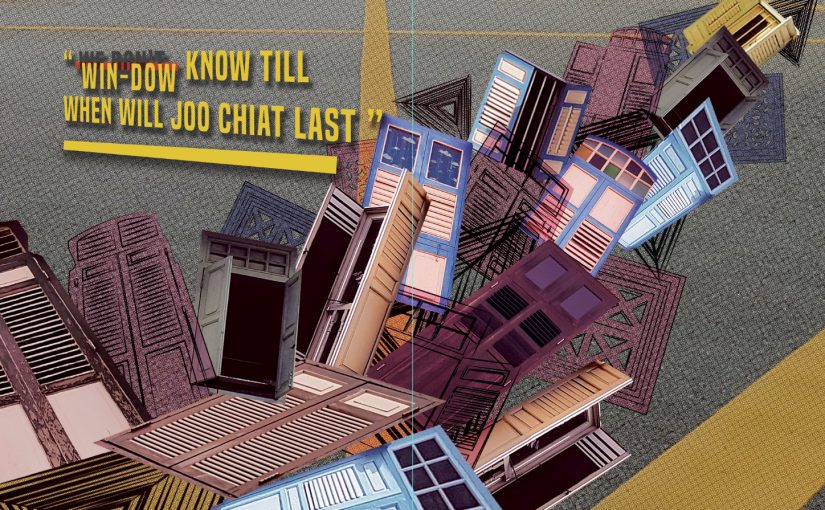
” Win-dow(we don’t) know when will this beauty last”” People Co-co-nuts (go go nuts) with #ootd here “” We must nut-meg(not make) any changes to Joo Chiat “
2nd page:
Compiling photos and illustrations of windows
———————————————————————————–
OR
3rd page:
Work in Progress
Critics and reflection
As I received the first critic for my first mockup, I realized and agreed that it does not do justice for the place due to its very dull and dark visuals. And usage of old and dark colored windows wasn’t a good idea.The colors and images used don’t represent the Joo Chiat area which is colorful, bright and lively. Therefore, I decided to take a huge leap and go for a different style.
Locale Joo Chiat Final mockup: My Pun-ny thoughts at Joo Chiat
So, for my final product, I decided to go for an illustration style and use more pastel and colors that are found in the Peranakan houses area of Joo Chiat. I also added elements and graphics that represent the Peranakan identity of the place.
For the front and back page, I use the graphics of the architecture from the Peranakan houses. And lay them out in rows. This represents an ‘introduction’ of what to expect in the book. And I wanted readers to get the identity of the place just by looking at the cover page. And to start off, readers are greeted with and Peranakan-styled open window at the front page with the title. “My Pun-ny thoughts at Joo Chiat” is the chosen title due to some puns context inside where the puns were actually related to the past of this Joo Chiat area. Lastly, to end off the Zine there is a closed window showing that its the end of the zine.
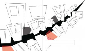
For the first and second page of the zine, grids of illustrated windows are shown which are complemented by the text on the second page:
“Win-dow(we dont) know how long this beauty will last”
Not knowing till when the beauty of that area last. I emphasize the visuals of the colorful old-style windows to represent the Peranakan houses.
As for the third and fourth page, the text says:
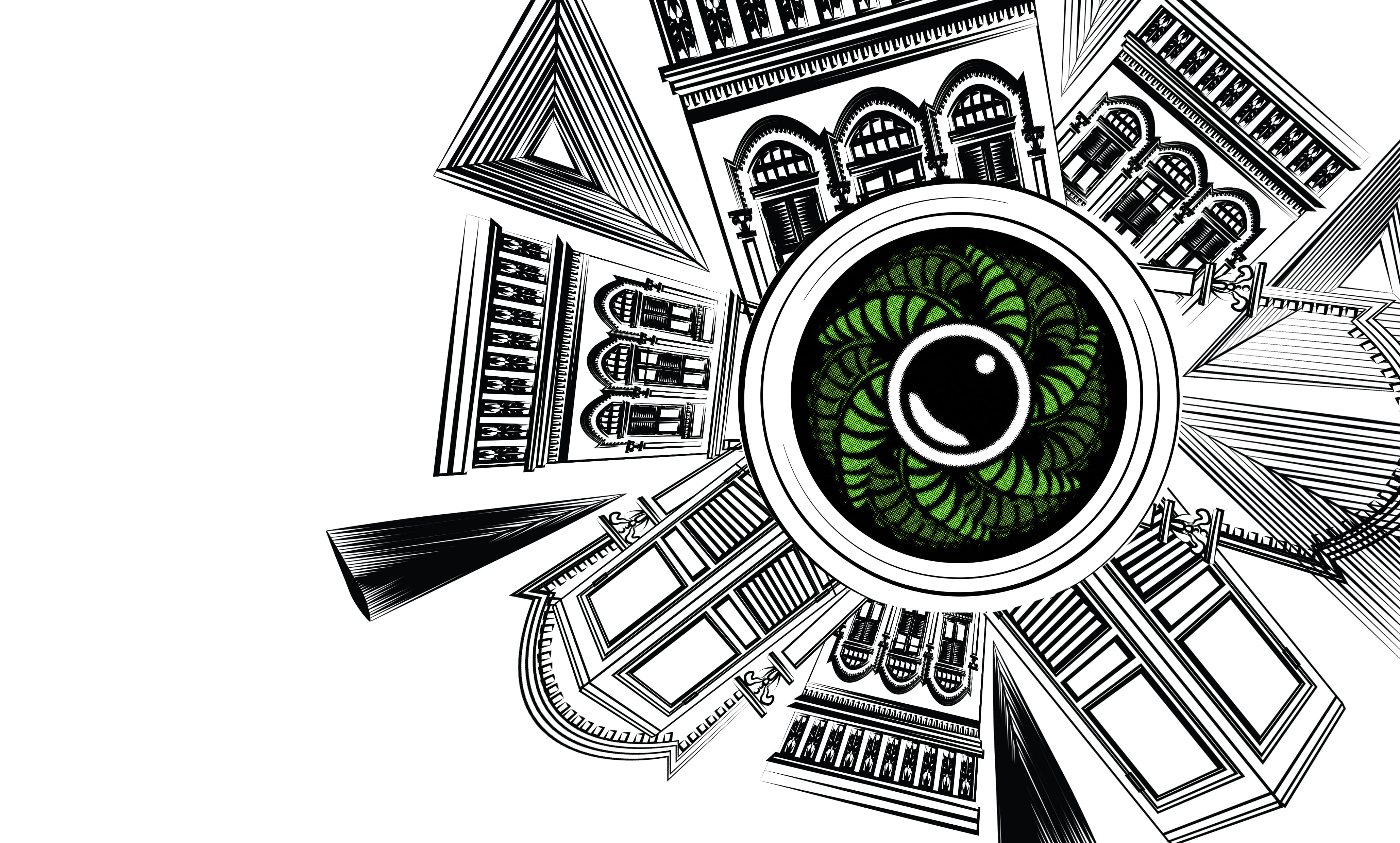
“People Co-co-nuts(Go nuts) with #ootd her”
The word Coconuts is taken from the past of Joo Chiat which used to be a coconut plantation. And the idea of #ootd came from my research and my own experience going over to the place and seeing so many people taking their pictures there. The visuals then supported the text. In a form of circular arranged Joo Chiat’s Peranakan houses, representing a camera lens in the middle is a half-cut coconut surrounded by its leaves. The beauty of the Peranakan houses is illustrated by the houses illustration.
[#ootd = outfit of the day. Pople will take a photo of their outfit and uploaded it to social media with #ootd]
Finally, the last 2 pages of the zine with a text:
“We must Nut-meg (not make) anymore changes to this place”
From my research, besides being a coconut plantation, there were also nutmegs plantations in Joo Chiat back then. For this pages, I focuses on the visual elements of The Joo Chiat area that we can still see now. The mosaic tiles, old letterbox, signboard and some parts from the Peranakan houses. In this two pages, I wanted to emphasize on how this items and elements in Joo Chiat shouldn’t be removed or change.
For all the pages I tried sustaining the colors and decorative visuals that represents Peranakan therefore, throughout, the zine not only tell a story but also showing the identity of Joo Chiat.
For printing of this ZIne, I have chosen a glossy paper to further push the colors out. Because matte paper may pull down the colors of the zine.
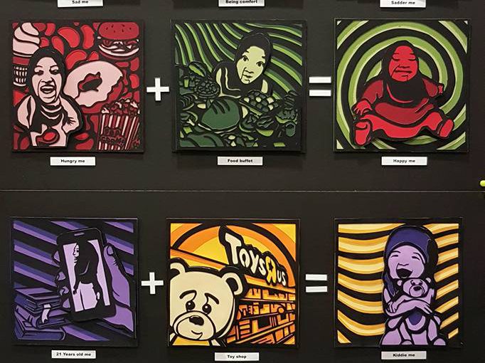
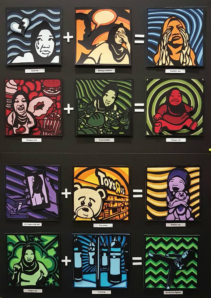
In this work, the equations tell the audience a story of me being in different situations, displaying my characters.
——————————————————
References & Research
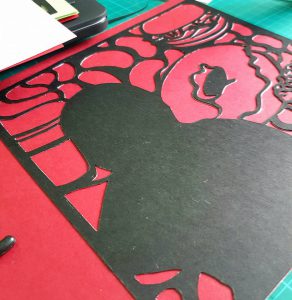
Upon receiving the brief, I’m determined to work on a paper cut work as I want to challenge myself and I want to work with a traditional medium. I manage to search for a few references of paper cut works which further motivates me to go with the medium.
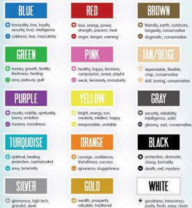
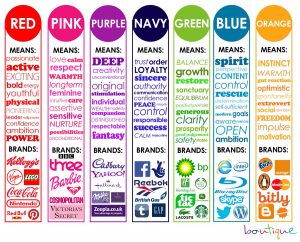
Not to forget, research on the meaning of colors. The emotions and meaning each color gives plays a part in this work.
COLORS
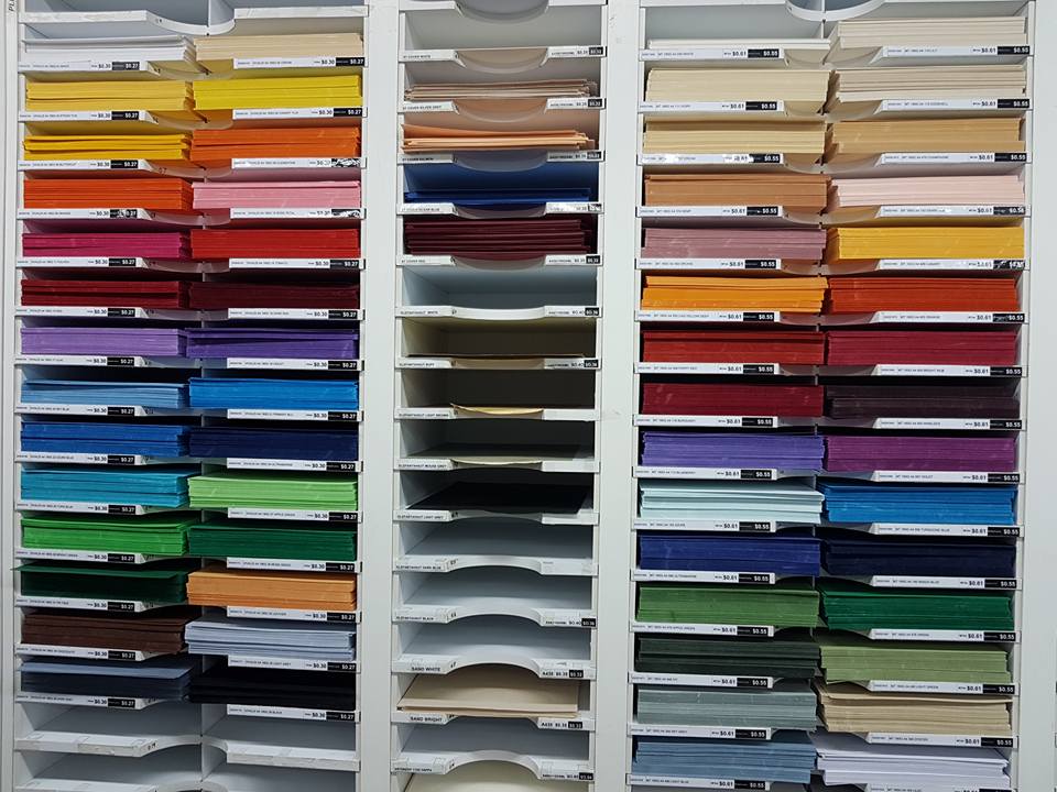
Selecting colors are the hardest part of the process, as it requires detail and using the paper cutting method, papers used are mostly colored paper/ construction paper which leaves me with minimal choices when selecting the specific shades of color.
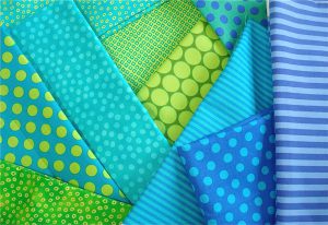
The color combination I decided to use is complementary and analogous colors as it gives the contrast I want my work to have, which is the ‘ Pop-art’ style. Below are references for the color combination selected.
These are the shelves of color paper at Artfriend, I spent about almost an hour just selecting the right shade of paper.
Process
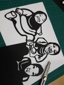
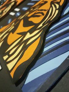
Images are selected to narrate different situations for each frame. The threshold effect is added to bring out the outline for the paper cutting process of the images, and give it a ‘pop-art look’.
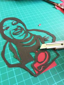
After being printed, the images are paste onto a black card paper. Frames are then cut out individually divided into layers, backgrounds, and pop-ups elements.
Color paper are then pasted and further cutting is done. This process are repeated in layers until all the colors are filled in.
Pop up method are used for the main characters/elements that I want the audience to focus on. This gives the work the extra height/depth which pushes the ‘Pop-art’ style more.
Final Work
1
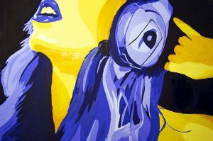
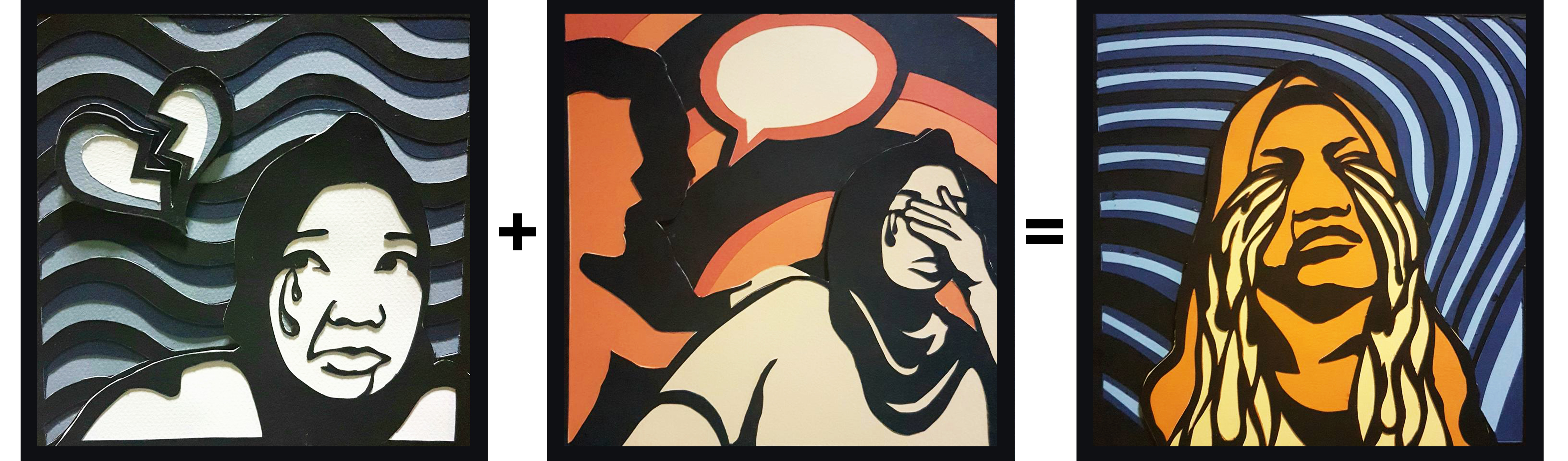
In the first set, colors used are complementary color. Blue(represents coldness & sad) + Orange (Sluggishness). The combination of the two colors is shown at the final product of the sad, ‘ Sadder me’. Frame 1 has the monochromatic color of blue and Frame 2, monochromatic color of orange which then results in Frame 3, which is the combination of both colours.
Sad me + Being comfort = Sadder me
——————————————————
2
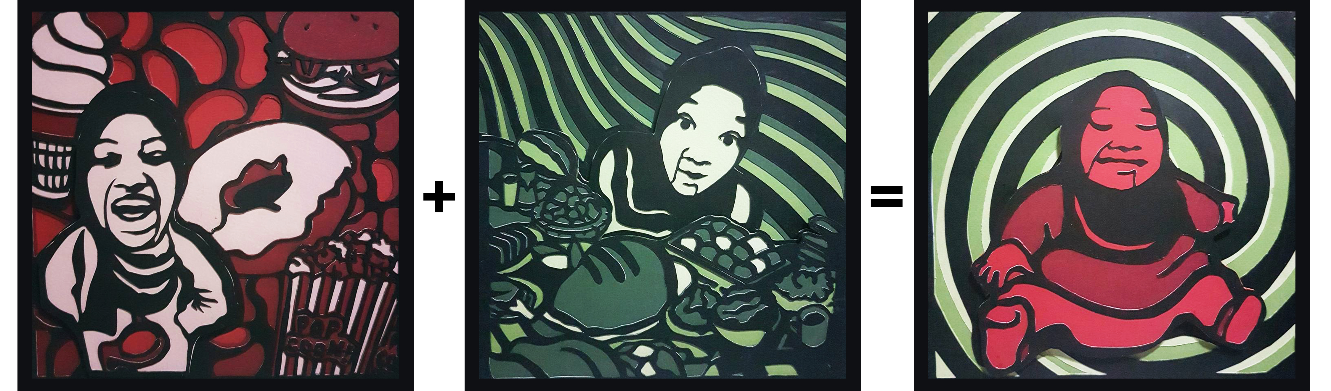
The second set, the complementary color of Red (represents danger and warning) and green are used. In this set, I’m trying to portray how food buffet actually makes me happy when I’m hungry. Frame 1 has the monochromatic color of red and Frame 2, monochromatic color of green which then results in Frame 3, which is the combination of both colours.
Hungry me + Food Buffet = Happy me
——————————————————
3
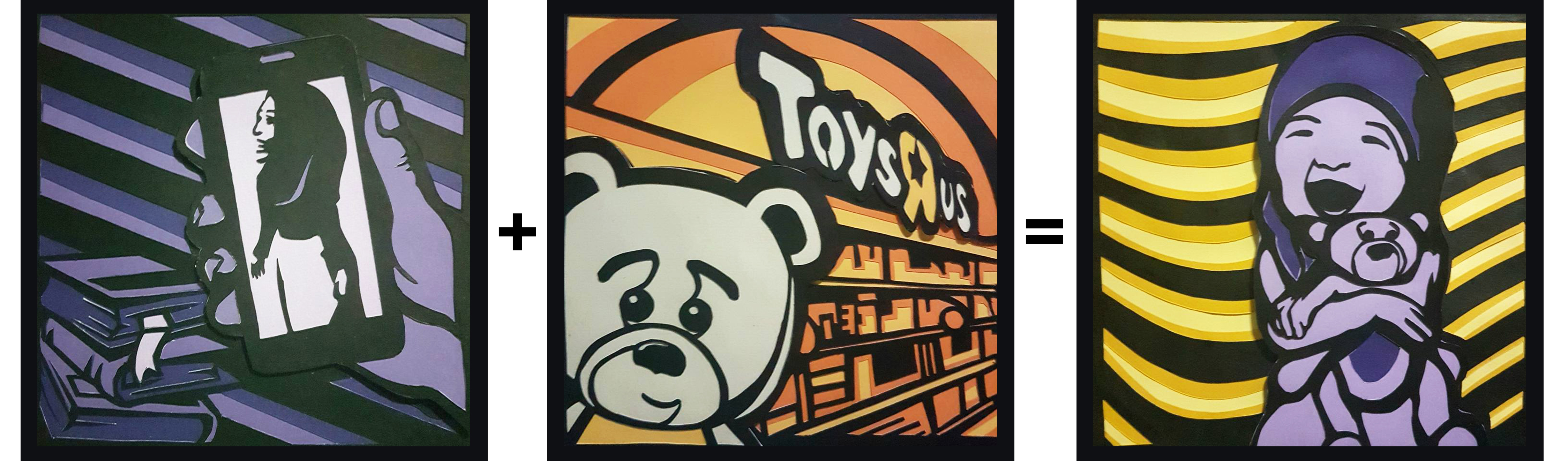
The third set, the complementary color are also used which is the complementary of purple and yellow. This set depicts me and my love for toys. Frame 1 has the monochromatic color of purple (represents ambition) and Frame 2, monochromatic color of yellow (represents bright and happiness) which then results in Frame 3, which is the combination of both colours.
21 Years old me + Toy shop = Kiddie me
——————————————————
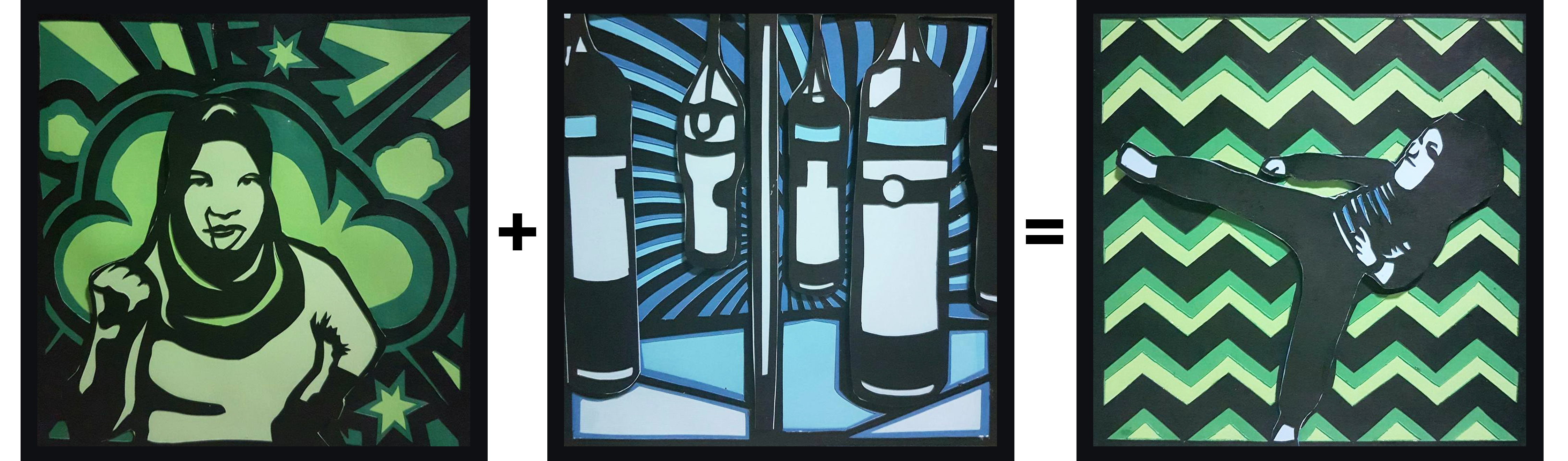
4
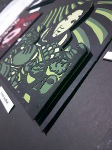
Lastly, for the 4th set, I decided to apply analogous color to the frames, the colors of green(discord / jealousy) and blue(represents spirit and determination). Frame 1 has the monochromatic color of green and Frame 2, monochromatic color of blue which then results in Frame 3, which is the combination of both colours.
Angry me + Training = Hardcore fighter
Reflection
Overall, I really enjoyed the process of this work. Even though it was very detailed and a lot of strength and patience needed in cutting out the frames layer by layer, portraying myself in the work, I really am proud and happy with the final outcome. And I believe there are some areas that I can improve on, based on the reviews given by the lecturer and my classmates. Some areas that I can improve on are the illustration of the different situations so that it is clearer for the audience to understand and the presentation of the final outcome, having the right colored backboard to push the contrast of the work more.