Final Project – EGO
In this work, the equations tell the audience a story of me being in different situations, displaying my characters.
——————————————————
References & Research
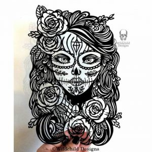
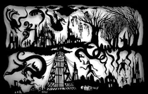
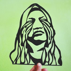
Upon receiving the brief, I’m determined to work on a paper cut work as I want to challenge myself and I want to work with a traditional medium. I manage to search for a few references of paper cut works which further motivates me to go with the medium.

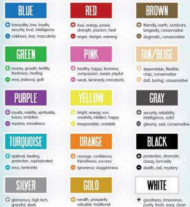
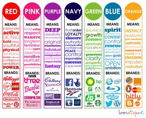
Not to forget, research on the meaning of colors. The emotions and meaning each color gives plays a part in this work.
COLORS
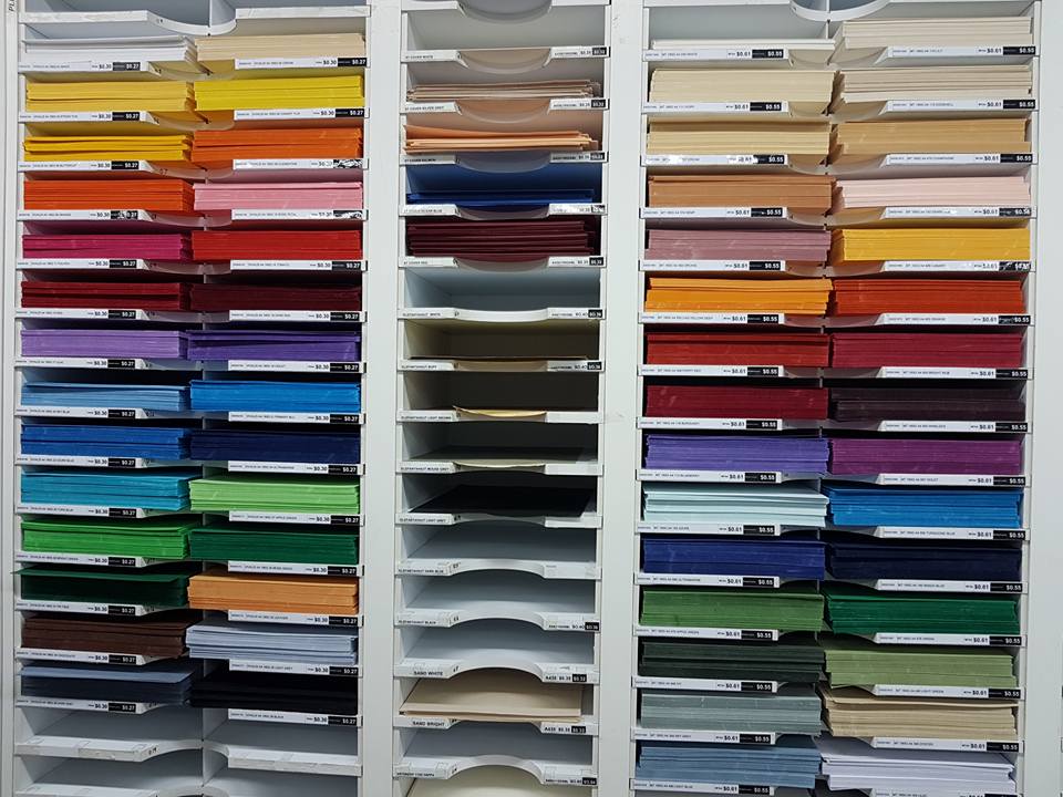
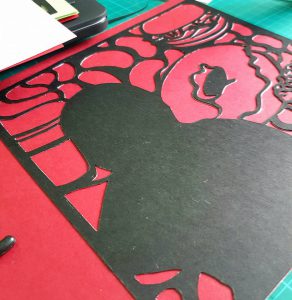
Selecting colors are the hardest part of the process, as it requires detail and using the paper cutting method, papers used are mostly colored paper/ construction paper which leaves me with minimal choices when selecting the specific shades of color.
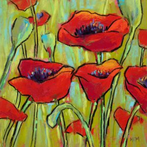
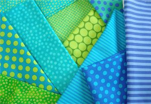
The color combination I decided to use is complementary and analogous colors as it gives the contrast I want my work to have, which is the ‘ Pop-art’ style. Below are references for the color combination selected.

These are the shelves of color paper at Artfriend, I spent about almost an hour just selecting the right shade of paper.
Process
Images are selected to narrate different situations for each frame. The threshold effect is added to bring out the outline for the paper cutting process of the images, and give it a ‘pop-art look’.
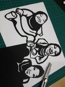
After being printed, the images are paste onto a black card paper. Frames are then cut out individually divided into layers, backgrounds, and pop-ups elements.
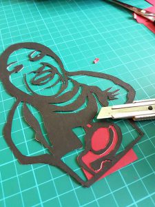
Color paper are then pasted and further cutting is done. This process are repeated in layers until all the colors are filled in.
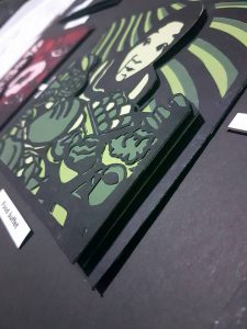
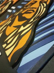
Pop up method are used for the main characters/elements that I want the audience to focus on. This gives the work the extra height/depth which pushes the ‘Pop-art’ style more.
Final Work
1
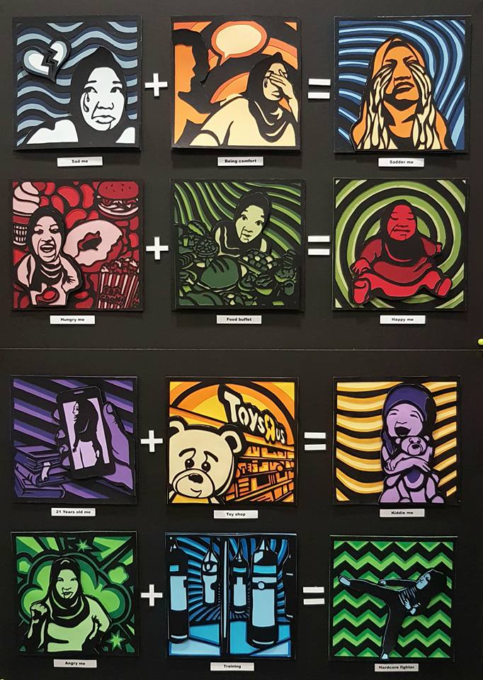
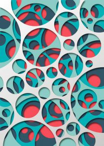
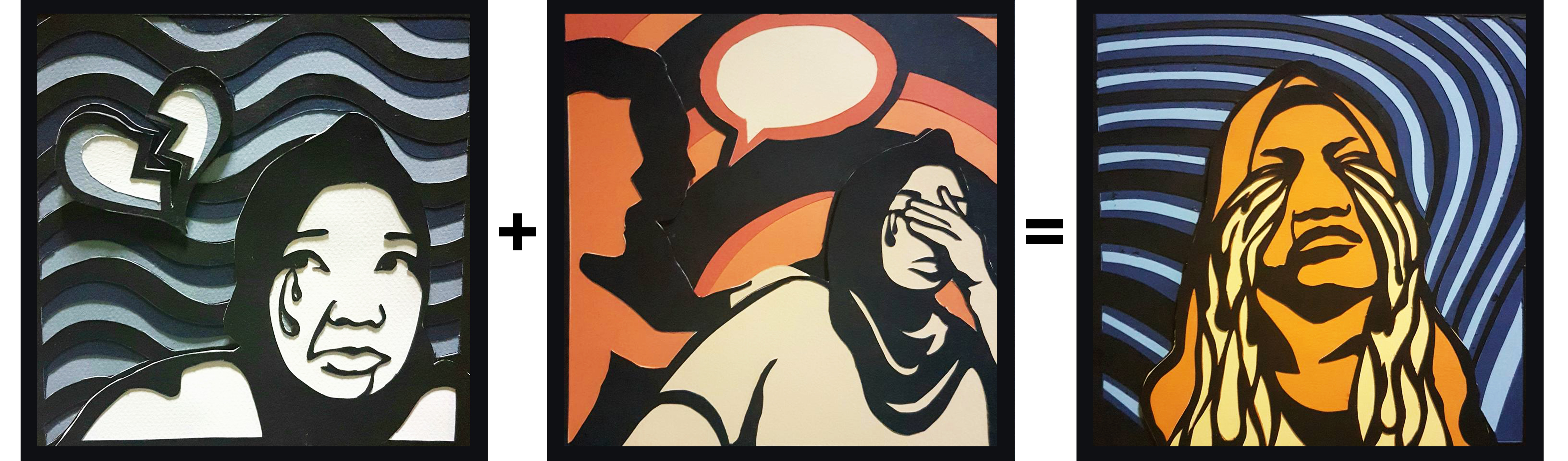
In the first set, colors used are complementary color. Blue(represents coldness & sad) + Orange (Sluggishness). The combination of the two colors is shown at the final product of the sad, ‘ Sadder me’. Frame 1 has the monochromatic color of blue and Frame 2, monochromatic color of orange which then results in Frame 3, which is the combination of both colours.
——————————————————
2
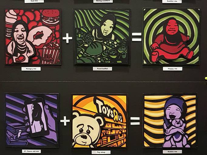
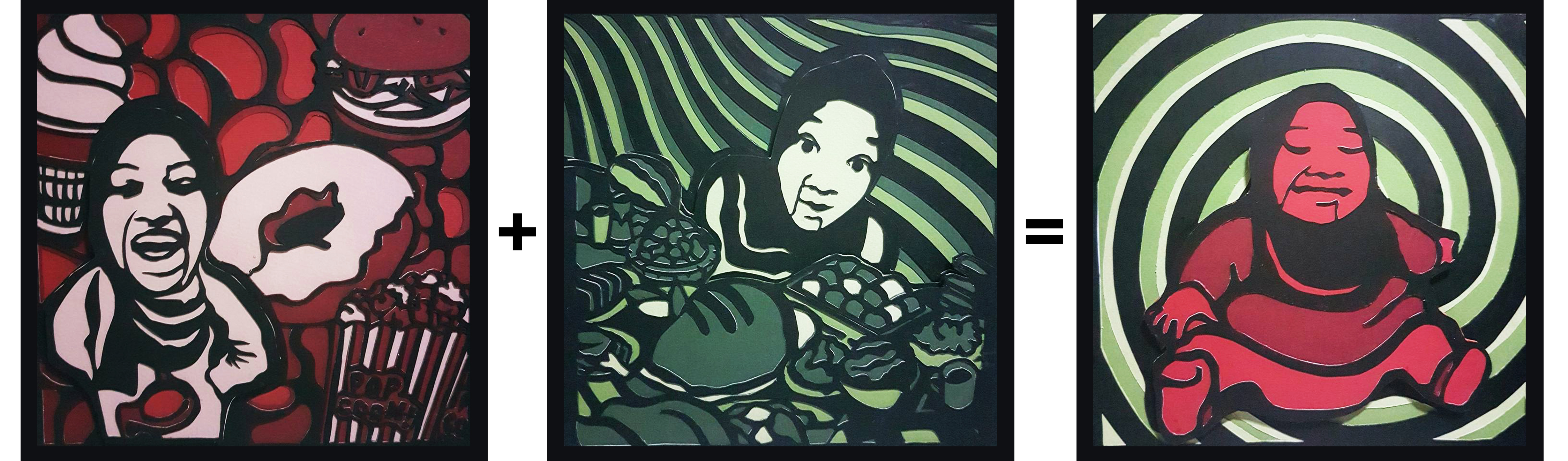
The second set, the complementary color of Red (represents danger and warning) and green are used. In this set, I’m trying to portray how food buffet actually makes me happy when I’m hungry. Frame 1 has the monochromatic color of red and Frame 2, monochromatic color of green which then results in Frame 3, which is the combination of both colours.
——————————————————
3
The third set, the complementary color are also used which is the complementary of purple and yellow. This set depicts me and my love for toys. Frame 1 has the monochromatic color of purple (represents ambition) and Frame 2, monochromatic color of yellow (represents bright and happiness) which then results in Frame 3, which is the combination of both colours.
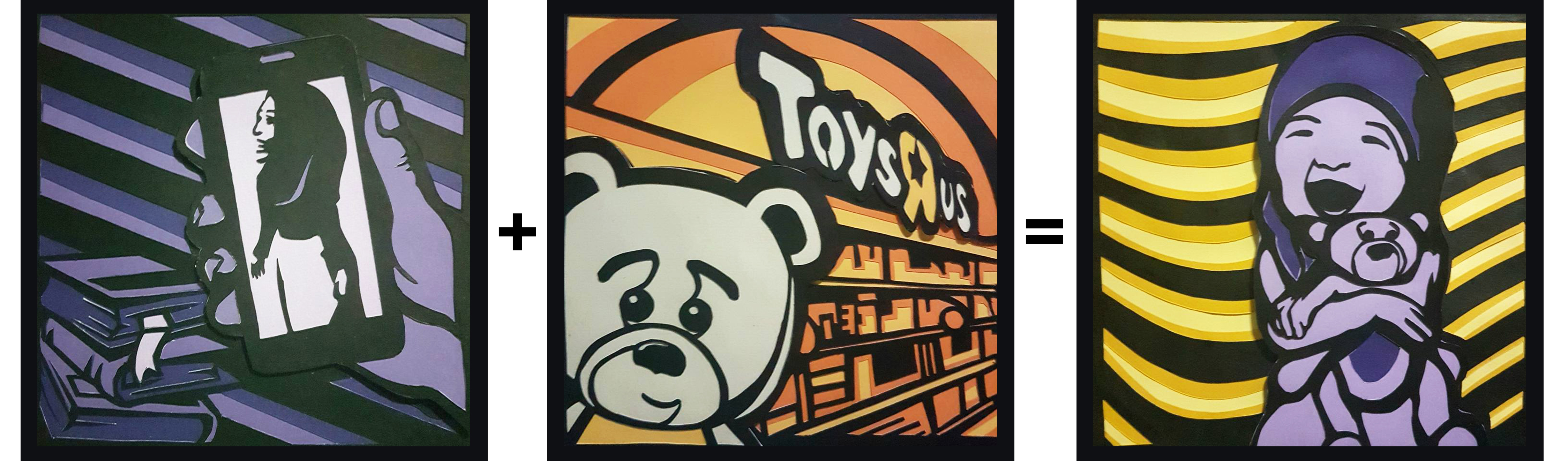
21 Years old me + Toy shop = Kiddie me
——————————————————
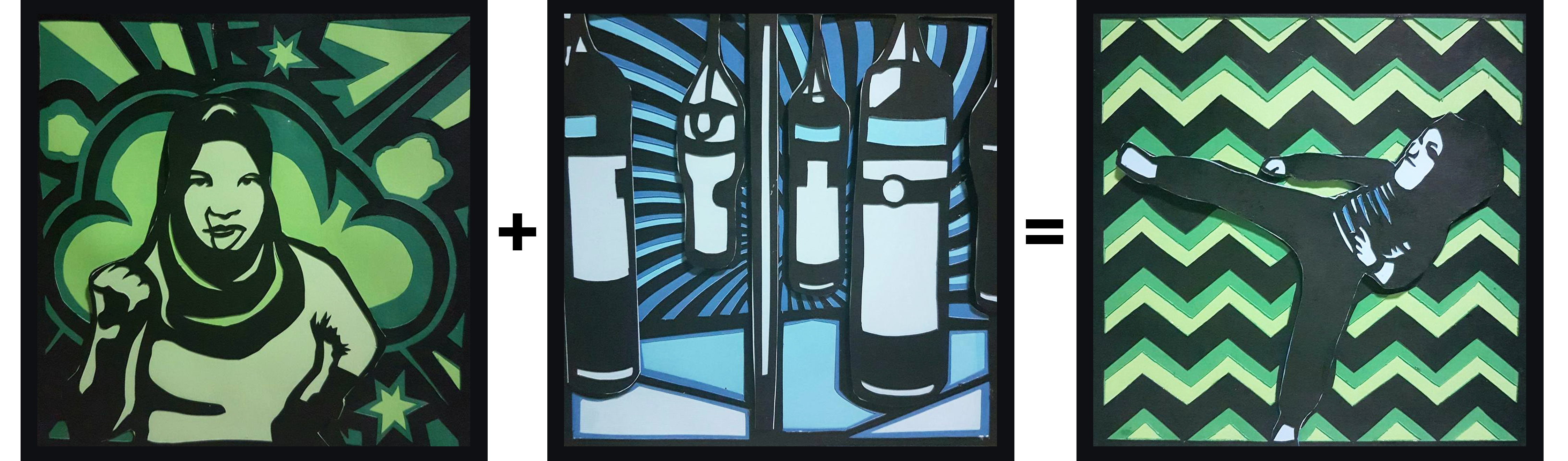
4
Lastly, for the 4th set, I decided to apply analogous color to the frames, the colors of green(discord / jealousy) and blue(represents spirit and determination). Frame 1 has the monochromatic color of green and Frame 2, monochromatic color of blue which then results in Frame 3, which is the combination of both colours.
Reflection
Overall, I really enjoyed the process of this work. Even though it was very detailed and a lot of strength and patience needed in cutting out the frames layer by layer, portraying myself in the work, I really am proud and happy with the final outcome. And I believe there are some areas that I can improve on, based on the reviews given by the lecturer and my classmates. Some areas that I can improve on are the illustration of the different situations so that it is clearer for the audience to understand and the presentation of the final outcome, having the right colored backboard to push the contrast of the work more.


 For the first exploration, I decided to design a clock in an eye, to show a hypnotized eye. As we know, the idea of a person who is hypnotized can be ordered around. Therefore, I’m trying to portray the eye being hypnotized by a clock.


