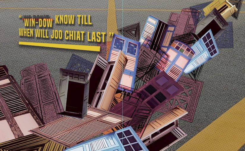
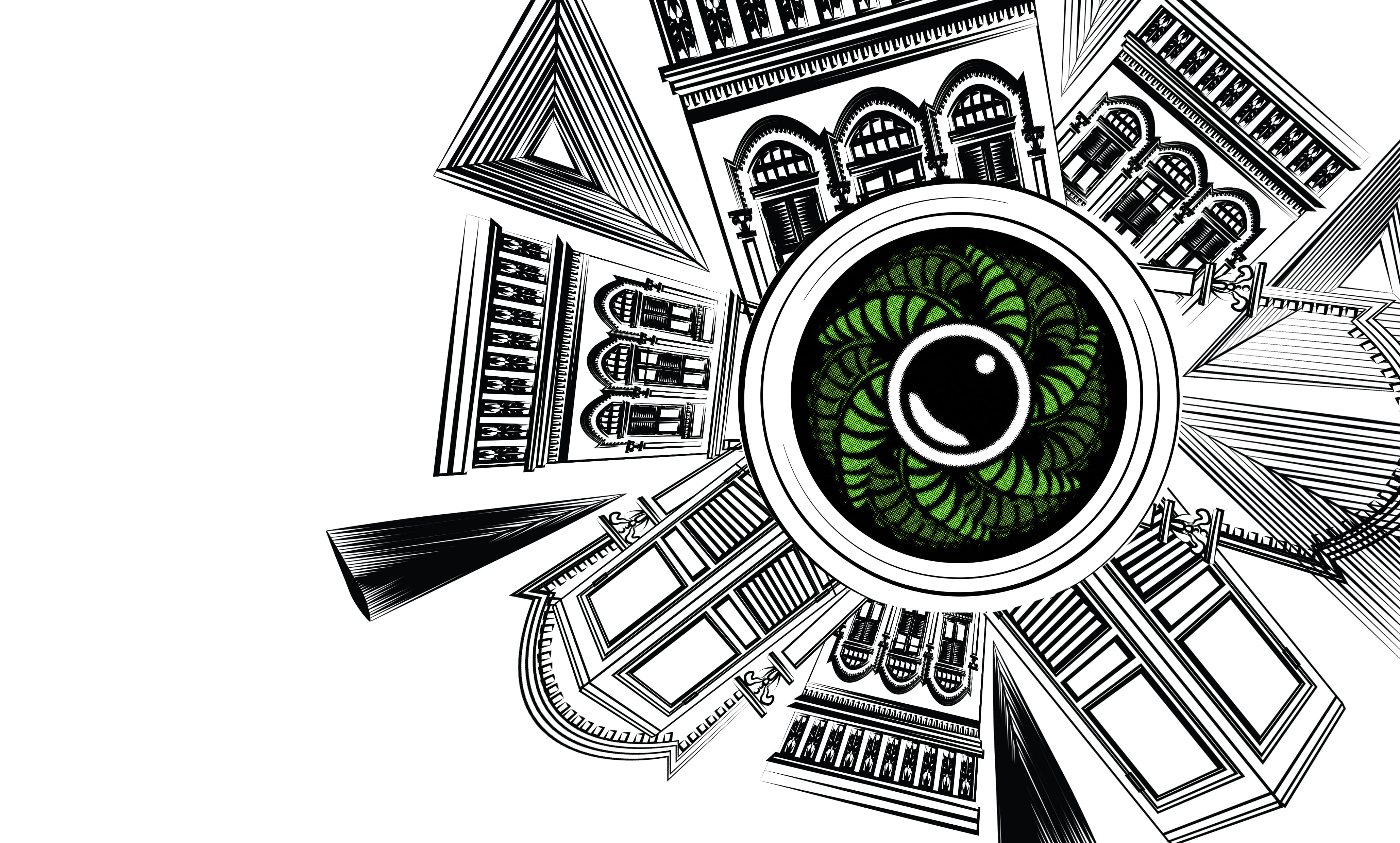
Locale Joo Chiat Final: My Pun-ny thoughts at Joo Chiat


FINAL PRODUCT


Peer critics and Reflection:

Overall, I’m very satisfied with the final outcome although there are areas that I can improve on. Firstly, I’m glad I’ve taken the decision of making a big change of style and direction. It’s been a fruitful process.

Some of the critics I got were

“Love the Lame Puns”: Glad they actually like the puns even though it’s not that Pun-ny (funny) get it? haha. And some do say that they understand what I’m trying to tell through the texts and with the support of the visuals.

Can explore Typography more: I agree with it, one of my weak skills are typography and I hope I could learn more and core on Typography in the future to further develop my design.

The last page seems off from the rest due to its colors: I just realized that the last 2 pages are a little off due to the sudden usage of a strong color as a background. However, I did apply a little of the same color on the previous 2 pages. But I agree that it does affect the consistency of the colors in the Zine.

Zine does show the identity of the location: I’m glad that everyone manages to get the identity of the location through the zine, however, there is still more aspect of portraying the identity of Joo Chiat that I can explore.

The Idea of an open and close window for the front and back page was good: Didn’t expect anyone to notice that small detailed I’ve put on my zine. However, I’m glad that someone actually notices it and pointed it out with a positive feedback.

I appreciate the critics given knowing that I still have areas that I can actually improve on. Besides that, I’m also glad to see the various styles and works from my classmates. It was surely an eye-opening assignment exposing me to see that I could even step out furthermore from my comfort zone.

Joo chiat-Process

JOO CHIAT ZINE

For this zine, I want to include the past and the future which is shown in the sentences for the different page. Using puns to include some past elements to my thoughts on Joo Chiat now.

As for the visuals, I would like to show the architectural forms and elements that I extract from the photos I took and some illustration.

” Win-dow(we don’t) know when will this beauty last”
” People Co-co-nuts (go go nuts) with #ootd here “
” We must nut-meg(not make) any changes to Joo Chiat “


2nd page:

Compiling photos and illustrations of windows

———————————————————————————–

OR


3rd page:

Work in Progress


Critics and reflection

As I received the first critic for my first mockup, I realized and agreed that it does not do justice for the place due to its very dull and dark visuals. And usage of old and dark colored windows wasn’t a good idea.The colors and images used don’t represent the Joo Chiat area which is colorful, bright and lively. Therefore, I decided to take a huge leap and go for a different style.

Locale Joo Chiat Final mockup: My Pun-ny thoughts at Joo Chiat

So, for my final product, I decided to go for an illustration style and use more pastel and colors that are found in the Peranakan houses area of Joo Chiat. I also added elements and graphics that represent the Peranakan identity of the place.

For the front and back page, I use the graphics of the architecture from the Peranakan houses. And lay them out in rows. This represents an ‘introduction’ of what to expect in the book. And I wanted readers to get the identity of the place just by looking at the cover page. And to start off, readers are greeted with and Peranakan-styled open window at the front page with the title. “My Pun-ny thoughts at Joo Chiat” is the chosen title due to some puns context inside where the puns were actually related to the past of this Joo Chiat area. Lastly, to end off the Zine there is a closed window showing that its the end of the zine.

For the first and second page of the zine, grids of illustrated windows are shown which are complemented by the text on the second page:

Win-dow(we dont) know how long this beauty will last”

Not knowing till when the beauty of that area last. I emphasize the visuals of the colorful old-style windows to represent the Peranakan houses.

As for the third and fourth page, the text says:

“People Co-co-nuts(Go nuts) with #ootd her”

The word Coconuts is taken from the past of Joo Chiat which used to be a coconut plantation. And the idea of #ootd came from my research and my own experience going over to the place and seeing so many people taking their pictures there. The visuals then supported the text. In a form of circular arranged Joo Chiat’s Peranakan houses, representing a camera lens in the middle is a half-cut coconut surrounded by its leaves. The beauty of the Peranakan houses is illustrated by the houses illustration.

[#ootd = outfit of the day. Pople will take a photo of their outfit and uploaded it to social media with #ootd]

Finally, the last 2 pages of the zine with a text:

“We must Nut-meg (not make) anymore changes to this place”

From my research, besides being a coconut plantation, there were also nutmegs plantations in Joo Chiat back then. For this pages, I focuses on the visual elements of The Joo Chiat area that we can still see now. The mosaic tiles, old letterbox, signboard and some parts from the Peranakan houses. In this two pages, I wanted to emphasize on how this items and elements in Joo Chiat shouldn’t be removed or change.

For all the pages I tried sustaining the colors and decorative visuals that represents Peranakan therefore, throughout, the zine not only tell a story but also showing the identity of Joo Chiat.

For printing of this ZIne, I have chosen a glossy paper to further push the colors out. Because matte paper may pull down the colors of the zine.

Project 1 Final and process: ‘My name is’

Gum Buster

“When gum ends up outside of a mouth but not in a trash can, it can become pretty gross and unwanted. That’s when a Gum Buster goes to work.”

– https://www.careermatch.com/job-prep/career-insights/profiles/gum-buster/

For this work I want the focus to be on the gum itself. The stretched gums are extracted from images from google. I then use warp/ distort technique carefully, stretching and expanding the gums to form up my name up, letter by letter following my sketch using photoshop. The tip of the gum vacuum cleaner and the yellow boot was taken images from Google where I then digitalise it using High fidelity in Illustrator. A further effect was then added in Photoshop.

Roller Coaster Tester

A job that can earn you a high pay but risking your life. A Rollercoaster tester is someone who is paid to be the first tester of a ride before it officially opens for the public. For this work, my name is crafted by the rollercoaster track. After drawing out the draft, I use Illustrator to trace out the tracks part by part using the pen tool. Then, I use photoshop to give the track a realistic effect. I then design the rollercoaster seat using Illustrator as the base and Photoshop to give its depth and realistic touch. The other elements in this work, like the details of the platform and tracks, was also done in Illustrator. The Grass was an image taken from google and using high Fidelity in Illustrator to digitalise it and further effect is added in photoshop.


Surgeon

“A surgeon is a physician who performs surgical operations” – Wikipedia

For this work, I wanted to show the point of view of a surgeon dissect a body. Using the small intestine as the main focus to create my name, I took pictures of the human organs from Google and extract out parts of the small intestine. Then I form it up letter by letter. The human skin is then drafter in Illustrator and effect are applied in photoshop to give it texture and tone. I then blood to exaggerate the effect.

Barber

Barber is the choice to replace my job as a translator. I draw out my idea and craft out my name from a hair image where I then added bits and pieces of hair onto my name making it more realistic and detailed. Lastly, I applied an effect in Photoshop to give it a wavy texture. I then added the human forehead and shaver that was from images that I searched for where I further manipulate constructing and applying tones and effect on.

For all of the works, I explored Illustrator for drafting out/illustrating parts of the work and using Photoshop to further explore my strength in digital imaging and manipulating an image content.


Peer critic & reflection:

I have received critics on “Roller-Coaster Tester” & “Barber” where both images are a little too flat compared to the other two. And the perspective of the roller coaster tester is not right. In future work, I will pay attention to the perspective of the elements in my work and also the consistency throughout my works.


Project 1- Process

Process

After selecting the TOP Job choices from my list, I Search for images and references related to the jobs. I also design a mood board for each job.

GUM BUSTER

For gum buster I want it to have the real colours of the actual situation that the busters have to see, the colour of the gum, the grey road and a little yellow from the cleaner boots to show its a job of cleaning up gums. And using Gum as the main Element to spell out my name. Below is a draft of my idea.

The draft idea using a font and distorting it.


SURGEON

As for Surgeon, I wanted the mood and colour of the work to be related to the job scope which is dark red and dark situation that represent blood and also a little contrast for the surgical glove. And I wanted to play around with the idea of using organs/body parts itself to spell out my name which is a direct representation of a surgeon job.

How I extract part of organs(Small intestine) to form letters

ROLLER COASTER TESTER

For roller coaster tester, I wanted it to have the colour of happiness, fun and vibrant as its related to entertainment and fun time. And using the rollercoaster track to form up my name would be my idea.

TRANSLATOR

For Translator, I chose colours that are friendly and cheerful which are blue and yellow. To me, the colours really represent the idea of being a translator. As for the method of work, I wanted to try a different technique which is to play with negative space/gestalt. Forming up my name using different language letters.


BARBER [ADDED]

When Barber came to mind, all I imagine was a cosy and ‘home’ feels barber shop. Where the walls are either wood or brick. I looked for image references of a barber shop and most of them have about the same environment. The feels and colour I want to go for was something along the warm and earth tone colour.

Project 1- Research

Upon receiving the project brief, I started looking for various strangest/top jobs in the world. Some of the Jobs I listed out was

List of Weird Jobs

  • Gum Buster (a job to clean up chewing gums on street)
  • Professional Sleeper (Paid to sleep, Finland)
  • Elephant Dresser (Sri Lanka)
  • Panda Nanny
  • Professional line-standers (Paid to wait in line[sale/opening])
  • Fortune cookie writer
  • Roller coaster tester

List of Top Jobs

  • Software Developer
  • Dentist
  • Surgeon
  • Optometrist
  • Translator
  • Hairdresser
  • Barber


And the top chosen jobs are

Gum Busters

Roller coaster tester

Surgeon 

Translator

& Barber


Below are some reference/research on the mediums for this project.

https://creativepro.com/typetalk-the-typographic-expressions-of-stefan-sagmeister/

Inspired by the reference above, I would want to go to a more realistic directions with usage of both Photoshop and Illustrator.