INTERPReTATION of theme
For this project, the main theme was the idea of Subversion. To subvert is to change the original understood meaning of a particular idea or object. However in its strictest definition, it describes the complete destabilising or challenging of an established concept. To focus on creating more impactful images, I chose to adopt the latter definition.
object
The object I was tasked to subvert — Broccoli
My main concept required me to first deconstruct broccoli into the common attributes associated with it — both physically and metaphorically.
Physical Attributes: Green, Thick Stalk, Florets, Leafs, Rough, Soft and Spongey, Crunchy, Dry, Bland
Metaphorical Attributes: Healthy, Essential Superfood, Dieting, Cleansing, Detox, Balanced Meal, Detested by Adolescents, Gross, Unpleasant, Force-Fed
Component 1—DEnotation
For the first component, I had to capture the broccoli as it was, without imbuing or associating it with any implied meaning. However, I did not want to simply photograph the Broccoli as we would usually see it — when in grocery carts or our kitchen. I wanted to capture certain unique attributes of the vegetables that we may often overlook. I achieved this by playing with perspectives and employing close up shots — how often would one closely inspect a Broccoli before chopping it up? I wanted the images in this component to be strong enough to provoke the audience (through mere physical representation alone) into associating them with their own meaning. The resulting images emanate a sense of an alien, sci-fi like like landscape.
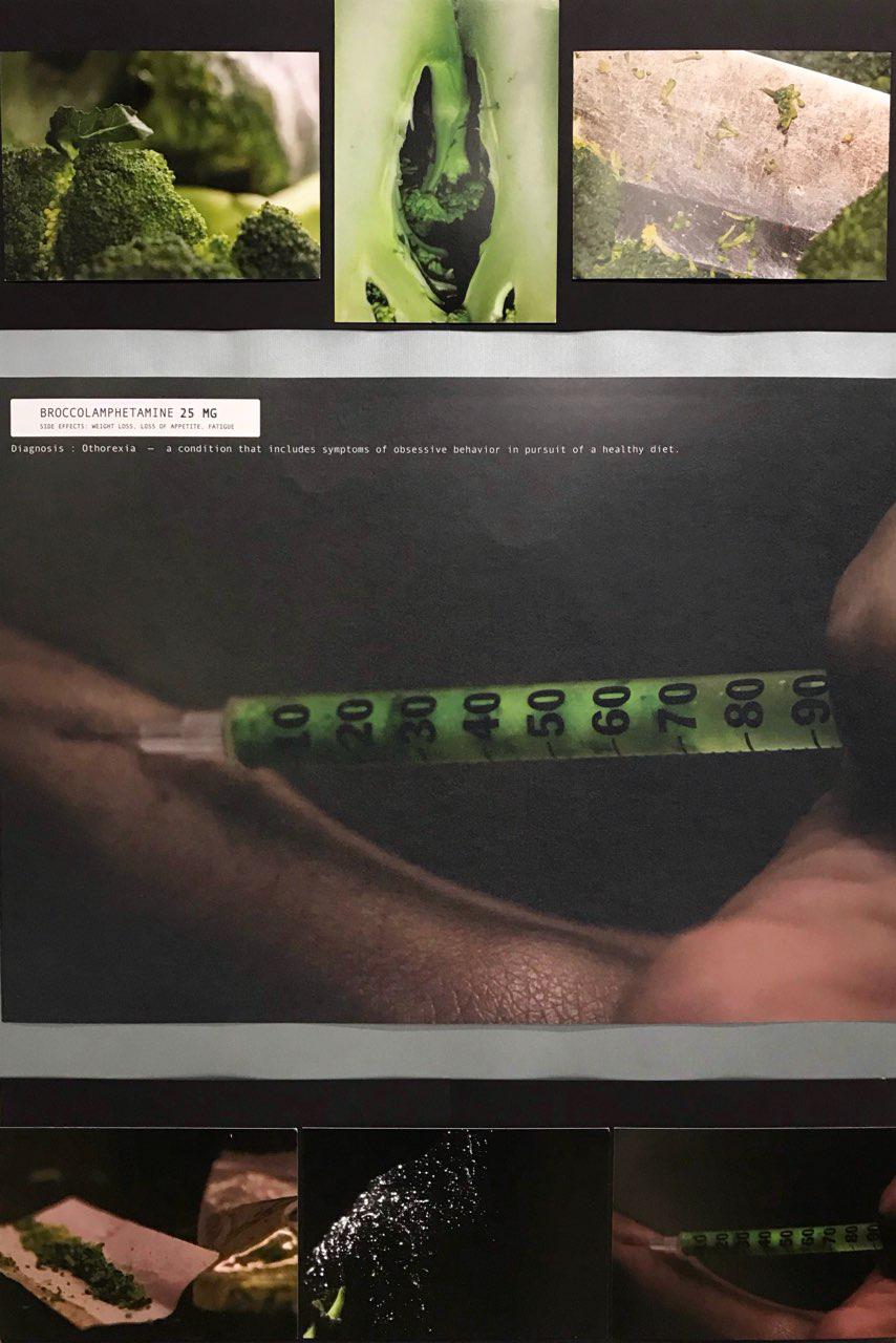
image 1
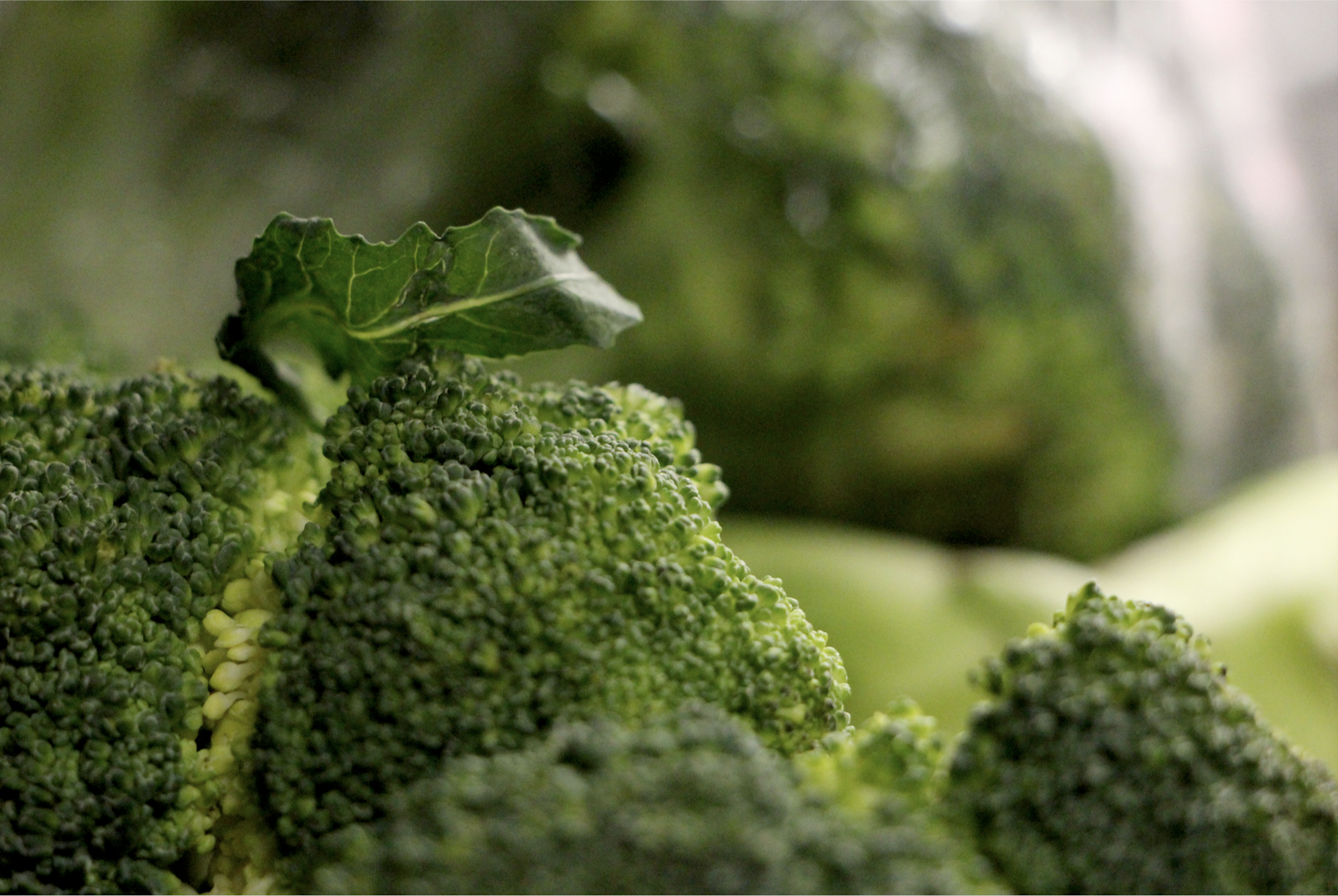
This image comprises of two broccolis — a bare one in the foreground, and a cling wrapped one that is in the blur of the background. In this image, I wanted to capture the discoloured areas of the vegetable instead of the predominantly noticed lush green. Hence I focused my lens on a yellow line of discoloured florets that cut across the surrounding patch of green. A lone leaf also seems to be sprouting out from this ‘line’. These leaves are often obsolete and overlooked as being part of the broccoli — when one thinks of broccoli they would rarely describe it as having leaves. I intentionally framed the ‘anomalous’ leaf in my shot to feature the forgotten sides of this familiar vegetable. In the background I ensured that the stalk was also visible as I wanted to capture its general form. To provide a different perspective, I placed a cling wrapped broccoli which represents stored vegetables, in the background too. The reflective property of the cling wrap accentuates the alien-like mood and landscape in this image.
image 2
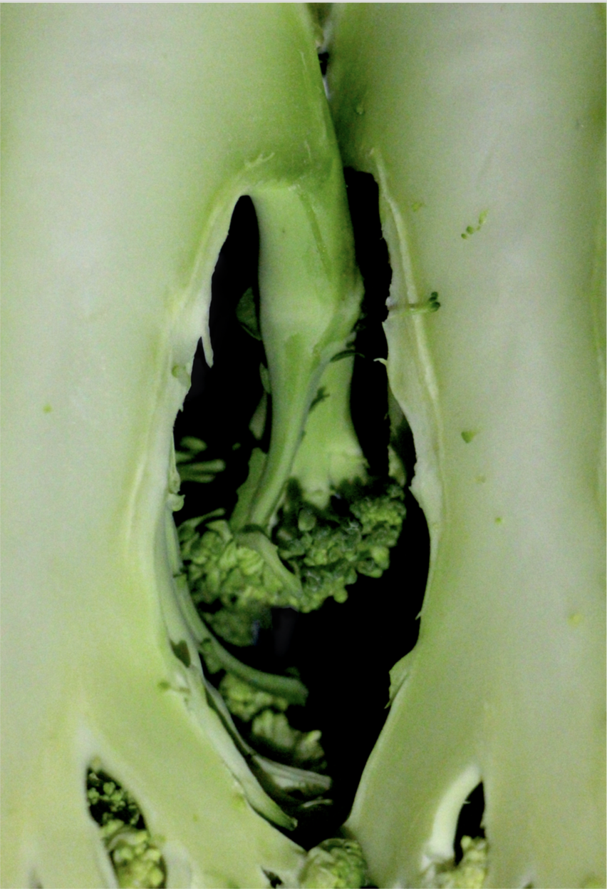
This is an image of the cross-section of two halves of a broccoli placed side by side. For this image, my intention was to capture the interior of the Broccoli, apart from just exploring its external form itself. The cross section of the stalks have a desaturated pastel green tone that contrasts from the bright green of the exterior. I intentionally placed the cross sections such that the little floret sprout from the first half, and the second half form a cavity that provocatively alludes to the form of the female genitalia.
image 3
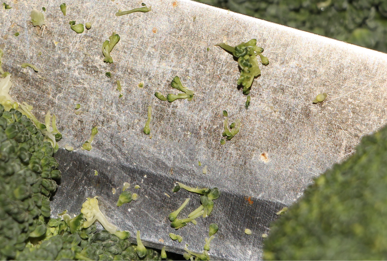
This is a close up shot of the broccoli’s florets stuck against the blade of a kitchen knife. I sliced a knife through the broccoli just like all of us do when we chop vegetables for cooking. However, I only sliced down halfway and decided to capture the remnants that are left behind on the knife after one is done with their chopping. The tiny florets are also featured as individual pieces instead of one big cluster. The fragility of the florets is emphasised through its juxtaposition against the cold, hard, and scratched steel of the blade.
COmponent 2 — ConnoTATION
For this component, I wanted to subvert he metaphorical meaning of the broccoli. Firstly, broccoli is widely associated with balanced meals and good health. It is also considered an unpleasant ingredient by many, especially children who tend to avoid eating them. Hence in the series of images for this component, I wanted to portray it as being insidious and destructive rather than beneficial — as an alluring drug that is detrimental to one’s health. I did this through techniques of replacing, removing or altering certain parts of the broccoli.
iMage 1
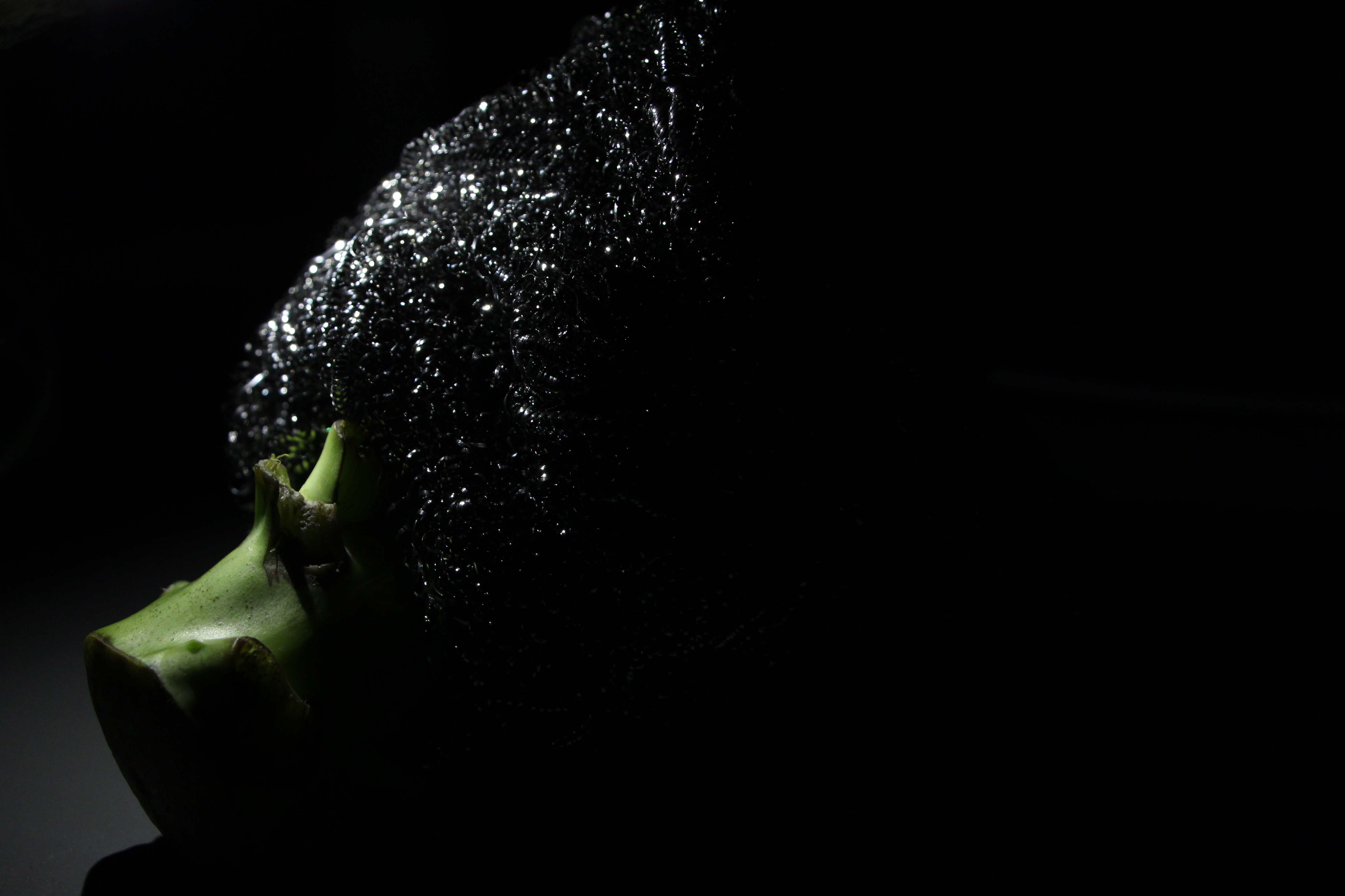
In this image, the top portion of the broccoli has been chopped off and replaced with clumps of steel wool. My intention was to subvert the original ‘feathery’ texture and make it coarse and bristly instead. Only part of the stalk is visible and it looks as if its disguising itself as something shiny and visually alluring. This gives this image an ominous mood. I also wanted the broccoli to be ‘eye-catching’ and have a tinker-like look to evoke the feeling of people craving it as a vice, the same way magpies are ‘addicted’ to acquiring shiny items.
image 2
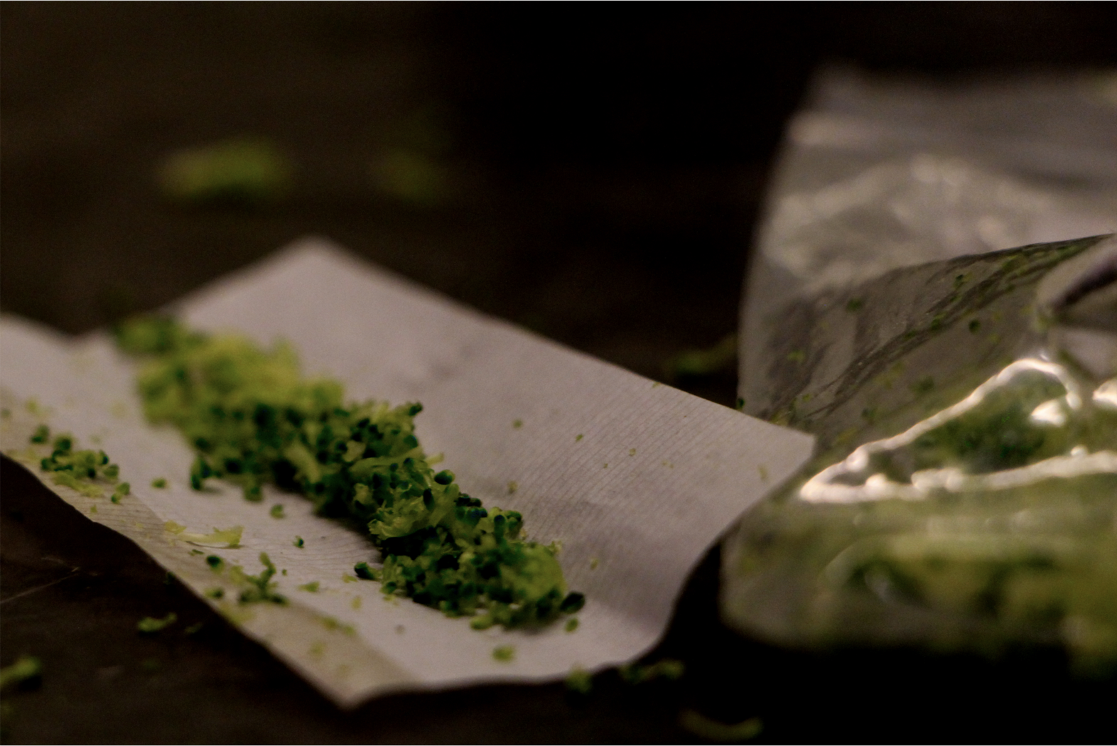
In this image I wanted to make the broccoli look like marijuana. I removed the florets from the main vegetable and scattered some on a rolling paper to simulate a joint. Beside it, I placed a ‘baggie’ filled with chunks of broccoli to accentuate the marijuana imagery. This image was taken on a kitchen counter top, scattered with bits of broccoli which I included in the frame — drug houses tend to be messy and unkept. Here, broccoli is portrayed as highly sought after and widely consumed marijuana.
image 3
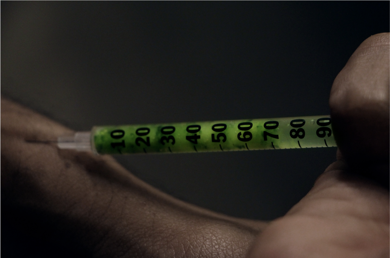
In this image, broccoli is portrayed as the highly addictive and potent painkiller, heroin. I ground chunks of broccoli, mixed them with water and filled up an insulin syringe to achieve this shot. The needle is angled such that it is pressed against a vein, suggesting intravenous injection — the most potent method of administering any kind of substance. I wanted the frame for this image to be as tight as possible and to convey tension — by using my curled finger, syringe and the portion of my forearm to form a visually rigid frame.
COMPONENT 3 — A2 Poster
For this component, I decided to use the third image from component two and combine it with a text. This was in line with my intention to portray broccoli as an addictive and unhealthy drug — challenging its original idea of being a healthy and beneficial food source. I did research to retrieve any information about vegetables being possibly detrimental to one’s health. While doing so, I learned about a relatively unknown eating disorder called Orthorexia Nervosa. It is a condition that includes symptoms of obsessive behavior in pursuit of a healthy diet.
‘To be clear, orthorexia is not an interest in healthy eating – it’s when enthusiasm becomes a pathological obsession, which leads to social isolation, psychological disturbance and even physical harm. In other words, as Bratman said in a co-authored book in 2000, it’s “a disease disguised as a virtue.”‘
– https://www.straitstimes.com/world/europe/orthorexia-when-healthy-eating-ends-up-making-you-sick, 2017
It is a widely argued concept and is not officially recognised by some experts. As such, I decided to use my image to make a poster that would raise awareness and bring concern to this often sidelined disorder.
Poster
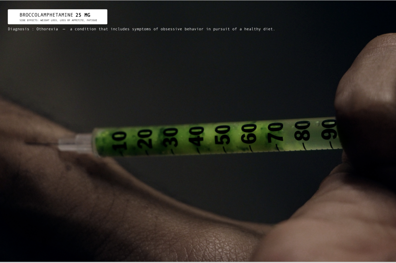
There are two text components in this poster — the text label and the line of text below it. I wanted to utilise broccoli, which is an established metaphor for healthy eating as the basis for highlighting Orthorexia. Hence I created a text label with the composite word : Broccolamphetamine – Broccoli and Methamphetamine. Amphetamines are substances that are infamously abused to achieve rapid weight loss. Hence I welded it with the word broccoli, to make it sound like an unhealthy drug. Amphetamines are also highly addictive and propagates unhealthy repetitive behaviour which is also a key sign of disorders. I included ‘side effects’ in subtexts to make the label look like a legitimate clinical and medicinal label. The side effects stated are synonymous with both Orthorexia and Methamphetamine Abuse. For my main text, I decided to keep it simple by using the definition of Orthorexia with the word ‘Diagnosis’. Since this was an awareness poster, I decided that the definition of the disorder would be sufficient enough to arrest viewer’s attention. The use of the word ‘Diagnosis’ emphasises the point that it is a serious medical condition — as serious as injecting substances into your body.
Reflection
After feedback from my peers and professor, I realised that I should have made the broccoli in the final poster more visible. I could have added chunks of broccolis in the background to help viewers make the link between the vegetable and the green substance in the syringe. I could have also added more text for those who do not have knowledge on drugs. This would ensure a wider and more successful outreach.