
Pandora’s Box: Symmetry
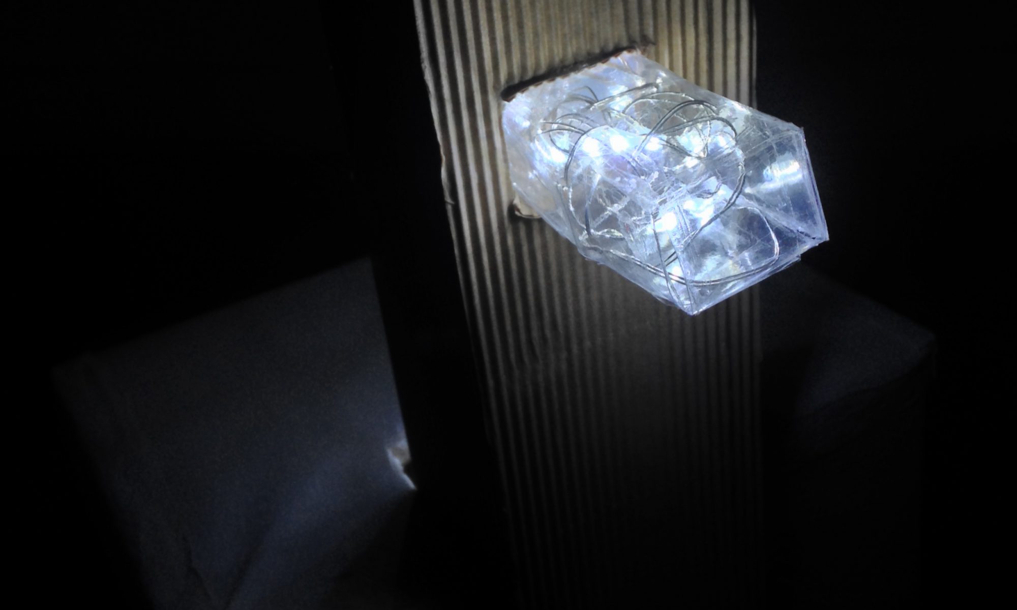
Bottom: Product in light
Concept
A common term usually associated with symmetry is ‘equilibrium’, where it refers to elements being equally arranged on both sides of an axis, creating a sense of balance, and thereby establishing beauty of form. Additionally, the idea of elements coexisting in such a way where balance and beauty are achieved, can be reinforced through the use of varying materials and spaces.
Drawing inspiration from these ideas that were evident in projects such as Hufton+Crow’s Disparate Bus Stops and Sou Fujimoto’s House H, I hope to, in my final product, apply these concepts using different techniques and design principles, with the use of materials enhancing it further.
Principles Applied
I. Techniques Applied
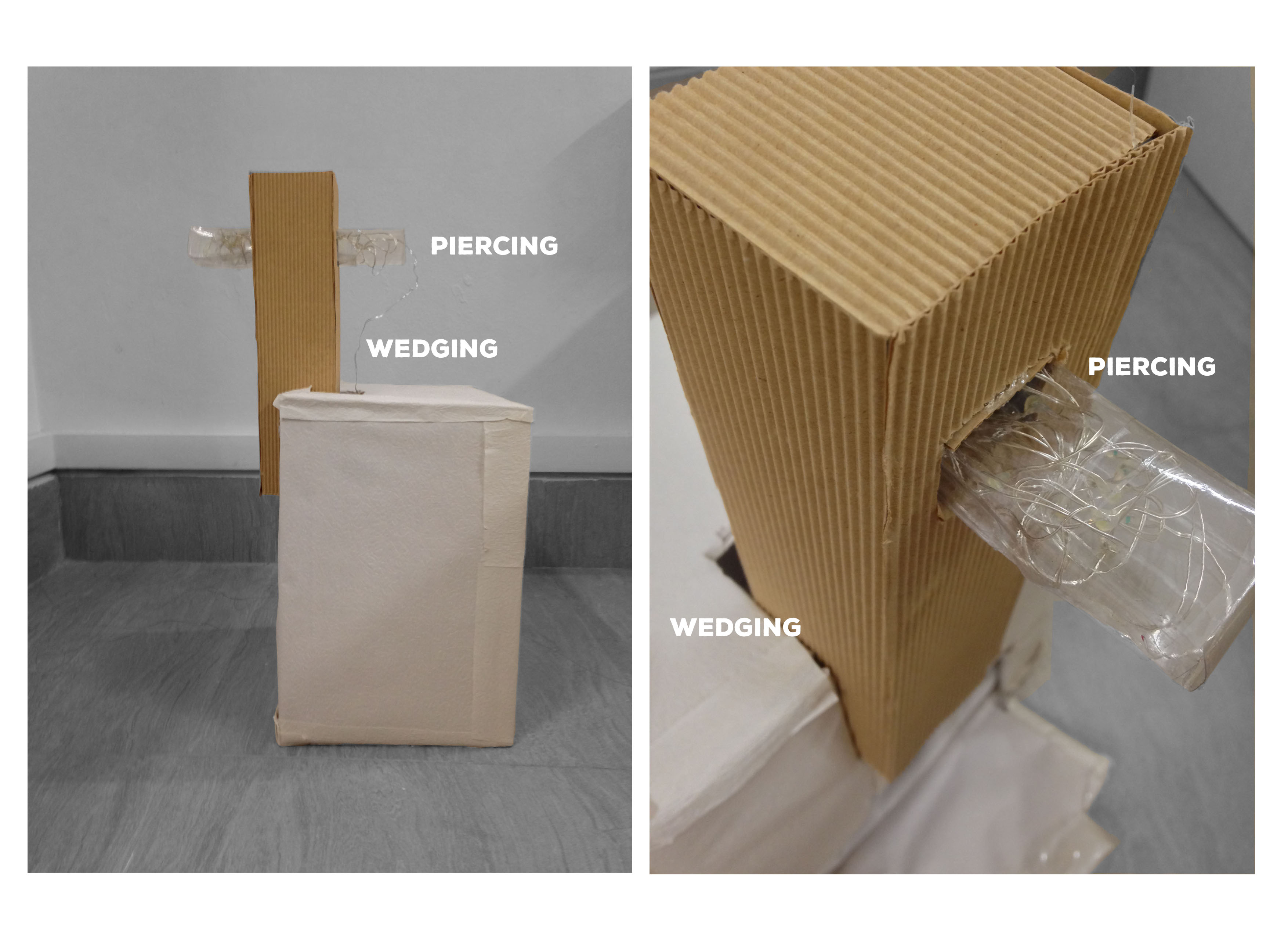
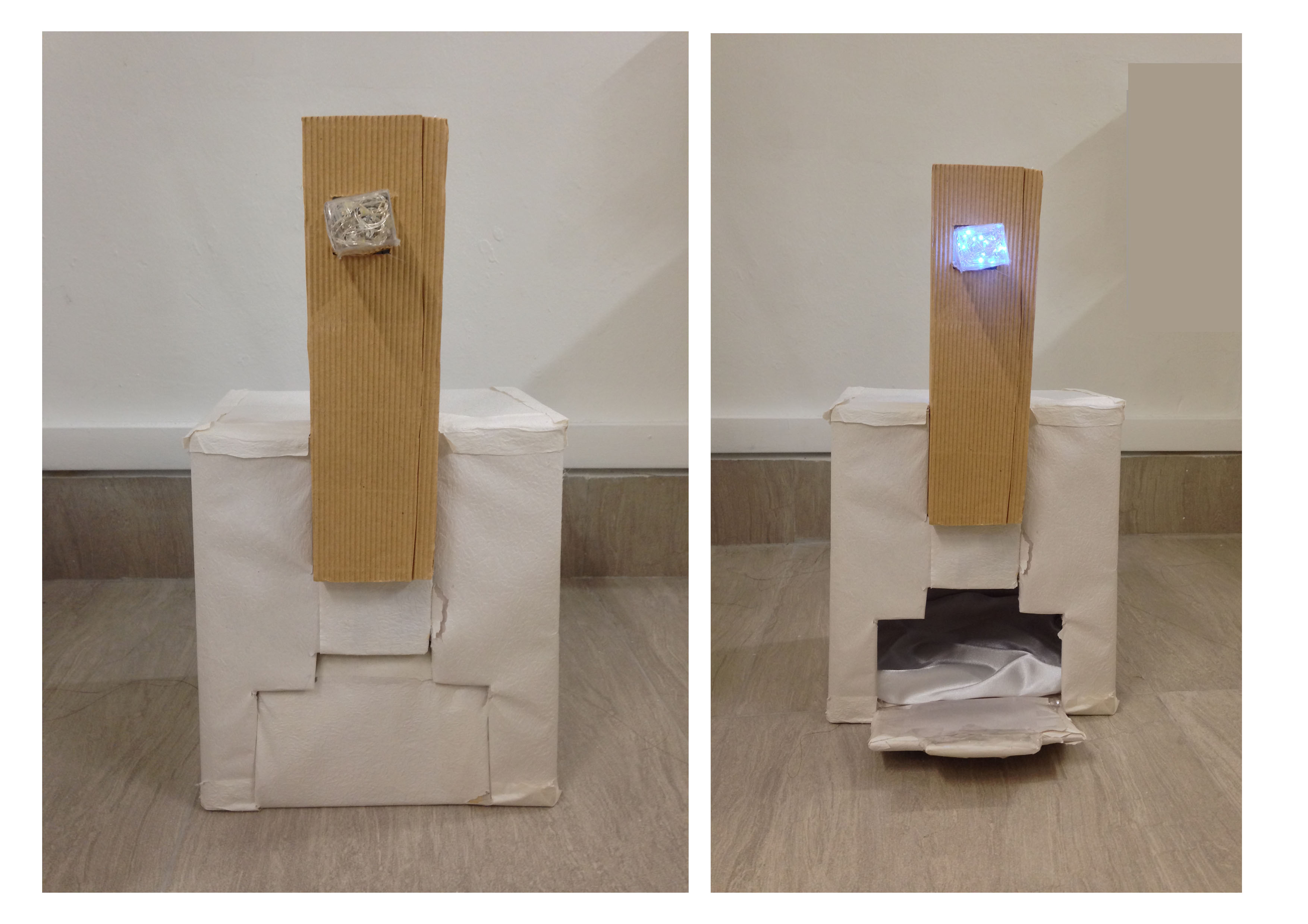
Piercing and wedging the boxes helped in creating symmetrical views at different angles.
II. Design Principles
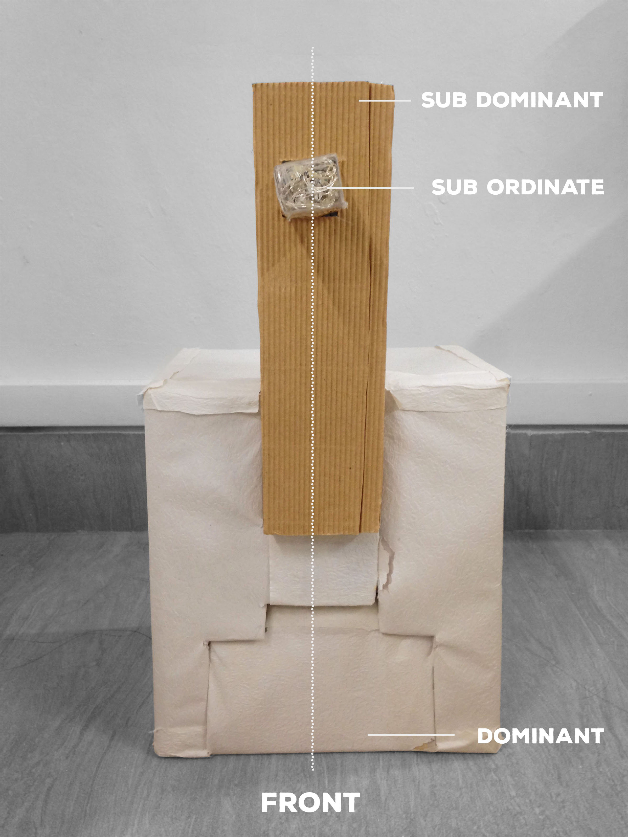


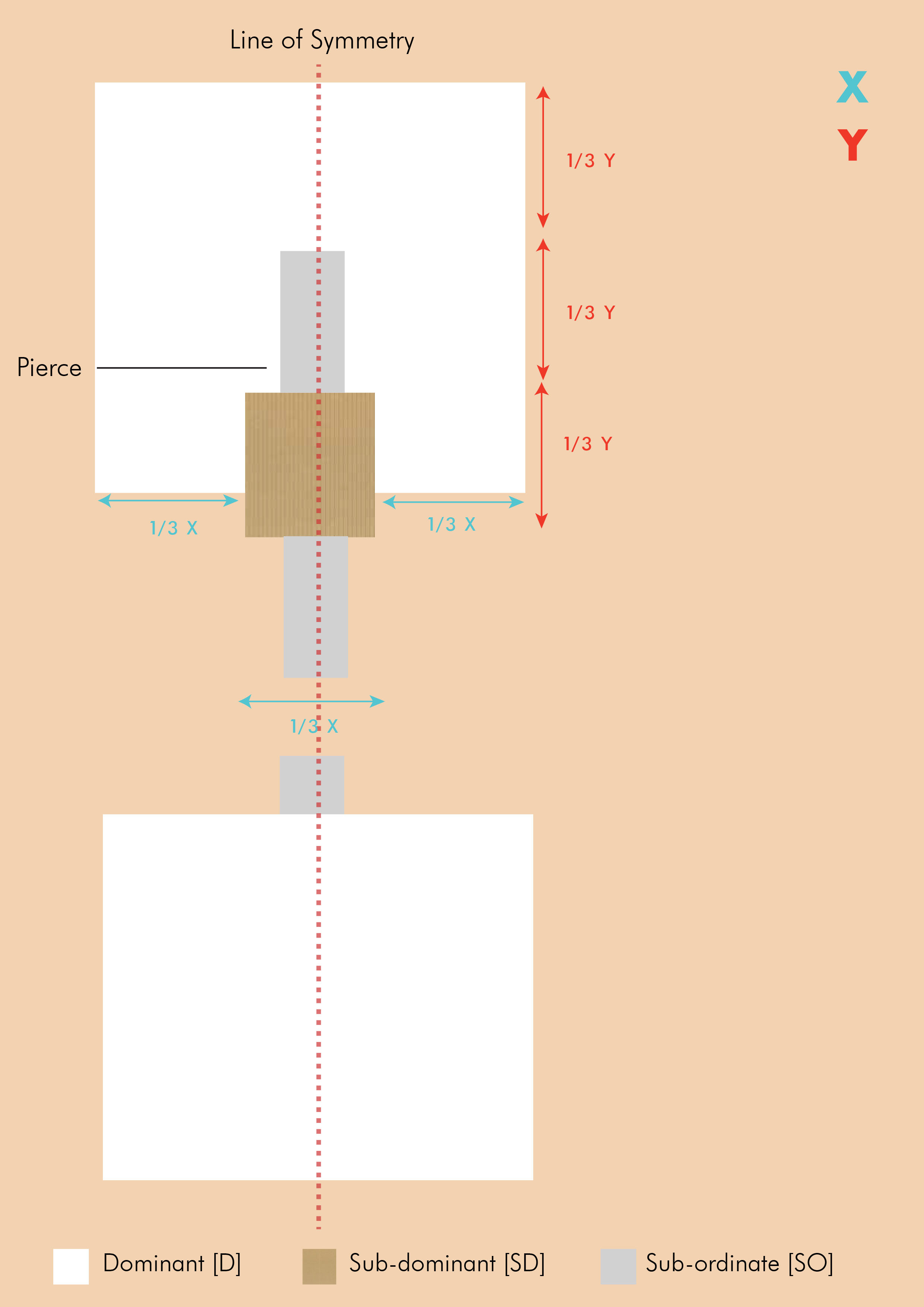
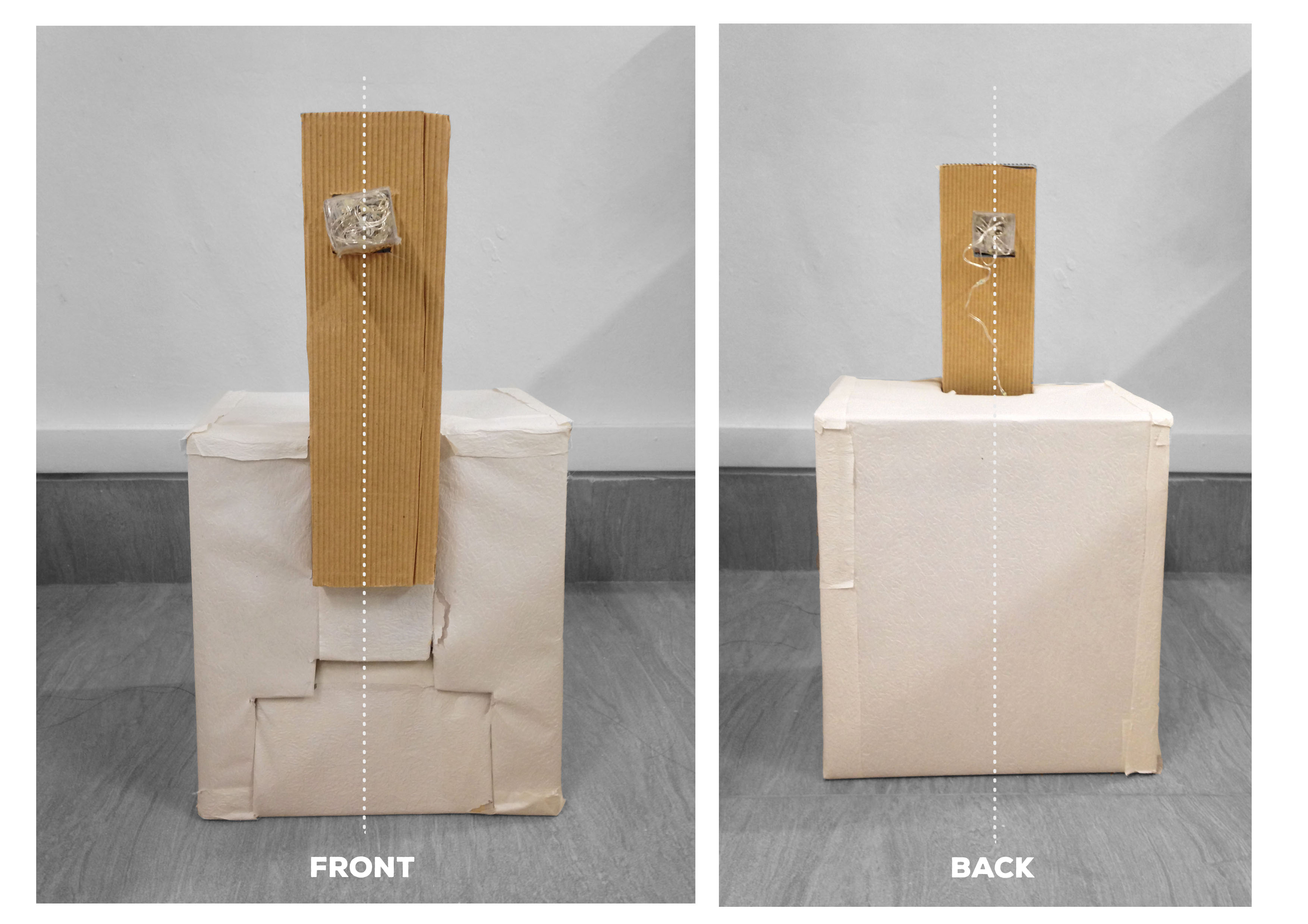
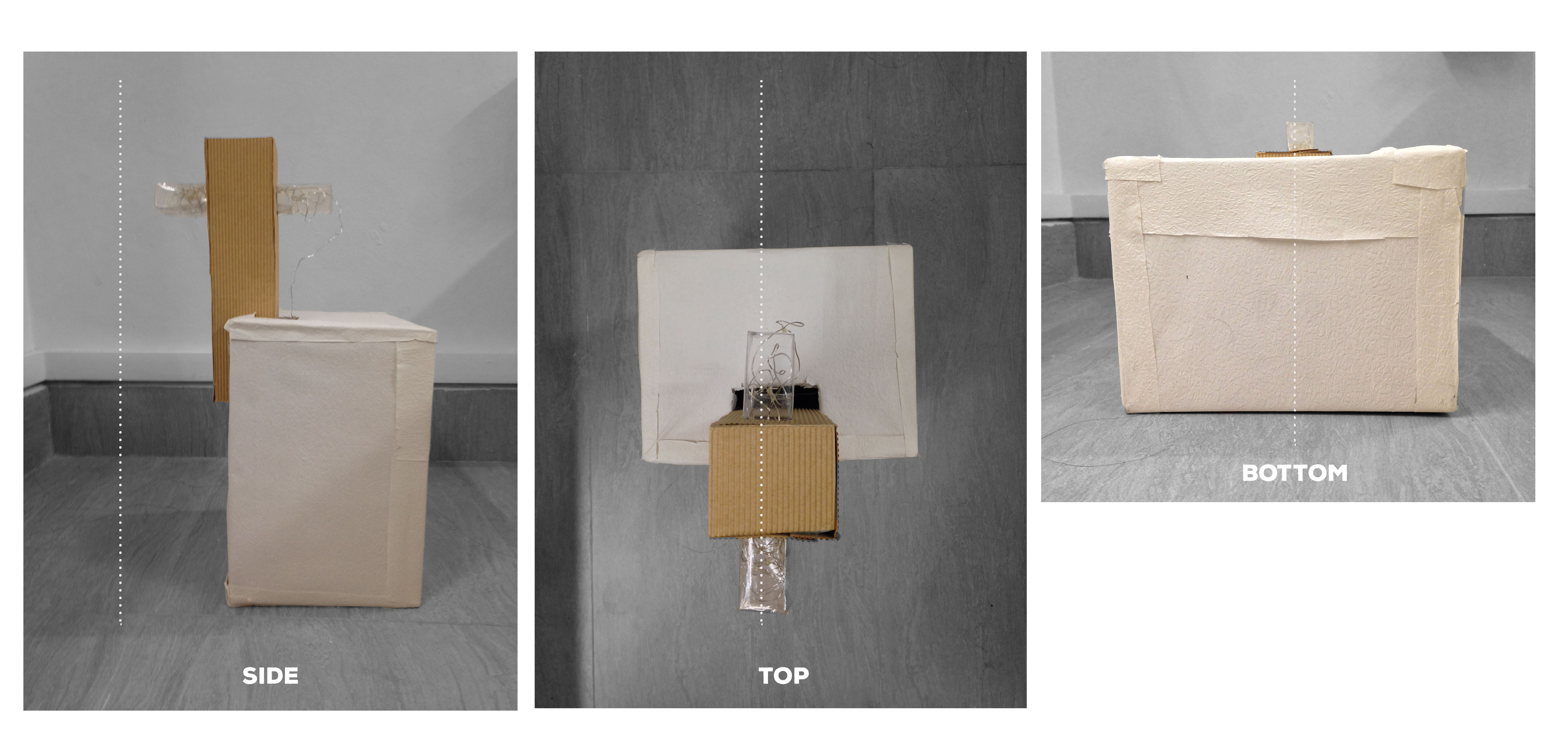
| Symmetry | Symmetry is established by having elements on both sides of the principal axis equal. Focusing on the idea of Reflection Symmetry, I wanted to ensure that the proportions of the boxes on both sides of the principal axis (or line of symmetry) were equal – when a line is drawn through the boxes, they would be equal on both sides. |
| Rule of Thirds | Rule of Thirds is applied through the lengths in which the boxes are placed. This can be seen in the aforementioned sketch analyses where the lengths are indicated by X and Y. |
| Hierarchy | Hierarchy is displayed through the use of boxes of different sizes, displaying the Dominant [D], Sub-dominant [SD], and Sub-ordinate [SO] elements. |
| Balance | The equal proportions on both sides also help in creating a sense of balance. |
| Void | The product is also a hollow structure whereby there is an incision in the front, creating negative space within. This also allows for the light above to enter the structure, making it more visually-appealing. |
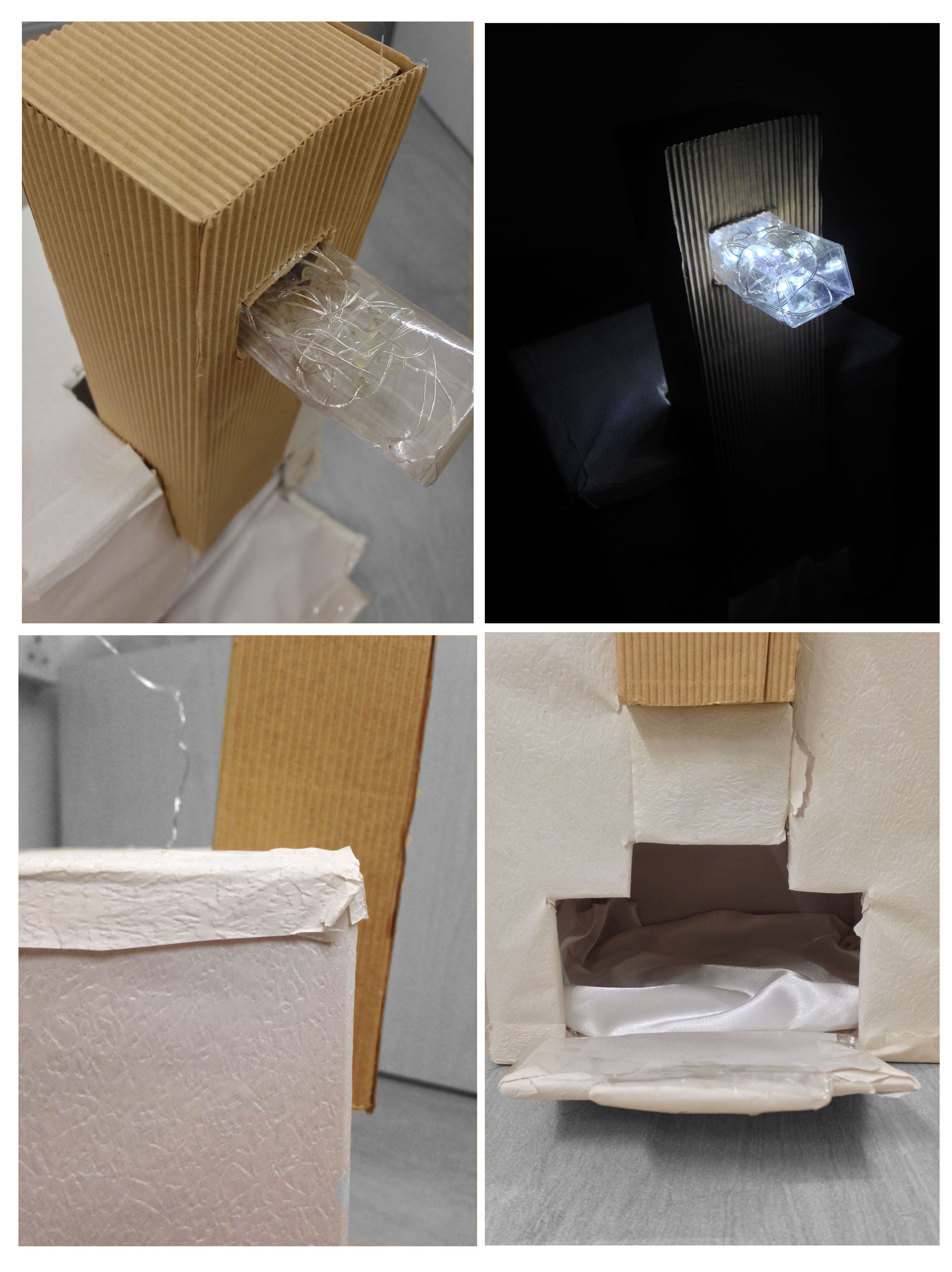
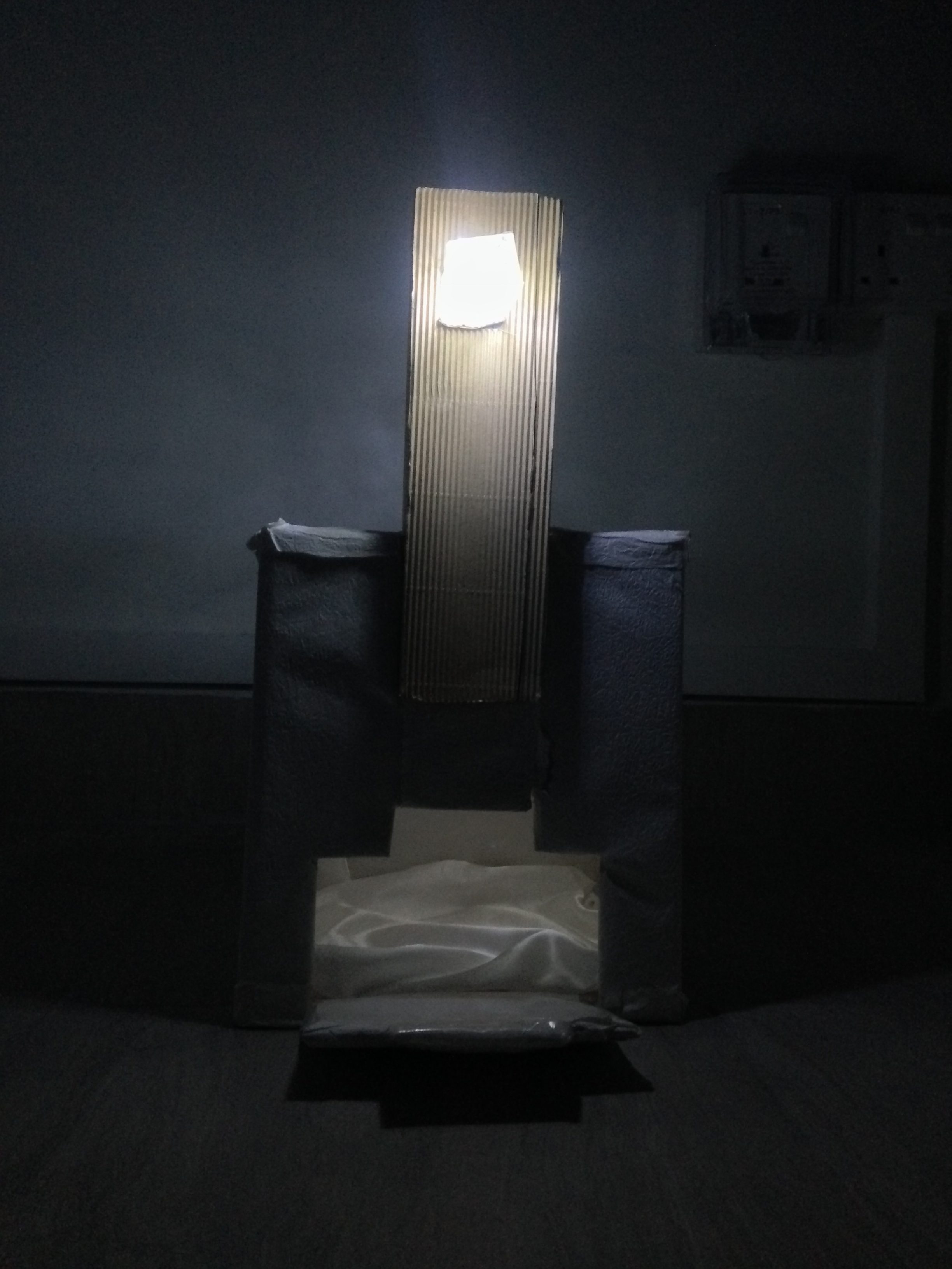
Top: Use of light
Bottom: Use of wood, textured paper, fabric
|
Contrast |
I wanted to expand on the idea of contrast by having different colours and textures – this is carried out through the portrayal of wood (using Kraft paper), marble (using textured white paper), and soft/shiny surfaces (using fabric).
Inspired by the aforementioned Disparate Bus Stops, I also wanted to include an element of light to further enhance my product, and at the same time, enhancing the SO by making it more of a ‘finishing touch’ kind of element. |
| Opacity | I wanted my product to display the use of opacity as well. This was carried out by using a range of materials with varying opacities – the wood being opaque, textured paper being translucent, and the clear plastic (SO) being transparent. |
Application
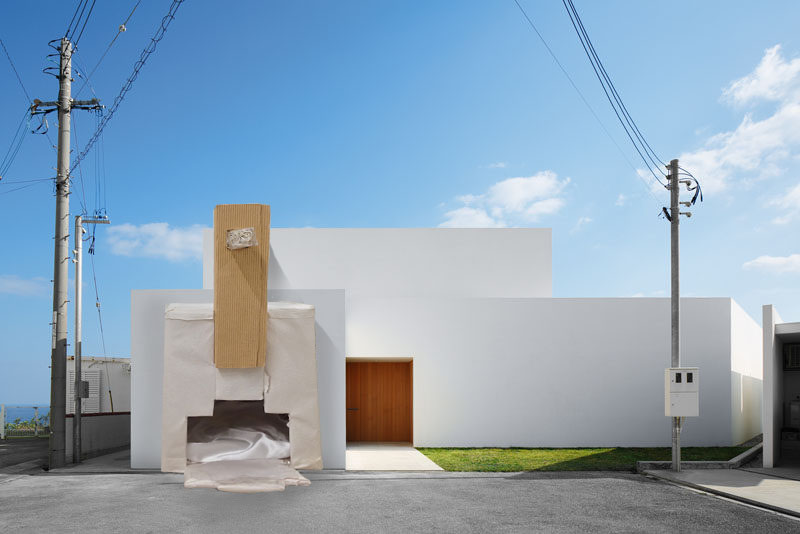
I. Micro Application
With regards to application, the final product can be used as an outdoor doghouse. The Dominant aspect, with negative space within, acting as the main body, the Subdominant aspect acting as support for the structure and also for aesthetic purposes (being made up of a contrasting material to the Dominant aspect), and the Subordinate aspect acting as a light.
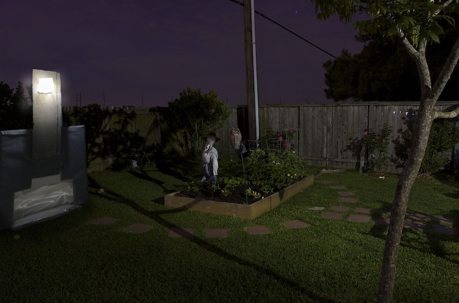
II. Macro Application
Another application the product can be used for is a garage. Similar to that of the doghouse, the Dominant aspect, with the negative space within, can be used as the main structure for housing the car, the Subdominant acting as a support structure, and the Subordinate aspect functioning as a light for the driveway.
III. Third-Angle Application
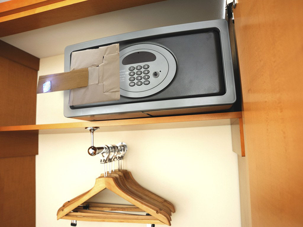
The product can also be used as an additional high-tech safety feature for a safe. The Subdominant can be used as a handle while the Subordinate can be used as an indicator that turns green when the correct code is punched in and red when the wrong one is used.
Challenges and Improvements
A challenge I faced was symmetry being a straightforward concept and therefore, I struggled in coming up with creative ways in representing it. However, after researching more on architects, artists, and how common people perceive the idea of symmetry, I was able to formulate ideas.
I also hope to improve on the final display of my product by making it much neater and the cuts cleaner.
– Link to research and process: https://oss.adm.ntu.edu.sg/vwong005/research-process…t-1-pandoras-box/
– Link to 2D sketch analysis (of interesting 3D object): https://oss.adm.ntu.edu.sg/vwong005/2d-sketch-analysis/