||MARK-MAKING||
The Essence of Mark-Making
Mark-making is the process by which lines, dots, marks, textures, smears, scribbles, drips, scratches and patterns put down using different tools (almost anything in this universe can be used) onto a surface of any texture or material to abstractly express emotive qualities, capture moments of life or simply to create an aesthetic form to be engaged with or appreciated.
https://rebeccaatwood.com/blogs/from-the-studio/mark-making-challenge
http://www.tate.org.uk/learn/online-resources/exam-help/themes/mark-making
Mark-Makers of the World
Some notable artists who utilise mark-making in their works are:
-
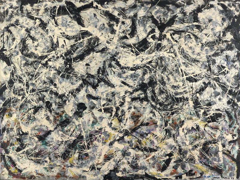
Jackson Pollock (a.k.a. “Jack the Dripper”)
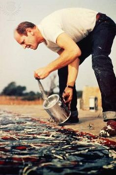
Paul Jackson Pollock was a major figure in the abstract expressionist movement (Post WWII, 1940s, New York) who had a volatile personality and was a “raging alcoholic” (as quoted by my Art History lecturer) and specialized in drip painting. He carried out his action paintings using hardened brushes, sticks and resin-based paints while rigorously and passionately working his way around the canvas, splashing paint in whatever manner catered to his mood that day.
https://en.wikipedia.org/wiki/Jackson_Pollock#Influence_and_technique
https://en.wikipedia.org/wiki/Abstract_expressionism
Some of his most famous works include:
- Autumn Rhythm
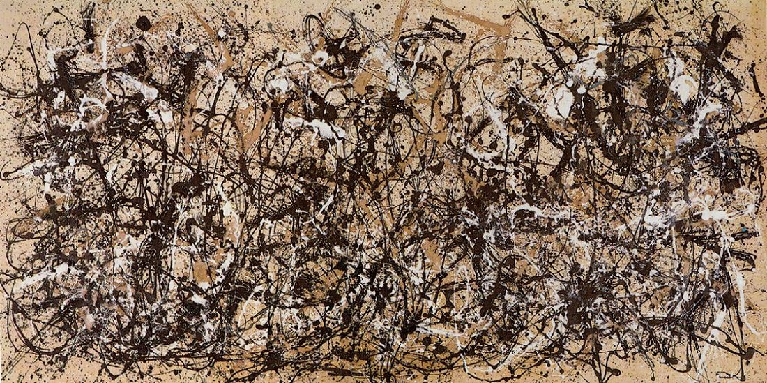
Artist: Jackson Pollock (American, Cody, Wyoming 1912–1956 East Hampton, New York)


Date: 1950

Medium: Enamel on canvas

Dimensions: 105 x 207 in. (266.7 x 525.8 cm)

Classification: Paintings

Credit Line: George A. Hearn Fund, 1957

Accession Number: 57.92

Rights and Reproduction: © 2017 Artists Rights Society (ARS), New York
- Greyed Rainbow
Jackson Pollock American, 1912–1956 Greyed Rainbow1953 Oil on linen 182.9 x 244.2 cm (72 x 96 1/8 in.), unframed Signed and dated: recto: "Jackson Pollock 53" (bottom right in black paint); verso: "Jackson Pollock / 53" (upper left in black paint) Gift of Society for Contemporary American Art, 1955.494 © 2017 Pollock-Krasner Foundation / Artists Rights Society (ARS), New York
2. Yayoi Kusama (a.k.a. Polka Dot Queen)
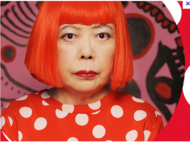
Yayoi Kusama was born in Nagano Prefecture, Japan where she would do many paintings on her own, but her love of art was rejected by her family, compelling her to further develop her works in the United States. She is heavily influenced by the abstract expressionist movement as well and her 2D works often utilize a wide variety of media such as gouache, watercolours, pastels and oils to print repetitive patterns such as polka dots and nets for the entire area of a canvas (even the sides of the canvas would be painted), which creates an overall psychedelic effect, especially under certain lighting.
Actually, a few months ago I had the opportunity to visit the Yayoi Kusama: Life is the Heart of a Rainbow exhibition.


Asides from her astounding 3D works, her 2D works are equally intriguing. The colours she uses are very opaque, mostly vibrant which make a very strong statement. The variation in lines and shapes is also thus made very obvious. The fact that Kusama is able to persist with such repetitive patterns across an entire canvas never fails to impress me. Some of her paintings are littered with simple shapes like cirlces and stripes, but for some of them, you have to squint closer to really see it. For example, take a look at the 4th painting from the left in the top row (the brown and black one). Try squinting and having a guess at the title of the painting!
***drumroll intensifies***
.
.
.
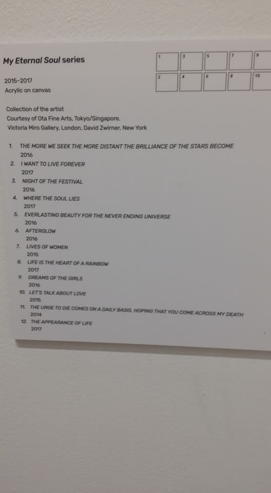
***Answer: Lives of Women, 2015***
3. Gerhard Richter (no legitimate nickname for him but I call him Squeegee Man)
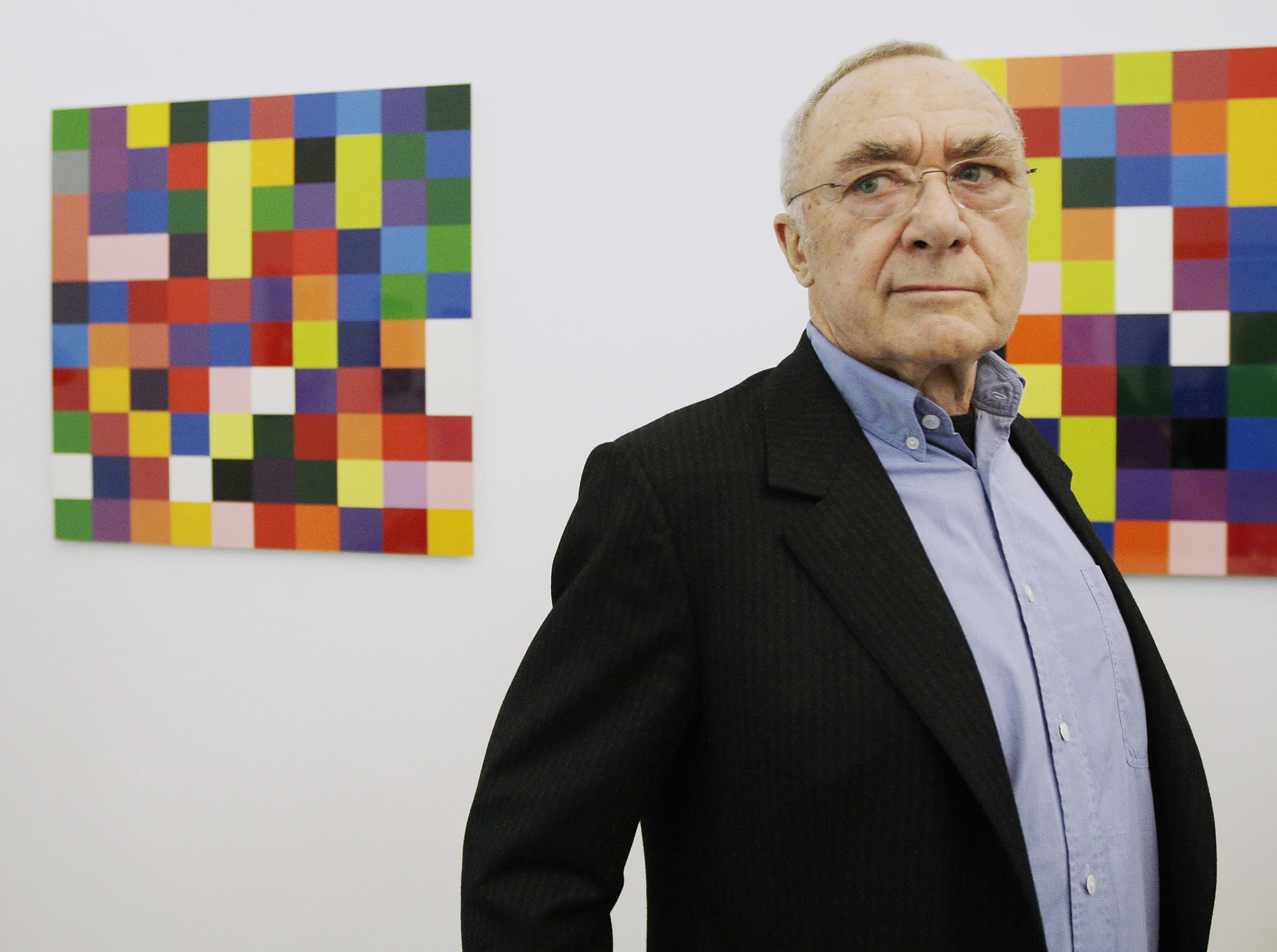
Gerhard Richter is a German visual artist who produces both abstract and photorealistic works (many others as well). He was one of the artists that pioneered new, objective ways to create abstract art, which in his case, he popularised the use of the squeegee.
http://artmuseum.princeton.edu/story/rothko-richter-mark-making-abstract-painting-collection-preston-h-haskell-class-1960
If you watch the video below, you can see how he uses this massive squeegee-like block to slide across the entire canvas, where there is already paint layered out and a single scratch can reveal the myriad of colours beneath:
https://www.youtube.com/watch?v=yF6EluMNR14
Most of his paintings have very distinctive lines that are quintessential to all his squeegee works.
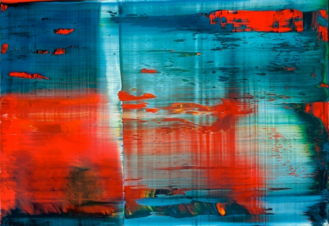
Abstraktes Bild
Abstract Painting

1999 50 cm x 72 cm Catalogue Raisonné: 858-3

Oil on Alu Dibond
~Expressive Qualities of Lines~
-
Thin lines represent fragility, elegance, delicacy and give off an ephemeral air. They can be used to show vulnerability, or emotions that come in short, staccato waves.
-
Thick lines on the other hand appear to be robust, stable. They can be used to convey, boldness and courage or emotions with strong intensity.

-
Horizontal lines are parallel to the horizon and they seem to lying down, at rest, asleep, indicating calmness, tranquility, peace and comfort.

-
Vertical lines are perpendicular to the horizon. They seem to be strong and rigid (lack of movement, no direction). They make strong statements, especially when the width of the line is increased. As such, they also seem to suggest stability but in a more forceful manner compared to horizontal lines. Variation in the spaces between vertical lines can create a sense of dynamic rhythm to create more movement (sort of like a barcode). Their tallness and formality may give the impression of dignity.

-
Diagonal lines are unbalanced and give a sense of potential dynamic movement and direction. They can be used to guide the viewer’s attention to certain subject matter and are more dramatic than horizontal and vertical lines.

The Japan Army’s flag has radiating diagonal lines that is effective in showing how sunlight is going outwards.
-
Curved lines have a much gentler sensation since they sweep and turn. They are more unpredictable and organic than straight lines and change direction, expressing fluid movement. The tighter and more frequent the curls, the more intense the feeling (passionate, zest). However, if the curves are looser, they can give off a more pleasant and sensual feeling. Overlapping curls can give off a sense of confusion as well.
Tools experimented with:
After over-purchasing and hoarding a bunch of random items I could get my hands on, I decided to test them all out to see what kind of tools would make interesting patterns that would be useful. (I might have went a little overboard with the shopping list but it was interesting seeing some of the patterns they produced!)
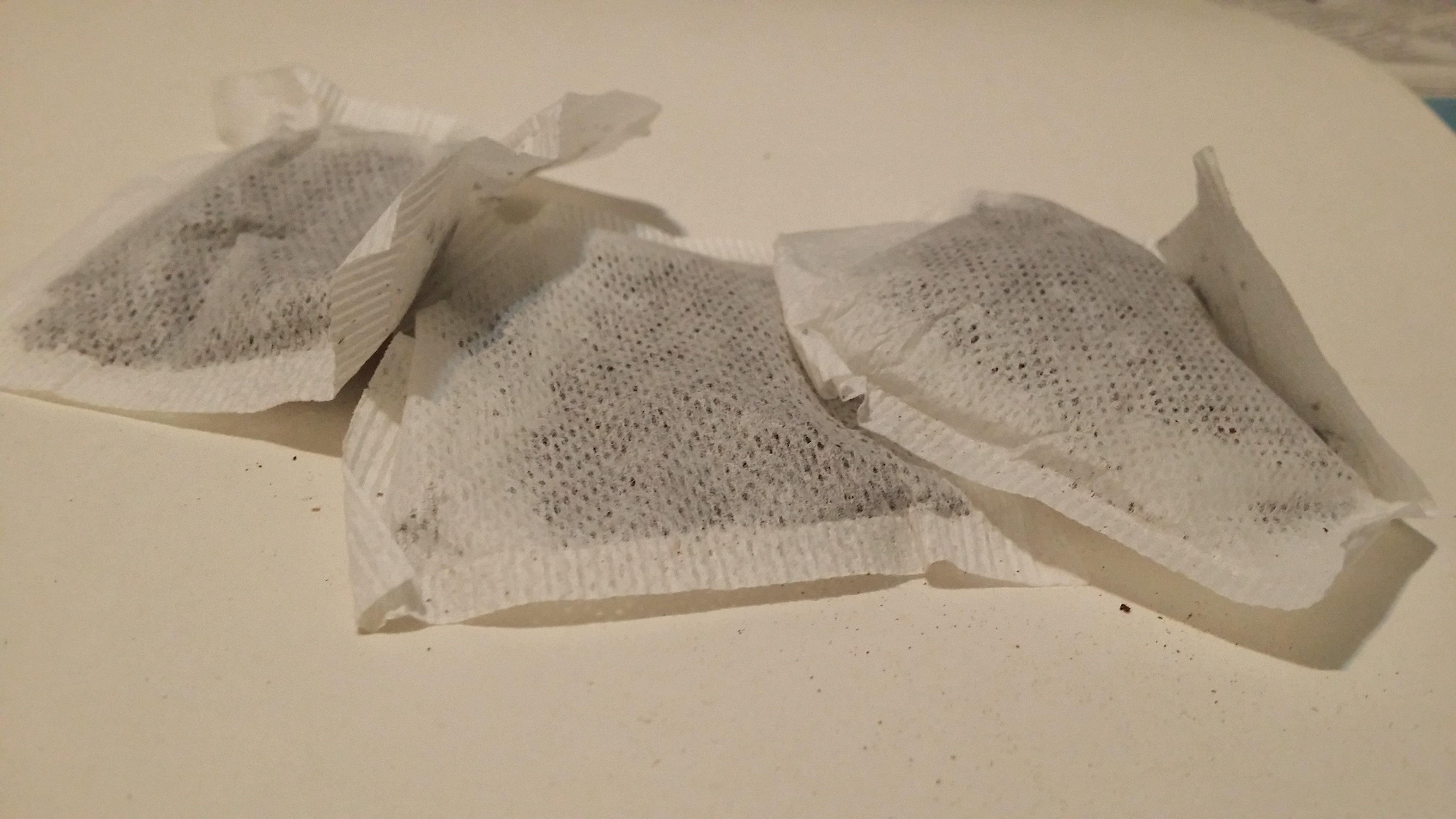
- Ink; our main ingredient (The stench of this ink is undescribable 8’D)
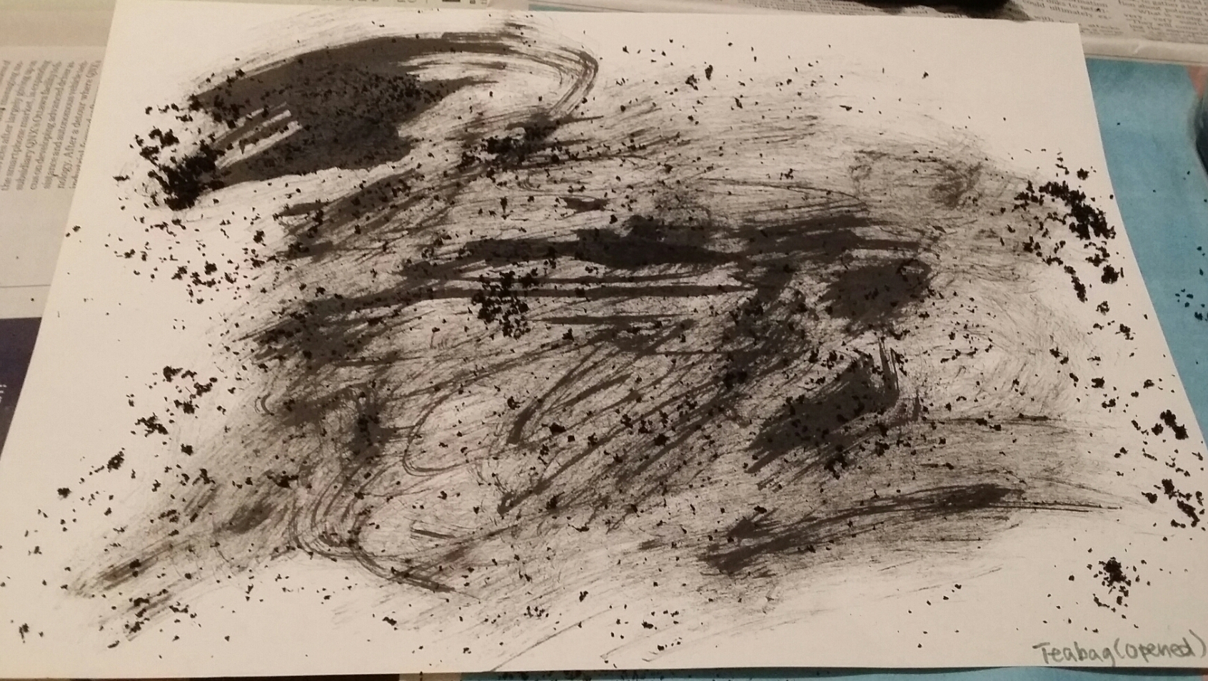
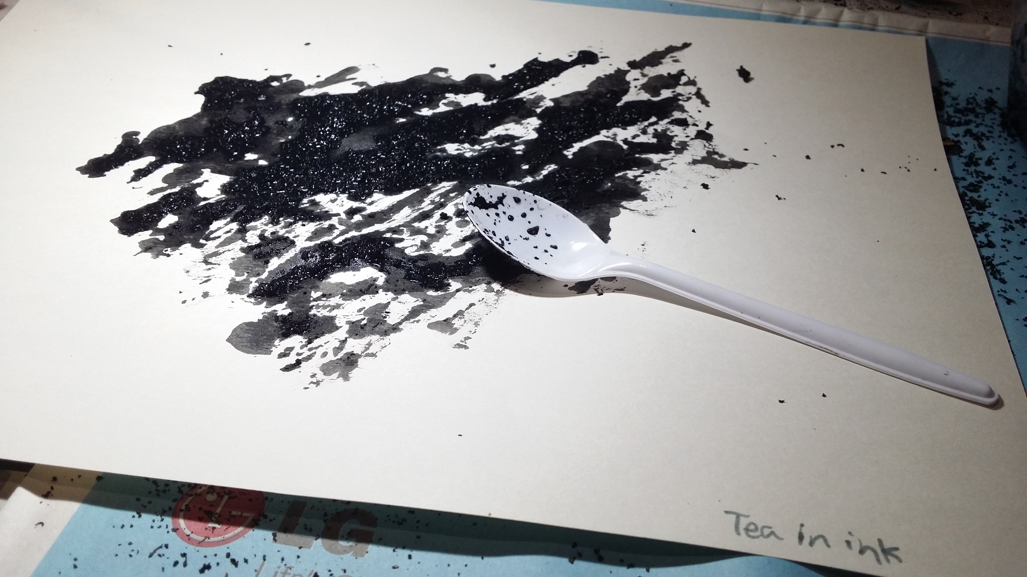
- Tool: Teabags ( I used both the teabag itself and the tea leaves inside)

Aftermath:
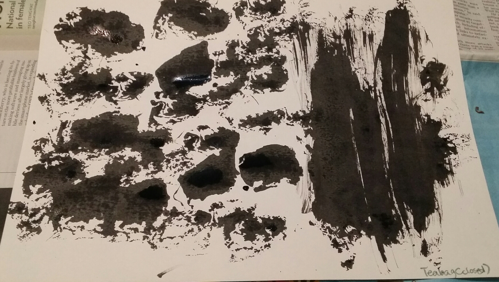
Sprinkled tea leaves onto the paper before using teabag to smooth paint over. The tea bag got clogged up with tea leaves, giving rise to a scratchy, kind of angsty effect.
Tea effect 3 – Photo by me. Poured the tea leaves directly into the ink before using the spoon to spread it out onto the paper. Gave rise to a grainy texture with a somewhat splotchy background.
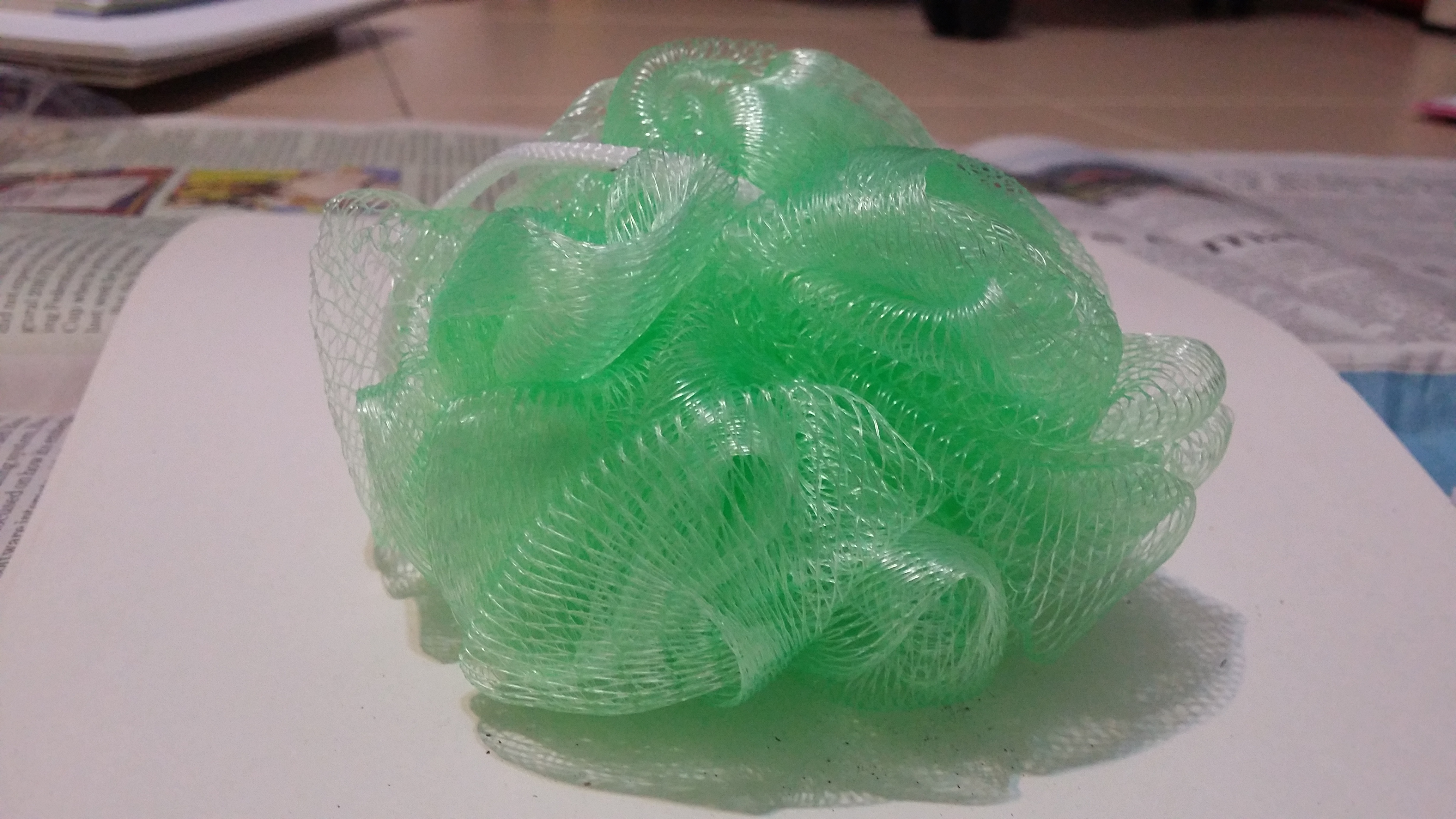
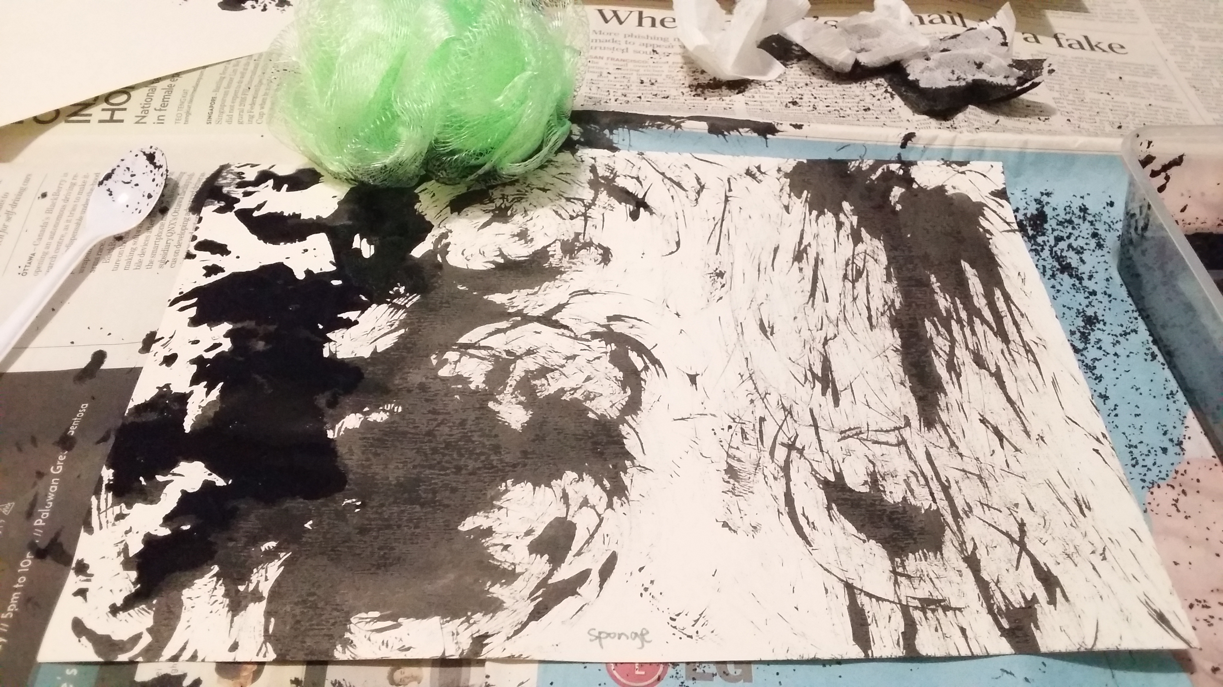
- Bath Sponge
Aftermath:
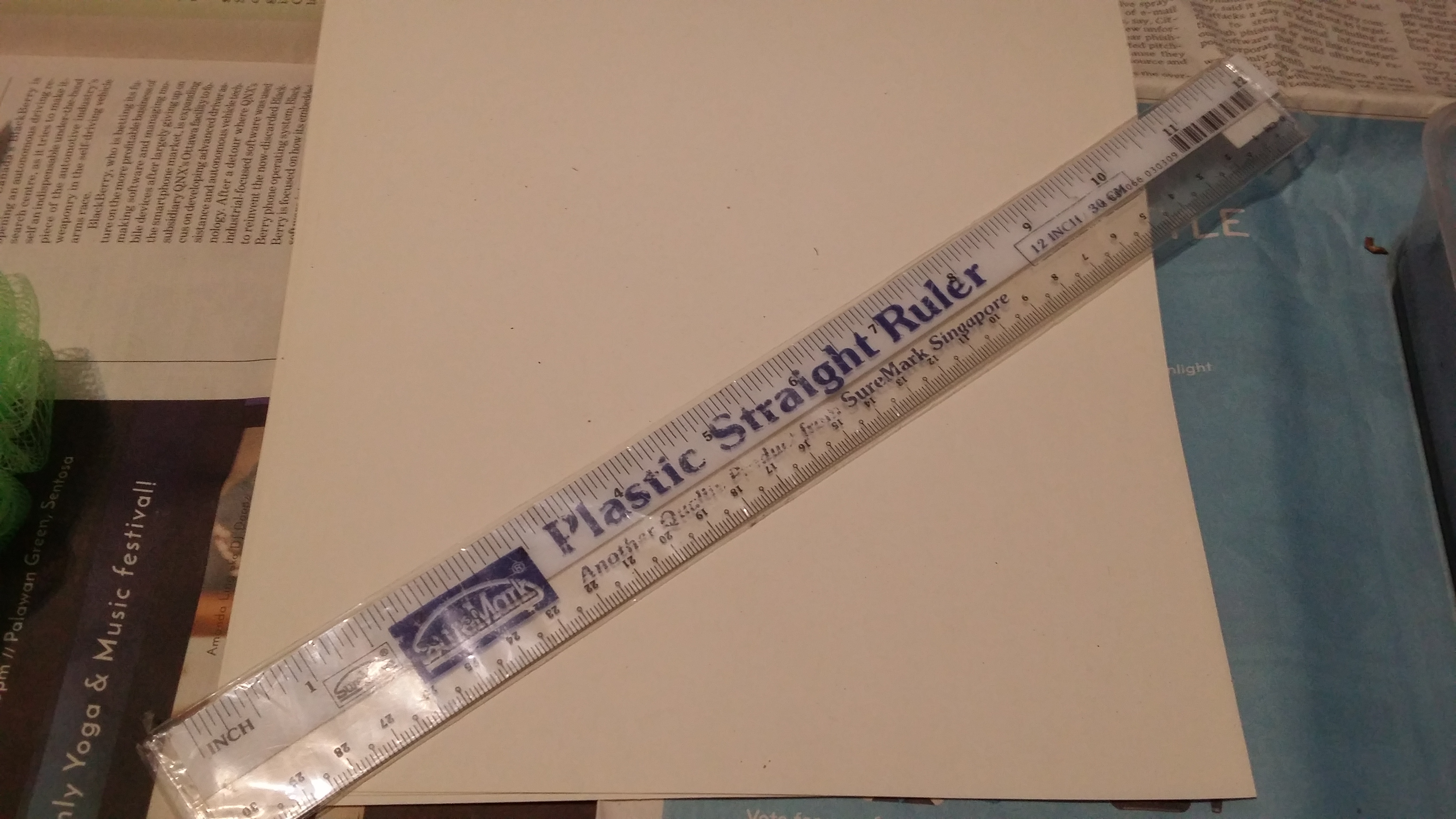
- Plastic rule Plastic rule – Photo by me.
This one was inspired by Pollock’s squeegee paintings, I wanted to see if I could recreate the squeegee effect.Aftermath:
Ruler effect – Photo by me.
I had to use a spoon to put some ink at the “starting line” first, before using the ruler to spread the paint over the paper. I think it turned out pretty neat! (though I would really use a smaller ruler instead)
- Metal filter + Tea strainer (this idea had worked out a lot better in my head)

Aftermath:


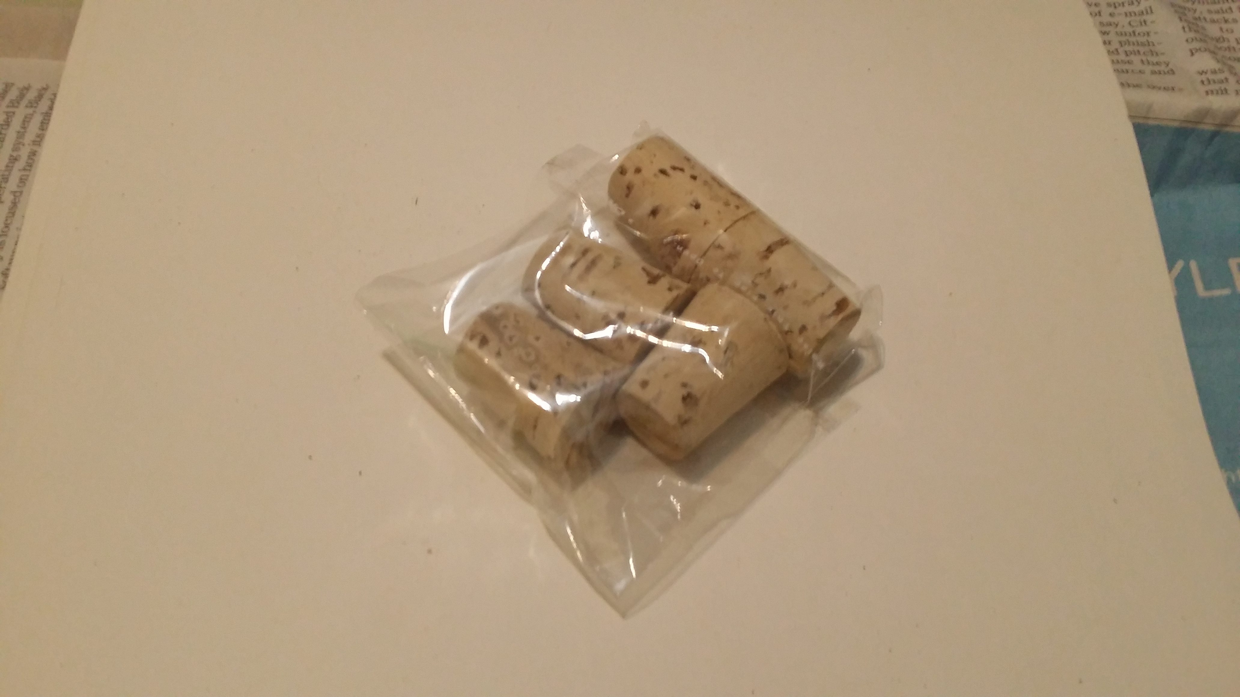
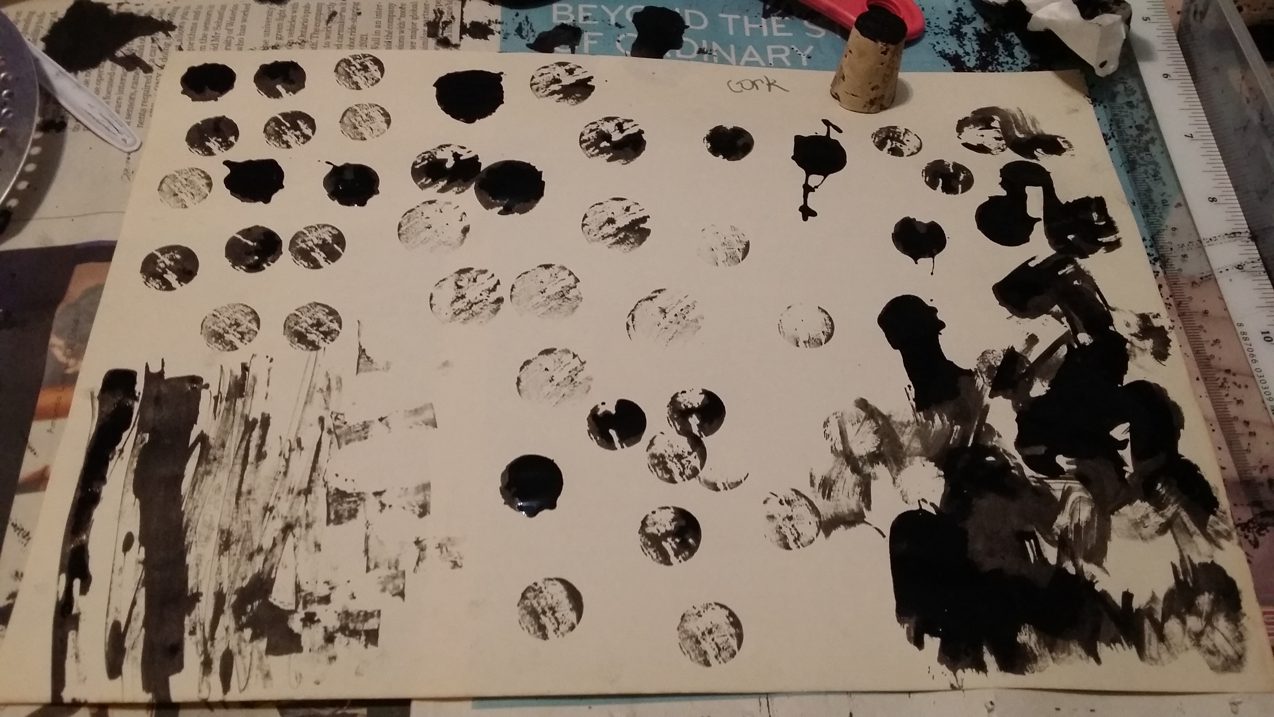
- Wooden cork
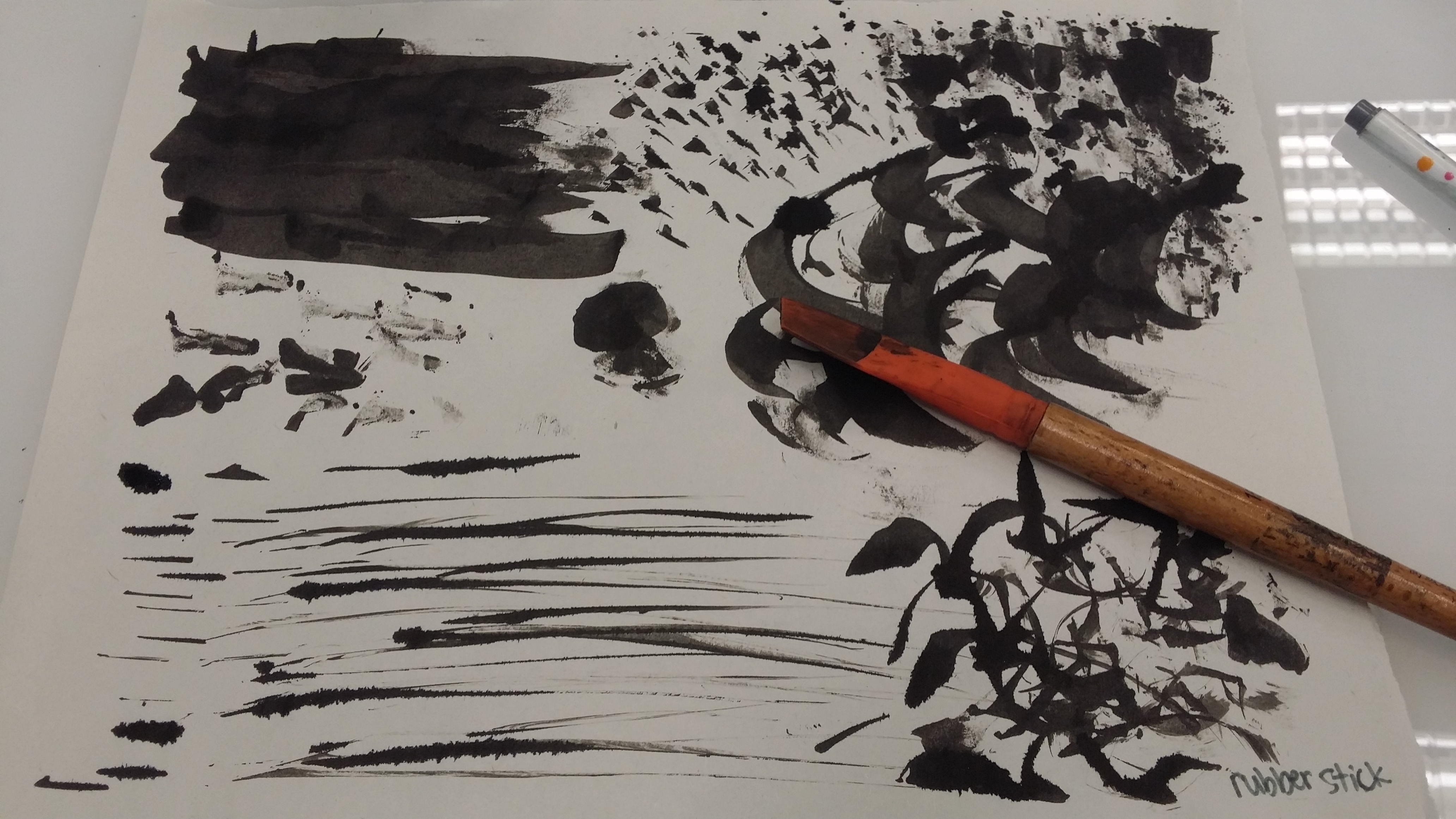
- Scrubbing Brush

Aftermath:
Scrubber effect – Photo by me. Again, I had to use a spoon to deposit some ink first before I could use the brush to scrape it outwards. It gave rise to sort of a wispy effect since the lines produced were so fine. I also purposely let the paint drip down and now it looks like a thunderstorm.
- Bubble wrap
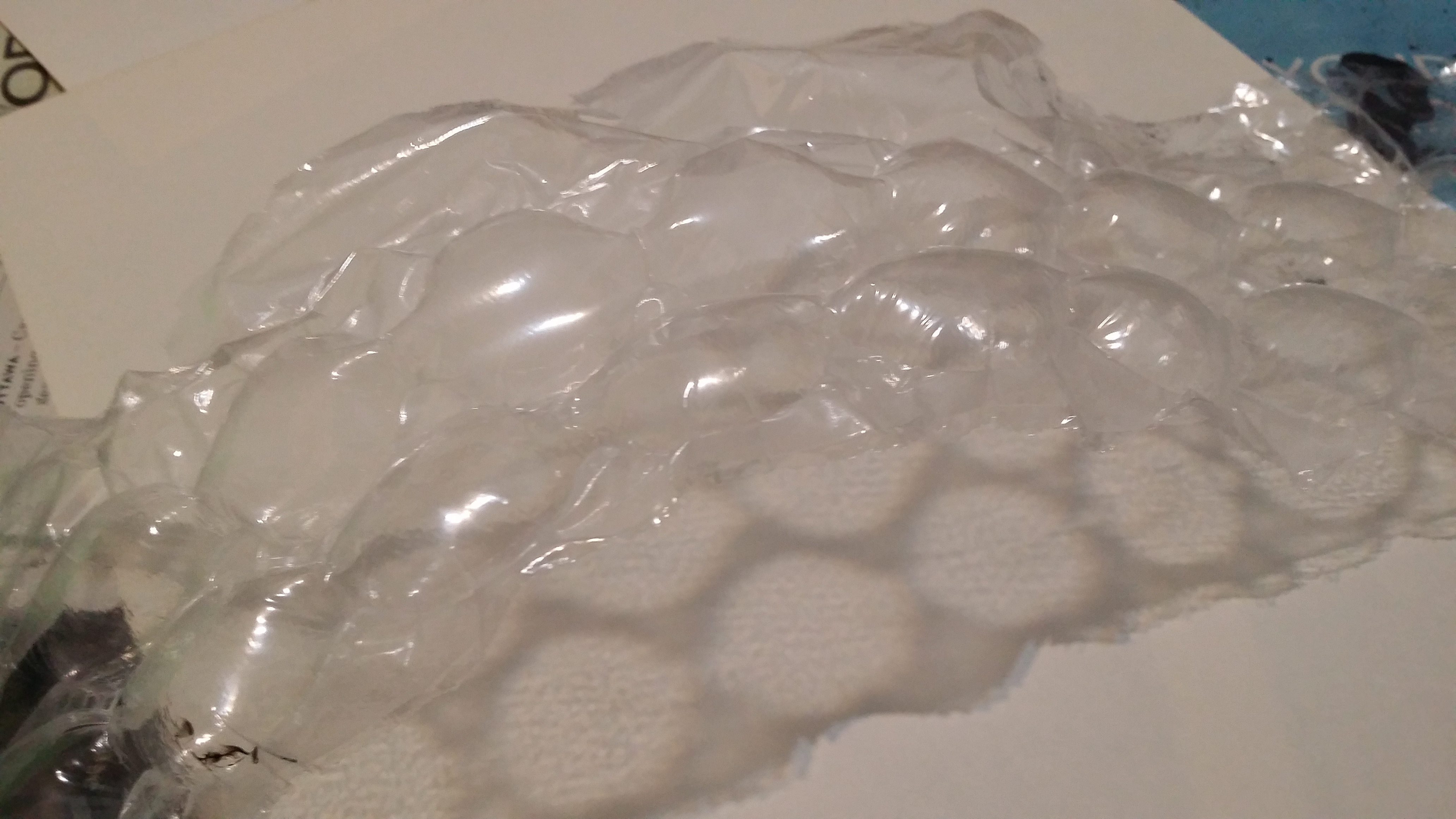
Aftermath:

I used the bubble wrap to print ink onto the paper. The pattern it produced was somewhat similar to the corks but the circles produced were much less scratchy and more splotchy.
/\/\/||– \\~~Emotional Lines~~//–||/\/\/
-
Love – affection, lust, longing
Love is wholesome and warm feeling, one where you feel like you are being in a tight embrace and protected. This can be illustrated by curved lines that depict convexity and roundedness, and lines should be favourably thin and light to show the tenderness of love. Curves can also either be relatively sparse to suggest the sensuality of romance or more closely positioned to generate more passion and zeal.


-
Joy – cheerfulness, zest, contentment, pride, optimism, enthrallment, relief
Joy has a very vibrant, enthusiastic, ecstatic tone that can be showcased through more well-rounded curved lines as well, or zig-zagged lines radiating outwards to show pent-up energy being released. Joy can also be being pleased with status quo, such as enjoying a cup of tea in solitude in the early morning, and that can be expressed with more loose, wavy curves. For a prideful joy, tall vertical lines or steep diagonal lines can be used to indicate the celebration of superiority. For a sense of relief, there can be curves in the shape of a wave (The Great Wave of Kanagawa) to show something being held back before being calmly released, just like a sigh of relief.
-
Surprise – pleasant surprise, shock
Surprise has a positive connotation and is a rather transient feeling that is triggered by a sudden event, thus short lines, or small circles can be incuded. The spacing between these elements can also be considered, for example, having a cluster before gradually becoming sparse shows a sense of dispersement of shock. Curved lines with a point (also like multiple waves) and the use of diagonals to form peaks that grow out of a horizontal line also indicated something suddenly appearing out of the calmness.
-
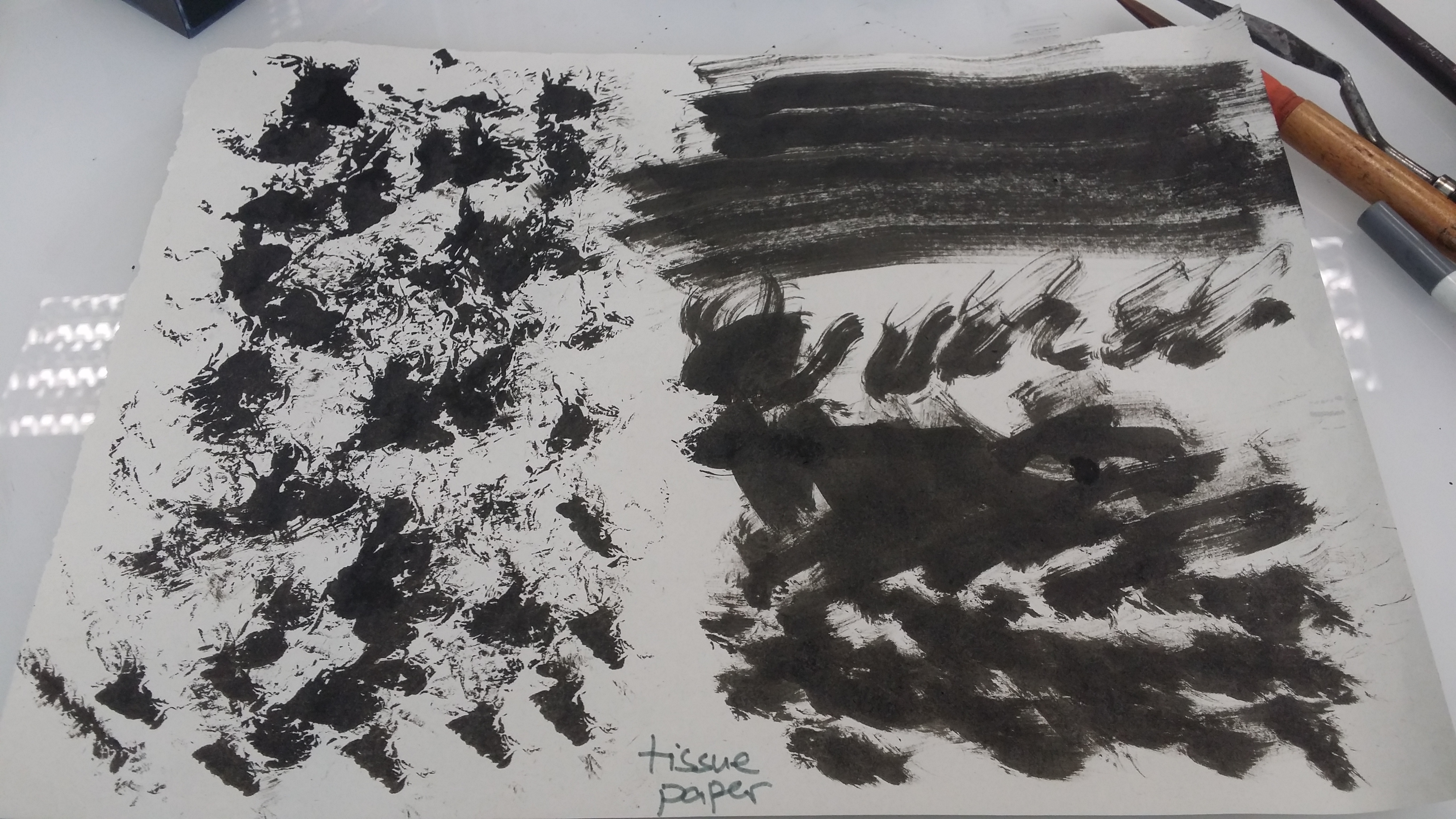
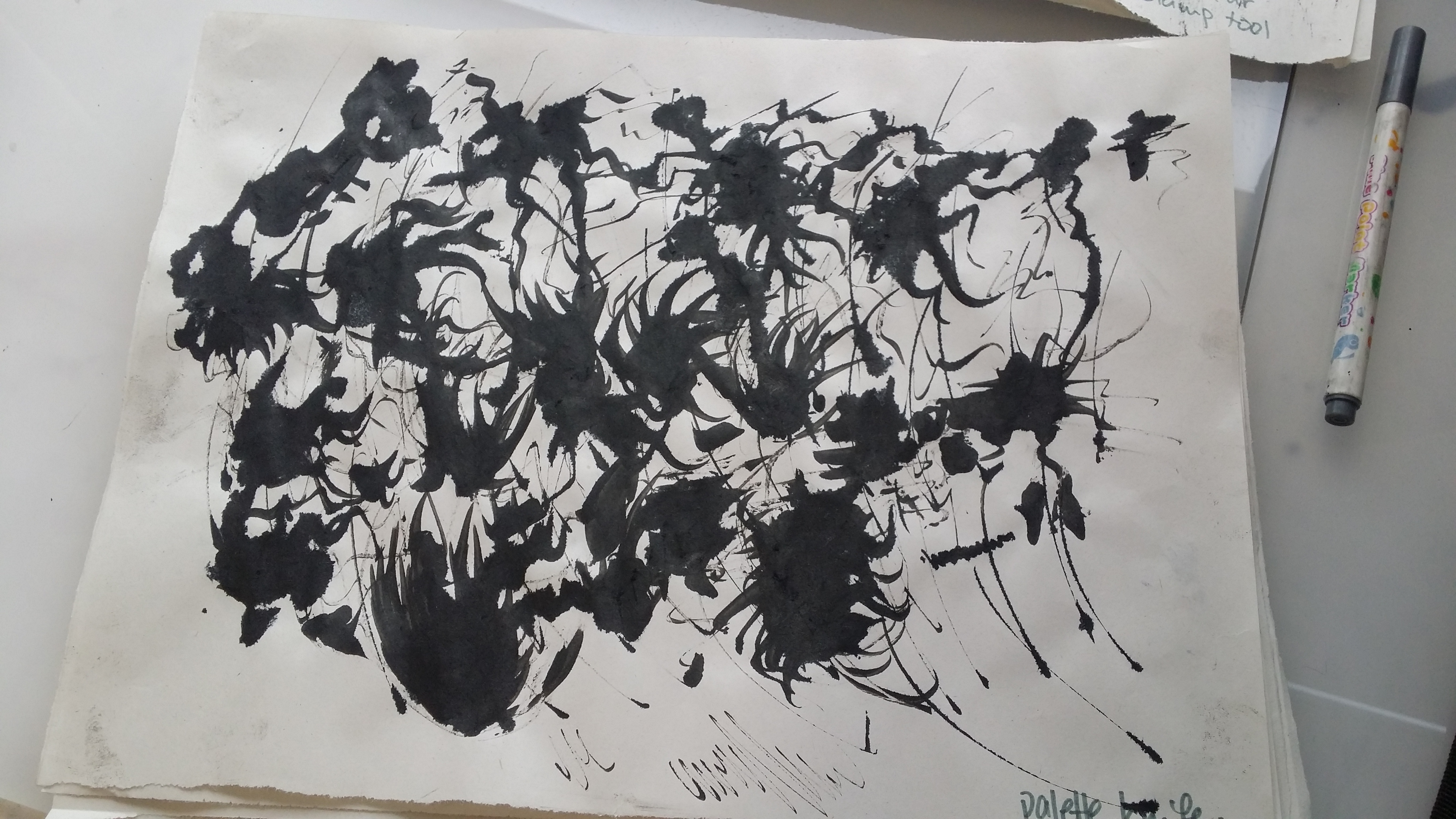
Anger – irritation, exasperation, rage, disgust, envy, jealousy, fury
Anger is a very intense feeling which can last from small waves of irritation to a long-held grudge. Rage or fury can be shown using looser curves thickness with varying that reach outward (rather than tight curls), to aliken the feeling to hot flames of rage. For irritation, short, bold, jagged lines can be used to illustrate the constant but rather brief spans of feelings of annoyance. Disgust can be conveyed using wide, convex curves that disperse outwards to express revulsion (sort of like the feelings you get in your stomach before puking). Bold but connected splotches can be used to show envy or jealousy; a lasting, deep-rooted grudge that someone is reminded of every now and then when they are in contact with the person they just are unable to come to terms to with.
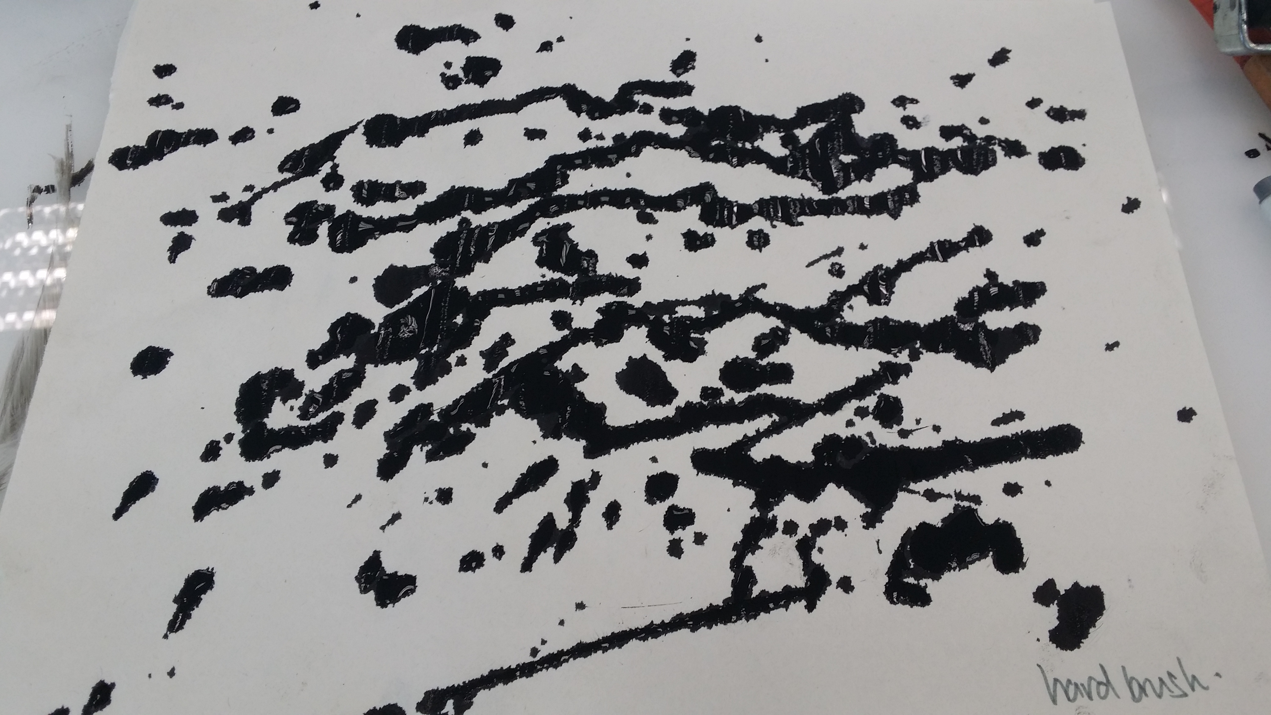
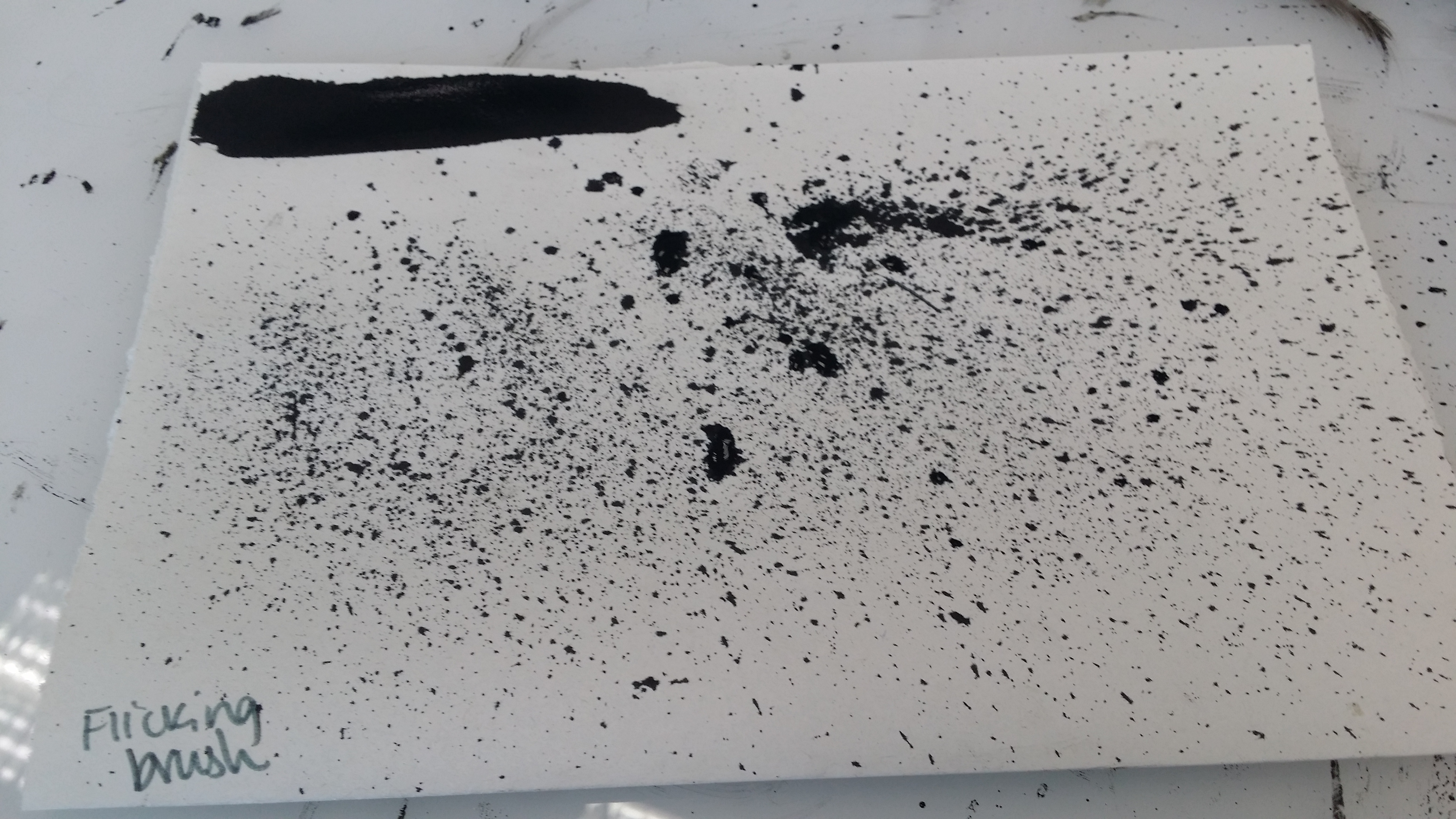
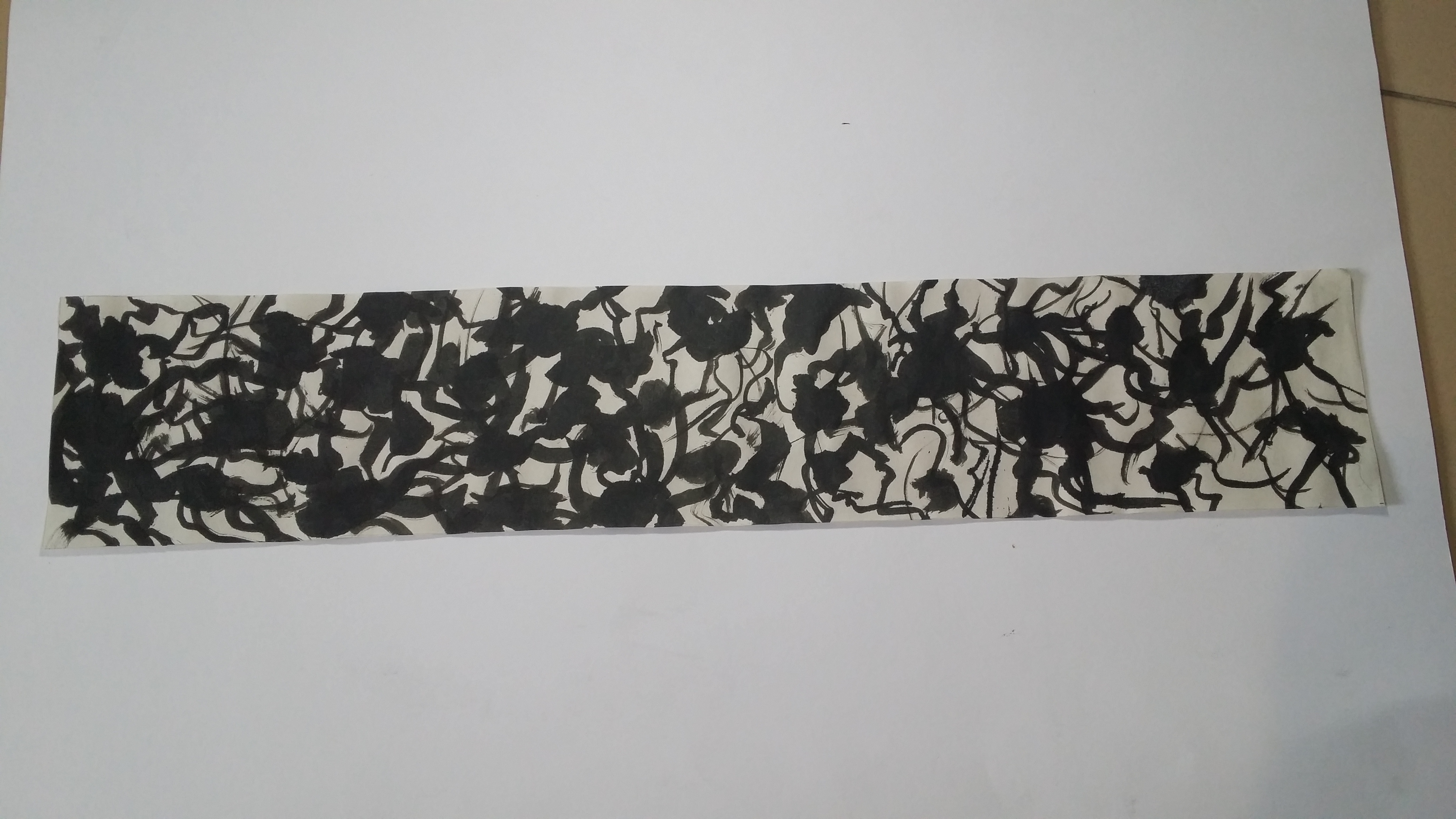
 Jealousy – Chinese ink, dripping using hard brush. Inspired by Jackson Pollock’s drip painting.
-
Sadness – suffering, sadness, disappointment, shame, regret, sympathy, anguish
Sadness is a pretty personal feeling that not a lot of people express openly, so it would be appropriate to have a cluster of elements together rather than spread out widely or evenly throughout the entire paper/medium. Drip lines or really thin, wispy lines can be used to convey the silent wallowing in grief, and give sof a sombre, gloomy feeling. For a louder kind of sadness, like anguish, deep sorrow or regret, wider curves can be used, rather than straight lines or zigzag lines because straight lines are not as organic as curves and our ability to feel sad can be owed to our roots as human beings, therefore using curves would give it a very natural feeling (it’s only human to feel sad).
-
Fear – horror, nervousness
Fear is also a very intense emotion, it is created by mostly external experiences and guided by our very primal instincts of survival. It is also much more prolonged than shock and has a negative connotation, unlike surprise. There is suspense, anticipation, a sense of unknown or any threats that serve to trigger a griping fear from within us. Thus, there can be wide curves sprouting outwards, or exaggerated zigzag lines (like the ones on cardiograms) to indicated a racing heartbeat, or even short little jagged lines to show a less intense variation, nervousness.

Final Draft:

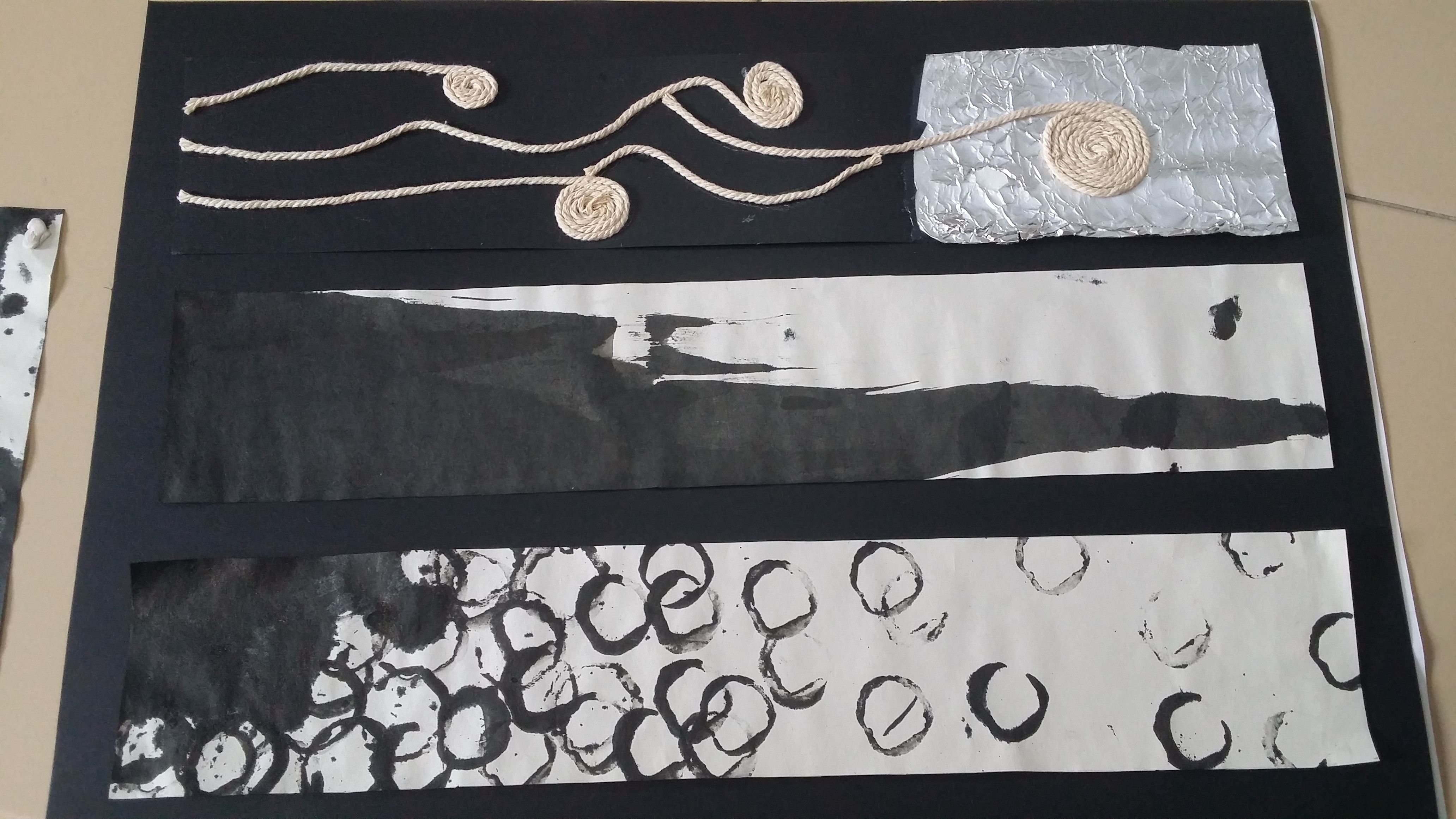
Final Submission (6 emotions):
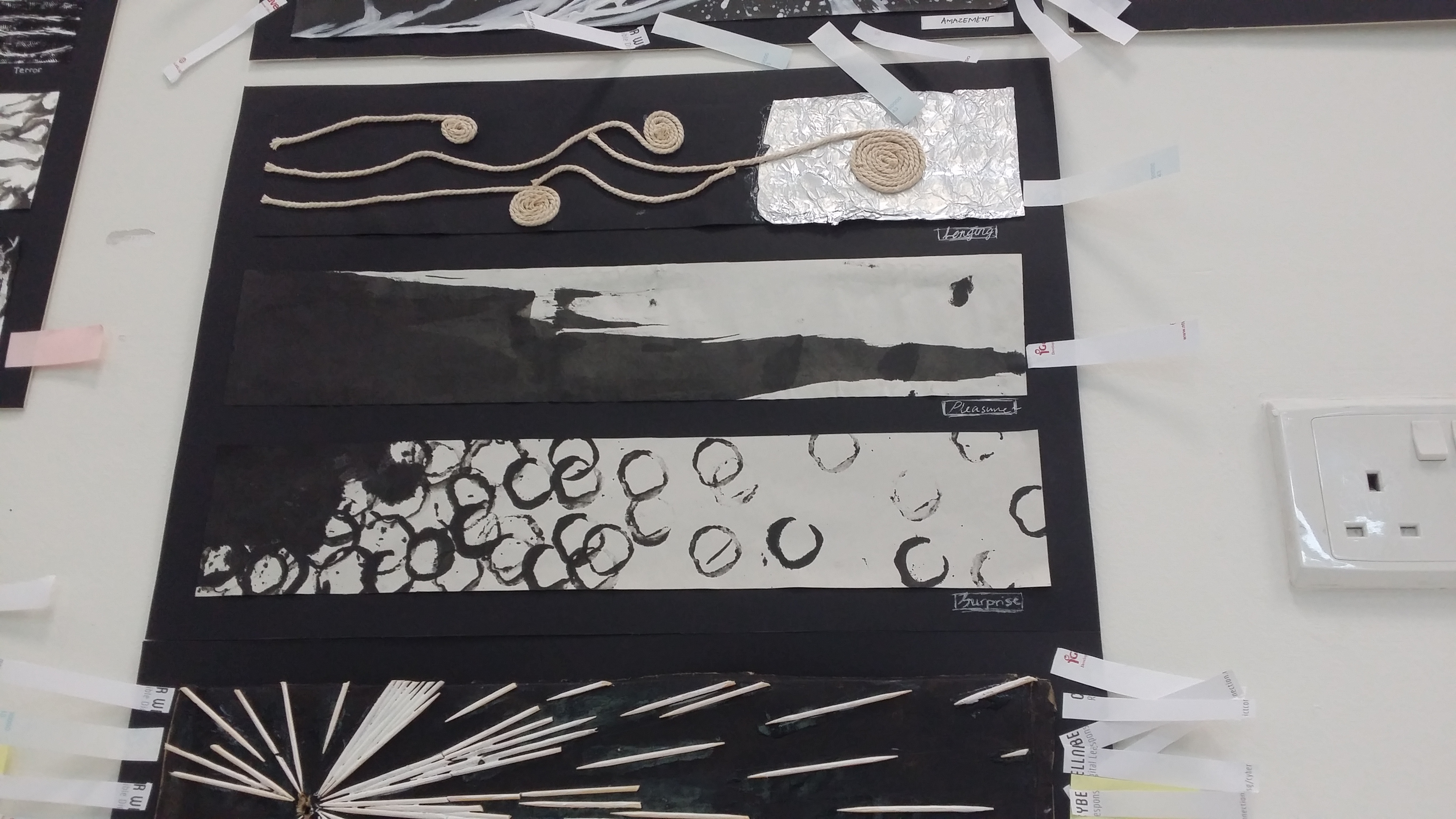
6 emotions (top to bottom):
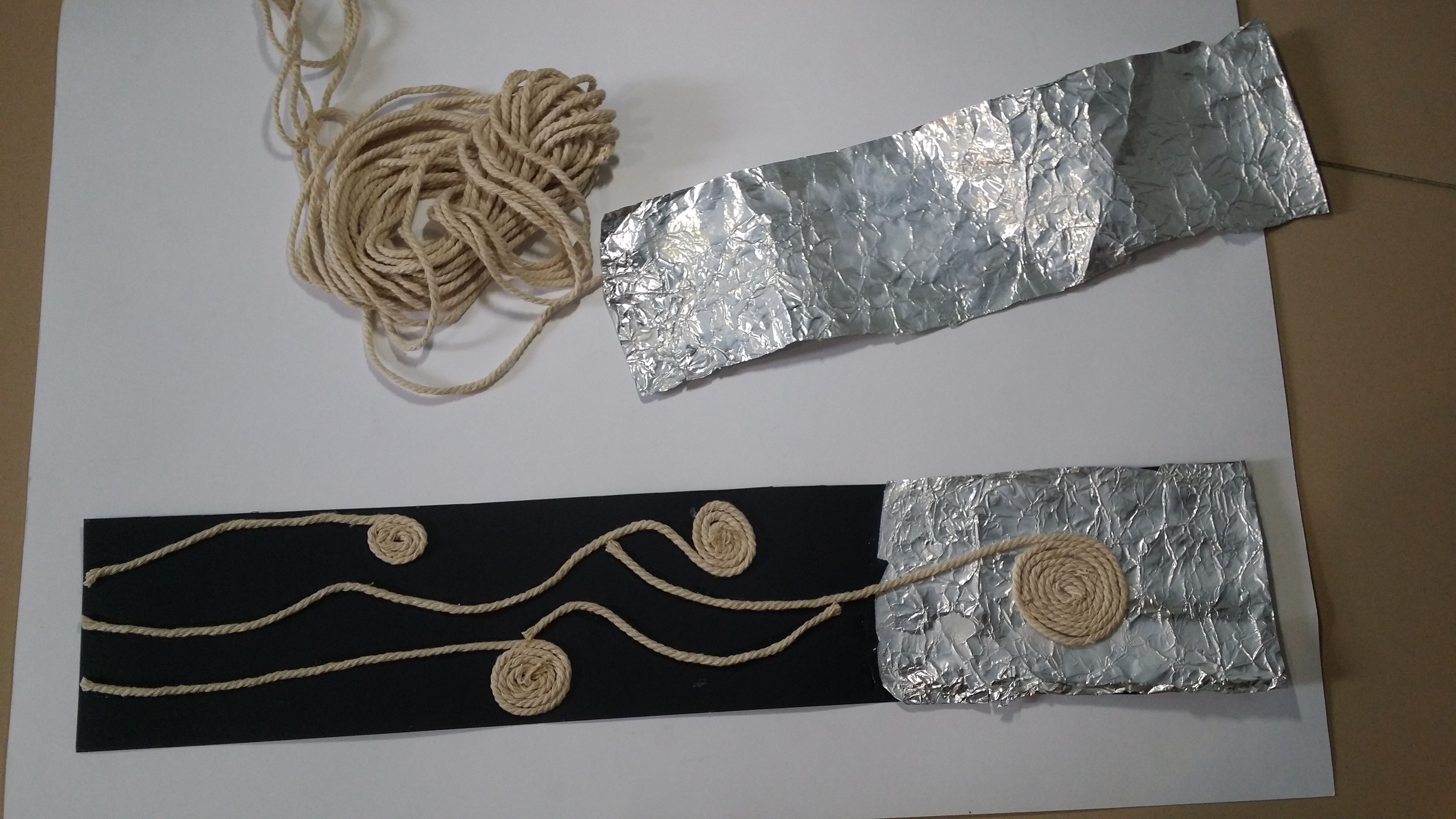
- Longing – String, aluminium, black paper, glue. Inspired by collagraphy.
- Definition:
- A yearning desire. Wishfulness.
- My interpretation:The lingering craving for something better, usually arises when someone is down in the dumps, desperate to get out of their current situation, which they find bothersome/tiresome.Tools and exploration:Aluminium foil, glued on string using white glue, scrunched up aluminium foil.tried using cotton buds to create a wiping texture but the white colour looked too washed out towards the bottom. (inspired by Judith Ann Braun who did fingerpainting). I decided to try out string on aluminium after coming across a video about collagraphy on cards.Rationale:“The grass is always greener on the other side.” I felt that it was necessary to create that contrast between feeling very lost in the dark of the black paper, and the brightness of the scrunched up aluminium foil (more reflective surfaces=extra bright). Almost like the saying “the light at the end of the tunnel”. Using the string to create curved lines creates a sort of motion which pushes all the way from the darkness to the light. The coiling of the string mimics the motion of grasping as well, as such it is similar to wanting to wanting to be in possession of something better.
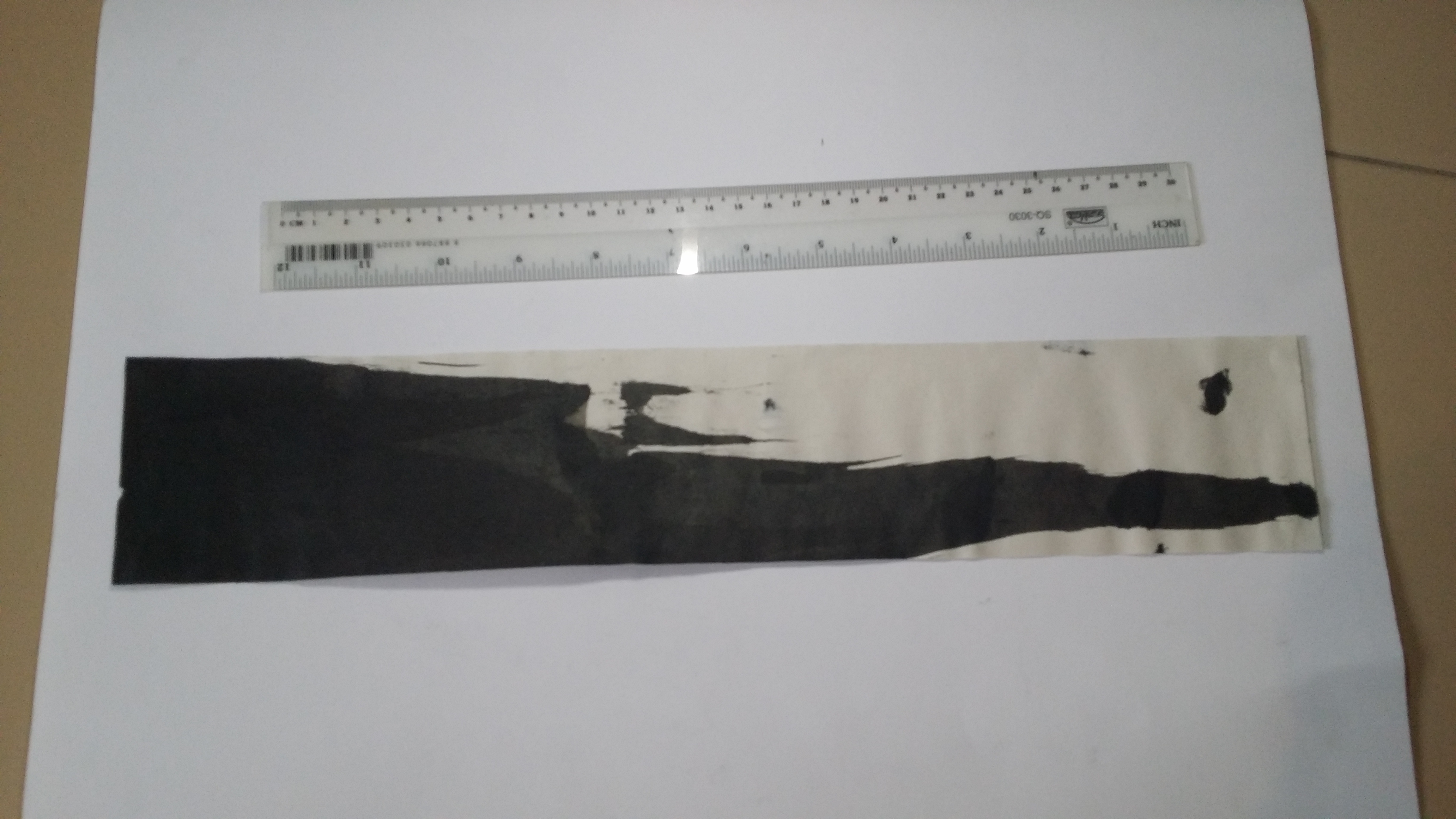
- Pleasure – Chinese ink, long ruler, inspired by Gerhard Richter’s squeegee technique.

Definition:A feeling of happy satisfaction and enjoyment.
Interpretation:
An uncontrollable feeling of bliss in a moment that seems like it would last forever.
Tools and exploration:
Previously tried using watercolour markers to create long flowing curves with gradient but looked too dull and static. Inspired by German artist, Gerhard Richter, who popularised the use of a squeegee for his abstract art works in a wiping/stamping motion, I decided to recreate a mini squeegee piece using my long ruler and some Chinese ink.
Rationale:
Pleasure is a rather uncontrollable emotion that comes in the heat of the moment. Can be fundamental (eating, exercising, social belonging) or higher order (experiencing altruism, viewing art). The feeling always comes in a sudden rush/wave and thus by using the ruler to quickly swipe across the strip gives it a sense of a quick motion, ink spills out of dimension as well to show that it is overwhelming.
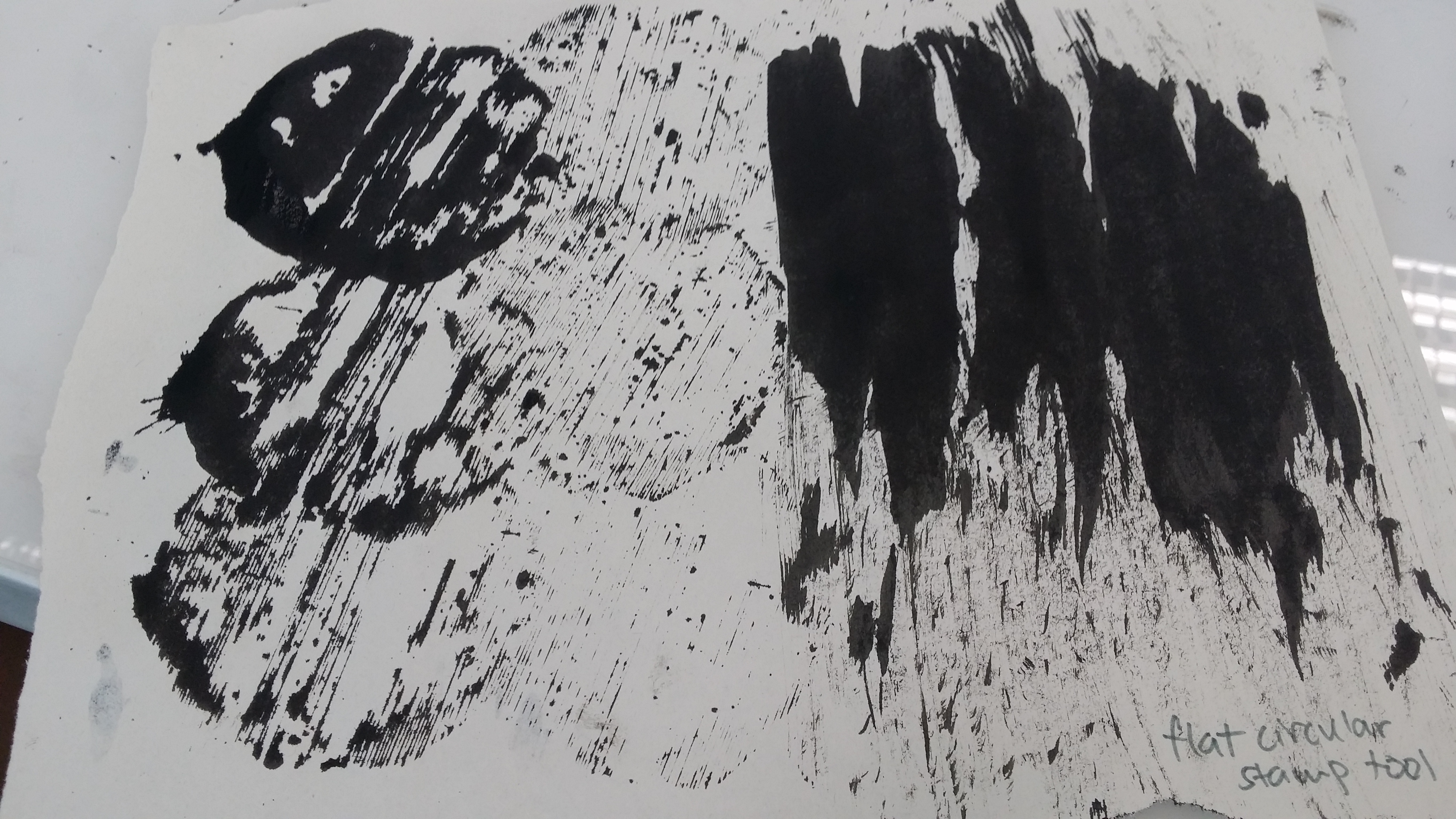
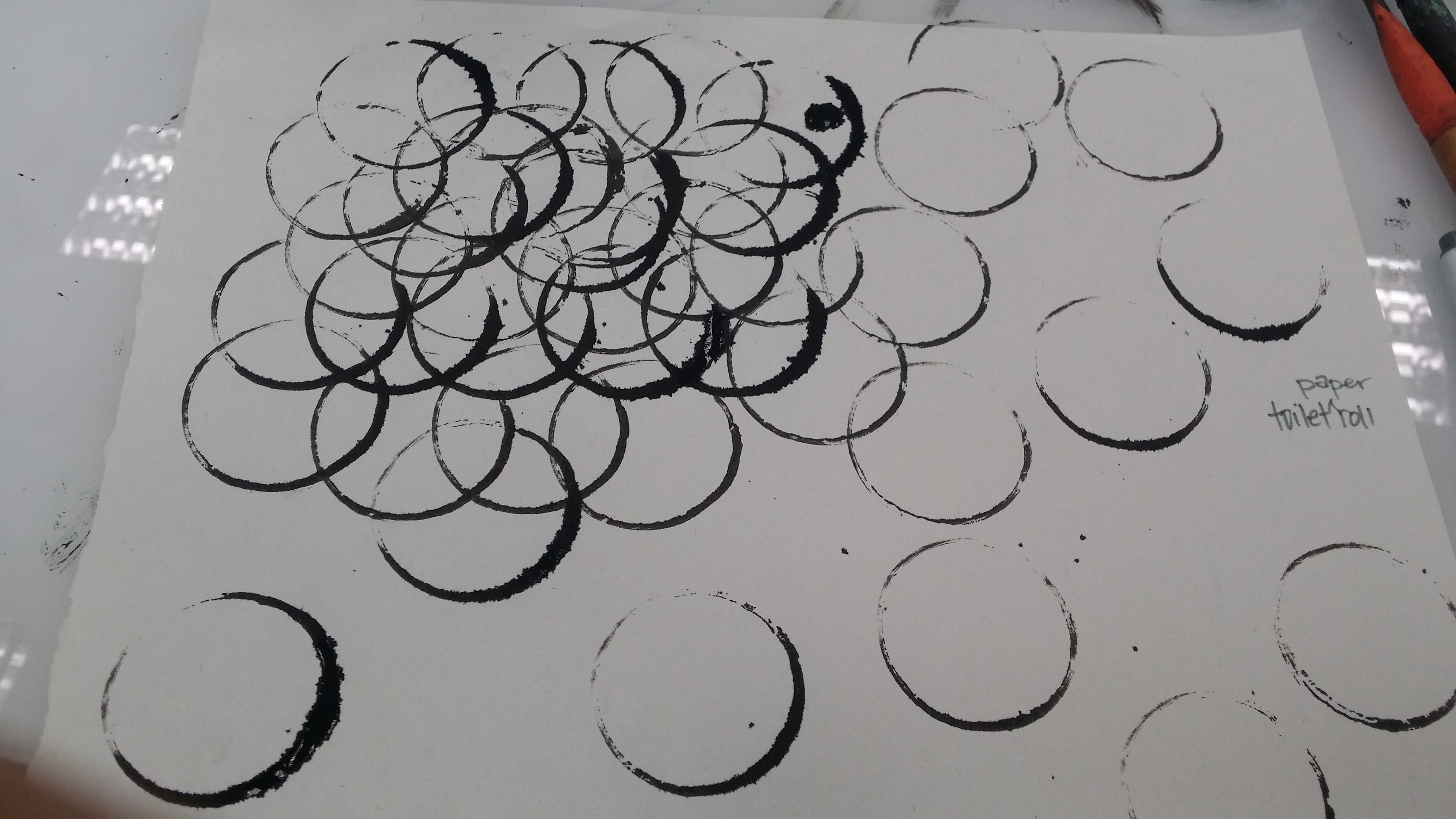
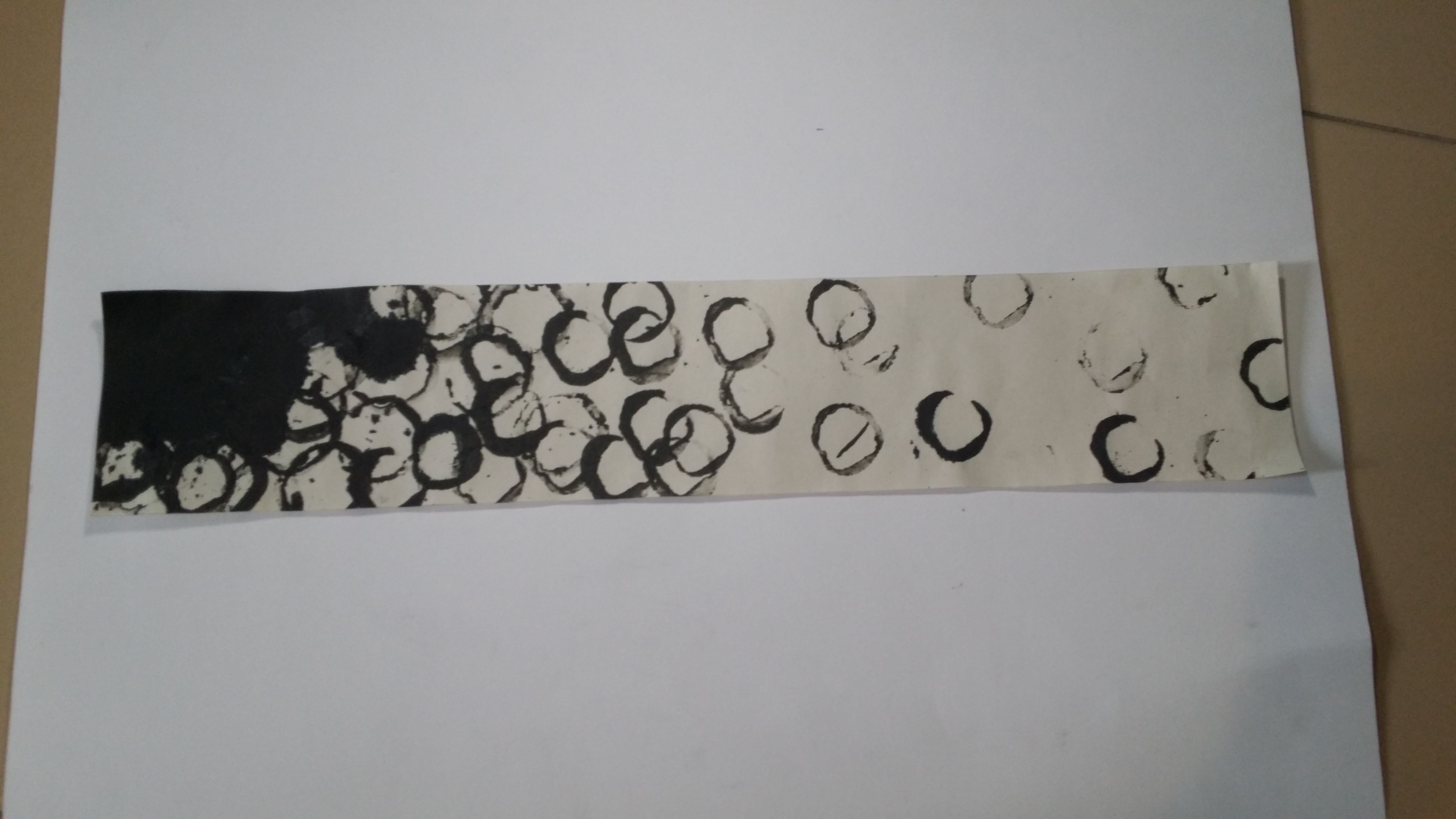
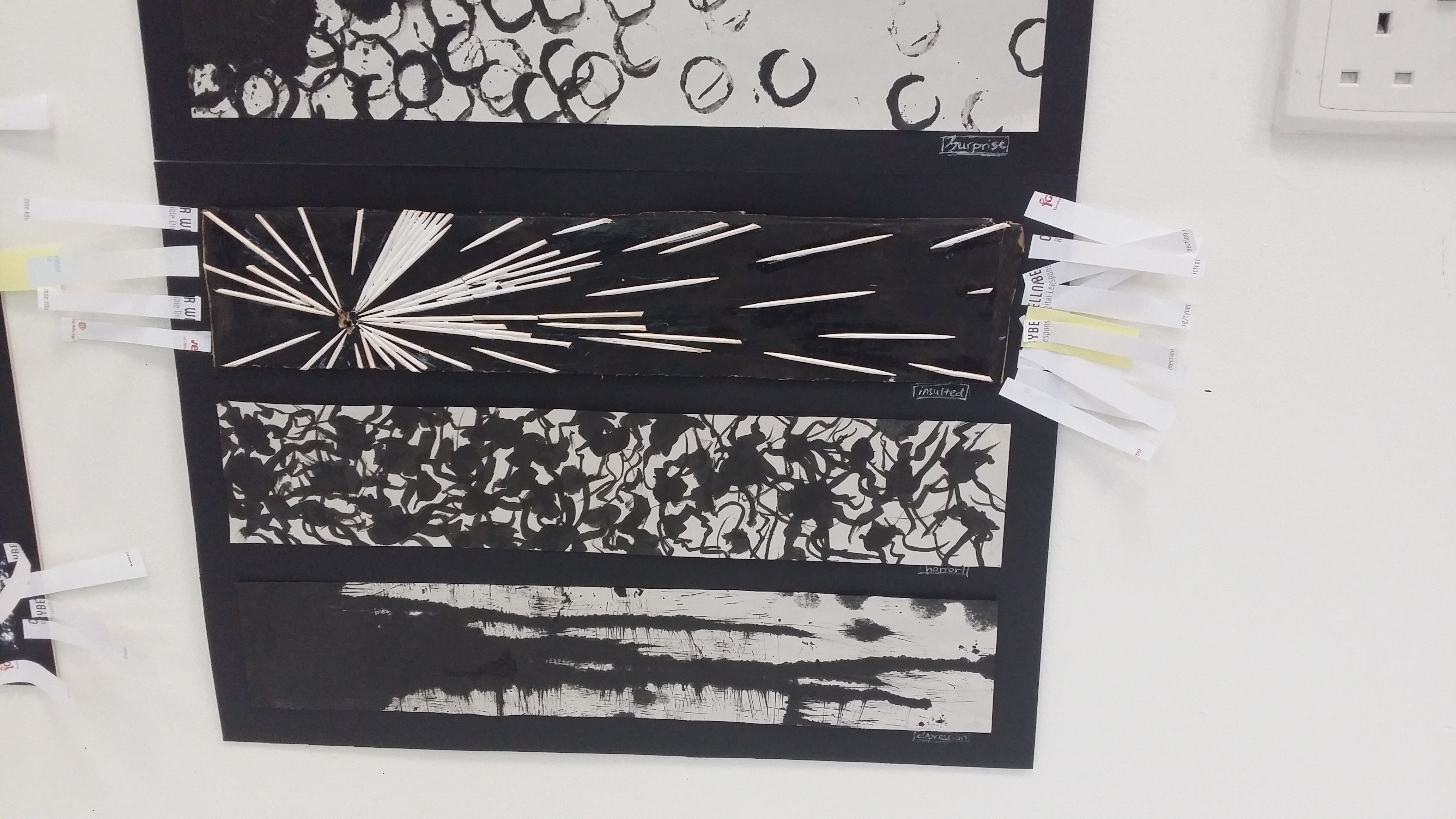
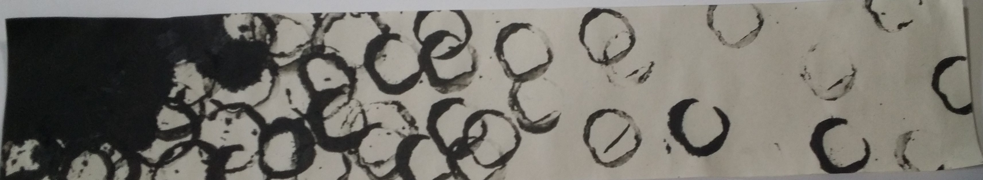
3. Surprise – stamped with moulded clay, Chinese ink on newsprint
- Definition:
- To feel mild astonishment or shockInterpretation:Surprise is an emotion triggered by the occurrence of a sudden, unexpected event and is a transient emotion as well that gradually fades off and does not linger for too long.Tools and Exploration:At first, I used a cardboard toilet roll and stamped it on newsprint using Chinese ink for experimentation. I then switched to clay instead and moulded it such that it could produce circles as well but smaller ones.Rationale:
Surprise has a positive connotation and is a rather transient feeling that is triggered by a sudden event, thus short lines, or small circles can be included. The spacing between these elements can also be considered, For example, having a cluster before gradually becoming sparse shows a sense of dispersing of shock.
At first, concentration but gradually becomes more scattered. The rhythm slows down as the space between the circles increase towards the right.
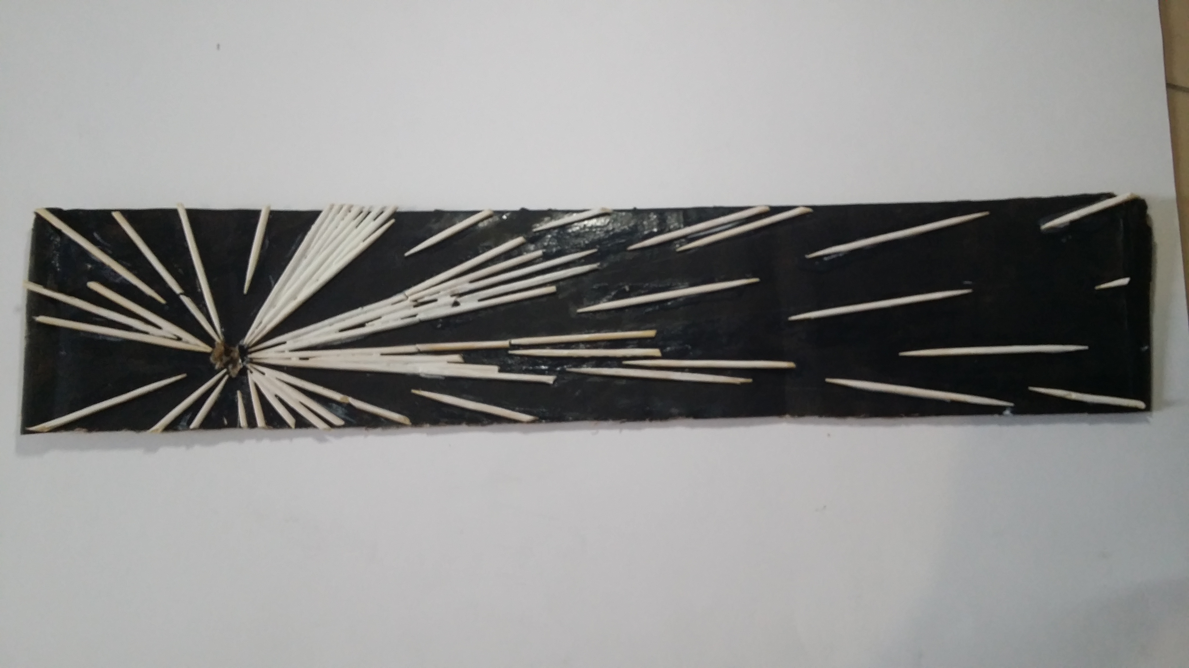
4. Insulted – toothpicks, white paint on black paper

- Definition:
- To speak or treat people with disrespect or scornful abuse
- Interpretation:
- To hurt someone verbally in order to hurt their ego/pride/dignity/sense of self-worth/self-esteem. Bring them down. Usually coming from someone who has a larger than needed ego him/herself who assumes a superior position and looks down on others.
- Tools and exploration:
- Simply using short strokes was not enough since it did not really create a sense of direction. I wanted the strokes to aim towards the hole (which is visibly torn, the torn paper can be paralleled with the destruction of ego. Toothpicks and glue. Tried normal paper vs cardboard (more sturdy).
- Rationale:Cardboard painted black, sense of isolation. Using toothpicks that have both a blunt and sharp end and aiming the sharp end towards the hole and following perspective lines, the sense of having small insults being thrown towards an individual (who is inferior, as shown with the small size of the hole). It can also easily be assumed that the aggregation of the small insults being thrown about eventually will cause a large amount of damage to an individual. Stark contrast between light and dark.
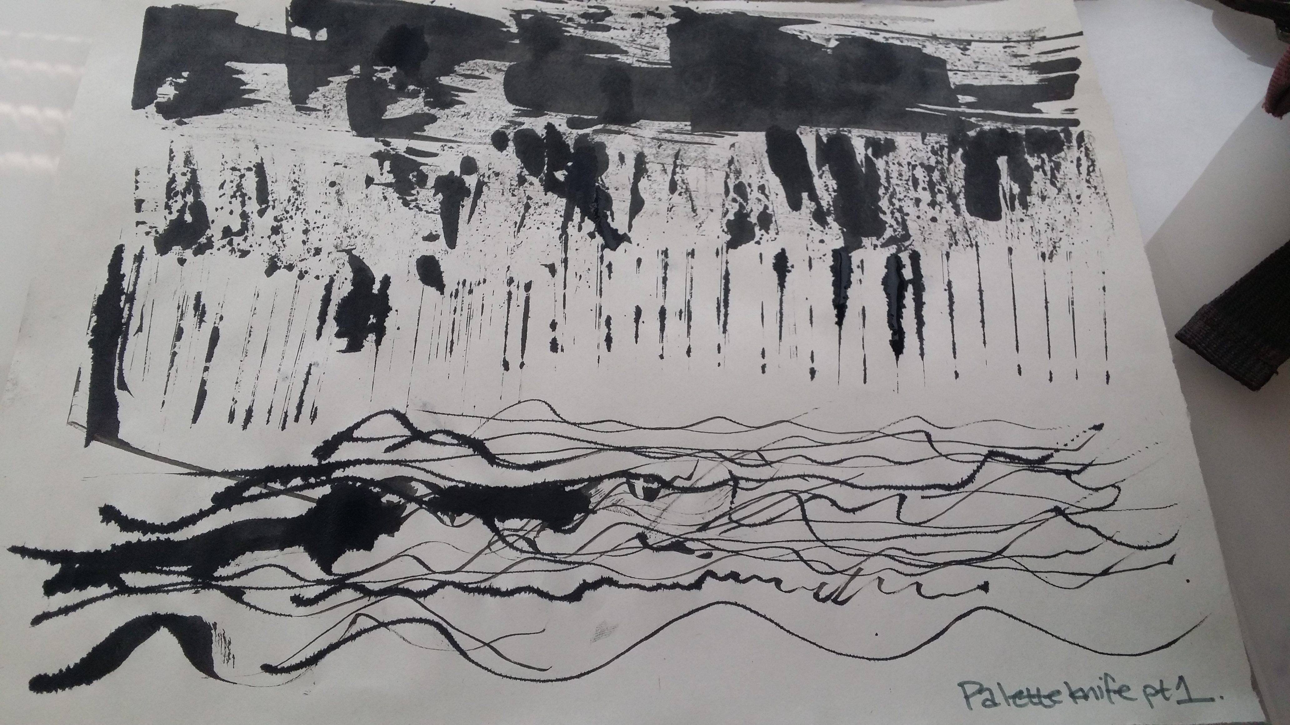
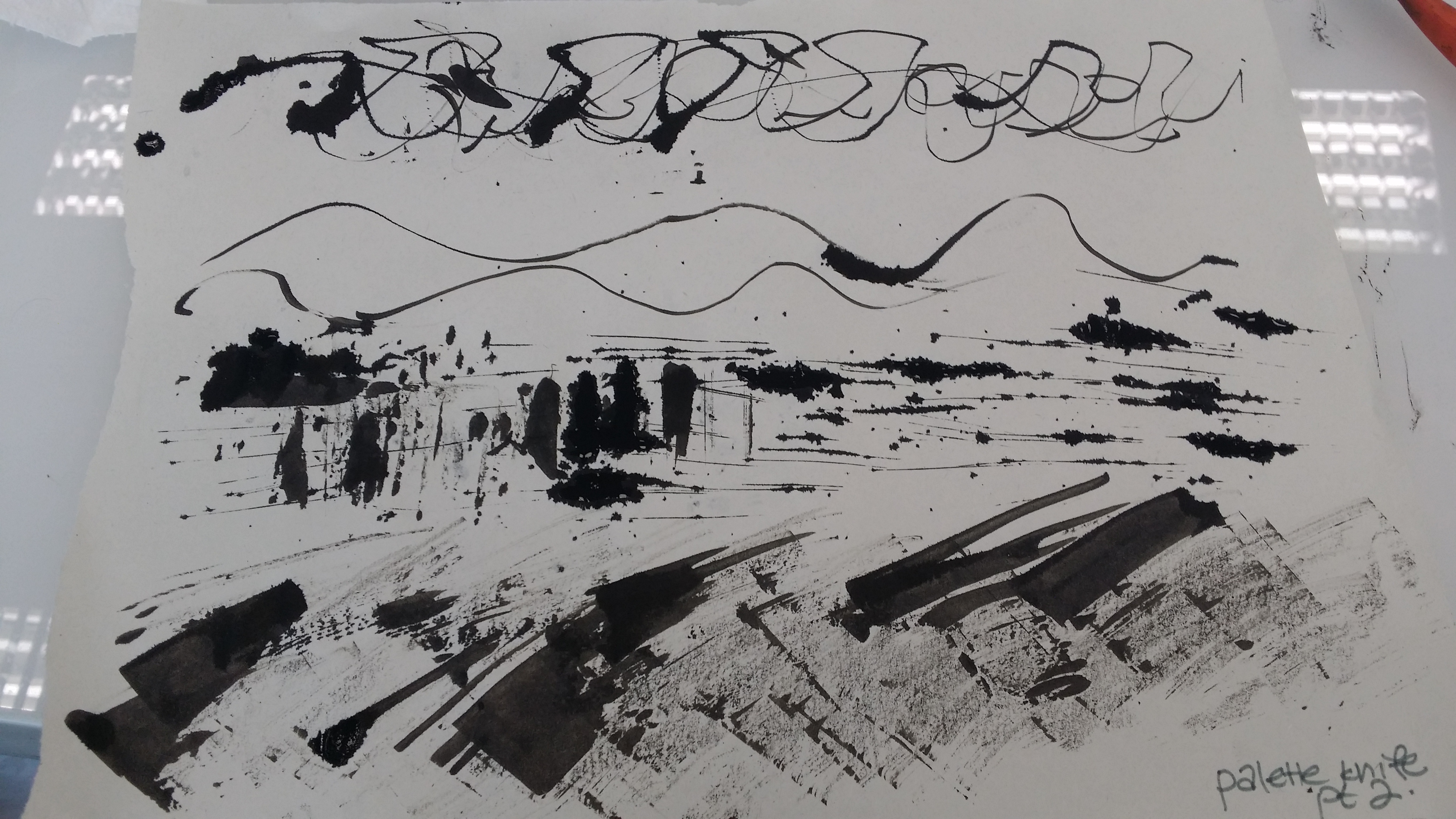
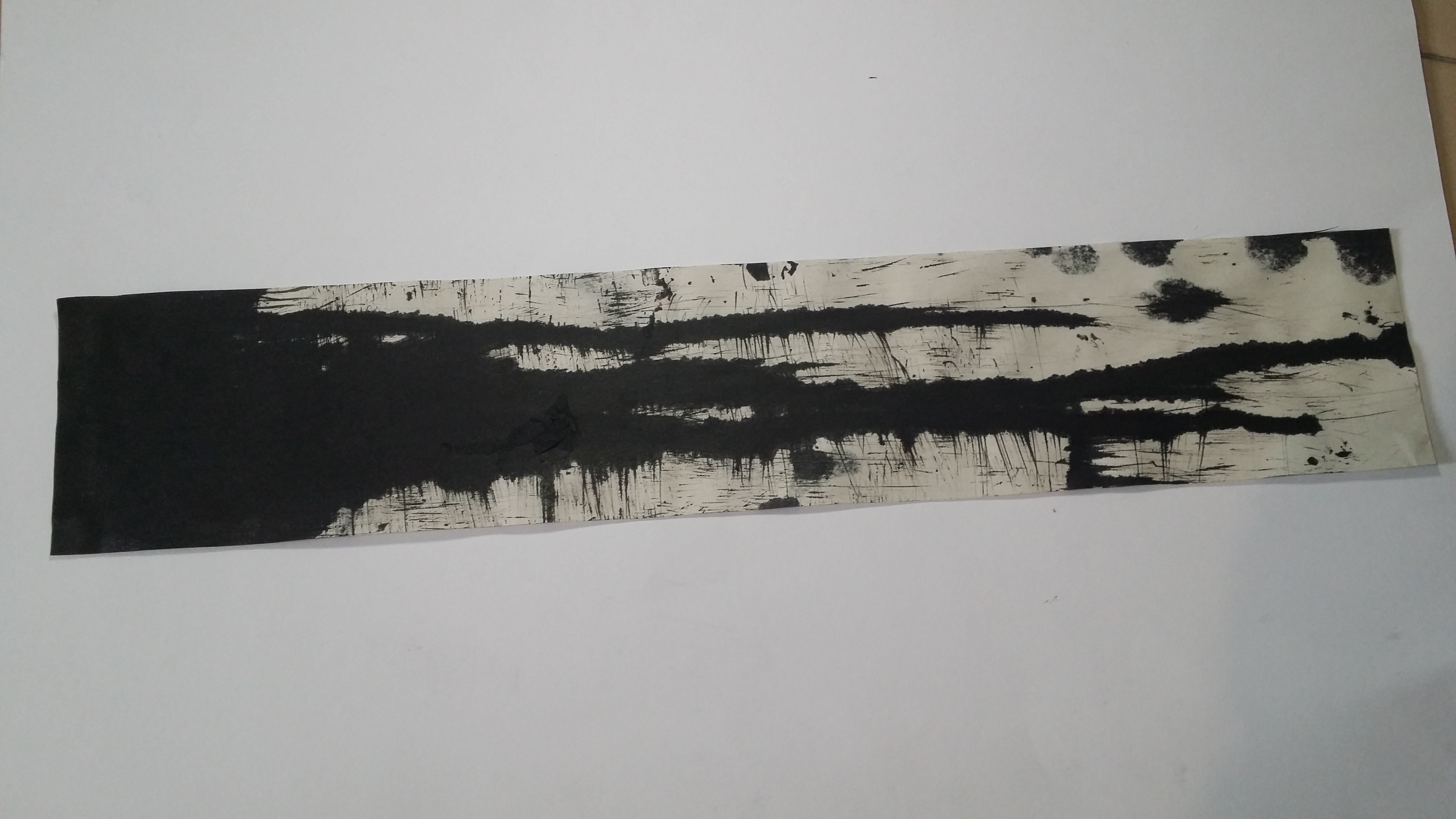
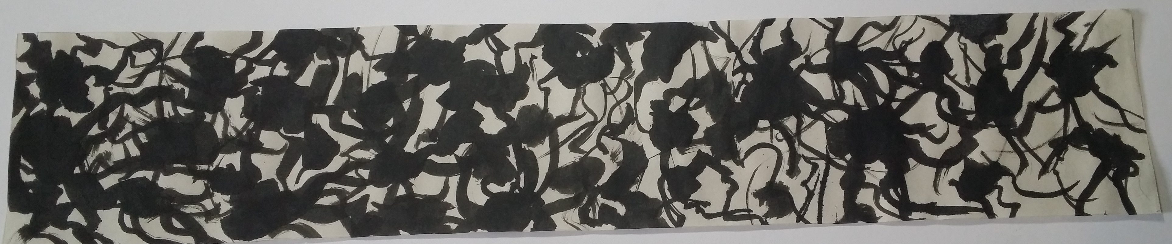
5. Horror – Chinese ink, Palette knife, newsprint
- Definition:
- An intense feeling of fear, shock, or disgust.
- Interpretation:
Primal, instinctive feeling of fear that comes from the gut when confronted with a threat/dangerous situation
Tools and exploration:
Chinese ink, palette knife. Previously tried other subdivisions such as anxiety, anger using tools like tissue paper, jealousy using drip painting with a hard brush
Rationale:
Feeling like something rises internally and feels intrusive, climbing manner upwards. Wavy patterns that radiate outwards from a dark source. Sort of like how any paranoia originates from insecurities, suspense that prolongs it. Tangled string-y feeling that is hard to get rid of.
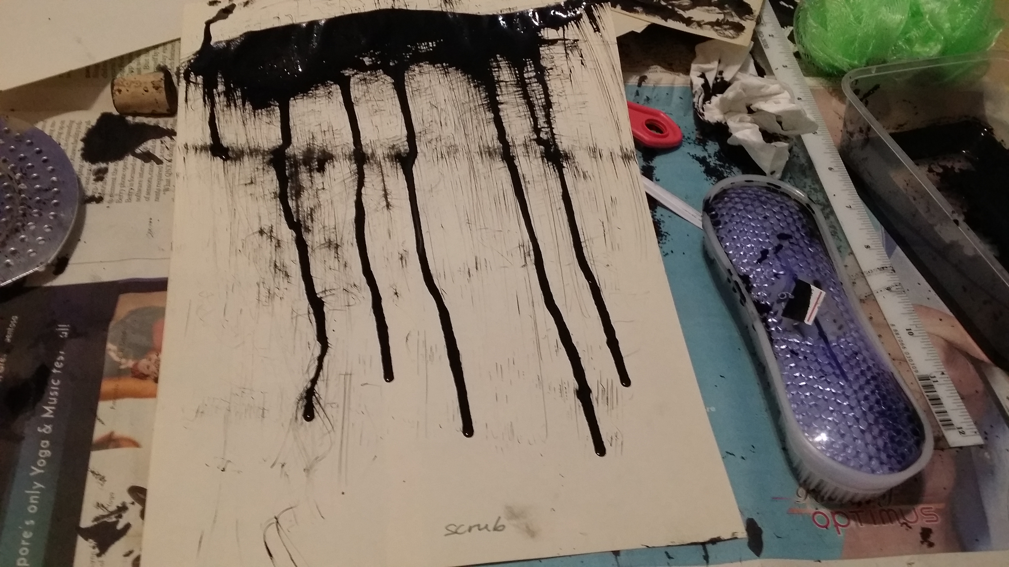
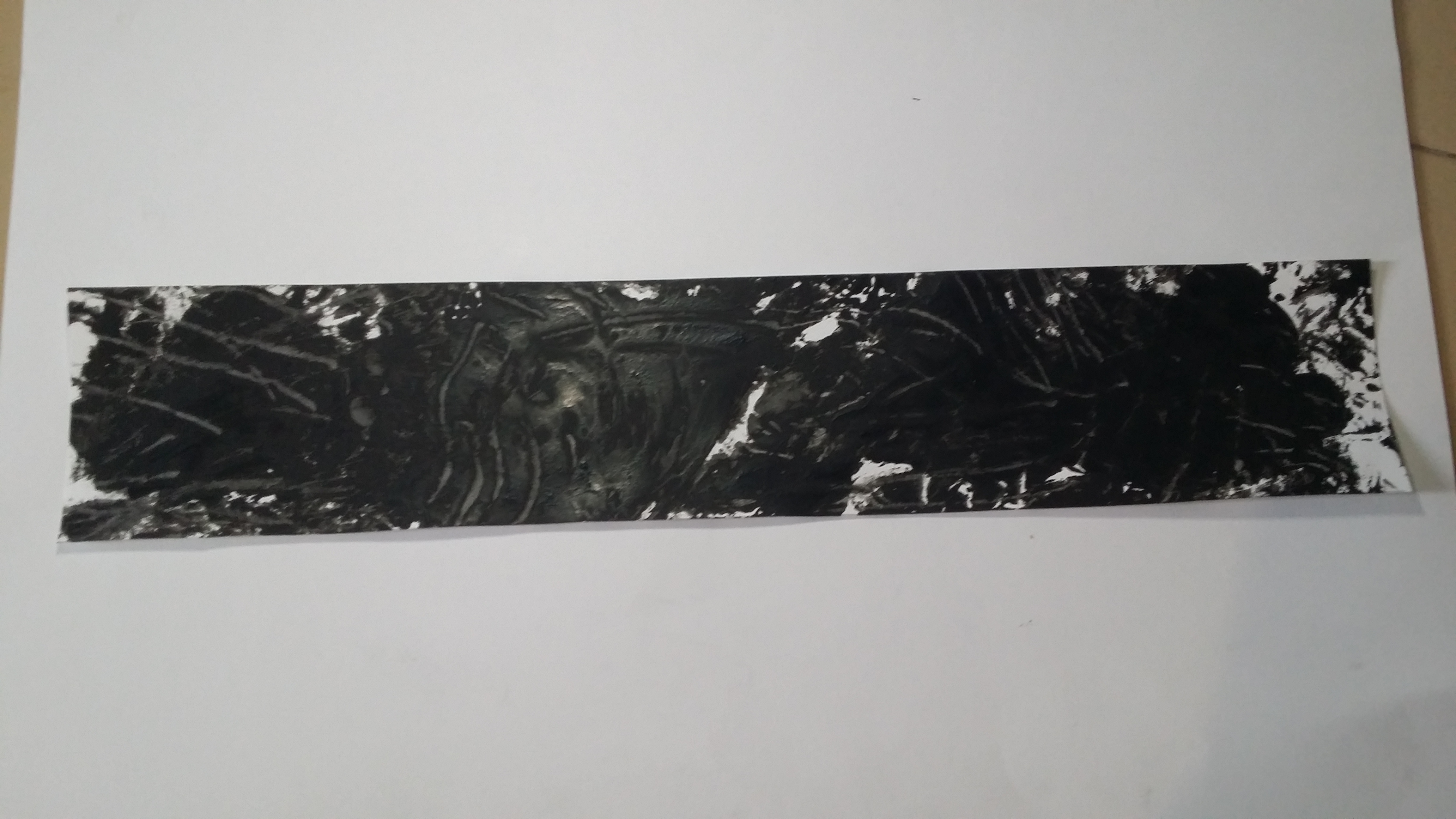
6. Depression – Chinese ink, newsprint, bath scrub

- Definition:Feeling of severe unhappinessInterpretation:Something heavy that weighs you down, stains you, clouds your perspective of the world around youTools and exploration:At first I tried directly scraping some ink onto the paper but the hard brush did not pick up much ink, used plastic spoon to lay down ink before spreading it out. As I was holding it up, the ink dripped down but the downward direction implied was perfect for the overall effect.
Rationale:
Sadness is a pretty personal feeling that not a lot of people express openly, so it would be appropriate to have a cluster of elements together rather than spread out widely or evenly throughout the entire paper/medium. Drip lines or really thin, wispy lines can be used to convey the silent wallowing in grief, and gives off a sombre, gloomy feeling.
Reflections:
Through this project, I have learned that the effects of designs on posters, websites, advertisements etc. may largely go unnoticed, they are extremely deliberate and directed in such a way that leaves a huge impact on our subconscious mind. Designers certainly do not add polka dots into a design just because they like polka dots. There are very specific reasons why they used a certain design in order to evoke a certain mood upon the viewer.