Surface Design: Methods

This is a journal of all the methods I have tried during my Surface Design class.

Reflection:

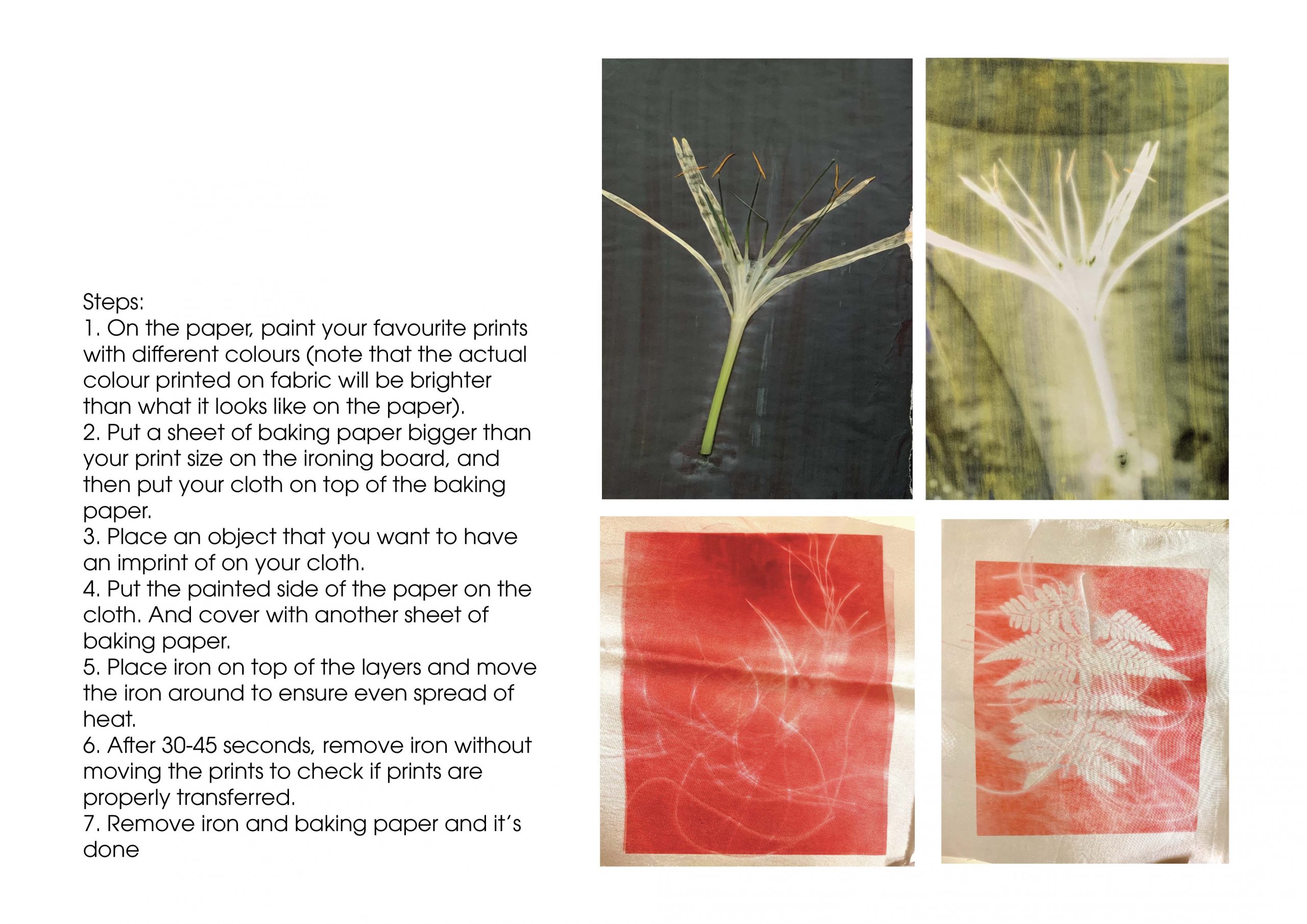
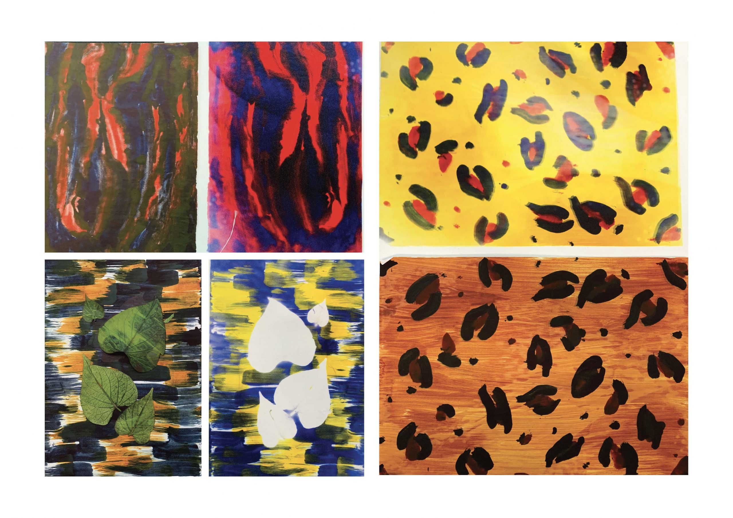
I think this method is very fun and lucrative. As I like to paint, this method can make it really easy for me to transfer my paintings onto any fabric I like. In addition to that, the colours are all very vibrant and additional details can be added by adding flowers and threads to create negatives.

I think this is one of my favourite methods, a lot of potential to explore.
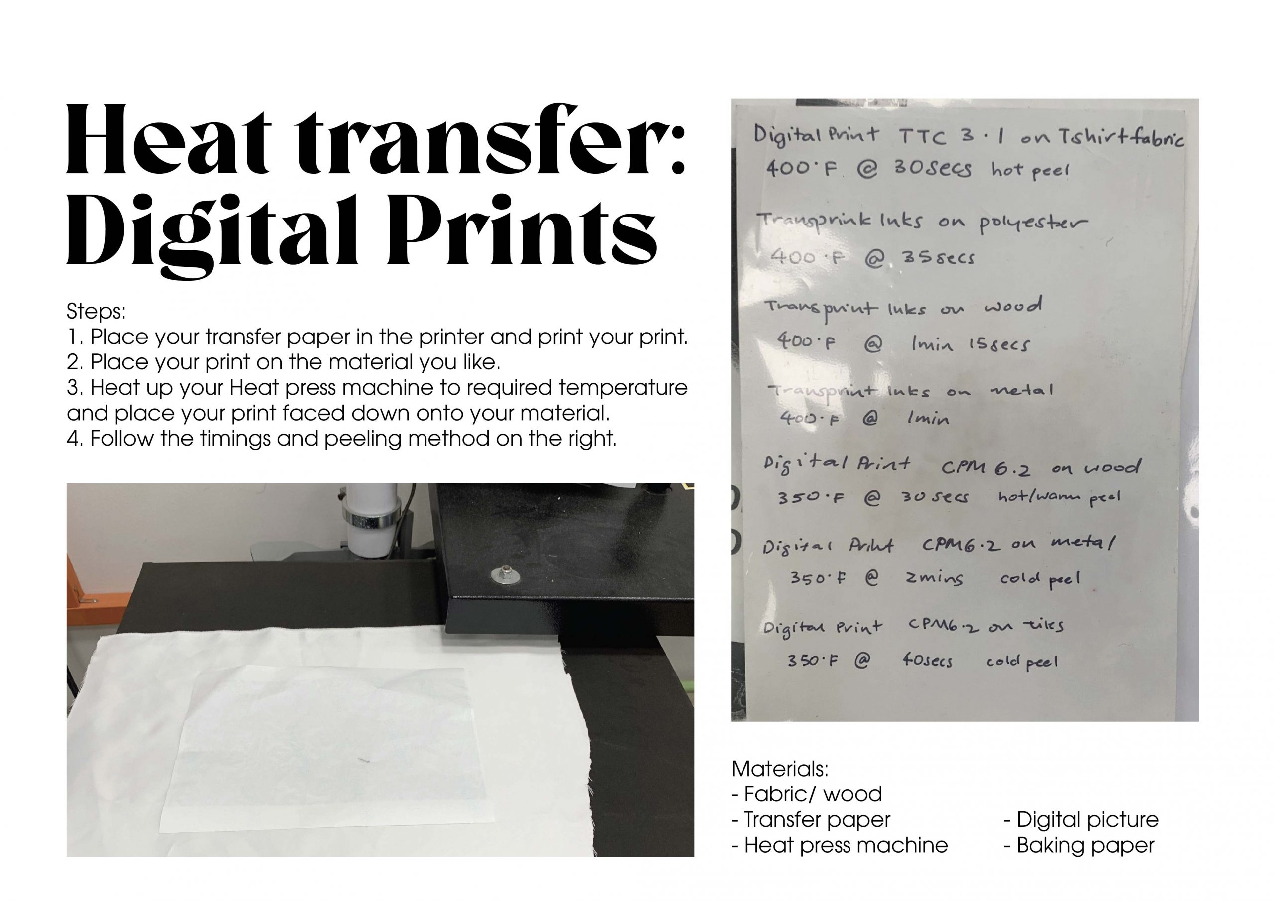
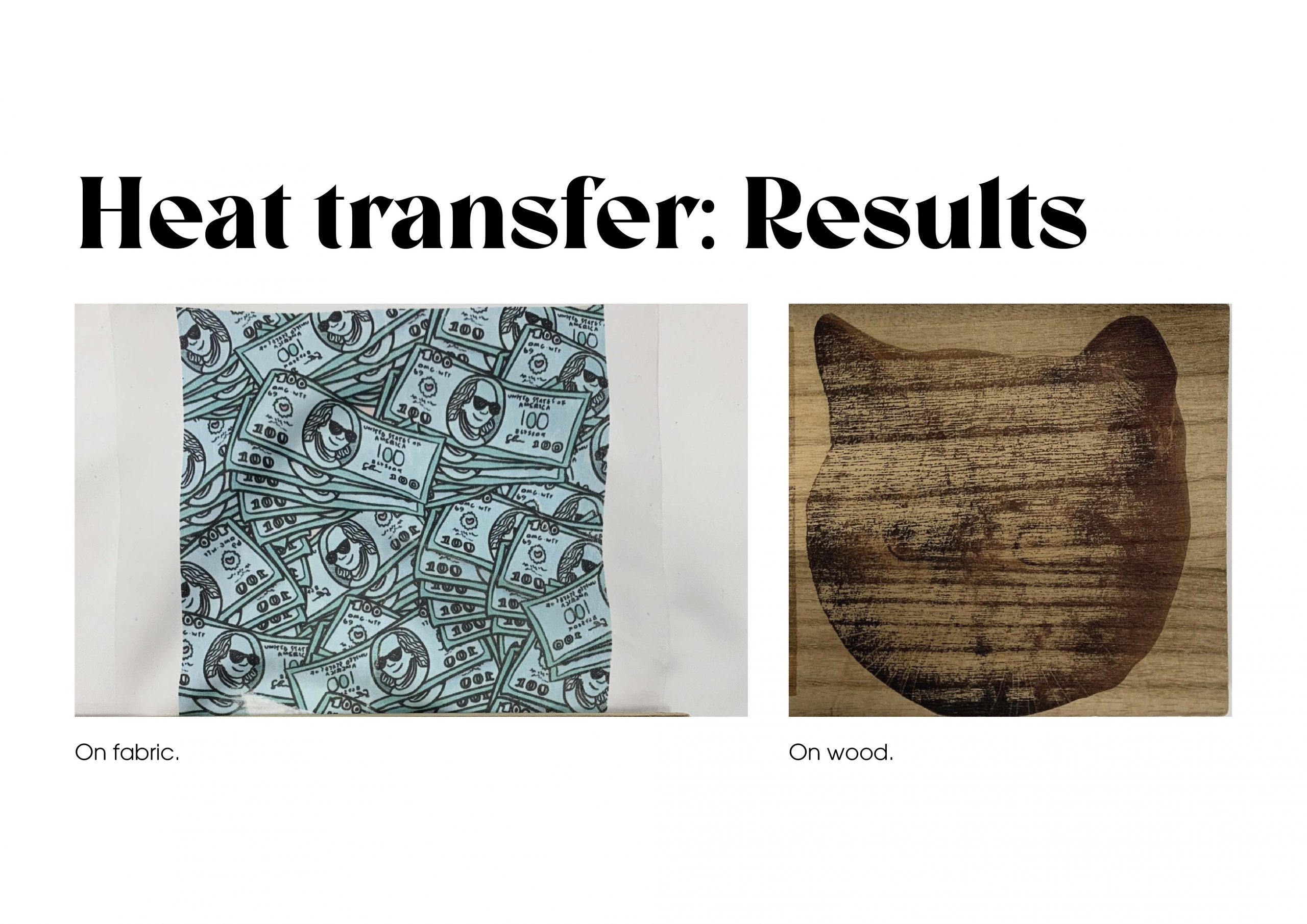
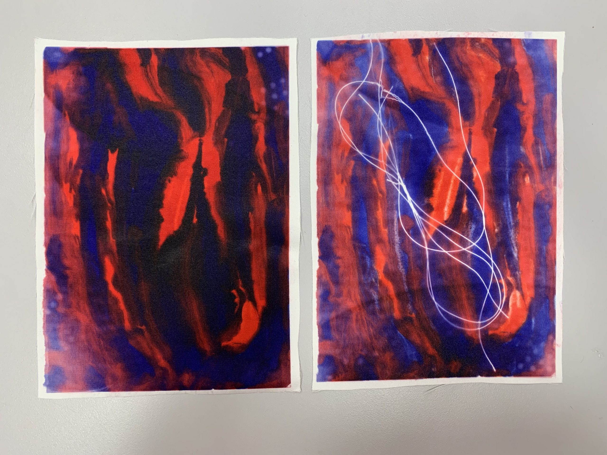
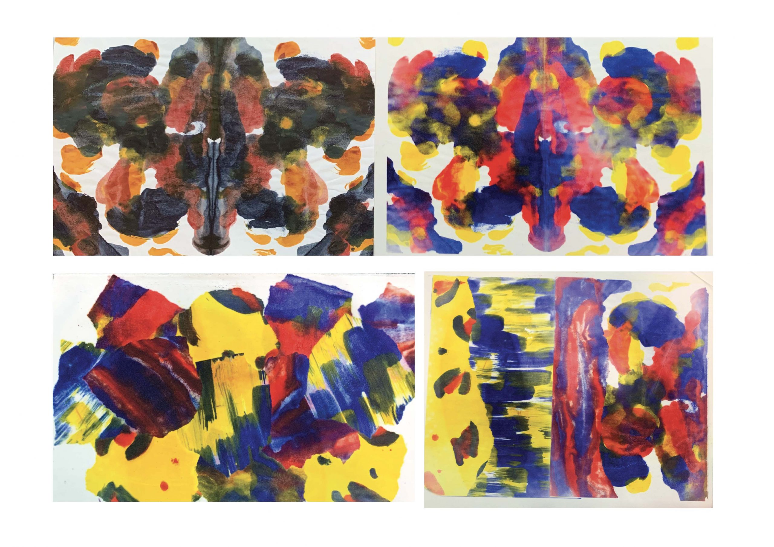
Reflection:

I think this method is very straight forward and easy to execute as well. this method also has a lot of potential to create my own prints. I’m not a fan of the print on wood, but the one on the fabric is very beautiful!
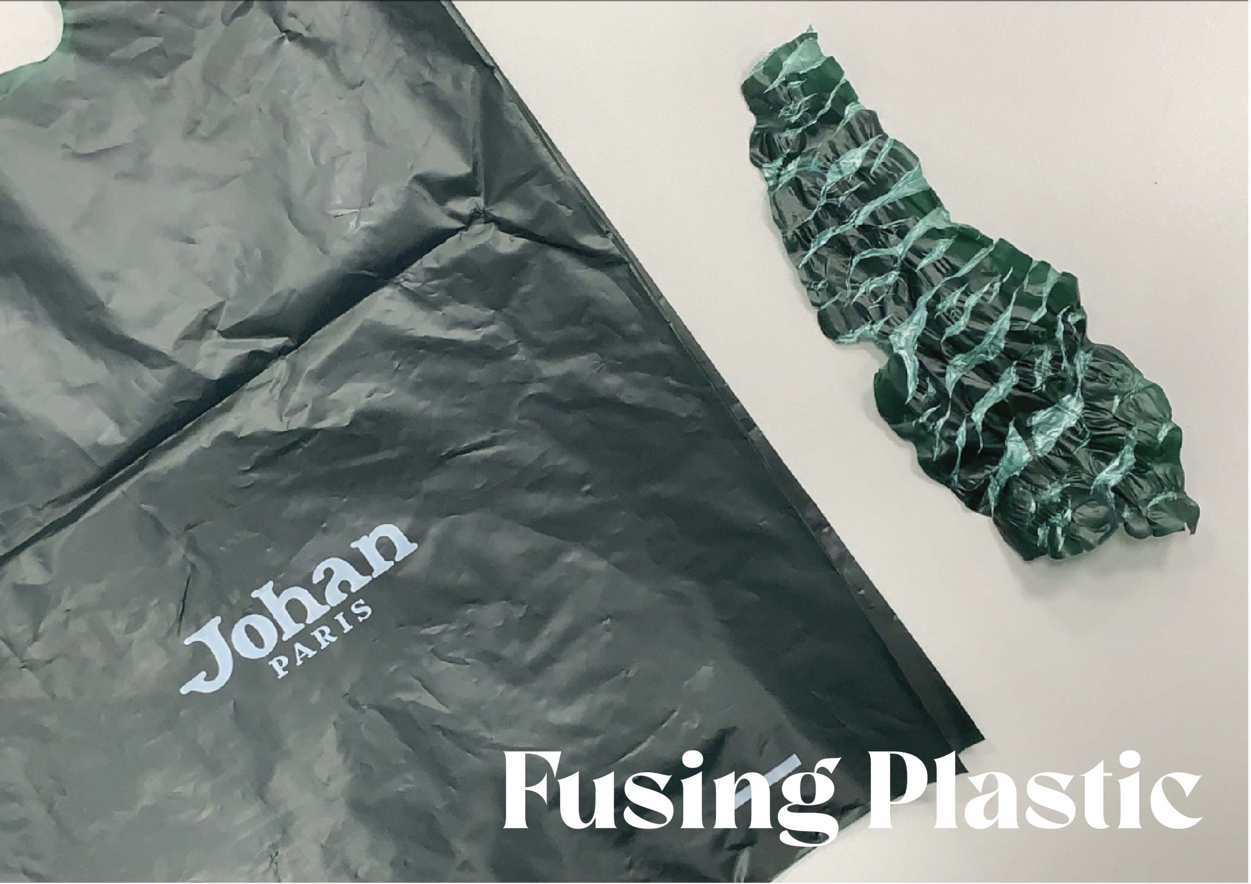
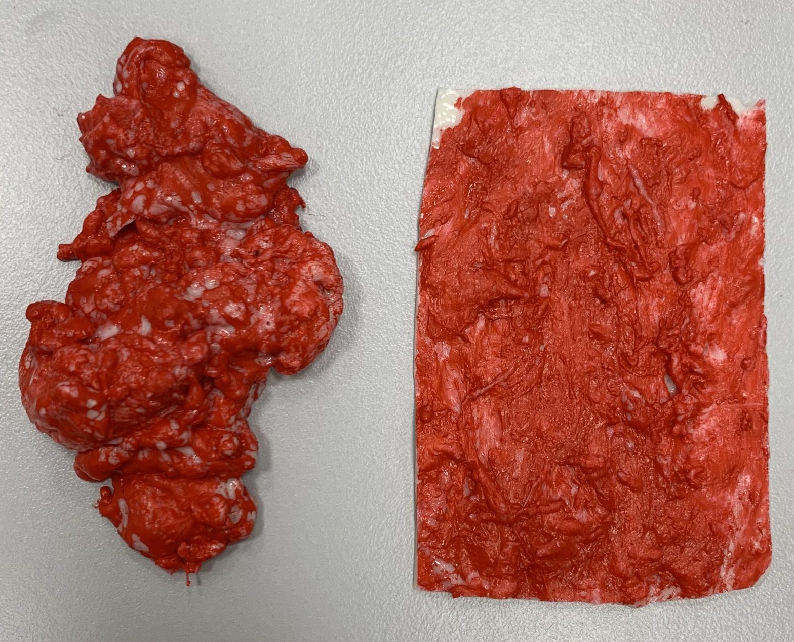
Reflection:

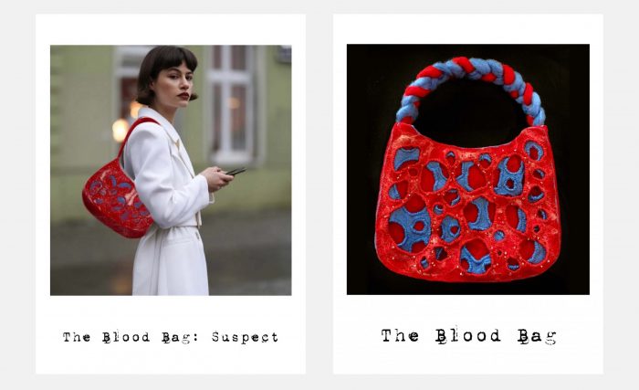
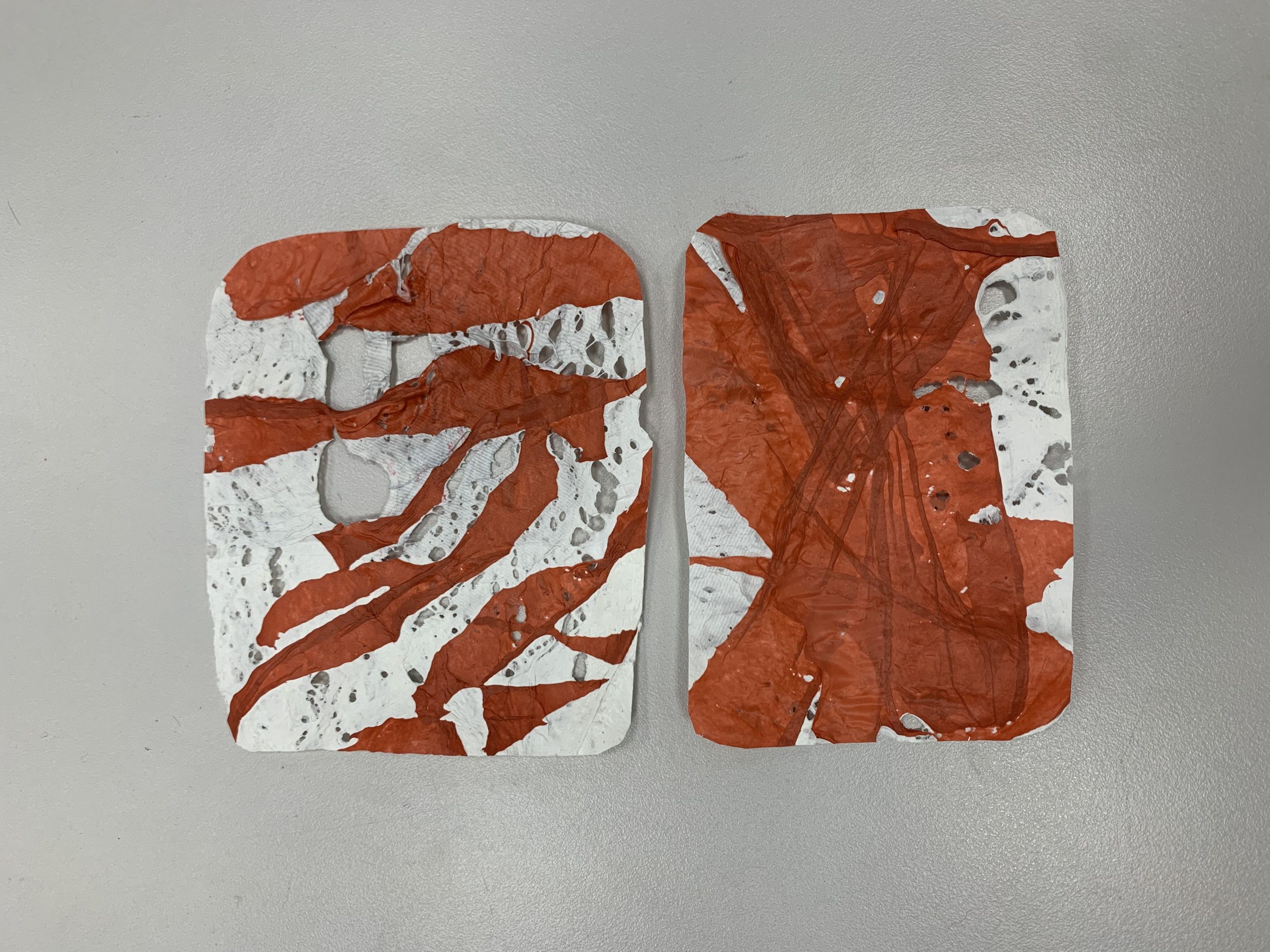
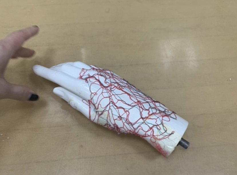
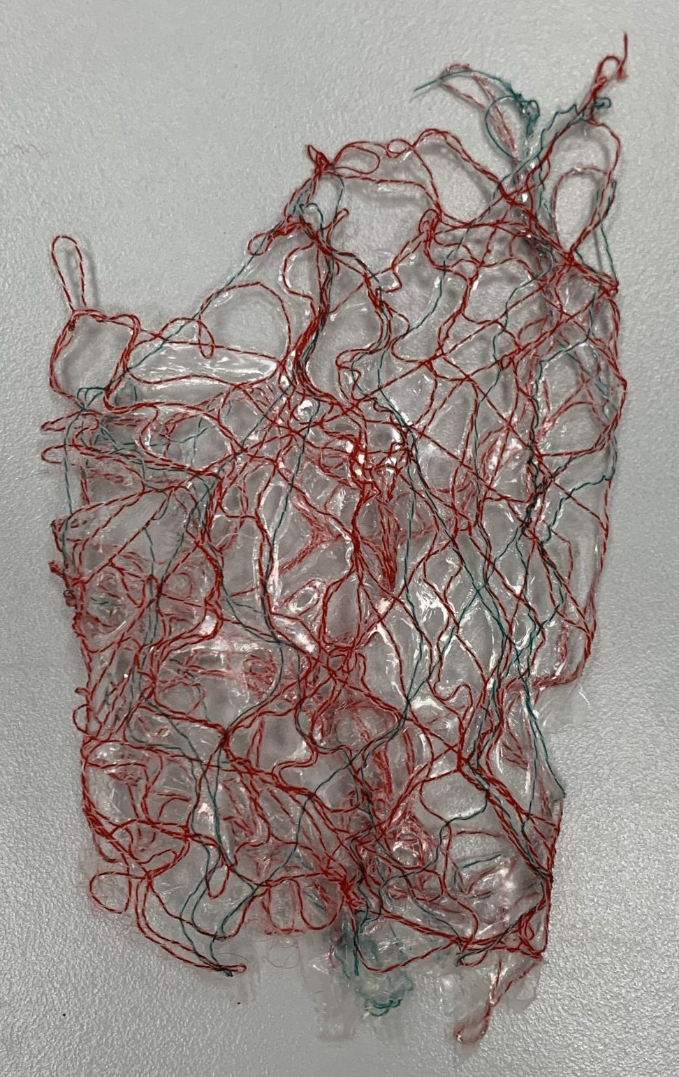
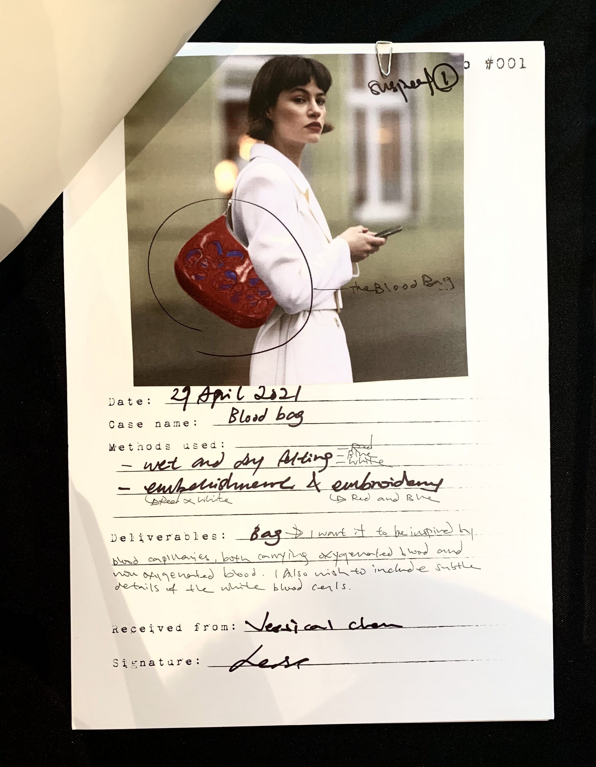
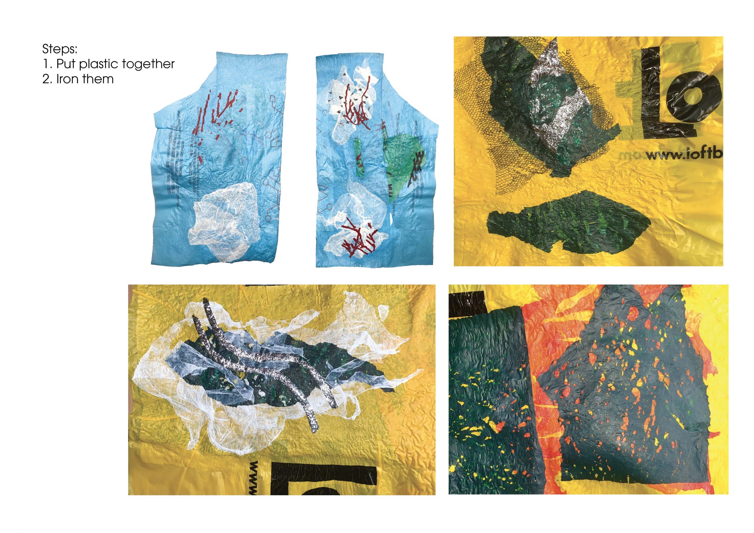
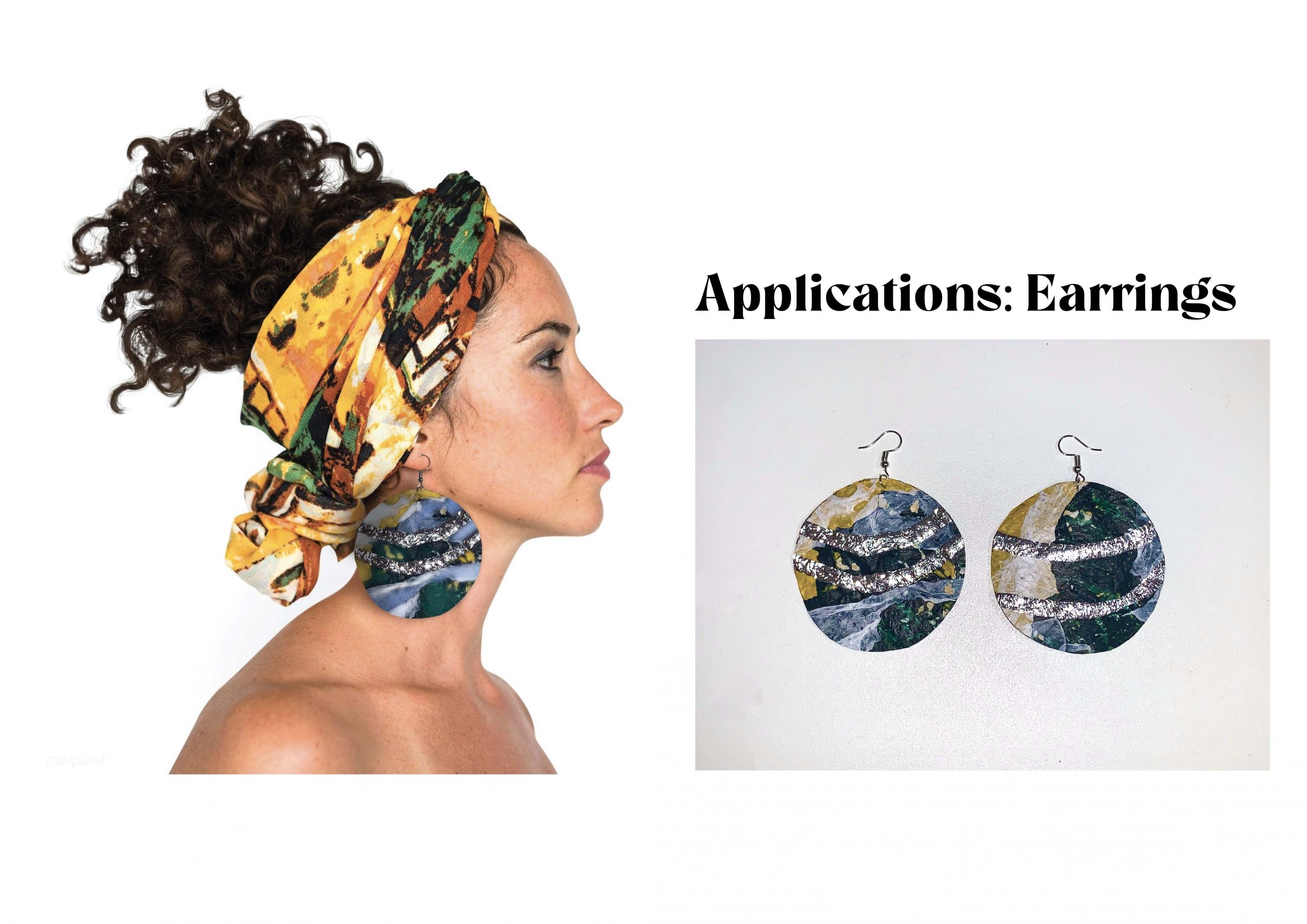
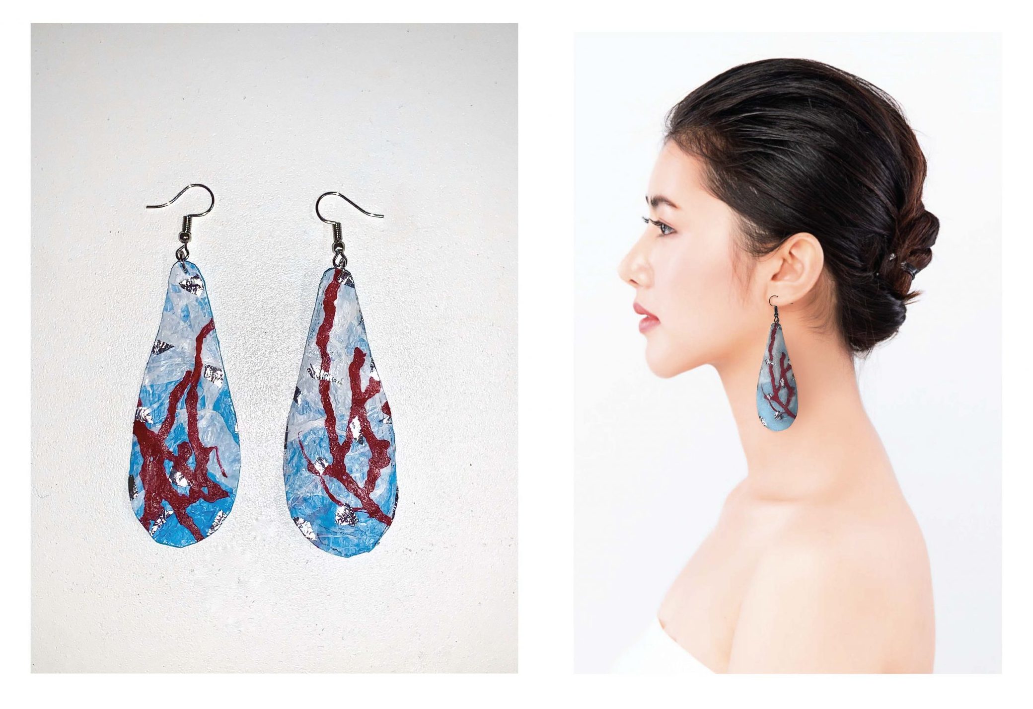
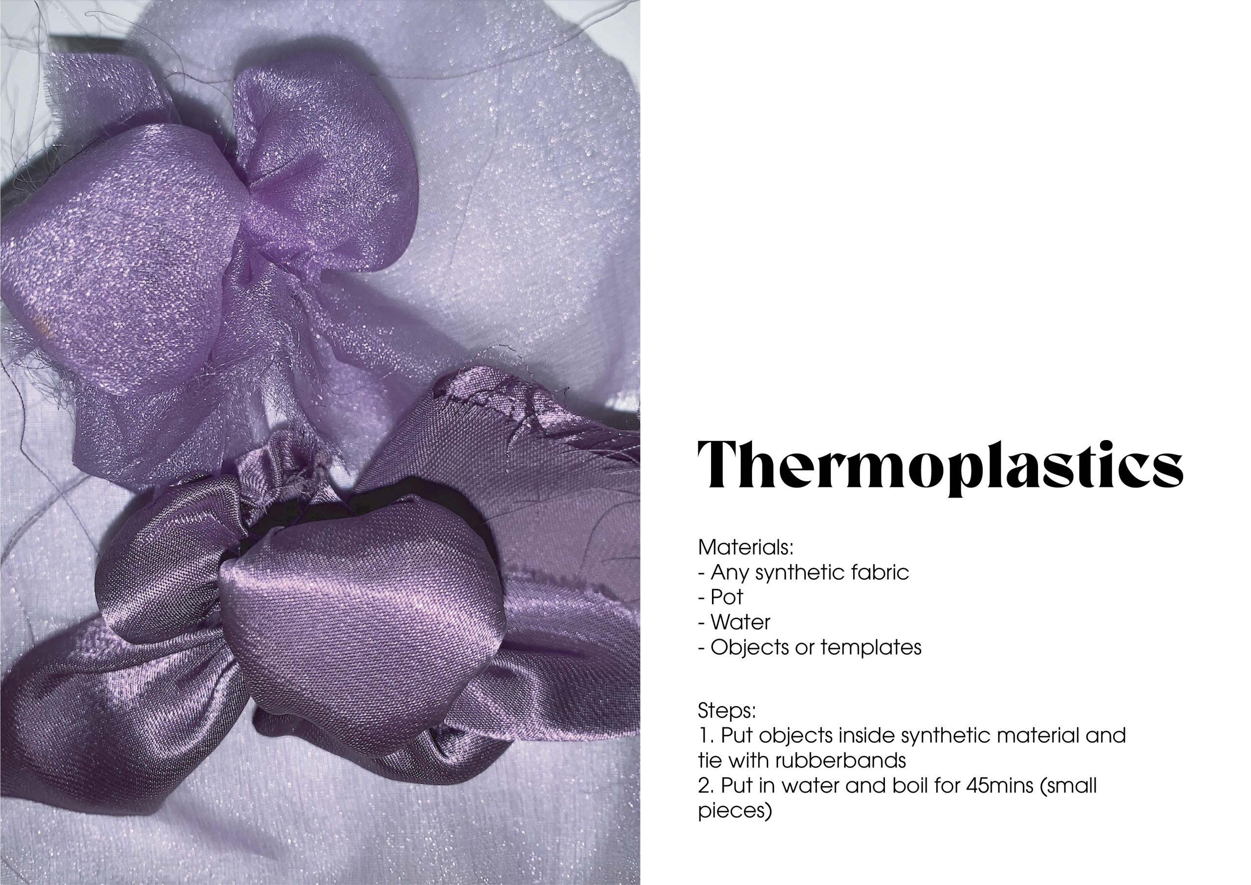
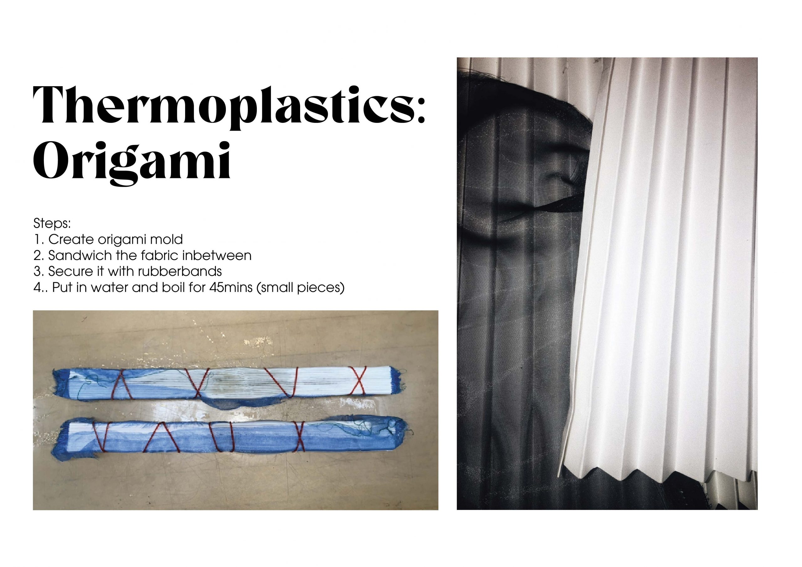
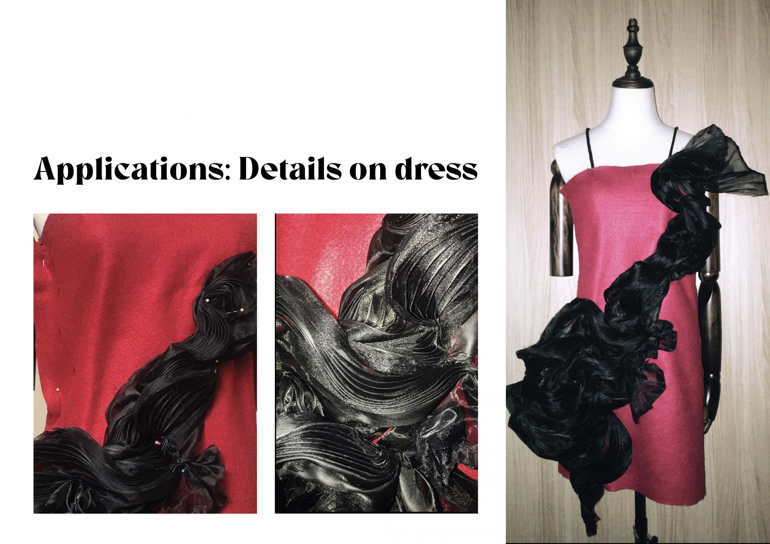
I love this method! One of my favourite methods as well. This method has a lot of potential and I feel like it can create a lot of raw and organic compositions. I feel like this can be an execution method of a sustainable project. This method creates very hard plastic items, so I think it is more suitable for jewellery or bags.

Reflection:

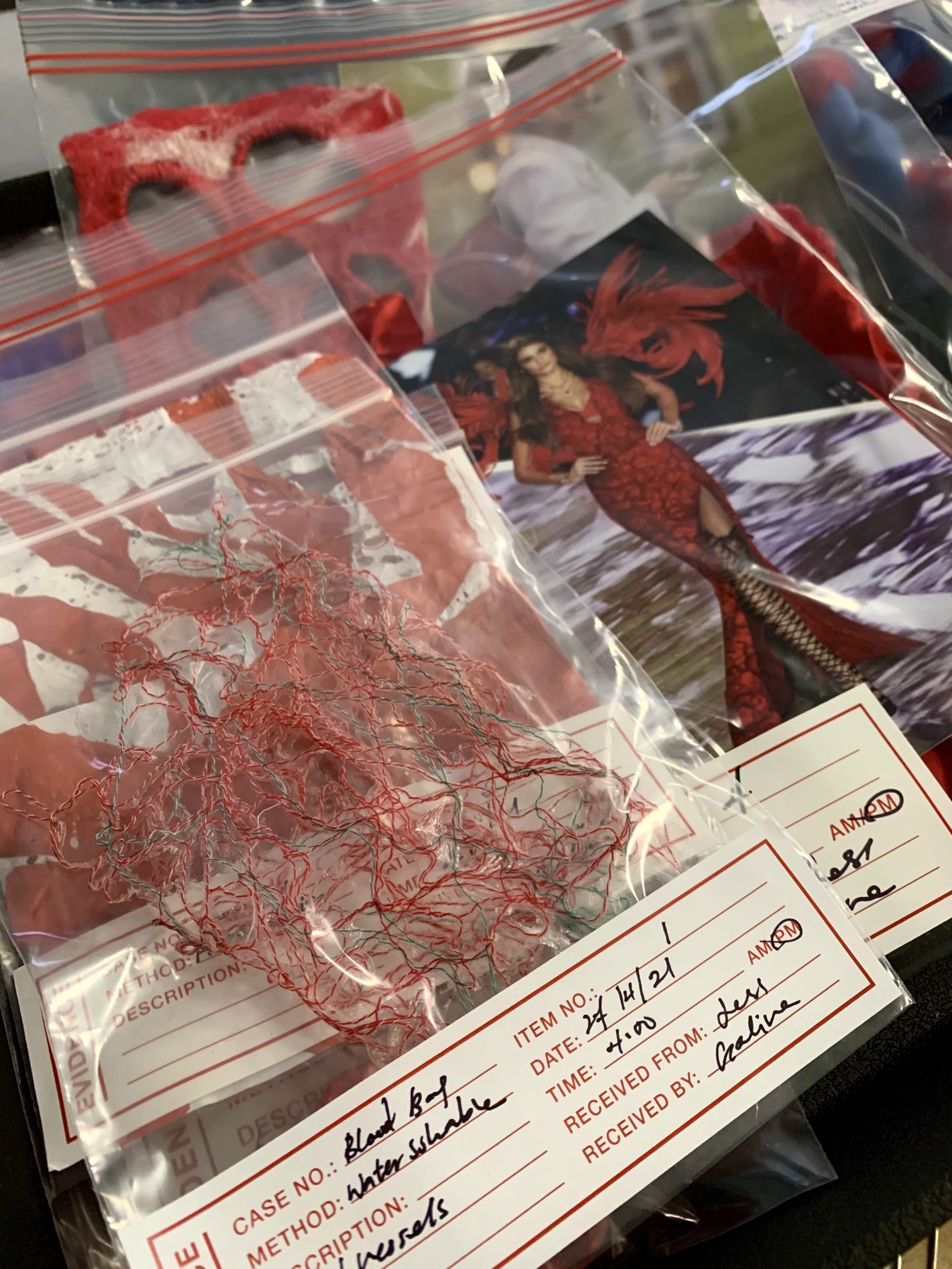
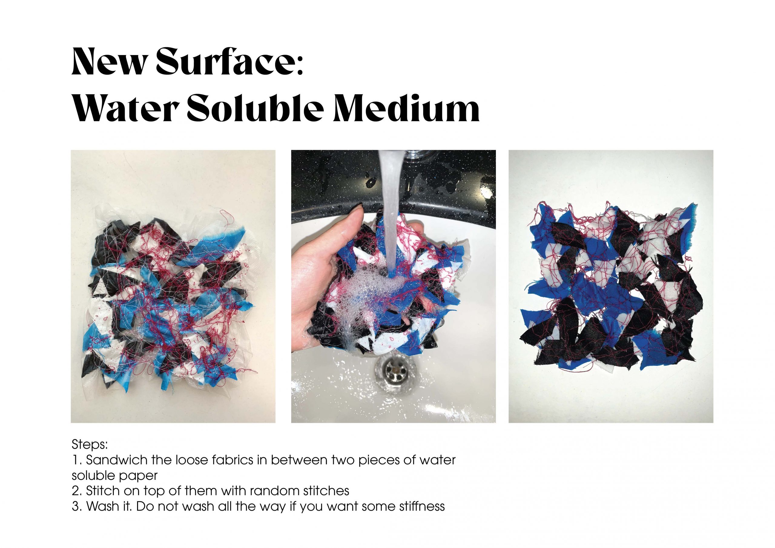
This is an amazing method as well, and I can see myself using it for a sustainable project by reusing all the small left over fabric. This method is very lucrative as well and the interactive between the water and water soluble material intrigues me heavy.
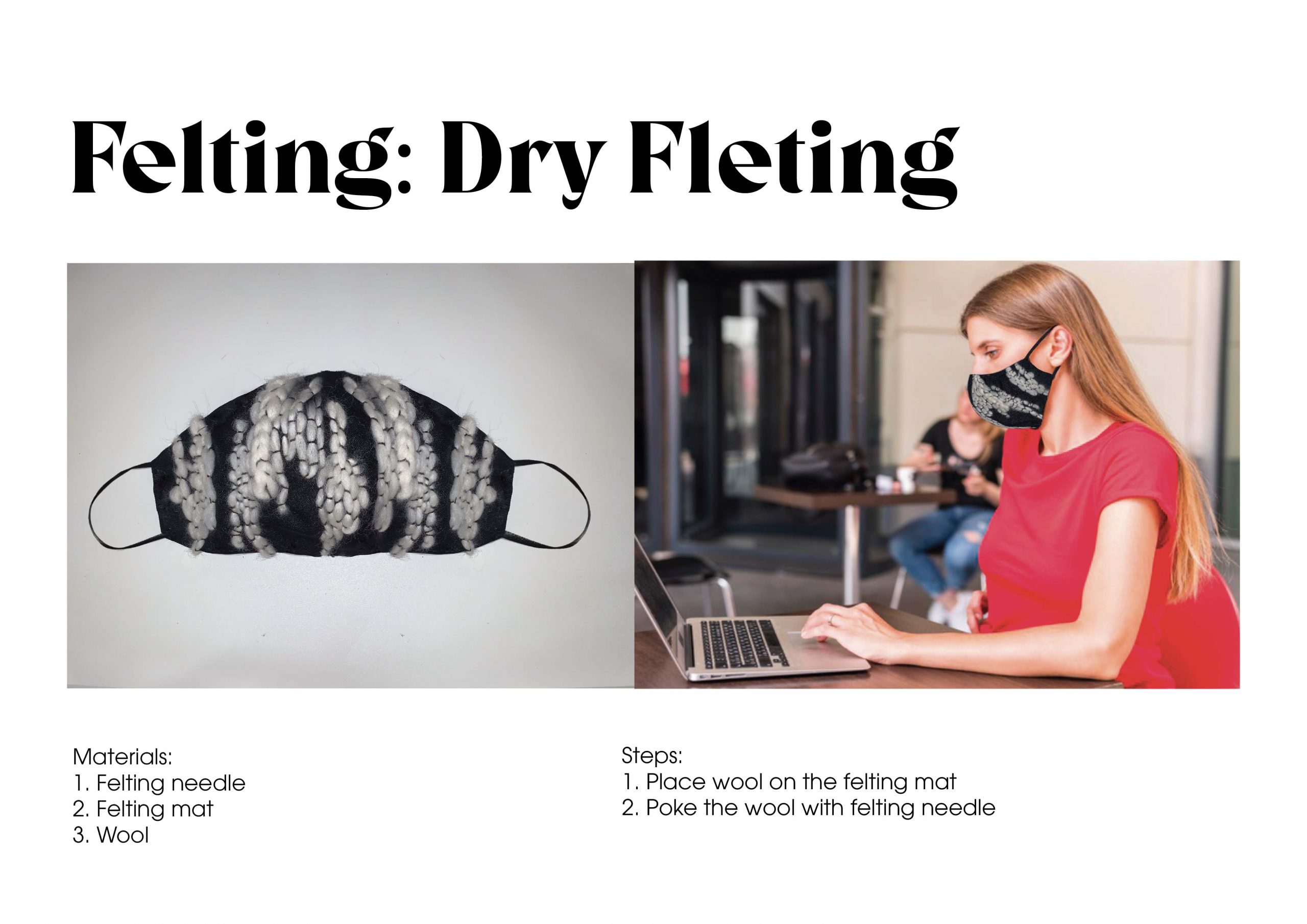
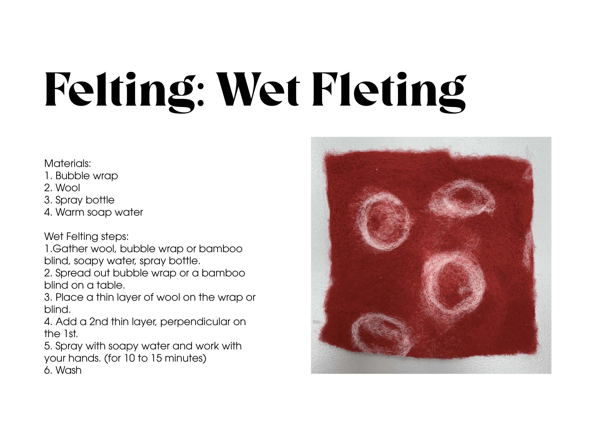
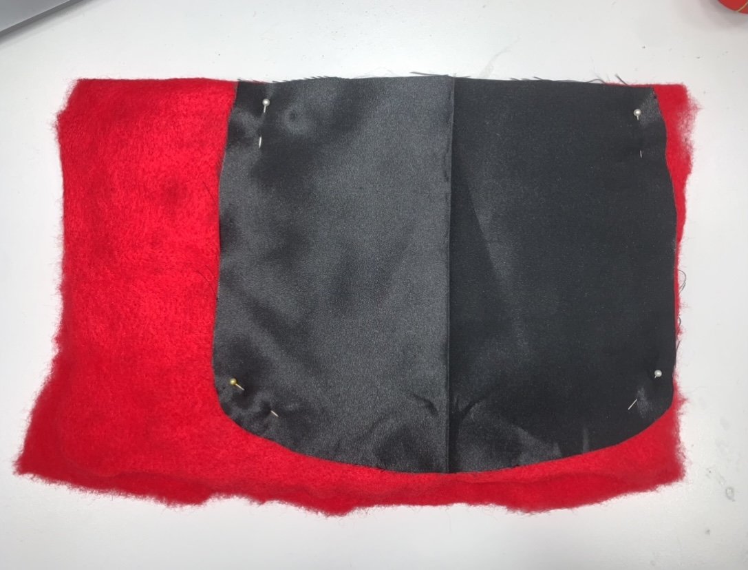
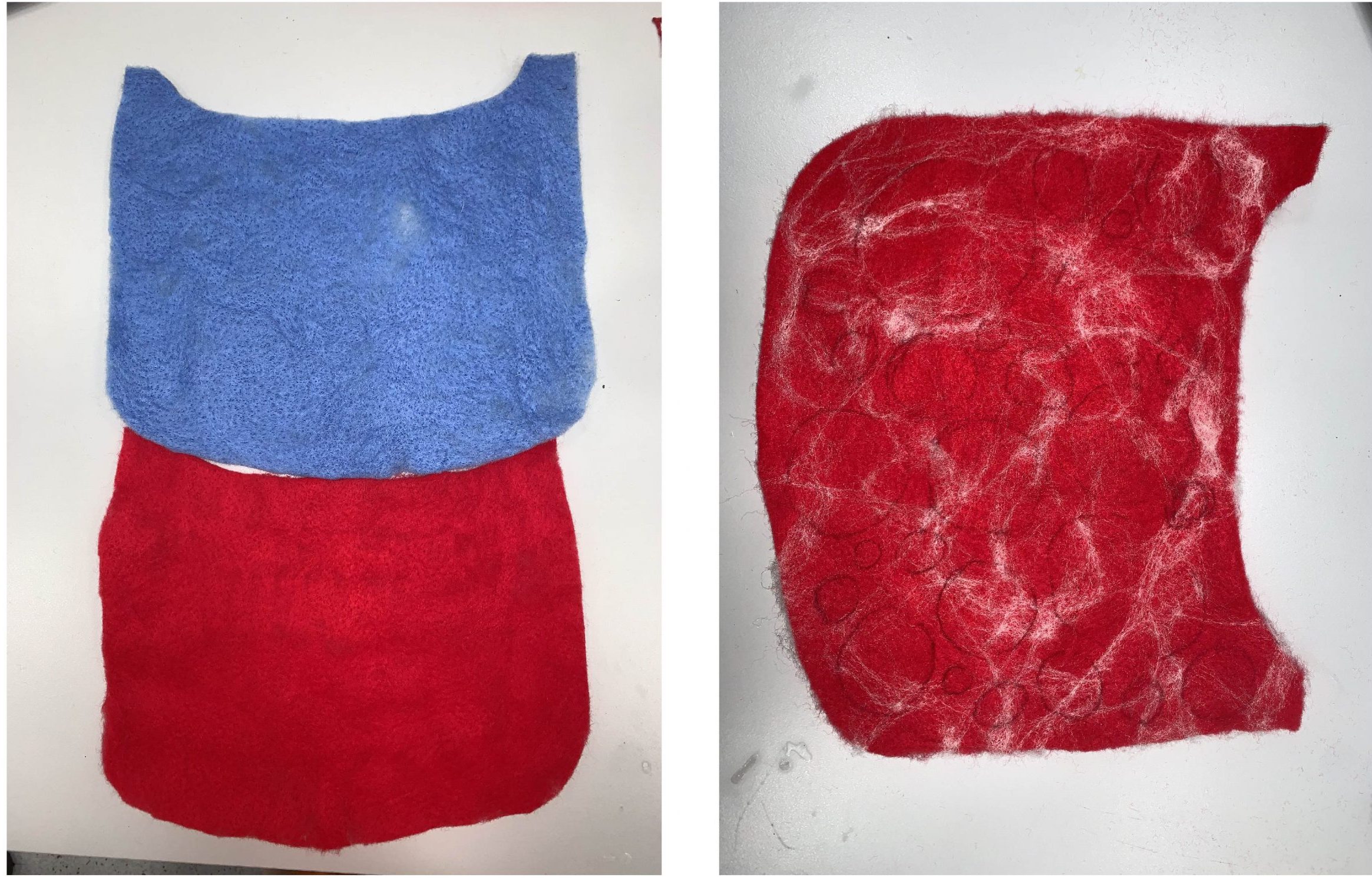
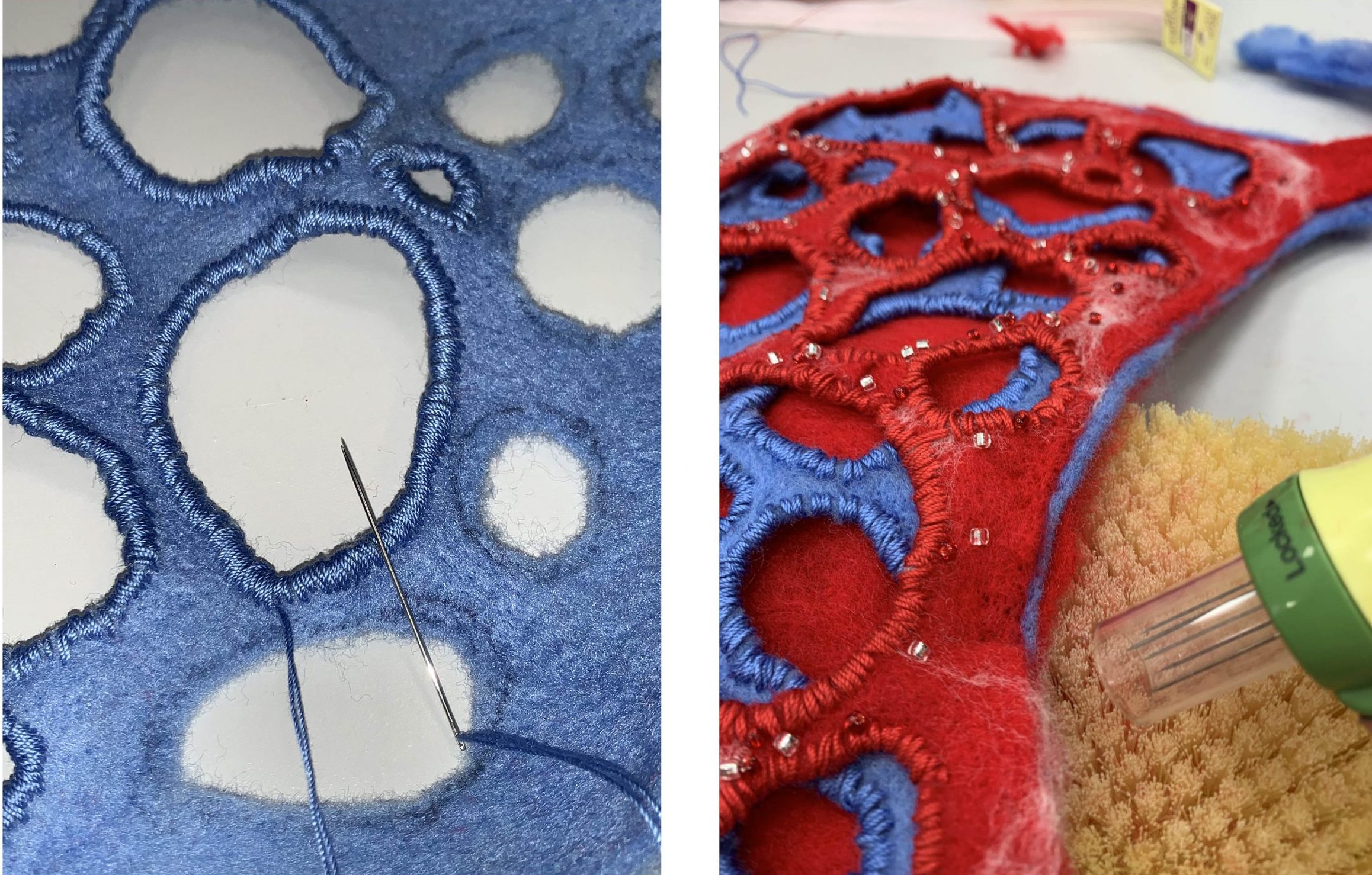
Reflection:

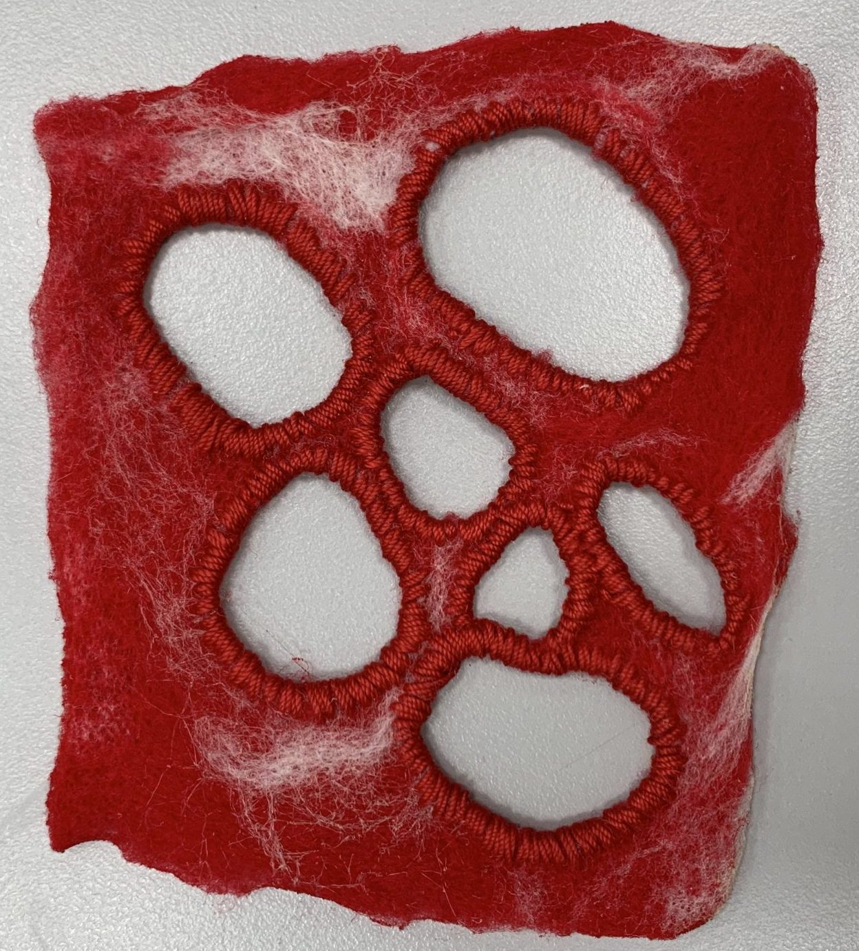
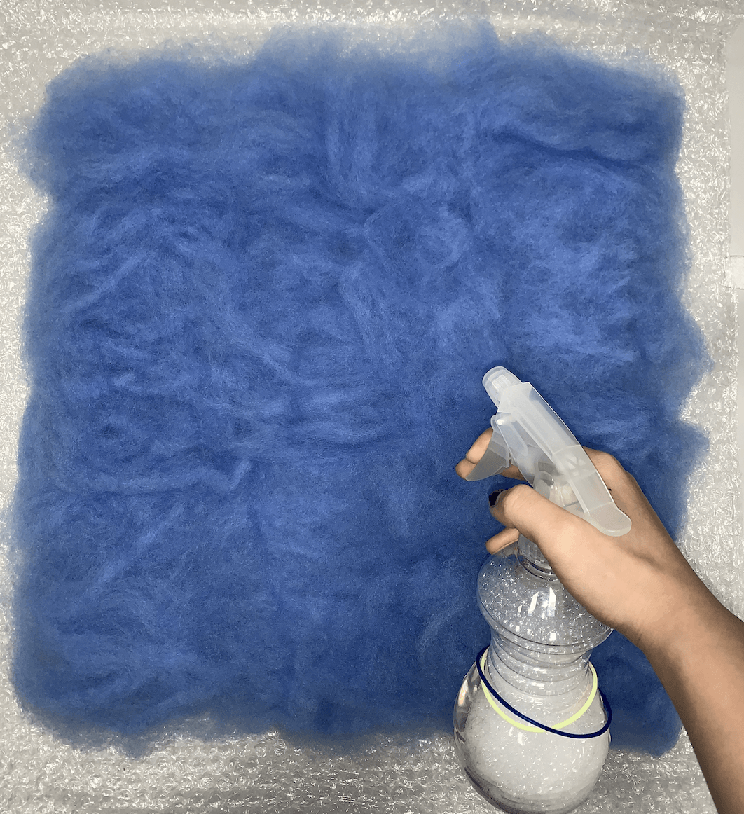
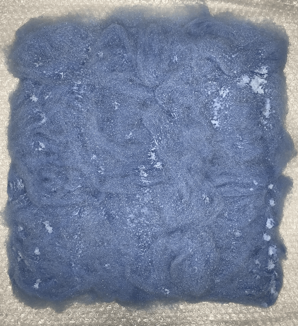
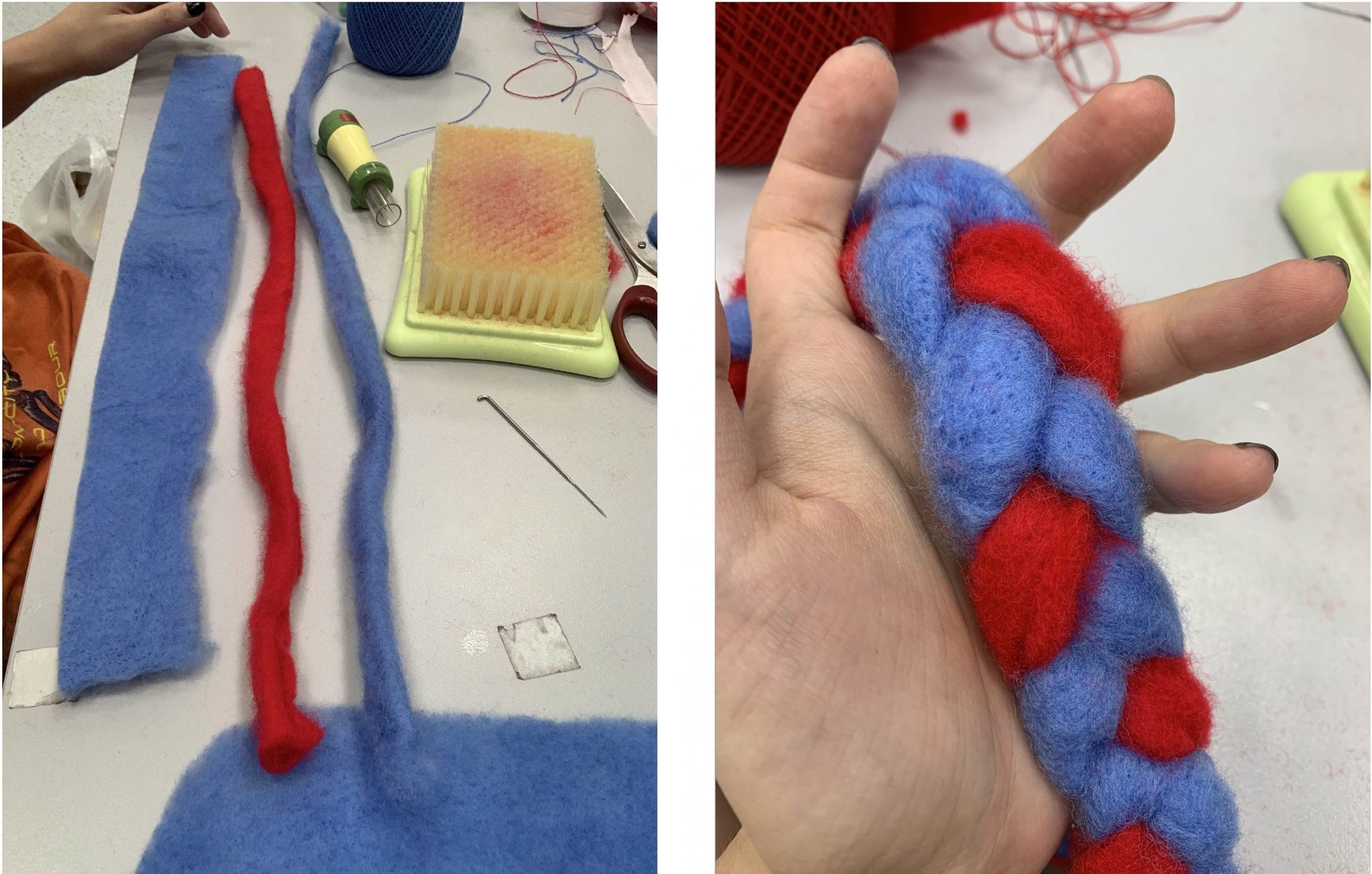
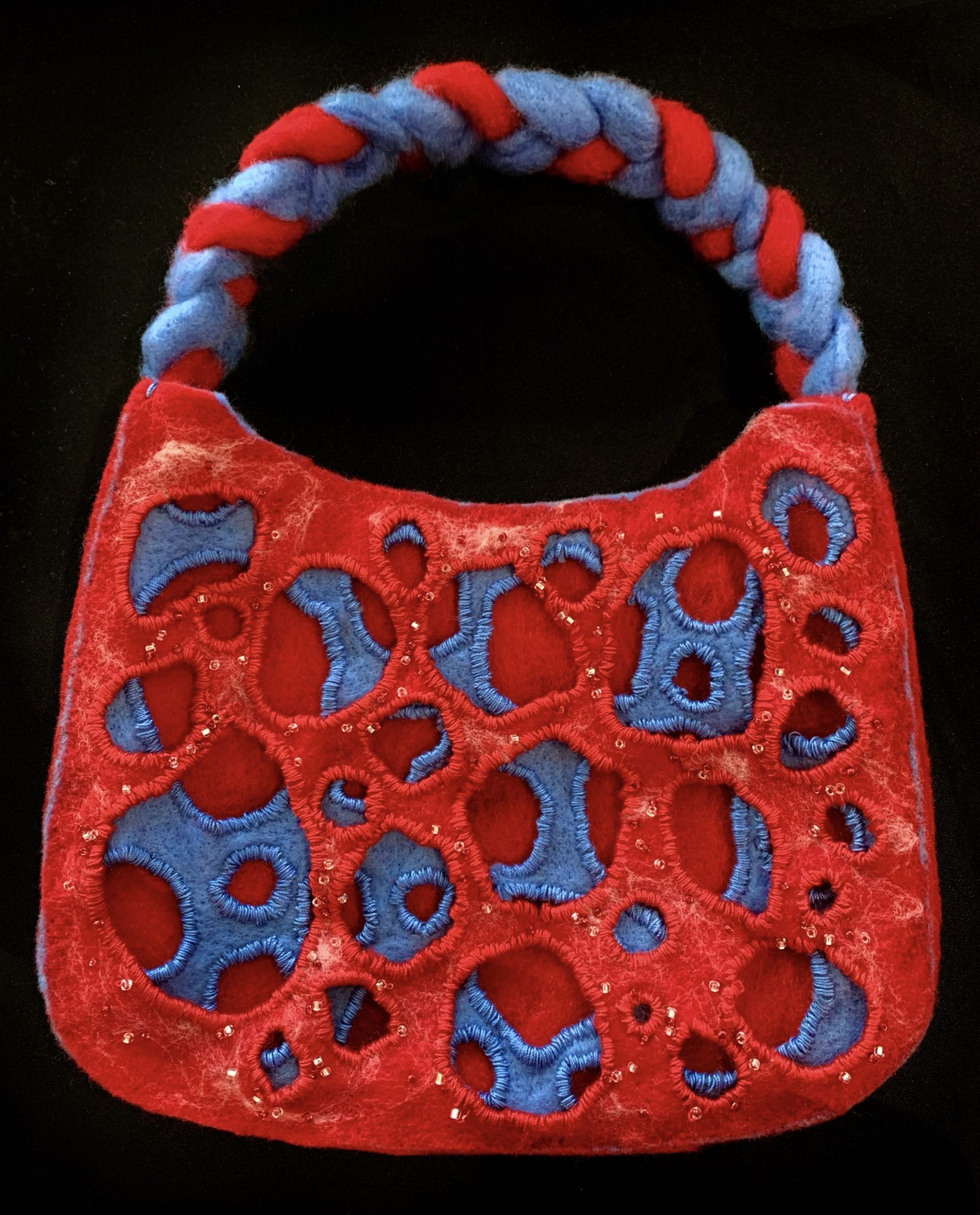
One of my favourite methods! Even though it takes a really long time and energy to felt, I find that it can create amazing works and intricate details in the felt I create. I can see myself creating new patterns on the felt and making felt products like bags.
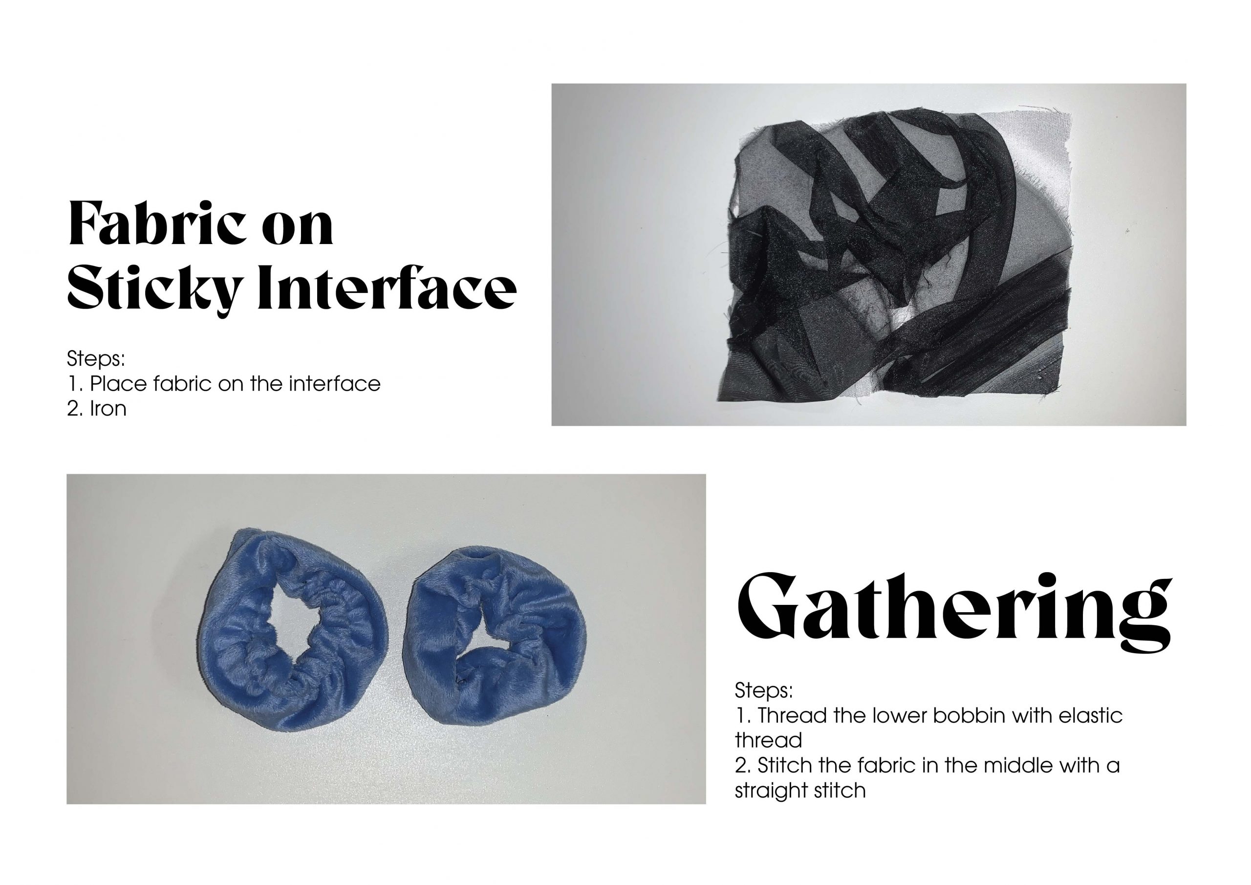
 

Reflection:

Very fun methods! I really enjoy them.
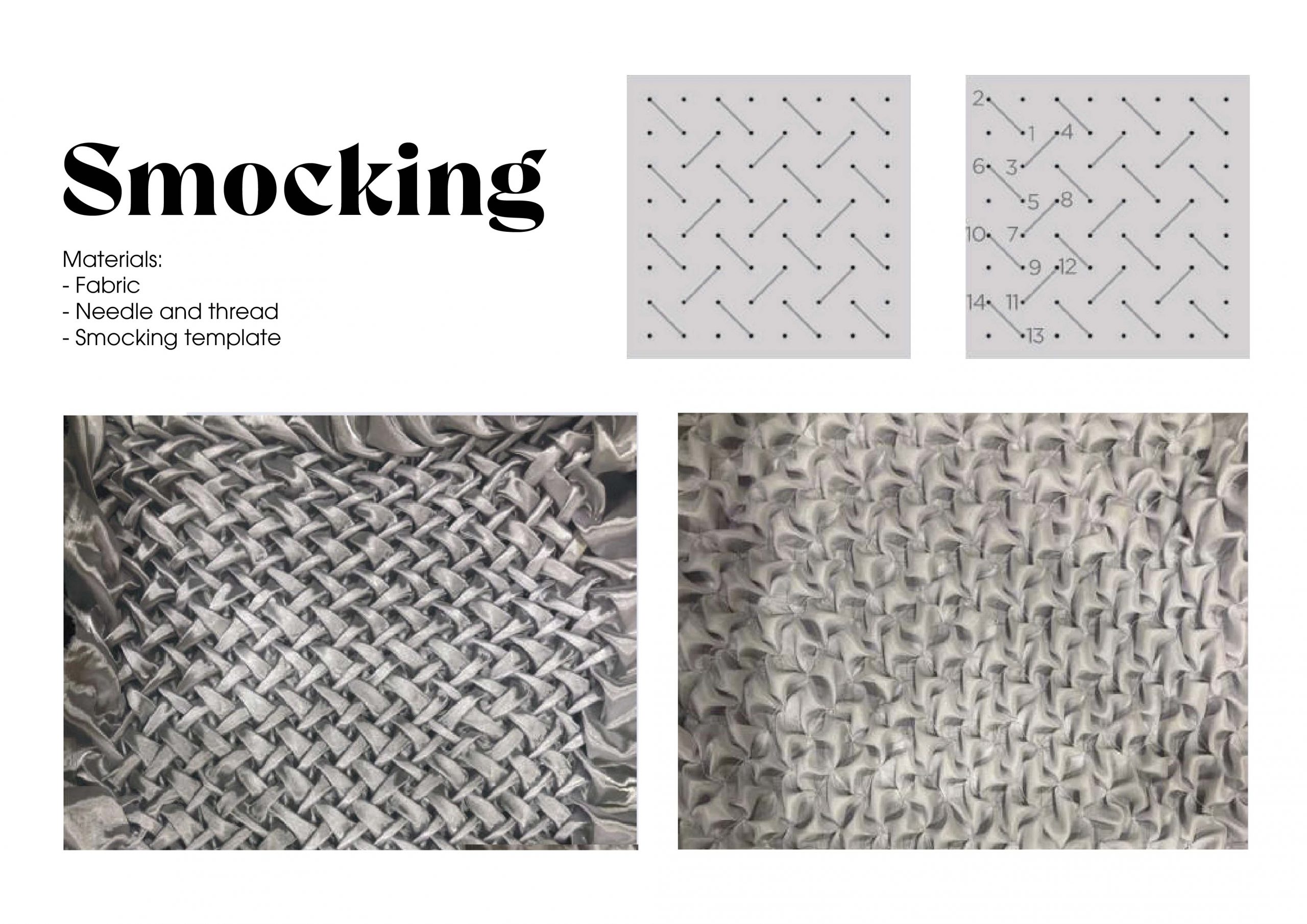
Reflection:

I love smocking! I feel like this is a very intricate method of creating texture and requires a lot of patience and accuracy. I really enjoy creating this. I can see myself using this method to create amazing gowns and added texture onto other fabric.

Reflection:

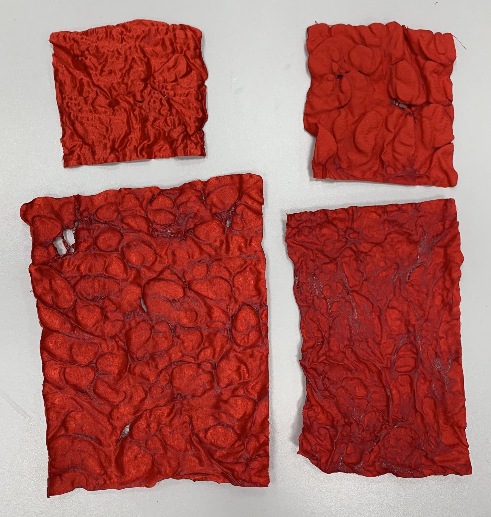
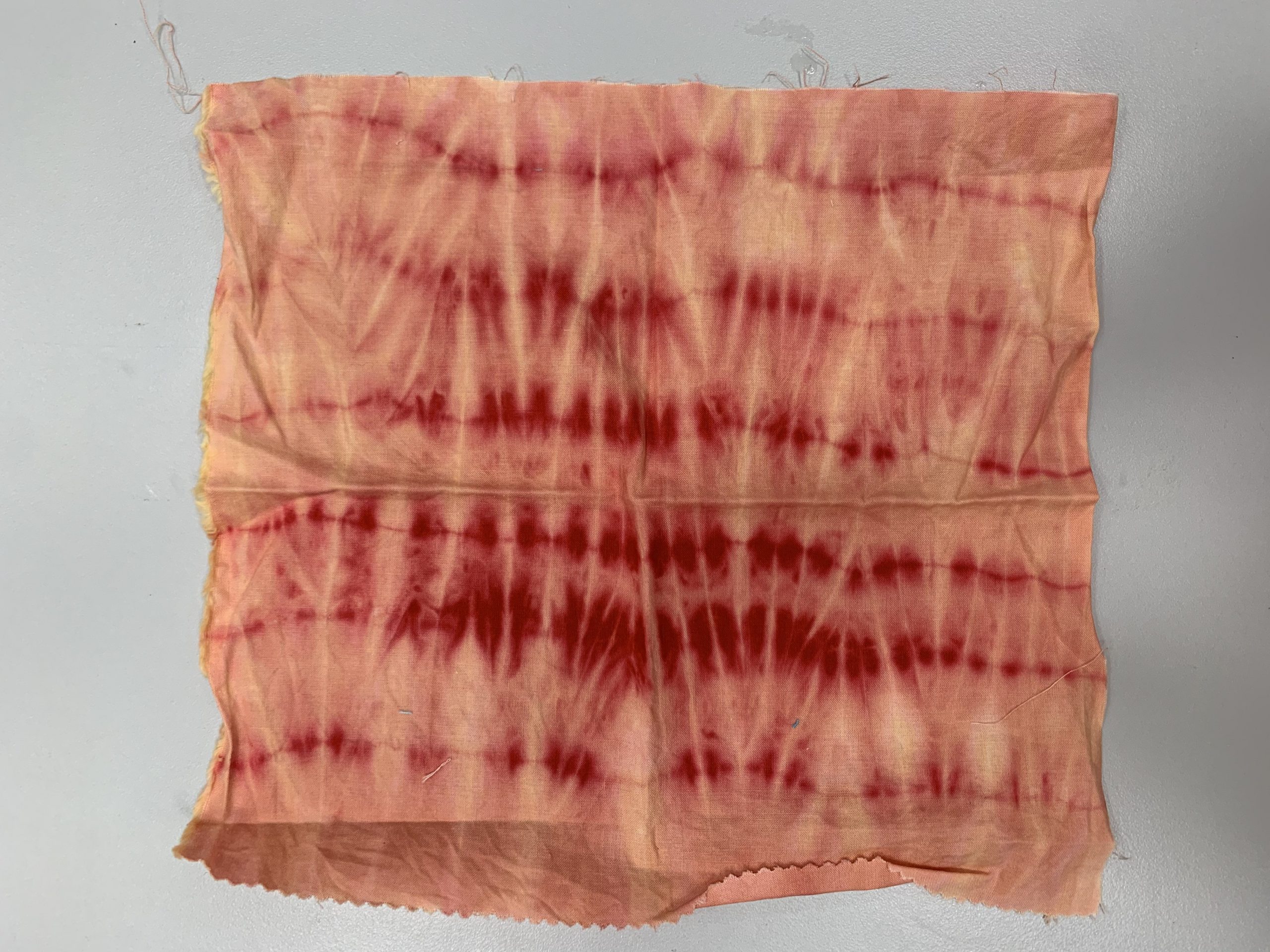
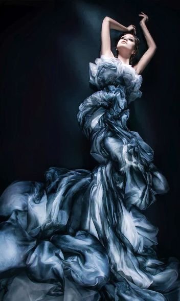
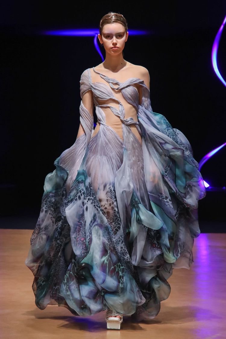
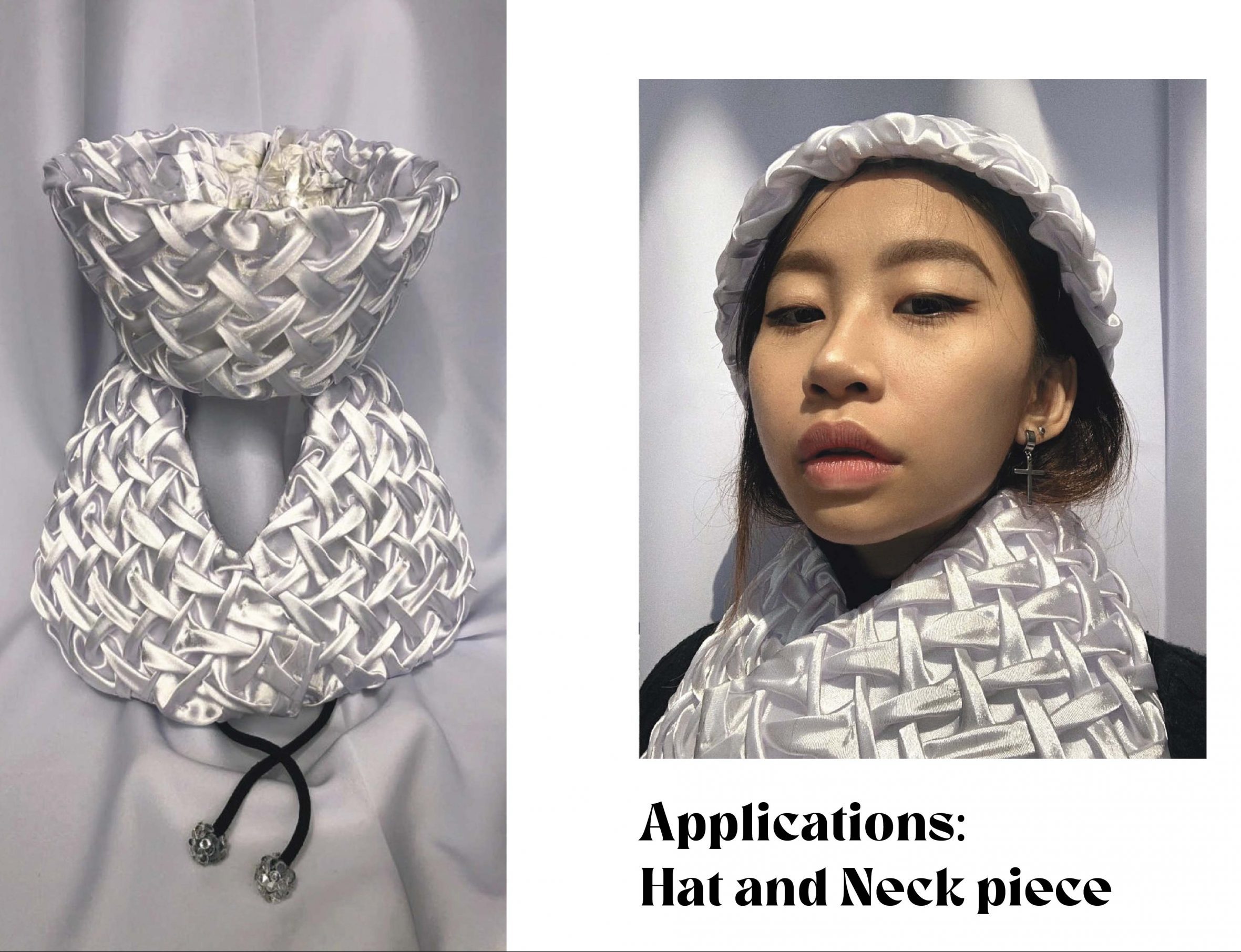
Another one of my favourite methods! I love this method because it is quite lucrative and can create both very organic and geometric results. I really enjoy creating this piece and I can definitely see myself using this method to create a gown or more intricate details on a dress.

Reflection:

This is a very therapeutic method and requires a lot of time, patience and focus. Not my preference but so find it fun. Probably do it when I retire.
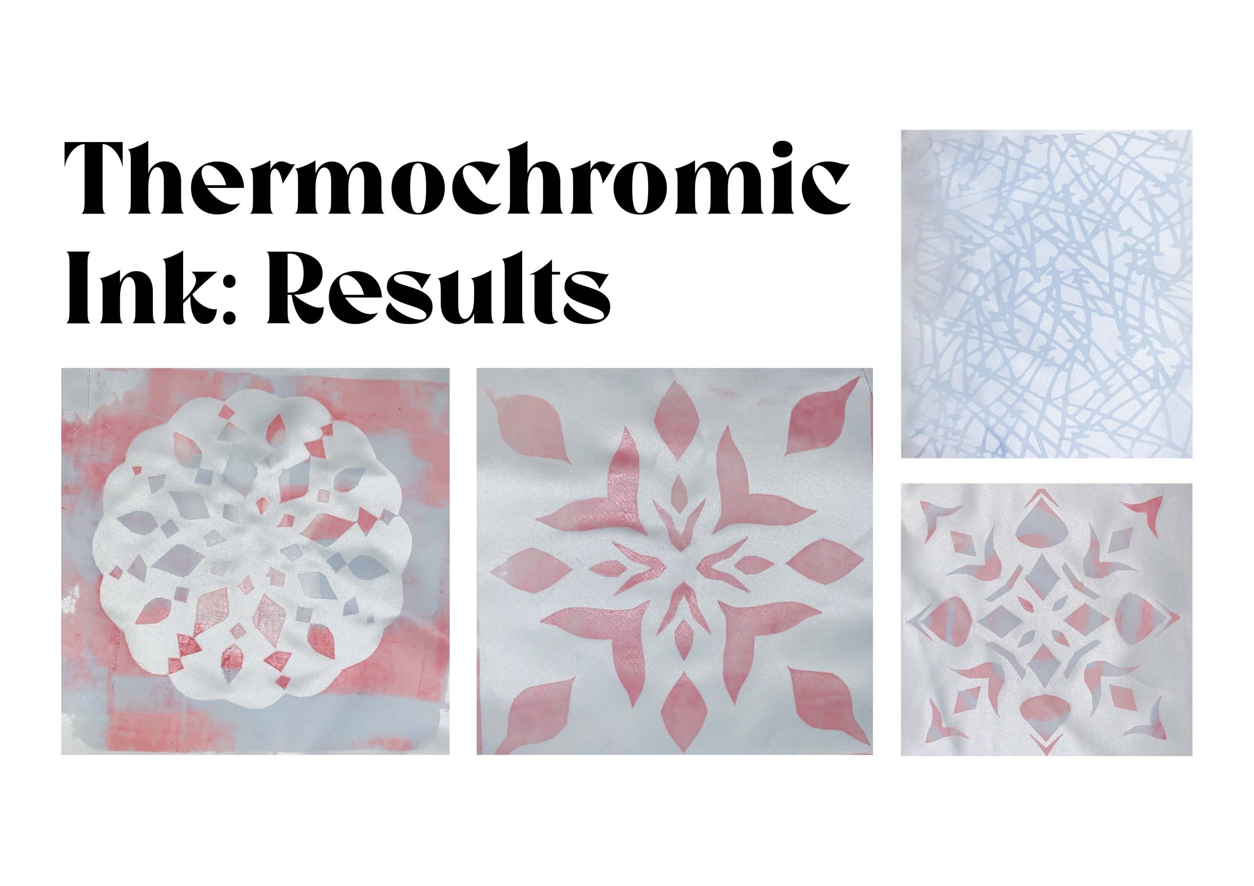
Reflection:

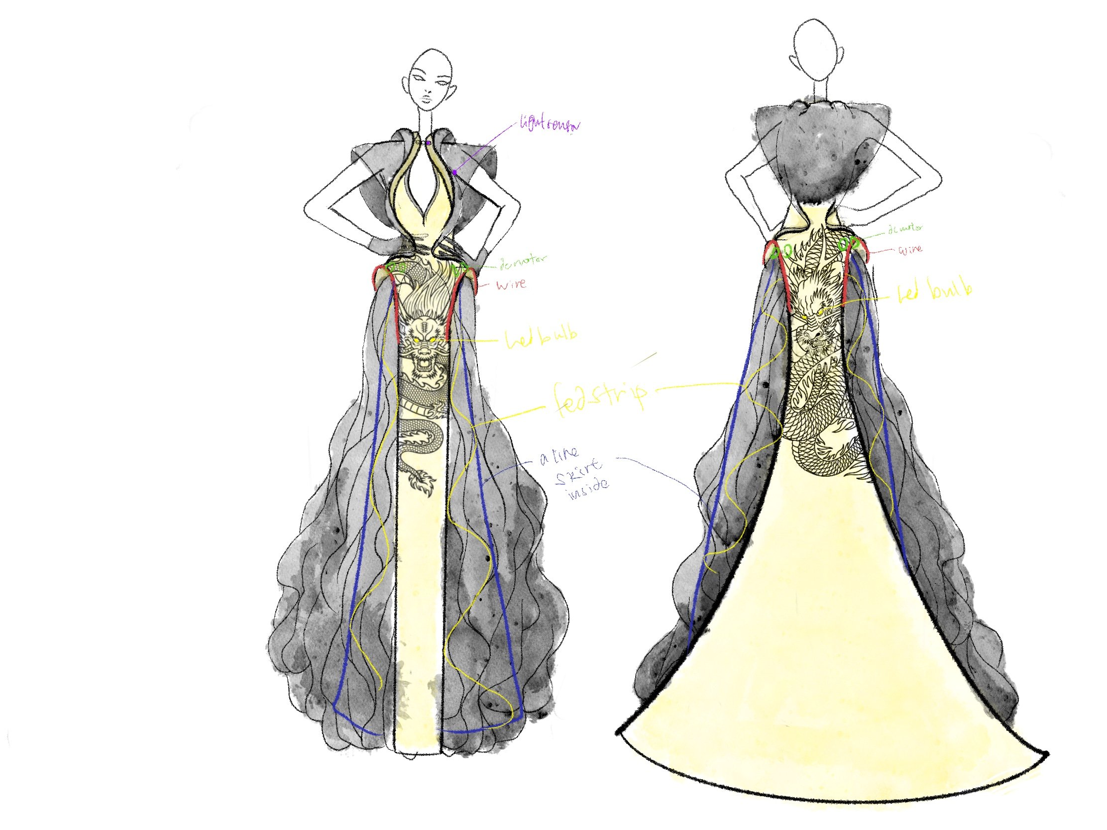
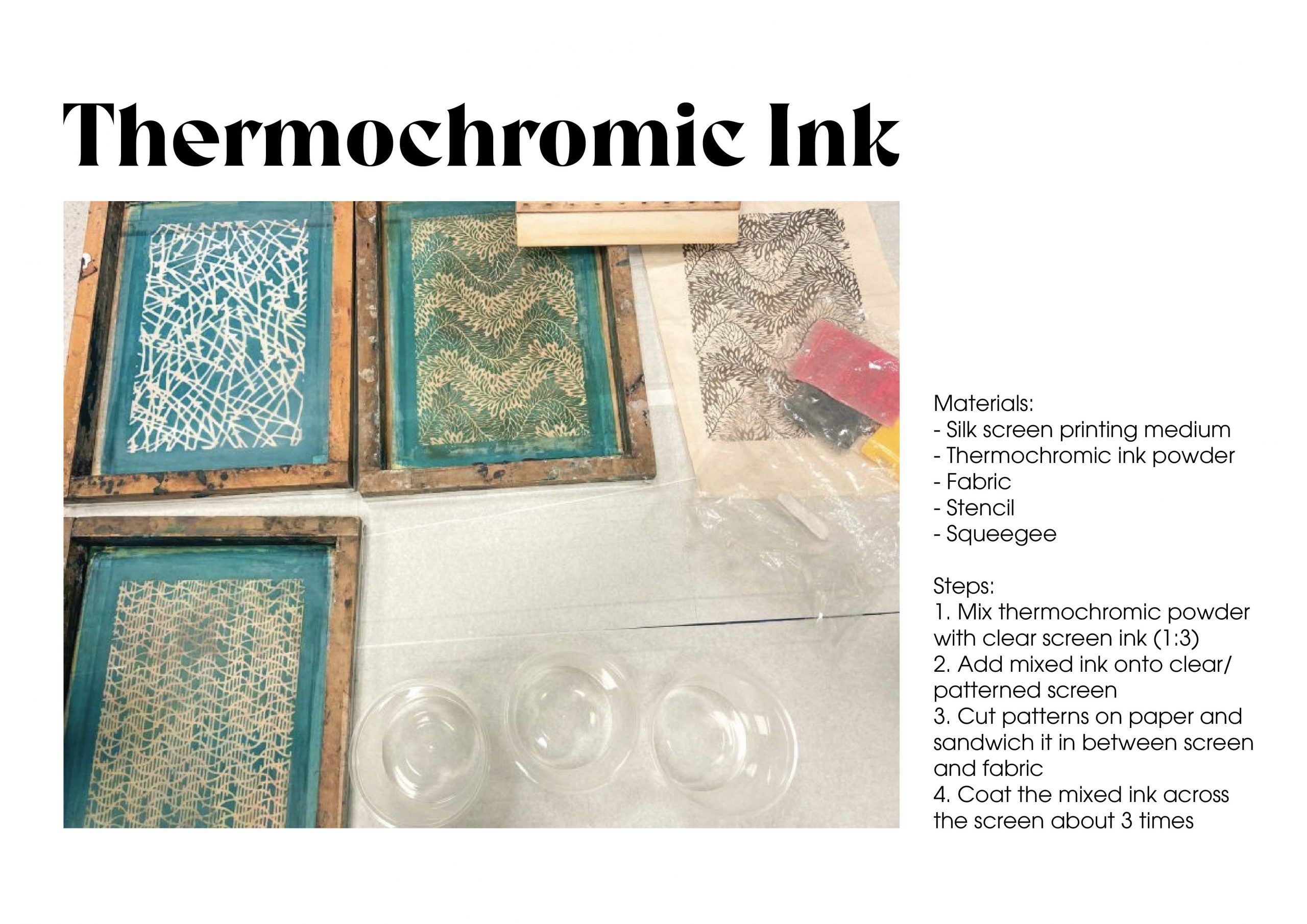
This is a very interesting interactive method as it reacts to temperature. I see a lot of potential in this method and can create very interesting print as well. I definitely can see myself using this method for an interactive piece.
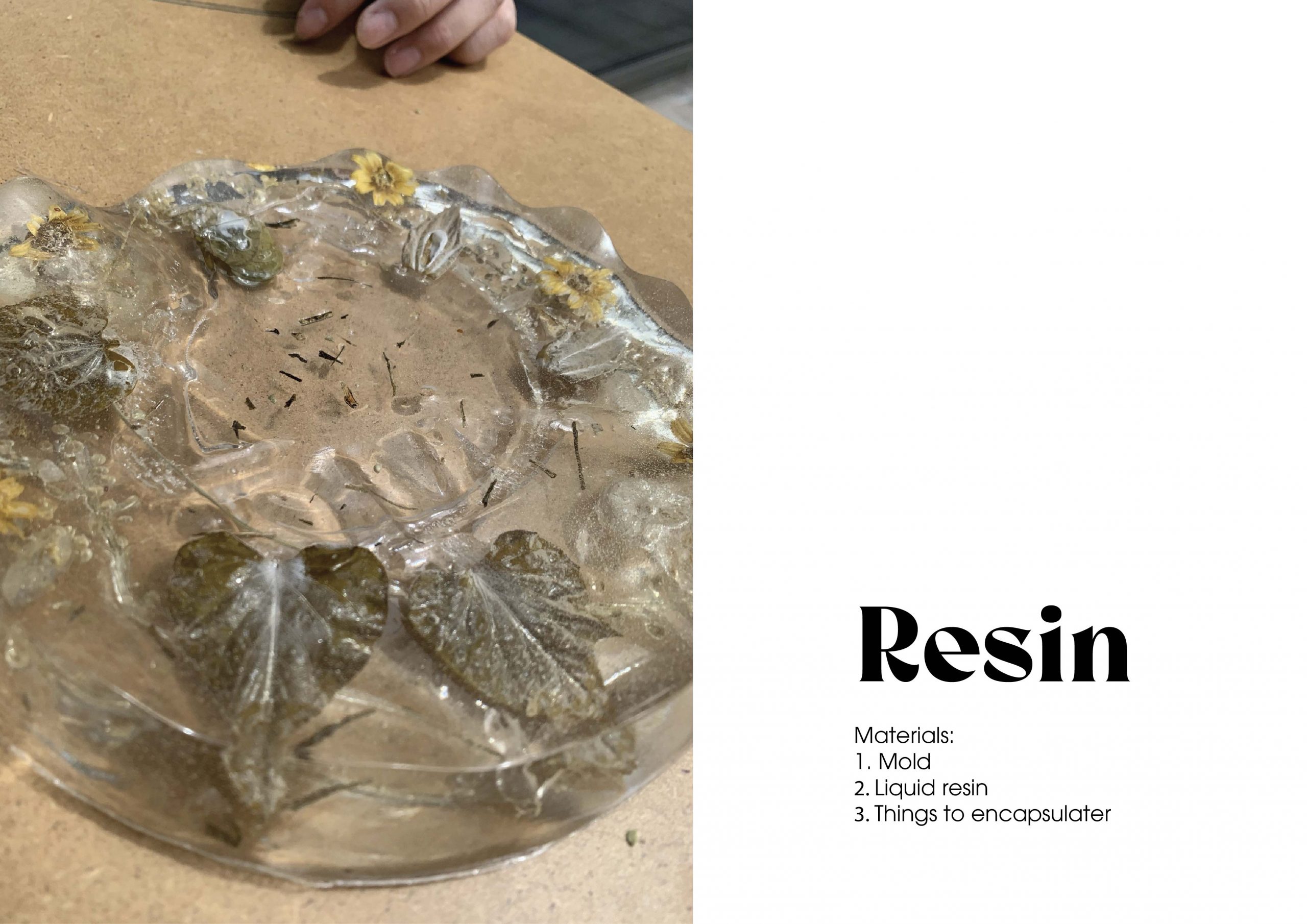
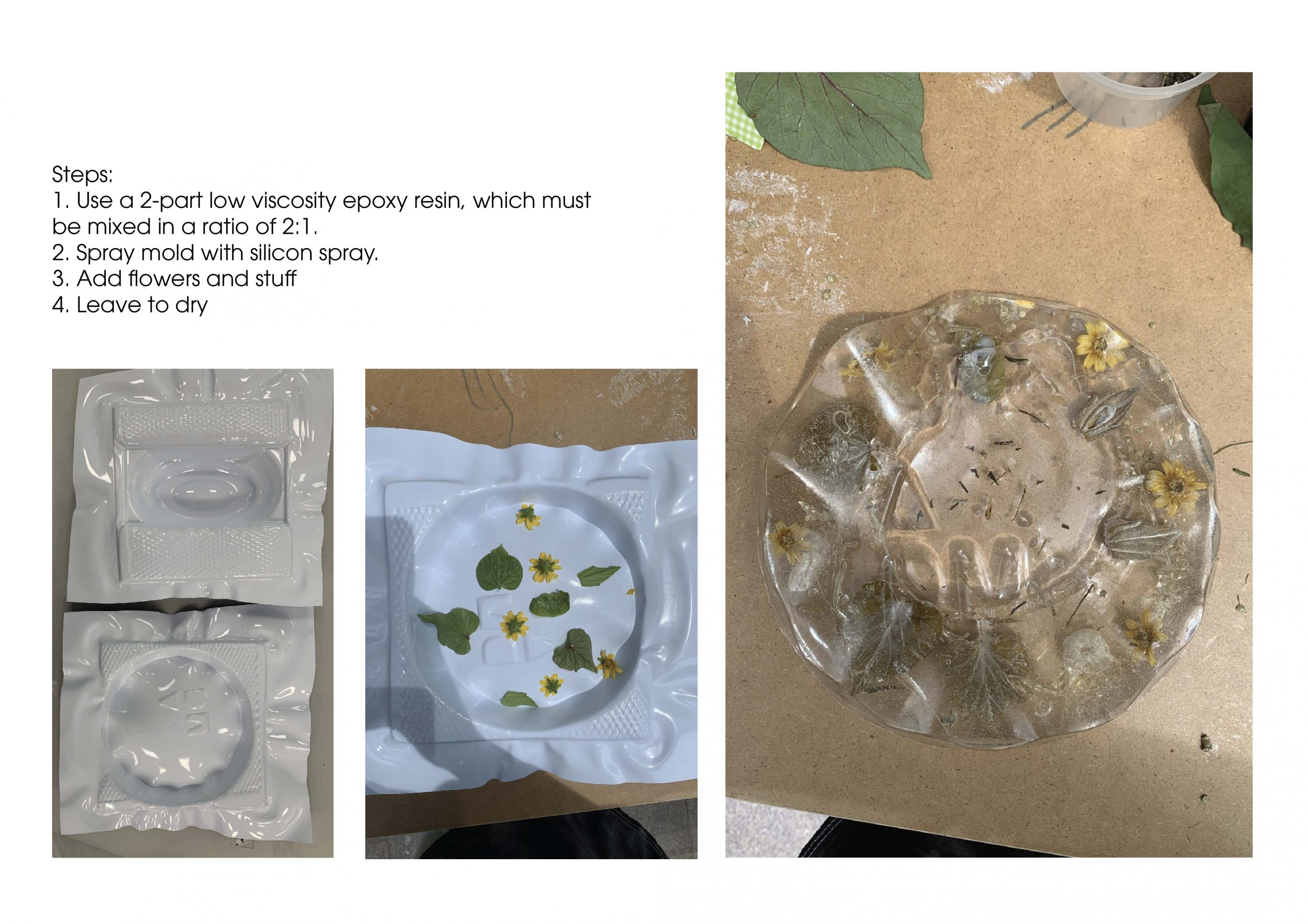
Reflection:

This is a cool method as well even though it is expensive. I think this is a beautiful way to encapsulate something. Some applications can be earrings and coasters. I love how the sunlight bounce around in the resin and create a mesmerising shine to the product.
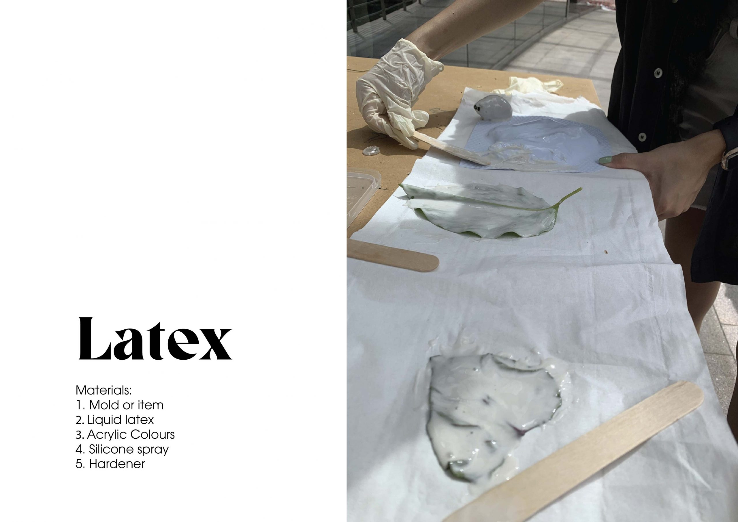
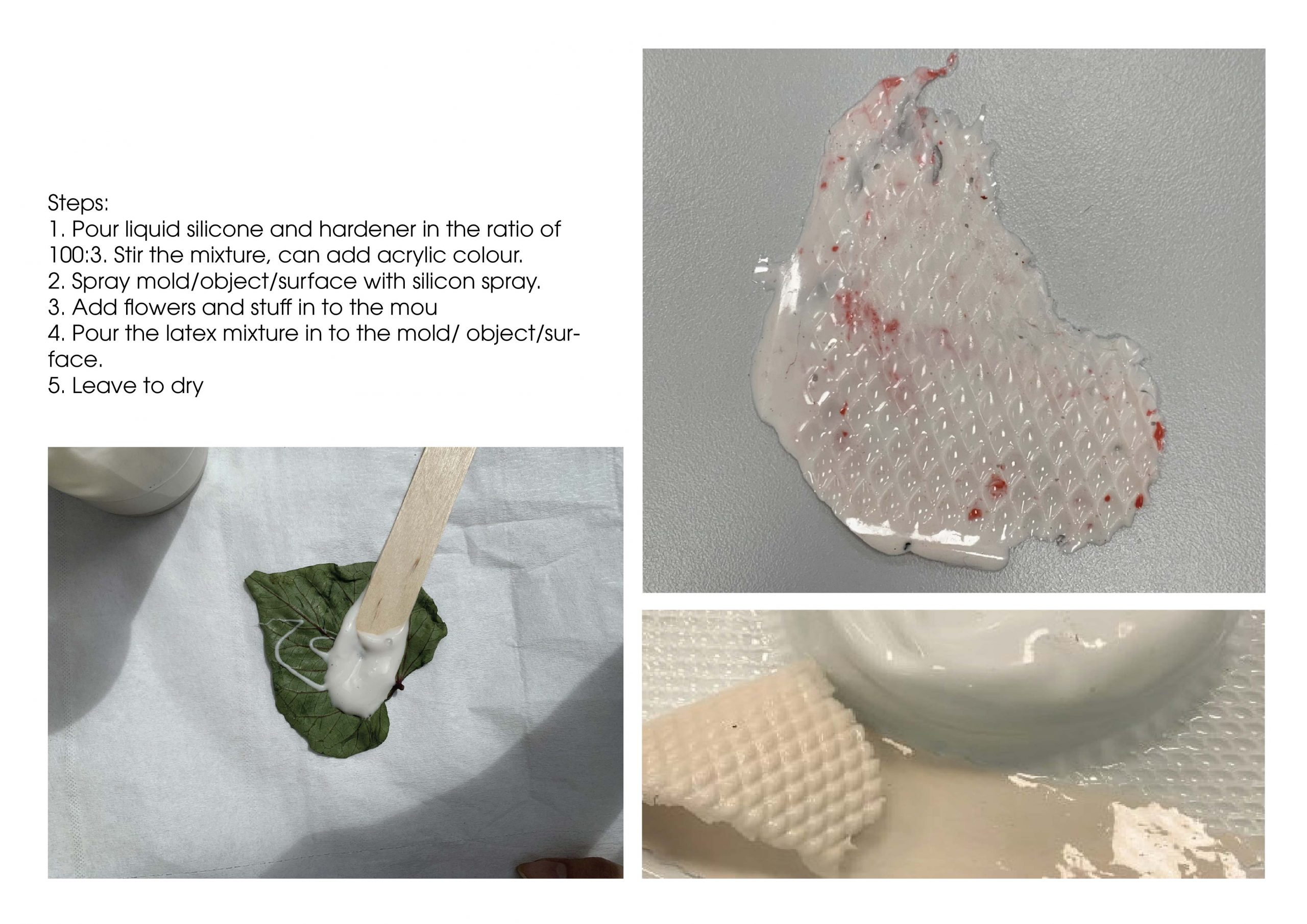
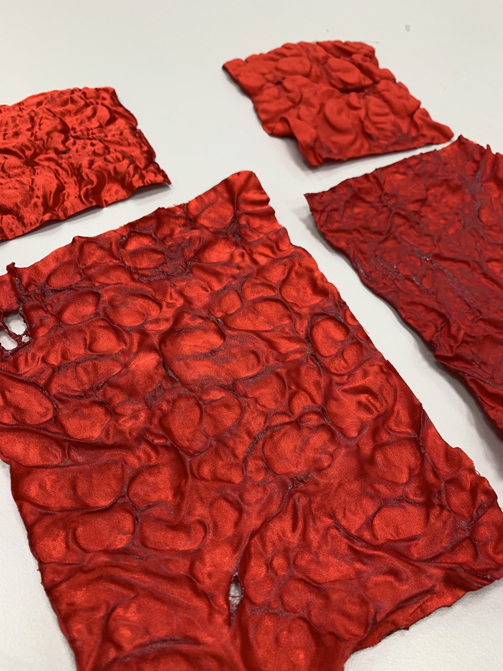
Reflection:

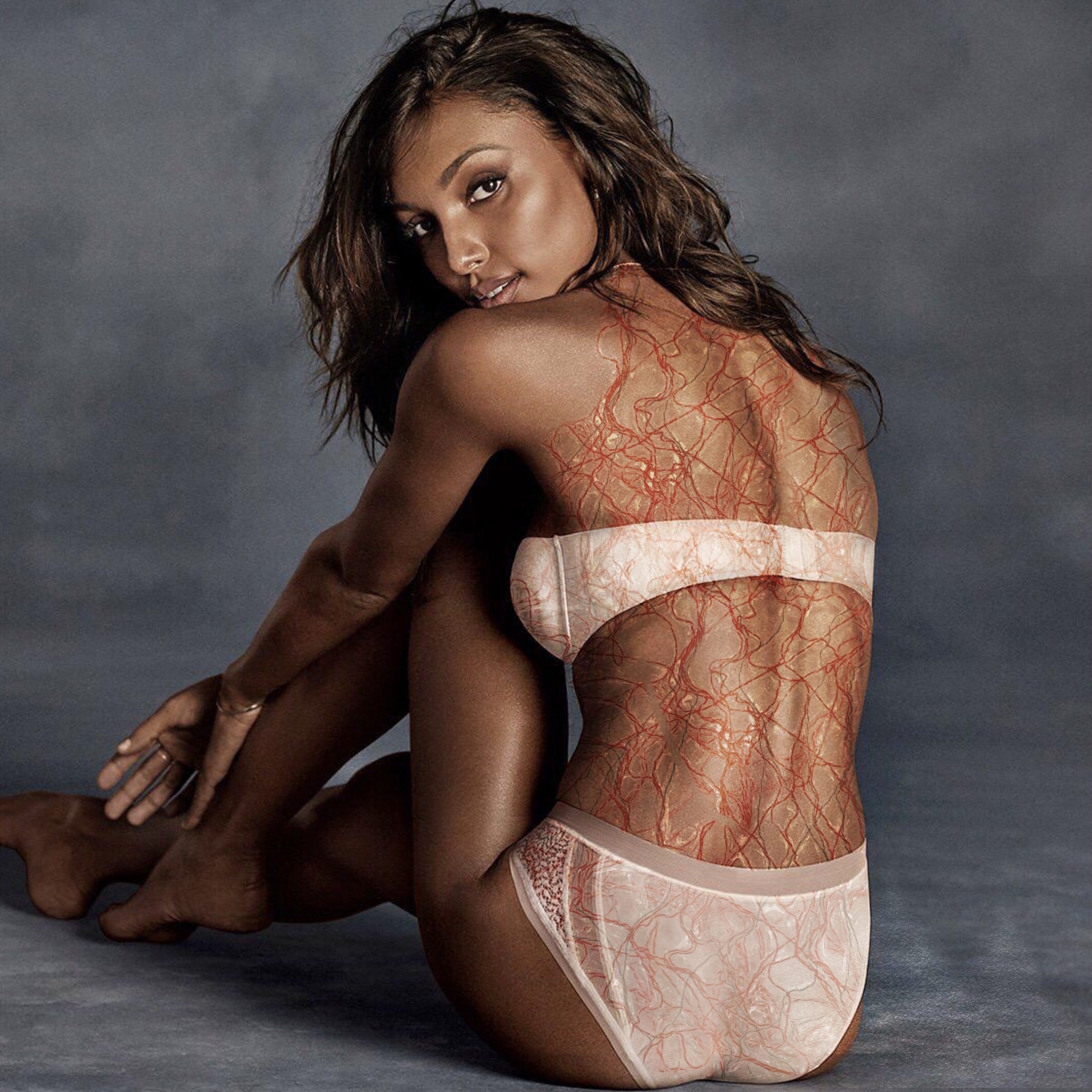
I think this is interesting method as well and can really create some interesting textures related to skin.

Reflection:

Ver expensive method! This is a very unconventional print creating method but I think this is very interesting and can create some very cool lace prints.
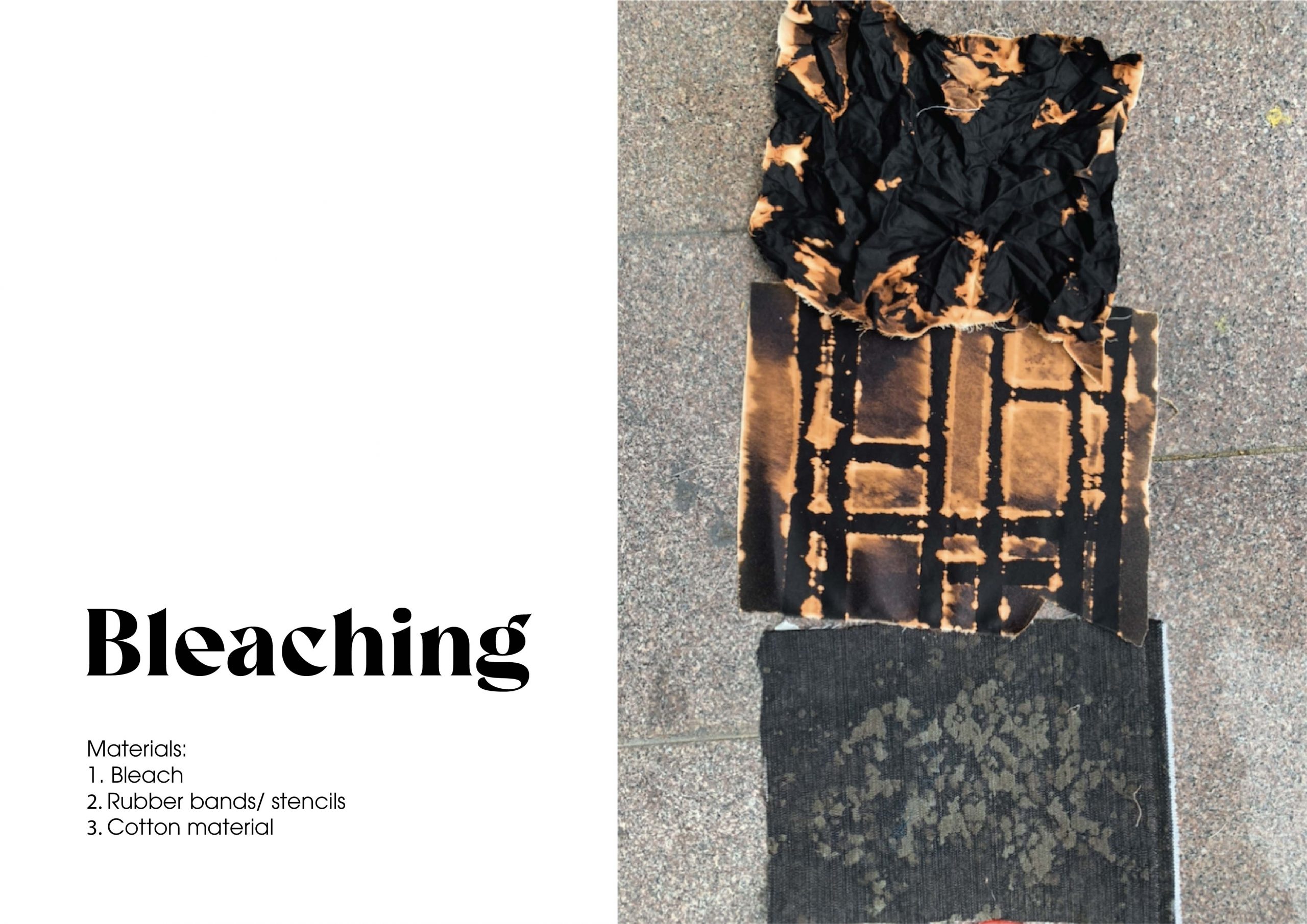
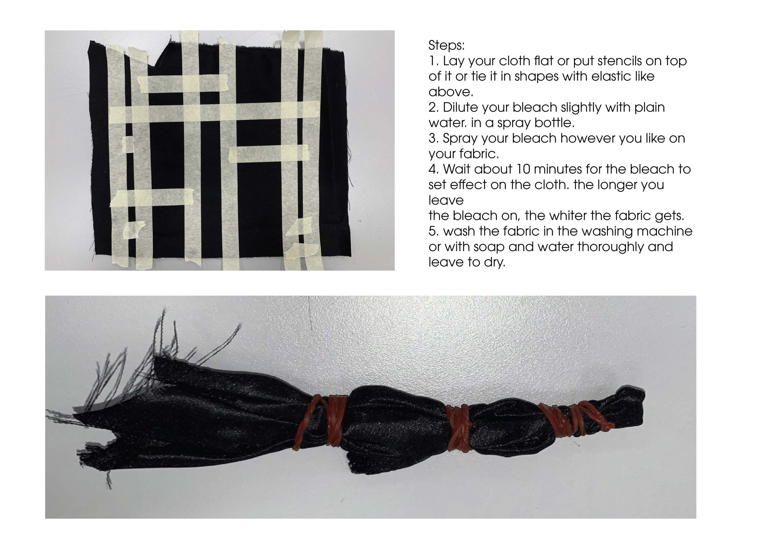
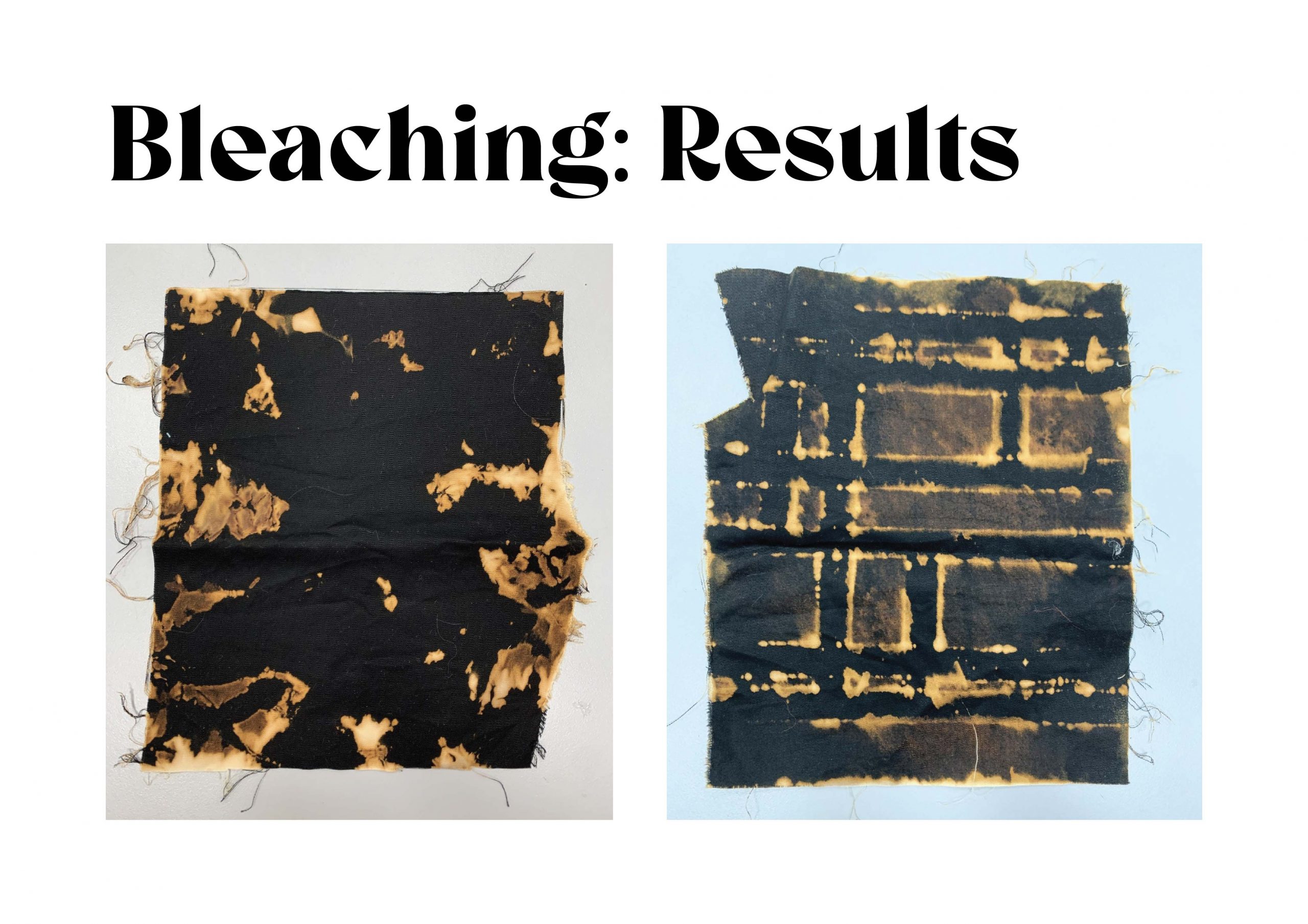
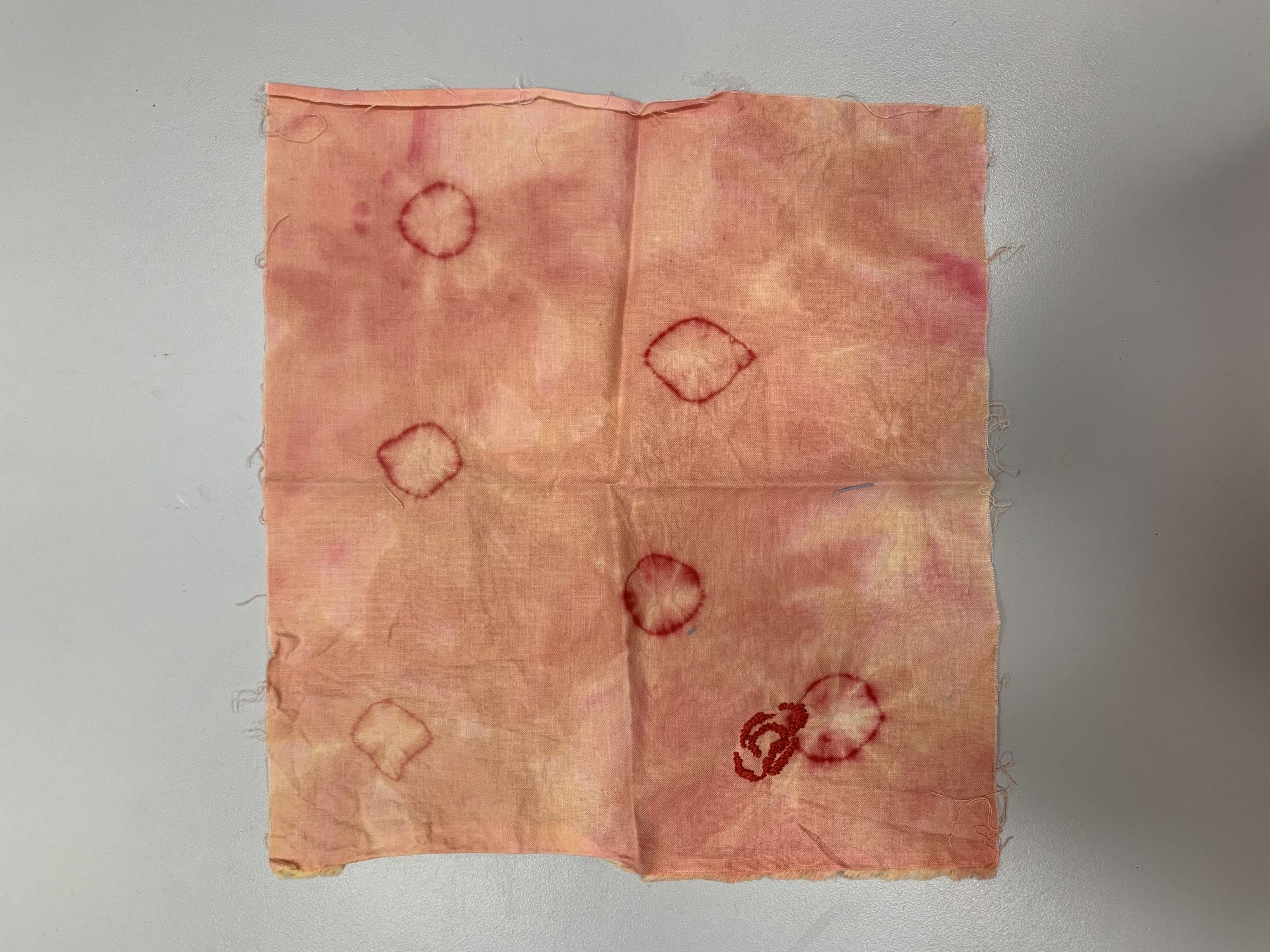
Reflection:

I love bleaching! I feel like it creates some very raw and organic prints. I also love how there’s not a lot of ways to control it, hence it really feels organic and free in its way. I can definitely see myself using this method.
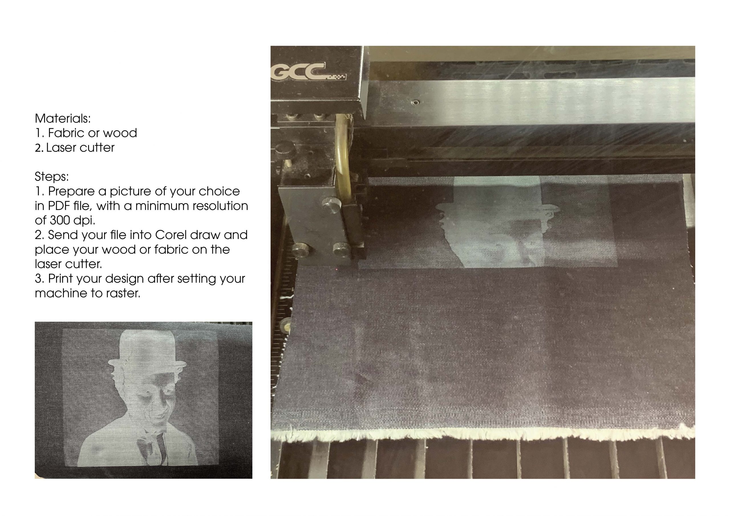
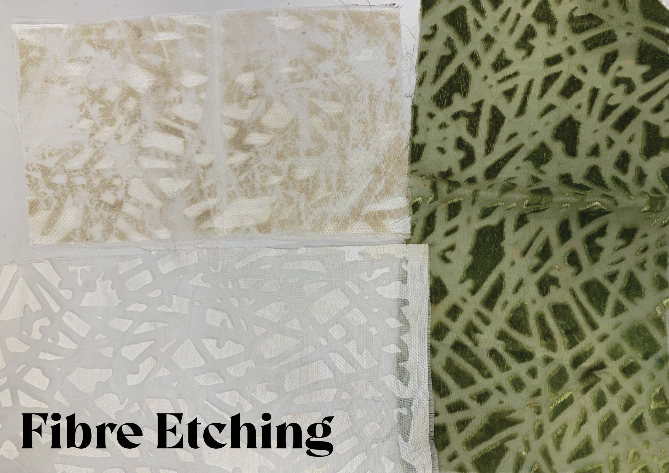
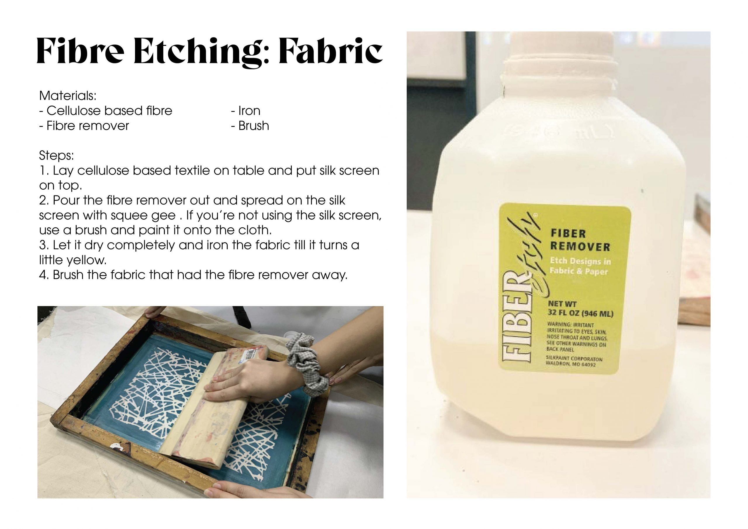
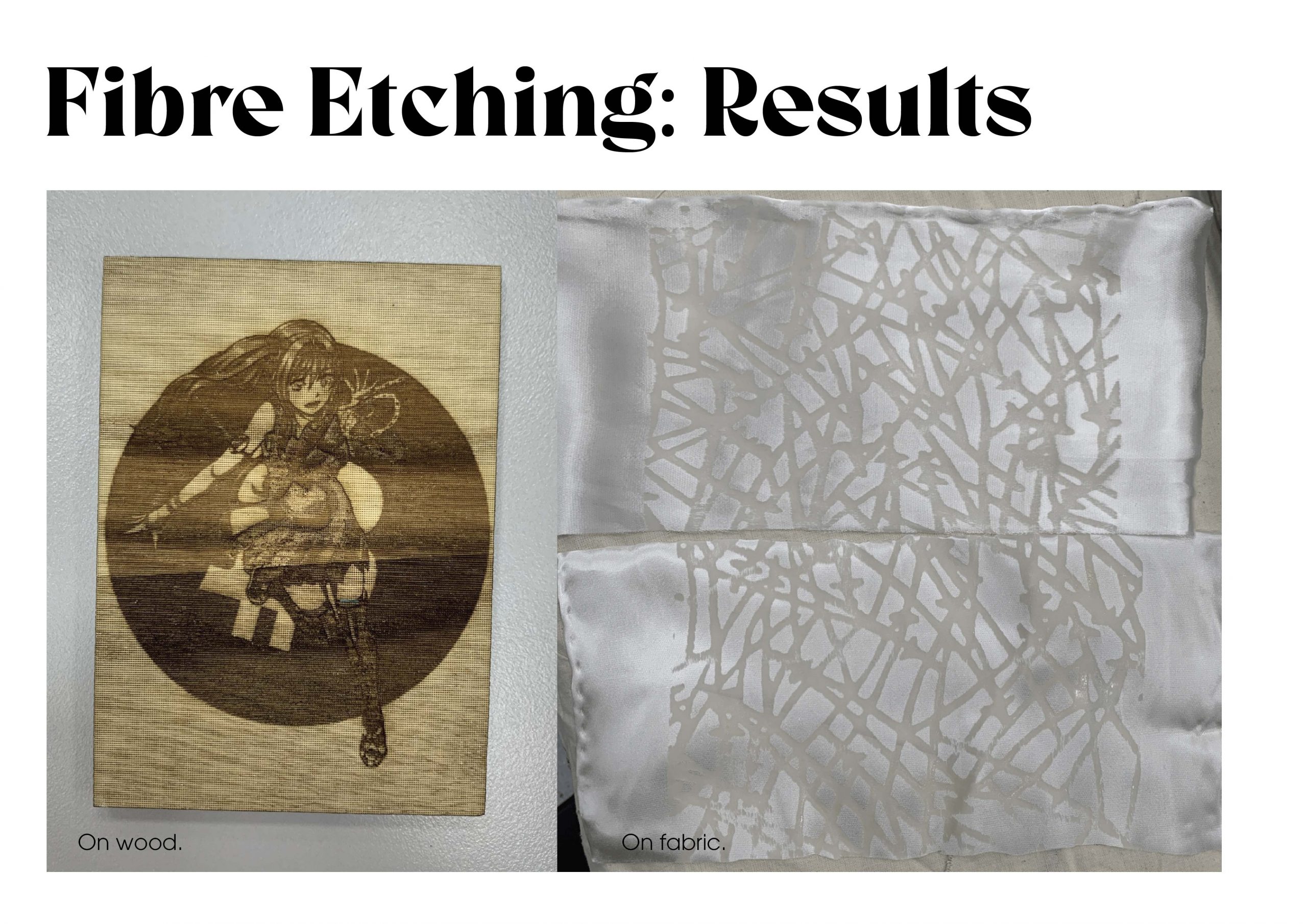
Reflection:

I think the laser cutting on fabric is very interesting and and create very cool prints or distressing on thick fabric. I can see this method being used on denim pants or jackets.

Final Assignment: The Blood Bag

My mood board/inspiration:

I wish to explore blood and blood vessels but not in the gory way. I am very intrigued by how they look like under the microscope and there are so much complexity and texture to it.

Method used:

I tried a few methods which I feel best fits the aesthetics and the methods that are able to capture the details of my subject.

Plastic fusion:

I love how the thin plastic melts and create hole like how the blood vessels look like under the microscope like the images in my mood board.

Water soluble material:

This is inspired by the blood and blue blood vessels running through our body, I used this method because I wanted to explore how this method can wrap around out body. I didn’t wash everything as I felt like the shine from the water soluble material also look little like the plasma.

Wet and Dry Felting:

This method is my favourite as it really help me create some very fine details. This is supposed to be inspired by arteries openings and plasma. I mixed in bit of embroidery at the edges to create some short of thickness to the arteries opening.


Thermoplastic:

I used a heat gun on synthetic material, and just held it close to the fabric until it wrinkles. It creates some really interesting vein like effect and some bums that looks like cells.

Ink Transfer:

This method really allows me to create some interesting pattern that mimics the oxygenated and deoxygenated blood with the vibrate colours it creates.

Latex:

I wish to explore some blood clogs (left) and veins under the skin (right), however I feel like this is too gory for me.

Bleaching:

I wanted to explore this method because it is a very organic and raw method. I wish to create some blood cells and veins by tying some thread around the red fabric, then soak in bleach and add some embroidery. I love the effect it produces.


Applications:

Thermoplastic:

Felting:

Water soluble material:

Final product process:

Method: Wet and dry felting

I created two huge pieces of felt (Red with white, and Blue) with the wet and dry felting method. Red – oxygenated blood, White – plasma, Blue – deoxygenated blood.

I then draft out a pattern for my bag on a spare fabric and then pin it onto my felt to cut it out.

After cutting them out, I mark out where I want to cut out the arteries and vein openings on the red and blue felt.

With the holes cut out, I start to do the embroidery at the edges of the cut out to create the arteries and vein opening thickness (inspired from my mood board on the microscopic view of the blood vessels)

I also added some beads and embellishments to suggest the red and white blood cells and also to add some details and texture to the piece.

After I’m done with the embroidery and embellishment, I then felt the two pieces together.

For the strap, instead of just doing a normal rectangle strap, I decided to felt some long cylinder strips and braid it to suggest the 3-dimensional arteries and veins connecting everything in our body.

Final and packaging:

I wanted my packaging aesthetics to be like crime and evidence inspired. Hence I pack my Blood bag and samples in ziplock bags and label them like how evidence will be stored from crime scenes.

Mood board and description:

Sample packaging:


Assignment 2: Process

For this project, I did not want to do a direct representation of the molecule but instead I wish to have my own fantasy twist to it.

Here are some sketches I did:

For this, I wish to depict the hardworking scientists as bees and the hive was inspired by the honeycomb shape of the molecule. I wish to include them doing the actions that allows them to create this molecule.

For this, the net is inspire by the hexagon shape of the molecule. I wish to portray a scientist using this new molecule to “fish”/ create more new ones.

For this, the molecule just looks like stars to me…


I decided to go for the honey comb idea as Ela do prefer that concept as well, but she wish to include the secondary products produced from this new molecule. Hence, I decided to put those secondary produced chemicals as the honey created. The style I used is kind of inspired by some insane artists with crazy line works such as Victo Ngai. Here is my process:

For the bees, I wanted to depict them a little more realistically and test out different placements.

Final work:

5 Artists research

Jim Lee

Jim Lee is a Korean American comic-book artist, writer, editor, and publisher. He is currently the Publisher and Chief Creative Officer of DC Comics.

Harry Clarke

Henry Patrick Clarke was an Irish stained-glass artist and book illustrator. Born in Dublin, he was a leading figure in the Irish Arts and Crafts Movement. His work was influenced by both the Art Nouveau and Art Deco movements. His stained glass was particularly informed by the French Symbolist movement.

Steven Silverwood

Steven SIlverwood freelance illustration graphic design and animation. Lichfield, Birmingham, UK.

Cliff Chiang

Cliff Chiang is an American comic book artist. Formerly an assistant editor at DC Comics, he is now an illustrator, known for his work on Human Target, Beware the Creeper and Crisis Aftermath: The Spectre, Green Arrow/Black Canary, Wonder Woman and Paper Girls.

Li Huayi

Li Huayi is a contemporary ink artist whose admiration for the monumental landscapes of the Northern Song dynasty with his training in both traditional Chinese ink and Western art, inspired him to create his own style of ink painting.

The awaken dragons

What is happening in china now: https://www.scmp.com/news/china/policies-politics/article/2134570/entry-denied-identity-crisis-facing-chinas-covert-dual

Concept: merging traditional chinese dressed with western avant garde influence.

Dragons and pearls:

  • The pearl itself has strong meaning in Asian folklore. Both Taoism and Buddhism use pearls as symbols of wisdom or enlightenment. Buddhism particularly depicts the pearl in the center of a lotus blossom as the ultimate wisdom in life. Since dragons were believed to be supernaturally wise, perhaps it is only natural that they should seek or hold such a treasure.
  • Chinese dragons are symbolic of being lucky, propitious, powerful, and noble; not as monsters as they are portrayed in Western stories.

Inspiration:


Sketches: exploring forms

Final (kinda): 9 dragons

Material

– bridal fabric

– organza

– silk thread

– paint


Tech part:

Assignment 1a – Letter Drawings

For this assignment, I tried 4 serif fonts and 3 san-serif fonts. I referred to some interesting fonts online and when I was drawing, I do start to realise the different features and weight of each stroke. To achieve a type like effect, I drew a top and bottom line and then measured the distance between each letter before drawing to make sure the kerning is the same.

Overall, I really enjoyed doing this as it really makes me take notice at all the negative spaces and how each letter compliments each other. I feel like I prefer San-serif as it looked nicer on paper for some reason.

Assignment 1b – Letter Croppings

For this assignment, I try my best to explore as many letters and fonts as possible. I try to experiment with different font sizes, rotating and cropping the letters, but still able to identify which letter it is.

I do realise how certain cropping for some letters can be dangerous; b, d, p and q, as these letters are very similar.

I also try to play with the black and white background, additionally trying to create different negative spaces with the letters.

During this try out, I do realise that I gravitate towards cursive fonts because of how flamboyant they look, especially letter like: F,B, K, L and P. The way the letter is written has a very nice flow to it.

Overall, I genuinely do enjoy this activity as it really allows me to explore different fonts and have a closer look at the letter’s unique parts. It shows me the possibilities these letters can create.

The fonts I’ve used:

  • Apple Chancery
  • Bodoni 72 Smallcaps Book
  • Bradley Hand Bold
  • Brush Script MT Italic
  • DIN Condensed Bold
  • Impact
  • Noteworthy
  • Phosphate
  • Rockwell
  • Savoye LET Plain:1.0
  • Shopping Script Demo
  • SignPainter
  • Skia
  • Snell Roundhand
  • Superclarendon
  • Trattatello
  • ヒラギノ角ゴシック