4D | maggie party!

The second project, is Text and Image,  where we have to create an advertisement, using text and images!

We were told to each bring an item to class, and got randomly assigned another classmates’ item for our second project.

The item i got was……

Myojo Chicken Abalone Noodles! 

When I started working on this project, I wanted to focus on the freshness of the food, the abalone.

I wanted to show that despite being instant noodles, it can still give you the taste of real chicken, and freshness of the abalone.

And here’s my final work!

I incorporated the cooked in a pot instant noodles with a photo of the sea – showing the freshness of the whole dish! And adding floating abalones to show how fresh the whole thing is! Eating the noodles is just like eating abalones straight out of the ocean! (hahaha) There’s also an image of someone picking the noodles out from the ocean using chopsticks – to signify someone wanting to eat it already!! In the background, I used the the sky view, with flying chickens – because the chicken in the noodles tastes so fresh you can fly!!

I added a line of text at the top “Just like the real deal”, to reiterate the point that Myojo’s noodles are as fresh as eating it straight from the ocean.

Lastly, I placed an image of the maggie noodles at the bottom left border – so viewers can note that it is an advertisement done by Myojo.

What did i enjoy
I enjoyed working on this, as I want to venture into viscomm!
However, for a visomm advertisement, this is honestly not up to standard, it looked more paradoxical than commercial based.

Improvements that I can make
I realised that the background of the sky that I chose was pretty harsh – it added clutter to the entire sequence of the advert. It was taking the attention away from my maggie ocean!
Also, I should’ve chosen another flying chicken, as the roasted flying chicken looked too weird!!

And this concludes Project 2!

Till then,
Flazéda!
jamz
x

4D | paradox

Process taken:
Capturing of images
Usage of photoshop to edit

Idea behind this creation:
Showcase the new place I call my second home, which is the current hall I’m staying at – Hall 8.
As most of us knows, NTU is a smoke-free campus, but there are still many cigarette butts lying around, signifying that many are going against the rule and still smoking.

My paradox shows the results of heavy smoking and what the outlook of NTU will be if no one clears their cigarette butts properly after smoking – it will be flooded everywhere!

There’s a dinosaur to present fear for the situation happening.
With a glitch on the buildings to the left, it shows how unrealistic the paradox is! (Like honestly, where do you find those huge-ass cigarette butts!)
The raining cigarette butts shows how polluted the air in NTU is, with cigarette smell lingering along the air on campus.

Challenges Faced:
Time constraints
Used an iPhone instead of DSLR – work could’ve been of higher quality

What did I enjoy
I enjoyed distorting reality!

And that’s the end of Assignment 1! 

Till then,
Flazéda!
jamz
x

4D | encountering three strange characters!

In my strange world, everyone are black & white, whereas all the elements of the world, are filled with vibrant colours!
This is to signify that in the world, we have everything we want and need, but we are still unhappy with life.

The process of making is done by Adobe Photoshop. 

Timo
The first character I have is a representation of the lack of time in the world. We never have enough time for everything. Time is always insufficient.
Timo is constantly searching for time, and steals time away whenever he touches someone.
His mouth, is being replaced a padlock, to represent the saying of Speak no evil.

Monika
The second character represents Money, and how people are never happy with their wealth. Money is always never enough. Being the greedy bird she is, Monika steals your money whenever her marbled eyes turn white!
With wings, she is granted the ability to fly, like how money flies away from your wallet so easily!
Her eyes are replaced with marbles, as a representation of See no evil.

Hemi
The third character represents Health. People always strive to keep a healthy lifetyle, in to order to extend their lifespan. Many go to the extremes of consuming huge quantities of vitmans and doing exercises.
Hemi steals your health (HP) whenever she uses her legs, carbon fork, to stab you.
With her stealing your HP, you’ll lose and die earlier.
The rat tail Hemi has represents that she is a sneaky little thief!
Her ears are replaced with seashells, as a representation of Hear no evil.

Challenges Faced
A major challenge I faced was having the conceptual idea in my head, but having no idea on execution. It was difficult coming up with Hemi, the 3rd character, as Health is not that a prominent issue linking to having a lack of.

What I did Enjoy
Freedom of creating characters
Giving the characters a backstory.

That’s it for the Assignment 1a! 

Till then,
Flazéda!
jamz
x

2D | reflecting ego

” Why did you choose to do 8-bit?
Because I like torturing myself. “

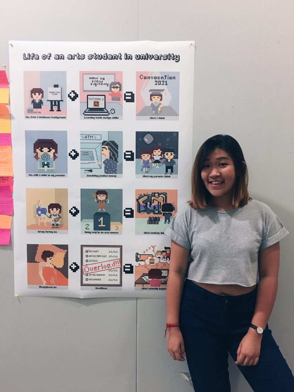
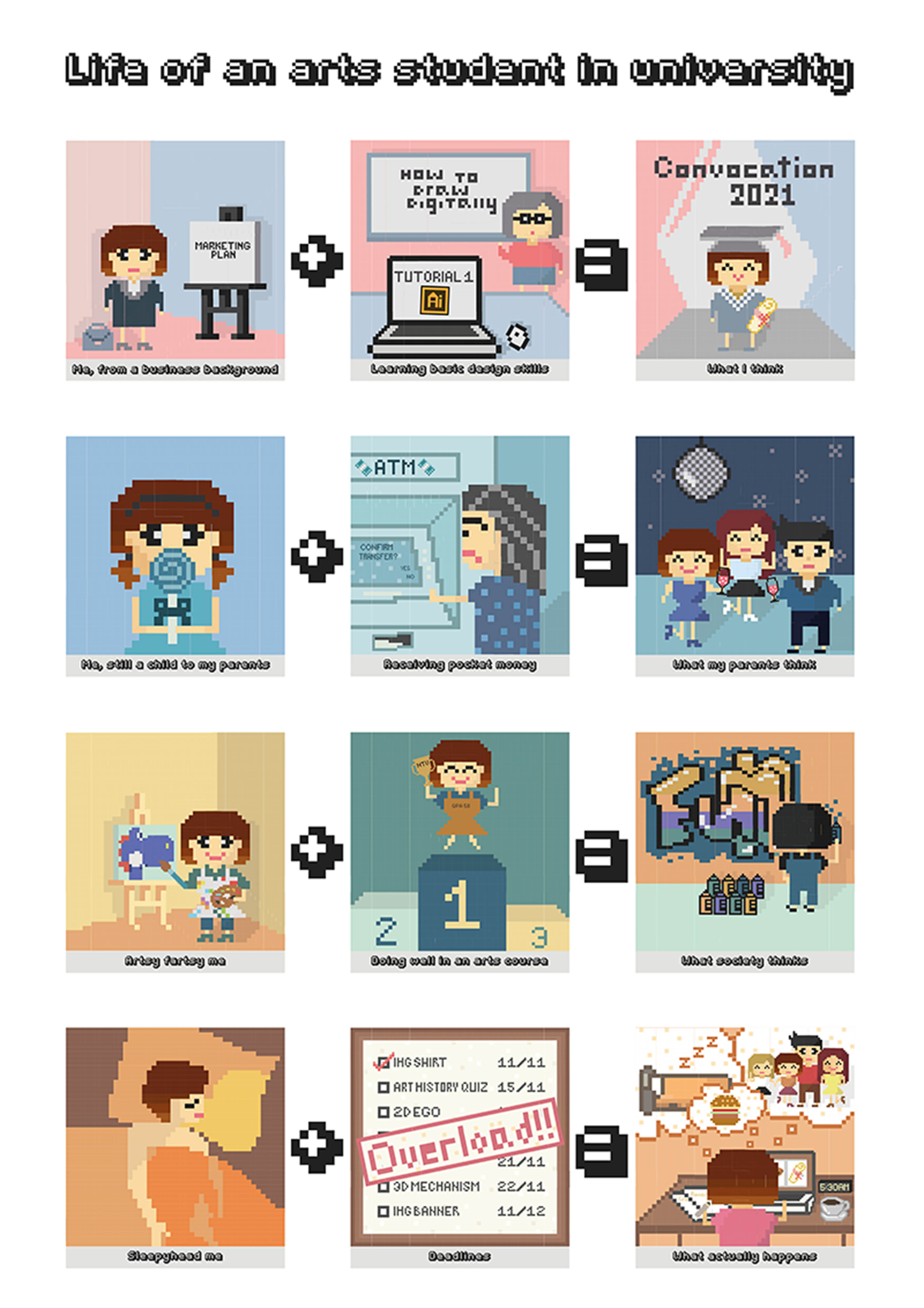
Finally, I’m done with Foundation 2D and the final project – EGO!
The journey was tough, but the final product was better than expected!
From the day I decided to to 8-bit, I knew it was the day I am doomed.

Informing my classmates about my choice of art style was hilarious.
They were all saying that I’m crazy for deciding to choose an art style is of a certain level of difficulty, what more I have never tried it before!
Even when consulting Prof Mimi, she told me that no one has ever done Project Ego in 8-bit art style before!
And that scares me…. If i screw it up, I am screwed.
But, I decided to go with my gut feeling, took a leap of faith and went ahead doing!

It was really tough doing 8-bit, as I had to colour in pixel by pixel, which meant – if I changed my design, it means I have to restart again, which happened.

I couldn’t decide on the layout and elements to put in, and I kept changing it, resulting in tons of time taken away, and I took a really long time finishing it.

But, seeing the final work, No regrets!

This project, is by far my favourite to work on for Foundation 2D!
I got to experiment freely, and play with colours, to bring out certain mood that I am going for or emotions that I want to evote – which is pretty cool.

Compared to the previous assignments, there was less restrictions in this, and it was really stunning to see the whole class’ work being hung out – each and everyone of us had such different and unique styles!!

Instructor’s Feedback

“Harmony of Colours evident
Could keep the fonts neutral.
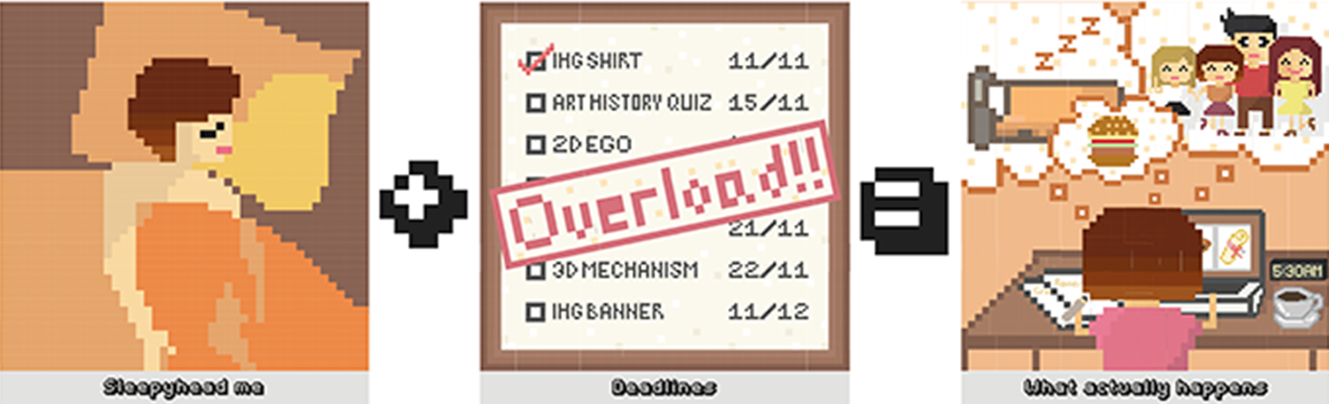
Sleepyhead me could be improved. Smaller pixels.”
These were comments by Prof Mimi pre-critique!

I do agree that sleepyhead me could have been further improved, by maybe adding more elements in too! Right now, it seemed too plain, just with me sleeping (it’s not like i’m sleeping beauty right HAHA)

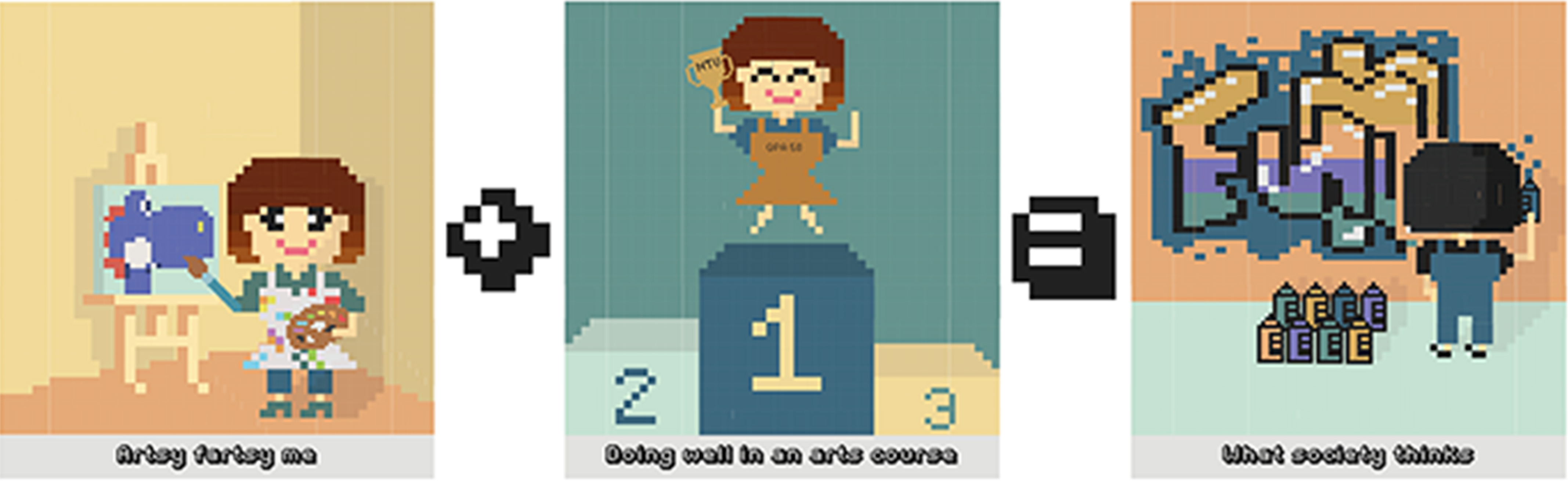
After sharing my project, Prof shared that maybe for the square of “Deadlines”, it would have been better if I didn’t cover the whole square just with the board of deadlines – which I have to agree with! Maybe adding a pair of hands, or other stationery/elements would’ve made it better!

Also, the fonts for the text could’ve been more neutral as it seemed too much with all the 8-bits everywhere!

The third row colours did not seem to complement very well either – & I agree. It didn’t look like what I perceived it to be! On my laptop the blue-green colour had more blue tinge, but it wasn’t really shown on the print-out! (Or maybe my spoilt laptop screen was showing me things :()

Prof Mimi also said that it was a steep road I took, from the consultation designs that I showed her, till presentation day, due to the drastic changes hahaha. But i’m glad, it all turned out well!

Peer Review 

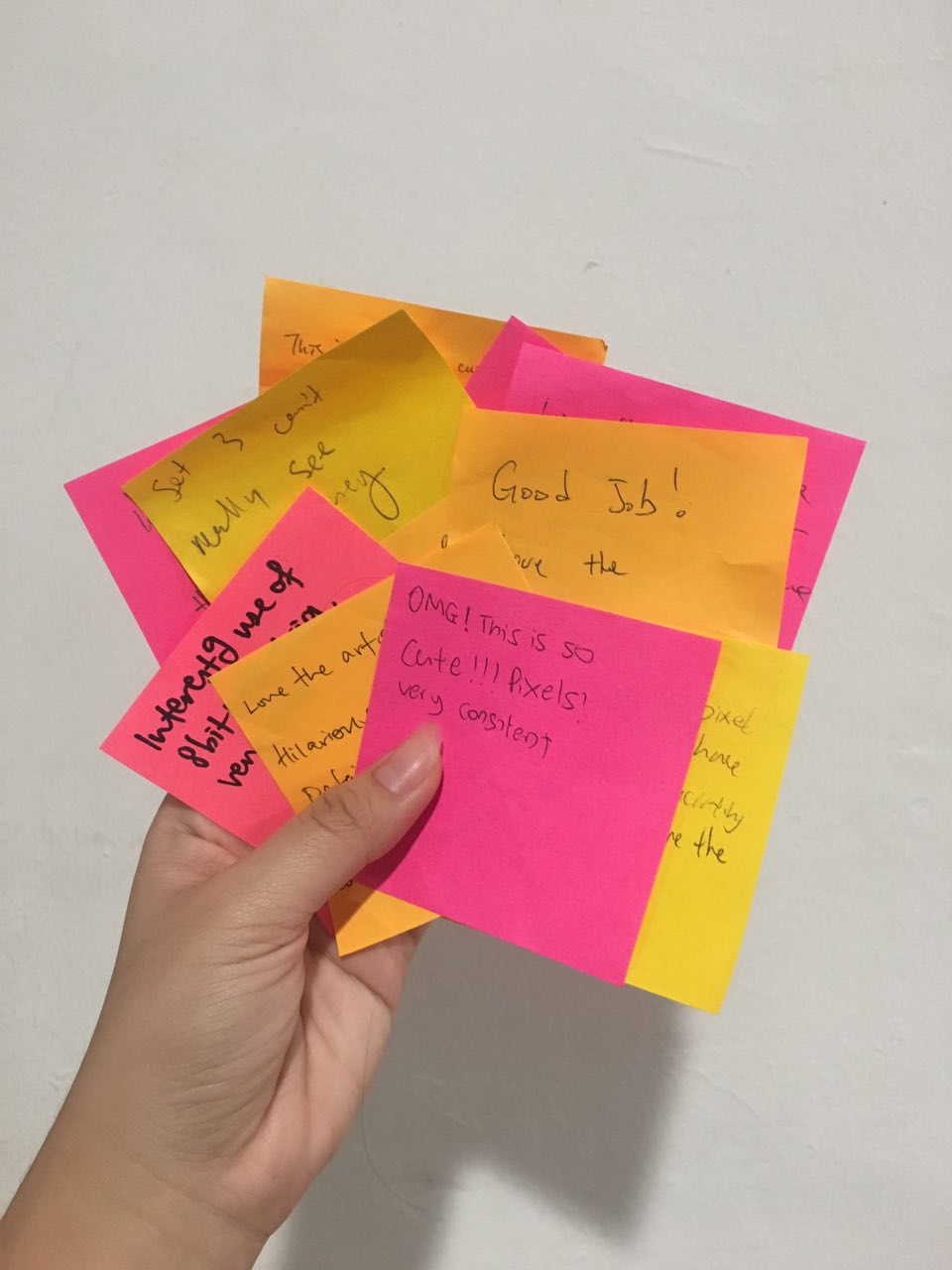
Many reviews that I’ve gotten from my classmates are really positive!
Most of the comments are they liking the 8-bit pixel art style that I went for, and the neutral/pastel colour scheme I used!
Thanks friends for liking my 8-bit work! 

Further way of improvements

A way I know that I can work on, is my pixel art!!
As a first-timer, I’ll say that it isn’t that bad, but overall, it looks below average.
Instead of using the same size pixels, I kept switching around, resulting in a square having different sizes of pixels – which is something I should work on!

Next, it was something I realised too late.
While I was finishing up my last square, my friend taught me an easier way of doing 8-bit. But it was too late, as I had most of it done already!

If time allowed, I would’ve re-done everything in that same style, it would’ve saved tons of time and looked less messy!

Also, for colour-wise, I feel that I should’ve done more research into it, especially on the usage of complementary colours. Complementary colours are a real tough play, as one step of going wrong might result in the whole row looking weird and inconsistent – which is what happened to my Equation 3! 


All in all, thank you Foundation 2D, for bringing me on an exploration journey where I got to experiment and know more about my art style and drill my creativity and artistic talent!

Till then,
Flazéda!
jamz
x

2D | final ego

I am finally done with all my 4 equations!
8-bit took a painstakingly long time to finish, but I’m pretty impressed with how the results turned out!
I used a pastel/neutral colour palette for my squares.

The title of my Project, is life of an arts student in university, based on online memes.
There are 4 outcomes, What I think, What my parents think, What society thinks, and What actually happens.

Equation 1: Me, from a business background + Learning basic design skills = What I think

For Equation 1, I placed the squares of me, from a business background, presenting a marketing proposal, as I was from a business student back in Poly days. + when I came to NTU ADM, my perception of ADM was that it’s a platform that I learn basic design skills and then, 4 years later, I’ll graduate!
I thought that University Life was actually that easy for an arts student! (But i am obviously very very wrong 🙁 )

For colours wise, I used mostly pastel reds and blues, as NTU’s convocation consists of mainly those colours. Also, red represents passion – and I used it to signify my passion for designing.

Image result for pastel colour palette red blue

This color palette is where I referenced my colours from! They belong to the analogous harmony.

Equation 2: Me, still a child to my parents + Receiving pocket money = What my parents think

For Equation 2, I started with a young character of me, portrayed as still a kid in my parent’s eyes. With receiving pocket money from my parents, it leads to the last square of What my parents think – of me using the money they gave to go drinking and clubbing.

Colour-wise, I used monochromatic blue palette!

Blue

This is my reference palette! The reason I chose blue, is because the good emotions it evotes are love, which in this case, my parents love for me. But, it also evotes negative emotions, like fear – which can also be interpreted here, due to my parent’s fear of me wasting money and playing around, instead of concentrating on my studies.

Equation 3: Artsy fartsy me + Doing well in an arts course = What society thinks

For Equation 3, I defined myself as artsy fartsy – someone whose very artistic, + doing well in an arts course (ADM), being first and having GPA (exaggerating a little too much) = What society thinks, that I’ll be living on the streets, being a spray painter.

For the last square, the reason for putting a spray painter for What Society thinks, is because of the societal norm. There are still people whom are not very accepting of the arts industry, and whenever I say i’m from an arts course, their first reply, was “What future do you have?”
It always seem that arts have no future!!! Also, an inside joke between my friends and I when we went to Melbourne, they jokingly asked me if that’s my future job when we passed by Hosier Lane witnessing many artist spray painting. Thus, I decided to use spray painting artists as a meme of having no future for an arts student.

For the colours, I used Complementary harmony.
Image result for pastel colour palette red blue

This is the colour palette that I referenced from. The reason of having orange, was due to the emotion related to it – ignorance. I feel that many people in the society are still ignorant to what art students actually does, and what holds in the future of art students!

Equation 4: 

The final equation, is what actually happens in the life of an ADM student.
Being a sleepyhead me, I require tons of sleep everyday! (I can literally sleep the whole day away if I have no alarms hahaha)
But with overloading deadlines to meet and the tons of assignments to do, it leads to what actually happens – the reality 🙁
The reality is me, at 530AM, still trying to multitask between rushing assignments and studying for quiz, and trying to survive on coffee.
Meanwhile, I am thinking of sleep, and food (cuz it’s an unearthly hour and it’s hard to get food!!!) Also, I am missing my social life and the time spent with my friends!

For the colours, I used Warm Analogous Harmony, but based mainly on browns.

Brown

This is the colour palette I referenced from!
I chose warm colours, as it gives me a feeling of reality, which links to my equation!

And that’s it for the last project of Foundation 2D!
Stay tuned to my next post on the post-review reflection!

Till then,
Flazéda!
jamz
x