INT2 | assignment 1

For Assignment 1, the interactive art I’d like to mention about is Cell, by James Alliban and Keiichi Matsuda, done in 2011.

Cell is an interactive installation which questions online identity. It was commissioned by the Alpha-Villa festival for its 2011 event. It was built using Openframeworks. Cell plays with and proposes alternative landscaped in the technological ether surrounding  our everyday movements.
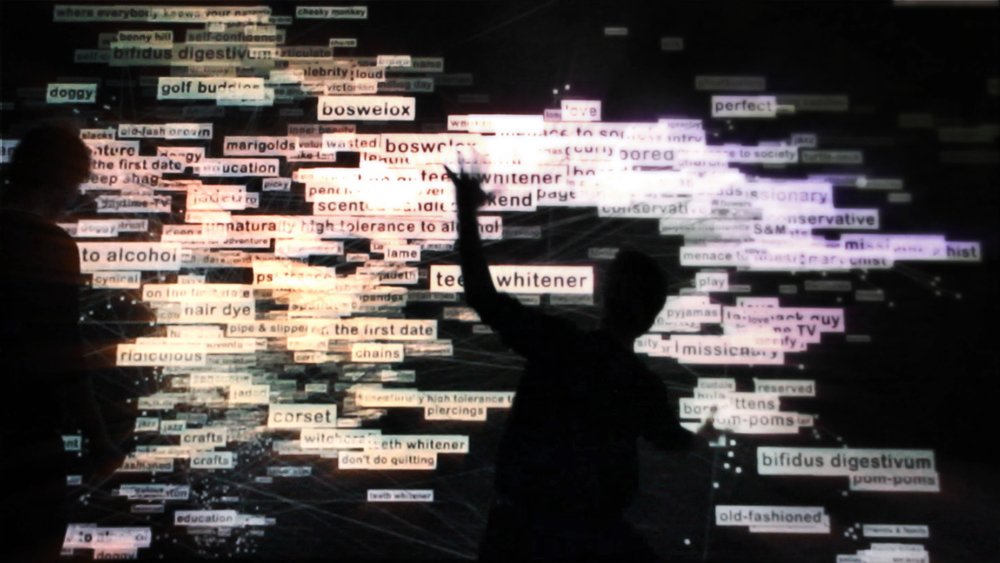
how cell works
In Cell, identities become deliberately constructed and broadcast commodities, It’s projected personae increasingly enmesh and define us.
Cell acts as a virtual mirror, displaying a constructed fictional persona in place of our physical form. It is composed from keyword tags mined from online profiles. Our second selves stalk our movements through space, building in size and density over time. Resulting forms are alternate, technologically refracted manifestations of the body. This reveals the digital aura while allowing us to escape from the identity.
Cell detects whenever anyone enters the room. It assigns each person a random identity and avatar. The keyword tags are originally projected in a cloud on a wall. The tag will begin to attach themselves to your avatar. The tag ranges from a variety of words, e.g. golf buddies, cynical, love kids, hipster. The longer you stay, the more tags you accumulate.
why cell
I think that Cell is an interactive installation which address the current social issues. Today, many people are obsessed with the Internet and the information they post on social media, that they might seem to have a different online personality compared to physical, as they will only want to show the good side of themselves. It is a great example of using art and technology, and it shows explicitly how the usage of technology on a daily basis affects our emotional wellbeing. The exhibition shows a reflection of us towards social media and being exposing our true selves online.
references

http://www.jamesalliban.com/cell/
https://www.vice.com/en_au/article/pgzwkg/icelli-is-a-virtual-mirror-that-reflects-our-online-identities

Till then,
Flazéda!
jamz
x

INT1 | singapore night festival

Having been to Singapore Night Festival for the past few years, I honestly felt that it was pretty underwhelming this year. I’ve been to the festival ever since 2016, and I felt that the previous years were better,

Nevertheless, I think the amount of effort and thought put into the artwork of the artists was still pretty commendable by all.

STORY OF THE FOREST BY TEAM LAB
Image taken from http://www.hypeandstuff.com/wp-content/uploads/2017/01/Story-of-the-forest-6_-Image-Courtesy-of-teamLab.jpg

This artwork isn’t exactly under Singapore Night Festival, but more of National Museum of Singapore.

As this installation is done in National Museum’s Rotunda, it fully utilises the shape of the space, the Dome and having participants walk around and down to the final view where they see the whole forest.

The entrance of the installation is at the top of the dome, and viewers see the dome ceiling with flowers blooming and changing over time. Crossing the bridge through the falling flowers of the dome, participants will descend down the passageway through a vast interactive forest inhabited by the animals of Singapore. As they walk down, the forest changes from morning to night, and with dry and wet seasons of Singapore. When they enter the base of the dome, they get a bigger view of the dome, with the flowers blooming at the top, and having animals and forest coming up when the participants move nearer to the wall. This artwork is very relevant to National Museum, where it talks about Singapore History – more heavily dedicated to William Farquhar Collection of Natural History Drawings.

Animated GIF - Find & Share on GIPHY

Animated GIF - Find & Share on GIPHY

The artwork is depicted in real time by a computer program, and offers interactivity to a certain level. The first part of interaction with the artwork is more passive, whereby we are just walking into the rotunda and looking at the flowers. The only interaction we had initially, was walking around the dome. But it became slightly more reactive, when we reached the base of the dome and we could see how having participant’s presence, how it could change the work.

I felt that this artwork was a very interesting way of depicting Singapore, as it’s seldom thought about singapore being related to animals and forest as it’s more of an urban city. It was also a learning journey for us, where we get to know more about species relevant to Singapore.

Animated GIF - Find & Share on GIPHY

This artwork spoke to me as it’s the artist’s take on Singapore on a different approach, and making it interactive for participants, so that they won’t just feel bored walking around the dome.

Image taken from http://cdn.luxuo.com/2017/02/16.jpg

Although it’s not officially under Singapore Night Festival, I think this artwork is an honourable mention as amazing artworks can be found within the interior of the museum, instead of just the outskirts surrounding!

Leap of Faith by Teng Kai Wei
The Leap of Faith
Image taken from https://www.nightfestival.sg/-/media/snf2018/night-lights-main-prog/10-the-leap-of-faith-1200×514.jpg?as=1

This is the second artwork I’d like to talk about from Singapore Night Festival.

Animated GIF - Find & Share on GIPHY

The intention created for the participants is for them to take a leap of faith and   jump from step to step, to signify literally jumping to take a leap of faith.

The intention of this interaction is for participants to take a “leap of faith”, by jumping from a step to the other. While participants jump, the lights of the step changes, and there are several variations on the lights. This artwork is reactive and has high interactivity level, as participants have to make an action for a reaction to the artwork. But that being said, in the middle of the interaction, there is a light sculpture whereby interactivity is not needed.

The anatomy of this interactive system was very simple, with steps that lights up whenever we step on it. There are several rims of colours on the step, and it lights up differently.

And that’s it for my trip to Singapore Night Festival 2018!

Till then,
Flazéda!
jamz
x

GRAPHICFORM | overview

Project 1: hello! my name is

A typography assignment using our names to illustrate on 4 occupations. I used JAMZ, my nickname, and illustrated the jobs: Post-man, Lantern Painter, Hawker Centre Cleaner & Batik Painter, to address the issue of dying trades & jobs in Singapore’s context.

Click here for jamz :-))


Project 2: Locale – Zine

A zine assignment on exploring a local neighbourhood, and presenting it in an abstract manner. The location I worked on was Ten Courts of Hell, an attraction at Haw Par Villa, and I created a zine to illustrate the punishments of Hell.

Let your journey to Hell begin! >:-))


Mandatory shot with the assignments!!
Year 1 , Done & Dusted!!!

Till then,
Flazéda!
jamz
x

GRAPHICFORM | locale zine

ABOUT THE PROJECT:

To respond to a specific location in Singapore, expressing it’s uniqueness through an abstract graphic form.

Create an A5 Saddle Stitched zine with a maximum of 8 pages.

Let’s go on a journey to Hell!

CONCEPT

To focus on the effect that Ten Courts of Hell gives visitors, upon visiting that attraction. Tapping on to the creepy and scary vibe that Ten Courts give, to create an abstract zine that makes people hallucinate and trippy!

ART DIRECTION

I wanted to focus on the punishments without text, and mostly pictorial. However, I was afraid that just pictures will not reach out to viewers on the punishment, thus the addition of the Chinese words illustrations.

I consistently used a colour scheme for each page, and only at the back cover page, bringing them together. Trippy/hallucinating art style was also incorporated in the artwork.

Stone – Grey
Cold – Blue
Heart – Red
Boiling – Orange
Tongue – Purple
Knives – Green

LINKS TO:
RESEARCH

GRAPHIC FORM | LOCALE RESEARCH

INFOGRAPHICS

GRAPHIC FORM | LOCALE INFOGRAPHICS

PROCESS

GRAPHIC FORM | LOCALE – ZINE PROCESS

ARTIST REFERENCES

GRAPHIC FORM | LOCALE – ARTIST REFERENCES

Feedback from classmates:

Feedback from Joy:

It’ll be better to have consistency in the Chinese words illustration
Colours are working out better with one colour on each page, and it comes well together on the last page.
Strongest spread – cooking spread (spread 2), which incorporates the mural & words.

Personal Reflection:

Overall, I had really mixed feeling about the zine that I’ve created. I felt that I could’ve done way better than what was produced, but I couldn’t think of other ideas to make the zine abstract.  There were many ideas floating around in my head, but none of them seem to tick the checklist of “abstract”. But, thankfully I didn’t give up!! I decided to start working randomly till an idea got to me, which I stuck with it through! Making a zine sure isn’t easy, as there are many pages to take care of, and it is very important to be consistent – something I’m not very good at. After many trial and errors, I finally got my zine to come along together and I’m just glad that at the end, it all (kinda) worked out well! Super hyped that I managed to create something I can call my own, from scratch, and I got to learn more about zine-making!

About 60% happy with my zine :’)

Fun fact: showed my mum my zine and she had goosebumps viewing it halfway, and didn’t dare to finish it HAHAHA.

Assignment 2, Completed!!

Till then,
Flazéda!
jamz
x

GRAPHICFORM | locale artist references

I was greatly inspired by trippy art to create my zine, as I wanted to give people these reactions:

“what just happen”

“my mind got blown”

“so creepy”

thus I went to my trustworthy site – Pinterest to get some inspirations, and here’s what I got!

I realised they usually have very vibrant colours, and sparks at random places. Tons of overlay was used also to create the effect of messy, random.

pinterest : jvnxie ☹ ☻
Image taken from https://i.pinimg.com/564x/d7/e5/d9/d7e5d963de7f4aa413a1939cea1f4bcd.jpg
Image taken from https://i.pinimg.com/564x/b1/05/83/b10583c7f4f5ec3ad88bee638081847a.jpg

From this, I went ahead to experiment my own style of trippy art!

Chineasy is a publication that I saw on Ted Talk! The artist, ShaoLan Hsueh, a Taiwanese based in London, came up with easy pictorial way to teach children Chinese, in a visually engaging manner!

Home

She incorporated the Chinese words into the form itself and it was easier to learn those words, especially for kids and visual learners!

ohmyasian: “2114. Chineasy by Shao Lan Hsueh. Cute drawings to help you remember some easy chinese characters! ”
Image taken from https://i.pinimg.com/564x/a1/23/79/a123797751633f41a3c1f502d149173d.jpg

I was greatly inspired by her work to come up with mine as well, not to teach Chinese, but to inform my zine’s viewers about the punishments in Ten Courts.

I didn’t want to include chunky text as description, and just wanted something sweet, simple, yet have other meanings to it.

Chineasy-14
Image taken from https://i.pinimg.com/564x/3b/af/1e/3baf1ea48bb048e98216e703371f417d.jpg

Some illustrations done by her!

Therefore, I did up illustrations of a few Chinese words, and that really aided me a lot in my zine!

That’s it for my art references!

Till then,
Flazéda!
jamz
x