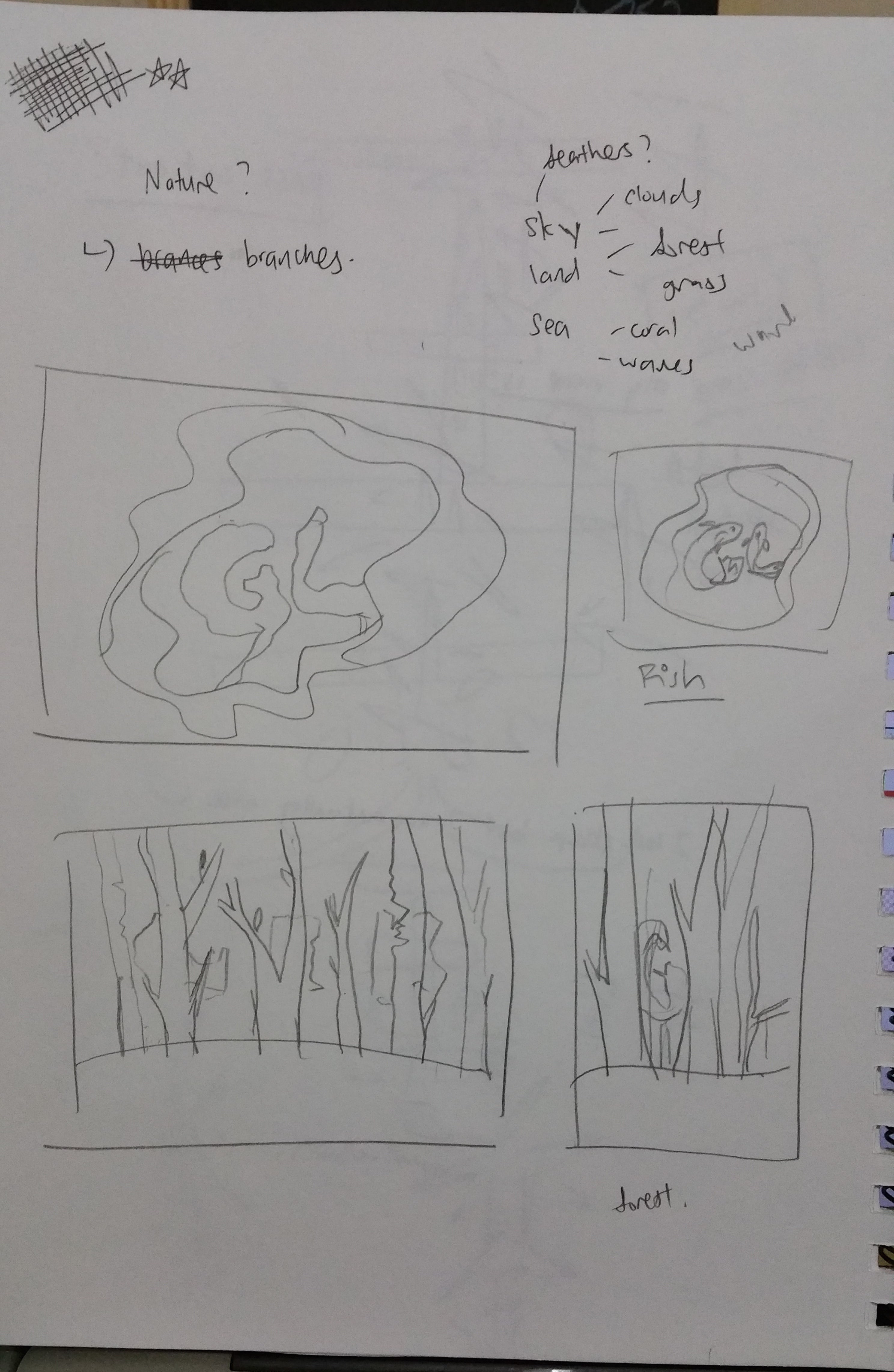
As i wanted to go with the theme of nature, after branches, the next element that came to my mind is water. Initially, i was wondering how should i make water interesting when it is just water?
Before:
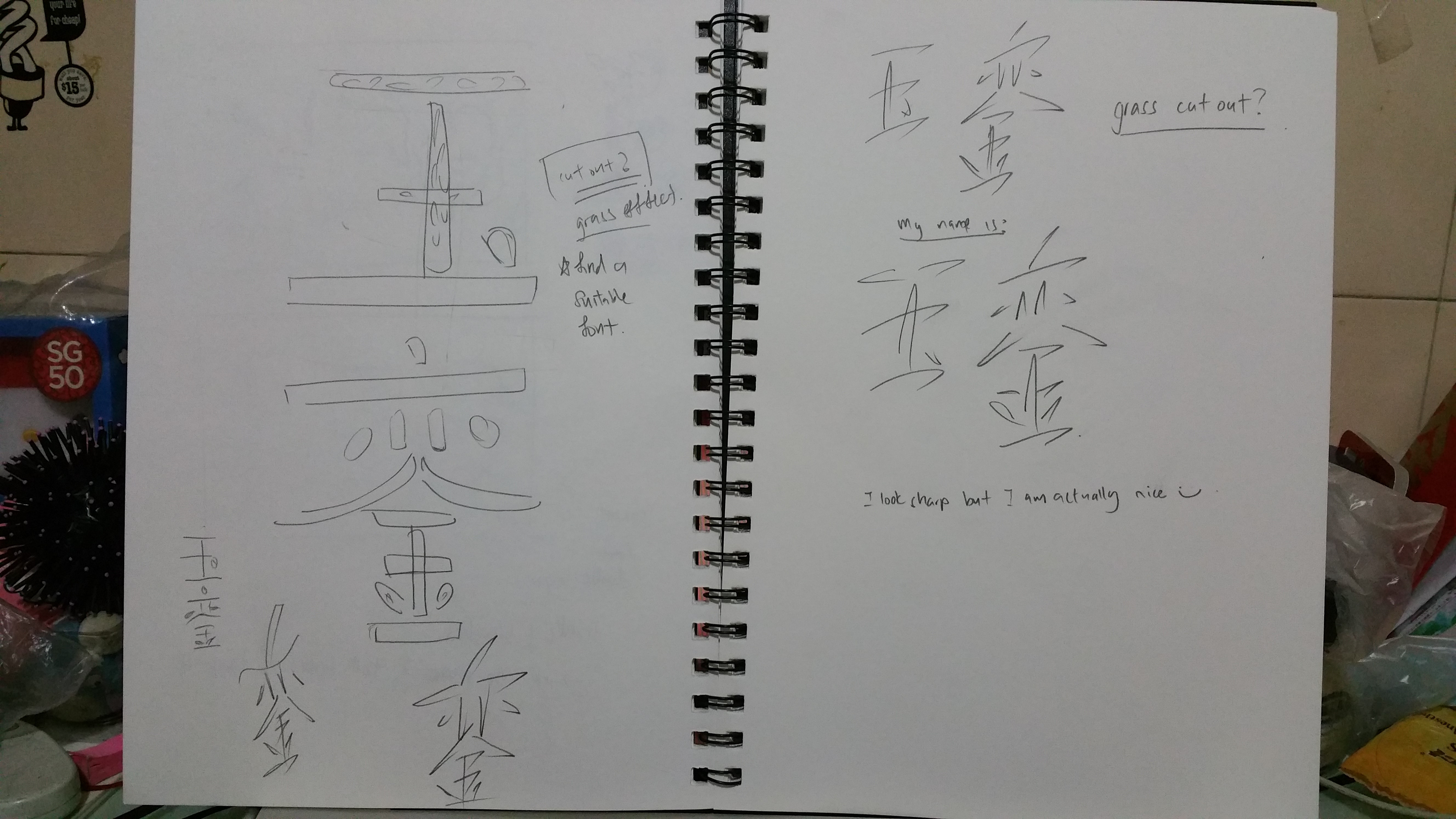
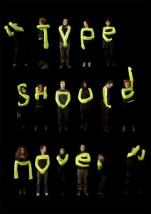
For my letters, i was only trying to create it as it is. Looks unnatural and too simple
I found really good references of water cut outs on pinterest. It reminded me that water could contain so many things! Fishes, seaweed, bubbles, plants, etc. I was really inspired by the fishes and found out that it is the perfect element for my initials.
References for this piece:

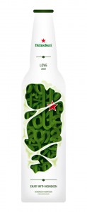
from pinterest: https://www.pinterest.com/pin/293508100695785442/

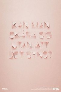
I really love the idea of have the white frontal piece to add visual interest and flow to the whole piece! from: https://www.pinterest.com/pin/293508100695788902/
The main keyword for this piece would be flowy and deep/layers.
WIth these reference, I have decided that i would make the 2 fishes show G and L.
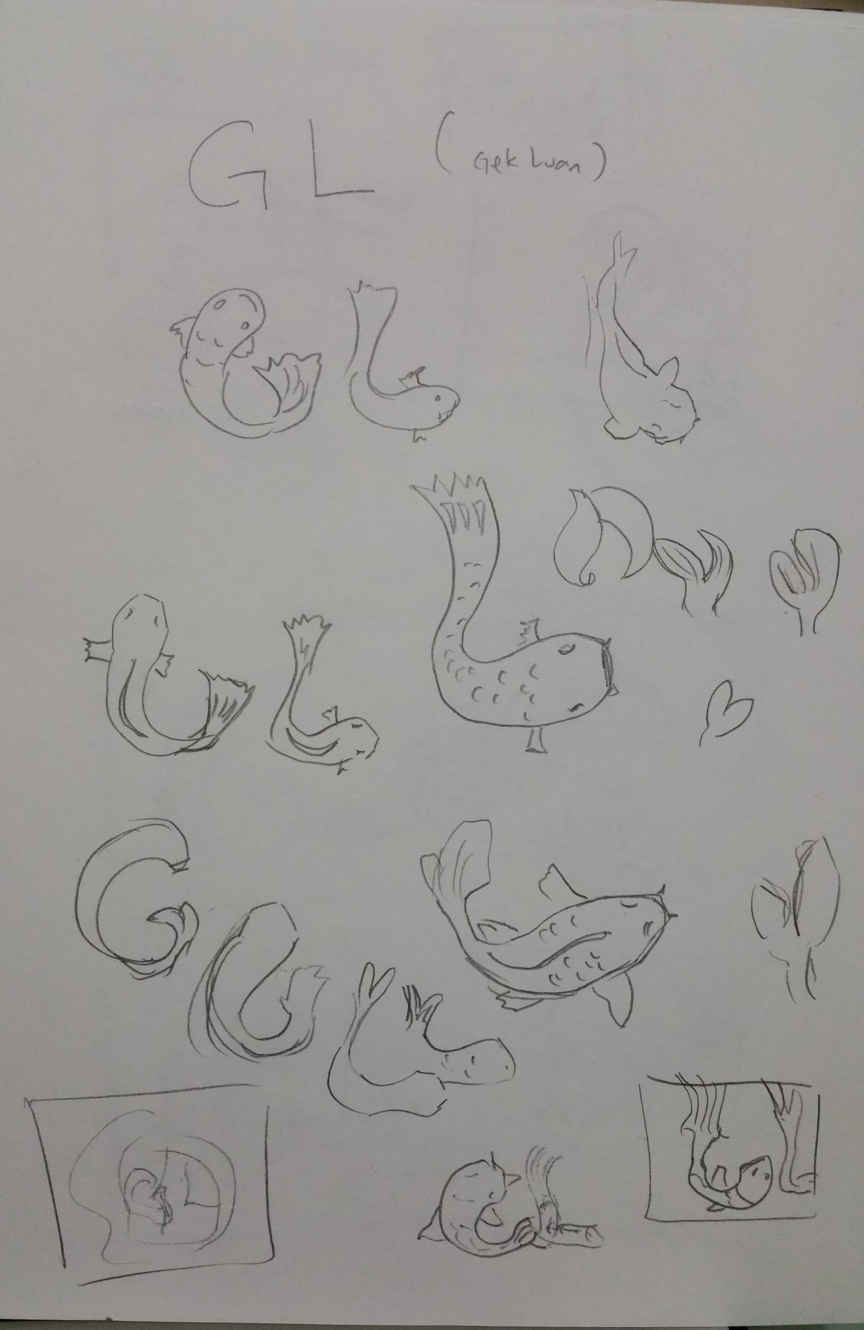
Design exploration of how the fishes would look like. Had fun doing this!
Actual making of this piece:
I lifted the layers up to see how i should arrange the different layers of water
Make shift light box!!

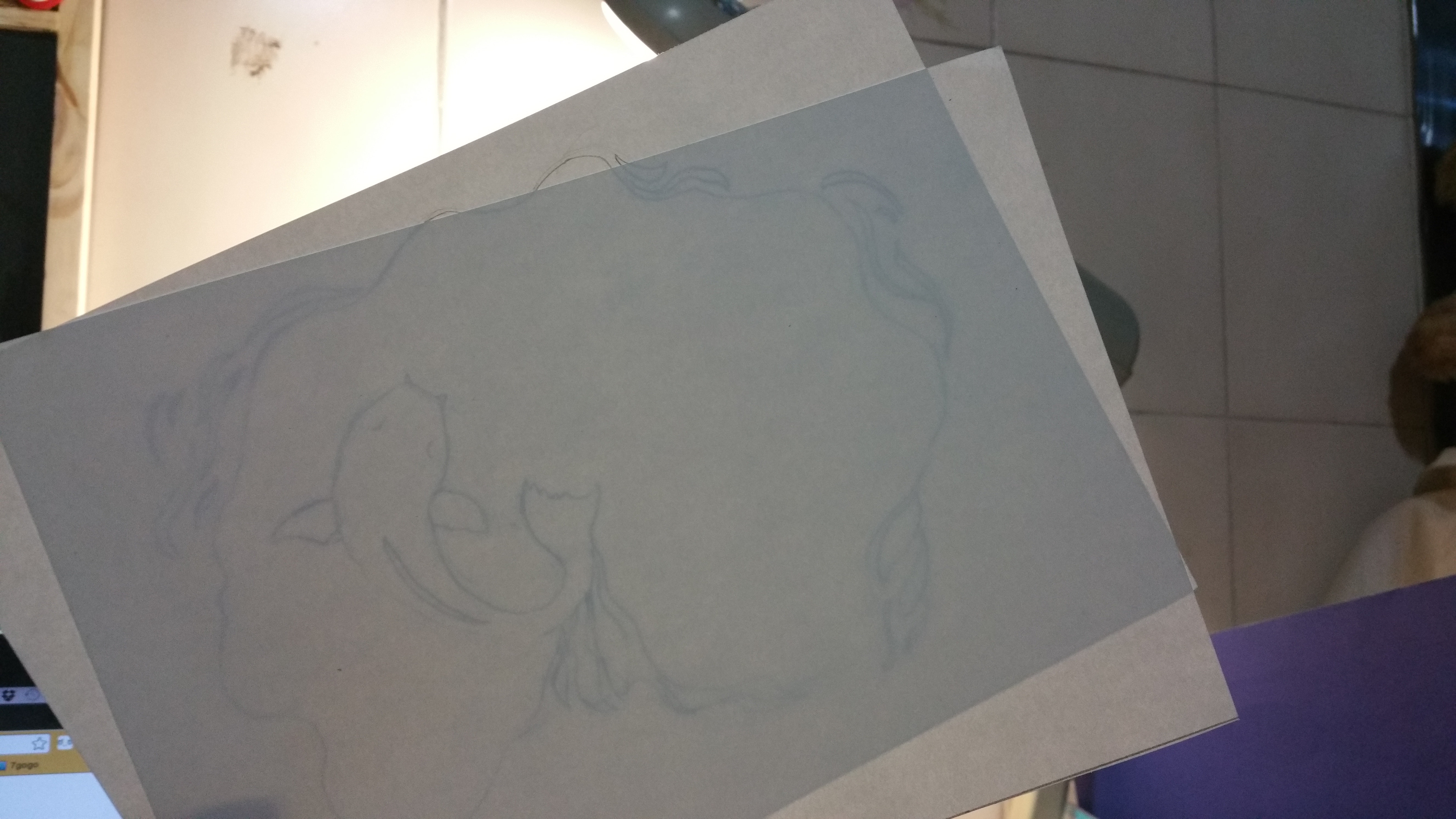
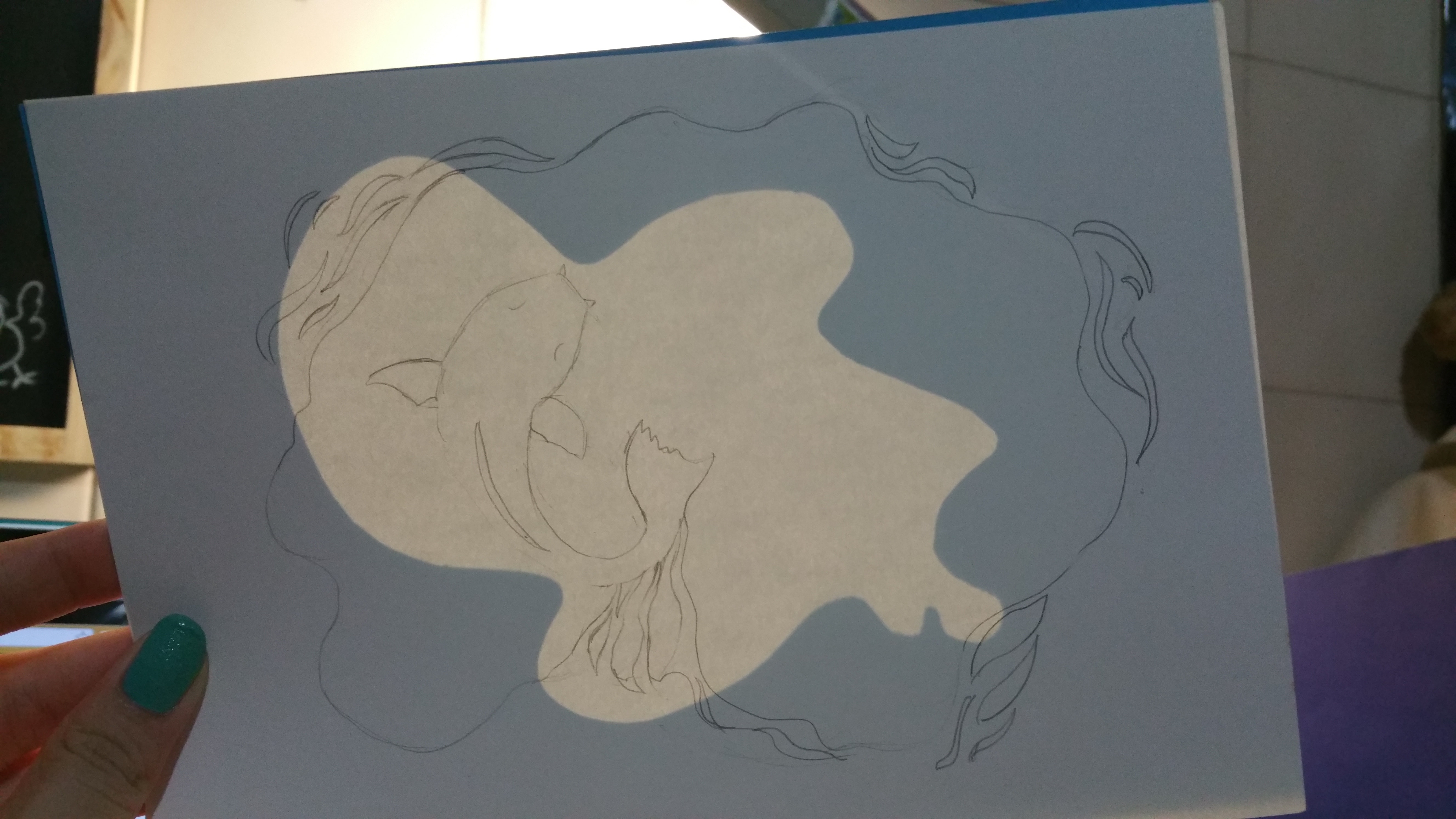
after i sketched out the layers, its time for me to carve out the fishes!!
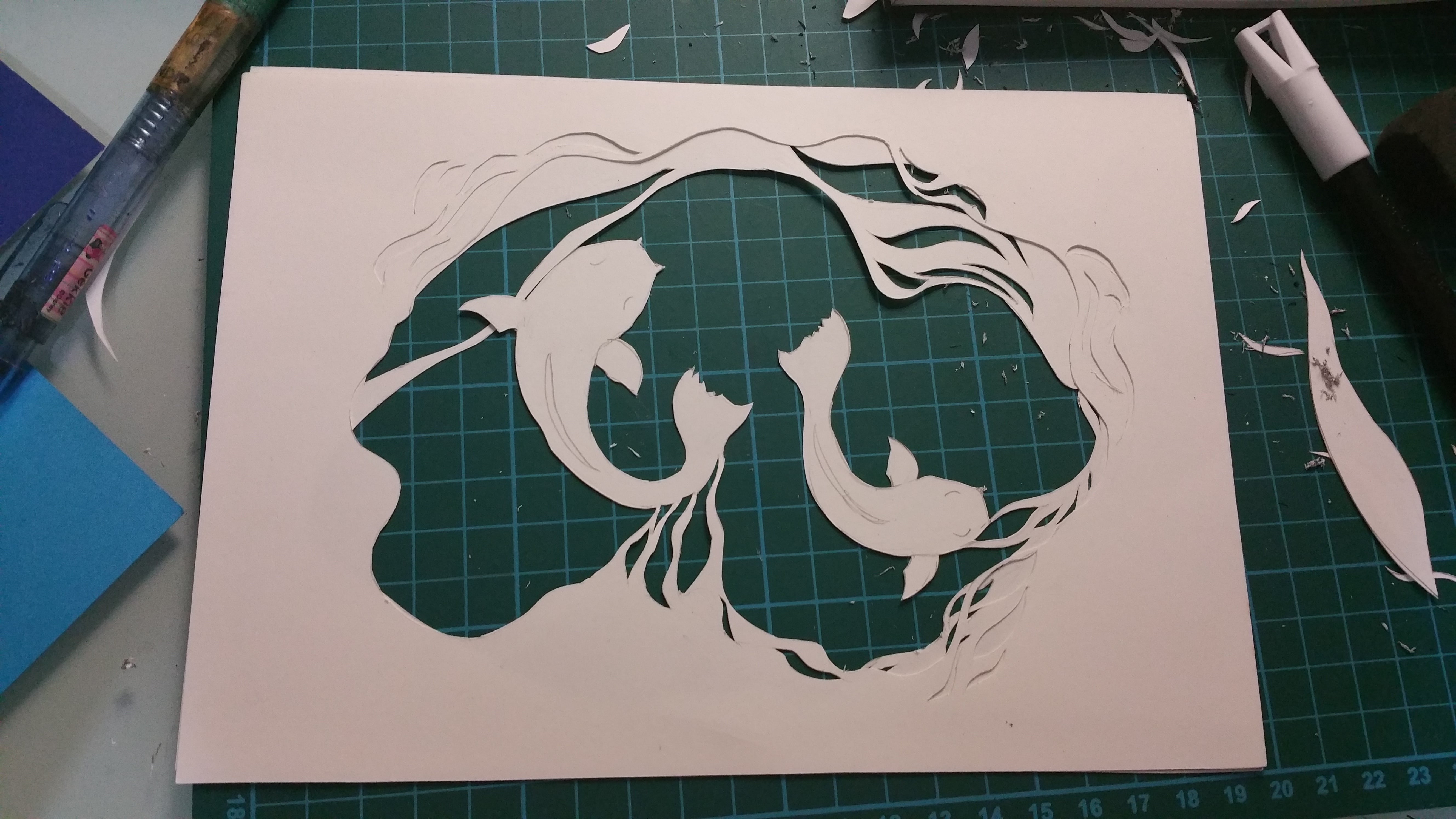
first completed fishes!~~
I would firstly sketch and cut the main subject so that i can get a sense of space they occupy and what i should do with the other layers.