TP: Getting inspirations from creating

Standard

After the first look and consultation with Prof Ina, I decided that the keywords for this project would be “nature” and “watercolour”.

These 3 are the ones that I found the most interesting and related from the pile of references that I found.

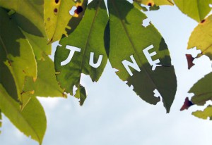
leaves,cut outs.

leaves,cut outs.

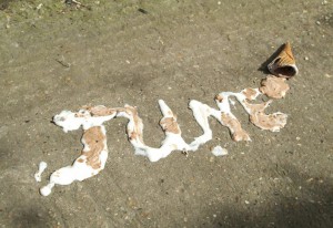
ice cream?! wow

ice cream?! wow (using the raw materials)

tie up with the water colour?

tie up with the water colour?

With all these references, even though I am still clueless, I thought it would be good for me to start on something so that I could kickstart the project and have an idea of what I want to do.

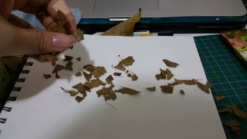
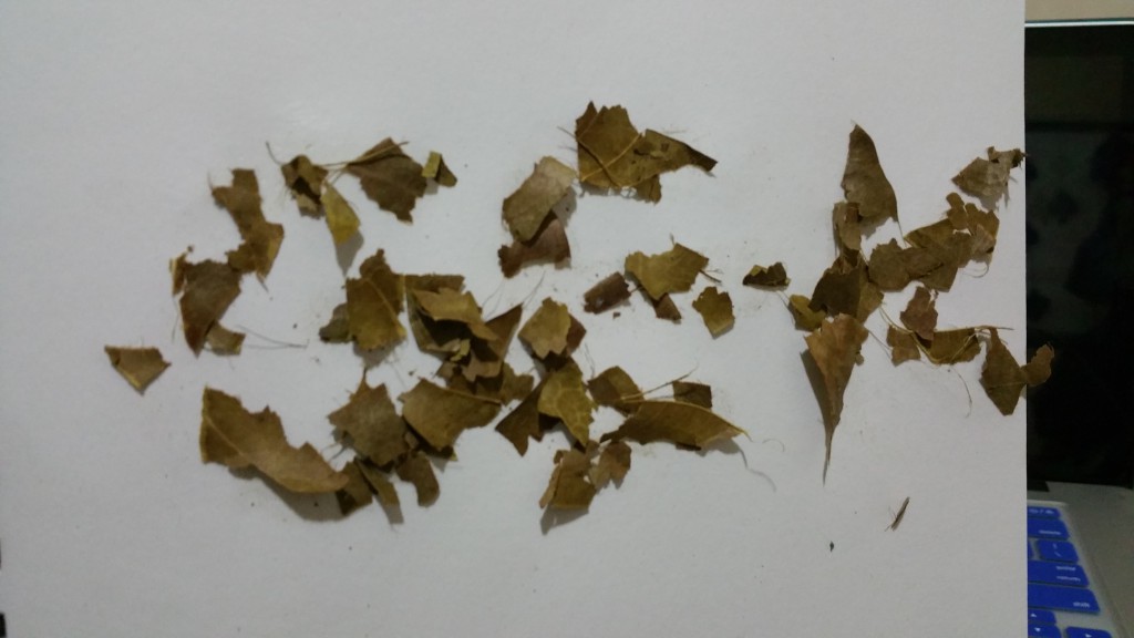
And so I went out of the house and collected a bunch of fallen leaves.

20160125_000802-min

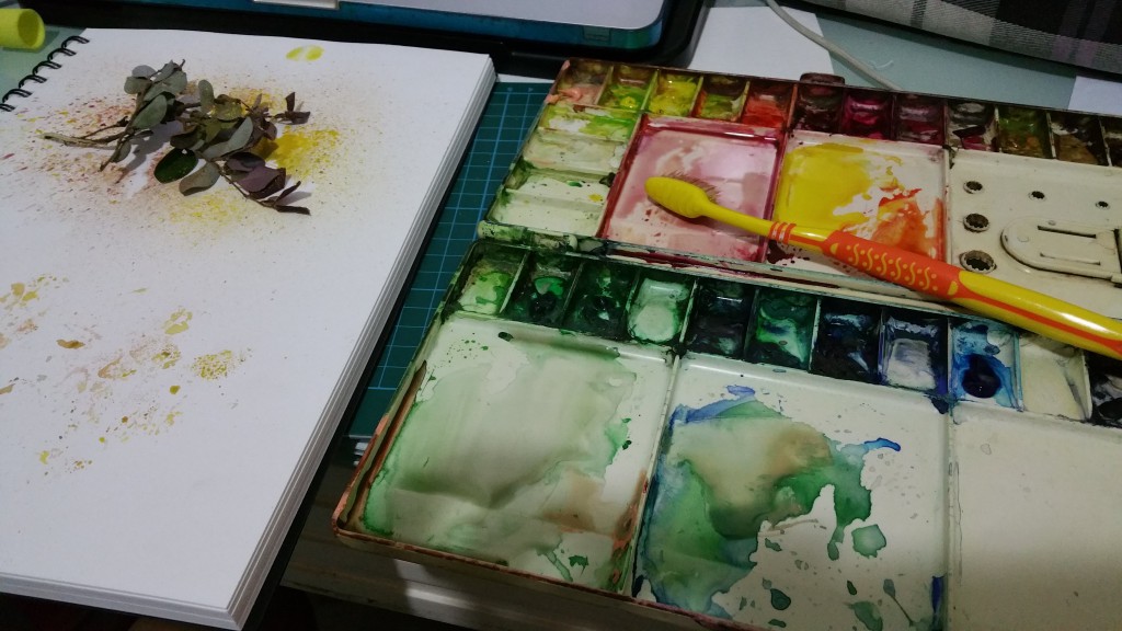
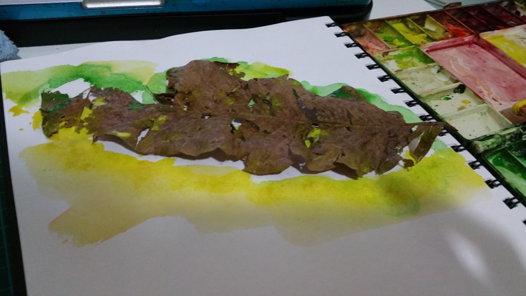
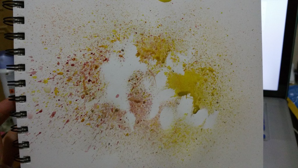
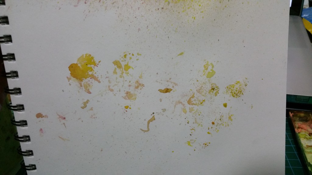
The first work i started with.. I splattered some watercolour over the leaves, trying to create the outline of the small leaves

20160125_000825-min

The silhouette created of the leaves

20160125_000831-min

Printed the ink on the leaves

20160125_001514-min

I remembered the importance of the leave looking natural. I picked one with holes eaten by caterpillars and broken. I painted over it, hoping that the paint would seep through the holes and create a crisp outline

20160125_002147-min

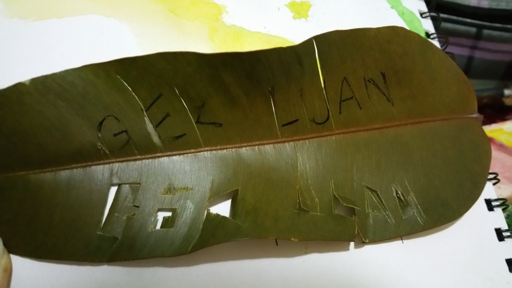
I wanted to try to create the effect like the first reference i found.. Cut my name out. I didnt want the letters to look exact, hence simple cuts are made. However, the letters became quite illegible. If these cuts were on paper, they might have work out much better.

20160125_002632-min

I wrote “GEK” with glue and splattered torn leaves on it

20160125_002857-min

The result: it stuck surprisingly well, didnt it? I like the “natural” feeling of these letters

These methods may work for small tests but if it were to be a proper submission, I think that it will look sloppy… Hence, off to find more new inspirations! However, i like the theme of nature and i will continue to stick with it for now!

Referencing is really important: Precision vs Energy?

Standard

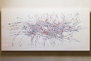
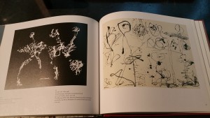
Up Next is Peter Foucault! Thin lines, Collage (i need to this this), robot drawings, somewhat probably inspired by Jackson Pollock too?

1-ZFOzT0-vghTsbkn-guLOdA

1-y9UnUJIo_h5hRcCMdPO7lw 1-iQg_ppdBfWWFpgp_kBES7A


My Take:

2015-09-03-23-08-30_deco

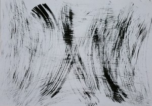
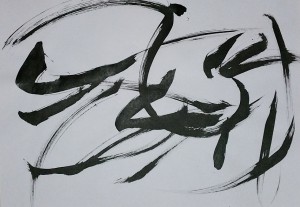
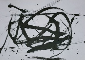
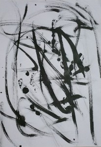
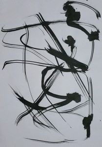
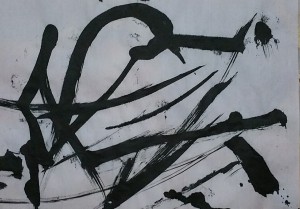
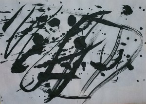
These are created with swinging of the dust wiping brush with chinese calligraphy ink!


2015-09-03-23-09-25_deco

Several more tries.


2015-09-03-23-11-18_deco

All these are inspired by the robot drawings by Peter

2015-09-03-23-33-19_deco

The sense of direction and the aggressiveness from the brush strokes

2015-09-03-23-38-13_deco

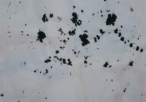
The ink blots are left by having the ink on the previous pages passed through. They are joined up like “connect the dots” with the glass deco liner

2015-09-03-23-38-42_deco

2015-09-03-23-32-14_deco

2015-09-03-23-37-42_deco

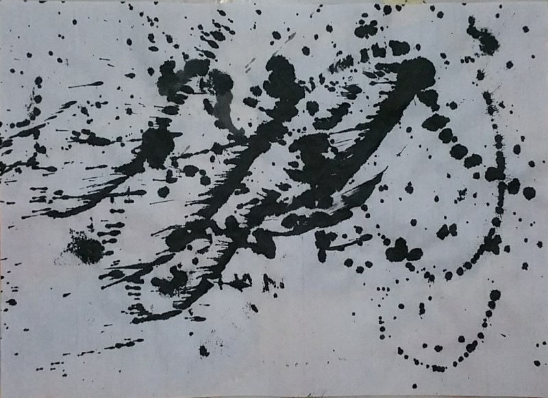
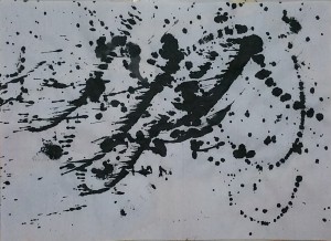
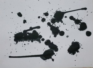
Marks are created randomly with splatters and a wooden stick dipped in ink. Combination of Sol LeWitt and Peter?

20150901_161828

Surprising Monoprint that created surprising results~

Peter Foucault’s works are a mix of precision vs energy. There is a sense of wildness u see in Pollock’s work and yet the details in LeWitt’s works. He is really an interesting artist i want to know more about. It helped alot in my

I really had fun during these creation. It was a mix of “wanting to know what you want to do” and “be bold and forget about whatever restrictions”.

Referencing is really important: Loving these energy

Standard

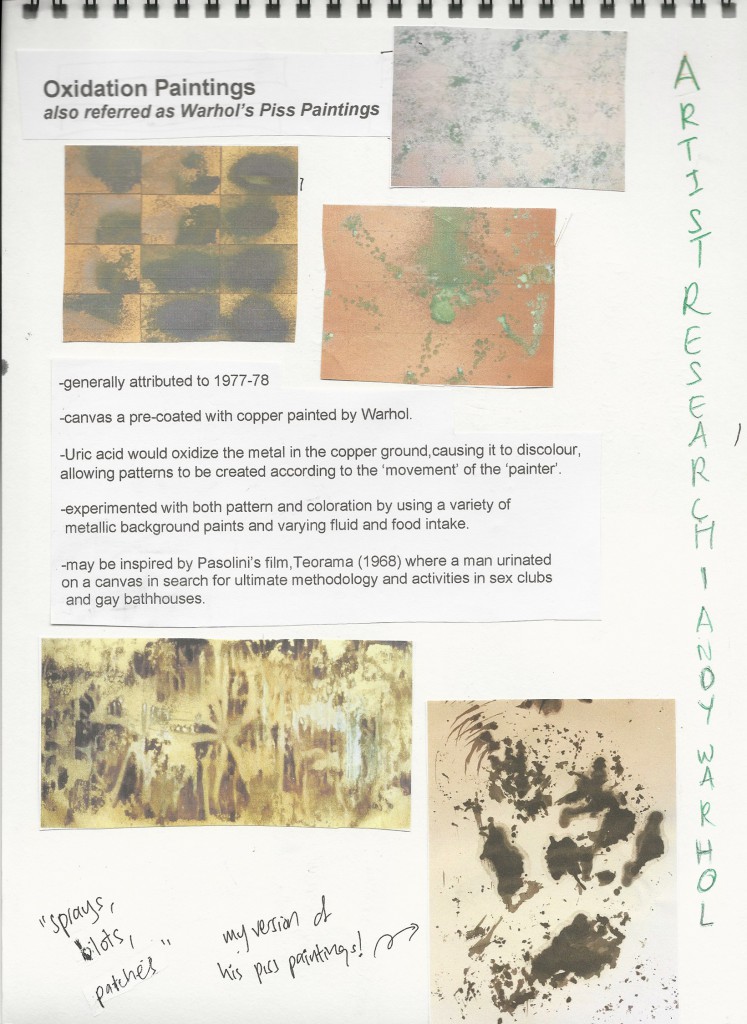
With the proper researches that i did, i had a few references artist in mind. Mainly they are Jackson Pollock, Peter Foucault, Sol LeWitt, a little bit of Andy Warhol and Alexander Cozens.

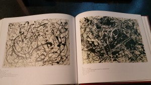
Lets start with Jackson Pollock! Unrestricted lines! Curves! Strength! Flow! Action!

20150901_183307 20150901_183252


My Take:

2015-09-03-23-16-53_deco

2015-09-03-23-18-35_deco

2015-09-03-23-19-26_deco 2015-09-03-23-20-12_deco 2015-09-03-23-24-59_deco

2015-09-03-23-23-12_deco

I remember one of his techniques was to use the Japanese paper, and making the ink seep through. Hence i increased the amount of ink used on the first sheet to create these. (i had 3 to four paper)

2015-09-03-23-24-36_deco

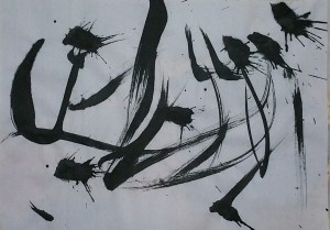
I really love this. The Energy that can be seem merely from these strokes. Powerful strokes (and splattered ink) in one direction

2015-09-03-23-22-24_deco

2015-09-03-23-25-24_deco

2015-09-03-23-26-36_deco


They are mainly created using Chinese rice paper, Copier Paper and with Chinese ink and Poster colour.


Early Monoprints and automated techniques

Image

Monoprinting when i didnt have any reference artists in mind. Just doing whatever that came to mind.
20150901_160850

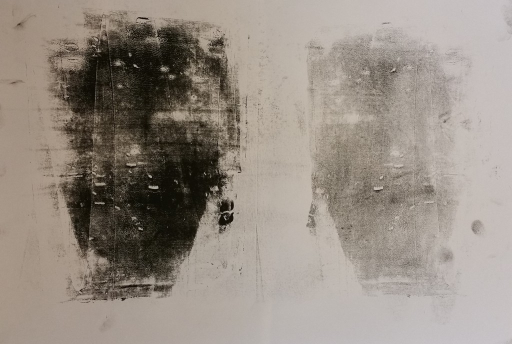
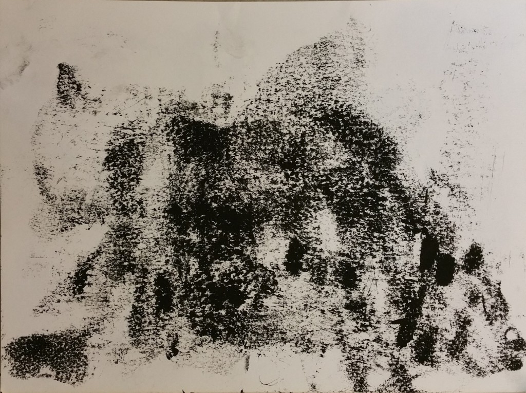
This was very interesting as this print is actually created by wiping the glass table with ink on it. As I realised that it actually creates interesting visual texture, i decided to swirl it to create a sense of direction/movement
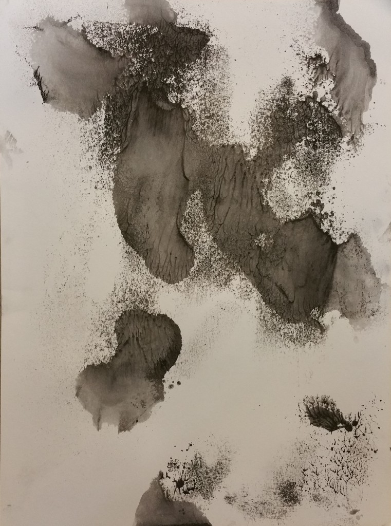
 

20150901_160923

With the link on the table(again) i decided to dilute it with water at certain areas and added some paint. I also used the spray bottle(sprayed on table) before gently pressing my paper on top
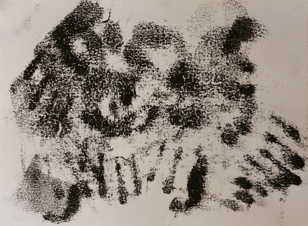
20150901_161000

Another attempt at table wiping, those strong lines at the end are actually…… (fingers)
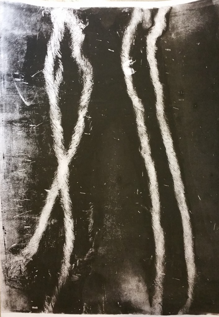
 

20150901_161358

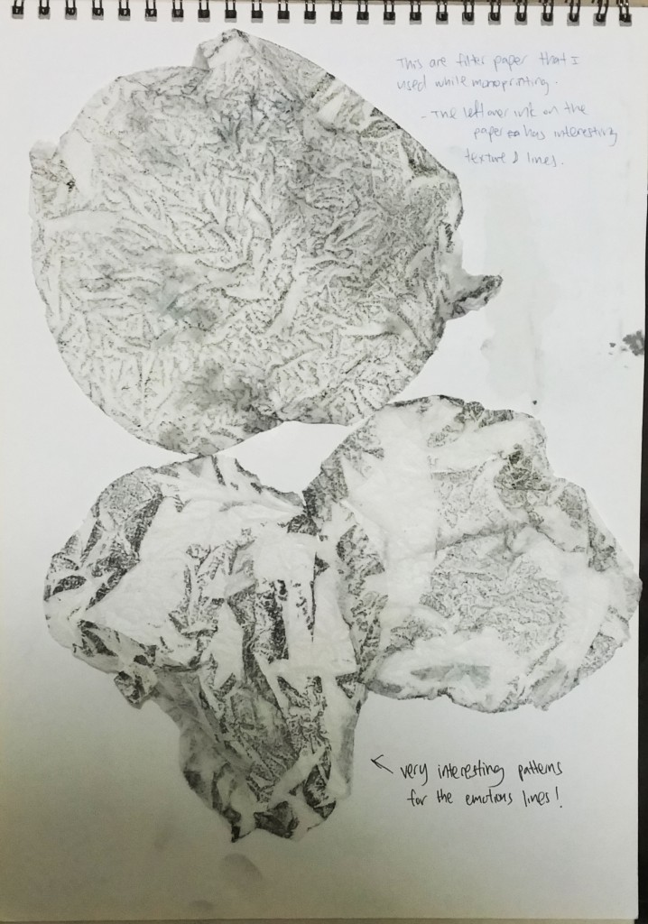
This idea was actually created by twisting and twirling kitchen towels and pressing them using the machine (inspired by Lipeng’s prints). I really like the mini textured lines that was printed too. And of course, i did not throw the kitchen towels away! They are valuable and they are printed with ink too!
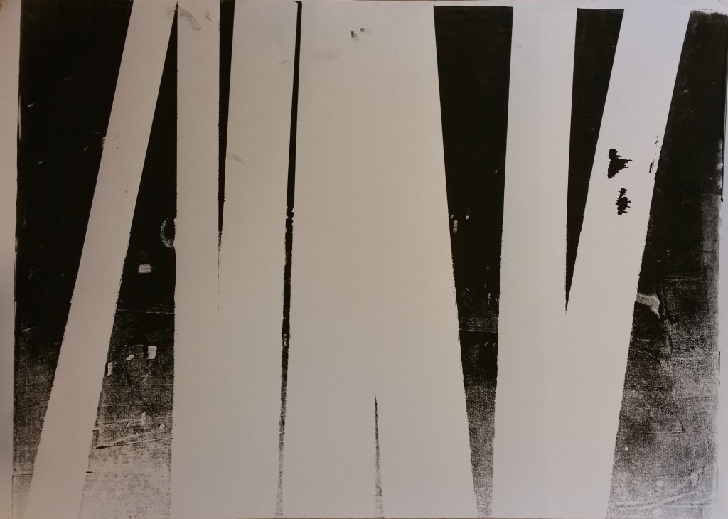
20150901_161421

Masking tape creates great block out~ and very clear negative spaces
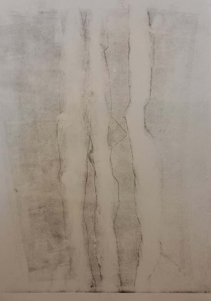
20150901_161555

reprinting of the same tissues?paper?
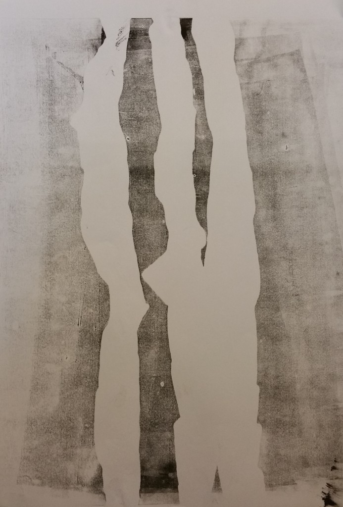
20150901_161540

20150901_161630

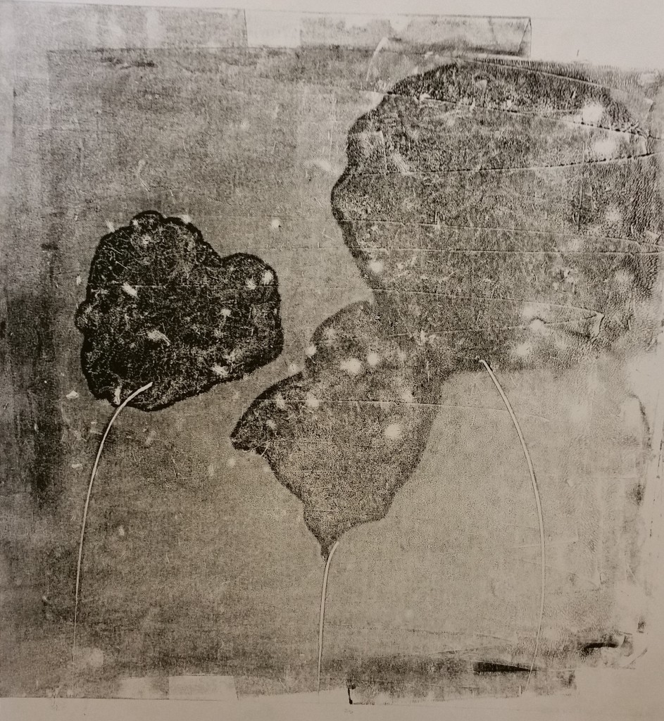
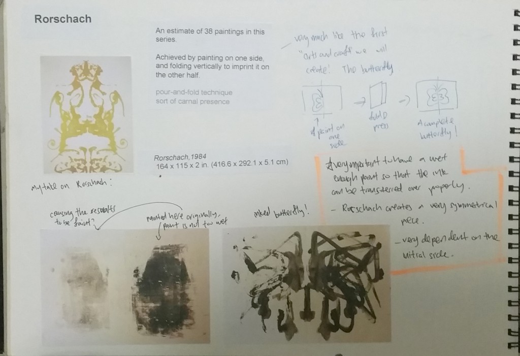
I used the roller and pressed some ink on one side of the paper. Was thinking of trying out Rorschach Technique, folded the paper into half and this was what it created. It didnt have the same value because the ink has already been half dried? I suppose i will need a wet ink to create that
20150901_161649

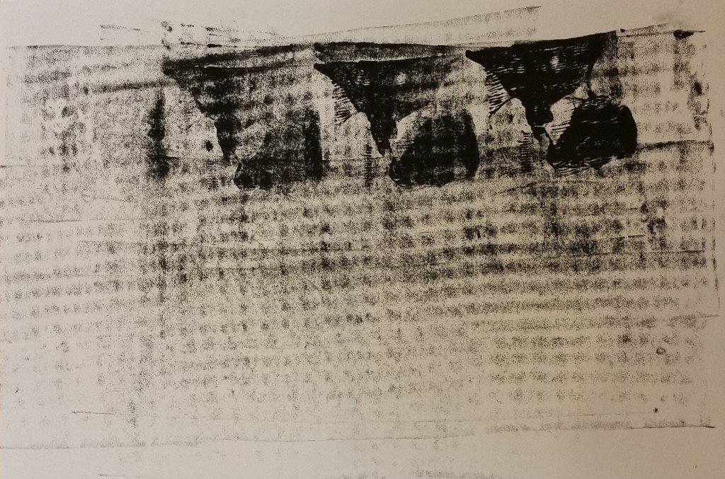
usually we will only think of using pencil with brass rubbing techinique, however i had this checkered cloth, and was wondering if it will work with ink too? And indeed it did!
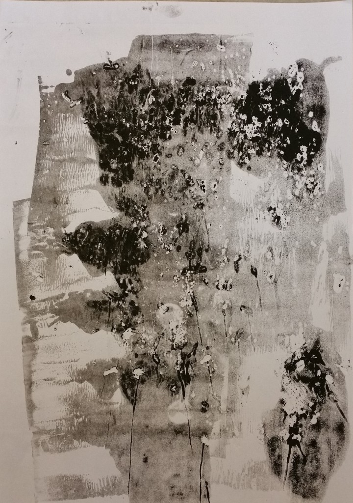
20150901_161736

This was probably done with tea leaves~
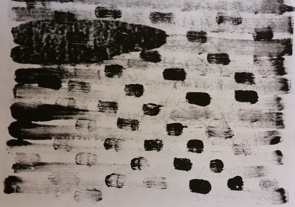
20150901_161810

I was just drawing and splashing ink on the plate itself directly
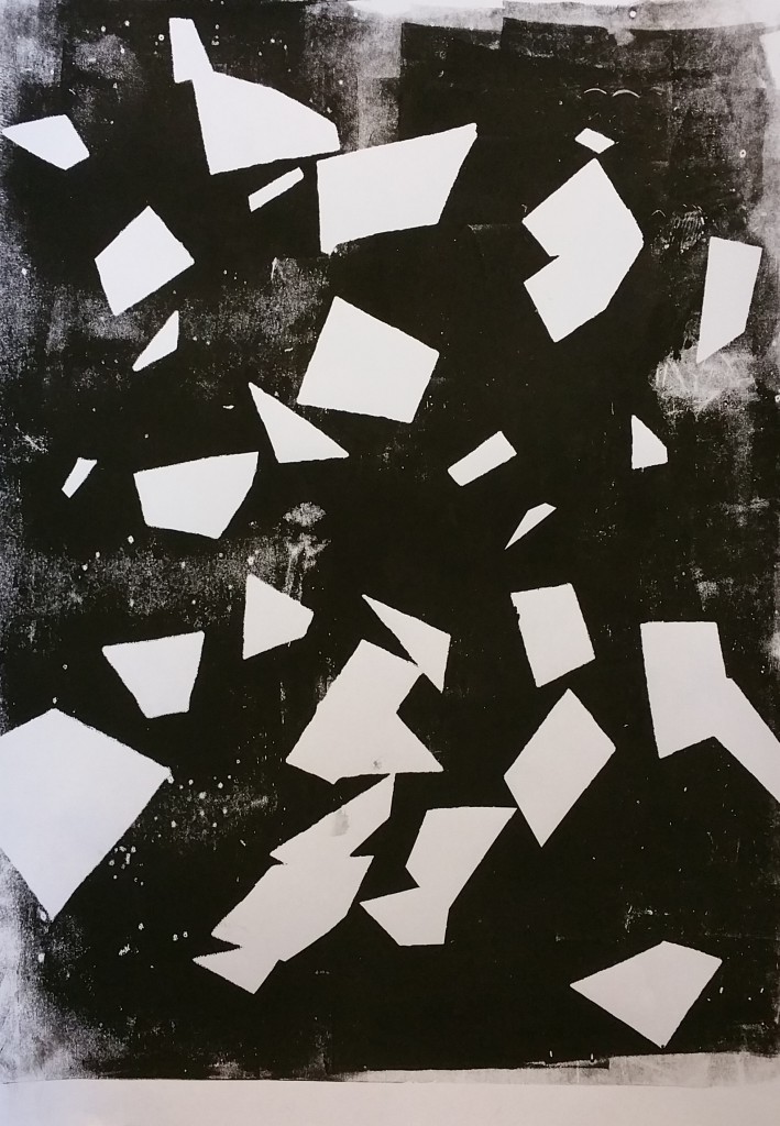
20150901_161838

The papers used here came really useful during my creation of lines XD
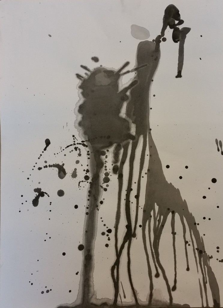
20150901_161905

SPLATTER!! and letting ink drip. One of the more natural way to see how ink flows~ It kinda look like a giraffe with a tree isnt it ww
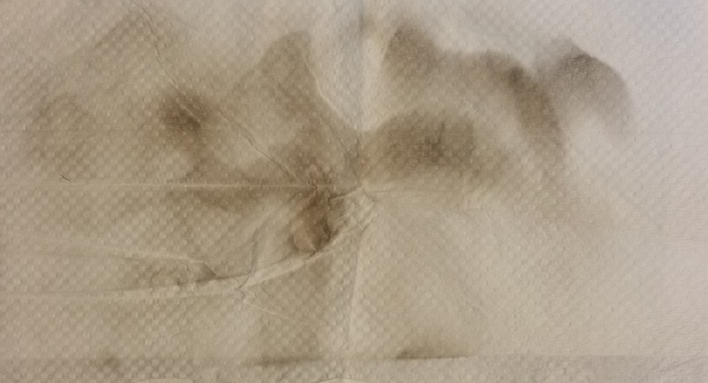
20150901_161921

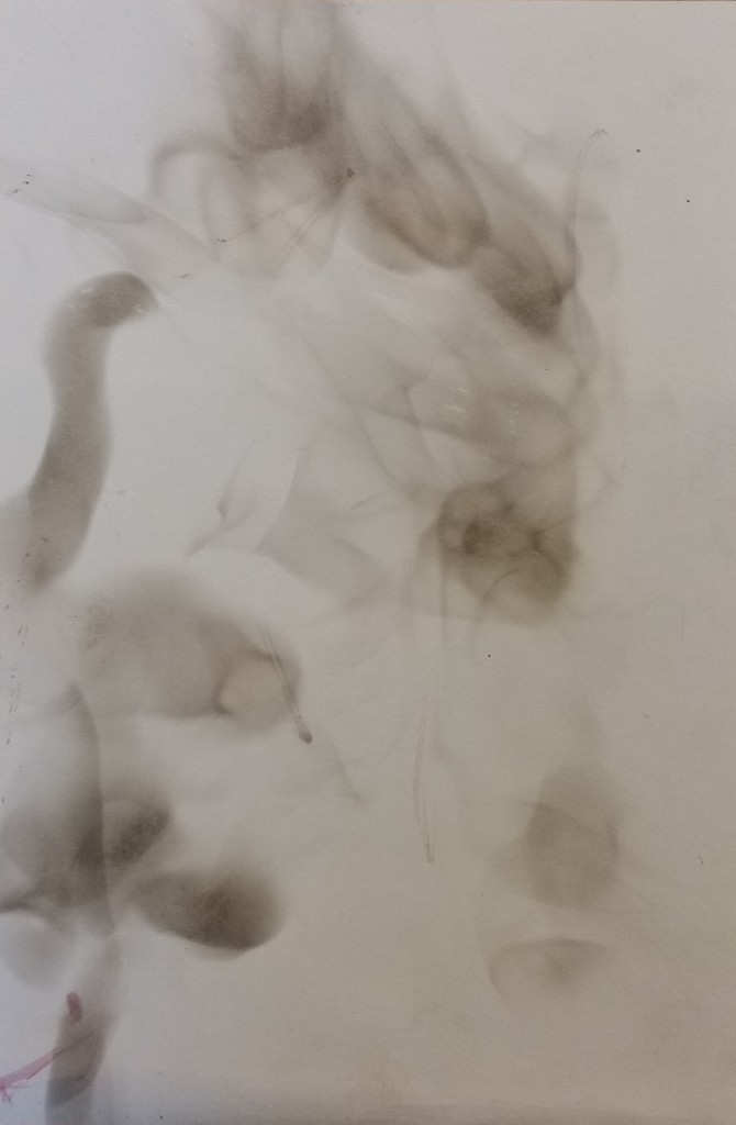
FUMAGE ON PAPER TOWEL! it was easier to get marks on here..maybe because its thinner? however it is easier to “brown” the surface too
20150901_161932

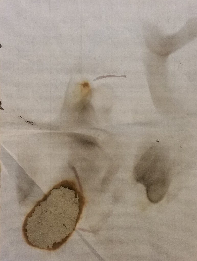
FUMAGEEE on drawing paper. I really like doing this ^^
20150901_161946

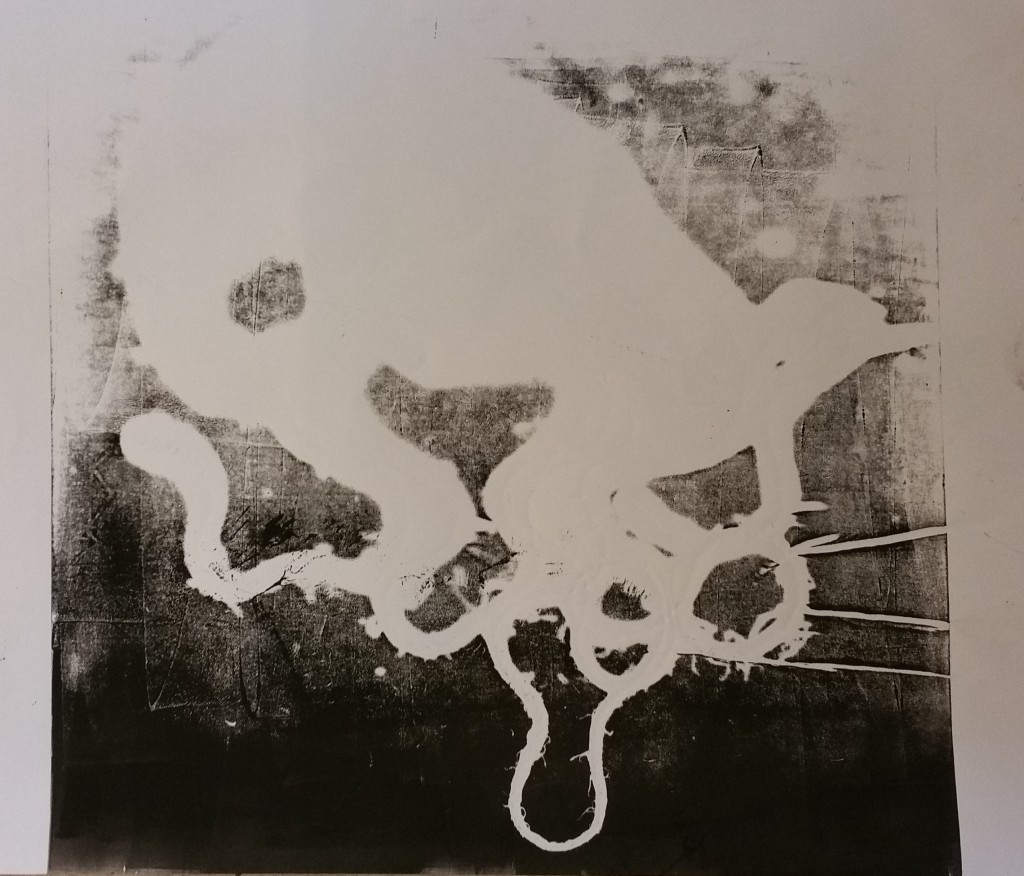
Fumage on chinese rice paper. Due to the super thin paper, it got burnt easily
20150901_162021

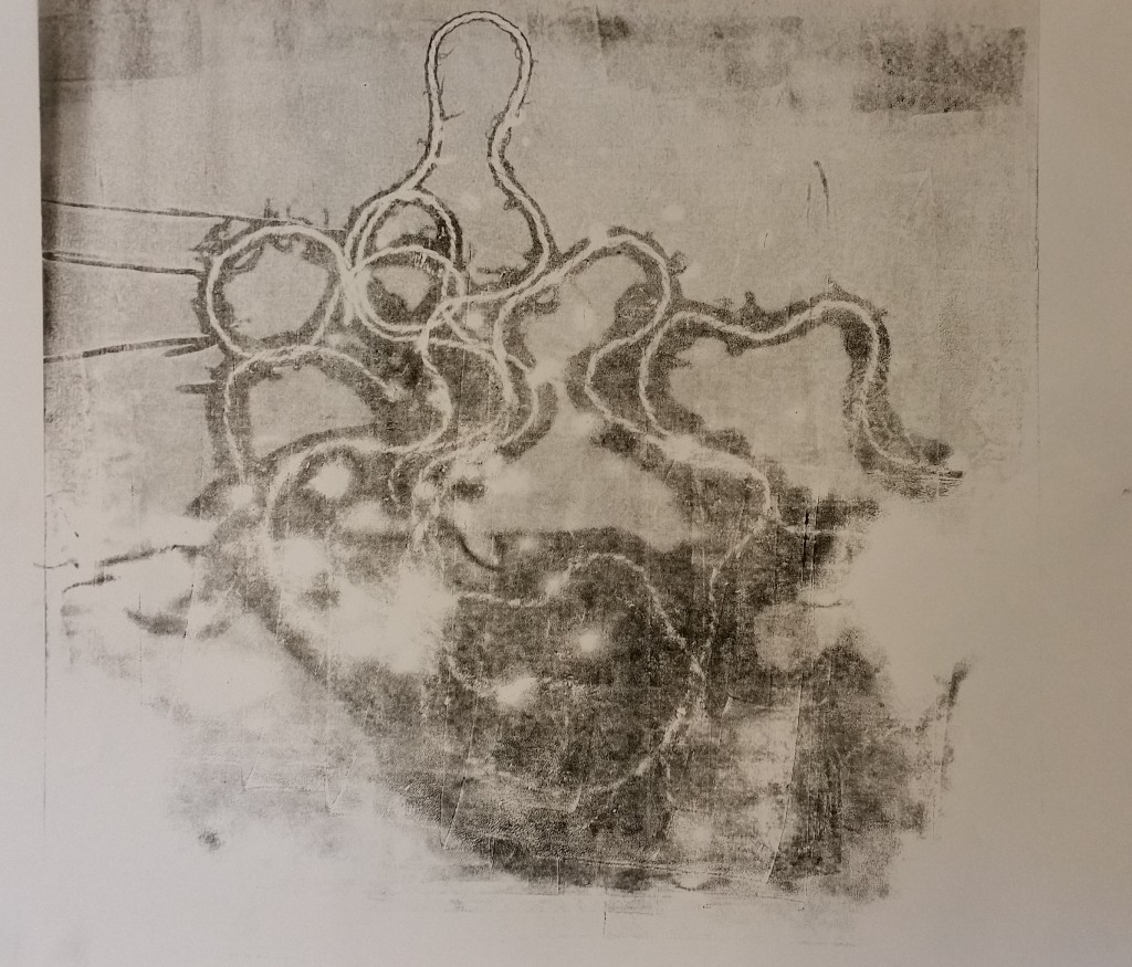
Strings and ink. look at those furry ends. i love them
20150901_162056

Reprint with clearer details

20150901_162210

Mini Flowers?ww

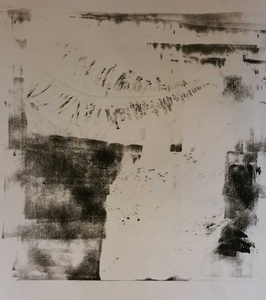
20150901_162219

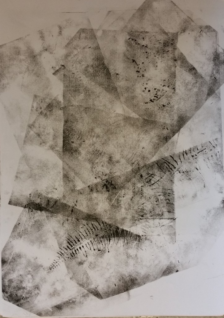
The patterns created by this fern is really unique <3
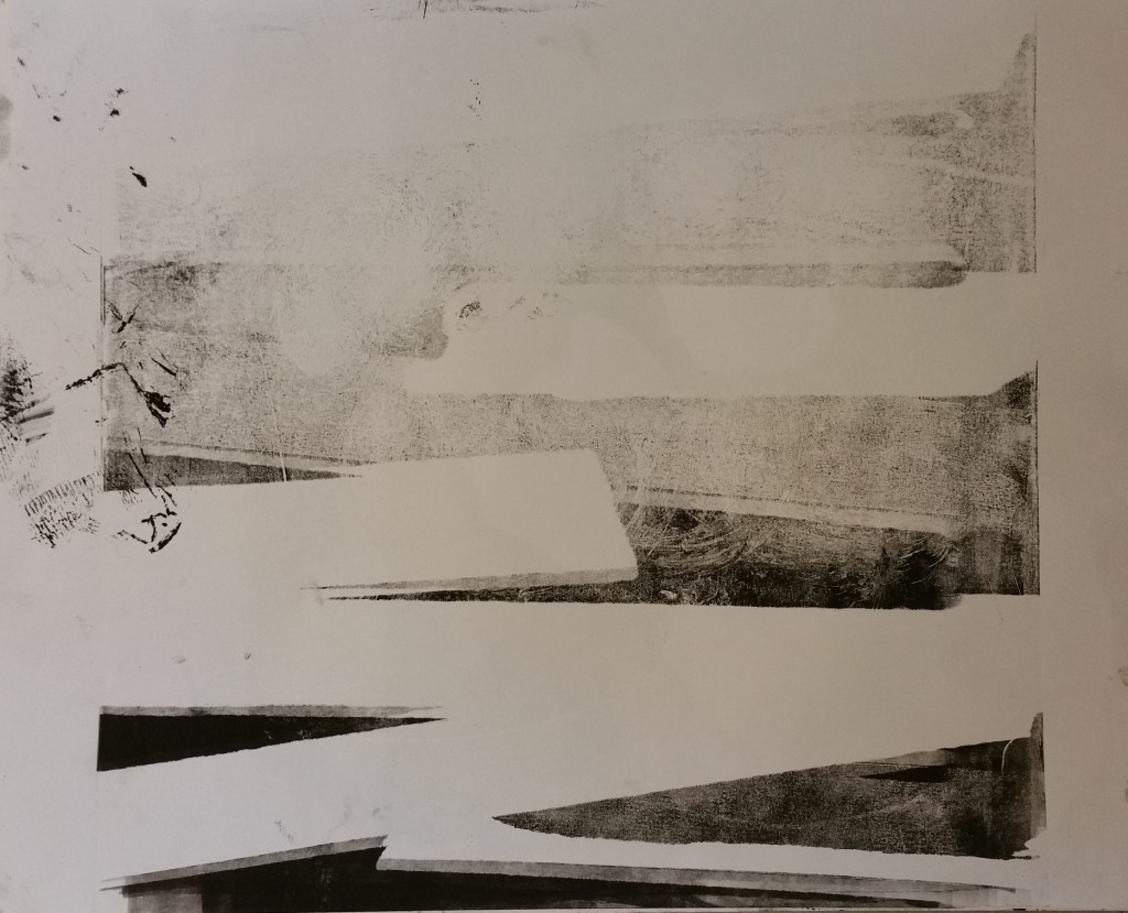
20150901_162245

They look like they are drawn by a almost dried flat tip marker
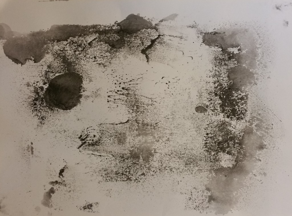
20150901_162259

double print on one surface~loved that “shadow”/depth effect created with each tape
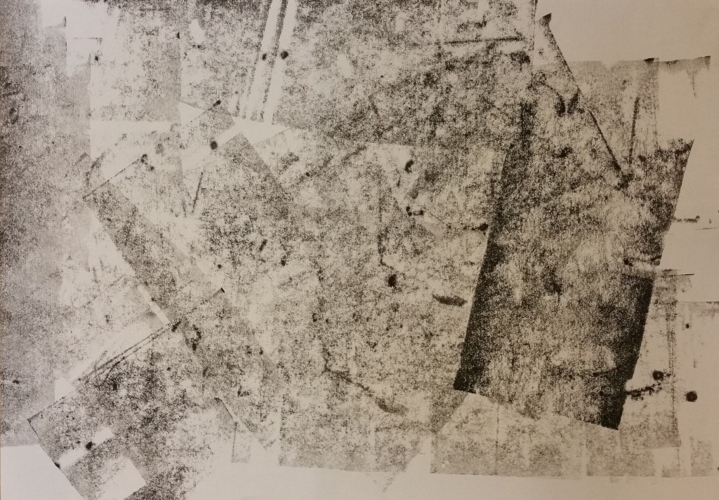
20150901_161144-min

This was another one created with spraying and “cleaning” the table
20150901_161703-min

Rolling the roller multiple times on different paper creates a different texture

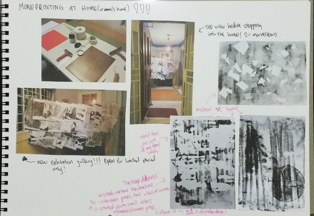
This is a gallery of automated techniques and monoprints that i did earlier! As they are all in A3 size, i wont be able to put much of the original prints in my sketchbook and it would be a waste to not document these.