
Indonesian/Malay-themed front page.

So many buildings called “Bugis”. Who are they?

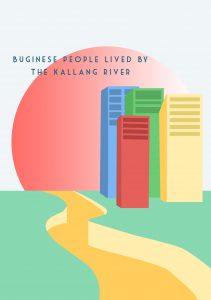
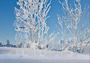
Buginese lived by the Kallang River.

The came to Singapore through the Java Sea.

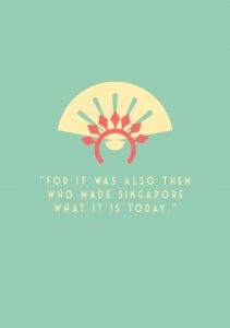
Let’s thank them too, shall we?

Indonesian/Malay-themed front page.
So many buildings called “Bugis”. Who are they?
Buginese lived by the Kallang River.
The came to Singapore through the Java Sea.
Let’s thank them too, shall we?

In this project, we were required to make a zine about a place we were allocated to. For me, I was allocated to – BUGIS.
As we all know, Bugis is mostly known as a famous shopping place AND for the food cafes. But I find that it’s too cliche to talk about the modern stuff of Bugis. Instead, I decided to make my zine more about the history of it. Not much people know that Bugis is actually a race in Indonesia and Singapore.
My initial idea was to follow the concept of old newspapers to show that it is of history content.

Old Malaysian Newspaper

However, when shown for consultation, comments were given that it was not graphic enough. I was told to rethink about my idea and try to focus more on flat design concept.
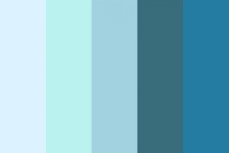
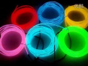
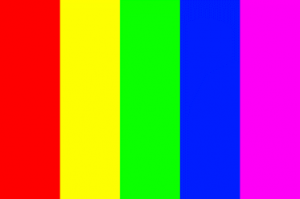
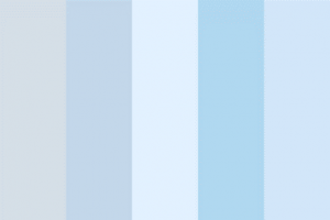
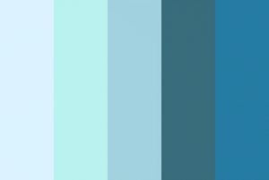
While brainstorming, I decided to start with having a fixed color palette as to make it very contrasting.
I came up with these designs.

Page 1
Comments: The borders are not of Malay/Indonesian design. And try to make an interesting heading instead of the name “Bugis” only.

Page 2 and 3
Comments: All the buildings are fighting for attention and the composition looks very cluttered and cramped together. Instead of focusing on 3D/Perspective imaging, try to focus on flat front view designs of the buildings.

Page 4 and 5
Comments: The sudden separation between the 2 pages seem awkward. Try to combine both pages together and have a fix color scheme. The ocean doesn’t have to be blue and the continents doesn’t have to be green, you can play around with colors.
Page 6
Comments: It doesn’t show that Buginese people lived by the Kallang River. Do they live in the building above? Try to add in a kampung to the image to show that they lived in kampungs on the river.
Page 8
—
Upon further improvement, I heed the advice and comments given and tried to further improve my composition. I’ve never really tried flat graphic designs before but I gave it a try. Here are the current improvements!

I added in the words “Niga Tau” which translates to “Who are” in Buginese language. I then changed the borders to something more floral and malay-like which is the famous fan/flower windows found in most modern kampungs.
—


Urban Landscape in Flat Design – Ramcreativ
For this particular design, I decided to focus on a front perspective view of buildings with the name “Bugis” in it and make it as cartoonized as possible, while showing only the prominent elements for the buildings. Bugis Junction with the ship, Bugis Street with its red top cover and cross tiles and Bugis+ with the black and white building and the red-green-yellow building which was once known as Iluma. I decided to follow the trendy flat design found of front perspective view.
—

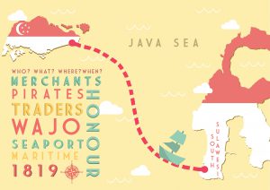
Final!
From the previous design I did of this composition, I’ve decided to combine both elements together and create it into a single A4 page. I included both countries and created a route from Singapore to Indonesia and vice versa (as they are constantly travelling). I then added in texts descriptions about the Buginese people. Comments given was that it was too loud since it was placed in the middle and too large till the rest of my elements were drowning behind it. And the words on the countries were blending in with the other fonts which made it too confusing when reading.
Thus, I decided to use the country colours and fill in the continents (coincidence that both of the countries uses the same colour, phew!) I also reduced the description about the Buginese people and placed it on the bottom left to make it less obvious.
While presenting, comments were given that the description was too blocky and squarish as compared the the free-shaped route drawn to show the movement of the Buginese people. If I were to make the blocky words more freestyled/shaped, it could be better.
—

For this piece, I decided to show that the Buginese people lived by the Kallang River and in sea kampungs. I used a 2-colour palette to show this composition. Using a front view of the kampung, I placed it above a yellow sea. In the white sky, I added in green clouds and also a original-yellow sun.
—
For the back page, I made it as simple as possible with minimal wordings, “For it was also them who made Singapore what it is today”. This is to reiterate that Buginese people were one of the first few to contribute to the upbringing of Singapore but they are so underrated. I added in the fan and the ever-so-popular Indonesian/Malay Sanggul (head-dress) and combined them together to form one icon.
—
All in all, I really enjoyed this project. It allowed me to experiment on things that I was not comfortable with in the beginning. It was a challenge for me which I gladly took up as I am more of a 3D-kind of person as compared to flat designs. I am quite pleased with the end product and it was a $6.40 well-spent, hehe.


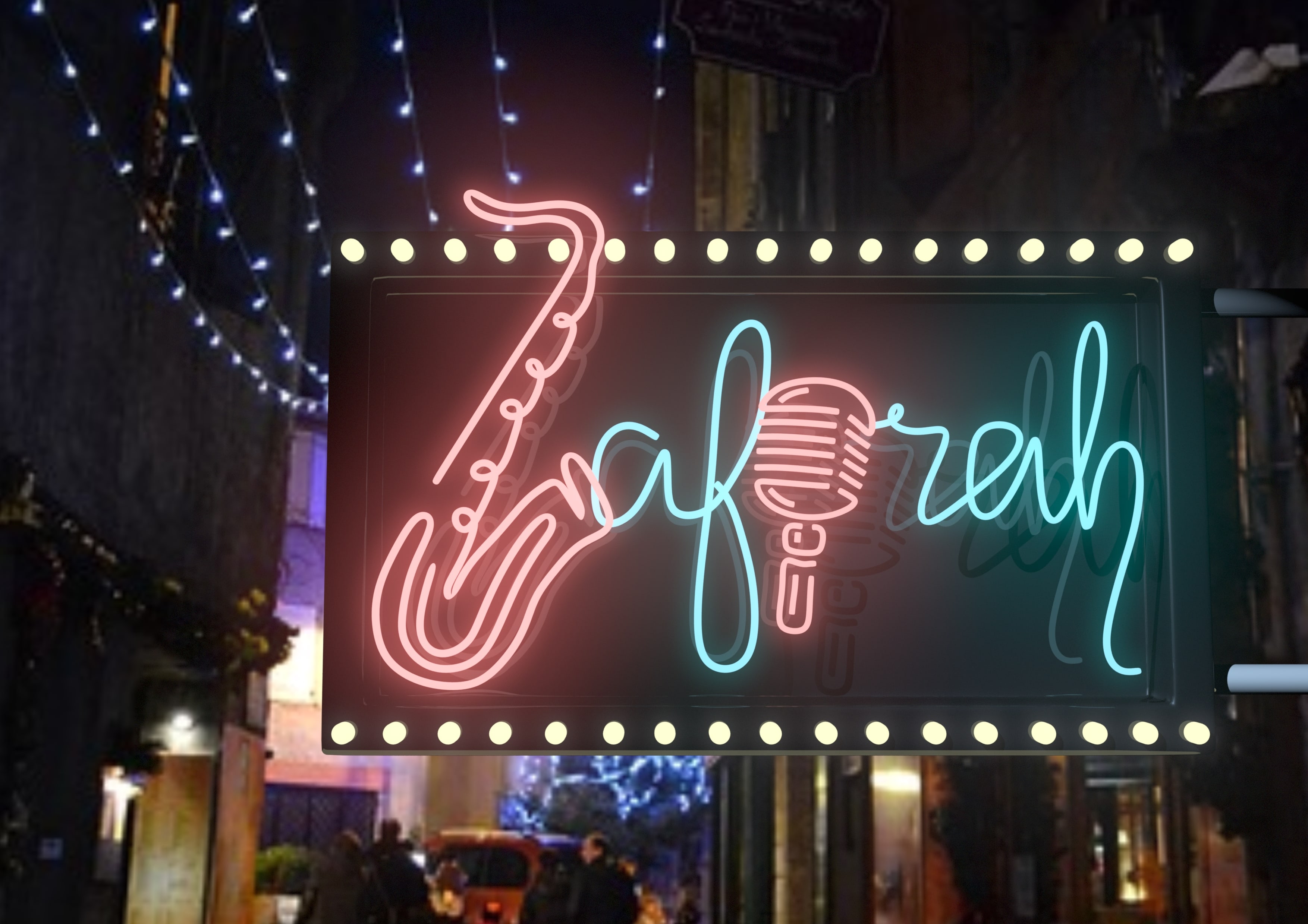
My name is Zafirah and I am a Jazz Player.

My name is Zafirah and I am a Preschool Teacher.

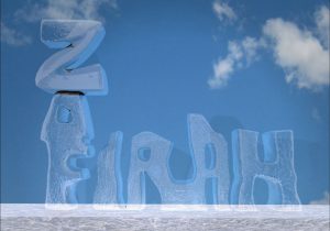
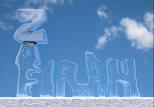
My name is Zafirah and I am an Ice Sculptor.

My name is Zafirah and I am an Engineer.


ICE SCULPTOR (80%)
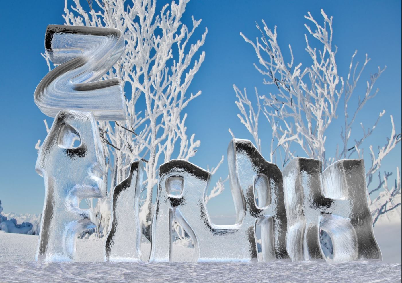
I managed to find the proper ice texture. The object was made with a blinn (shiny and reflective) material. I changed the attributes of it, playing around with the refractive index so that the ice will be transparent but at the same time, refracting the background and lights. I added in bump map, which sole purpose is to create realistic texture but it is actually a flat image pasted on top of the blinn material.
I changed the background to something with more detail so that the refraction can be seen clearly in the ice.
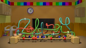
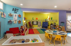
PRESCHOOL TEACHER (80%)
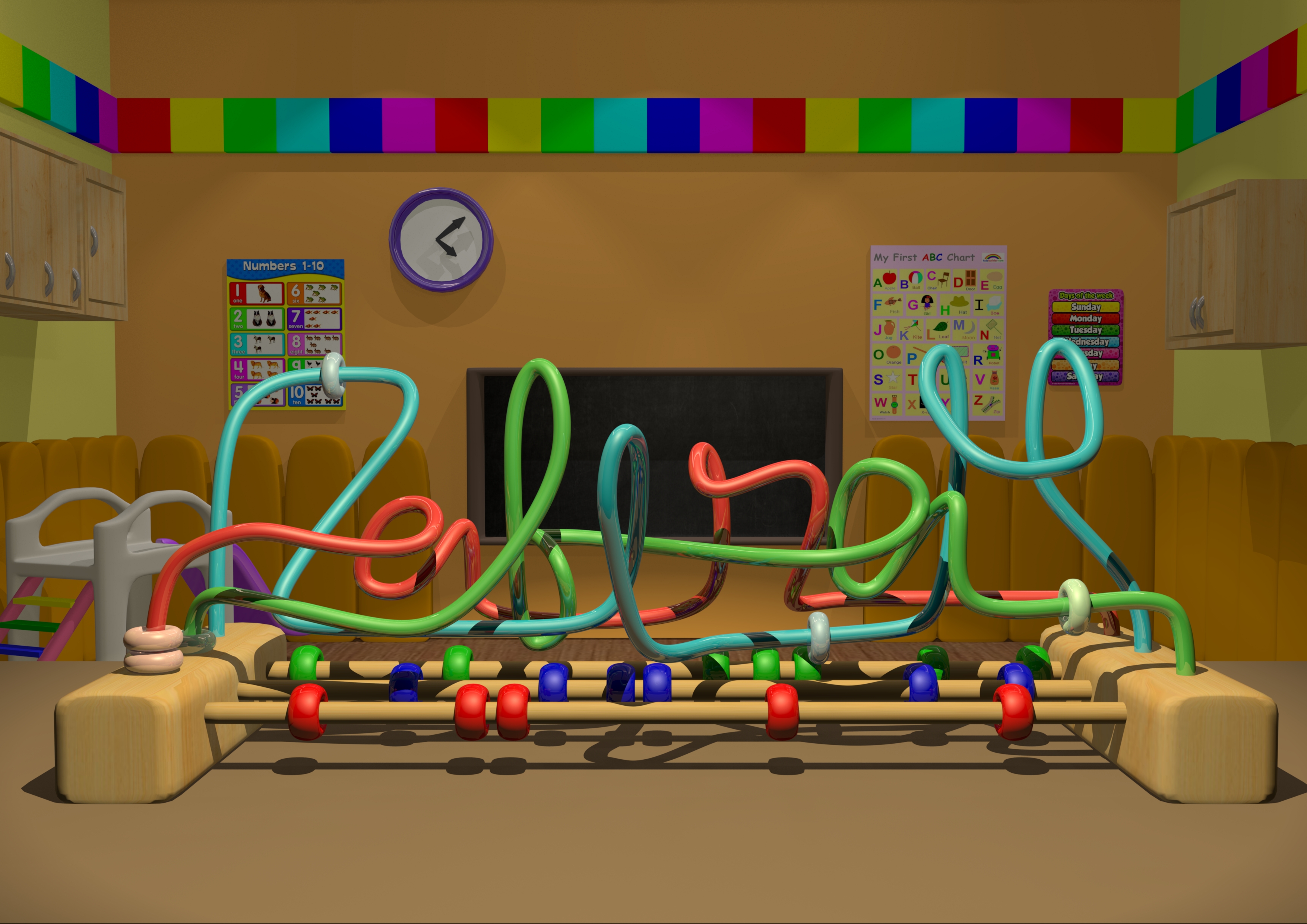
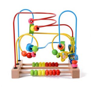
I’ve decided to submit this 80% piece and then focus on improving the typography later on. I made use of the colourful scheme to make it look like a preschool classroom. Preschool are mostly filled with babies and toddlers. Their toys are mostly for educational purposes. I’ve decided to use this particular toy as there’s more freedom to create free-form shapes using the metal rods.
JAZZ MUSICIAN
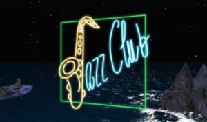
I’ve decided to go with the outdoor scene as it looks more realistic. People would see this outside the club before proceeding inside. I changed the letter “Z” to a saxophone and the letter “I” to a microphone. I made the rest of the letters cursive to give it an informal and casual feeling. I feel that it’s quite easy to see that I am a jazz musician/singer due to the saxophone and microphone. And also the mini light bulbs surrounding the signboard.
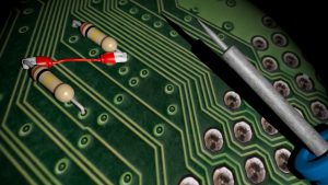
ENGINEER (CIRCUIT BOARD)
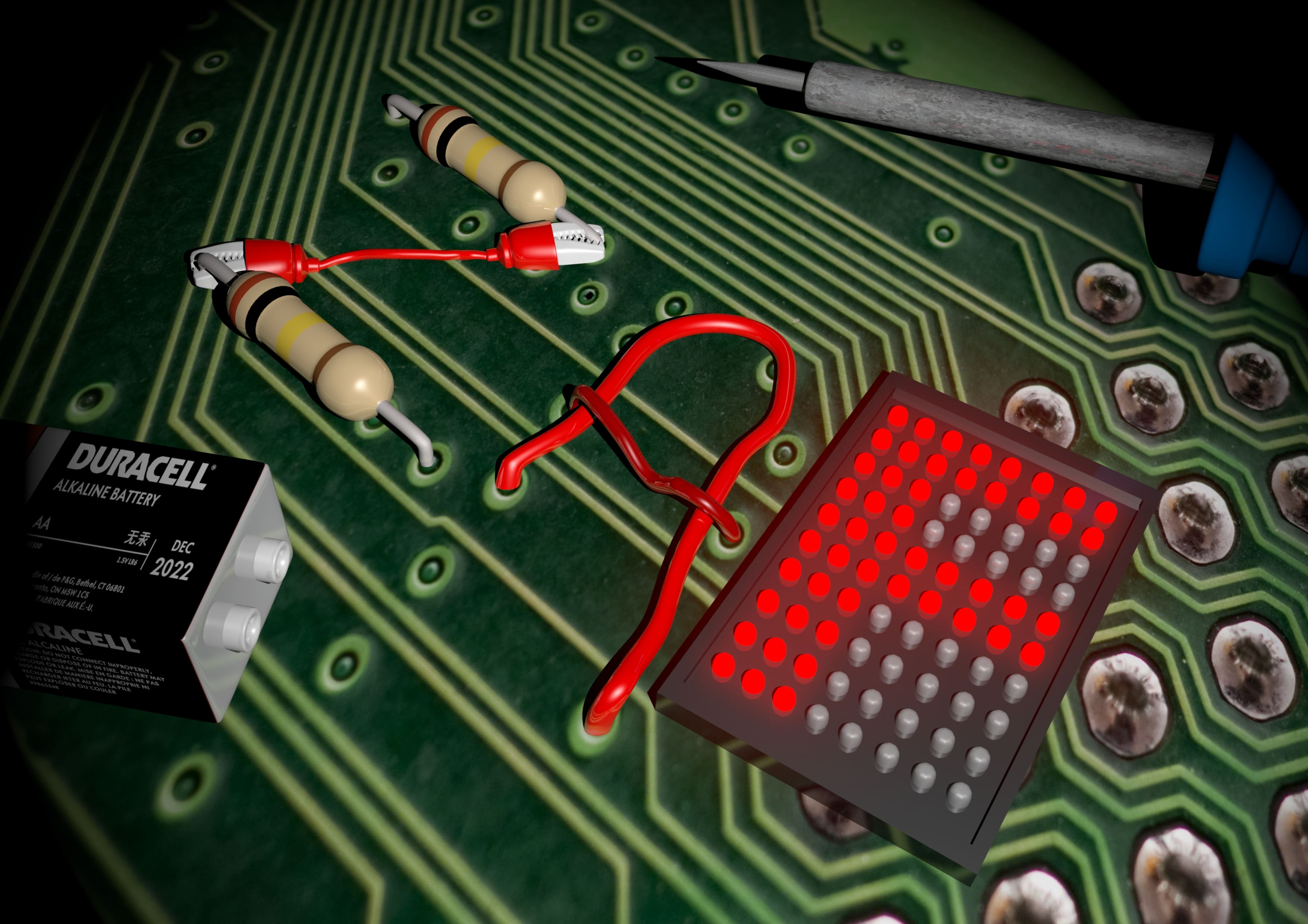
This is the final outcome. I’ve combined various electrical components to create my name. I’ve used resistors and a crocodile-teeth wire for the letter “Z”, wires for the letter “A” and finally, an LED light board for “F”. I’ve decided to use my nickname “Zaf” instead of my full name. I thought of changing the wires for the letter “A” to a blue-coloured wire but decided it didn’t compliment the colours of the other 2 components as both of them are red in colour. I decided to use 2 different tones of red for the letter “A” to create a contrast. Props such as soldering iron and battery are placed around the name to show that I was working on the circuit board.
This project has allowed me to explore various ways of creating names in a unique manner. I have to say that I really enjoyed myself doing this project. Totally worth staying up till 5am everyday to complete this work *smiley face* I’ve decided to use Maya 2016 as the main medium for this particular project. I am still finding ways to improve myself. I have a feeling I’ll be more of a 3D graphic designer rather than a 2D for most of my work but I will try to explore different mediums more and step out from my comfort zone.
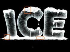
ICE SCULPTOR
For this particular piece, the main problem I had was to get the right amount of texture and composition to bring out the best from it. I started out with having a basic font and played around until I got the right texture.
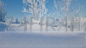
The top image has a specific spotlight pointing directly at it. Thus, the bright shine omitted from the reflection of the ice. Where as the bottom image has a more realistic feel to it. I have decided to go with the bottom texture. But after consulting, I received comments that the font used was too simple and to play around with the placement of the letters. Upon further exploration and modeling, I came up with the piece below.
The first image was horrible. I forgot what the settings were for the ice texture. Thus, the outcome. Light was pointed towards it which makes it almost invisible. I removed the spotlight and replaced it with an ambient light instead. Thus, the result in the second image. The ice texture didn’t come out that much too. I realized that there was something wrong with the settings and attributes of the texture applied. I went back to Youtube to find the tutorial and realized I left out one major step which made made such major difference. The third image came out but I realized the background didn’t bring out much of the ice texture. I decided to edit the background further and the final outcome will be revealed in another post.
PRESCHOOL TEACHER
For this concept, I decided to make it as bright and colourful as possible but still maintaining my name to be legible.
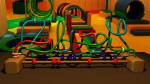
However, after consultation for this piece, comments were given that the background and foreground had too much contrast. It was illegible in beginning and suggestions were given to make the background more subtle/darker while making the name brighter and center of attraction.
I modelled the background from scratch and decided to give it a more preschool classroom feel rather than the play-tent kind of background.
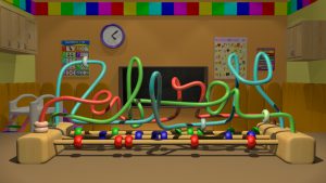
I decided the walls in the top image was a bit tad too plain so I added in some educational posters to make the classroom look more like a preschool classroom.
After showing this to my friends, they said they liked it but I could do something about the fonts. The ending of my name was a little bit hard for them to read. I used cursive fonts but the lowercase alphabets are all of different sizes. This makes it hard to read and differentiate which one of the letters are of upper case or lower case. One of my friends told me to refer to font proportion online and see the difference between an uppercase and lowercase.
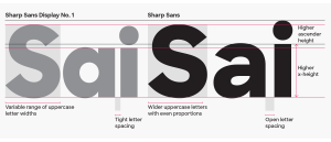
https://c1.staticflickr.com/9/8707/28400030326_6314874581_o.png
I should change it but I’ll submit the 80% first. Hehe.
JAZZ MUSICIAN
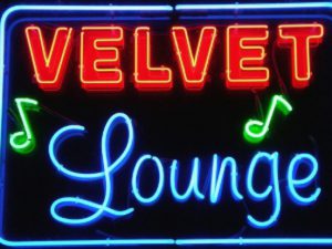
When I hear the word “Jazz”, the first thing that came to my mind was a dark and gloomy place filled with good music and one of the important factor, NEON LIGHTS. I decided to make use of the neon lights to make a Jazz signage and portray that I am somewhat the jazz musician for the night.
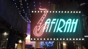
I used the letter “Z” in my name and edit it to look like a saxophone as it’s the major instrument in Jazz. After consultation, I was told that the “afirah” was too fixed and constant. I could make further improvement and make it look more cursive.
I came up with 2 different backgrounds. One of the signage was hung outside the jazz club whereas the other one was hung against a brick wall in the club.
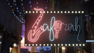
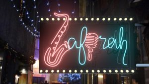

I’m contemplating whether to post the signage outside the club or the one against the brick wall for my final project.
ENGINEER (CIRCUIT BOARD)
I had a history of being a Design and Technology student. So I thought I could infuse my knowledge and my design together for this particular composition.
I started out with the basic empty circuit board as the base.
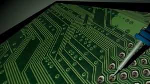
I started adding in components to create my name. I’ve decided to create my nickname “Zaf” as it is shorter than “Zafirah”. I added in resistors, wires and LED lights to create my name. The soldering iron at the top and battery are placed there for props. I’ll be posting my final outcome on another post!
In this project, we’re required to focus on different various typography of our own and infuse it to an occupation. I’ve decided to choose the 4 different occupations.
PRESCHOOL TEACHER
JAZZ MUSICIAN
ICE SCULPTOR
ENGINEER (PRINTED CIRCUIT BOARD)
I’ve made some research and found trends amongst the different occupations.
PRESCHOOL TEACHER:


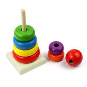
As you can mostly see, most of the things in a preschool classroom are mostly brightly-coloured and are of soft edges since babies/toddlers can’t be around sharp objects and toys. Since a preschool is mostly for babies and toddlers, their toys are mostly of educational purpose that trains their mind and movement.
JAZZ MUSICIAN:

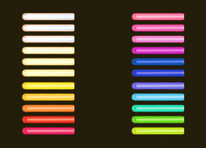
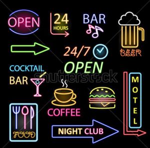
Most of the neon lights have a glow to them which makes it noticeable that it is a neon light and not just a regular light stick. The brighter it is, the stronger the neon light will be. Most of the fonts used in this are sans serif, smooth and informal. If there’s more than one word in the signage, multiple fonts are used so that it does not look too dull. As for the colours, they are mostly of primary colours such as blue, red, green, yellow, orange, purple and pink (this is an exception). Most fonts for Jazz clubs use blue colour and are of cursive San serif font for their signage.
ICE SCULPTOR:
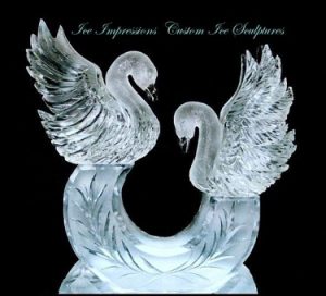
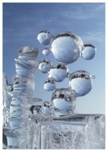
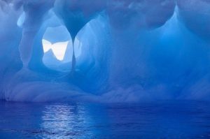
The colours used are mostly of cool tones, mainly of the blue shade. There’s different type of ice too. Some are transparent whereas some are frosted. The placement of elements for each ice sculpture are different too. Some are placed side by side whereby some are stacked on top of each other. The fonts used are mostly thick and bulky as thin ice chips away too easily. It will be a tedious job to find the proper texture for this but I will try my best.
ENGINEER (PRINTED CIRCUIT BOARD):
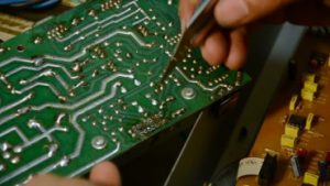
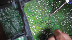
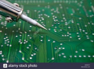
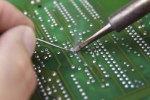
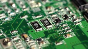
Soldering is very important in an engineer’s life. It is what keeps everything together in a electrical component. Electrical appliances such as phones and laptops require this important . I’m planning to use the different components such diodes, capacitors and resistors to add on to the typography. The main font will mostly be connections of wires and solderings. The colour used is mostly of green and metallic grey.
Let’s hope what I have in mind will be executed nicely!