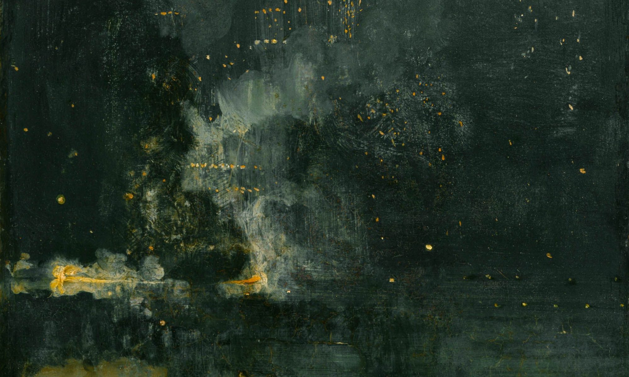
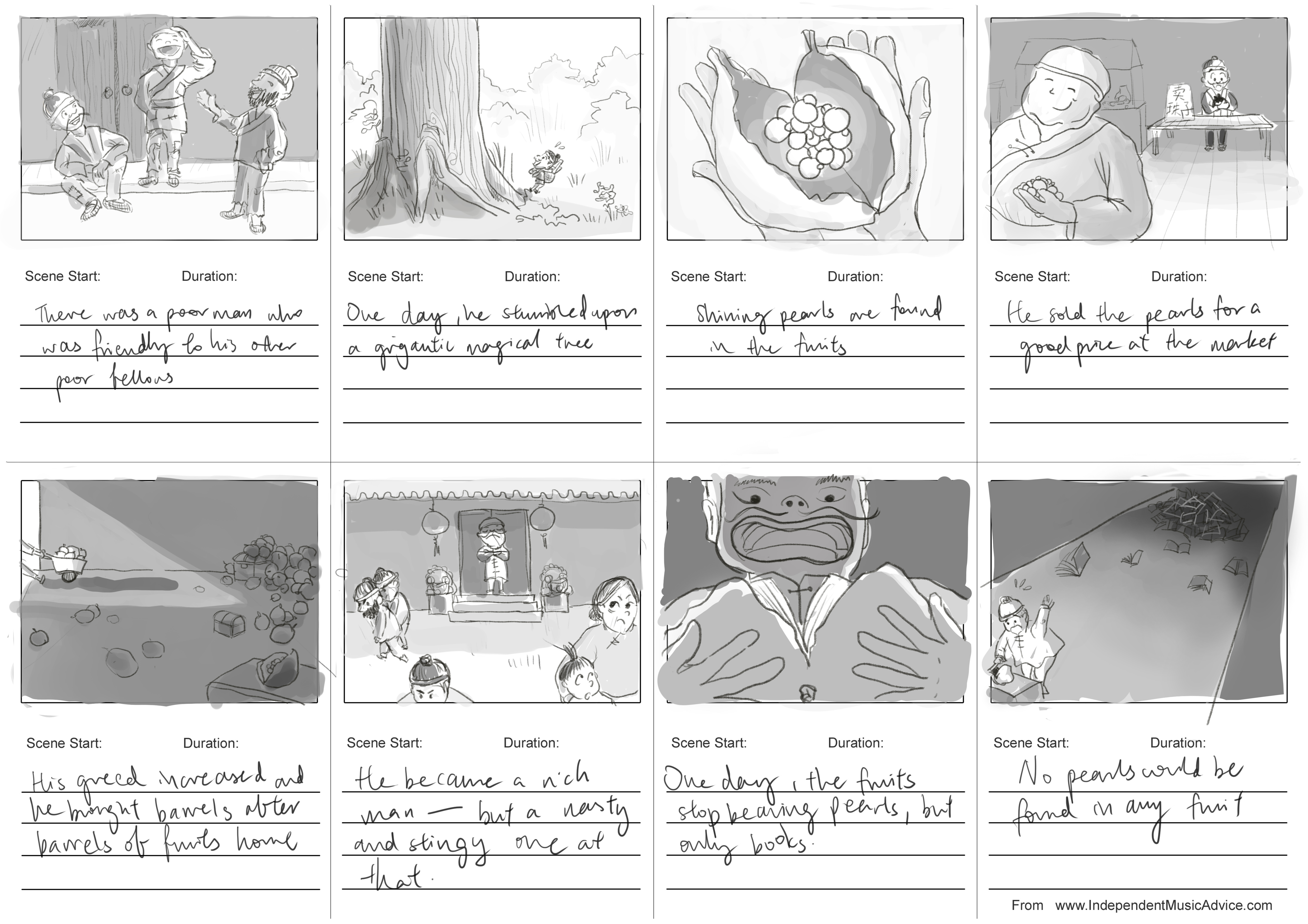
I have cleaned up my storyboards from last week’s submission and moved them over to digital media. The story is slightly shortened as well. I have used tone to differentiate the different stages of the story as well: brighter tones when he is kinder and poorer and darker tones when he became rich but nasty.
For this project, we were tasked to create our own movie campaign.
Film synopsis
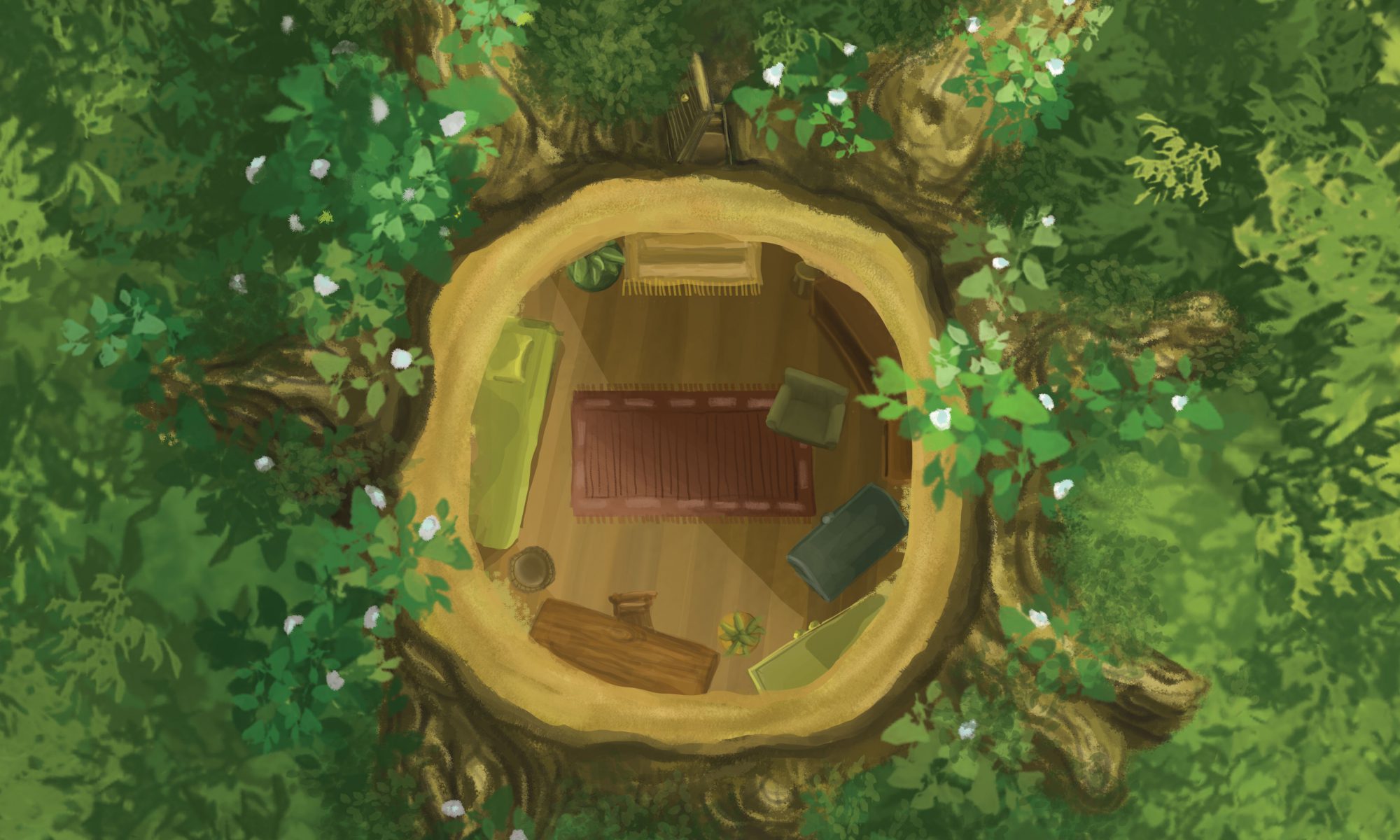
A tree spirit is displaced when his home — an mighty oak tree — was felled by humans. A moving adventure awaits him as he leaves his beloved home in search for a new shelter.
This story is inspired by a Thai belief that spirits inhibit trees, and that a ‘spirit house’ has to be built for the spirits when their trees are cut down. When I came across this fact, it prompted me to wonder what will happen if the spirit house isn’t built and the spirits have to search for their new homes.
Mood Board
Keeping in mind the fact “spirits” can be easily associated with ghost stories or haunted movies, I deliberately steered away from inducing such an effect by adopting bright and vibrant colours. As I intended the film to be of a fantasy and adventure genre that is suitable for kids to watch, I wanted the poster to convey a light-hearted mood while provokes curiosity. At the same time, with themes like deforestation in the movie, I was heading towards the exploration of environmentalism in the movie.
My main source of inspiration and colour study was Studio Ghibli films, in particular The Secret World of Arrietty. Studio Ghibli is renown for their visually-stunning images of nature and greenery. Their choice of colours and style are very much aligned with what I had in mind.
Compositions
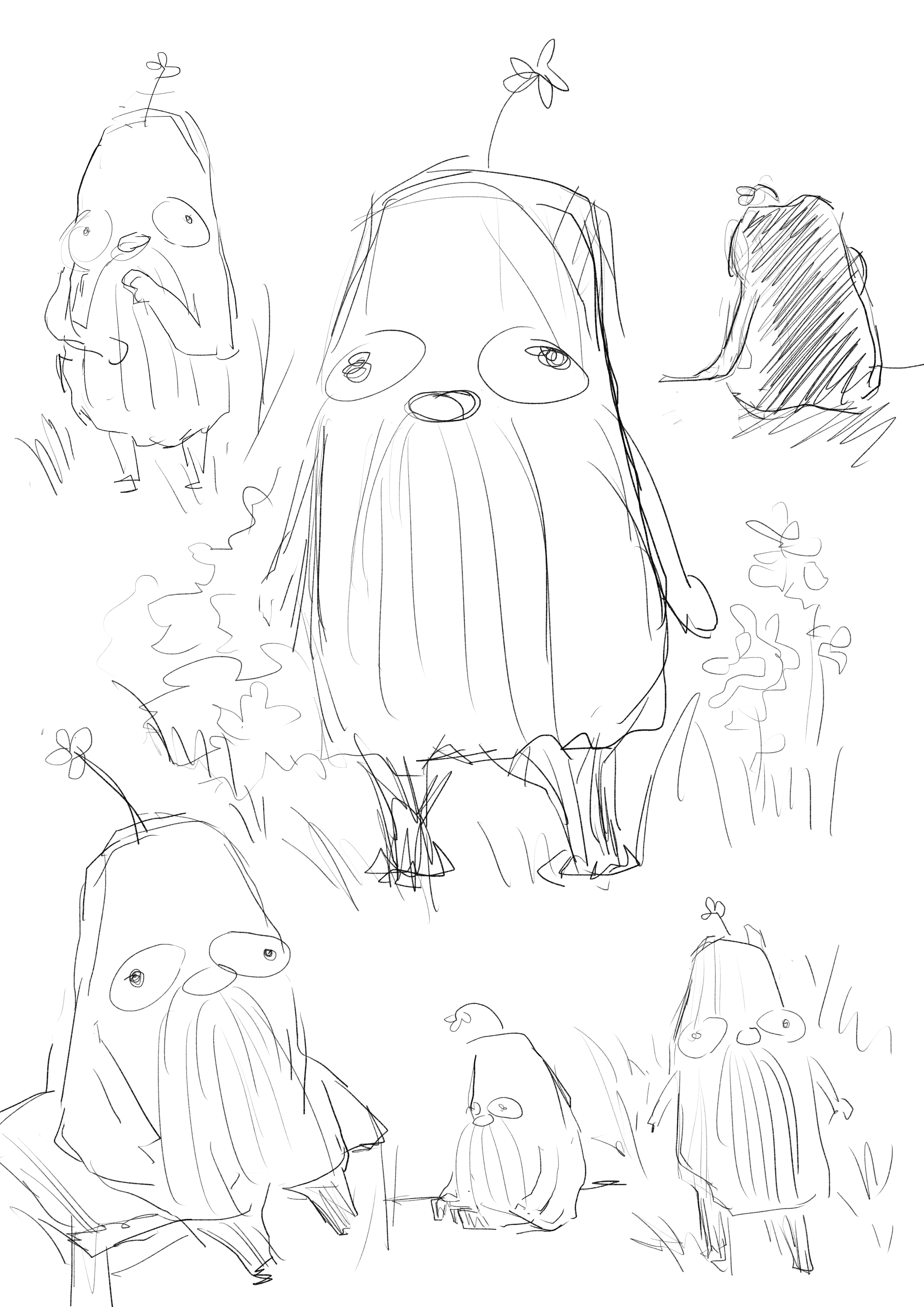
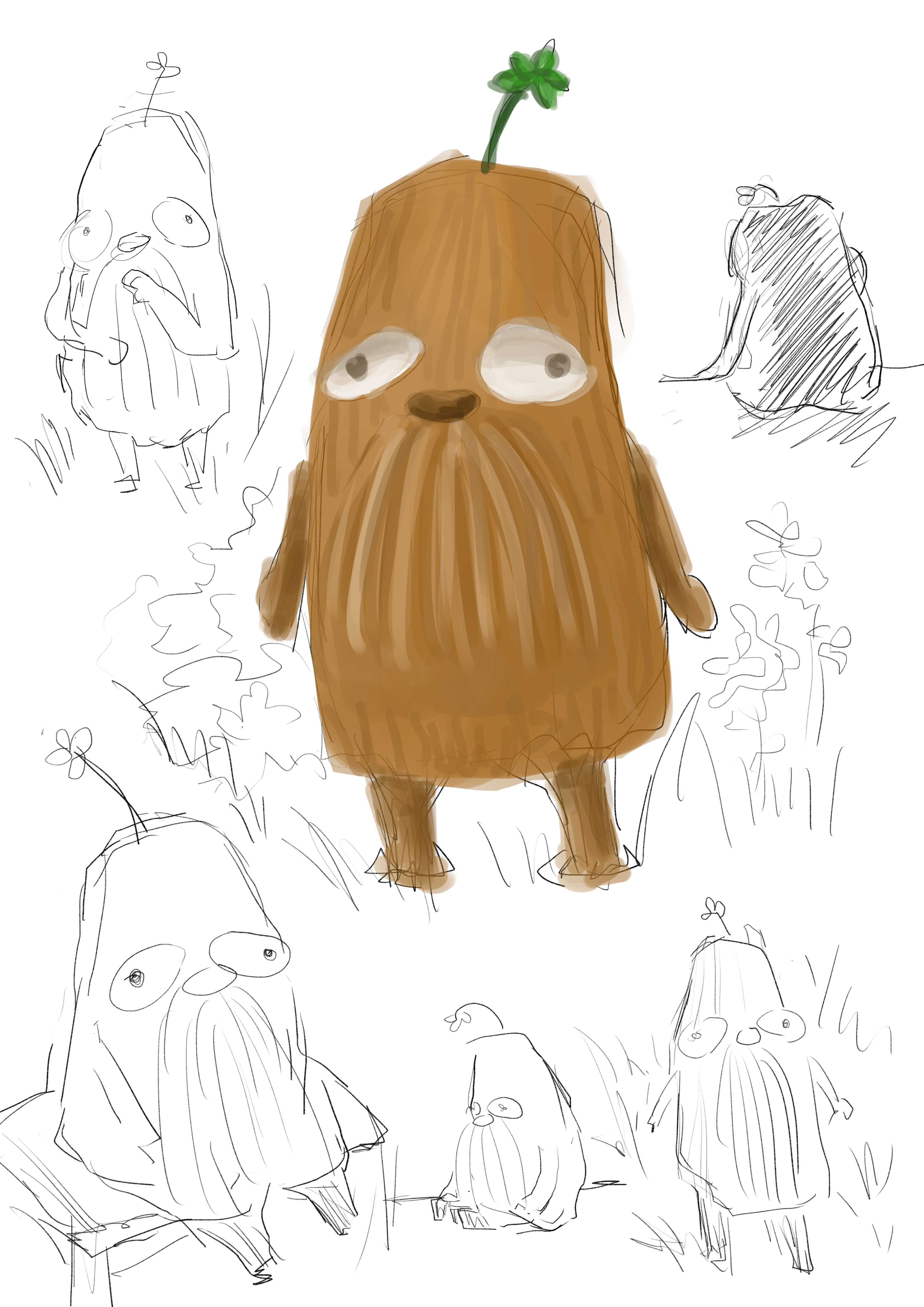
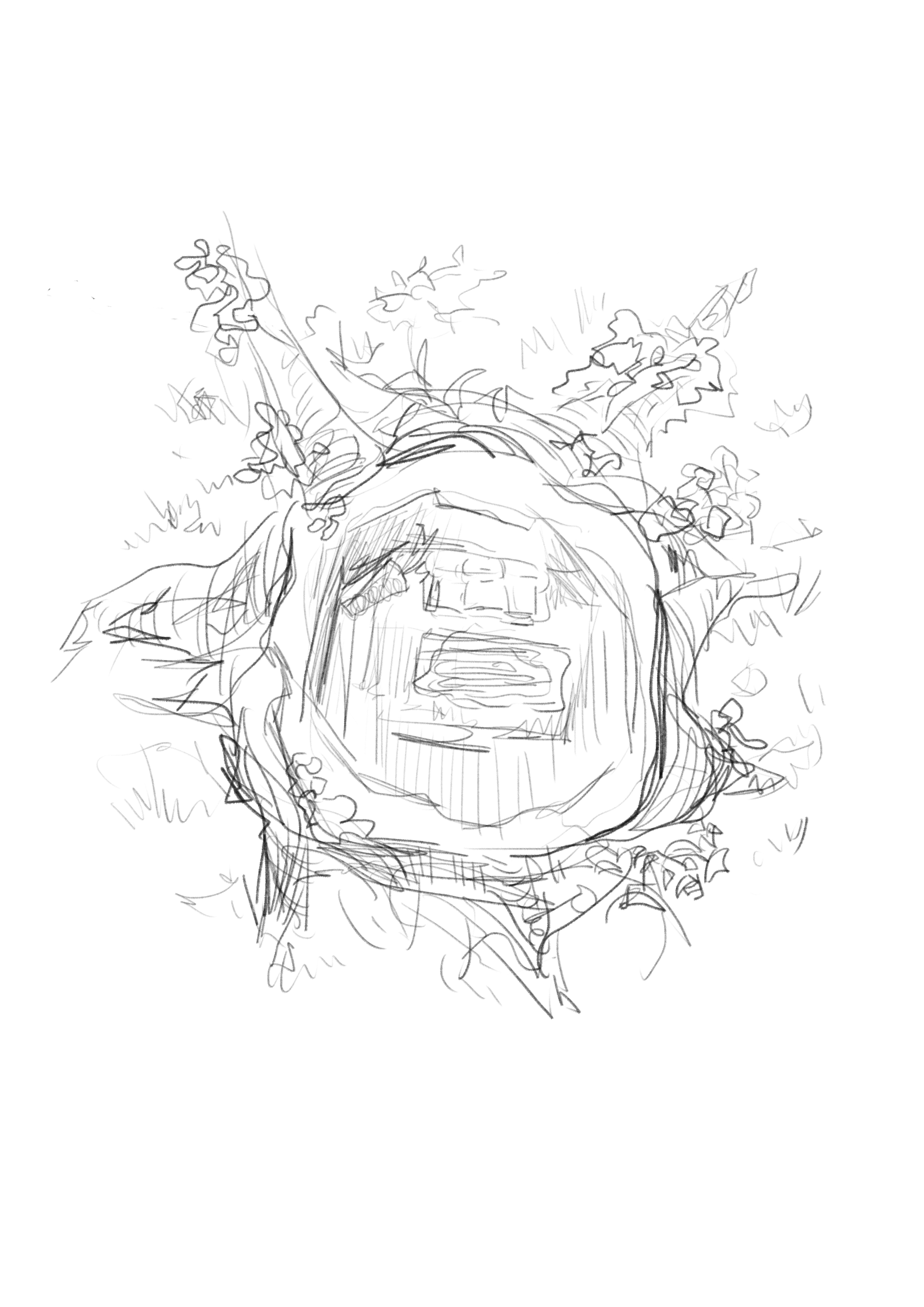
I did several sketches to brainstorm the design of the poster. Initially, I wanted to use the main character, i.e. the tree spirit, as the central focus and display it prominently on the movie poster. I tried several compositions that show that the spirit is miserable that is tree is cut down/ resolutely leaving its home to find a new place.
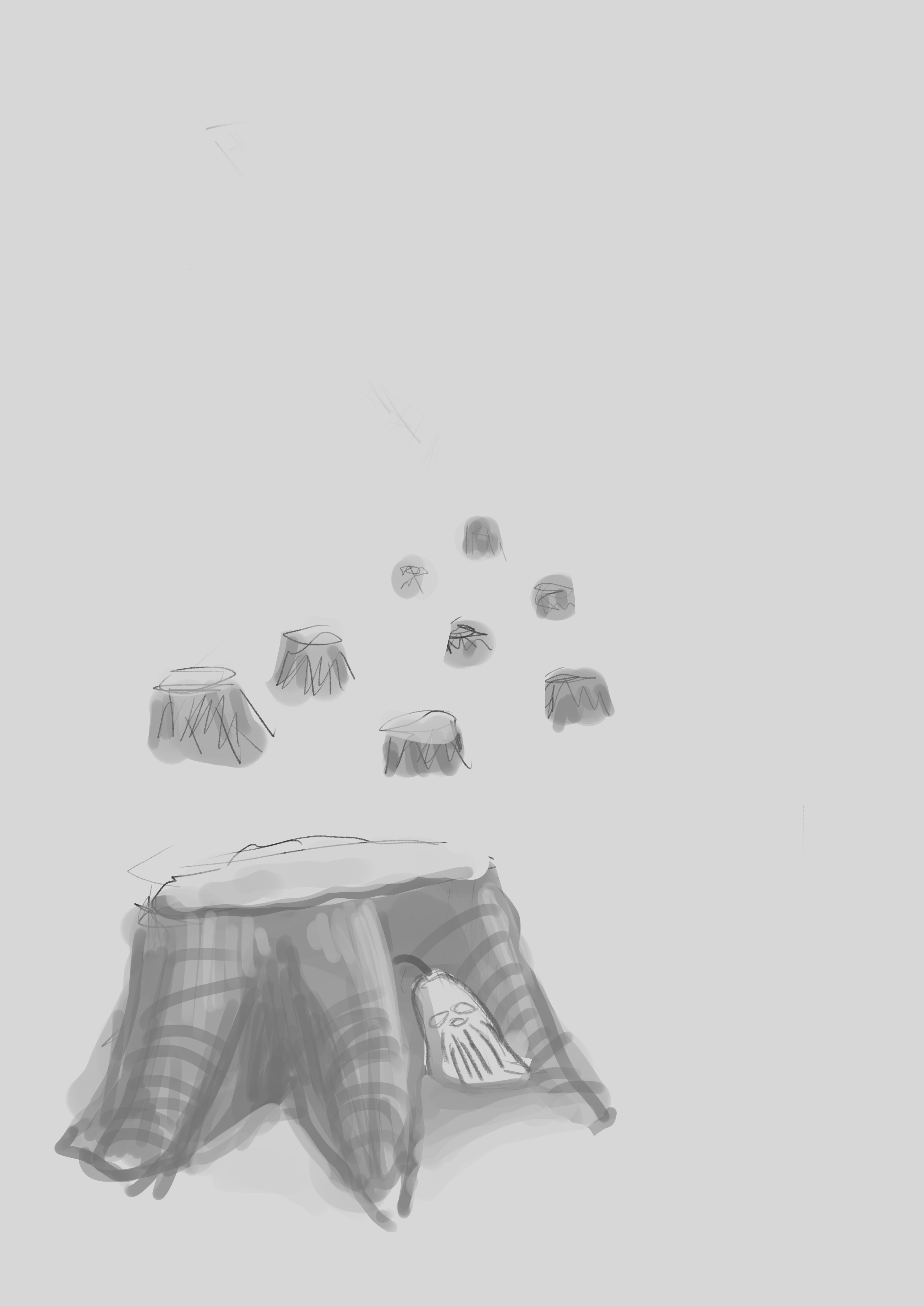
Upon further development, I decided to use the sketch below — a top view of the tree stump after the tree was cut off. No character can be seen here; the spirit has left already. I thought that this composition works the best because: firstly it sparks curiosity about why there is a house in the tree stump, secondly who lives in it, and thirdly where is the being that lived in it.
Process
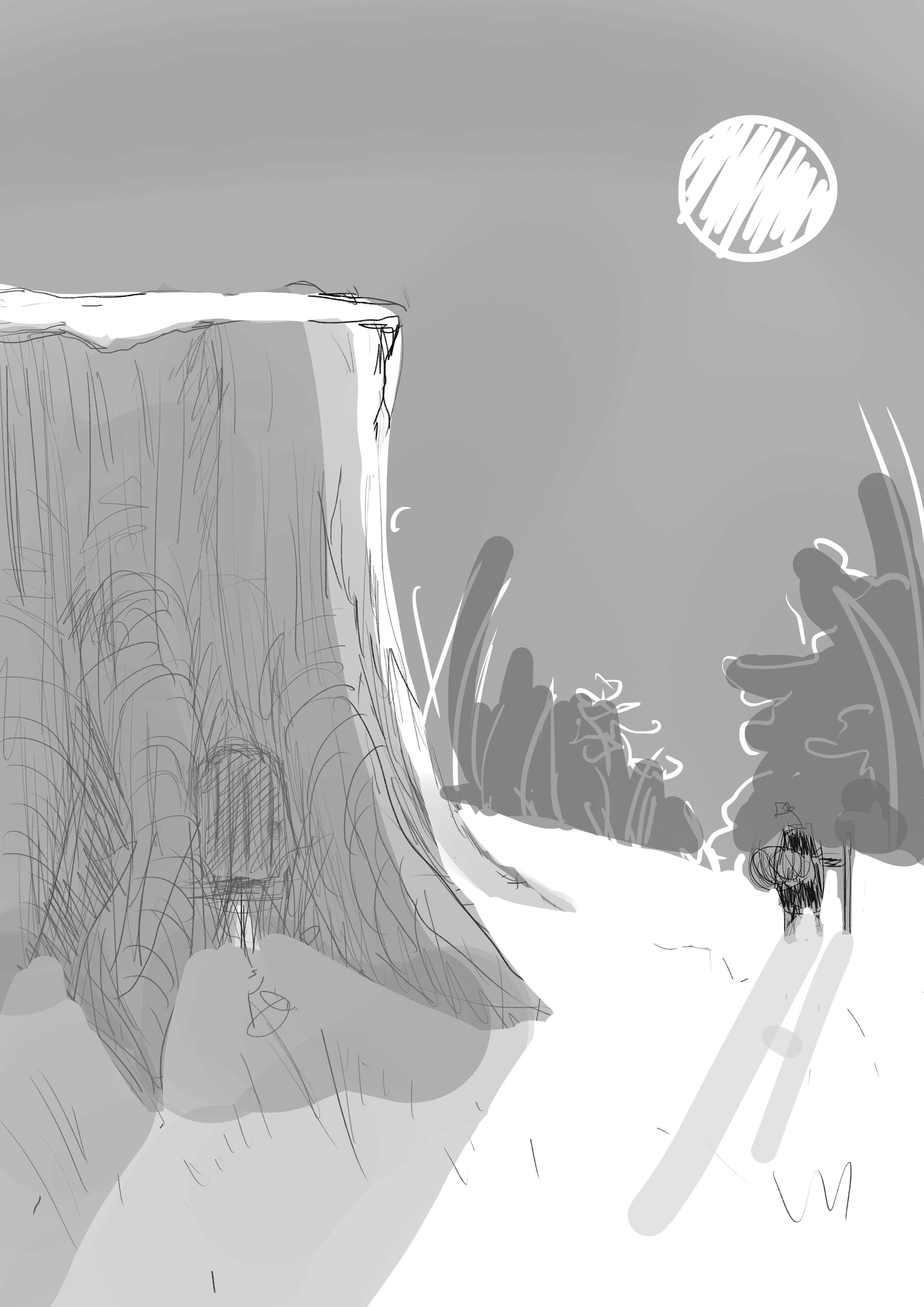
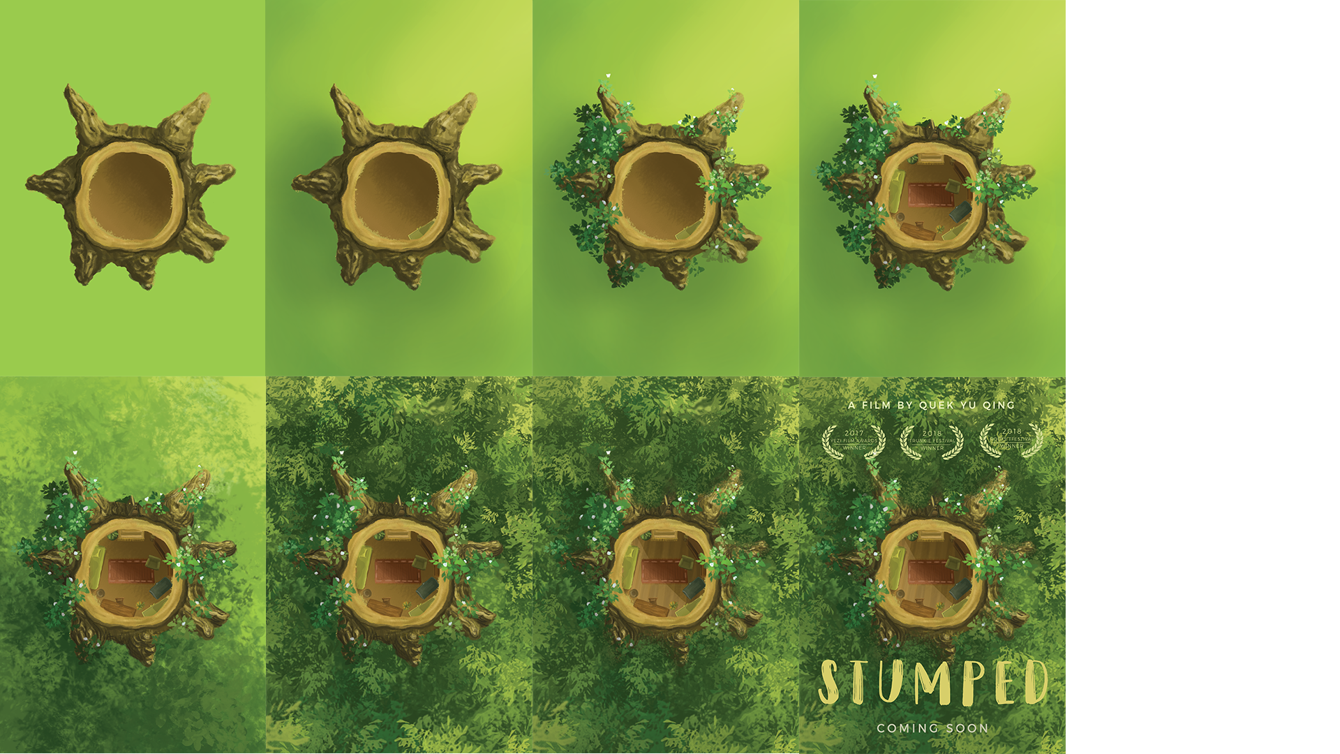
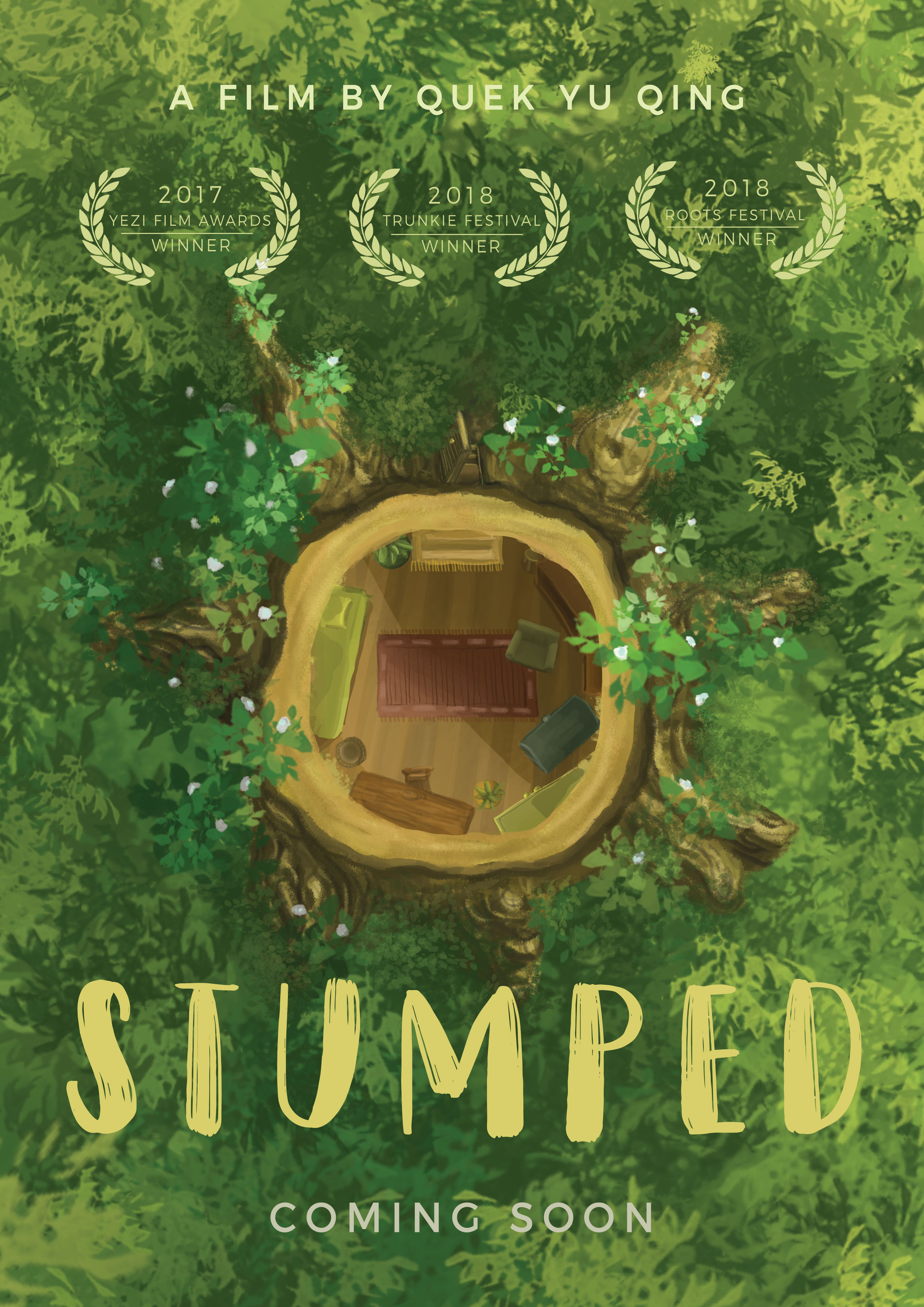
I used a central composition of the stump to draw attention to it immediately so that viewers will notice the layout of a house inside the stump. I flooded the sides with foliage and greenery instead of more complicated designs to emphasise the stump further. The greenery also heavily hints at themes of environmentalism in the movie.
The choice of typography is more quirky and cartoony to further express the light-hearted mood and to appeal to younger audience.
A small open door is added to the tree stump to suggest that someone has left the place. The layout of the house and furnitures are still to evoke a sense of stifledness and calmness — that the departure is quietly and seriously pondered over.
Final
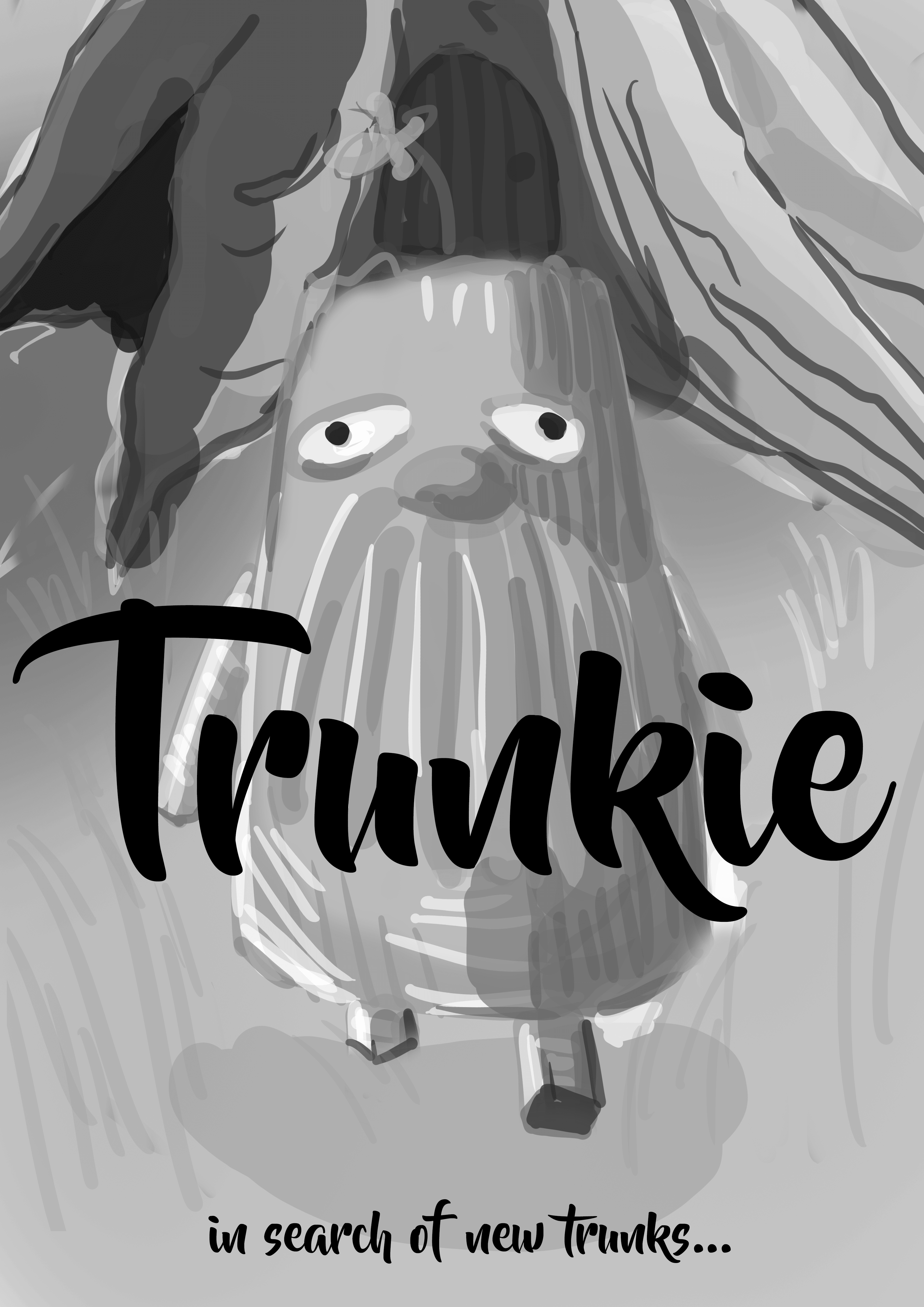
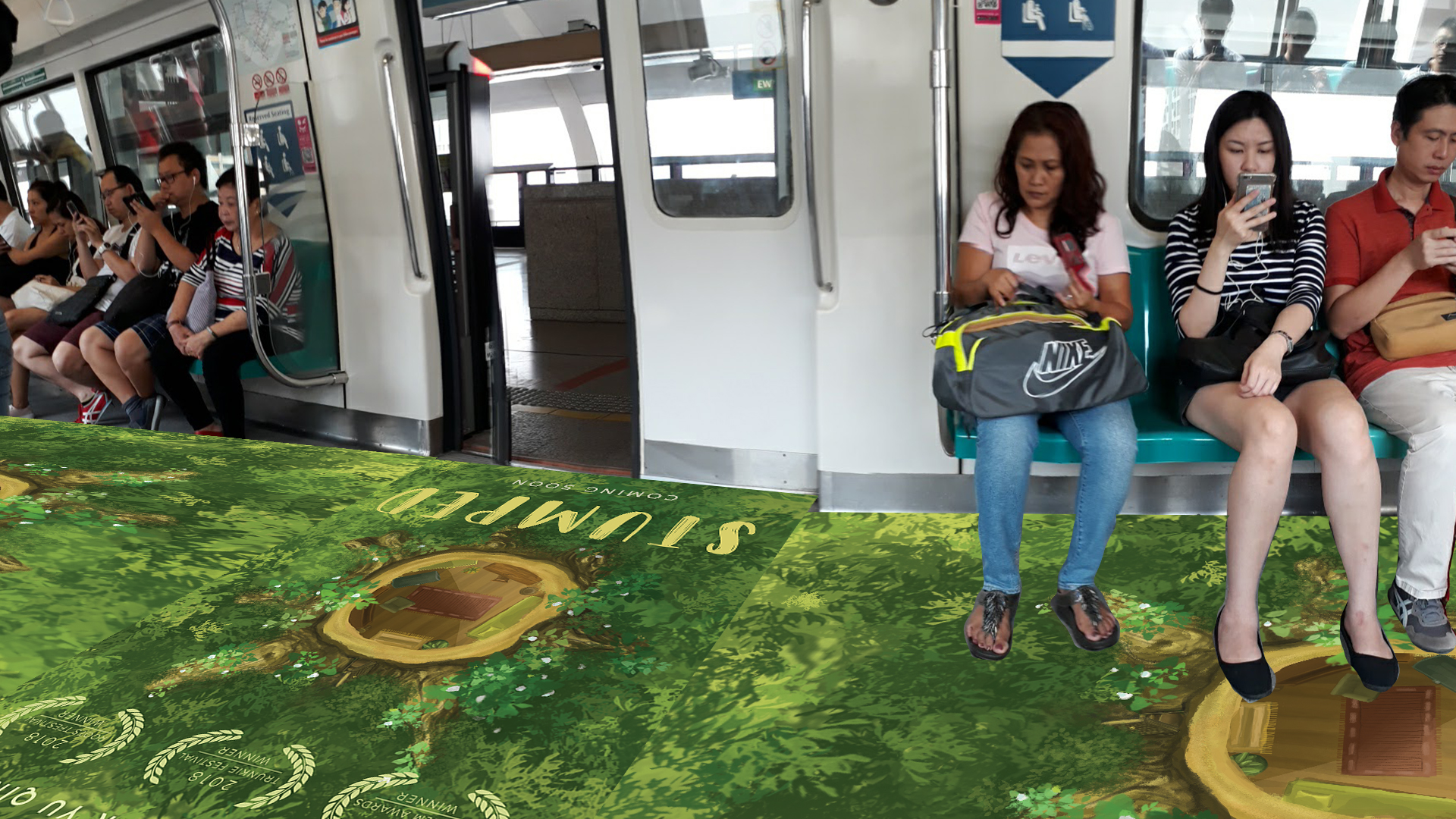
I titled my film “Stumped”, both as a wordplay on the tree stump and as a symbolisation of the spirit’s bafflement and confusion after his house was destroyed.
A poor man chances upon a magical tree that bears jewellery-containing fruits. His greed for the treasures estranged him from his friends, and only after which did he learn that true wealth is in wisdom and friendship, not in material goods.
Story Beats
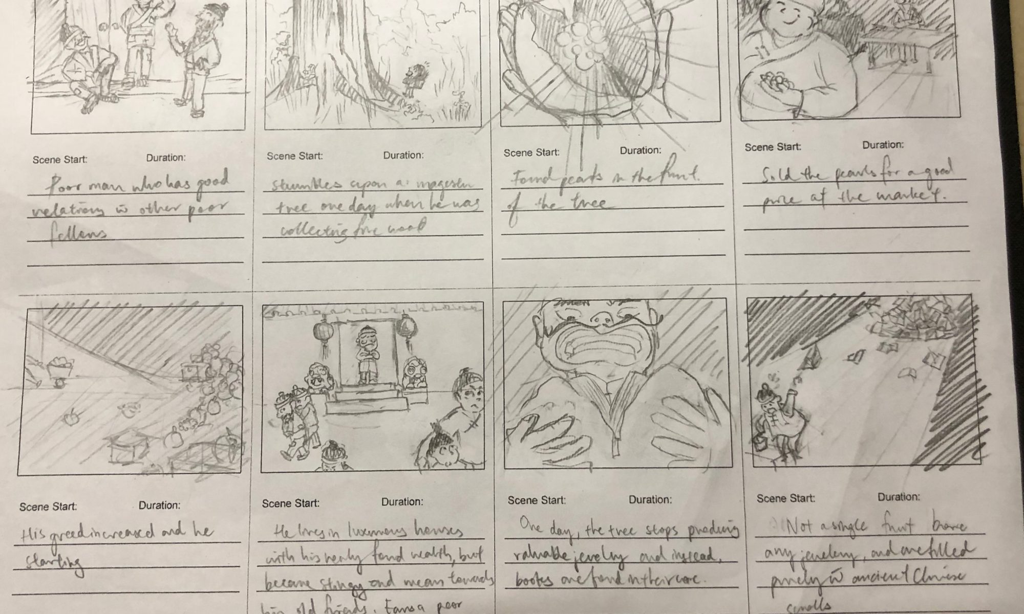
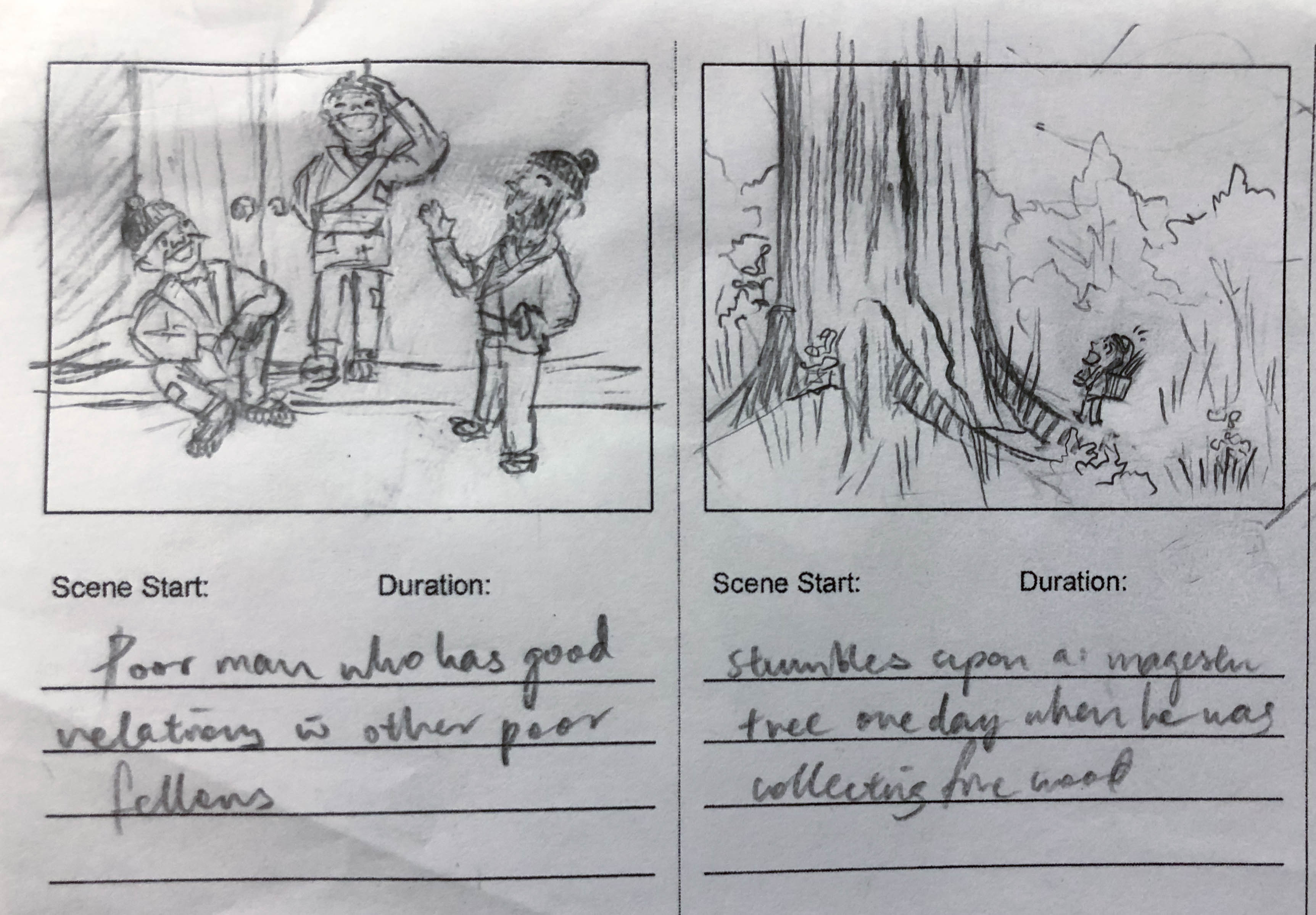
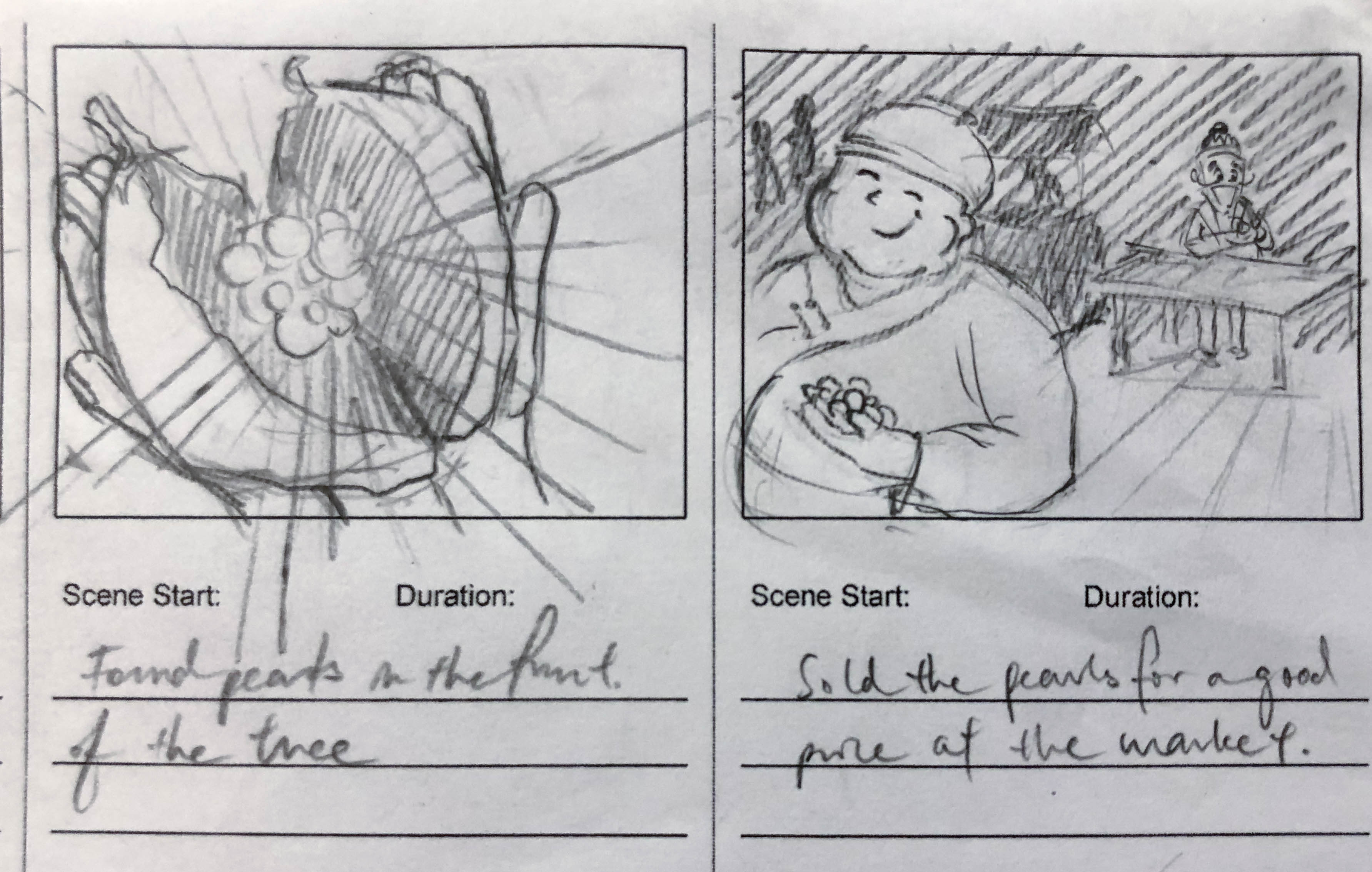
There was a poor man who was friendly with his other poor fellows
One day, he stumbled upon a magical gigantic tree
He found shining pearls in the fruits of the tree
He gleefully sold the pearls for a good price at the market
His greed increased and this compelled him to bring barrels and barrels of fruits home
With his sudden increase in wealth, he now lives in luxurious houses and dresses in luxurious clothes. He was a stingy and nasty man and despised his old friends. He earned a bad reputation.
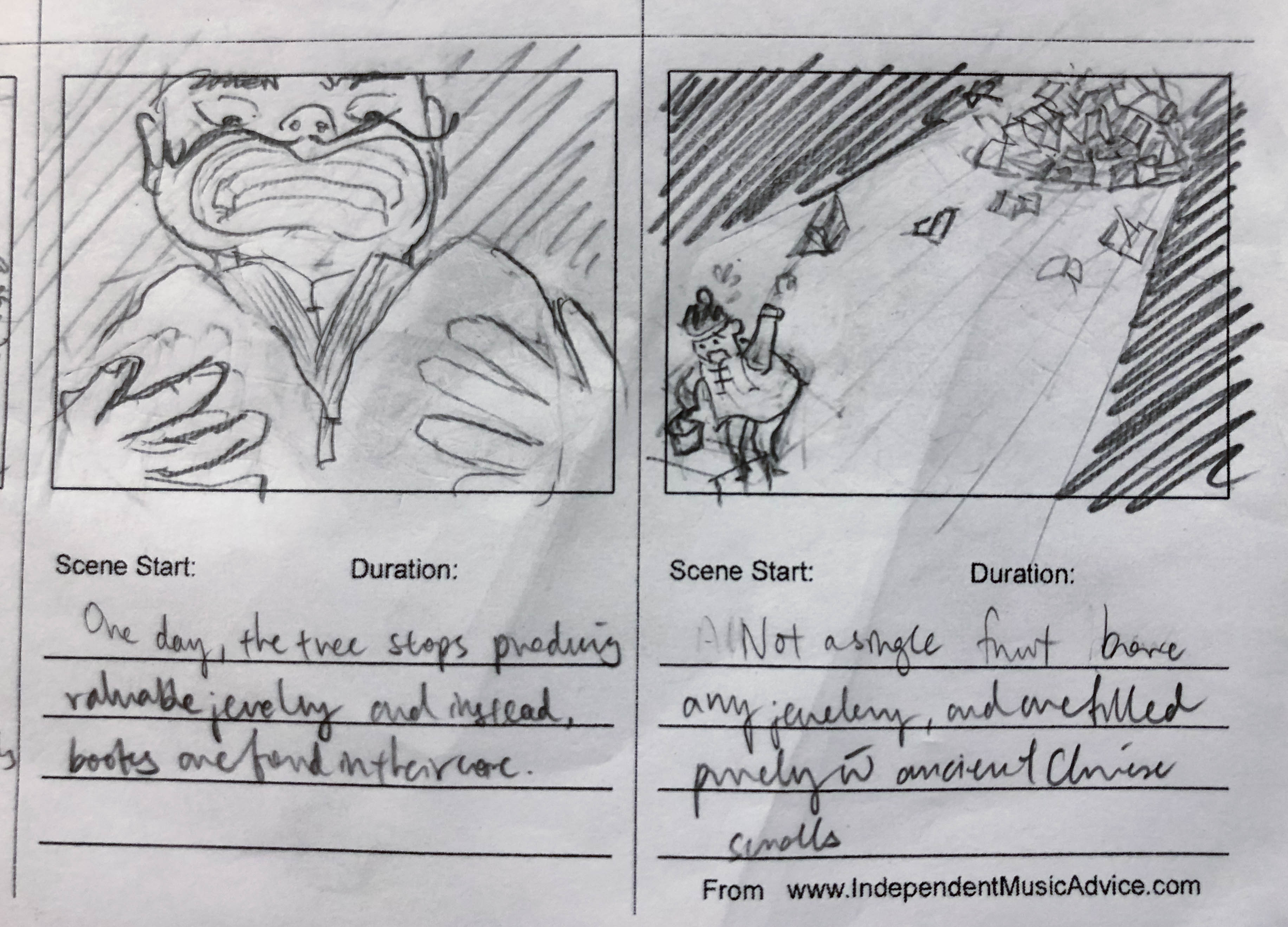
One day, the tree stops producing jewellery. Instead, books are found in the fruits.
He frantically checked all the fruits but none of them bore any jewellery. Only books could be found.
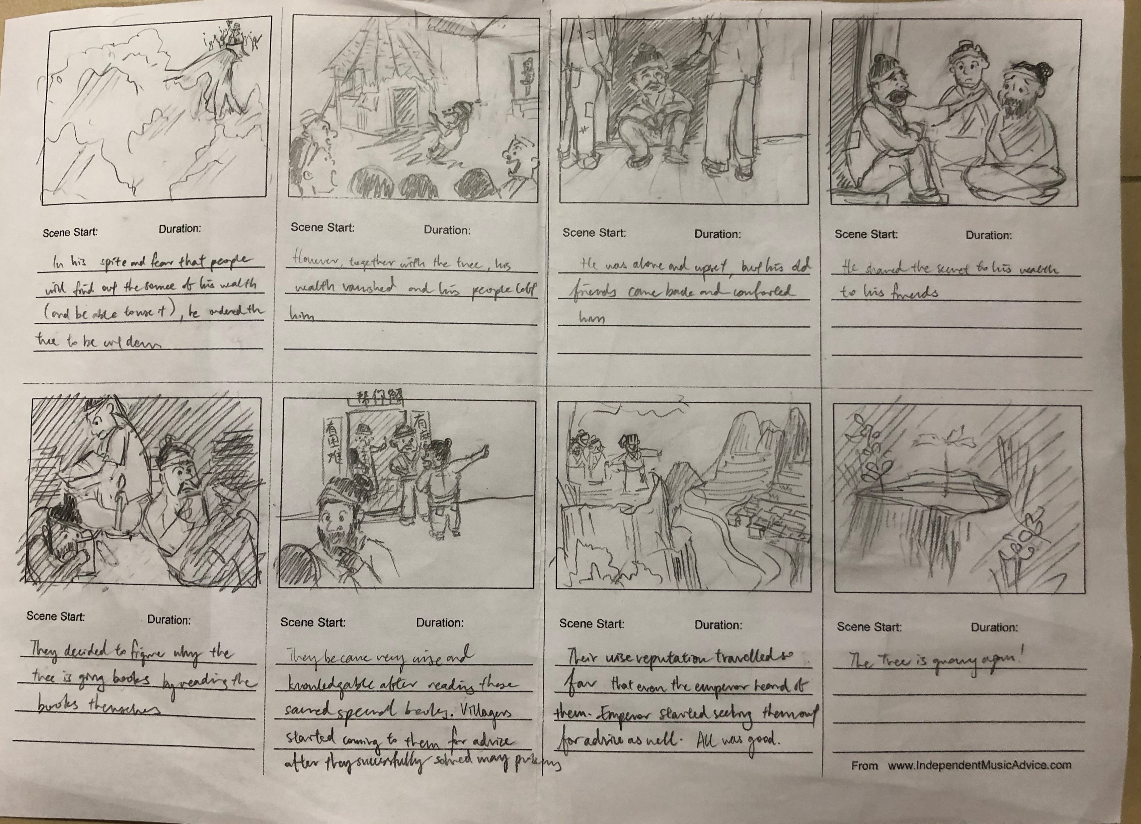
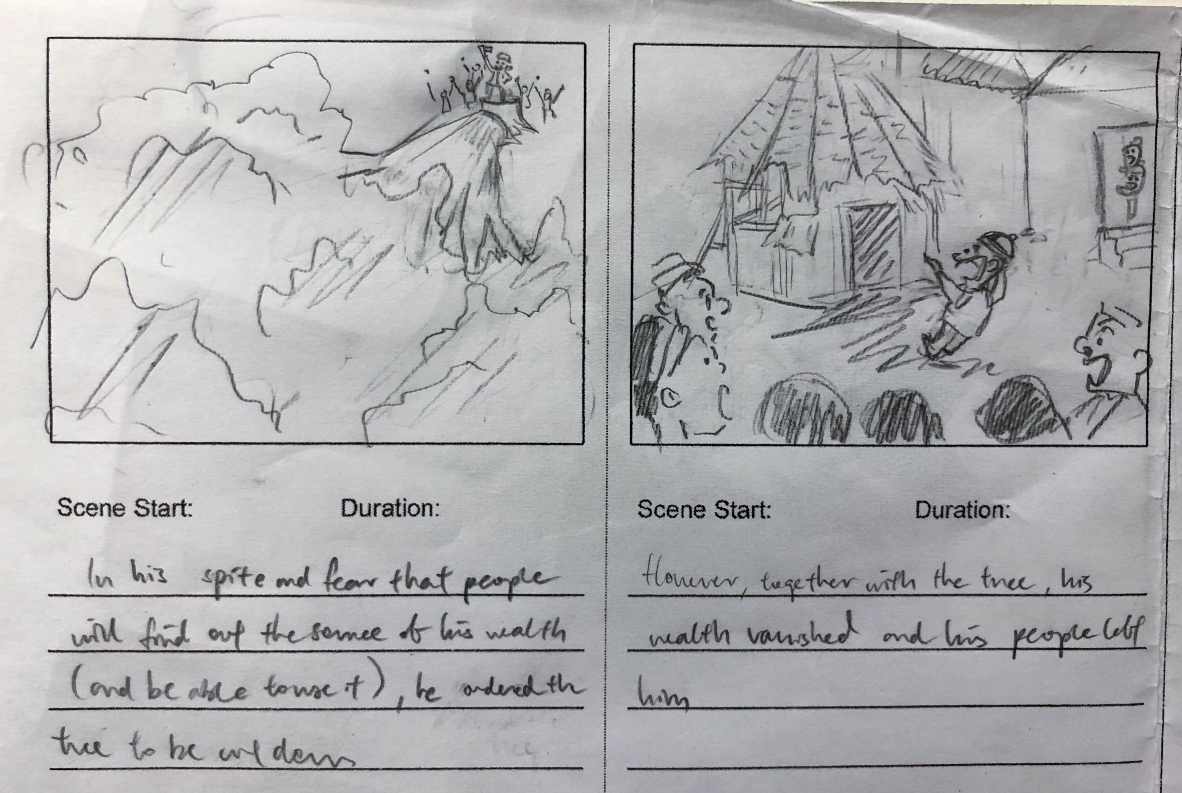
In his spite and fear that others will find out his secret source of his wealth, he ordered the tree to be cut down
However, together with the tree, his new-found wealth vaporised.
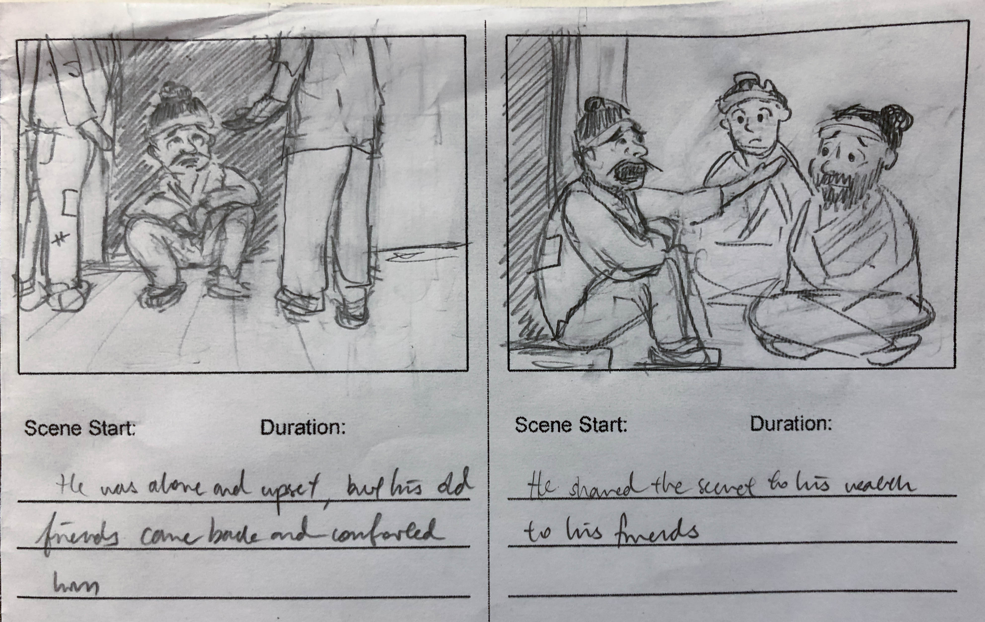
He became alone and upset, but his old friends came over to comfort him
He shared the secret to his wealth to his friends
Together, the three friends decided to read the books to see what it contains
They became very wise and knowledgable, and villagers started coming to them for advices
Their reputation travelled so far that even the emperor has heard of them. The emperor sought them out for advice. All was good.
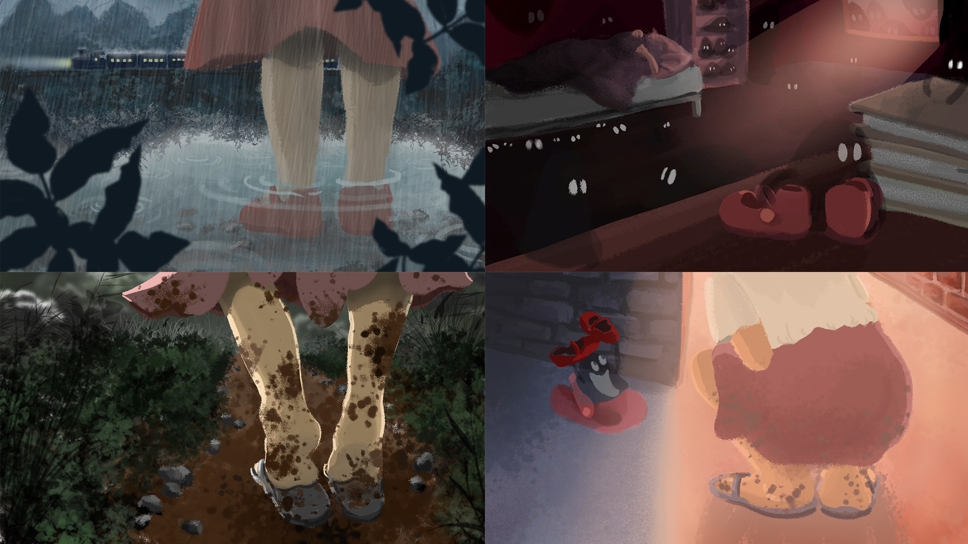
For this assignment, we were tasked to present 4-6 images that express basic human emotions. I chose to work on the following 4 emotions: Sadness, Fear, Disgust, and Happiness in the format of a visual narrative. I chose the Digital painting medium to develop my digital painting skills, which I am not very acquainted with.
Initially, I wanted to express the emotions through the different portrayals and actions of water. I aimed to explore how a still and tranquil water body can evoke acute feelings that are raging and turbulent. However, I realized that I was unable to confidently illustrate water due to its abstract character that was difficult to personify. Having reached a dead end, I then turned to a more feasible representation — the figure of a little girl. I deliberately did not illustrate her facial features (or even specific details) so as to keep the enigmatic character that leaves room for the faculties of the imagination.
Initially, I wanted to express the emotions through the different portrayals and actions of water. I aimed to explore how a still and tranquil water body can evoke raging and acute emotions. However, I realized that I was unable to confidently illustrate water: it was intensely difficult to personify due to its abstract and turbulent character.
Having reached a dead end, I then turned to a more feasible representation— to use a protagonist in space to relate to emotion. I chose the figure of a little girl: a symbol of naivete, purity, capriciousness and endless wonder. I deliberately did not illustrate her facial features (or even specific details) to leave room for the faculties of the imagination.
With this new representation, I had to update the story type— from distinct and atomic frames to a narrative that flowed from the first frame.
I drew upon my initial ideas of emotive water as the background to complement the protagonist’s emotions. To elicit the same emotion in the audience, I also employed colour theories of emotion for each scene.
The first draft of the story is:
Sadness: Father leaves daughter; rainy scene
Fear: Daughter alone in room, buckets collecting dripping water, imagination ran wild in fear of the dark and of ghosts
Anger: Daughter shouting to the stormy sea in frustration, in the direction of the foreign town
Happiness: Father returns; dew hanging off greenery shining in the sun
Upon further development to add more content and excitement to the story, I came up with the final story:
Sadness: Father leaves daughter; rainy scene
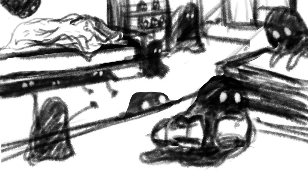
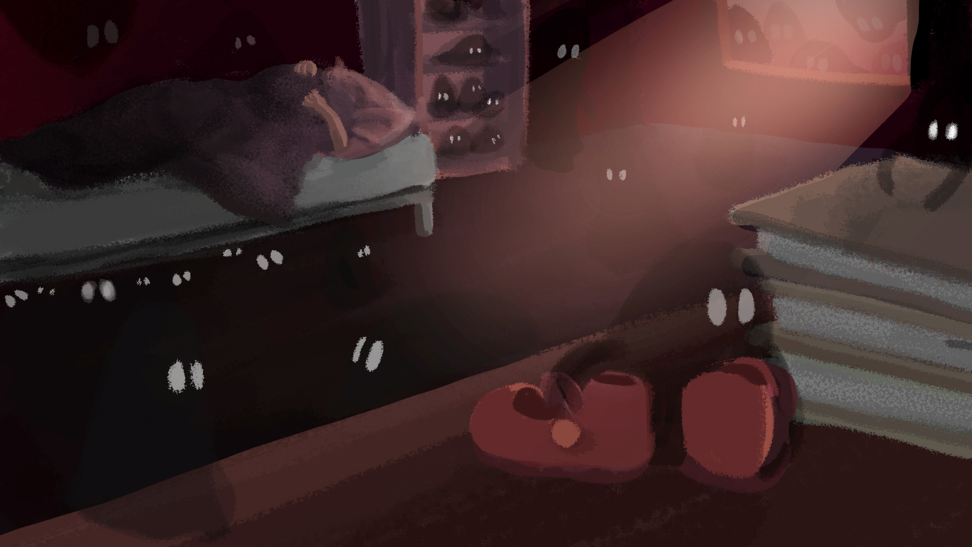
Fear: Daughter is left alone in her room to fend her fear of the dark. Her imagination ran wild as she faintly hear something being dragged across the room. In actual fact, a ‘ghost’ has took her shoes away.
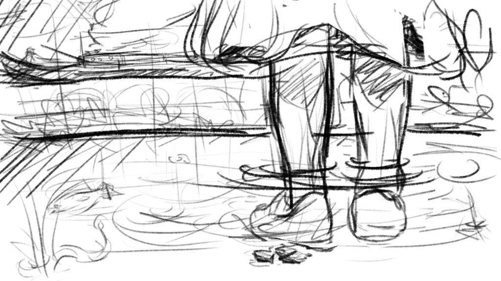
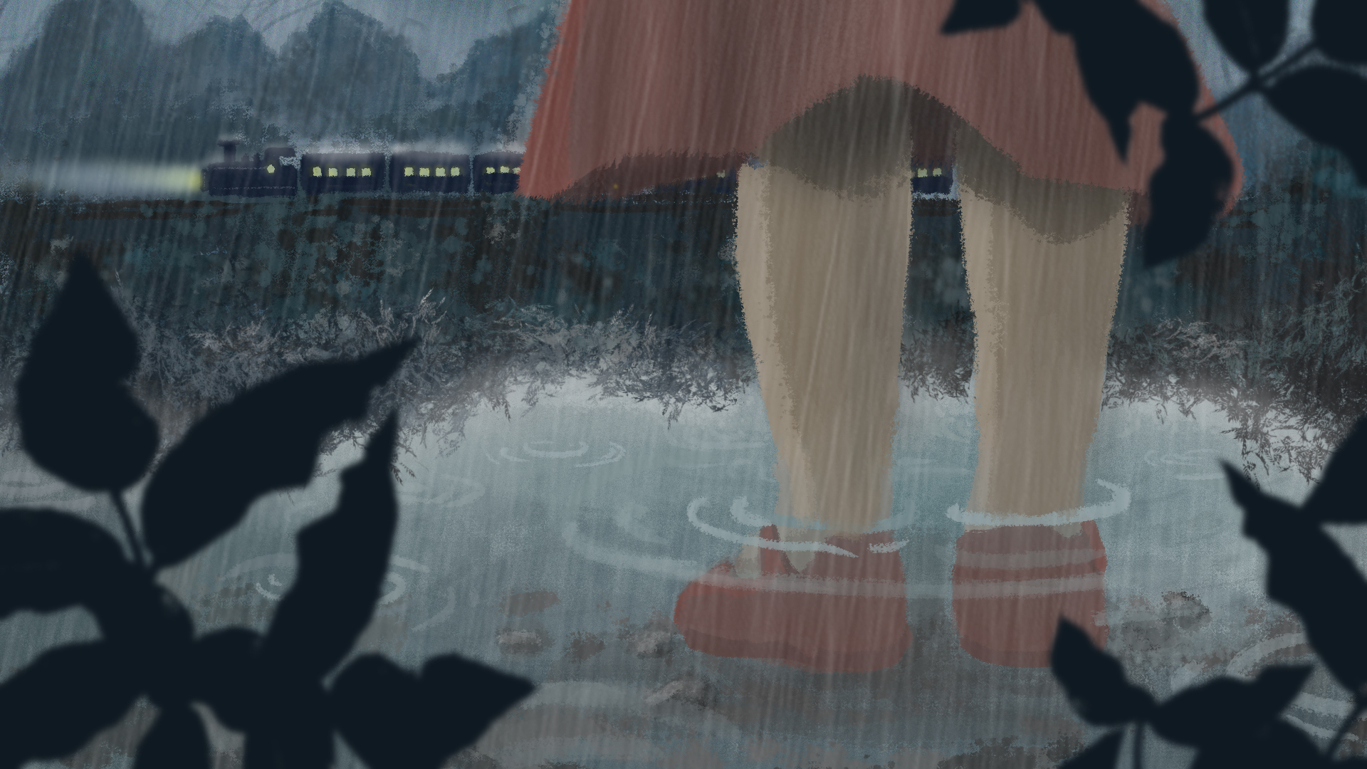
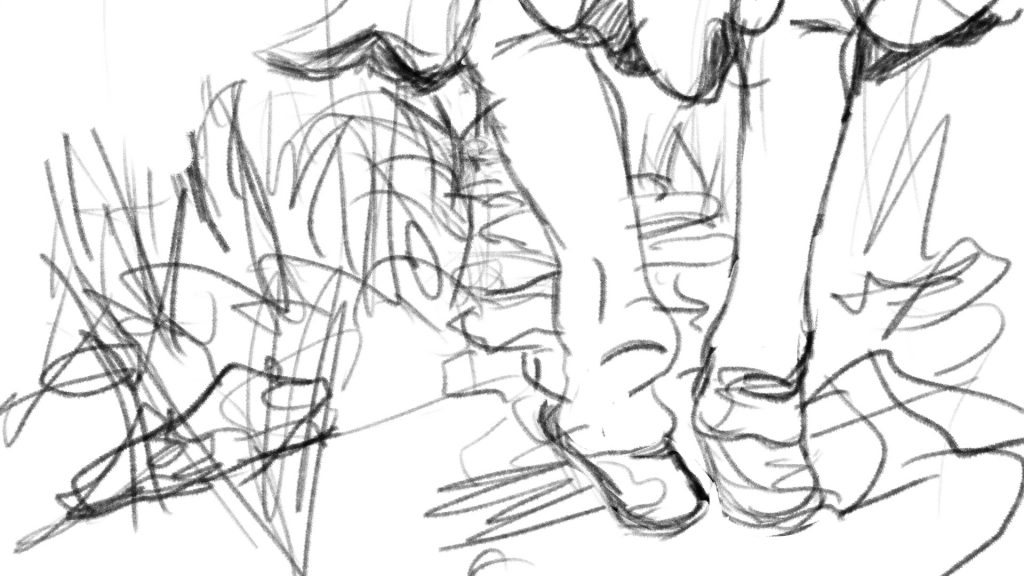
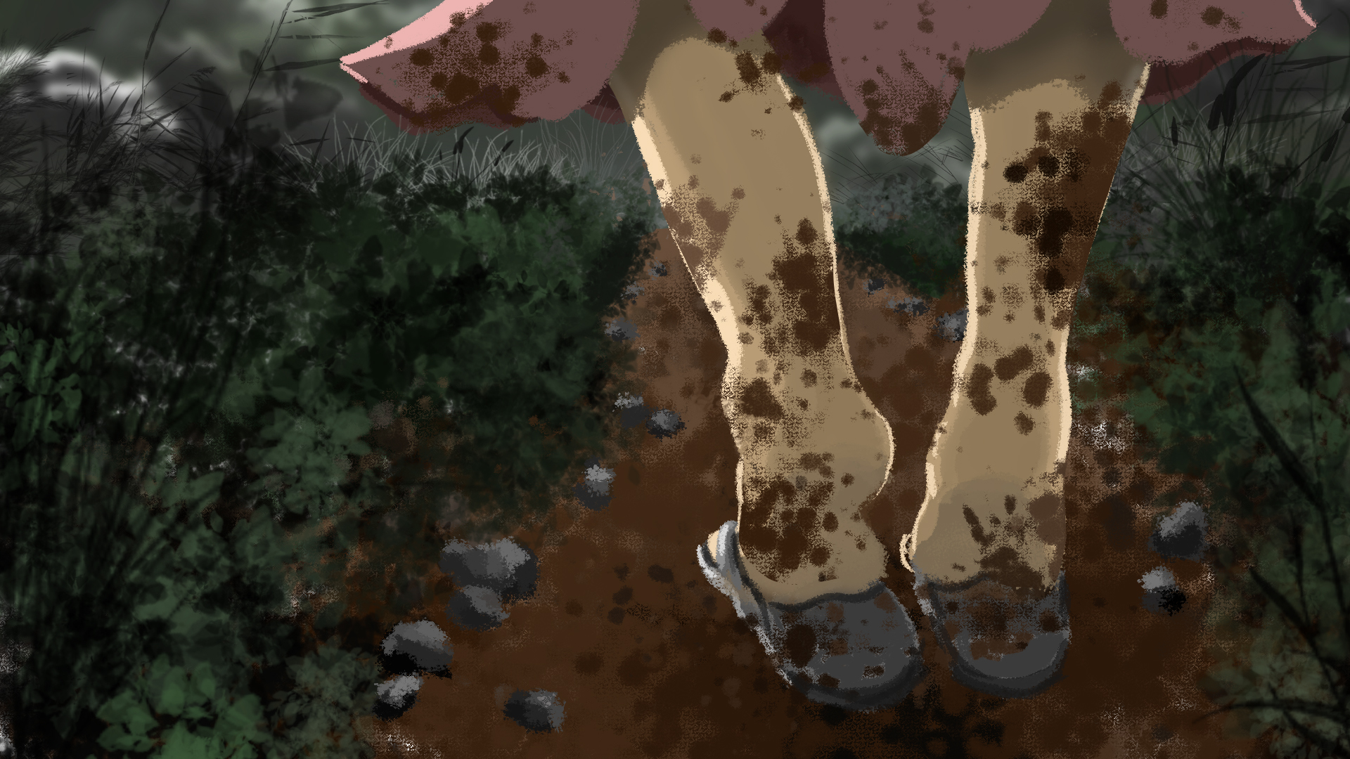
Disgust: Daughter realises the next morning that her favourite shoes are gone. Wearing her old slippers, she went out in search for it. Wet mud splattered all over her skirt and legs, evoking a strong sense of disgust from her. (note: not disgust at the fact that someone took her shoes because this will be too strong for a young girl)
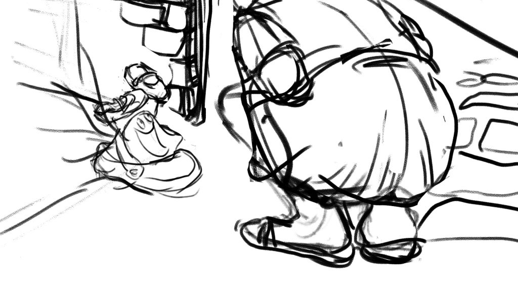
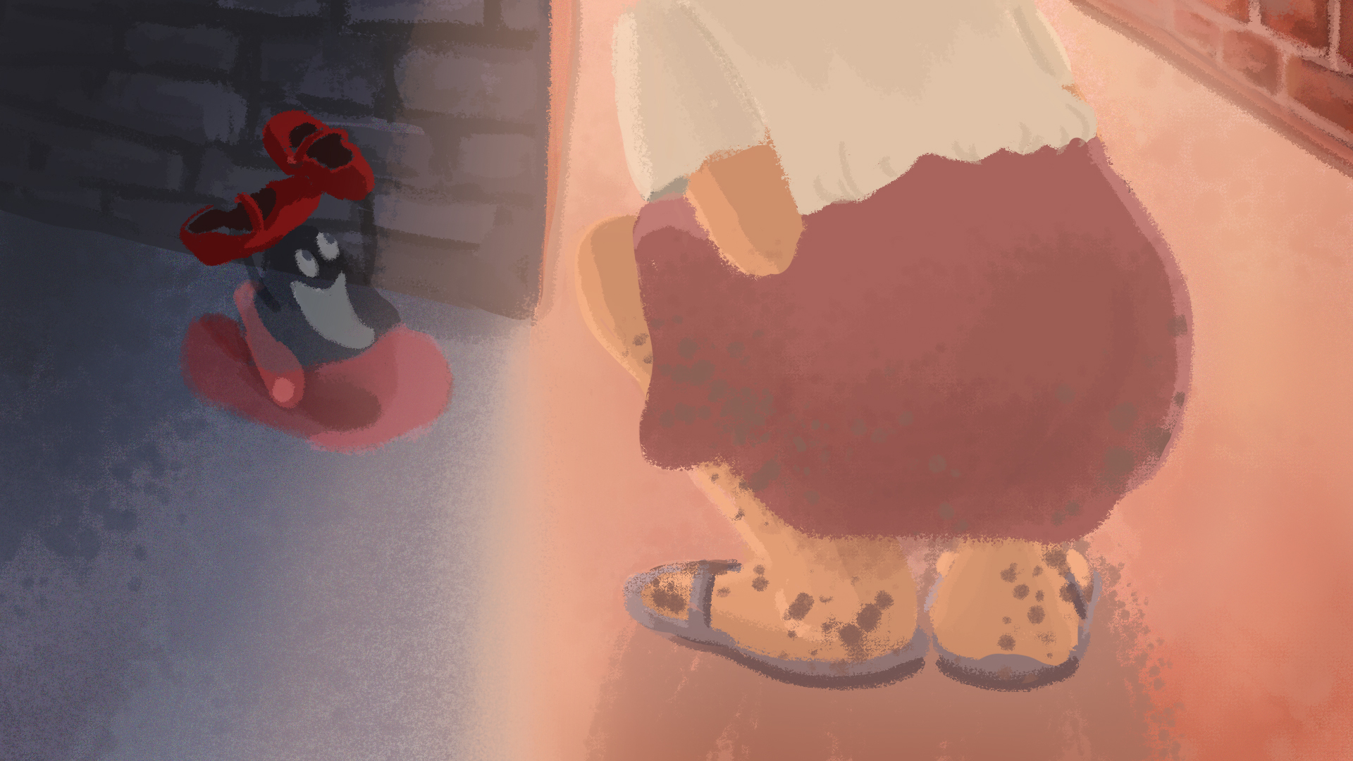
Happiness: She found her shoes! In fact, the ghost was on its way to return the shoes as well, after modelling and making its own ghost shoe.
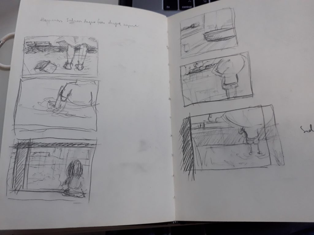
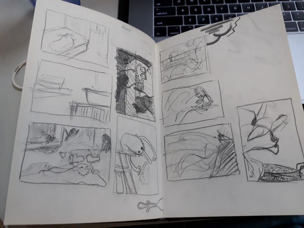
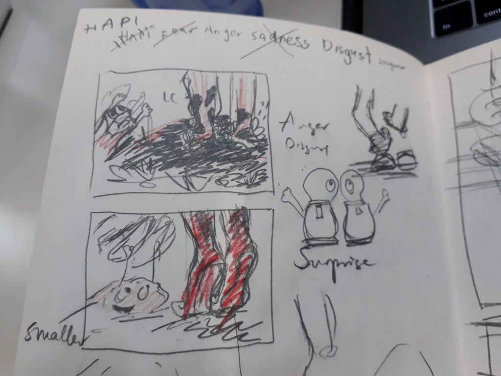
Some sketches that I drew before starting work. I feel that I work better when I sketch my thoughts on pen and paper.
One key point that I experimented with was whether it was possible to illustrate all four panels with the placement of the shoe being fixed, while presenting the images different perspectives. I managed to do it, but the sadness and disgust images are rather similar. Perhaps more could be done to experiment with alternative povs :>
Final Images
Sadness
Father leaves daughter; rainy scene
Fear
Daughter is left alone in her room to fend her fear of the dark. Her imagination ran wild as she faintly hear something being dragged across the room. In actual fact, a ‘ghost’ has took her shoes away.
disgust
Daughter realises the next morning that her favourite shoes are gone. Wearing her old slippers, she went out in search for it. Wet mud splattered all over her skirt and legs, evoking a strong sense of disgust from her.
Happiness
She found her shoes at last! In fact, the ghost was on its way to return the shoes as well, after modelling and making its own ghost shoe.
I am very happy with the final work even though the quality and style isn’t that consistent throughout (something to take note of next time). Having worked mainly with traditional medium and less with digital, this assignment helped me pick up many useful techniques from photoshop. Now I am really starting to appreciate digital painting!
The phobia I chose for this assignment is Telephonophobia, which is the reluctance or fear of making or taking phone calls, literally meaning ‘fear of telephones’. While I personally do not have this phobia, I can somewhat relate to the anxieties and trepidation one might feel when having to handle phone calls; because I do experience that fear sometimes (in a milder form) when an unknown caller reaches me.
Following my research, I narrowed down three causes of telephonophobia that I wanted to focus on:
Anxieties associated with having to speak and converse with someone on the other end
Absence of body language, thus fear of misinterpretations and misunderstandings
Fear of embarrassing silences and the failure to respond appropriately
From the 3 main causes, I did a simple word map to brainstorm some ideas. Here are some keywords that I have identified through this process:
I realised that a parallel can be drawn between this phobia and stage fright, since the symptoms expressed are similar, eg nausea, sweaty palms, shortness of breath. Expanding on the idea of stage fright, I decided to portray the scene as having to give a speech, since, just like handling phone calls, making a speech requires one to ‘perform’ and use the voice as the primary medium of communication.
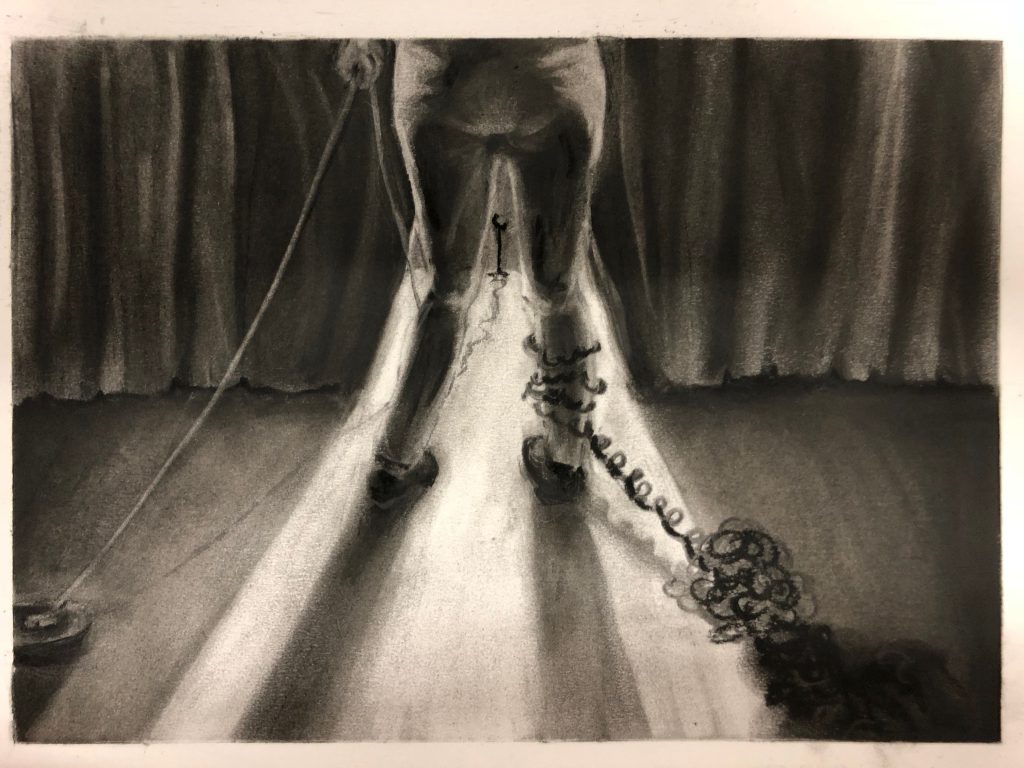
Image 1 (Charcoal Drawing)
Who: Performer // speaker
Where: On stage // in front of a telephone
What:
Glaring stage lights makes audience non visible to speaker -> inability to see body language
Speaker’s hand holds on to the cable of the telephone, giving her the autonomy to cut the phone/back out from performance or take it
Telephone cords wrap around leg and drags on ground -> resemble chain and ball, represents weight of anxiety that rests on the speaker regardless whether phone call is taken
When: Just before performer steps out on to stage // when the first ring of phone is heard
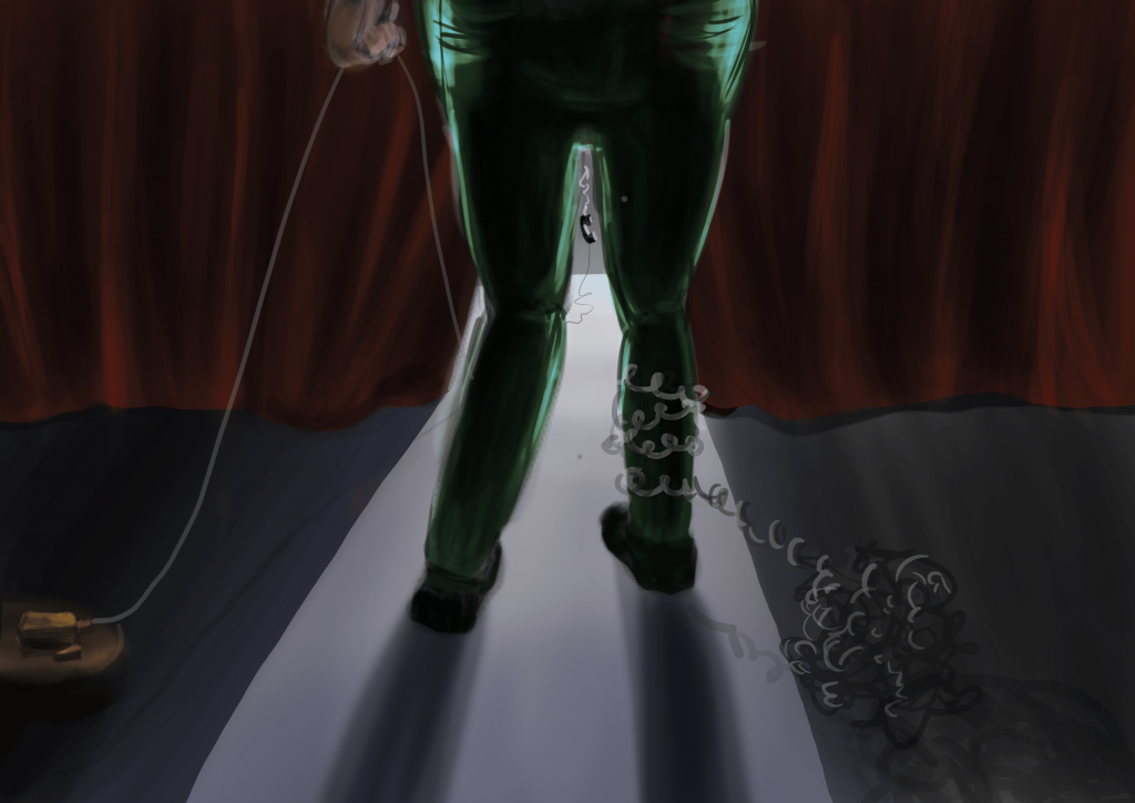
Image 1 (Coloured)
When I coloured the image, I decided to go for a more muted and dark colour scheme to more adequately express the phobia since we usually associate scary/evil stuff with darkness and bleakness. All things are cast in shadow, except the source of fear – which the speaker will inevitably have to face.
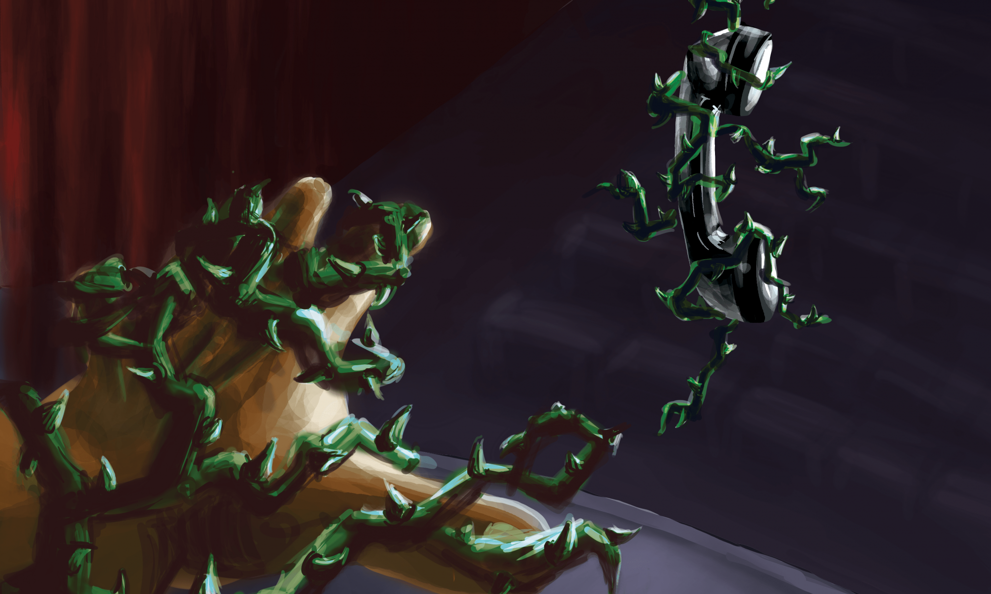
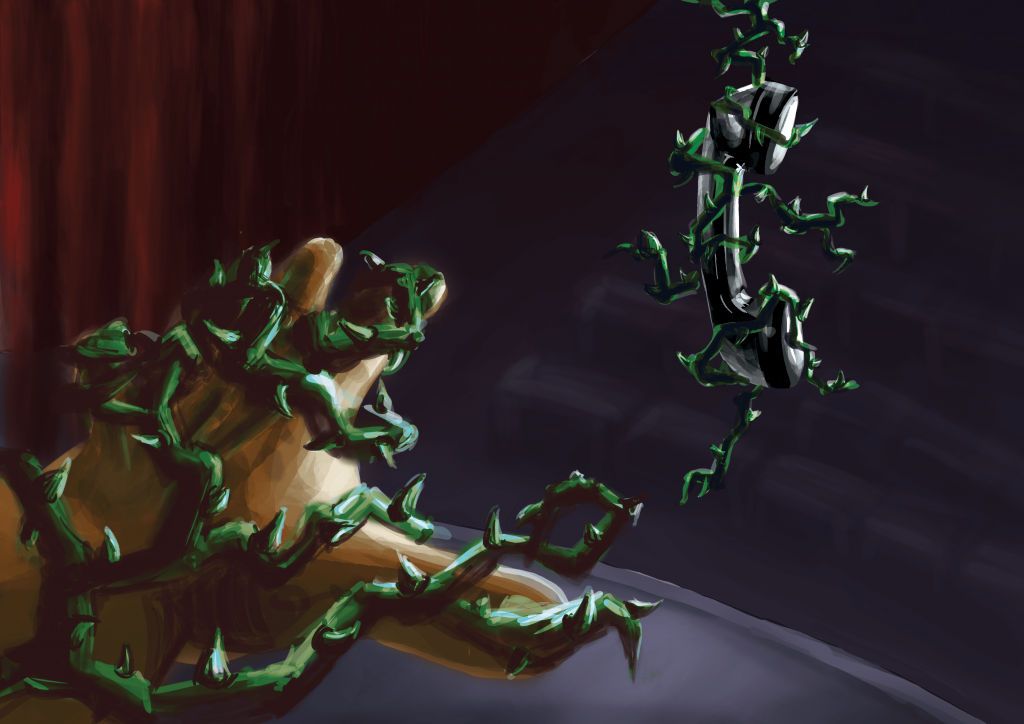
For the second image, I decided to develop the story up to the point where the speaker is about the answer the call/make the speech. As the speaker approaches the phone, the scene becomes increasingly threatening to her. The telephone cords that previous wrapped around the speaker’s legs have now turned into menacing thorny vines that crept up the entire body of the speaker, engulfing her in fear and pain. The corresponding vines around the phone receiver shows that the telephone is the source of the speaker’s misery.
Image 2
I have used the same colour scheme for both images to keep them coherent. I chose the complementary red-green colour scheme, because firstly they help viewers recognise objects in the scene (eg stage curtains and vines), and secondly the contrast lends a vibrancy to the scene, making it look even more alarming. Red-green complementary is particularly known for being able to express dark and heavy scenes and are commonly associated with villains and monsters — which is very apt in this case and further accentuates the danger the the vines pose to the speaker.
Comments from Class:
use an more muted/desaturated red to create a better contrast between red and green
Perhaps use a different perspective for the second image, and not immediately have the hand reaching out to the phone. Alternative: see the speaker from bottom up and see her gripping with fear at the vines