2D(ii): Que Sara Sara Research

For the first project of 2D, we are tasked to create a typography out of our dream jobs!

What is typography?

Typography is the visual component of the written word. It is able to evoke different feelings through its appearance. Good typography sets the tone of your written message and helps to reinforce its meaning and context. Good ty­pog­ra­phy can also help your reader de­vote less at­ten­tion to the me­chan­ics of read­ing and more at­ten­tion to the mes­sage!

For example, this table that I found on Pinterest

How can different fonts evoke different emotions

These are a few things we as designers can take note in order to create a visual hierarchy for our reader:

– Size and weight

– Colour

– Positioning

– Typeface

Typography is also very technical, in terms of many terms like kerning, baseline, serif non serif and etc. The good thing about this project is that our lecturer Shirley emphasised we do not need to make it logical. So we can let our imagination run wild and play around with many different looks!


My first thought process:

Breaking down the entire brief and after reading typography articles online, basically the ultimate goal is that:

– Reader can legibility read the font

– Able to identify occupation

– A E S T H E T I C S

– Able to convey the feelings and emotions related to the job scope (this one is next level!)

Points above are listed out in accordance of importance to me. Overall, there is a need to find the balance between the art and function that is created. Throughout this project, it is key to ask the people around me for their feedback and their opinion towards my typo.

To start out the project, here are some of the jobs that I considered: 


After consultation and thinking about which type I ca execute the most interestingly, I decided to settle on these four job scopes: 

1. Pirate: People who attacks and robs ships at sea.

Perhaps inspired by the many series of Pirates by the Caribbean in my growing years, I have always imagined myself sailing the seas and living my life under Caption Jack Sparrow. I decided to go forth with the idea of doing a pirate tattoo, meaning that I had to hand draw it.

Key characteristics of a pirate: Hook, eye patch, destroyed ribbon, skulls, octopus tentacles, swords, anchor, pirate flag, pirate ship,  ropes, fish scales, mermaids.

I kept in mind to make it look rugged and manly as well.

screen-shot-2017-02-07-at-7-12-00-am

Some inspirations

2. Fisherman: A person who catches fish for a living or for sport

Growing up, my dad used to take us to Jurong lake to do some fishing and prawning. Meanwhile my mother came from a fishing (and rice planting) family.

Initially, I wanted to do physically DIY the font and take a photograph of it. However I changed my idea last minute. Here is what I had in mind initially!

I wanted to create a typography out of styrofoam and paste DIY fish scales and fins onto it. For the background, I wanted to place a fishnet and the background to have a blue colour.

3.  Treasure Hunter

Again, perhaps inspired by movies while I was younger, I can imagine myself travelling across the world and across different terrains to look for the treasure. More than that, last year in Philippines there was a rumour about a treasure being hidden around the island going, and I saw a legit real map. Looks more beautiful and intricate than the maps we see on Google images, sadly I am forbidden to take a picture of it! Haha.

For this idea, I am going to create a 3D font and photoshop, emphasising the nature of the occupation itself – exploration and the lookout for a treasure.

Mostly inspired from this online tutorial which luckily I found! It helped me a lot because it is the first time I am using the 3D function and photoshopping many small elements together.


– Lifeguard

BAYWATCH. Red swimsuits, surfing, running slow motion in the beach. I am all up for it. Or in Singapore context working in Wild Wild Wet looking at patrons chilling at the lazy river.

The only series that I watch, Bondi beach rescue!

For this, I decided to go ahead with combining different elements of lifeguard equipment and illustrating them into vectors before piecing them together to form the alphabets.

For this, I had no need for as much inspirations as my other occupations because I already knew what I wanted. Perhaps it is because I am inspired by the many examples shown in class as well, which I did not manage to stumble across online.

That is all for this post!
 

F3D(ii): Once upon a scent

Incoming smells are first processed by the olfactory bulb, which starts inside the nose and runs along the bottom of the brain. The olfactory bulb has direct connections to two brain areas that are strongly implicated in emotion and memory:  the amygdala and hippocampus.

Unlike the other senses which requires to travel through the thalamic relay station to the brain, our sense of smell gets direct access to our olfactory bulb. It is the most primal and mysterious senses.

How smell affects our behaviour: 

– 80 percent of the flavours we taste come from what we smell

– Smell can influence our perception of time. Dr. Hirsch led studies into the way that smells can influence our perception of time. In one of the studies, 20 separate participants were exposed to a baby powder aroma, a coffee aroma, and no aroma at all. The coffee aroma produced a reduced perception of time, while the baby powder aroma produced a longer perception of time.

– Our perception of smell is largely determined by prior learning, personal history, and also cultural and geographic variations. For example, in North America and Europe lavender is perceived as a calming scent whereas in Japan, jasmine is associated with a relaxed mood instead.

– Smell can trigger memories, and also affect our emotions.

Mapping out smells

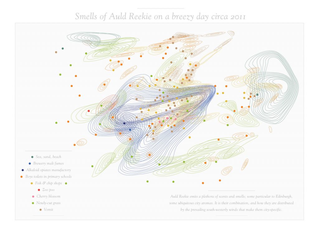
kate_mclean_smell

Kate Mclean is a Graphic Designer who creates smell maps of cities around the world. Wanting discover the importance of smell mattered to, she has already conducted these walks around Edinburgh, Glasgow, Paris, Amsterdam, Milan, Newport, Rhode Island, and New York City. Mclean wants to discover how smell effects our memory and place.

As quoted from her, “The smells there were cheese, wine, rain and Yve Saint Laurent perfume, because Parisian women take that away with them to remind themselves of Paris and where they come from,” McLean says.

Class activity – tasting chocolates

Ms Cheryl conducted an eye opening class activity about our sense of smell. In order to experience the basic sense smell firsthand, we blocked out our sight. A sense that we heavily rely on in our daily lives. She then passed around 3 different types of chocolates to which we have to carefully taste, smell, and describe.

Warning: I don’t like dark chocolate therefore the relevant reactions below!

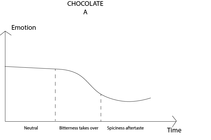
Chocolate A:

chocoa

– Smelt it, does not smell sugary

– Upon placing it to my mouth, it remains tasteless for a few seconds. The texture of the chocolate was smooth and hard

– Suddenly to my dismay, it became bitter, meaning that it is dark chocolate

– As I bit onto it, it broke apart with dull snaps. Took a longer time to melt compared to the chocolates I usually consume

– As the chocolate began to disintegrate, there was a sudden surprise element as the chocolate started to become a little spicy. It was a very interesting “SO”!

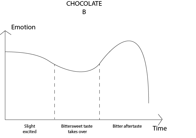
Chocolate B:

chocob

– Surprised to feel that the chocolate is individually wrapped in plastic. With its ridges, it reminds me of the time when my secondary school friends Kimberlyn offered us Royce chocolate.

– The wrapper opens easily. Smelling it, I could already tell that it is dark chocolate as the scent is quite strong. It also smells bitter.

– The chocolate melts much more easily onto my palm, creating a circular ridge.

– I placed it onto my mouth and it is still slightly cold and hard. Melts quicker on my tongue than the previous chocolate and is much smoother in texture.

– The ridges slowly disintegrated and it started to become overwhelmingly bitter for me.

– Thankfully after melting more, it started to become slightly sweet. The taste becomes bittersweet and it slowly becomes more pleasant.

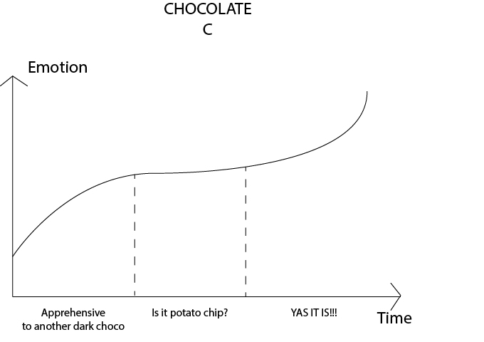
Chocolate C (my favourite!):

chococ

– Excited to hear the plastic wrap open. A sweet and salty smell wafts through the air, the smell is slightly familiar yet I cannot put a finger onto the scent.

– The chocolate I received was slightly cold, and was slightly wet due to the condensation. The chocolate also have ridges, with the top side coated with chocolate while the bottom part having salt granules.

– Guessed that it was chocolate potato chips just by the smell and texture itself, was elated to consume it but unsure whether I would still enjoy as I could still smell the bitterness of the chocolate. The chip melts onto my hand similarly to chocolate B.

– Placing it onto my tongue I had to restrain myself from biting onto it. The saltiness hit me first, then came in the bittersweetness of the chocolate. Twirling it around my tongue, the salt and bittersweetness made my tastebuds dance in elation.

– I bit onto it and there was a dull thud before it broke to many small pieces. The chocolate melts onto my tongue while the chip slowly disintegrated. The smoothness of the chocolate and rough texture of the chip created a pleasant experience.

– There was still a slight bitter aftertaste of the chocolate, however the aftertaste has a sweet and salty tinge

3D(ii) Project 1

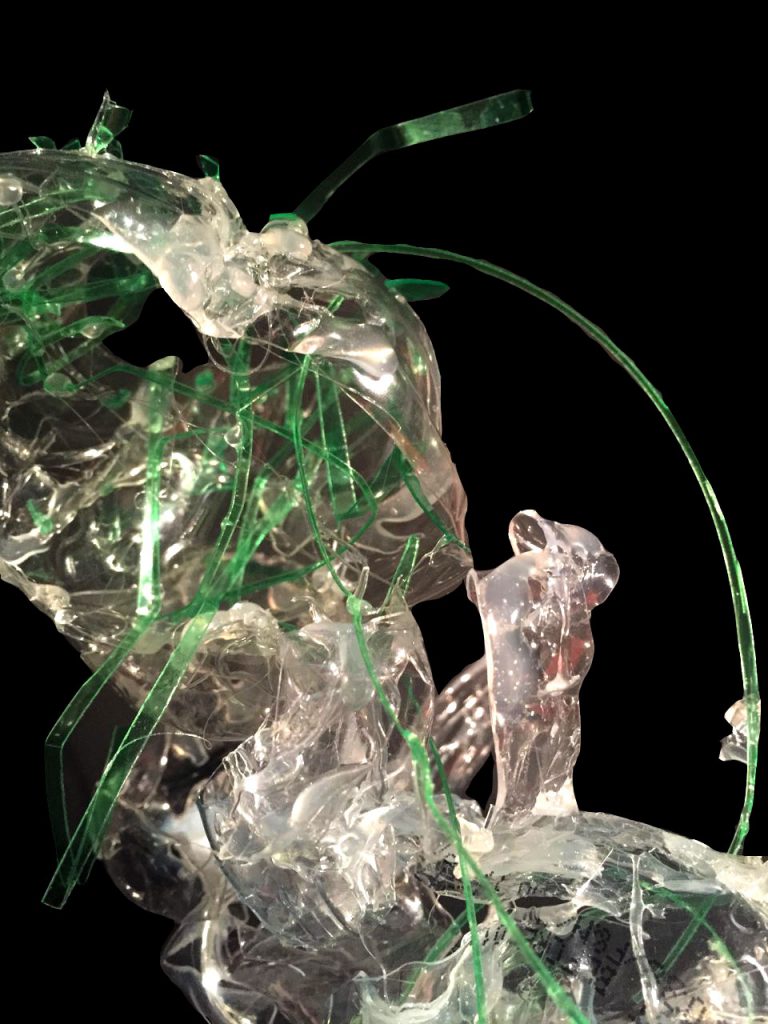
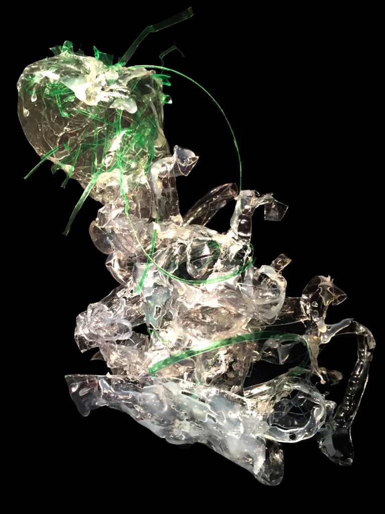
For the first project of the semester, we had to create a model out of a bad scent and a good scent. The model have to be created out of plastic bottles, and we were thrown to interpret the smell onto our plastic model. Initially, I was at lost at what to do as perhaps I have never solely depended on my sense of smell before.

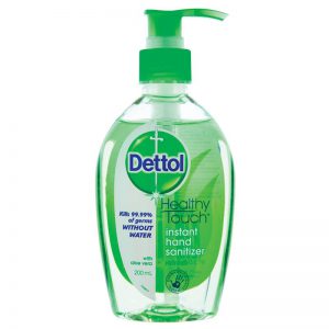
Bad scent: Dettol hand sanitiser

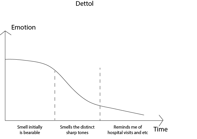
The clinical smell of Dettol just burns my lungs. Despite also being a product that helps people (similar to Axe Oil), the sharp notes and overpowering scent is invasive to my nostrils. It also brings back memories of hospital visits to my late grandfather, and the detergent my friend used throughout secondary school. A period of puberty and teenage drama.

f2d_800

Key words to describe scent:

Sharp, overpowering, sickly, acrid, strong, pungent

dettol

Good scent: Axe Brand Oil

A necessity for Singaporean households, axe oil is a significant part of my childhood. My mother uses this brand to calm my troubled stomach whenever I fell ill as child, bringing me back to innocent days where the love between my mother and I was more much tangible. Though the scent by itself is quite heavy, I enjoy its herbal notes and the complexity of the medicated concoction.

axe-brand-universal-oilKey words to describe scent:

Soothing, balmy, spicy, wafting, comforted, medicated, herbal notes

axeoil

Inspiration: 

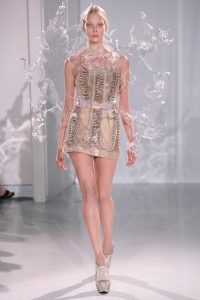
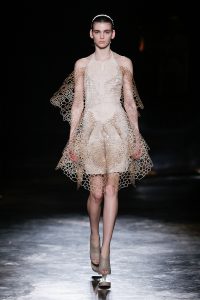
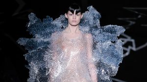
Iris van herpen, fashion designer who utilizes plastic for fashion

f4fdb649e533b8c318de2f5f5940bd4a15-iris-van-herpen-fall-2016-ready-to-wear
iris-van-herpen-ss17-couture-fashion-design_dezeen_hero

I like how she manipulates the texture and shapes of the plastic to invoke different feelings of each outfit. I studied a few of her designs and explored the different ways to use plastic to interpret my chosen scents.

Finalised model: Disruption

img_2017-01-23-20-41-5


img_2017-01-26-101115

See my full PDF file here 🙂

3dii_1

4D Project 1: Picture Story – Curating Self

Processed with VSCOcam with t1 preset

Task 1: Me 

I spent some time thinking about which faucet of myself should I introduce, one that will be engaging and interesting to the viewers. Then I decided to do a project that most people probably wouldn’t have the experience of – being an individual of a mixed race.

Me and my parents wedding photo

My parents wedding photo and  I. The photo is done by using a visualiser to create the backdrop behind me. My father is a Singaporean Chinese whereas my mother is a filipino from Cebu.

I was questioned why I chose to use my parents wedding photo. Marriage is a deep rooted symbolism of two people coming together to be one. And from that very day onwards this combination of my parents resulted in me, a Filipino Chinese that happened to be raised in Singapore.

Race is something that runs deep within individuals, and the way people perceive and treat me (even so subtly) is according to the of race they identify me as.

Most of the time, I feel that race is often stereotyped by the way one look. One of the most distasteful things I’ve heard was when my mother and I were in the Philippines and a foreigner nonchalantly said “yea, you look very filipino”, to a lady who is seated next to both of us.

Which got me thinking, what actually identifies a race? Is it based only on the outer appearances or does it run deeper than that?

Task 1 explores this question and expresses how I feel being a multi racial individual.

1.3

Characteristics that people say make me look Chinese, slanted eyes and yellow skin

1.2

Comments that I heard from people who said what characteristics made me look filipino. Prominent eyebrows, wider set eyes and tanned skin.

I chose to place my portrait next to each other in the photo presentation, signifying that these two cultures I stemmed from forms me. I am not me without one race or the other.

This article is something I can relate to (don’t worry, my situation isn’t so exaggerated)

17 Struggles Of Being Mixed-Race


Artist reference:

Ms Lei pointed out that my ideas is similar to John Clang, who used the visualiser to take his family portraits when he was studying overseas.

Upon referencing from him, I started to take note of my positioning and how I wanted the background photo composition to be like. I specifically wanted to stand in the middle of my parents, and thankfully I managed to dig out a wedding photo that fits my criteria.

Another artist I was referred to was Orlan, who does plastic surgery as a form of art and photographs the journey. This was very relevant especially since I wanted to draw the comments on my face. I took inspirations from her drawings and tried to replicate some of it on my face.

Areas of improvements:

  • The lighting on the different sides of my face was different despite it being cropped out from the same photo. Should probably take note of  lighting  in future
  • I wrote the words “yellow” at the sides of my jaw and unfortunately it didn’t occur to me that it couldn’t be seen until I took the photo


Concept 2: Object

If you were to ask me to name a significant object in my life, it would definitely be my stuffed toy who has been around with me for almost 10 years.

For this task, I want to capture how important my stuffed toy is to me.


Me going overseas with my stuffed toy

Me going overseas with my stuffed toy

With the luggage and my toy above it, it signifies that my toy is so loved by me that I want to bring it overseas (though I don’t do it now because I am an “adult”).

I took this picture by myself with a tripod and it was quite an experience to run back and forth to make the necessary changes. I also purposely positioned the camera at the certain angle because the road leads the eye to me, the main subject.

I did not make use of the road for the first few shots and this resulted a very messy shot as the eye did not know where to look. Did not help that there was a messy background too with all the pavements and street lights.


Mandatory shot of the main purpose of my stuffed toy

Mandatory shot of the main purpose of my stuffed toy, to cuddle!

For this shot I wanted to avoid making my room too dark. Had to play around with the curtains to get the light to shine at my stuffed toy.


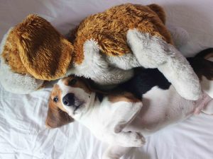
My real dog and my stuffed toy are the same breed

My real dog and my stuffed toy are the same breed

One of the funniest things I noticed is that my puppy is actually the same breed as my stuffed toy. It is purely a coincidence!

Artist reference: 

I had to look through Cindy Sherman, who dresses herself up and compose the shots to portray a certain meaning, to find some inspiration. Looking at her photos made me think of what kind of props and outfits I can use to express this point.

The rest of the photos in this task is done my experimenting and trail and error. I did search for bedroom shots in Pinterest to see the kind of lighting I can replicate for this shot.

Areas of improvements:

  • For the first photo I was actually holding onto my passport but for this photo (which was the best shot) it didn’t look very obvious
  • I personally feel that the third photo is slightly overexposed due to the strong light from my window

Theme 3: place

My father is a scuba diver and my mum is a fisherman from the province of Cebu. With this, water is a huge part of me and my family’s life. In fact we are going to Bali to scuba dive this December!

OLYMPUS DIGITAL CAMERA

Taken with an underwater digital camera that my friend kindly lent

For this photo, I wanted to to portray that it feels like I am birthed out from water.

3.2

A guy’s hand, which represents my dad’s

My dad is not the kind of person that openly display his love. When we go on diving trips his love is more obviously shown more when he holds me by my tank, afraid that I feel sink to the deep bottom. He also saved me from drowning a few times and the imagery of his hand pulling me out of the water is stuck strongly in my mind.

3.5

If you look into my heart and into my soul what you’ll find is water

Screen Shot 2016-09-08 at 7.49.59 pm

Me and how I feel at peace with water

Screen Shot 2016-09-08 at 7.50.51 pm

How I perceive water, the sun representing shallow waters and the dark which suggests deeper waters. Both I experienced and love

Artist reference:

Again, was search through Pinterest and I stumbled across Elena Kalis, Alice in waterland and looking glass series where she did photographed a girl reenacting Alice in wonderland underwater. With the lack of gravity and unique props, the results were beautiful and it seemed like the subject was in a timeless space. Definitely, it was difficult to recreate the quality of her photos. But giving underwater photography a try was a unique experience that I would definitely love to explore again.

If you want to see her works, click on the link below:

http://www.elenakalisphoto.com/alice/

Areas to improve:

  • After taking my first round of photos and looking back at Elena Kalis’s work, I realised that I could’ve played with even more angles in the underwater shots (despite already taking quite a bit of shots)
  • Things would be much easier if I have underwater lights and weights, because my friend and I kept on floating up. Realised that maybe I could’ve tried putting some torchlights in ziplock bags because #whynot

Overall conclusion, 

There is a lot of areas where I need to grow in photography. After looking through the class works, I realised that the next thing I should work on is lighting and exploring different angles. I looking back at the way I lay out my work, I realised that I could’ve laid it out better. For example, placing the undershot in the middle of the wall not at the top since it was one of the better photos.

One way to improve is to look through more photographs by artists and study their shots.

Excited to learn more in 4D!


My line is emo: Artist inspiration

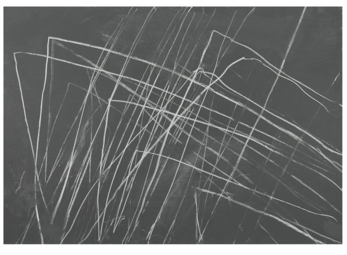
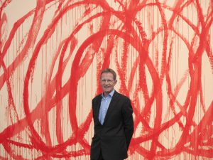
Inspiration 1: CY Twombly

Focusing on abstract work, I really like CY Twombly’s ‘scribbled’ art.


cy-twombly

CY Twombly with one of his most famous art pieces

098N08991_6vj9q

Love this

Screen Shot 2016-09-05 at 2.31.29 pm

I wanted to do a line for love, mainly passion. When I think about a crazy, sort of passionate form of love, I envision two lovers being hopelessly together in their own messy world. CY Twombly’s style of ‘scribbles’ really resonates with what I envision the line to be, so I dove right in to try it out.

Tying two pens together with a fishing line (with the two pens signifying a pair of lovers), I let my emotions flow and thought of an image of messy love. Here is a video of me trying it out:


love(passion)

Emotion – Passion. I layered the same image below it to emphasize on the love between two people.

He is the few artists that I got my inspiration from. My other pieces are techniques that I found online 🙂