
After so many long posts, let’s start off with my work process~
*Disclaimer: I started using colours that aren’t pastel yet, as I wanted to have a solid bold colour to see if the overall outlook matches, before making them pastel!*
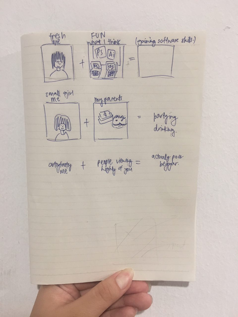
Before I started doing it digitally, I conceptualized on a little notebook I had!
(Sorry for the really messy sketch)
I started out working on
Equation 1: Me, from a business background + Learning basic design skills = What I think
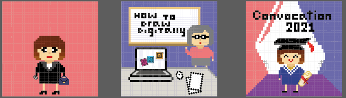
I placed me, wearing a business formal, with a red background. However, I felt that this square was too plain, and it might be better if I added more elements.
The next square, I used a scene whereby a teacher is having a class on “How to Draw Digitally”, something I expected to have during my journey in ADM.
Finally, the last square, it’s me, graduation in 4 years time (2021), in NTU!
The reason that I used these colours is because Red represents Passion, and design/drawing is my passion, which is why I ended up in ADM despite having done business in Poly!
Another reason – was because, NTU graduation ceremonies, has tons of reds and blues! I kept the colours for the last square to be aligned to the norm of NTU. Here’s a photo of the recent Convocation 2017!

But for the last square, I wanted to place purple as the ground colour, as Red + Blue = Purple. However, I felt that it doesn’t complement each other. I’ll work on it and hopefully come up with a better colour scheme!
For Equation 2:
Me, still a child to my parents + Receiving pocket money = What my parents think
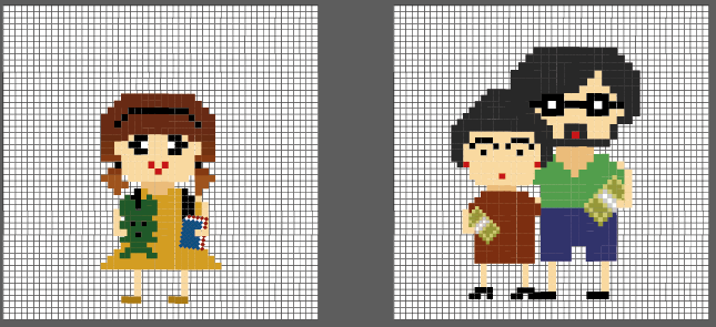
Firstly, I started with the first 2 squares only.
For square 1, It’s me as a child, with two pigtails, and a soft toy!
Square 2, it’s a mid-aged male and female, which is my parents, and they are both giving me cash (money), to fund my schooling and allowance!
To me, the colour scheme seems pretty off, and don’t suit the theme of me still being a kid to my parents.
*Note to self: Gotta work more on it!!*
For Equation 3:
Artsy fartsy me + Doing well in an arts course = What society thinks

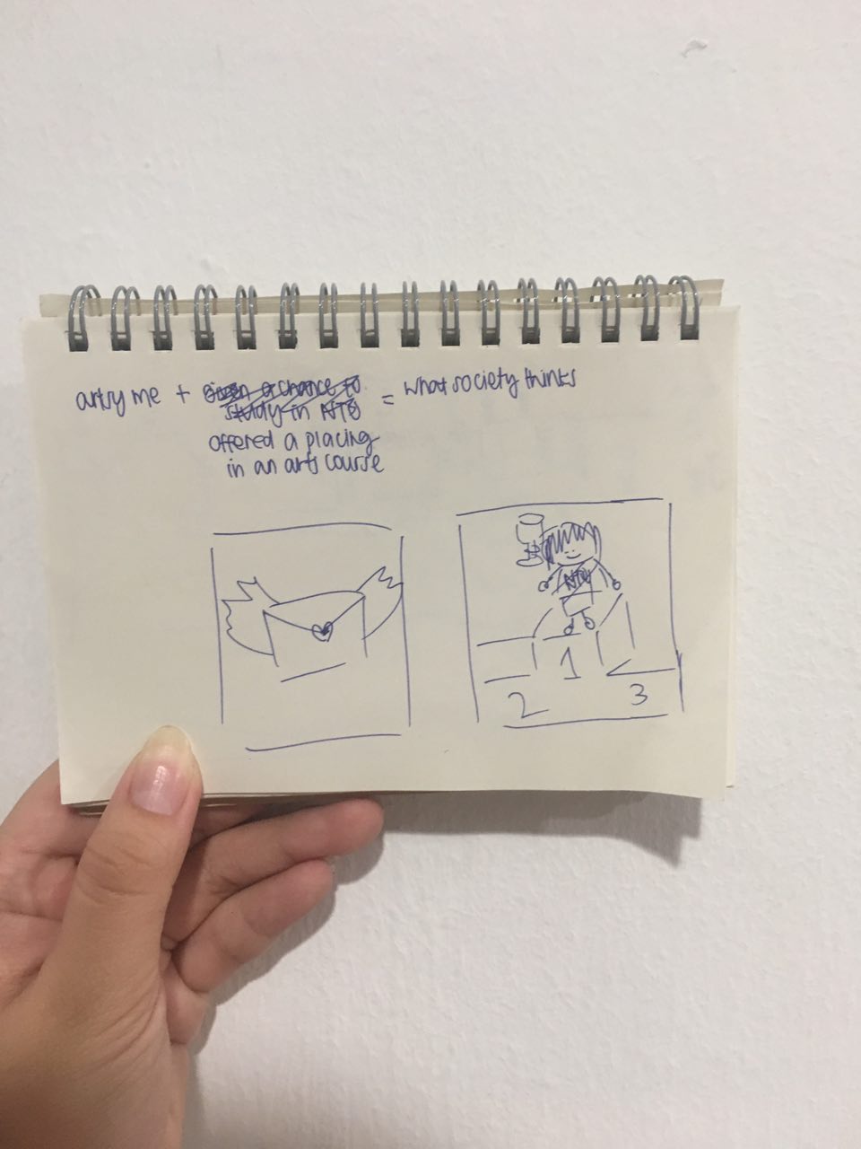
I did the last square of “What society thinks”, before doing the rest!

This panel was to portray me being an artist on the streets, selling my art commissions for a living. However, after a consultation process with Prof Mimi, I do agree that the colours I used were too dull, and the artworks looks like stamps instead. Thus, I suggested – why not use spray painting instead? It’s considered a kind of leisure street art!
Lastly, for Equation 4:
Sleepyhead me + Deadlines = What actually happens
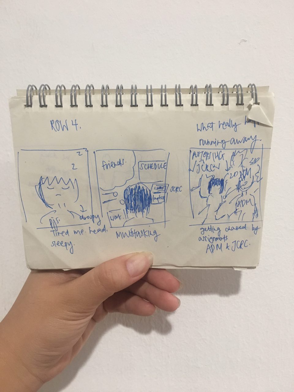
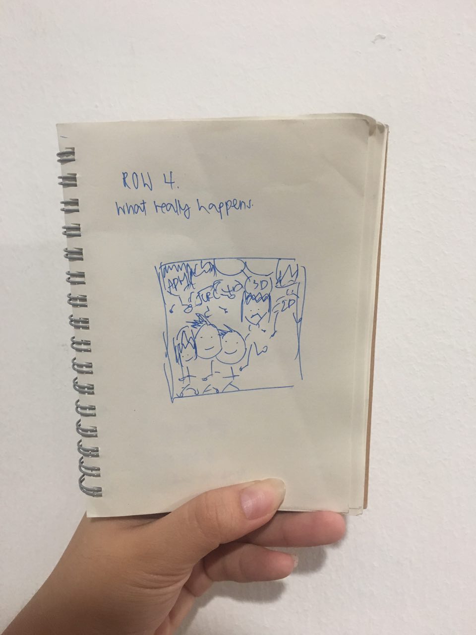
I only managed to come up with the sleepyhead me before the consultation, hahaha.

I really really like this as it looks like my face 24/7 HAHA.
But overall, I feel that this won’t suit the style of the 8-bit art I am going for, so I will be changing it!
Till then,
Flazéda!
jamz
x