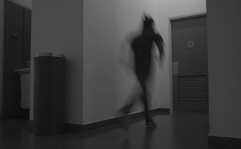
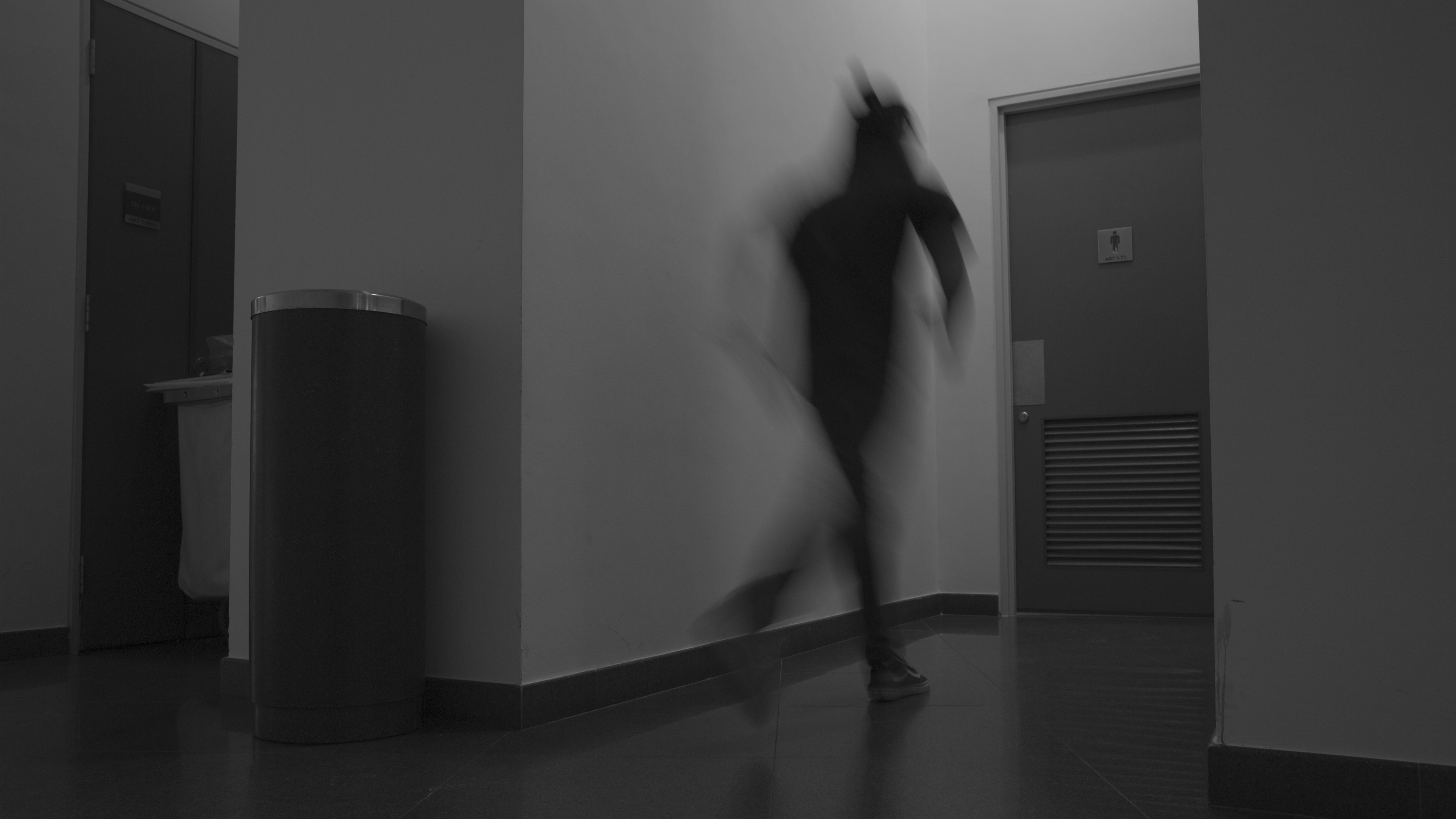
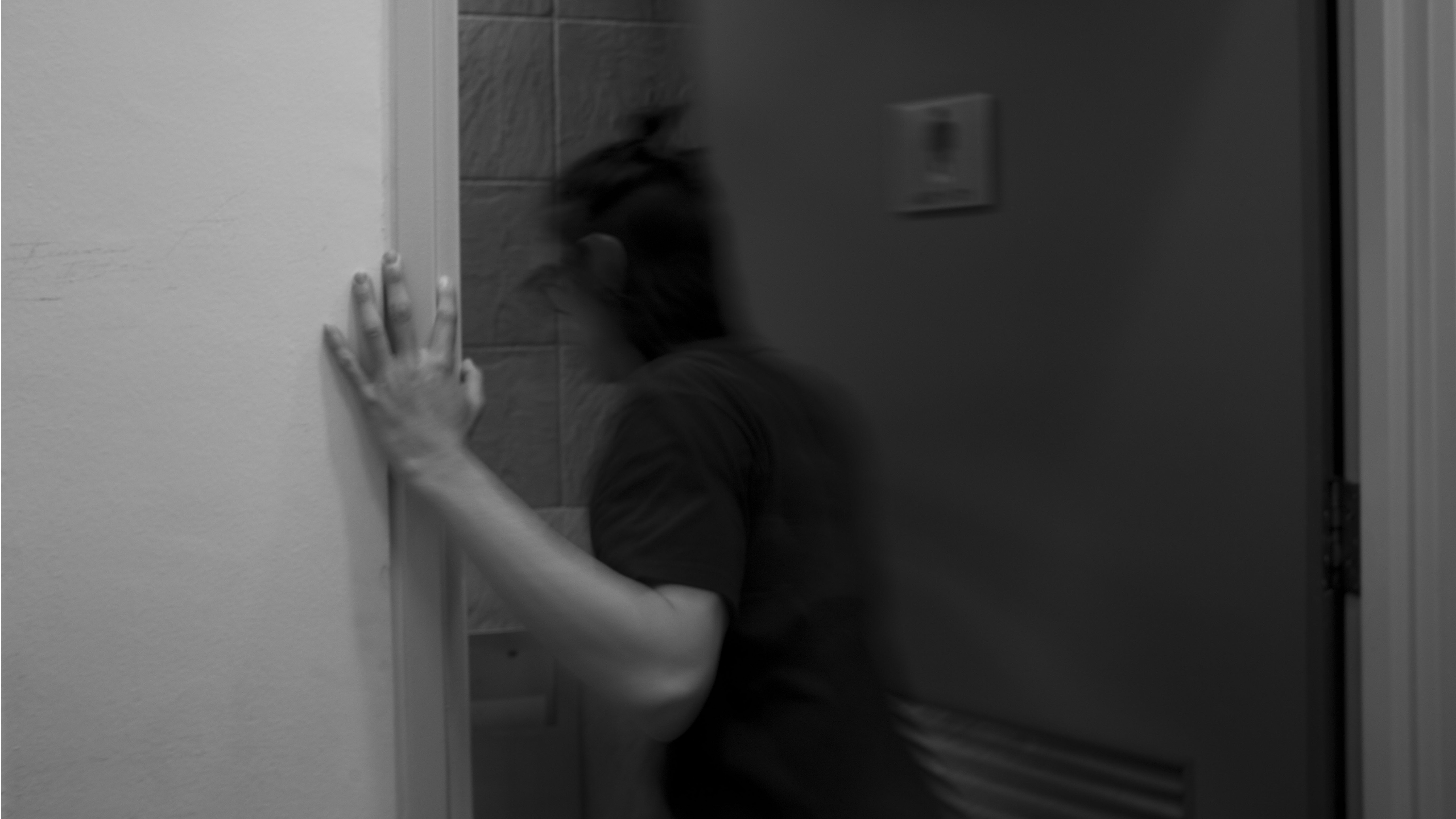

Protected: Jon in a Box (Working Title) Draft 03
Protected: Jon in a Box (Working Title) Draft 02
Protected: Jon in a Box (Working title) Draft 01
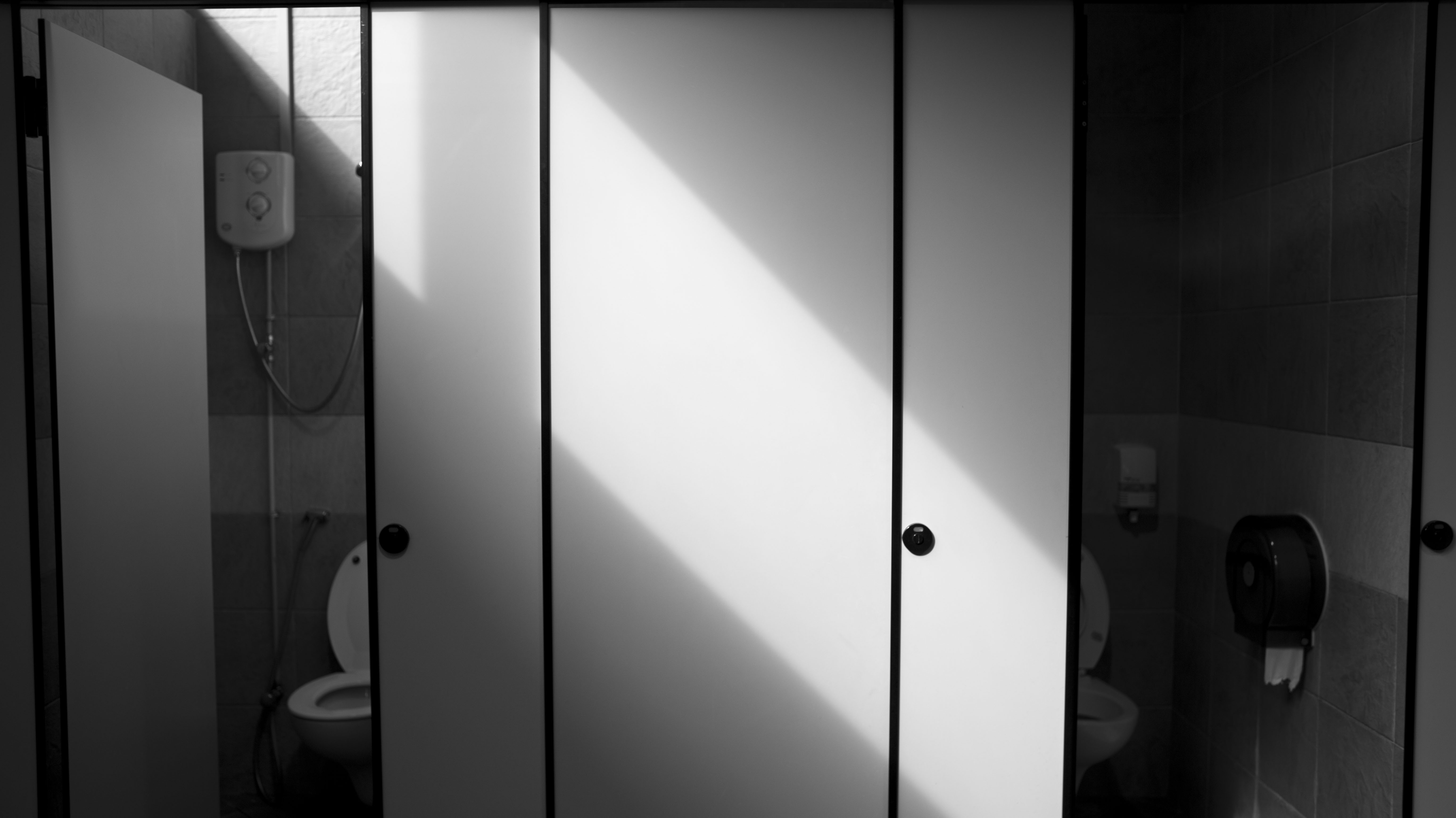
Protected: Filmmaking Thoughts
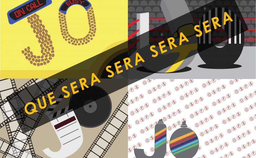
Josiah Tan – Project 1 Gallery
I am a Cab Driver

The main elements of being a taxi driver that I wanted to highlight were the cab signs of Singapore, the car itself, and the beaded seats that all cab drivers seem to use.
I am a Professional Wrestler
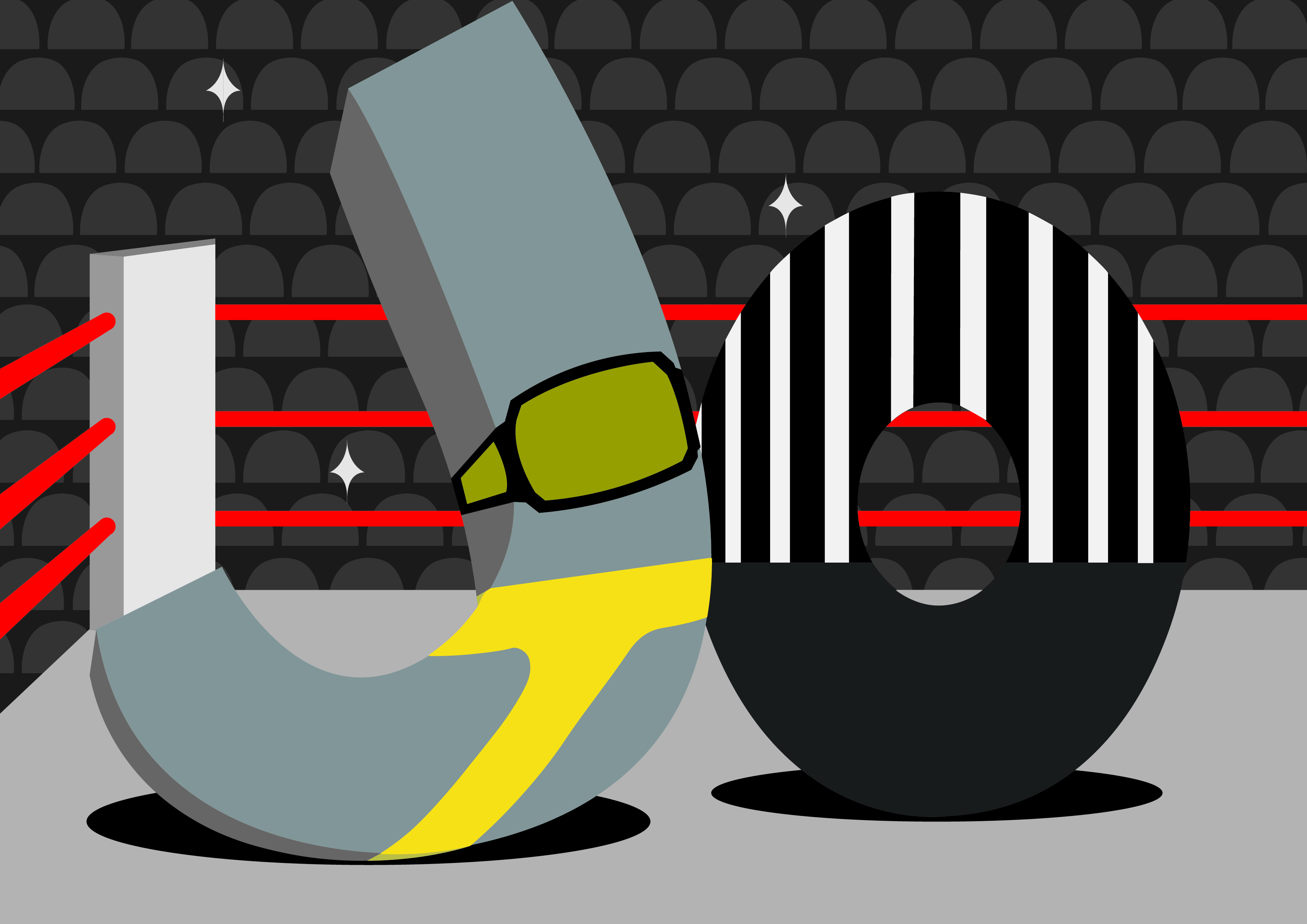
The main elements of being a professional wrestler that I wanted to highlight were the ring, the championship belt, the tights, the referee, and the fans. Additionally, to remove the confusion of professional wrestling to real wrestling, I wanted to make the type less gritty and more playful.
I am a Filmmaker
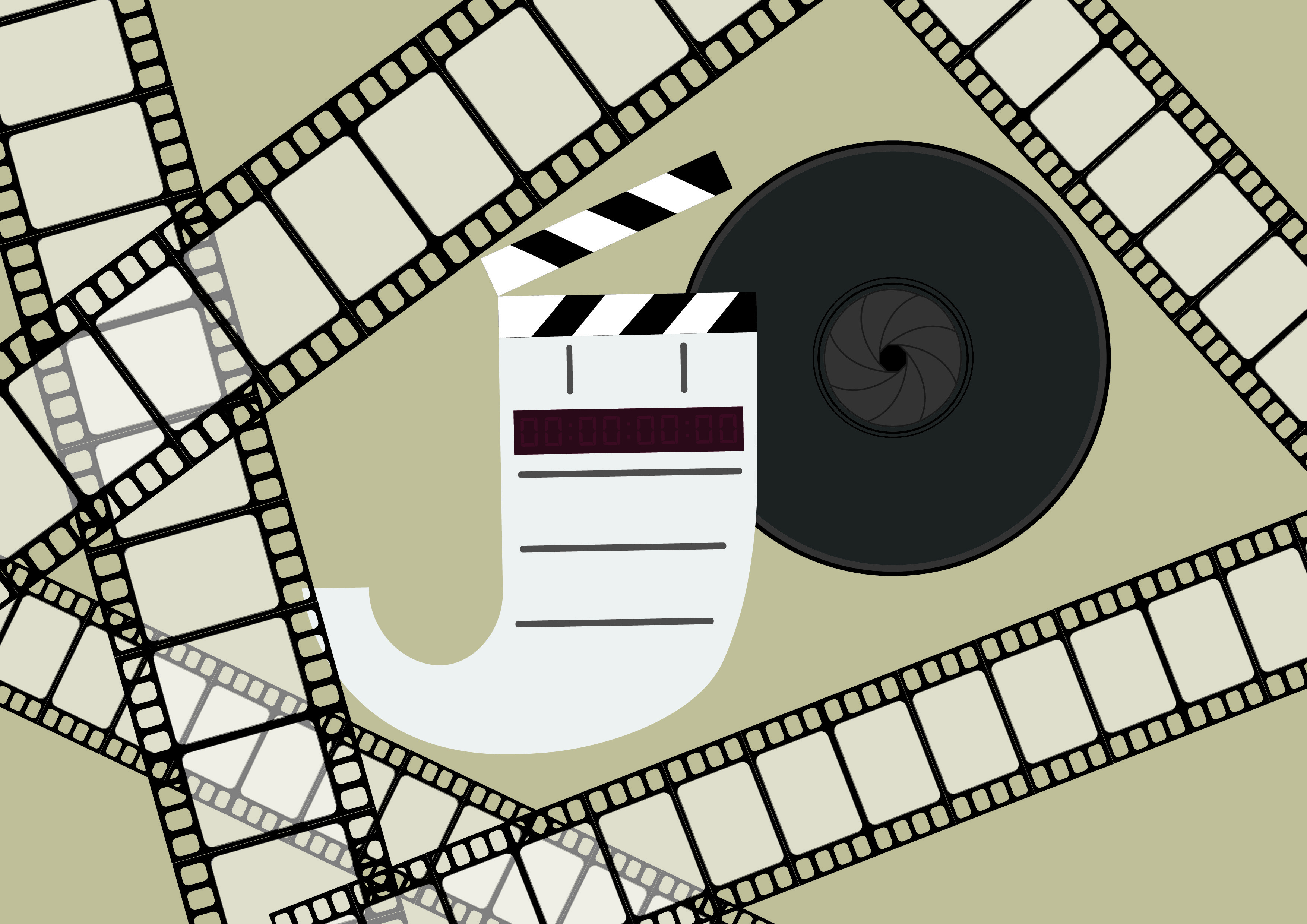
The main elements of being a filmmaker that I wanted to highlight were the clapper board, the camera lens, and the film reel. The use of a brownish colour is to give the sense of nostalgia to convey that film is where is feel comfort.
I am a Gangster Graphic Designer
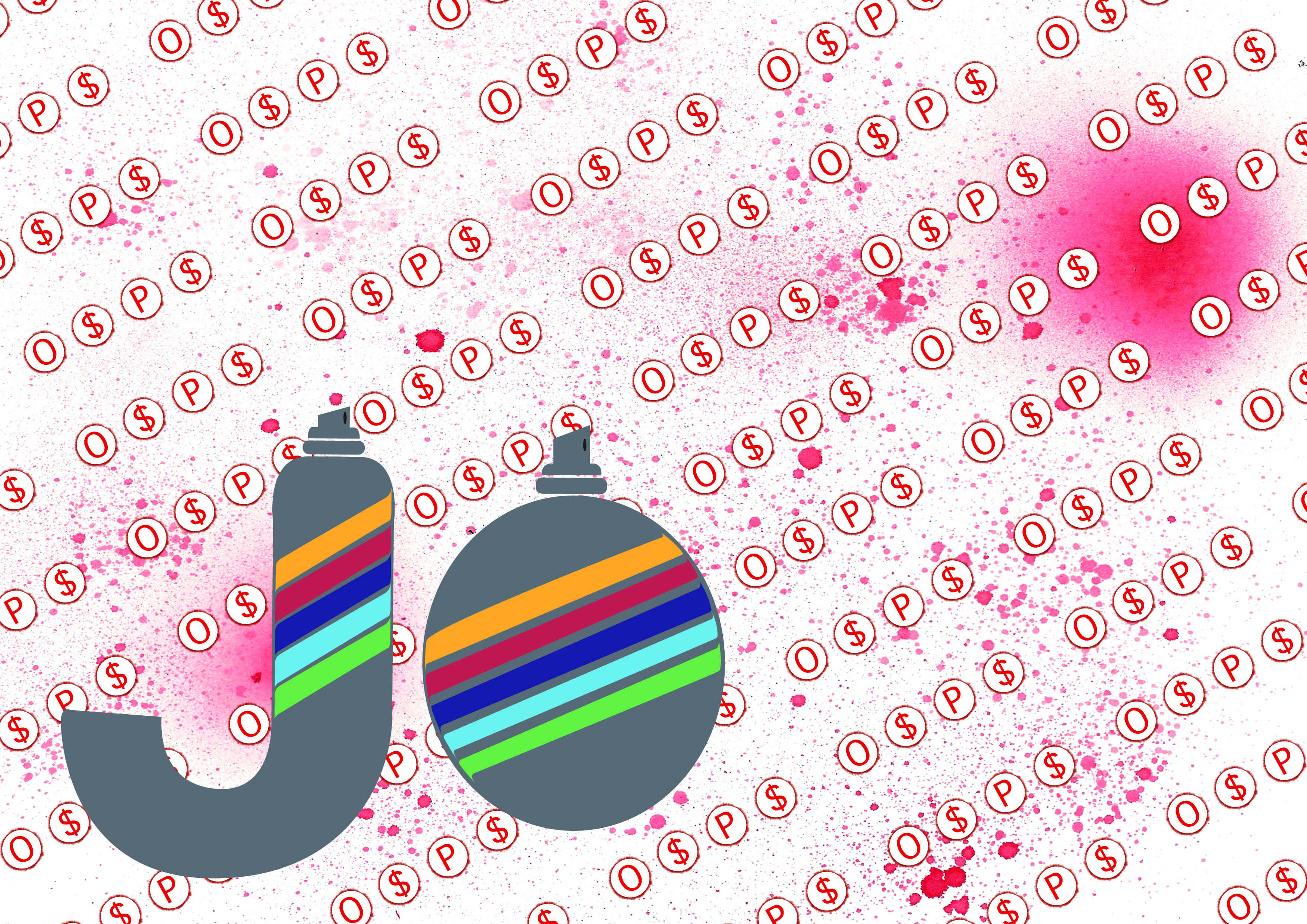
The main elements of being a gangster graphic designer that I wanted to highlight were the O$P$ graffiti and the spray paint. While this was the most interesting idea to me, conveying the idea of a graphic designer is challenging. I feel that the use of patterns conveys that in a slightly less direct manner.
Josiah Tan – Project 2 Gallery

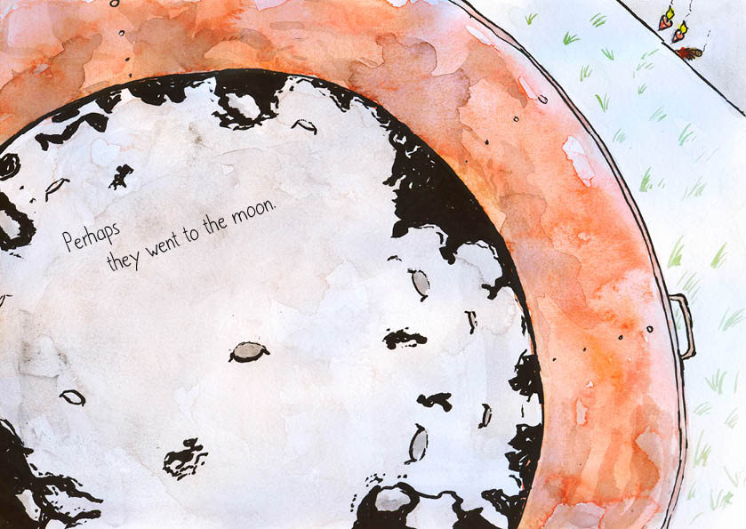
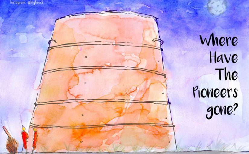
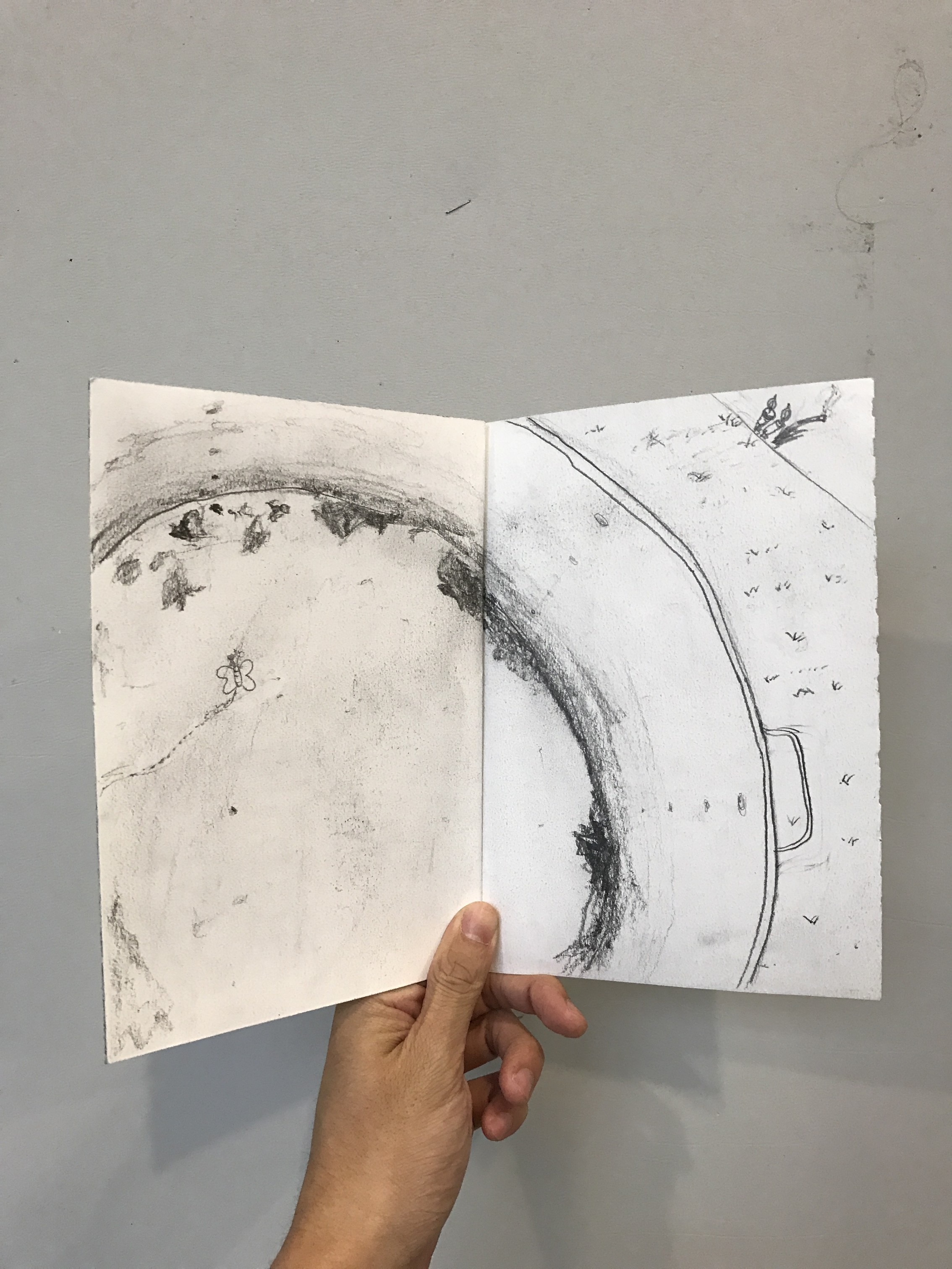
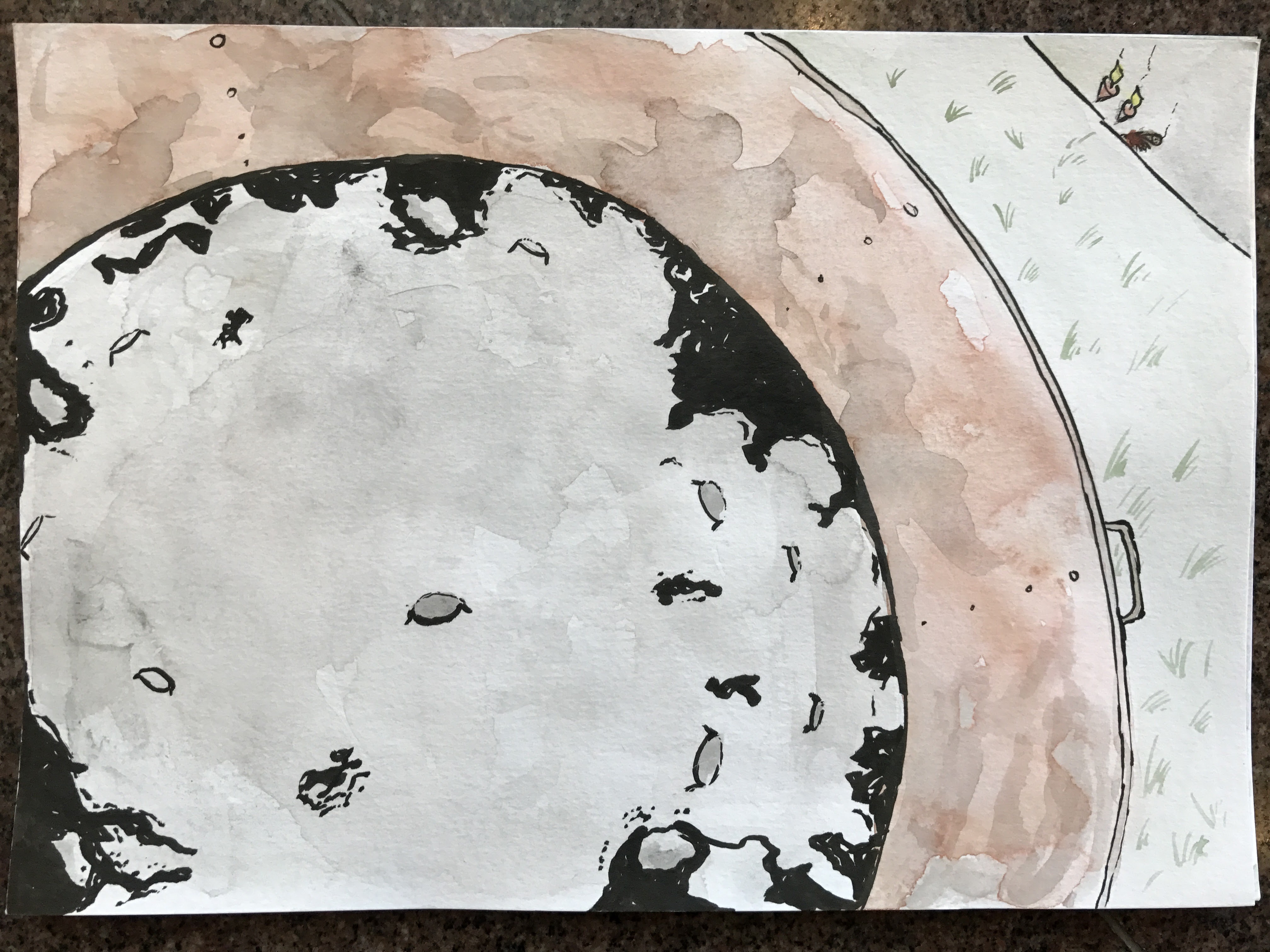
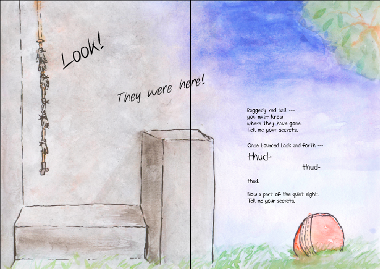
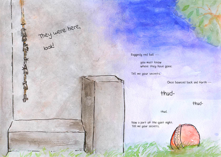
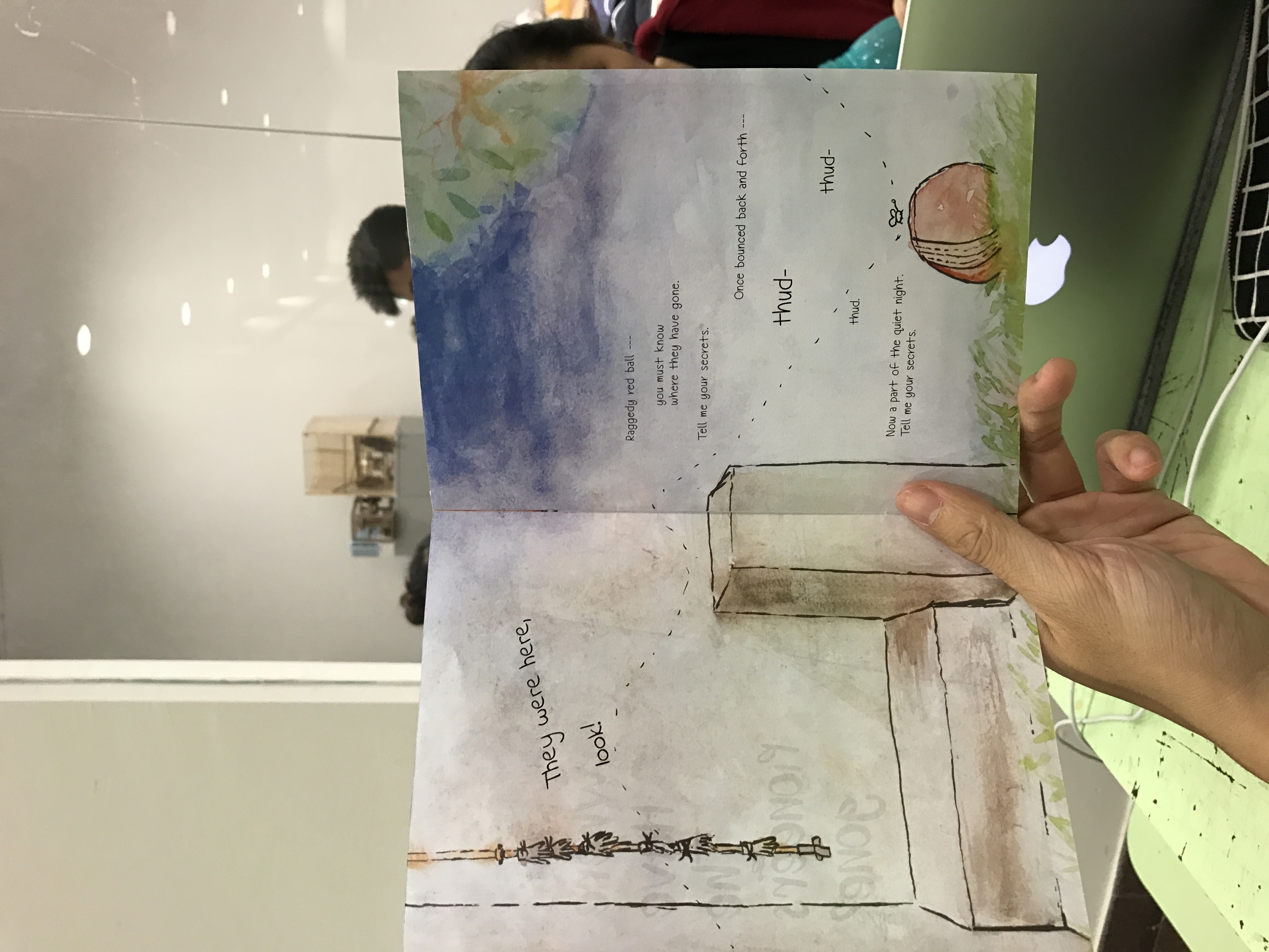
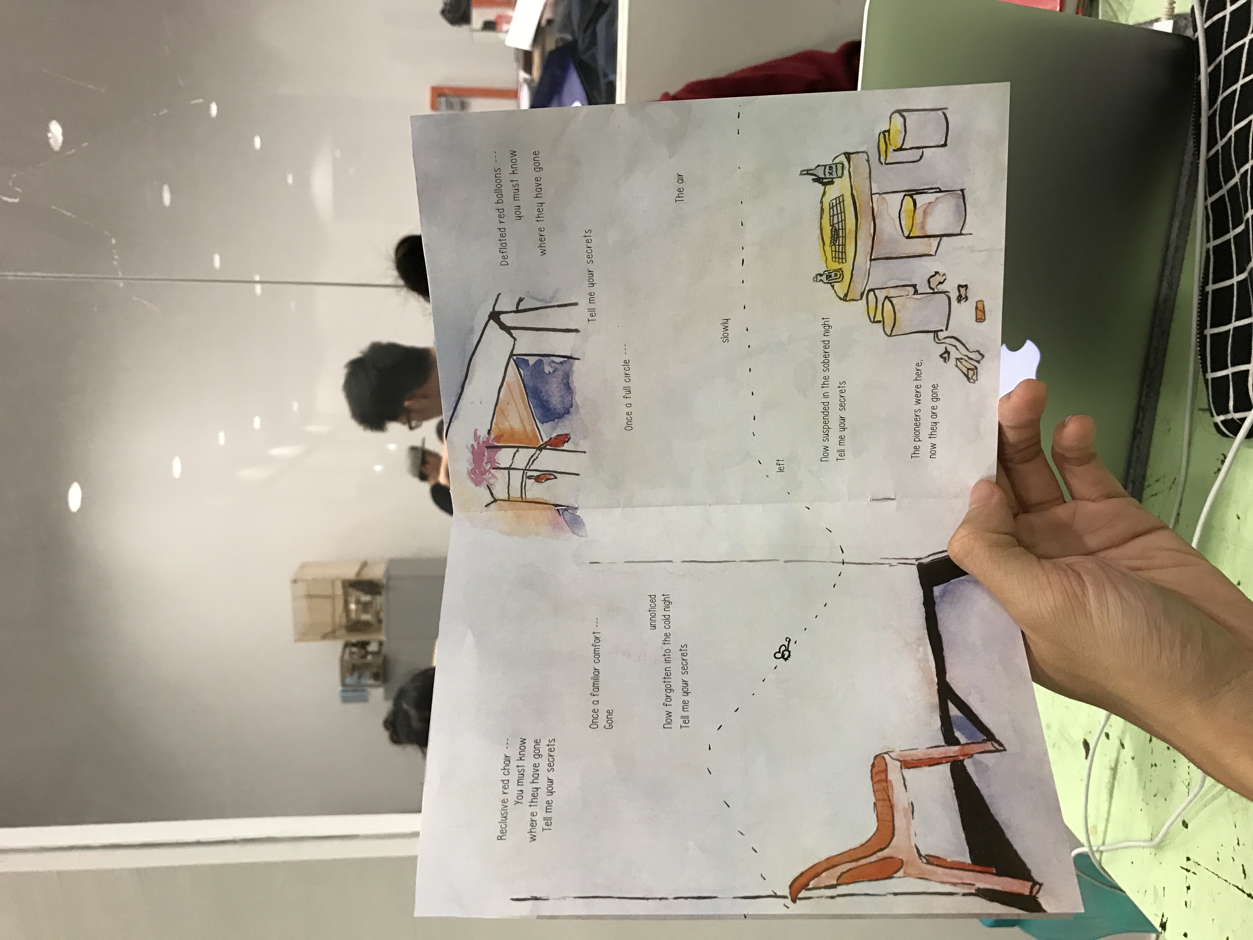
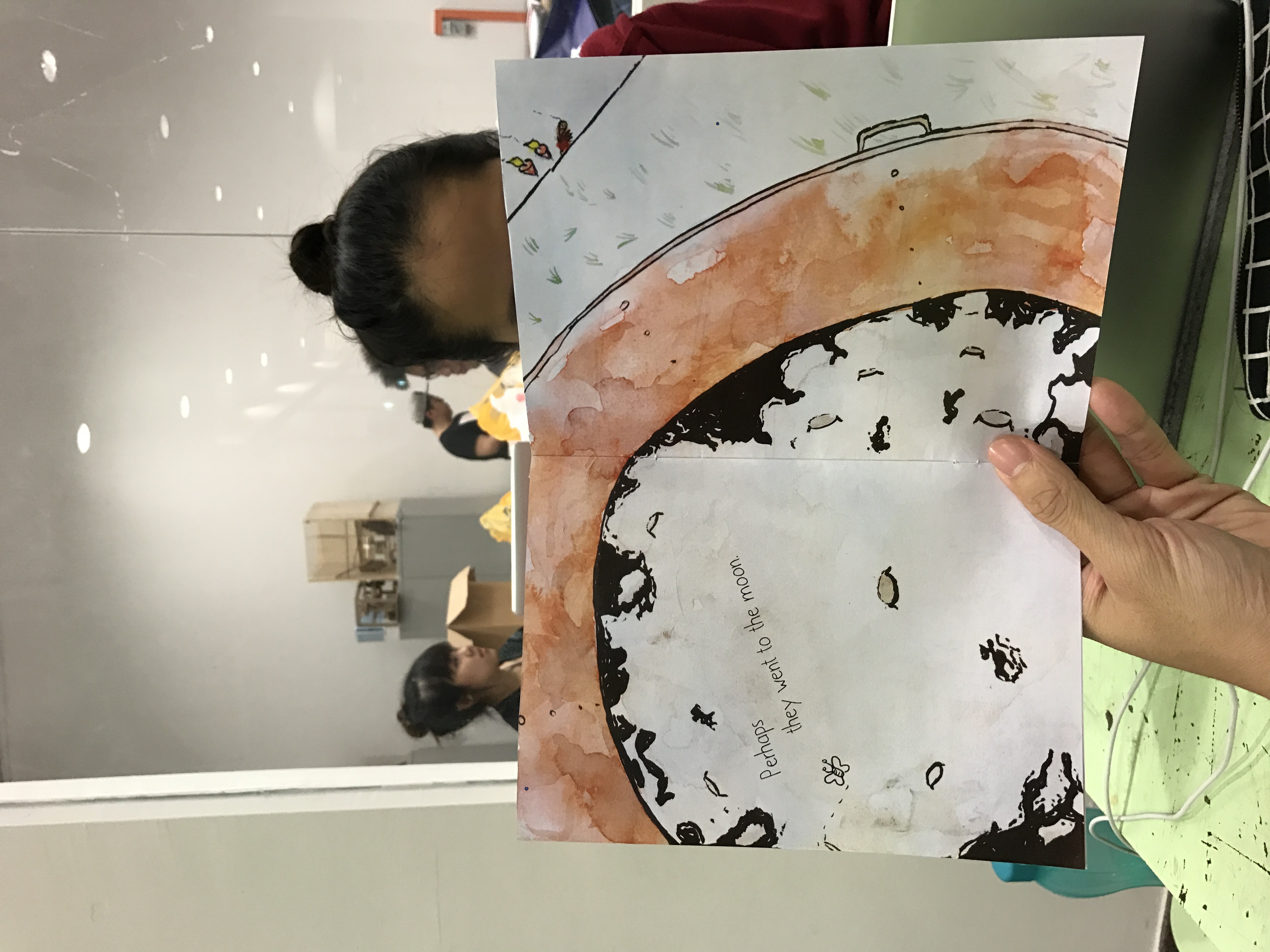
In my travels around Pioneer, I found many burning bins. This made me think of the morbid question: Are the pioneers all dead? I took a couple of photos of the insides of the burning bins and saw the moon. This made me think that maybe they went to the moon – a metaphor for them passing on. The poetry that accompanies the images were transformed from being just a narrative of the pioneers passing away to my reflections on the difficulties in connecting with the pioneers. In the poem, there is a progression from the ease of communication between kids and grandparents, to inexplicably losing it in our youth, to its complete loss when our grandparents have passed on – perhaps to the moon.
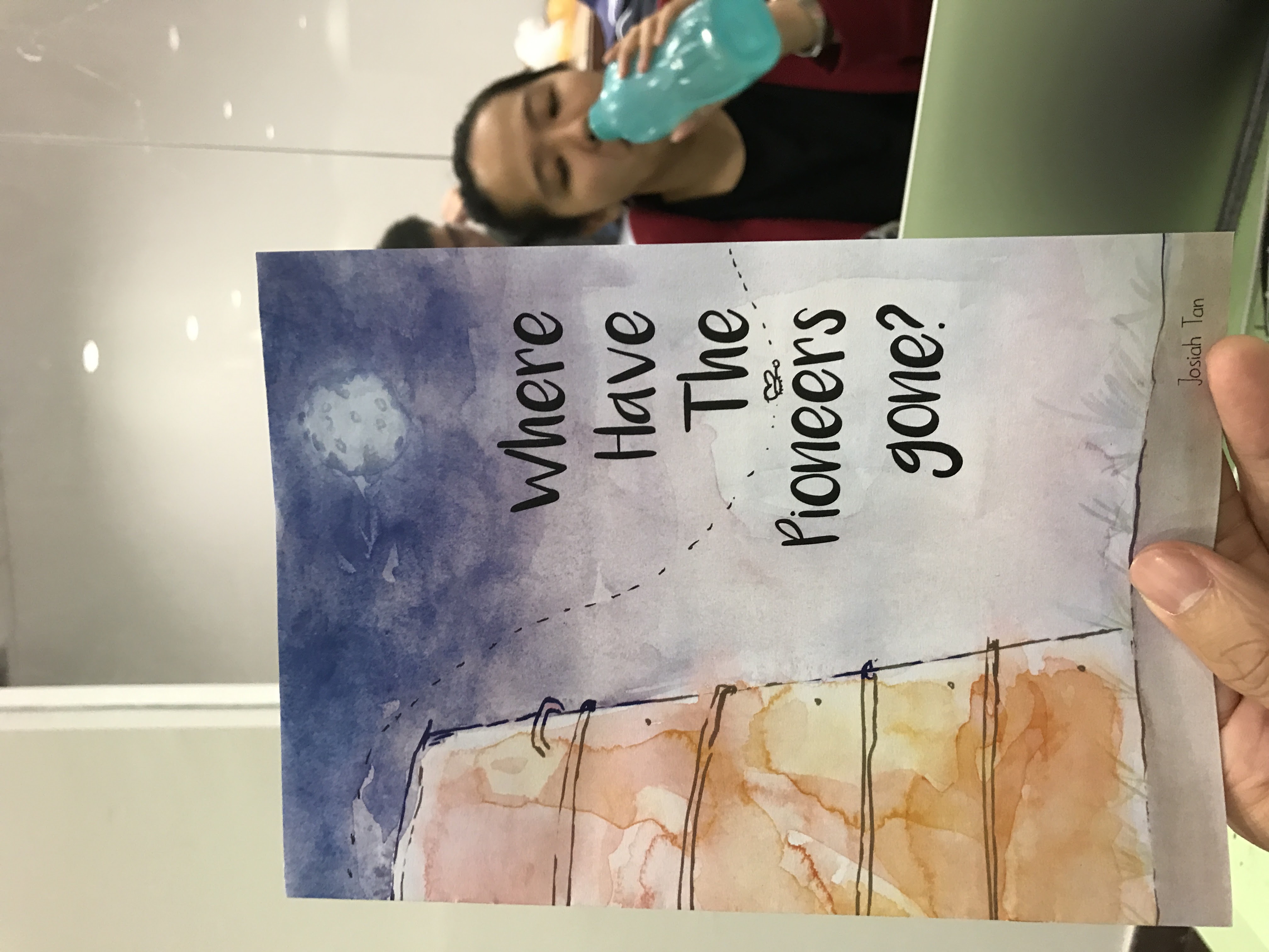
Where have the Pioneers gone?
That is all. If you have any queries, please don’t hesitate to ask.
Wew~
Time to get some sleep!
The pioneers too have gone to sleep.
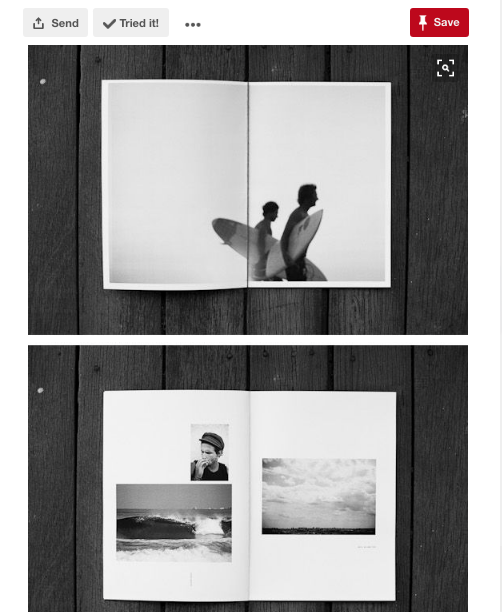
2DII Zine: A Pioneer Story
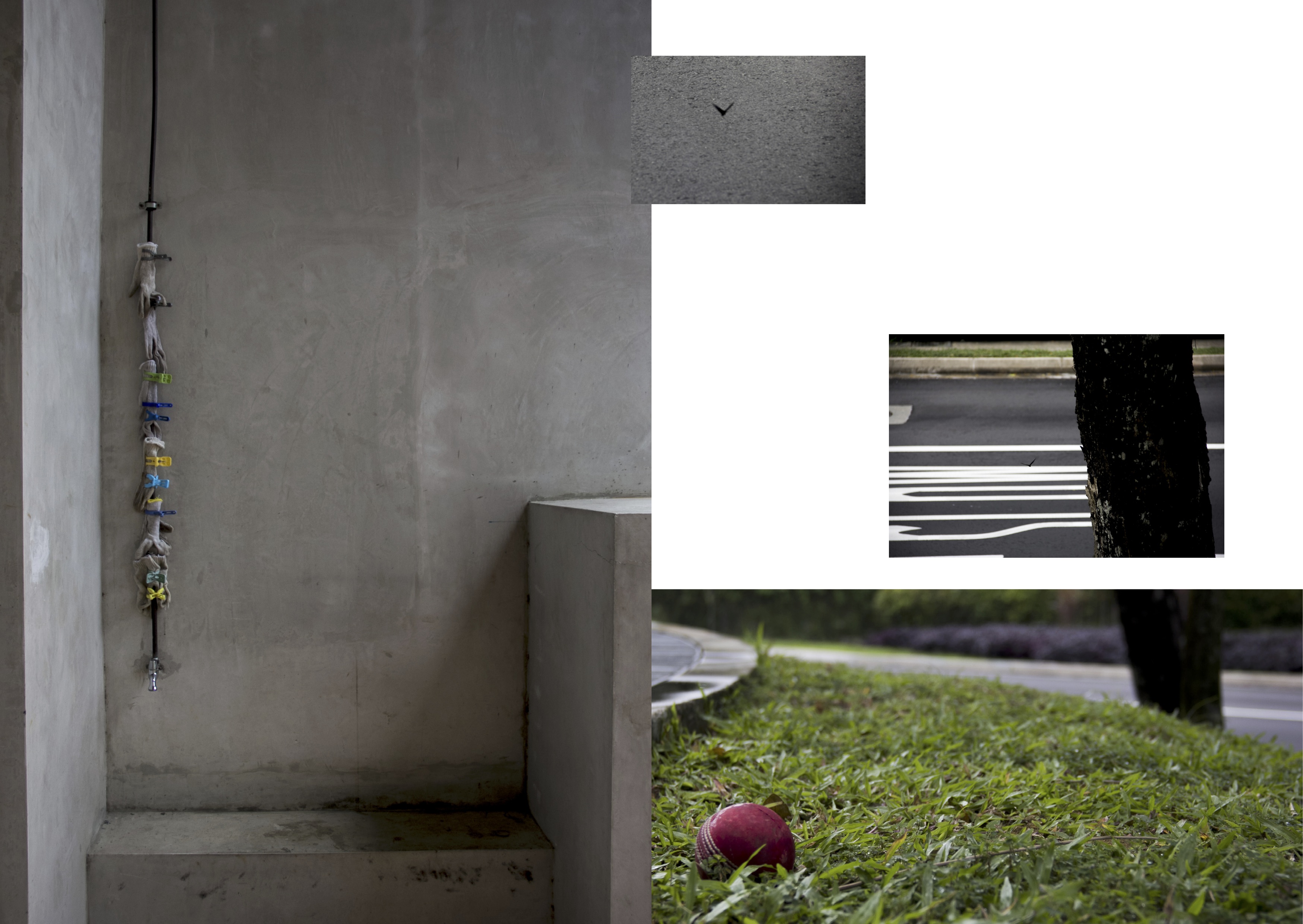
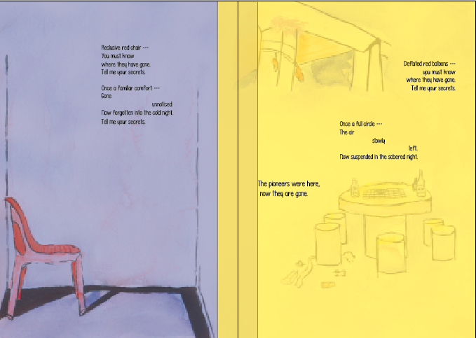
Following presentation, I planned out a rough spread-by-spread design using the photos that I took.
I wasn’t able to think about a front cover but I worked on everything else. Arranging the photos on InDesign, I created my very first draft.
IFC & pg 2
Pg. 3 & 4
Pg 5 & IBC
Back Cover
I liked the use of some of the photos and how they fit into the composition.
Overall though, I felt like I should be doing illustrations instead if I intend to take a narrative “children’s’ story” approach. I was worried about the illustrations not being able to convey that what I saw was actually there, but it turns out that it was not a problem at all. That was nice.
Before proceeding, I went to find inspiration for zine designs. I made saw a couple that piqued my interest.
Chungking Express Sardines

Poems from Egghead: Or, you can’t live on ideas alone.
Random Pinterest zines
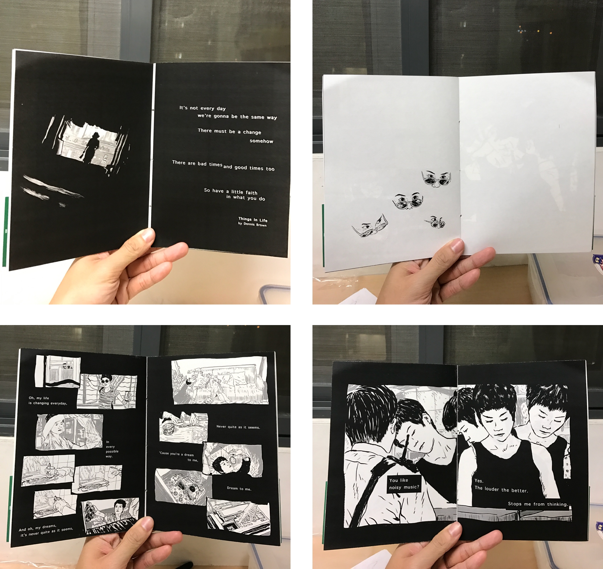
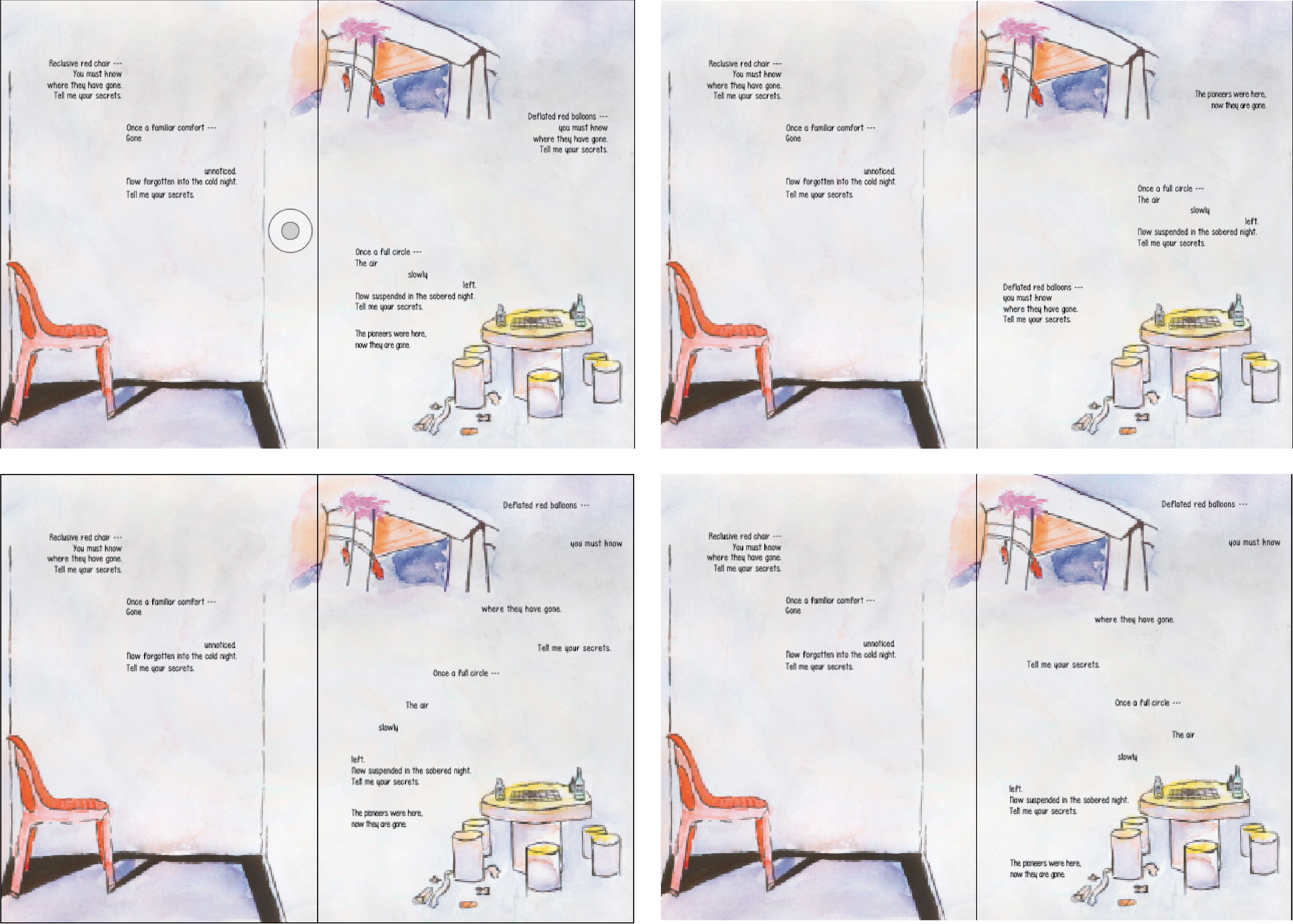
With a rough composition out and zinespirations, I proceeded to work on the rough draft in illustration,


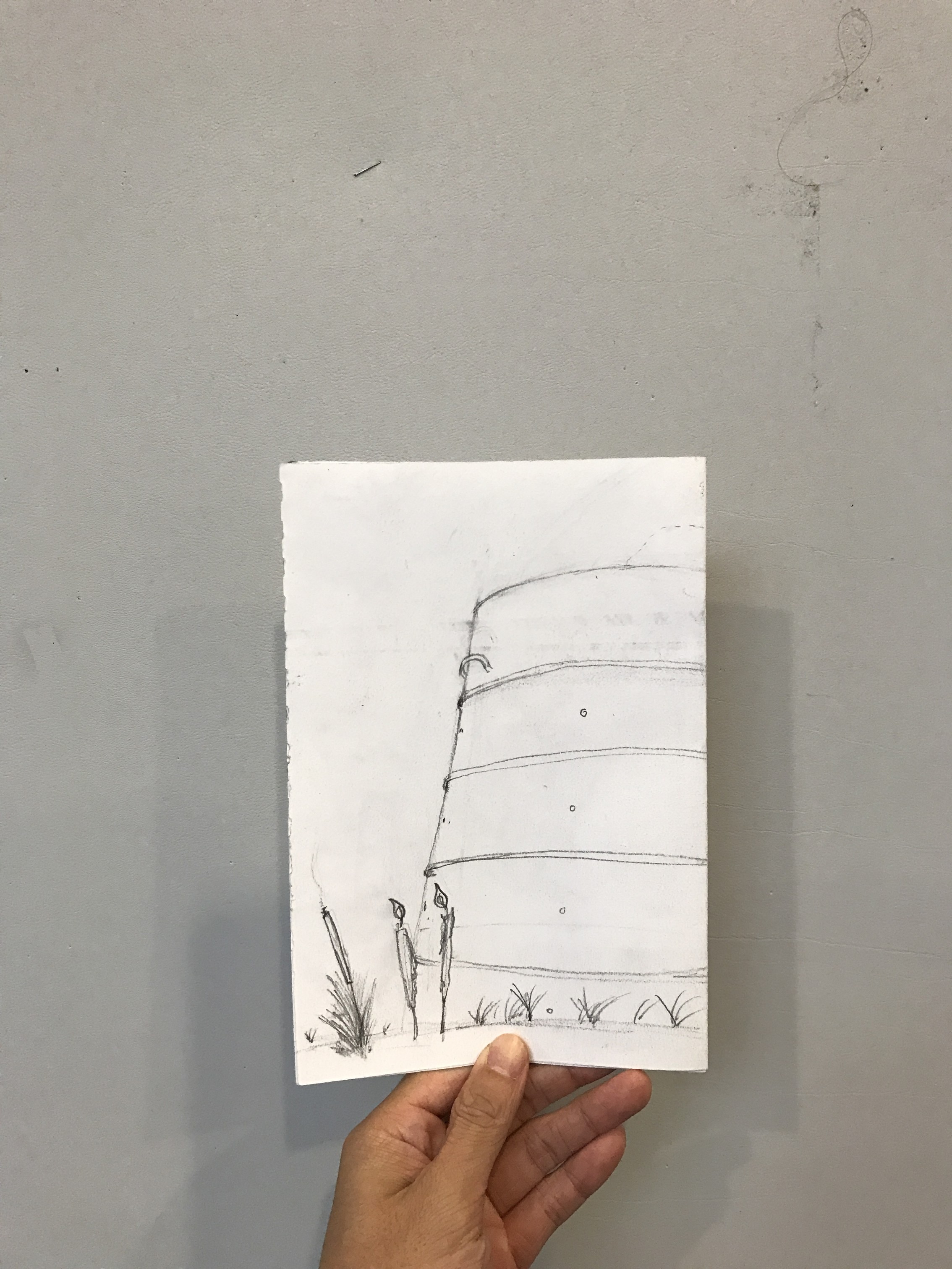
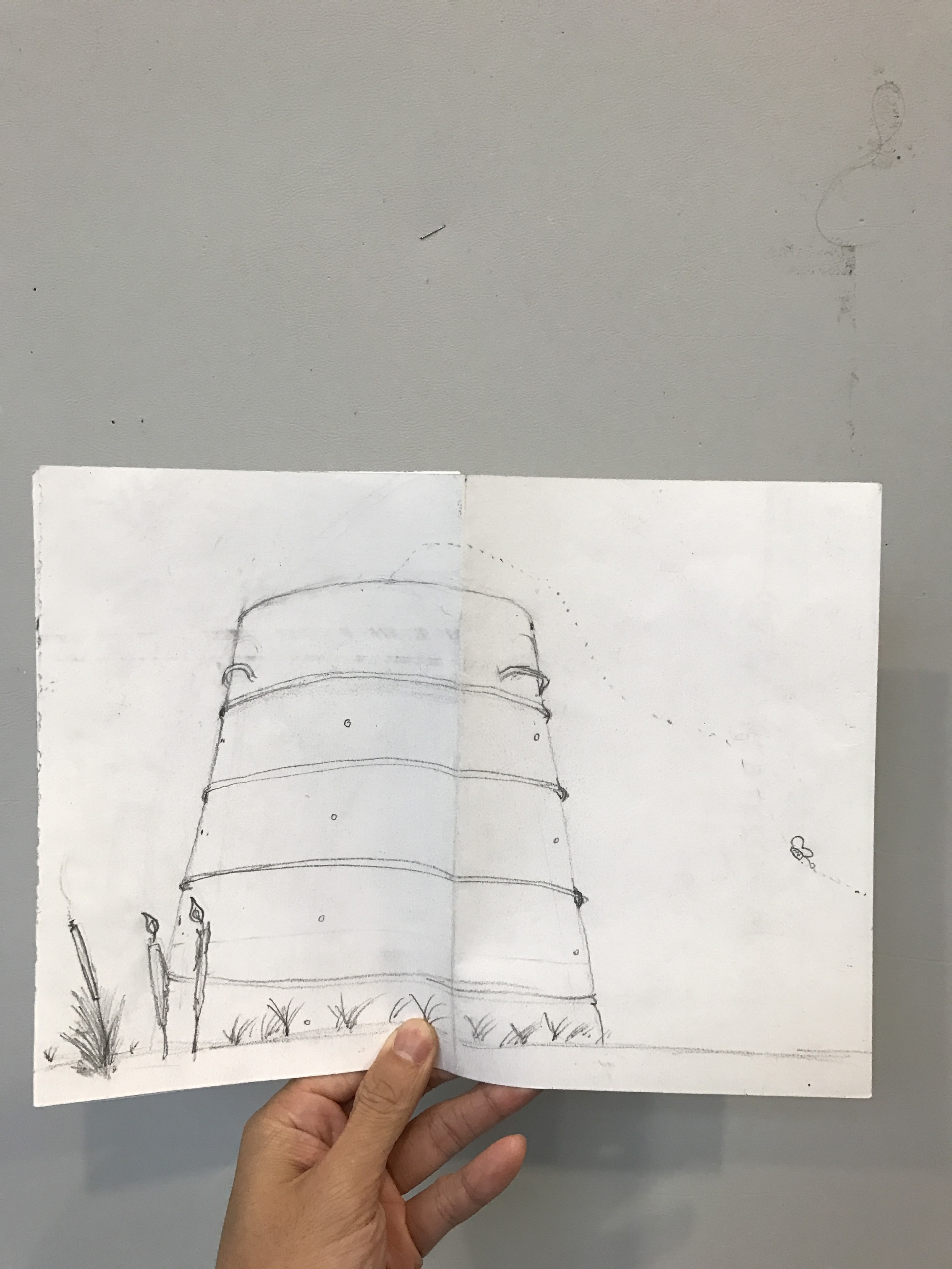
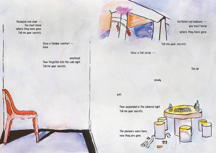
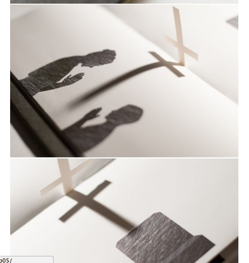
I found the use of images blending into each other or crossing over to the other page to be very liberating. I quite liked the recurring motif of the butterfly to represent souls flying through though I suspect that I will have to work on the composition before locking down the idea of the butterfly.
Now I needed to watercolour the composition and then add in the words and lay them out.
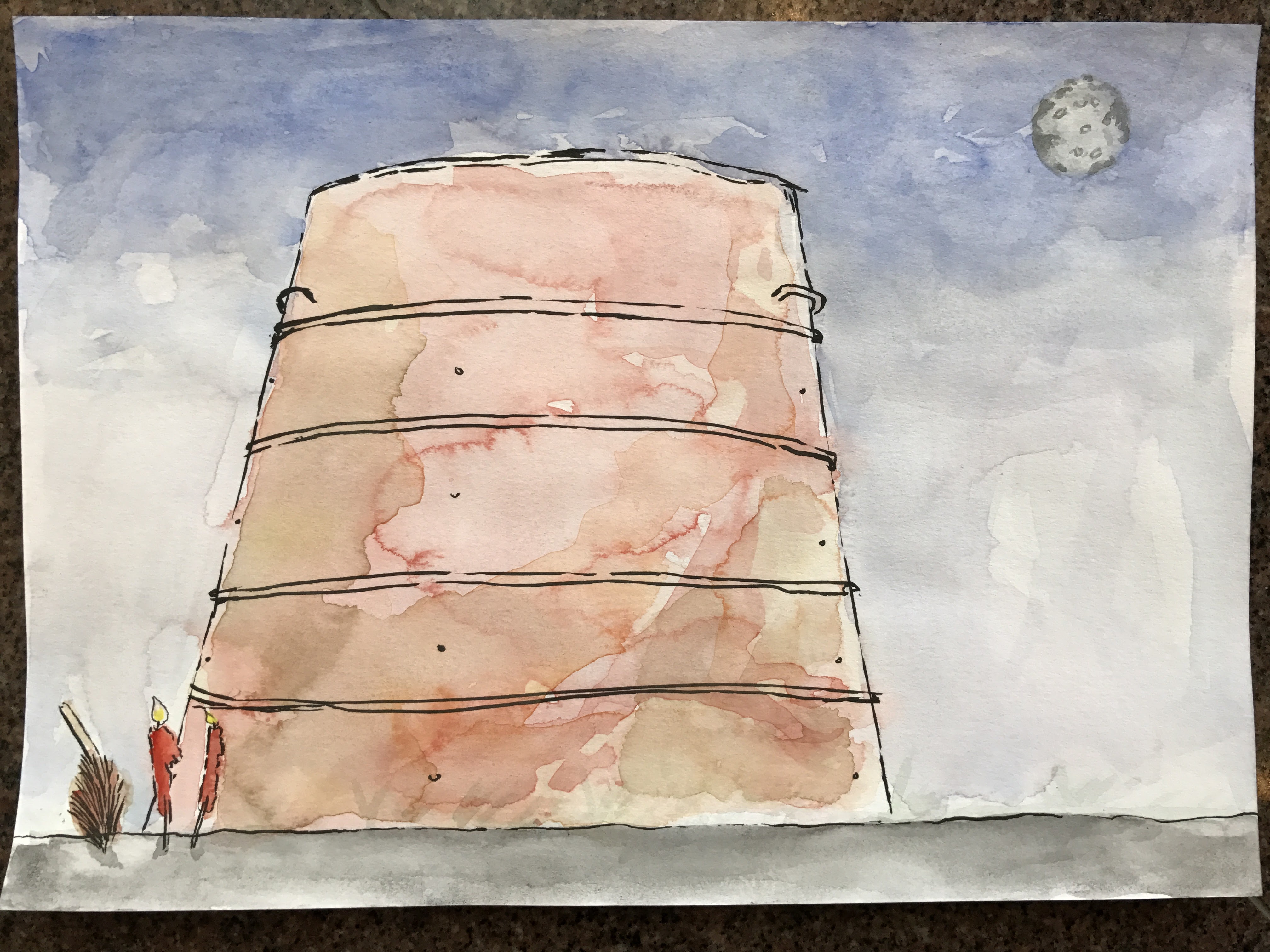


Personally, it would have been better to do a wet-on-wet medium but I didn’t have the means then. Still, I think that it achieved the intended look for the most part.
I thought about handwriting everything but I heard from someone that it was necessary to make use of InDesign so I did. That’s why I painted them in spreads as opposed to the “print” order. I also decided to use fonts because it forced me to think about different fonts to make use of. In the end, scanning and editing them on photoshop made it easier to lay it out. Composition-wise, I think that editing it in post-production helped.

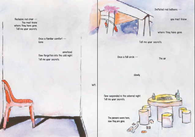
After trying and failing a couple of times, I managed to settle on design that I liked. I don’t like the idea of having to put my name in the zine but it seemed like it fit stylistically so I put it in. So finally, here are the final spreads.


After finalising the zine, I went to the adm library to print it.
$4.28 per zine – I thought they were supposed to be cheap to make.
Overall though, I felt that the butterflies and the lines were distracting. Okay, it was just the lines but I didn’t want to include the butterfly without the lines. It then just becomes another element to think about. I didn’t want that.
Off to print again!
Total money spent: $8.56.
I was thankful that the binding wasn’t too much of a hassle. That said, I learnt valuable lessons about binding. Firstly, remember to score the centre of the zine first, then staple them together on a surface like an eraser (or blue foam). Other than having the bleed marks, it is important to know how to use the bleed marks properly. I made the mistake of cutting it all the way through from one side to the other. Because of this, either the horizontal or vertical bleed mark will be cut away and you will have no marks to work with on either the horizontal or vertical mark, depending on which you worked on first. What you should do is: use a penknife to cut it from the bleed mark and not from each end of the paper. cool stuff.

Controversial Video Art Installation
What is a video installation?
Is it a bird? Is it a plane? No! It’s a contemporary art form that combines video technology with installation art, making use of all aspects of the surrounding environment (space) to affect the audience.
David Wojnarowicz’s A Fire in my Belly (1986–1987) –

Screened at the National Portrait Gallery, a Smithsonian museum in Washington, it was withdrawn after the president of the Catholic league described it as anti-Christian hate speech. The 13-minute video, featuring images of ants crawling over Christ on the crucifix, is about death, social inequality, faith and desire. It attracted controversy not only over its use of religious iconography but also because the art world was angered when the museum pulled the exhibit – accusing it of stifling artistic freedom. The artist made the artwork in a time during the AIDS crisis of the late 1980s to early 1990s. According to the museum, the artist himself was diagnosed with HIV and was the artwork was probably a reaction to that. Personally, I think that the casual use of religious icons in artworks can be quite powerful, though it would most definitely anger religious folk. I imagine that there would be two schools of thought in Singapore: 1. Outrage from the religious community. 2. “Aiya this artist purposely do this to attract attention one.”
Bill Viola’s Anthem (1983); or Nope. Nope. Nooooooope. –
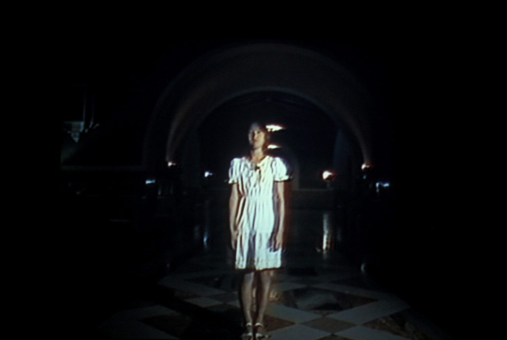
Body parts being picked at. Ew. Cannot.
Whether this piece if good or bad, it is definitely going to be difficult to stomach. I didn’t manage to sit through it because I don’t enjoy watching gruesome images. I couldn’t find where exactly it was screened, though I imagine that it was probably at a museum. The artwork has to be presented as cinema: screening has to take place in an isolated dark room with seating for the audience as opposed to an open “walk through” gallery. It is played on a scheduled basis, not on a loop. It seems that it was the artist’s intention for this to be viewed from start to end and not experienced in an installation space. This artist focuses on the theme of life and death, and their relationship, not only in Anthem but throughout his works. Anthem is supposed to be an evocation of “our deepest primal fears, darkness, and the separation of body and spirit.” For me, it is communicated quite clearly, at least for the parts that I watched. I respect that it dared to show graphic content. Personally, I would have approached the matter entirely more subtle. This makes me think that it comes off as a very emotive piece in contrast to the way I would have approached it.
On the topic of controversy, I’m going to do something controversial and talk about a video installation that isn’t necessarily controversial but one that I want to talk about to contrast with the rest which makes a clear argument for being controversial. Is it even necessary to make controversial works? (Ooo controversial)
Apichatpong’s Primitive (2009) –
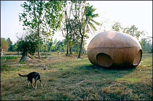

Primitive is a multi-screen video installation displayed within a gallery – 7 videos with different durations and eight projections (two being the same video, titled Primitive, in sync). The artist re-imagines the history of Nabua, Thailand, as an elusive science fiction ghost story rooted in Thai folklore.
According to the artist, “Primitive is a reincarnation of presence (and absence). It’s also a reincarnation of cinema as a means of transportation as it was in the time of the early cinema innovator Georges Méliès: the “motion picture” carries us from our own world. Primitive is a meditation on those voyages in fabulous vehicles that bring about the transformation of people and of light”
The artist’s works tend to make use of the supernatural or the surreal to create artworks that dreamlike and tend to be difficult to explain in words – the experience is communication.
Nabua was a place of violence and oppression from the 60s to the 80s when the Thai army occupied the place in order to curb those who were accused of being communists. What makes this work of art controversial could be that it was made in a time of political turmoil in Thailand.
The video installation was exhibited in Germany and UK, but I could not find if it was exhibited in Thailand. If it was then that would definitely be cause for controversy but perhaps it was in not exhibiting it in Thailand which makes it controversial – controversy in the absence of it.
Conclusion
The nature of controversy these days seems to border on the line between controversy for controversy’s sake or for purposely artistic expression. When thinking about controversy in art, I thought about how these artworks take some form of current affairs and their own opinions to create. I don’t think it has to be controversial as long as the message is powerful, or if the experience leaves a lasting impression.