My main goal for this project is to experiment more with design/composition as well as colours. I also plan on either drawing/painting or illustrating my final compositions because money is tight – plain and simple.
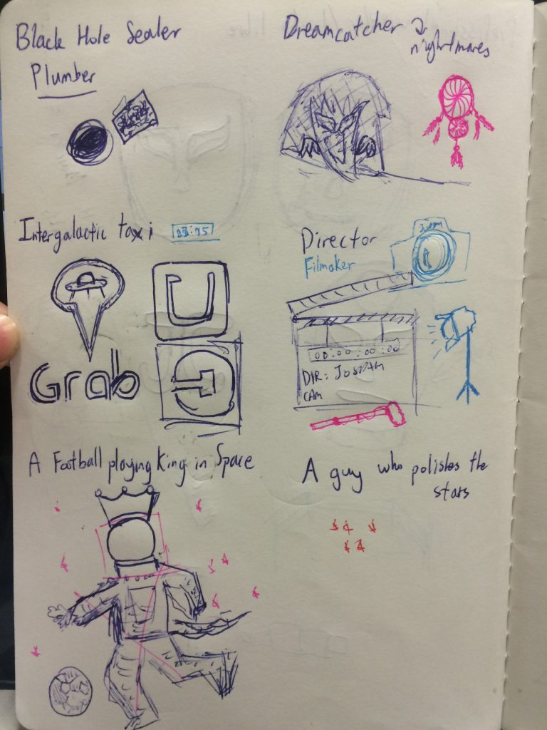
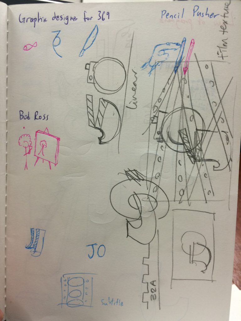
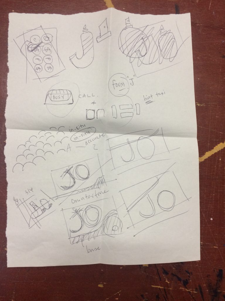
I started off this project by sketching out a couple of jobs that I wanted to work on. I did not think about what aesthetics I could make use of first because I did not want to create what has already been created. People will argue with me about this but this process is more organic to me and it is how I have to do things.
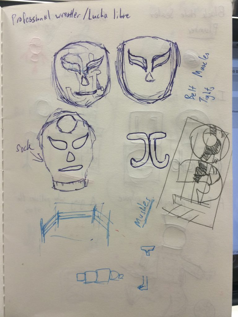
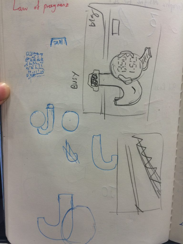
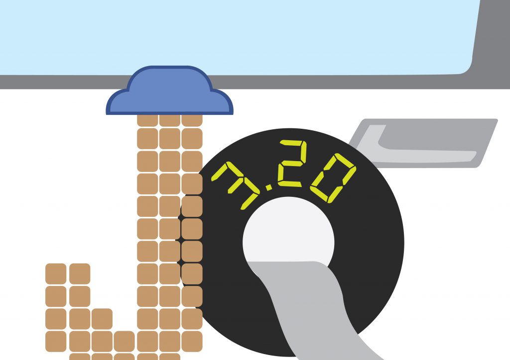
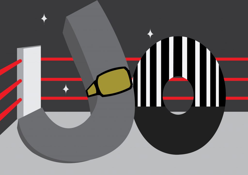
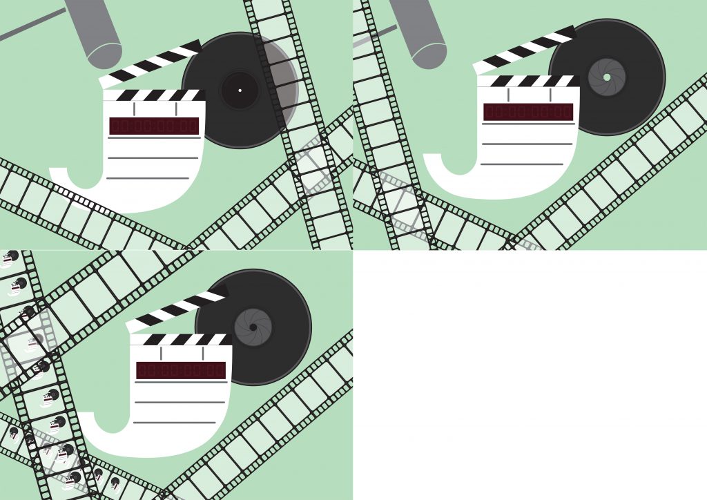
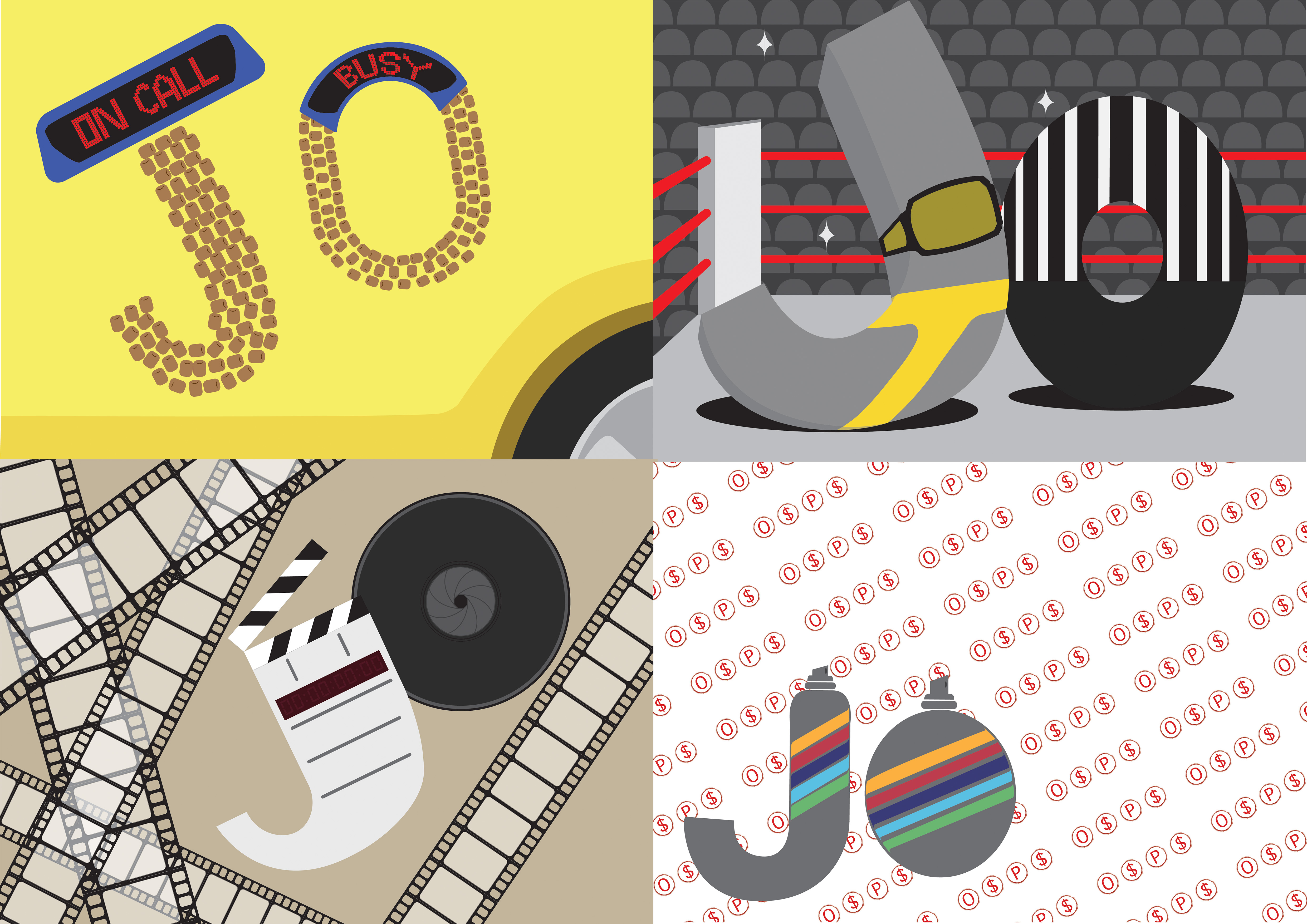
These were based off my own ideas of trying to create typography and blend it with the future job. After the consultation, however, I was told that I should imagine if the letter was the job. That meant that we were to characterise our letters; in my case, J and O.
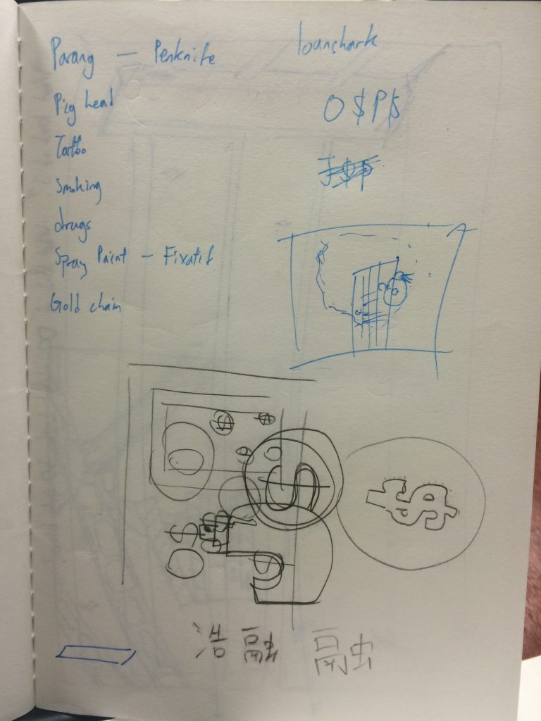
With that, I came up with a couple of new thumbnails (some of which can be seen with the sketches above)
I then worked on turning the thumbnails into illustrations.
I was looking out for inspiration and it so happened that I was having MacDonald’s, one day, near Chinese New Year. They were giving out Angpaos that had really nice illustrations. I decided to try adapting this style to create my compositions.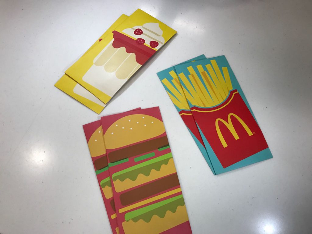
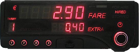
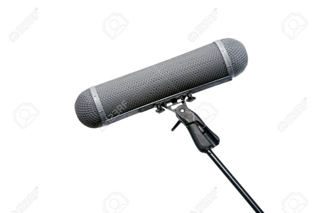
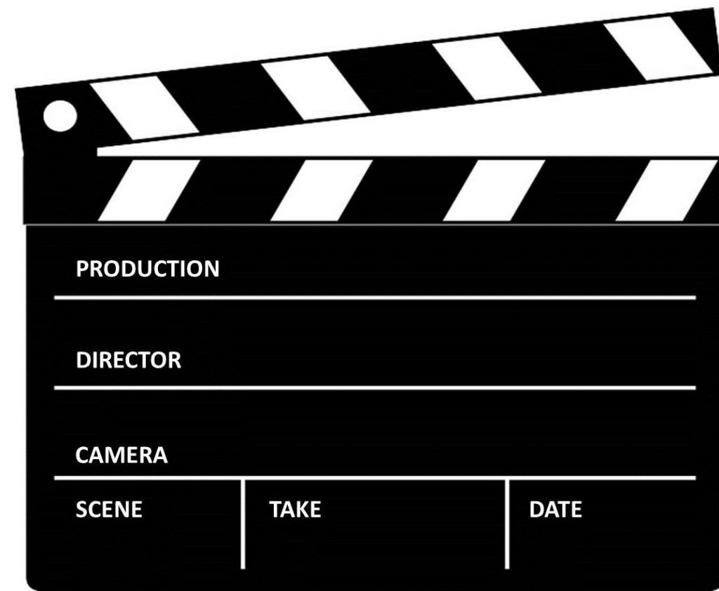
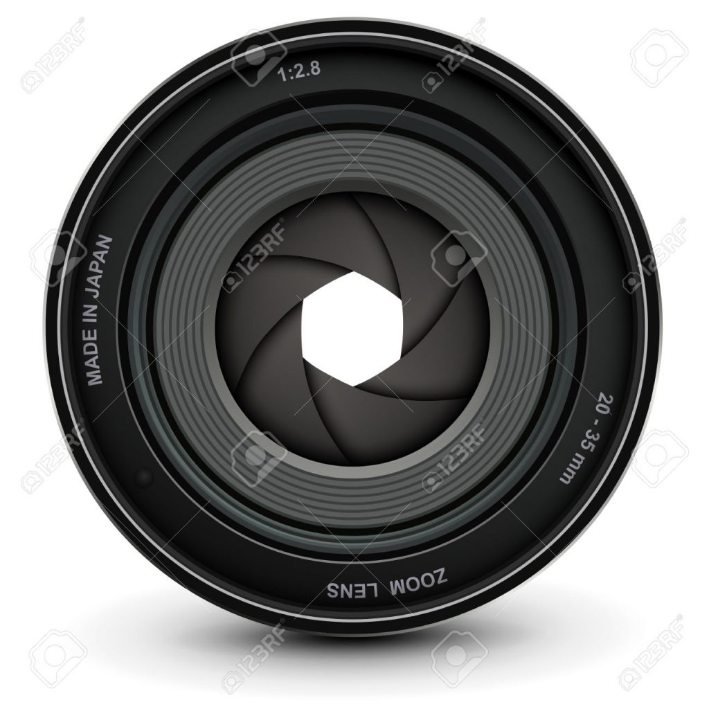
I looked for points of reference for my elements, then implemented them in my designs.


After working sufficiently on the rough versions of the illustrations, I brought them for consultation again. This time though, I was told that I should create a single font style for each job. I was a little perplexed now. Was there a wrong way of doing typography? Were things right one week and wrong the next? Perhaps this was just a means of creating variety in the work. Nevertheless, the client gets what the client wants – those are the rules of the game.
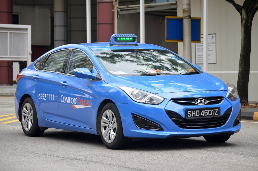
To be fair though, I believe that the taxi driver one was difficult to decipher.
In the end, I had a mixture of typography (typographies?) that were either characters or that could be a full set.
In hindsight, variety is probably good.
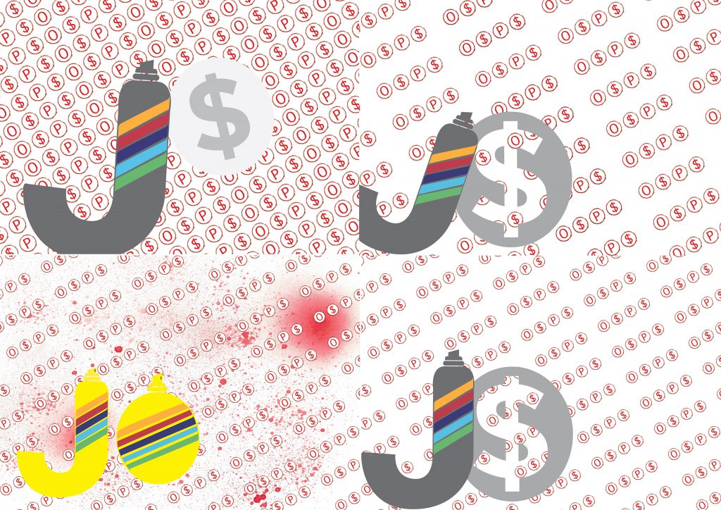
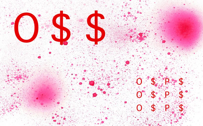
I experimented with colours, spacing and trying the O as the stencil for the $. All of these were steps in the right direction.
This was the right direction I wanted to be heading in. It was getting better. I liked that even though they were all illustrations, they had styles that made them diverse.
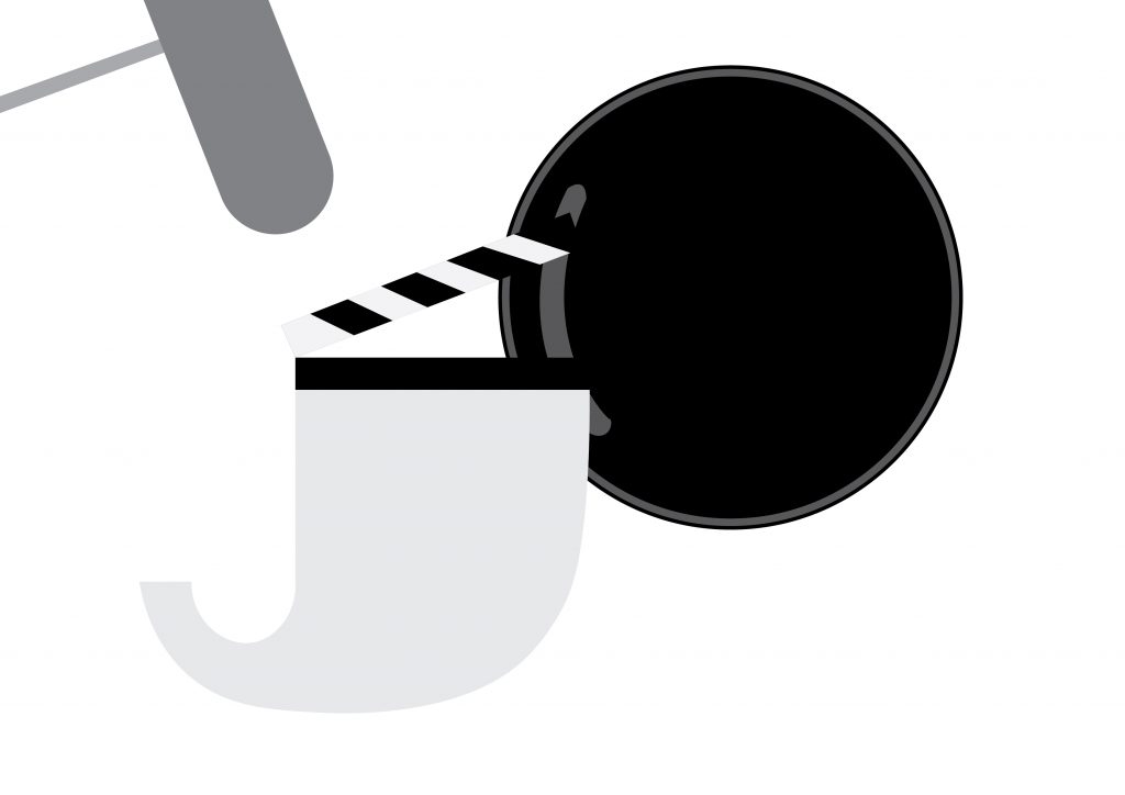
I need to add a metallic sheen on the taxi. It was hard to find a way to do that. I also needed to straighten the clapper board in the filmmaking composition because there were enough angled film reels. This would give variety to the design. A couple more tweaks and I should have my designs.