Task: Find two maps of a building or place you have visited – one map is badly designed and the other is well designed. Be prepared to explain your examples and bring maps to next class.
Think of a time you were lost in a place and write in your journal how and why you got lost. What about the user experience didn’t work for you?
Bad Map: Jurong Point (App)
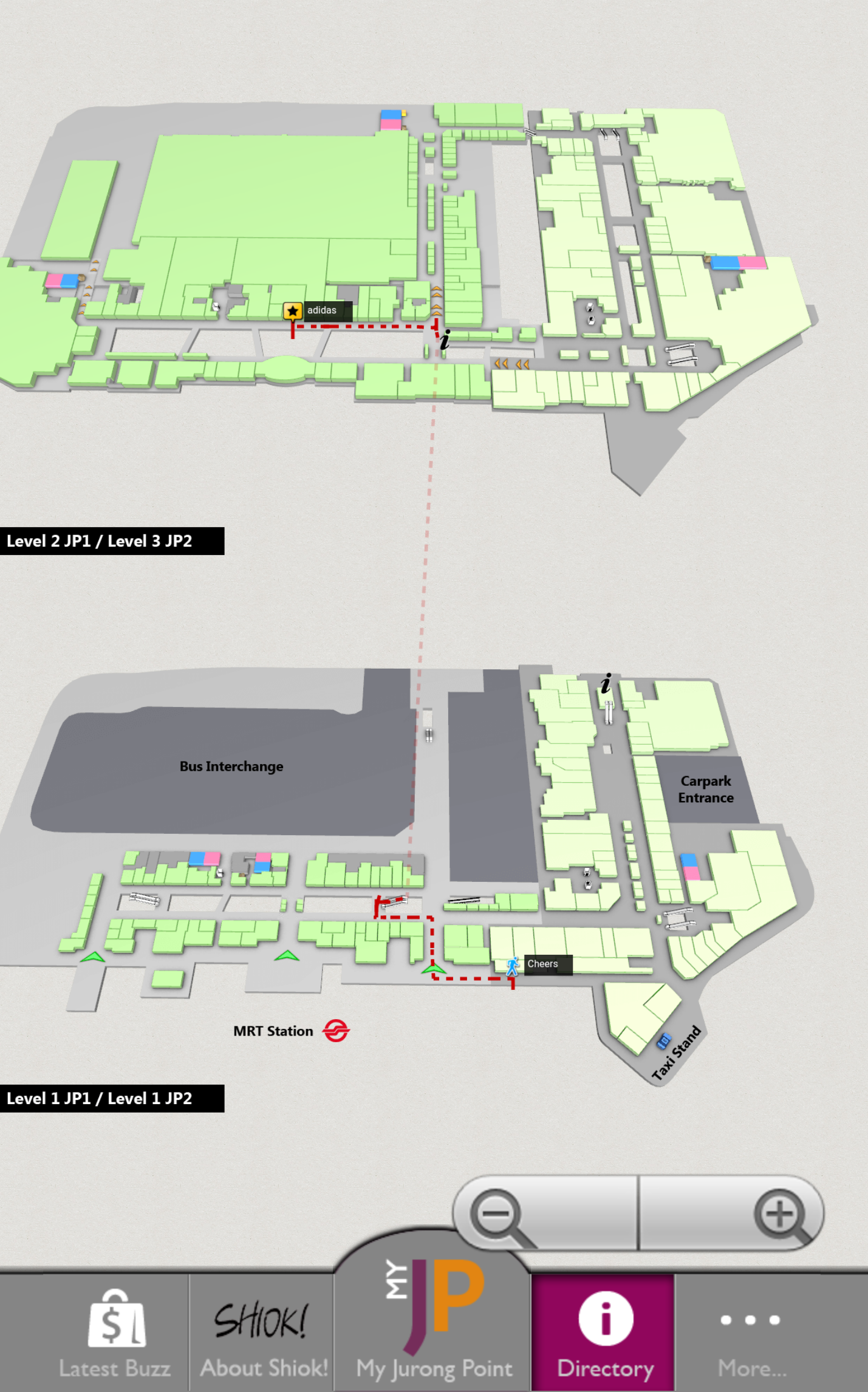
Problems:
- Lack of labels
- Confusing
- Not a realistic representation
Good map: Sentosa
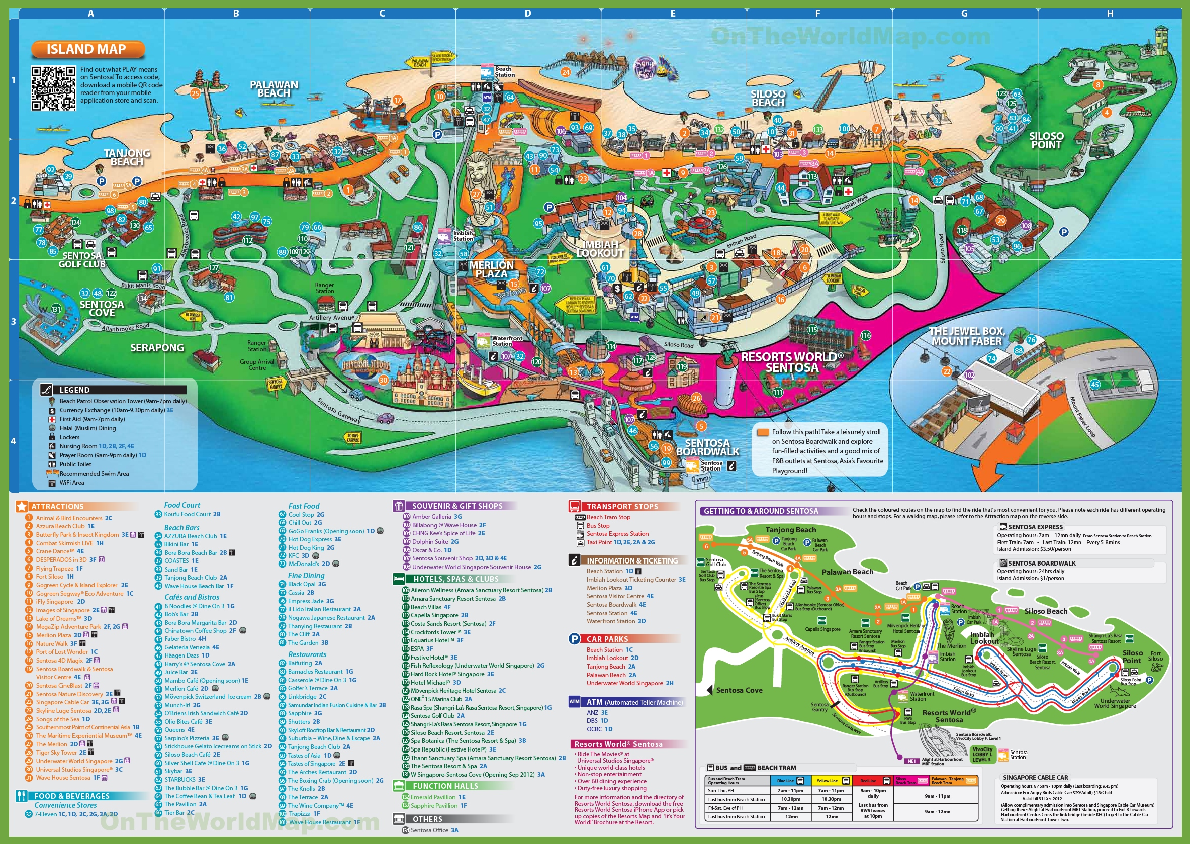
What’s Good:
- Well-labelled
- Easy finding
- Colour coded
- Includes all the information required