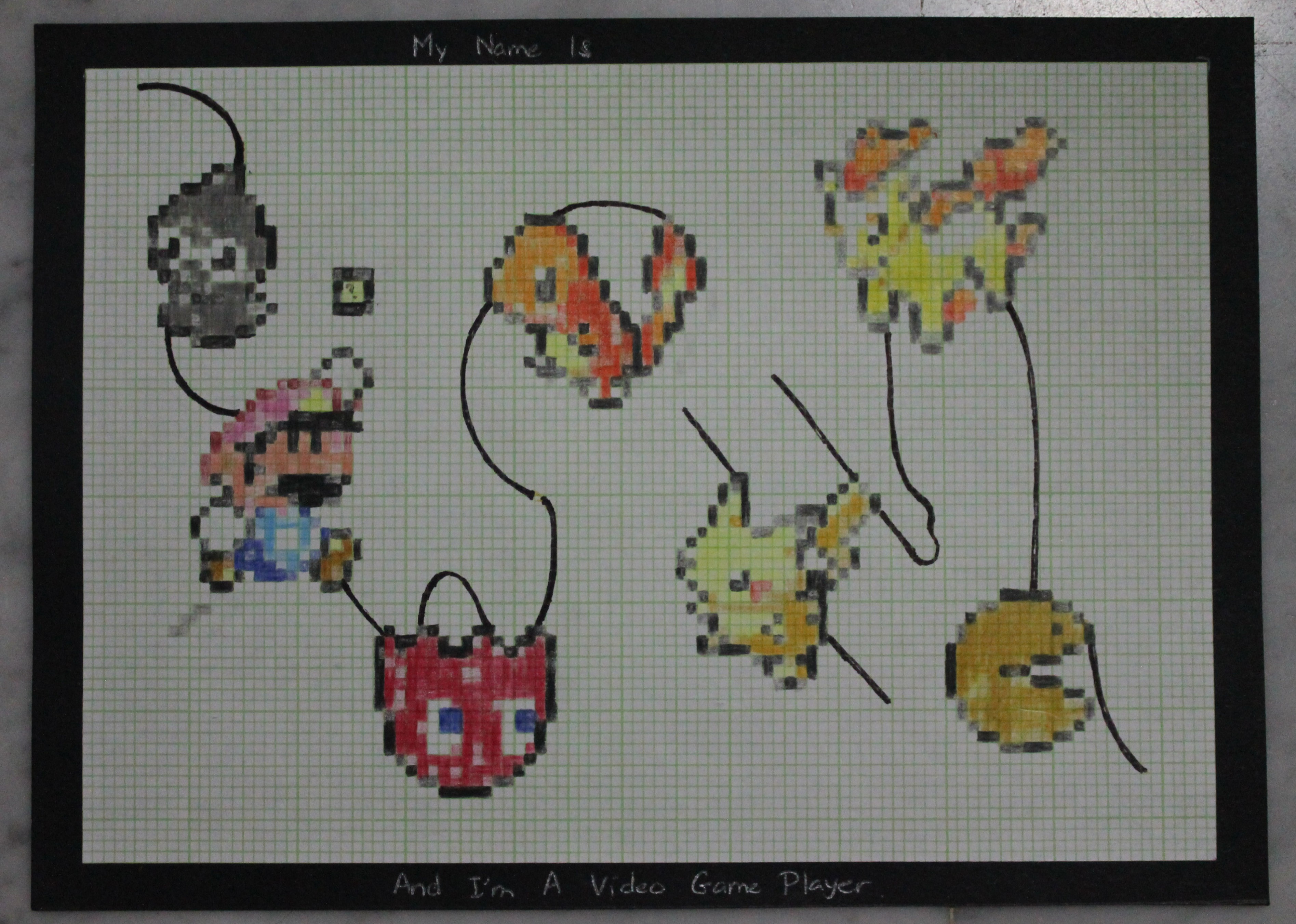
Initial Ideas For This Project
- Compilation (nursery rhymes + pov project) based on common subject matters from my past works : animals.
-rhymes (b&w works) transitioned to pov (colourful works)
2. Compilation with improvisations (nursery rhymes)
– adding in particular into the b&w works to evoke/represented a certain mood/feeling/atmosphere
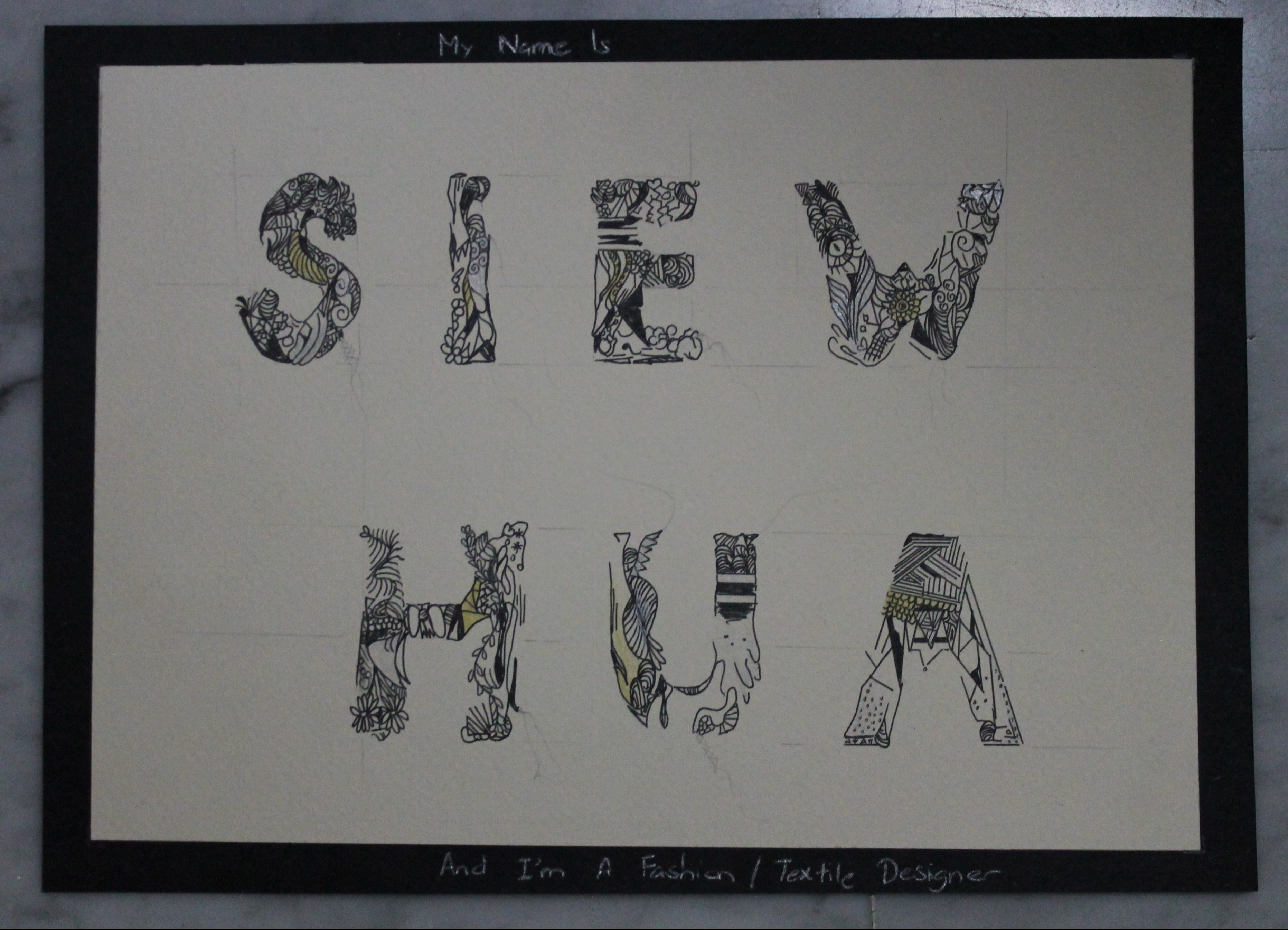
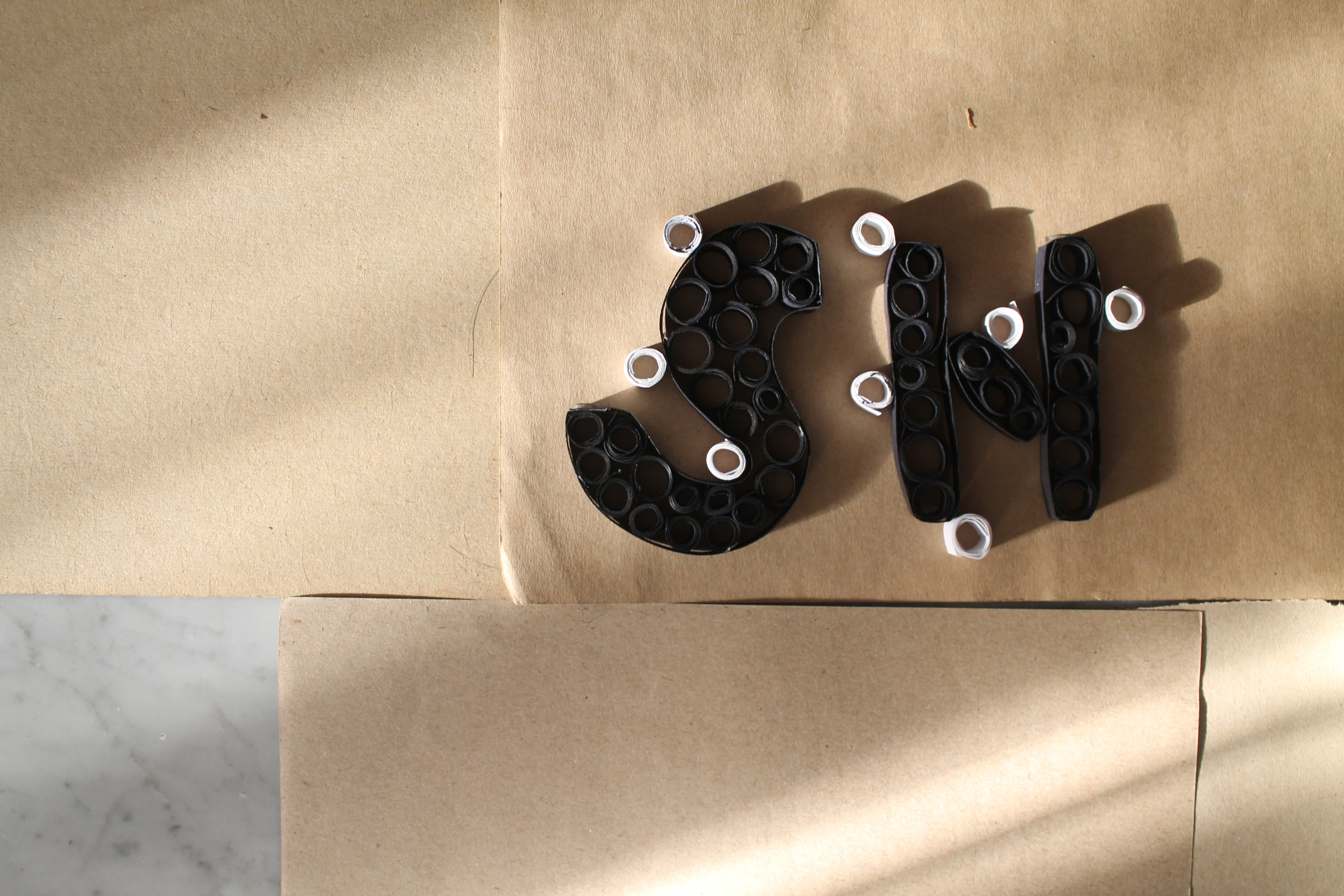
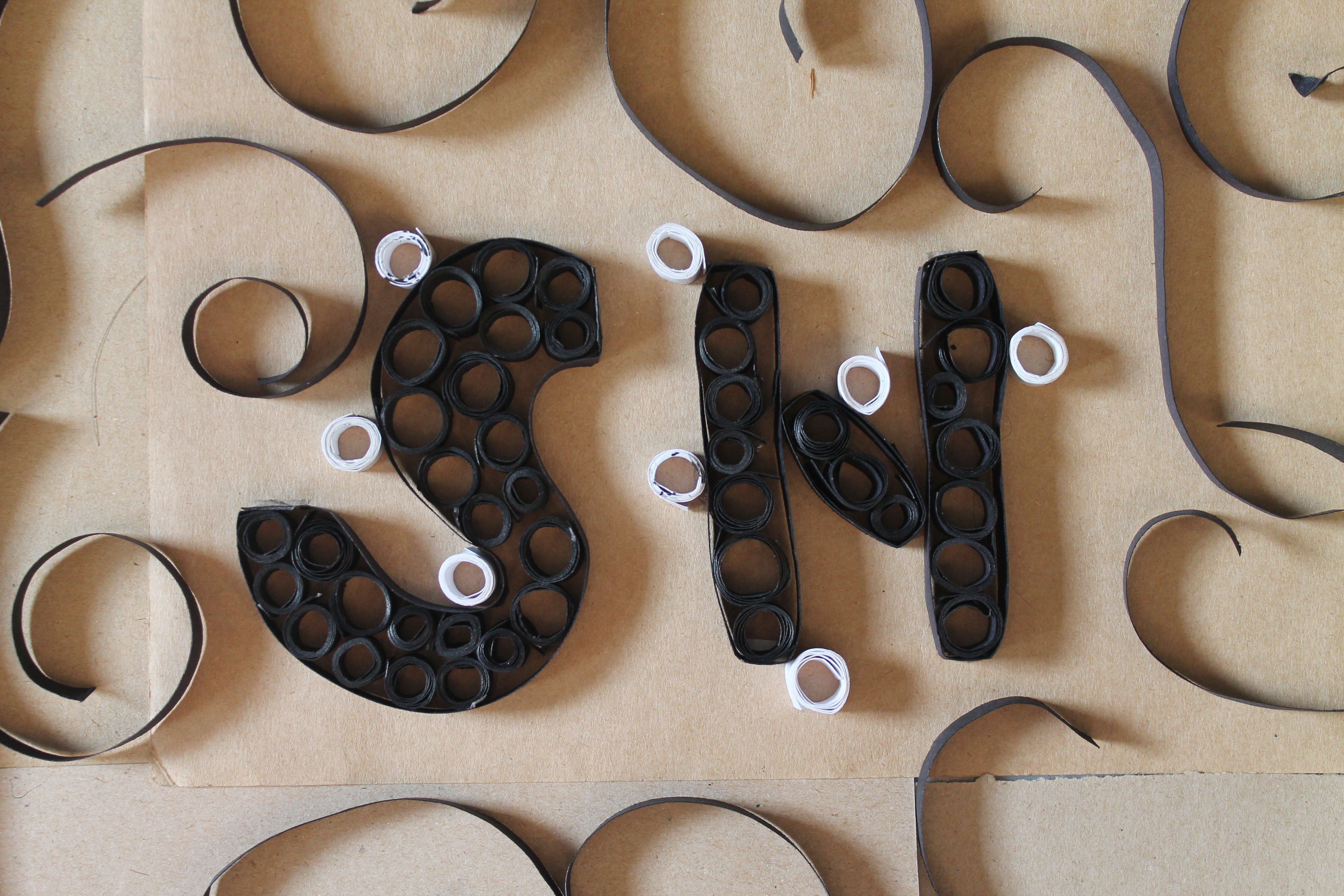
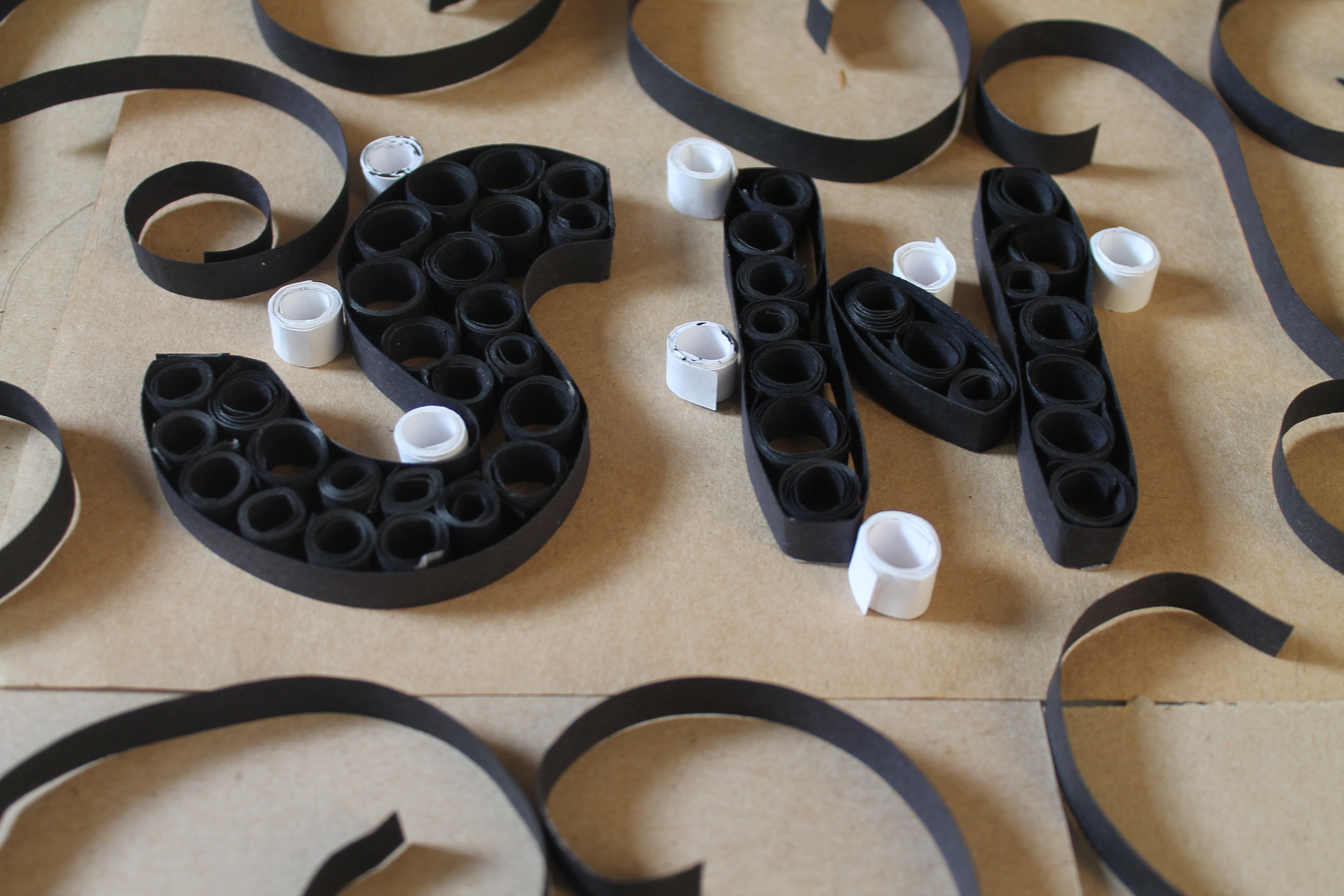
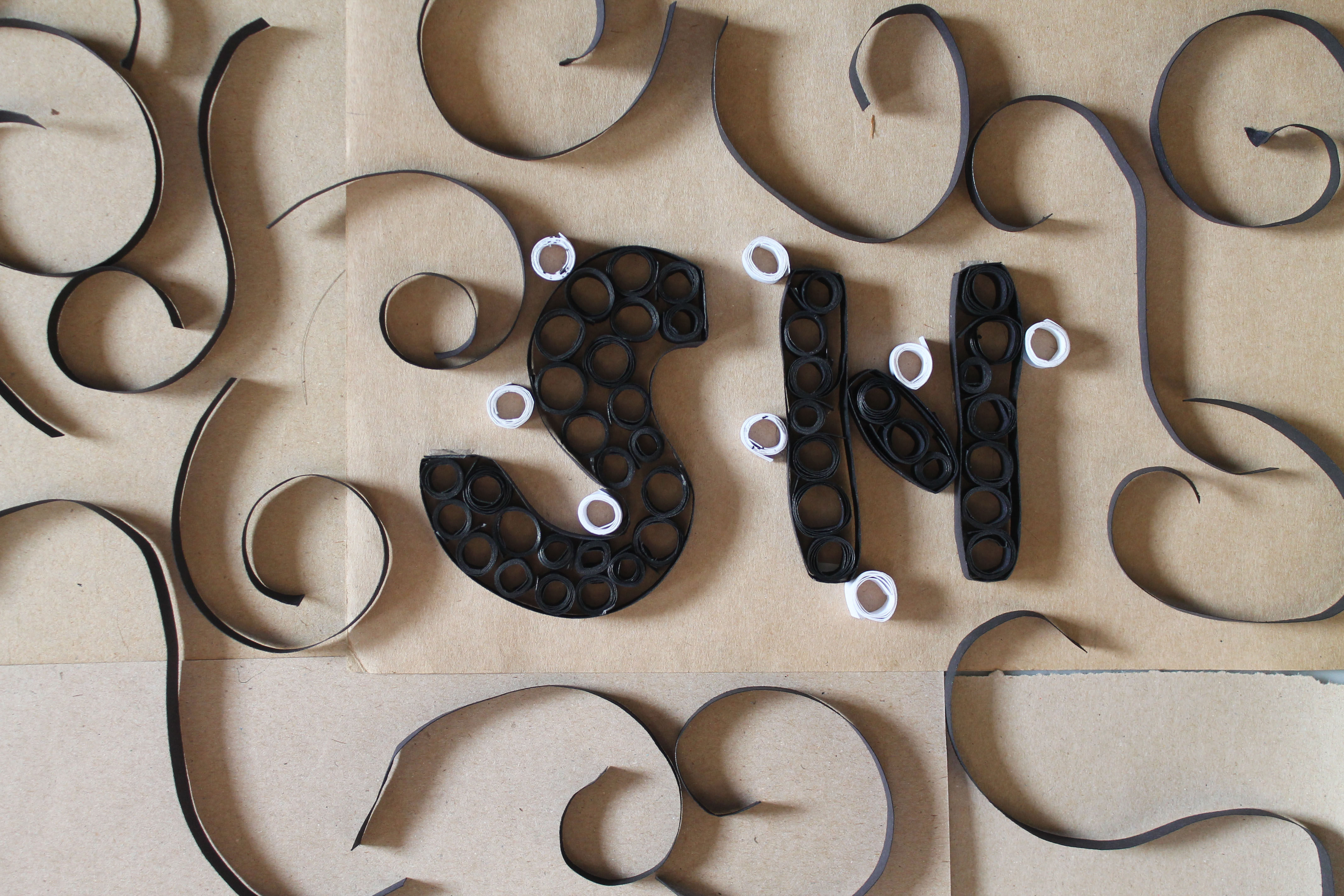
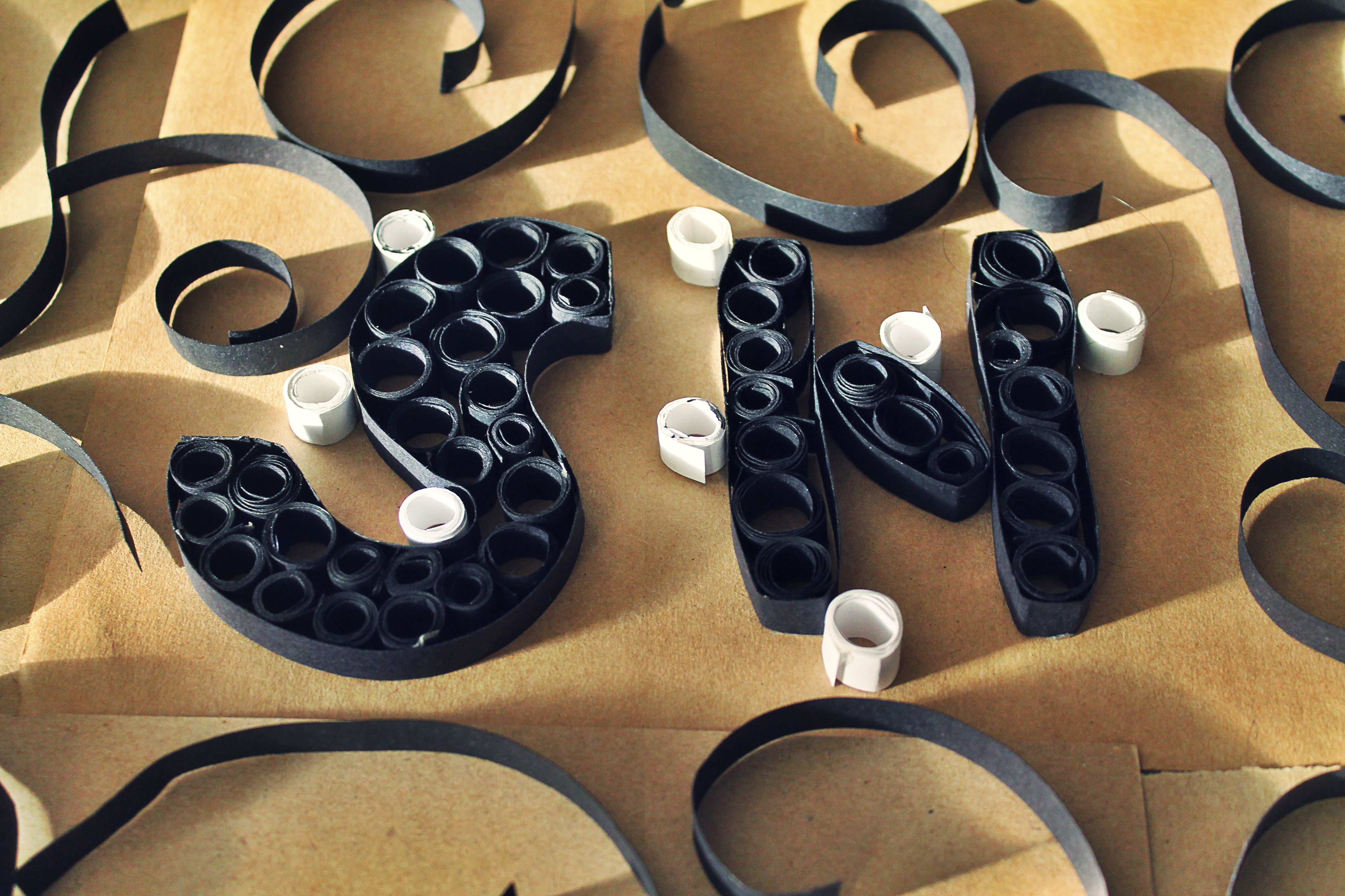
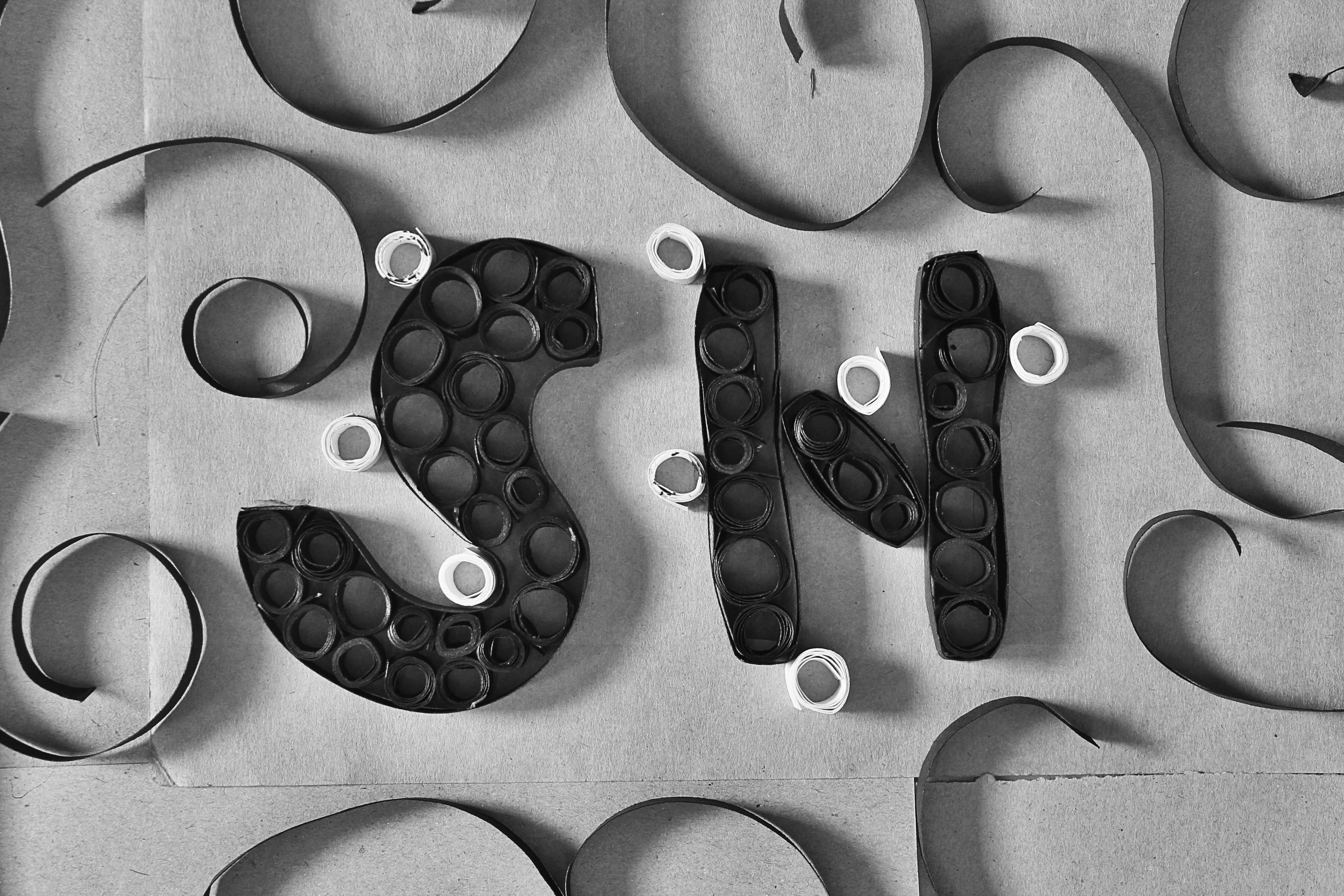
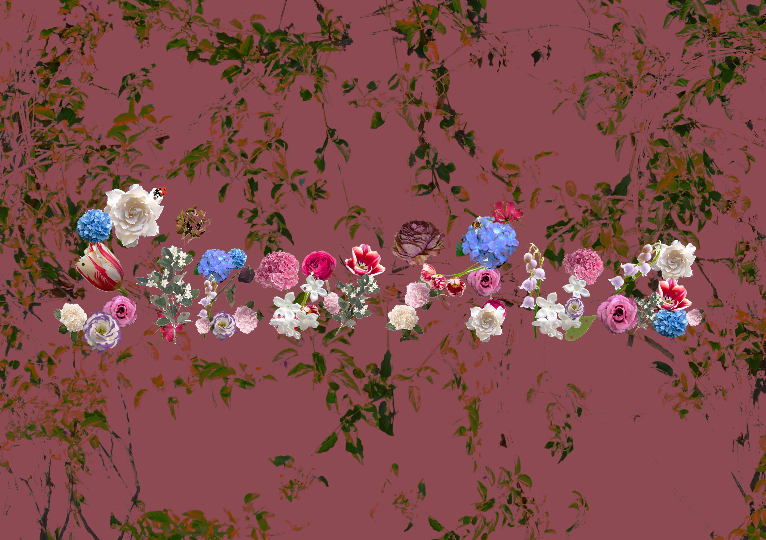
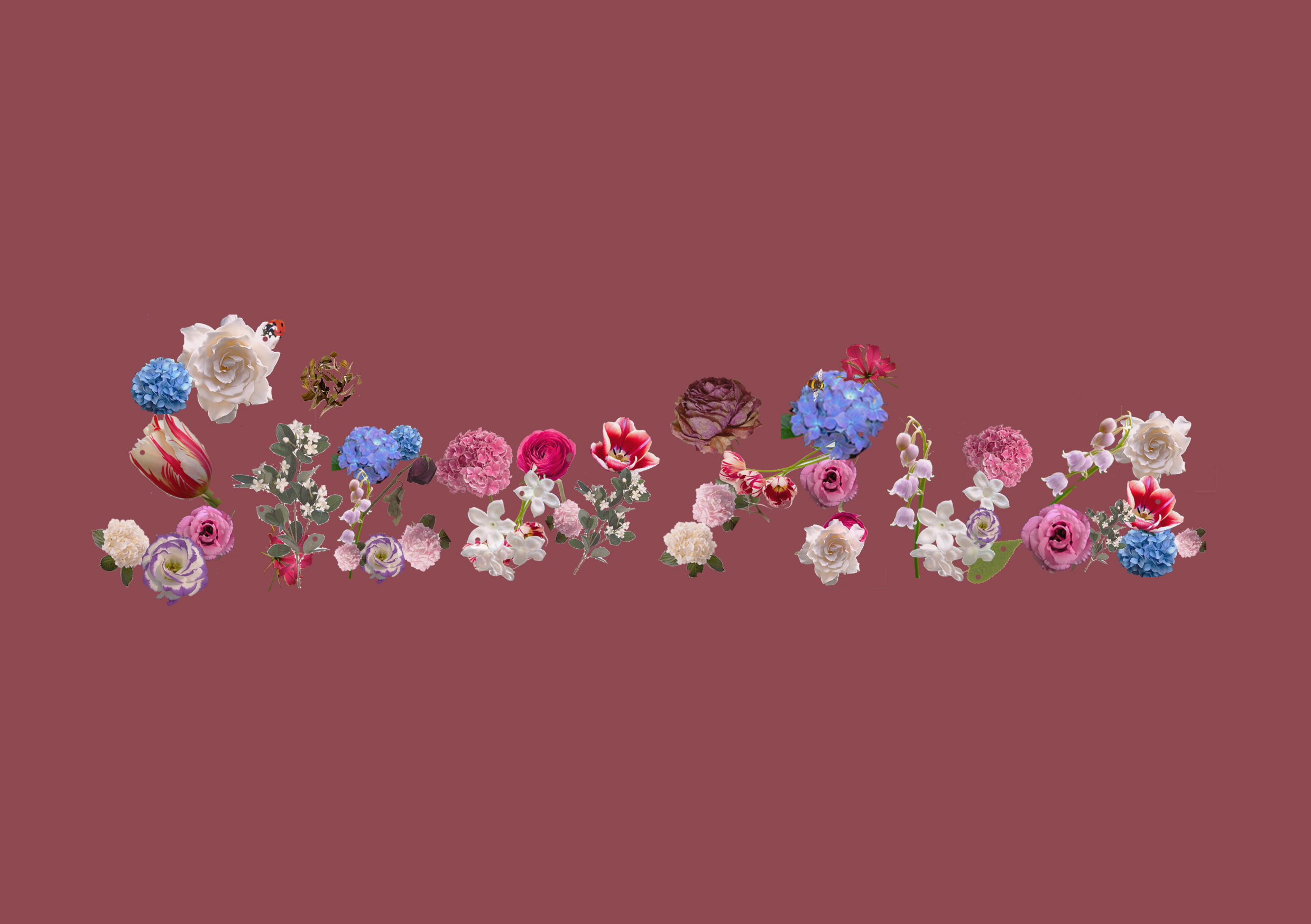
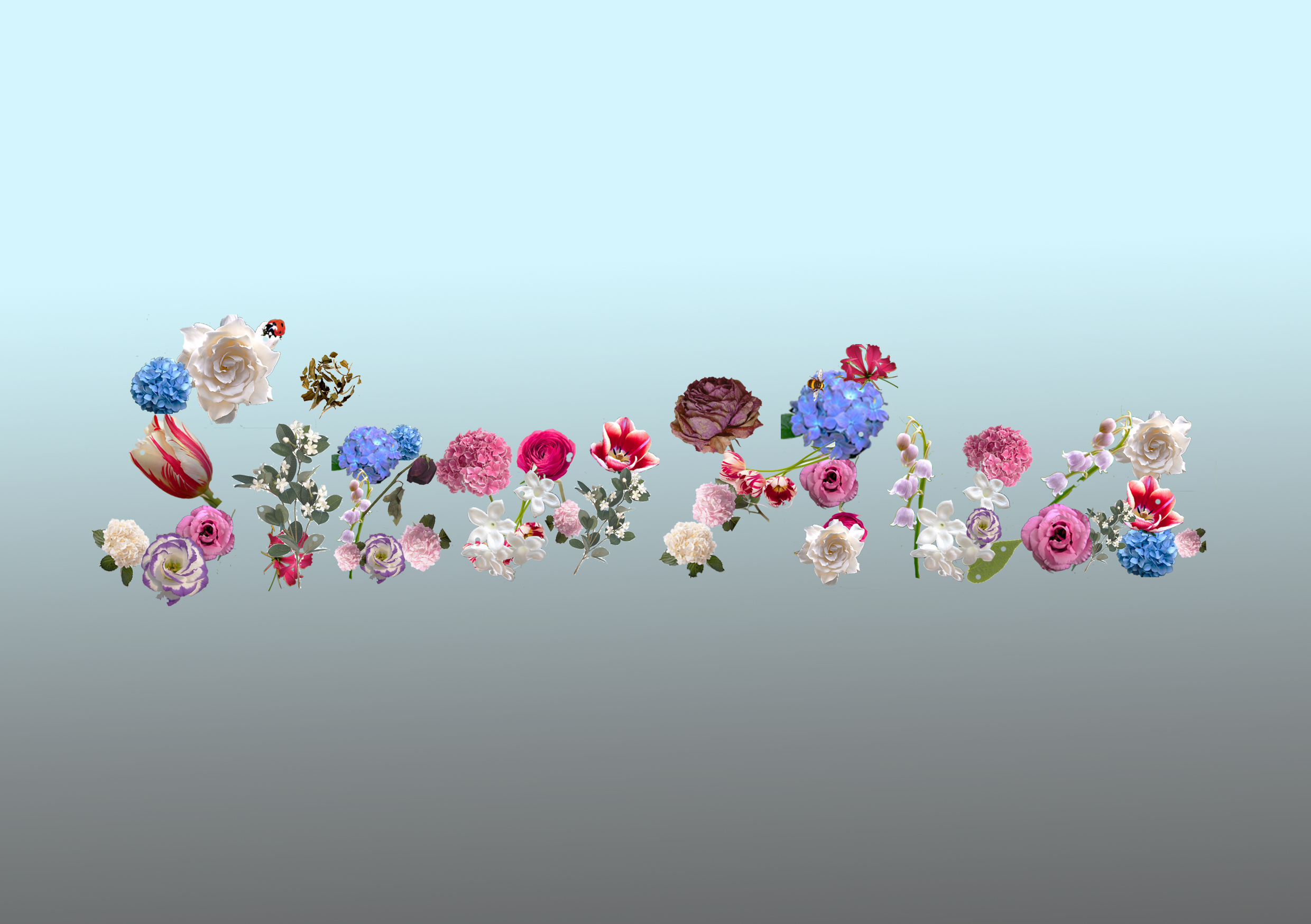
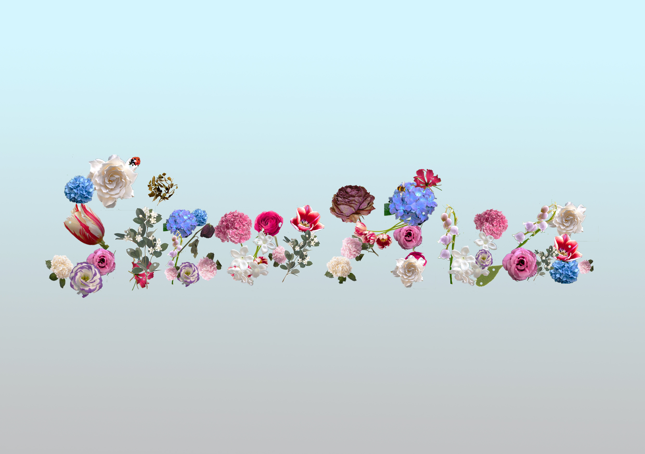
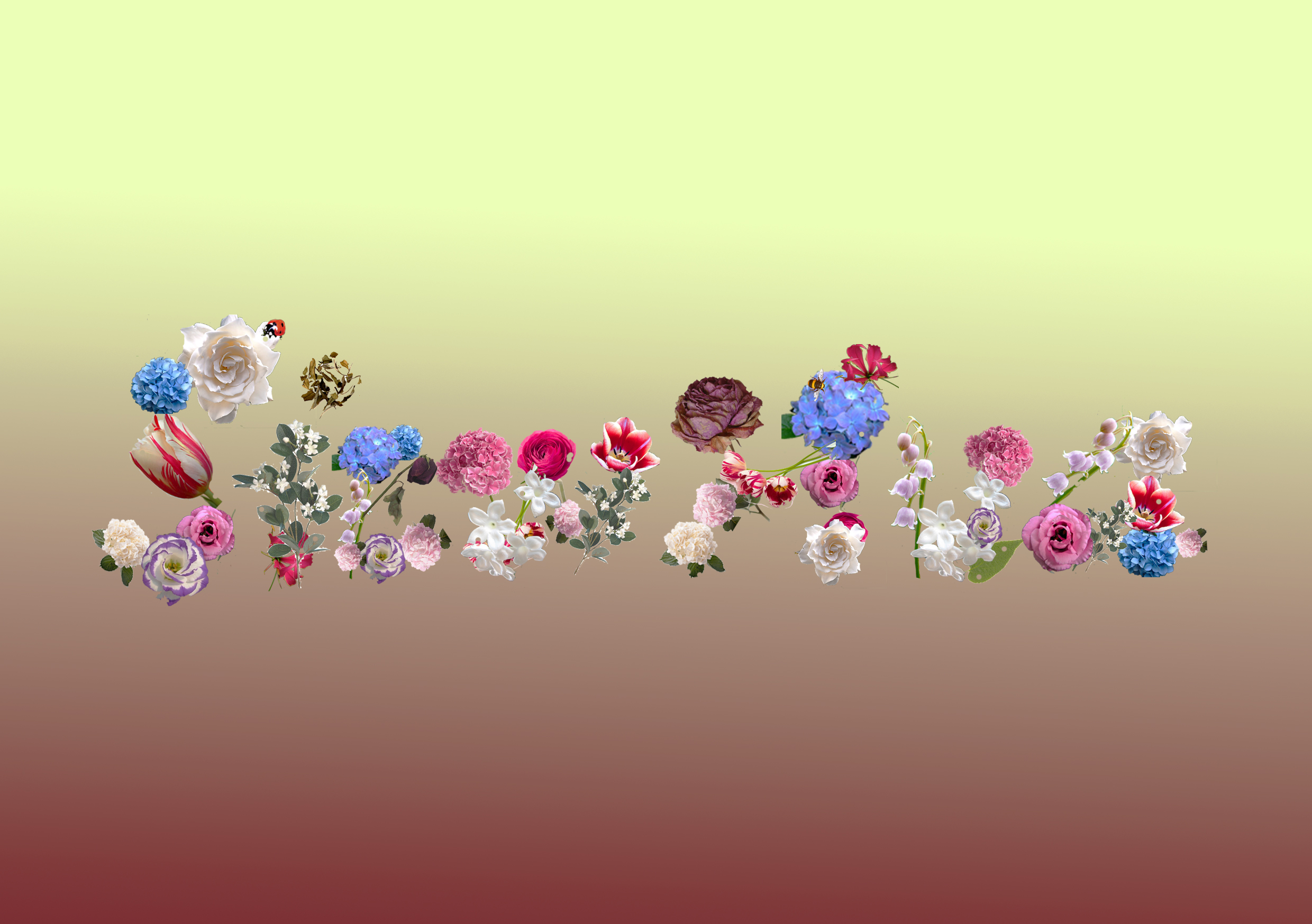
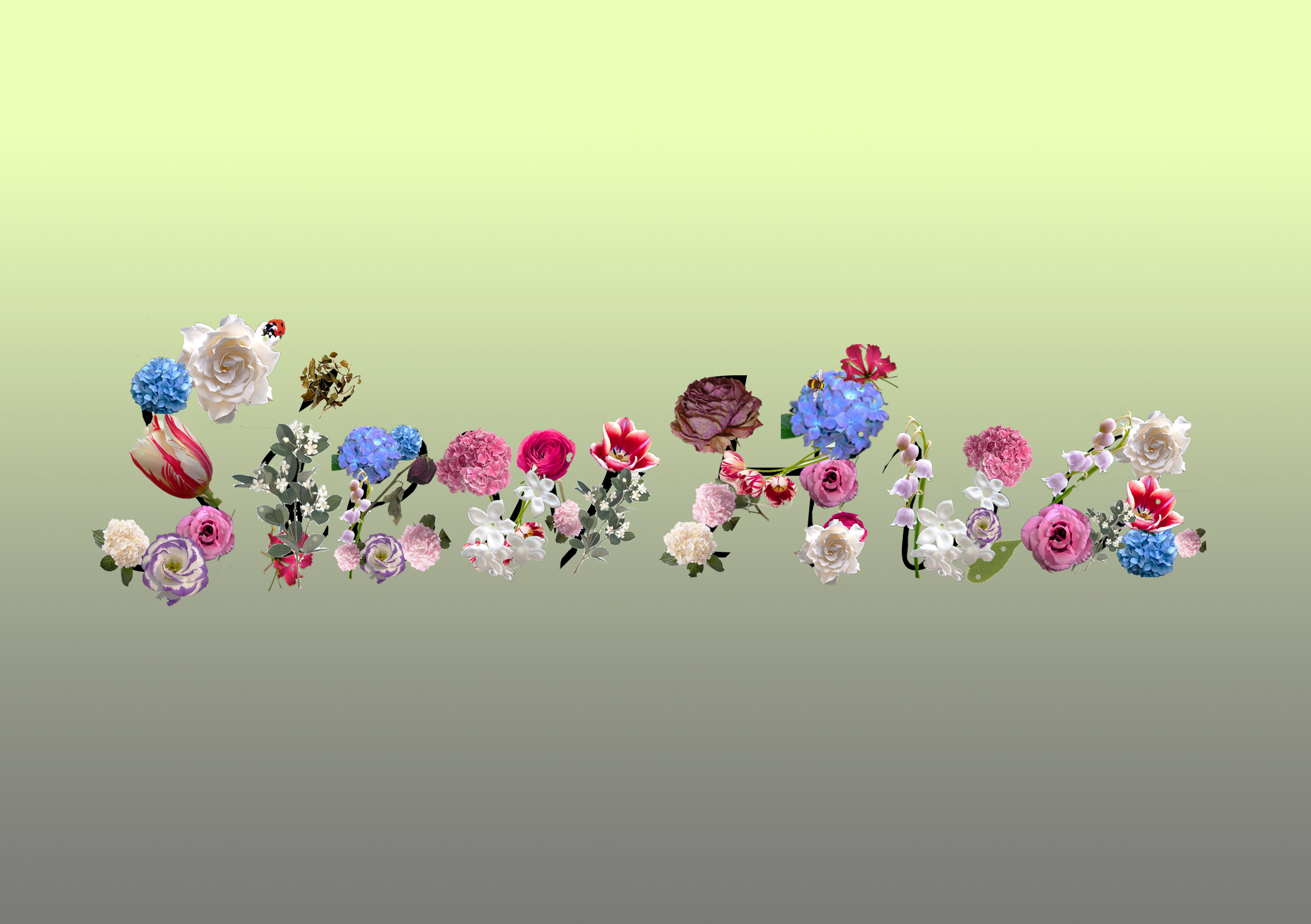
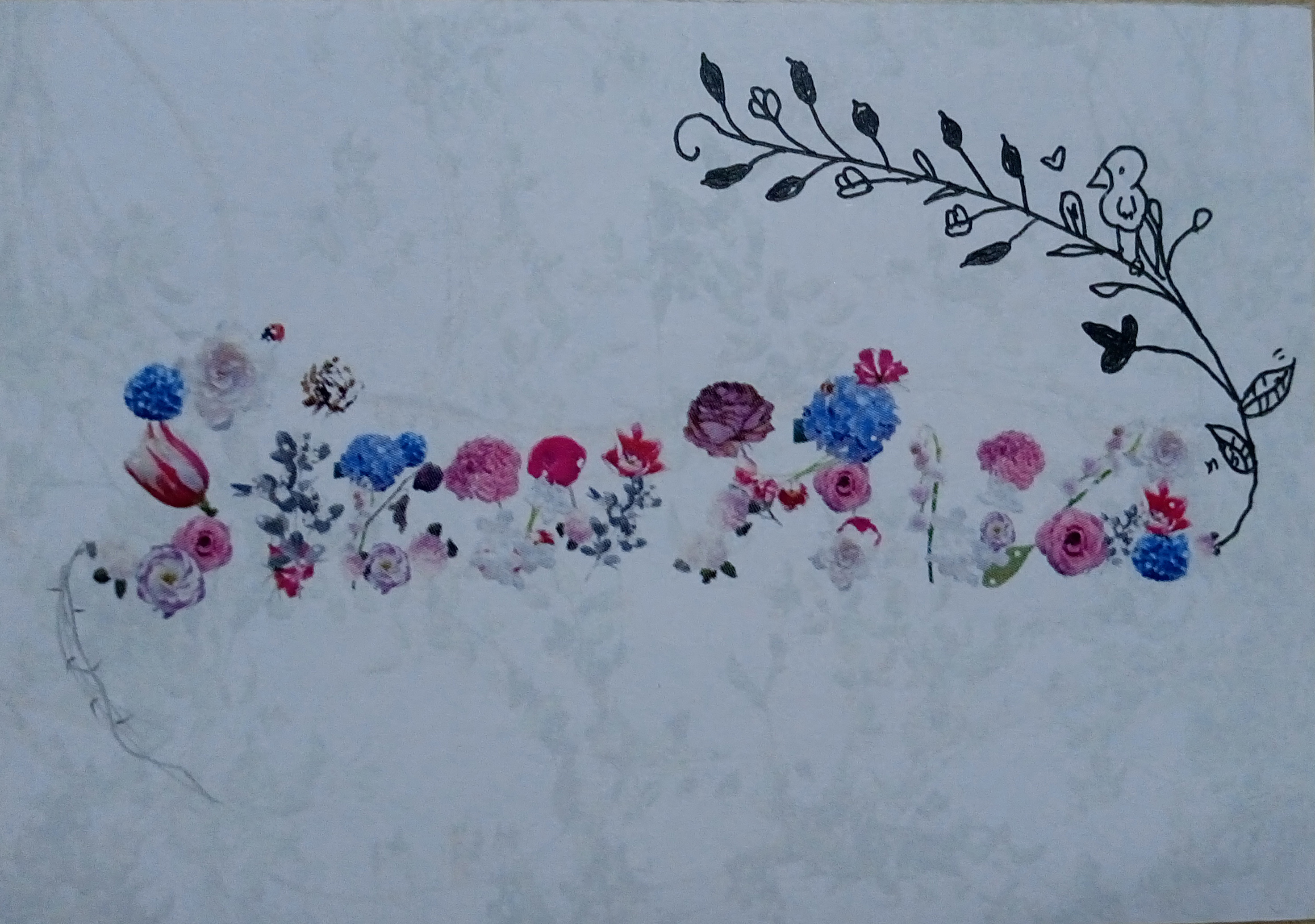
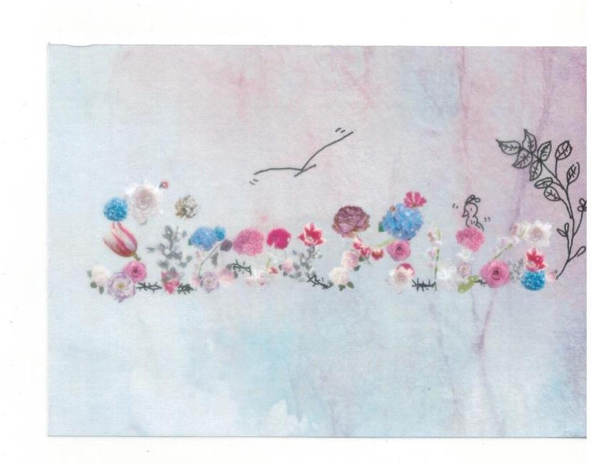
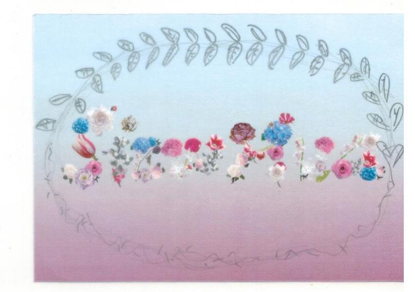
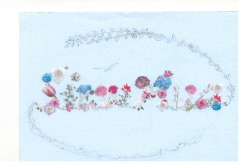
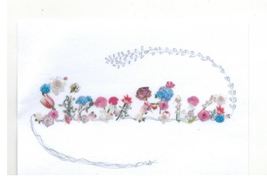
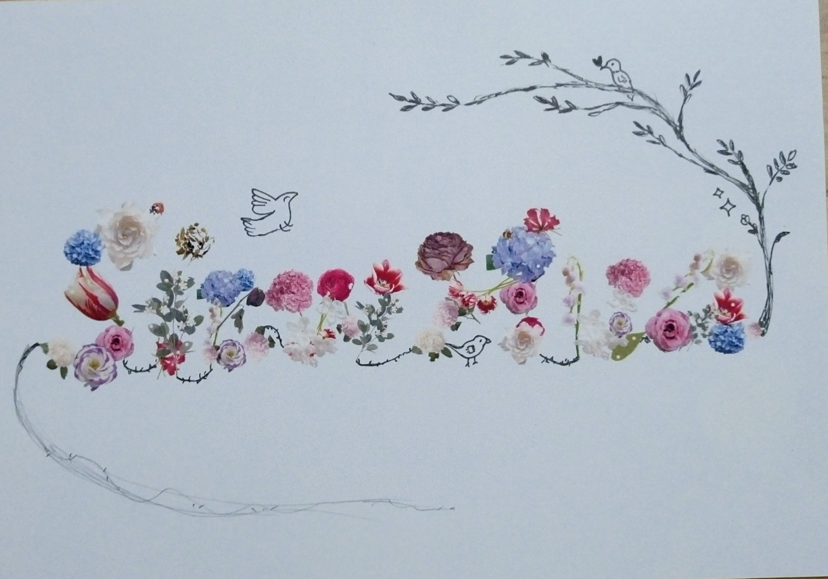
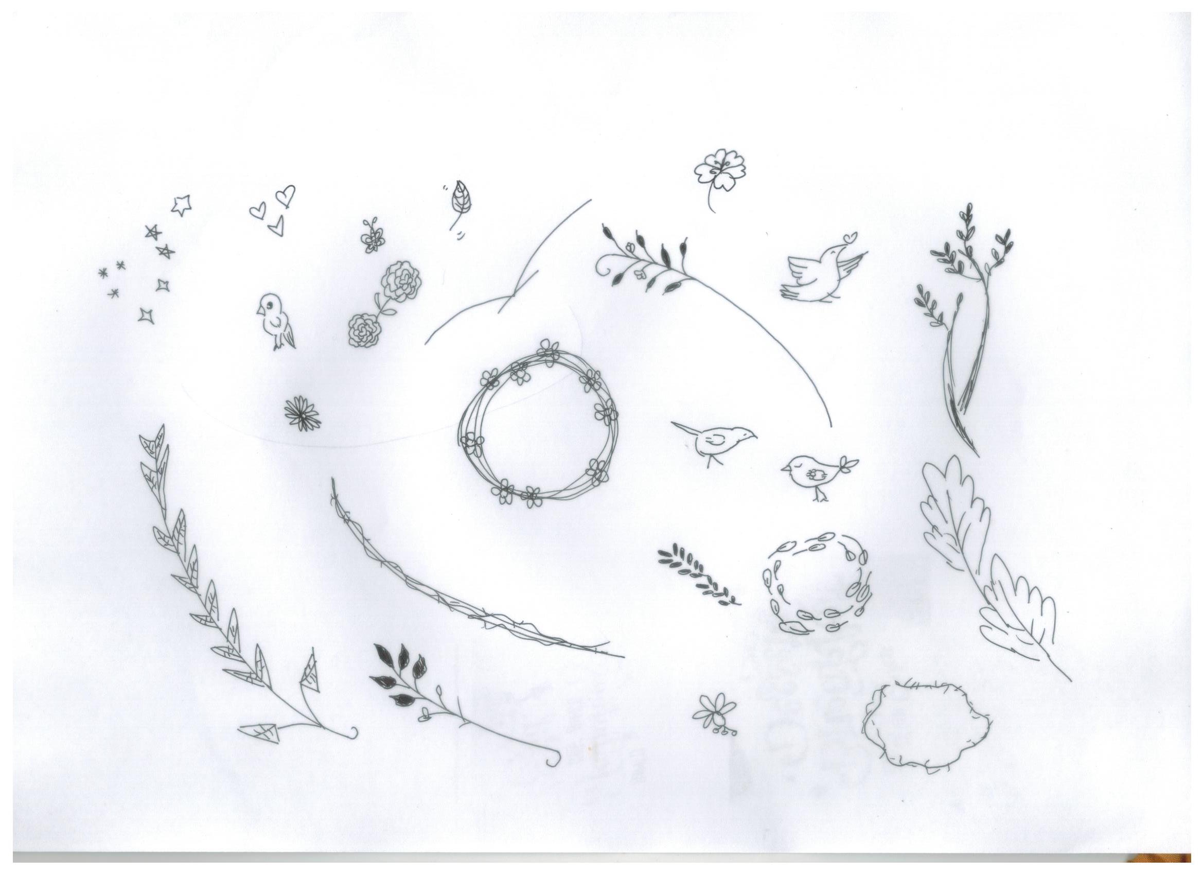
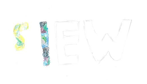
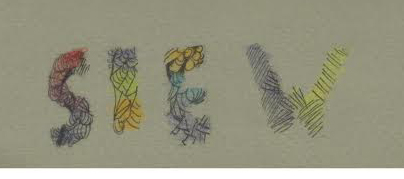
3. New works (typographic portrait problem project)
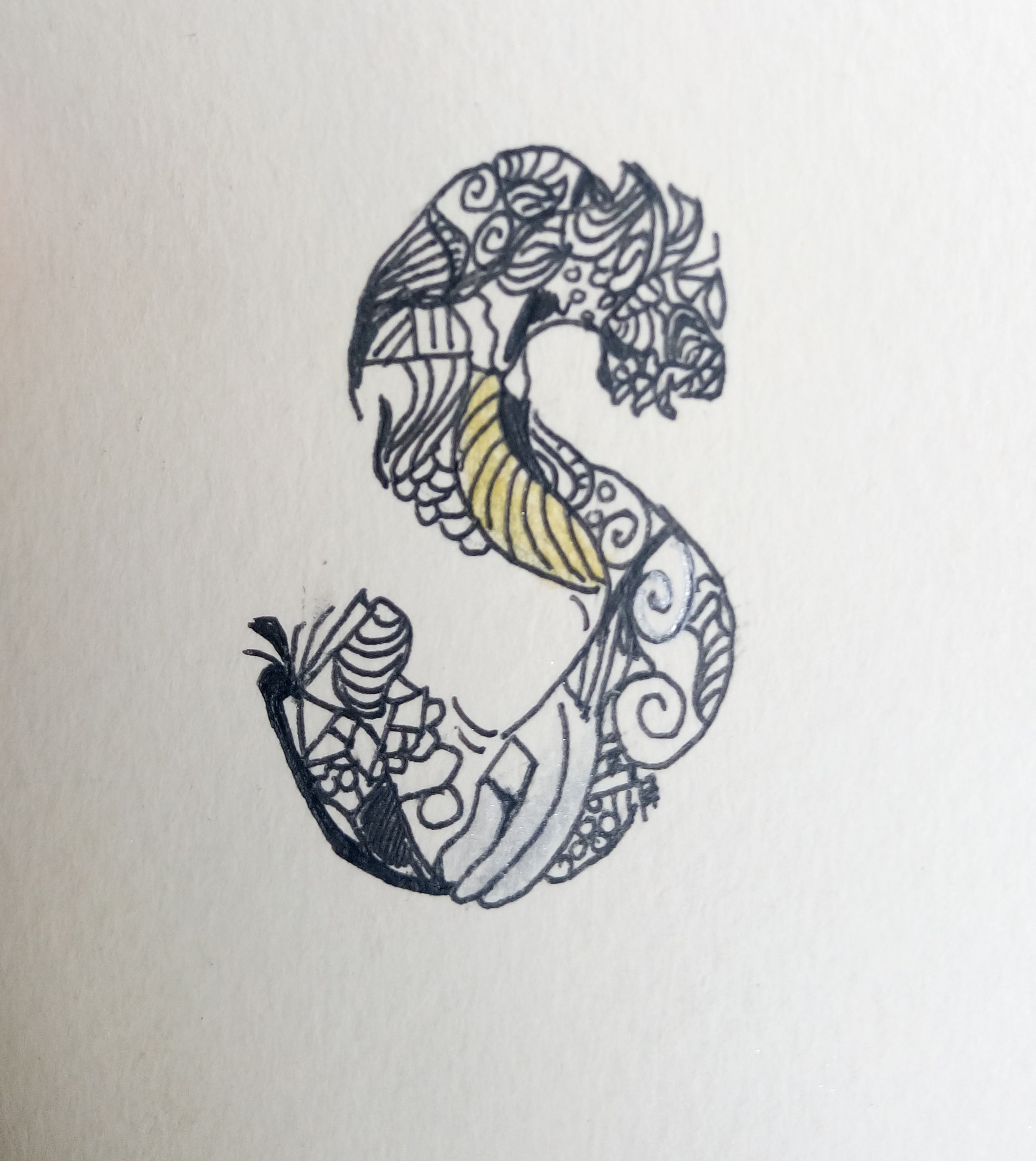
-using the line work style of illustrations to create a zine on typography
4. Compilation with improvisations (pov project)
– using the content to make a zine focused on the interactivity of it
-inspired from feedback from previous critique
5. New works (pov project)
– using the same style (basic shapes/vectors) and context (singapore) to make a match-word-to-pictures-kind-of-book.
– focused on interactivity
*note: ideas i choose to explore more on / develop.
Process
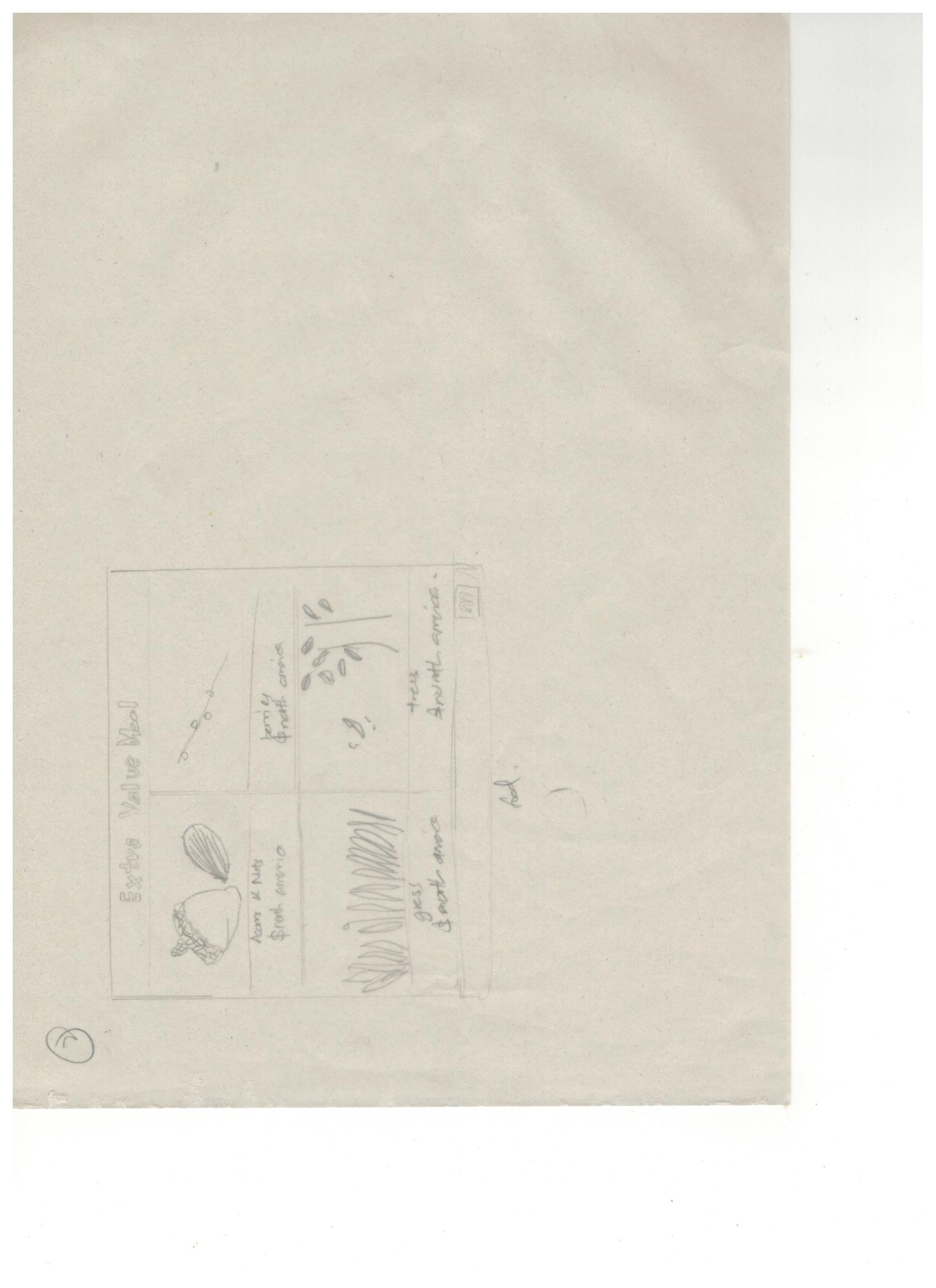
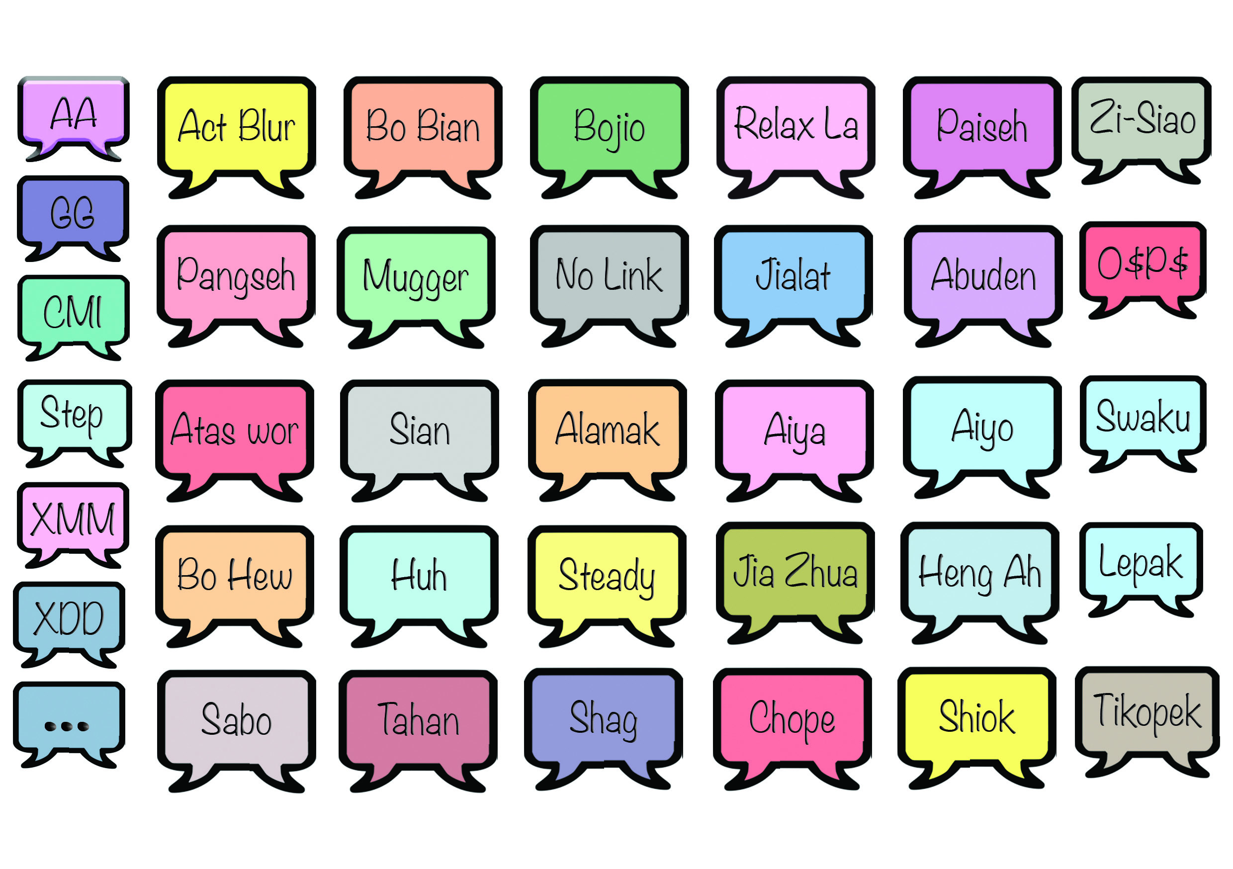
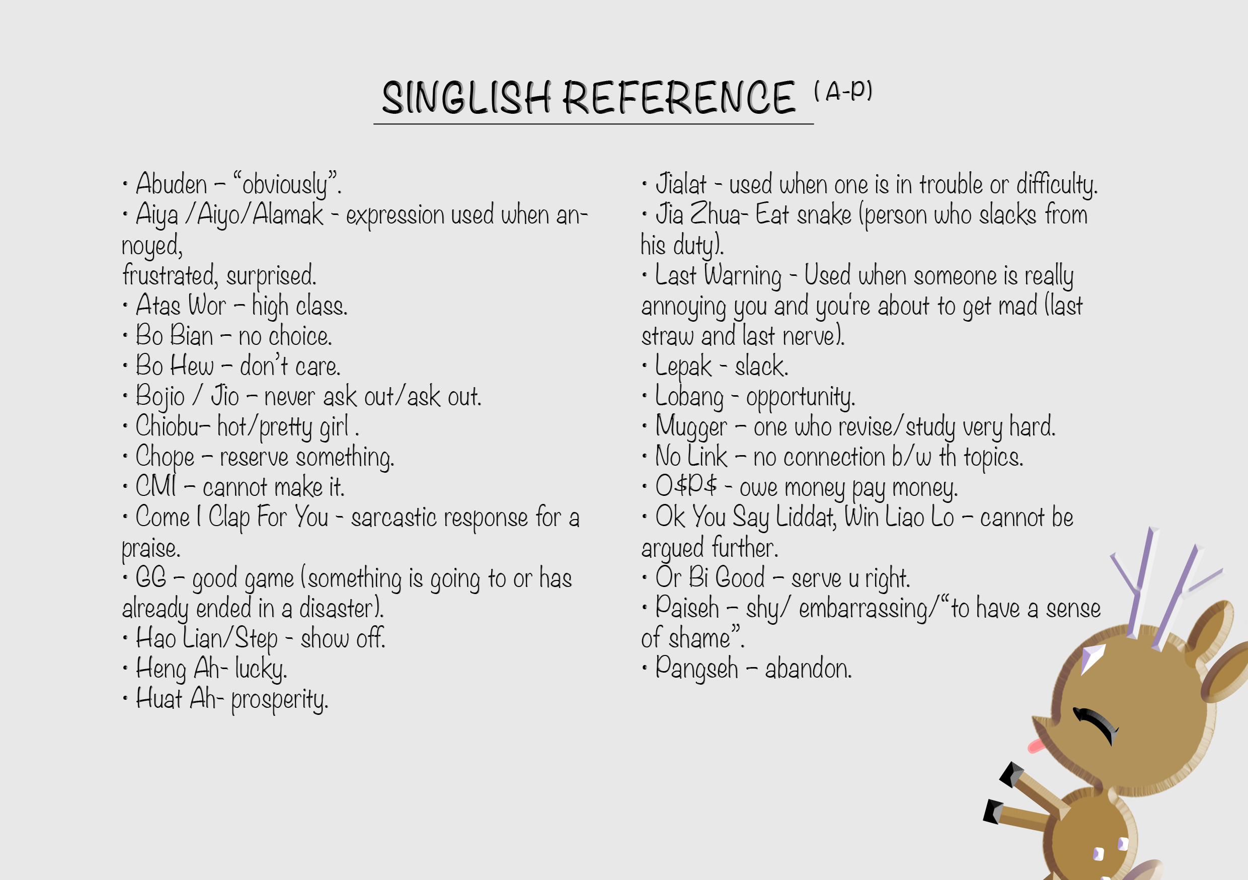
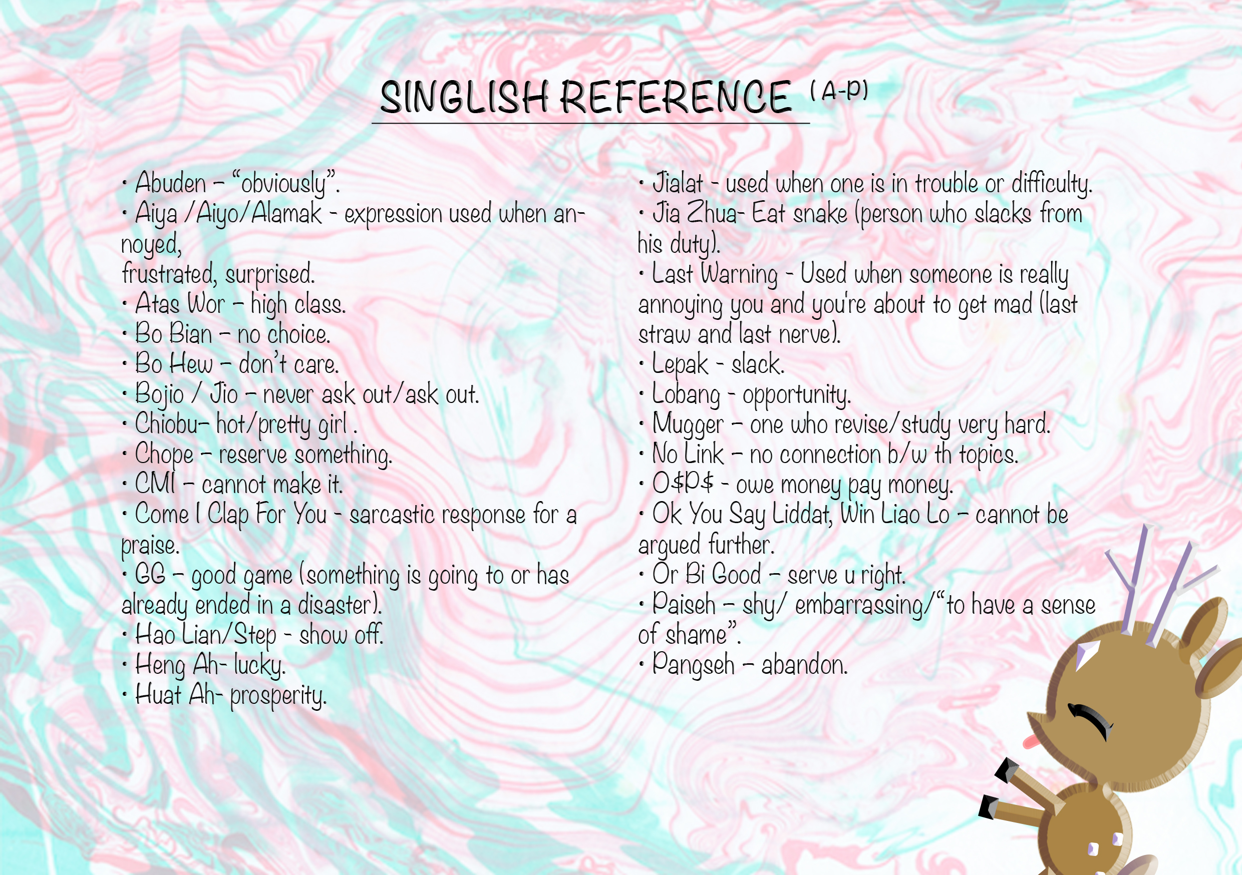
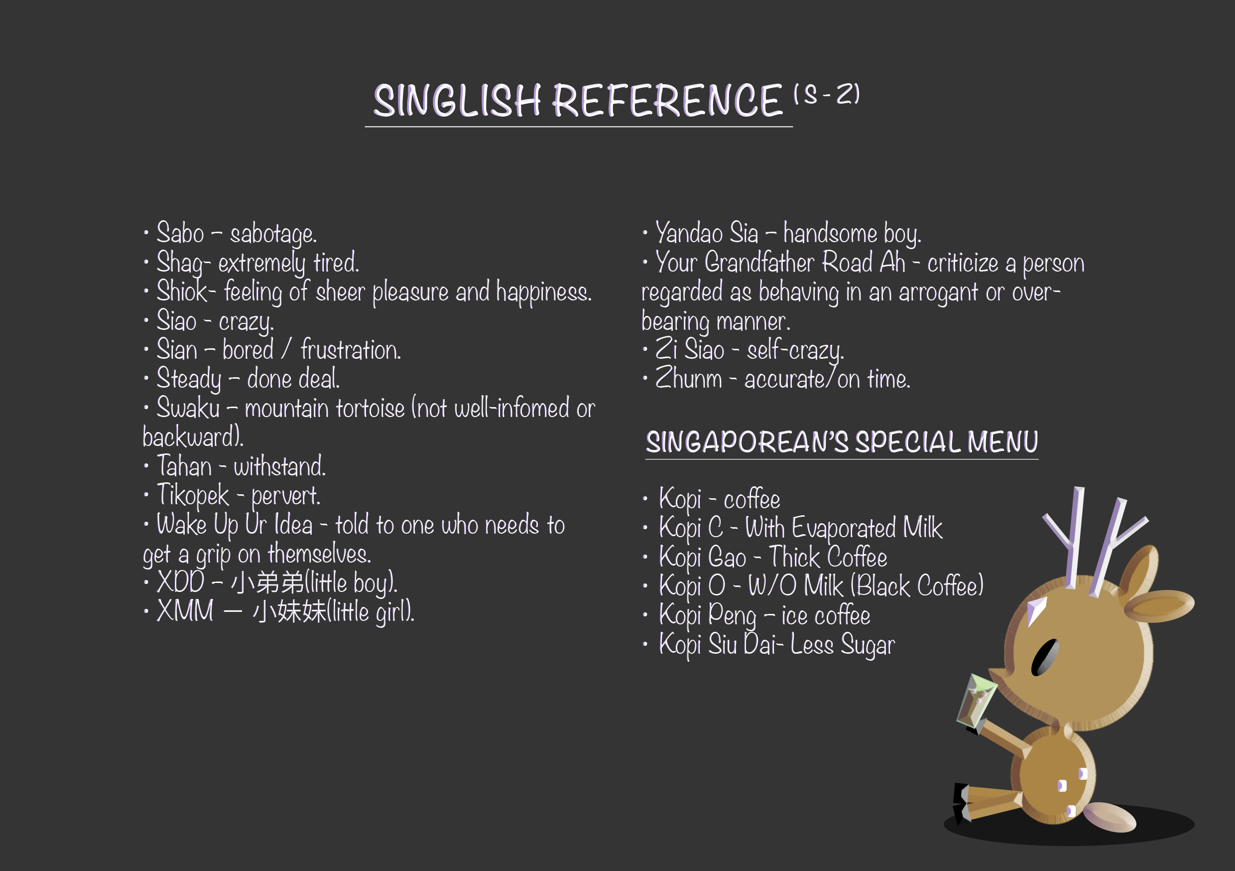
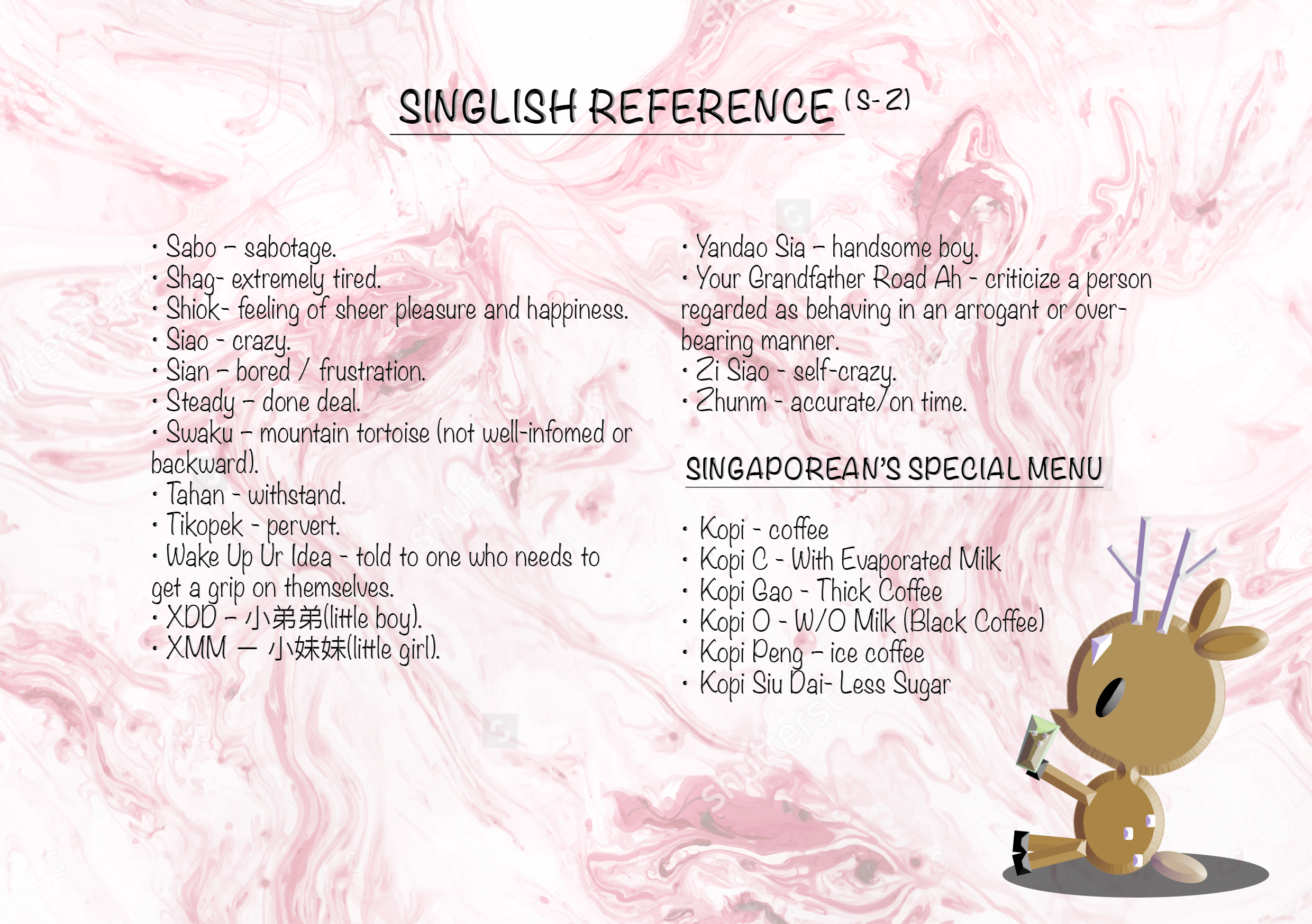
Before I started on the illustrations, I researched extensively on all the singlish words used commonly used here in Singapore, followed by narrowing it down the ones that I thought would be more appropriate for my project. (some examples: https://drive.google.com/open?id=0B9SxP4EKVfKBV0hZb1BBYnJXc3c)
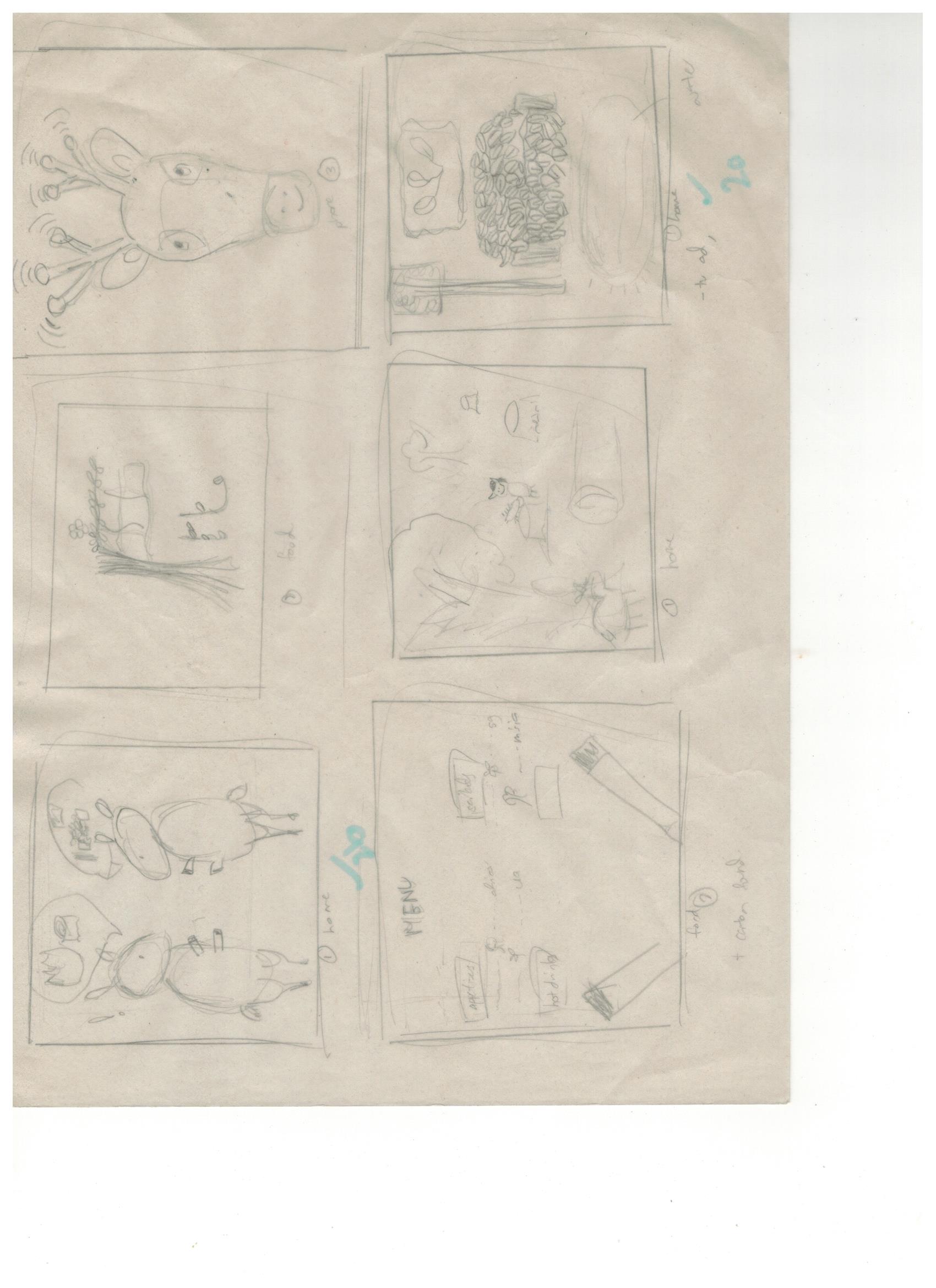
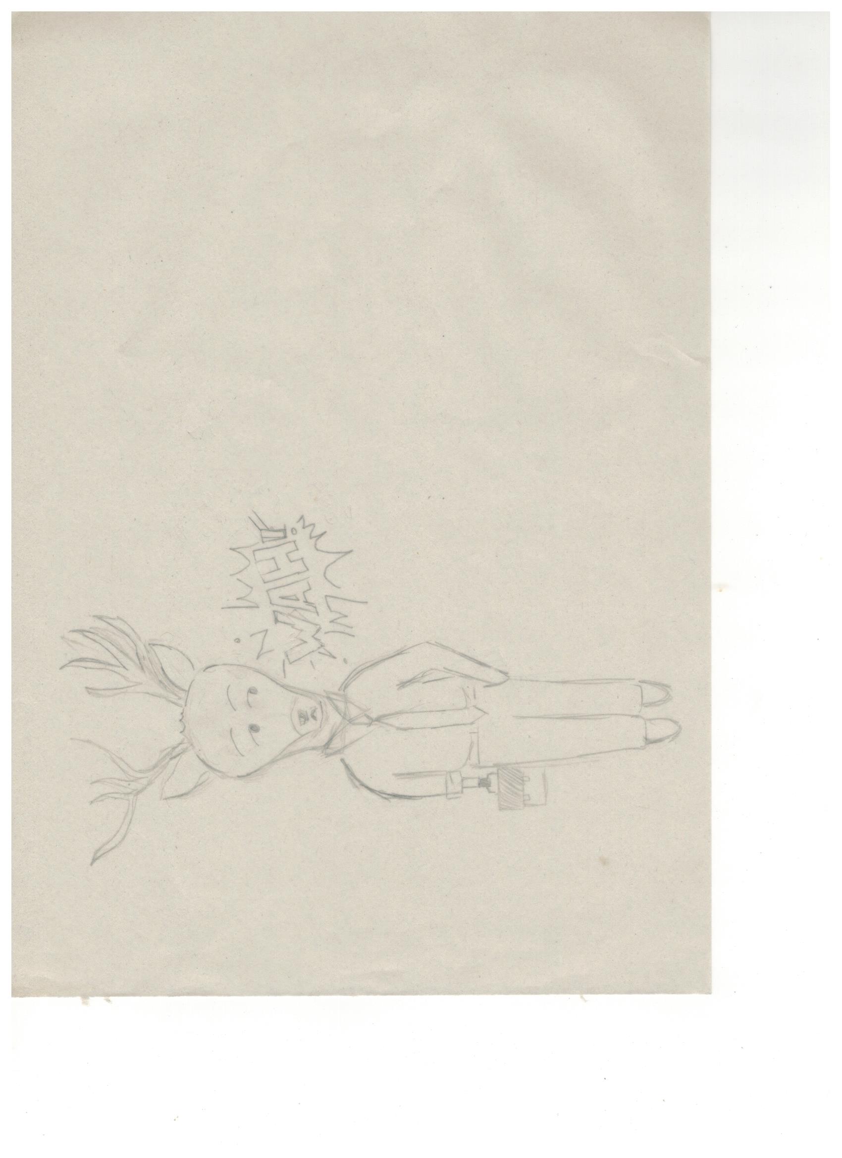
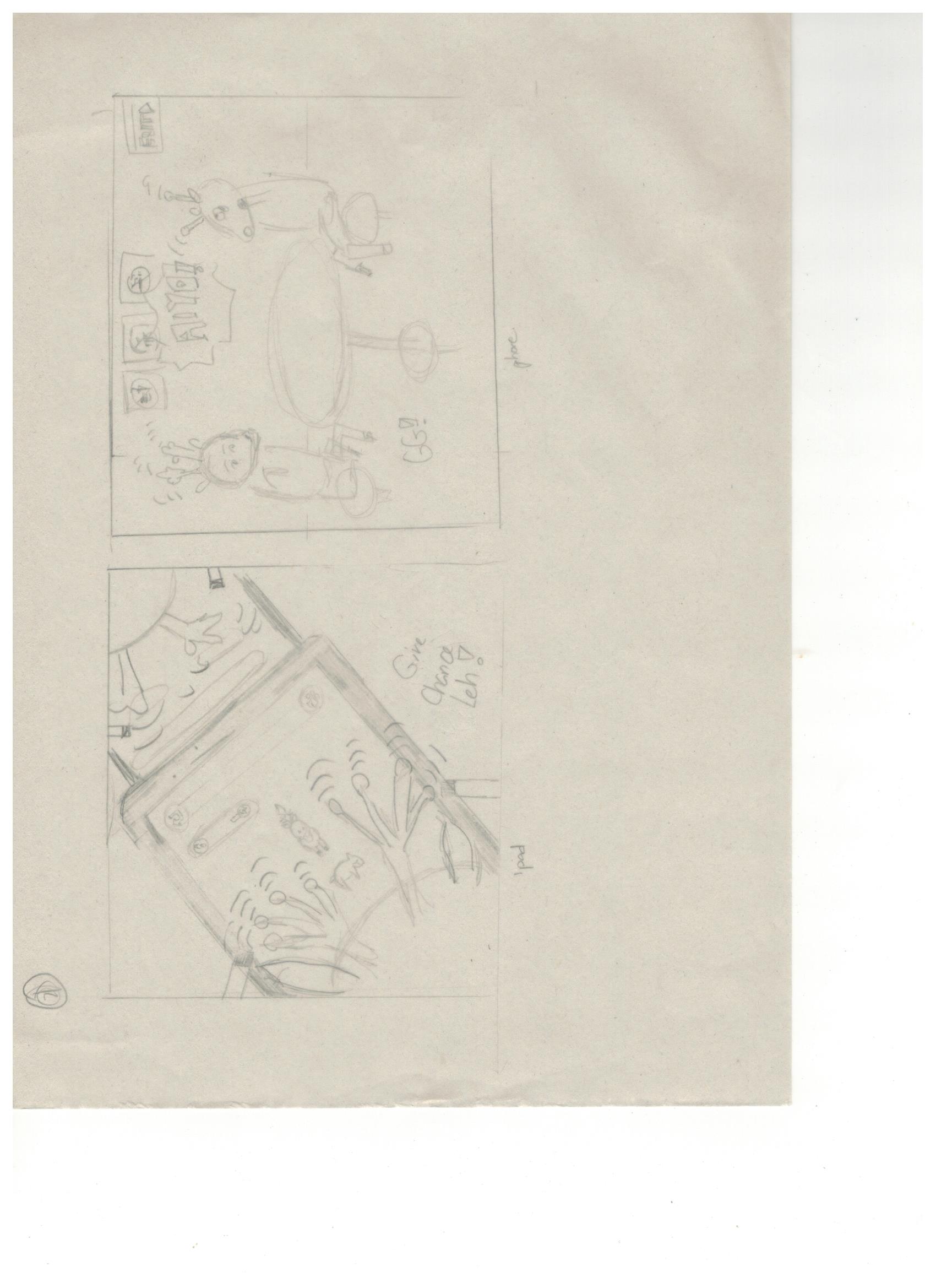
After that I first tried out making a few illustrations for idea 5( refer to above on initial ideas).
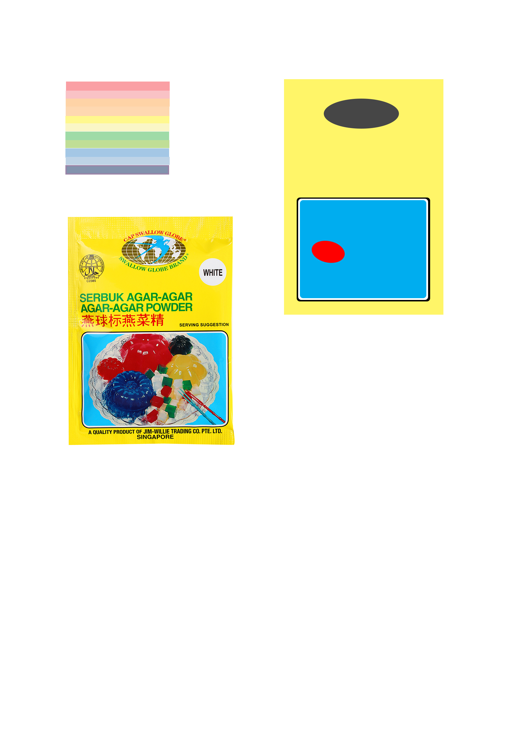
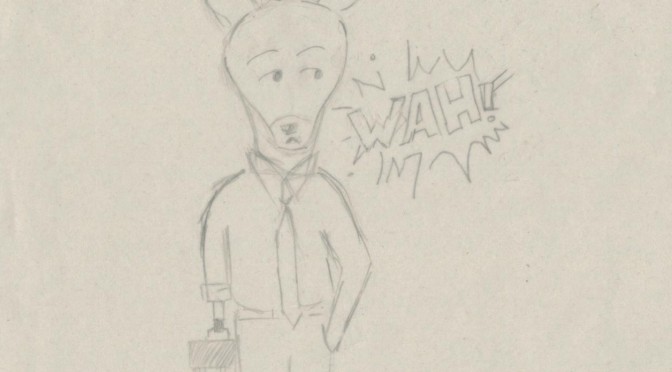
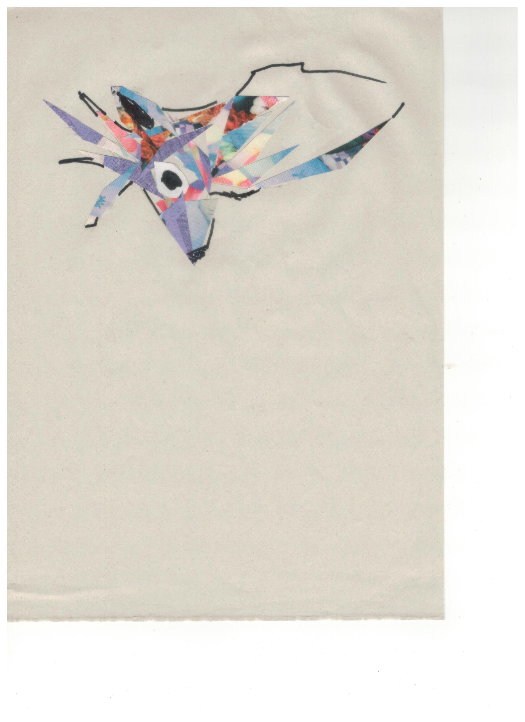
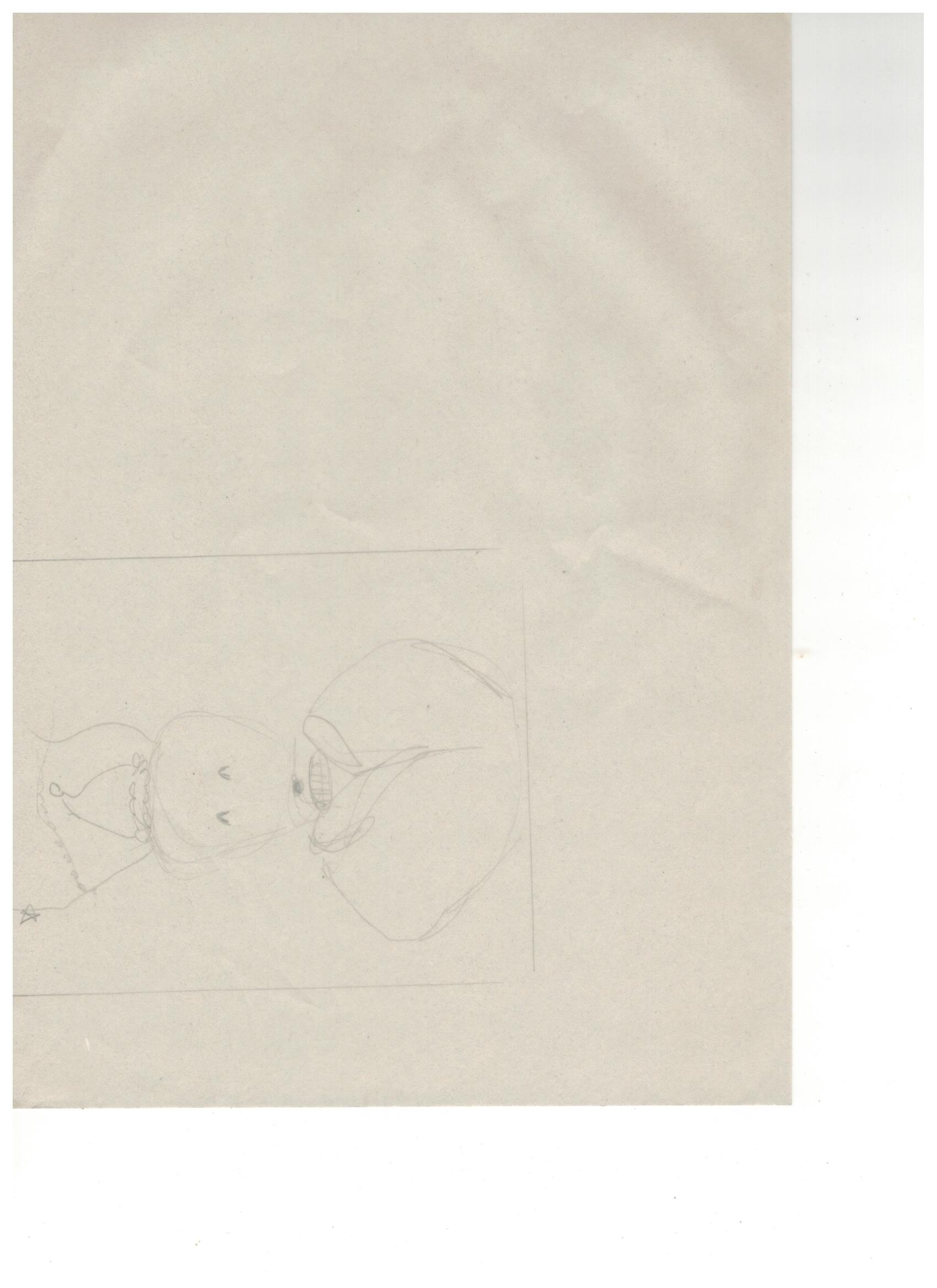
Tryout of a illustration for word (agar-agar: jelly / rough estimation).
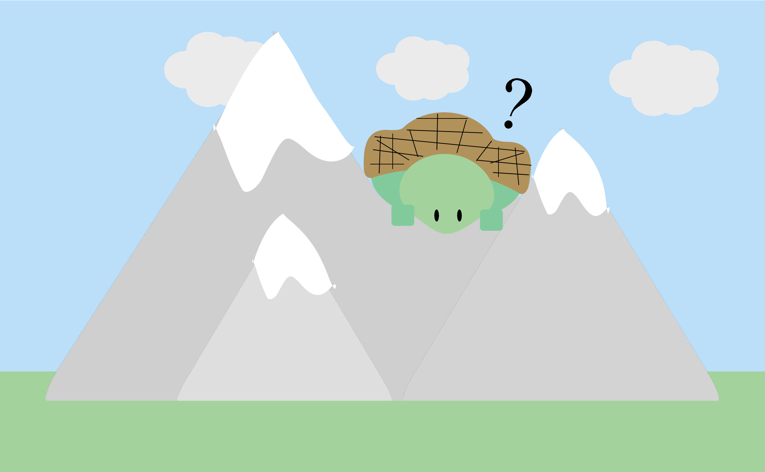
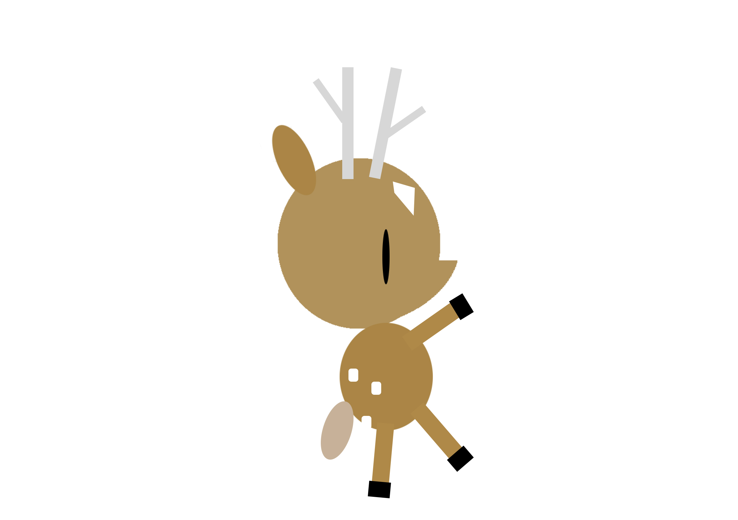
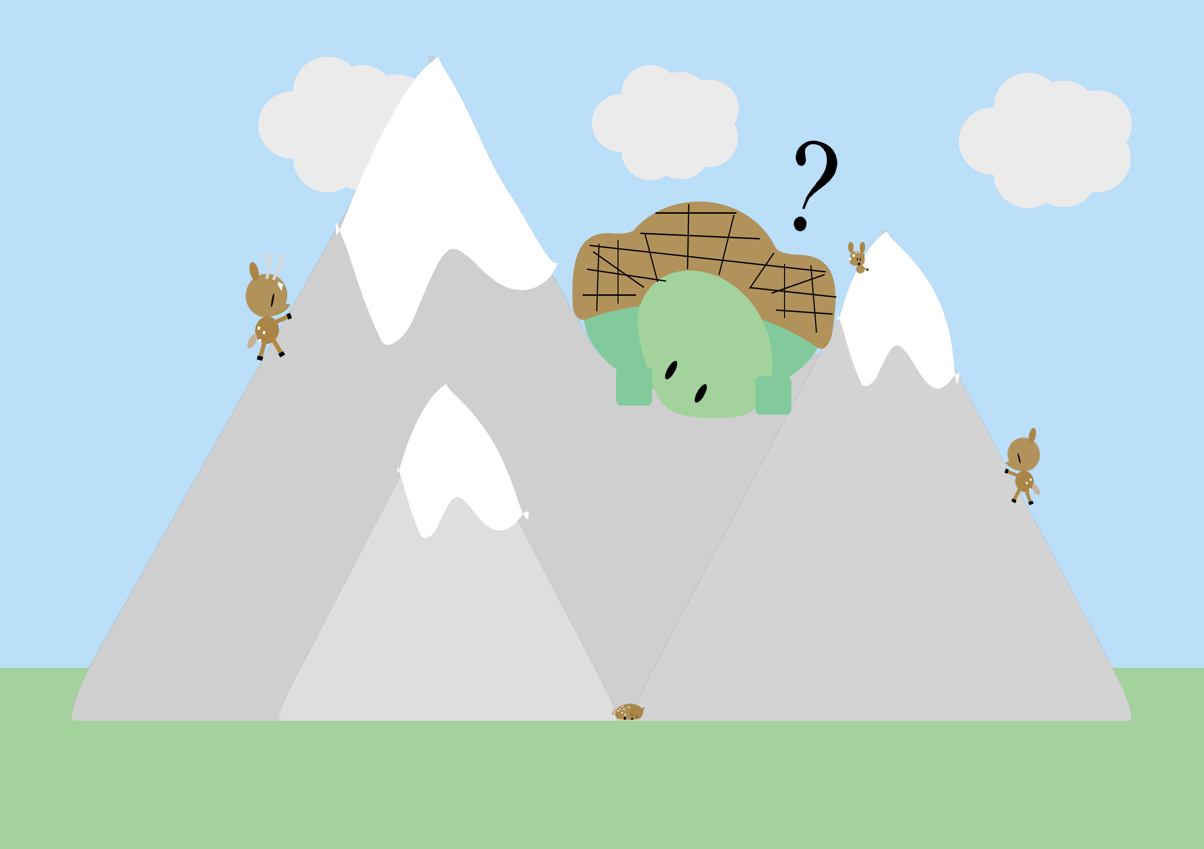
tryout of illustration for word (swaku-mountain tortoise) with full background/ setting a context.
I tried out two ways of portrayal , one being just focusing on the subject matter itself and the other being set in a context where viewers can find clues/hints from the background/surroundings (perhaps a hint of narrative too).
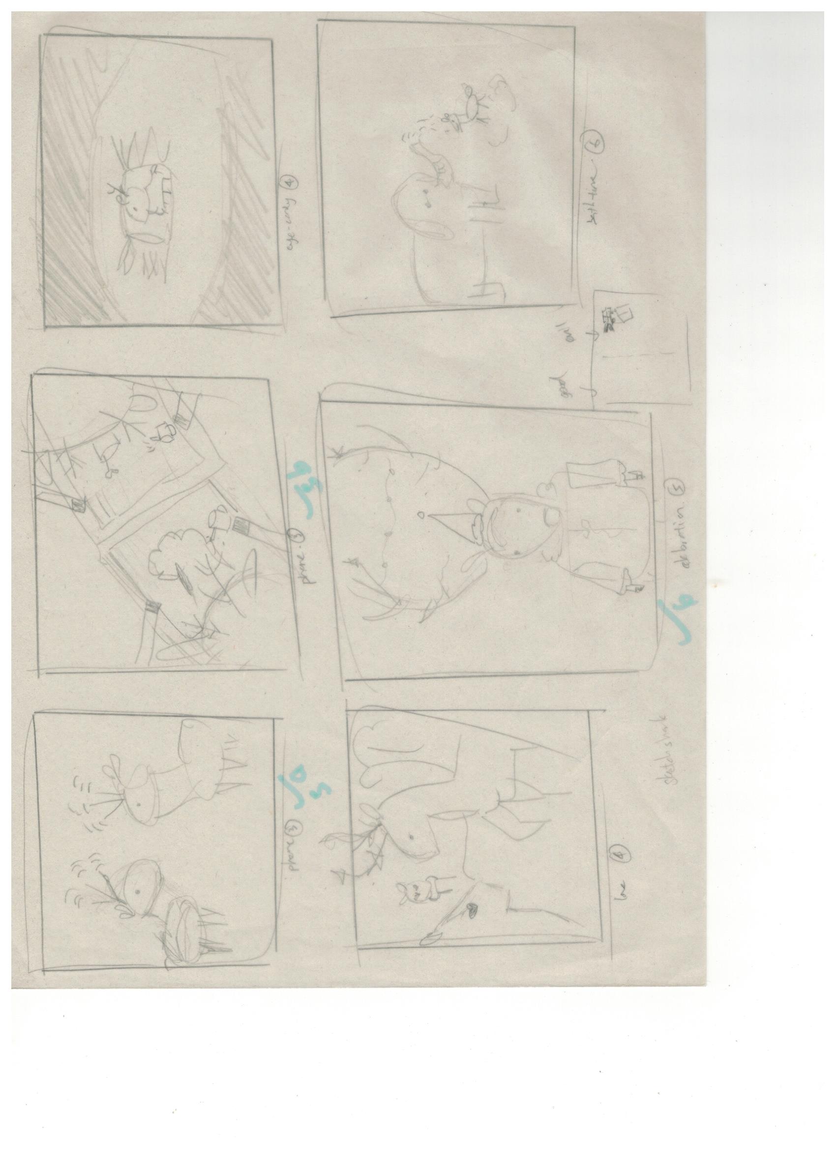
However, I realised it was hard for me to bring life to this objects that are already representational in real life and from the tryouts, I was not fully pleased with the results. I scraped the idea. Hence, I decided to work on idea 4 instead as I’ve always been more drawn to having many narratives in my works.
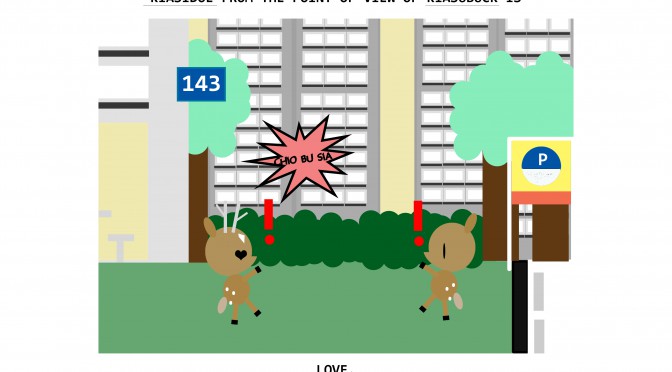
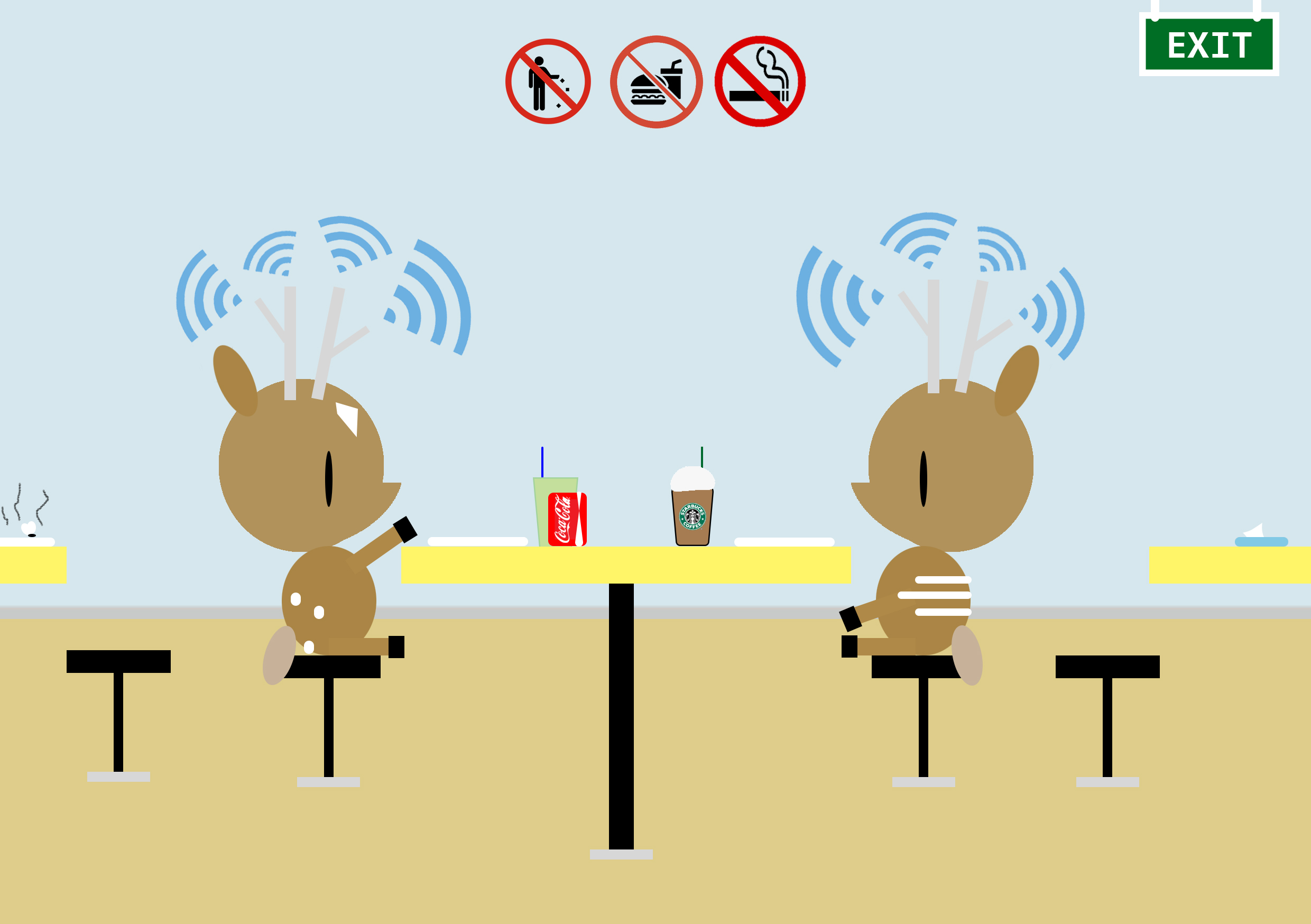
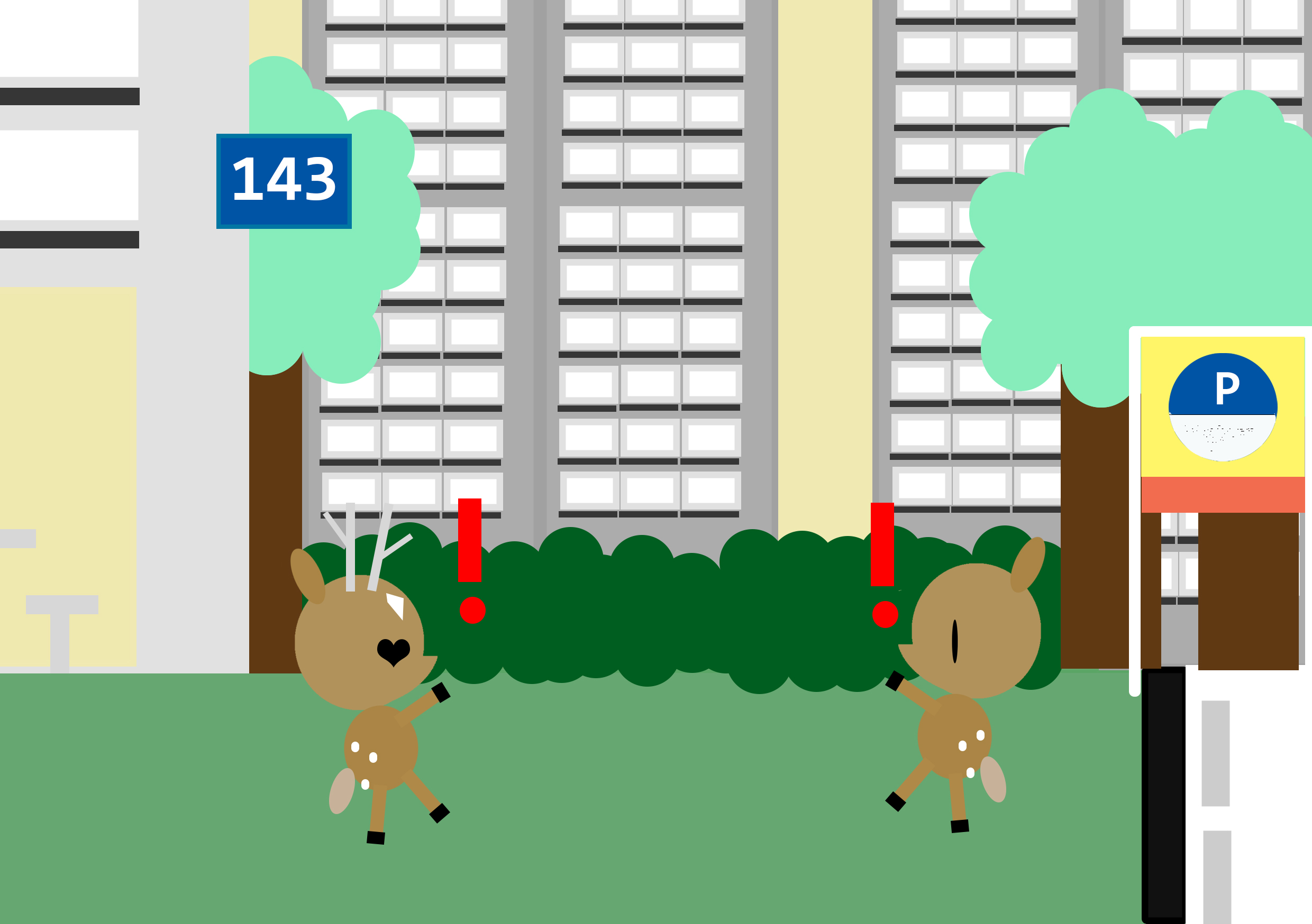
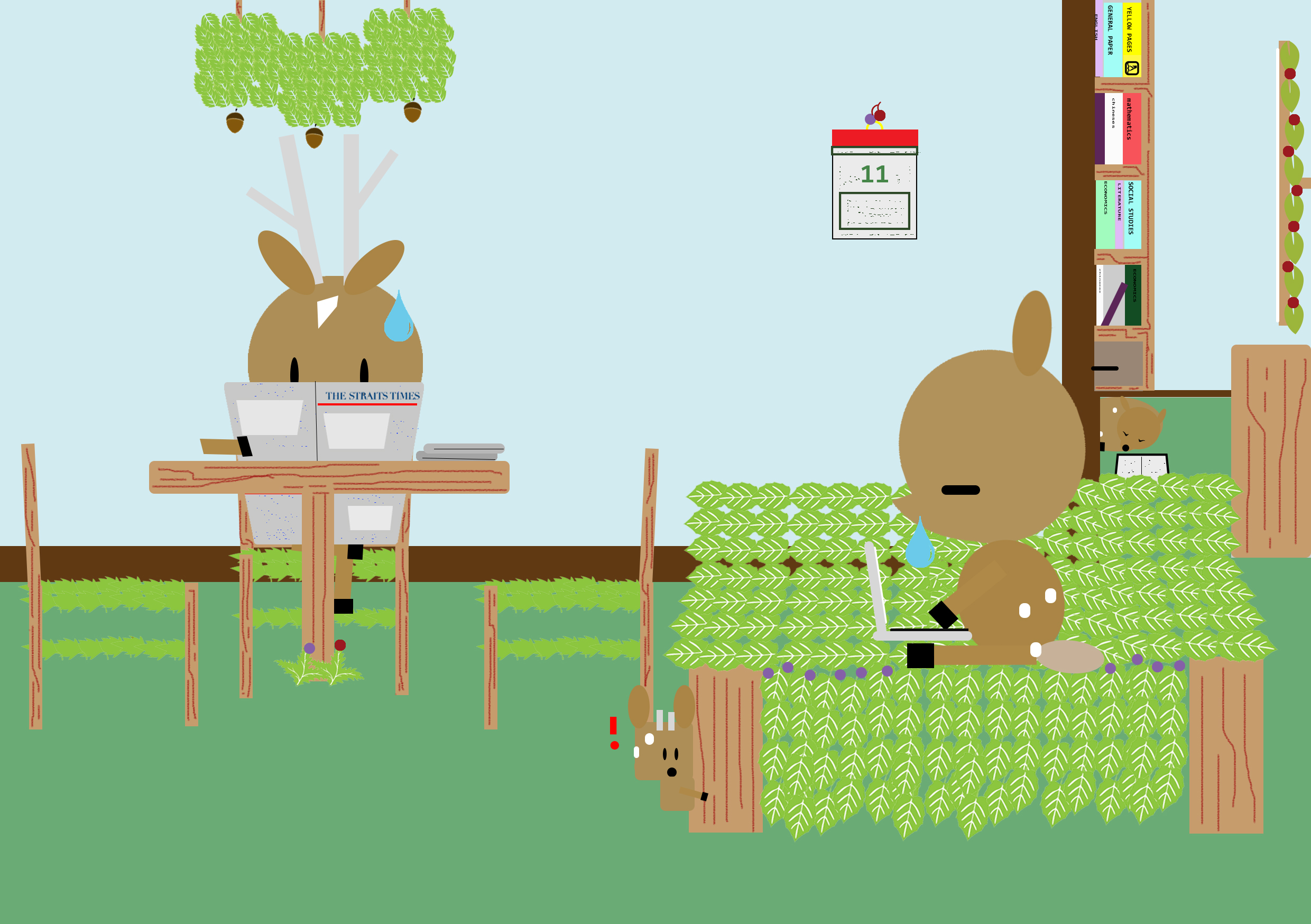
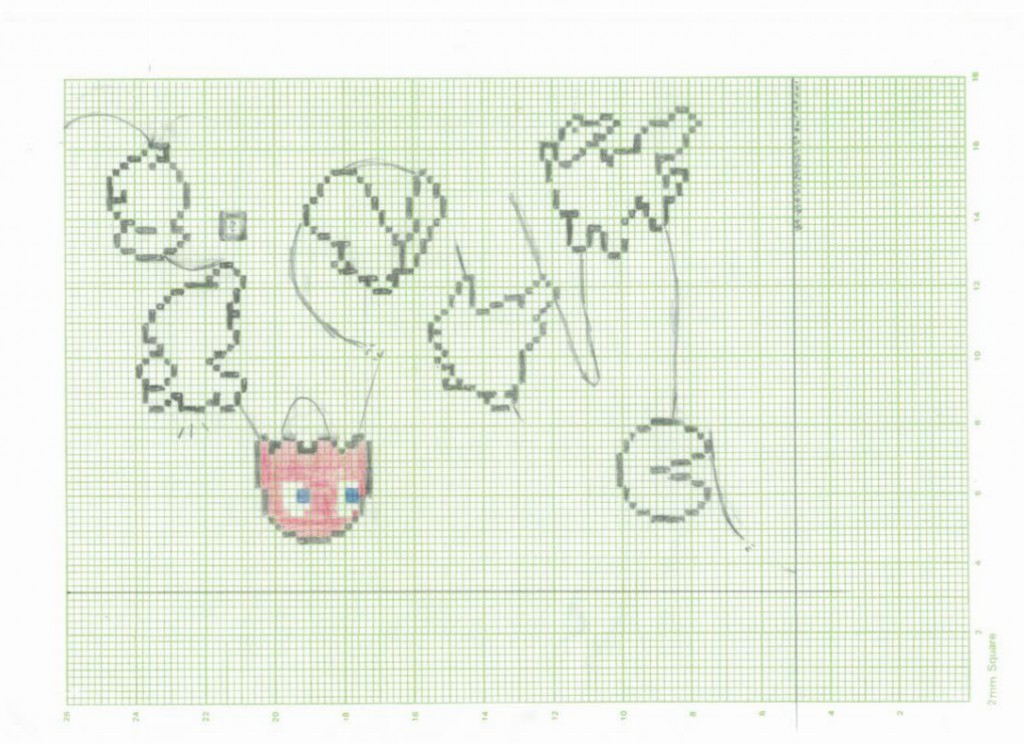
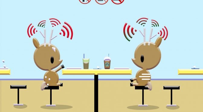
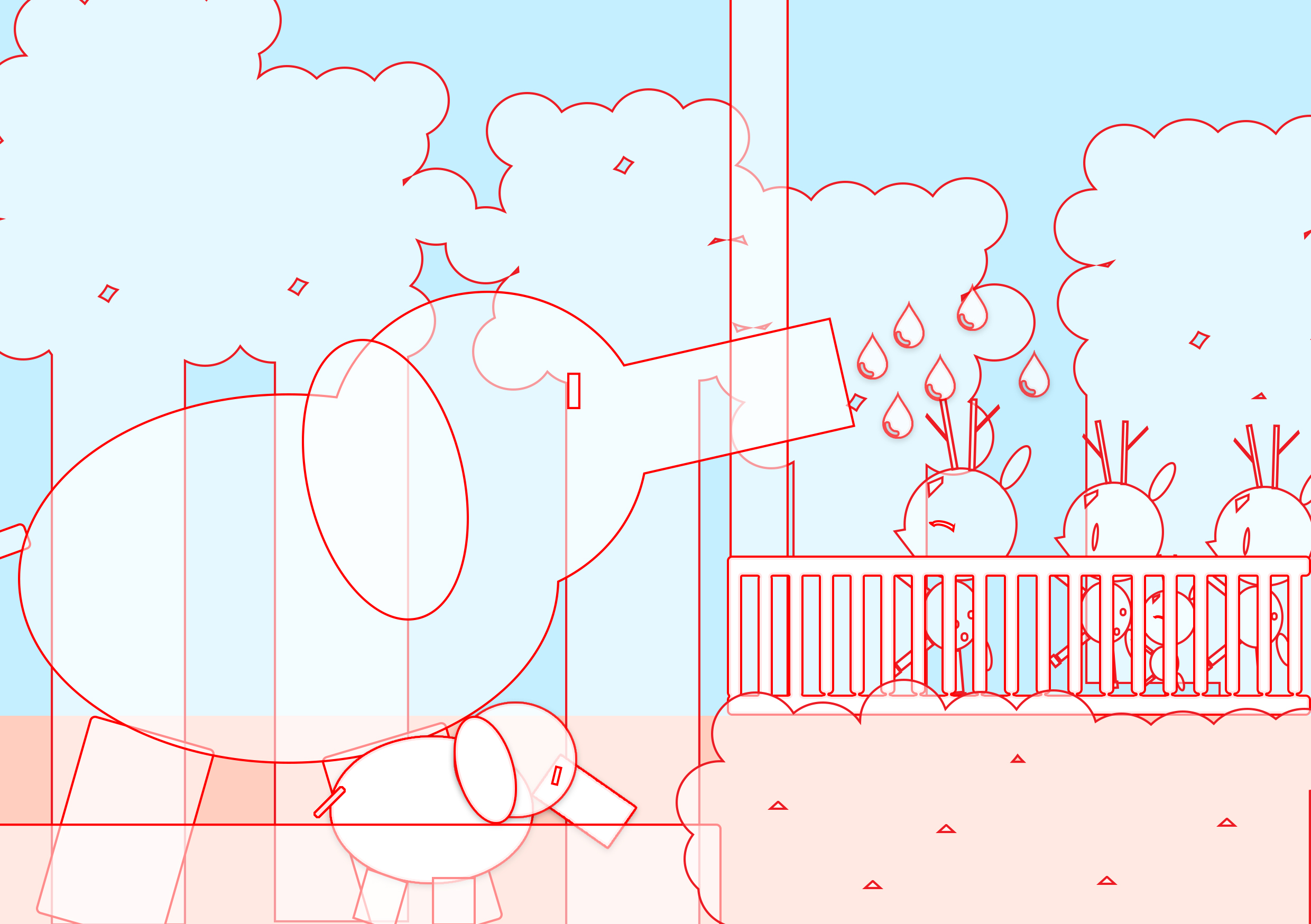
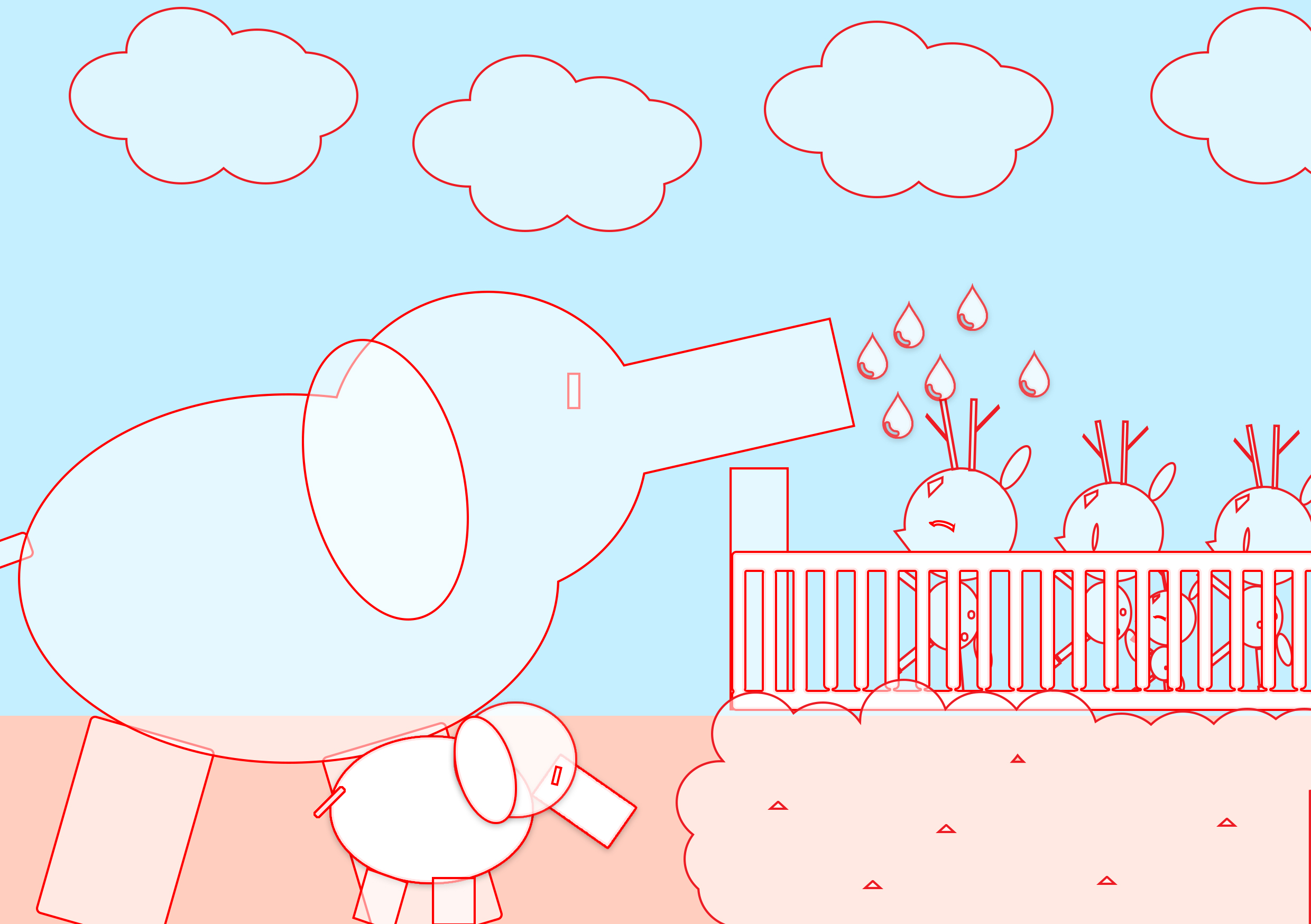
Firstly, I reviewed my series of works for the pov assignment and selected the ones that I’d like to use while changing some others for new illustrations.
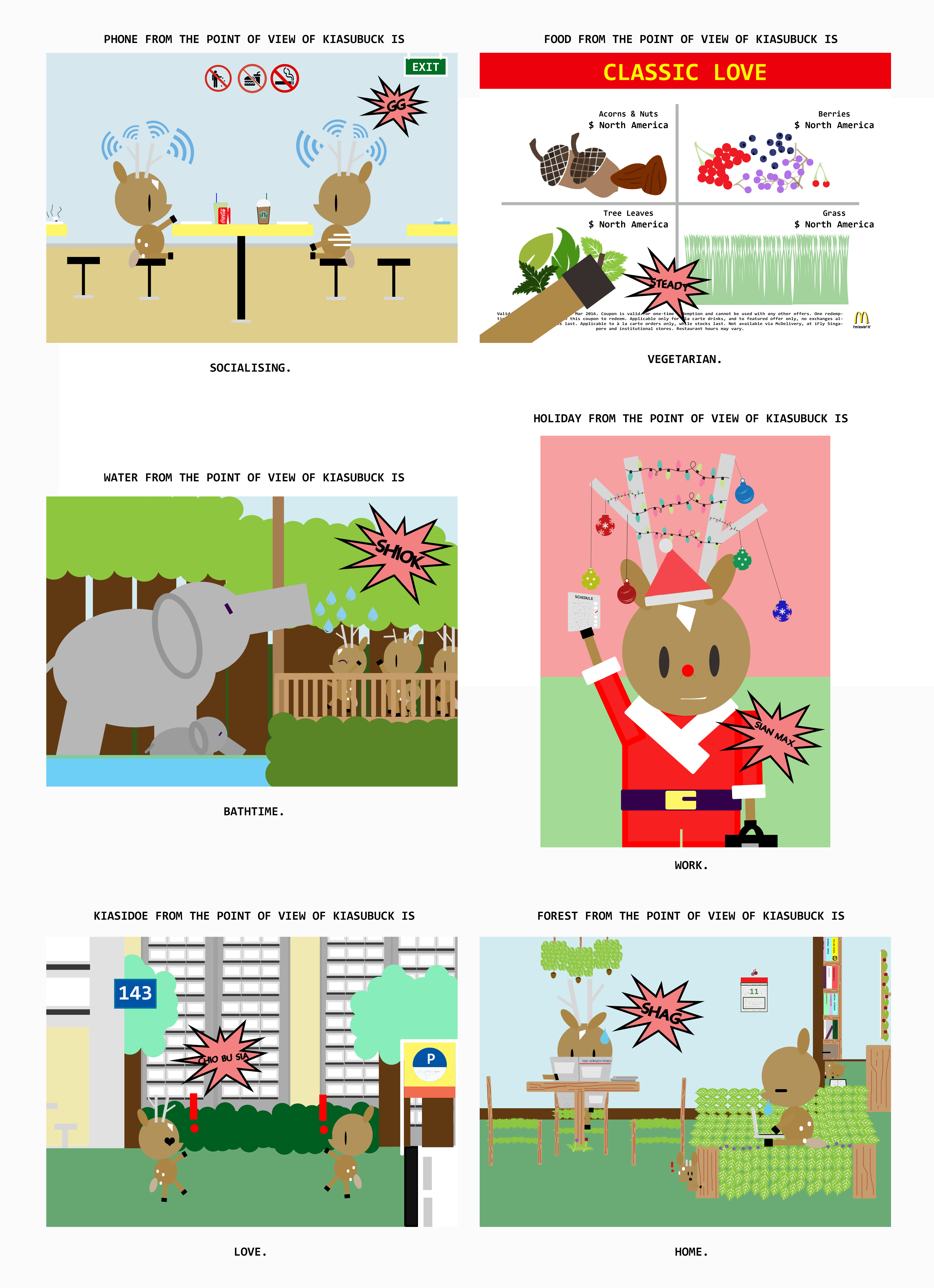
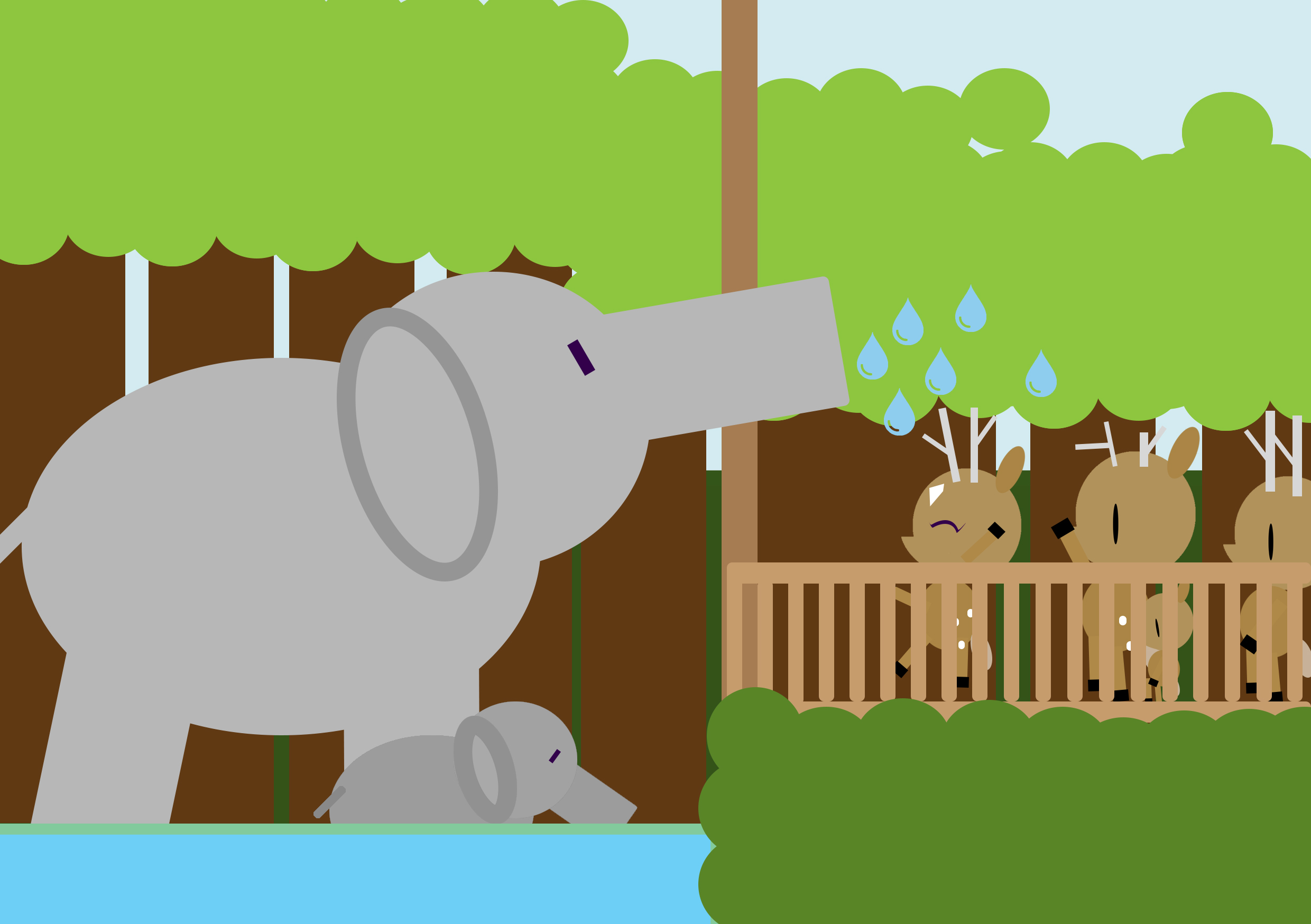
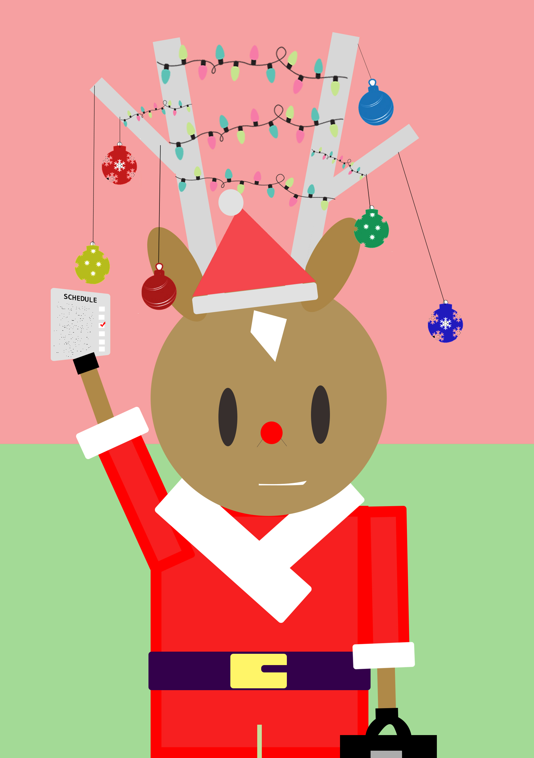
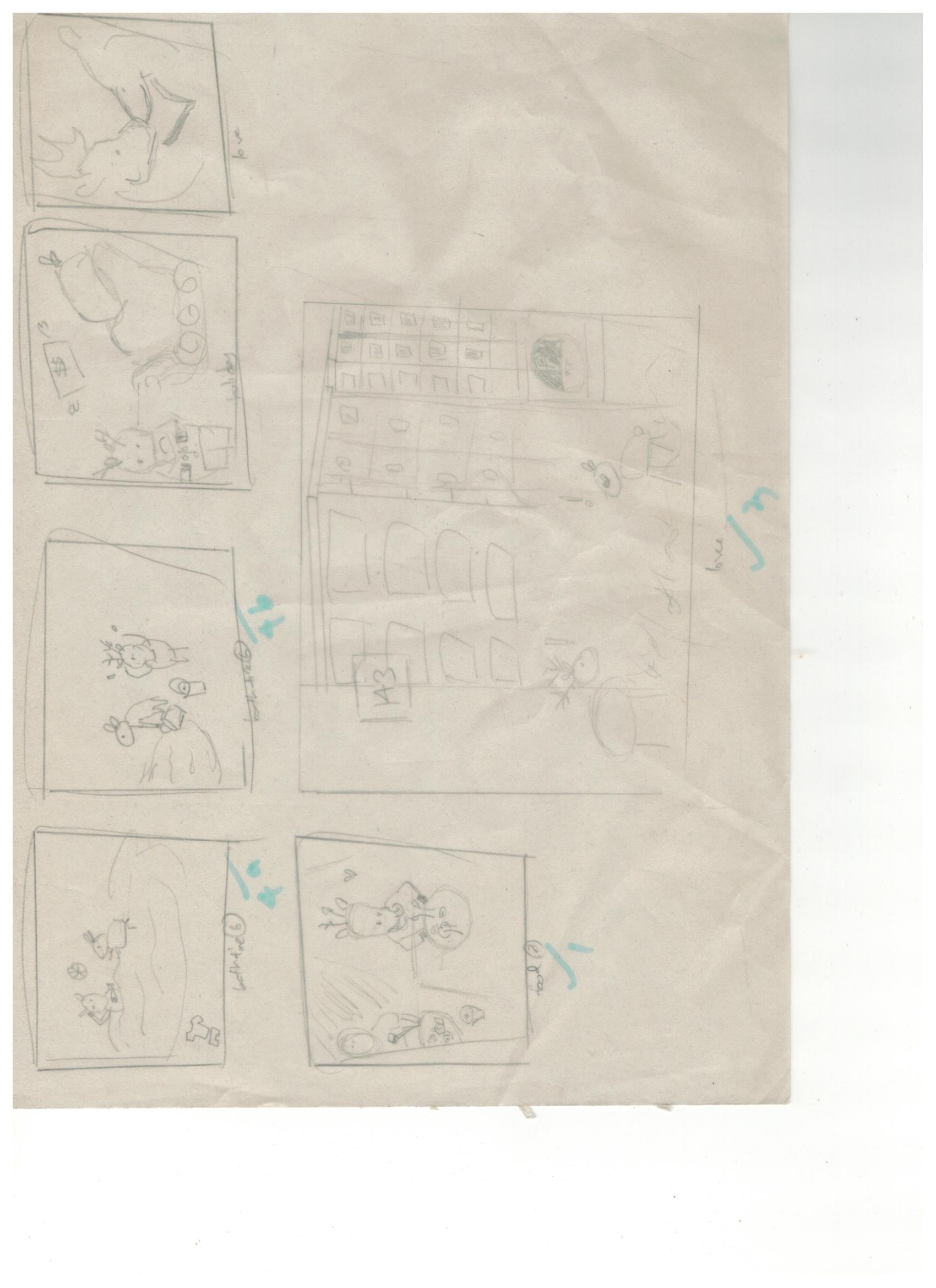
original set of works that I worked with.
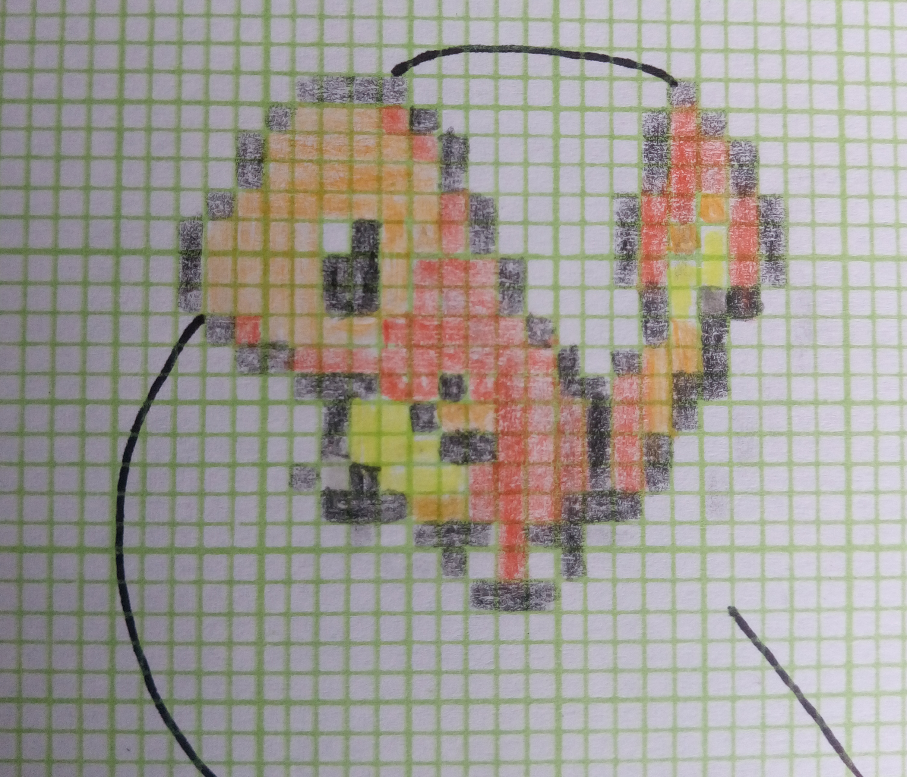
Replaced the original work(top-right) with this
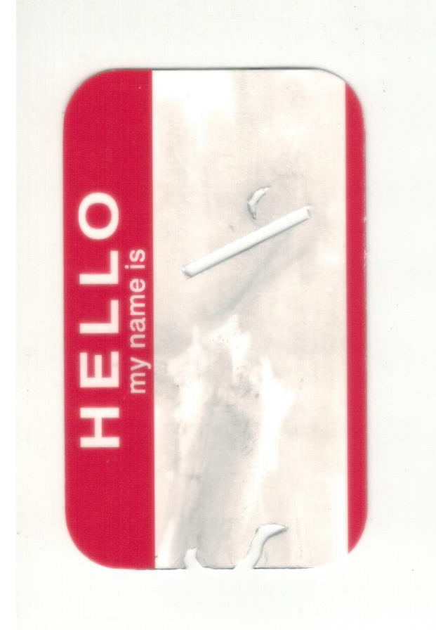
For this idea, I was really inspired by this interactive book that Joy gave as feedback from the previous critique.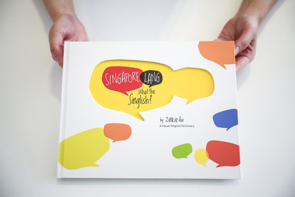
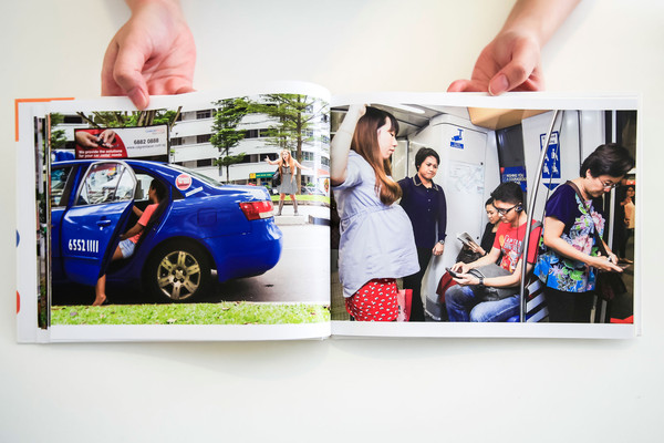
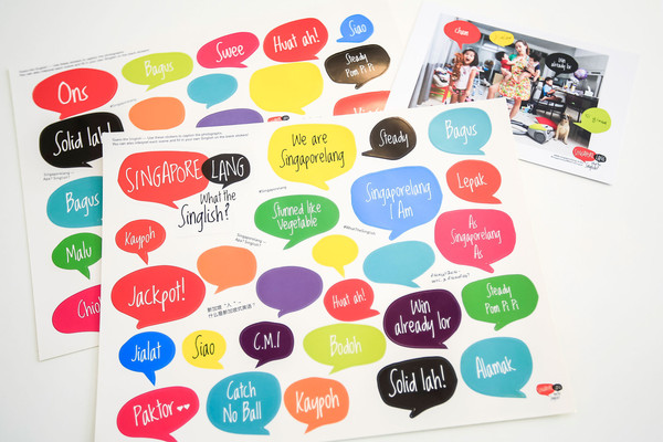
Singapore Lang – What the Singlish! Book
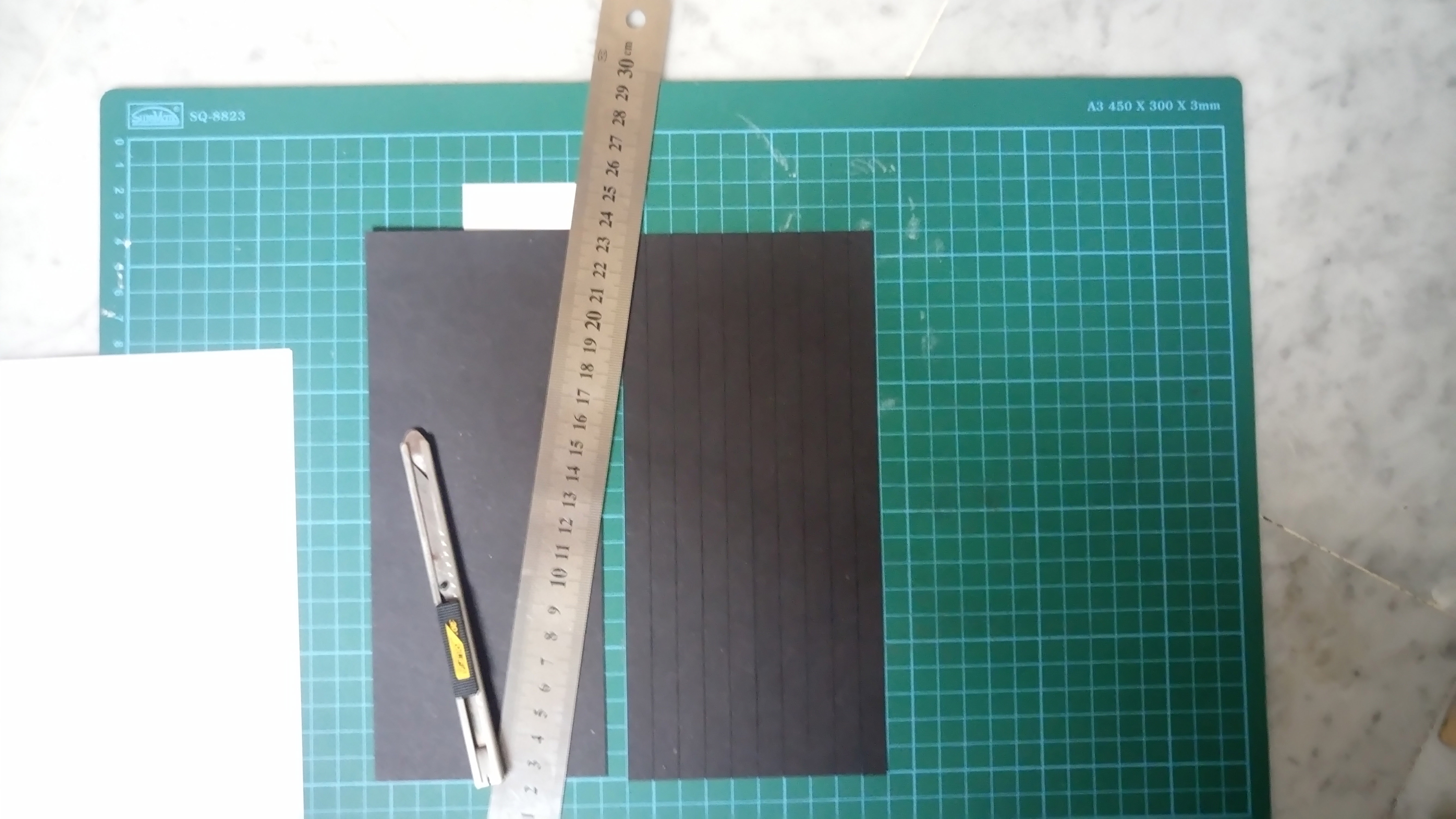
I tried out various binding methods for the mock-ups, such as side stapling , saddle stitch with thread and Japanese binding. After consultation, many recommended for the book to be able to be fully-opened for easier user experience.
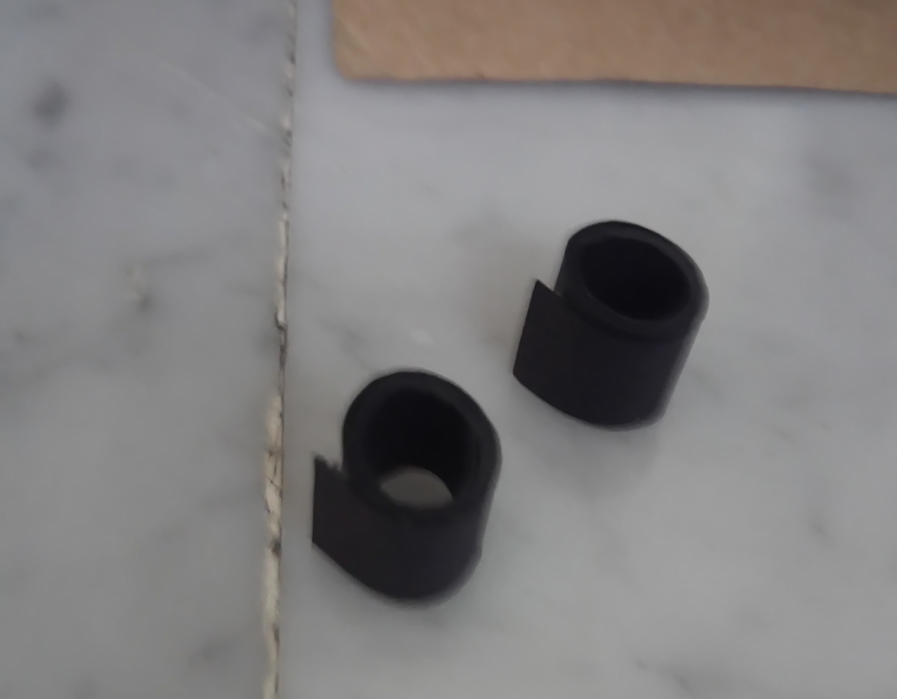
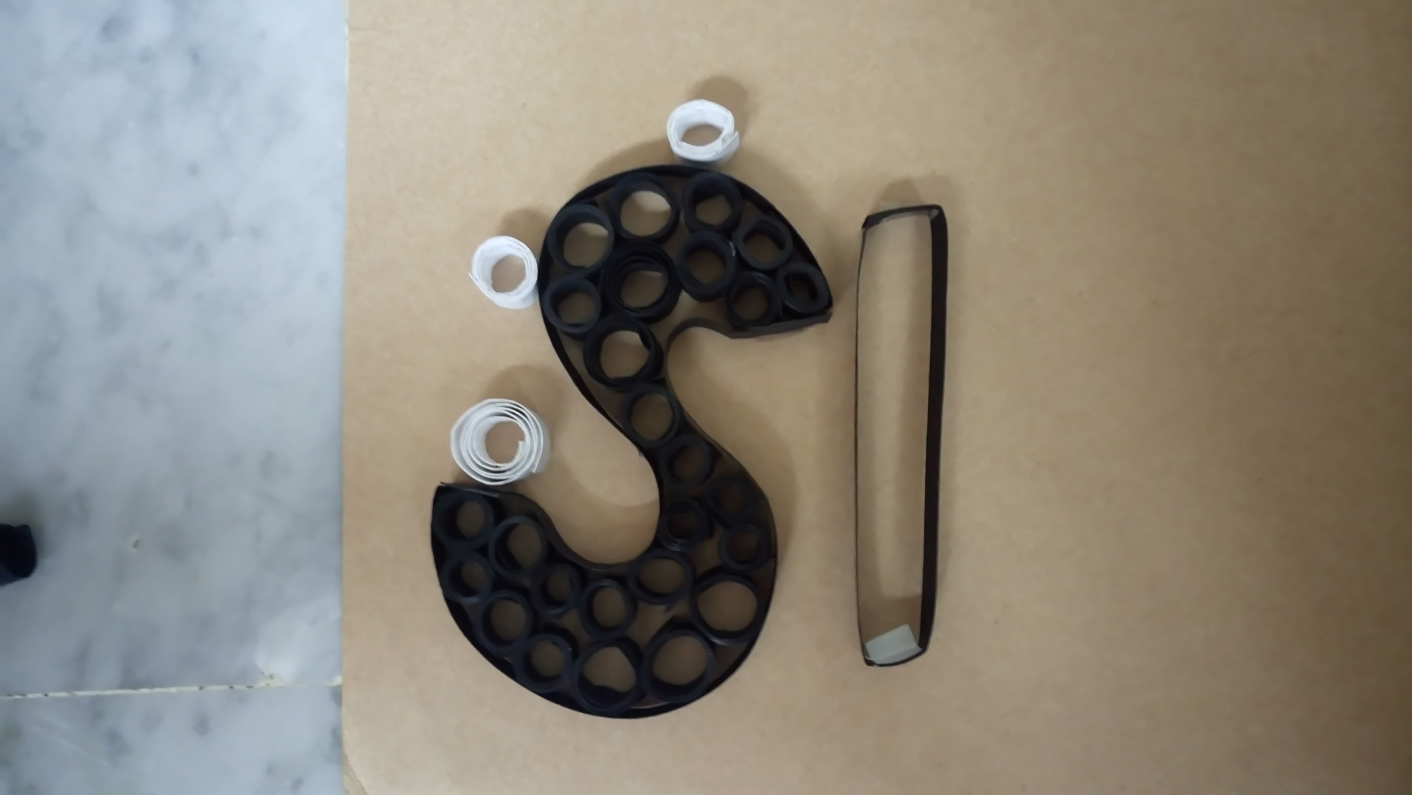
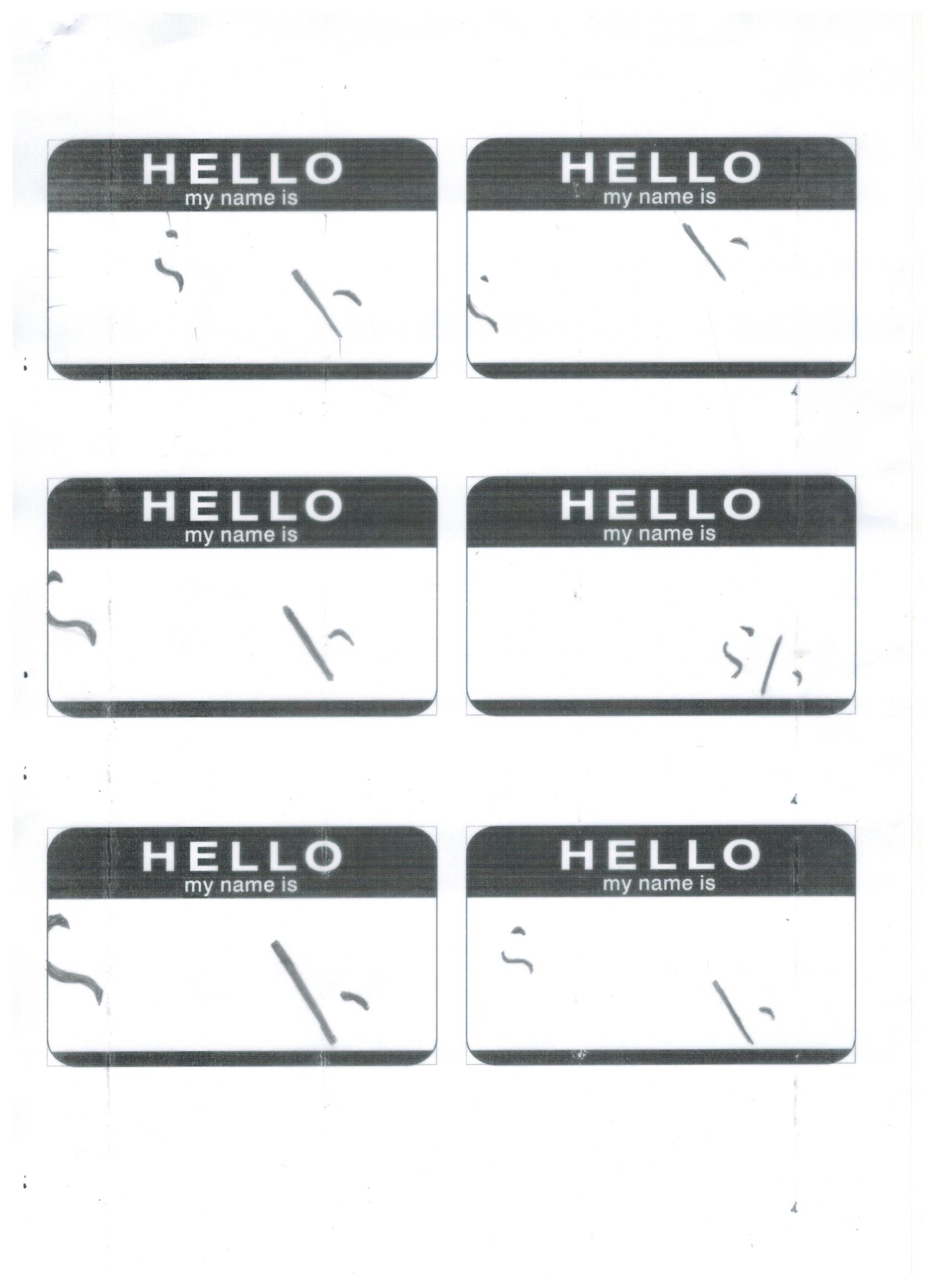
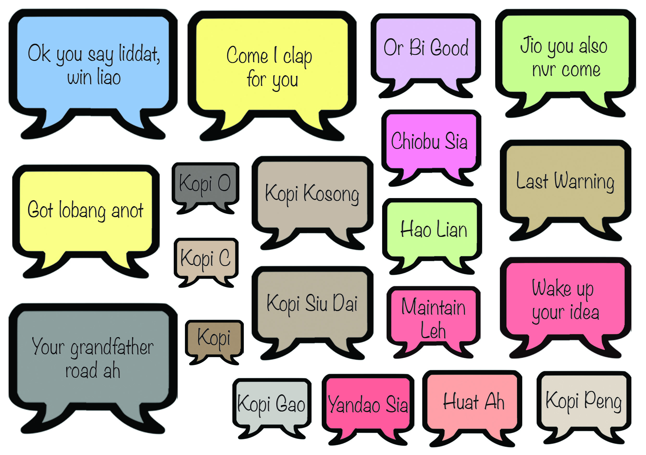
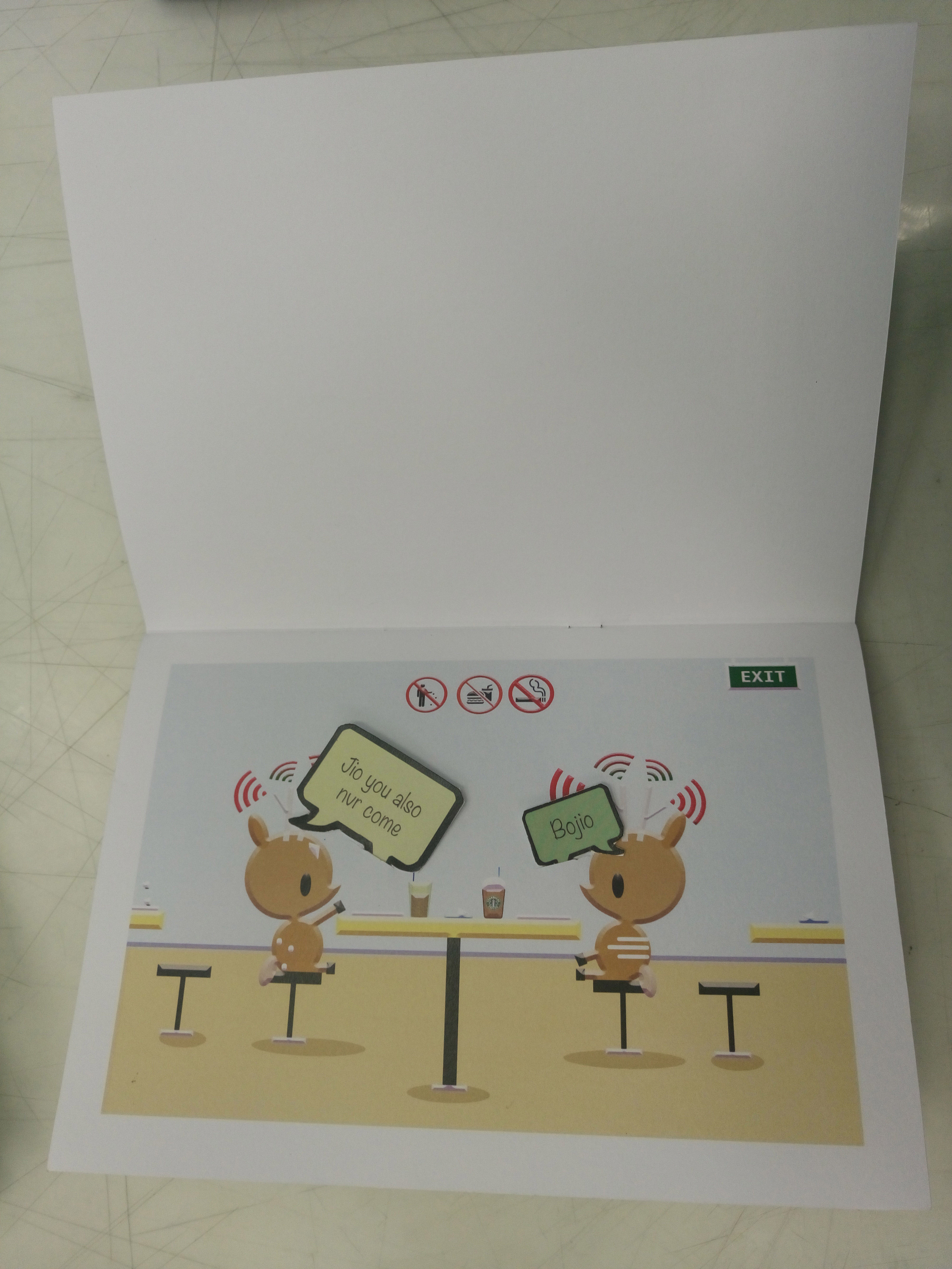
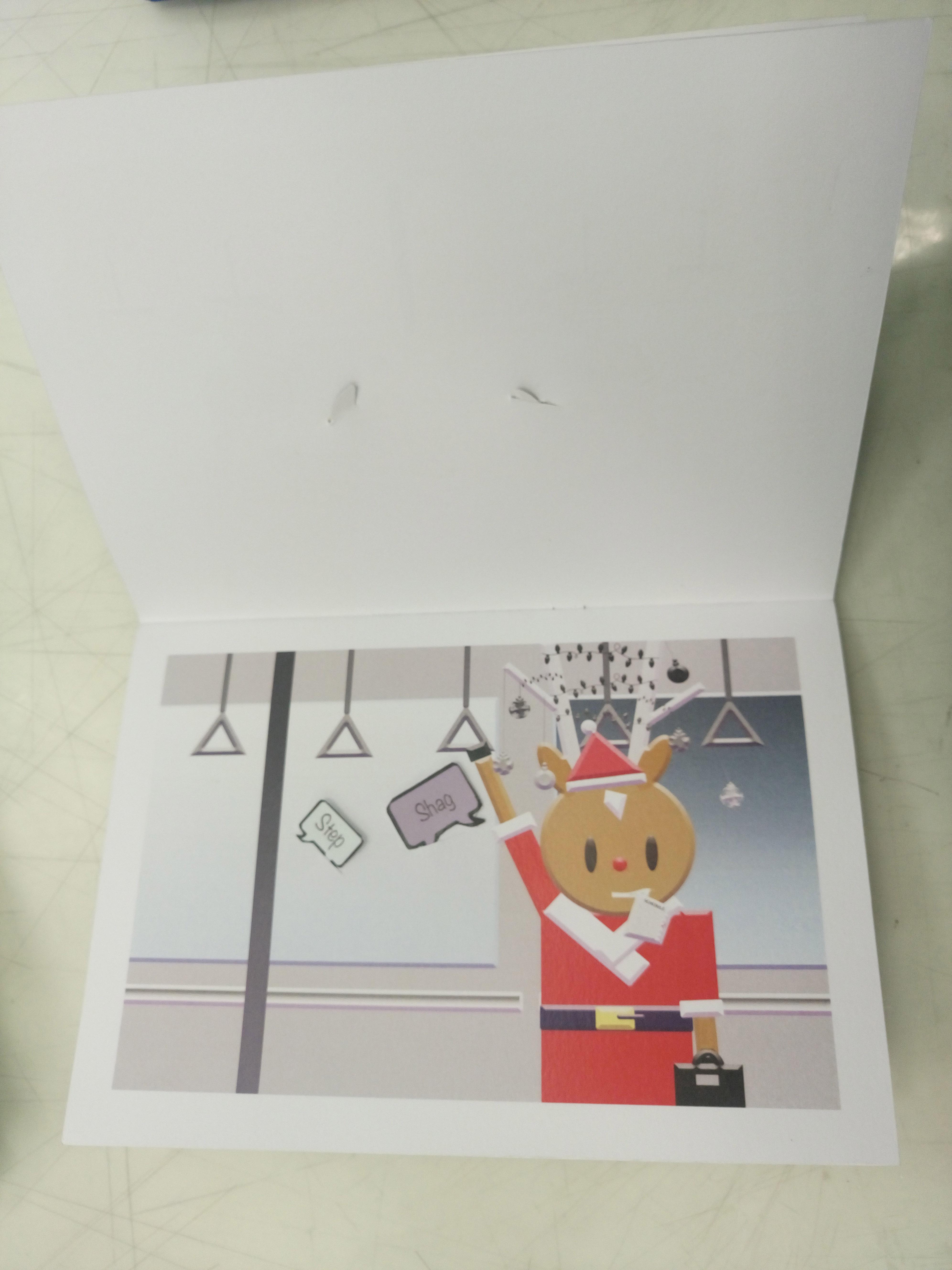
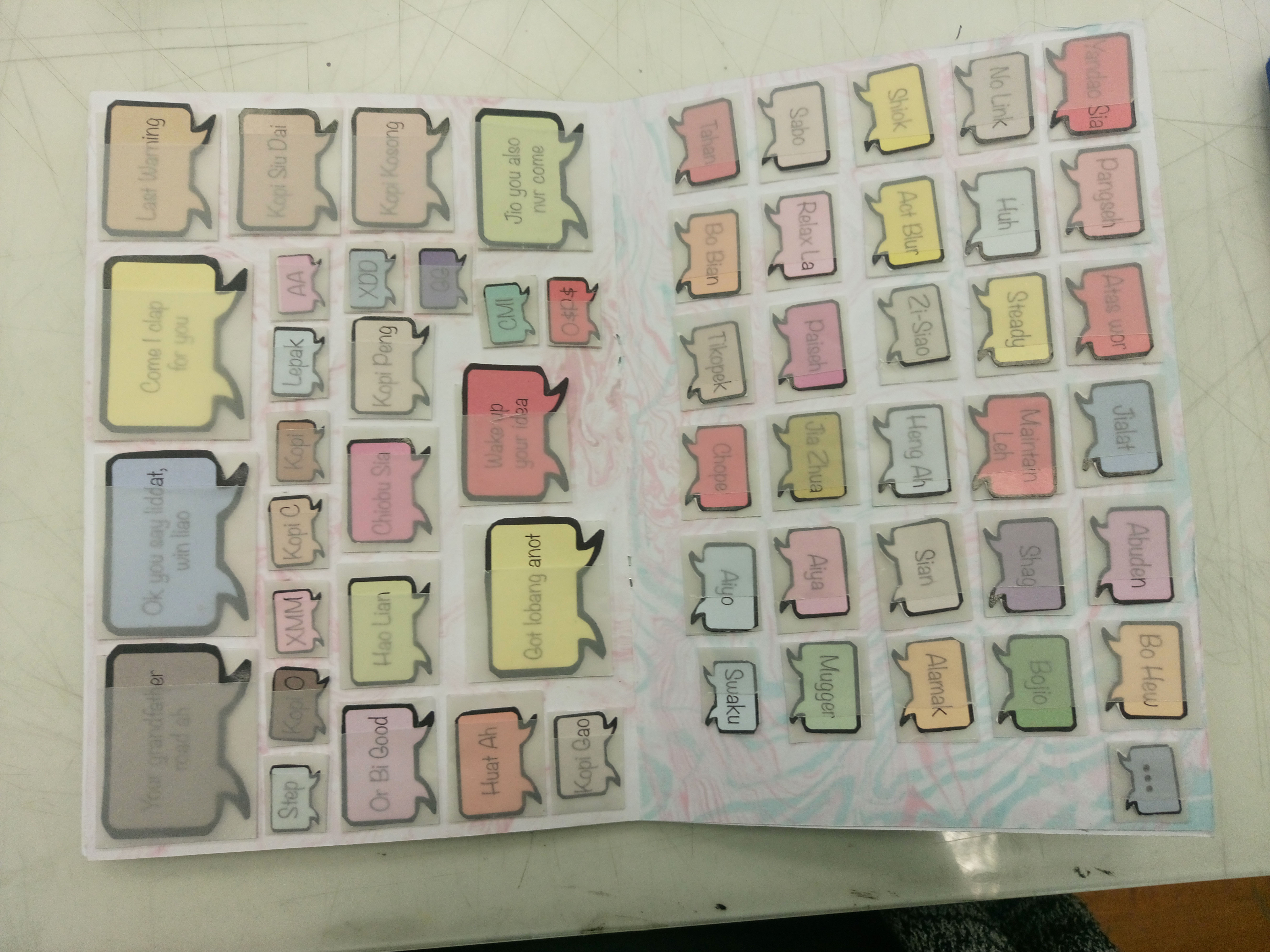
I decided to work on how my speech bubbles would appear and the meanings. Instead of stickers, which are only for one-time use, I thought of ways that the speech bubbles can be used several times. I thought of using velcro, however, i felt the thickness of the material would cause the zine to pop out constantly.
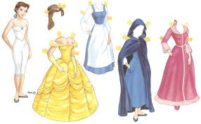
paper dolls with its unique flaps
Hence I decided to go with this idea of flaps.
Initial
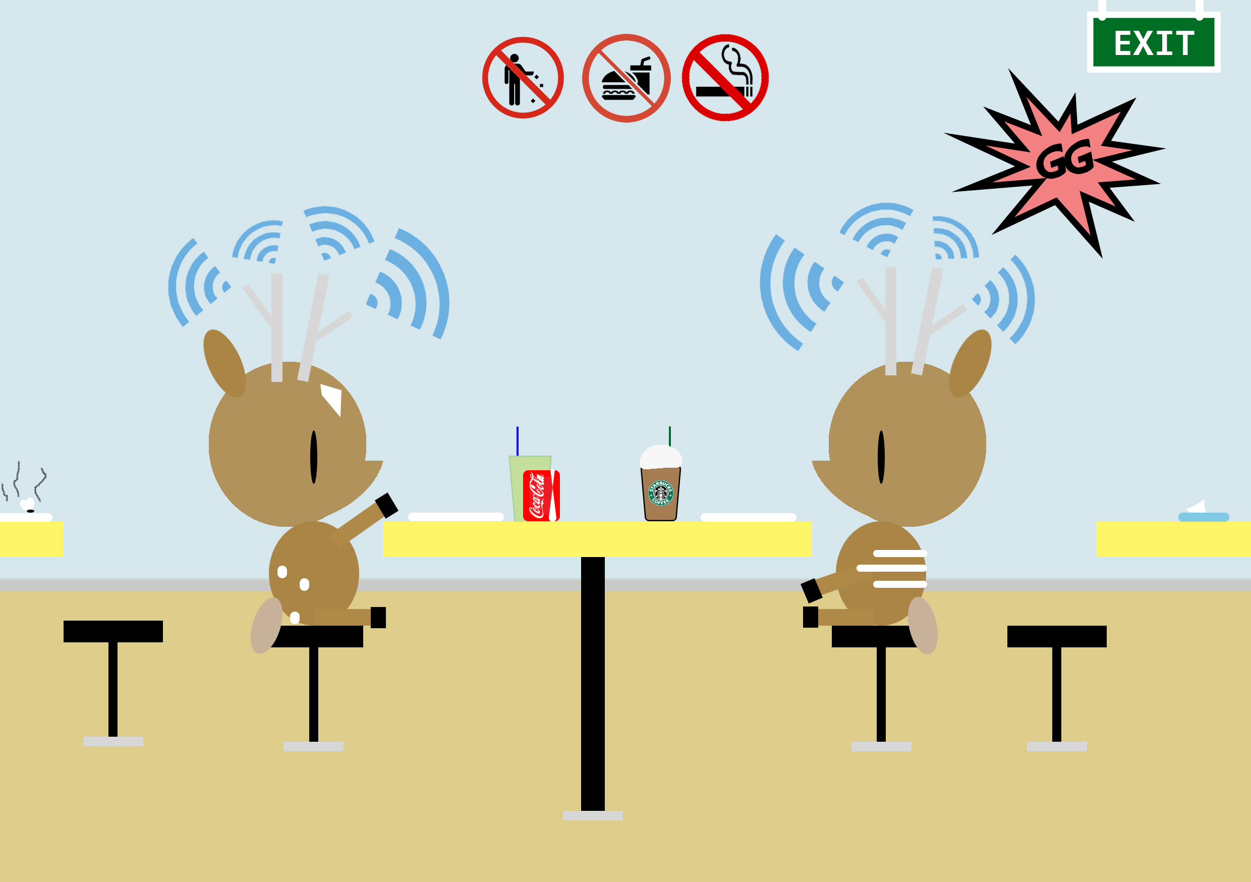
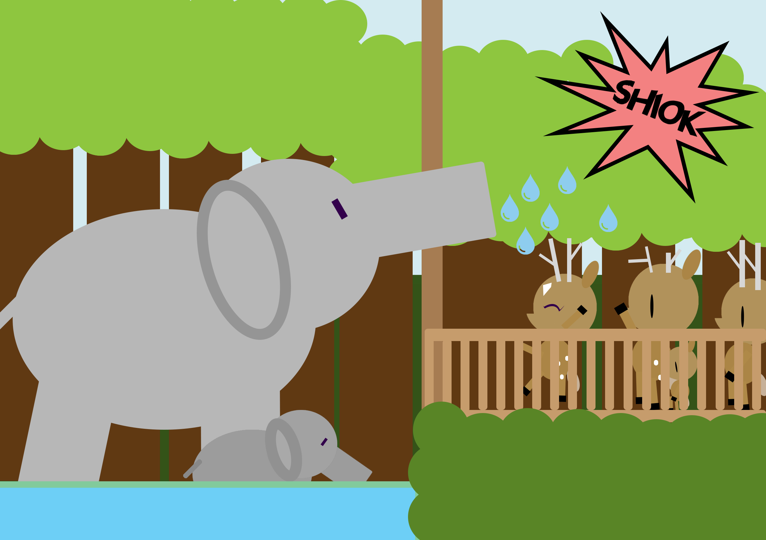
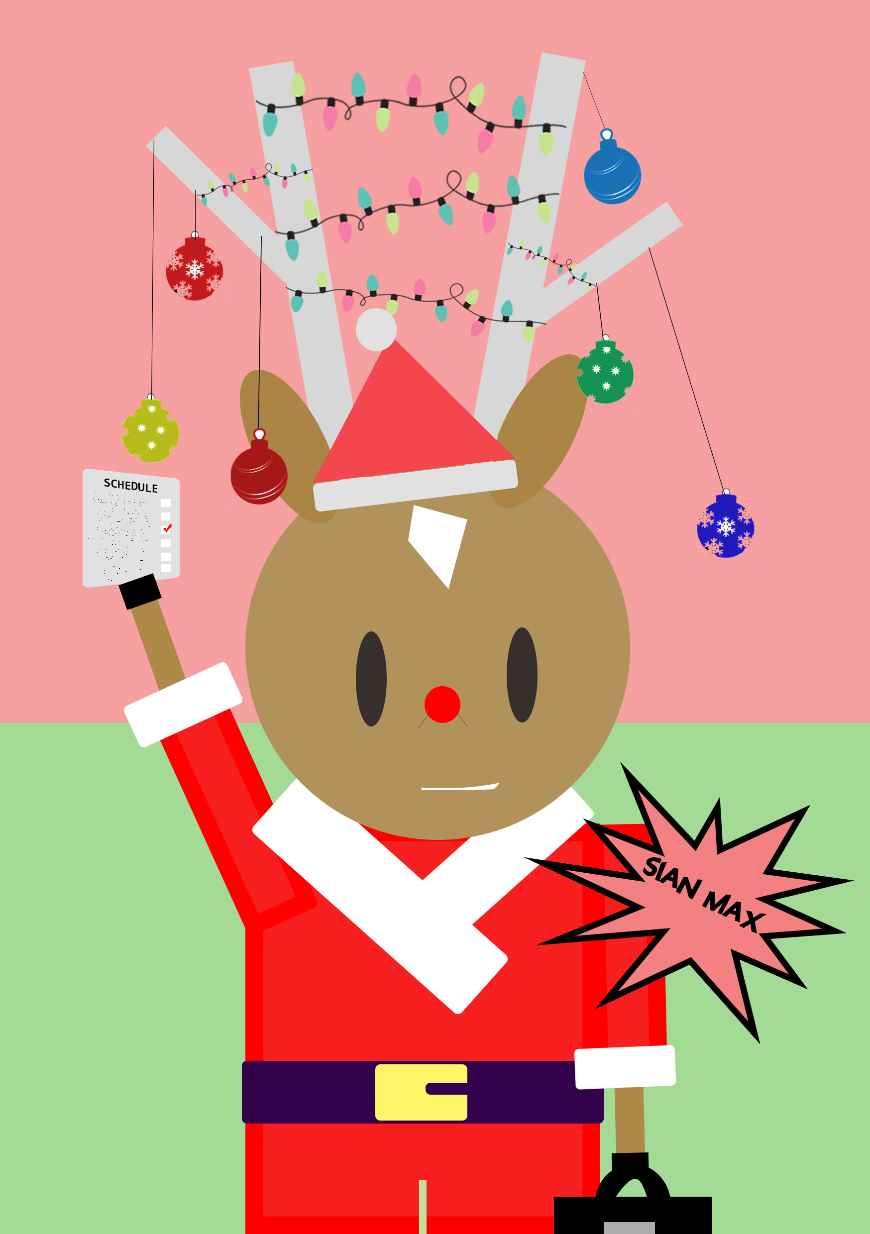
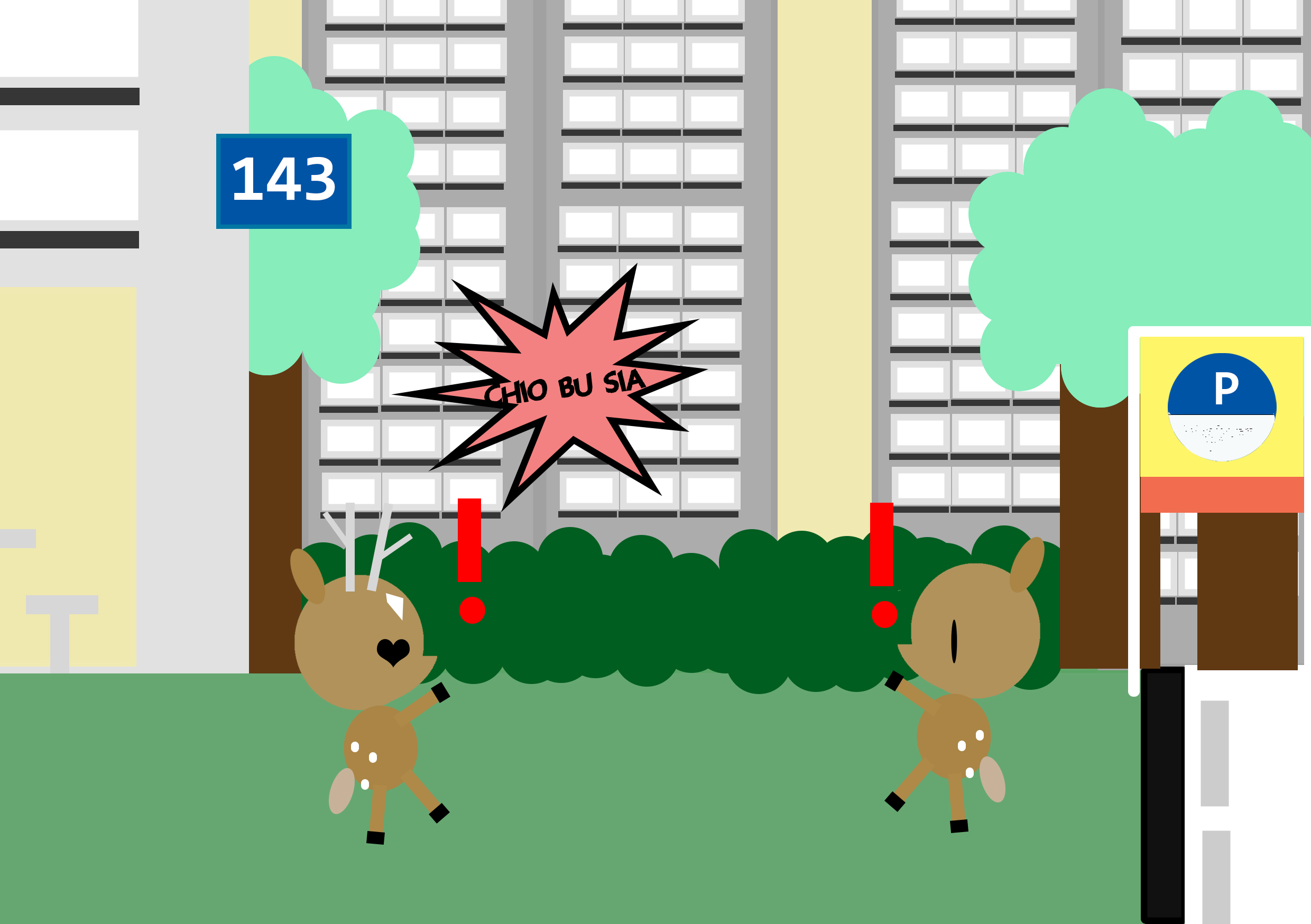
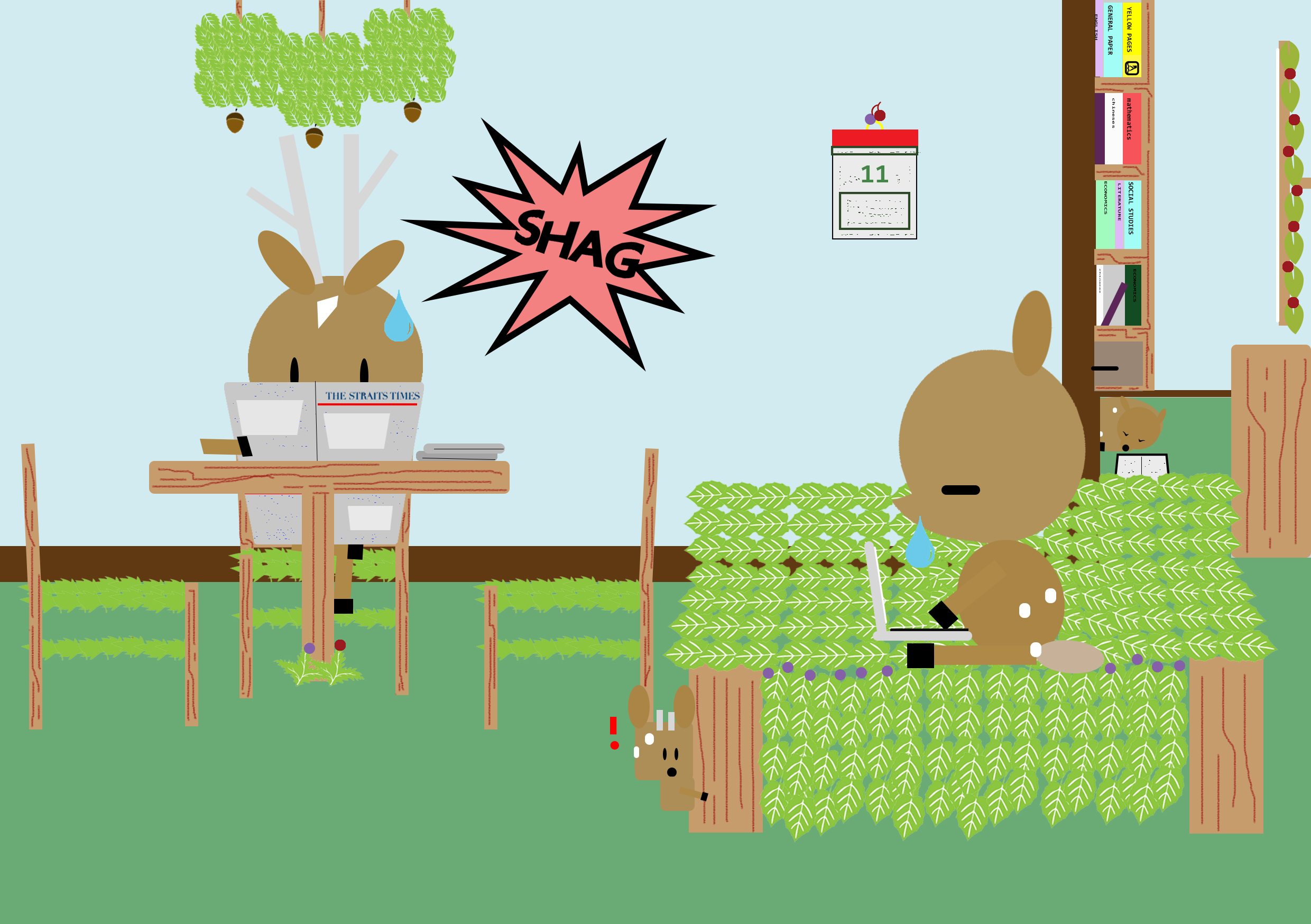
Then, for better user experience again, I decided to make it in such a way that the direction of the speech bubbles is interchangeable. The speech bubbles are also colour coded based on the negative or positive feeling or connotation it evokes. For example, green is highlighted in words like ‘bojio’ , ‘mugger’, ‘hao lian’ and so on which suggest hints of envy/jealousy.
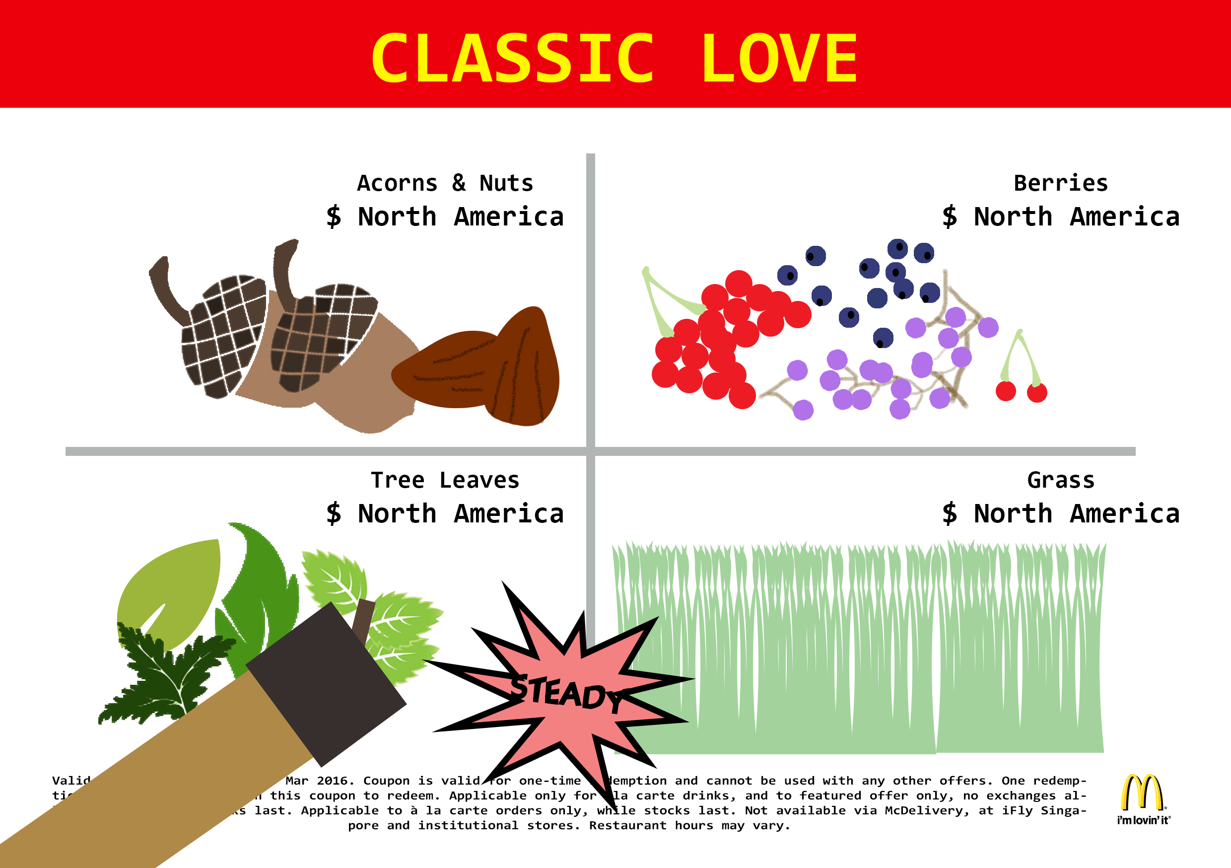
I then proceeded to work on improving the visuals of the content itself with trying out changes of illustration styles while retaining the content itself. I also did some edits for the content to make it more appropriate and even more relatable to singapore (aim: with one glance, viewers should be able to tell its singapore context).
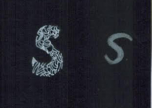
Illustration style 1: adding of obvious black outlines to make the subject matter stand out more
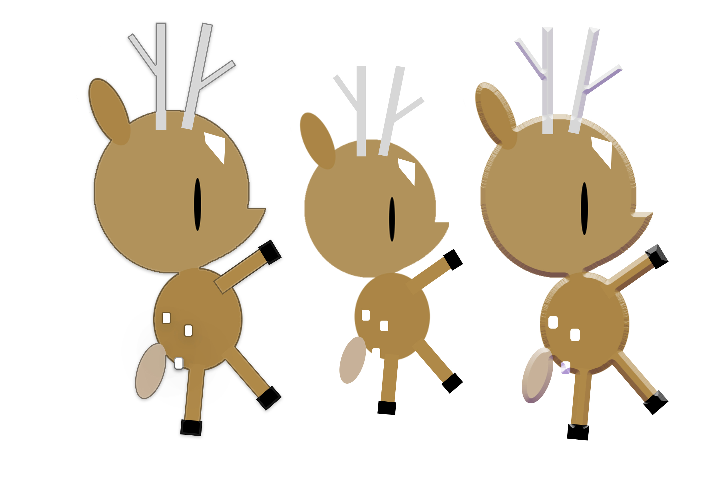
left: with outline / middle: original / right: embossing
However, it was scraped as it did not make much obvious differences and did not fit the final outcome I was looking for.
Illustration style 2: adding of embossing / shadows to make it more 3-dimensional and also to make the work come more to life.
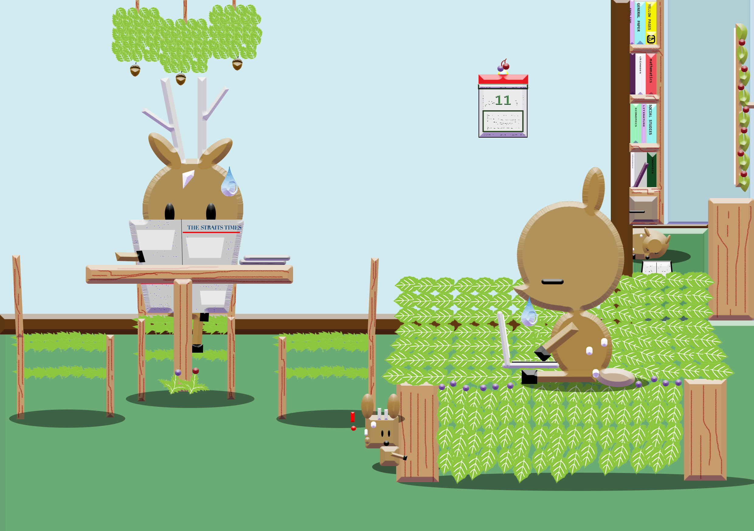
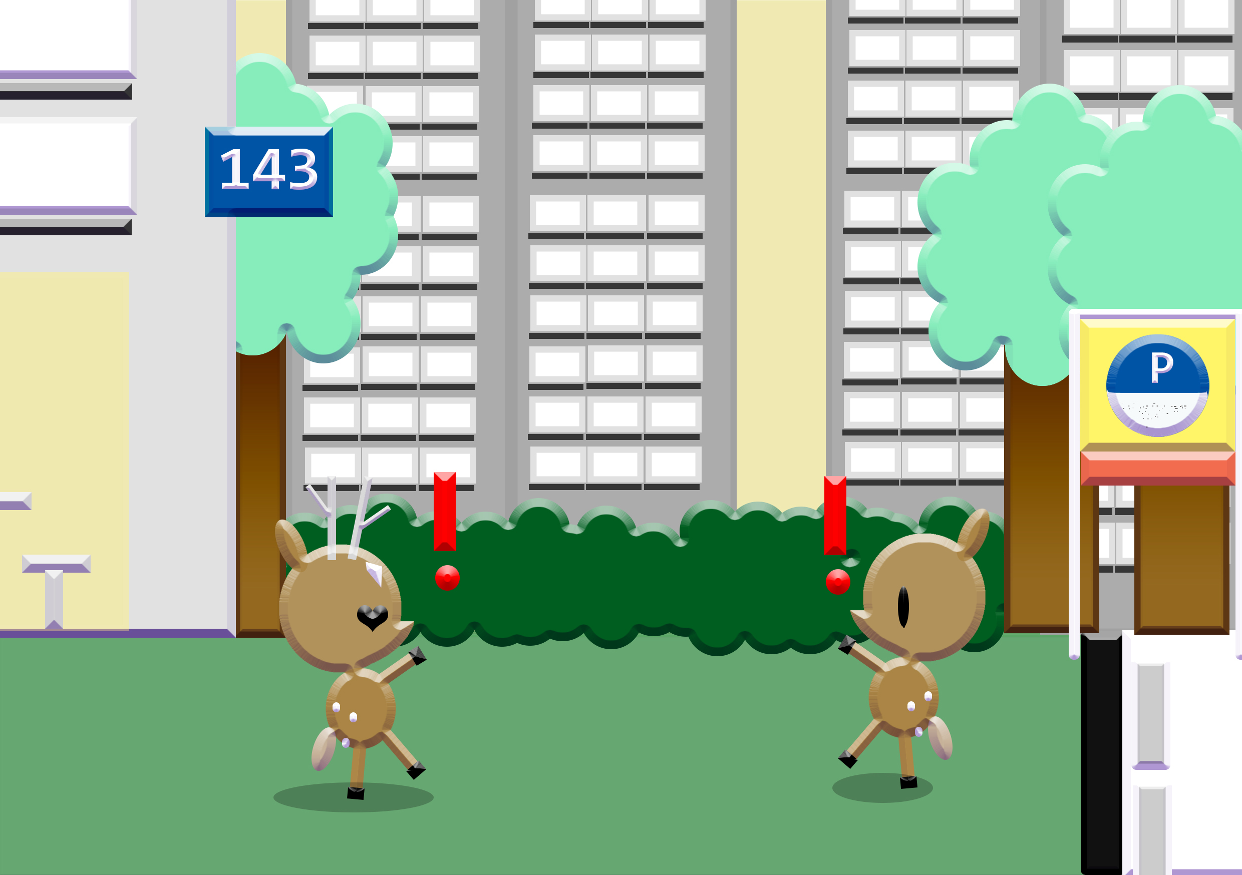
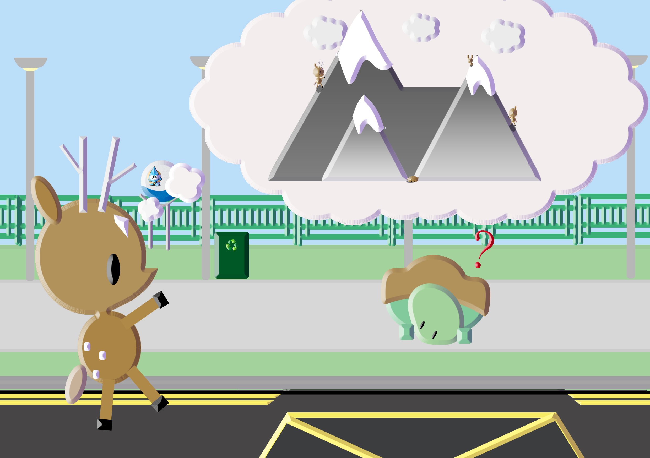
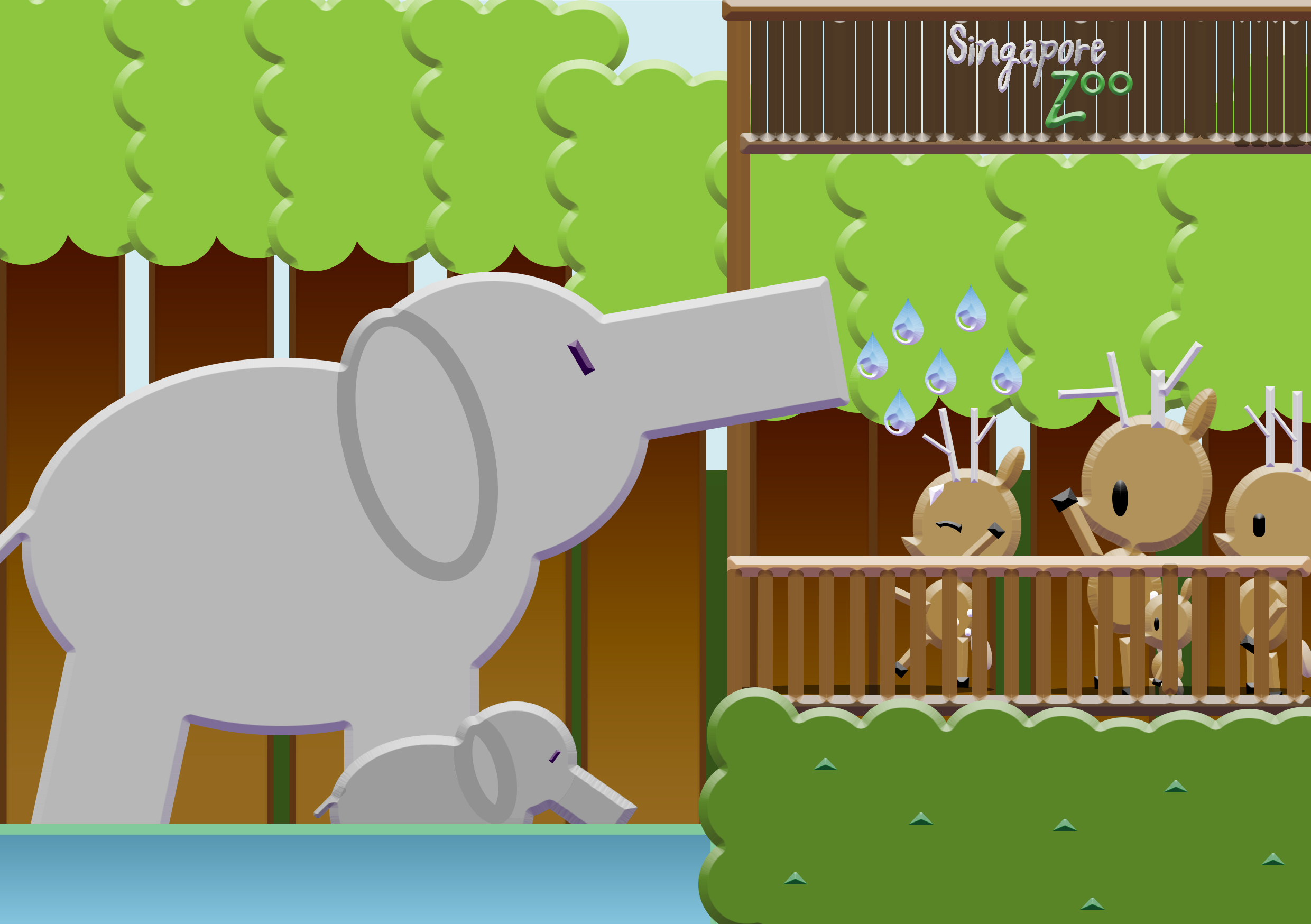
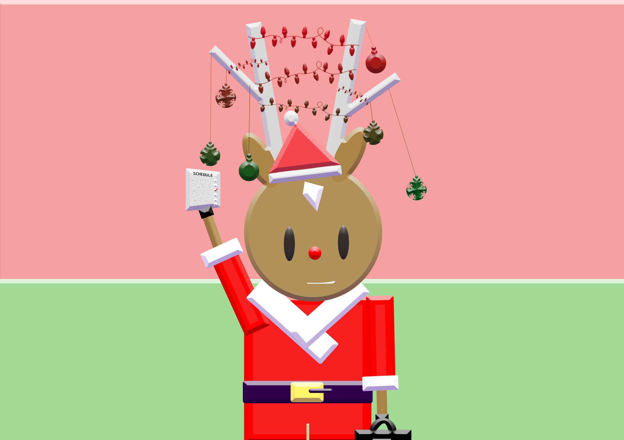
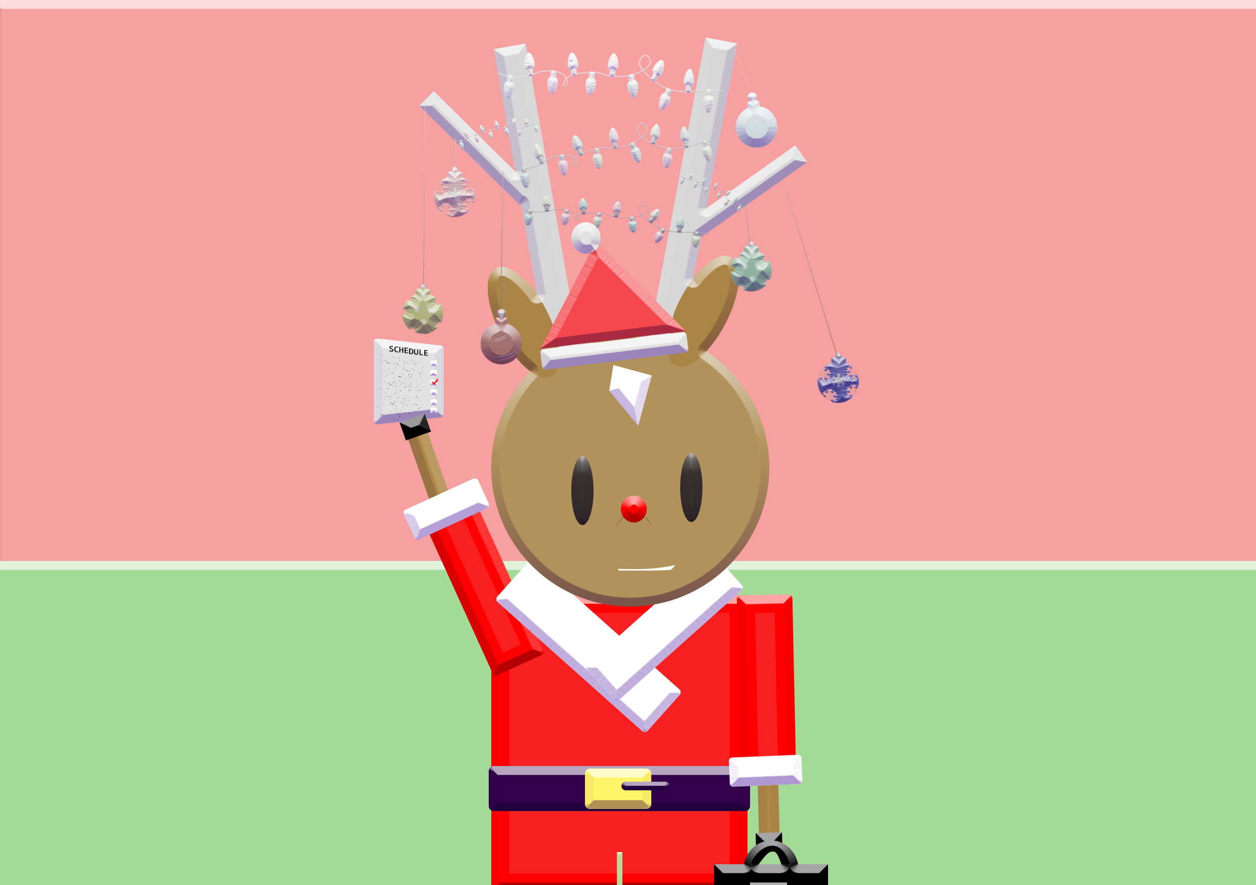
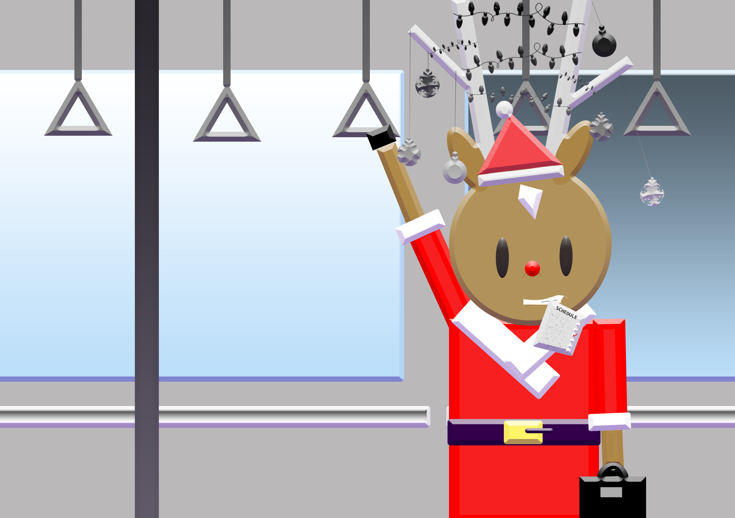
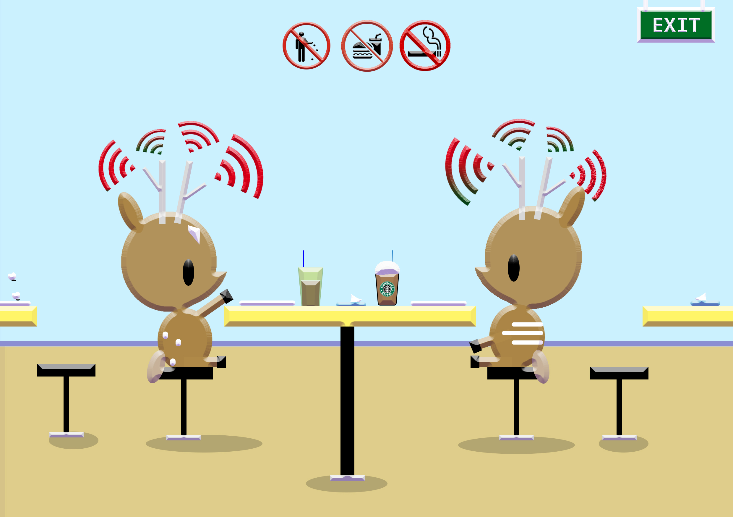
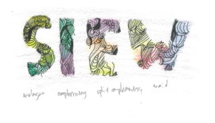
Illustration style 2: line work illustrations with limited colour palette (2-3colours used only)
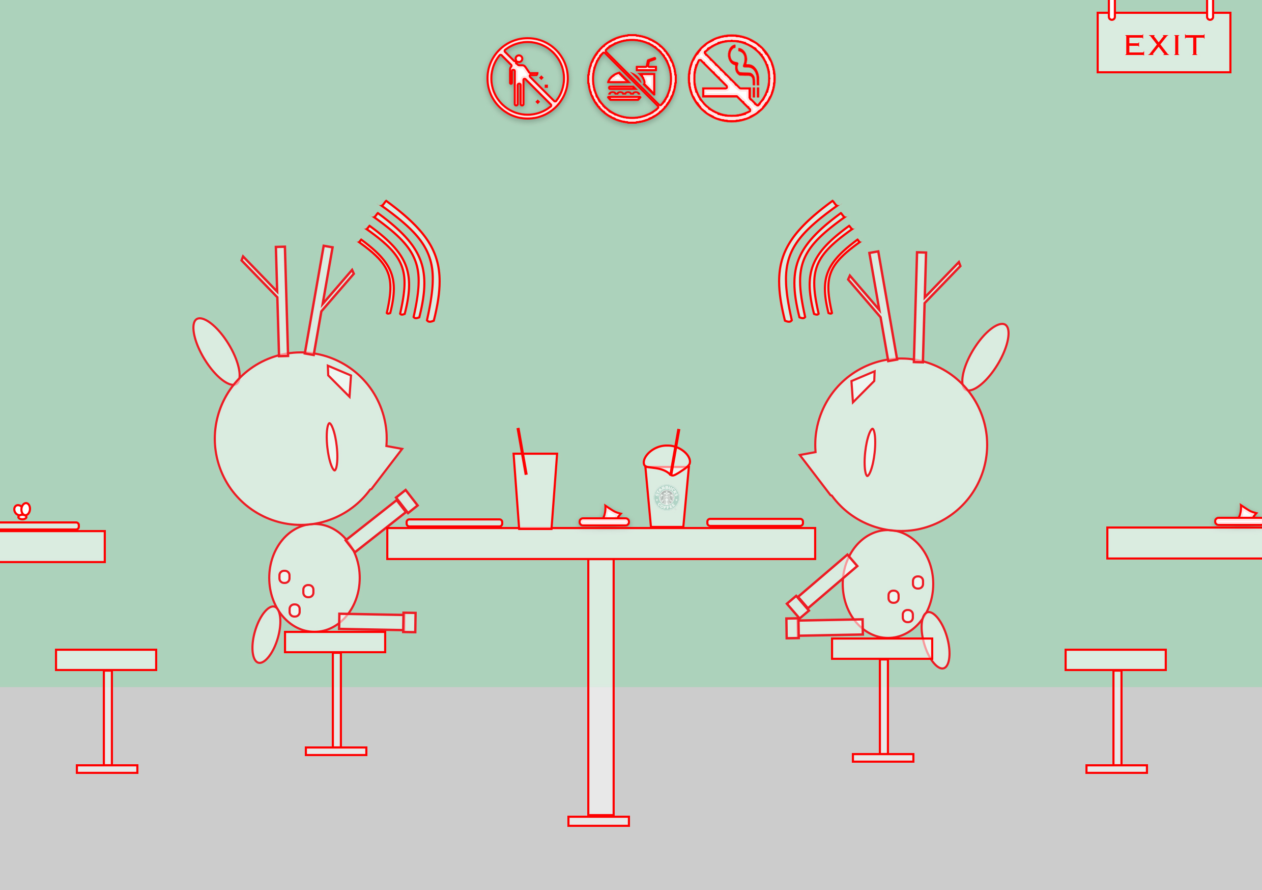
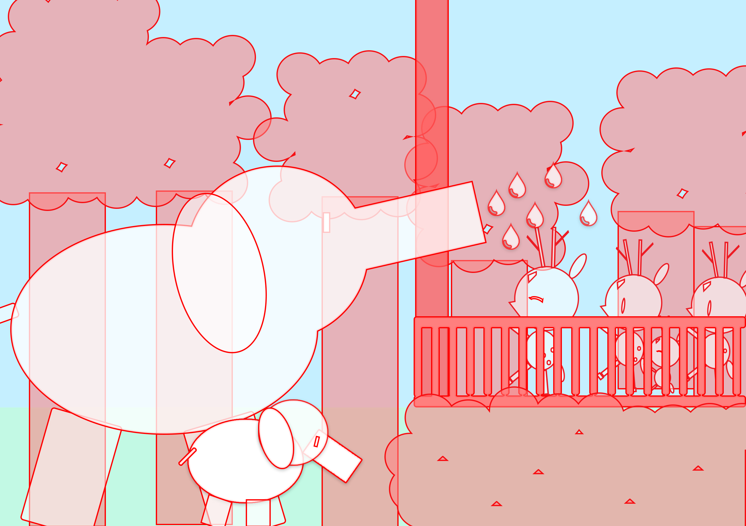
I really loved the aesthetics however I was facing many problems with making it neater and hiding the overlapping shapes.
Cover pages design tryouts:
Reference pages design:
With the content done, I worked with the layout of my zine.
Proposed layout in indesign (not in running order): https://drive.google.com/open?id=0B9SxP4EKVfKBV1dvMEZRcUlxNXM
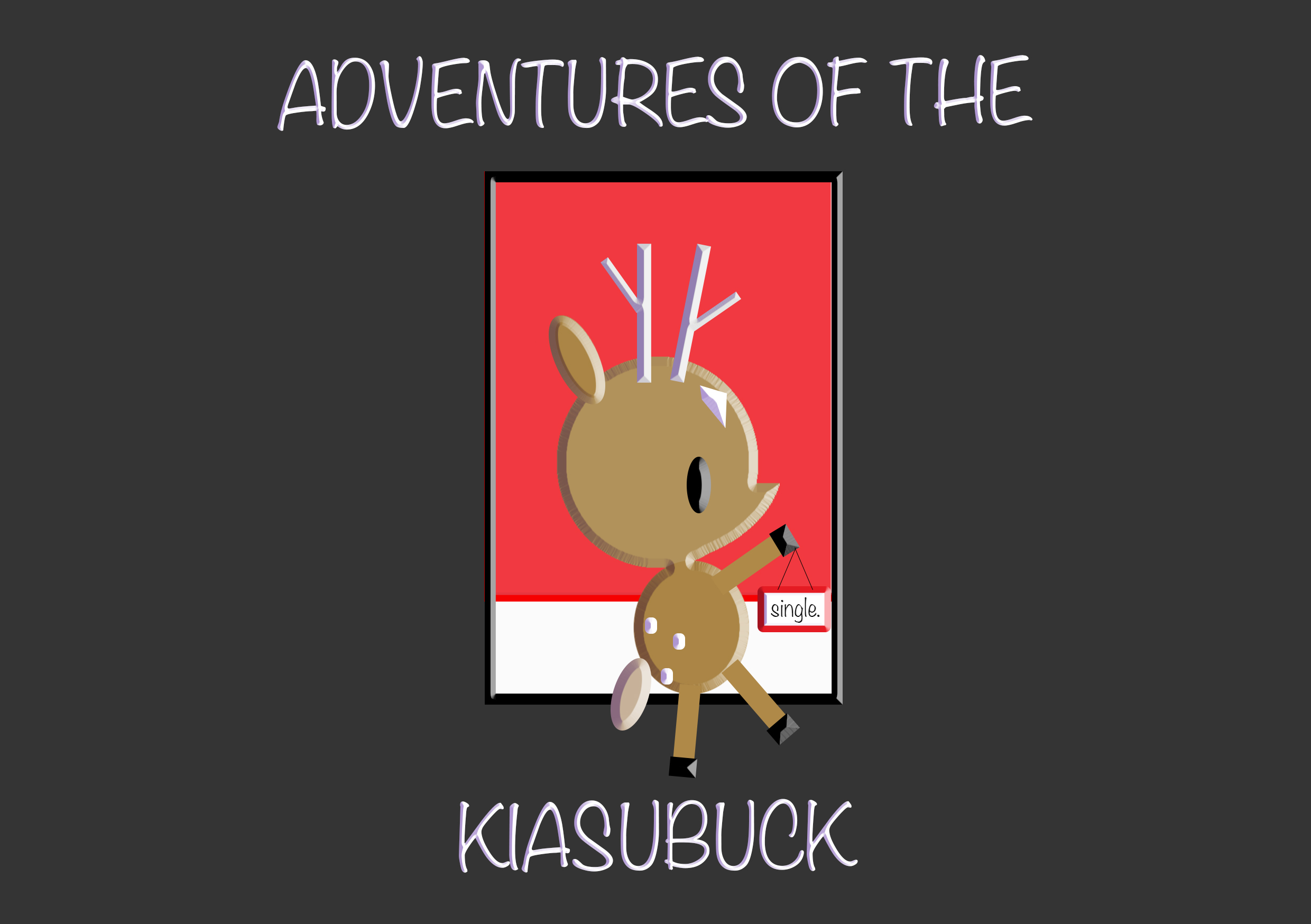
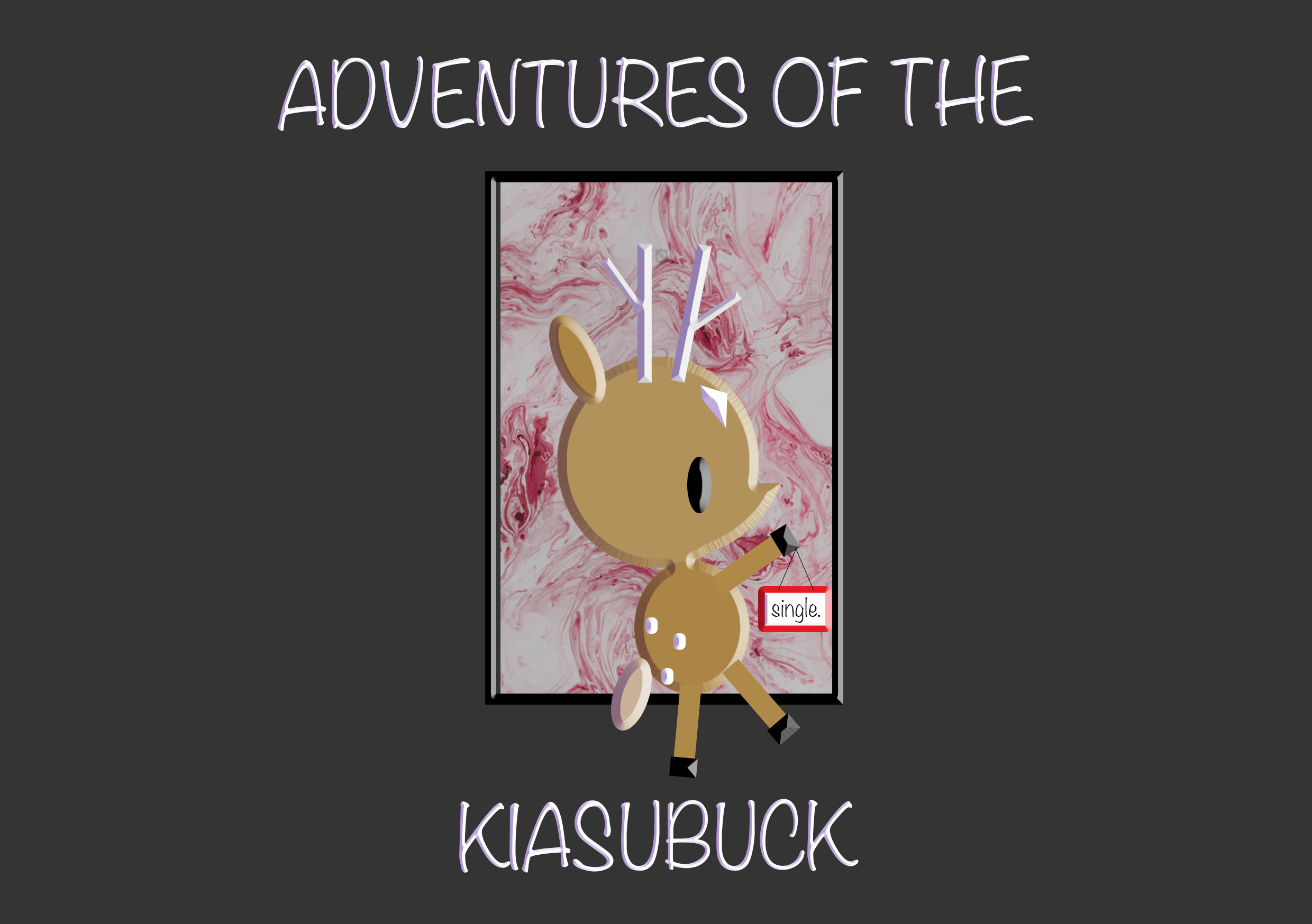
Final
- missing page photo (reference page)
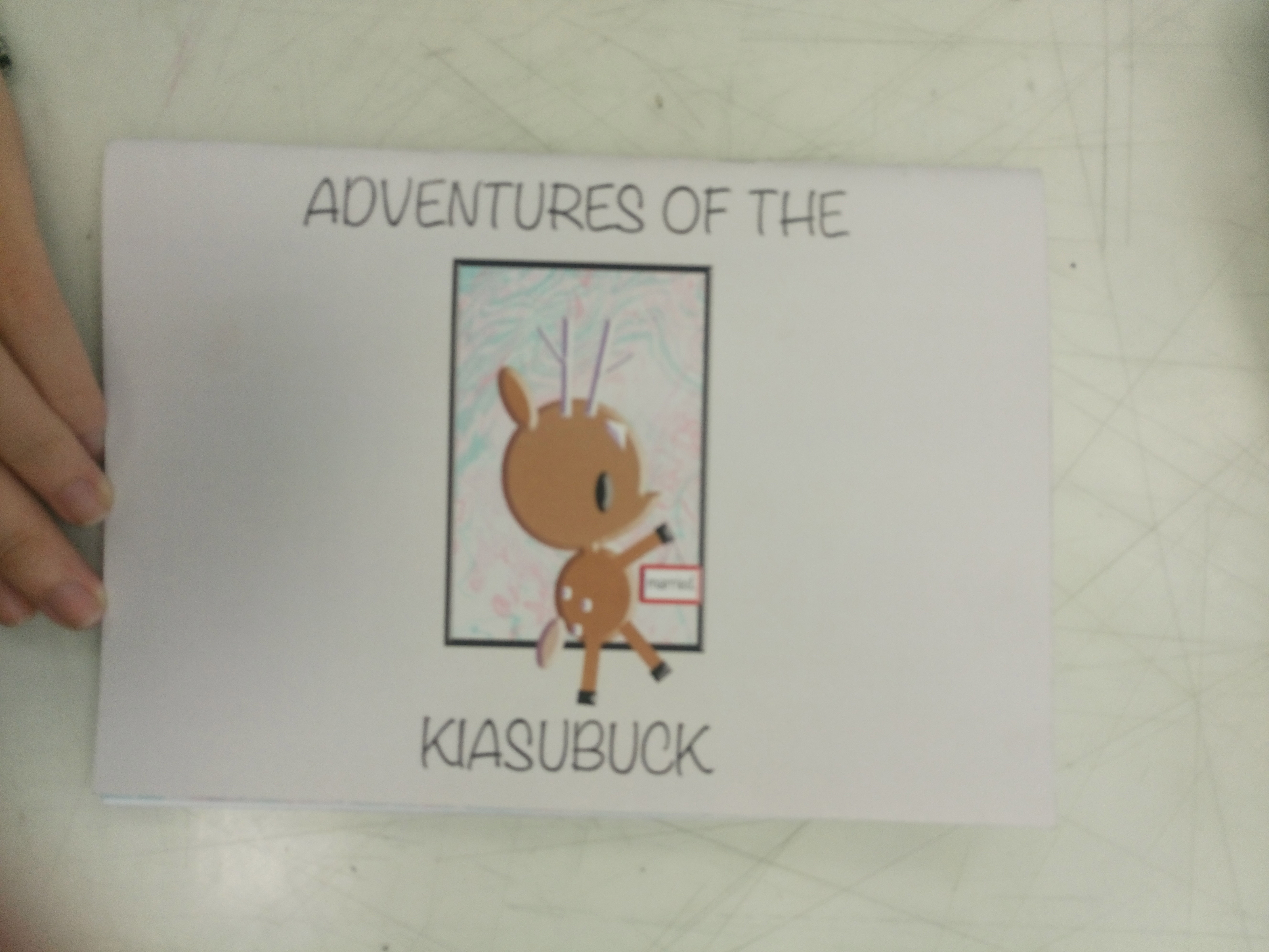
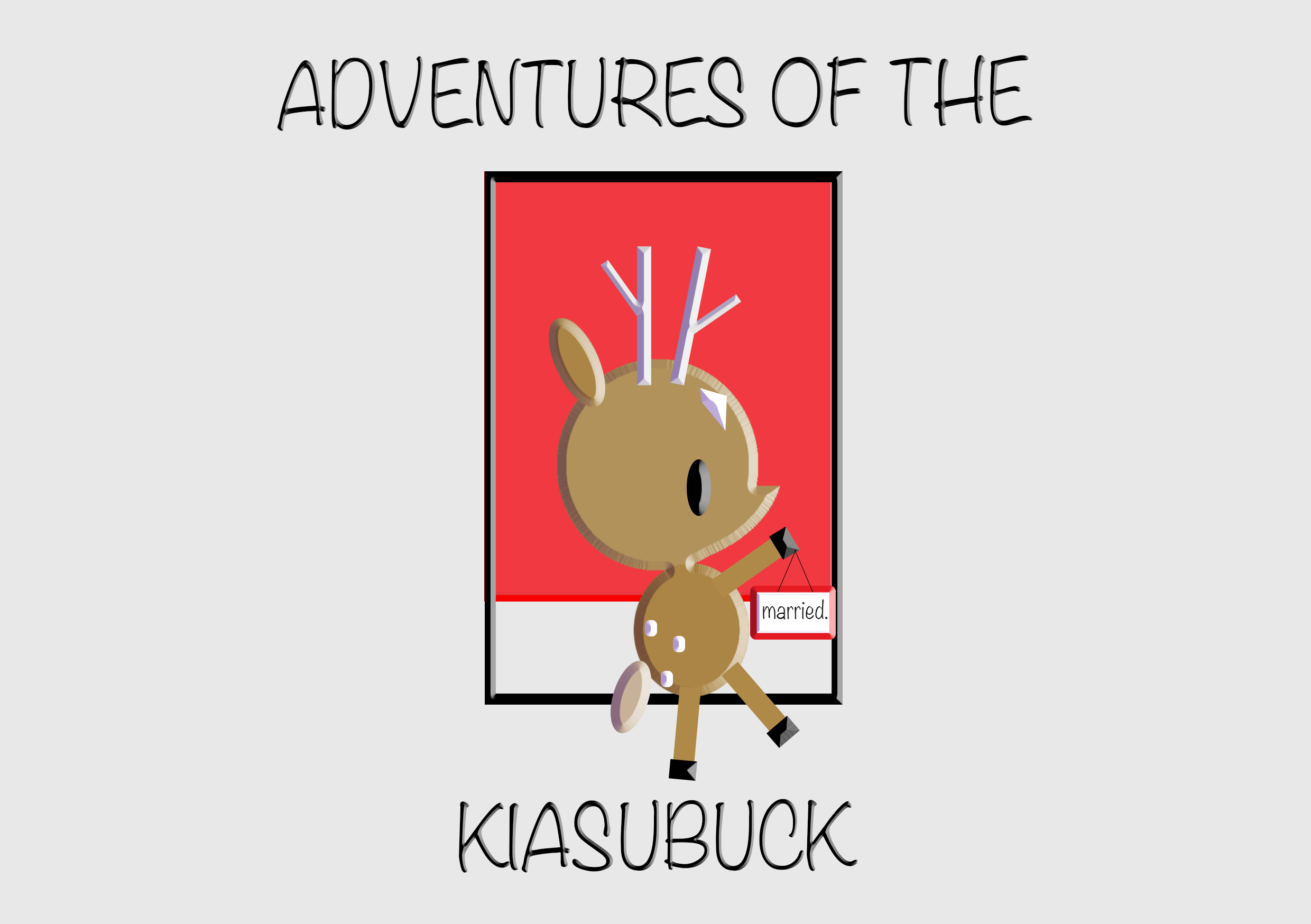
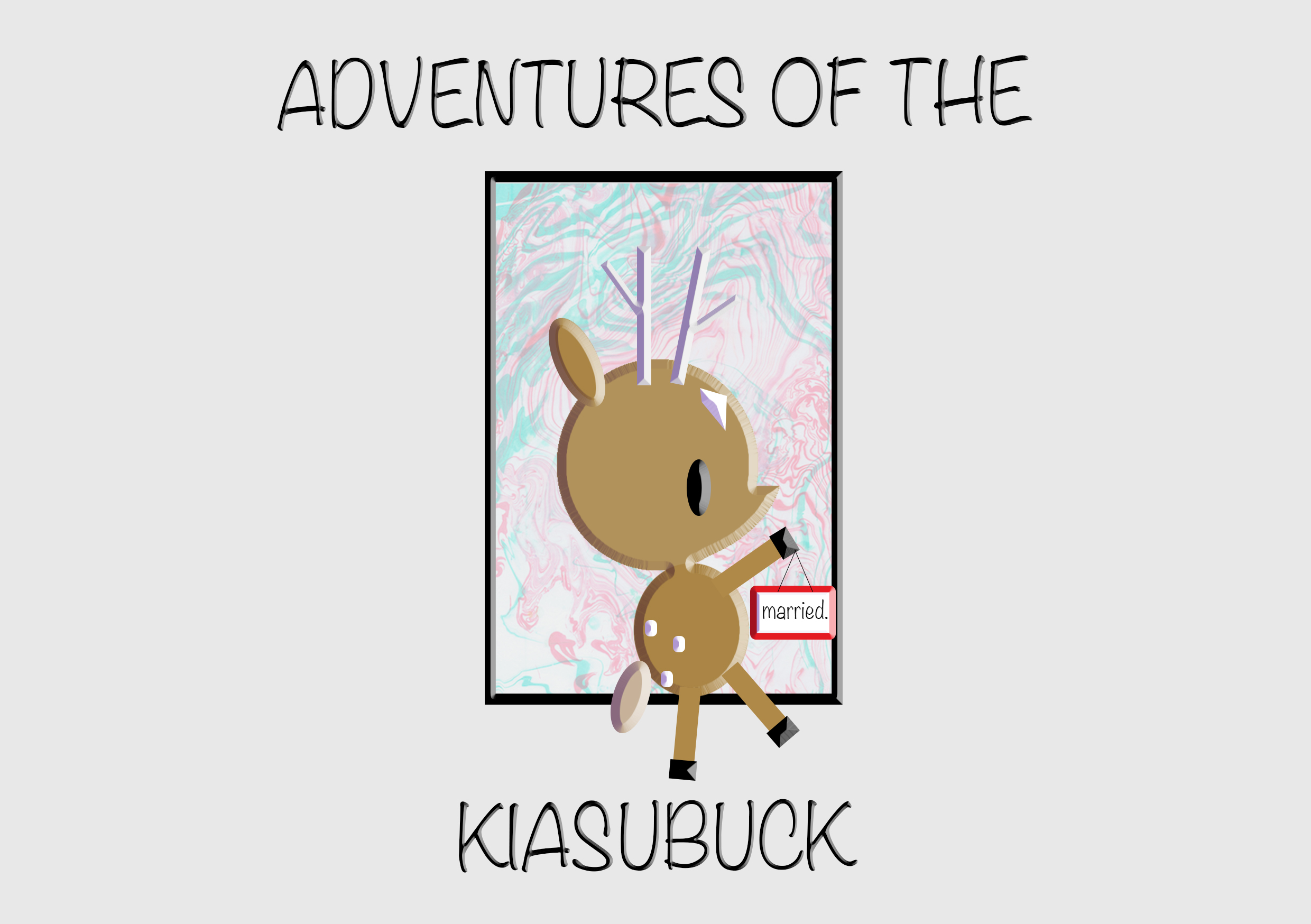
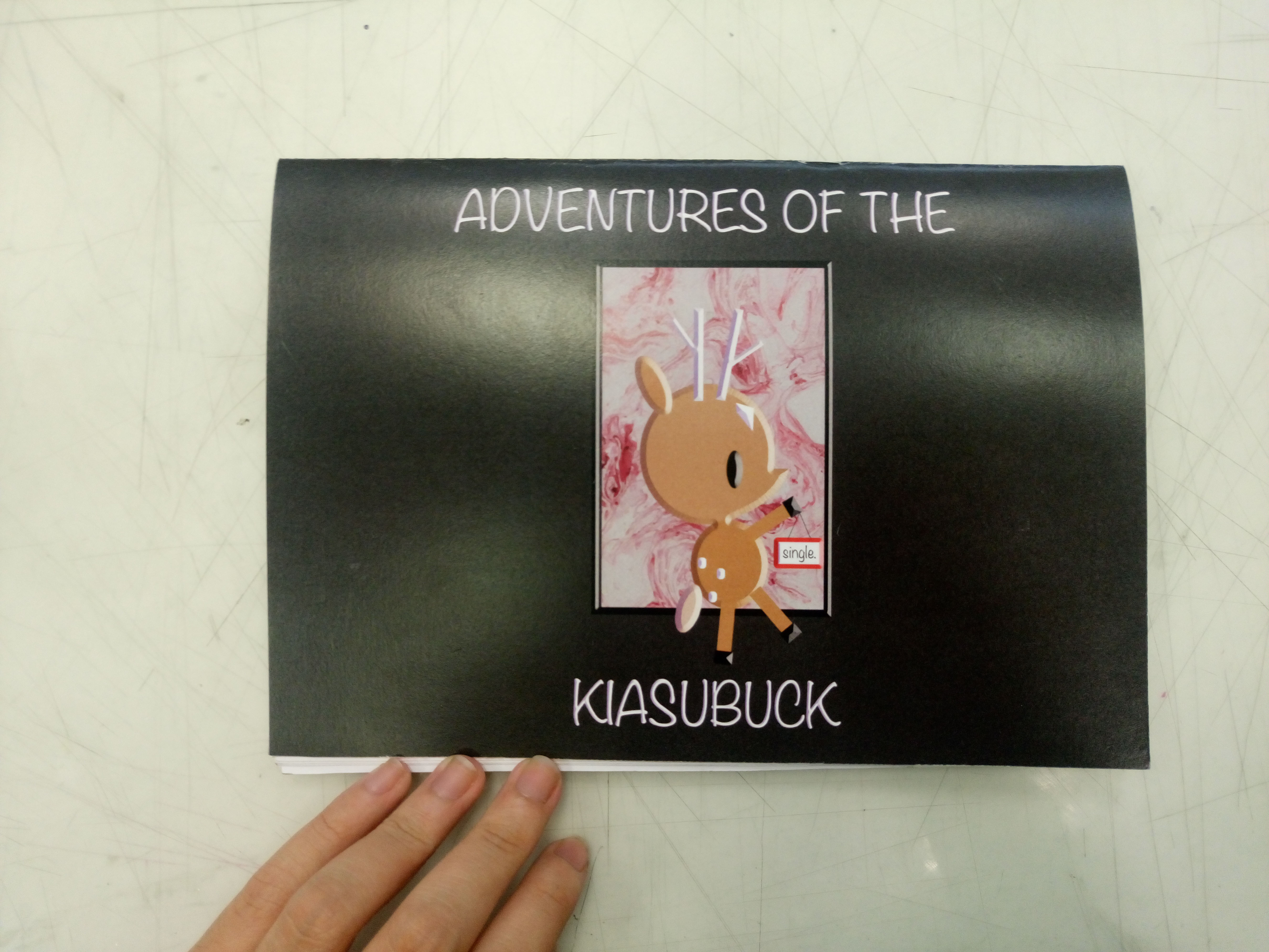
For this zine, I wanted the main focus to be on the interactivity. There are two sides (single life / married life) to this zine, where it can read from any direction and the narratives would still work. The reason for two sides is because there are the groups of people who are more career/single life orientated, the groups of people who are more family orientated and of course the group of people who overlap these two sides as well.
I titled the zine – ‘Adventures of the Kiasubuck’ because viewers can choose how the story flows, the personality of the characters. Generally, I invite viewers to set their own adventures based on the available choices of singlish words. This is to highlight how their choice of words and the way one speaks can change the impression they leave on others.
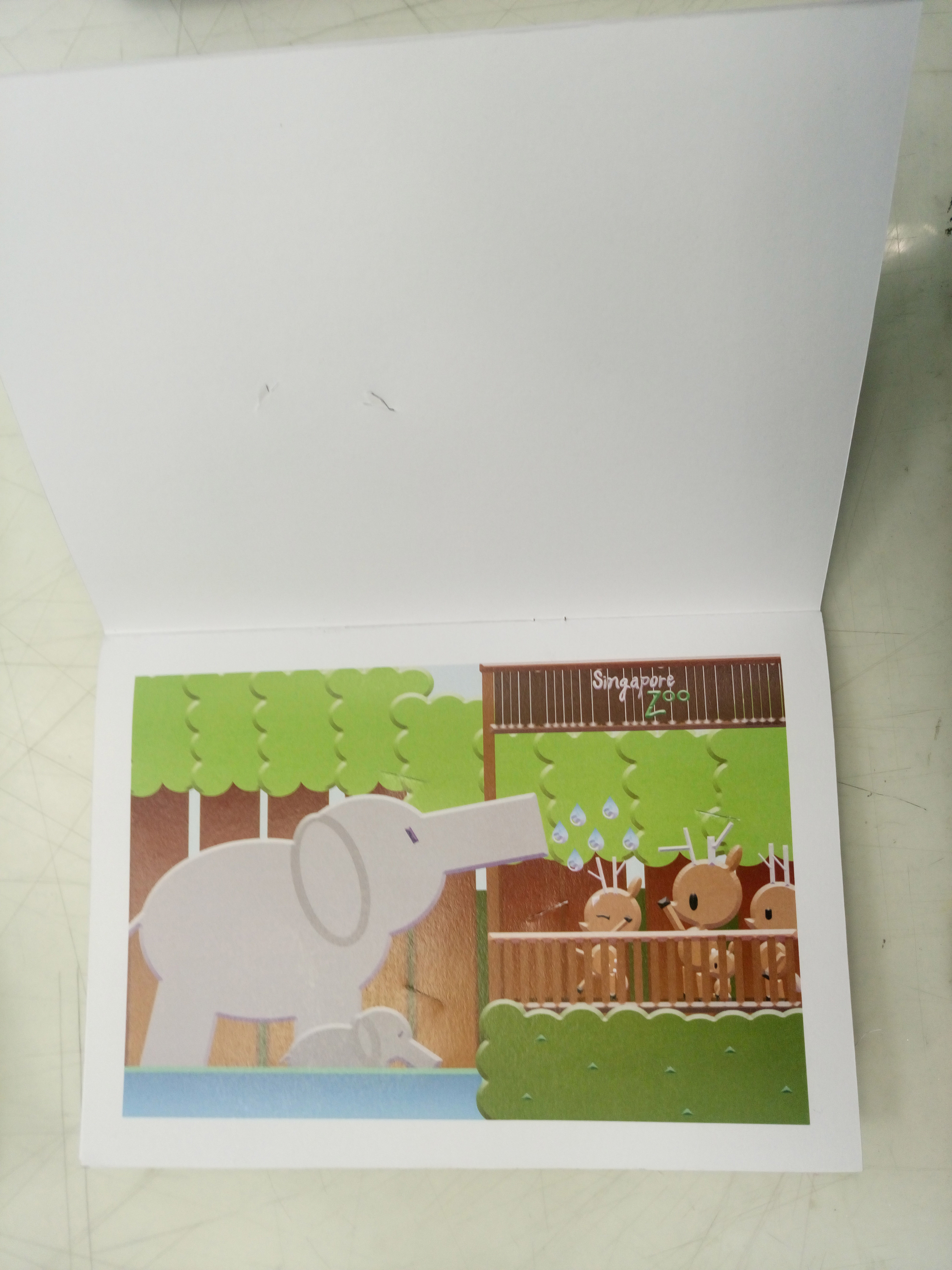
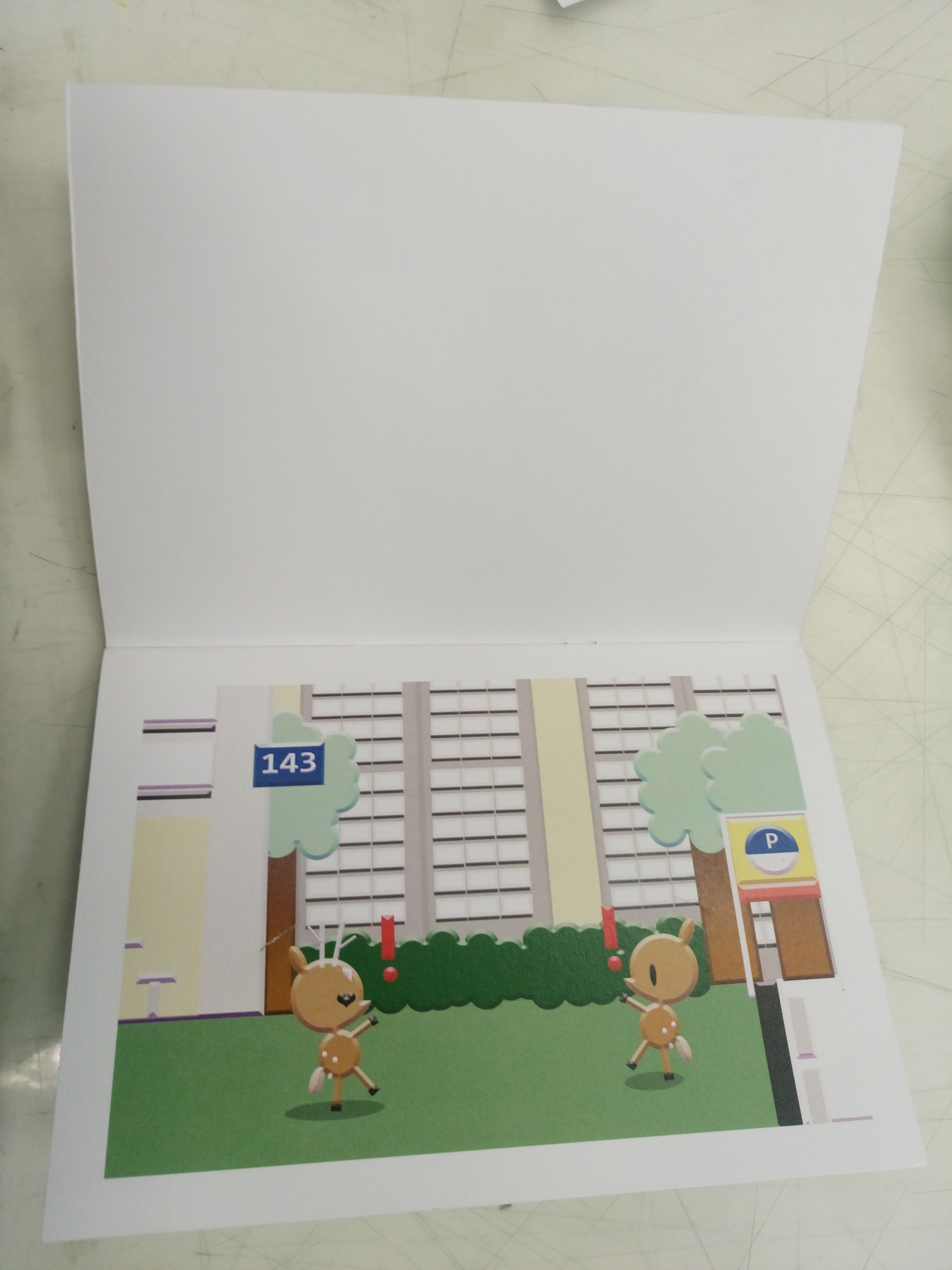
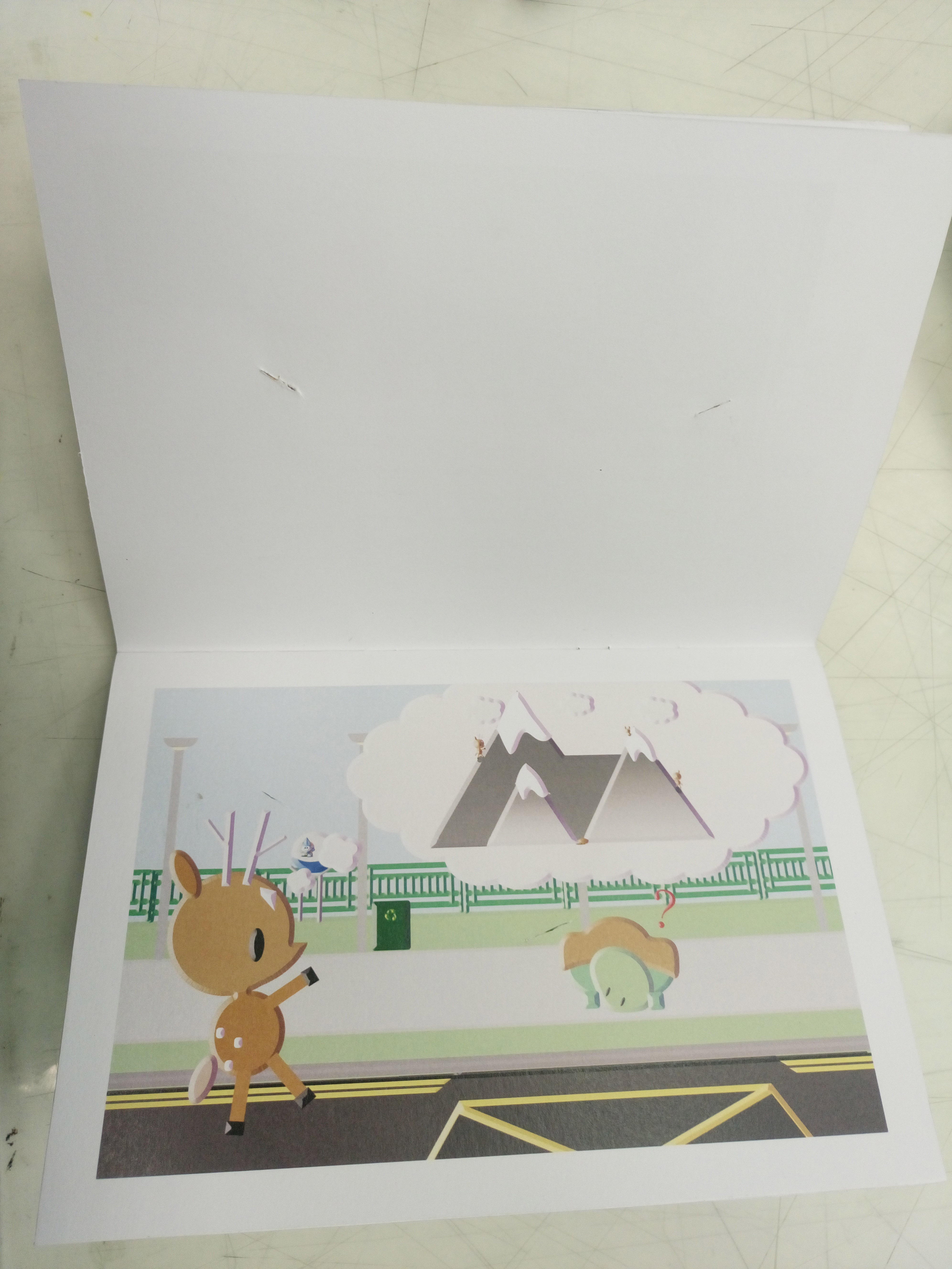
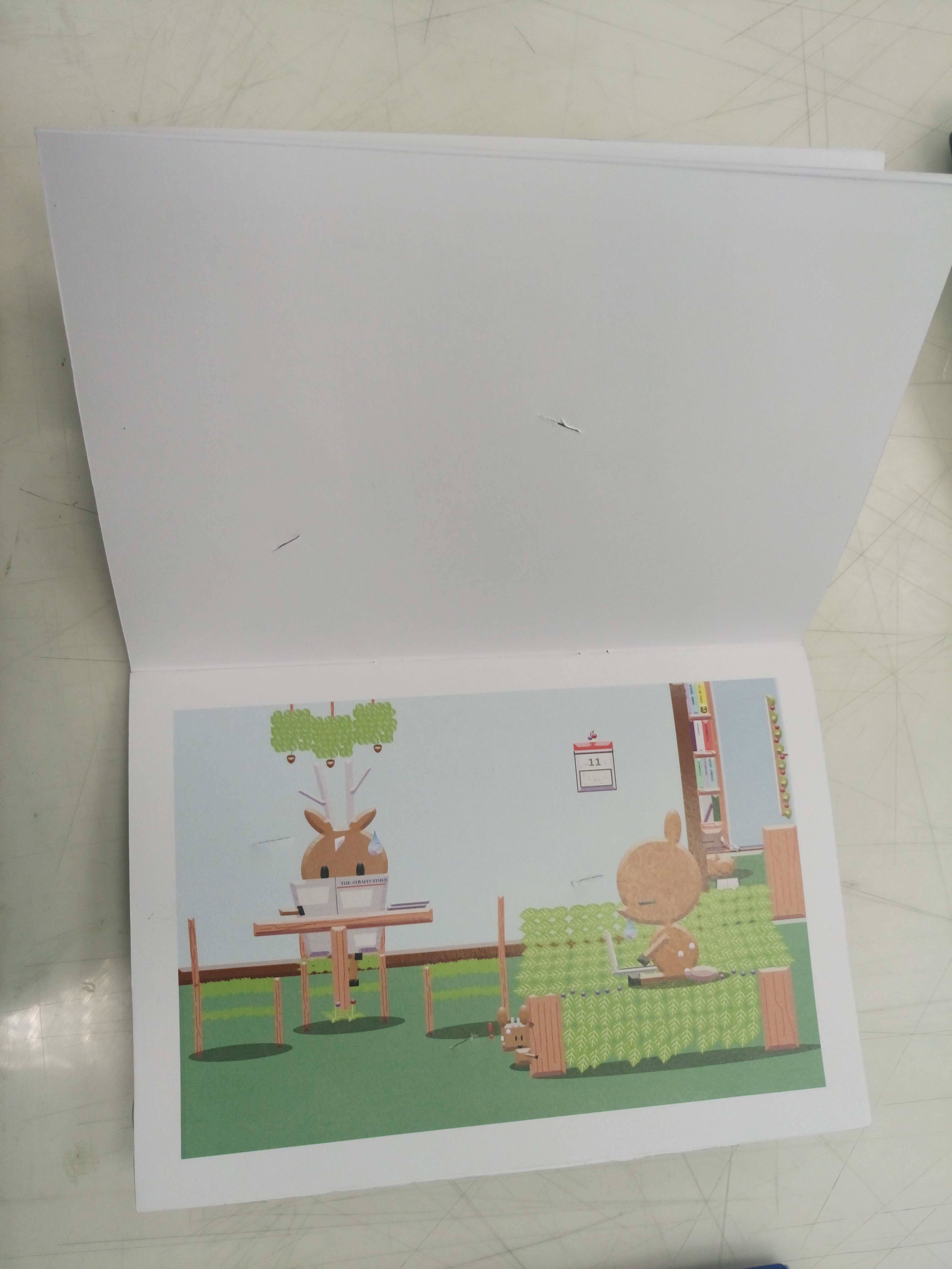
The zine is printed one sided so as to prevent damage to the subsequent contents as I created slits for viewers to slot in their choice of speech bubbles. The available places for slotting in the speech bubbles are not just limited to the pre-made slits but I welcome viewers to make their own slits and they can choose to place the speech bubbles on anything they see fit , allowing for a more enriching experience. The white border around the content serves to maintain the neatness as well as an influence from the book I’m inspired from (Singapore Lang – What the Singlish! Book). The orientation of the book is in a horizontal format instead of vertical so viewers are allowed to immerse themselves in the narrative and see the details (the small details are important hence I avoided making the works too small). Choice of paper is thick for both the cover pages and inside pages, this is to firstly retain my inspiration from the kind of hard paper the creation of paper dolls use. Secondly, it is to withstand the possible wear and tear in the future.
For the speech bubble page, I made them in a layout that all the individual speech bubbles follow the orientation of the respective pages. The pockets are made of tracing paper so to allow viewers to be able to see the words at one glance without having them to take each out to check which one it is. I also left part of speech bubbles out of the pockets so that viewers can easily take and put the speech bubbles back after use.
Difficulties/Reflection
The hardest part of the zine was actually the speech bubbles aspect as I had to think about how to store them properly without them falling out when the book is flipped from all directions and I had to cut them all out neatly without damaging them . Credits to Fiona who taught me how to make the secure pockets.