~Finalising ~
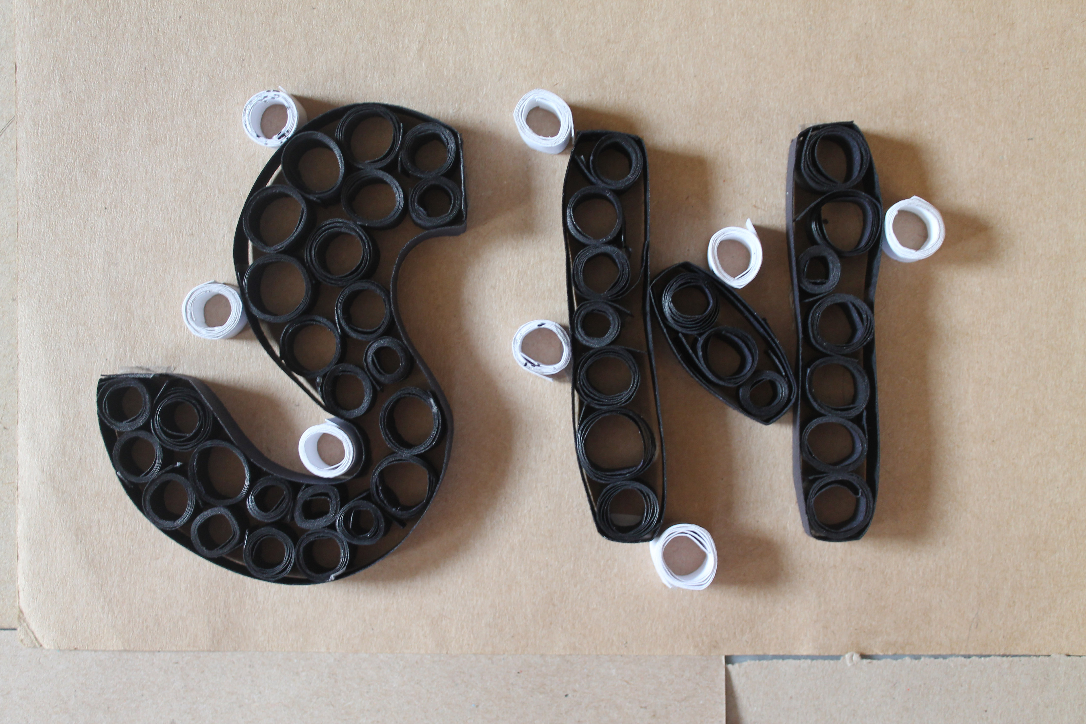
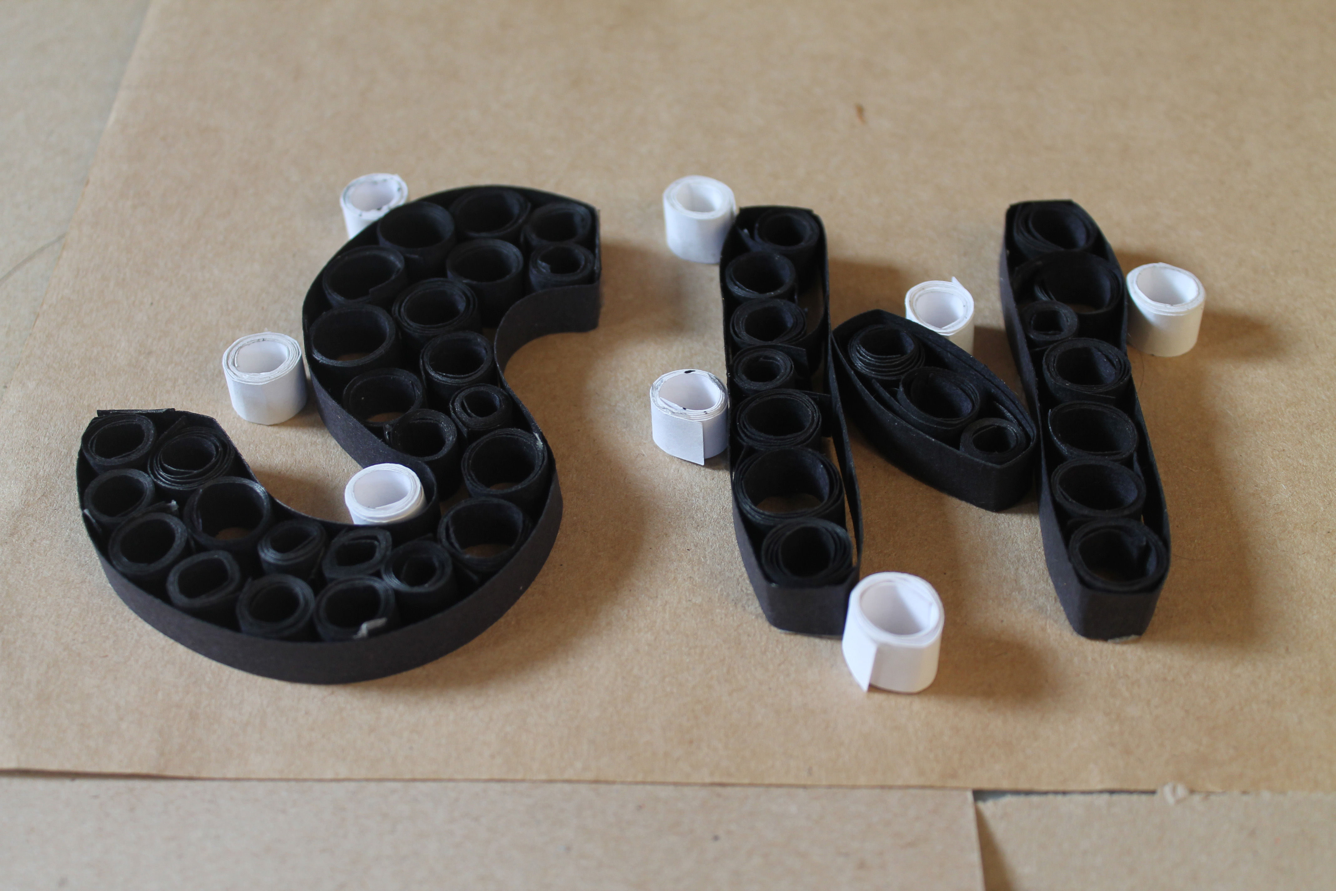
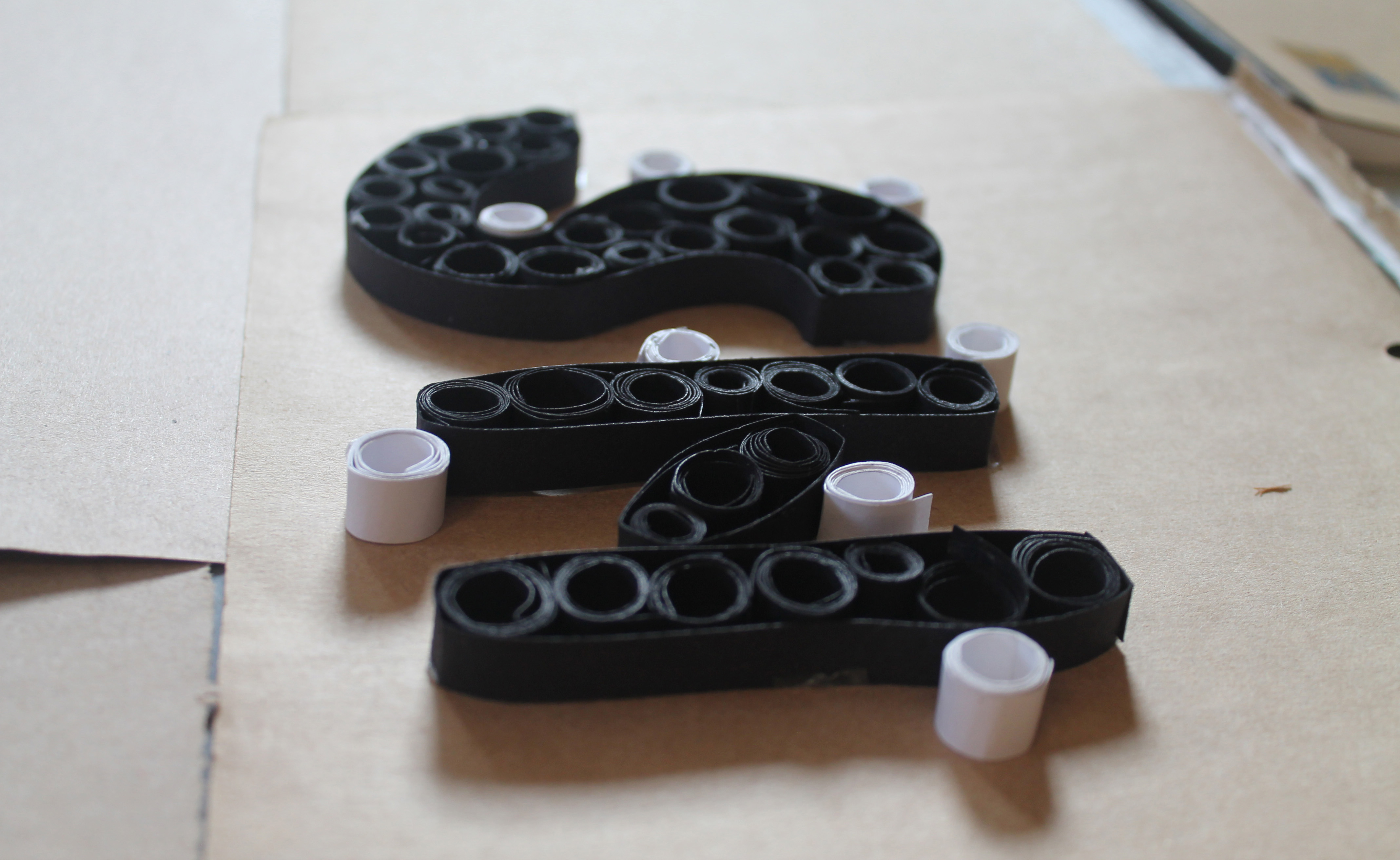
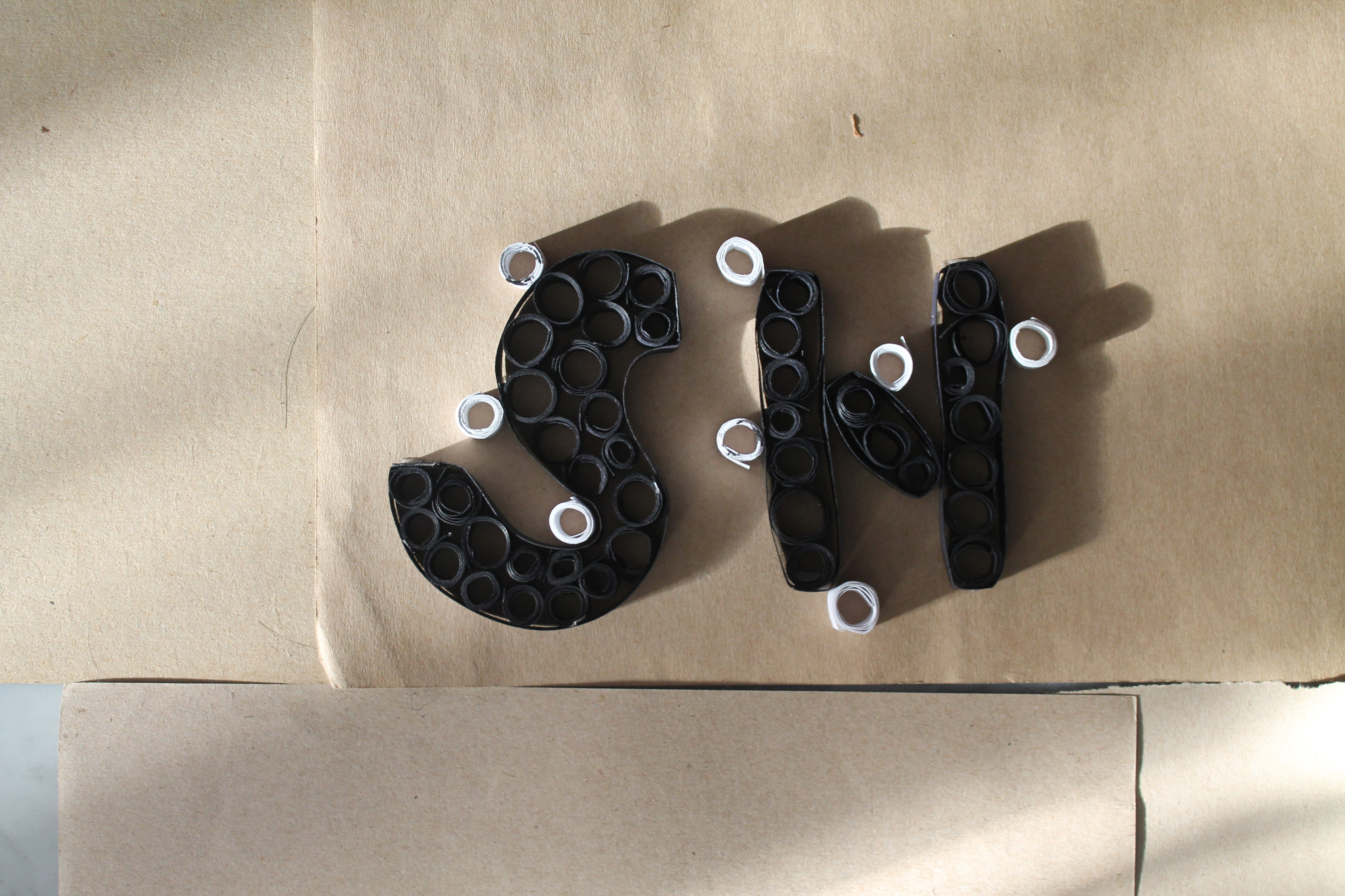
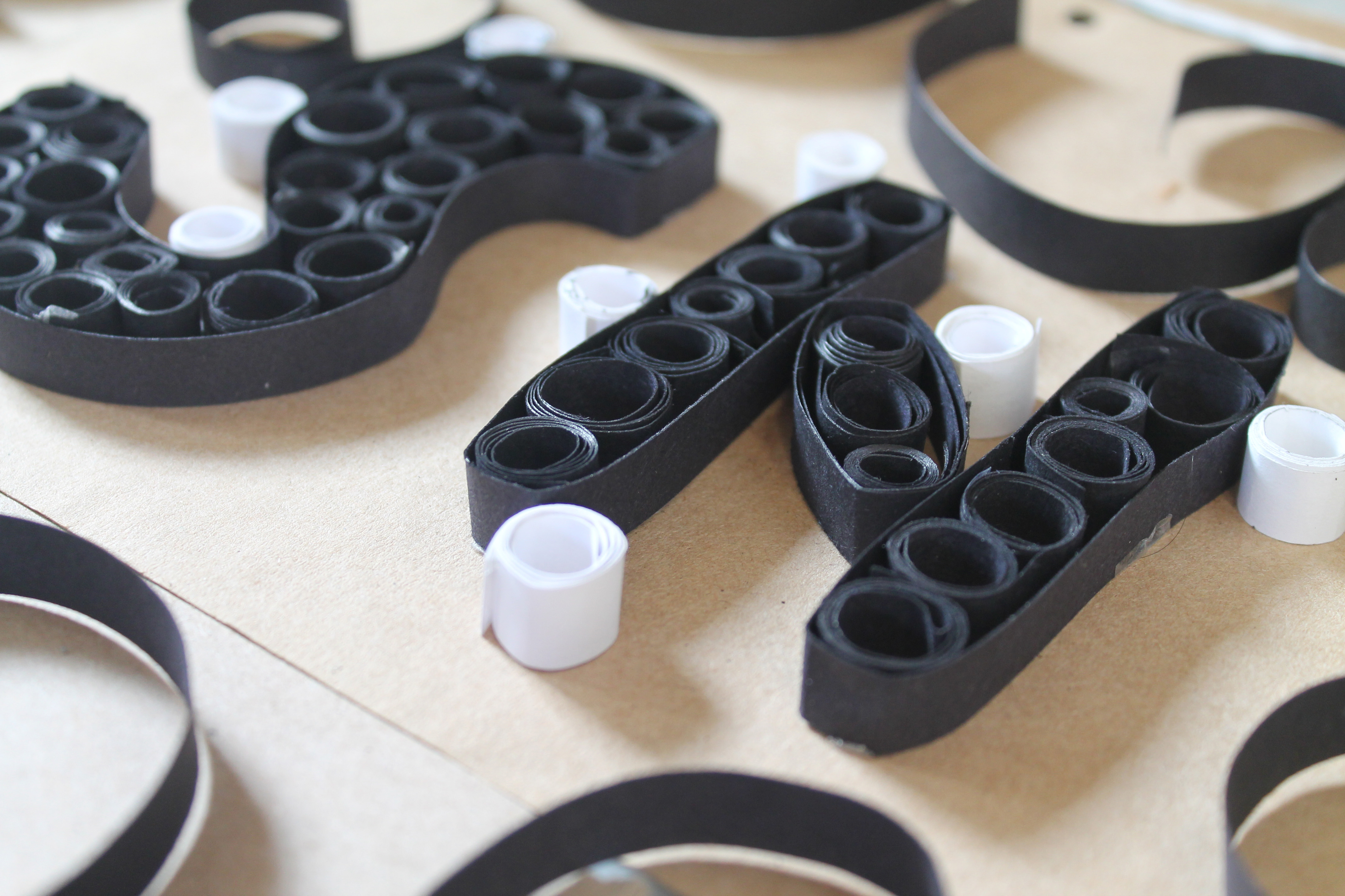
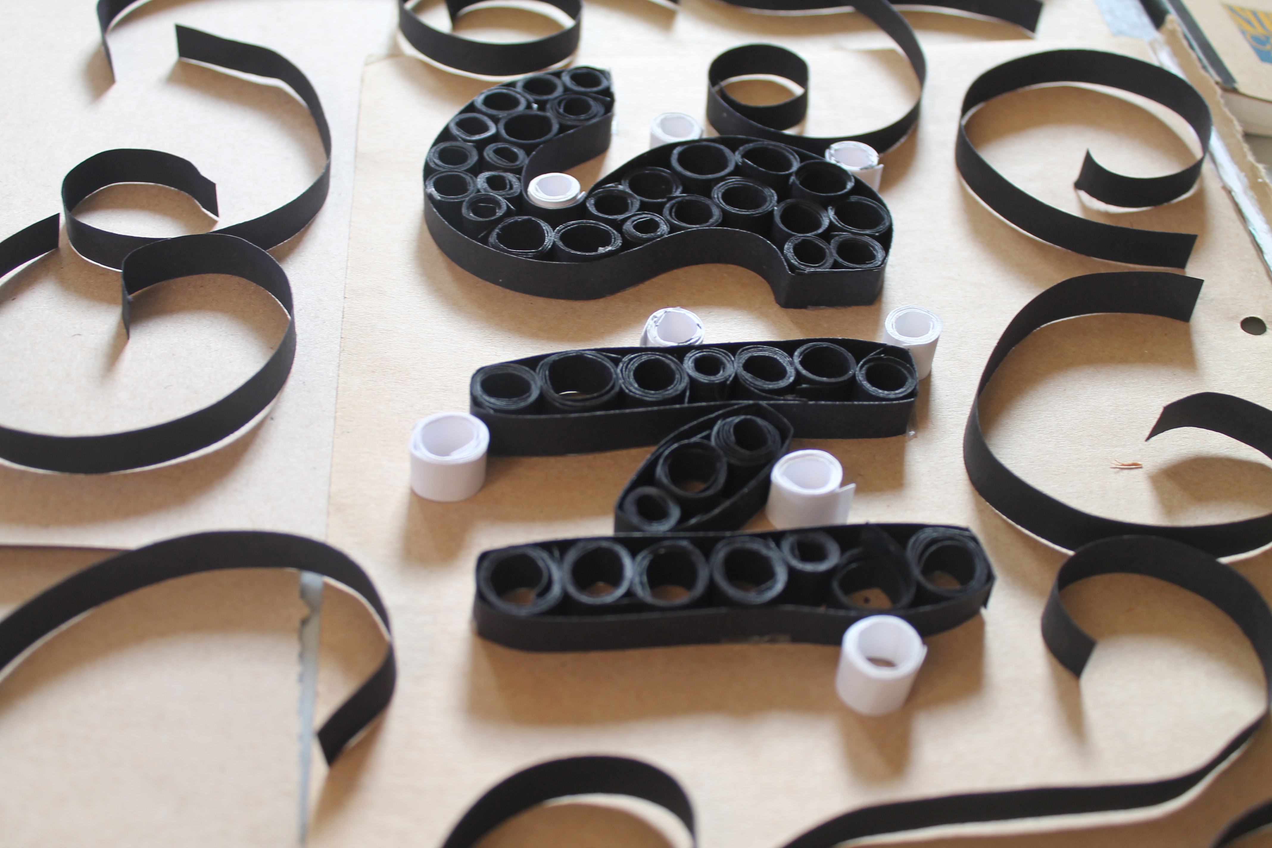
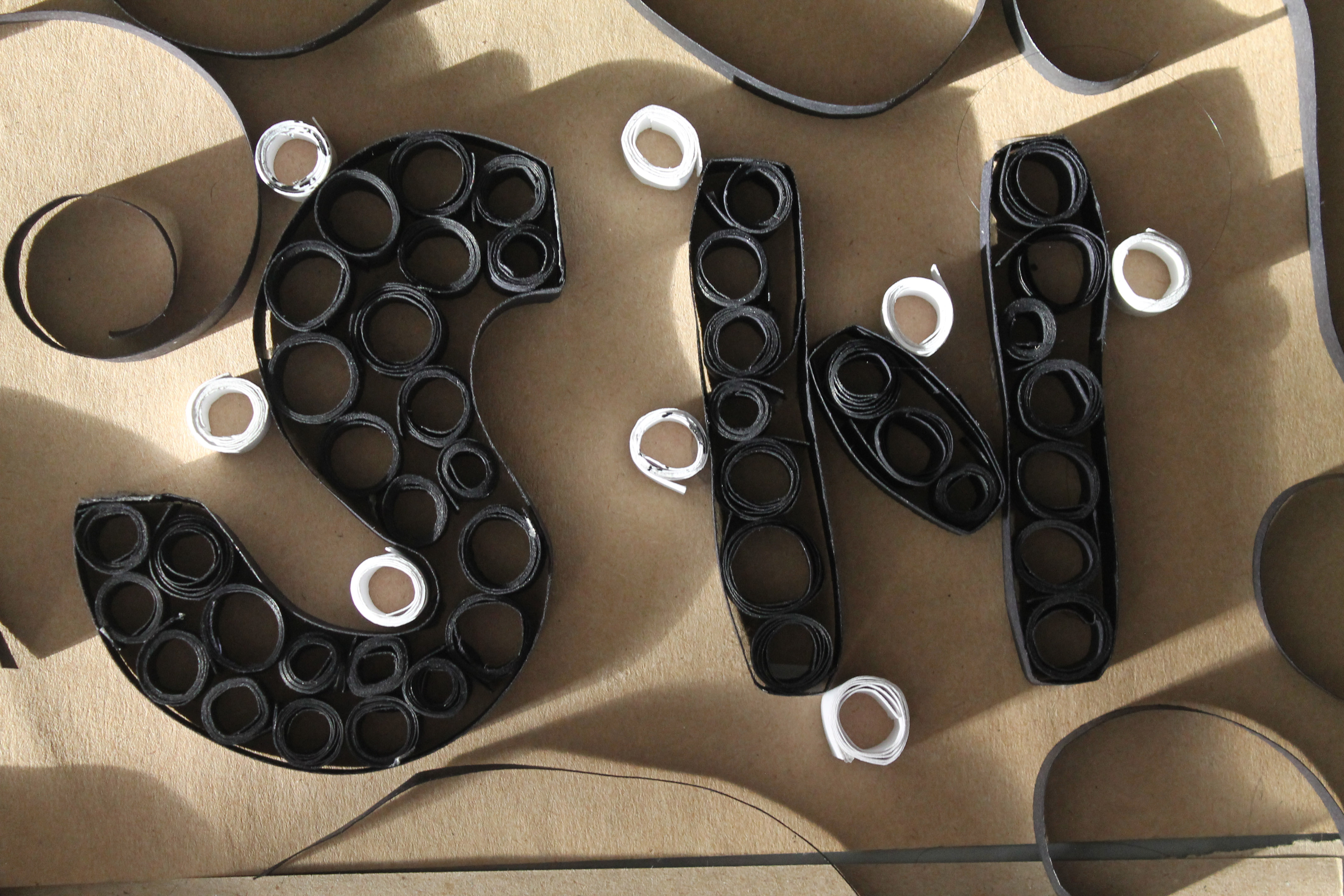
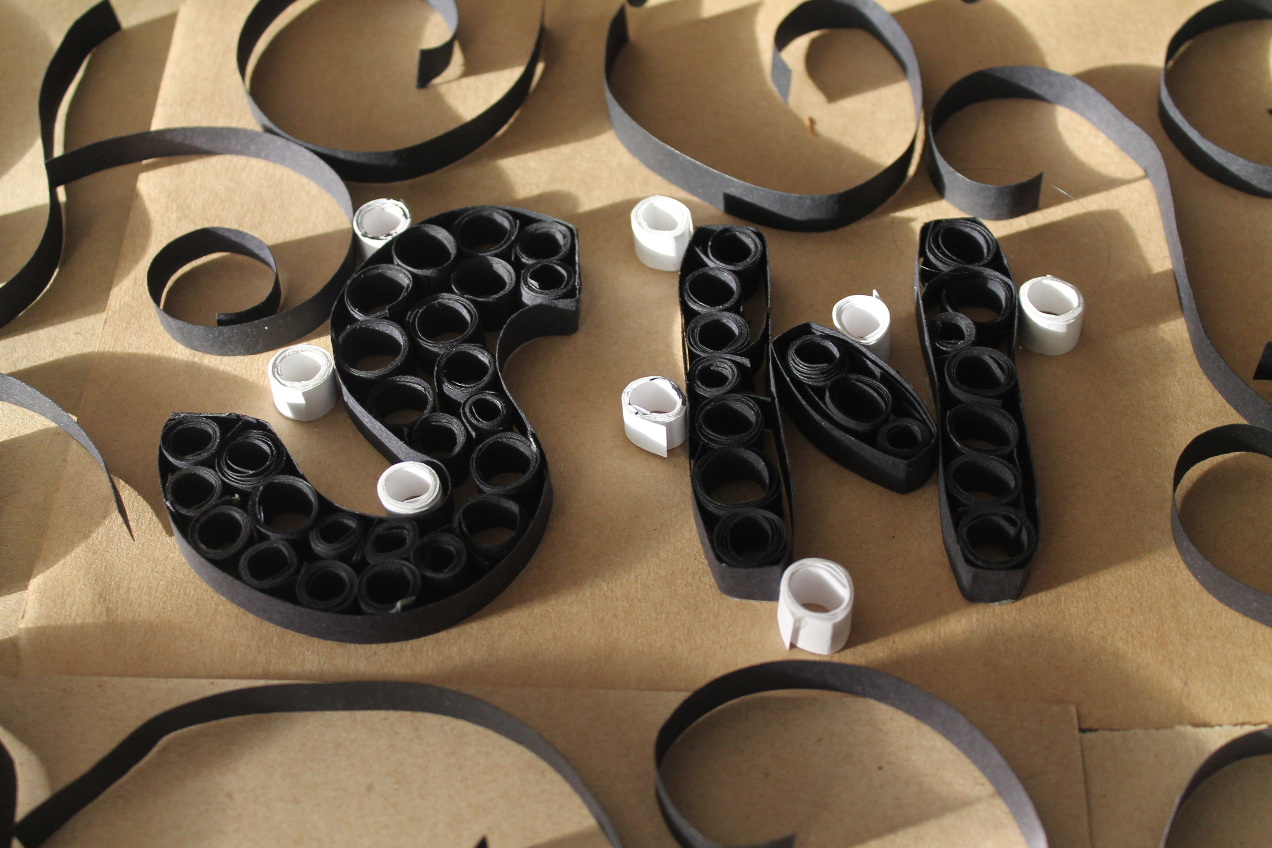
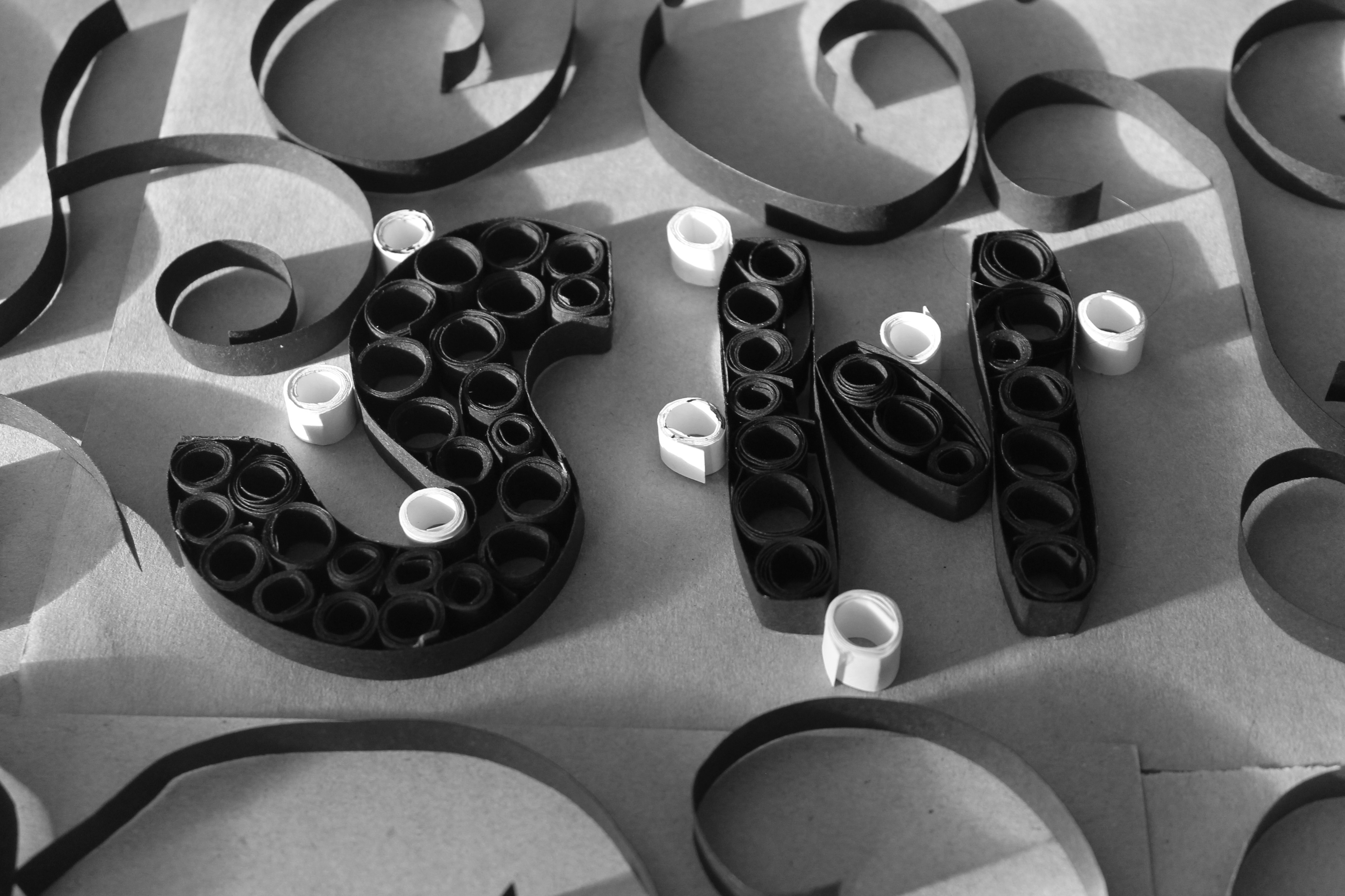
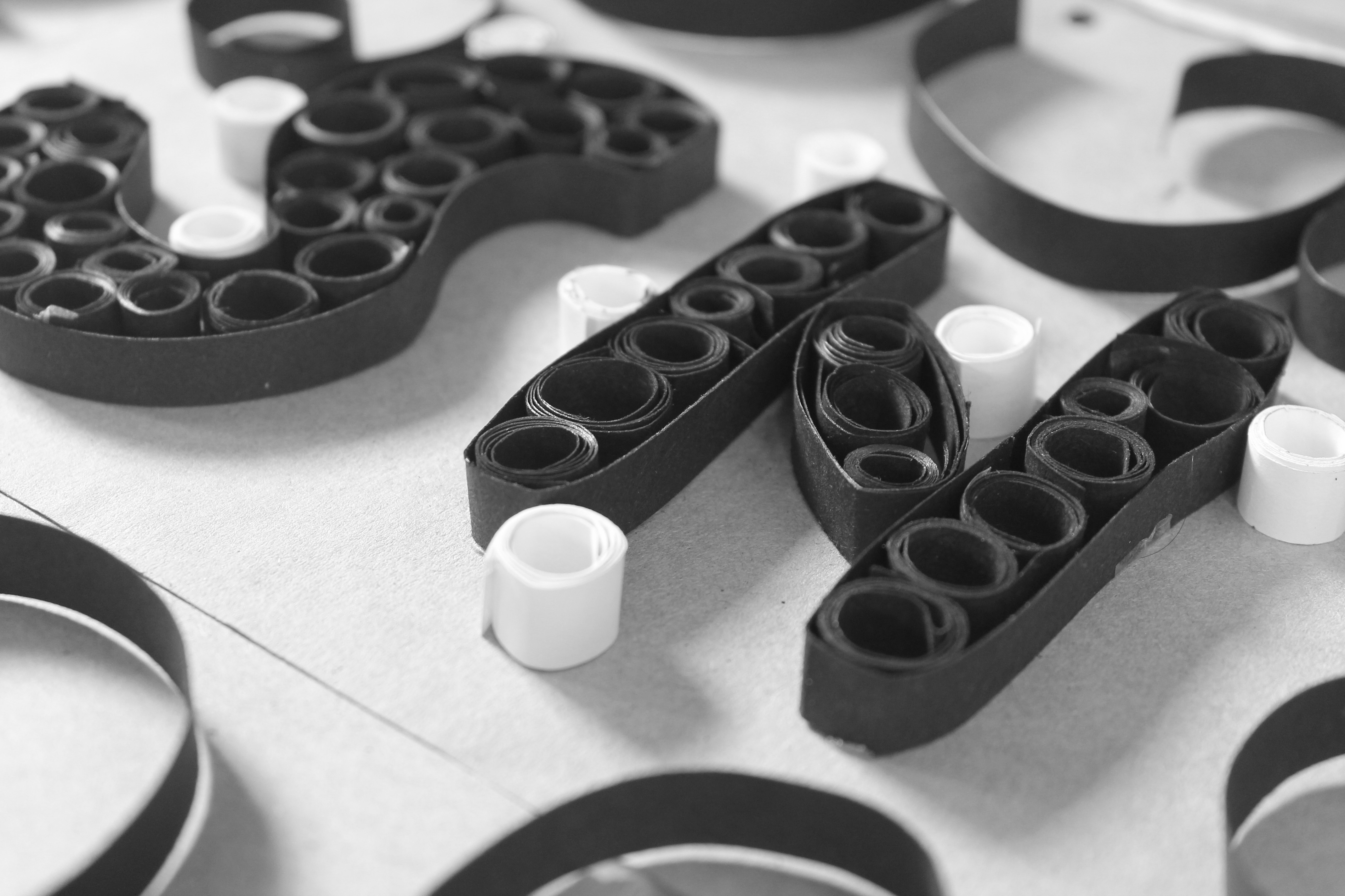
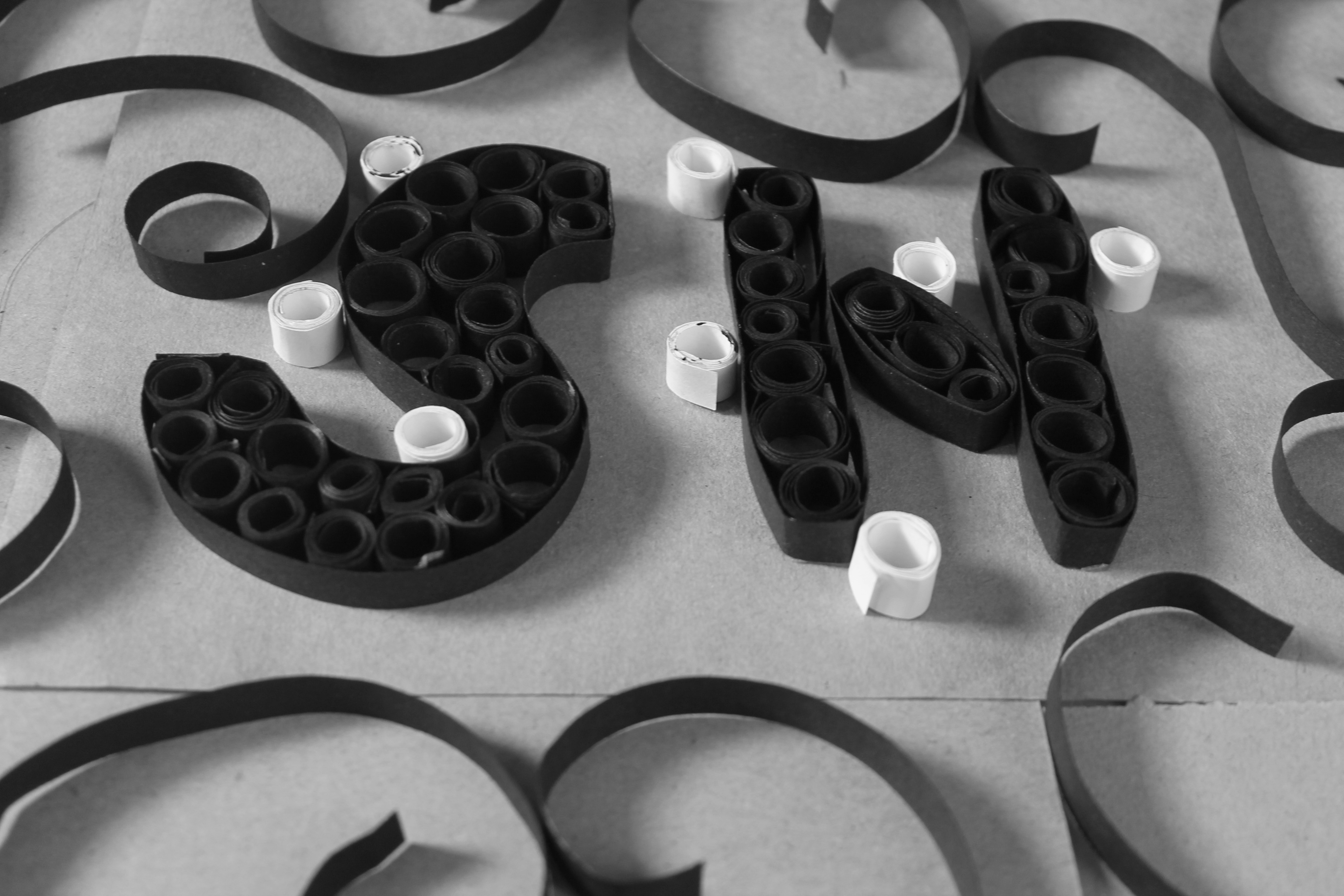
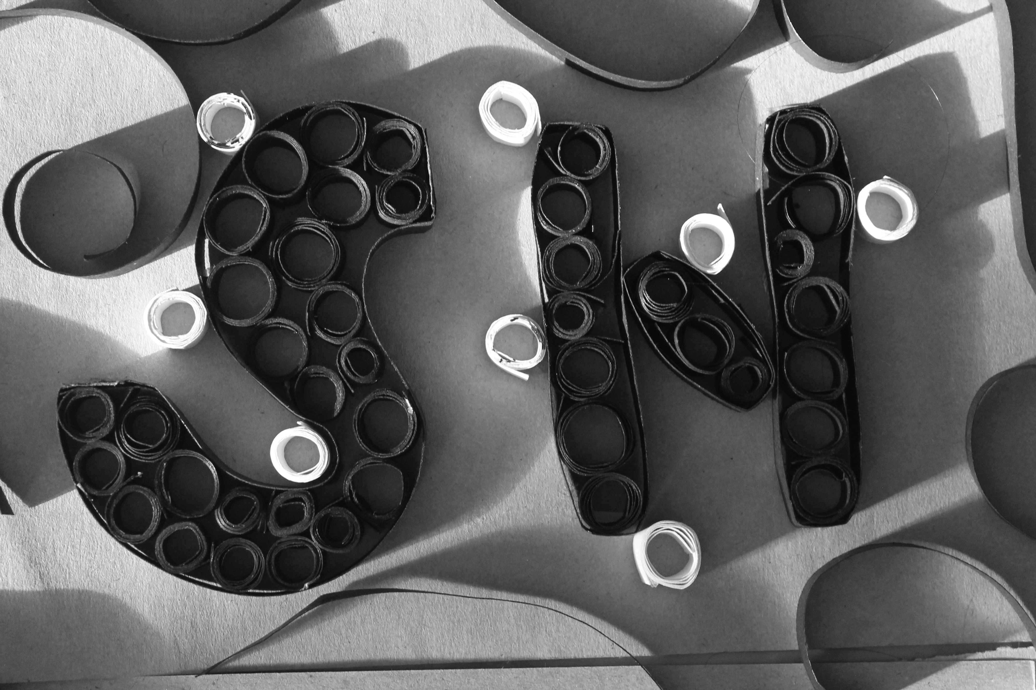
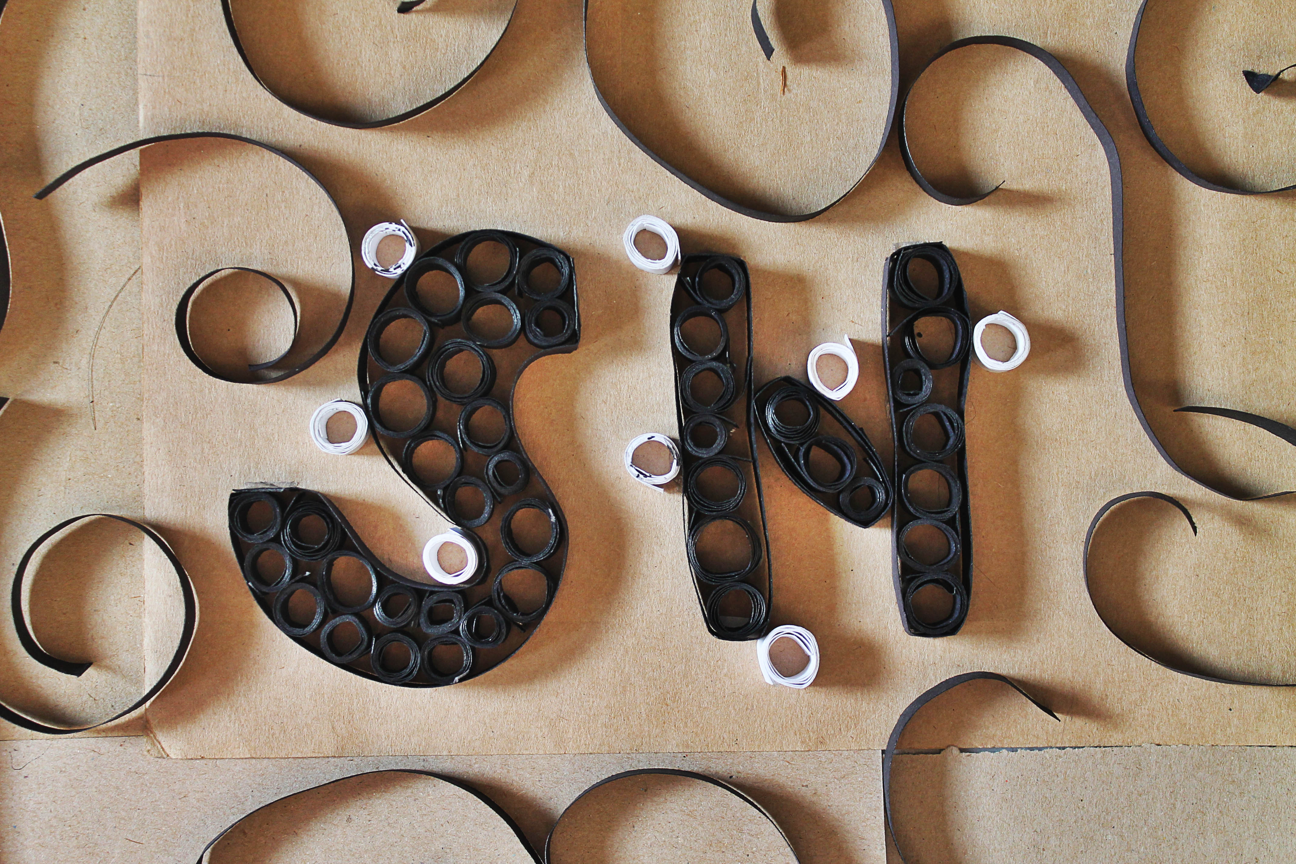
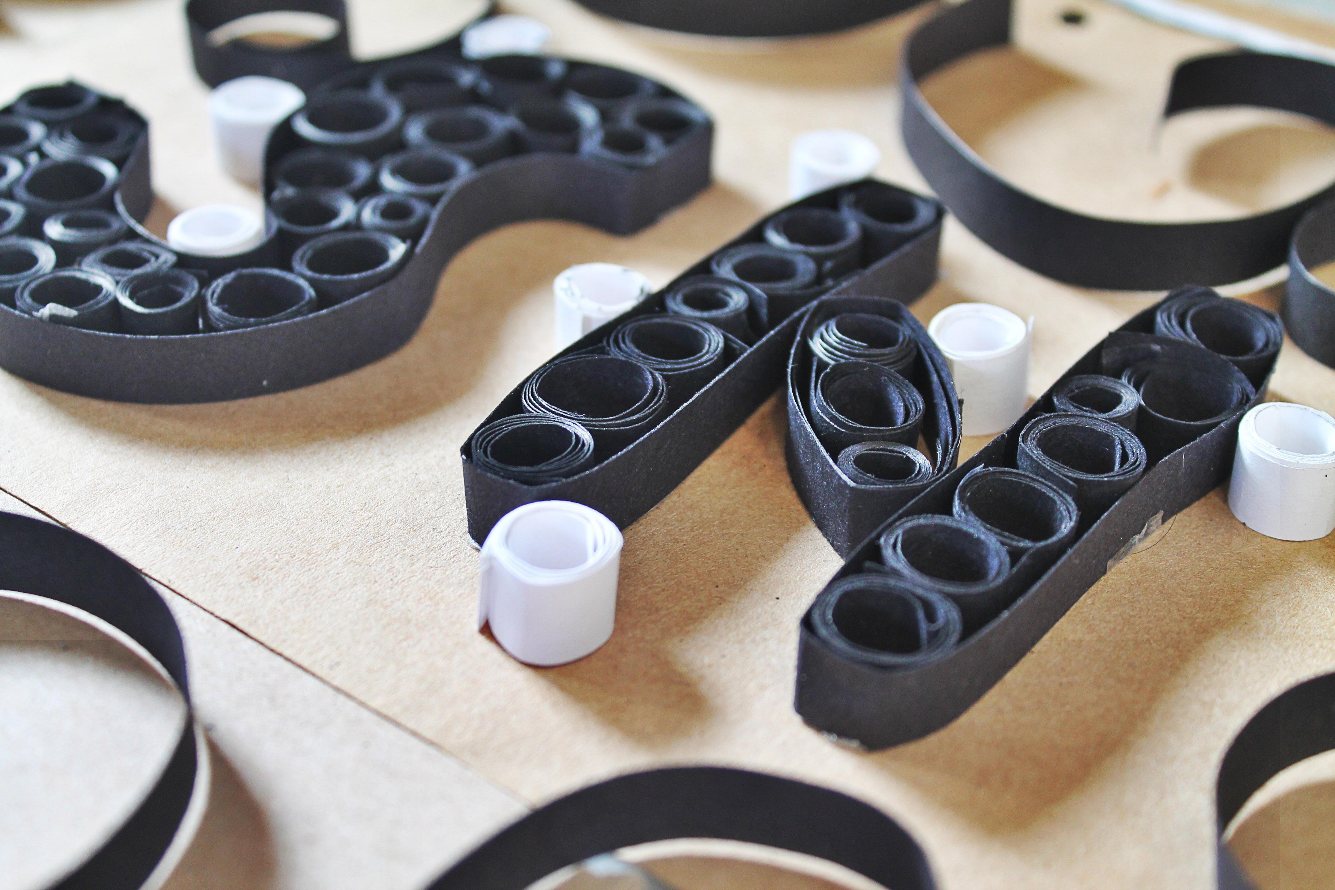
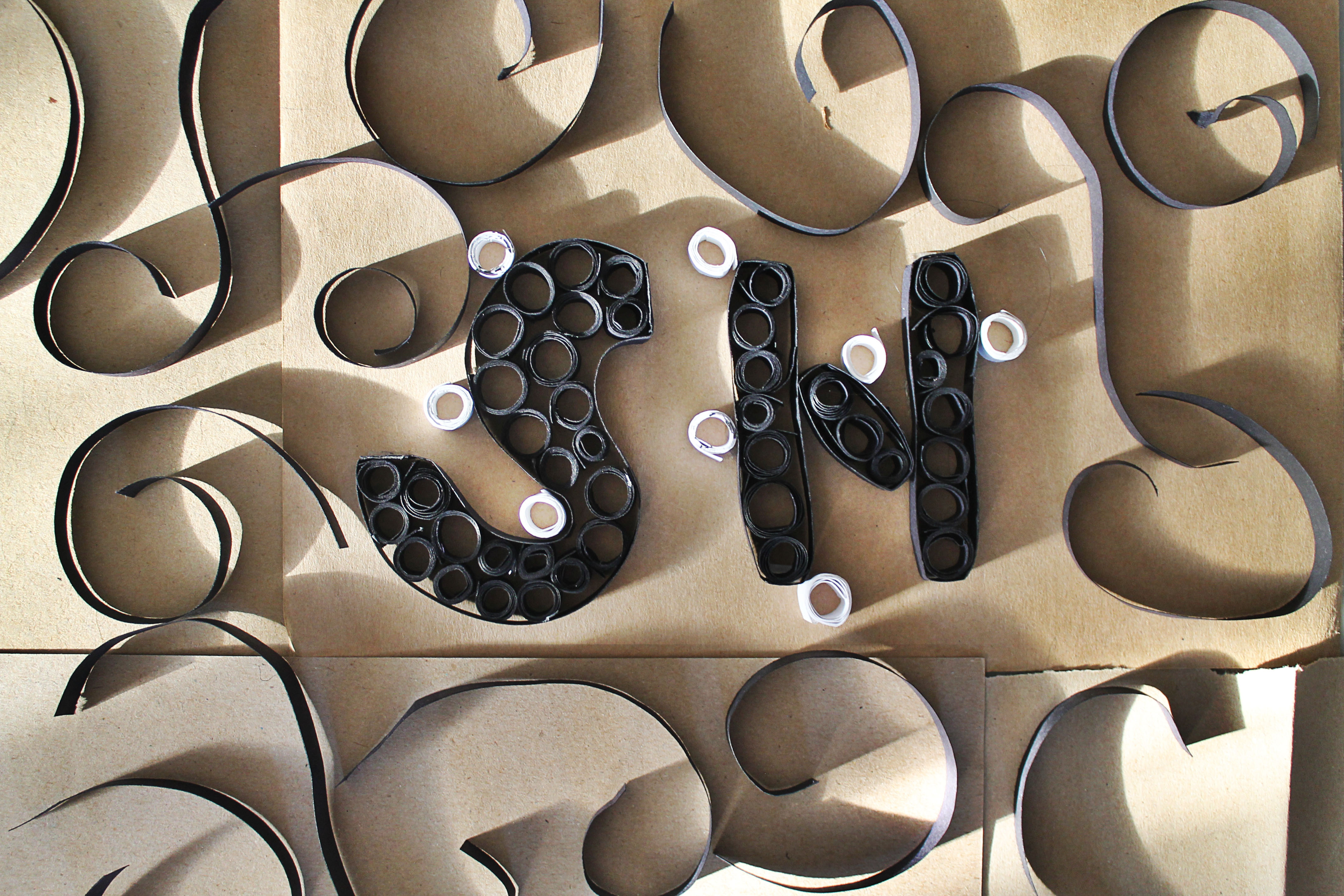
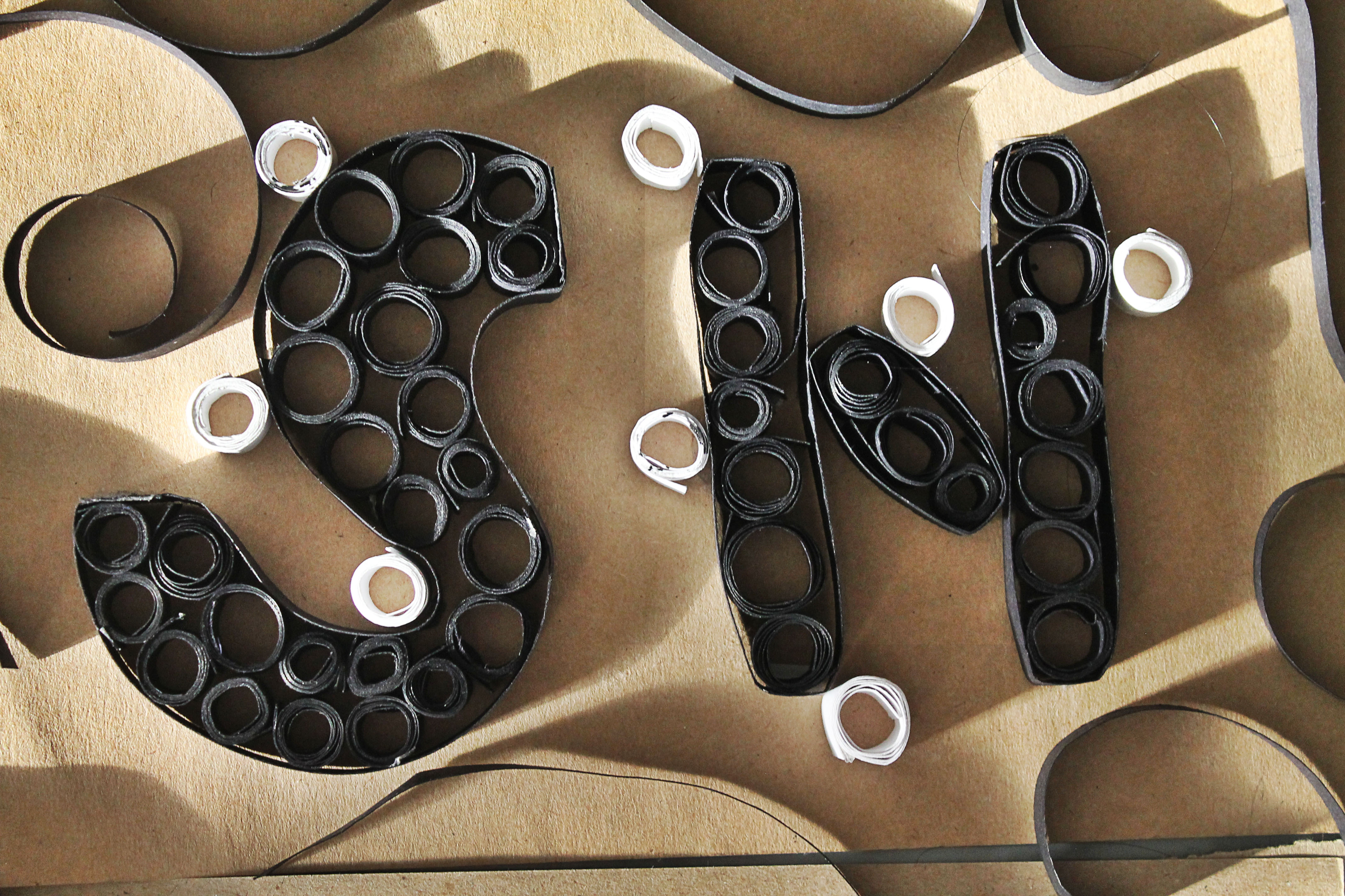
1. Assembly Line Worker
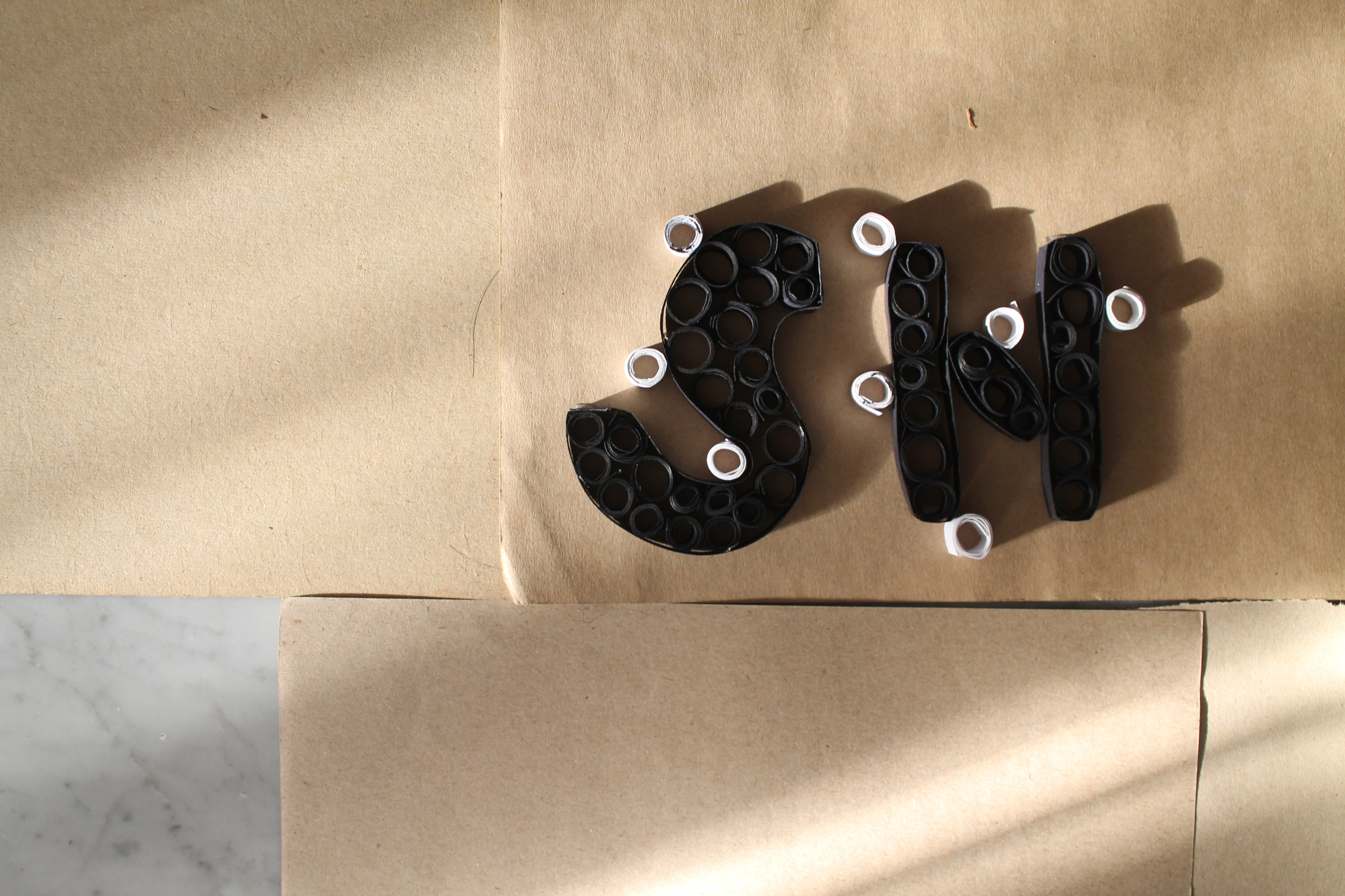
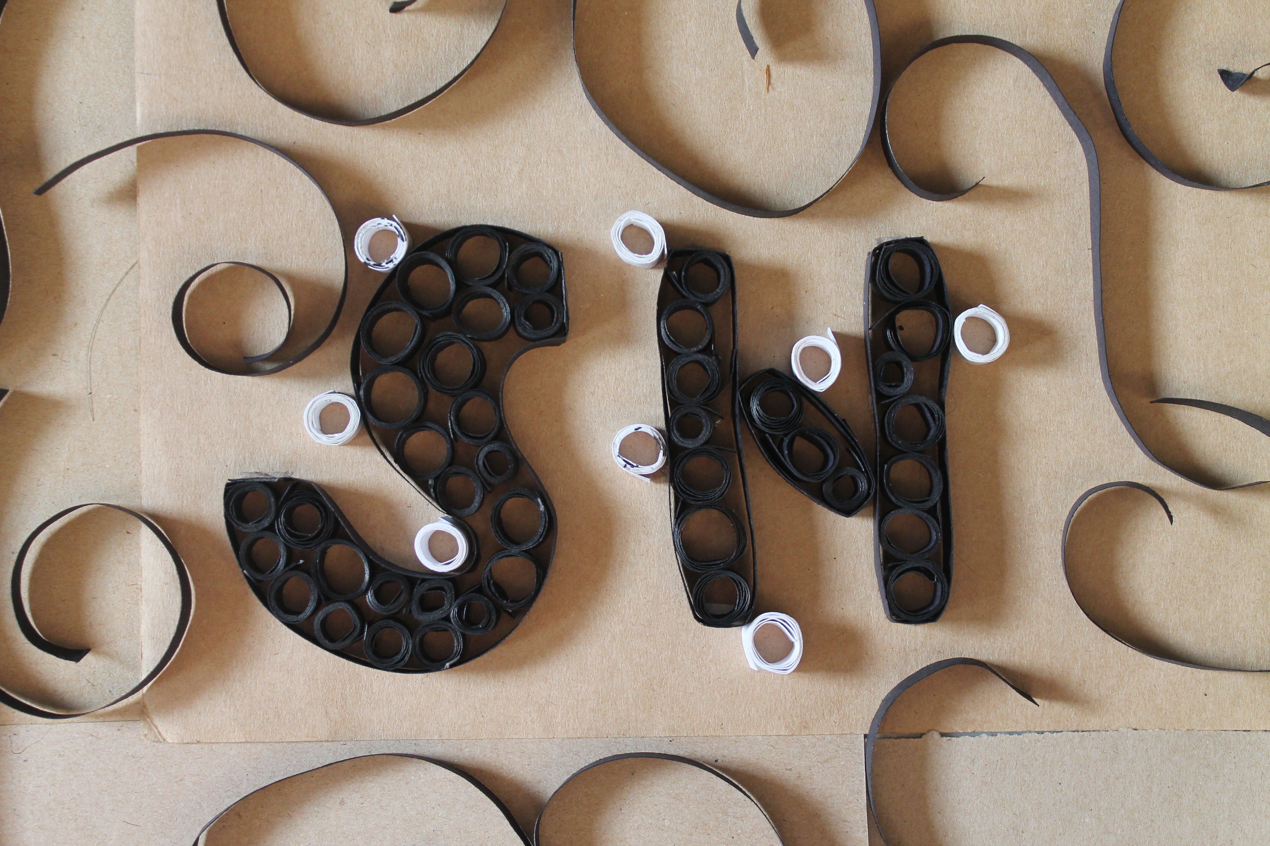
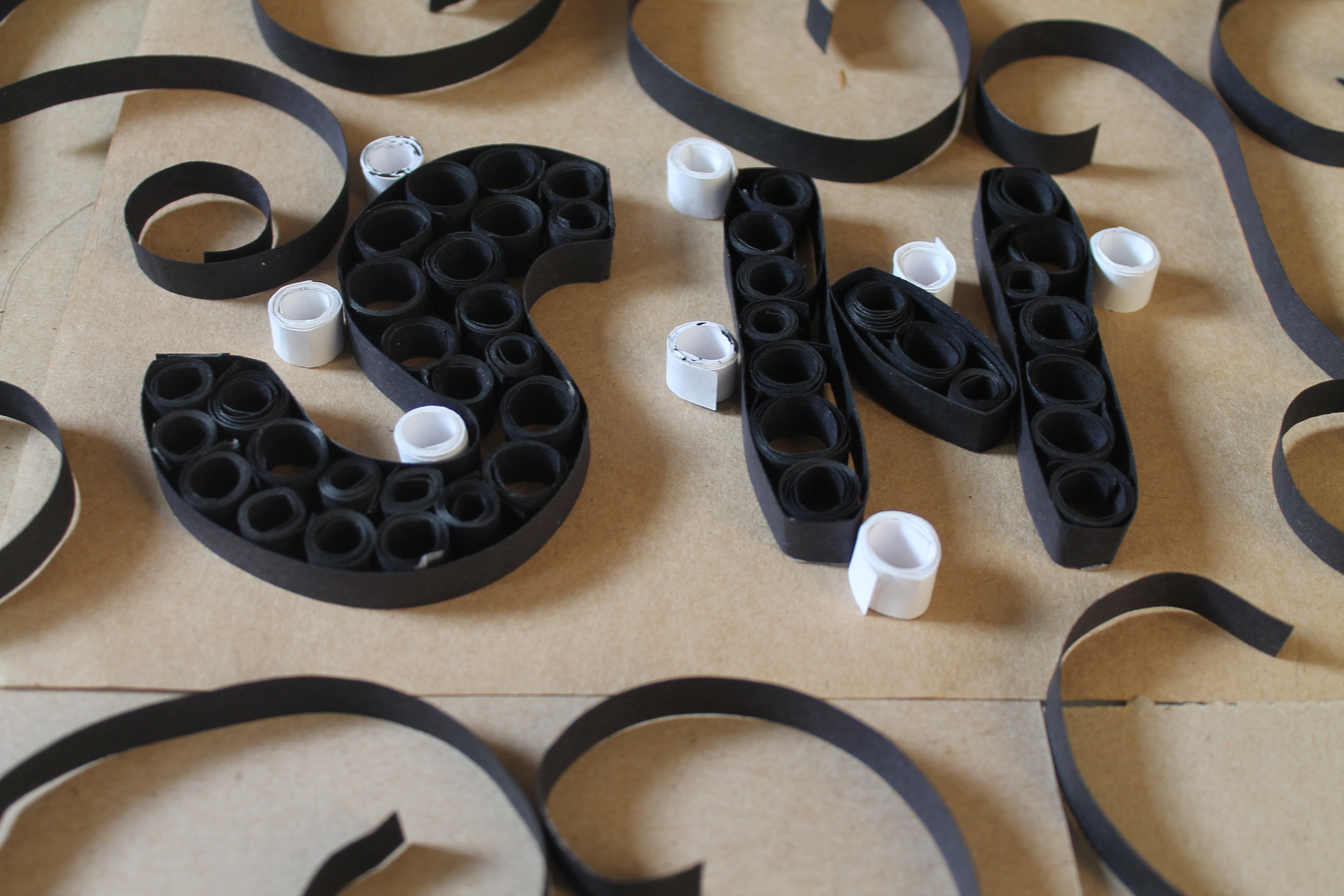
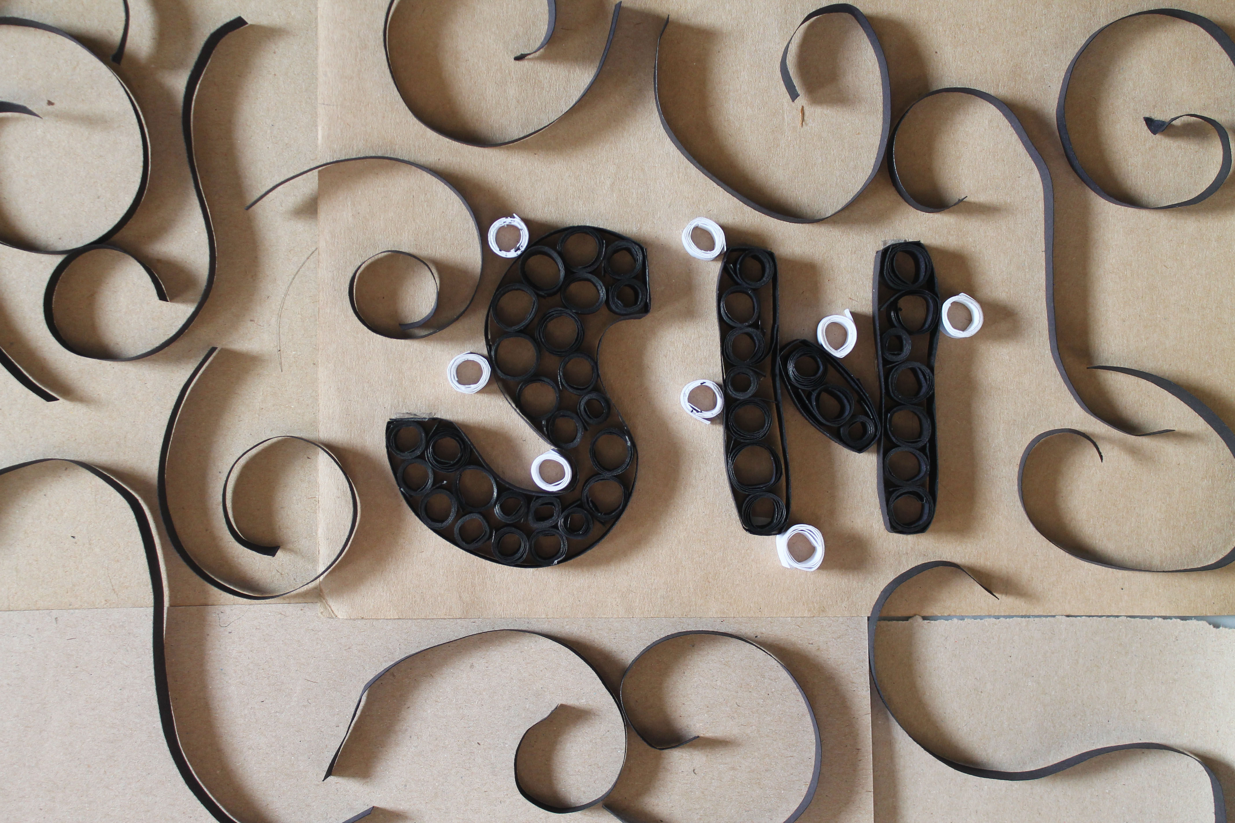
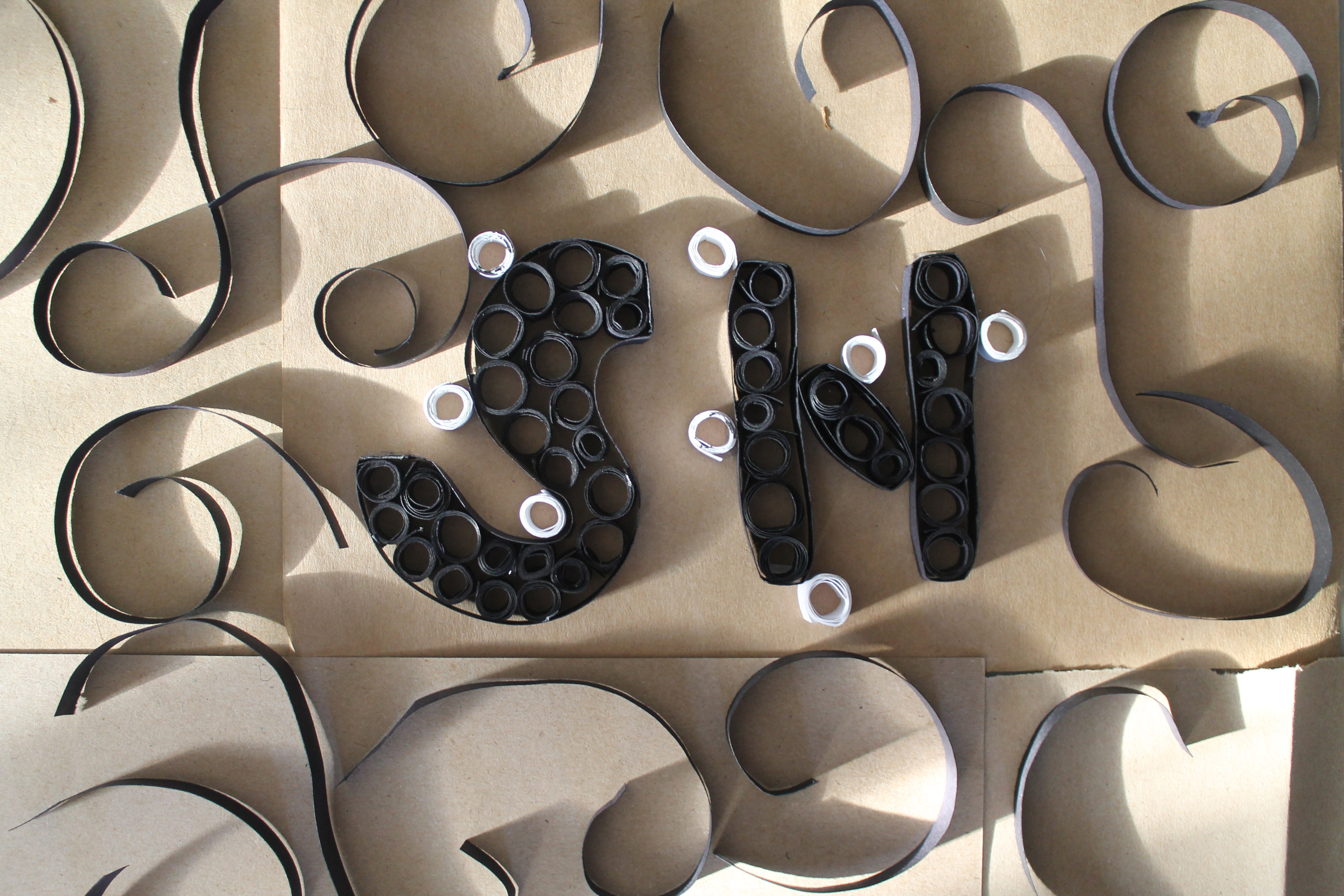
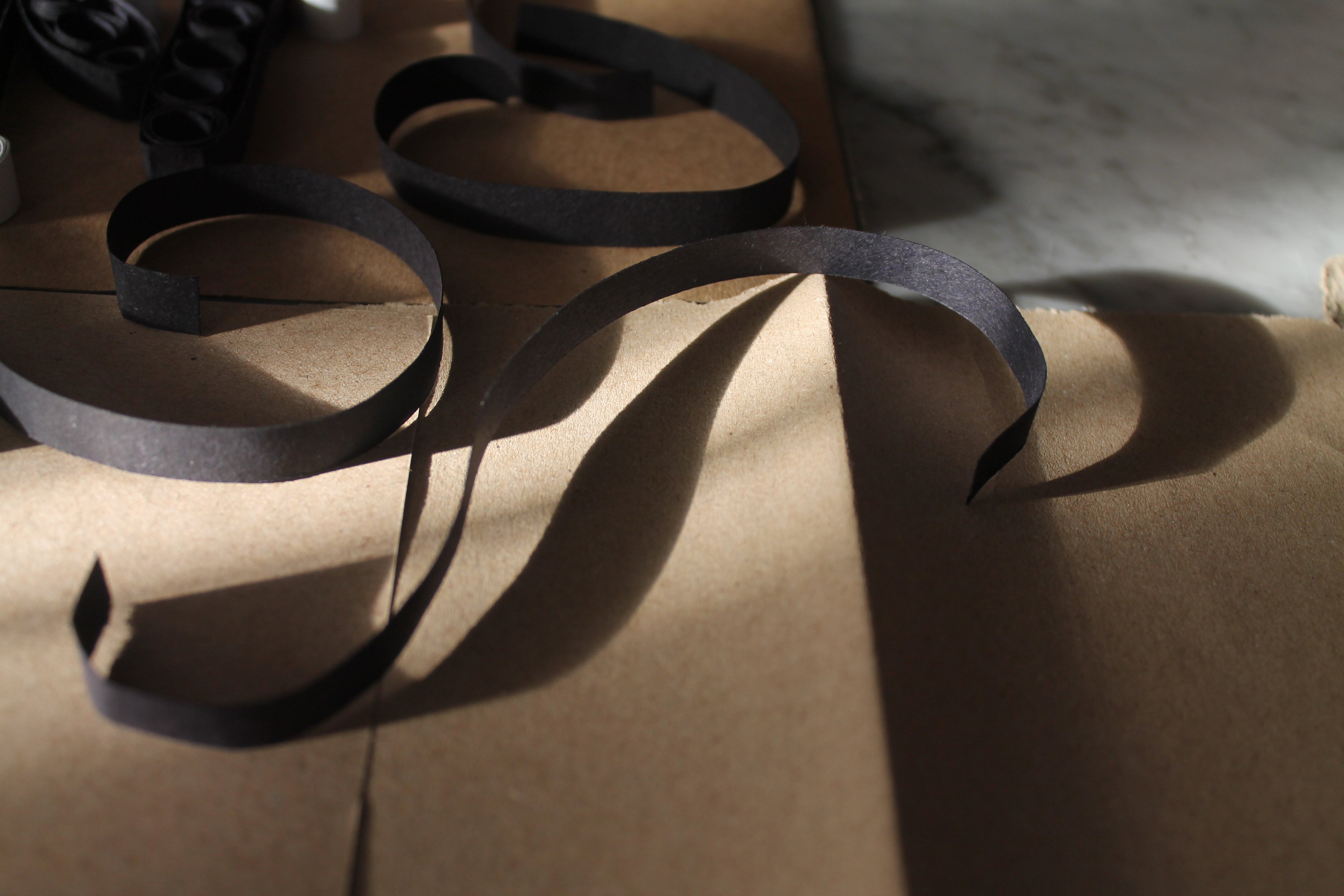
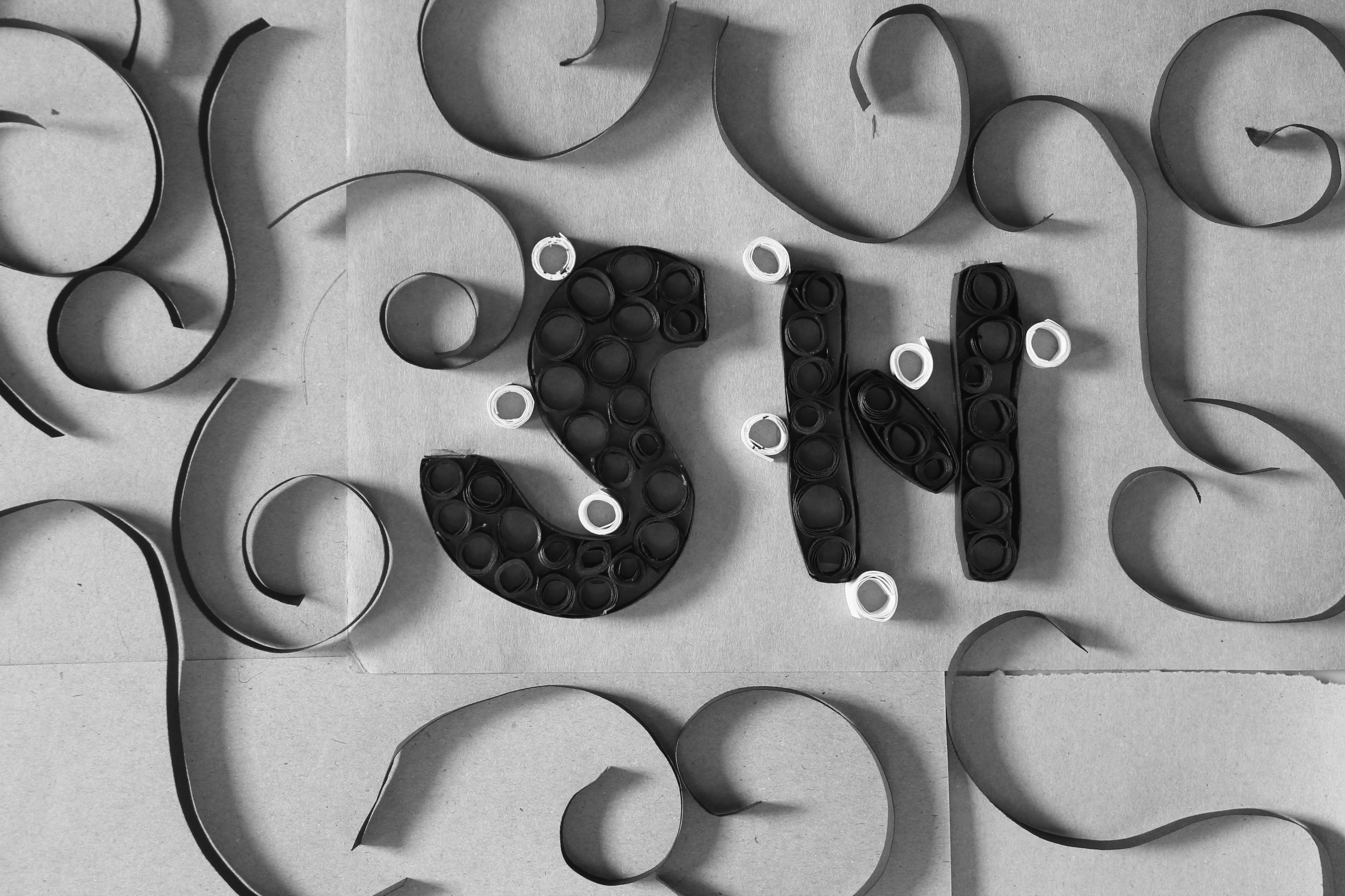
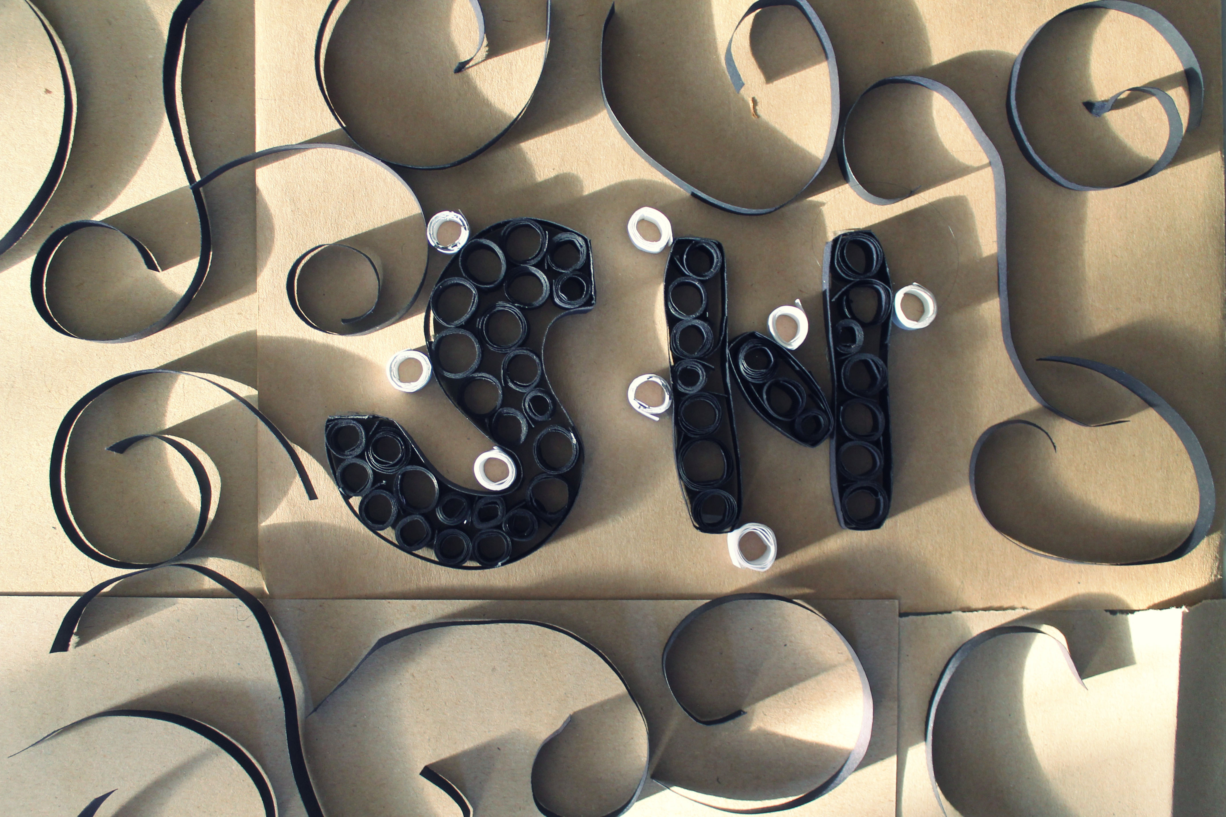
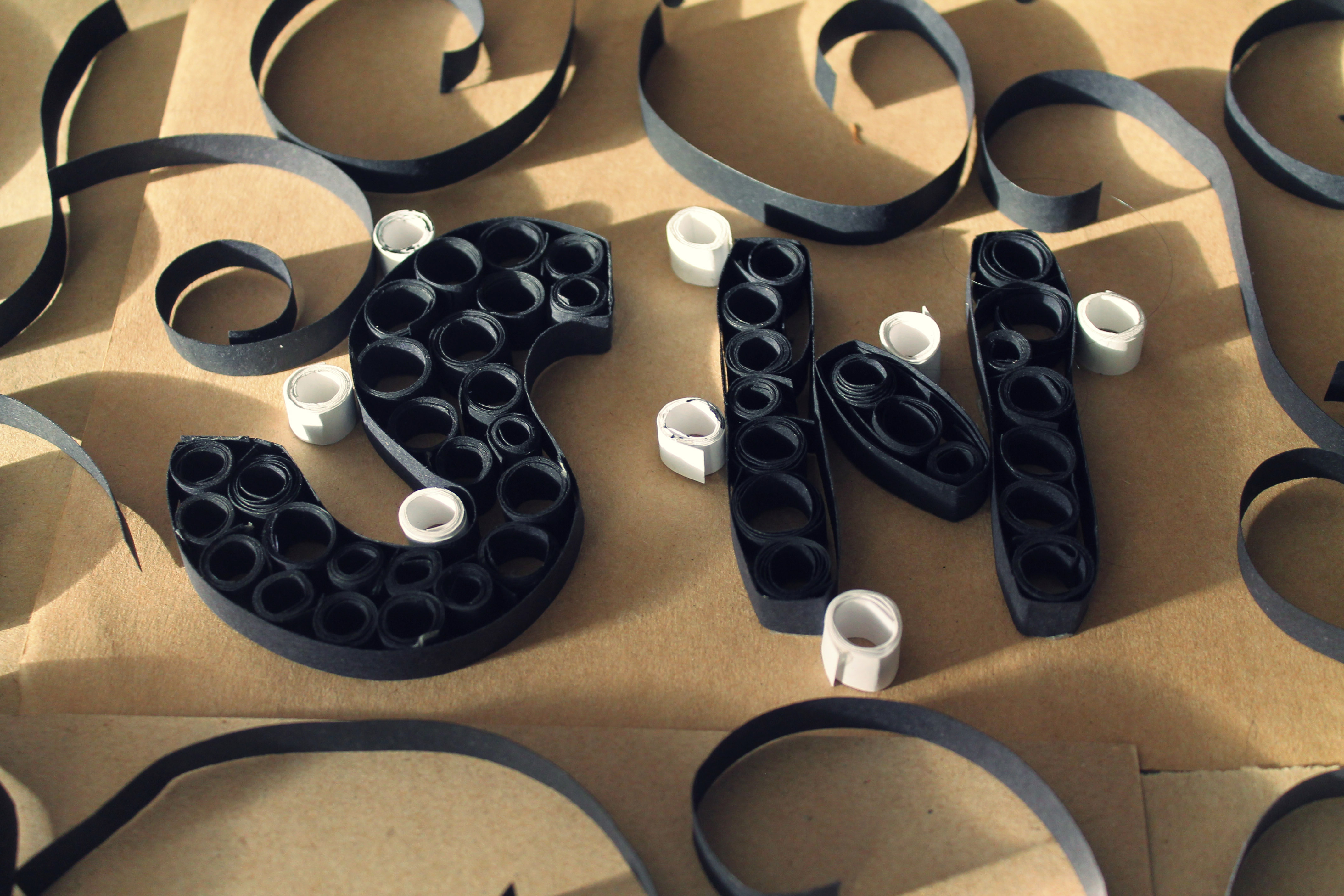
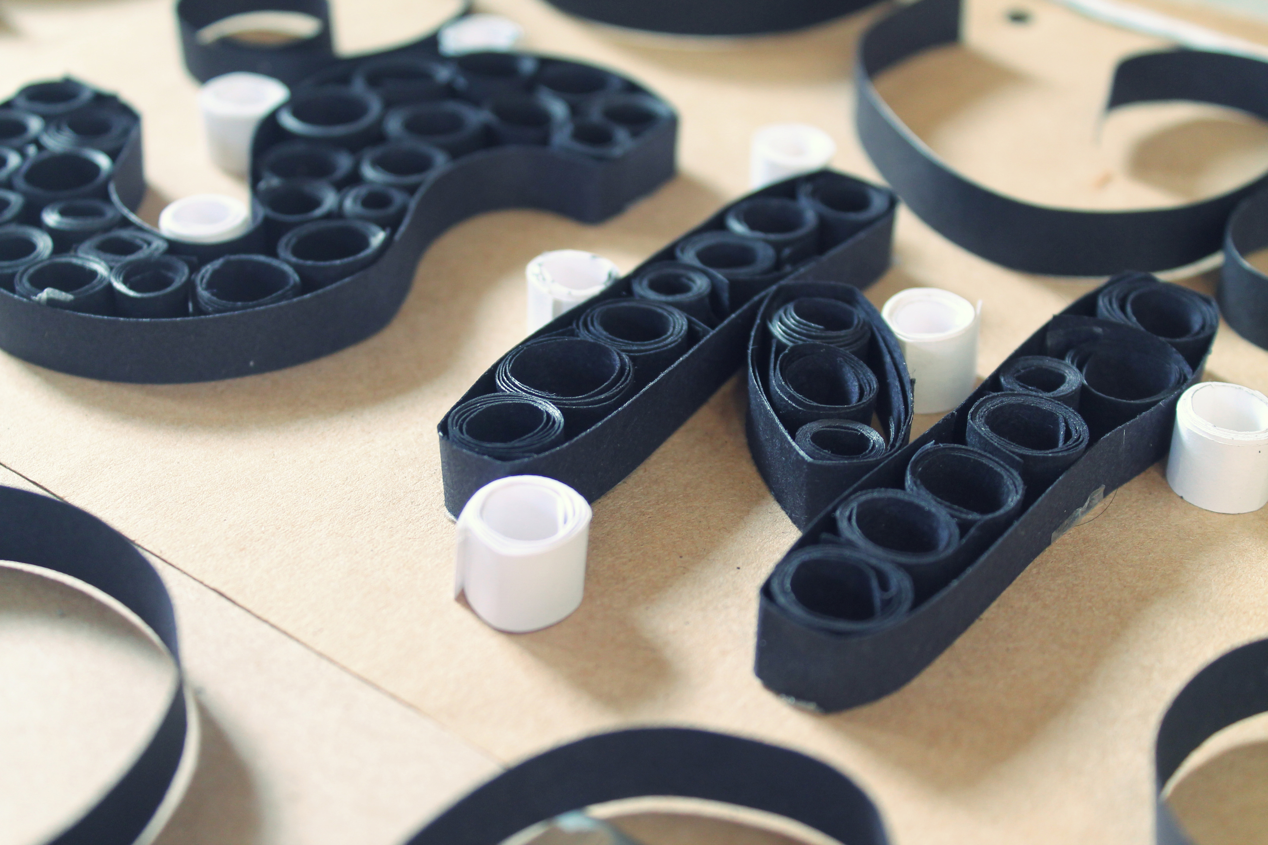
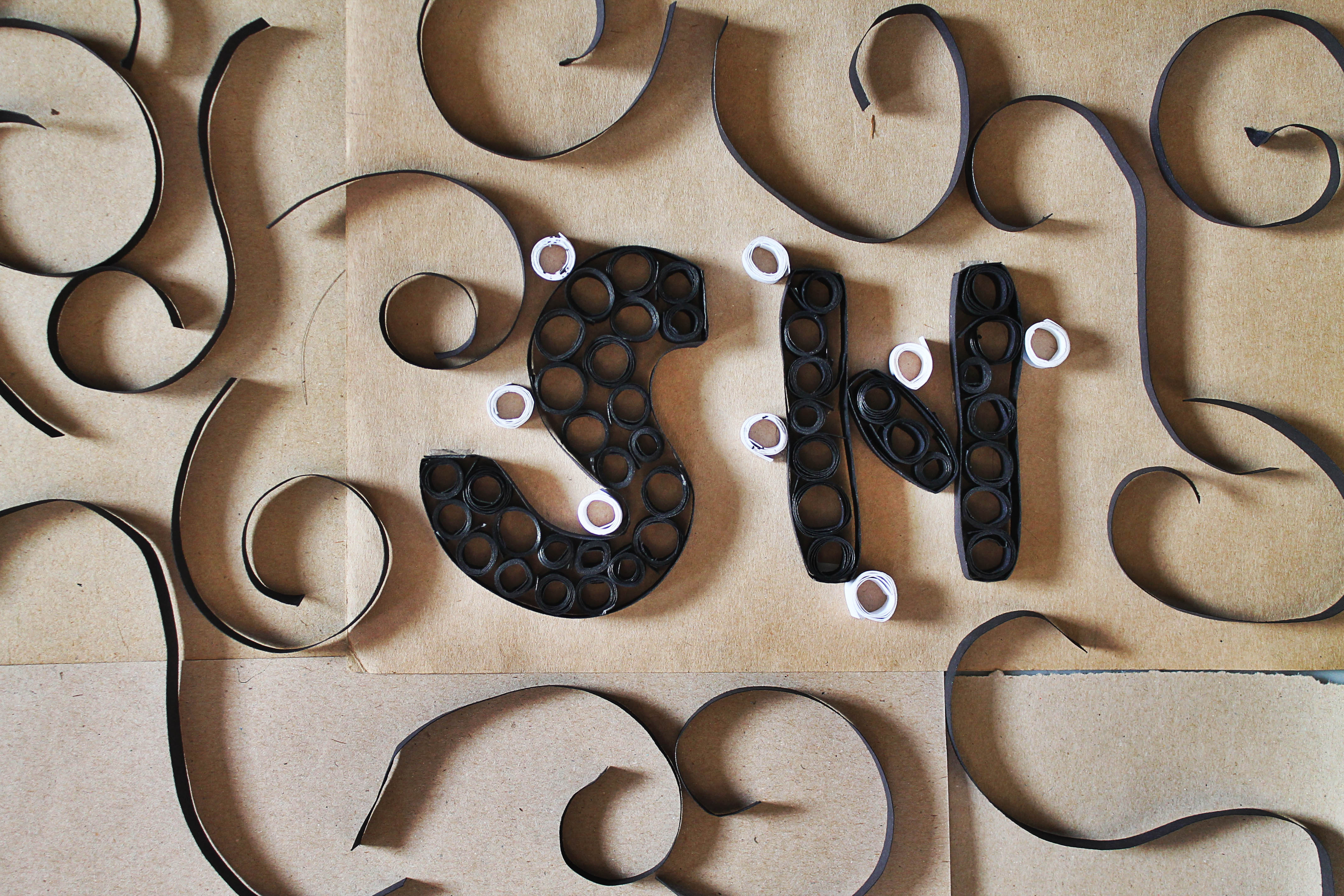
After doing up the piece itself, I planned to present it to viewers through photography instead of the actual one (also taking in mind how Joy suggested to deviate from 3D stuff). Hence, I wanted to explore a lot with the shots and take from various different views and ways so that I can get the best shot that best depicts my idea.
Layout explorations:
A. Softer light & shadow x Simple composition
close up shot
angled close up
flipped orientation shot
B. Ray of sunlights x Simple composition
softer light & shadow
harsher light & shadow
C. Softer light & shadow x Complex composition
close up shot
angled close up shot
far shot
extreme angled close up shot
flipped orientation shot
D. Harsher light & shadow x Complex composition
close up shot
angled close up shot
far shot
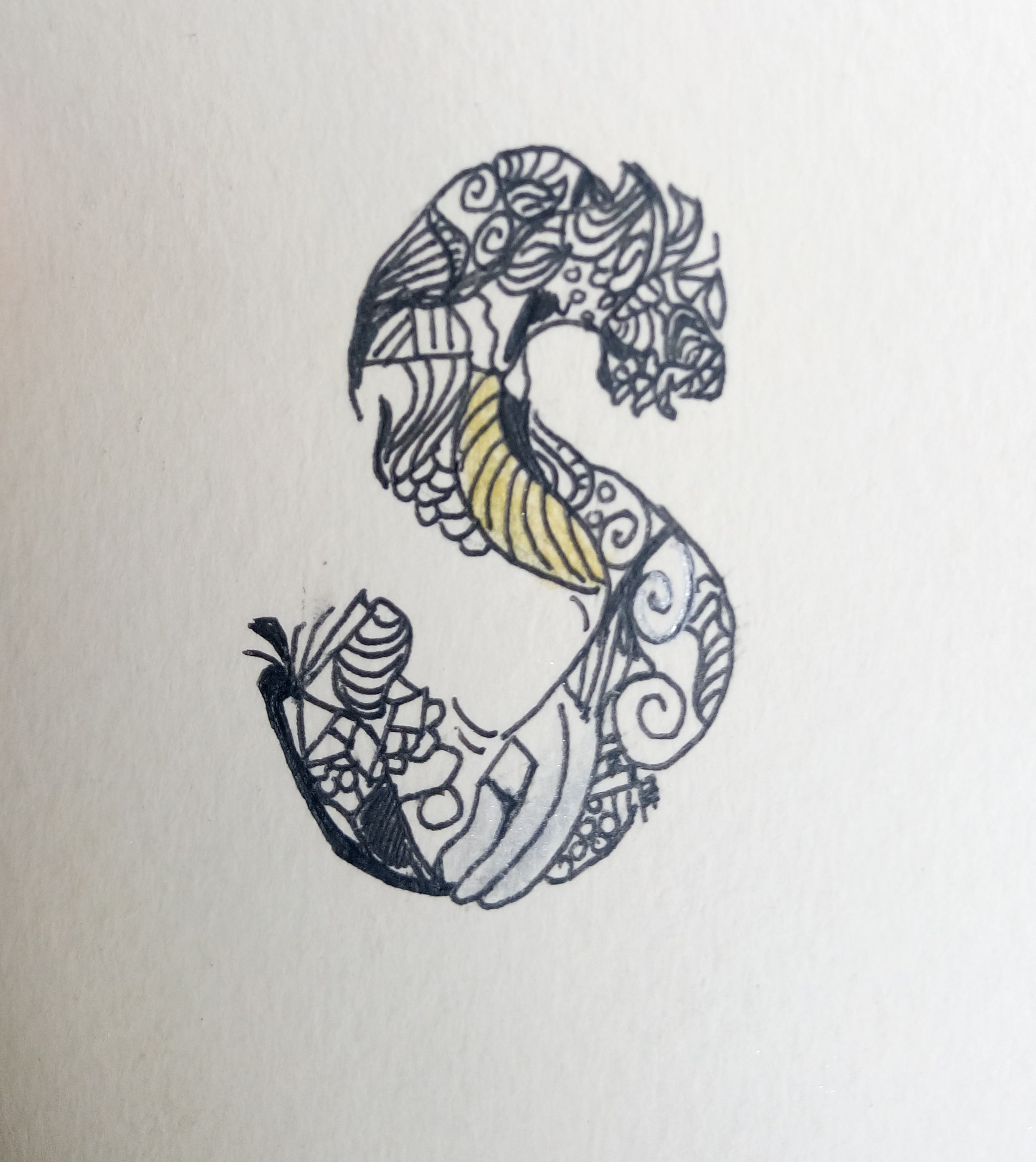
*Possible project tryout in the future?
random font exploration?
This is not a layout/composition exploration but while i was taking the shots of my work, i chanced upon this casted shadow of an ‘S’ and thought that it was rather beautiful yet interesting and it definitely has room for future further developments.
Presentation explorations:
Since Joy suggested during the first consultation to do away with 3-dimensional works, I decided to stick to presenting it by photography. Instead of just using it as a medium to capture the work, I wanted to fully utilise this medium by making edits, filters and adjustments to enhance both the aesthetics and also conceptually as well.
A. Filter – Tom (Pixlr ; default)
As many of the negativity of such factories/industries are make known to the world nowadays is by newspaper report, hence black and white is to resemble that of a newspaper clipping. One can argue that technology is so advanced nowadays that pictures can be printed in colour now. However, i felt that assembly line workers are more prominent in the older times where technology was not as advanced.
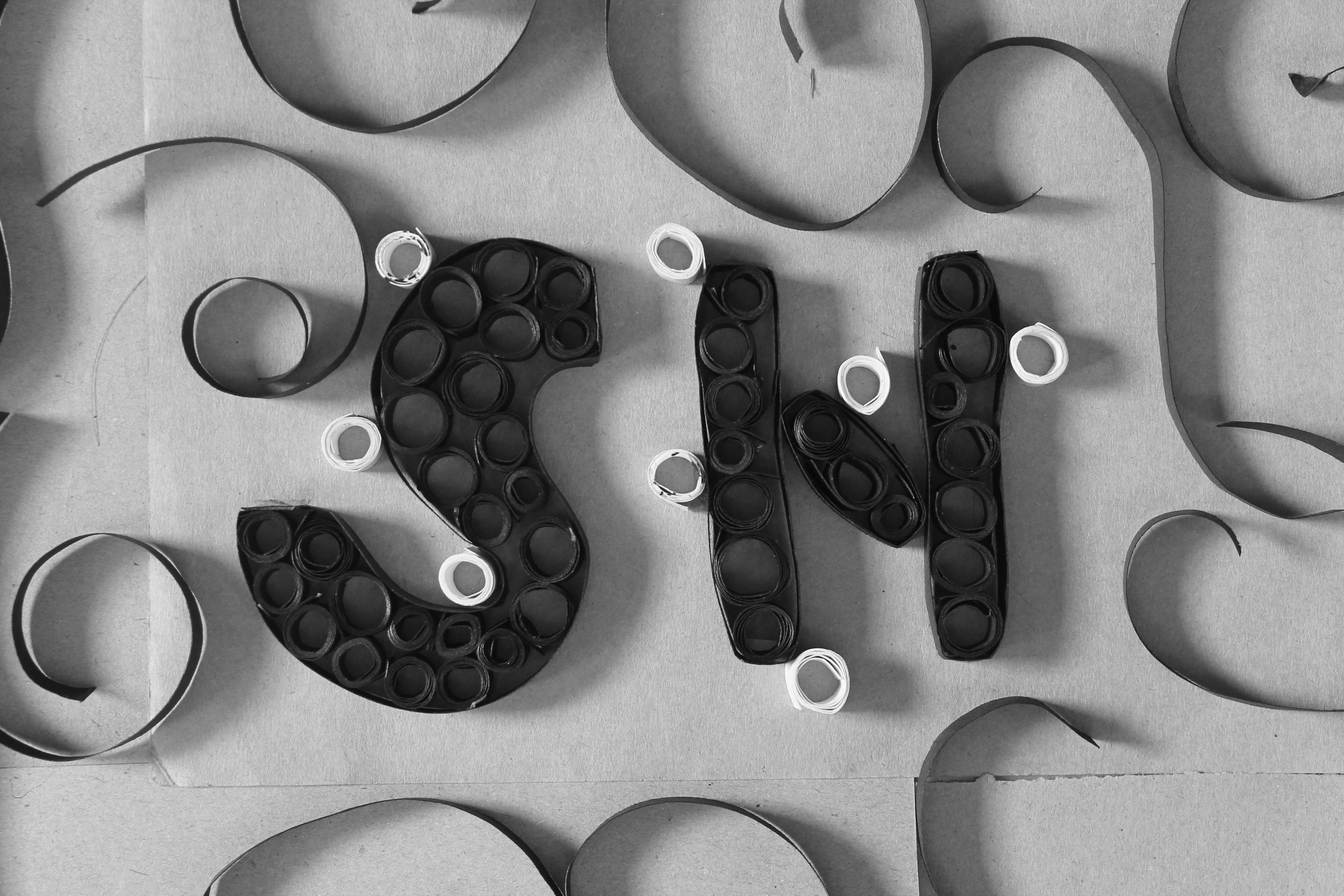
B. Filter – Sanna (Pixlr ; subtle)
Adding on to the point above, to current date there are still some assembly line workers still doing the work manually and are not yet being replaced by machines. Hence, with this point in mind, the factories would tend to try and cover up their negatives/faults to maintain their reputation. Similarly to how the companies work, this filter sort of beautifies the image, in a way covering up for the bad parts but the critical flaws can still be seen.
C. Filter – Ingrid (Pixlr ; subtle)
The idea for this filter is totally opposite from the first two mentioned above. Instead, in this filter, it sort of sharpens and makes the image rather grainy/coarse-looking which sort of portrays effectively how tough and hard it actually is for the people working in this industry. In a way it can depict the working environment/conditions realistically.


C. Filter – Combination
Sanna x Ingrid
Tom x Ingrid
2. Video Game Player
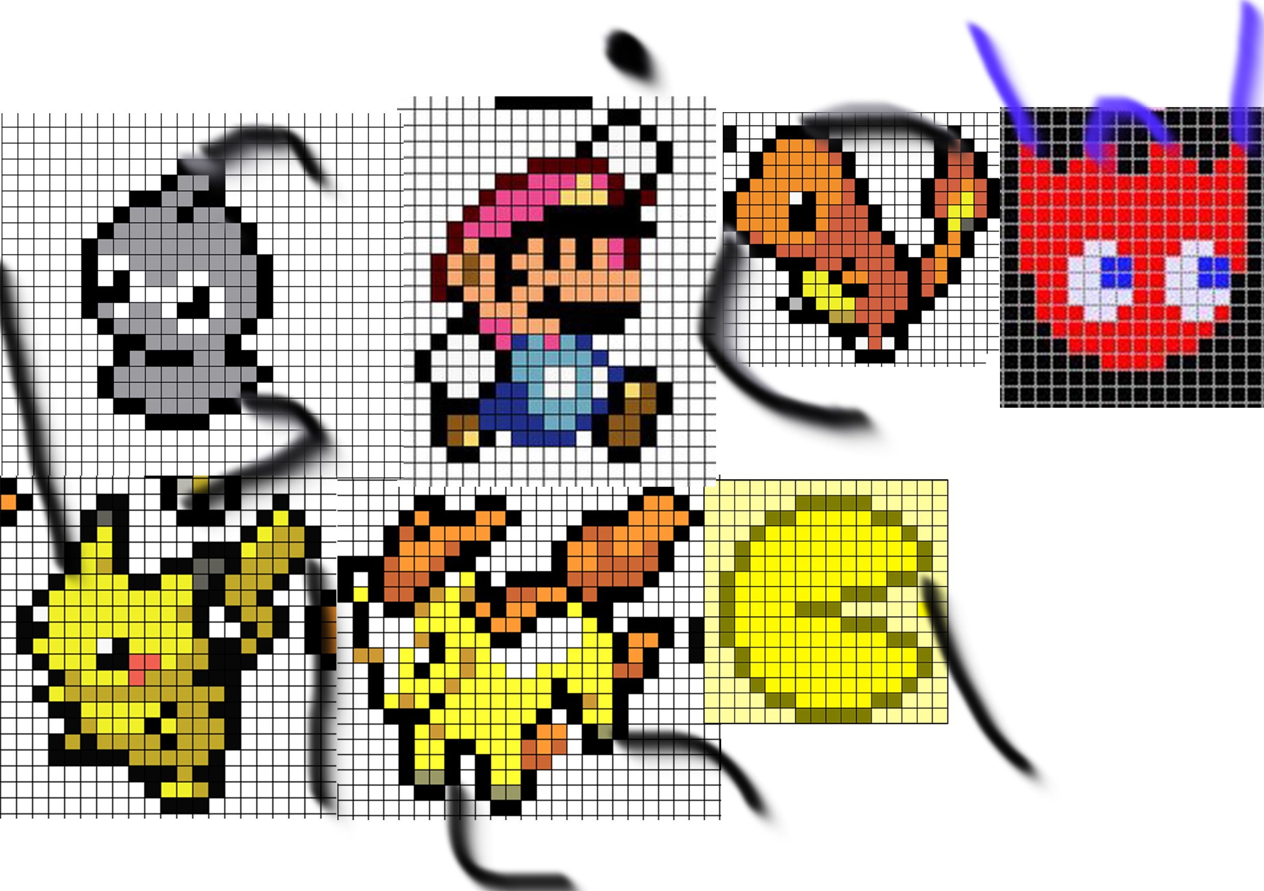
chosen characters
proposed layout
final layout
Since my overarching concept is about subtle glitches & consumerism, I decided to not colour every square (pixel) fully. Some appear faded while some appears the proper fully coloured square.
Below is an example:
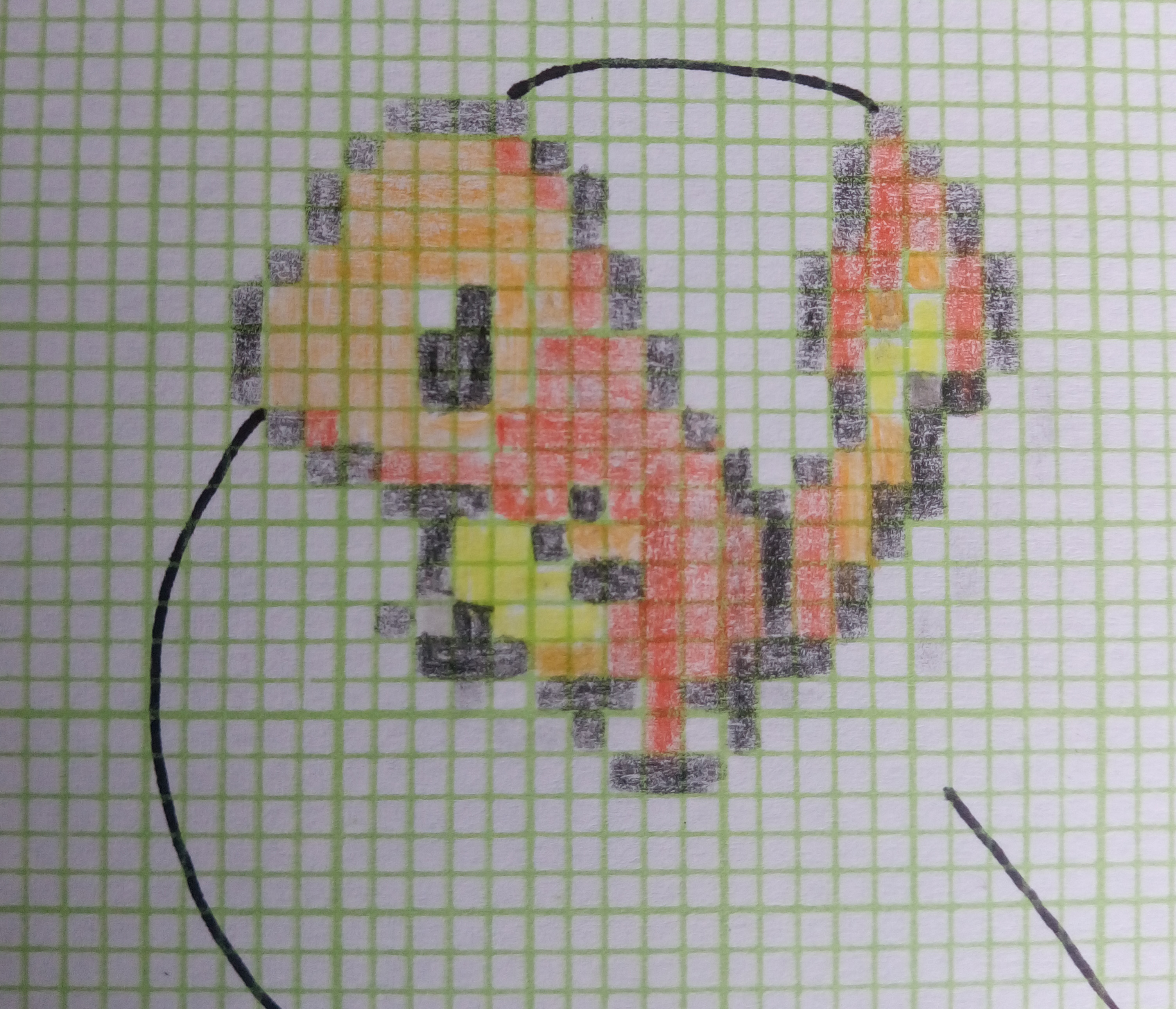
example of the glitch/defect
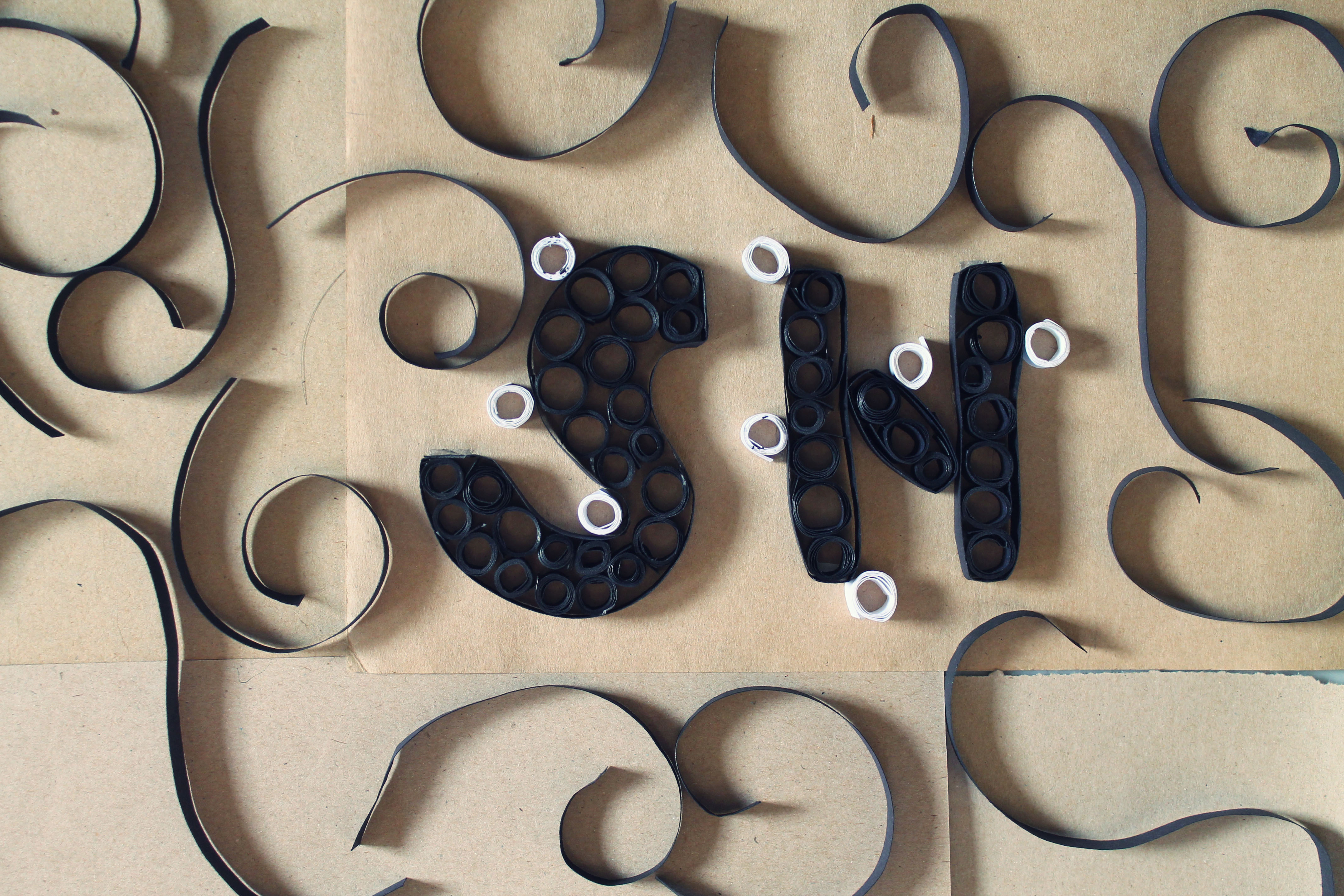
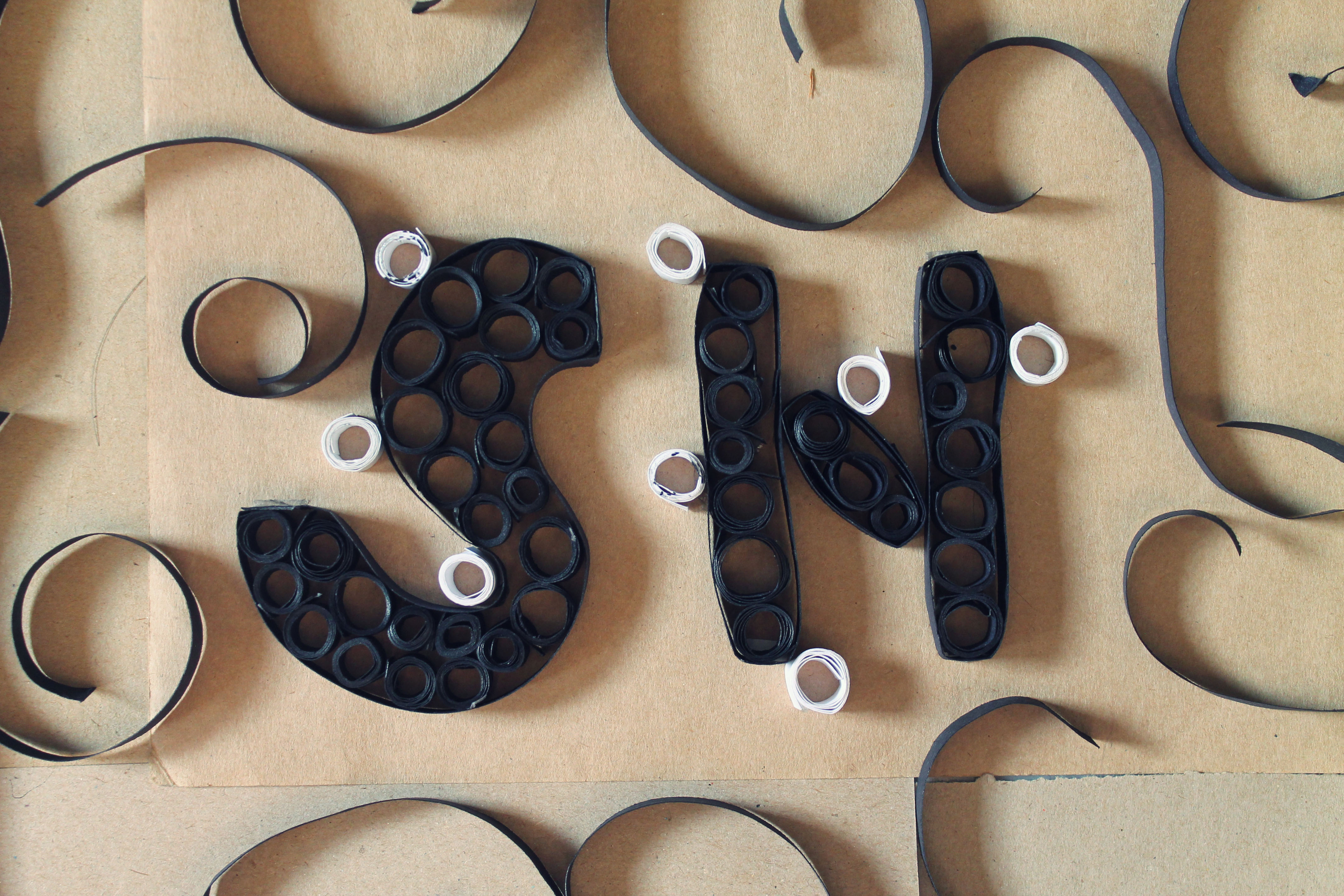
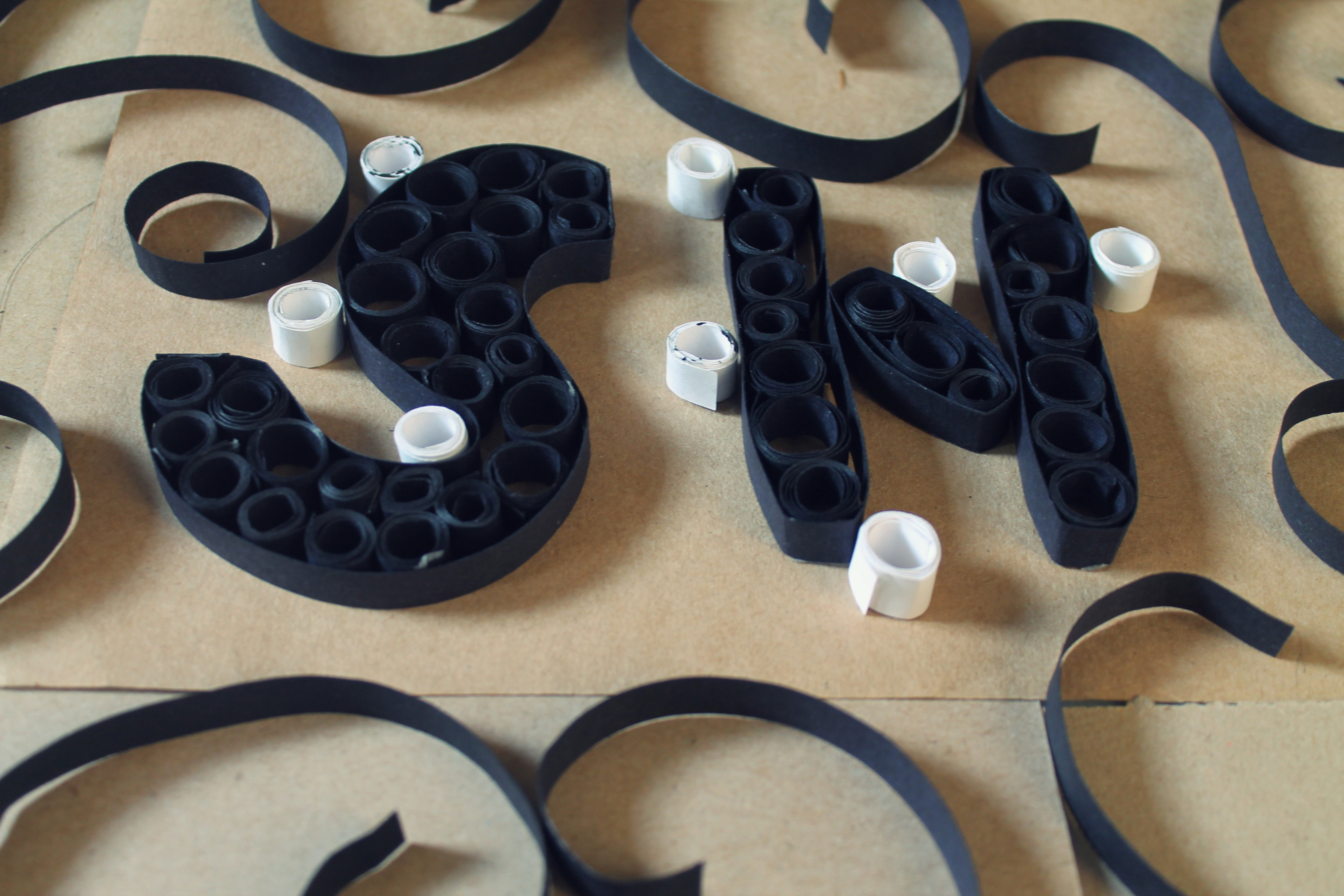
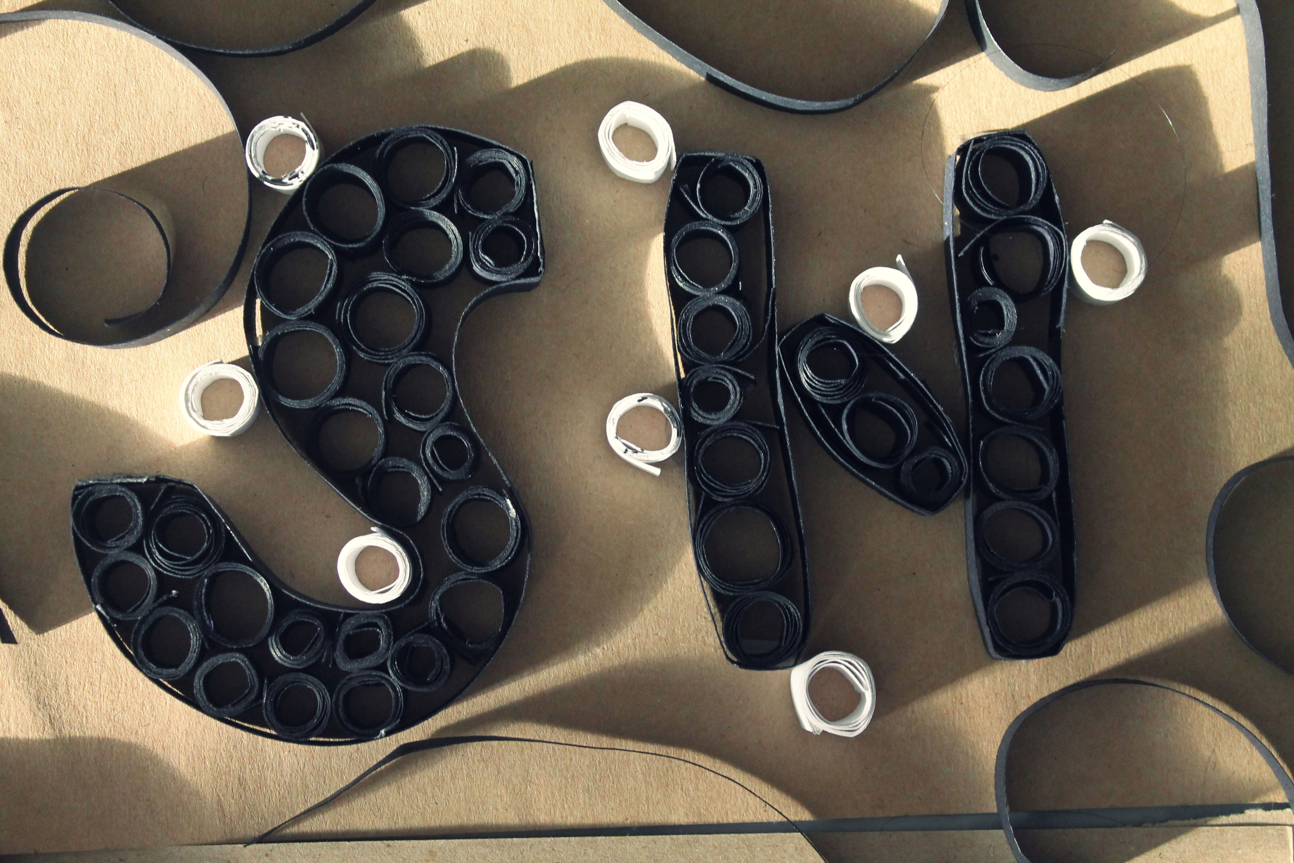
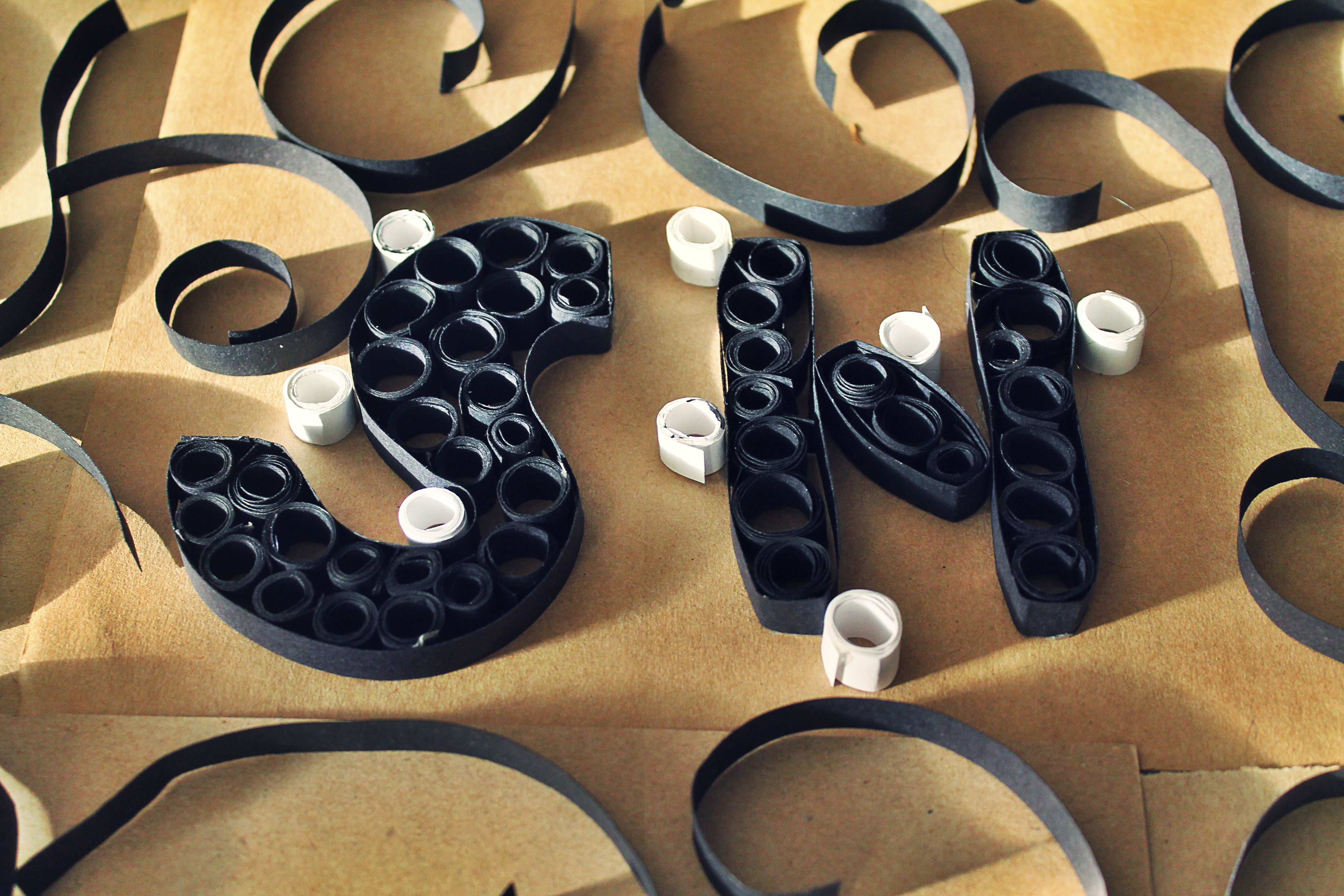
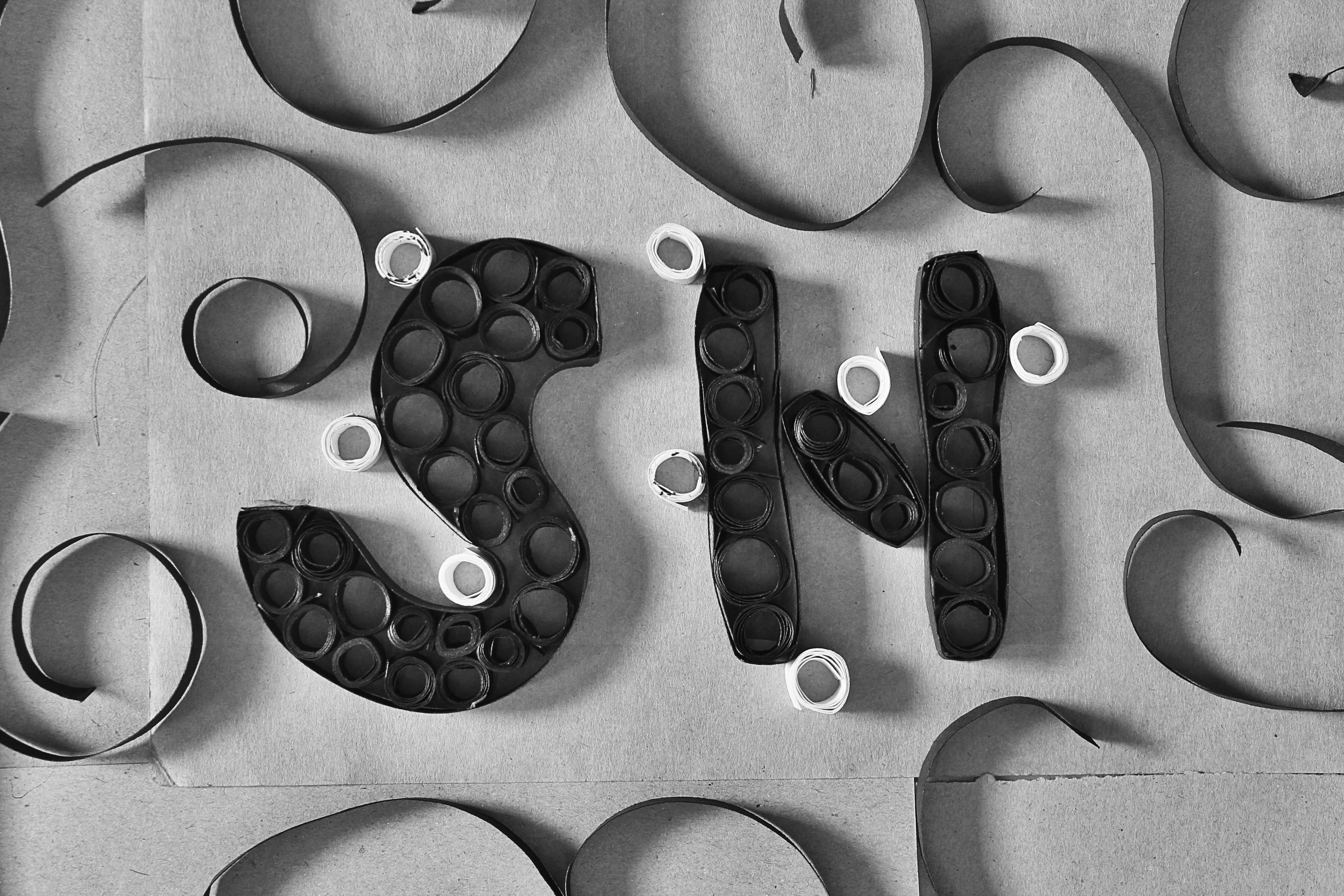
3. Fashion Designer / Textile Designer
After looking over where my progress was currently at for this work, I felt that something was still not right because of the spacing between each letter. I felt that they were too cluttered together which does not fit in with what i think of the job. I feel that in this industry, every piece of cloth they create is meaningful and each hold their own importances. They’re all unique pieces and they are each given adequate time limits for the audience to admire.
Therefore, i wanted to capture all those in my typography work and this is what i came up with:
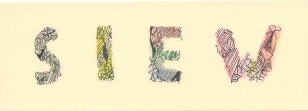
Off-white/ beige paper with spaced out letterings
I decided to do away with the various colours schemes to make it look more sophisticated and glamorous, just like how the fashion/textile designers tend to work towards. Instead I tried out with black pen and the shiny/slightly glittery colour pencils .
example of the typeface
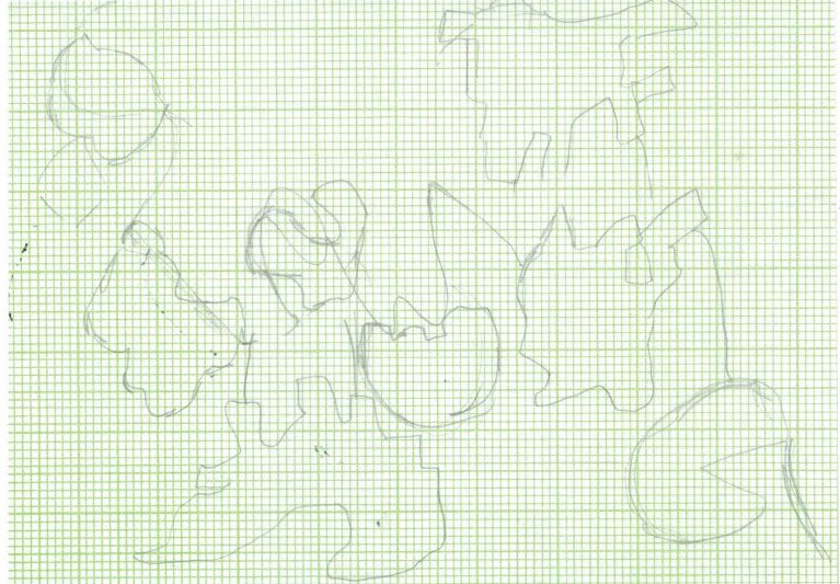
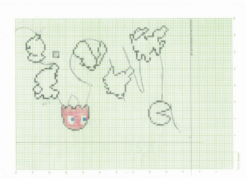
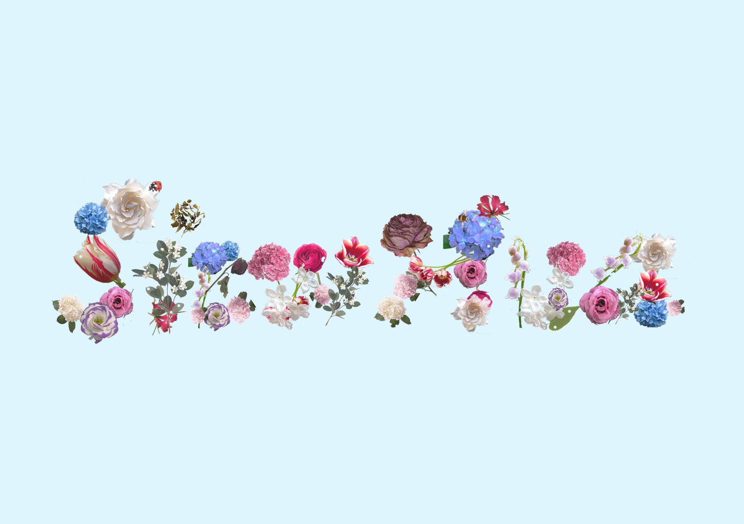
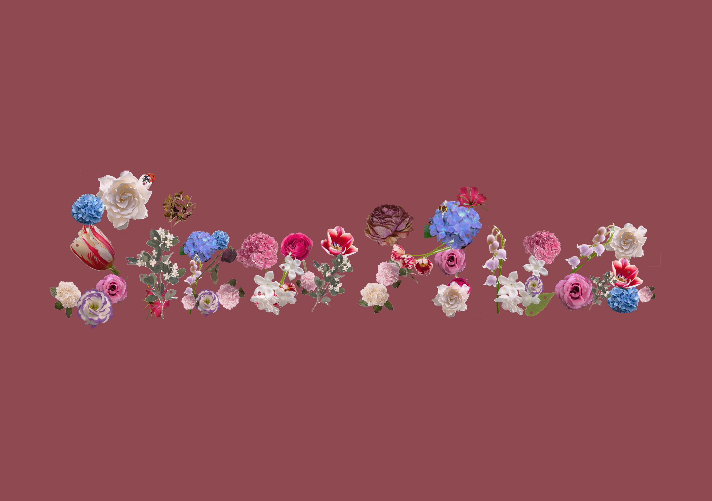
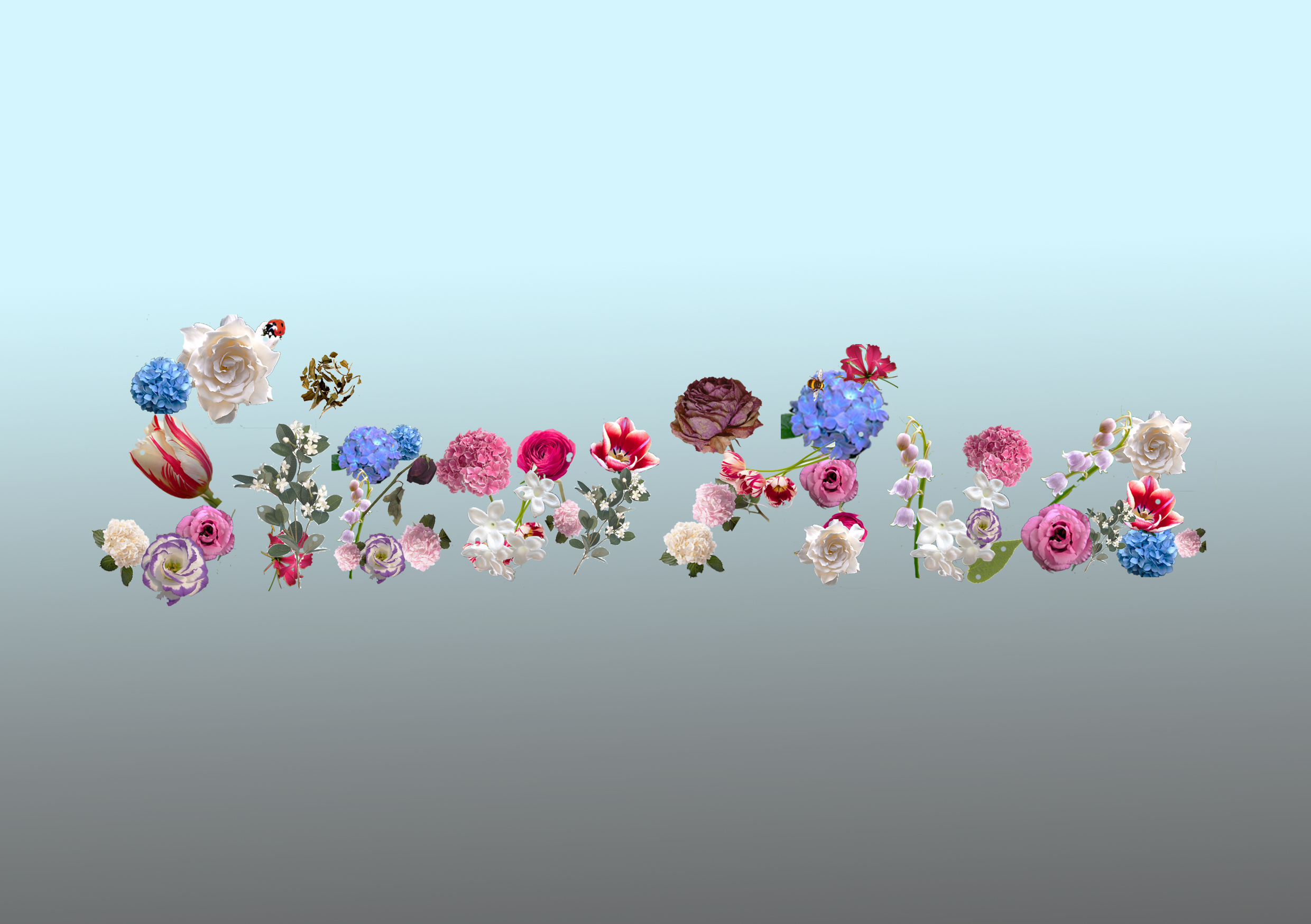
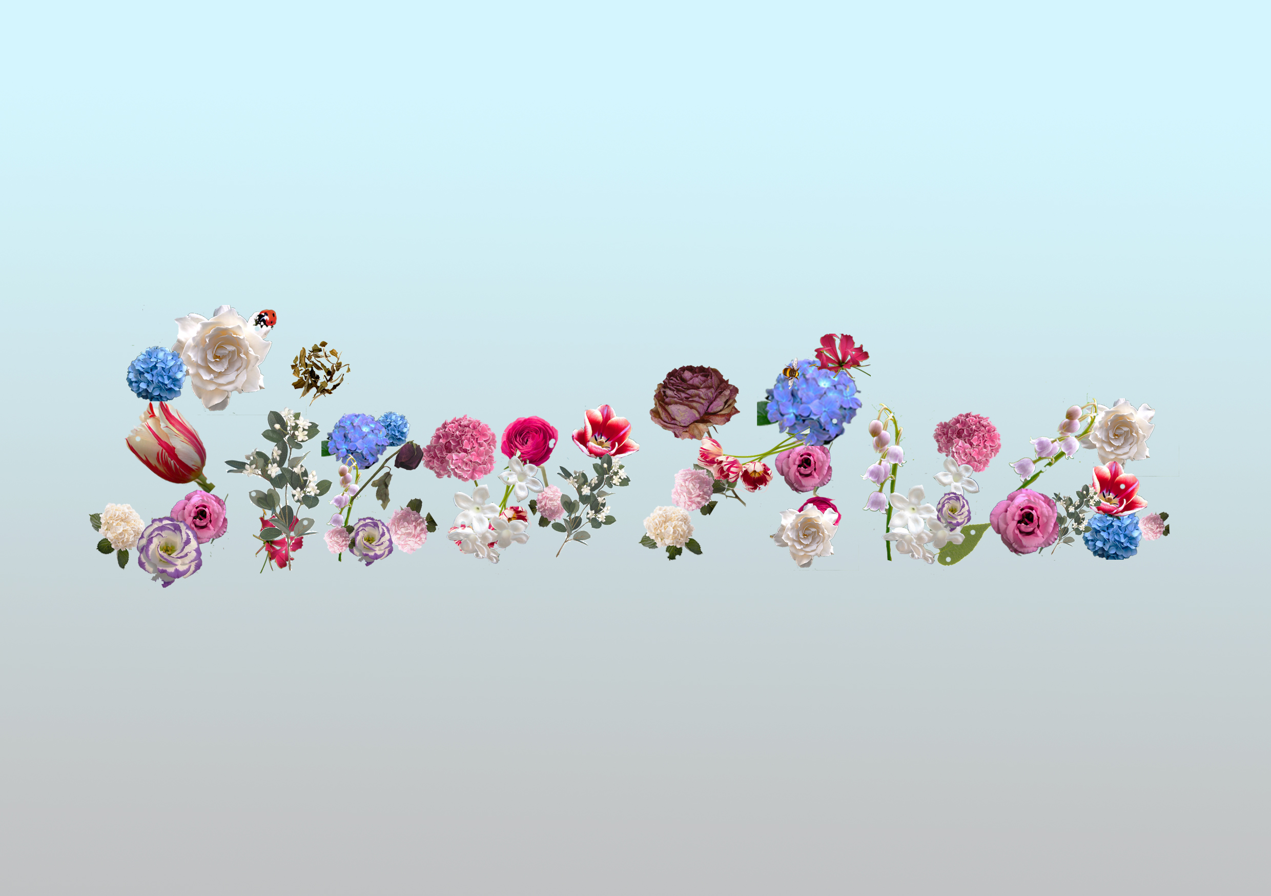
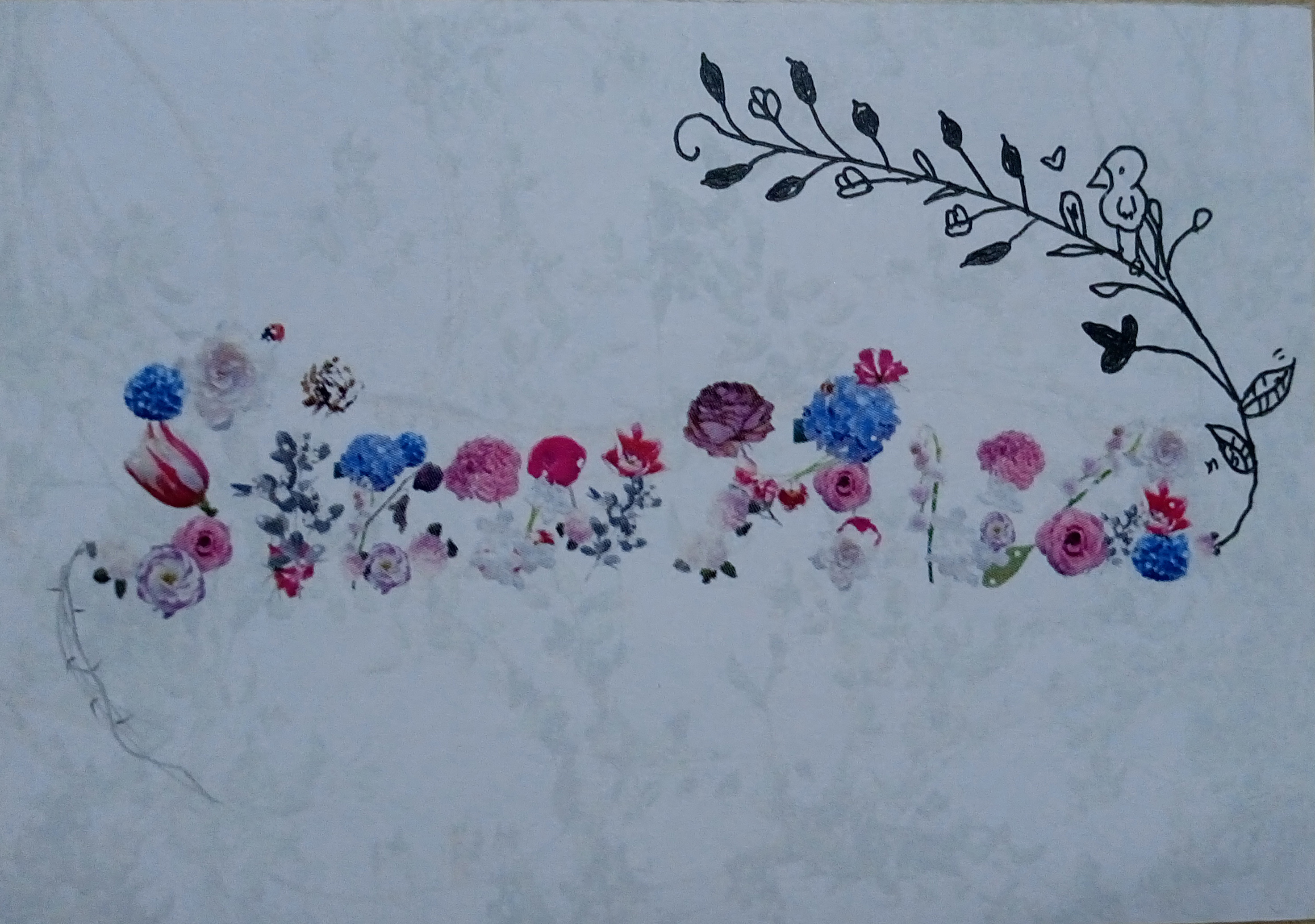
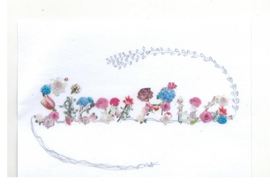
4. Gardener
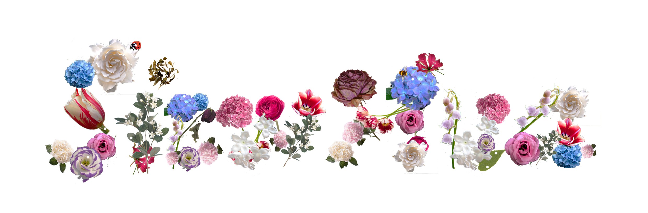
Development: defects
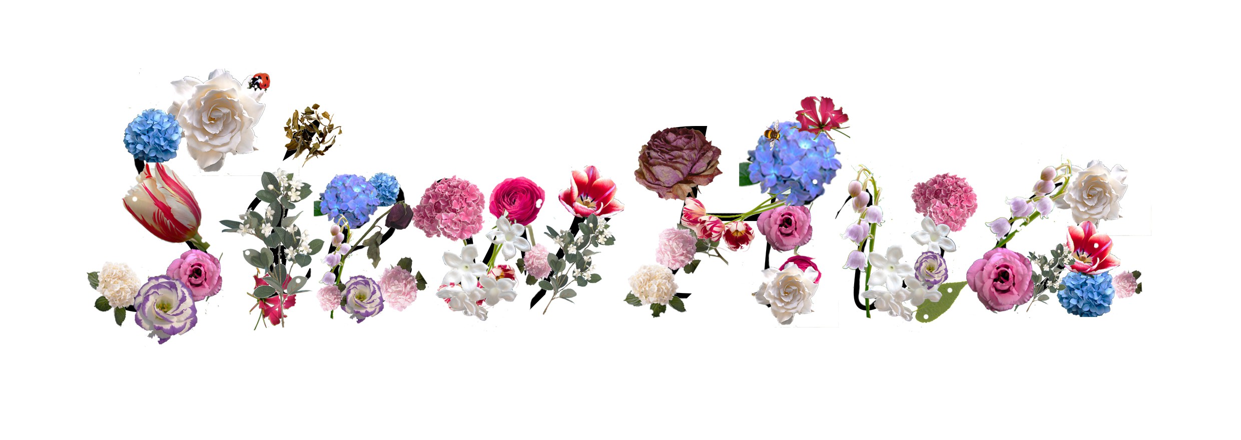
layout of how i tried piecing the flowers & insects together to make alphabets with black lines
For the backgrounds I planned to use individually or combination of maybe blues, greens, reds & greys, blacks and white. Why those colours?
- Blue: calmness, serenity
- Green: nature, envy,
- Red: blood, pain, passion
- Grey, black, white :hidden negatives/flaws, unknowns, overlooked
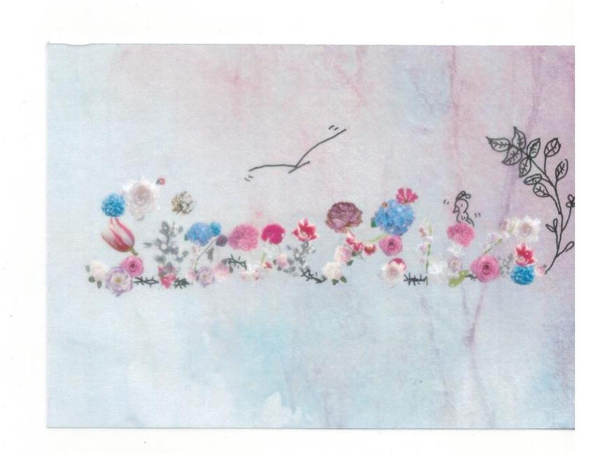
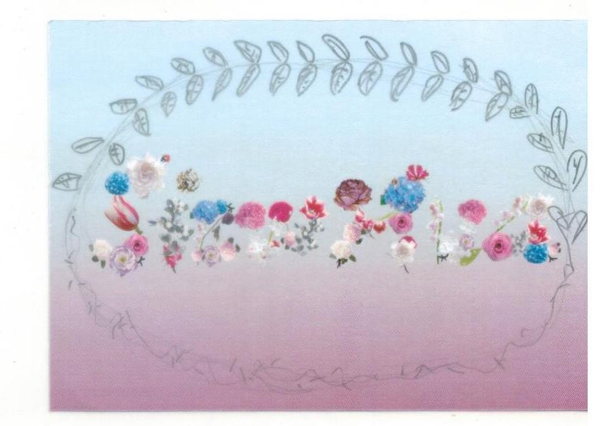
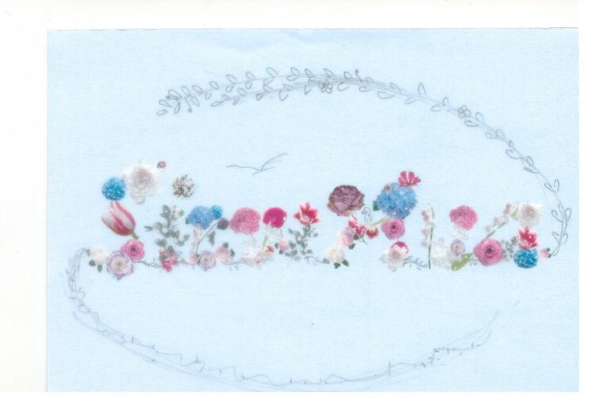
Here are some tryouts with background exploration:
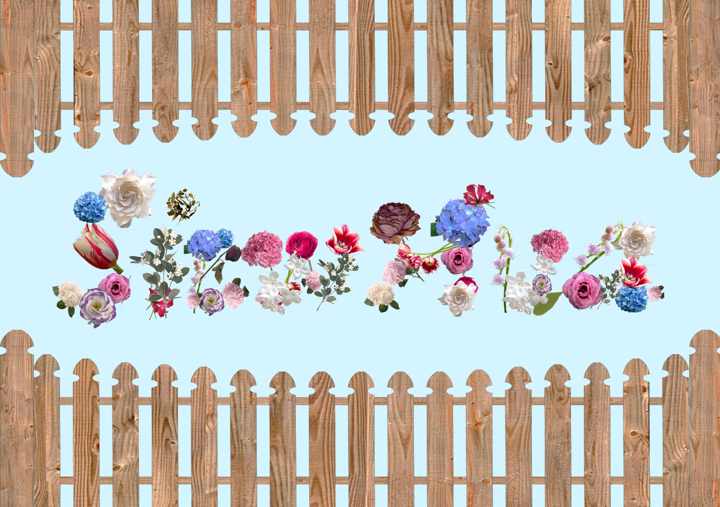
pastel blue x fences
Fences because gardens usually requires such high-maintenance that there is often a divide to prevent outsiders from ruining it.
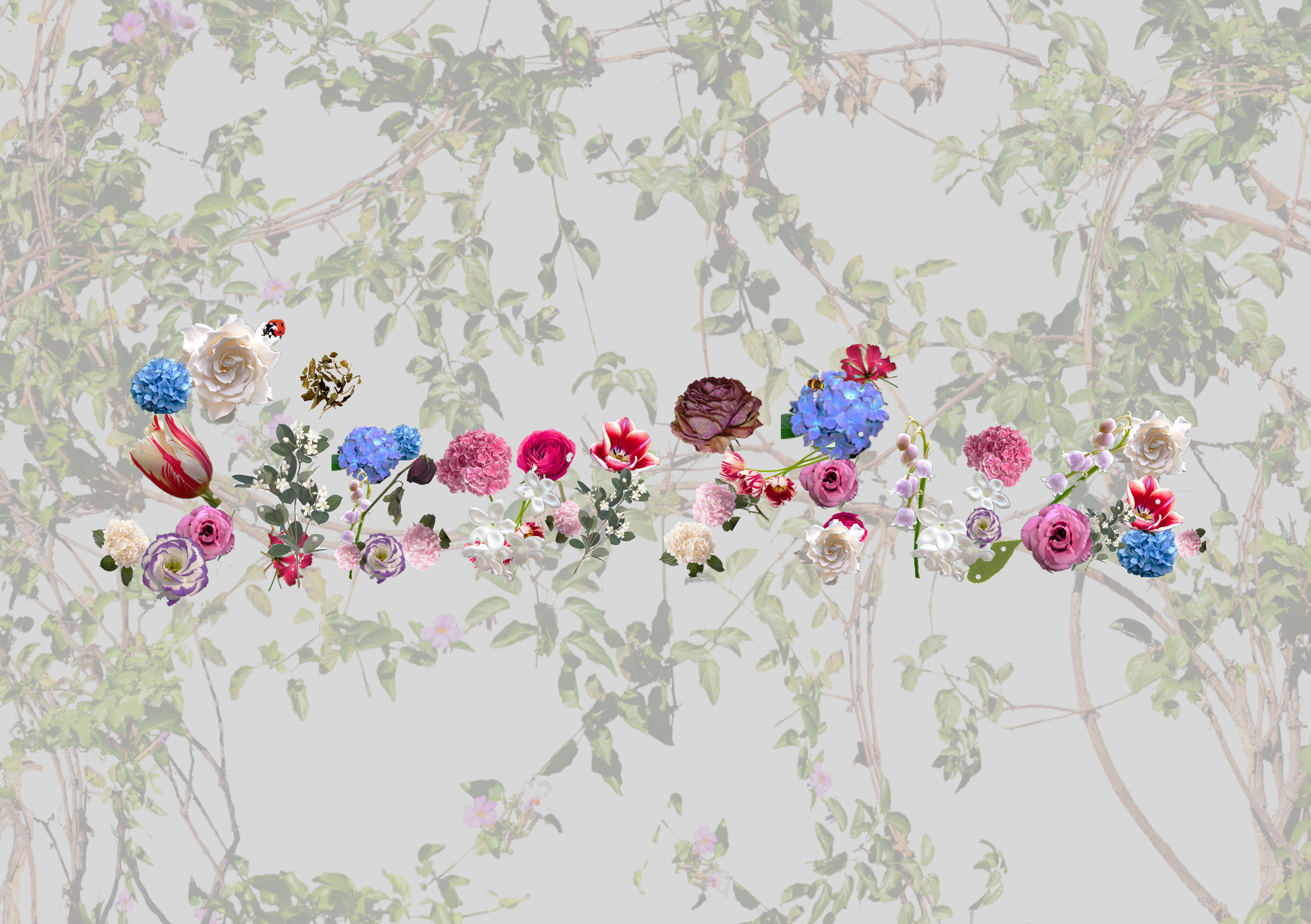
grey x vines
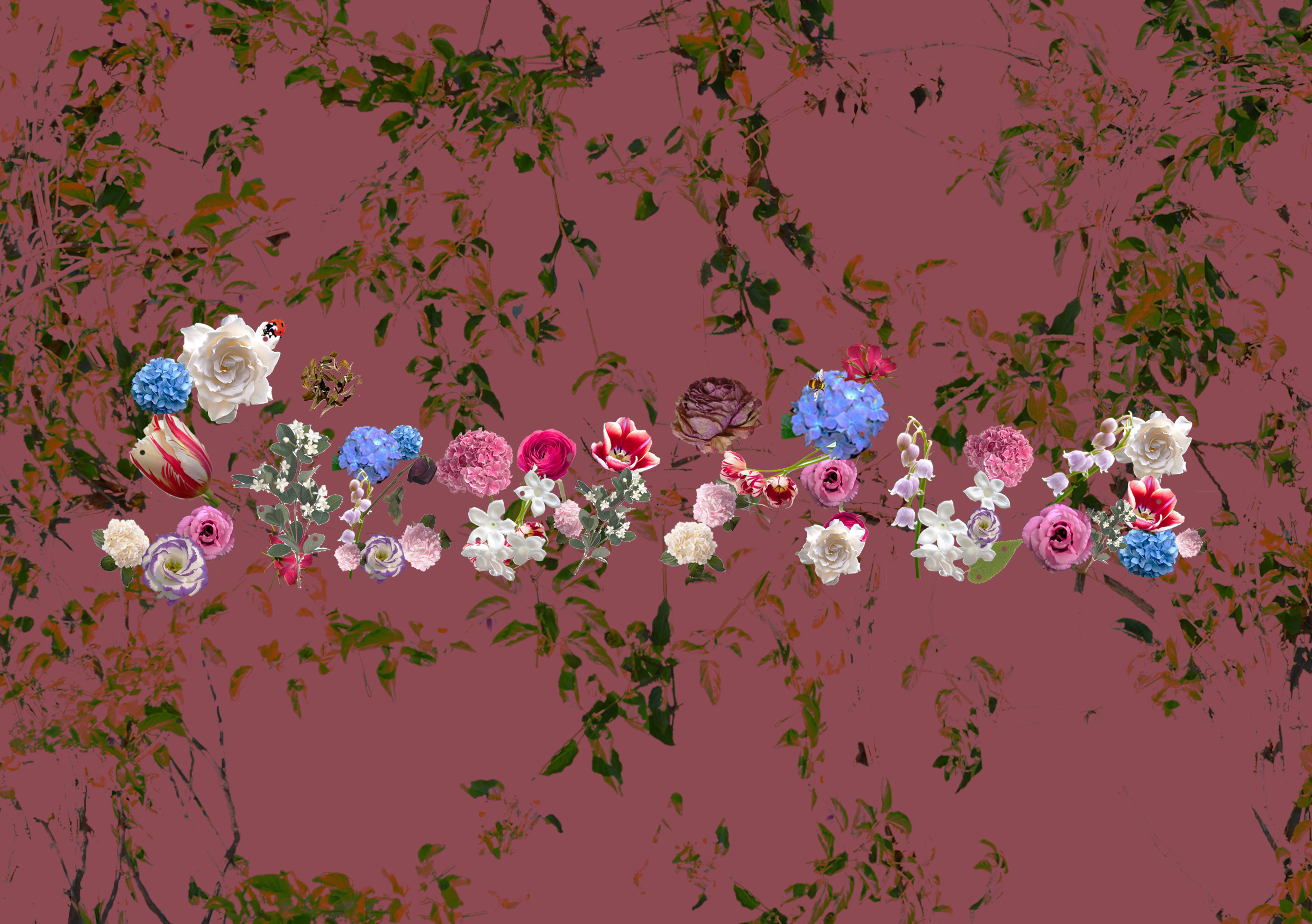
red x vines
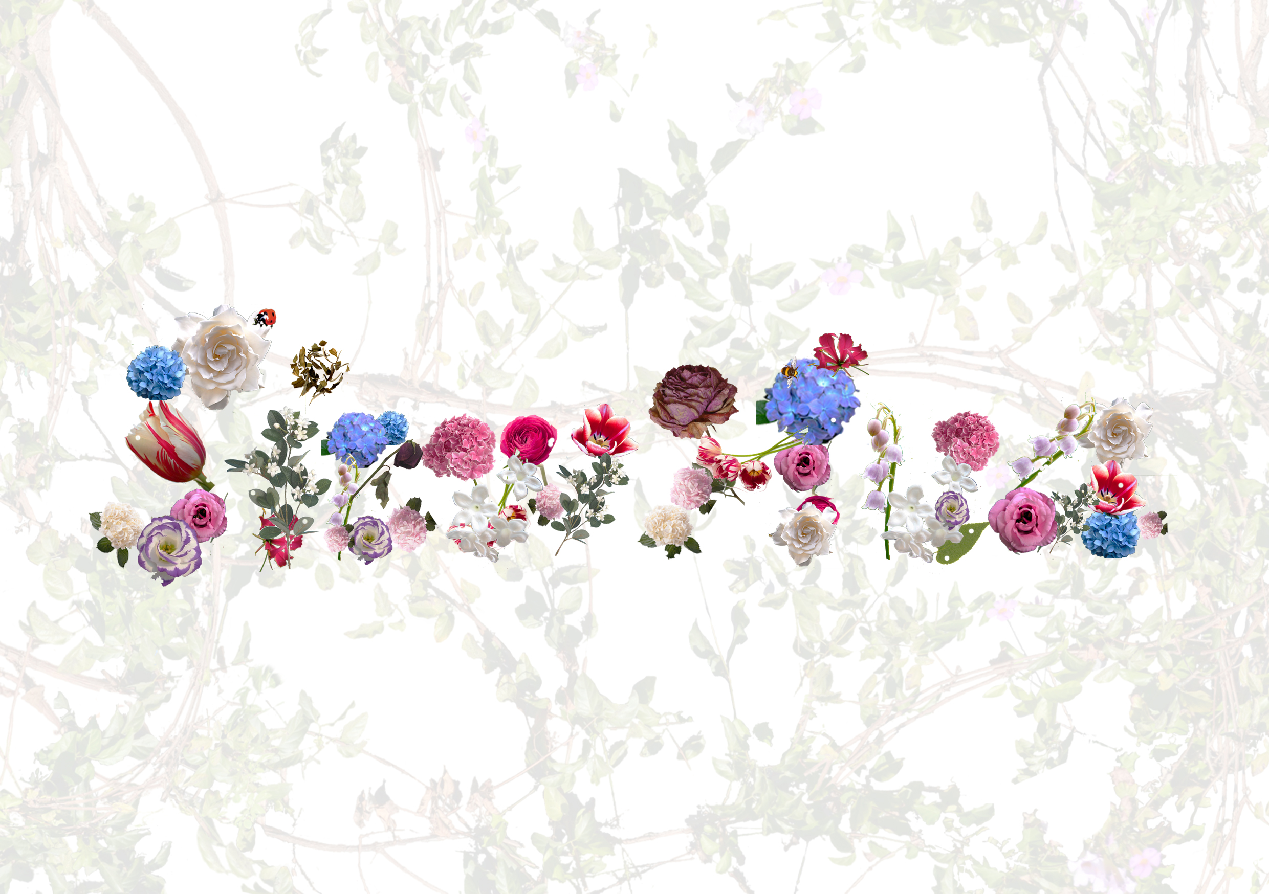
white x vines
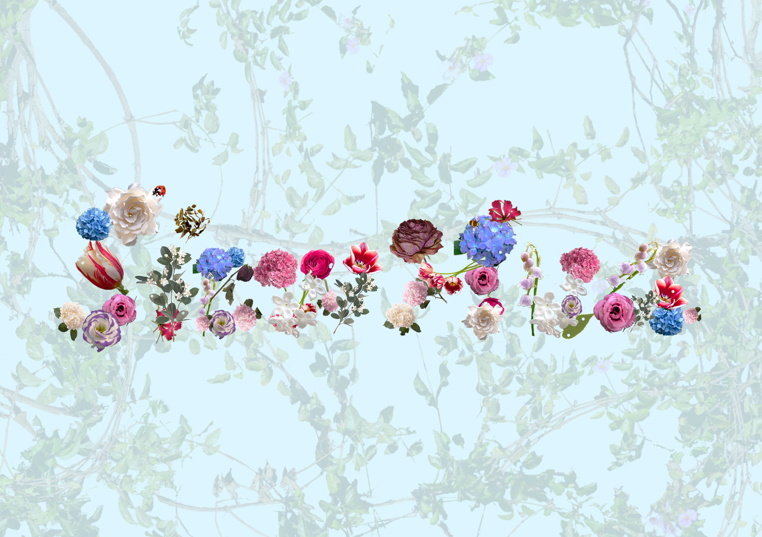
pastel blue x vines
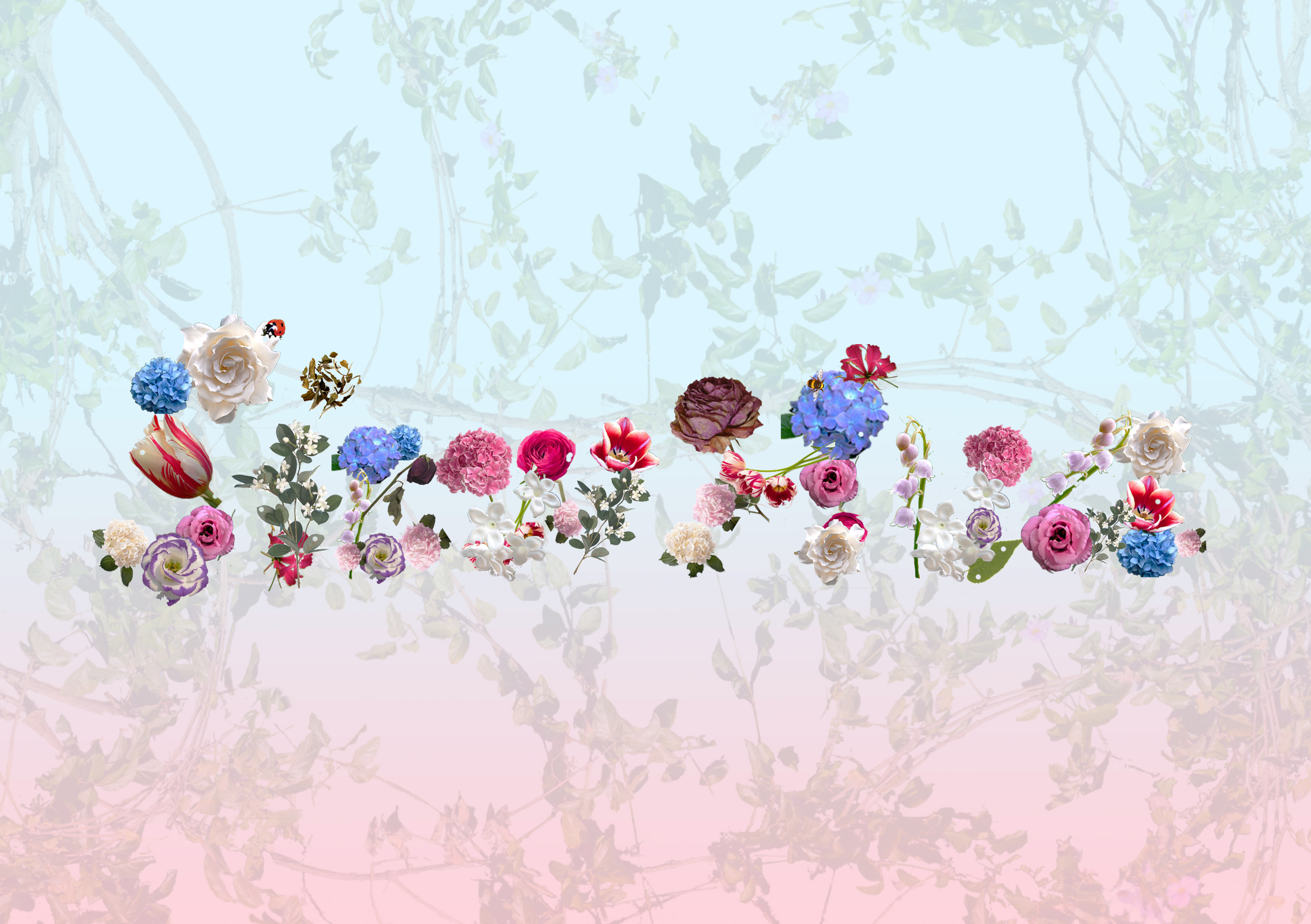
pastel blue-red gradient x vines
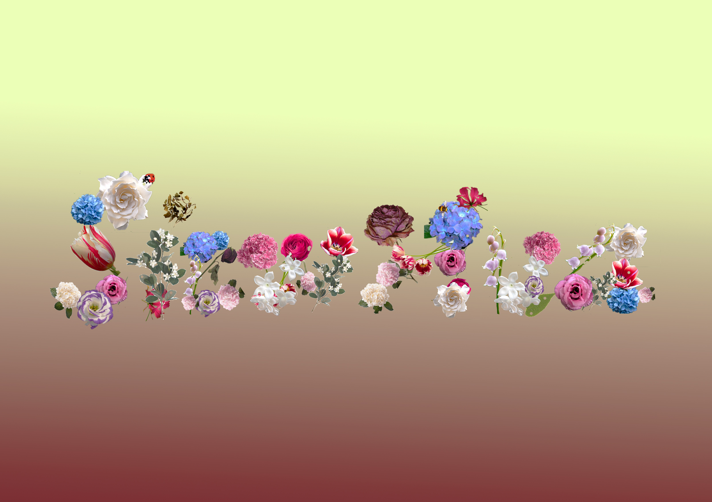
I decided to also tryout without the backgrounds i initially tried out with as it would also be hard for me to put in my illustration on it if i wanted to do mixed medium since it will be too cluttered. Therefore, i decided to leave it simple and plain but i explored on the various colours that are suitable for my idea.
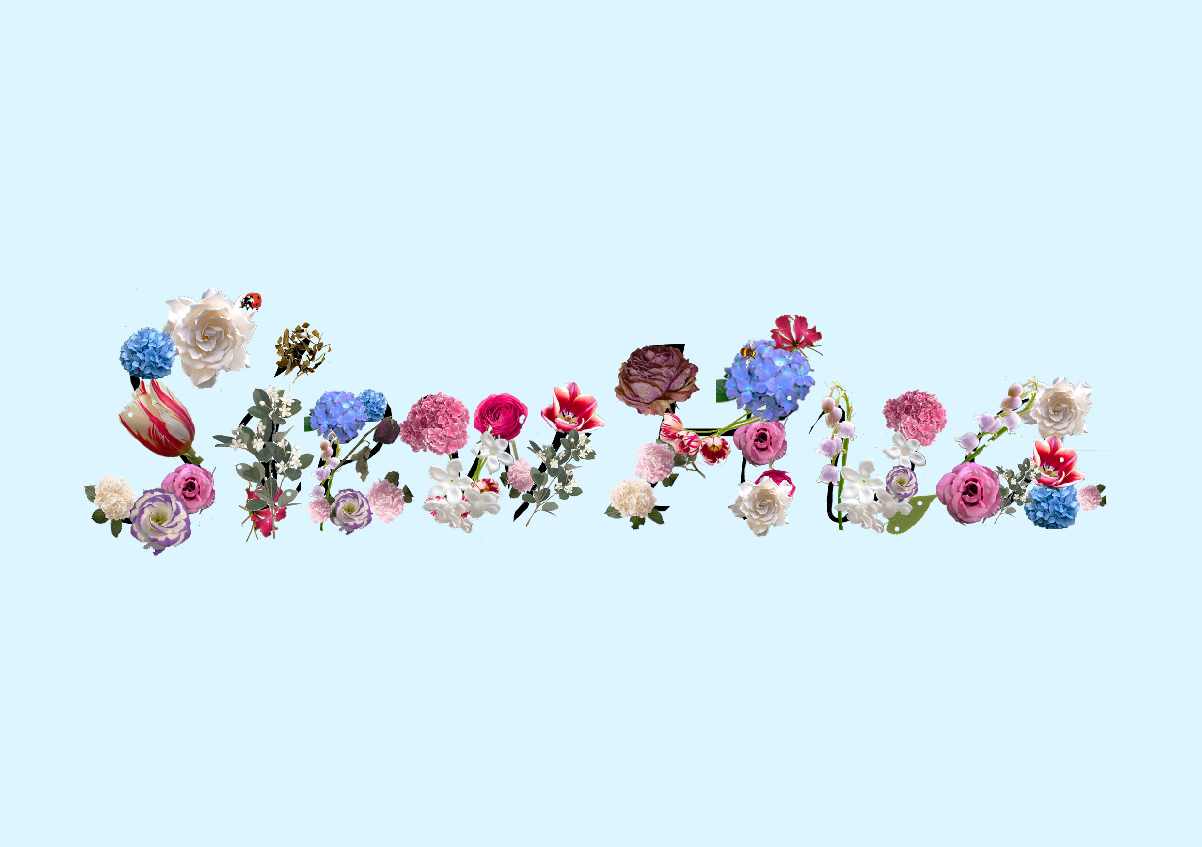
pastel blue x letterings with black lines
pastel blue
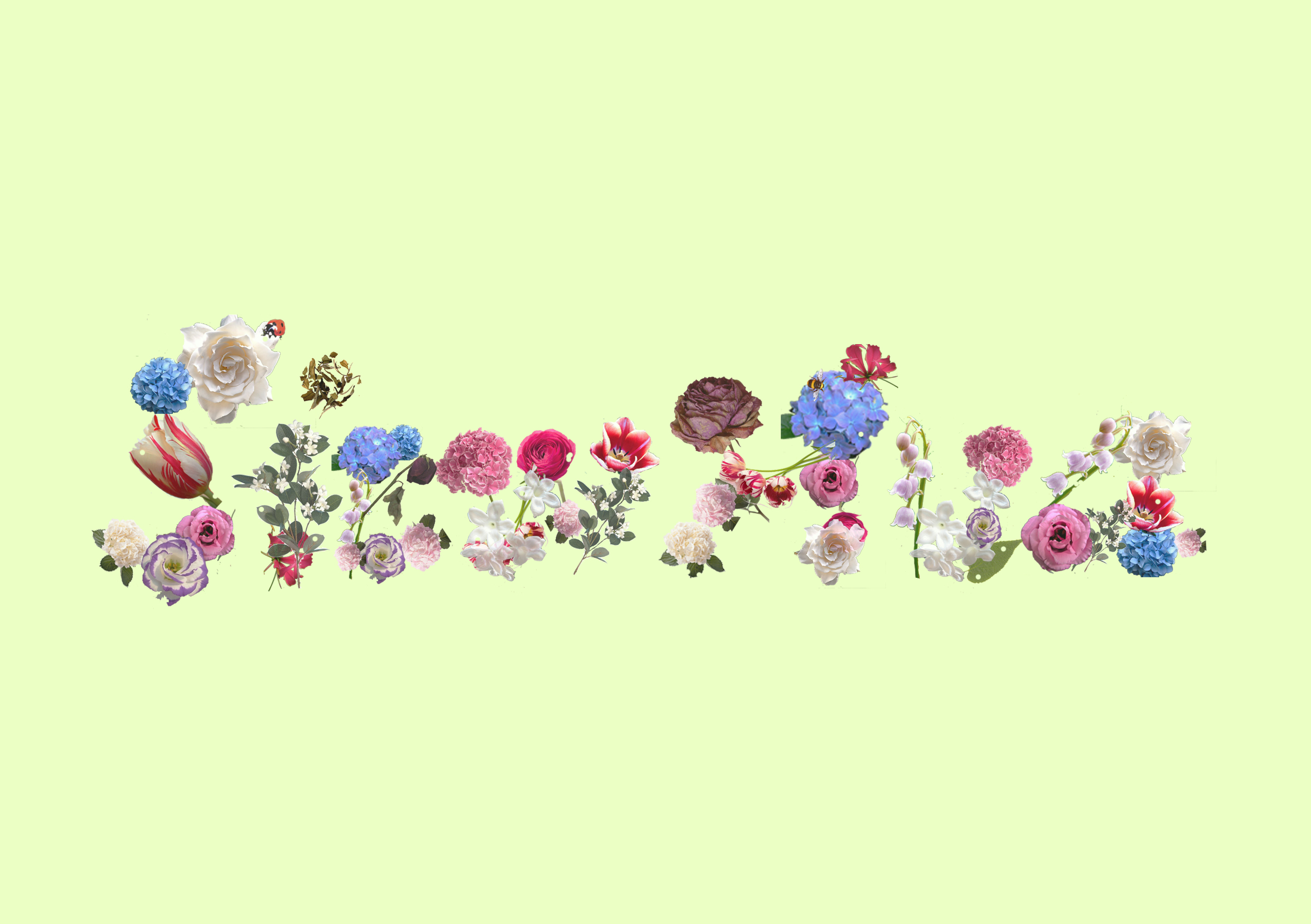
pastel green
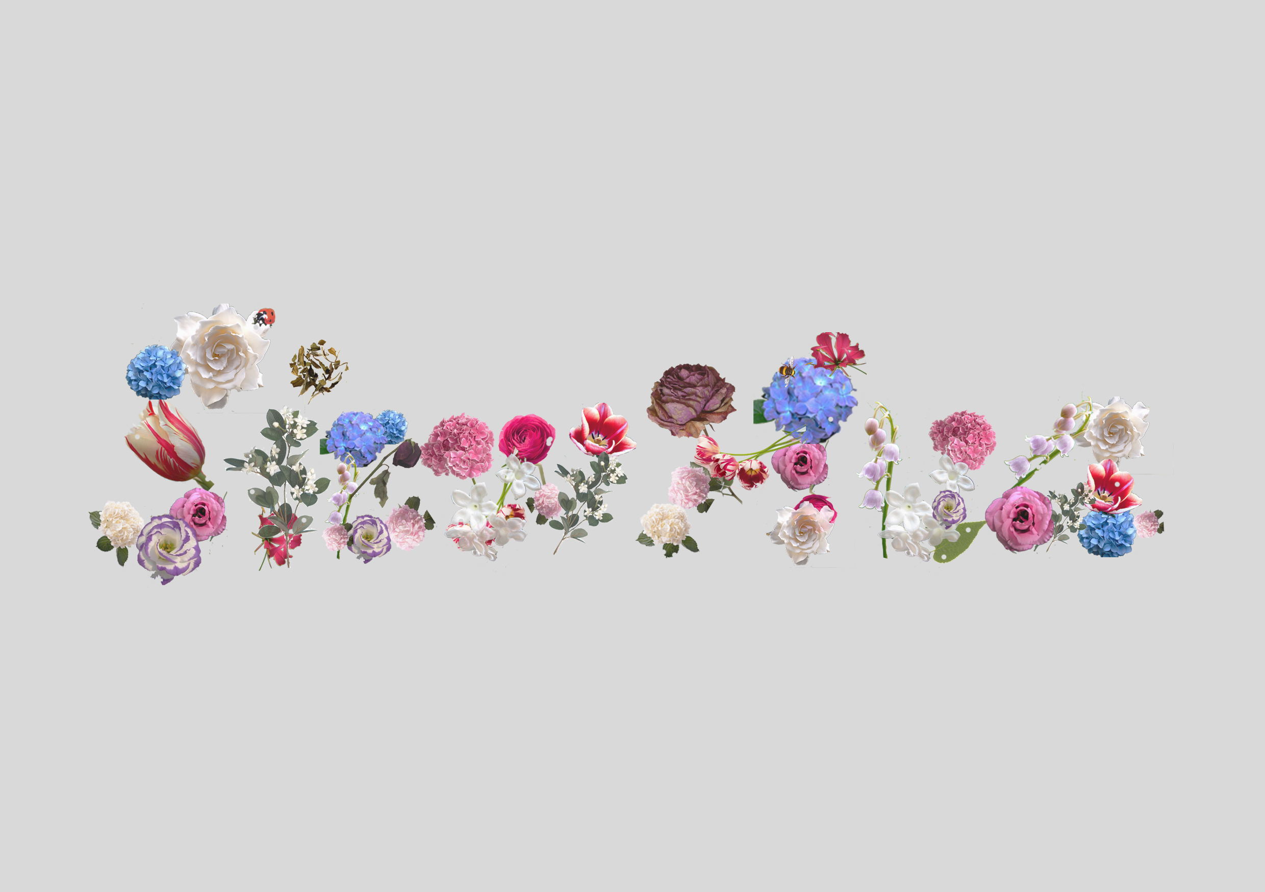
light grey
red
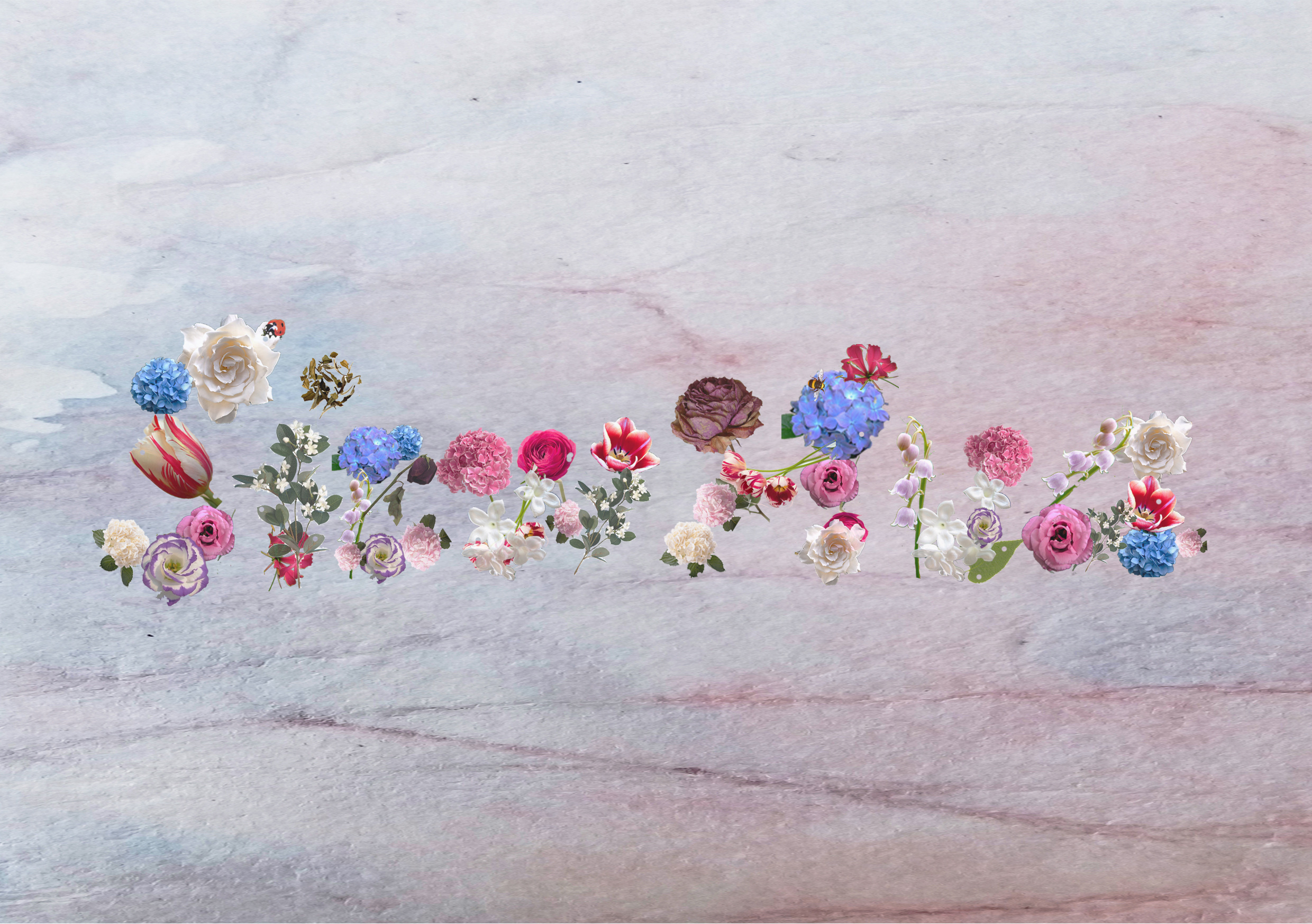
with my watercolour background paper (horizontal)
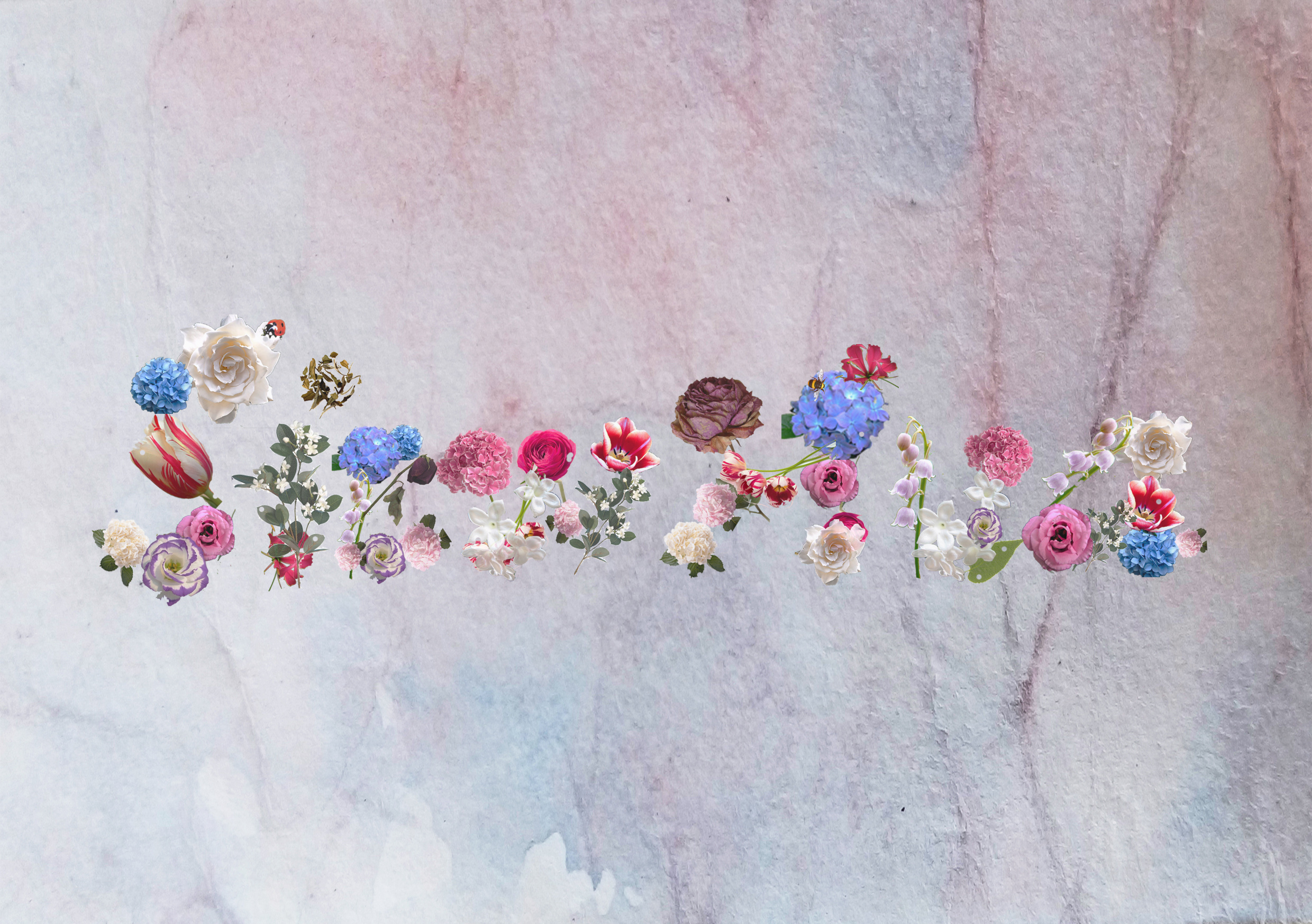
with my watercolour background paper (vertical)
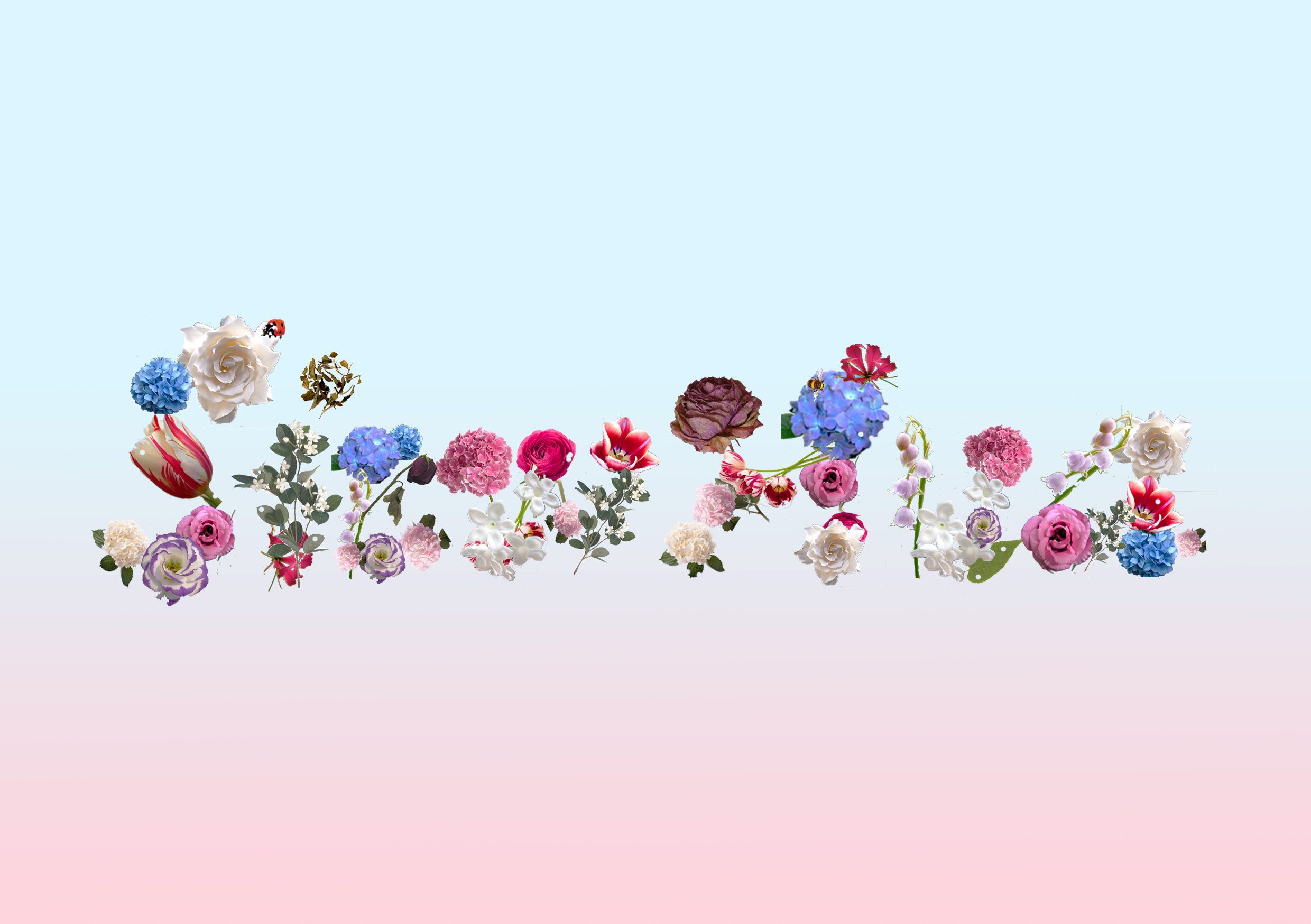
blue-pastel pink gradient
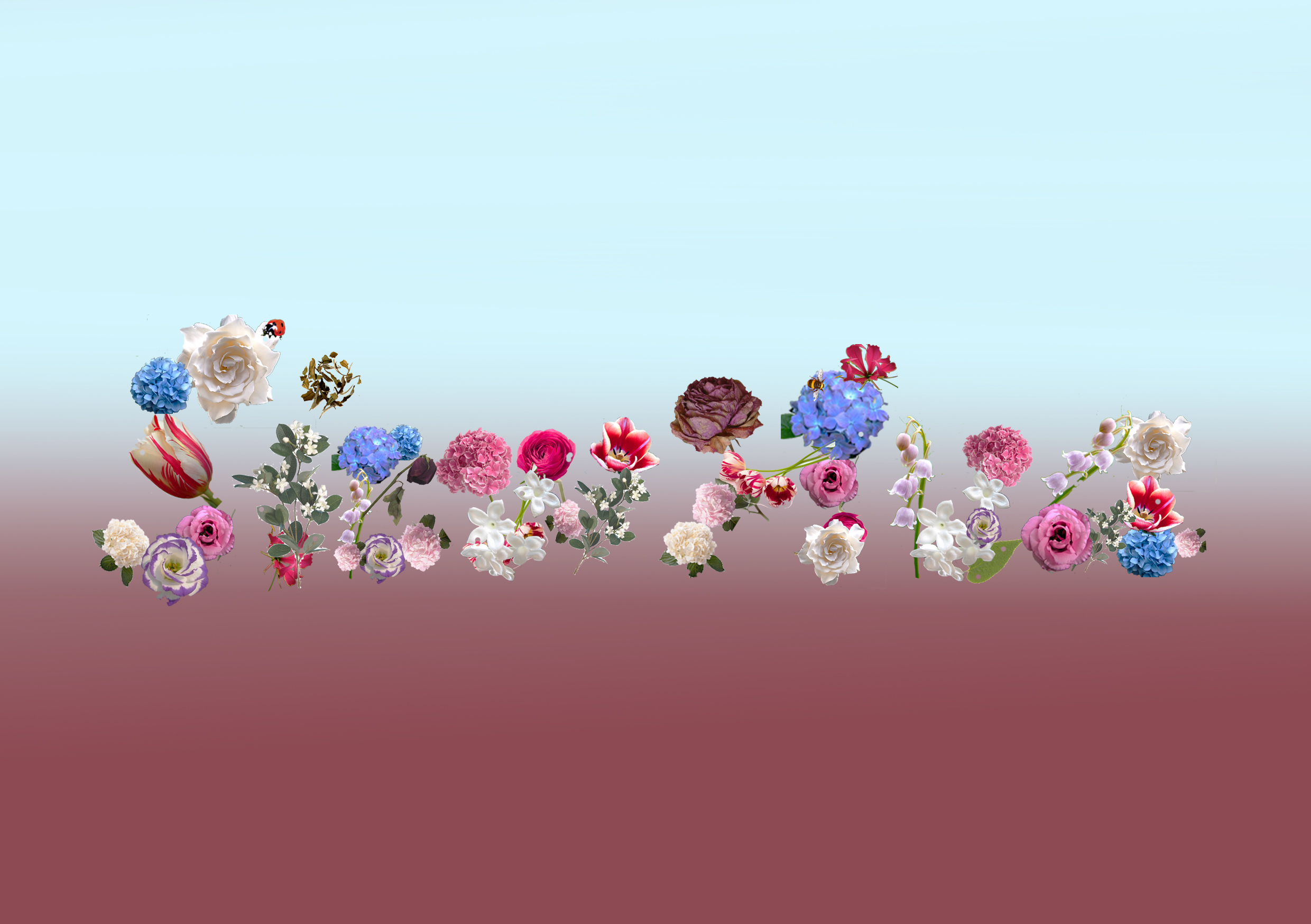
blue-red gradient
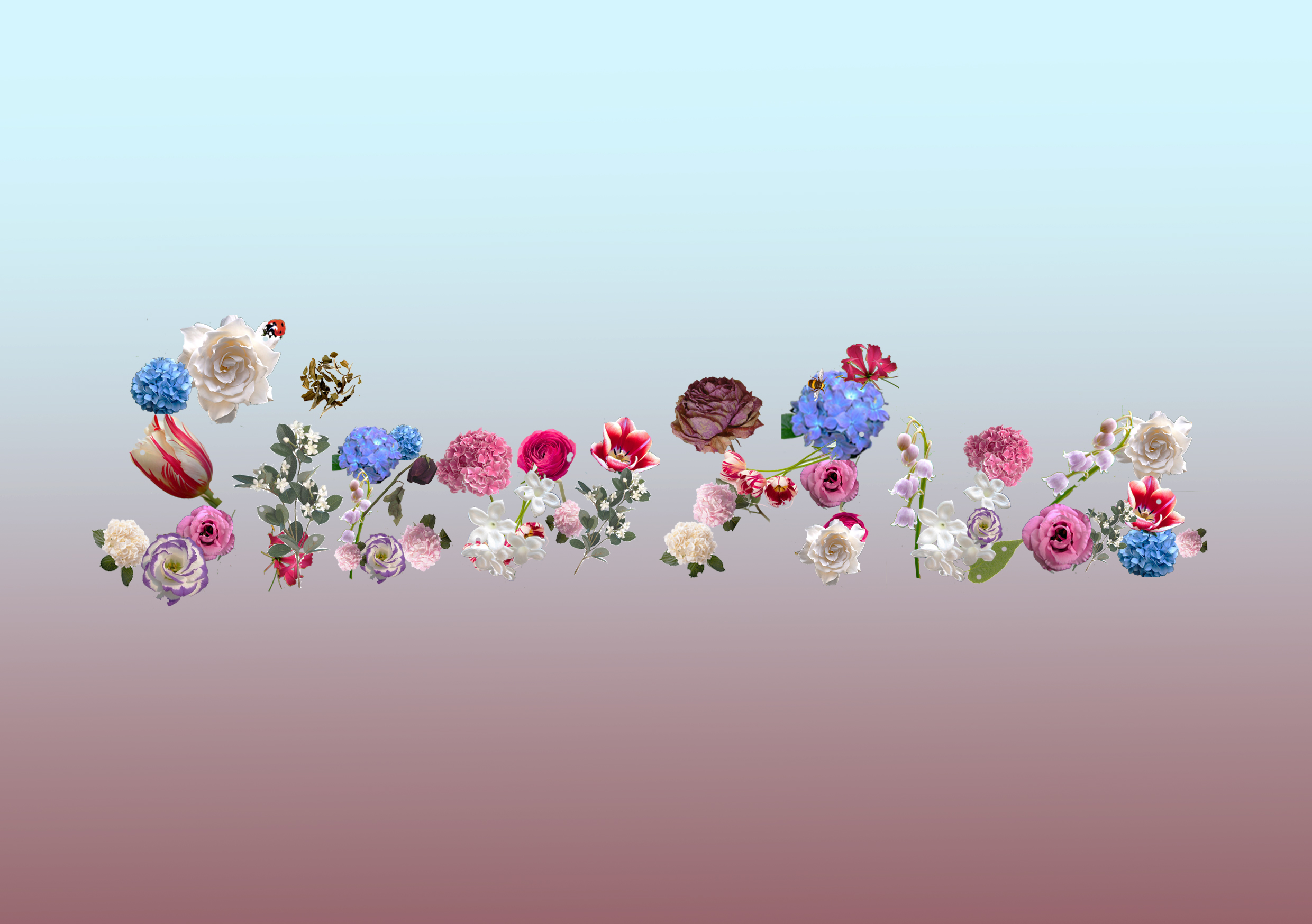
blue-red gradient
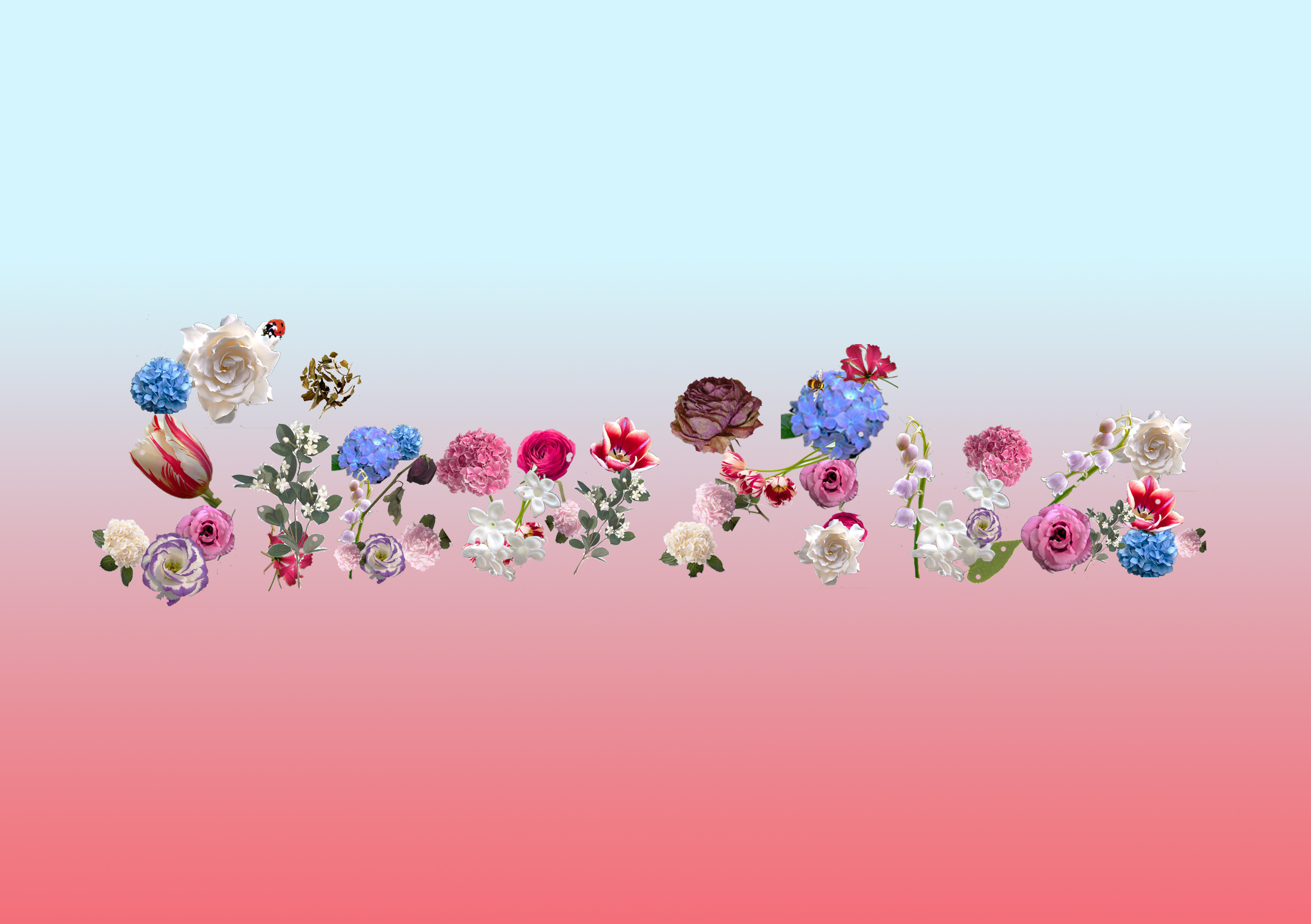
blue-red gradient
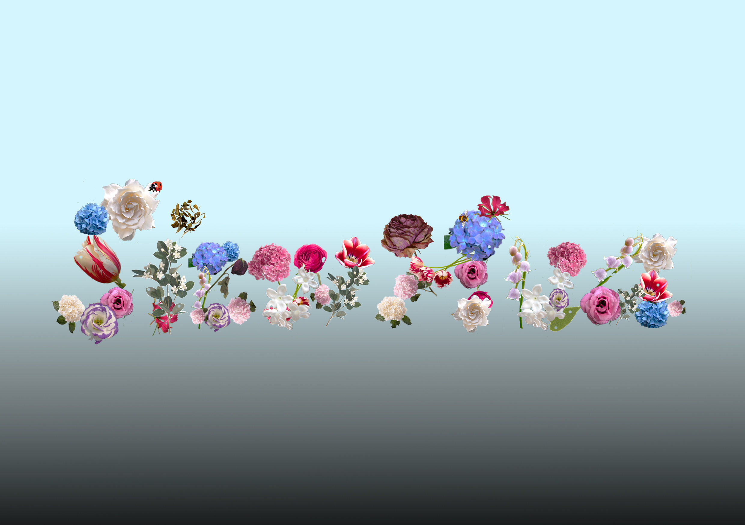
blue-black gradient
blue-dark grey gradient
blue-light grey gradient
green-red gradient
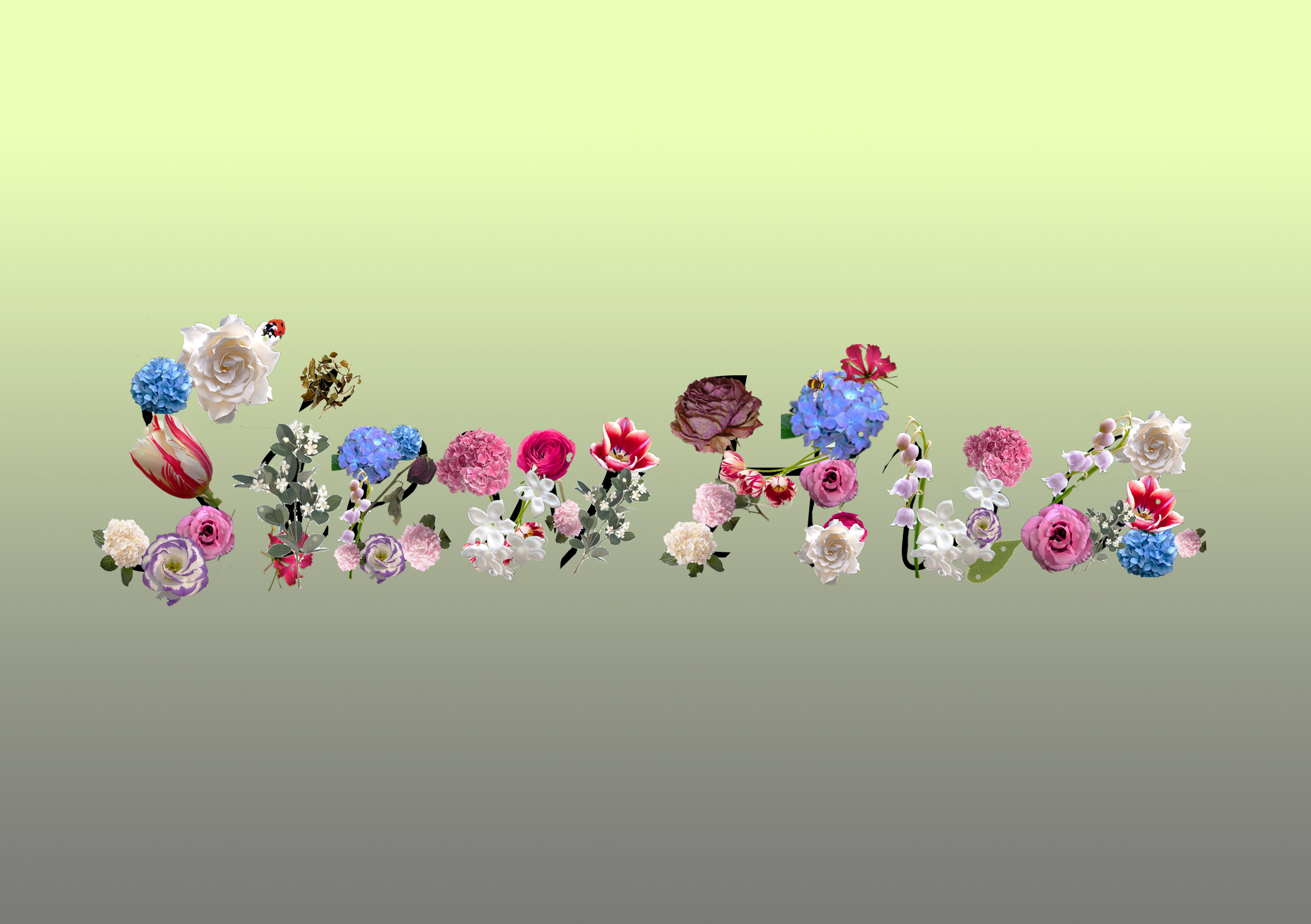
green-grey gradient x letterings with black lines
Exploration of Mixed Medium:

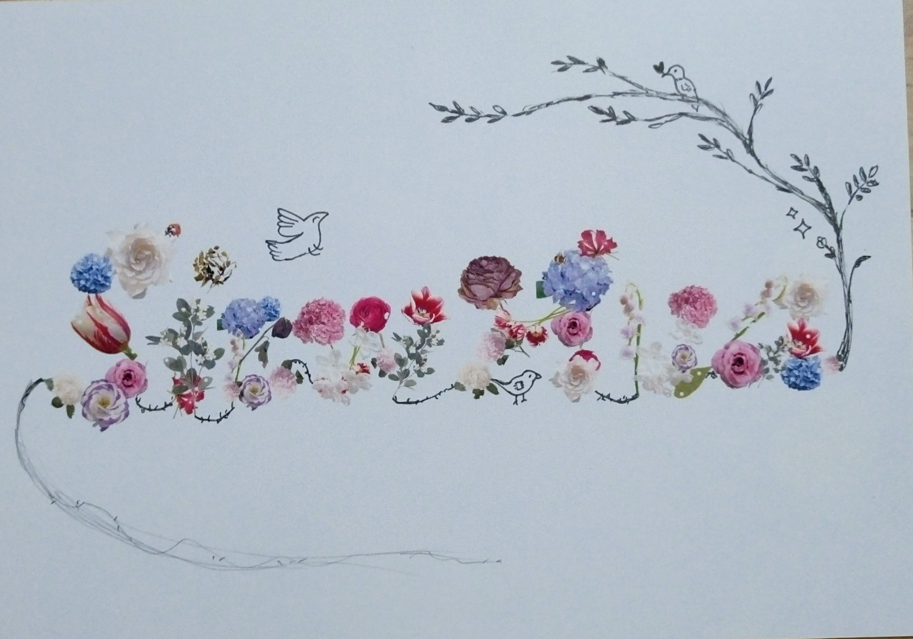
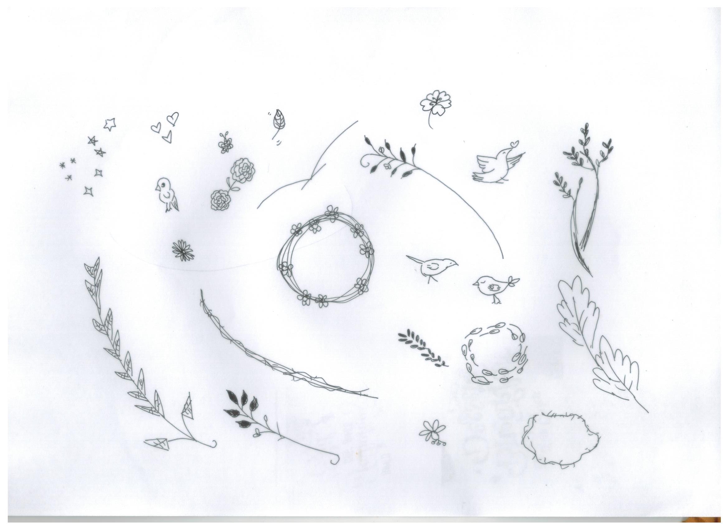
some illustrations tryouts