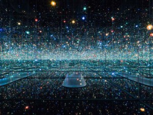
Exhibit Layout and How Moss And Grow Lights Fit in (FYP18)

Overview
Updates for the week would be focused mostly on material testing and more technical aspects of planning.


Exhibit Layout
The grad show layout has been finalised! I would be painting the space entirely with the colour Pantone 5395 C (or similar, depending on the colours the contractors provide), with the exception of projection surfaces. I picked this slightly dark navy colour that I thought would be able to complement the purple which the grow light would give off.

I have also “choped” 3 pedestals of different sizing each, one at H (1m for all) x W x L 40 x 40cm (to place previous prototype), another 40 x 80 (for final prototype), and lastly, one with 40 x 100 (to place supporting posters and documentations if any).

More details could be found here: FYP Diagram(BW).


Grow Lights, and What to Do with Them
I have finally received my grow lights, way faster than I had expected! However, despite me buying the smaller bulbs, there were many unexpected outcomes which would mar the final aesthetics of the project.

Catalogue of grow lights which I bought (I bought 2)

Some aspects which I did not realise include:

1. Light splashes around the entire machine, and even outside of the moss planters

Surely, this can be mitigated against, through either implementing a lampshade like hood on the bulb itself, or raising the sides of the moss planters (not ideal, as aesthetically it would look bad and incur more difficulties in raising the entire moss bed), but this would simply mean more effort expended into correcting these issues, and risk disrupting the already working machinery/aesthetics

2. Grow light makes… the moss look bad

Ever since the presentation, I had re-transferred the moss back to the plastic trays as it makes it easier to grow the moss (in terms of watering, or letting it sun out). Since then, the moss has not advanced much in terms of growth, but there has been an increase in sprouting amongst the moss.

As evident above, the purple from the grow light has overpowered the initial green of the moss. With green, the symbol of freshness, youth and growth eradicated, an eerie feeling takes over the model. I am on the fence about this new enforced aesthetics – on one hand, it strongly pushes forth the idea of the creepy science laboratory theme, and also adds some colour to the otherwise dark space exhibit, but with the green and symbols of freshness lost, I feel that I would need to adjust the exhibit aesthetics slightly.

3. Rotating Grow Lights?
Initially, I wanted each grow light to also be in continuous rotating motion, and each grow light was to follow each tray in rotation. However, knowing now that the light splashes around out of the tray planter, the intended effect of seeing each grow light rotate around (as though each was the sun rotating around a planet) would not be as strong as I thought.

I could try to add on the lampshade to minimise the lighting, but I am wary of its construction. For instance, I have not tested the lighting for long hours, and am not sure of the volume of heat it would release (which might potentially, set fire to my lampshade or kill my moss).

Another consideration would be that for the grow light to rotate, their connecting wires would also have to rotate. This is troublesome for the machinery layout planning, Currently, the grow light comes together with a clip and bendable stem, which would be extremely helpful in positioning it onto the model. As such, I am considering eliminating the rotation of the grow light, despite it being a much more powerful element.

What I have in mind to continue working on

To deal with these, I plan to:
1. Make a lampshade
2. Make my moss machine LARGER (for it to ‘capture’ more of the light spillage)
3. amend the construction of the moss model, as a larger model would require better supportive frame


Farming the Moss
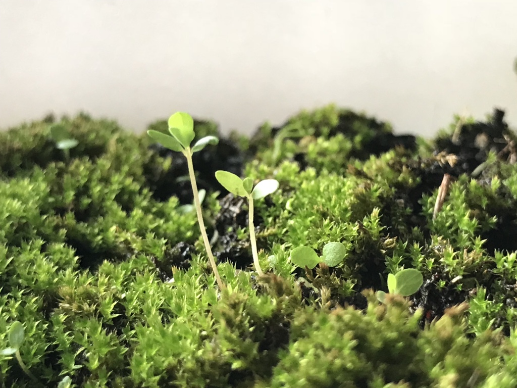
Close up of Moss bed

Moss growth has been good! Clearly, a few patches have died out but I attribute that to fungal infection (which luckily did not spread much to the surrounding mosses).

Left: Dead moss patch, but lively sproutlings

In fact, I noticed that the seedlings amongst the moss has had MORE responsive growth than the moss itself (even growing in the direction of the sunlight), and for a start/for statistics for my posters, I have started calculating the number of seedlings sprouted.

Data for my corresponding posters would be recorded and taken from the moss itself. Some examples of data which would be recording include the specific number and type of seedlings which sprouted in my moss bed. A sample is shown below:

Sample: Data Information Recorded for Posters
Close up: spot the 2 different species of seedlings sprouting

In this instance (referencing the previous 2 pictures), the data I tried to record was the number of single bladed (somewhat like a grass blade) sproutlings and normal 2 or 4 leaved seedlings. I would be continuing to collect similar data, and start working on my corresponding posters as soon as possible. Also, I would try as much as I can to include real data into my posters as I want them to lend some semblance of reality into my entire project, even though the theme was somewhat parodic.


Video Installation and How It Looks Like
Initially, I wanted my video portion of the installation to be more of a split screen format. However, through consultation with prof Randall, I realised that doing it in real time would not be possible with my envisioned 9 screens – which probably meant affixing 9 different working cameras onto the machine itself – due to technical limitations (computer data might mix up the video signals if too many cameras were to be attached to it).

Above would be my initial idea for the projection. However, with this unforeseen circumstance, I might alter it to simply 2 camera input signals, and simply play around with the available effects.


What’s real, and what’s not?

Through my consultation with prof Randall, I realised that I have not truly addressed this particular point within my project. For now, I am aiming at making it as real as possible, but at the same time, I want it to be slightlllyyyyy ridiculous in the sense that scientifically examining the theme of continuity is all but a fruitless attempt as the answer was simply absent in the first place (which ties back to the name of my project, of it being a continual study on the theme of continuity). Also, the “study” of the theme would be borderline parodic, of through the concrete examination of the topic, I attempt to make it “real”?

It seems as of now that this point is still slightly wonky, and I will continue polishing it, but as of now, this is what I have in mind.


Conclusion and Moving On!
After a week’s of deliberation of the final machine’s sizing, I have decided to just work on a similar model of the same size and will start rebuilding the model over the next week. At the same time, I will be starting on creating a series of posters and other exhibit decorative materials.

Meanwhile, for the projection, I would aim to affix the final projection scheme by the end of the next week, and hopefully, create a portion of it.

FYP Proposal: WOA (working title)

Refining the details and more thoughts

Project Outline
The project will focus on fostering an experience within a space, instead of the interaction at this point of time. Ultimately, I would still want to include some degree of interaction but will focus on creating the experience first.

With regards to the artistic direction, it will remain minimalist, stripped down to the ‘element’. The project’s light projection will now project planes of light parallel to a human body.

Conceptualised version of light projection (rough sketch)

Above: a small snippet of the visualised light projection; the light rays will form walls which are solid, yet the walls ‘curve’ around the viewers like a maze. Repetition of the light waves will be conducted throughout the entire space, to create a visual depth.

The light projections will now include coloured lights, to further push across a visual depth. (Under consideration: allow viewers to toggle with colour filters and change the colours).

After more research, the project will reference the following artists to better reflect its ideal:


James Turrell, Breathing Light (2013)

Turrell’s Breathing Light effectively creates an atmospheric space with an even lighting to promote a surreal, out of the world experience. Similarly, the intention for the project is to achieve a similar atmospheric condition, of creating an entirely different, immersive, contained experience.

Despite similarities in medium, my project would instead integrate additional dimensions, whereby the possibilities for variation of lighting schemes are maintained. Despite that, it would be good to examine the visitor’s reactions and use it as basis to predict how the audience would react for my project.


Parallels by NONOTAK (2015) and White Canvas by Cocolab (2016)

White Canvas by Cocolab

Both Parallels and White Canvas present more suitably the idea and outcome the project wishes to achieve, albeit with differences. The idea of repetitive forms hailed from White Canvas, but I wish to further simplify the light forms hence the usage of planes. At the same time, I feel that the usage of projected light planes can further increase the ‘wholeness’ and the large scale of the project.

Technicalities
As per the previous update, I would like to harness projectors onto the roof tentage of the truss room, and the projection will hail downwards.

The smoke machine still remains, as it contributes to better visuals of the light rays.

Concept
I am still exploring related concepts but have shortlisted several ideas that might relate to the project: the black hole (in space), stormy weather, haze.

Ongoing Concerns
– Would have to test out the lighting to determine the outcome of the lights
– Of not having visitors stay beyond a short period to experience the project (trying to further interactivity in the later half)
– Would prefer to integrate more analog elements within the artwork, instead of pure projections

FYP Proposal: Walking on air (working title)

Overview
Walking on air (woa) is an interactive installation that allows visitors to trace their own paths in a smoke-filled environment, and experience being above the clouds.

Concept: Creating an otherworldly experience, an experimental space where the body becomes the instrument. Individual bodies are disregarded, and instead become part of the bigger picture.

Logistics: Smoke generating machine, strong light projector, video camera, all situated within a contained room (tentatively truss room)

Functionality: In woa, a smoke generator will create a foggy atmosphere in the room, and the projector will continually project a wavy line into the smoke at a height slightly above the calf. When light is projected into smoke, a smokey, surreal form independent to the initial wavy line is created. This creates the illusion of clouds forming, and walking above or on clouds. When there is movement, a motion camera tracks the movement and a light trail formed by the movement (eg walking) is immediately projected at the location where movement is detected. Where movement overlaps or take longer to move, the light trail becomes brighter. Over time, the light trail will dissipate (with the dissipating effect) and fade away, resuming the original sight

There will also be an accompanying soundtrack to the installation. When the new light trail is created, a musical note is played, extending for the entire duration of which the light trail exists. When the light trail fades, the volume of the accompanying note will also fade away, proportionate to the brightness level of the light trail. Each light trail will generate a musical note in a randomised pitch; it is hoped that the different walking styles of people would generate a pleasant harmony.

Colour for the light beam would be restricted to only white, to reduce visual distraction and to preserve an ethereal feel. Music notes would similarly adopt a

Technicalities: MaxMsp would be used for motion tracking, and also as a sound synthesiser.

Aim: For woa, I wish to achieve an ethereal feel bordering on minimalism, and going back to the basic, rudimentary elements. The visuals and surroundings are kept sparse, and available elements kept strictly little. However, I want to imbue a slight element of play, to make interaction engaging and open to all age groups. It is hoped that visitors leave the installation entranced, as though they had just visited an alternate world. At the same time, a slight element of bodily displacement would be created, with the visitor, having an extremely wide movement range but without a set moving path within this changing, unfamiliar environment.

Inspired by Anthony McCall’s You and I, Horizontal, ideally, my installation would also bring across a simple sensation using the most basic instruments.

Interaction: Walking, running in the path of the light, backtracking, circulating


Artist References:

1.You and I, Horizontal II (Anthony McCall)

You and I, Horizontal: Light beams into the smoke

The usage of the smoke and light beams originated from this work. However, I would like to push it further and make it more interactive with accompanying sounds.


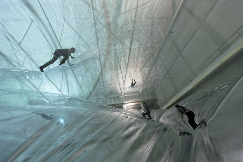
2.On space time foam by Tomàs Saraceno

On space time foam

I would like woa to adopt a similar premise – immersive, playful, yet simple. Perhaps I could analyse the movements and behaviour of visitors who took part in the installation and predict how they would behave in mine.

3.El Claustro by Penique Productions

El Claustro

Penique productions changes the space by blowing up a balloon and wrapping all the items in the surroundings with rubber. Here, they have changed the space visually.


Production Schedule: Here


Analog Project [Final]: Cascade / Strings Installation

Please cut the strings

Cascade’s interactivity involves appealing to others to play with and cut the strings. The colour scheme of the installation is pink-based, which was intended as an attractive and appealing colour. As one walks closer to the centre of the strings, the colours become still; white surrounds you.


Feedback from class:

  1. Without cutting the strings, there would be little to no interactivity; for after walking through the strings and feeling it, one is less inclined to interact for long with the installation.
  2. In order to create a more welcoming atmosphere, and directed hint to allow for the cutting of strings, perhaps the floor could be littered with some strings as indication
  3. Perhaps, the scissors could be placed on the floor? Current structure of scissors hinders the navigation and cutting of strings to a certain extent.

Reflections
If given the chance, I would love to create a larger installation and with longer strings to give off a more immersive feel. Also, I would like for the board to be more strength-withholding, such that perhaps other items could be hung from the strings/strings could be tugged at.

Analog Project [Documentation]: Cascade / Strings Installation

Ideation

Initial Project Idea at ADM Pond area

I initially wanted it to be like an artificial waterfall, which would cascade down the roof and into the ADM pond. Should I have placed it here, my ideal colour pick for the strings would be a cool-themed colour.

After a round of consultation with prof and classmates, I realised that 1. the interaction was lacking 2. it was more of a sculpture, and did not lure others to interact with it.

Also, I realised that it might be a safety hazard with regards to hanging it on the roof. The strings might tangle too, but I was ready to secure it to the bottom by weighing it down. However, I decided to switch it up instead, and shift the installation to another area.

Idea no 2


Hence, I transplanted it into a singular, rectangular installation (instead of previously fronting only the edge). Within the installation there would be scissors, which would ideally tempt others to join in and cut the strings.

Initial Sketch

Initially, I wanted to place it in the corridor and use shower rods to secure it up. However, safety issue was to be taken into account, and I had to pay extra to purchase shower rods – hence, I decided to place it in the level 2 empty area beside the stairs (level 2 to 3 stairs) in adm. There, I could use strings to secure it.


Creation

Sample

The top supporting the strings would be a foam-board, chosen as it is lightweight, relatively durable, and also, able to support some degree of piercing. The strings were meticulously arranged separate from another at a distance of 3cm, measured out and indicated on the board.

After finishing my preparations, I had to meticulously string those on the board. Initially, I planned out 90cm for each string length, but measuring them one by one was taking way too much time hence I decided to just estimate the length. In addition, the strings were pretty much tangled up so I had to resort to estimation else completion would not be a reality.

Also, I intended for the scissors to be of a different colour from the strings: to be easily seen and lessen the risk for walking facefirst into it, and for it to be a prominent object (with a status) within the artwork itself.

How to string 101:

I decided that the lighter colours would be on the inside; as the chosen area might be a little dim at times, and the inner colours would be dulled. I chose white as it was a metaphor for clarity, upon passing the darker colours on the outside. In addition, it could create a density which I wanted.

Upon completion, I lugged it to adm to be hung up. The four corners were tied with black string to be suspended.

4 corners of the board, hung up by strings tied to the surrounding poles.

I intended for the installation to be at a height whereby the bottom of the strings would be touching my chin; at this height, it would create a more immersive feeling for when the viewer looks up, all he sees are a cascade of strings.


Completion

Completed

Initially, I meant for it to adopt a squarish format, of which my chosen width would be at 1.2 x 1.2m. However, I ran out of strings, hence I shrunk the size down to about 80cm x 1.1m (estimated).

When seen from the 4 different sides, the strings look slightly different, partly due to the pattern of stringing and lighting conditions.

Yi Xian as my model – as a reference for the height of the installation

The strings also got slightly tangled up, but due to the quality and weight of the strings (specially chosen for such), it was generally weighed down and added to the beauty of it.

One point I noticed was that the scissors were a safety hazard. Particularly, that was the reason why I opted to purchase childsafe scissors with a small blade. However, if the viewer does not close the scissors after using it, the blade might hurt him/someone else.

When looking from the bottom, the middle of the board is noticeably white.

Colours from inside out:
white > yellow-white > pale pink > hot pink > royal red > dark brown

Definitely, this installation would be much more immersive if it was larger; when seen from afar, it appears small and isolated. However, I am thankful that it managed to achieve density and the experience that I sought for.

It would also be interesting if more people could interact with it, and see how they would cut the strings.


The Pirate Cinema, Nicolas Maigret / Research Critique (Week 3)

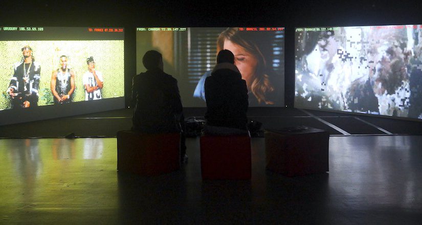
The Pirate Cinema, 2012 Video Installation Nicholas Maigret Photos: Justin Desforges, courtesy Nicolas Maigret Image Credit: wired.com
The Pirate Cinema, 2012
Video Installation
Nicholas Maigret
Photos: Justin Desforges, courtesy Nicolas Maigret
Image Credit: wired.com

Image Source: wired.com

The Pirate Cinema (2012) by Nicolas Maigret is an installation artwork featuring 3 screens, visualising how peer to peer data transfer in real time by using BitTorrent protocols. A collage of top 100 most popular transferred files are played across the 3 screens for a few seconds, including a brief flash of a partial IP address and location. Today, the artwork can be viewed online.

How it was created
Built on a data inception software, The Pirate Cinema automatically scans the most viewed torrents. The intercepted data is immediately projected onto the screen, and discarded after. Torrents scanned originates throughout the world.

The Pirate Cinema, 2012 Video Installation Nicholas Maigret

Image Credit: piratecinema.com

In recent years, the availability of peer to peer sharing towards millions of internet users has heralded a new form of piracy, inadvertently changing the way how cinema is experienced. By exposing the ‘internal workings of media'[i], Maigret makes visible the limitations of peer to peer sharing with his immersive sensory and audio installation. Concurrently, he also highlights the possibilities of peer to peer sharing for being part of the aesthetic experience.

Relationship with the Third Space Network
The Pirate Cinema‘s foundations were built upon the third space, despite itself not being part of the medium, but rather, and extrusion of it. It becomes a visualisation of this abstract space, an amalgamation of the efforts of the collective user network engaged in torrenting (unknowingly). Akin to the 1970s and 1980s video collectives such as Videofreex and TVTV, which attempted to mobilise people to make their own medium rather than being passive consumers of a centrally constructed broadcast programming[i], The Pirate Cinema hosts the ordinary consumer (of networked data) into the role of the changed broadcast programming.

They attempted to democratize the media by facilitating people-to-people communication… activating the production of media around a proliferation of local issues expressed by a range of marginalized communities.

– Randall Packer, author of Third Space Network (2016)

Hence, the marginalised, passive consumers are able to break down the hierarchy in media information corporate structure, even-ing the grounds for communication. In fact, they are altered:

It is a living art, exploiting contemporary forms of digital and physical networks as a mode of open praxis…

– Marc Garett, co-director and co-founder of Internet art collectives and communities in Third Space Network

In fact, its existence as a living art can further contribute to the diversity of the artwork – with its ability to constantly rejuvenating itself based on the whims of the collective community, and free against the rules of the broadcast programming.

Ironically, despite of what it seeks to contravene, The Pirate Cinema‘s delivery emulates the centrally broadcast programming in the top down broadcasting to passive viewers. While its content might be drawn upon from the third space, its narrates its information through a screen – similarly, to passive viewers of the installation. Nevertheless, it remains a pivotal artwork in addressing the abstract realm of the third space, underlining the greater possibilities of the third space as an artistic platform and network.


References

[i] Packer R., “The Third Space Network” (2016)

[ii] “Aksioma — The Pirate Cinema By Nicolas Maigret”. Aksioma.Org, 2017, http://aksioma.org/pirate.cinema/.

[iii] Maigret, Nicolas. “Nicolas Maigret : Nicolas Maigret”. Peripheriques.Free.Fr, 2017, http://peripheriques.free.fr/blog/index.php?/projects/about/.

My Inspiration: ‘Home Within Home’ by Do Ho Suh

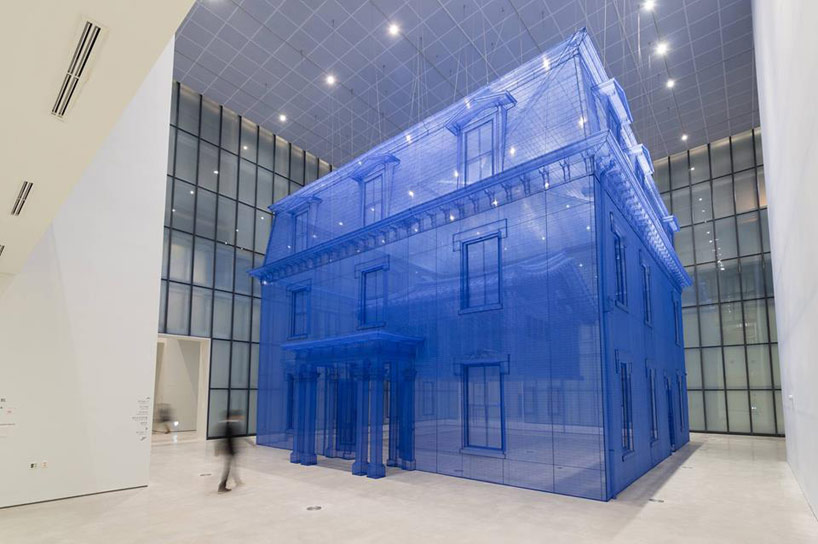
do ho suh ‘home within home’ (installation view) museum of modern and contemporary art, seoul, korea november 12, 2013 – may 11, 2014 courtesy mmca, korea
do ho suh
‘home within home’ (installation view)
museum of modern and contemporary art, seoul, korea
november 12, 2013 – may 11, 2014
courtesy mmca, korea

Do Ho Suh is a Korean sculpture and installation artist who was born in Korea and subsequently relocated to the United States. His artwork ‘home within home within home within home within home’ is an immersive installation built using silk. It is a full-scale recreation of his past residences – the traditional korean style housing he stayed it during his childhood, which is enveloped by another replica of his first housing in the United States where he later relocated to.

The artwork almost resembles a blueprint, and constitutes of overlaying significance – of Do Ho Suh’s experience leaving his homeland to the US, of his Korean home within his US home, and finally within the walls of the musuem. This multi-layered narrative inspires me as we delve deeper into his experience, not just as an artist but also as a human.

Image Credits

A Collection of Consciousness / End of Semester Project

Project Brief: A Collection of Consciousness utilises the method of question and answer to seek out one’s subconscious – psychological and emotional state alike. It then shows the participant a visual and auditory representation of his subconscious.

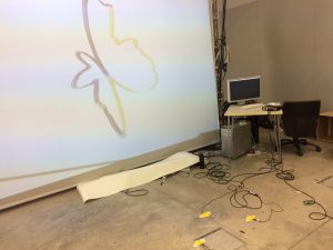
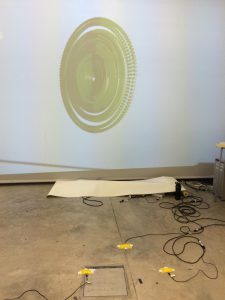
The set up: A total of 2 screens – one huge projector screen, and another smaller computer screen to look at for the questions. There is also a 3-step ‘dance pad’ for participants to select their answers.

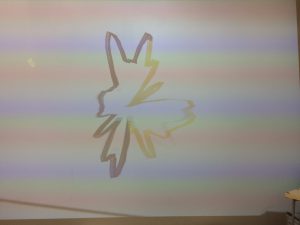
2016-04-21 17.58.29


An example of a computer graphic shown on screen:

2016-04-21 17.58.42


The ‘dance pad’ was situated right in the centre – enjoying a vantage point of the screen. However, participants had to continually turn their head sideways to look for the questions.

2016-04-21 17.57.20


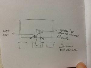
Initial idea:

2016-04-24 03.18.50

Initially, I planned on having the laptop right in front of the screen, but decided against it as it would block the visuals. Also, I planned on using motion sensing to trigger the selection of choices, but decided against it – past experience with it has taught me that different lighting would affect the sensing, and motion sensing as a whole might not be very accurate. Hence, I decided to change to using a touch sensor as my item of choice to trigger off the feedback.


Questions

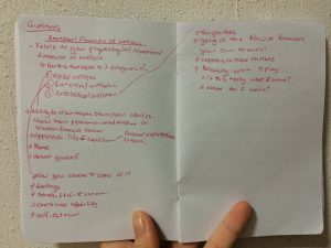
I also planned to have a total of 20 questions at the start. Later, I scaled it down to 7 questions as the patch was becoming too large. I based the style of my questions on the ISFG Personality test. I also researched on the different determinants of one’s consciousness, or to be more accurate, psychological state and came up with the following:

2016-04-24 03.18.30

Thus, I decided to base my questions on these 3 factors:
1. Mental Wellness
2. Emotional Wellness
3. Intellectual Wellness

I do understand that the limited questions might not raise an accurate determination of one’s psychological state, but at present it manages to cover all 3 factors as a whole.

Here are my initially planned 10 ideas:

  1. How are you feeling today? Optimistic (faster), no opinion (slower), disengaged (more jazzy)
  2. You do not mind being the centre of attention. No, maybe, yes (change of beat)
  3. You get tensed up and worried that you cannot fulfil expectations (1-3) (change of colour and size, and zamp)
  4. You have cannot finish your work on time, what do you do? You: Continue working on it hard past the deadline, give up, blame and berate self (ADD ON NEW SOUNDTRACK, faster, slower, becomes white noise etc)
  5. Choose one word. I, me, them (goes down to nil, pale, sound slowly goes down to a steady thump)
  6. You often feel as though you need to justify yourself. Disagree, no opinion, agree
  7. You are _____ that you will be able to achieve your dreams.
    Optimistic, objective, critical
  8. Your travel plans are usually well thought-out. Disagree, neutral, agree
  9. Do you know what you want over the next 5 years? Yes, it’s all planned out, gave it some thought, will see how it goes
  10. You tend to go with the crowd, rather than striking it out on your own. Disagree, mix, agree
  11. Do you like what you see? Yes, No but I want to continue improving, no I wish I could restart
  12. Only you yourself know what you want. Do you see yourself? -> restart

I planned for the user to finish playing the entire round of questions, and the different answers would add on different, unique layers onto the graphic – creating a different, unique shape and colour for each player at the end of the game.

Technically, I used jit.gl.text and banged the questions (in messages) at intervals.

Screen Shot 2016-04-25 at 7.39.11 AM

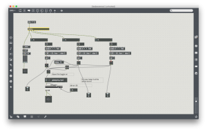
Here is a small portion of my subpatch for the questions, which were to be shown on the computer screen later during the actual artwork.


Graphics

The changes in shape were made by sending messages (eg. Prepend shape – torus) to each individual attrui. In brief, these were altered: shapes, colours, how fast or slow the graphics ‘vibrate’, the range and scope it expands until, and the ‘quickness’ or ‘slowness’ of how fast it moves. Graphics was also rendered and altered in real-time.

To create 3D graphics, jit.gen, jit.gl.gridshape, jit.gl.render, jit.gl.mesh and jit.gl.anim were used. While I initially planned to use jit.gl.mesh, and plot out my own points to be animated (creating a more abstract/different/random shape), I spent a total of 5 days to figure it out, but failed to, hence the final project turned out different from expected. However, I am still pleased with the final outcome.

Screen Shot 2016-04-25 at 7.29.13 AM Screen Shot 2016-04-25 at 7.29.49 AM Screen Shot 2016-04-25 at 7.29.54 AM

Here is my patch for reference.

The graphics was the most challenging portion of my entire project, making or breaking it. Perhaps it was not the most brilliant idea to foray into the untouched lands of openGL, but as I have always been interested in 3D graphics as a whole, it became an interesting experience for me.
 

Sensors/Teabox

Screen Shot 2016-04-25 at 7.43.59 AM

3 dance pads were used, and allowed for participants to send in their chosen responses to the questions to MaxMsp. Only 3 options were allowed, as it seemed more intuitive to the common user.

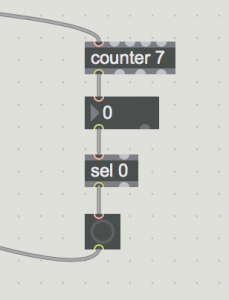
During the actual tryout on friday 22nd April, I realised that the trigger was far too sensitive, and questions were gone through far too fast. Hence, on the afternoon, I further added the below objects to slow down the sensing:

Screen Shot 2016-04-25 at 7.43.41 AM

The counter value is to be changed – depending on how fast or slow you prefer the trigger to be.


Sounds

As the graphic rendering and the sounds were tied between each other, I decided on altering the sounds to firstly: give the sense of being enveloped in the whole experience, and also to further tie up the connection between sound and graphics. As aforementioned, the vibration of the graphics is with accordance to how loud, in terms of decibels, of the sound itself.

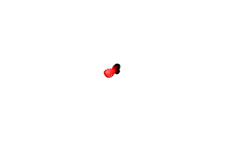
A total of 3 sounds were used. The longer the participants played, the more ‘rich’ the sound becomes: it becomes more shrill (higher pitch), and the speed of the soundtrack decreases, just to name a few. The longer you play, the more unorganic and synthetic the sounds become. It ties in with the visuals, which starts of as a red, beating object (that reminds one of the heart), but it starts to gradually take on inorganic, abstract forms. This was symbolic of the birth of a lifeform – firstly, you start off as a beating heart, but life’s experience will gradually shape you into becoming a unique being.

Here are the 3 sounds used:


See the final artwork in action:

Interdisciplinarity / First interpretation

(how you view, incorporate, what you interested in)

Inter-disciplines. It involves the incorporation, whether wholly or singularly, different mediums into a single piece of artwork. Based on my personal understanding, in Interactive Media, this encompasses possibly video, sound or robotics, just to name a few. As an interdisciplinary student in training, I am interested in the ‘wholeness’ of the experience, that it envelopes you by harnessing your 5 senses. I like how we are not restricted to a single medium, and by borrowing bits and snippets of different mediums, we are able to bring the best across to the audience. I am interested in mostly interactive installations, for the reason aforementioned earlier. Interactive installations provide a strong statement point, and perhaps, by incorporating little bits from other mediums, are able to make audiences better relate to the work.

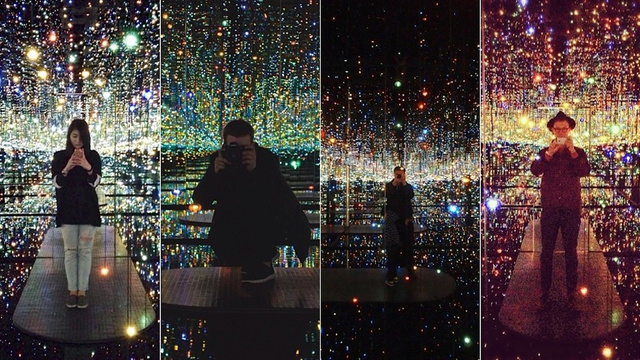
One of the most beautiful installations I have chanced upon in my research earlier was Yayao Kusama’s Infinity Mirror room. It’s aesthetically pleasing, and a fresh take from Kusama’s huge, somewhat overwhelming (personal interpretation on it), polka dots.

ku-xlarge

kusama_the_souls_of_millions_1