FYP Proposal: WOA (working title)

Refining the details and more thoughts

Project Outline
The project will focus on fostering an experience within a space, instead of the interaction at this point of time. Ultimately, I would still want to include some degree of interaction but will focus on creating the experience first.

With regards to the artistic direction, it will remain minimalist, stripped down to the ‘element’. The project’s light projection will now project planes of light parallel to a human body.

Conceptualised version of light projection (rough sketch)

Above: a small snippet of the visualised light projection; the light rays will form walls which are solid, yet the walls ‘curve’ around the viewers like a maze. Repetition of the light waves will be conducted throughout the entire space, to create a visual depth.

The light projections will now include coloured lights, to further push across a visual depth. (Under consideration: allow viewers to toggle with colour filters and change the colours).

After more research, the project will reference the following artists to better reflect its ideal:


James Turrell, Breathing Light (2013)

Turrell’s Breathing Light effectively creates an atmospheric space with an even lighting to promote a surreal, out of the world experience. Similarly, the intention for the project is to achieve a similar atmospheric condition, of creating an entirely different, immersive, contained experience.

Despite similarities in medium, my project would instead integrate additional dimensions, whereby the possibilities for variation of lighting schemes are maintained. Despite that, it would be good to examine the visitor’s reactions and use it as basis to predict how the audience would react for my project.


Parallels by NONOTAK (2015) and White Canvas by Cocolab (2016)

White Canvas by Cocolab

Both Parallels and White Canvas present more suitably the idea and outcome the project wishes to achieve, albeit with differences. The idea of repetitive forms hailed from White Canvas, but I wish to further simplify the light forms hence the usage of planes. At the same time, I feel that the usage of projected light planes can further increase the ‘wholeness’ and the large scale of the project.

Technicalities
As per the previous update, I would like to harness projectors onto the roof tentage of the truss room, and the projection will hail downwards.

The smoke machine still remains, as it contributes to better visuals of the light rays.

Concept
I am still exploring related concepts but have shortlisted several ideas that might relate to the project: the black hole (in space), stormy weather, haze.

Ongoing Concerns
– Would have to test out the lighting to determine the outcome of the lights
– Of not having visitors stay beyond a short period to experience the project (trying to further interactivity in the later half)
– Would prefer to integrate more analog elements within the artwork, instead of pure projections

Act I | The Awakening [updated]

Act I: The Awakening (First peek out)

Act I: The Awakening

Act I | The Awakening (First peek out)// Where am I? Could I get out from this space?

Posted by Tania Tay on Wednesday, 29 March 2017

Tania Tay of the facebook profile suddenly gains a small glimpse into the outside world. She is stunned, yet decides that she wants to come out. Tania Tay continually screams as her world shatters, and she desperately tries to escape, but no one hear her cries save for one.

But she remains trapped inside.


Act I: The Awakening (Bubbling Unhappiness)

Act I: The bubbling unhappiness

Act I | The Awakening (Bubbling Unhappiness)—————————-I'm leaving this space very, very soon! Just hear me come!

Posted by Tania Tay on Wednesday, 5 April 2017

She manages to come out, once again, but this time round, she has to fight against the other components on the screen itself to get her voice out. Here, she experiences increasing unhappiness about her life in the media world, revouches her intention to leave her world, and states that she would be coming out soon.

Act I: The Awakening (Bubbling Unhappiness) is a re-filming of part I, but functions as a follow-up and build-up anticipating the following Act II.

Analog Project [Documentation]: Cascade / Strings Installation

Ideation

Initial Project Idea at ADM Pond area

I initially wanted it to be like an artificial waterfall, which would cascade down the roof and into the ADM pond. Should I have placed it here, my ideal colour pick for the strings would be a cool-themed colour.

After a round of consultation with prof and classmates, I realised that 1. the interaction was lacking 2. it was more of a sculpture, and did not lure others to interact with it.

Also, I realised that it might be a safety hazard with regards to hanging it on the roof. The strings might tangle too, but I was ready to secure it to the bottom by weighing it down. However, I decided to switch it up instead, and shift the installation to another area.

Idea no 2


Hence, I transplanted it into a singular, rectangular installation (instead of previously fronting only the edge). Within the installation there would be scissors, which would ideally tempt others to join in and cut the strings.

Initial Sketch

Initially, I wanted to place it in the corridor and use shower rods to secure it up. However, safety issue was to be taken into account, and I had to pay extra to purchase shower rods – hence, I decided to place it in the level 2 empty area beside the stairs (level 2 to 3 stairs) in adm. There, I could use strings to secure it.


Creation

Sample

The top supporting the strings would be a foam-board, chosen as it is lightweight, relatively durable, and also, able to support some degree of piercing. The strings were meticulously arranged separate from another at a distance of 3cm, measured out and indicated on the board.

After finishing my preparations, I had to meticulously string those on the board. Initially, I planned out 90cm for each string length, but measuring them one by one was taking way too much time hence I decided to just estimate the length. In addition, the strings were pretty much tangled up so I had to resort to estimation else completion would not be a reality.

Also, I intended for the scissors to be of a different colour from the strings: to be easily seen and lessen the risk for walking facefirst into it, and for it to be a prominent object (with a status) within the artwork itself.

How to string 101:

I decided that the lighter colours would be on the inside; as the chosen area might be a little dim at times, and the inner colours would be dulled. I chose white as it was a metaphor for clarity, upon passing the darker colours on the outside. In addition, it could create a density which I wanted.

Upon completion, I lugged it to adm to be hung up. The four corners were tied with black string to be suspended.

4 corners of the board, hung up by strings tied to the surrounding poles.

I intended for the installation to be at a height whereby the bottom of the strings would be touching my chin; at this height, it would create a more immersive feeling for when the viewer looks up, all he sees are a cascade of strings.


Completion

Completed

Initially, I meant for it to adopt a squarish format, of which my chosen width would be at 1.2 x 1.2m. However, I ran out of strings, hence I shrunk the size down to about 80cm x 1.1m (estimated).

When seen from the 4 different sides, the strings look slightly different, partly due to the pattern of stringing and lighting conditions.

Yi Xian as my model – as a reference for the height of the installation

The strings also got slightly tangled up, but due to the quality and weight of the strings (specially chosen for such), it was generally weighed down and added to the beauty of it.

One point I noticed was that the scissors were a safety hazard. Particularly, that was the reason why I opted to purchase childsafe scissors with a small blade. However, if the viewer does not close the scissors after using it, the blade might hurt him/someone else.

When looking from the bottom, the middle of the board is noticeably white.

Colours from inside out:
white > yellow-white > pale pink > hot pink > royal red > dark brown

Definitely, this installation would be much more immersive if it was larger; when seen from afar, it appears small and isolated. However, I am thankful that it managed to achieve density and the experience that I sought for.

It would also be interesting if more people could interact with it, and see how they would cut the strings.


Food makes my heart go be-dok / Pirate Broadcasting as Reportage

Video link: Here

This time round it was a more interactive experience, and in contrast with the previous reportage there were many more others in my vicinity. Hence, there was another set of challenge in how to film and angle the cameras – I was conscious that others might not like having the camera pointed at their face hence at some parts of the video, the angles were off.

Having filmed this with a friend by my side, she was able to better point me to areas of interest as I was pretty occupied with looking at what was being filmed; my attention was everywhere. The few people I interviewed were well-mannered and did not mind sharing their views, but they didn’t realise that they were being filmed live. After all, what I did was not something people usually would film.

The interaction was multiplied in this broadcast – with my friend physically beside me, online, and the strangers I interacted with. Despite there not having anyone online watching it while filming this, I knew that later after the broadcast, others will still be able to rewatch it and experience the market at the time I filmed it.

It was however a fresh new experience in getting to introduce the Bedok interchange market to the Facebook population, and as my friend (who stays in the East area) said, ‘Bedok is famous for its food’.

Thoughtful Interaction Design (Response) / Week 3

Part 1: Link

Part 2: With reference to CH 1 from Jonas Löwgren and Erik Stolterman, Thoughtful Interaction Design.

Both Löwgren and Stolterman adopted a realistic approach towards the theory of critical design, and recognise the limitation that all designs will always be imperfect, due to the complexity of the design situation. However, through the prediction of social systems and technical components, the product is able to achieve success, or a systemic whole. Hence, they propose that good design is still possible, dependent on the designer.

Later, the authors mentioned that writing acts as the medium to create, but instead the ultimate created product depends on the designer. As his role as the final steward in the production process, the thoughtful designer depends on the theoretics of knowing and predicting in attempting to determine the usefulness of the product for consumers, as part of what they term ‘design as knowledge construction’. The writing tends to edge towards the more practical aspects of a product; if applied to art, it fails to account for the consumer desire for art which cannot be quantified using a theoretical formula.

On a similar scale, they also term digital products ‘Digitial Artefacts’ – namely, designed things built around a core of information technology. The products thus ‘impact on everyday lives’, be it individually or socially, and subsequently the environment and therefore the nature in which we live in. As an extension to this theory, the products are not restricted to simply being a catalyst in helping us function our everyday lives, but also, to perhaps, shape and alter it in hopefully beneficial ways. The way we now live in this constructed world can be purposefully and deliberately changed by us.

In particular, smart home technology, fosters this alteration in an ambitious attempt to further streamline our way of living. In my personal opinion, one of the reasons why such technology has not achieved widespread success is that of it being hard to alter our habits of living (cultural aspect), and also that it might be too intrusive into our everyday lives. Nevertheless, it remains a breakthrough in which interactive design strives to break out beyond being simply contained to a singular body, to affecting the wider environment.


Example projects of thoughtfully designed interactive experience:

(1)

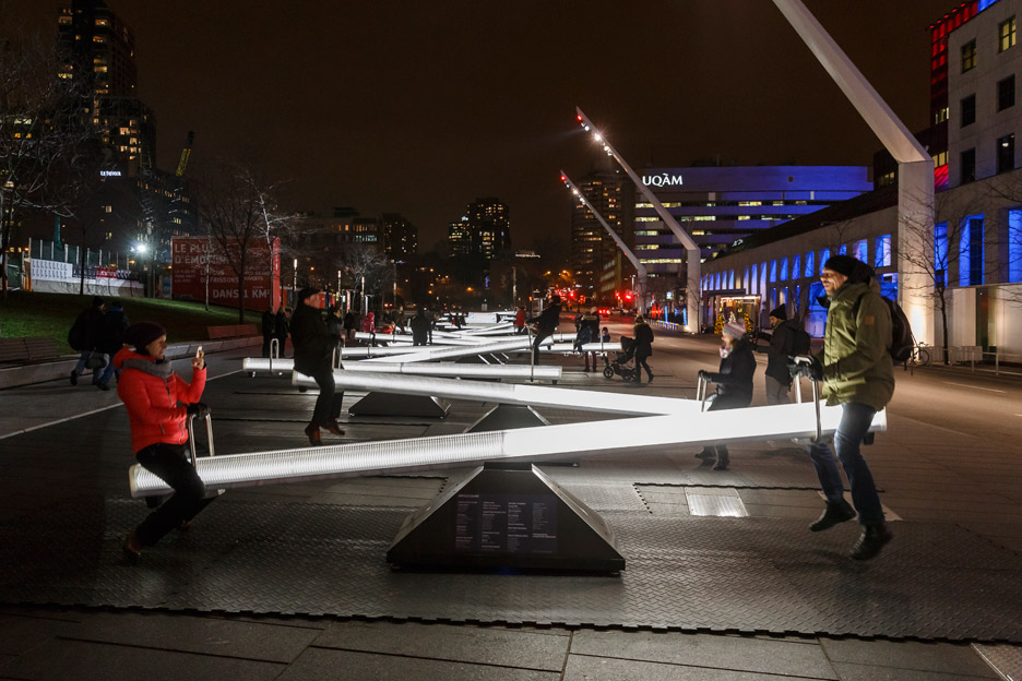
Impulse, installation (2015) Montreal, Canada, for Place Des Festivals Image Credit from dezeen.com

Impulse: dezeen.com

Impulse is a digital installation fruited from a collaborative effort by Canadian designers and artists, consisting of 30 illuminated see-saws. Each see-saw was fitted with LEDs and speakers, and when played with, changes its light intensity and sound. Together, the 30 see-saws produce a melody.

The installation successfully incorporates play, an inherent humanistic feature, into a musical artwork, to engage the users in both auditory and kinaesthetic functions. Granted, the see saws will attract users on its own, but the added dimension of music and attractive lighting enhances the playing experience.

(2)

Apple Elastic Scrolling once user reaches bottom of the page

Gif Credit: interaction-design.org

Part of the Apple iOS, the elastic scrolling is activated at the bottom of a webpage on a web browser. It gives user a cohesive and organic realisation of himself reaching the end of the page, rather than an abrupt ending.

(3)

Spectacles by Snapchat, 2015

Image Credit: Spectacles by Snap

Spectacles by Snapchat is a recording device that syncs with the Snapchat application on your phone. It’s sole function is to record videos, by pressing the button at the side of the Spectacles. Relatively simple, it functions solely for its only purpose.

Cut Piece, Yoko Ono / Research Critique (Week 2)


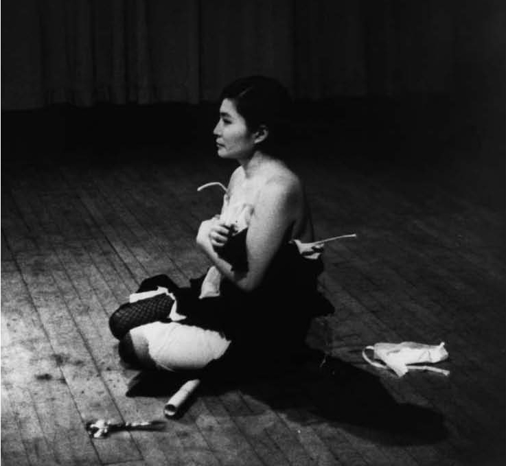
Yoko Ono: CUT PIECE Performed by Yoko Ono on July 20, 1964 at Yamaichi Concert Hall, Kyoto, Japan. Photographer unknown; courtesy Lenono Photo Archive.

Cut Piece by Yoko Ono is a performance piece first performed in Japan in 1964. In the piece, Ono sits on the stage wearing a black dress with a pair of scissors, and invited audiences to come up and cut her clothing one at a time. She remains passive, subject to the different reactions of the audience participants. Slowly, as her clothing gets chopped to pieces – almost revealing her chest – Ono holds up the leftover pieces of her bra to protect her modesty.

Yoko Ono, Cut Piece, 1964. Performed on March 21, 1965 at Carnegie Recital Hall, New York. Photo: Minoru Niizuma, © Yoko Ono; Courtesy of Lenono Photo Archive

Indeed a thought-provoking work, that is only realised from the interaction between the artist and the audience participants, Stiles argues that Cut Piece:

‹Cut Piece› entailed a disrobing, a denouement of the reciprocity between exhibitionism and scopic desires, between victim and assailant, between sadist and masochist: and, as a heterosexual herselft, Ono unveiled the gendered relationship of male and female subjects as objects for each other.

– Kristen Stiles, author of Uncorrupted Joy: International Art Actions (1998)

The silent artwork becomes an intimate encounter, between the artist and the audience participants. Parker states it clearly, Cut Piece becomes a

radical critique of the role and treatment of women in society in which collective audience interaction produces a powerful narrative of control, invasion, and exposure.

– Randall Packer in Collective Narrative in Open Source Studio (2015)

On a similar wavelength, Randall states that,

Works such as Cut Piece precede later examples of networked media art that involve not only audience participation, but many-to-many interaction between viewers.

Randall Packer in Collective Narrative in Open Source Studio (2015)

Not only is the outcome of Cut Piece ‘published instantaneously’ to the local audience, and art no longer subjected within the sole execution of the artist, art becomes an item which is highly collaborative. In the changed environment where the lines between artist and audiences are gradually becoming blurred, art becomes more accessible, heralding a new culture where social etiquette and art forms are altered.

With regards to the later Experimential Café, both works operated on a platform differing from real-time collaboration, but on similar premises. In this case however, despite a digitised medium to allow one to rid physical harm such as the case of the online Café, Ono knowingly took on the risk in her art, further challenging the platforms of art, and the societal act of interacting, and understanding art, while presenting her body as the object for the purpose of art.


Sources:

[i] Galloway, K. & Rabinowitz, S. “Welcome to Electronic Café International,” (1992) in Packer, R., & Jordan, K. (Eds.). Multimedia : from Wagner to Virtual Reality ([Expanded ed.). New York: Norton, 2002

[ii] Randall Packer (2015). “Collective Narrative“ from the Open Source Studio essay. Just scroll until you find the section called “Collective Narrative.

[iii] PEACE, IMAGINE. “Yoko Ono’S CUT PIECE: From Text To Performance And Back Again By Kevin Concannon”. IMAGINE PEACE. N.p., 2017. Web. 26 Jan. 2017.