Exhibit Layout and How Moss And Grow Lights Fit in (FYP18)

Overview
Updates for the week would be focused mostly on material testing and more technical aspects of planning.
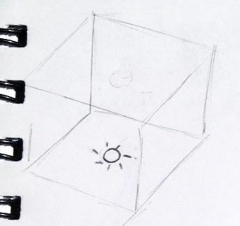

Exhibit Layout
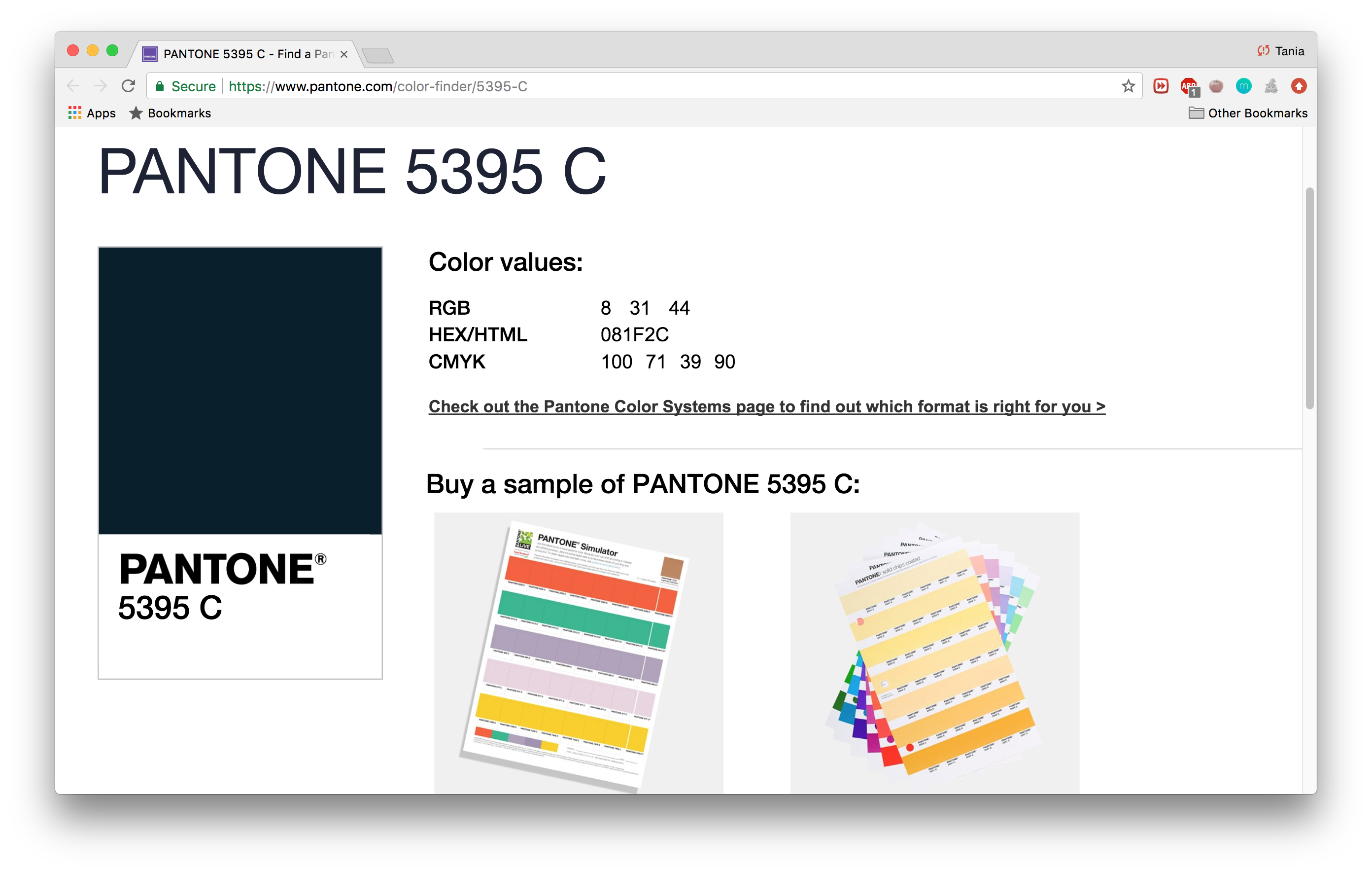
The grad show layout has been finalised! I would be painting the space entirely with the colour Pantone 5395 C (or similar, depending on the colours the contractors provide), with the exception of projection surfaces. I picked this slightly dark navy colour that I thought would be able to complement the purple which the grow light would give off.

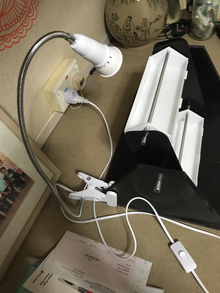
I have also “choped” 3 pedestals of different sizing each, one at H (1m for all) x W x L 40 x 40cm (to place previous prototype), another 40 x 80 (for final prototype), and lastly, one with 40 x 100 (to place supporting posters and documentations if any).

More details could be found here: FYP Diagram(BW).


Grow Lights, and What to Do with Them
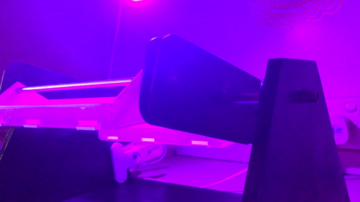
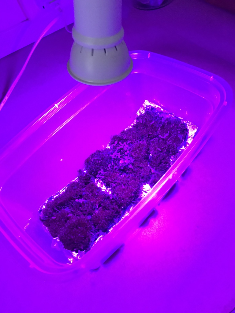
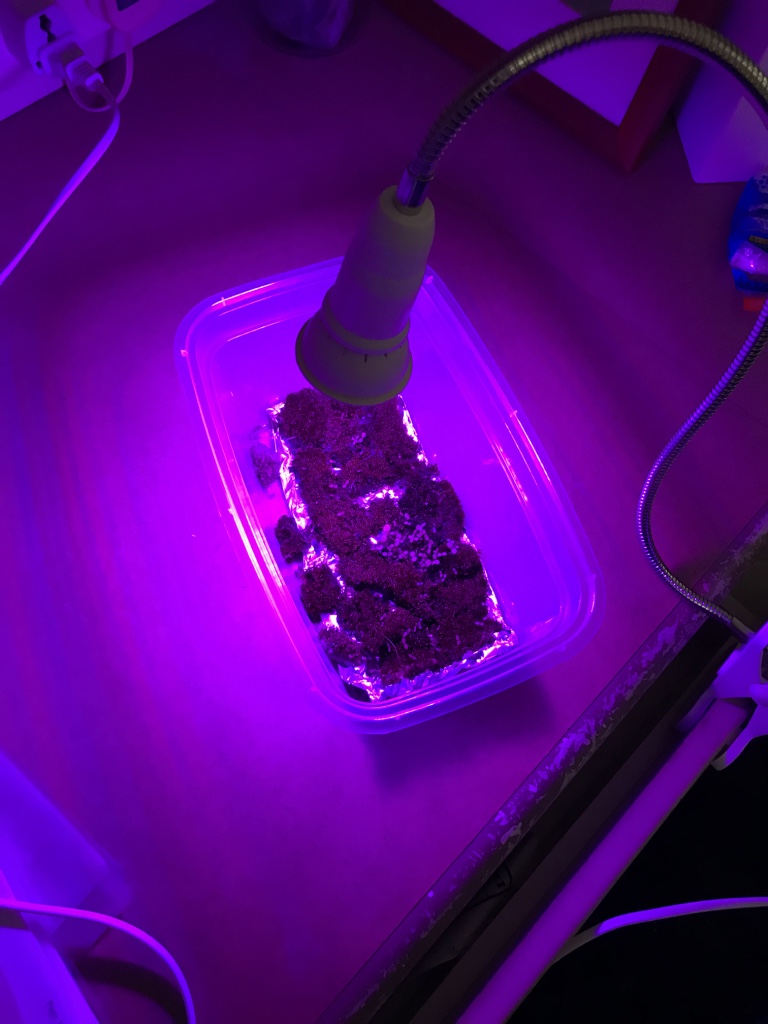
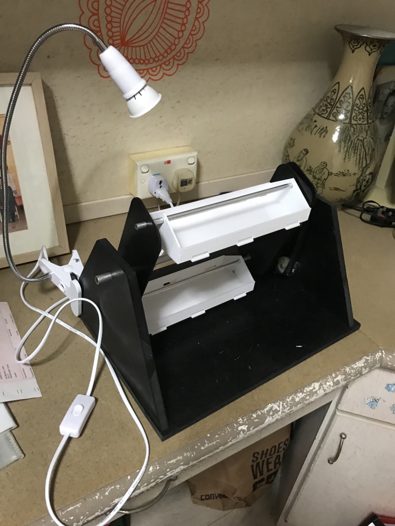
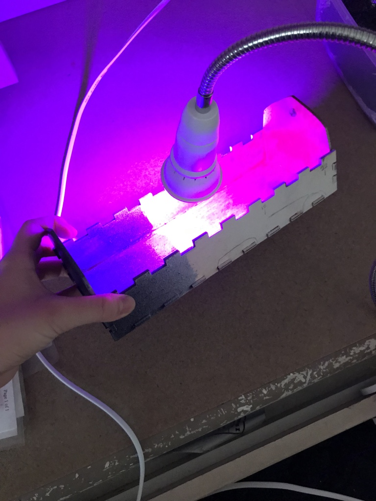
I have finally received my grow lights, way faster than I had expected! However, despite me buying the smaller bulbs, there were many unexpected outcomes which would mar the final aesthetics of the project.

Catalogue of grow lights which I bought (I bought 2)

Some aspects which I did not realise include:

1. Light splashes around the entire machine, and even outside of the moss planters

Surely, this can be mitigated against, through either implementing a lampshade like hood on the bulb itself, or raising the sides of the moss planters (not ideal, as aesthetically it would look bad and incur more difficulties in raising the entire moss bed), but this would simply mean more effort expended into correcting these issues, and risk disrupting the already working machinery/aesthetics

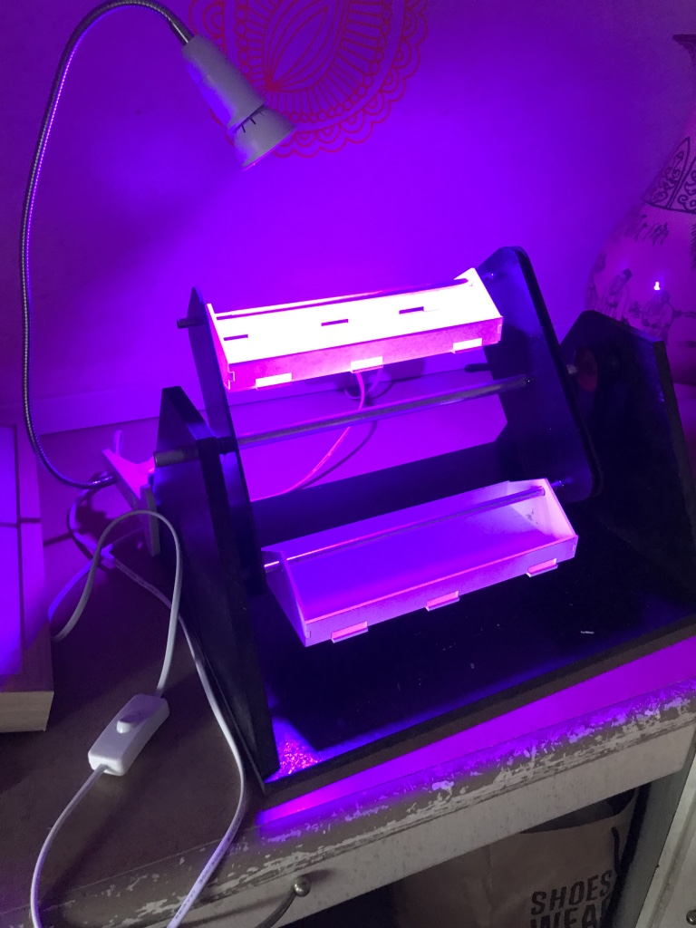
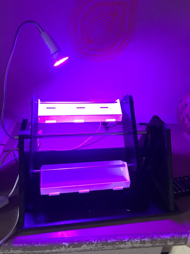
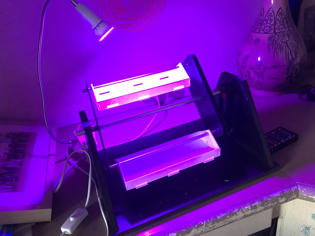
2. Grow light makes… the moss look bad

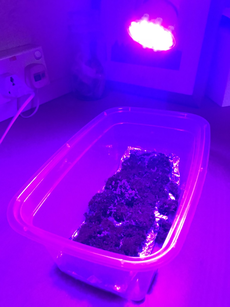
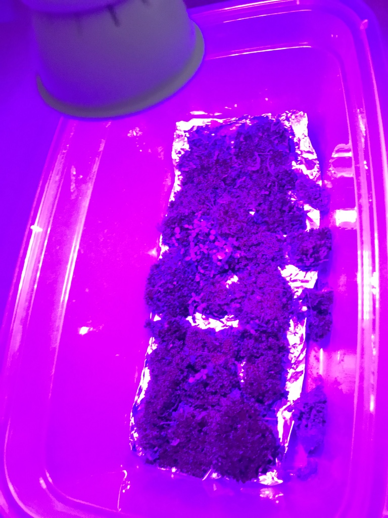
Ever since the presentation, I had re-transferred the moss back to the plastic trays as it makes it easier to grow the moss (in terms of watering, or letting it sun out). Since then, the moss has not advanced much in terms of growth, but there has been an increase in sprouting amongst the moss.

As evident above, the purple from the grow light has overpowered the initial green of the moss. With green, the symbol of freshness, youth and growth eradicated, an eerie feeling takes over the model. I am on the fence about this new enforced aesthetics – on one hand, it strongly pushes forth the idea of the creepy science laboratory theme, and also adds some colour to the otherwise dark space exhibit, but with the green and symbols of freshness lost, I feel that I would need to adjust the exhibit aesthetics slightly.

3. Rotating Grow Lights?
Initially, I wanted each grow light to also be in continuous rotating motion, and each grow light was to follow each tray in rotation. However, knowing now that the light splashes around out of the tray planter, the intended effect of seeing each grow light rotate around (as though each was the sun rotating around a planet) would not be as strong as I thought.

I could try to add on the lampshade to minimise the lighting, but I am wary of its construction. For instance, I have not tested the lighting for long hours, and am not sure of the volume of heat it would release (which might potentially, set fire to my lampshade or kill my moss).

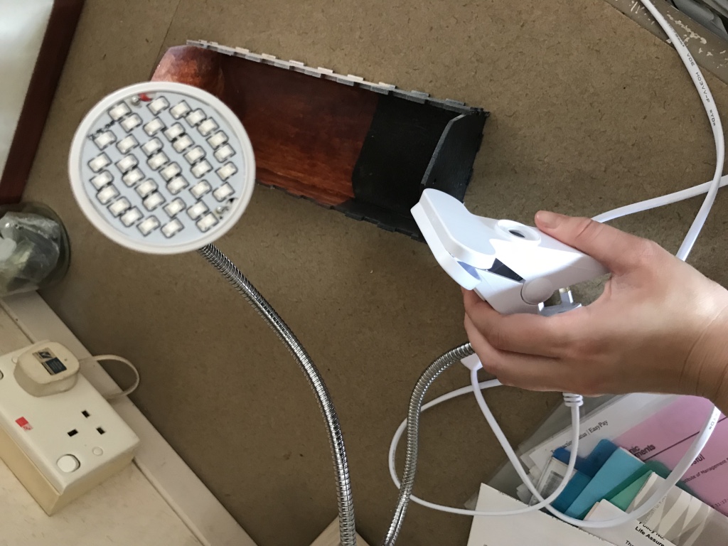
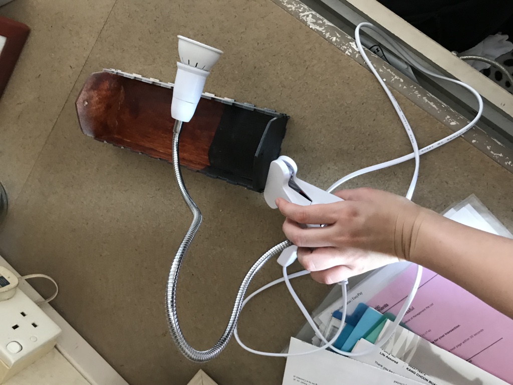
Another consideration would be that for the grow light to rotate, their connecting wires would also have to rotate. This is troublesome for the machinery layout planning, Currently, the grow light comes together with a clip and bendable stem, which would be extremely helpful in positioning it onto the model. As such, I am considering eliminating the rotation of the grow light, despite it being a much more powerful element.

What I have in mind to continue working on

To deal with these, I plan to:
1. Make a lampshade
2. Make my moss machine LARGER (for it to ‘capture’ more of the light spillage)
3. amend the construction of the moss model, as a larger model would require better supportive frame


Farming the Moss

Close up of Moss bed

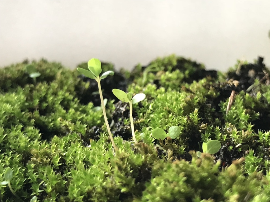
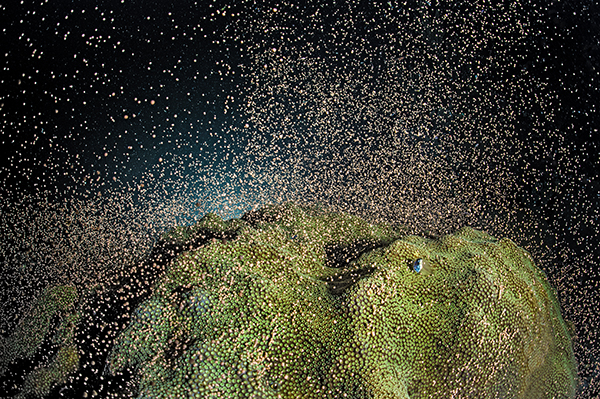
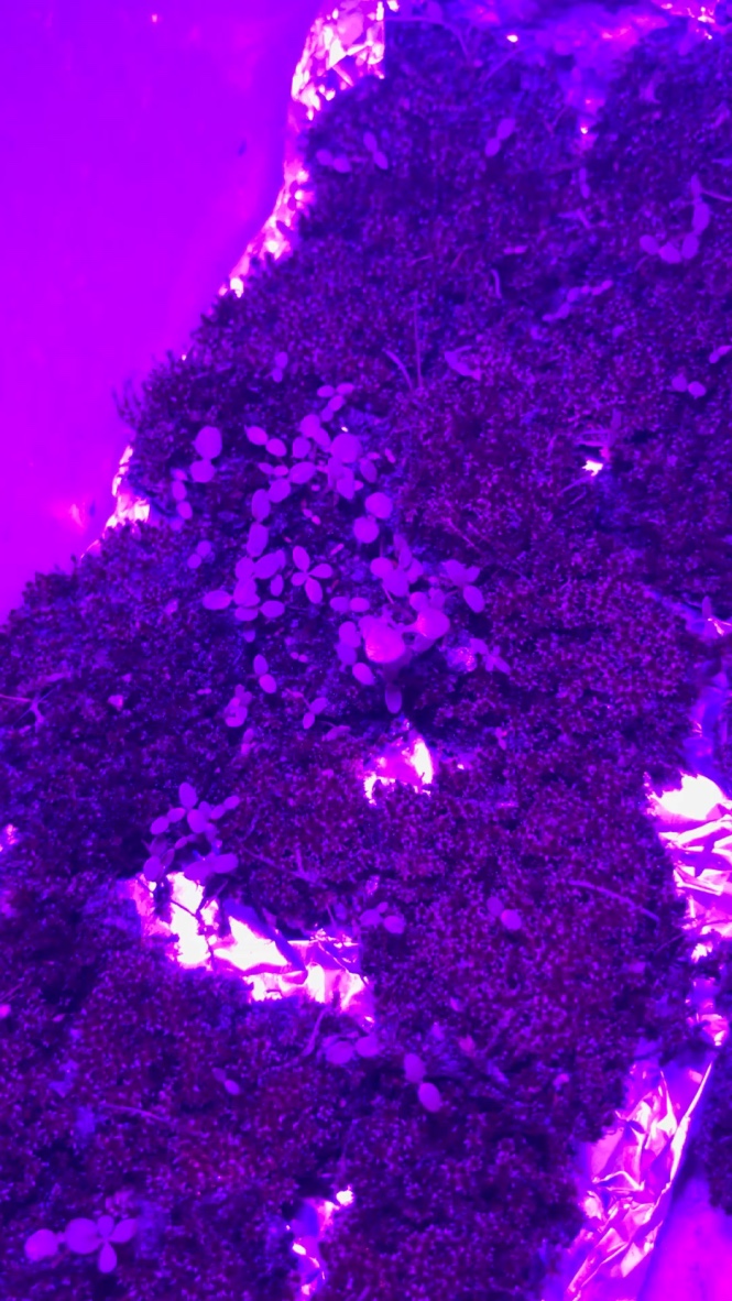
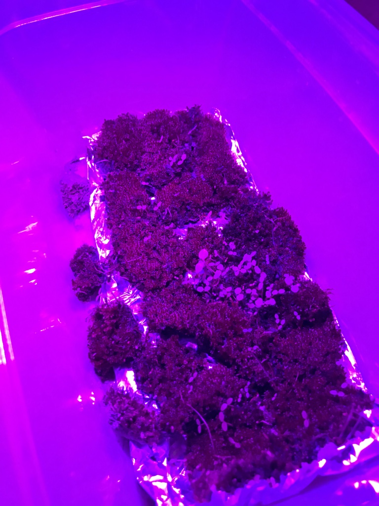
Moss growth has been good! Clearly, a few patches have died out but I attribute that to fungal infection (which luckily did not spread much to the surrounding mosses).

Left: Dead moss patch, but lively sproutlings

In fact, I noticed that the seedlings amongst the moss has had MORE responsive growth than the moss itself (even growing in the direction of the sunlight), and for a start/for statistics for my posters, I have started calculating the number of seedlings sprouted.

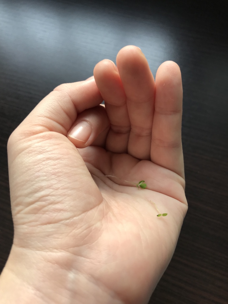
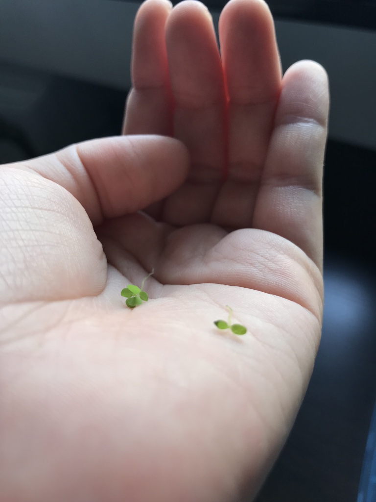
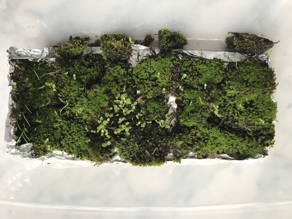
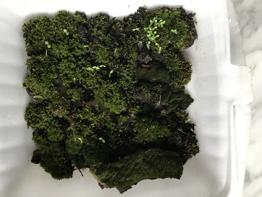
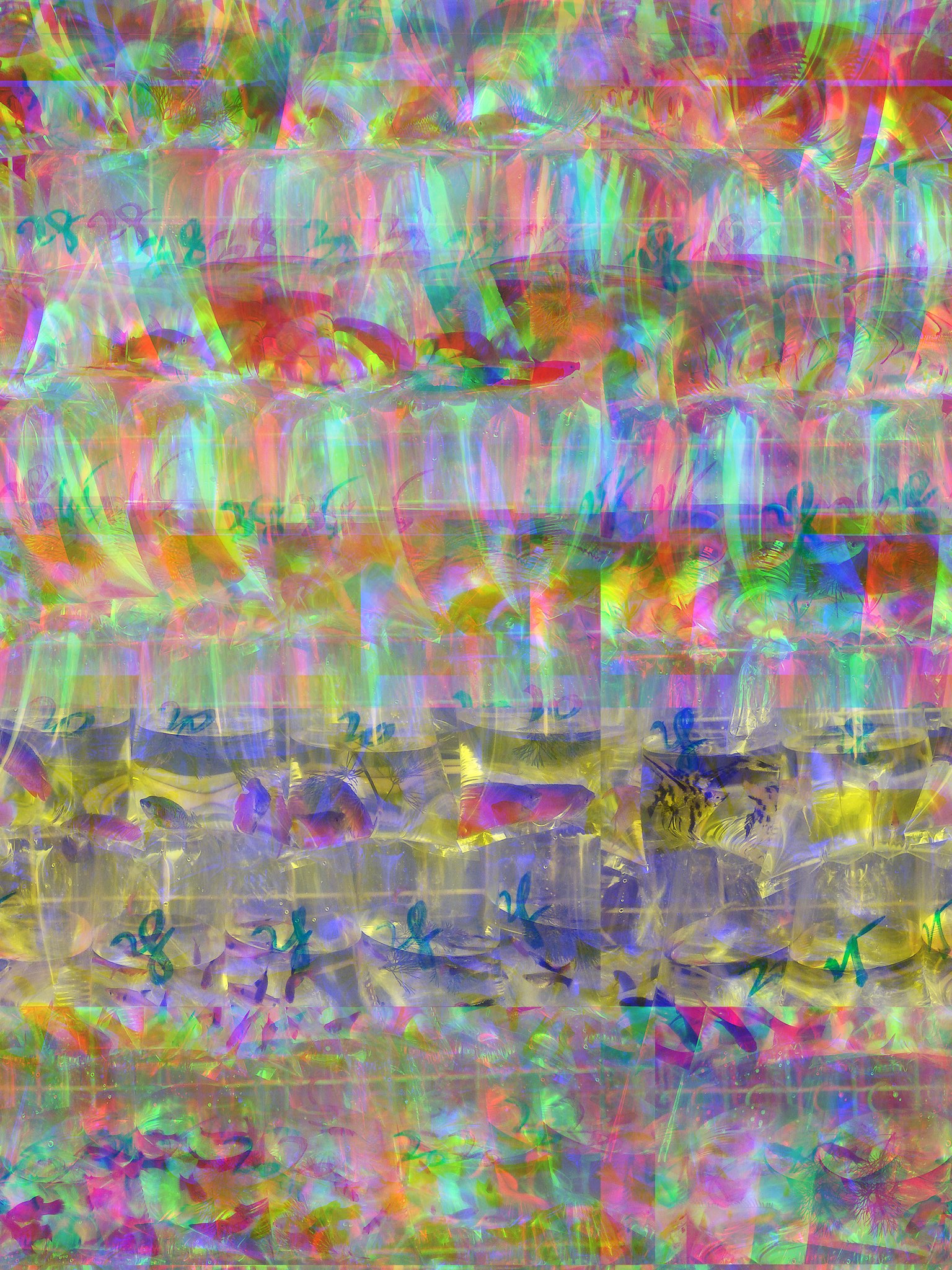
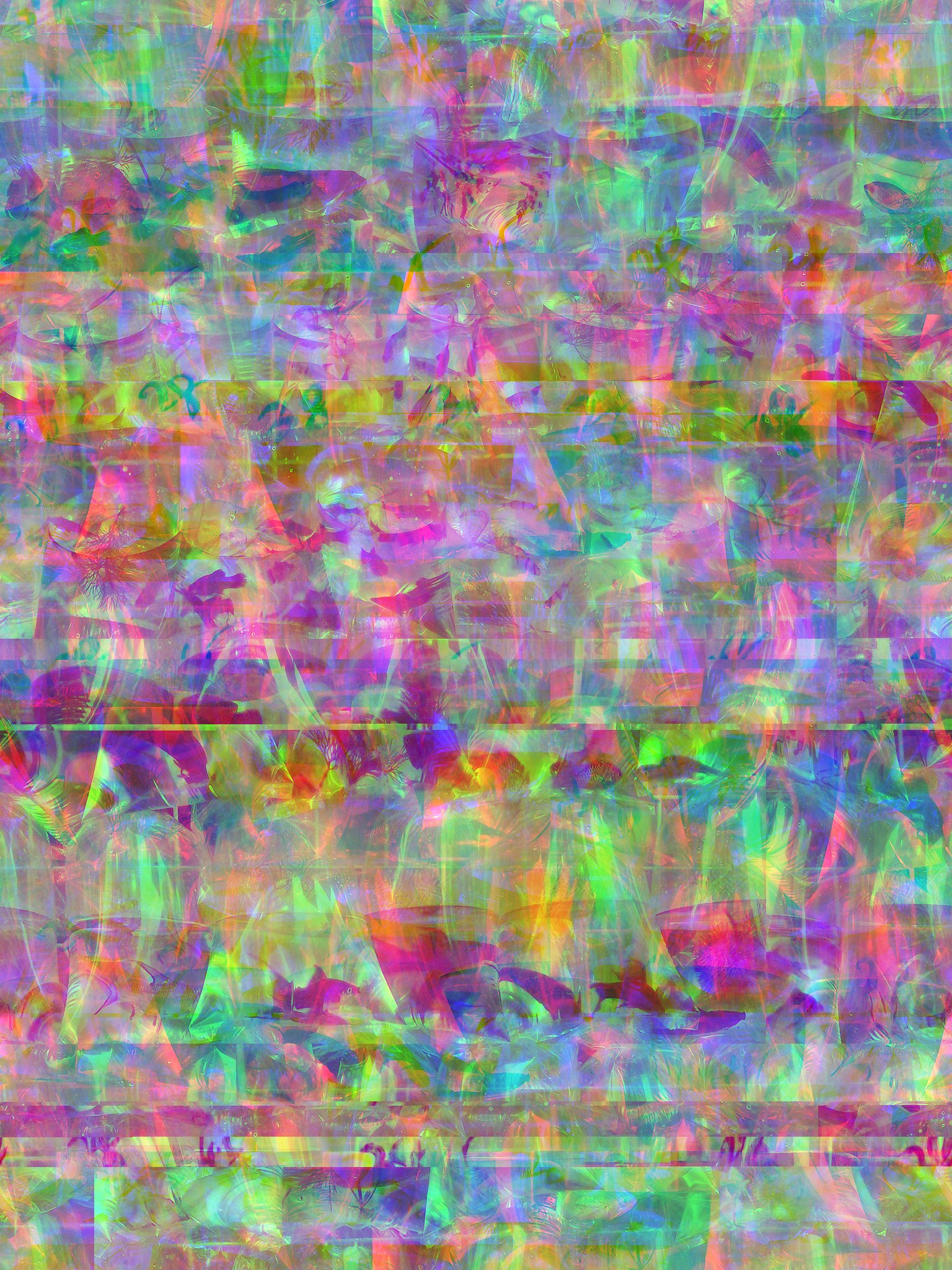
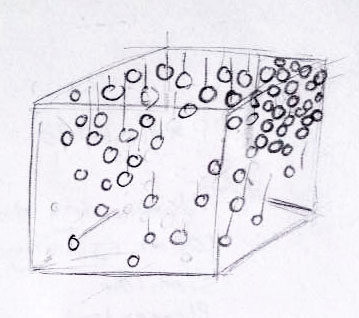
Data for my corresponding posters would be recorded and taken from the moss itself. Some examples of data which would be recording include the specific number and type of seedlings which sprouted in my moss bed. A sample is shown below:

Sample: Data Information Recorded for Posters
Close up: spot the 2 different species of seedlings sprouting

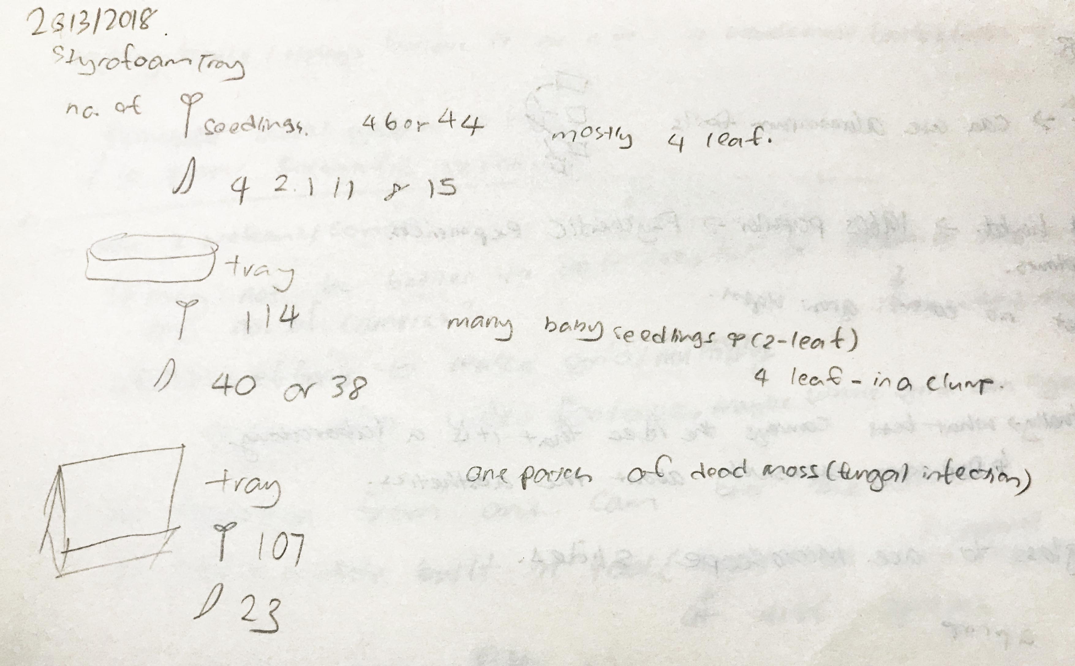
In this instance (referencing the previous 2 pictures), the data I tried to record was the number of single bladed (somewhat like a grass blade) sproutlings and normal 2 or 4 leaved seedlings. I would be continuing to collect similar data, and start working on my corresponding posters as soon as possible. Also, I would try as much as I can to include real data into my posters as I want them to lend some semblance of reality into my entire project, even though the theme was somewhat parodic.


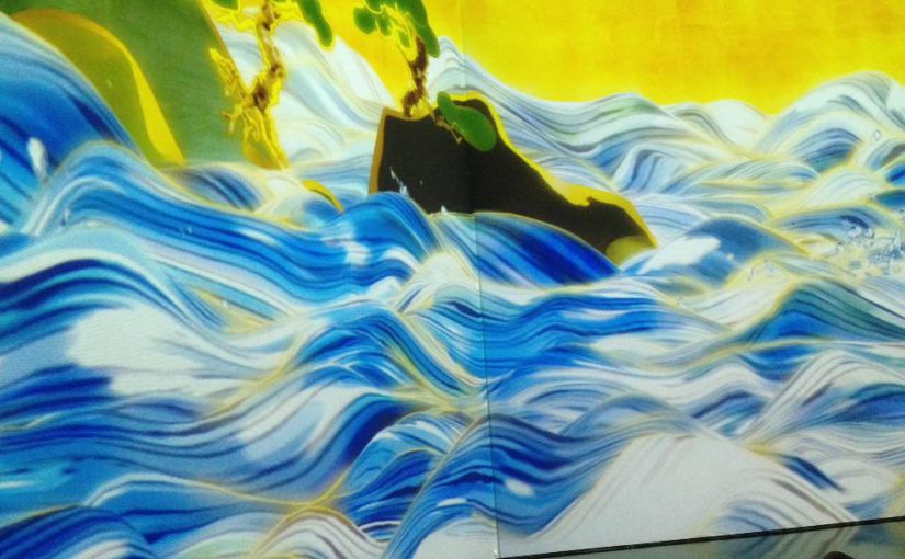
Video Installation and How It Looks Like
Initially, I wanted my video portion of the installation to be more of a split screen format. However, through consultation with prof Randall, I realised that doing it in real time would not be possible with my envisioned 9 screens – which probably meant affixing 9 different working cameras onto the machine itself – due to technical limitations (computer data might mix up the video signals if too many cameras were to be attached to it).

Above would be my initial idea for the projection. However, with this unforeseen circumstance, I might alter it to simply 2 camera input signals, and simply play around with the available effects.


What’s real, and what’s not?

Through my consultation with prof Randall, I realised that I have not truly addressed this particular point within my project. For now, I am aiming at making it as real as possible, but at the same time, I want it to be slightlllyyyyy ridiculous in the sense that scientifically examining the theme of continuity is all but a fruitless attempt as the answer was simply absent in the first place (which ties back to the name of my project, of it being a continual study on the theme of continuity). Also, the “study” of the theme would be borderline parodic, of through the concrete examination of the topic, I attempt to make it “real”?

It seems as of now that this point is still slightly wonky, and I will continue polishing it, but as of now, this is what I have in mind.


Conclusion and Moving On!
After a week’s of deliberation of the final machine’s sizing, I have decided to just work on a similar model of the same size and will start rebuilding the model over the next week. At the same time, I will be starting on creating a series of posters and other exhibit decorative materials.

Meanwhile, for the projection, I would aim to affix the final projection scheme by the end of the next week, and hopefully, create a portion of it.

Act I | The Awakening [updated]

Act I: The Awakening (First peek out)

Act I: The Awakening

Act I | The Awakening (First peek out)// Where am I? Could I get out from this space?

Posted by Tania Tay on Wednesday, 29 March 2017

Tania Tay of the facebook profile suddenly gains a small glimpse into the outside world. She is stunned, yet decides that she wants to come out. Tania Tay continually screams as her world shatters, and she desperately tries to escape, but no one hear her cries save for one.

But she remains trapped inside.


Act I: The Awakening (Bubbling Unhappiness)

Act I: The bubbling unhappiness

Act I | The Awakening (Bubbling Unhappiness)—————————-I'm leaving this space very, very soon! Just hear me come!

Posted by Tania Tay on Wednesday, 5 April 2017

She manages to come out, once again, but this time round, she has to fight against the other components on the screen itself to get her voice out. Here, she experiences increasing unhappiness about her life in the media world, revouches her intention to leave her world, and states that she would be coming out soon.

Act I: The Awakening (Bubbling Unhappiness) is a re-filming of part I, but functions as a follow-up and build-up anticipating the following Act II.

FYP Proposal: Walking on air (working title)

Overview
Walking on air (woa) is an interactive installation that allows visitors to trace their own paths in a smoke-filled environment, and experience being above the clouds.

Concept: Creating an otherworldly experience, an experimental space where the body becomes the instrument. Individual bodies are disregarded, and instead become part of the bigger picture.

Logistics: Smoke generating machine, strong light projector, video camera, all situated within a contained room (tentatively truss room)

Functionality: In woa, a smoke generator will create a foggy atmosphere in the room, and the projector will continually project a wavy line into the smoke at a height slightly above the calf. When light is projected into smoke, a smokey, surreal form independent to the initial wavy line is created. This creates the illusion of clouds forming, and walking above or on clouds. When there is movement, a motion camera tracks the movement and a light trail formed by the movement (eg walking) is immediately projected at the location where movement is detected. Where movement overlaps or take longer to move, the light trail becomes brighter. Over time, the light trail will dissipate (with the dissipating effect) and fade away, resuming the original sight

There will also be an accompanying soundtrack to the installation. When the new light trail is created, a musical note is played, extending for the entire duration of which the light trail exists. When the light trail fades, the volume of the accompanying note will also fade away, proportionate to the brightness level of the light trail. Each light trail will generate a musical note in a randomised pitch; it is hoped that the different walking styles of people would generate a pleasant harmony.

Colour for the light beam would be restricted to only white, to reduce visual distraction and to preserve an ethereal feel. Music notes would similarly adopt a

Technicalities: MaxMsp would be used for motion tracking, and also as a sound synthesiser.

Aim: For woa, I wish to achieve an ethereal feel bordering on minimalism, and going back to the basic, rudimentary elements. The visuals and surroundings are kept sparse, and available elements kept strictly little. However, I want to imbue a slight element of play, to make interaction engaging and open to all age groups. It is hoped that visitors leave the installation entranced, as though they had just visited an alternate world. At the same time, a slight element of bodily displacement would be created, with the visitor, having an extremely wide movement range but without a set moving path within this changing, unfamiliar environment.

Inspired by Anthony McCall’s You and I, Horizontal, ideally, my installation would also bring across a simple sensation using the most basic instruments.

Interaction: Walking, running in the path of the light, backtracking, circulating


Artist References:

1.You and I, Horizontal II (Anthony McCall)

You and I, Horizontal: Light beams into the smoke

The usage of the smoke and light beams originated from this work. However, I would like to push it further and make it more interactive with accompanying sounds.


2.On space time foam by Tomàs Saraceno

On space time foam

I would like woa to adopt a similar premise – immersive, playful, yet simple. Perhaps I could analyse the movements and behaviour of visitors who took part in the installation and predict how they would behave in mine.

3.El Claustro by Penique Productions

El Claustro

Penique productions changes the space by blowing up a balloon and wrapping all the items in the surroundings with rubber. Here, they have changed the space visually.


Production Schedule: Here


Analog Project [Documentation]: Cascade / Strings Installation

Ideation

Initial Project Idea at ADM Pond area

I initially wanted it to be like an artificial waterfall, which would cascade down the roof and into the ADM pond. Should I have placed it here, my ideal colour pick for the strings would be a cool-themed colour.

After a round of consultation with prof and classmates, I realised that 1. the interaction was lacking 2. it was more of a sculpture, and did not lure others to interact with it.

Also, I realised that it might be a safety hazard with regards to hanging it on the roof. The strings might tangle too, but I was ready to secure it to the bottom by weighing it down. However, I decided to switch it up instead, and shift the installation to another area.

Idea no 2


Hence, I transplanted it into a singular, rectangular installation (instead of previously fronting only the edge). Within the installation there would be scissors, which would ideally tempt others to join in and cut the strings.

Initial Sketch

Initially, I wanted to place it in the corridor and use shower rods to secure it up. However, safety issue was to be taken into account, and I had to pay extra to purchase shower rods – hence, I decided to place it in the level 2 empty area beside the stairs (level 2 to 3 stairs) in adm. There, I could use strings to secure it.


Creation

Sample

The top supporting the strings would be a foam-board, chosen as it is lightweight, relatively durable, and also, able to support some degree of piercing. The strings were meticulously arranged separate from another at a distance of 3cm, measured out and indicated on the board.

After finishing my preparations, I had to meticulously string those on the board. Initially, I planned out 90cm for each string length, but measuring them one by one was taking way too much time hence I decided to just estimate the length. In addition, the strings were pretty much tangled up so I had to resort to estimation else completion would not be a reality.

Also, I intended for the scissors to be of a different colour from the strings: to be easily seen and lessen the risk for walking facefirst into it, and for it to be a prominent object (with a status) within the artwork itself.

How to string 101:

I decided that the lighter colours would be on the inside; as the chosen area might be a little dim at times, and the inner colours would be dulled. I chose white as it was a metaphor for clarity, upon passing the darker colours on the outside. In addition, it could create a density which I wanted.

Upon completion, I lugged it to adm to be hung up. The four corners were tied with black string to be suspended.

4 corners of the board, hung up by strings tied to the surrounding poles.

I intended for the installation to be at a height whereby the bottom of the strings would be touching my chin; at this height, it would create a more immersive feeling for when the viewer looks up, all he sees are a cascade of strings.


Completion

Completed

Initially, I meant for it to adopt a squarish format, of which my chosen width would be at 1.2 x 1.2m. However, I ran out of strings, hence I shrunk the size down to about 80cm x 1.1m (estimated).

When seen from the 4 different sides, the strings look slightly different, partly due to the pattern of stringing and lighting conditions.

Yi Xian as my model – as a reference for the height of the installation

The strings also got slightly tangled up, but due to the quality and weight of the strings (specially chosen for such), it was generally weighed down and added to the beauty of it.

One point I noticed was that the scissors were a safety hazard. Particularly, that was the reason why I opted to purchase childsafe scissors with a small blade. However, if the viewer does not close the scissors after using it, the blade might hurt him/someone else.

When looking from the bottom, the middle of the board is noticeably white.

Colours from inside out:
white > yellow-white > pale pink > hot pink > royal red > dark brown

Definitely, this installation would be much more immersive if it was larger; when seen from afar, it appears small and isolated. However, I am thankful that it managed to achieve density and the experience that I sought for.

It would also be interesting if more people could interact with it, and see how they would cut the strings.


The fishy prisoners / Glitched Aberrations


1st glitch
1st glitch
2nd glitch
2nd glitch
3rd glitch
3rd glitch


Side by side comparison of glitch:

Original Image

This photograph is of Hong Kong’s goldfish market, where small packets of fishes are arranged neatly in rows on a wall for sale. Trapped within individual pockets of water, the fishes swim circularly, unable to avoid their unknown fate. As the glitch process intensifies, the helpless creatures swirl and descends; their individual fates gradually sinks into a chaotic mess. This riotous disorder channels mix up the infinite possibilities of the fishes’ destiny, yet speaks of the choice-less fate they have to accept despite being in the world with limitless outcomes.

Life Sharing / Research Critique (Week 6)

Overview
In Life Sharing (2000), Eva and Franco Mattes, an New York-based artist duo, critiques the landscape of privacy and ownership on the internet. By exposing their personal computer to the world wide network, they reveal their digital identities intentionally, turning it into an artwork. Ironically, they opt to hide their true identities, by providing contradictory information about themselves, accentuated by their obscure domain of http://0100101110101101.org.

In his text Webcams: The subversion of Surveillance, Steve Dixon claims that the digital recording devices are separated into two paradigms: one, surveillance, voyeurism, but also two, openness, sharing and freedom of expression.

“While CCTV surveillance is commonly covert and broadly concerned with policing, the webcam is characterised by a generally opposite impulse towards openness, sharing, and freedom of expression.”
– Dixon. S, in Webcams: The subversion of Surveillance (2007)

The Mattes duo forcibly combined both models in Life Sharing, creating their own version of the open, inviting Big Brother.

Abstract Pornography?

Life Sharing is abstract pornography
– Hito Steyerl, German filmmaker, writer and visual artist

The term ‘abstract pornography’ nicely summarises the essence of this artwork: a calculated spectacle, it reveals enticingly, yet wantonly. More distinctively, it gives off a pleasurable vibe and allures; why do we watch it? Pleasure gained from its novelty, of voyeuristic exhibition, or of knowing that the viewer have knowledge over the artists? However, it is noteworthy that viewership remains passive, as viewers are unable to edit the files. Ownership by the Mattes duo is somewhat retained, ironically solidifying the notion that the original artist still operates from an authoritative standpoint, despite its resemblance to the Open Souce Community.

A Privatised Exposure
File Sharing remains an unorthodox experiment in the artistic landscape, where other artists toil to preserve their Intellectual Property. Instead, the Mattes duo purposefully revealed their art studio, discrediting this policy; privacy is non-existent, and instead a shared trust between viewer and artist is established. On the contrary, as they selectively revealed solely their digital identities – hiding their bodied physical self – they inadvertently impeached a more intimate level of exposure. Private thoughts, and the personal(ised) usage of the computer usually hidden to others are now flaunted in the digital arena.

Summary
Life Sharing is undeniably an iconic figure in contending the open source community and its related concerns of privacy and ownership. It reveals what we already know – privacy is no longer a solid, fool-proof concept. Interestingly, like bees to flowers, people are drawn towards connecting with others in real time, perhaps in part of their human nature of desiring friendships, or of transposing real life connection into the digitised world. The gradual loss of connections in the public arena of the digital world has resulted in a more desperate attempt for users to connect with another, be it through friendly or perceived ‘unfriendly’ ways.

“The desire to connect to others in real time may be driven by a response to the ‘loss’ of the public realm”
– Dixon. S, in Webcams: The subversion of Surveillance (2007)


Sources
[i] Dixon, S. (2007) “Webcams: The subversion of Surveillance” (pg. 443-455), Digital Performance, 2007


teamLab’s Future World Exhibition Response

Despite their works being rooted mainly in digital technologies, it was fascinating that teamLab continues to integrate traditional Japanese/East Asian aesthetics into its works – modernising how we view traditional art. Takasu-san highlighted that the Future World exhibit was how teamLab envisioned the future – through a digitised playground grounded in traditional play structure. Inevitably, he hints that the future is in technology, and the ubiquity of it transcends our everyday living – starting from the next generation. He also sparked this question in me: was teamLab trying to change the art scene? Traditionalists might argue that their works seem too avant-garde, however, by extruding and integrating the human quality of play, teamLab keep their works accessible – to both traditional and digital art.

With the privilege of having Takasu-san to explain the artworks, it was good to finally realise how the artworks were carried out – using MaxMsp to produce the sounds, lazer sensing technology to accurate trace position and motion. Technology wise, my skills pale in comparison greatly to teamLab’s, but it was an eye-opener to see how far technology with the team of the best expertise could further art. Similarly, for our following FYP, we might want to embark on a larger scale project but lack the expertise. Though on a smaller scale, we could take on what teamLab has epitomised – drawing on the expertise of many and creating a collaborative project.

Another idea that Takasu-san brought up was the instance of people of the Silicon valley not purchasing art as they ‘looked forward’ at not behind (hence hinting that art was of a behind state). However, he later stated that art with digitised medium is not lagging behind, but in contrast was fronting the battle, with teamLab’s Light Sculpture of Flames being purchased for permanent collection later. Perhaps, teamLab tries to pry open the lid of the present, jogging towards the future of art.

cat-squid: an unusual creature lurking in the depths of the artificial ocean

Riot: Alternative web browser / Research Critique (Week 5)

Overview
Riot (1999), by Mark Napier, is an alternative Web browser that constructs its pages by merging text, images and working links from recent pages that the Riot user has surfed. The composite then appears on a single page, with overlapping text and imagery in a haphazard arrangement. The browser can accommodate up to a total of three different sites compositions, with a unique composition per browser refresh.

A screenshot of Riot, compositing the web pages Zalora, Laneige and Newnation

Definitely, Riot fits the definition of glitch, as interpreted by Rosa Menkman as,

…a (actual and/or simulated) break from an expected or conventional flow of information or meaning within (digital) communication systems that results in a perceived accident or error.
– Rosa Menkman in The Glitch Moment(um), (2011)

On two different spectrums, Riot deconstructs:
1. visual imagery and text arrangement on the webpage; and
2. the idea of a singular web surfing experience

Shattering Boundaries: Physical and Digital
In allowing multiple sites to flow together, Riot forcefully expands the virtual environment – sites are no longer constrained within their physical boundaries of the digital medium. Traditional ideas of ownership, territory and authority, already transgressed by the new form of the web (where a percentage of online content has a shared viewership and authority), is further probed: through Riot, it becomes a public space.

The dismantling of browser arrangement in Riot can be perceived as an error to the everyday user; conversely, this ‘error’ also exposes the lack of control users have on the net. Despite the conviction that users are gradually having greater autonomy on the net, they are ultimately still subject to the set web environment. Only after experiencing the have-not, then do they realise what they are privileged with – ultimately a human condition of not being able to appreciate what they already have. As such, glitches can be used to,

…bring any medium into a critical state of hypertrophy, to (subsequently) criticize its inherent politics
– Rosa Menkman in The Glitch Moment(um), (2011)

References
[i] Menkman, R. (2011) “Glitch Moment(um),” Institute of Network Cultures

Spatial Analytics

Lightbulb Arrangement: Inspired Image

1. 1 Lightbulb Arrangement

Sole presence of single bulb leads us to have a wider visual field. The space looks expanded. Space within a space.


2. 10 Lightbulbs Arrangement

Spatial, distended formation. Some variation of interlocking space.


3. 100 Lightbulbs Arrangement

Spatial tension between lightbulbs of varying distance. Tension at different points differ. Clustered form at the corner. Radial forms – starting from the corner. Hierarchy from the side. Some sort of rhythm.


4. 1,000 Lightbulbs Arrangement

Linear form (a series of forms arranged sequentially in a row). Grid form (a set of modular forms related and regulated by a three-D grid) Liner form has been manipulated to form repetitive, enclosed a portion of space. Equality gives repetition. Visual field is mostly occupied by the bulbs. Layering of diff planes, multiples of overhead plane. Symmetrical.


Analysis of space in artworks

Analyse an artwork (to do with space) and discuss its architecture. 3 different works.

1. Cooking the World, Subodh Gupta

Subodh Gupta, Cooking the World (2016) Found aluminium utensils, monofilament line, steel 600 cm (diameter) Collection of the Artist Displayed at the Singapore Art Museum as part of the Singapore Biennale
Subodh Gupta, Cooking the World (2016)
Found aluminium utensils, monofilament line,
steel 600 cm (diameter)
Collection of the Artist

Artwork is displayed at the Singapore Art Museum as part of the Singapore Biennale 2017. 

Consisting of aluminium and steel utensils, there is a certain rhythm to the artwork, creating a particular space within the larger space. Repetitive objects (despite not being of similar shapes) create a symmetrical plane of the sphere-shape. White space is preserved for roundabout circulation of walking.

2. Half of the Air in the Given Space, Martin Creed

Martin Creed Work No. 262, Half the Air in the Given Space, 2001 Installation Green Latex Balloons Dimension variable Collection of FRAC LANGUEDOC ROSSILLON
Martin Creed
Work No. 262, Half the Air in the Given Space, 2001
Installation
Green Latex Balloons
Dimension variable
Collection of FRAC LANGUEDOC ROSSILLON

Artwork is displayed at the Singapore Art Museum as part of the What is not visible is not invisible exhibit, in collaboration with the Singapore Biennale.

This artwork presents an interesting debate; architecture mainly brings about notions of solid items. However in this case, what is solid is made out of something not solid, and vice-versa. The balloons provide a constant repetition, and the artworks are constantly changing in spatial arena – but standardising blanketing the lower plane of the enclosed box-space.

3. Home Within Home, Do Ho Suh

do ho suh ‘home within home’ (installation view) museum of modern and contemporary art, seoul, korea november 12, 2013 – may 11, 2014 courtesy mmca, korea
Do Ho Suh
‘Home Within Home’ (installation view)
Museum of Modern and Contemporary Art, Seoul, Korea
November 12, 2013 – May 11, 2014
courtesy MMCA, korea

Artwork is displayed at the MMCA, Korea.

An artwork the most similar out of the three stated here that looks much like the typical architecture. The ‘walls’ are instead not made out of plaster, but rather, silk. It is an outright representation of space within space, the Seoul home enclosed and floating in the middle of the outer home. The four planes (right, left, opposite right and left) are parallel planes to the opposing home. There is a hierarchy – the outer home having a stronger ‘power’ than the inner home due to the spatial placement. There are no interlocking between the two homes, showing distinctiveness and separateness.