Zine: Final! (+ a bit of reflections)

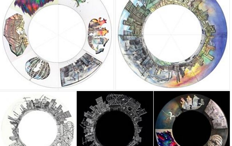
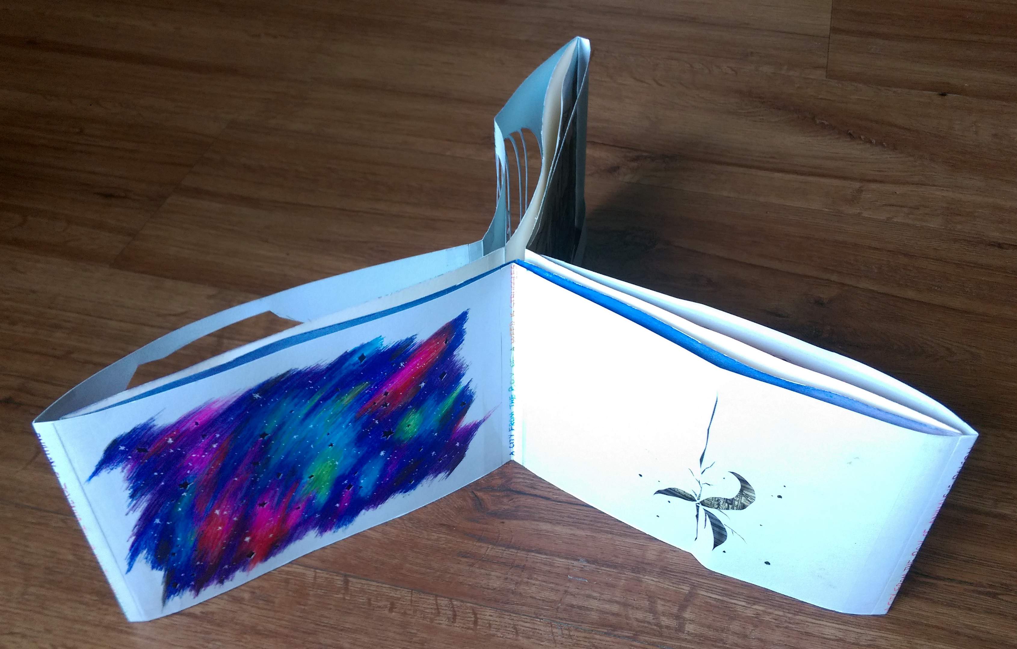
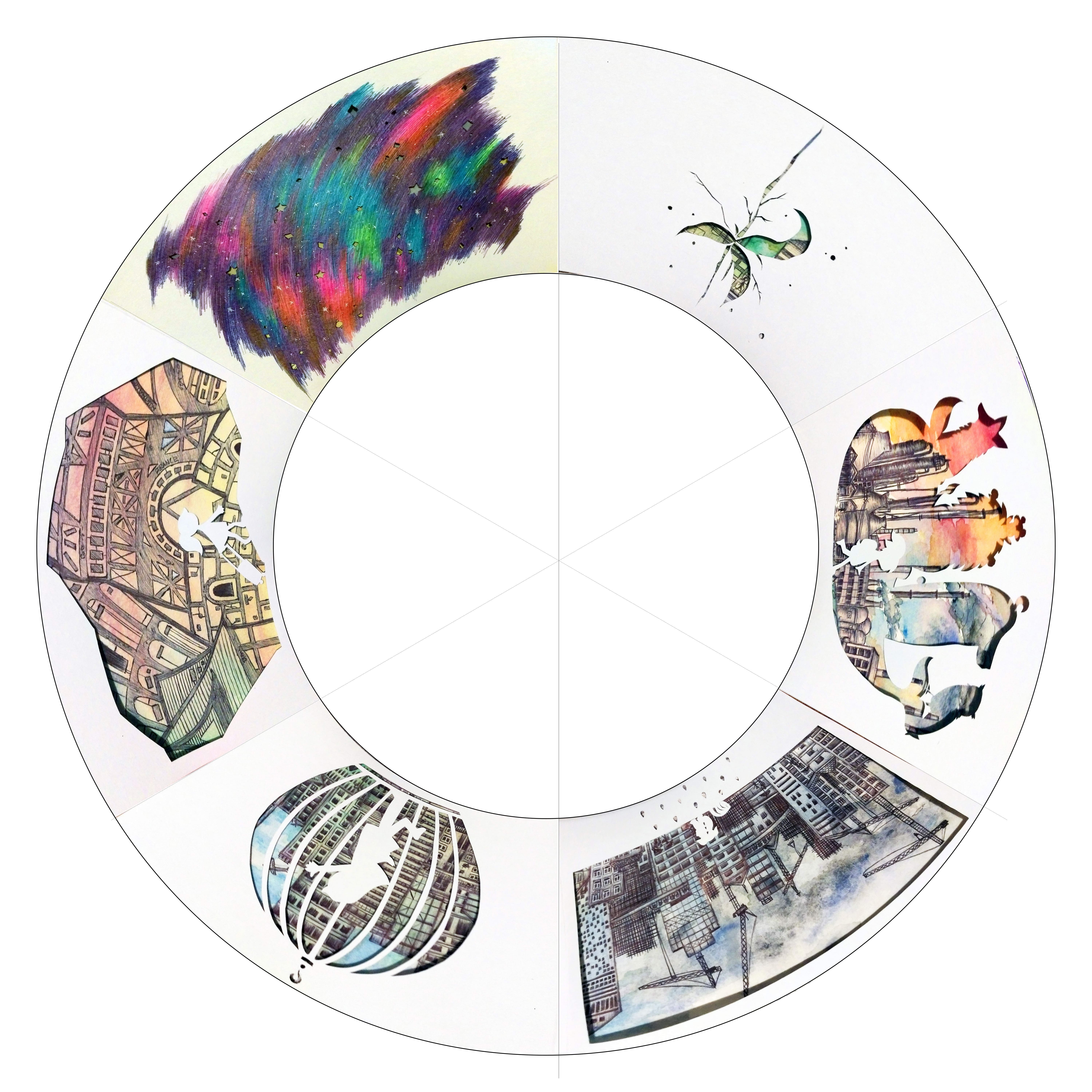
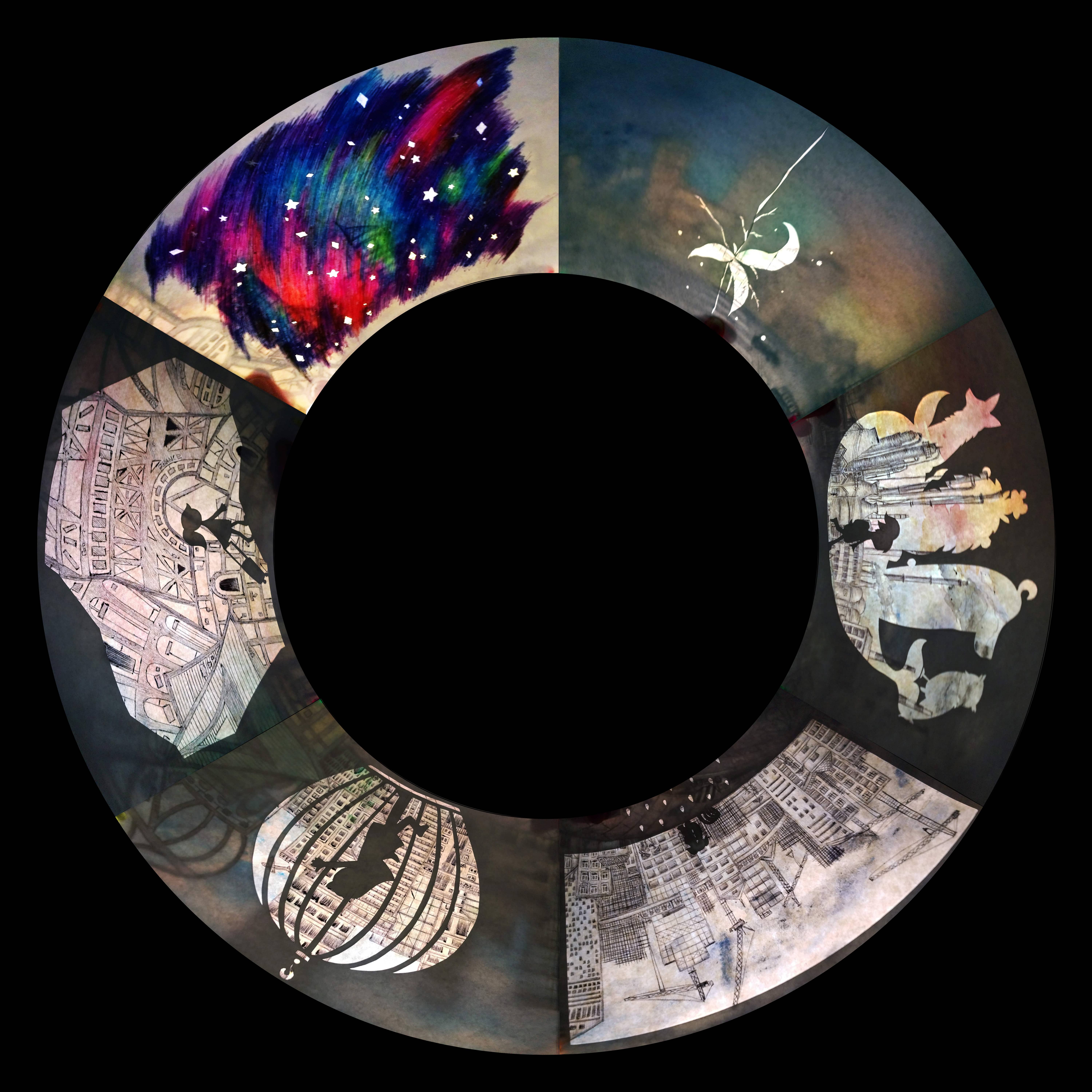
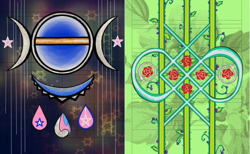
A gallery of the digital pages (In the way I arranged them for printing, not the proper reading order >_<)

I think, in the end, my zine turned out to be a good extension of my POV project…

IMAG6540__1461556340_155.69.161.30

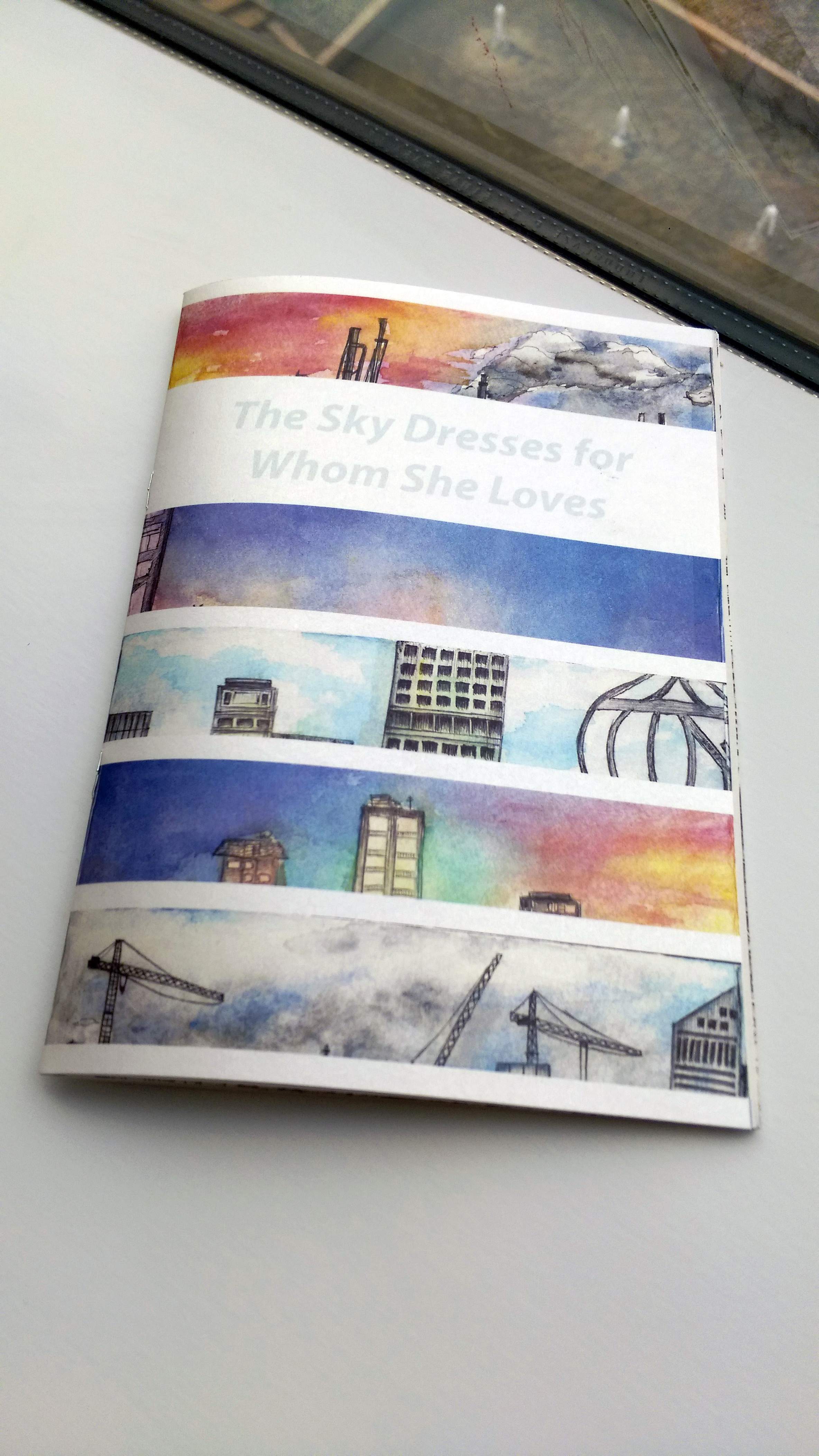
For the cover page I chose a shimmery paper because I just couldn’t resist, I love shimmery paper XD

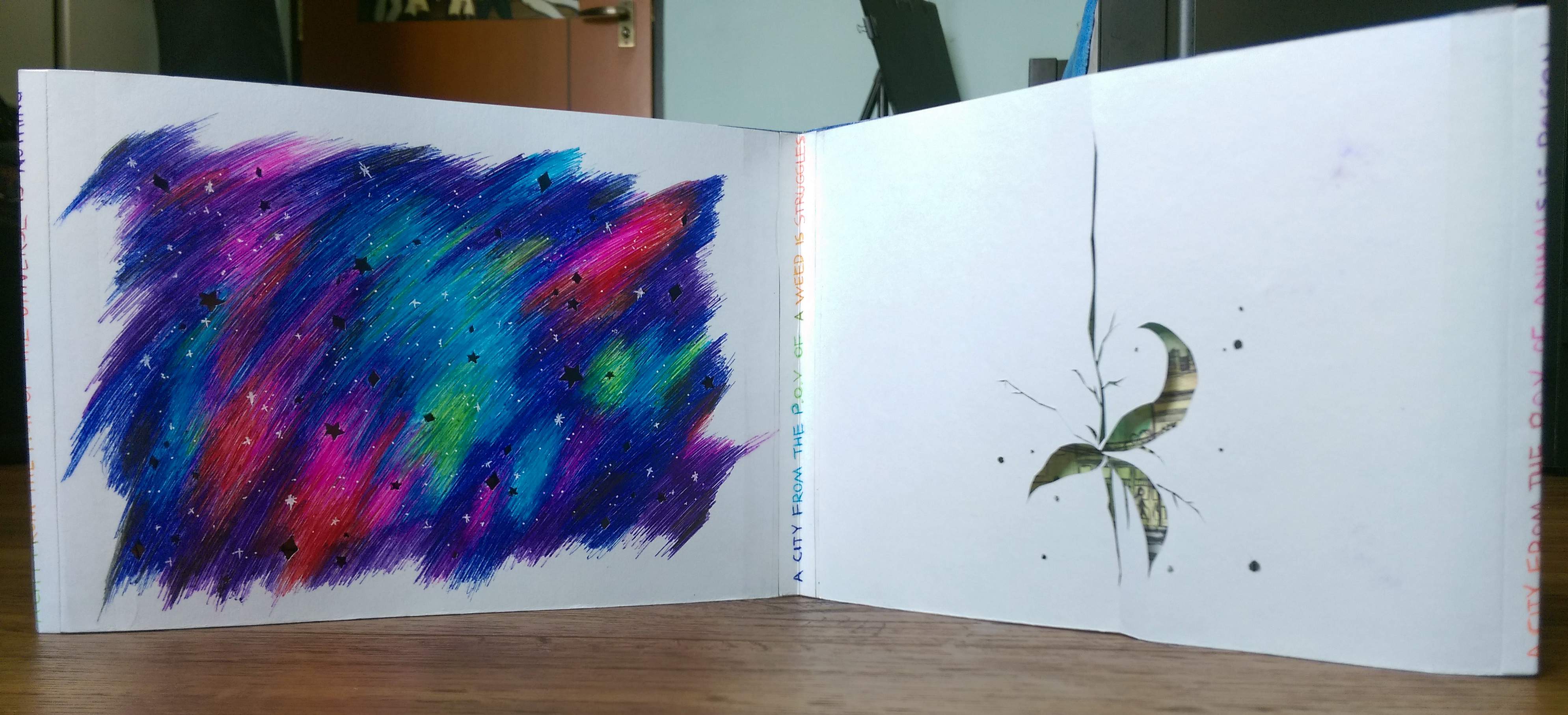
No but seriously the way that kind of paper tend to shimmer and shine reminds me scattered stars, the glow of the sky, and other magic like that. So I felt it worked well with my cover page.

IMAG6541__1461556429_155.69.161.30

Prof suggested I write something on the first page. Perhaps a short description or the artist/artwork? I stared at the page for half an hour and felt that my usual way of writings will be too clumsy for the elegance I was hoping for for my zine. So I dug around my embarrassing stash of writings from the past few years and picked out this line that will ideally convey the mood I want to achieve with the zine, in a more succinct manner.

IMAG6542__1461556439_155.69.161.30

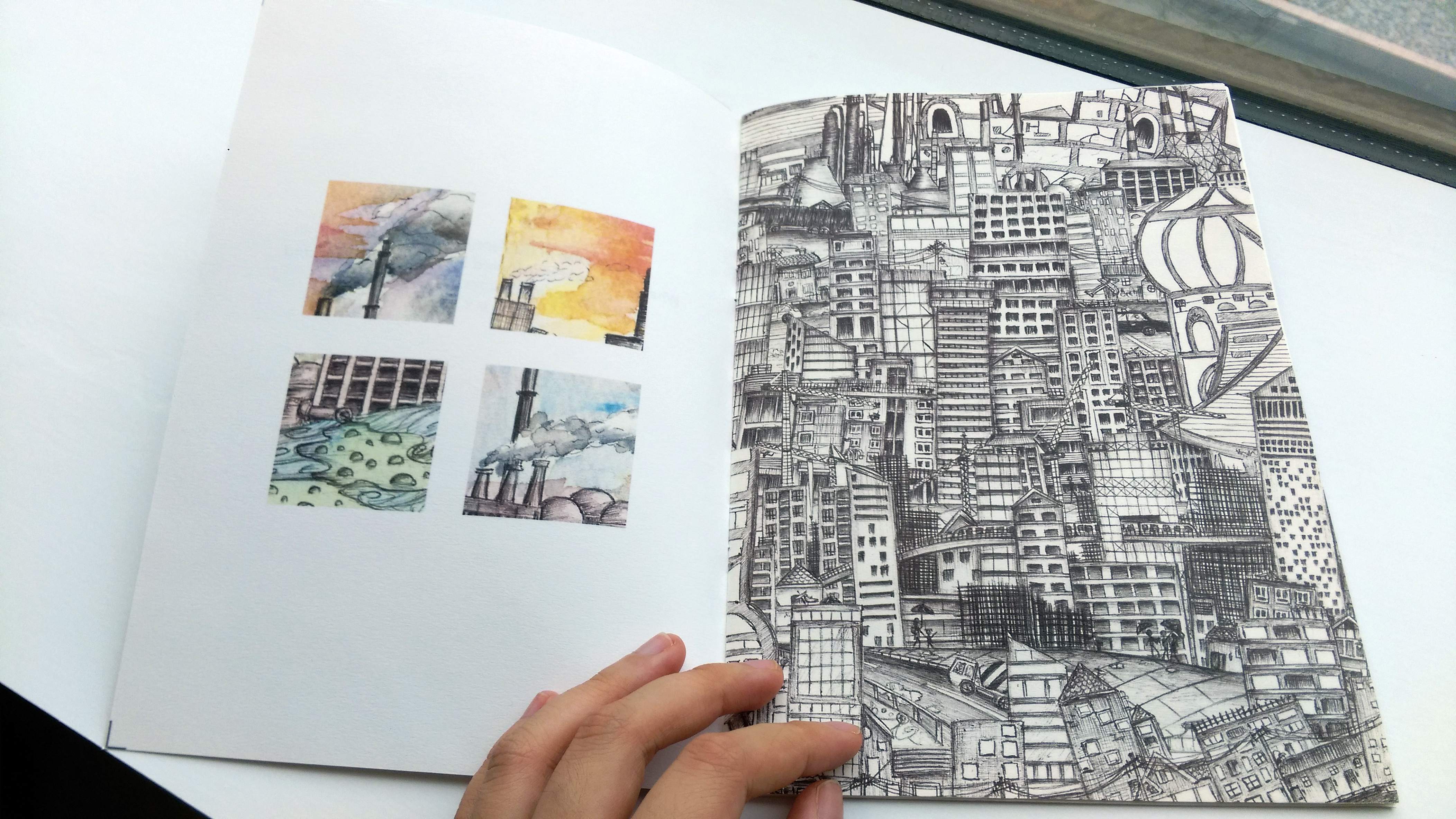
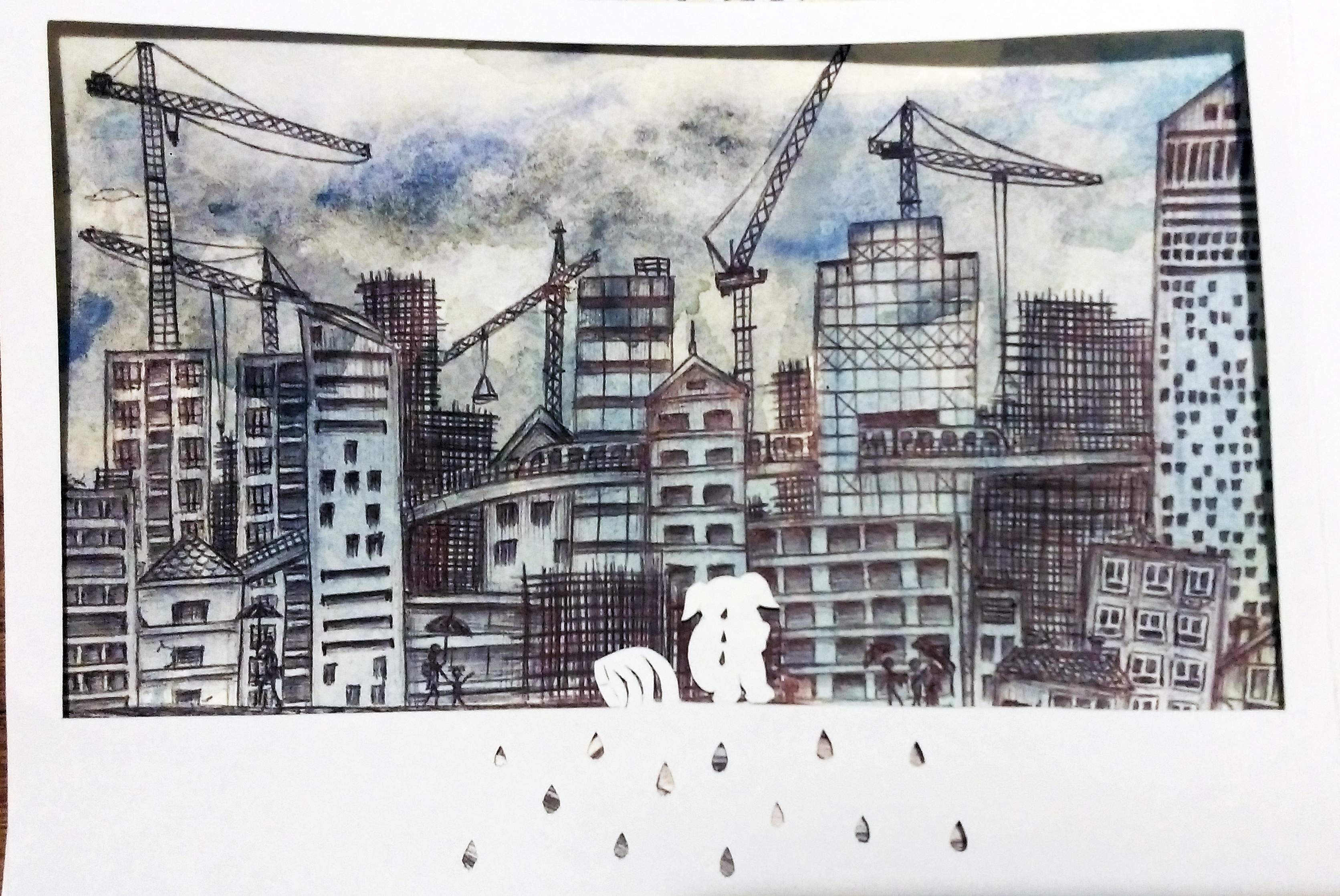
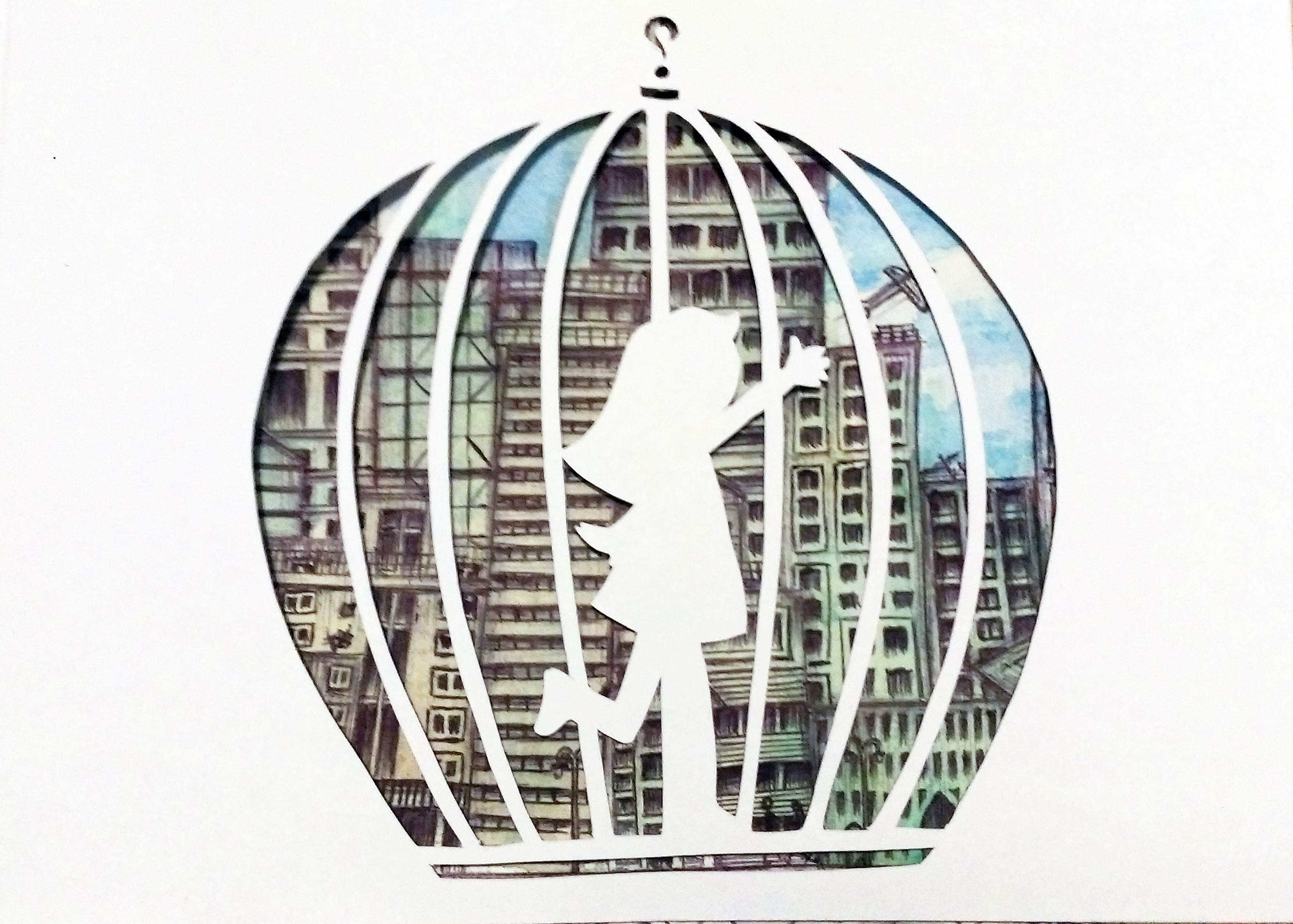
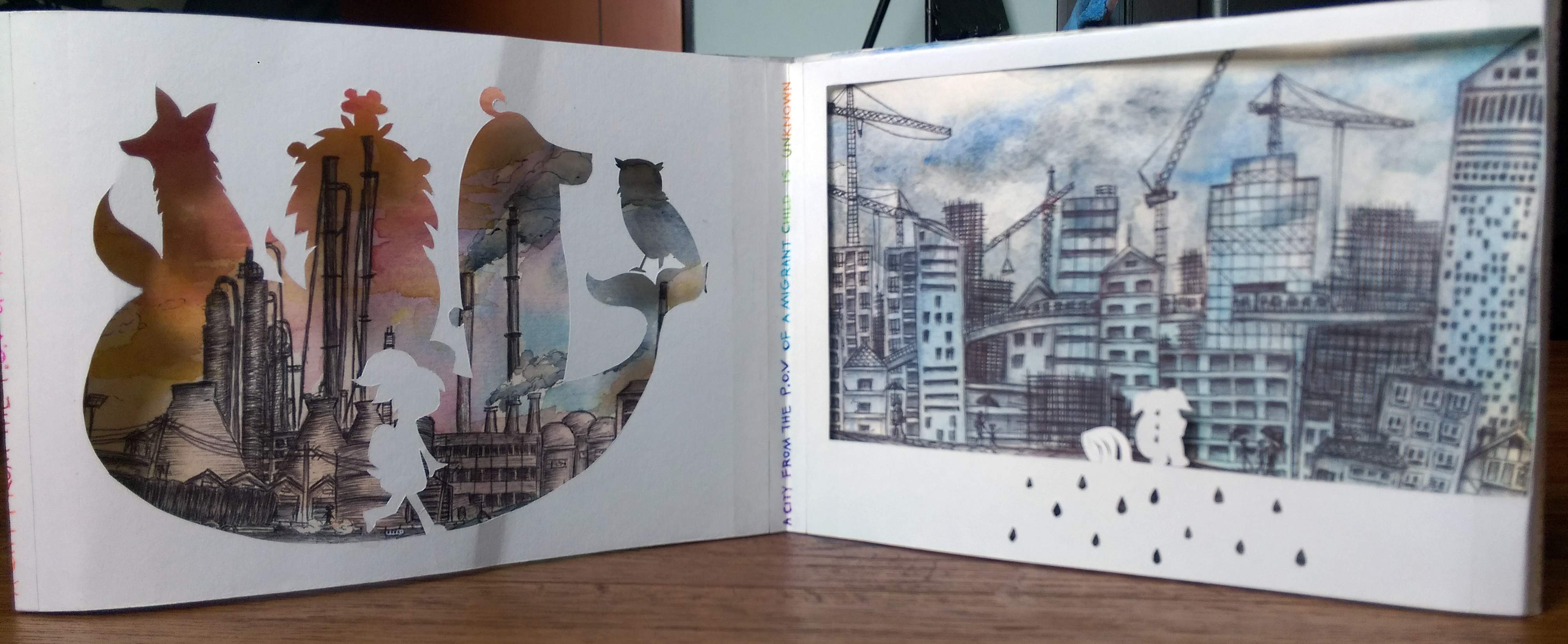
Pollution and overcrowding (Overwhelming)… General unpleasant things that.. people can live with once they accept I suppose… (Despite the constant desire to escapeeee >_<)

IMAG6543__1461556447_155.69.161.30

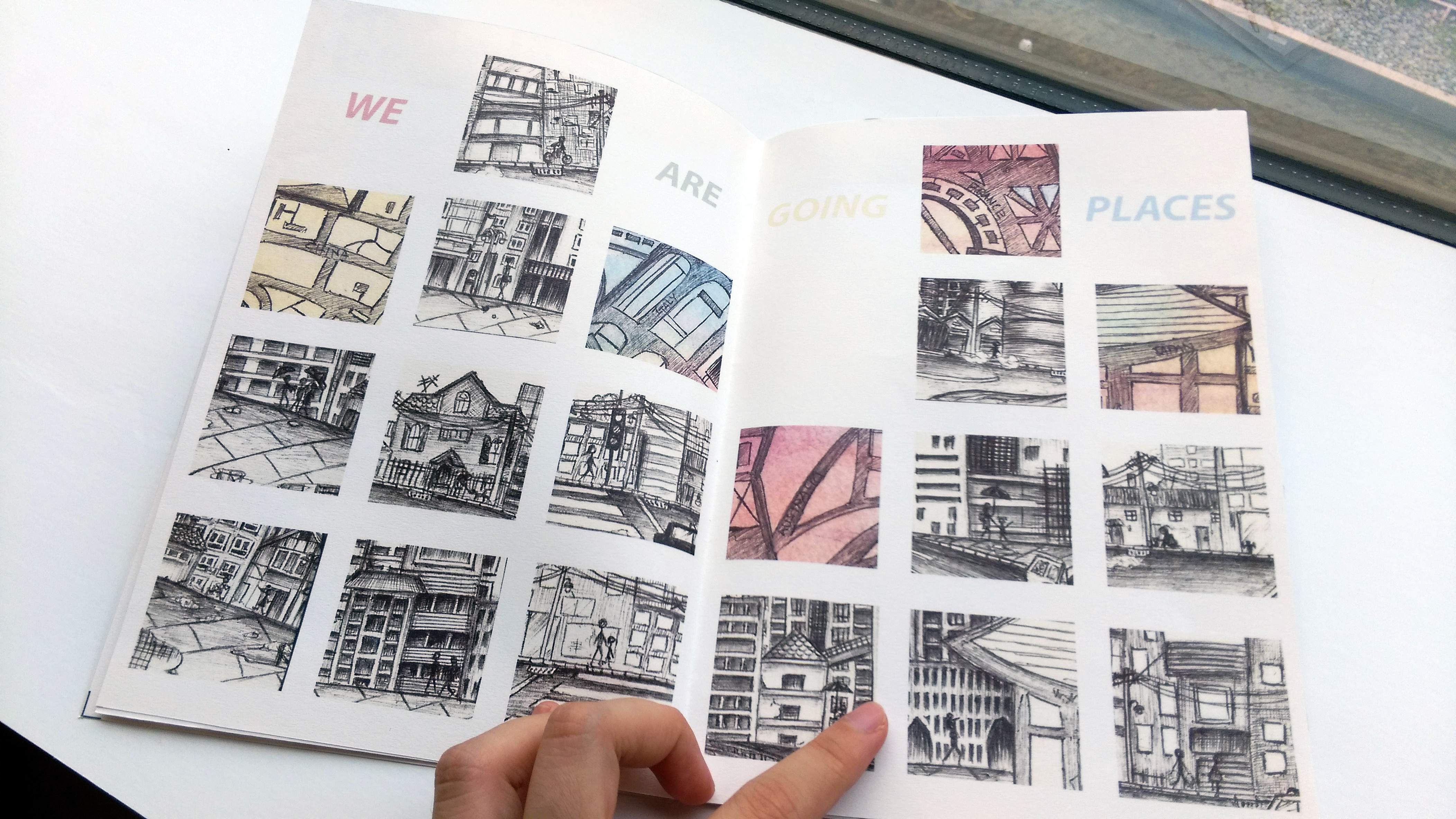
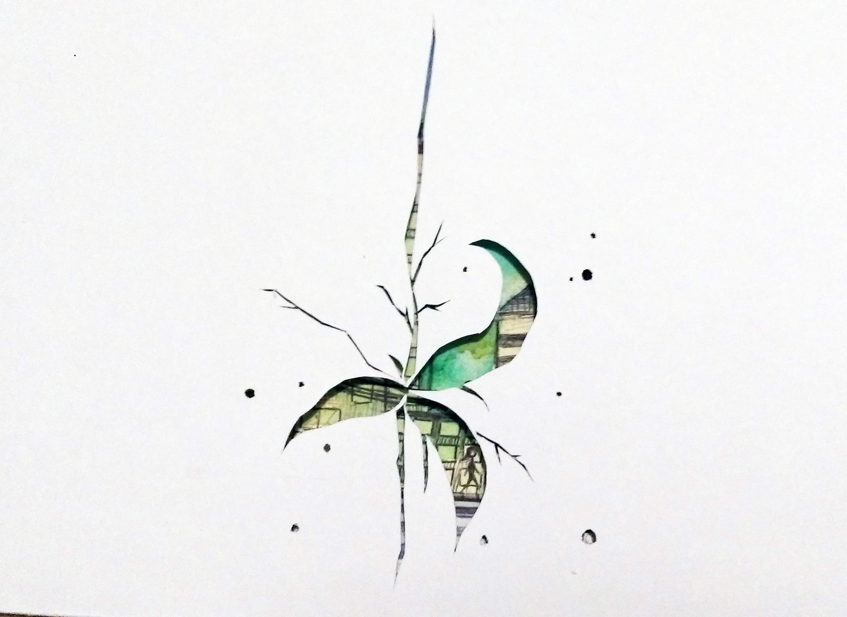
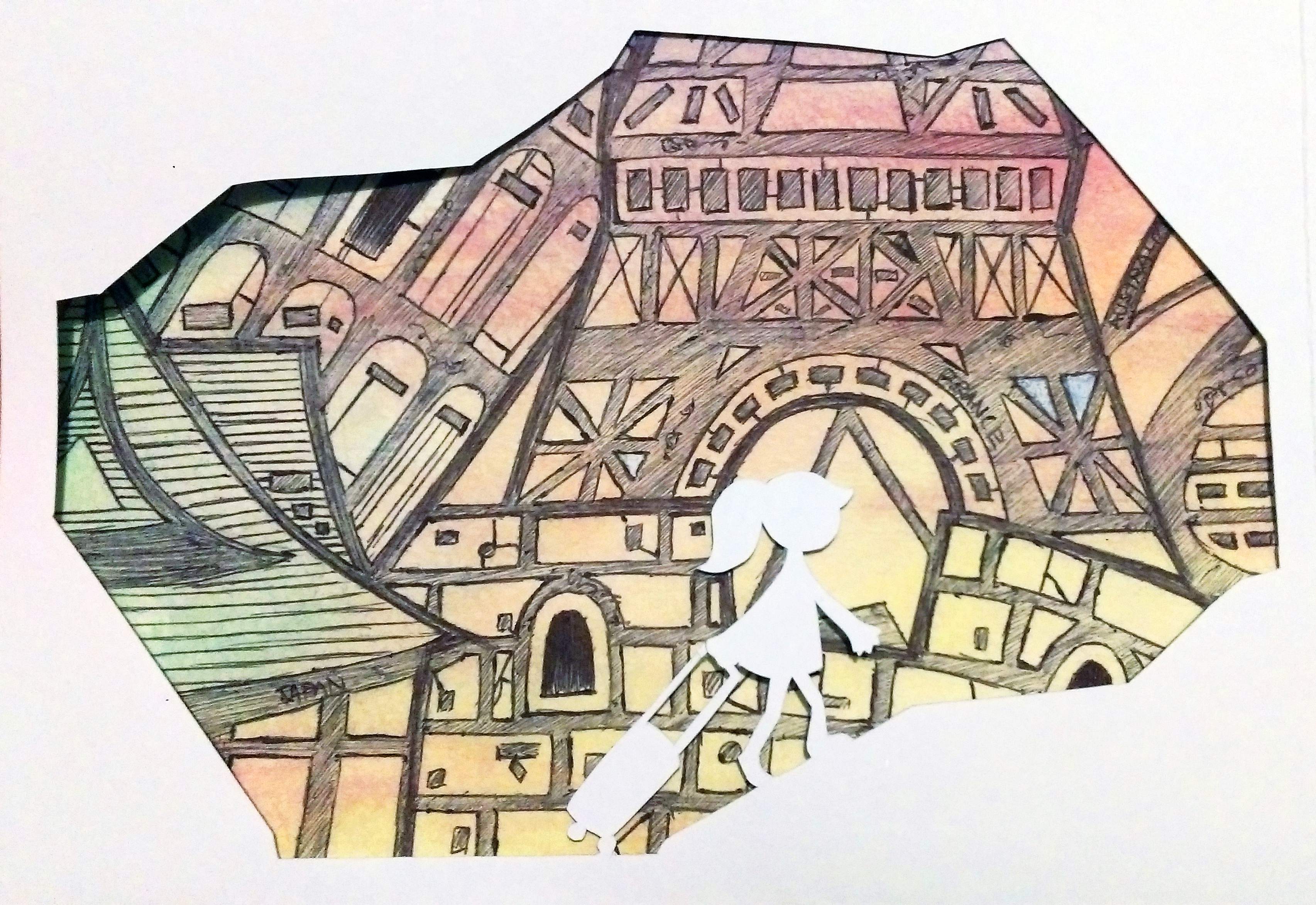
The idea of travelling, but also we each lead our own life and are on our own path to different locations and goals in life.
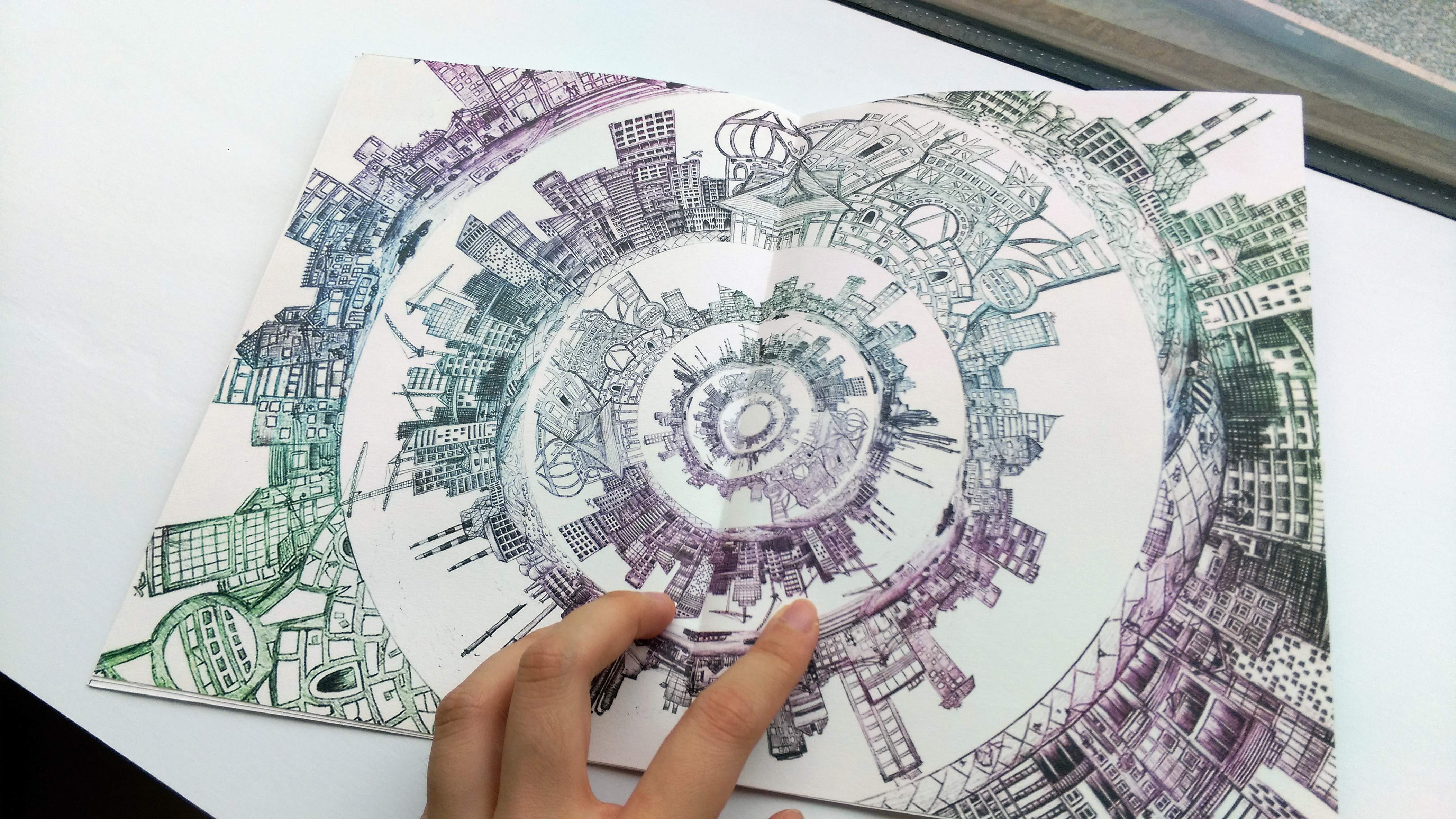
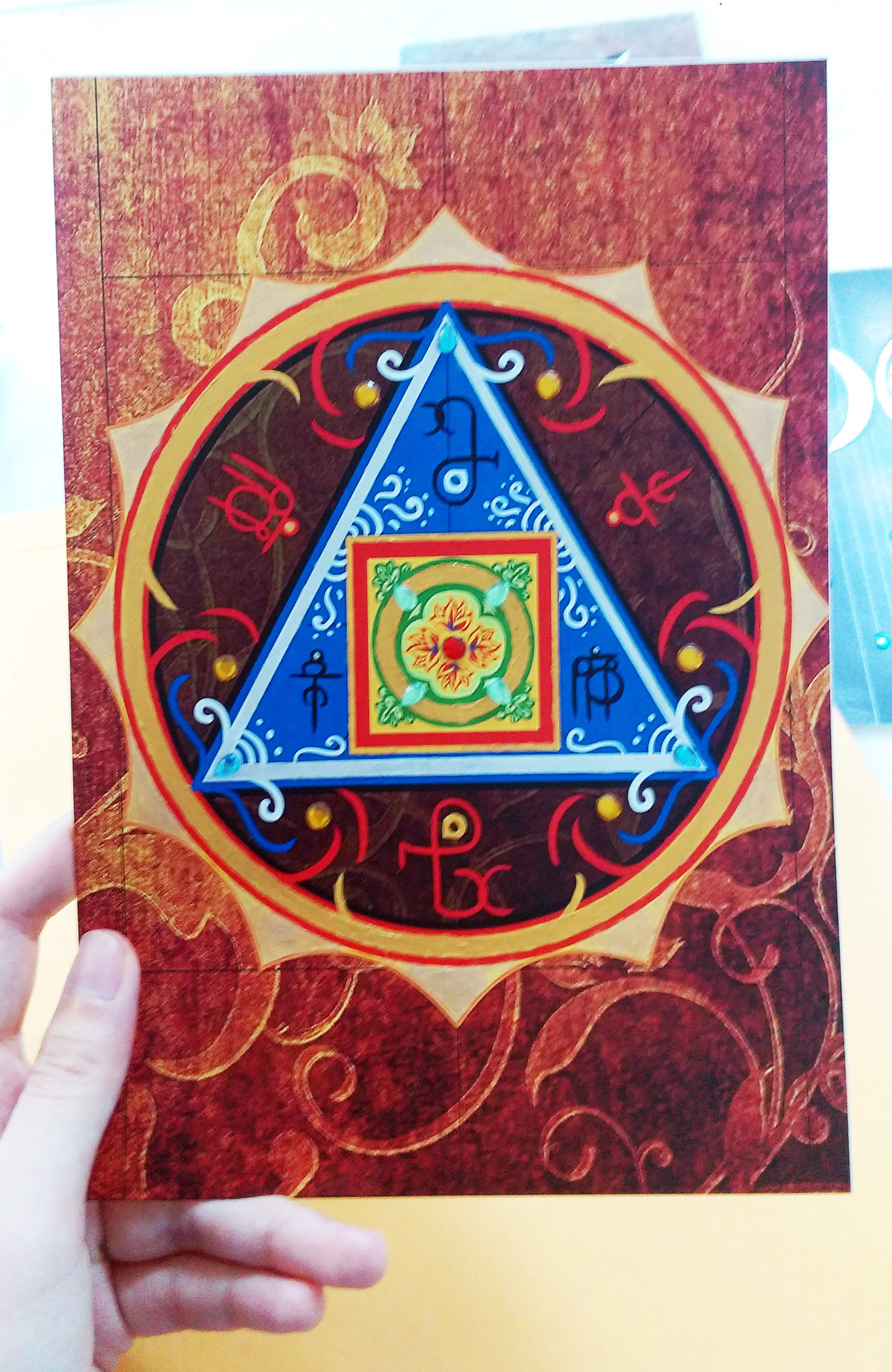
IMAG6544__1461556454_155.69.161.30

The center page @w@

IMAG6545__1461556950_155.69.161.30

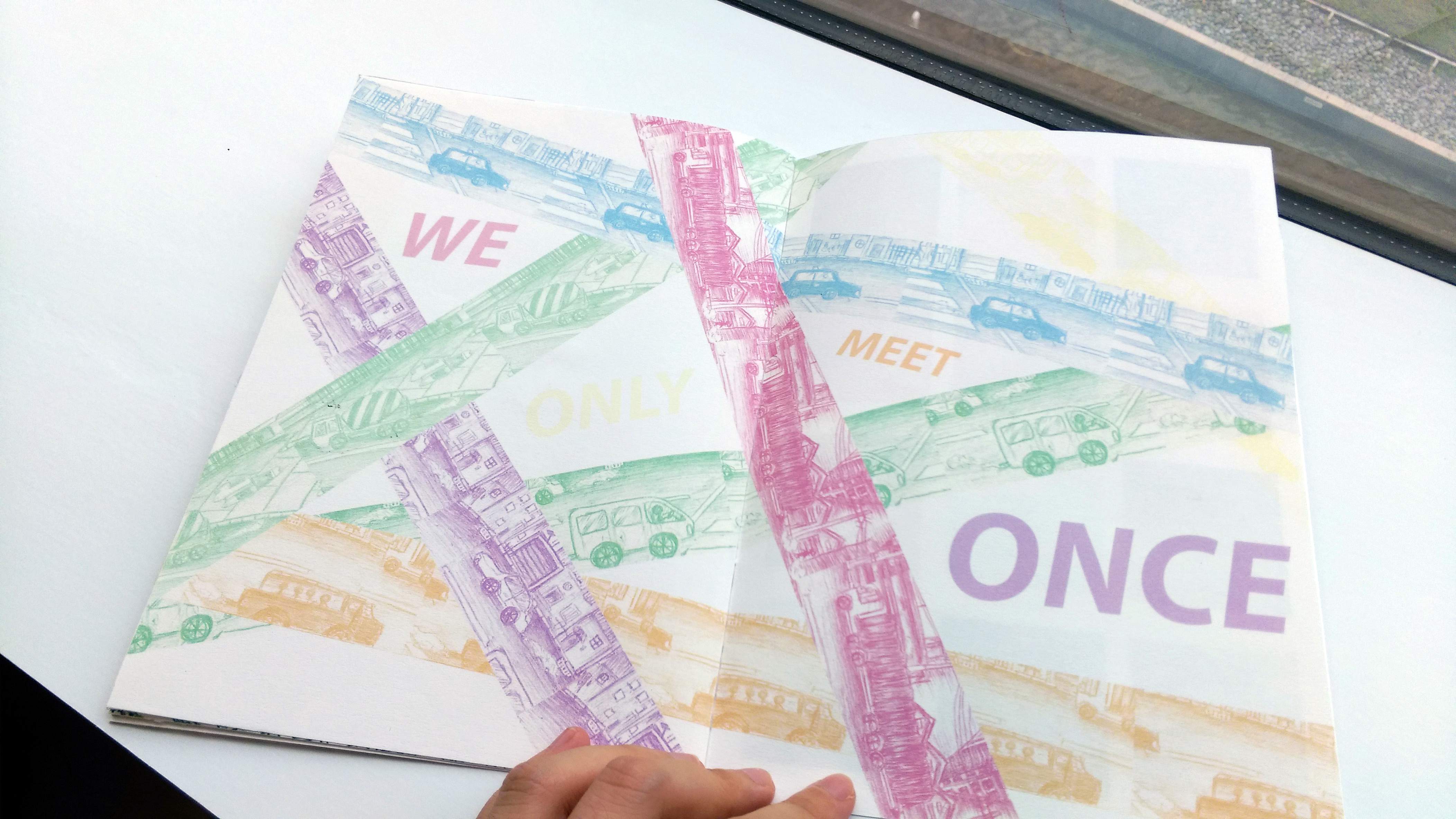
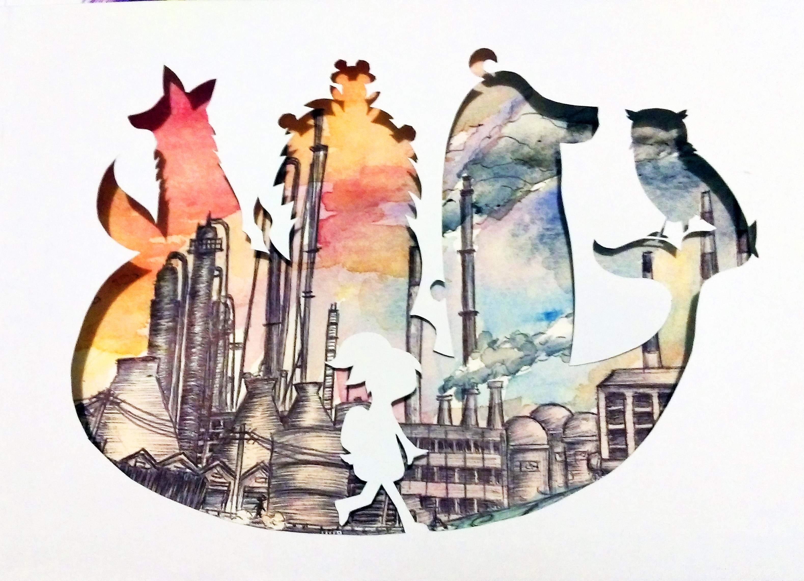
This some-what mirrors the “We are going places” page, but with more emphasis on how we will never completely know another person. Partly due to how hectic city life is, but also due to essentially.. how life is I guess. Most of us only meet at one point of our lives and zoom past each other really fast…

IMAG6546__1461556474_155.69.161.30

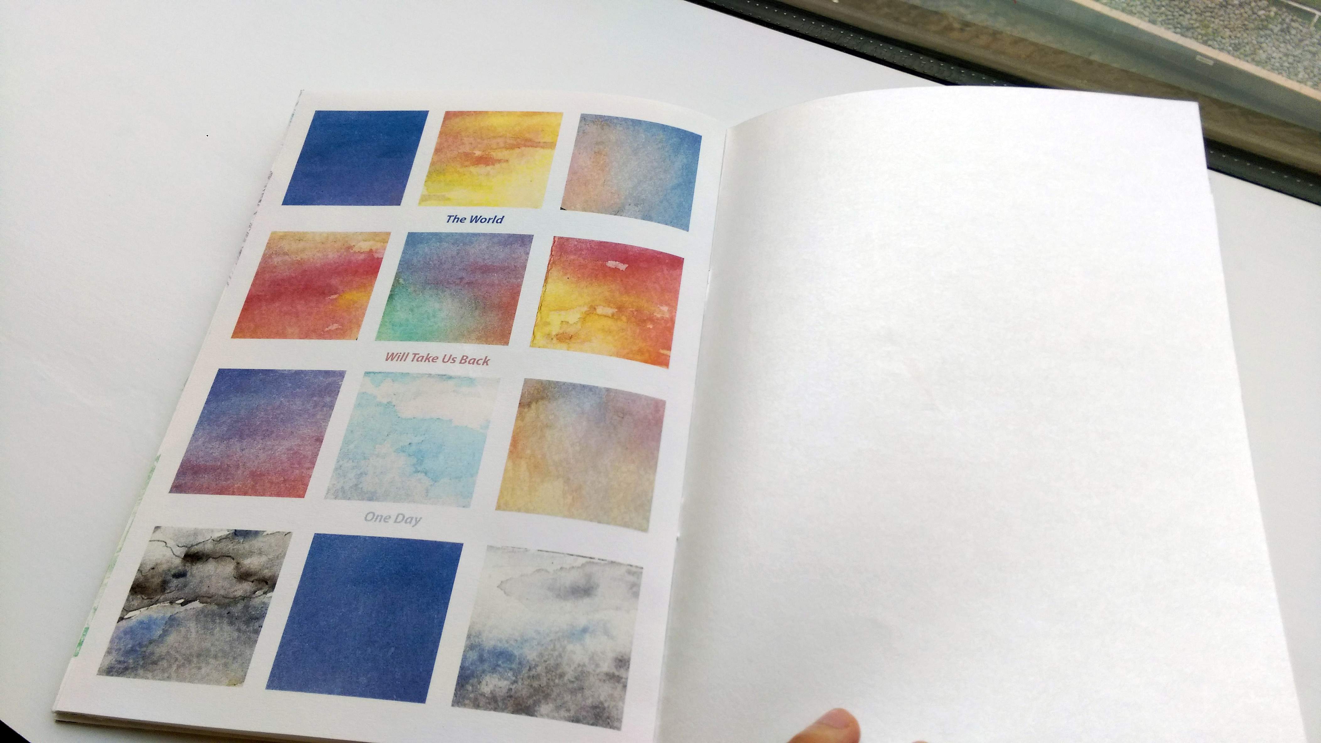
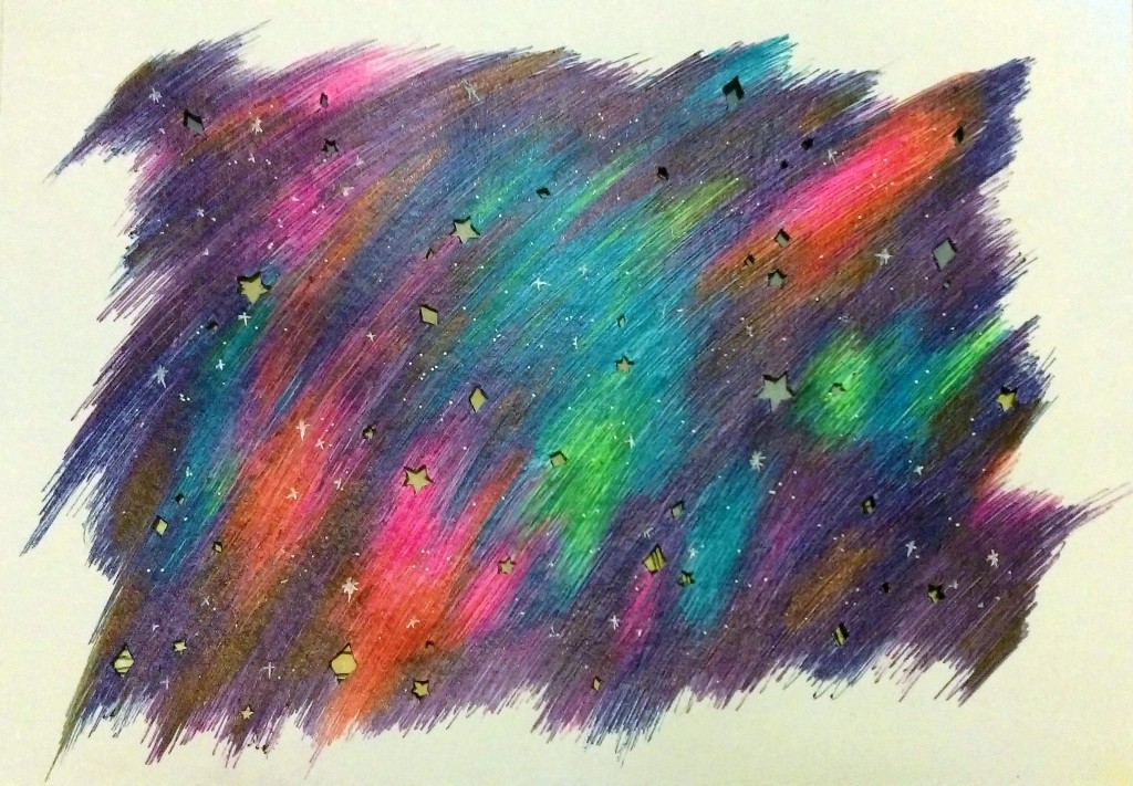
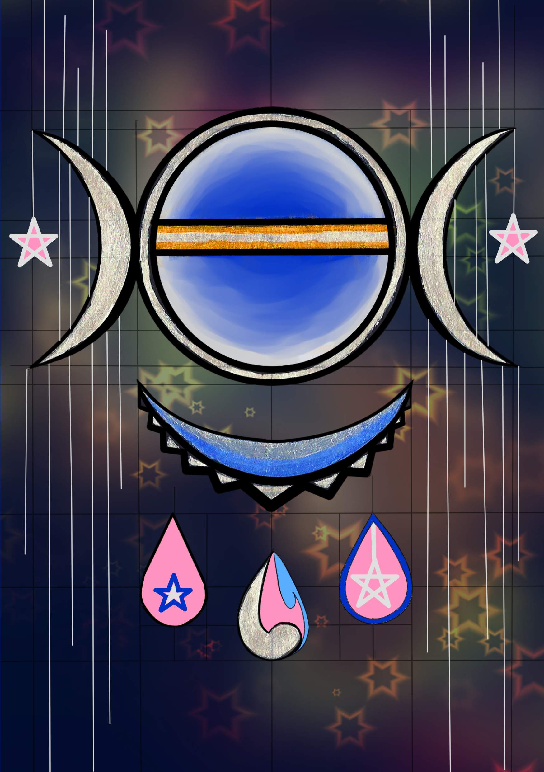
And of course, the last page mirrors the cover page. The message too. Both are about how the universe love us…

I guess, to me, it’s a calming thought that no matter how much we rush through life and it’s pleasant and unpleasant aspects, we will one day all be accepted back by the universe equally… I’m not sure if this random reference to death is creepy or morbid but.. to me, this insight is comforting and sort of beautiful (?)

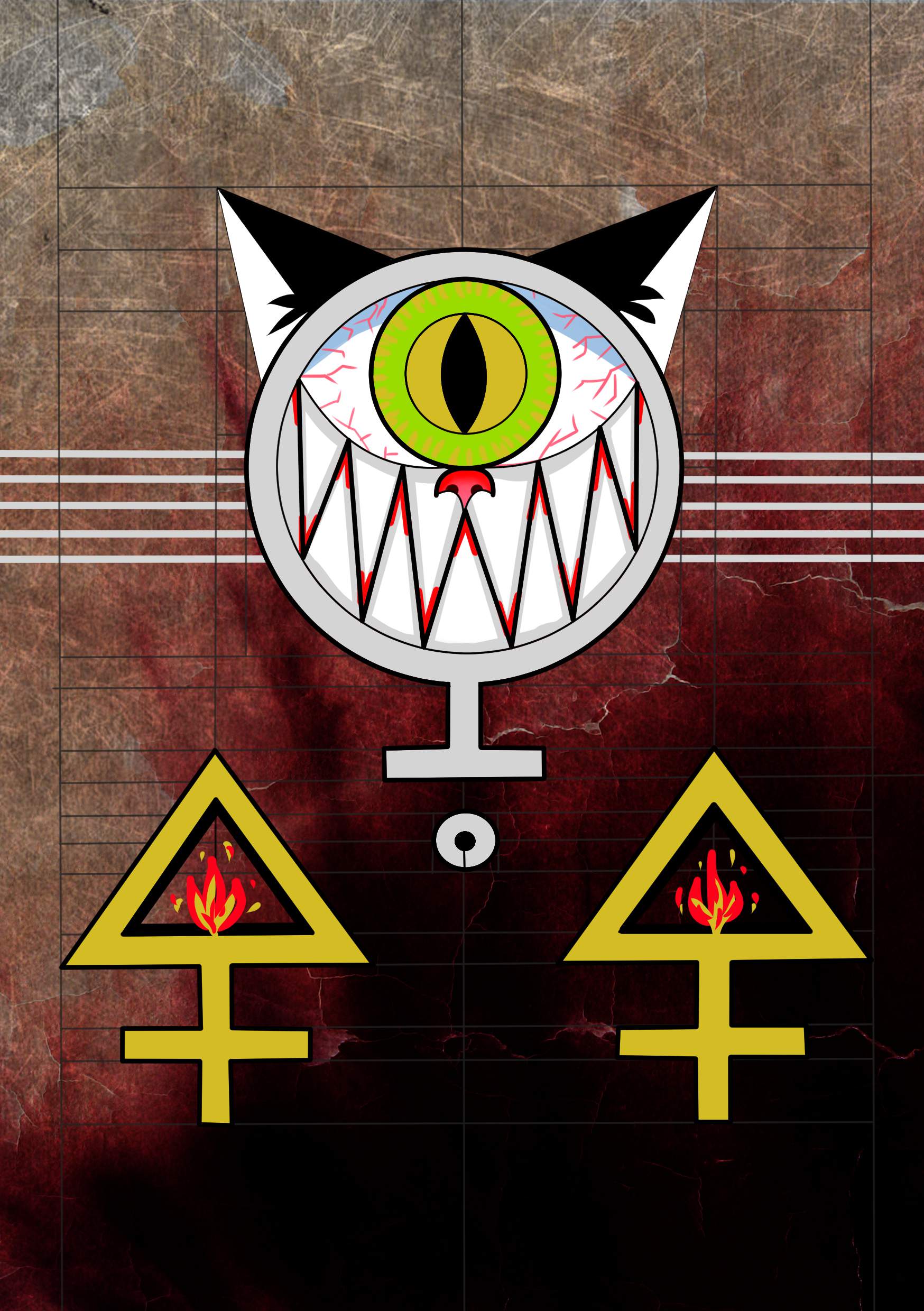
(The back cover was photographed but the photo turned out badly so please just look at the digital version earlier >_<)

I am not sure what to explain about the back cover except “Where is my path of flowers back to the sweet pastel sky?” is a line from… something longer that I wrote, and it’s positioning on my Zine is up to interpretations.. The “thing that I wrote” wasn’t entirely relevant, but personally I feel like this line close the theme of my zine quite well..

Overall Reflections:
I love most of how my Zine turned out in the end, but I think might have limited myself from the beginning with my perception of how a Zine “should” be.

I still can’t help but wonder if I should have tried more ways to merge my different projects for my Zine, since I did really want to include more than my POV project. (It would have been a lot of content, but it might have been worth it? I mean, perhaps I should have pushed harder in that direction at least in the exploration stage..). For example, perhaps instead of taking the separate elements of the different projects to merge into 1 image, I could try balancing the them by having different image from different projects on each page, but mirroring each other… hmmm…

Then again, that is just me speaking in hindsight as I feel very inspired by a lot of classmates and how they executed their zines, some of which were really cool OwO!!!

Of course, they way I execute my own zine was semi-intentional because not only did I want to try the “simple” look of most zines, I also knew I would be busy at the end of the semester. I actively decided to devote lots of time to my first 2 projects in 2D, but give more time and focus to my other final assignments (Such as foundation drawing…) instead. I don’t regret how it turned out, but perhaps… *^* \I’ll have to push myself even further next sem!!/ *^*

The entire semester has been immensely rewarding though, and since I did my best the best way I know how… I have my fair share of learning and exploring, and what more can I ask for? ^w^~ (Thanks Prof Ina!!)

POV: Final City!

IMAG6411

A City from the Point of View of a Weed is a Struggle.

This is actually inspired by something I wrote a long time ago, comparing a person in a city and a weed growing out of concrete, thus the positioning of the paper cut out such that a small person is visible as part of the weed.

IMAG6412

A City from the Point of View of Animals is Poison.

Needless to elaborate, about pollution.

IMAG6413

A City from the Point of View of a Migrant child is the Unknown.

Here, I wanted to go for the effect of the buildings towering over the child. The gloomy atmosphere is such that I focused more on the negative aspect for a child to migrate… I considered other words like “Loneliness/Not Home” as well, but in the end settled on the more neutral “Unknown” because it will be an exaggeration and almost a lie to say that there are no positive aspects of migrating either. Such as Hope and Opportunities..

The constructions in the background mirrors how a child’s changing and growing state, especially after a drastic change in surrounding. I feel it is most suited to express the dual meaning of “Destruction”, noise, overwhelming changes, but perhaps also the new “Possibilities” thereafter…

IMAG6414

A City from the Point of View of a Wanderluster is a Cage.

The perspective is that the “Wanderluster” has yet to become a “Traveler”. Although the towering buildings are again used to indicate being overwhelmed by the city, I think when the concept of “Cage” came up, I refer more to the duty and responsibilities someone has to endure to live in a modern and developed city..

IMAG6415

A City from the Point of View of A Traveler is a Map.

Pretty straight forward. The art style however changed a little because I wanted the buildings themselves to resemble a map~

IMAG6416

A City from the Point of view of the Universe is Nothing.

A bit of contrast from the first one (Weed) going from the micro to the really macro perspective. And maybe also just a tiny bit of mockery towards human accomplishments (and failures~).

But really the execution of this last one also came from something I wrote long ago, comparing the light of a city to stealing the star light off the sky…

IMAG6445IMAG6449 IMAG6447 IMAG6448

final ring-min

Together.. and..

glow ring-min

Bonus back-lit version~ The photos doesn’t do it justice, but I think if given the time and ability I would like to have set up my final presentation with the artworks in a loop, and lights in the middle. It works especially well for the “Universe POV” but even for the rest, I always like to use lights when I do paper cuts because it shows the layering very well..

Honestly the “looped” version here is closer to my original idealized final mode of presentation, and I am very happy with how it turned out ^^

Hello Meow~

Firstly, the final. IMAG5385

This is the typography. It’s a one eyed cat, which I usually use as a symbol for myself. Although this “symbol” has evolved in style.

cat For example, this was a previous design that was screen printed on the back of a shirt~

This time the one eyed cat is made up of the letters “P” (red) and “X” (the green eyes) as these are my initials.

IMAG5384

This is the abstract. I love circles, but I also have hydrophobia so.. @@

Actually the small concentrated black dots in this picture still makes me quite uncomfortable. But the big, colorful ones are actually quite nice. Mostly because they are done in my favorite colors, and the loops within reminds me of CDs and music.

The 3 silver lines at each side that frames the circles are suppose to resemble abstract/simplified cat claw marks.

IMAG5382

This one……….. is mostly the combination of a gunshot, and an eye within. And is up to interpretations.

And these are the processes:

IMAG5387

I mostly worked from what I like (cats, royal looking things (emblems), books, eyes) and what mood I would like to convey. The mood particularly applied to the typography as I was unfamiliar with it and felt the need to put in more thought.

Then there were a lot of thumbnails.

IMAG5388

IMAG5386

More thumbnails and stylistic considerations.

Bonus this was my first attempt for typography. It did not look as aesthetically appealing as I would like, but the idea was a paw print made out of my finger prints (so it’s a cat, but its me? XD) and my name “scratched on”.

IMAG5383