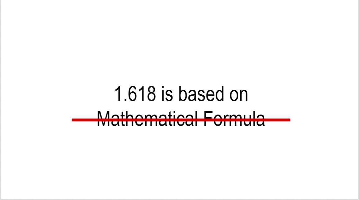
To get this number it involves maths but since im bad at maths, im not really gonna touch a lot on how to get that number. But basically to get that golden ratio number iits based on a specific formula
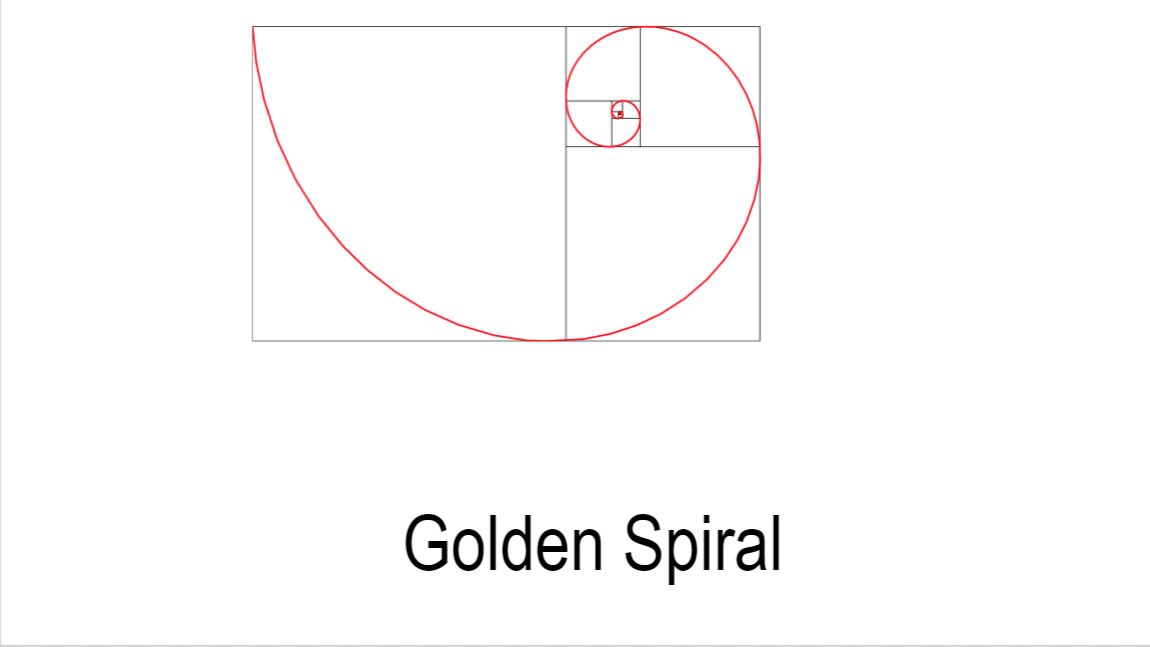
Imagine u have a finite line called a. And there is a random point on a that separates the lines into two different lengths. We r gna call the longer one b and the shorter c. now if u were to divide the length of b by c and its equal to a/b then those two numbers will be in the golden ratio
Based on that ratio u can create sth called the golden spiral. It serves as the basis of the golden ratio tool
The idea is that when u overlay the golden spiral on top of the artwork, im taking leonardo da vincis mona lsia as an eg, you want the focal point which is her face to lie in the intersection of those two red lines. So for eg, if u want to take a portrat pic of soemone u would want the eyes to be around that line
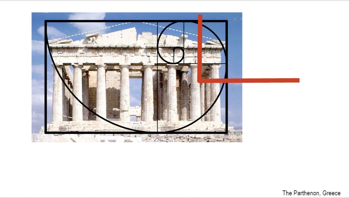
the top of the columns and base of the roof line are in a close golden ratio proportion to the height of the Parthenon.This demonstrates that the Parthenon has golden ratio proportions because the focal point that is the frieze (the part above the column) lies around the intersection of the red lines and the columns that is the secondary focus lie on the rest of the golden spiral
Golden ratio is everywhere around us. As u can see on this twitter layout, the tweet which we click on acts as the focal area as it is on the intersecting rlines. The rest of the secondary tweets which we r not reading flow out around the ohter parts of the spiral
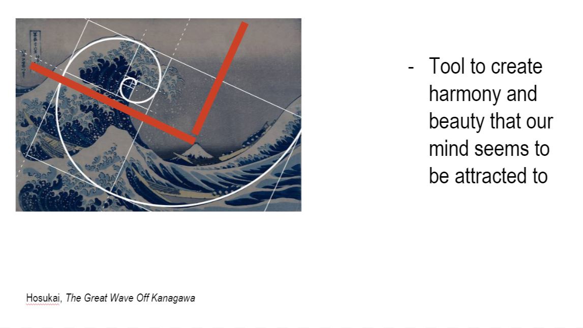
As you can see int his Great Wave painting our eyes are immadiately diverted to the area around the red intersecting lines and then it slowly flows to the other areas of the golden spiral. This makes thw whole painting aesthetically pleasing and not too overwhelming on the eyes
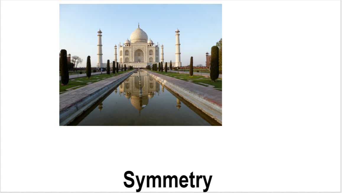
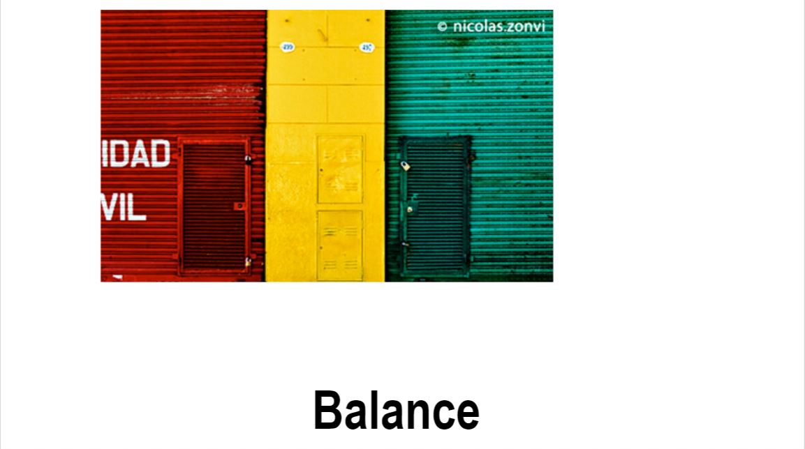
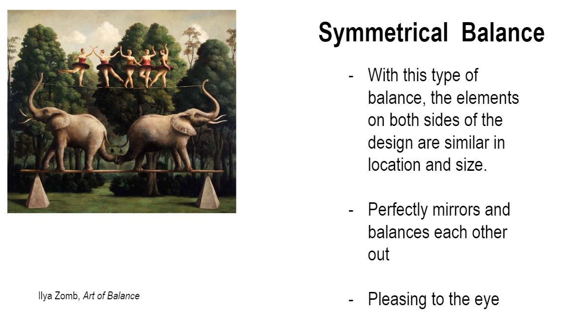
When it comes to symmetry theres two types symmetry and asymmetry. Ill be talking abt symmetry.
U can easily imagine that if a line was drawn in the middle, the left side would be virtually identical to the right
There is a same cluster of subject matter on both side of the artwork
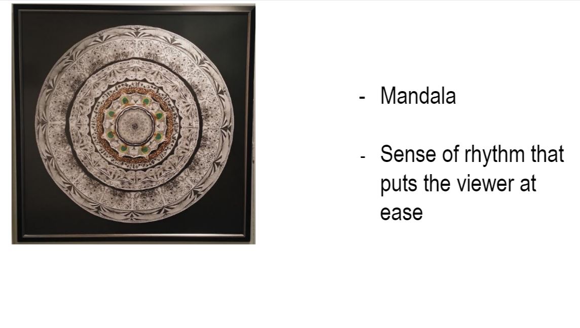
Did this for a levels. If u were to cut the mandala into a quadrant and repeat it, it mirrors the exact image
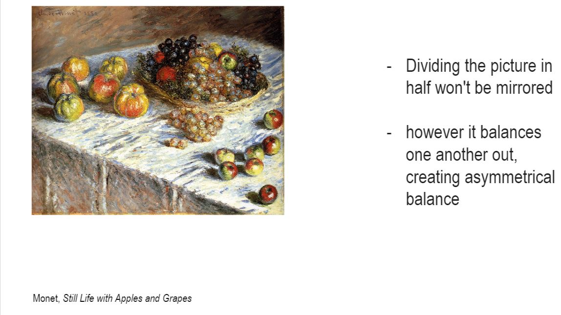
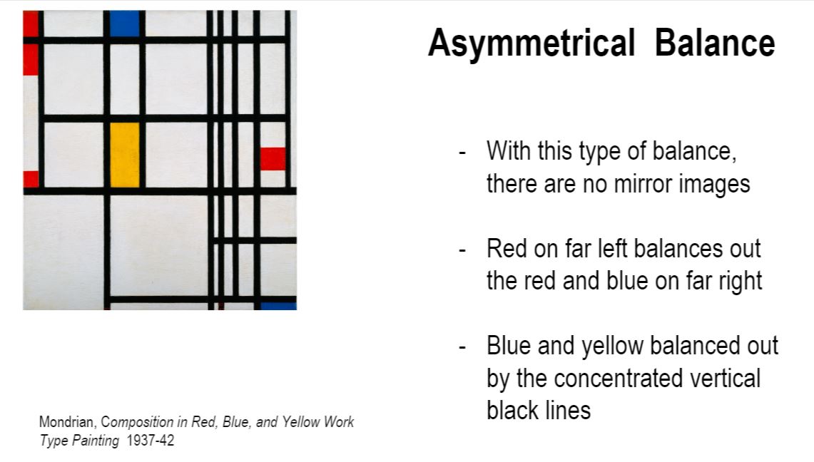
Each side of the design is different one huge tri on the left and 3 small tri on the right yet still balanced
Symmetry and asymmetry are similar because they both exhibit a sense of balance.
Eg.
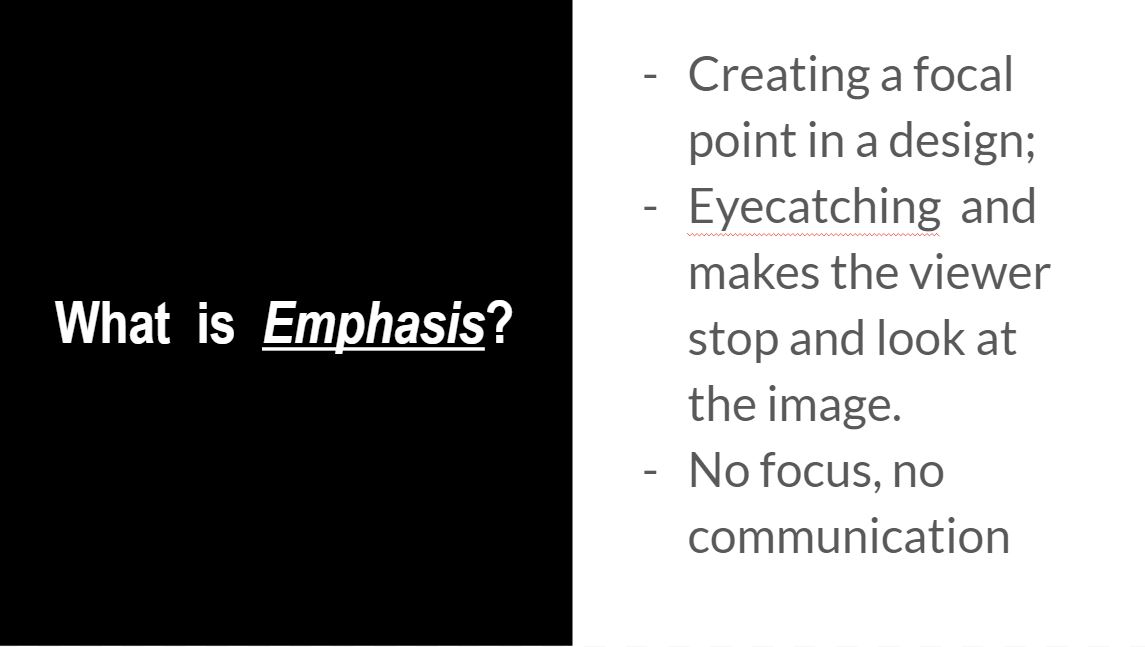
Emphasis creates a focal point in a design; it is how we bring attention to what is most important.
Emphasis is what catches the eye and makes the viewer stop and look at the image.
Without emphasis, without getting the viewer to look at the image, communication cannot occur.
You see a person hidden under a rainbow coloured umbrella. She’s walking in the snow. Everything else is covered in white except for the umbrella. And the thing that pops in your eye is the umbrella. This shows how that emphasis is placed more on the rainbow. Contrast in colours is being used, to show emphasis.
Similarly, contrast is being used here. What is being emphasised in the small dot , in a midst of big black dots of similar size and colour.
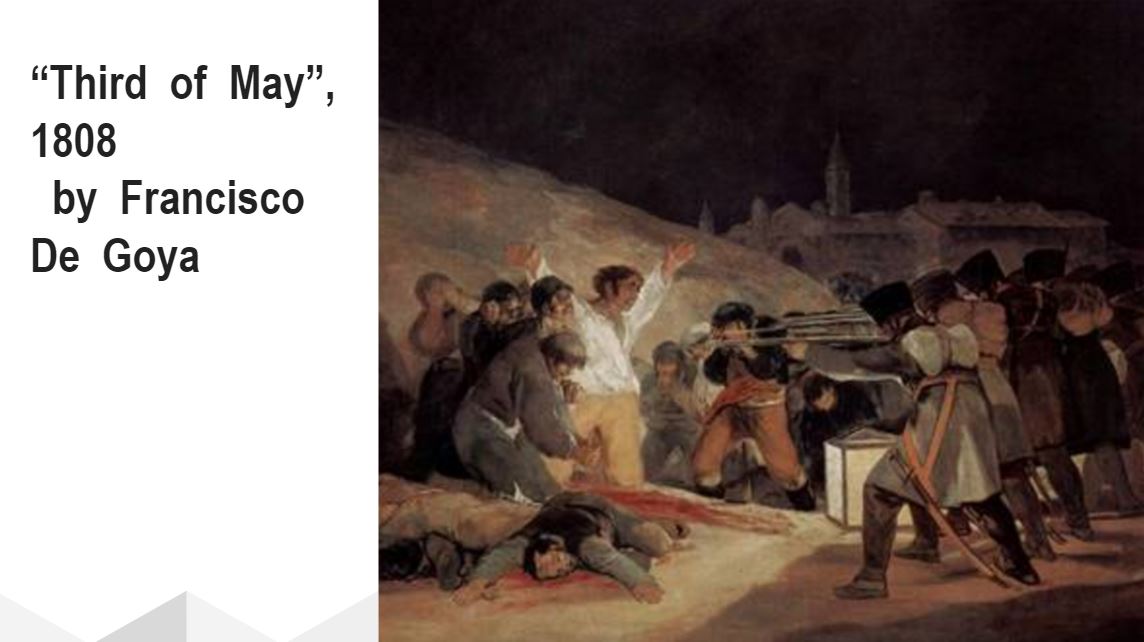
Emphasis can also be created by placement. Placement meaning the way some elements are being put also creates emphasis as well. We see a row of soldiers holding rifles standing side by side. As rifles are directed towards one directiom, that is a form of emphasis. Emphasis is put on the men in white with his handup in the air.
Implied lines all directed toward the same place can create a focal point there. Isolating an element from the others by its position in space will also create emphasis.
Implied lines, which also come in the form of subjects, all directed toward the same place can create a focal point there. Isolating an element from the others by its position in space will also create emphasis.
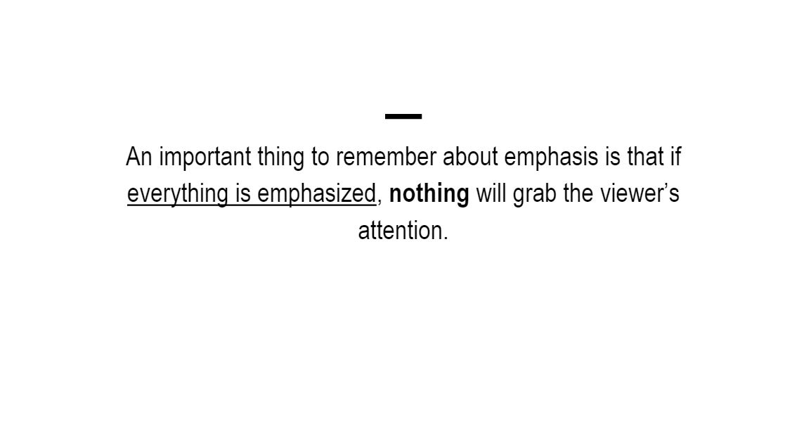
An important thing to remember about emphasis is that if everything is emphasized (all text is large and bold, all images are animated or flashing, everything is in bright colors) then nothing will stand out, nothing will be emphasized, nothing will grab the viewer’s attention.
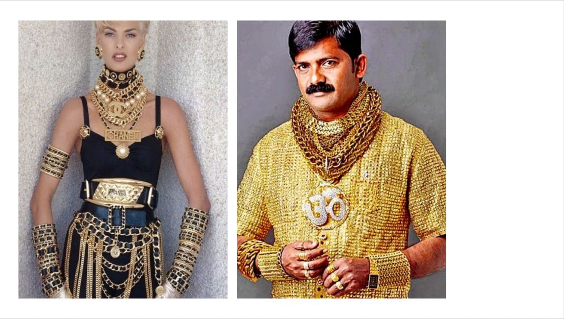
Everything that you see has no focul point, and it becomes super messy.
Fashion no-no’s: Too much emphasis as seen here. These two appear to be wearing lots of gold. Even if you look at them indivudally, your eye tend to wander around the gold. There’s no focal point, so you don’t know what is being emphasised here.
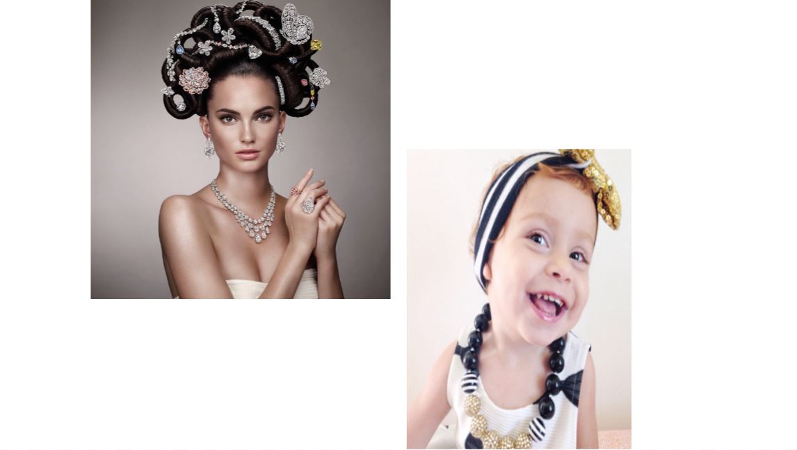
Both of these girls covered in jewellery but not as much as the ones before them. A good amount of emphasis put on the way jewellery is being put in model’s hair. Your eyes are much directed to her hair, her focul point. Then it drops down to her earings, her necklace and then those 2 small rings on her finger. So, there’s emphasis on the jewellery, your eyes are working around from top to bottom, making it easy on the eyes
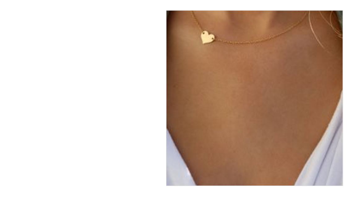
Similarly, as we see in someone’s neckline area, we see heart shaped necklace. What draws our attention is the the thing that stands out the most, that is the little heart shape here.
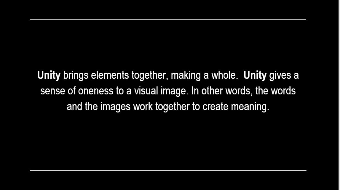
There’s this theory called gestalt theory of visual perception. What it means is basically our eyes, by default, tend to find meaning when seeing elements placed together. This means that you as a person, is actually looking for a connection, and for unity in the designs.
So when it comes to unity, there are 3 ways our group elements together and form a whole.
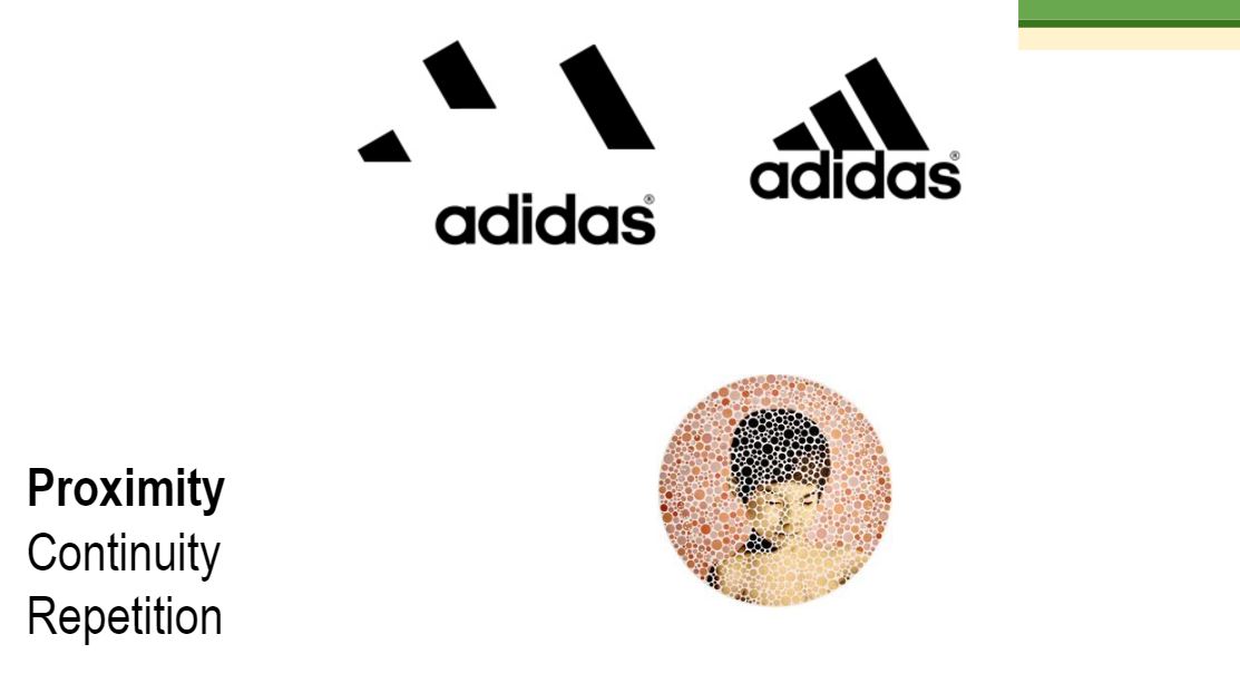
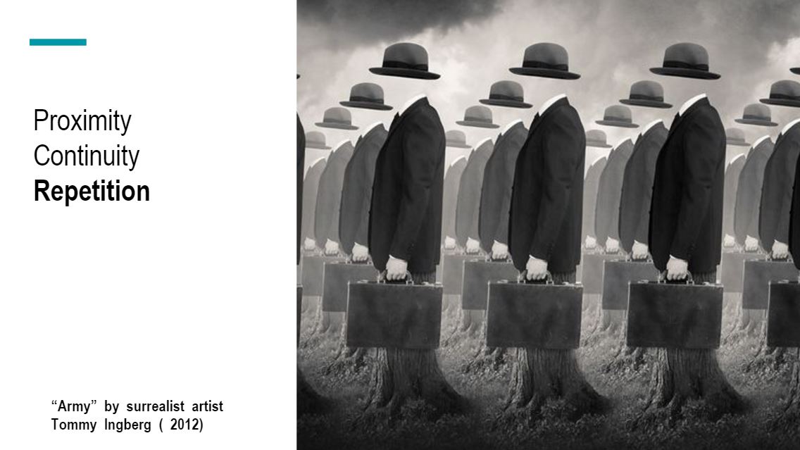
Proximity
continuation
Repetition
Proximity is based on grouping by closeness; the closer elements are to each other, the more likely we will see them as a group. Proximity is one of the easiest ways to achieve unity.
Continuation means that something (a line, an edge, a curve, a direction) continues from one element to another. The viewer’s eye will follow the continuing line or edge smoothly from one element to other and the mind will group the elements because of this connection. Implied lines are one example of continuation.
Repetition is based on grouping by similarity; elements that are similar visually are perceived to be related. Any element can be repeated – line, shape, color, value or texture – as well other things such as direction, angle or size. Repetition helps unify a design by creating similar elements and is one of the most effective ways to unify a design
Repetition is based on grouping by similarity; elements that are similar visually are perceived to be related. Any element can be repeated – line, shape, color, value or texture – as well other things such as direction, angle or size. Repetition helps unify a design by creating similar elements and is one of the most effective ways to unify a design