2D Zine (Process)

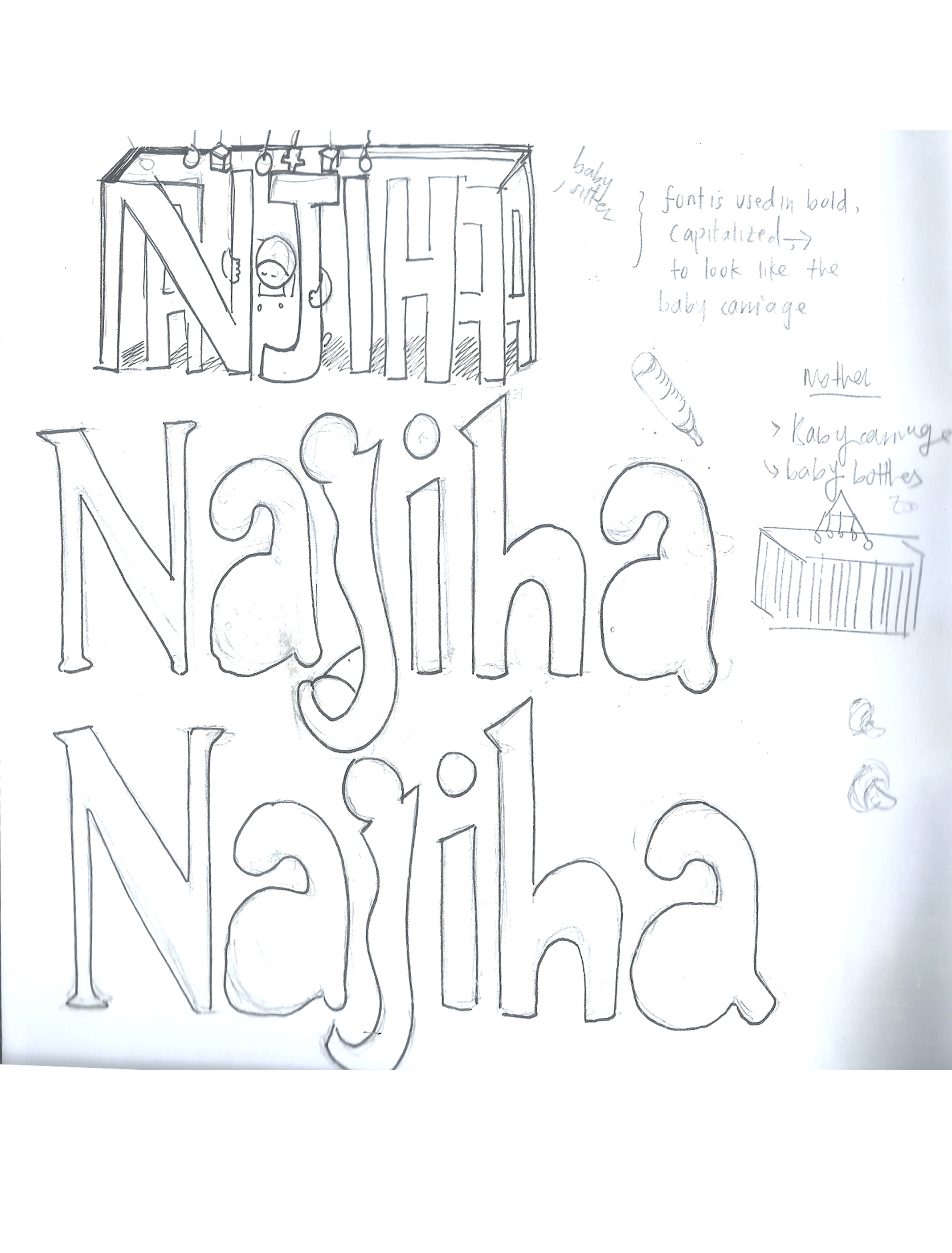
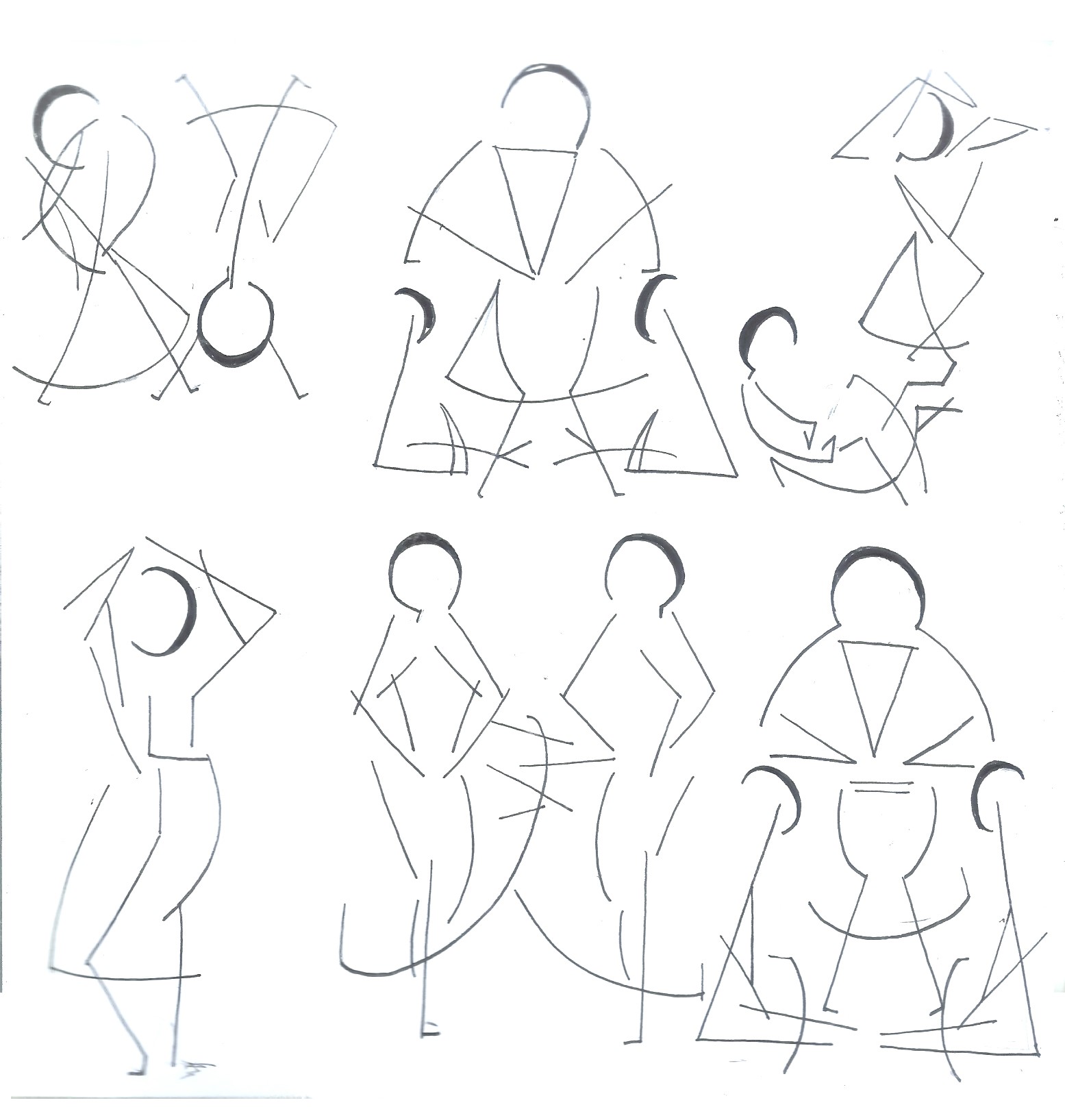
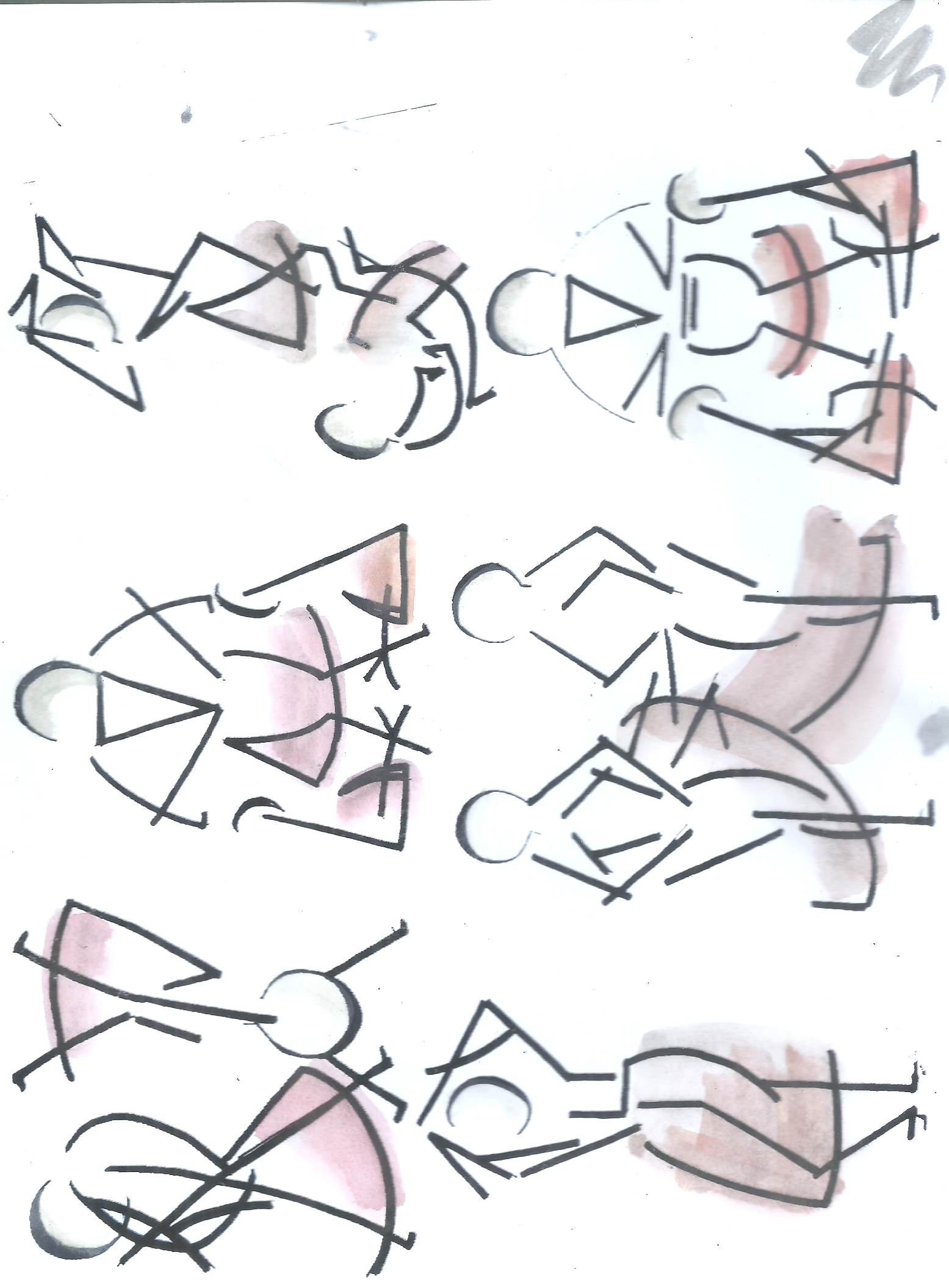
I was given feedback to work on my layouts and provide more sketches for my zine. I’m planning to use traditional mediums, like water colour and colour pencil. It’s quite hard to figure out what style, colour and illustration to work on, as requested by Ms Mimi. I wasn’t so familiar with different types of illustrative styles by artists and how they tell a story. I only knew I could use those mediums and make subjects appear realistic. So, I had to do my own research and search for artists, whose works and styles would be quite interesting to follow.

Just to recap on concept;

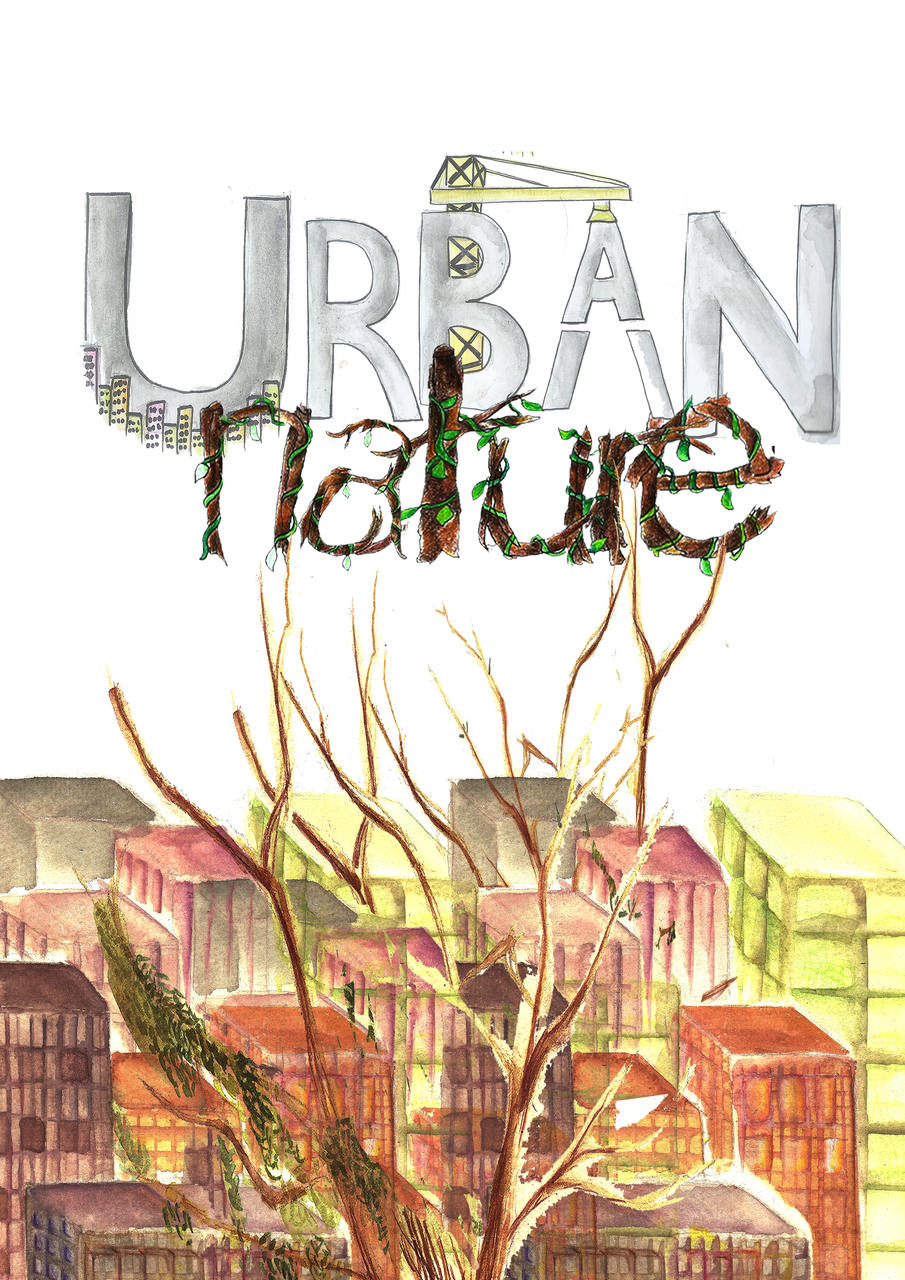
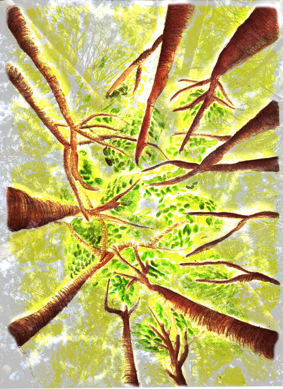
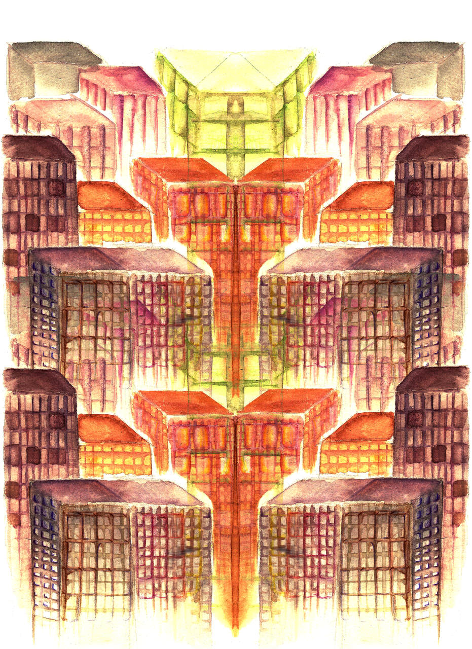
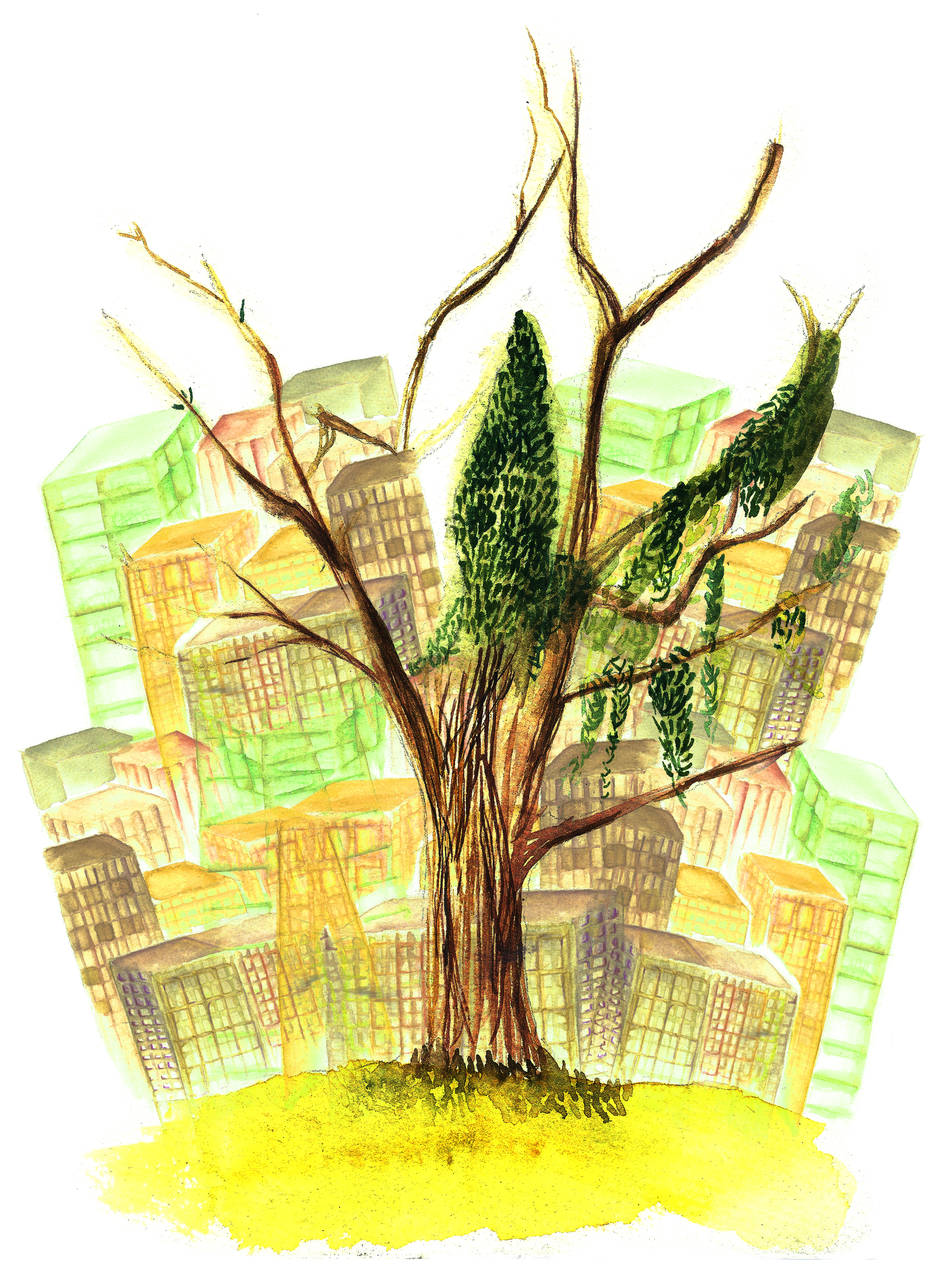
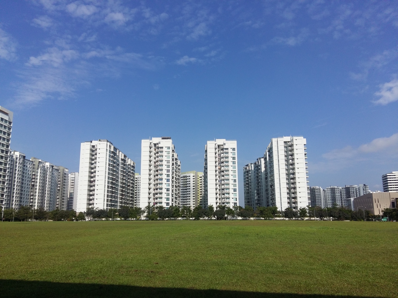
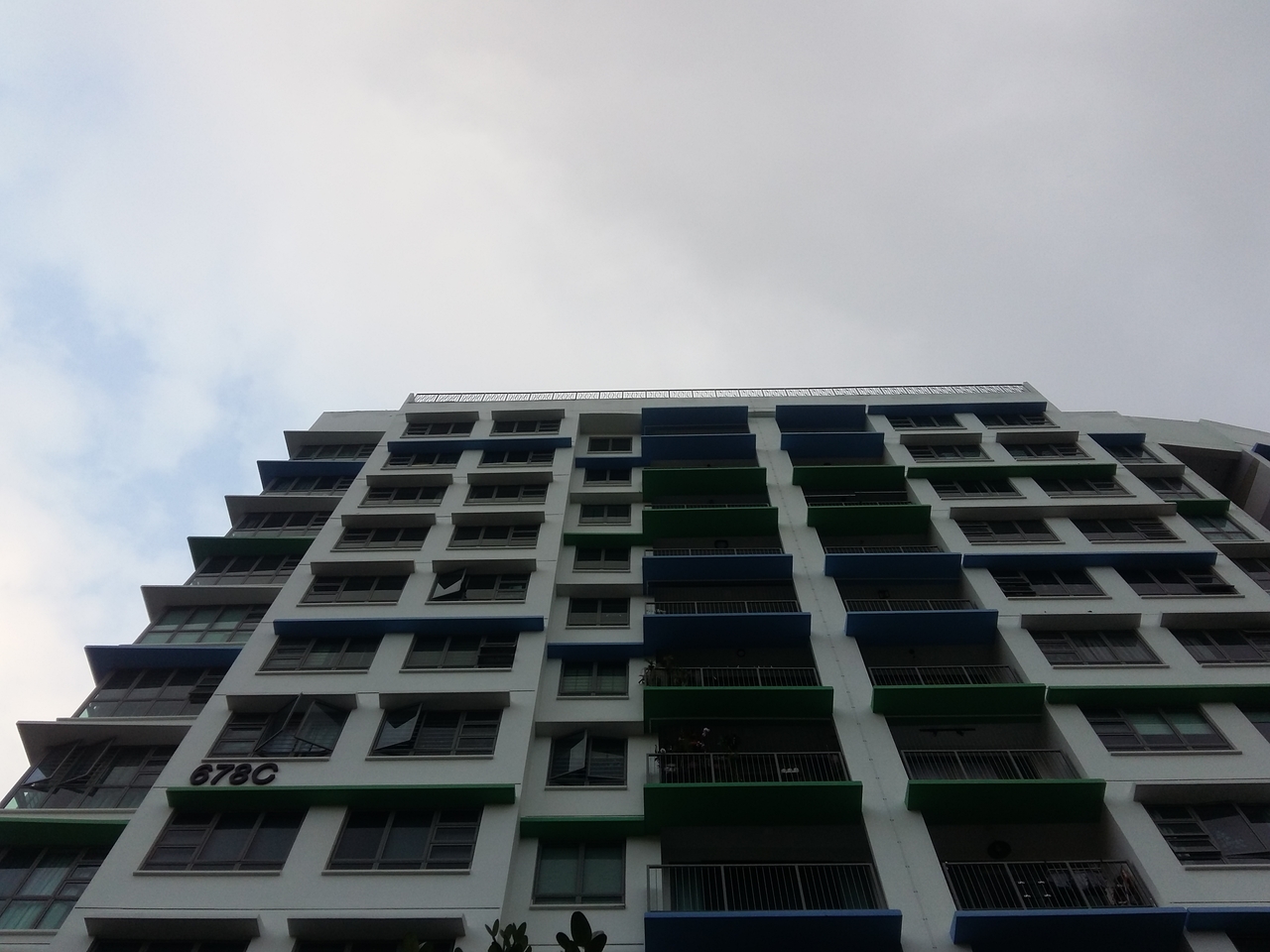
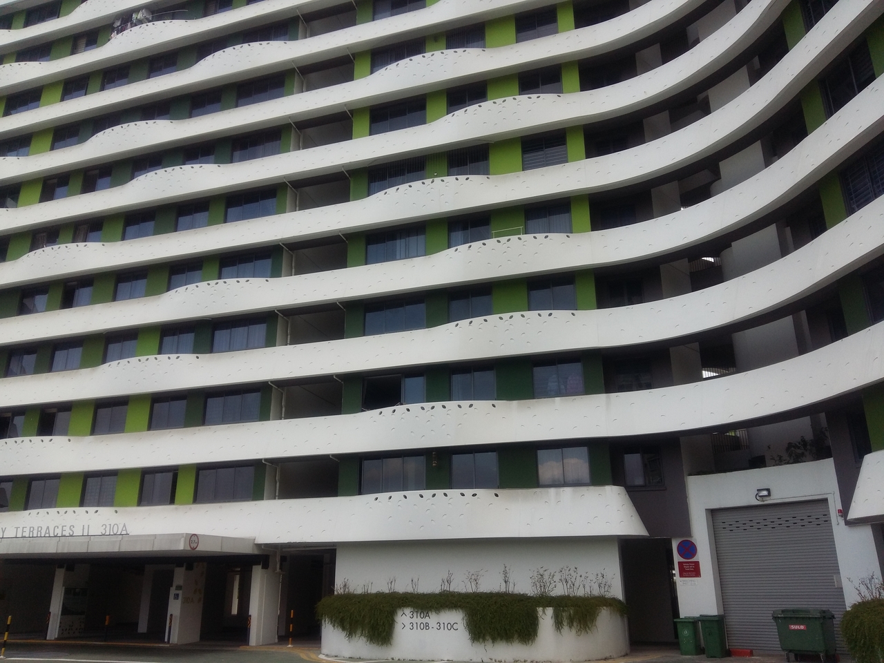
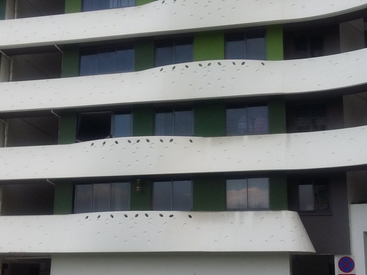
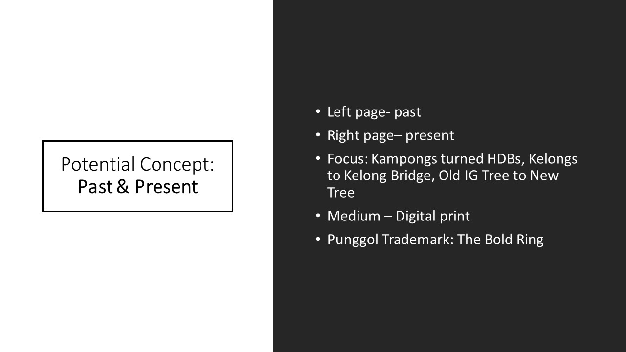
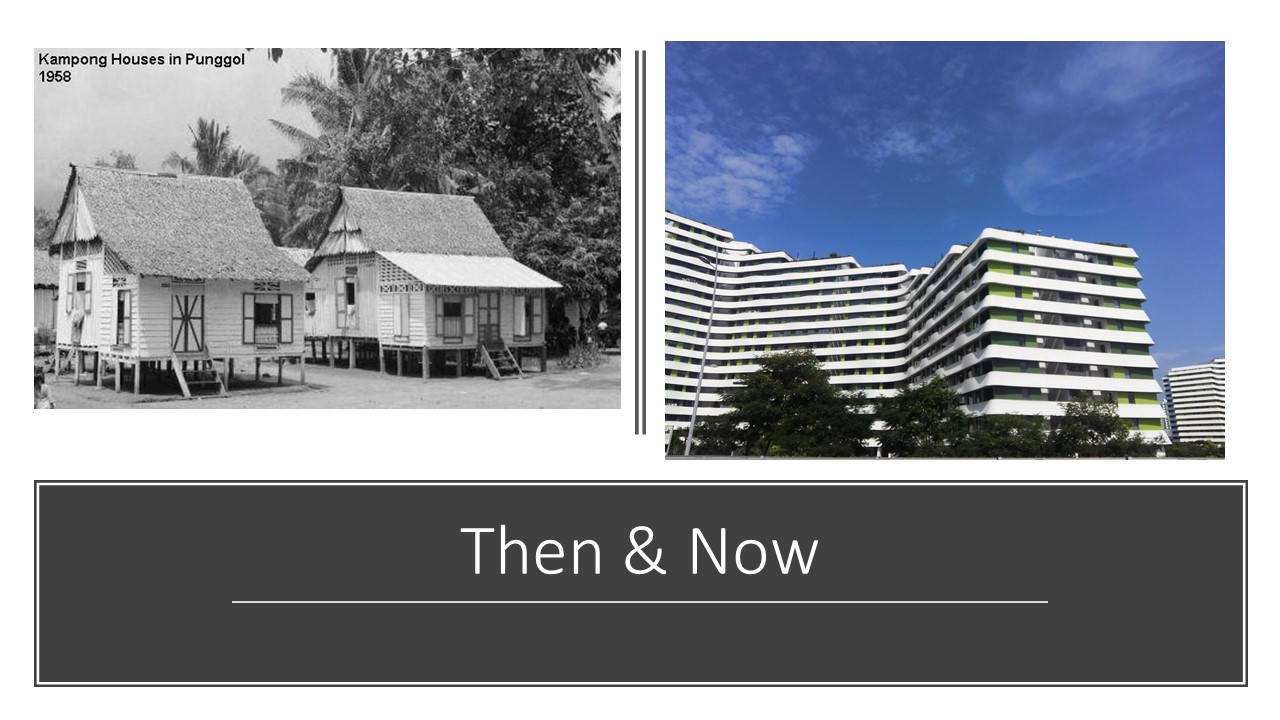
  •   – “Urbanature” is title of my zine
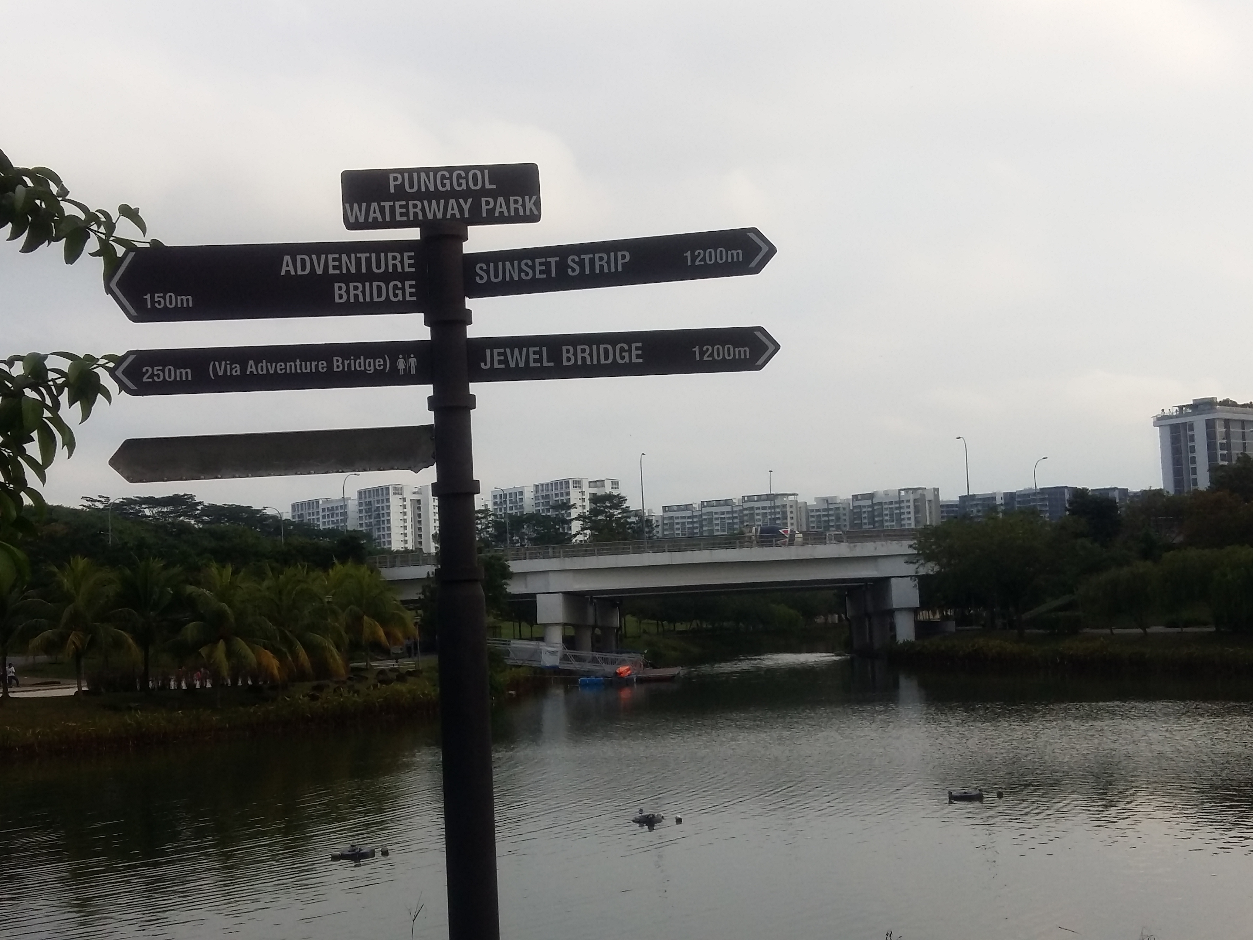
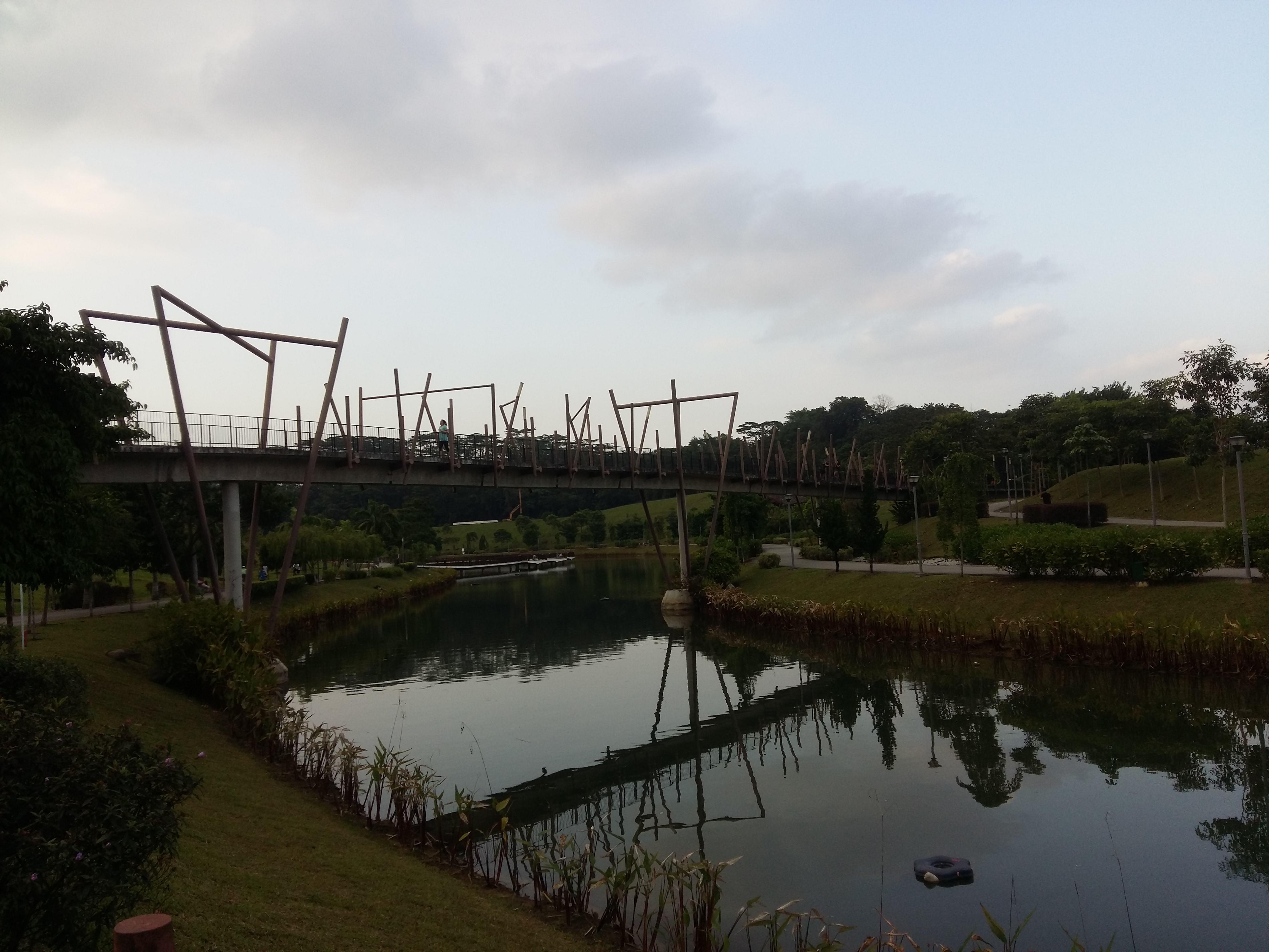
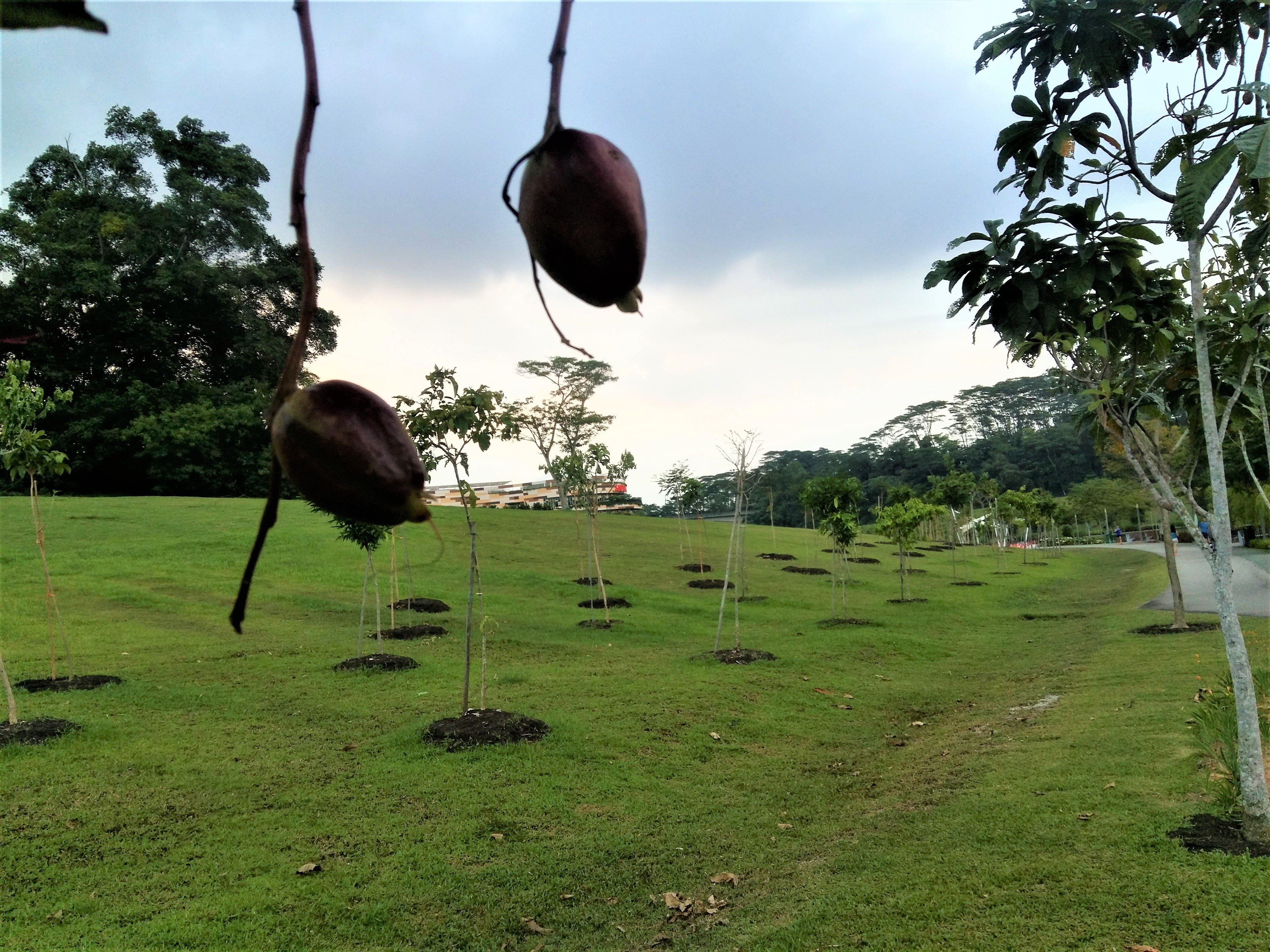
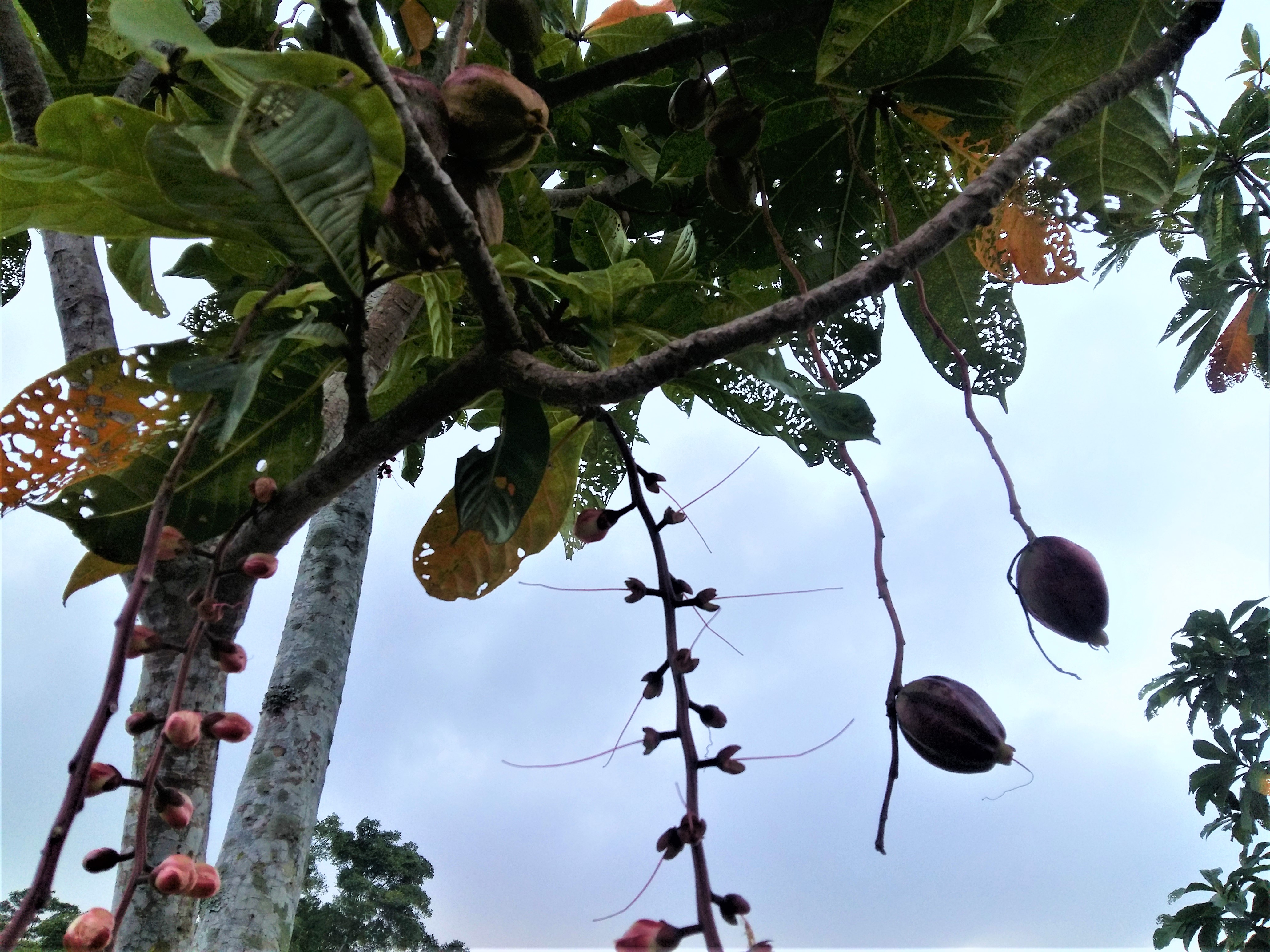
  • Tells a story about Punggol
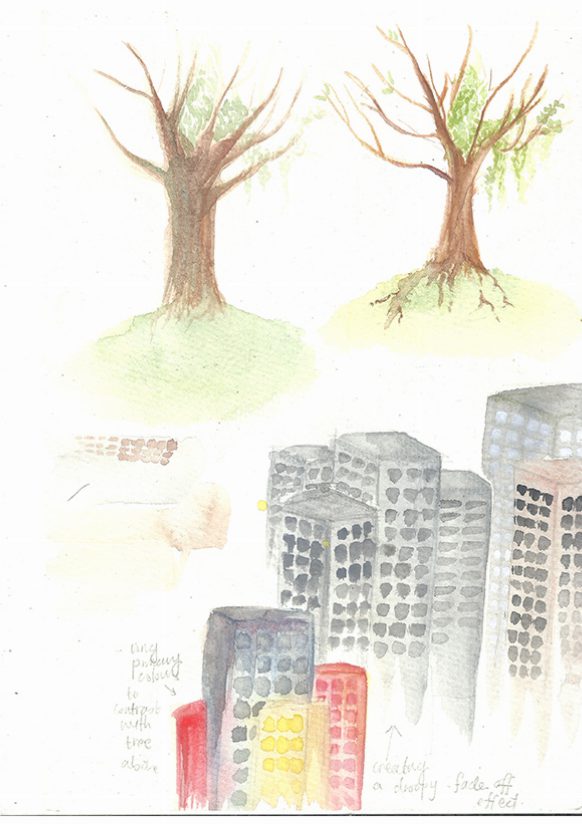
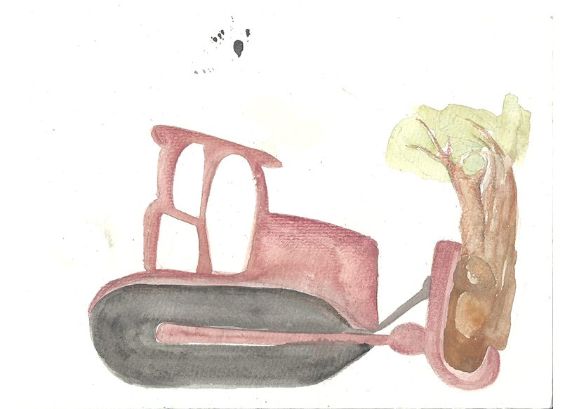
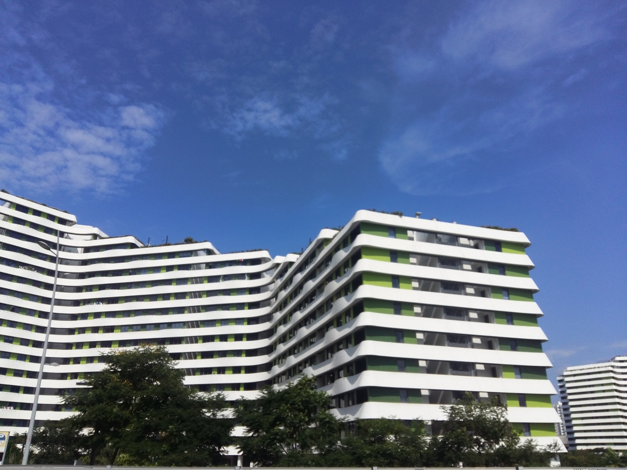
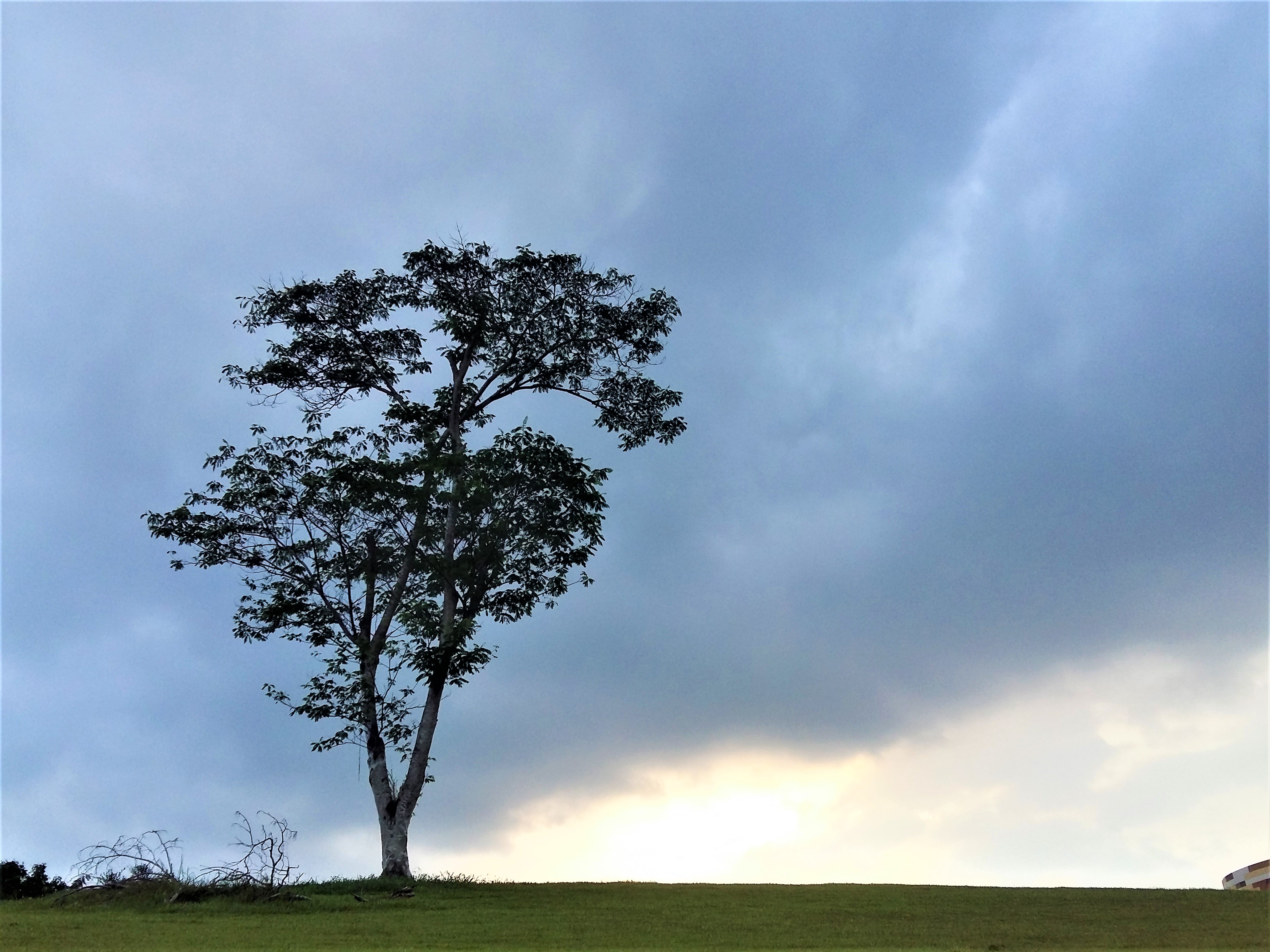
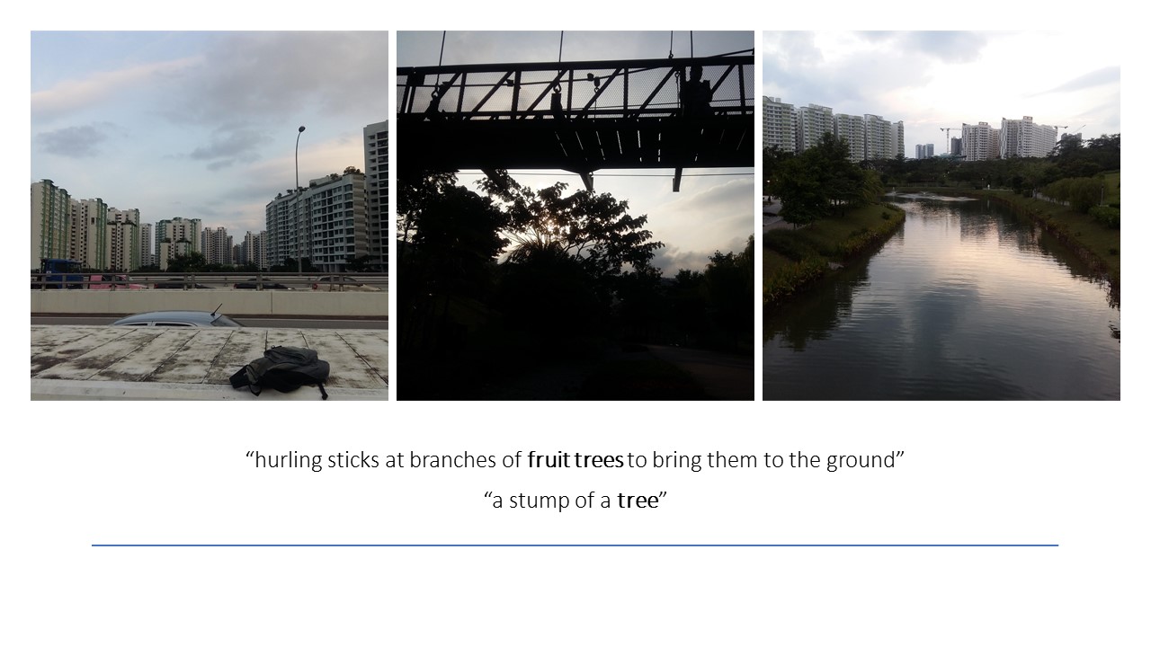
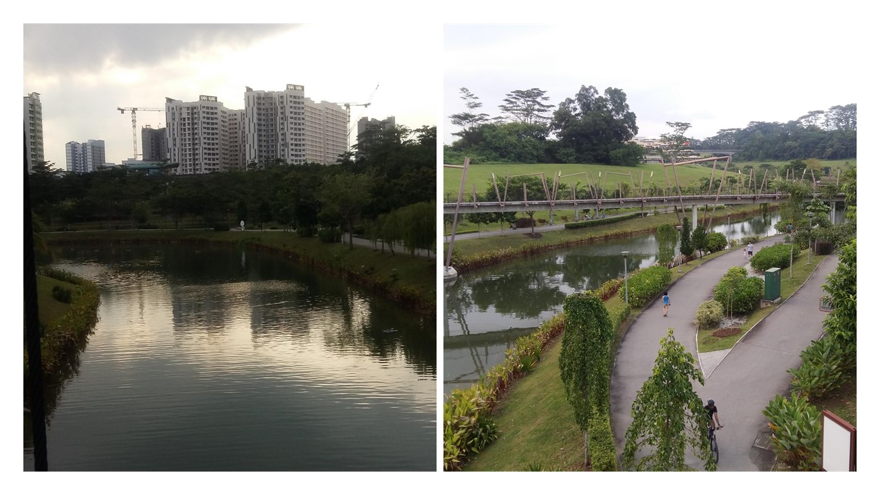
  • Removal of trees and forested areas to make way for tall flats
  • Tall buildings appear dull and boring, but high and mighty
  • Trees and habitats are left with little space, due to construction
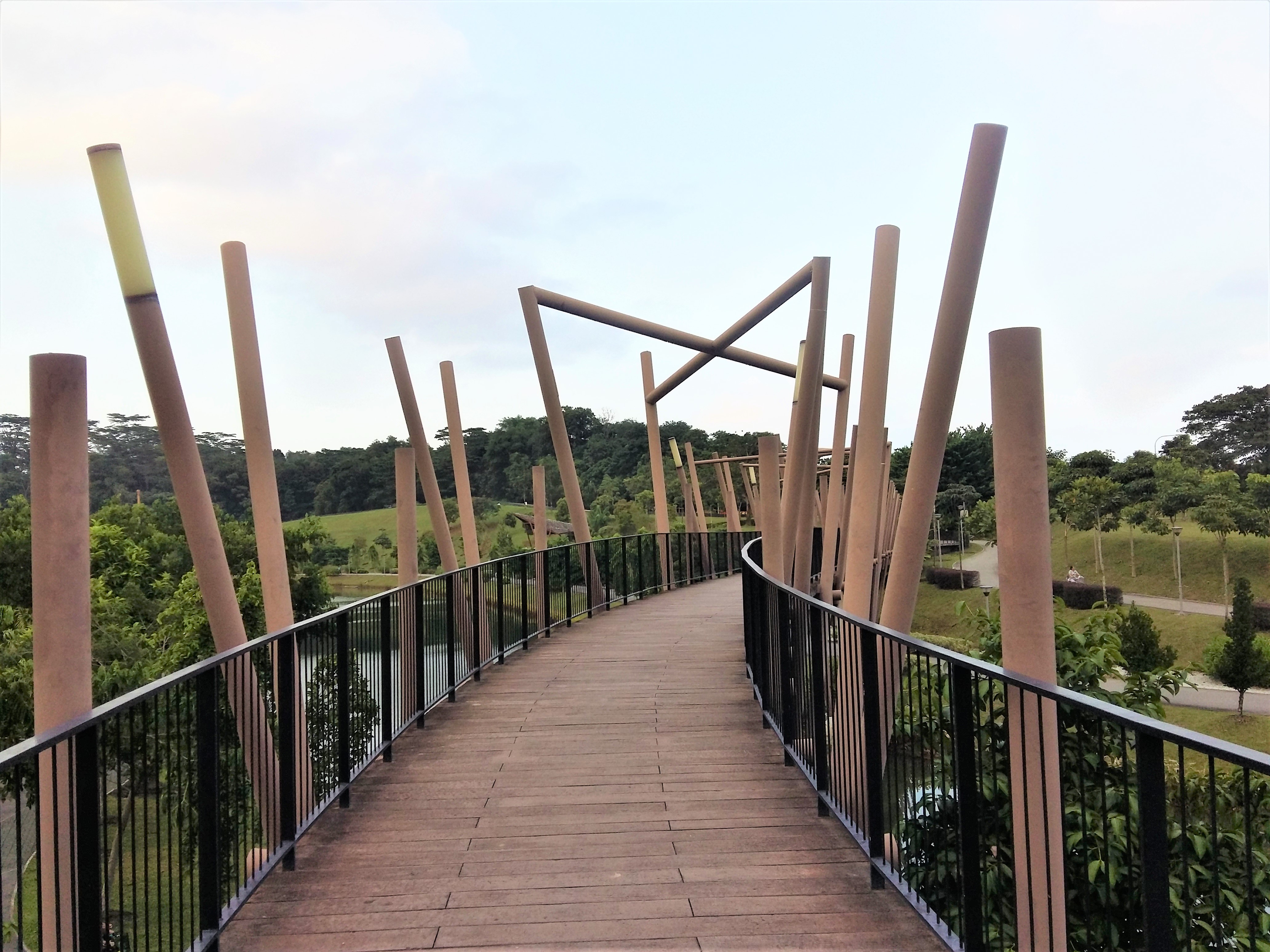
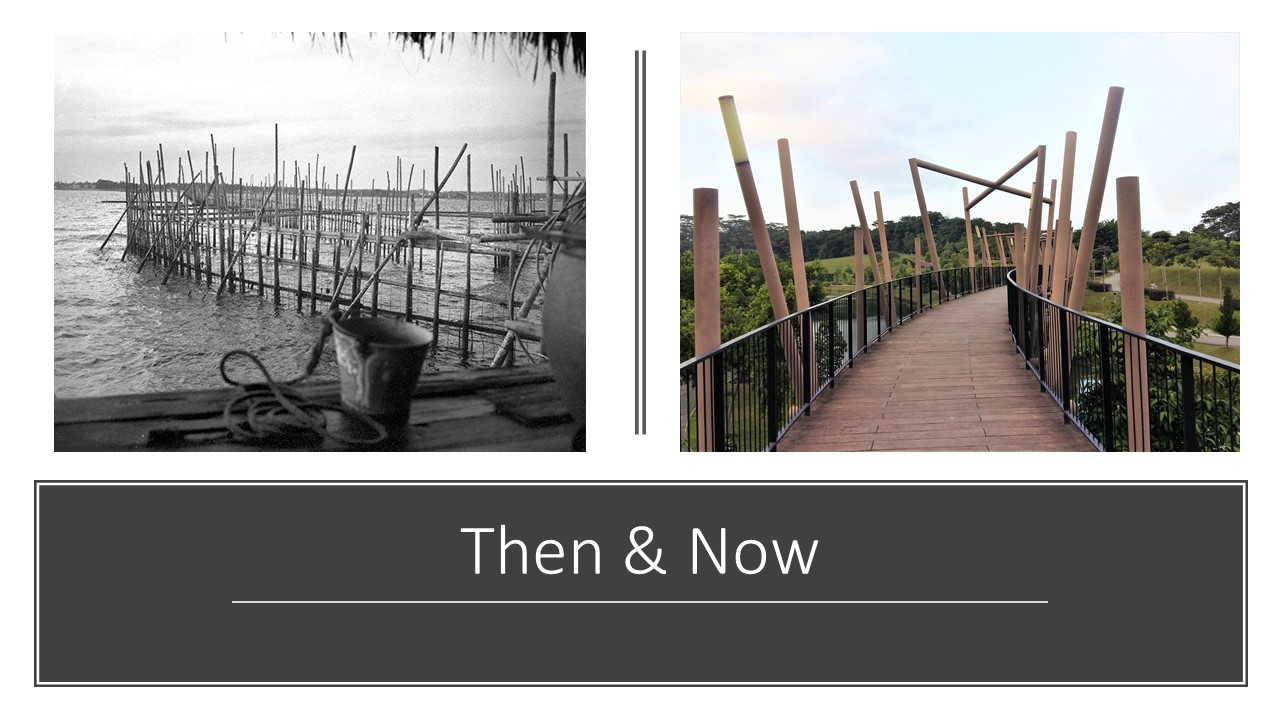
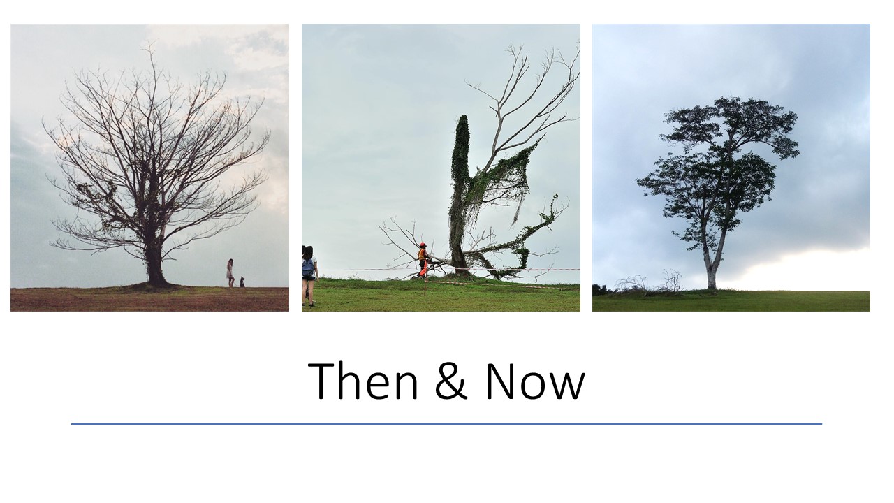
  • Ending: Tall buildings and nature can live side by side
  • Moral of story: Punggol residence shows how man-made and nature can live can co-exist
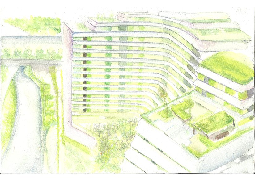
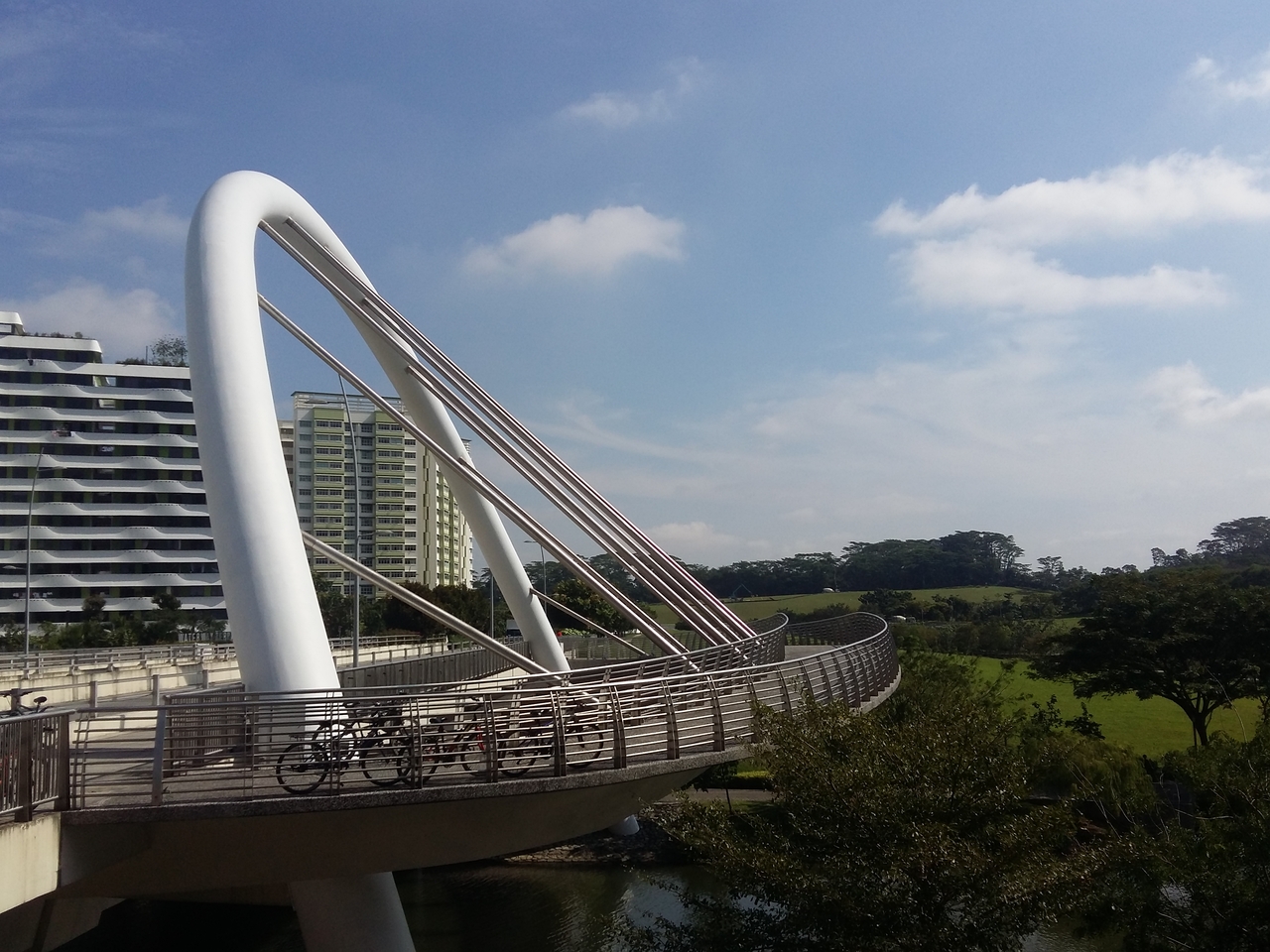
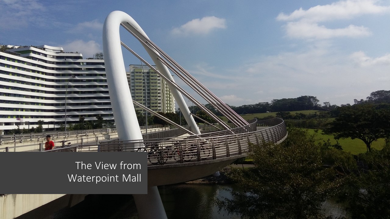
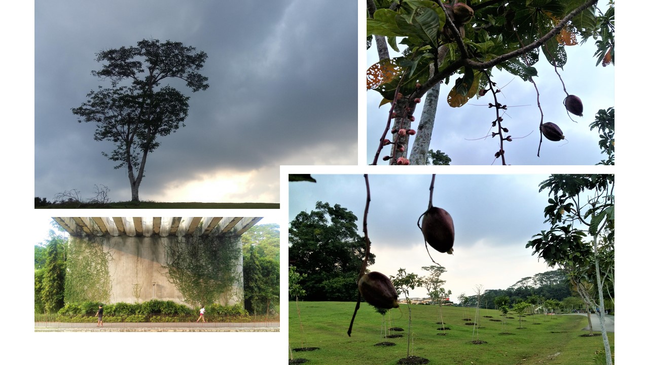
  • Aerial view of Waterway Terrace

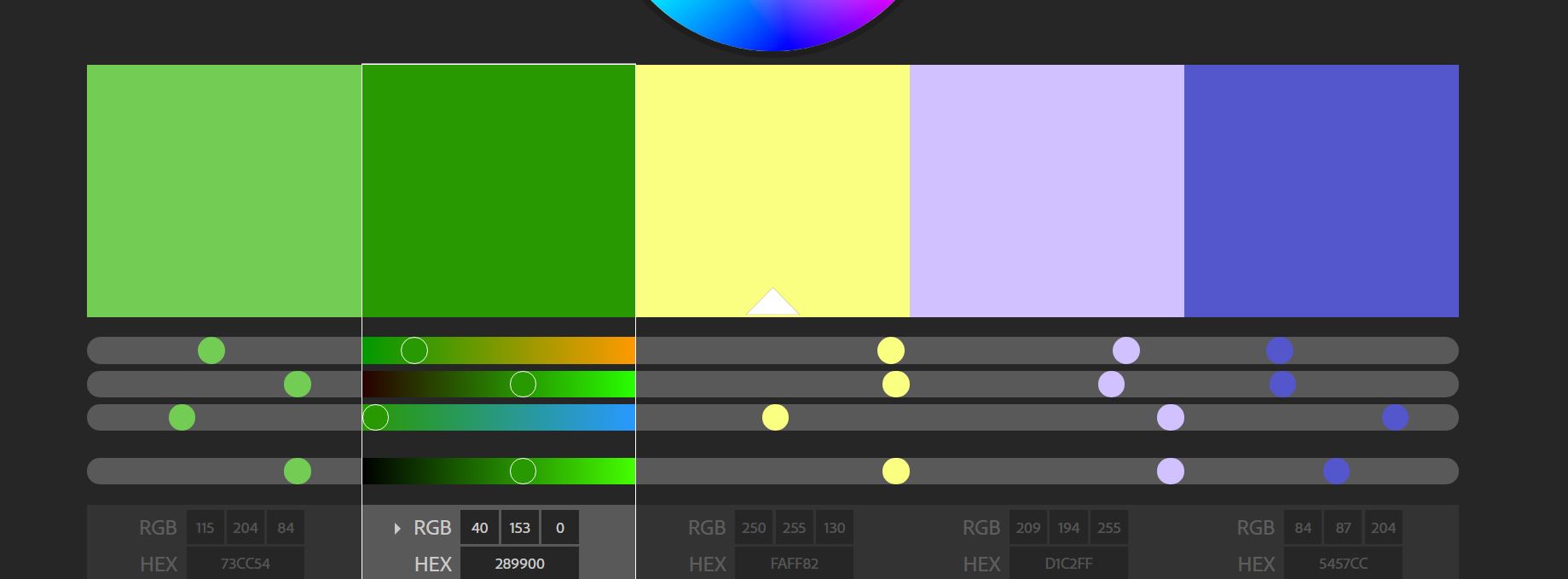
I’m planning to work this colour theme. I got them from Adobe Kuler and played around “triad” colours.

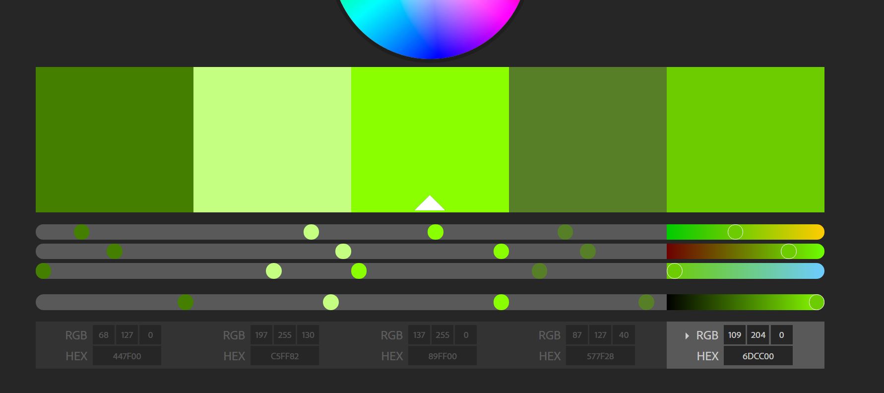
Or maybe this one. Because they have warmer tones to it, which I’d like to have for some colours used in my zine.

Found from Pinterest: 

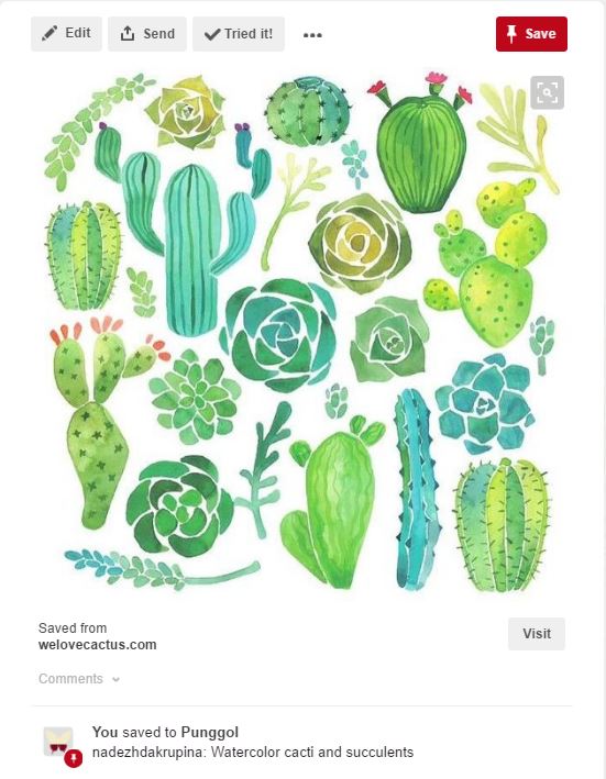
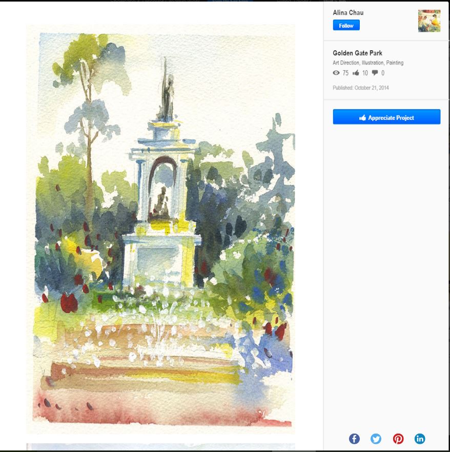
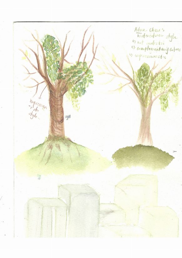
Artist Ref:  Alina Chau

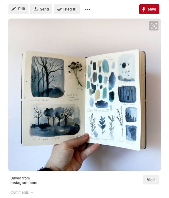
Artist Reference #2: Rosanna Tasker
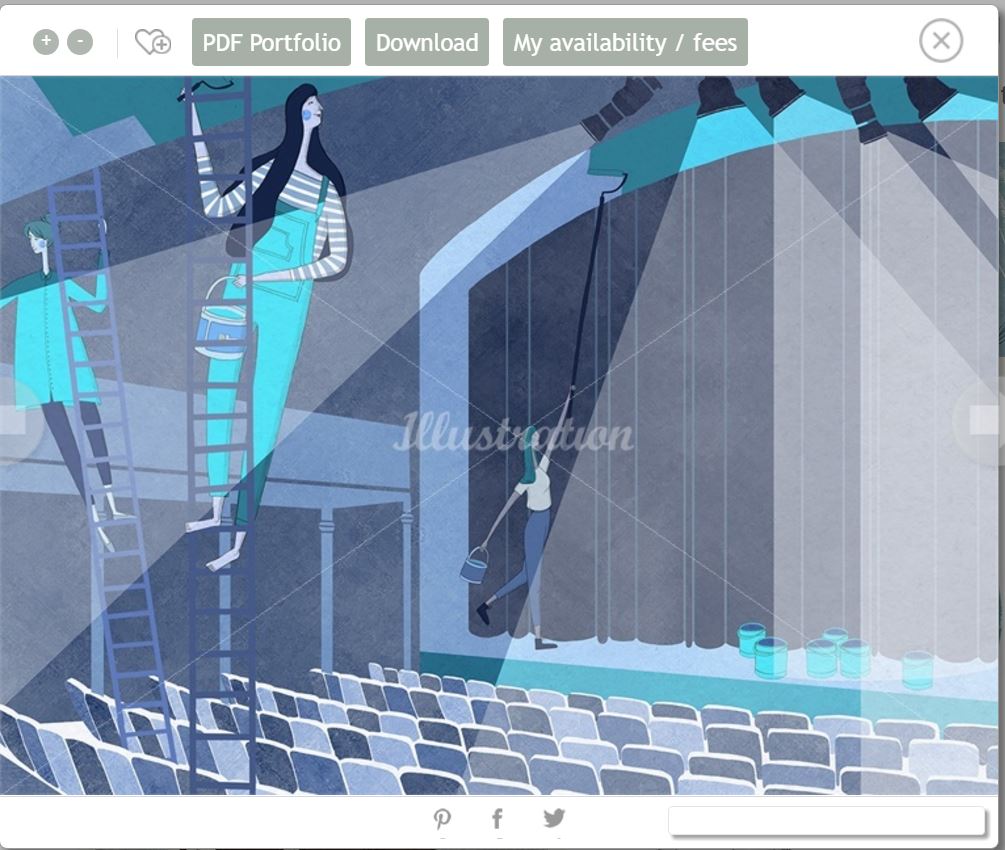
Approach

There are two main elements to Rosanna’s approach. The first stages of her work are created using natural media – pencils for the line work, and gouache paints, applied to separate layers using a light box. This, and the rich papers she uses, gives her work its unique, handcrafted feel. Images are completed digitally, using Photoshop to clean them up and add the finishing touches.

Style

Delicate lines and gentle textures are woven together to depict elegant, elongated figures and forms. She loves to experiment with scale, and nature usually plays a big role in her art. Rosanna chooses a limited palette for each piece, sometimes punchy, sometimes subtle, but always in keeping with the brief.

Source: http://www.illustrationweb.com/sg/artists/RosannaTasker/view?agenthelp=2


**

Rosanna’s works are quite interesting, especially with the use of colours. Her colour palette seem to be very limited, consisting of only blue hues and a bit of yellow to complement it. The use of yellow, actually brings out more emphasis on the subject matters.

Her style is simply a mix of traditonal and photoshop to make it neat.

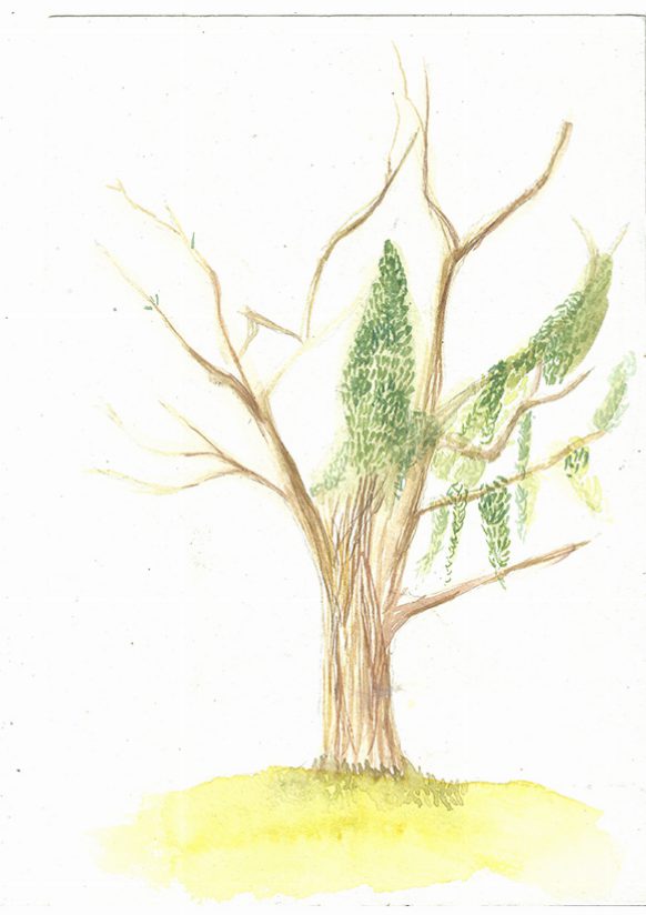
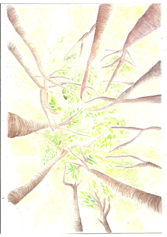
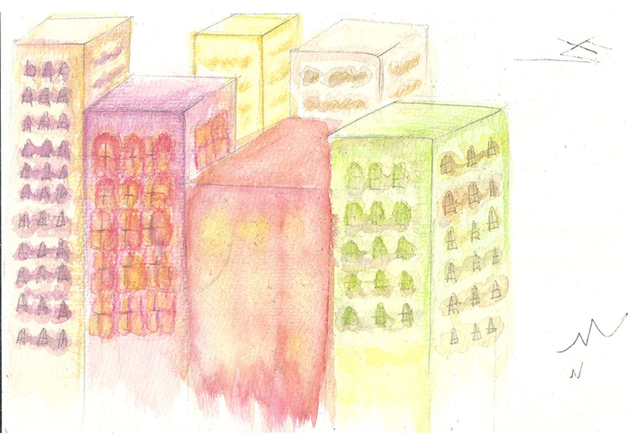
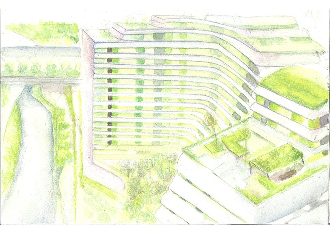
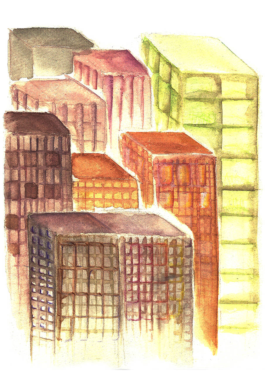
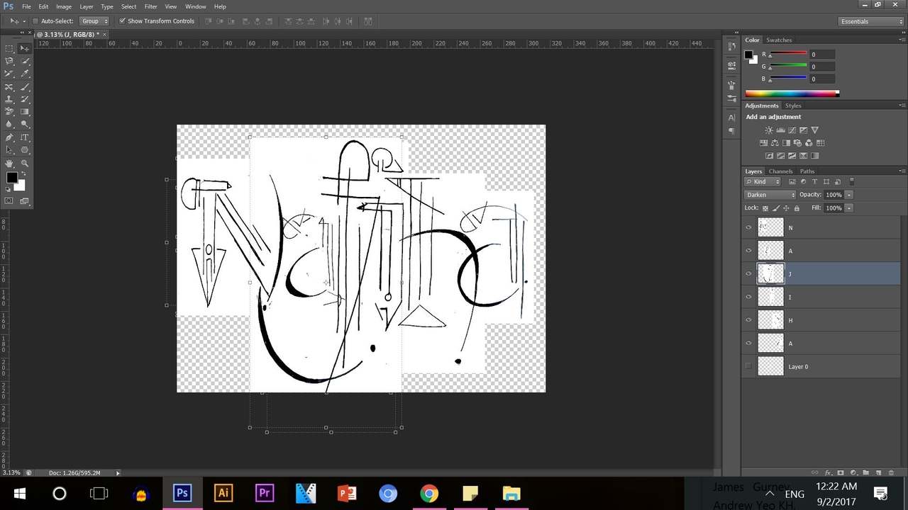
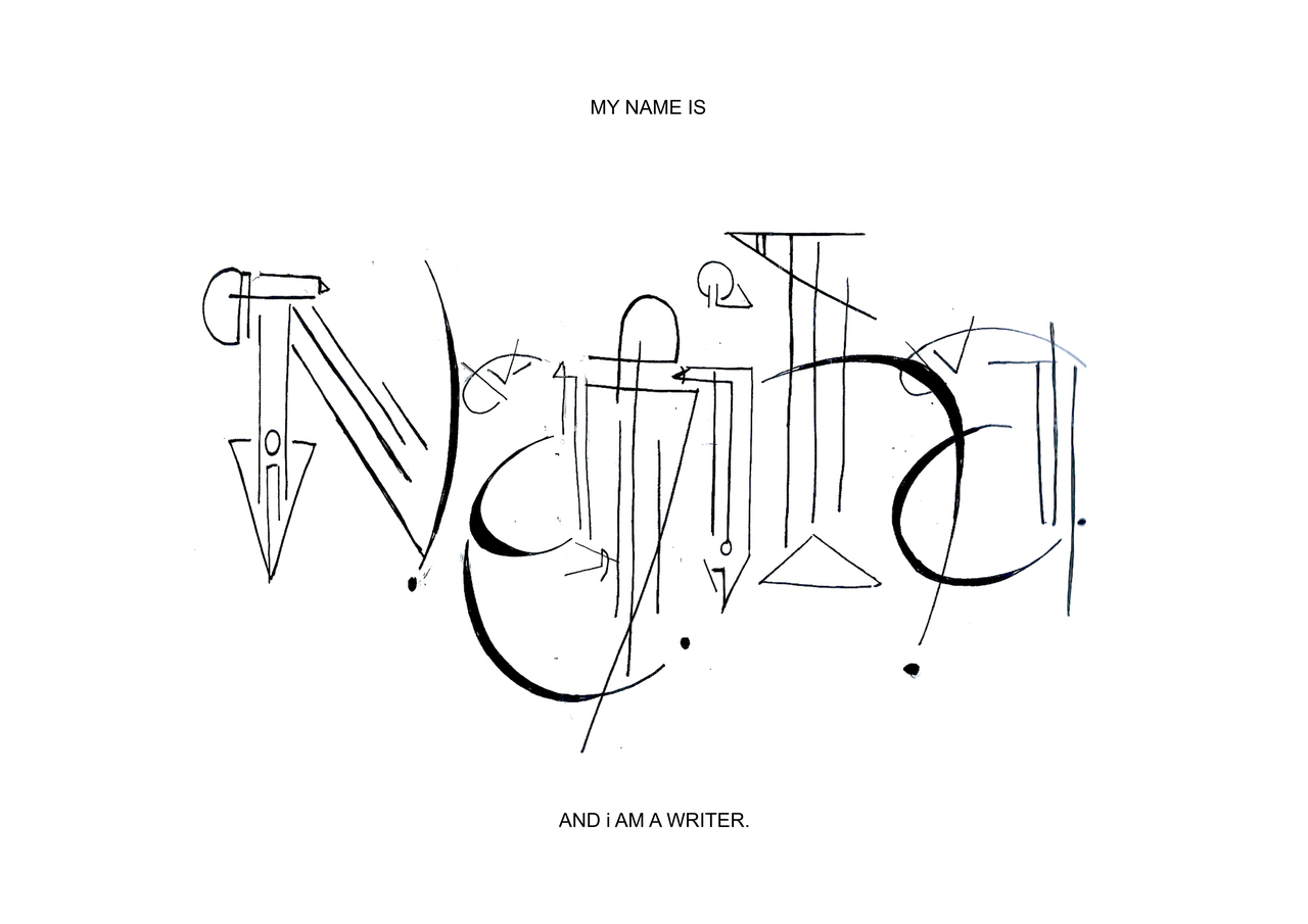
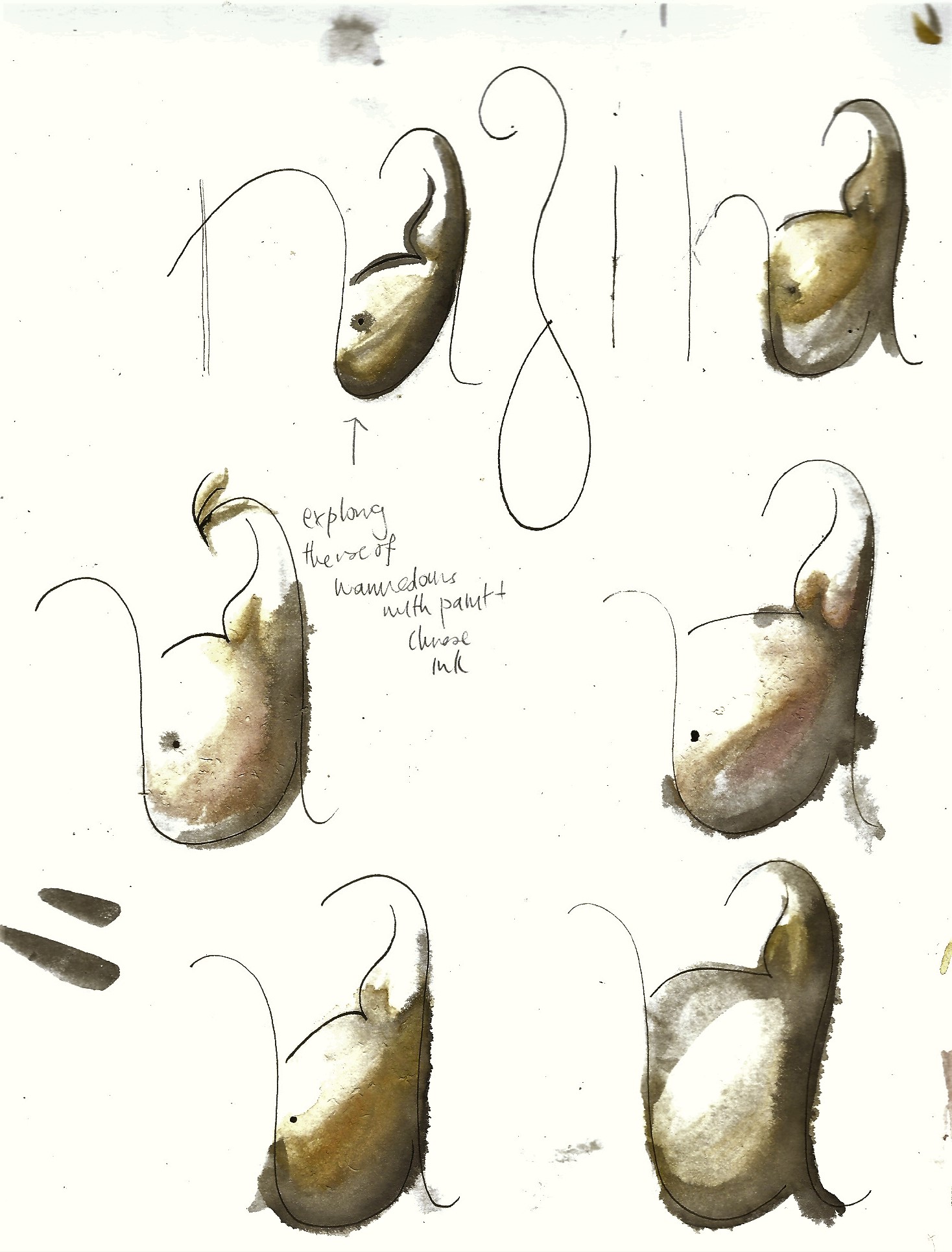
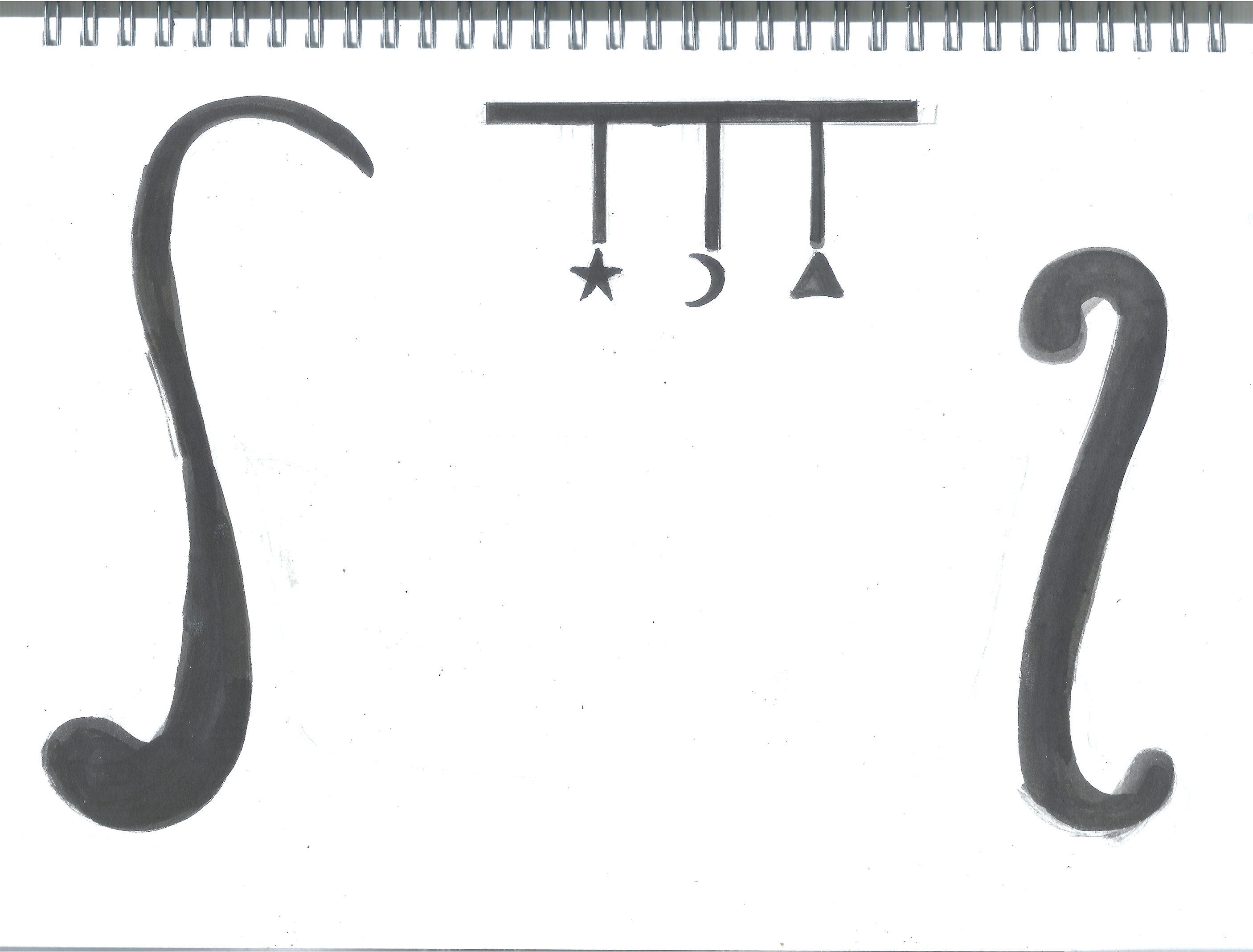
I decided to go for a more warmer tone for the colour scheme. After scanning, I edited those pictures using photoshop.These were the outcomes:


Zine Research: Punggol

‘Punggol’ is apparently a Malay word. It means to ‘hurl sticks at branches and fruit trees so they fall to the ground.’ It also means the stump of a tree, like this.

PErhaps Punggol had a lot to do with nature. After learning more about Punggol’s history, it actually is strong roots to nature.

Back then, way before even Stamford Raffles (founder of SG) came over, Punggol already existed and had her own community of people. Back in early 1950s, Punggol was a fishing village where fishing docs were set up so fishmongers can make a living, kampongs (villages) were nearby, fruit trees were planted, and they had farms to look after pigs and other animals. (Picture shown later below)

First Impressions

I alighted at Punggol MRT station and walked in to Waterpoint Mall which was nearby. The mall looked quite new; they had a lot of stores, high end stores especially, which wasn’t surprising. It was clean. It was in the morning so it wasn’t crowded or anything. I had a  hard time searching for the recreational space that was suppose to be somewhere nearby. Got lost along the way, but I eventually found my way through.

Walking Along Arc Bridge

Too many tall buildings to count.

The waterway terrace was interesting. I like the look of it. It had green and white walls. And the white pillars aren’t flat, they actually jut out, like a wing, and have this wave like pattern to it (if you look closely). The leaf motifs on the white walls are quite interesting too. It’s not commonly found in HDB flats because it’s always a solid colour with no pattern to it. I guess Punggol flats are starting to develop it’s own nature-friendly character through it’s designs.


The Waterway Park

The place was really beautiful, very nature-friendly and there some nice architecture – such as that Kelong bridge. ‘Kelong’ is wooden blocks in Malay – they’re used to build bridges where fishermen go to get their fish. It’s like a dock. I liked how they remodified this Punggolian thing into a Kelong bridge for people to walk by.


Research Presentation


This was the Kelong Bridge I was talking about. Punggol is actually one of the few places in SG, where they have ‘kelongs’. In fact, the real actual kelongs can only be found in SG, Malaysia and Indonesia. Because of urbanization, it’s disappearing.
The 1st 2 pics from left is known to be that ‘Instagram Tree’. I dont have IG so I’m not sure what’s the buzz about. But reading about it online, the IG tree was just a famous hotspot for people to take photos, because of the nice backdrop and it’s lone position. the one that I took (far right) is newly grown, apparently.


Feedback From  Research Presentation 

  • My concepts weren’t strong enough, it’s vague and too broad,  so I need to be more in depth with my findings
  • Pictures were nice, but not enough to show concept
  • Can’t use cut outs with leaf motifs ( my plan for design), so I might turn to photography instead
  • Can’t use Punggol’s ring trademark for actual ring binder for the Zine, so I have to scrap that one out
  • Research more on Punggol’s trademark (like ring)
  • More visits to Punggol again


2D: Typography

In summary, this project is about Typography.  We have to create our own fonts, and use that for our names. We have to create it in such a way that it reflects a job that we want to have in the future.

I made use of Bahaus movement as part of my references. The simple use of Sans Serif, and the lines, basic shapes (trianges, circles and squares) are art of the trademarks of that movement. Kassily Kandinsky, a Bahaus artist is one that inspired me to make use of simple lines, and play around with them to make out a typeface.

I have little background on using digital softwares, so I had to rely on my drawing skills. Other mediums used are water colour and pen. And some photoshop in terms of scaling.

The following are in order, and my final pieces are right at the end of each order.


1) Writer
2) Mother/ Babysitter
3) Zookeeper
4) Performer

380694165900b4d7de91b9d26cc485c0
Taken from Pinterest. The use of simple lines and and placement of the lines portrays the feather-ink pen that was used back in the day. It is not literal but by looking at this, the form is there.

0f29619a6caa63c1170a150723ec0e11

©Alan Magee "Portrait of Hannah Hšch," 1992 Digital photomontage on dye sub paper 10 x 8 inches, Private collection
©Alan Magee
“Portrait of Hannah Hšch,” 1992
Digital photomontage on dye sub paper
10 x 8 inches, Private collection


5a352e9a62431ddd7ab0734595615cb5
I was advised to use pen nibs, papers, writing fonts, and typewriter to show the job as a writer. Eventually I used this for later work.

3270668217_8c8afc908d_o


writer writer-sampling_easy-resize-com writer-template-1_easy-resize-com

Final Product:


writer-a3_easy-resize-com


1) Writer
2) Mother/ Babysitter
3) Zookeeper
4) Performer

Artist references:

Ji Lee (South Korean communications + graphic designer)

  • playful with use of letters, match up with meaning
  • simple fonts, but bolded

    909eb68f1672f4f0f121392ec0d5f4af
    Credits to Ji Lee for his work


img_002
I was told the baby crib (1) does not speak “mother” . Instead it was babysitter. The 2nd one was not obvious, as told by others. I thought the “j” would show a person cradling a newborn, but it wasn’t obvious. Someone told me the “j” looks more like an alien lol

mother-2-a3_easy-resize-com mother-a3_easy-resize-com

1) Writer
2) Mother/ Babysitter
3) Zookeeper
4) Performer

8804125e8b116243a8a1e9e6067832f8
Negative space

img

zookeeper-a3_easy-resize-com

1) Writer
2) Mother/ Babysitter
3) Zookeeper
4) Performer

9b29eeef58725ae1f608bb61d079098d a66937ad97efaad81ca6d731b93c220d e17fb3dbb9ad7d89b0f7d318787ae29d
untitled-1_easy-resize-com


performersefsketchesskk

performer-a3_easy-resize-com