PROJECT 1 : IMAGE MAKING THROUGH TYPE

For the first assignment, we were to create typographic portraits by using initials that describe our future occupation.

I have lots of jobs in mind, however I narrow it down to 4 jobs which I thought will be more interesting to work with.

Maze Runner
Fish Expert
Surgeon
Horologist

RESEARCH ON TYPOGRAPHY

ARTIST RESEARCH

I found several Instagram artists that inspired me.

RESEARCH AND PROCESS

PROCESS

When I think of surgeon. I think of surgery. Where surgeons are contact with wounds and fractured bones. I thought of incorporating these elements into my type.

I started drawing in out of Ai. However, I felt that the type is plain and flat. It needed some shadows.

I add shadows and I am pretty pleased with the result. However, when I ask my friends for their opinions, they felt that the legs are too straight. Skin should be more curve and not so rigid.

After making the changes, it look more like ‘skin’. I am glad I ask friends for their opinions. I also added splash of blood as the background to represent what the surgeon face daily. After consultation, the feedback that I get was that the splash of blood background makes it looks more like a murder and was a little to bloody. And that I should change it to something that is more related to my occupation.

Creating my own surgical cloth

As I could not find a suitable image of cloth for my background. I decided to create my own! I cut up a unwanted top and took photo of it. Then I edit the colours on photoshop. I also added more shadows and textures to my cloth.

FINAL

For my final work, I tried to arrange the letters in the form of the open wound. Wounds are normally in different sizes, therefore I increase and decrease the size of letters. By doing that, it also gives the name a little more dimension and depth.It will not looks so flat.

I when on the research more on surgeon. And I thought maybe I could use surgical cloth as a base. With the shade being darker at the tear open wound.

The main colour used in this composition is green, red and beige. I made used of like complementary colours. So that my name will start out more.


PROCESS

Some of the elements that I have pulled out from the clock is gears, screws and the knob. I wanted to try out a different style, therefore I hand drew the entire work. It actually turn out better that what I image it to be.


I added some dots to create depth to it. Which helps to make the letters stand out more.

FINAL

My final work, I scan my drawing and tried to create a perspective. The main colours used was brownish, as it gives off a vintage effect.


PROCESS

How I define a fish expert is someone that know everything about fish. Like the parts of the fish, the different segments of a fish. How many bones they have and the dimension. So I thought of doing like a see through of fish bones.

I started by sketching out my idea. I drew it out and scan it to ai and Image trace the image. I like how it creates a more structural edges.

After I add in the colours, I feel that it looks more a caterpillar instead. So I receive some feedbacks that maybe I could add in the fish head.

FINAL

I place the tail at the start of the composition and the head comes after they tail. However, we could still clearly identify that it is a fish. Our brain will naturally arrange and form the fish.

I placed the fish bone in a lab setting, Because  I am a fish expert. I have to study on the fish. So the I have to exact with the dimensions and measurements.


SKETCHES & IDEATION

PROCESS 

I started forming the maze of my name with Ai pen tool. It gives me a better ideas of where should be the positive (grass) and negative space.

I add grass to the background. However, I felt that my name does not stands out. It is not very obvious. I asked my friends and some comments given that there were to little grass.

FINAL

For my final work, I added more grass to the background. I chose to use a darker and thicker line for the name so that it will stand out more.

PRESENTATION

OVERALL

The challenges that I faced for this project was the interpretation of jobs. I misunderstood it and produce many wrong compositions. However, after the first consultation, I was clear of what was expected to be done. I felt that it was a lot easier after that. So, consultations are very important! Secondly, it is very important to test print. The first day I printed, the colours came out darker than what I expected. After editing the images, I had to head back to Bugis to print again. But after printing it for the second time. This time the colour was too light. I suspected that the printer ran out of ink, so I went to another shop to get it printed.

Through this project, I thought it help me move out from my comfort zone. I explored with different mediums. Instead of just sticking to one, I tried out ai, ps and also hand drawing. Although I am familiar with ai, this project allows me to explore with more tools and techniques that I am unfamiliar off.

And thank you to my friends, as I kept asking them for opinions. They always give me very truthful and useful feedback!


Micro Project 4 – Glitch

Original Image

First Edit:
I glitch it with photoshop to increase the noise level of the image. I also tried to distort my hand by swirling the image.

Second Edit:
May Thu used photoshop and added some oil painting effect.

Third Edit :
Brendan edited the colours. It reminds me of Vincent Van Gogh paintings.

Final Edit:
I pixelate the entire image.

There are no rules or boundaries, we are allowed to edit the photos however we want to. Each of us have a different style and we have no control as of what the next person will be doing.

At the end of the transformation, I could barely recognise my hand. It looks more like a distorted chicken. I felt that this project is similar to our DIWO assignment as it is a artwork made by the 3 of us. Which prompted us to realise this effort was truly collaborative.

Pandora Revisited

For this assignment, we are suppose to manipulate a basic 3D volume with the three words we got. The key words I got was Extrude, Skew and Pack.

Pack: very close together / a few items

Extrude: being forced out

Skew:  slanted / distorted in a way

Module 1:

For my first module, I define pack as a group if cubes being stick together ( a pack of 4) And I combine extrude and skew into a single object.

Module 2:

The second module, I started skewing the entire model and adding a little knot at the side to represent extrude. I thought of replicating the same models and placed them closely together to represent the word pack. 

I like this module more than the previous, as it creates a more interesting composition when being placed together.

Process:

I tried out both the silicon and the later method to replicate my model. I started with the silicon method and most of my models crack when I was removing the plaster from the cast. Therefore I tried using latex. Latex was able to capture more details.

Final :

For my final ice tray, I place 4 replicas of my module. I like this configuration most, as it best conveys my key words.

Initial Layout
The modules very too spaced out.

Final Configuration 1

Final Configuration 2

Process Images :

I was helping out with the pouring of silicon , hence I do not have images of process. The process of casting the mold requires teamwork, it was fun and interesting. It was a new learning experience.

Final :

Micro Project III

Posted by Kai Ting on Wednesday, 31 January 2018

The objective of this project was to make use of the third space to create an interactive artwork. To me, a third space to me refers to the ability to connect to people in the space regardless of the location. For instance, connection over a phone call, or Skype.

For our third space micro- project, Kai Ting and I took advantage of the split screen to create a symmetry drawing.

We initially had the idea of playing tick tac toe. However, we realised that we were unable to create a symmetrical template for the game hence we scrapped off that idea.

Kai Ting and I started the activity in different rooms seperately. However, we faced some technical issue with our connection therefore we had to troubleshoot it by moving to the same room while sitting at two different ends.

Besides, we tried to make our idea more interactive by introducing an activity where both parties had to create a drawing to mirror each other. In order to match each other drawing to create a perfect symmetrical shape, each party has to pay close attention and follow each other closely.

The poor internet connection was a major obstacle. Due to that, we had trouble coordinating as it was lagging. Another difficulties we had was the time constraint as we had to come up with an idea within the 30mins. As a result we were unable to practice our concept fully.

Overall, we felt that this activity was a good learning experience for us to understand the concept of the third space and how it works. The third space is important as it serves as a platform for people to connect with one another.

Research Critique 1: CrowdSourcing (Micro Project 2)

“It can collide with mainstream culture but also exist deeper in the networked shadows, in accordance to the needs of whoever participates at any given time. It is creativity with a radical edge, asking questions through peer engagement, as it loosens up infrastructural ties and frameworks. It is a contemporary way of collaborating and exploiting the advantages of living in the Internet age.”

Inspired by the above quote from Garrett, we aimed to pursue his interpretation of D.I.W.O. in the most literal sense.

For our project, we decided to collaboratively produce a simple piece of artwork with an Internet audience. The mechanics of our project was simple: starting with a blank canvas, our Instagram viewers will – through a series of votes on our account – choose what is the next item for us to draw.

The voting between 2 simple choices – examples included “moon or sun”, “sand or grass” – could only be done via Instagram. This in turn meant only those viewing that Instagram account at that point in time were able to participate. We were literally “asking questions through peer engagement”, with the final artwork created being “in accordance to the needs of whoever participated at any given time”.

With Instagram being arguably the most influential social media platform for millennials right now, it is the most “contemporary way of collaborating and exploiting the advantages of living in the Internet age.”

As the voting progressed, we realised that while we have ceded the decision making to the voters, we still retained a large amount of creative control of what was actually drawn.

For instance, while the voters might have decided on “moon” instead of “sun”, there were many ways we – as the artist – could have interpreted this. While we eventually drew a simple crescent moon in the sky, ideas brainstormed along the way included using the surface of the moon as the setting for our artwork; drawing a rocket on its way to the moon; and even aliens.

Final Artwork

That prompted us to realise this effort was truly collaborative in the spirit of Garrett as it has flipped art making on its head. Whereas traditional art making installed the artist at its head and with it – full autonomy and control – this project ceded the decision making to the audience.

Yoko Ono’s Conceptual Art Performance

While not to the same extent as Yoko Ono (her’s involved ceding total artistic and physical control), she remain motionless and the audience had the freedom to cut off as much cloths as they wish. I would argue that our project is more in line with the spirit of what Garret has described as it is more collaborative.

After all, D.I.W.O. stands for Do-It-With-Others, so it is imperative that the artist also has some artistic license and creative control. Otherwise, the artist would just be another cog in the machine producing exactly whatever was dictated of him, which would tragically be the very thing that inspired the emergence of D.I.W.O. in the first place.

Mnemosyne: Accessories (Pair Work) WIP

JJ and I was paired up for this assignment, where we have to make accessories. The accessories has to be link to our planar or mnemosyne scent structures!

Unfortunately we do not agree to each other scent. Therefore, we thought of memories of our own. Both of us always eat Mala Hotpot in school. We love the smell and taste of it. Therefore we decide to go for it.

Mala

Sudden Burst,Burning Sensation,Spicy,Excitement

Process


We came up with 2 different accessories, the head gear and the ring. Since Mala Hotpot is a Sichuan cuisine. We got inspiration from the ancient days emperor and empress.

Our idea is to show how our body will react after eating Mala. We use wood to show the exterior of how we are and we use copper wire to show what is happening inside us. The copper wire shows the burning burst of spicy that we cannot control. The wires are coming from different directions. And we use a gold colour sphere to represent our heart. The copper wires are piercing thru our heart.

We faced some difficulties when bending the wood, at first we wanted the wood to swirl up and the copper wires will be hiding inside. This is to represent how people see us. Like will not know how we are feeling inside after eating mala. However, it is almost impossible to create the swirl, the wood might break. Therefore we have to make some amendments. Instead of using swirl, we tapered the wood and place it in a upright position, to show the raising of spice level.

Improvement to be made

After our fashion runway, we were given some feedbacks. What we could do is to add in more copper wires to create a more intense ‘burst of spicy’ and we could create it in a way that it forms a plane.


Mnemosyne’s Scent

Smell & Memory

Human Beings have five different ways of sensing the world around them. One of them is smell.

How do smells trigger such strong emotions and memories?

Some smells and aromas are much nicer than others. While there will also be smells that we dislike. For me, I dislike the smell of dairy products. Especially milk, it has a very strong smell and taste, which reminds me of baby’s vomit.

That complex emotion and memory can be triggered by a simple sensory cue.

Memories linked to smells are often stronger and more vivid. Studies have shown that they also tend to be memories of early life, before we were 10 years old.

We tend to remember a particular sensation, rather than a bunch of facts about something that happened.

Mnemonic Devices

Mnemonic devices are techniques a person can use to help them improve their ability to remember something. In other words, it’s a memory technique to help your brain better encode and recall important information. It’s a simple shortcut that helps us associate the information we want to remember with an image, a sentence, or a word.

Mnemonic devices are very old, with some dating back to ancient Greek times. Virtually everybody uses them, even if they don’t know their name. It’s simply a way of memorizing information so that it “sticks” within our brain longer and can be recalled more easily in the future.

Acronyms

http://www.threegirlsmedia.com/wp-content/uploads/2014/07/acronym.jpg

An acronym is a word formed from the first letters or groups of letters in a name or phrase. An acrostic is a series of lines from which particular letters (such as the first letters of all lines) from a word or phrase. These can be used as mnemonic devices by taking the first letters of words or names that need to be remembered and developing an acronym or acrostic.

https://i.ytimg.com/vi/DM_nHm5V1NM/maxresdefault.jpg

Some people have a hard time remembering the colors of the rainbow. However, a few simple memory tricks can help you better remember the colours. Try to remember the name of an imaginary person called Roy G. Biv. So we can easily remember the 7 colours, red, orange, yellow, green, blue, indigo and violet.

Nowadays, youngsters come up with our on acronyms. Such as ttyl. It helps us to communicate in our own terms. When we see such acronyms, our brain immediately tells us it means talk to you later.

Visual

http://4.bp.blogspot.com/-NmiCmCD5Ksc/VR_0GFGejmI/AAAAAAAAFWI/0wLwKONthn4/s1600/months-knuckles.jpg

Since young, we have been using this method to remember the number of days in the month.

Count the months on your knuckles and the grooves between your knuckles. Leave out your thumb knuckle. Every month that lands on a knuckle is 31 days, every month that lands on a groove between knuckles is 30 days (or 28 for February).


Plastic Bottles Models

https://www.pinterest.com/pin /247275835765607017/
https://www.pinterest.com/pin/247275835765607050/
https://www.pinterest.com/pin/235735361726452048/

I like how they use texture to create a rough and harsh texture on the model. I actually prefer the suspended model. It allows people to use their own imagination, view from all angle. Compared to model with a base, it restrict us.

2 Pleasant & Unpleasant Scent

Pleasant Scent

https://toddlesg.files.wordpress.com/2015/04/johnsons-baby-skincare-wipes.jpg

I think everyone that knows me well, will be aware that I love babies and kids. They just bring so much joy and happiness to people around them. I have a niece, I love her so much. When she was 6 months old, before entering poly, I took care of her for about 4 months. I always use Johnson’s baby wipes to clean her, so when she was younger she have a Johnson’s baby wet wipes smell. Now that she is bigger, she no longer have the smell, which I miss a lot. Whenever I see the wet wipes, it just reminds me of the happy memories.

Unpleasant Scent

https://www.beautyliven.com/image/cache/Hair%20oil/Gatsby-hair-wax_1_2-800×800.jpg

My unpleasant scent is hair cream. Not that I dislike the smell. But it reminds me of when I was much younger. I shared the same room as my parents. My dad will put on hair cream, the smell of the hair cream is very strong. Whenever, I smell this smell, I know my dad is leaving for work. When I was young, I only want my parents to stay by my side. I do not understand will he have to work. Therefore, this smell gives me lots of unpleasant memory back then. Now that I have grown up, I understand that my dad works to support and give our family a better lifestyle.

Planes

Types of 2D & 3D Planes

There are 8 types of 2D and 3D planes. 2D planes consists of the straight axis, bend axis, curved axis and complex axis.  For 2D planes, the planes is fixed into a rectangle box. While 3D planes consists of the curved, broken, twisted and grouped planes.

For the assignment, we are suppose to create a interesting composition using different width planes. We have to be aware of the Dominant, Sub-dominant and Subordinate, making sure that it stays consistent throughout.

Sketch Model 1 


Sketch Model 2

Modify Sketch Model 1

Model 1

 I have trypophobia, therefore I use holes to represent my unpleasant scent.. My pleasant scent is baby wet wipes, it is soft and fluffy,  I tried use the soft and rounder edge to represent it.

However, the model is not that interesting as there is main focus. Everything is compact.

Model2

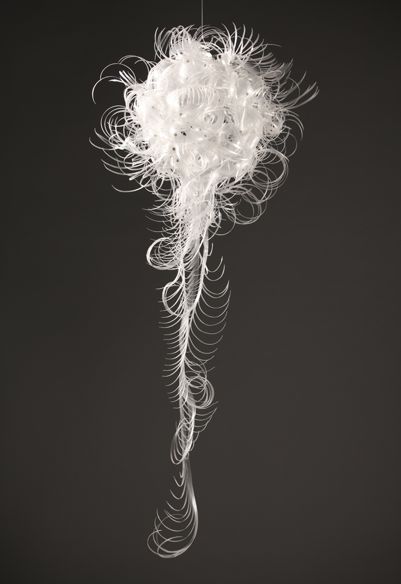
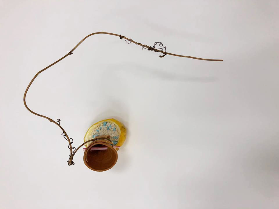
 After doing the first model, I am not satisfied. Therefore I tried to improve on it. I felt that the second model is more interesting and have a focus point.

Assignment 2: Sequencing Images

There is two task to this assignment. For the first task, we had to be in a group of maximum 4 person. We are to reinvent a history for someone whom we had lost touch. As for second task, it is a individual project. We had to make use of images shots that we took as a group to create a photo story with sound.

Plot

Our plot is about a girl and boy who are childhood friends since young. They communicate thru letters and would always meet at the park nearby, where all their memories are formed. However, over the years, the boy had to leave to go overseas. The girl anticipate for him letters, but she never ever receive them. Over the years, the girl moved on and have her own family. Then she receive a letter by the boy. She then realised the boy left her, not because he had to go overseas but he will suffering from illness and he doesn’t want her to suffer with him.

Process

While editing the images, we realised we had many missing images and scenes, therefore we had to change our story. We felt that the first shoot was lack of planning. We had many disconnections and the images do not bring out the emotions we are trying to convey. We didn’t use a tripod, so the images were some what not from the same angle.

Therefore our group agreed to reshoot.

The second time we shoot, we followed the story board closely. I felt that having a storyboard really helps a lot. It helps us plan and organise the story better.

Thankfully, the second time we shoot it turn out better. We had our things planned out. We went to various locations and had our props ready. Since this story is about childhood friends growing up together, we had to take the attire and surrounding into consideration too. We also confirm all the camera angle and lighting so that we will not face the same problem.

20 Images

We use a lot of wide angle shot to show what is happening at the surrounding. Then we zoom in into the subject, this is to show the emotions and main element in the photo.

We also made used of what we learn in class. Like the different perspectives and rule of thirds.

Inspiration

I got my inspiration from the film Memento. Memento is presented as two different sequences of scenes. A series of black and white to represent the past and a series of colour sequences to show the present.

Story

PRESENT – PAST – BACK TO PRESENT

The story starts and ends at the same location. I tried using two different colour schemes in my plot. Saturated colours for the present and desaturated colours for the past. It starts with the girl recalling back to the past, where they form all their memories together. The park is a place that connects them together. They always appear together at the park, however at the last scene it shows the girl sitting there alone. I want to show the loneliess and that the guy had left. I also made use of the leaf dropping scene to show that the boy had left. I also make use of black screens and fading effects between 2 different locations/ scenes to show the flash back memories and to show the passing of time.

Sound

I had no idea what sound to use. I went youtube to watch some still photo story to get inspirations.

0.00-0.12 I use peaceful and soft environmental sound.

0.12-0.30 I tried to add in the sound of ceiling fan and echo sound effect to show that she is a very small space. The sound is soft and not over powering. Then I use diegetic sound, for example the sound when the boy in sliding the letter into her house.

0.32-1.16 This is where all the happy memories are formed. There happier and lively environmental sound, such as birds chirping, wind and children playing. I also recorded the closing and opening of tin. At 1.16sec it ends with a loud bang. It is to show that the tin is being buried and to show that something bad is about the happen.

1.19- 1.33 This is where the boy left. The use go low pitch sound for the background, this is to create a tension and anticipation of what is happening next.

1.36-1.41 Instead of showing the man walking into the lift, I used a black screen with sound of the lift door opening. Like without even seeing whats going on. By the sound of it, we know where the boy is.

1.41-2.53 After the boy left her, I reduce the background sound, it is to create the loneliness effect and I only force a few sound to create the tension.

2.53-3.03 I use back the same background sound as the first scene to show that is a continuous of the first scene. However, I add the low pitch sound to create the mood of how the girl is feeling.

3.03-3.22  When she finally know the reason why the guy left, the sound of the background sound slowly fades away and become silent. It is to show peacefulness.

Reflection

I realised how difficult it was when I was editing the sound and images. It is really difficult to find the right sound to represent the mood I am trying to convey.  End up I had to record some of the sounds. Such as the opening and closing of biscuit tin.

It was also the first time I tried using Lightroom and iMovie. I had no idea how and what to do. I ended up learning from youtube videos. I learn how to adjust the settings.

Overall, it is a good learning experience. I am pretty satisfy. I never thought I will be able to do it. Although it is not perfect, but I tried 😀

Video

Forrest Gump- Process

I documented my design process and silkscreen process.

My final compositons will be documented in another post!

Compositions

1. I am the king of the World - Titanic

The keywords that I extracted out is King and World.


For the first 2 compositions. I was being too literally the word king and world keep getting stuck in my head.

Then I came across this image. The mother is using her phone and the baby is placed on the floor. I thought it is ridiculous as technology is taking over the world.

Then  thought about it and I felt that it is true that technology is taking over our lives. Everyone owns a phone. In the past, people communicate by sending letters or talking face to face. But in the current society, we no longer need to do that.

Even for myself, I feel weird not bringing my phone out when me. Therefore, for my third and final layout I want to show technology, mainly phones taking over the world.

This is the composition I worked on before my final.I use hand, phone, world and the dialling symbol. Since the technology is taking over the world, the main subject is the phone, hence it is the biggest and the world is the smallest.


2. The human world is a mess - Little Mermaid


The keywords that I extracted out is human, world and mess.

I use octopus to represent the mess. Like the human world is being taken over by animals. I want the focus to be on the octopus. After doing my first composition, I felt the design do not have a main subject. Everything seems too overpowering. Therefore, I tried to enlarge the size of the octopus and reduce the size of the human world. However, I still feel that the design is a bit too messy.

For my the third layout, I tried to duplicate the subjects. And I create a focus by enlarging the centre octopus. Showing octopus taking over the human world. I like this layout, but I felt that it do not show the mess as there are too much negative space.


3. It's always tea time - Alice in the Wonderland

The keywords that I extracted out is tea and time.

This is one of the quotes that I struggled with. I felt that my design is too literal and simple.

I use teapot and clock to represent the 2 keywords. I felt that there is too much postive spaces. What I could do, is try to duplicate the subjects and add in more textures.


4. When will my reflection show who I am inside - Mulan


The keywords that I extracted out is reflection and inside.


This is my favourite quote. Mulan is a girl but she have to disgust herself as a man. When I thought of the I thought of using roses to represent female. For my first layout, I place the rose outside of the heart and I felt that it does not show the inner self.

Therefore my second composition, I tried placing the roses in the heart it self and I use wire burb to warp around the heart. It is to show the inner self begin trap and she could not reveal her real identity as a female. And the rose in her eyes shows how much she wish to reveal her identity.

I really like this layout, but I feel that the design was too symmetrical and that I could as some texture and emotion to the background.

Silkscreen

I am very excited because the last time I did it was in poly. And I really enjoy it. However, what we did back then was slightly different.

After I have finalised with my final composition. The fun begins!

First, we had to print our design on 2 pieces of transparency. We each collected a silkscreen frame and a tote bag.

Then, we had to wash the frame to remove dusts. Next we have to coat our silkscreen with blue emulsion and put in the dryer until it drys.

Then we had to wash to off the unexposed part, I was so disappointed as my design got wash off and I had to redo another screen. I thought my design had many details and 18secs of exposing it not enough, so for my next screen I exposed it for 20secs. This time round everything got washed off. I was really worried as most of my classmates already had there screen exposed and I do not have time to redo another screen that day. I had to wait for the next week 🙁

I know I was behind time and I am also worried if the design got washed off again, I had to redo.  So the next lesson, I came to class prepared and I quickly went to coat the screen with emulsion.

After many tries, I finally got what I wanted. I am glad the details did not got washed off.

This is what my screen looks like after washing off the unexposed parts.

Now we move on the even scarier part, the test prints. I am very afraid the details will not be seen.

For my first trial, I applied too much ink and pressure. By the third print, I got the hang of it. Im glad it turned out better than what I expected.

And now I am ready to print on my tote bag!

The prints came out slightly lighter than on paper. I think it is because the bag absorbs more ink. However it still turn out good!

Yeah! It was a success! Thank you to my lovely classmates that helped my out in the silkscreen! 😀

I showed my family the tote bag and my sister wanted one too. So then the next lesson, I bought a extra tote bag and I printed it for her the next lesson. I felt that this tote bag turn out better and the ink was dark. However, the proportion is bit off as the bag is too big and the design seems smaller.


Time to say goodbye to my screen!

GAIA’S IKEBANA

What is Ikebana?

Ikebana is the Japanese art of flower arrangement. The name comes from the Japanese ike, meaning ‘alive’ or ‘arrange’ and bana meaning ‘flower.’

" Ikebana is not just about sticking a flower into a vase: It is about the love and need of the artist to create beautiful forms … Ikebana is not just about flowers, it is about the person who arranges them. "

Sofu Teshigahara, Founder of Sogetsu School
https://hiveminer.com/Tags/sogetsu

Ikebana is more than simply putting flowers in a container. Ikebana is an art, in the same sense that painting and sculpture are art. It has a recorded history; it is backed up by articulate theories; and it is concerned with creativity. In Japan, flower arrangements are used as decorations on a level with paintings and other art objects. It is a disciplined art form in which the arrangement is a living thing in which nature and humanity are brought together. It is steeped in the philosophy of developing closeness with nature.

As is true of all other arts, ikebana is creative expression within certain rules of construction.

Principles of Ikebana 

https://hiveminer.com/Tags/sogetsu

Ikebana has become an artform that is associated with a meditative quality. Creating an arrangement is supposed to be done in silence to allow the designer to observe and meditate on the beauty of nature and gain inner peace. Ikebana is meant to be viewed in all angles, the importance of space, which is not meant to be filled, but created and preserved through the arrangements. Each view should shows a different ‘story’. This ties into other principles of Ikebana including minimalism, shape and line, form, humanity, aesthetics, and balance.

Different kinds of Ikebana

Heika

http://www.ohararyu.or.jp/english/image/photo/cl_heika_1.jpg

Heika is a basic style of ikebana arrangement that uses a tall vase and highlights vertical lines. The biggest feature is the emphasis on bringing out the flowers’ natural charms and arranging them in a tasteful and elegant manner.

Moribana

http://4.bp.blogspot.com/-8pKPTKHDOsc/UDXlmm8wX4I/AAAAAAAABQ0/WsF1m3tm2Fk/s1600/ikebana001_117.JPG

Moribana uses a shallow container and a kenzan, a holder with many sharp points into which flowers are inserted. The big feature of moribana is the broad expanse of natural-looking shapes and a mound of beautiful flowers.

Taste Food Research

https://www.livescience.com/17684-sixth-basic-taste.html

Five tastebuds operate together to give us a full picture.

1. Sweet The most elemental of taste pleasures, sweetness signals the presence of sugars, the foundation of the food chain and a source of energy. Examples: Honey, Fruits, Desserts
2. Bitter A poison alarm, bitterness is a distinctive bad taste accompanied by a reflexive “yuck” expression on the face. Examples: Bittergourd, Grapefruit
3. Sour The mouth-puckering sensation is caused by acids in lemons, yogurt and sourdough bread and other food. Examples: Lemons, Vinegar
4. Salty Our brains are programmed so that a little salt tastes good, and a lot tastes bad. Examples:Ham, Potato Chips

5. Umami Japanese for “delicious taste,” umami is produced by certain amino acids. It’s best described as “savory”—a taste rich in flavor released by cooking, curing or aging. Examples: Seared and Cured meats, Fish sauce, Green Tea, Soy Sauce

Other than these 5 different senses, food also needs to be presented in a way that is appetizing to the eye as well as to the palate.

Taste is an incredible sense, sending information to the brain as to whether what you’re eating is sweet, salty, sour, bitter or savory. Taste as a sense is made up of sight, smell, touch and resulting taste. So when you screw up your face in disgust as that moldy piece of bread is put in front of you, chances are your brain has already made its mind up before you put a bit in your mouth – which is why most people refuse the moldy offering prior to eating it.

So in fact, eating that piece of chocolate which sends a positive signal to your brain’s receptors and lets you know you’re enjoying it actually comes from a mixture of sight, touch, smell and the effect on your tastebuds.

The way we see food affect its taste!

Smell

http://www.justcatering.net/wp-content/uploads/2015/04/bigstock-Closeup-of-a-male-chef-with-ey-61217975.jpg

Smell is important as it can affect our sense of taste. Researchers say 80 percent of the flavors we taste come from what we smell, which is why foods can become flavorless when you have a blocked nose.

If the smell is not appealing to us, we will not likely try it.

Smell is the only sense that affects the memory and emotion part of the brain. If we feel good when we buy a product then we are likely to continue buying it. However, if the smell is not appealing to you, you will not buy it again. This is also why many companies add fragrance to their products such as soap and washing powder. Smell has become increasing important to us and as a result the industry has responded to these demands.

Summer

We were ask to pick a season from the pandora box, the season I received was summer.

Summer is the hottest and most fun season. People often take advantage of the warmer temperatures by spending more time outdoors during the summer. Activities such as traveling to the beach and picnics occur during summer months.

Personally, I feel that summer is a fun season. summer. It is full of vibrant hues that can spark liveliness and bring energy to any space.

Season Mindmap

Summer Moodboard

This is the moodboard that I have done. Summer being colourful and vibrant. Since summer is the hottest season, icecream and desserts is a must have!

3D Analysis

We are allowed to be as creative as possible. However there are some key points that we have to that note of.

Models must consist of a cone, sphere and a cylinder. The Dominant(D), Subdominant(SD) and Subordinate(SO) should stay consistent on at least 4/6 views. We were to create a balance be is Dependent, Precarious, or Independent of directional forces in our compositions. And lastly no right angles are allowed in this assignment.

Model 1

FRONT
SIDE
TOP
  • Dominant (D) RED
  • Subdominant (SD) BLUE
  • Subordinate (SO) YELLOW
  • Things to improve on GREEN

All 3 elements could be seen on all views. However D, SD and SO is not consistent. D and SD have very similar length. While SO seems larger than SD too.

Model 2

FRONT
SIDE
TOP

All 3 elements could be seen from all angles and  D, SD and SO stayed consistent on most angles. I also tried placing the cylinder on 1/3 of the cone.

What  I can improve on?

I can increase the diameter of the cylinder. So that the SD and SO would not be so similar in terms of the diameter. Next, the side view has a right angle. What I could do is to tilt the cone.

Model 3

FRONT
SIDE
TOP

All 3 elements could be seen from all sides. SD and SO are too similar. Everything is symmetrical fro the side view, which makes the composition looks boring. However, I do like the front view, it shows different degree of angles.

What  I can improve on?

I could increase the size of SD and reduce the size of SO, so that SD and SO will be more obvious. I feeling that the composition do not look as interesting as compared to the front view.

Final Model

FRONT
BACK
SIDE
TOP

My theme was Summer. I wanted to create a more playful and youthful composition. I tried to swirl the branch around my cone, to create the liveness. Summer is also filled with colours and brightness. Therefore, I use colours to create a fun and joyful composition.

Summer is the hottest season of the year, desserts are the must have, therefore i used cold and refreshing desserts/ fruits to represent summer.

The dominant in my composition is the cone and branch. While the Sub dominant is the straw and blue pebbles to represent the sea, lastly bubble tea pearl is subordinate.

I also tired to play with the scent, I used lemon as it has a refreshing smell. Which represents summer.

Since ikebana is made to be able to be viewed in all angles, I tired to make all angles different and interesting. I made used of asymmetry and voids to create the composition. My favourite view is the front view. As the branch frames up the subject in the composition.