“The Marabou Stork of Jalan Kayu” is a zine that aims to provide a tongue-in-cheek introduction to the viewer of a rare gem of Jalan Kayu, hidden in the depths of the Animal Resort that nobody knows about.
“The Marabou Stork of Jalan Kayu” is a zine that aims to provide a tongue-in-cheek introduction to the viewer of a rare gem of Jalan Kayu, hidden in the depths of the Animal Resort that nobody knows about.


Project Proposal
“The Auction” is a performance art piece which takes a look into a possible near-future dystopian society. Web anonymity and security has been entirely obliterated, giving web service providers full access to any information shared online. They are able to disseminate the information to whoever they please, selling to corporations or private parties for targeted advertising, or to private parties for more sinister uses such as blackmail or stalking.
The artists have created a faux auction which fully immerses the audience into this fictional universe, allowing them to bid for information on themselves or other audience members which the artists have sourced from their social media platforms.
Concept & ideation
We were tasked to create a video, sound or performance art installation in groups of 2-3 people, developing on a concept we had explored in one of our previous projects this semester. Therefore we decided to work with the concepts of consumerism and technology, which I worked on in project 1 and project 2 respectively, and came up with 2 possible ideas:
While doing research for another project, Josiah and I were made aware of the news that POTUS Donald Trump is looking to repeal net neutrality laws that currently exist in the US. With the repeal, data service providers will be allowed to sell your private information such as your browsing history to the highest bidder. Despite living in a digital age, people still tend to be quite ignorant to the privacy risks that comes with using the web as they give out information blindly without considering the potential implications and consequences. Hence, we decided to go forward with our first idea and incorporate news of the repeal into our proposal because with the repeal of broadband privacy rules (i.e. net neutrality), it becomes all the more important to raise awareness of web security.
We consulted with Ms Lei on our idea because we felt that it was lacking in something and during the consult, we came up with the idea of “selling” information about our audience in the form of a simulated auction.
Process & Challenges
The first and most essential step to our installation was to source the content that we would be selling. I started by adding all of my classmates on Facebook and Instagram, and thankfully most of them accepted my request :’) These days everybody is on the internet and I managed to find all of my classmates on social media. The hard part was to actually decide which information to use and which to ignore. We didn’t want to use any information that was really very personal such as credit card numbers or addresses because we didn’t have the means to access such information and due to ethical reasons because we would be seeing these people around school for the next 3 years 🙂 We limited ourselves to things we could find easily such as Instagram comments/captions/photos and posts and information shared on Facebook.
Because the main reason usage of personal information by corporations is to target marketing strategies towards certain customers, we decided to include advertisements as well in order to show that sharing certain things online can lead to companies targeting certain advertisements towards you. For example, someone who shares a lot about their pet dog on social media may find that they are starting to see a lot of online ads about pet products, etc.
We wanted to present the information as a physical product so we purchased mounting boards and cut them into B4 sizes, as well as envelopes to place the boards in.
Because it was going to be in the form of an auction, we wanted it to be as immersive as possible so we decided to spend a little more time, effort and money on creating our props. We watched some videos of real life auctions and decided that we would need some kind of fake currency, number plates for our audience to hold up while making bids, as well as marketing materials such as a video and brochure since we are presenting ourselves as a company selling a product.

One of our “products”, encased inside a labelled and stamped envelope
Company logo brainstorming
Alternative logo design
Final design of company logo
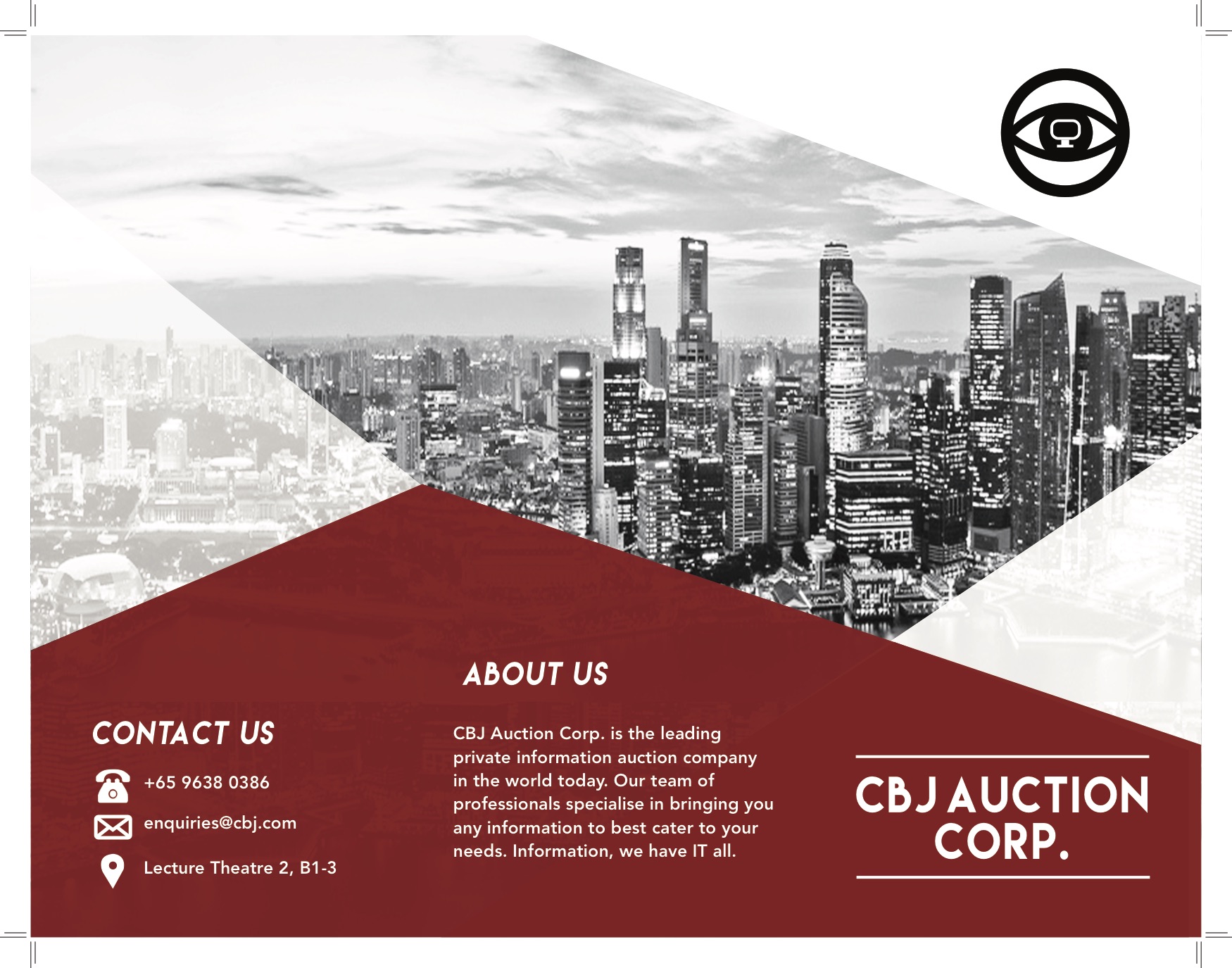
Brochure designed by Cassandra
Video done by Josiah
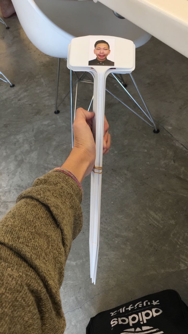
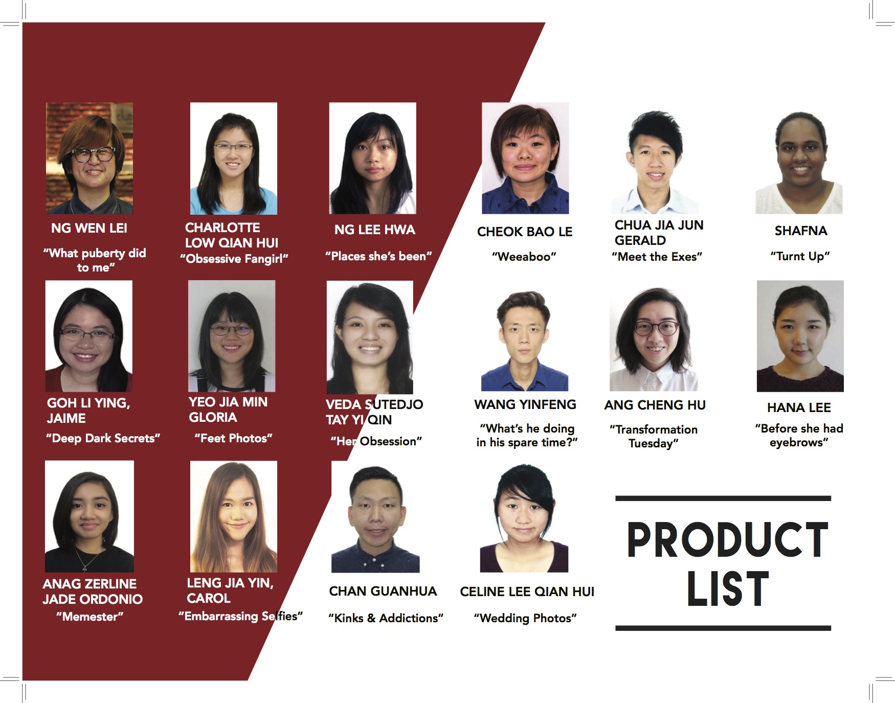
An example of the “number plate” we made for our audience, except instead of number plates, we used “face plates” – pictures which were taken from the NTU blackboard course photo gallery.
The decision to use “face plates” and their names were both for conceptual and practical reasons. Concept-wise, in an age where internet information is not really private or safe anymore, anonymity becomes a thing of the past – Hence the blatant disregard of it in the auction. Practicality-wise, everyone already knows each other and this was a relatively small sized auction, so instead of confusing us with numbers, we decided to call their names instead, and use the face plates as a supplement to that.
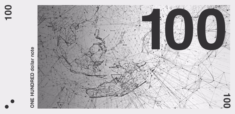
This is the “money” we used which was designed by our amazing friend Kim ❤️
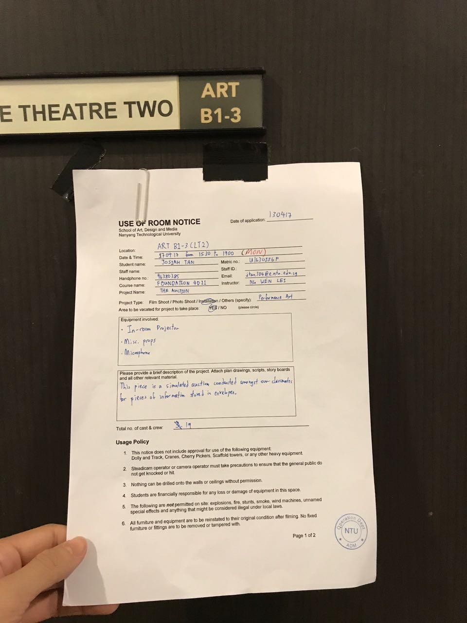
Another thing we had to take into account was the location for our installation. As Ms Lei mentioned, space is an integral part of any installation and should be carefully considered. We thought of using the lecture theatre in school because it would have a large screen and a stage for us to stand on, as well as seats that would give our audience a clear view of the auction. We pitched the idea to Ms Lei in our proposal and she approved it, so we went about the proper channels to secure our location.
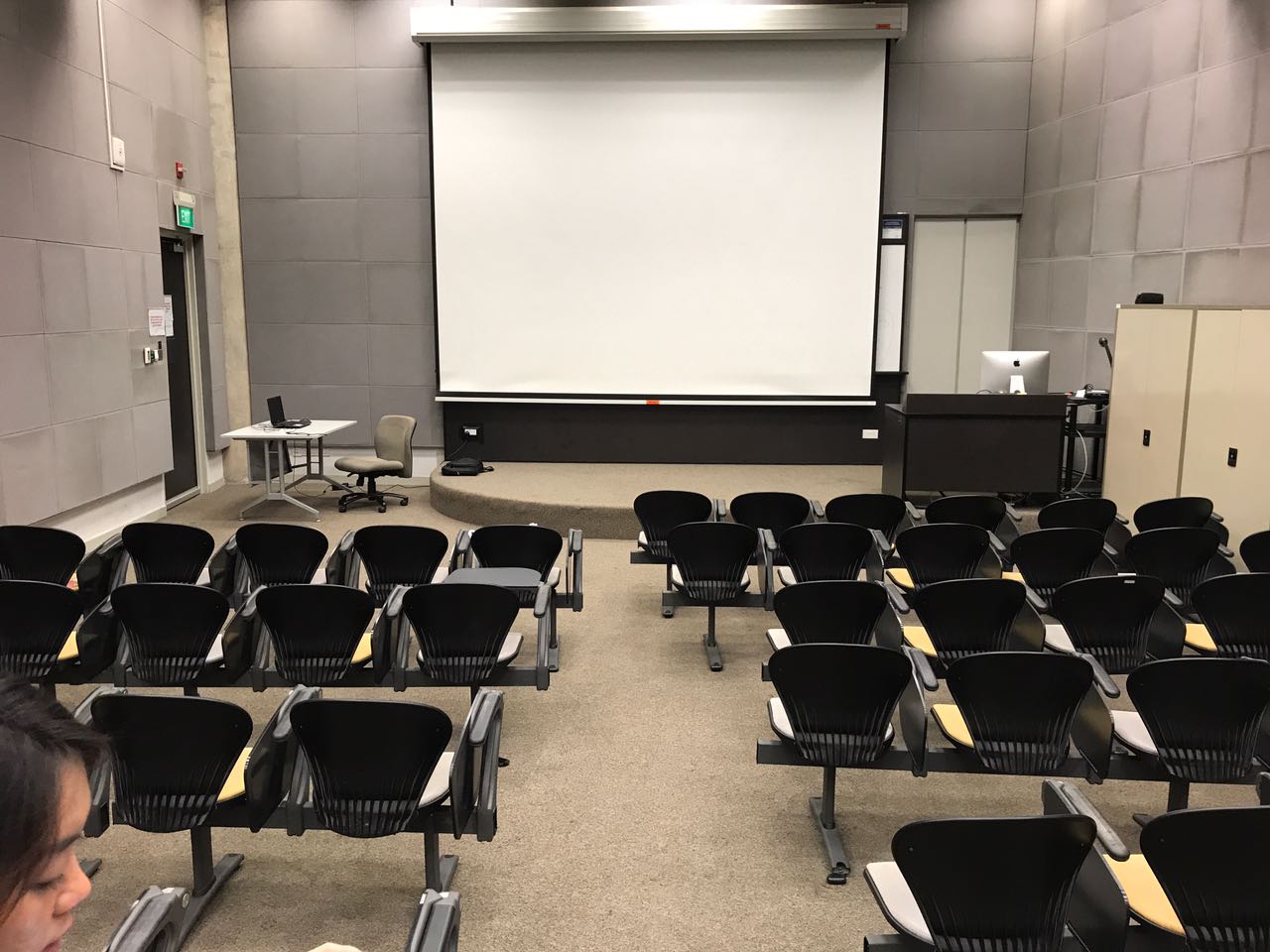
Recce of our intended location

We were told to contact Pheng Yew to book our location but ended up having to go through a lot of other people HAHA
yaaaaAAAas
With all our props and location settled, we decided to have a test run with a group of friends a few days before the actual installation, just to make sure it was feasible and to smooth out any errors we might have. This turned out to be extremely useful because there are apparently a lot of things that can go wrong in an “auction” that we didn’t realise. Here are some of the comments that we received during the test run:
We feel that having a test run was super important in terms of reminding us about the very essence of performance art, which is that you cannot predict how the audience will react to your art. Before the test run, we had a specific intention of how we wanted the audience to react and behave during the auction. When things didn’t exactly turn out as planned during the dry run we were a bit disappointed at first but we remembered what Ms Lei mentioned during the lesson on performance art, that the artist cannot control what the audience will do and this is part of the beauty behind performance art because every performance will never be the same. Thus we decided to let go of all our expectations of our audience and just have faith in our concept because we believe that the audience will have an enjoyable and fun time, which they did. It was also due to this reason that we scrapped the idea of using a planted audience to “hype up” the crowd because we wanted the performance to develop in an organic and uncontrived way.
The test run also highlighted to us the importance of showmanship during a performance art installation. We didn’t consider that choosing to do a performance art installation meant that we had to be in character at all times and we learned that it was very important that we show our audience that we are unwavering in our performance.
Another problem we battled with constantly along the way was that we wanted to be respectful and considerate to our audience despite the invasive nature of our performance. After doing our previous research on controversial installations, we wanted our installation to have an element of controversy but we didn’t know how to do so without making anyone uncomfortable. In the end, we managed to arrange our content in a way such that nobody was offended and everyone enjoyed themselves, teaching us that art doesn’t have to be offensive or cruel to be controversial.
Final Installation
Unfortunately, we weren’t able to capture the entire performance on camera because our footage got cut off after a certain point :/ but here’s what we managed to salvage!
First of all, the projector system in the lecture theatre (LT) is a little wonky, so setting up took a bit of time. We got our participants to wait outside while we set up. There, we handed them 15 $100 bills to be used for the bidding process. We handed them the brochures as well so that they would know the items up for bid; which would hype them up for the potential items they could walk away with. Before letting them into the LT, we let them know that the performance art piece was a simulation of a dystopian near-future where internet information can be bid for. With that said, we let them in.
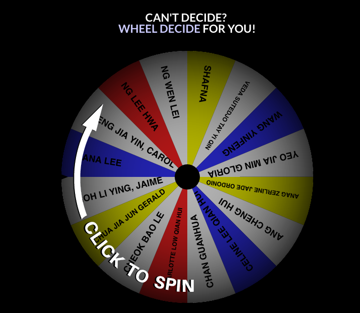
Once they entered, we got them to pick up their own “face plates” and sit near the front of the room. After they had settled down (and after some technical difficulties), we played them the commercial video then paused at the rules & regulations. I explained the rules of the auction to the audience and then we used wheeldecide.com to randomly select each product up for bid.
Once the wheel landed on a product, the name would be removed from the wheel and I would give a teaser about what could be expected in it. Meanwhile, Cassandra would place the product’s envelope on an easel (meant to mimic a pedestal) and Josiah would screen the amount each participant had left on the projector.
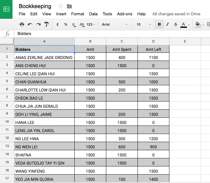
Participants talked among themselves about each product and made bids for them. They would make bids for others if the information was interesting to them. They would make bids for themselves if they wanted to keep that information away from the others or if they were simply curious about the write-up on themselves.
Once the bid was done, Cassandra would bring the envelope over to the winner and collect payment. The wheel would then be turned again and the cycle would be continued until the end of the auction. After all the envelopes were bid for, we concluded the auction and gave an explanation for the performance art piece, before opening up the floor for a Q&A session.
Thoughts & Reflections
First and foremost we’re extremely grateful for all the help and advice we received throughout the process of our project, from both Ms Lei and our friends. We definitely had doubts and troubles along the way but we never felt like we were alone or at a loss because we had a constant supply of feedback and a strong support system that kept us going and ultimately made our performance a success.
We also want to thank our audience for being such a good sport and participating actively in our installation (: We were worried at first about our performance being so reliant on audience participation but the moment we entered the installation everyone was so excited and seeing everyone have so many laughs and just enjoying the process really made all the hard work and late nights worth it :’) LOL (lots of love) to you guys!
All in all, we’re glad we were able to put up what we feel was the best possible experience for our audience and we really appreciate all the good feedback we received on it. Foundation 4D has been all we hoped for and we’ll definitely miss it once we’re in our respective majors next year! All the best to everyone for their future endeavours and thanks for the memories :’)
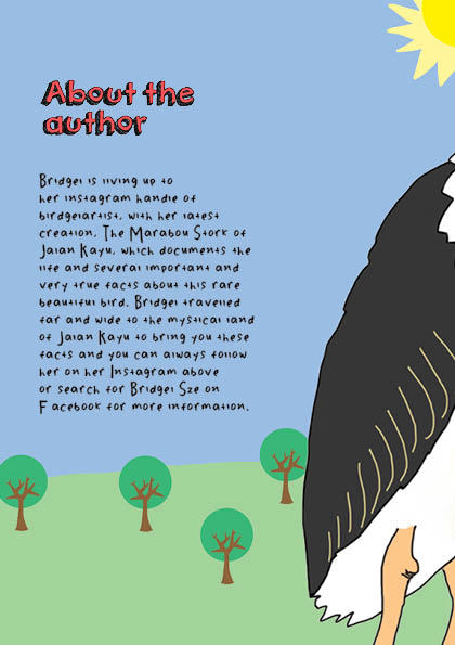
As I mentioned during my slides presentation in the middle of the project, I decided to do a fully illustrated zine in my usual humorous, tongue-in-cheek style because I think it represents my style best and people seem to like it ((((:
Concept
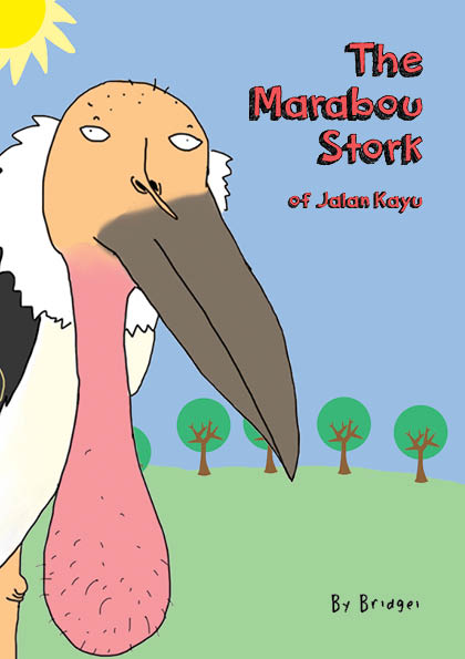
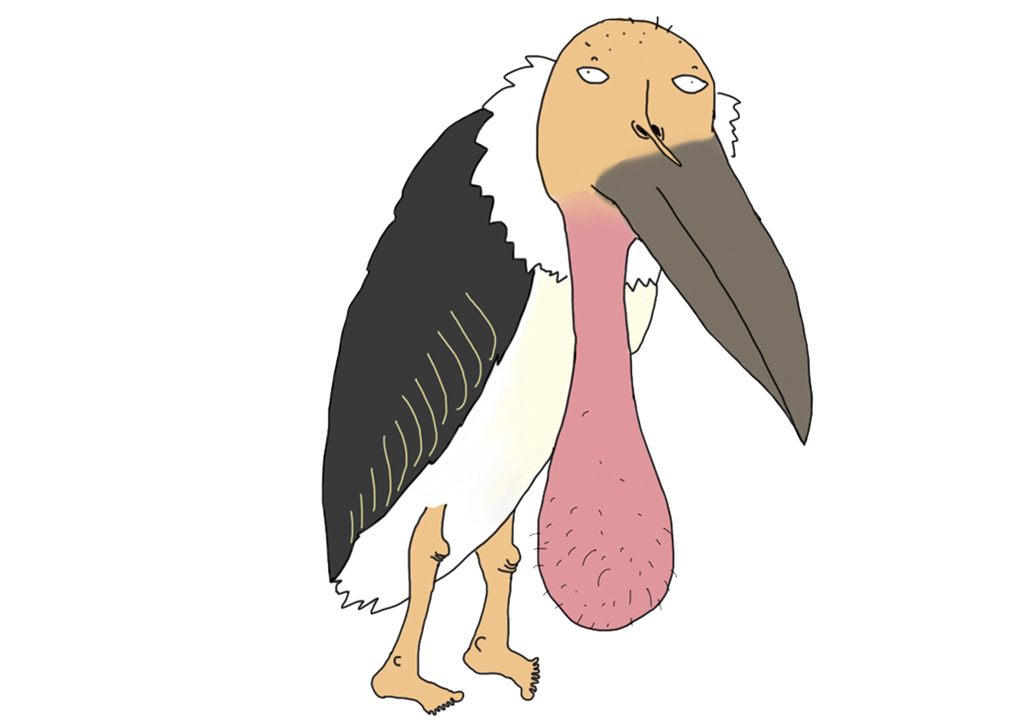
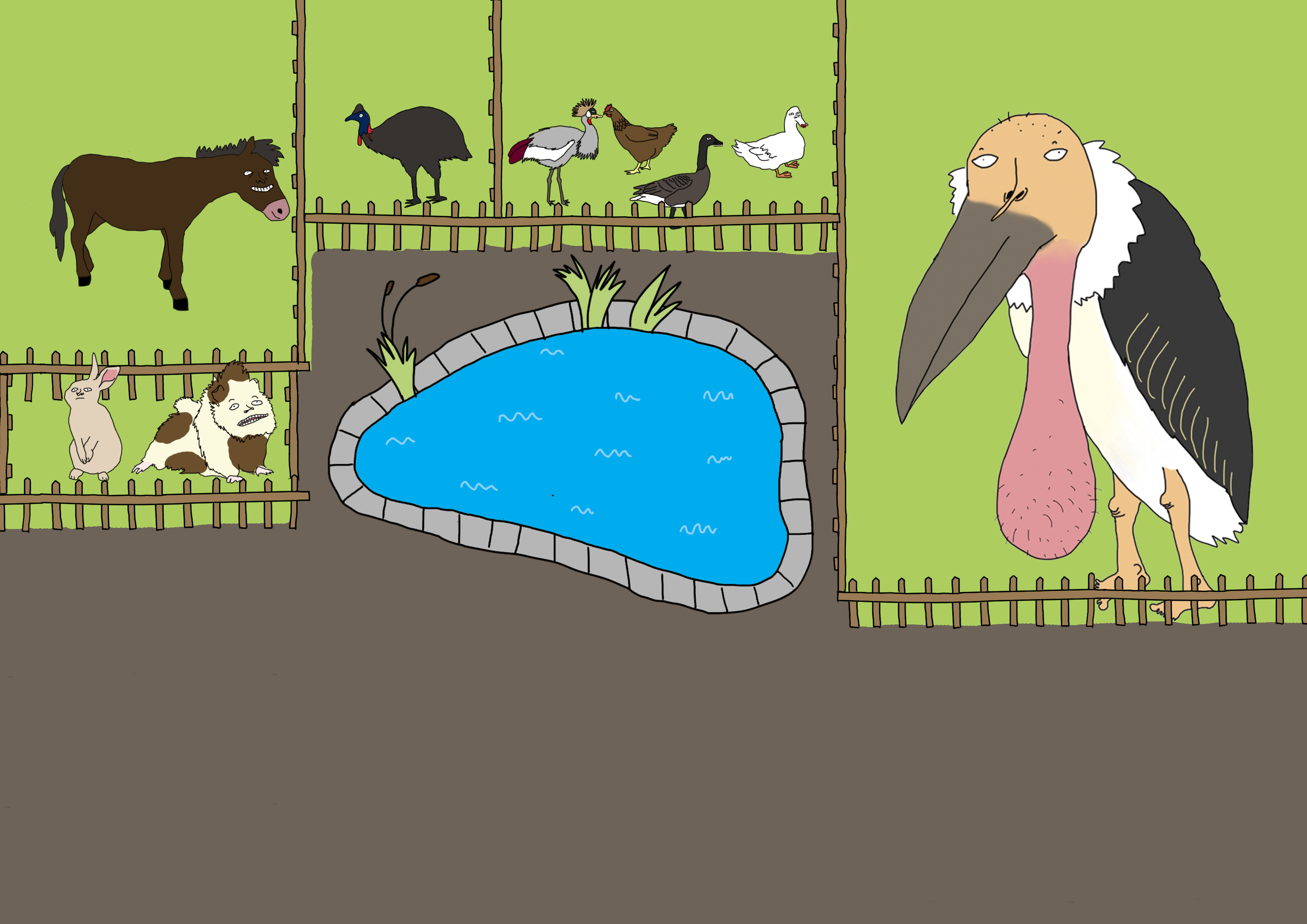
I decided to use the Marabou Stork (aka “ballsack bird”) which I found at the Animal Resort at Jalan Kayu as the main focus of my zine. This is because when I told people that I was doing the zine on Jalan Kayu, everybody was like “ROTI PRATA” and “SHOPHOUSES!!!!” so I immediately decided I was gonna do something different because if the roti prata is really that famous then it doesn’t need a zine to tell people that it exists lol.
Process
I had a lot of crazy ideas for what to do to my zine but most of them weren’t really good ideas. Since I wanted the zine to be funny I wanted to make the content as nonsensical as possible but I was reminded by Shirley during consultation that the content still has to relate to Jalan Kayu somehow. To get more ideas rolling, I decided to just open photoshop and just freely draw the ballsack bird in different poses and situations.
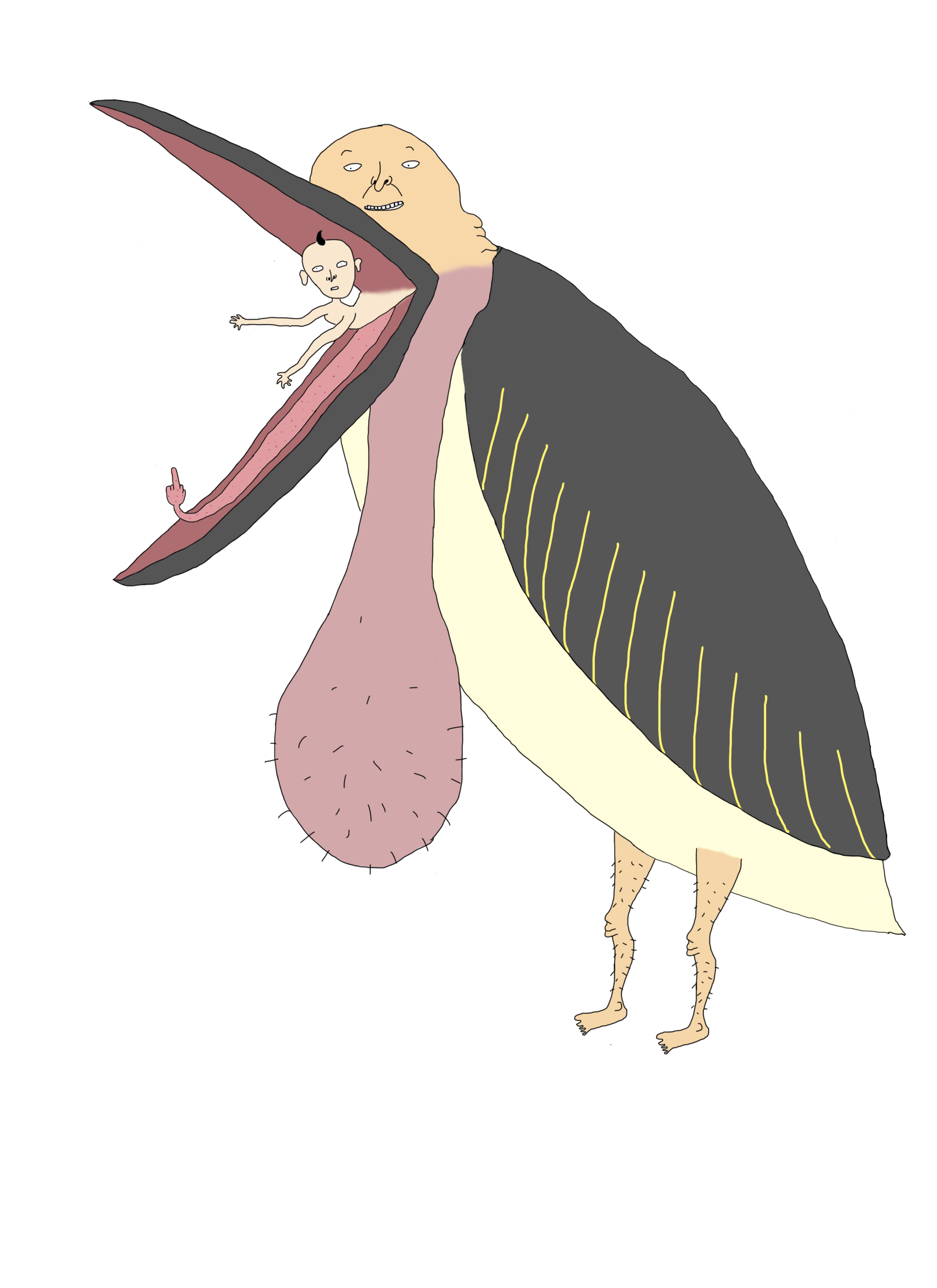
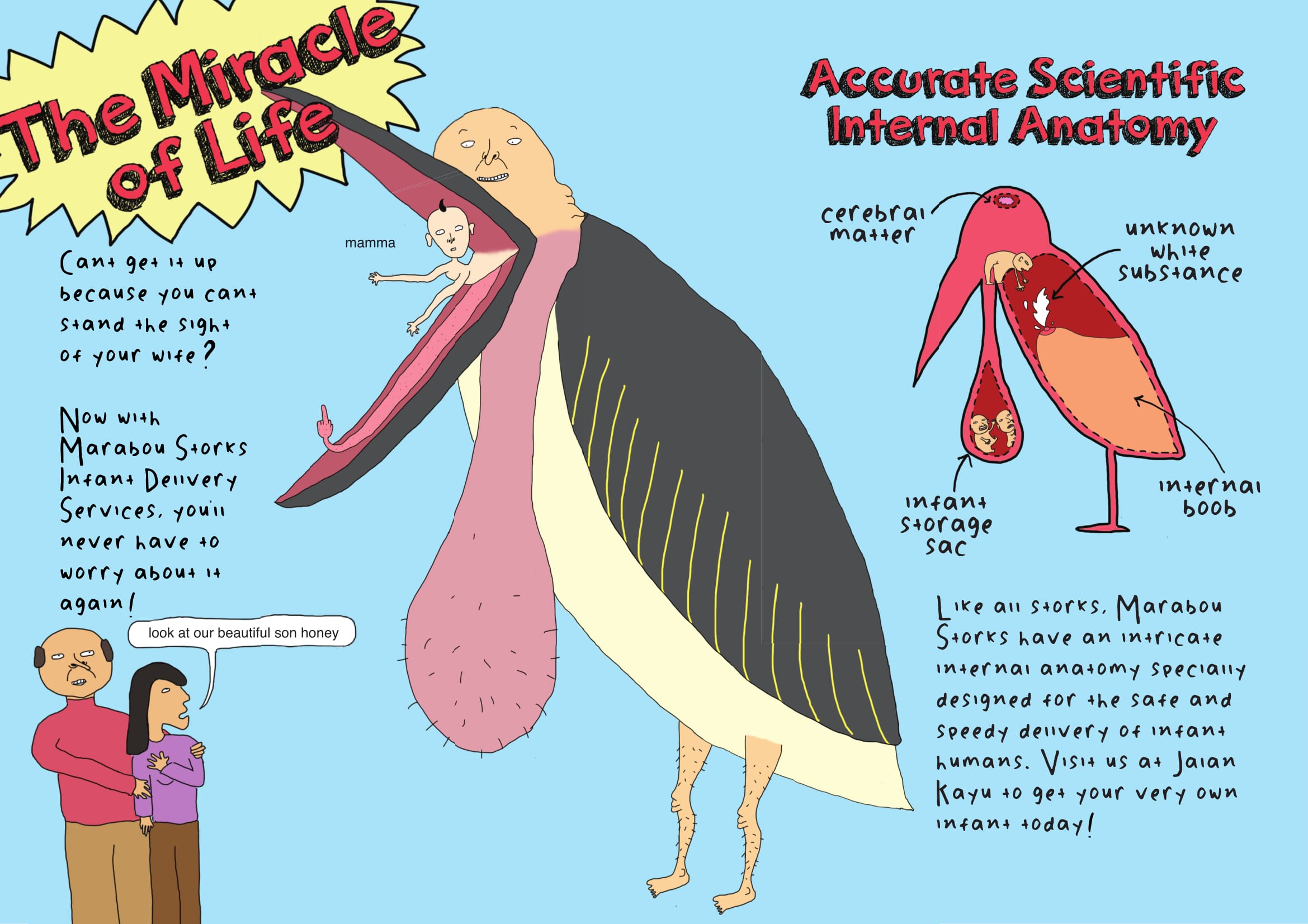
While I was drawing this bird, I suddenly randomly though of the movie “Storks” and it reminded me that storks are associated with delivering babies to parents. Hence I decided to include this concept as part of my zine storyline, and created the following:
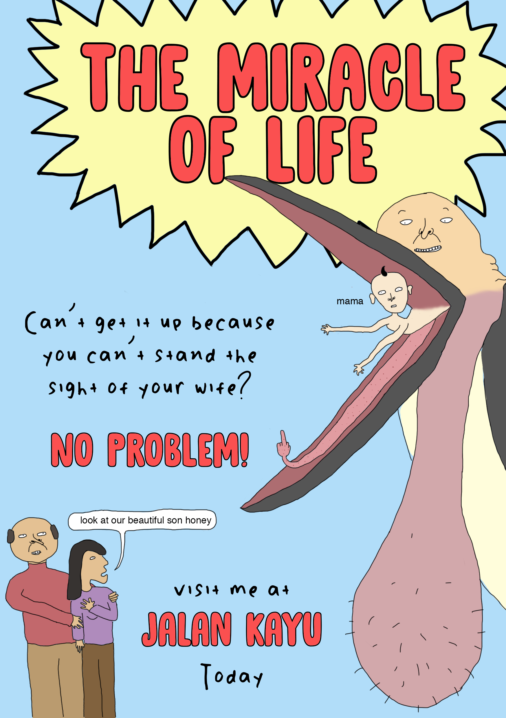
I was hoping to use these 2 pages as a spread in my zine. When I showed it to my friends it received a lot of good feedback but during consultation Shirley told me that the font was inappropriate and the spread lacked structure and hierarchy, and gave me advice on how to arrange the different elements properly. At this point I realised that to make my design more readable and cohesive, I should make use of the grid system in my zine and from here on I found that arranging the copy and images of the zine was a lot simpler.

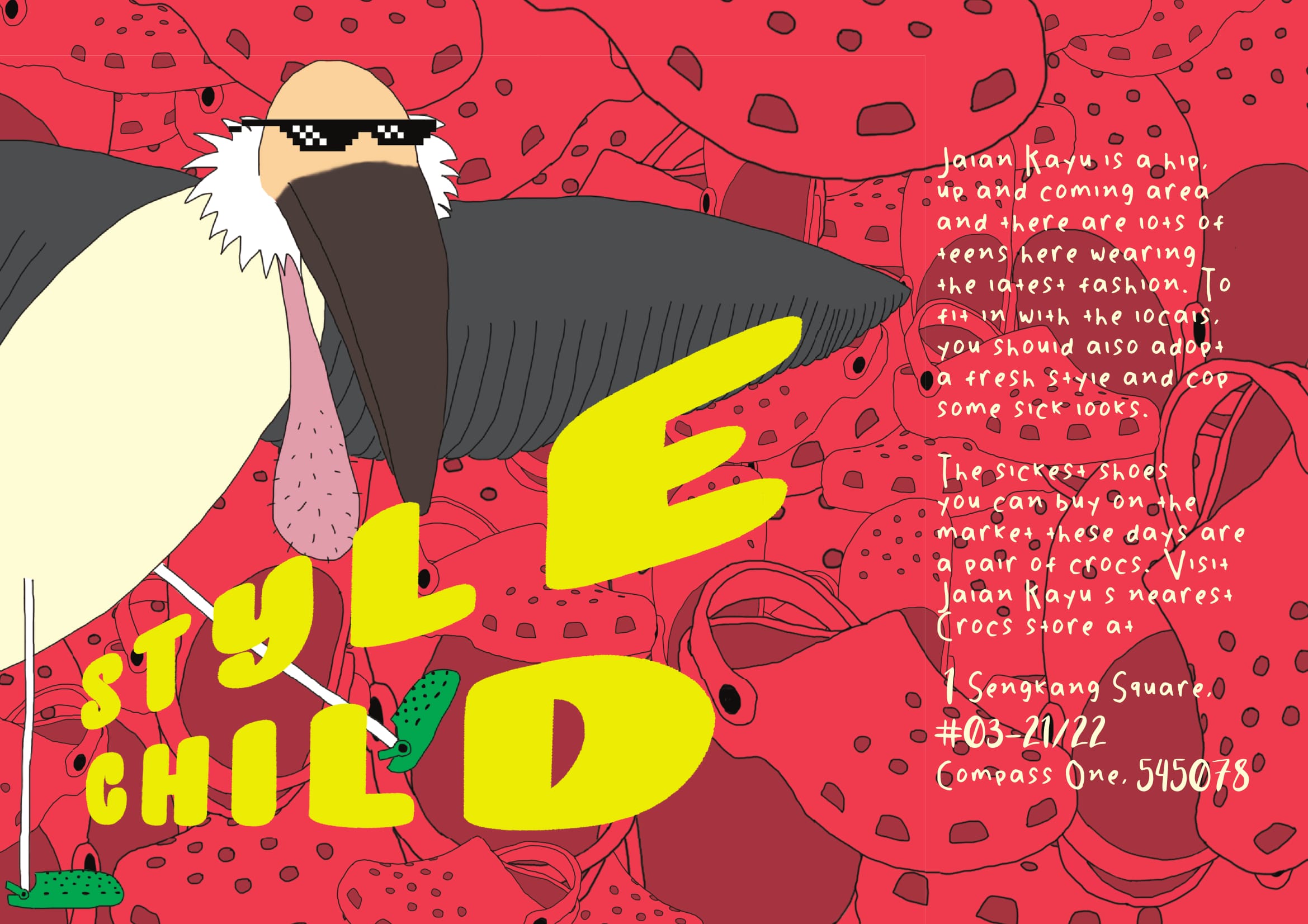
Another one of the first spreads I came up with was the one above. The idea behind it is that I wanted to create a joke “fashion guide” for people visiting Jalan Kayu since it is somewhat considered a “hipster” area and people visiting that area would usually dress nicely. I personally own 2 pairs of crocs and I think they’re great shoes but people are always giving me shit for wearing them which was why I decided to use something that is perceived as unstylish and unfashionable in contrast to the stylishness of Jalan Kayu. Shirley suggested that instead of using photos of crocs I should just illustrate the crocs to create a more cohesive illustrated style in the entire zine.
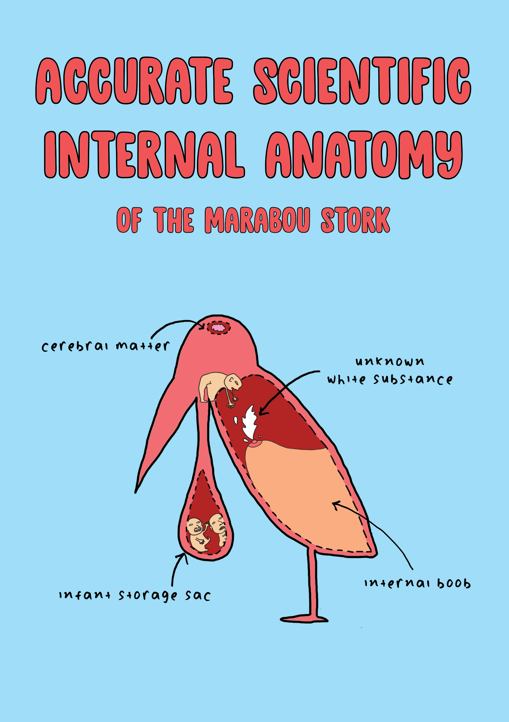
As you can see from the 2 spreads above I decided to go for a very bright colour palette with the use of a lot of primary colours. This is because I wanted my zine to have a bold, cartoon-like look, almost like it is a children’s book but upon actually reading the zine the reader is like oh my god this is totally not for children
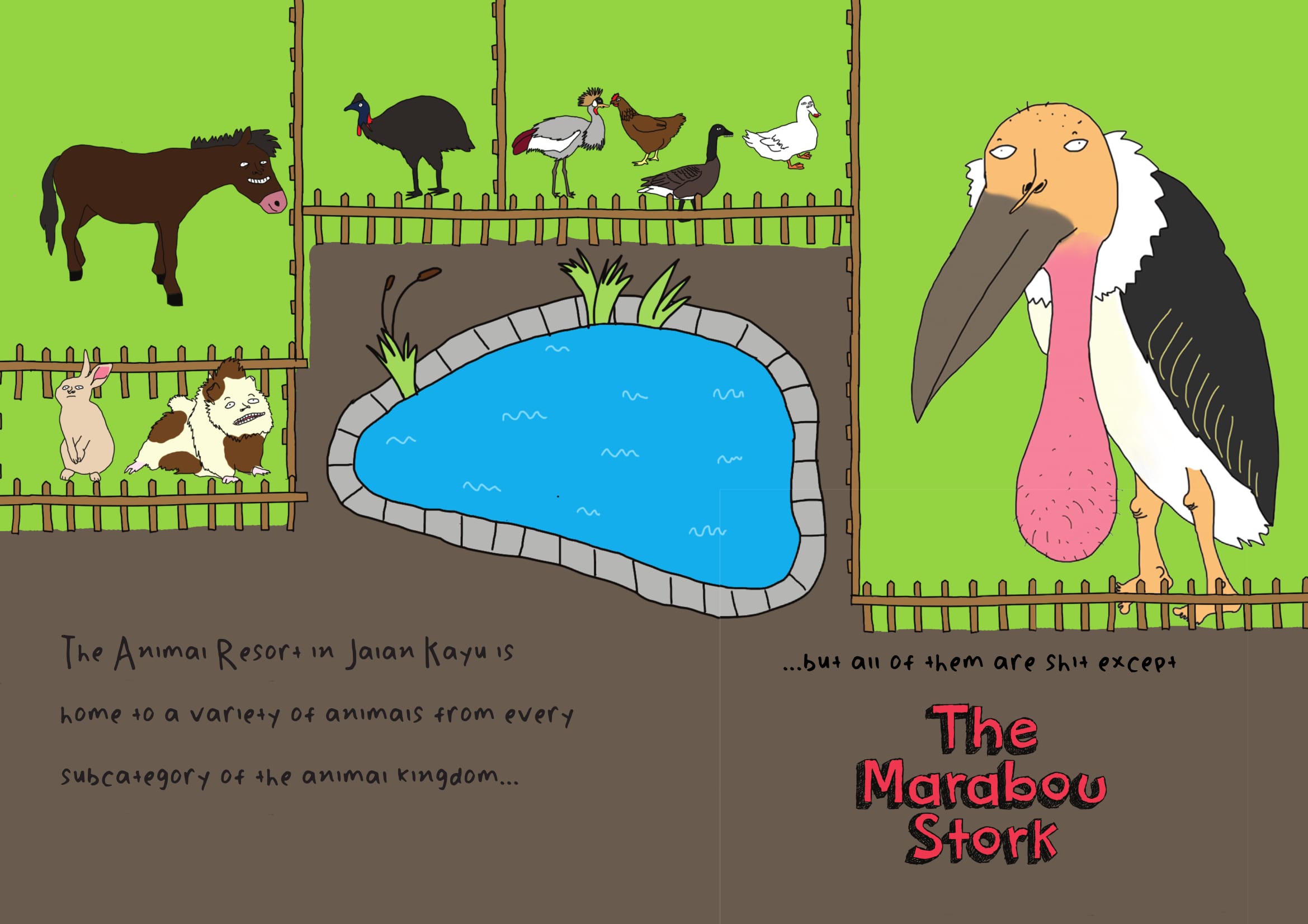
When I showed Shirley these 2 spreads, she suggested that my zine should also include a map of the Animal Resort or at least a sort of introduction to it since that’s where the ballsack bird resides. Hence I came up with the following illustration to use on my first 2 pages:
Throughout the entire process of making the zine, I constantly asked for feedback from my peers and kept changing my zine according to their advice and comments. I feel that this is important because as a designer/artist when we have been staring at our own design for too long it can become very mentally draining and we may start to miss out small mistakes or other discrepancies in our design. So it is always good to have someone else look at your work from time to time.
Artistic references
I did not really reference many artists or designers for this project. Since a zine is about self expression, I felt that it was more appropriate to just work in my own style in order to create a more authentic end product rather than to reference so many other artists that the zine is hardly even my own.
In my OSS post for project ego in sem 1 I mentioned several artists who heavily influenced my personal style. In the past few months I have came across more artists who I greatly admire and I guess have also served as an inspiration for this project.
Toshio Saeki

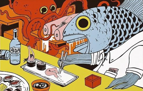

Toshio Saeki is a Japanese erotic illustrator who is known for his highly controversial and bizarre artworks. I actually wasn’t sure if I should include him in my OSS post because a lot of his work is really quite disturbing and the ones above are already some of the milder ones but I am a huge fan of the colour palettes used in his illustrations as well as the use of bizarre dark humour. The use of bold primary colours is something I also emulated in my own zine.
Joan Cornella

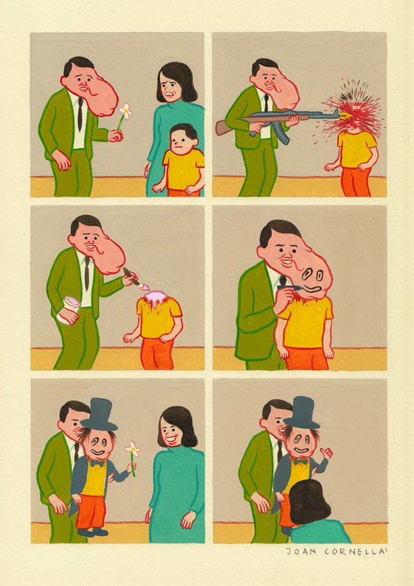
Last semester one of my classmates told me that my work resembles Joan Cornella’s so I checked him out and I am now a huge fan. I love nonsensical black humour and his art is just so full of it. He honestly has the weirdest brain I have ever encountered in my life and has become one of my greatest artistic inspirations.
Final Product
Here is the final product saved as spreads for your reading pleasure (: When I saved the postscript as spreads it created white boxes around all the different indesign elements which was a bit annoying because it wasn’t there in my print booklet version. I googled this and some forum said that it’s because of the PDF reader on Mac computers or something so I guess it just goes to show that sometimes life gives you lemons and things don’t go as planned but what can you do (: