Faces Places Review

Before this film, I was unfamiliar with the works of both JR and Agnes. I had known of JR because he had been mentioned a few times before in class, but I had never really taken the time to do research on him, so this film was also my introduction to both the artists. Upon hearing about this film and seeing the poster, I assumed that it would be a typical feel-good story about a friendship between an elderly lady and a younger man, and that the focal point of the narrative would be about how the age gap between them made them different, but I was wrong!

For me, Faces Places was not so much of a documentary and more like listening in to a conversation between two close friends. The film is about Agnes Varda, an 88 year old filmmaker, and street artist/photographer JR, and their travels around France in a bid to document the faces of regular people in regular places by photographing them, printing it and mounting the “faces” onto architecture. Rather than being a documentation of the travels, I suppose Faces Places is a documentary in the sense that it is a documentation of the friendship between JR and Varda, as well as a documentation of the stories of the people whose photos are being mounted in the film.

Watching the film got me thinking about the purpose of large-scale public art, particularly in the case of projection mapping. I had never seen the connection between public architectural art and projection mapping before, because before this I had always associated the former with graffiti and vandalism (yes I’m very Singaporean HAHA). Now, however, I realise that in some ways, painting/mounting a still image onto a large architecture is even more impressive than projecting a video. How do you capture in a single still image, the amount of narrative and emotion that a video could convey?

Another thing that I found interesting while watching the documentary was that I unwittingly started thinking about the differences between French and Singaporean culture. In particular, how people in both countries would react to large scale public arts that involved them. Near the beginning of the film, when JR and Agnes were mounting the first photograph onto the wall at the front of the old lady’s house, when she first came outside and saw the image she was moved to tears. I remember thinking that if this had been in Singapore and someone had printed the face of an elderly lady onto a HDB flat, I think most elderly Singaporeans would be very unhappy about that!

I did find the ending of the film confusing, as I didn’t understand what was going on when JR and Agnes visited the house of her friend and didn’t receive a warm welcome, just a cryptic written message which brought Agnes to tears. It made me curious to find out more about the backstory between their friendship, and I’ll probably go research further into it so I guess the film was successful in piquing my interest HAHAHA

All in all, this film was what I expected and more! It was nice to watch JR and Agnes interacting and their friendship was heartwarming. It also got me thinking a lot about public art and different cultures’ reception to it.

Final Project

Concept Ideation

When Kristy told us that we were able to do mapping for the CHC building, the scenario given to us was that such artworks could potentially be used for events like the opening of the Yunnan Garden which is currently under renovation. Hence, I had that in mind while doing the ideation for this project. I chose to do the CHC mapping as I wanted to have a chance to learn how architectural projection mapping works, as well as get some practice on After Effects, so it was perfect for me.

During my research, I discovered that the plans for renovating the Yunnan Garden were that the school was planning to turn it into a park for public use, rather than just a plot of decorative land in the middle of campus. Going with that theme, I decided to go for an friendly illustrative style of video as I felt it was something which could be appreciated by all age groups, also as I felt this was a style of video I had not really seen on architectural projection mapping before so I wanted to try something different. My image references and inspirations can be seen from my previous post!

To decide what assets I wanted to have, I decided to dig deeper into my research as well as make use of the knowledge I had gained from my 3 years of being a student at NTU. I wanted to incorporate things that were quintessentially NTU, such as the myriad of animals we have around campus, as well as other things that were iconic to Yunnan Garden like the Chinese pagodas and the entrance arch.

I took a visit to the CHC to view the exhibitions there. I didn’t manage to learn a lot about the garden specifically because they were more focused on the history of Chinese in Singapore in general as well as the history of the campus as a whole. However, I decided to take a visit to the CHC library as well and while there, I chanced upon a picture book on the history of NTU which gave me some insights into what life was like for a Nanyang University student back when it was a new uni!

From this, I learned that while nowadays most students wouldn’t even bother visiting the Yunnan Garden (even before it underwent renovations), in the past it was really a hub for student activities and students would go there to relax in their free time between lessons. I wanted to recreate that kind of scene in my composition, showing a lot of human activity and recreation, similar to how people would visit Yunnan Garden for recreational purposes in the past. This also ties in with the school’s aims to promote Yunnan Garden as a place for members of public to visit for recreational activities.

Process & Outcomes

I started off by illustrating the individual elements that I wanted to have, and laid it out in a composition as seen above. This helped me to set the mood of my animations, which was one that I wanted to be fun and cheerful. As mentioned, I wanted to pay homage to the student life at the old Nanyang University while at the same time taking note of Yunnan Garden’s new status as a public park, hence I mixed certain elements from the old Nanyang University (arch, pagoda, rambutan and durian trees) with animals that could be found in NTU today and also illustrations of different people doing various activities.

I decided to do my video in the style of a cinemagraph, so I planned to have the individual assets do subtle looping animations that could then be placed in the video composition to create a scene with different elements to pique viewers’ interests. This is because I had the idea that if this video were to be actually played at the opening event of Yunnan Garden, it could act as a backdrop to the event and be kept running while people went about partaking in activities at the event. Hence I didn’t want the video to be too flashy or narrative so a cinemagraph was a perfect example to use.

I started to animate the individual assets:

Reflections

This was actually fun to do and I’m glad I chose to try my hand at architectural projection mapping! I couldn’t have done it without the kind help of Reynard and Chris, so thanks to them for providing us with the After Effects template as well as assistance with Green Hippo and mapping the 3d model.

One thing I realised while doing this project was that because we were doing the mapping on a small 3d model rather than an actual building, it meant that the amount of space we had to work with on the model was limited because if the animations were too small it wouldn’t be seen as compared to projecting on an actual building which is much bigger and we could afford to have smaller assets (scale wise). Hence I couldn’t quite achieve what I set out to do in the beginning which was create a bigger cinemagraph composition with smaller assets doing different motions around the building. However this forced me to really think about how I wanted to use the limited space I had, and as Kristy mentioned it also meant that the animations would have been human-sized if they had been to scale so I didn’t mind it as well!

To work further on this project, what I would do would be to go back to the individual animations and polish them a little further so the movements could be more seamless. I would also think of more ways that I could incorporate architectural elements of the building into my video composition.

That’s all for my project! Thank you Kristy and classmates for a fun semester and hope to see everyone around!

Project Pitch

For the final project, I have decided to go with preparing a projection mapping project for the Chinese Heritage Centre for the opening of Yunnan Garden.

I was inspired by this video I have seen many times (as I’m sure we all have) along the walkway towards the Esplanade. What I like about it is the fun and approachable look it exudes, and I feel that it is a style I would like to try to incorporate int architectural projection mapping as the ones I have normally seen are usually based on 3D animations and not exactly illustrative.

Moodboard

Concept

For the video, I wanted to go for a more hand-drawn illustrative style of animation as I felt like it has the potential to look more friendly and inviting. I would like to fill the composition up with people doing activities, as according to my research, Yunnan Garden is historically a place which is teeming with human activities on campus.

For the style I decided to go with a more contemporary Chinese/Asian illustration style as an homage to the Chinese roots of Yunnan Garden and the Chinese Heritage Centre.

Light to Night Festival Review

I visited the festival with Mavis, Jinyee, Felix and Clarita after our field trip to the National Gallery!
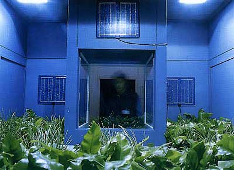
The Resident
National Gallery Singapore (Supreme Court Wing, facing The Arts House)


This was the first exhibit in Night to Light that I came across and I almost missed it because it was in such an inconspicuous location! I didn’t see the signboard for this projection hence I didn’t know it was a tribute to William Farquhar (it would have made more sense if I had known because Farquhar was known for his botanical drawings that he often commissioned). But I quite enjoyed it anyway, the symmetrical composition was very pleasing to watch and the plants were very beautiful.
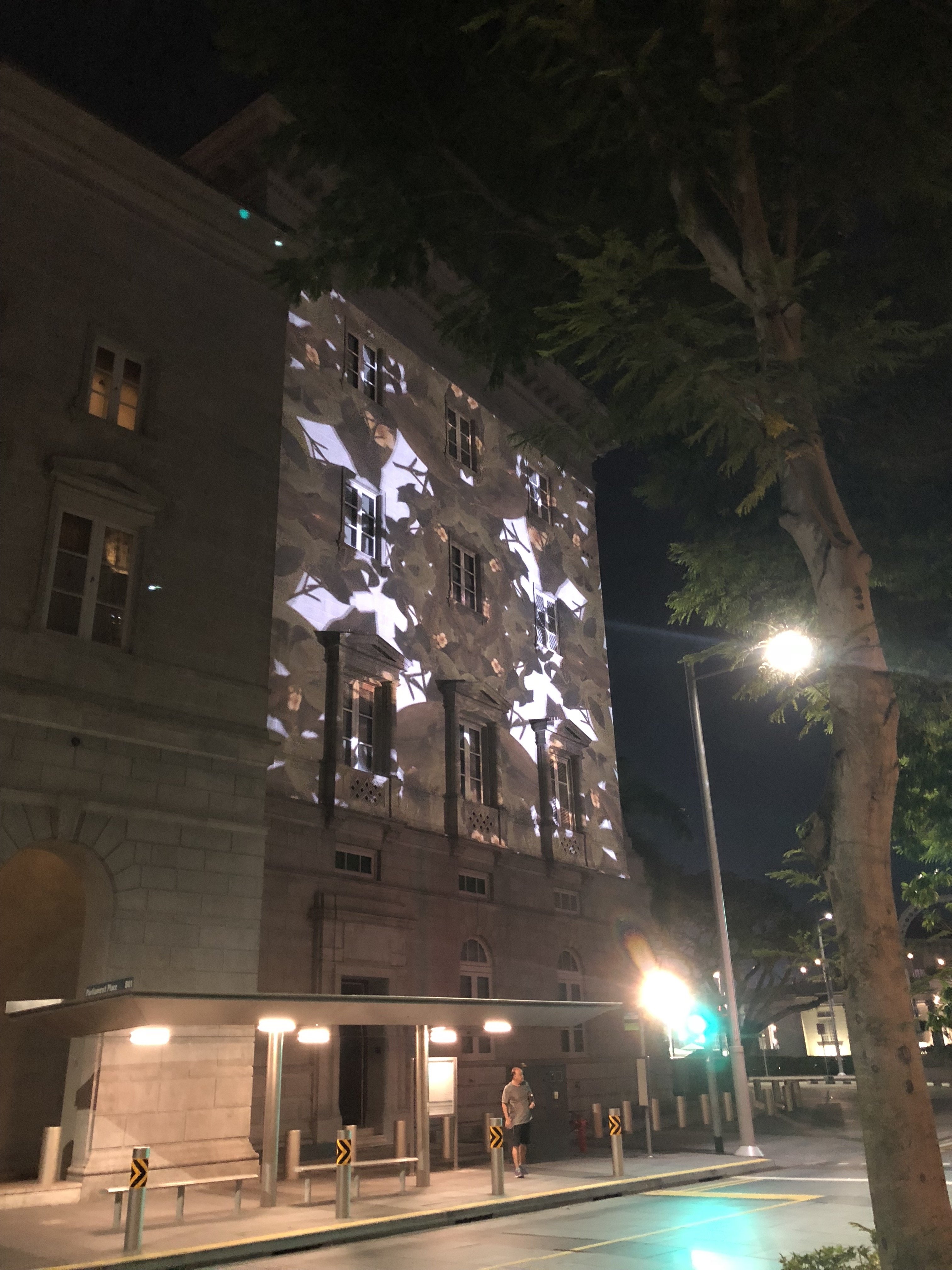
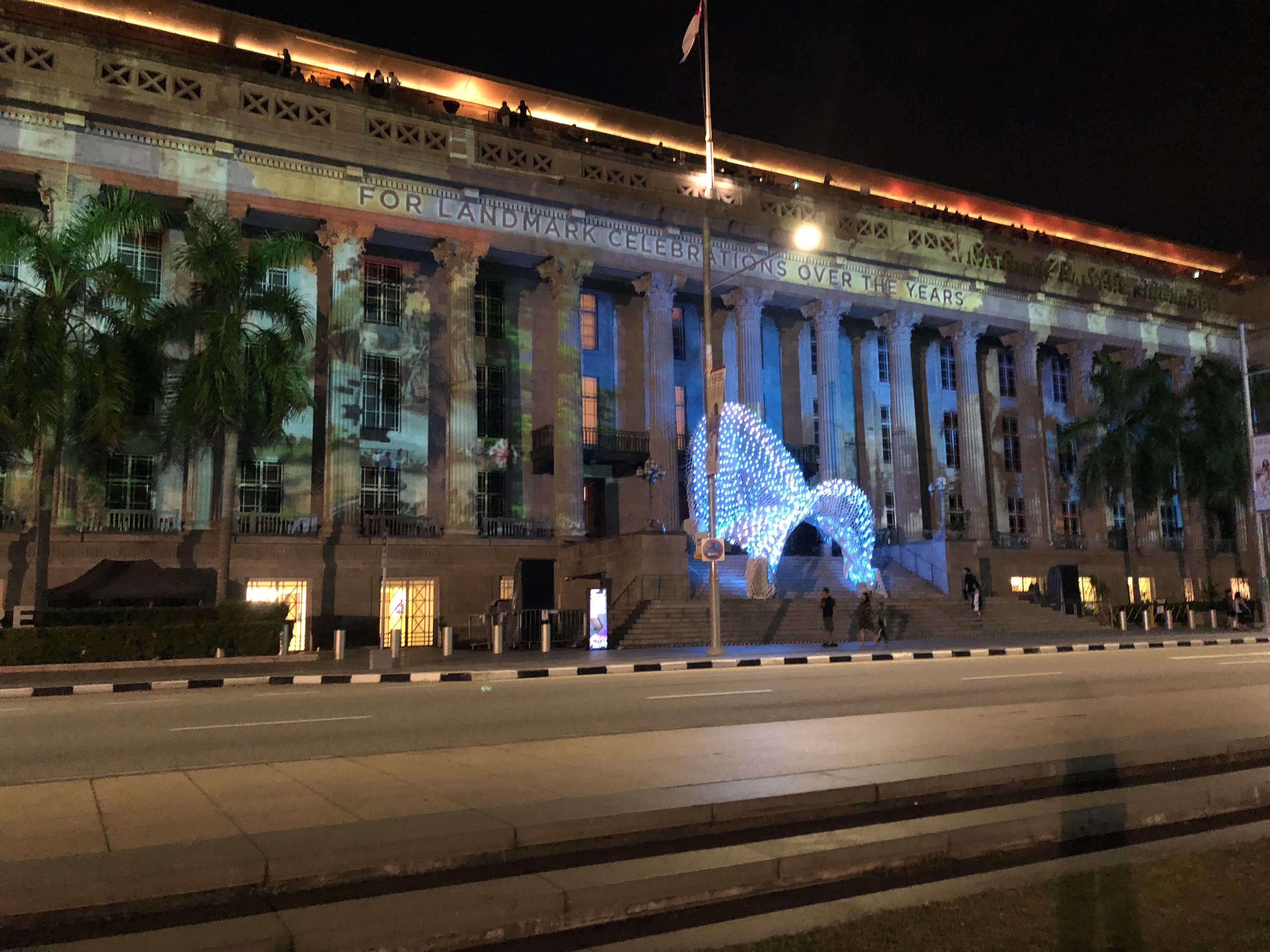
 

Through Her Eyes
National Gallery Singapore(Supreme Court Wing)


This piece started off as a black-and-white projection with text and the later part of the video was very colourful and vibrant. The 2 parts were extremely contrasting and I was a bit confused at first because I thought they were 2 separate artworks. However, since it’s about the history of the Supreme Court building, perhaps this contrast was intentional to show the contrast between then and now. Personally I liked the later half more because it was more vibrant and more easily visible!

I think due to the light pollution from external sources, the black and white projection wasn’t really visible so I could only see the text and I didn’t know there were supposed to be images until afterwards when I went home and saw the website. A lot of the details of the projection was lost due to interfering light from the sports field opposite.


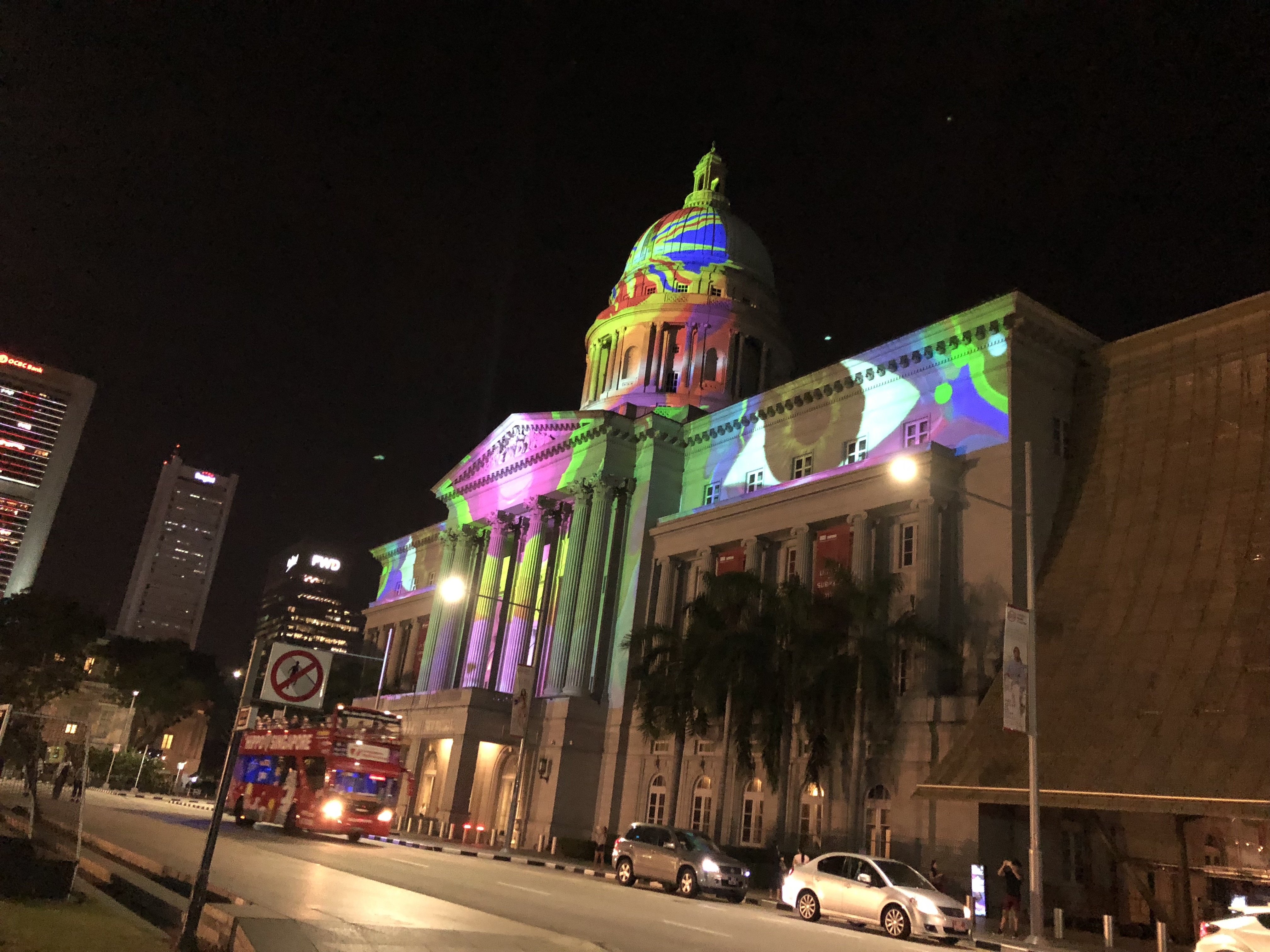
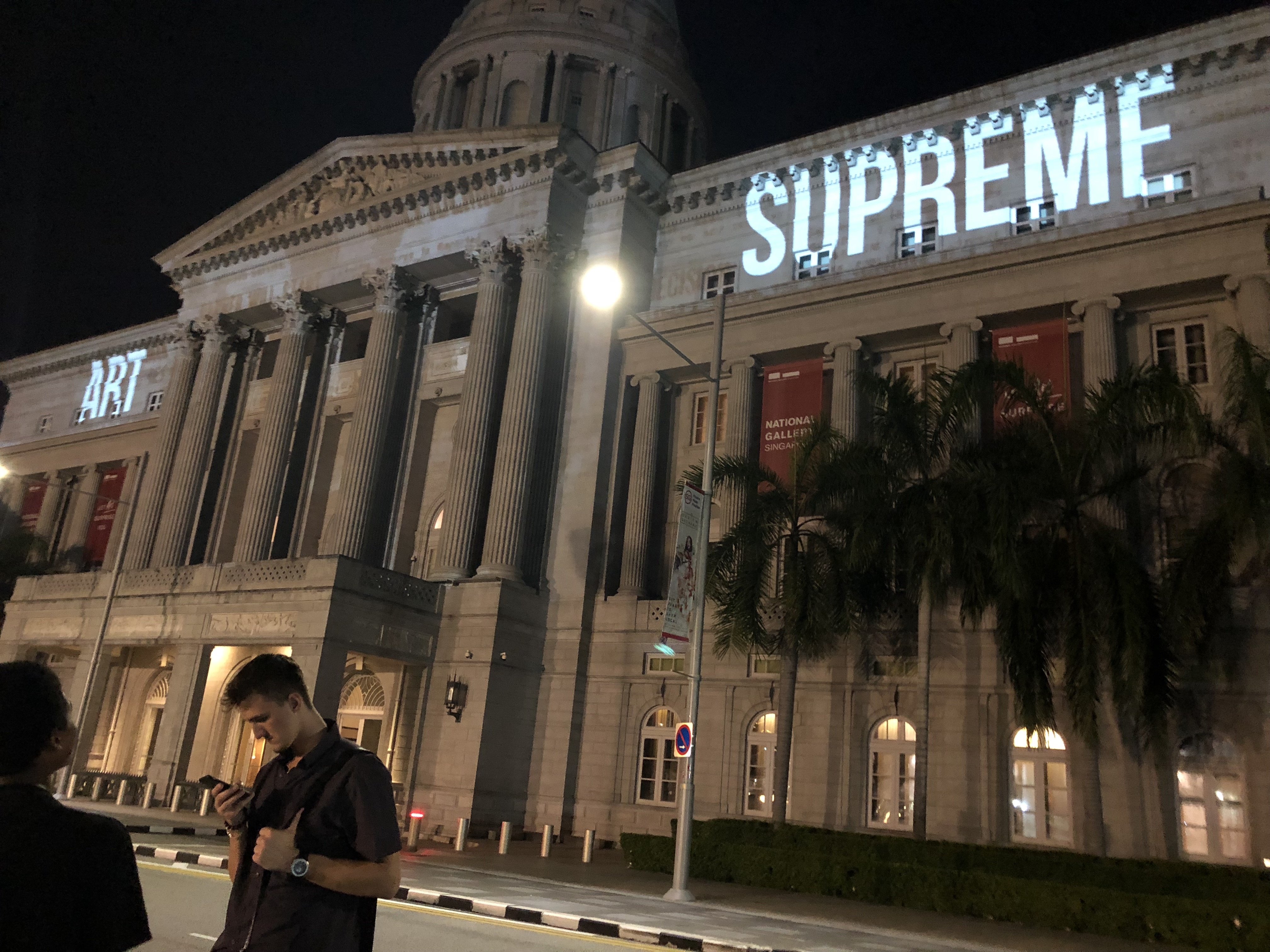
Secrets of the Sand, Written in the Stars, Snapshots in Time
National Gallery Singapore (City Hall Wing)

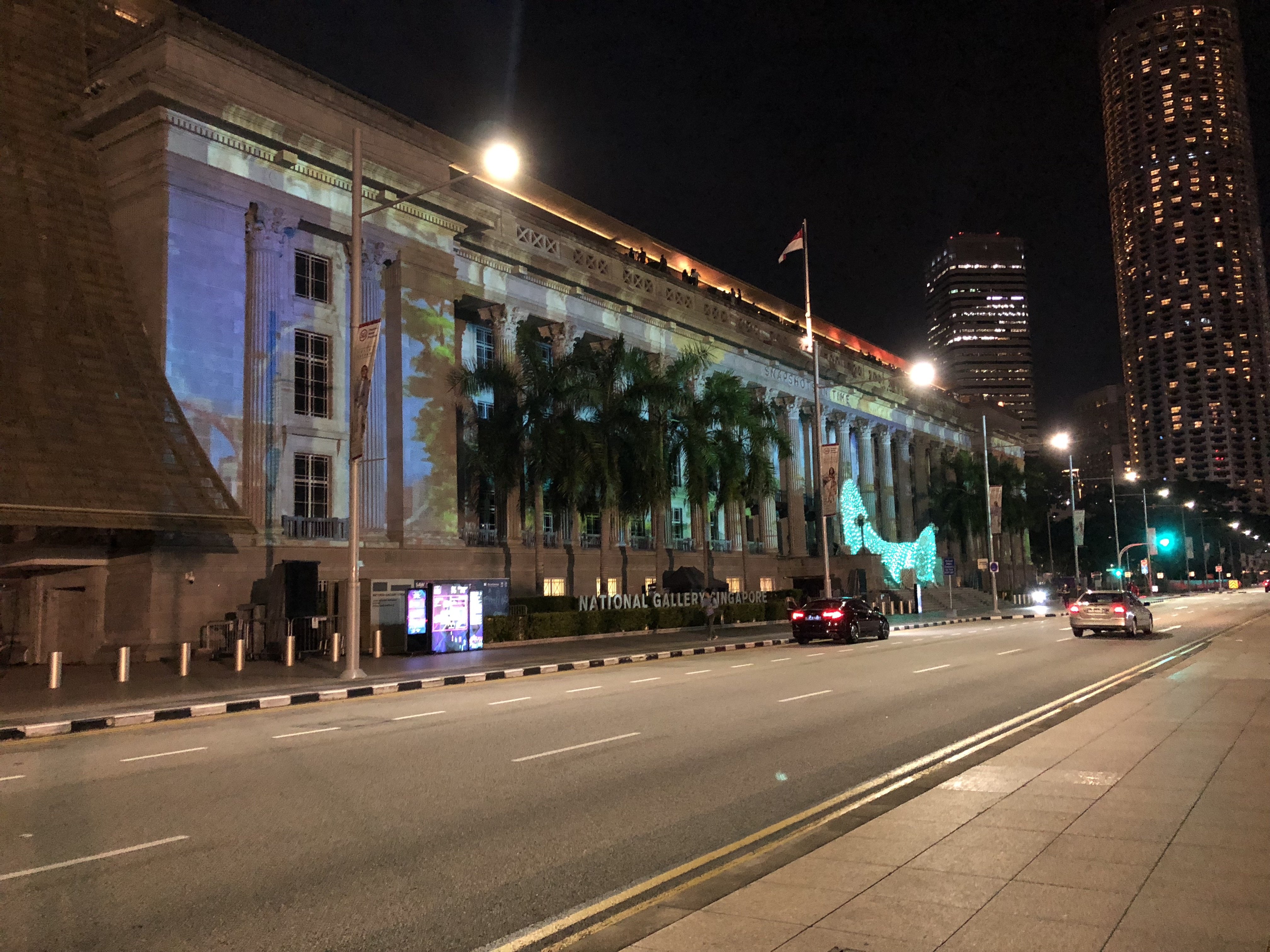
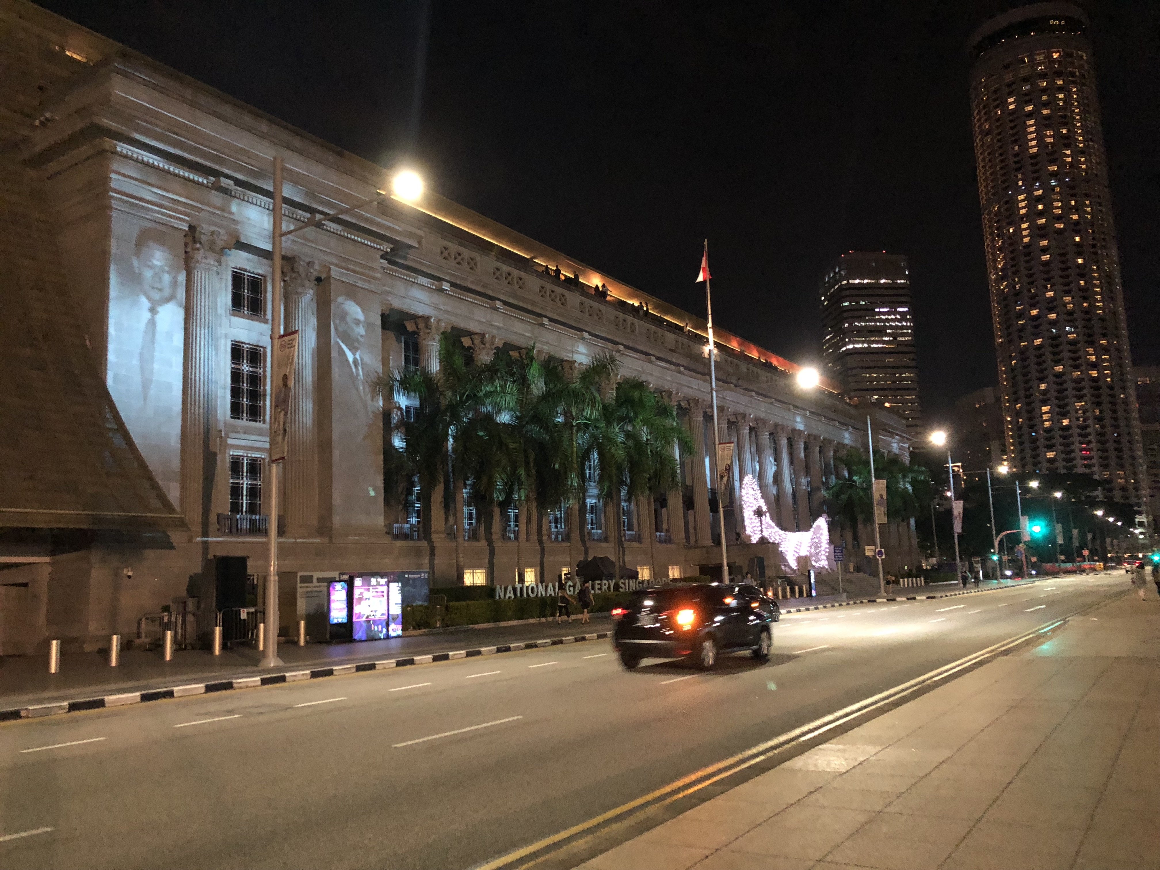
This was situated right next to the previous exhibition (Through her Eyes) and as such, at first I thought the 2 of them were a single artwork and was confused as I tried to view them at once as a singular art piece which didn’t work! Again, this was barely visible due to the interfering light but I managed to gather that it was a story about the history of Singapore from the images that I did manage to see. Some of the details of the video were very intricate and such such very hard to see because they didn’t show up well on the building facade, and also because the projection was so huge and we couldn’t stand far back enough to view the entire thing because there were activities going on in the field behind us. Because of this I felt like I preferred only the front part of the video which was more of a particle-like animation because it was simpler hence much easier on the eyes.

There was also a white structure at the front of the building facade which had colour changing lights that were choreographed to match the sound of the video. To me it was a bit unnecessary as it didn’t really look cohesive to the projection, so it looked like it was more of an afterthought or a separate art piece on its own. I felt the exhibition could have done without it, or it could have been matched with a different projection instead.


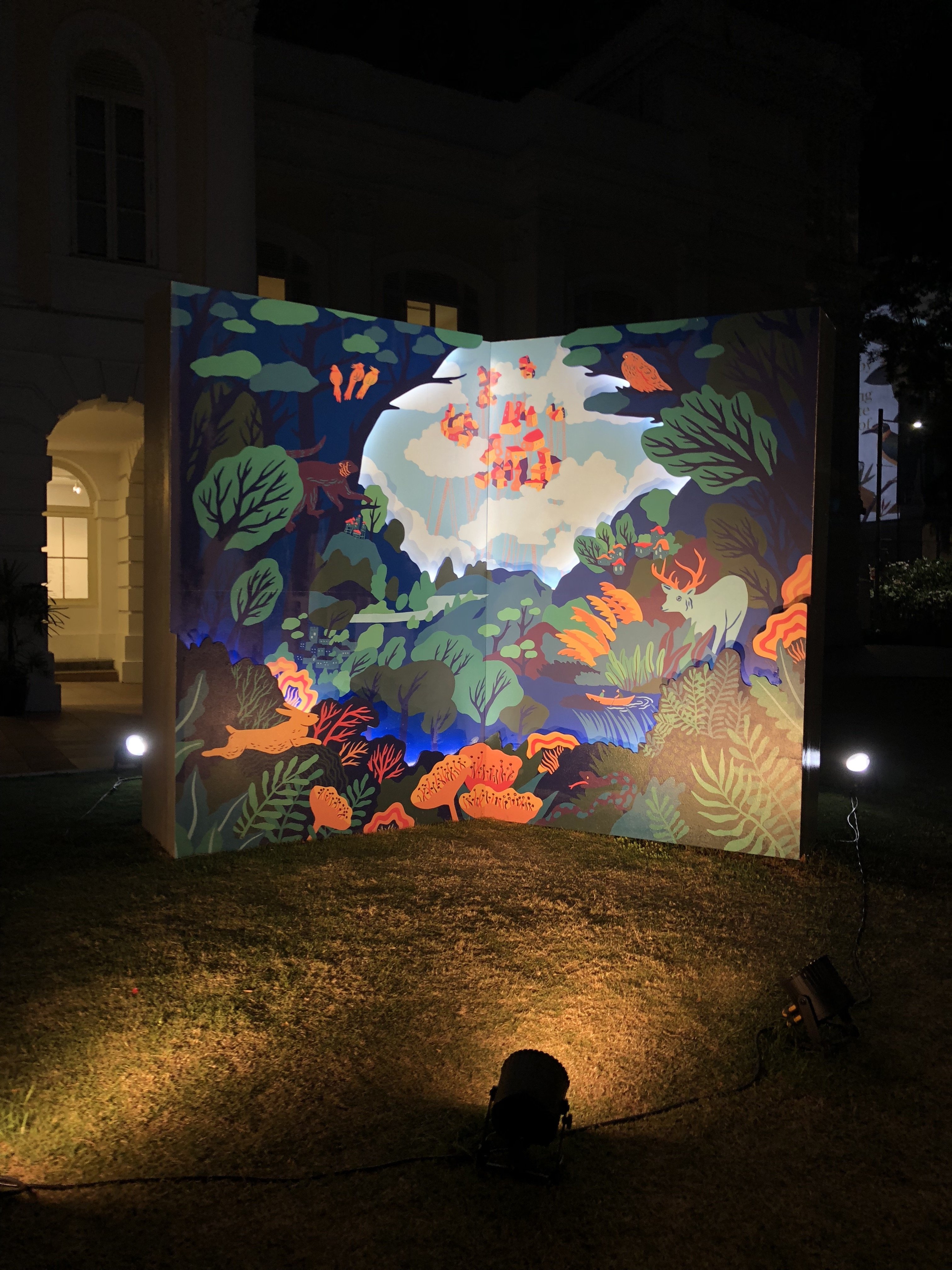
Stronghearts: The People of the Singapore River
The Arts House

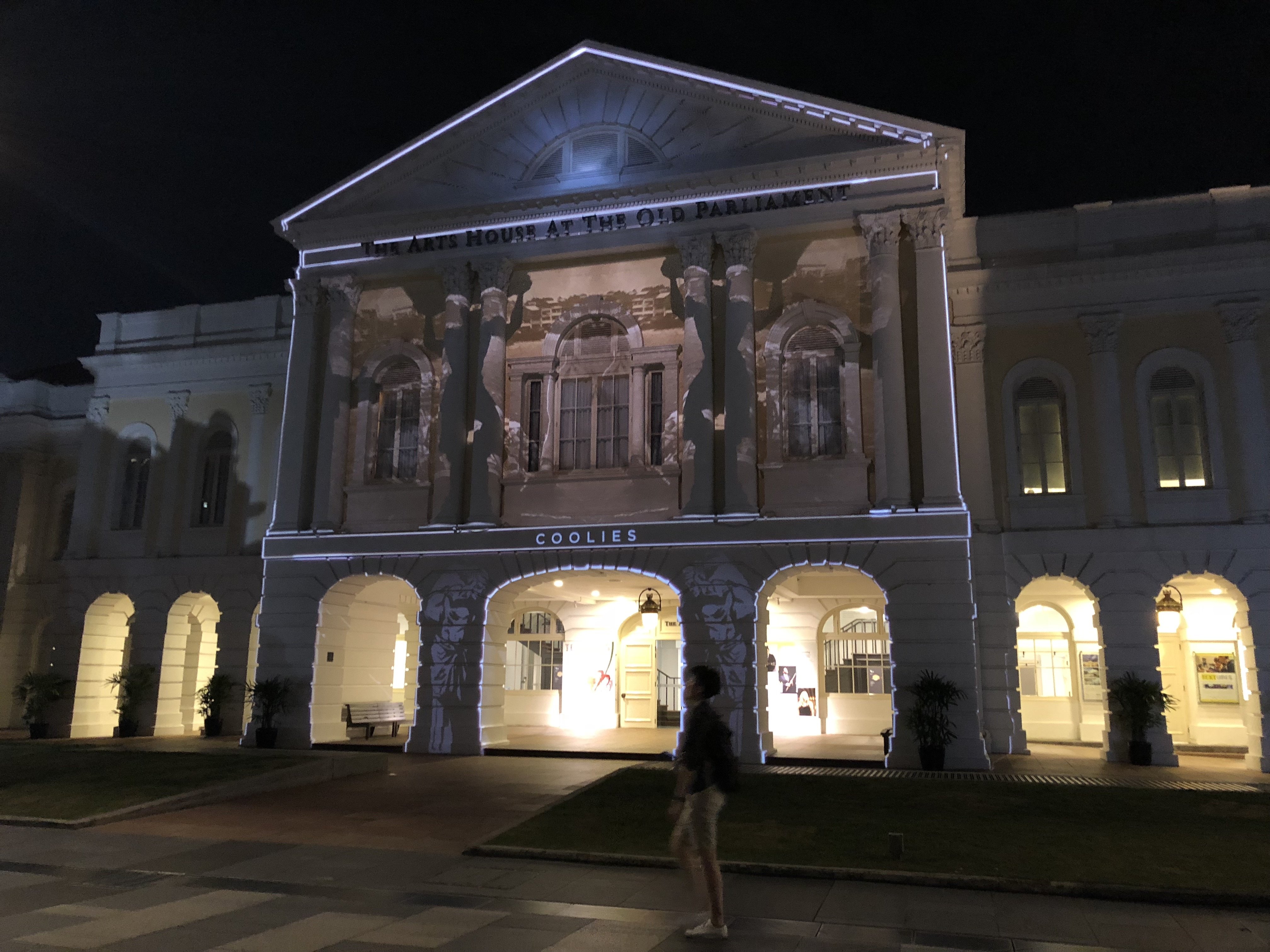
I really liked this piece because it was well mapped as well as the resolution was good and it was easy to view due to it being in a more intimate quiet location which was darker as well. This was about the history of the Singapore River and the kind of people we would have found along the river in the past, and it was very simple to understand and straightforward.


Open Books
The Arts House

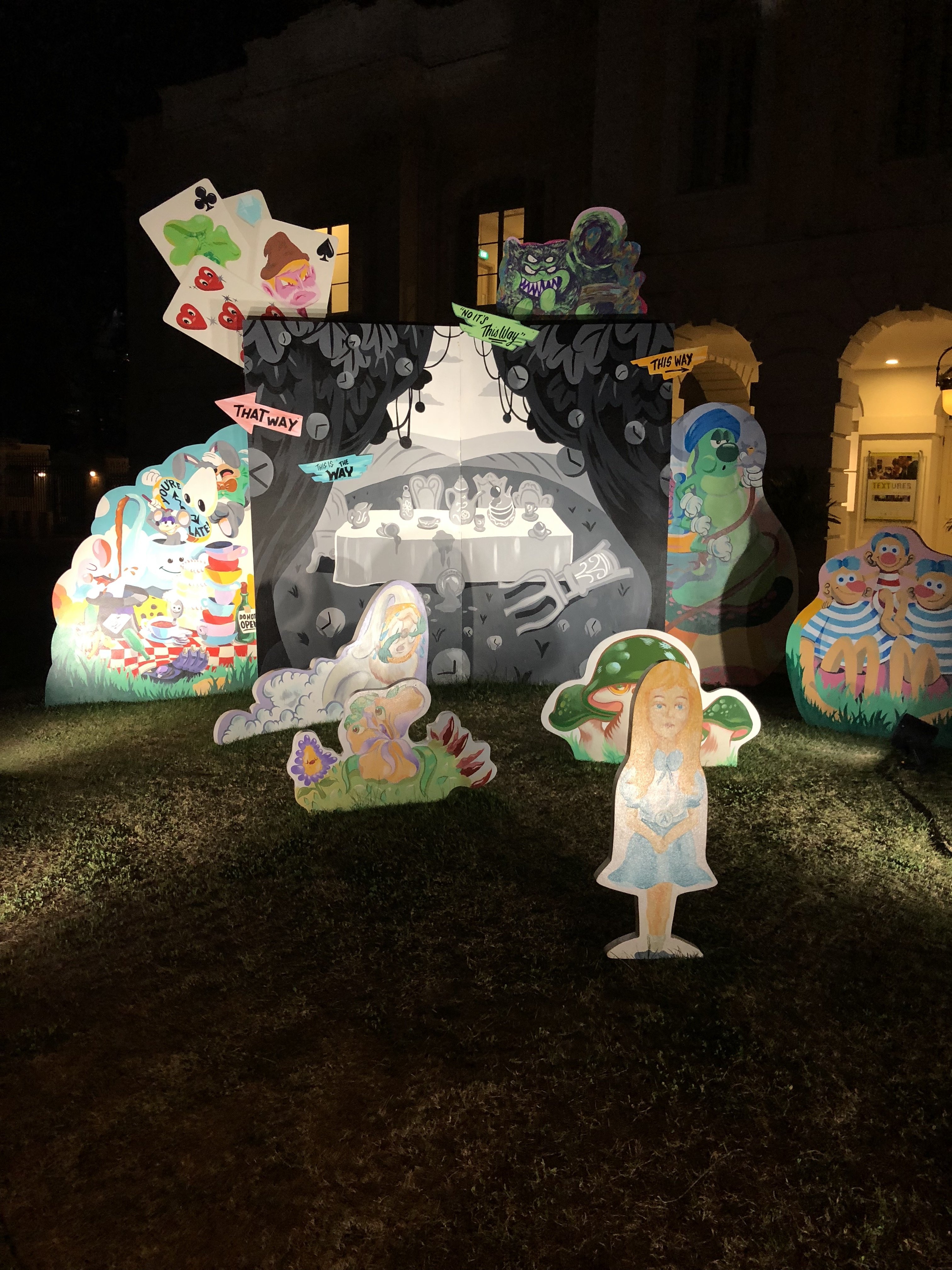
This wasn’t a projection mapping piece but it was nice to see! It consists of illustrated cardboard cut outs by local artist collective Tell Your Children. It added to the vibrancy of the festival and it’s nice to see support for local illustrators!


Portraits of Performers from the Past
Victoria Theatre and Victoria Concert Hall

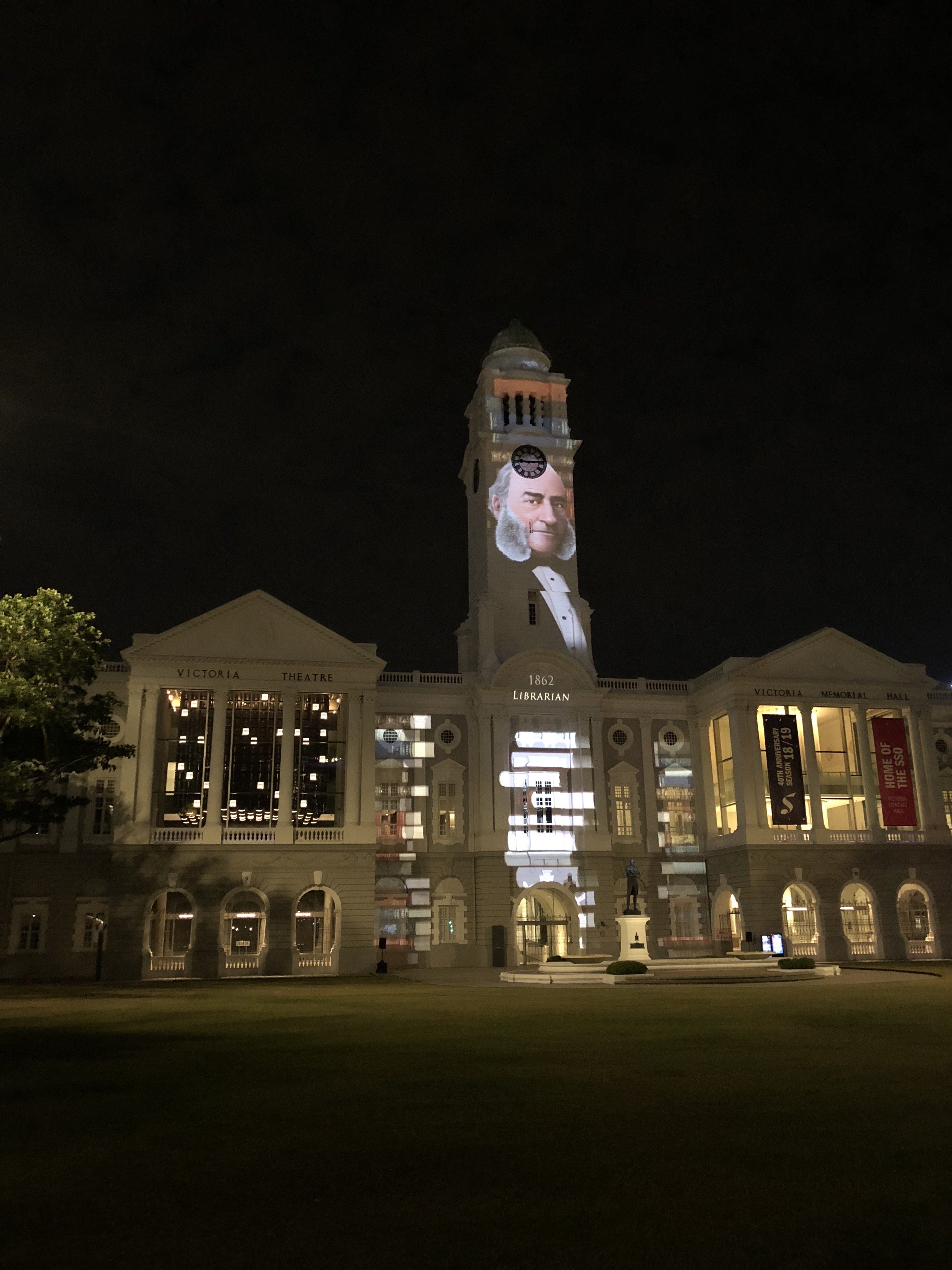
Coming from The Arts House, we very nearly missed this exhibit because it was blocked from our view by some trees. The animation and illustration style reminded me of the hidden object games that I used to play when I was younger!

Hidden object game haha
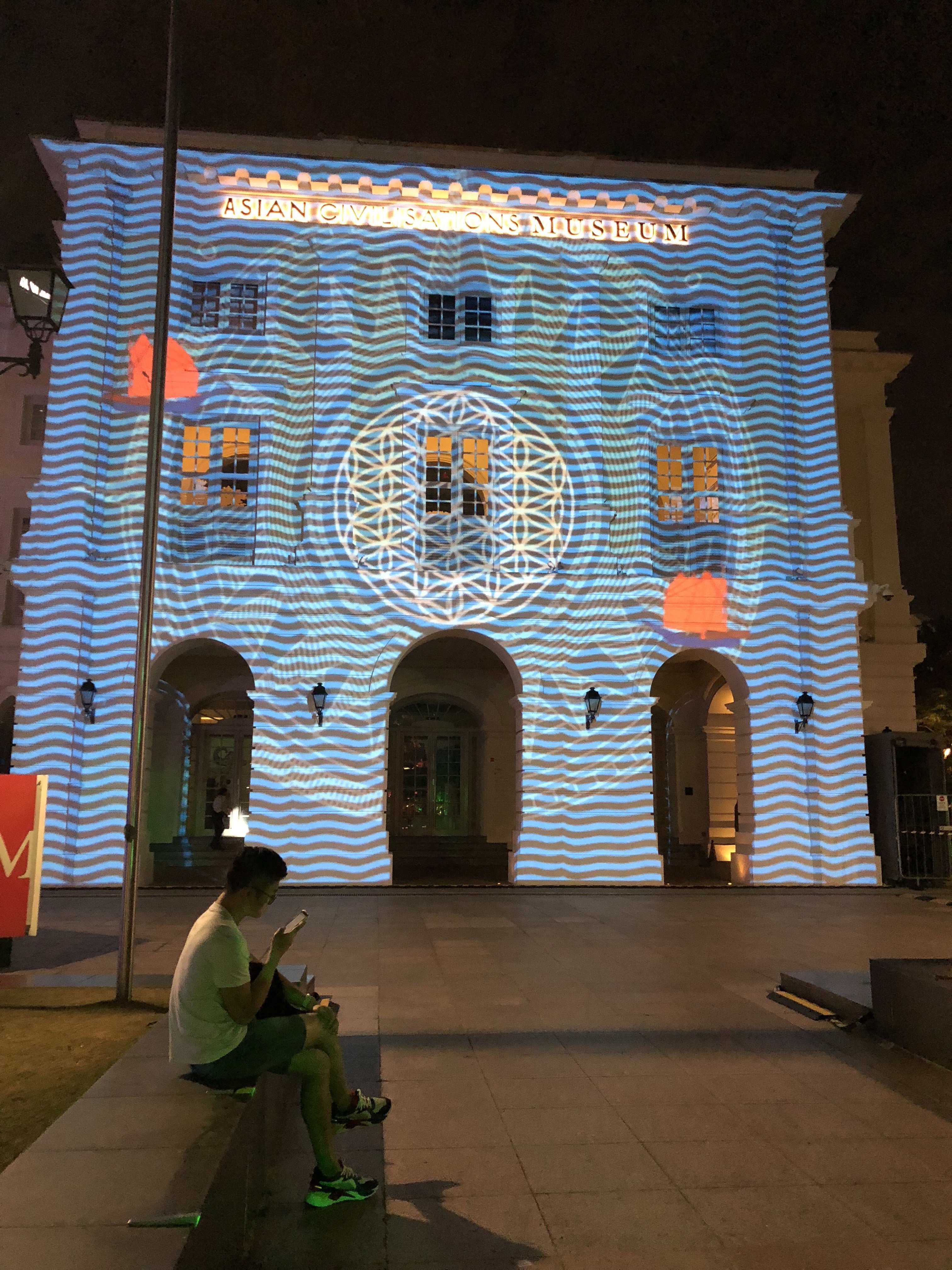
 

Sticks
Asian Civilisations Museum

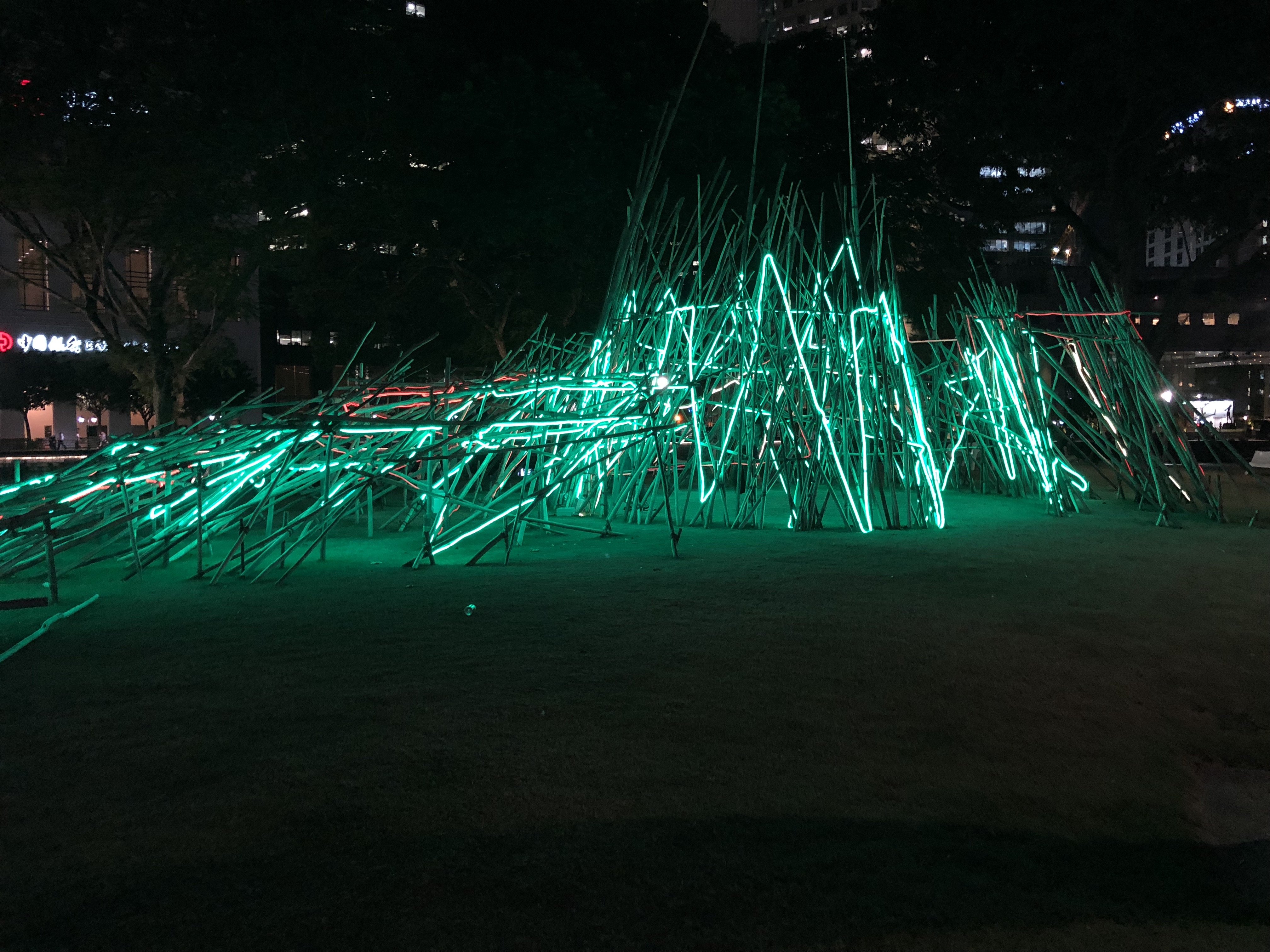
This was one of the only light installations that I saw in this festival, and I initially thought it was part of iLight. The concept behind this is quite interesting, the artist was inspired by pick-up sticks so I thought it was interesting how the lights flash different colours at night as the more modern versions of pick up sticks are made of plastic and comes in different colours whereas the traditional ones are made of plain wood with less colour like the installation. Hence I thought it was quite a fitting contrast to how one would view the artwork in the day and night, in the day without the colourful lights it would more resemble the traditional pick up sticks whereas at night it represents the modern version! But that is my own interpretation and I don’t know if the artist intended that!

Old vs New!


Intersections: The Story of Belonging
Asian Civilisations Museum

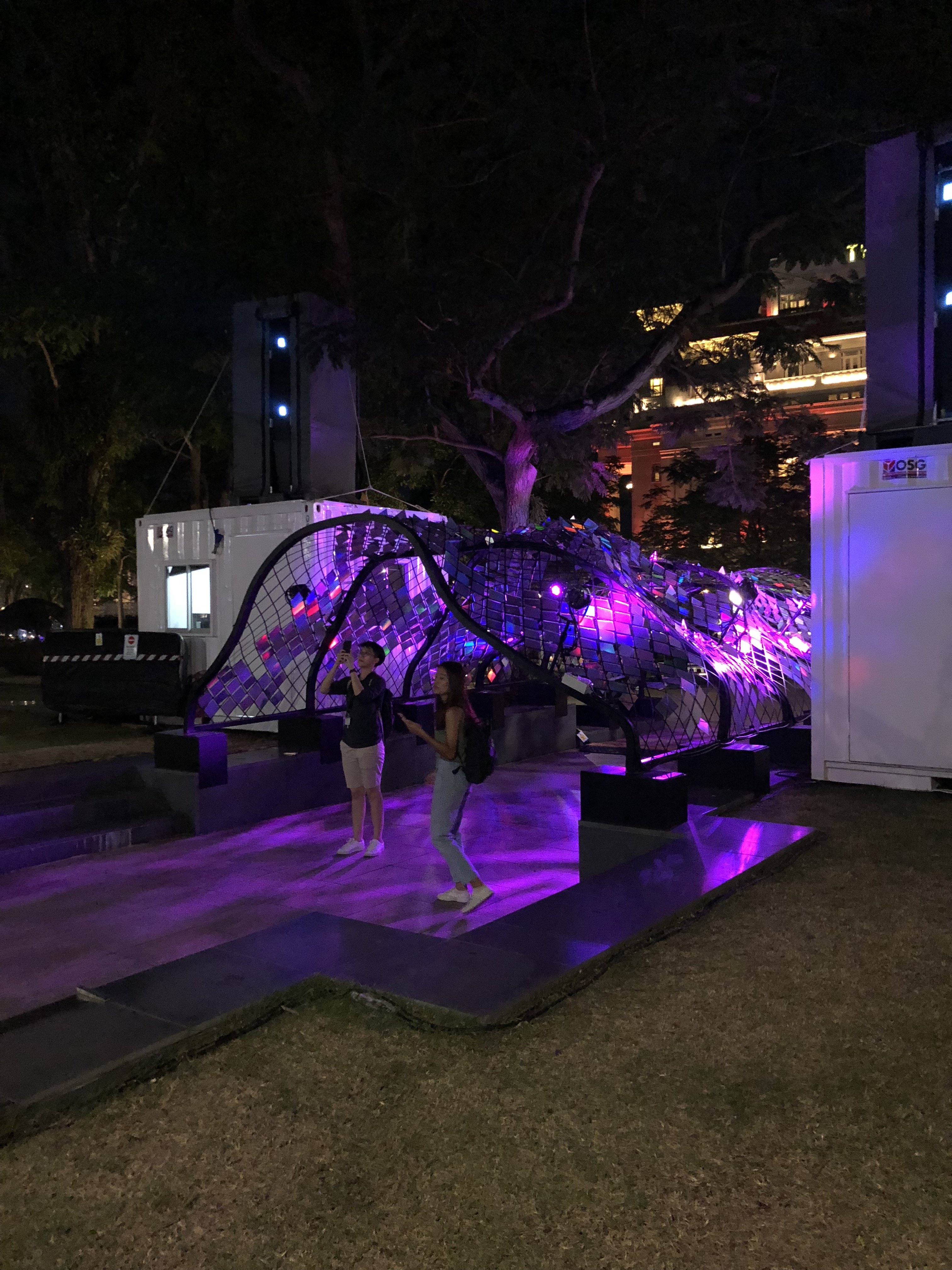
I think this was my favourite projection that I saw in this festival, because of the use of symmetry and vibrant colours. It tells a historical tale of Singapore’s origin story of Sang Nila Utama, in a fun and interesting way! It reminded me a bit of the projection which I saw at Wisma Geylang Serai. In front of it there was a canopy structure with scale-like pieces covered over it, not sure if it was part of this artwork or not but it seemed to be the best place to view the projection from so I assumed it was haha.


Overall Reflection

Overall for me the exhibition design and layout was a bit confusing for a few reasons. Firstly, it was spanning over several locations and some of the artworks were very hard to find as there was no comprehensive map of the whole area that we could access online. Because of this reason, we ended up forgoing all the exhibits at the Esplanade Park area as we couldn’t find them despite walking around the entire park!

Secondly, this festival was held in conjunction with iLight festival, and some of the areas were shared between both festivals hence we couldn’t tell if it was part of iLight or part of Light to Night festival. However Mavis pointed out that to a regular person who just wants to view some art at the civic district, it wouldn’t really matter to them to check which festival it is from as to them they are just viewing another artwork. It does make wayfinding quite hard though if someone is trying to view artworks in both festivals at once!

Thirdly, the placement of the signboards in this festival kind of bothered me. Because this festival was heavily based on projection mapping, I felt like they had to take into account that projection mapping is best viewed from a distance. Hence I felt that the signboards should have been placed at a fair distance from the building facade instead of directly in front of it, because the sign board acts as a placemarker to people that they should stand there to view the artwork. Furthermore some of the artworks like the ones on the National Gallery facade were not very friendly to be viewed from a distance due to events or structures that were in front of it hence maybe they could have done a smaller scale projection or chosen a different facade to project the video on.

I feel that when it comes to projection mapping, it is important to take into account the facade that it is being projected on and treat it was part of the artwork instead of just using it as a surface for projection for the sake of it. For some of the art works especially the ones at the National Gallery I feel there was a lack of consideration for the surrounding factors, such as the amount of detail in the building which disturbed the coherency of the video as well as interfering lights.

Nevertheless I did enjoy the festival overall and felt that some of the pieces were really good! It made me really happy to see that with Light to Night and iLight going on consecutively, the Singaporean art scene is really invigorated and exciting. I mentioned to my friend that if a tourist were to happen to visit Singapore at this very moment in time, they would be very lucky as they would have come at a period where there was a lot to see and do. I’m proud to be a Singaporean artist and can’t wait to start creating my own art to contribute to this vibrant scene (:

Week 1

Erik Samakh – Grenouilles communicantes, 1991

Erik Samakh is a contemporary artist who describes himself as a “hunter-gatherer” of images and sounds, which he has captured, recorded and exhibited for over 25 years in natural settings. His work is focused on our dialogue with nature through the combination of new technologies and natural elements. In the above installation which is one of his earlier works, Samakh encourages viewers to have “strange conversations” with frogs living in the installation’s habitat through the use of modules in the space which emit sounds to the frogs.

Nonotak Studios – Daydream V.2

This is an audio-visual installation by Nonotak Studios. They are a studio which I have been a fan of for quite some time now and they are popular for doing layered projection as shown above. I found it very interesting because I feel that it just goes to show how by doing something as simple as layering different semi-transparent screens, you can create an effect that looks polished and interesting. I think it is important to know that while in this day and age it feels like to create an interesting and exciting artwork we as artists have to learn all kinds of difficult software and latest gadgets, actually we can just use the simplest of analog methods to create something that is equally impressive.

I was interested in how Nonotak managed to do such a project so I did a similar mini-prototype of something like that one day! I used a mini projector and some PVC pieces coated in matte spray to make it slightly translucent. The effect is pretty interesting and if it is more refined I think it could look really good. Looking forward to doing more testing on similar methods in the future!