
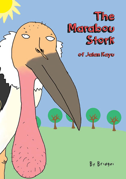
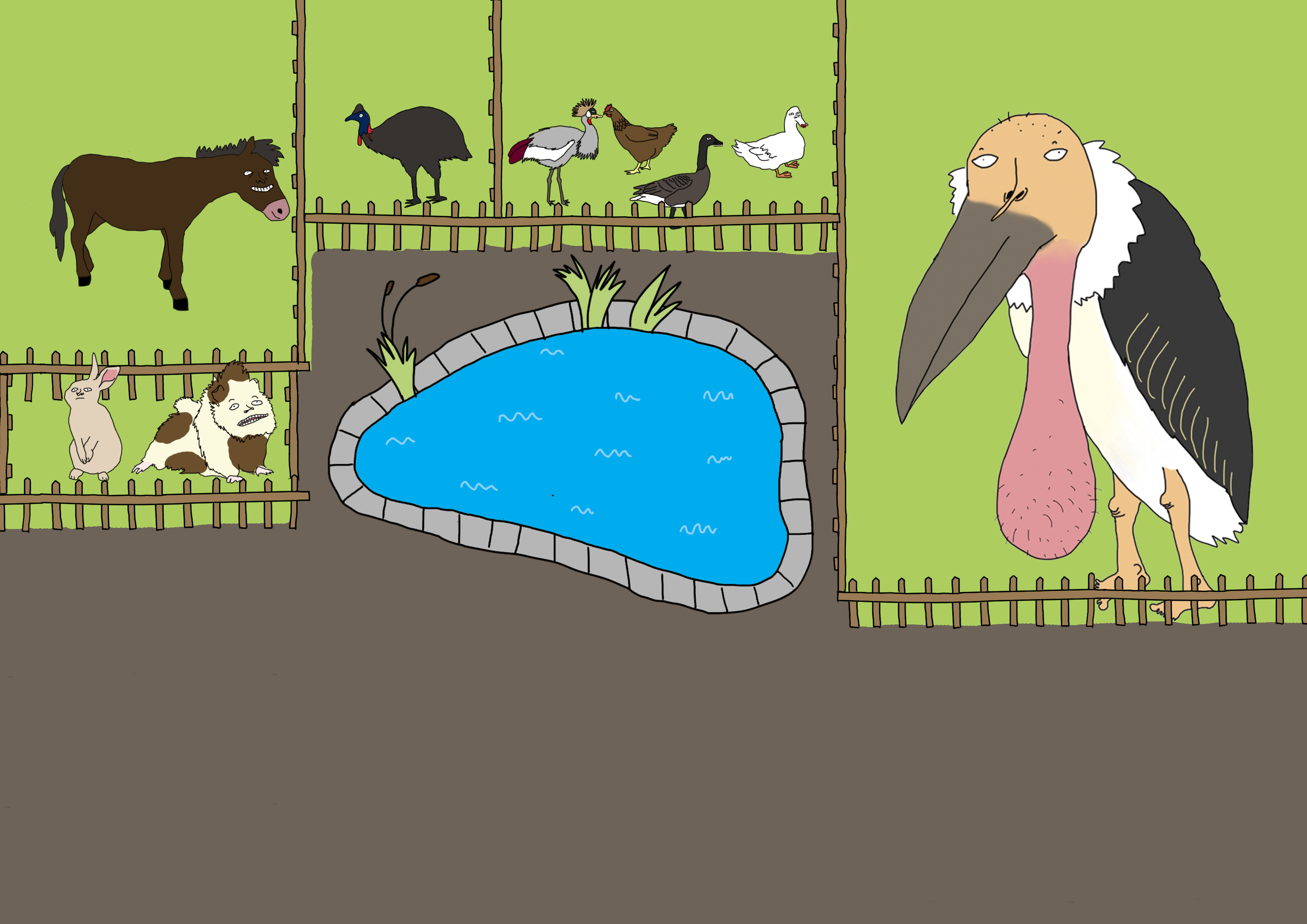
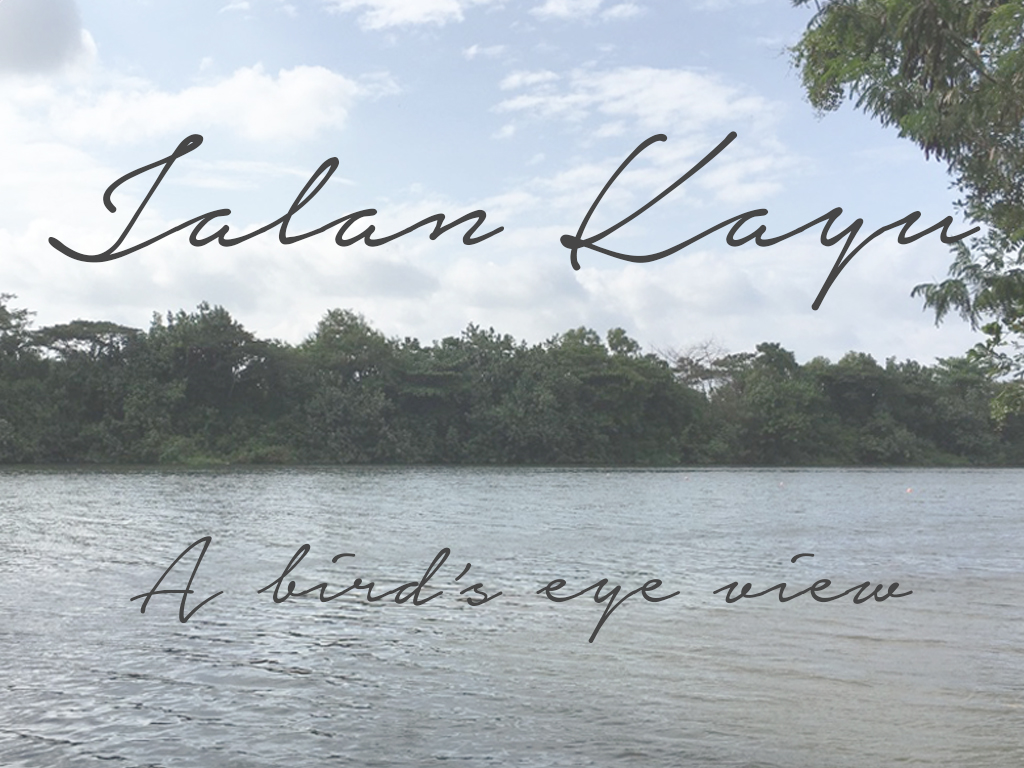
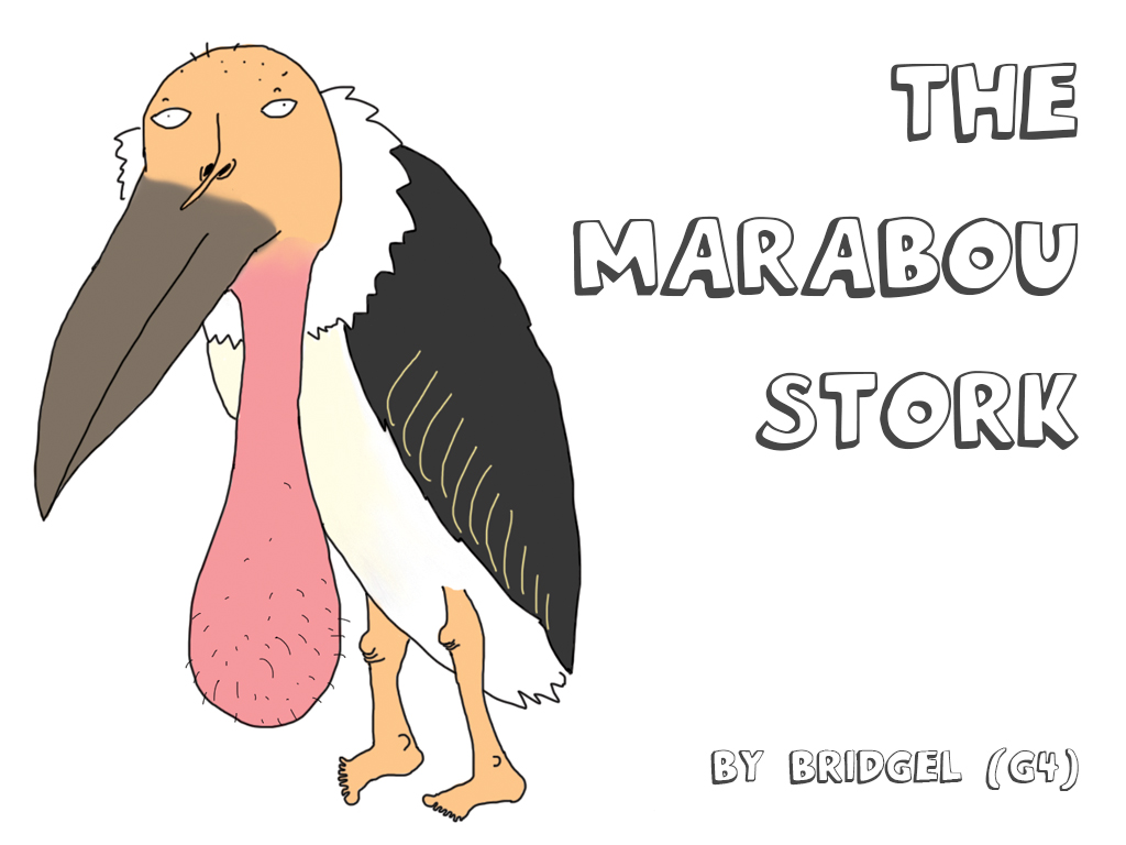
“The Marabou Stork of Jalan Kayu” is a zine that aims to provide a tongue-in-cheek introduction to the viewer of a rare gem of Jalan Kayu, hidden in the depths of the Animal Resort that nobody knows about.
There are 5 posts filed in AY1617 S2 FDN2DII G4 (this is page 1 of 1).
“The Marabou Stork of Jalan Kayu” is a zine that aims to provide a tongue-in-cheek introduction to the viewer of a rare gem of Jalan Kayu, hidden in the depths of the Animal Resort that nobody knows about.


As I mentioned during my slides presentation in the middle of the project, I decided to do a fully illustrated zine in my usual humorous, tongue-in-cheek style because I think it represents my style best and people seem to like it ((((:
Concept
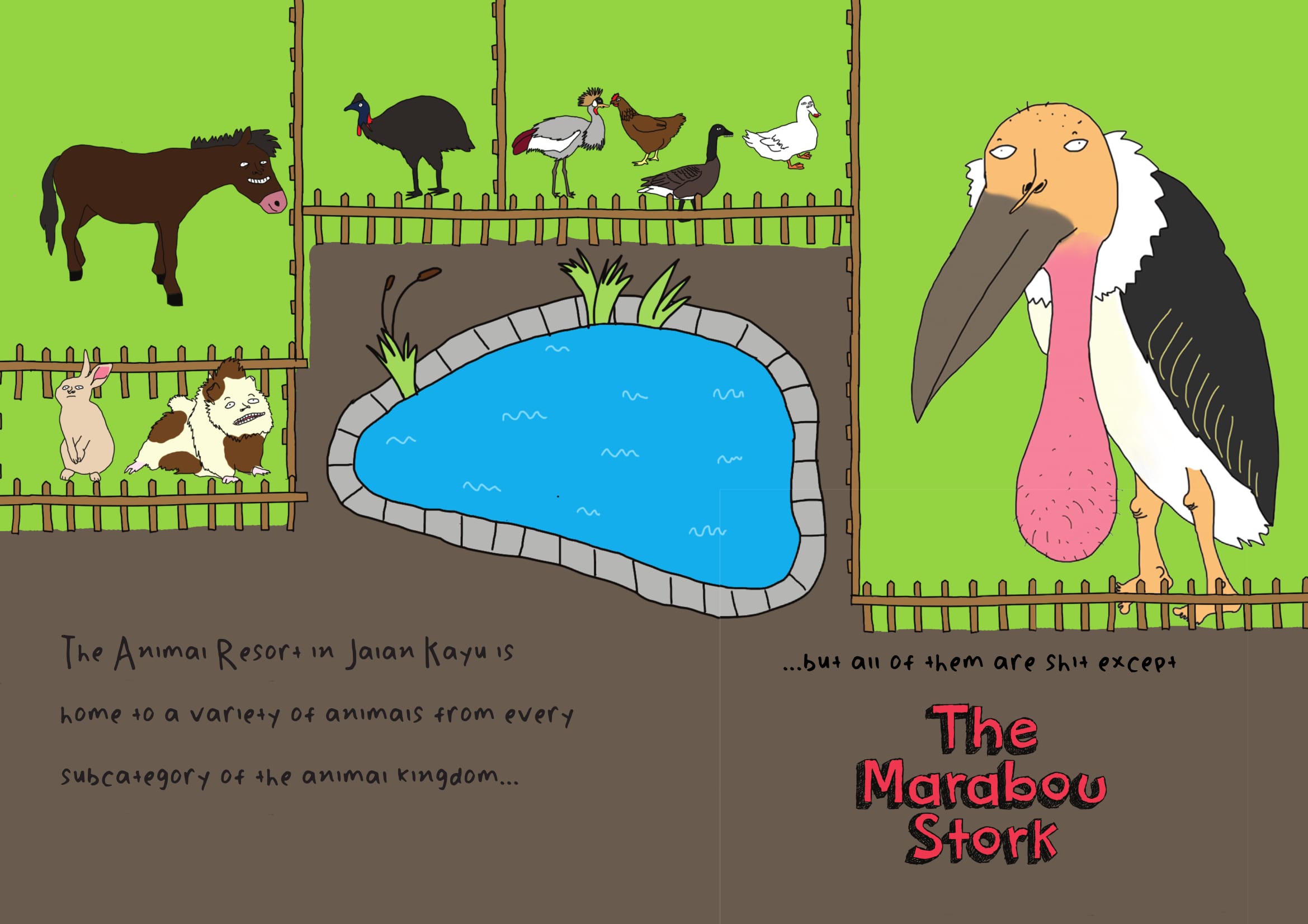
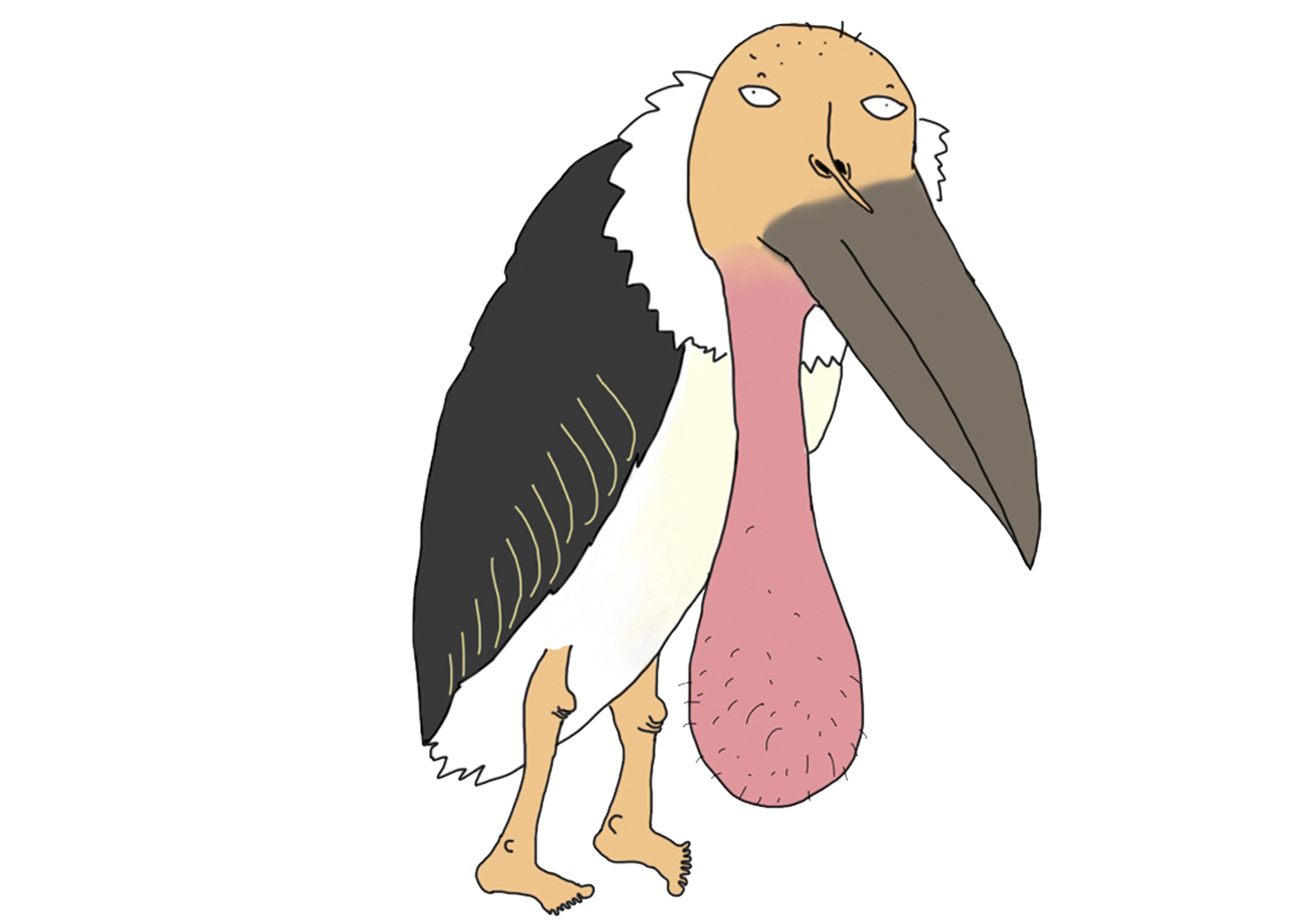
I decided to use the Marabou Stork (aka “ballsack bird”) which I found at the Animal Resort at Jalan Kayu as the main focus of my zine. This is because when I told people that I was doing the zine on Jalan Kayu, everybody was like “ROTI PRATA” and “SHOPHOUSES!!!!” so I immediately decided I was gonna do something different because if the roti prata is really that famous then it doesn’t need a zine to tell people that it exists lol.
Process
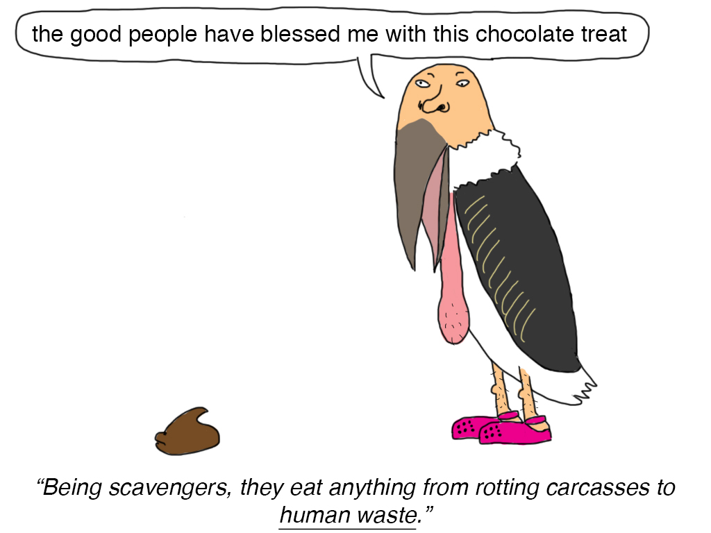
I had a lot of crazy ideas for what to do to my zine but most of them weren’t really good ideas. Since I wanted the zine to be funny I wanted to make the content as nonsensical as possible but I was reminded by Shirley during consultation that the content still has to relate to Jalan Kayu somehow. To get more ideas rolling, I decided to just open photoshop and just freely draw the ballsack bird in different poses and situations.
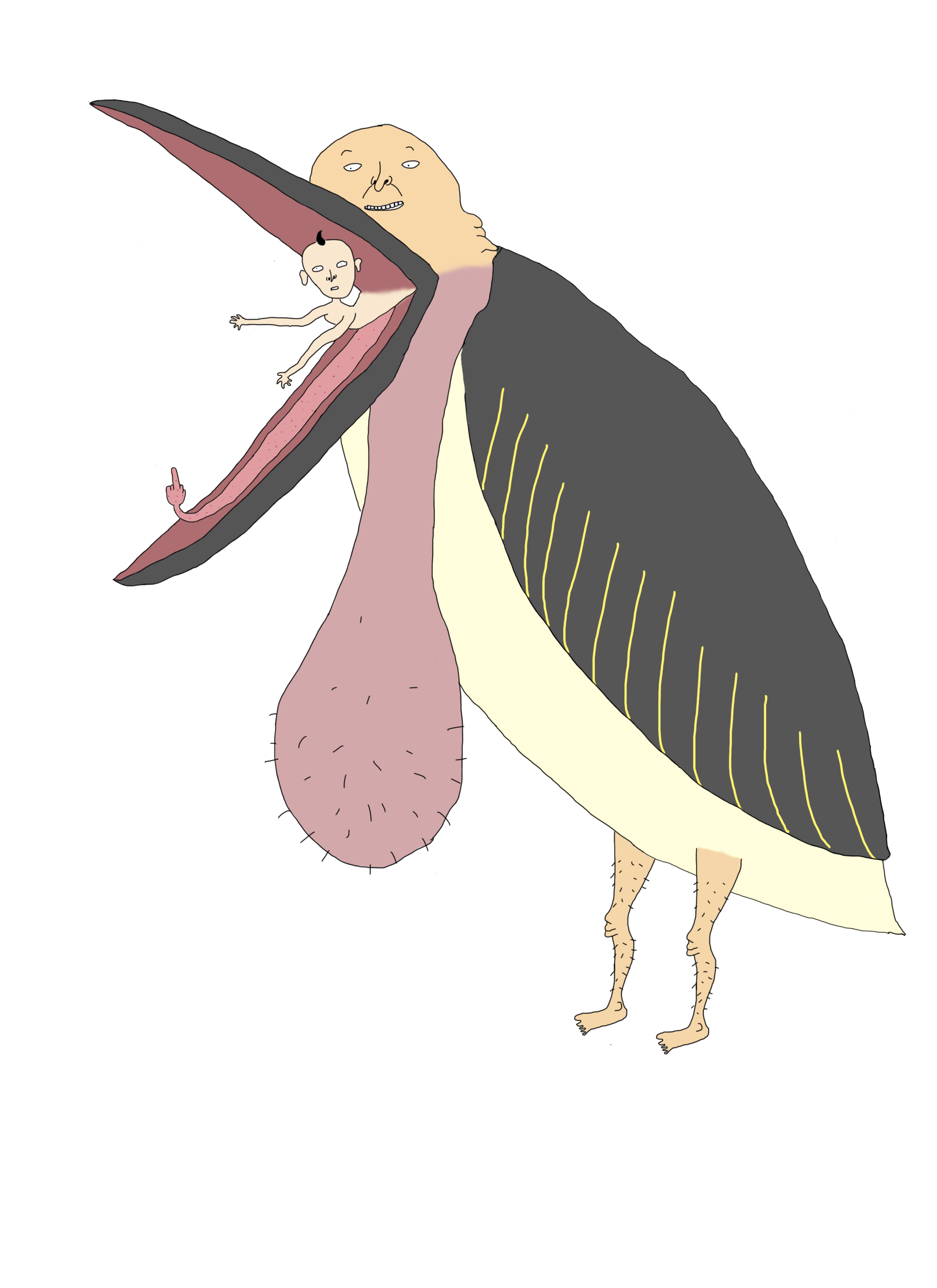
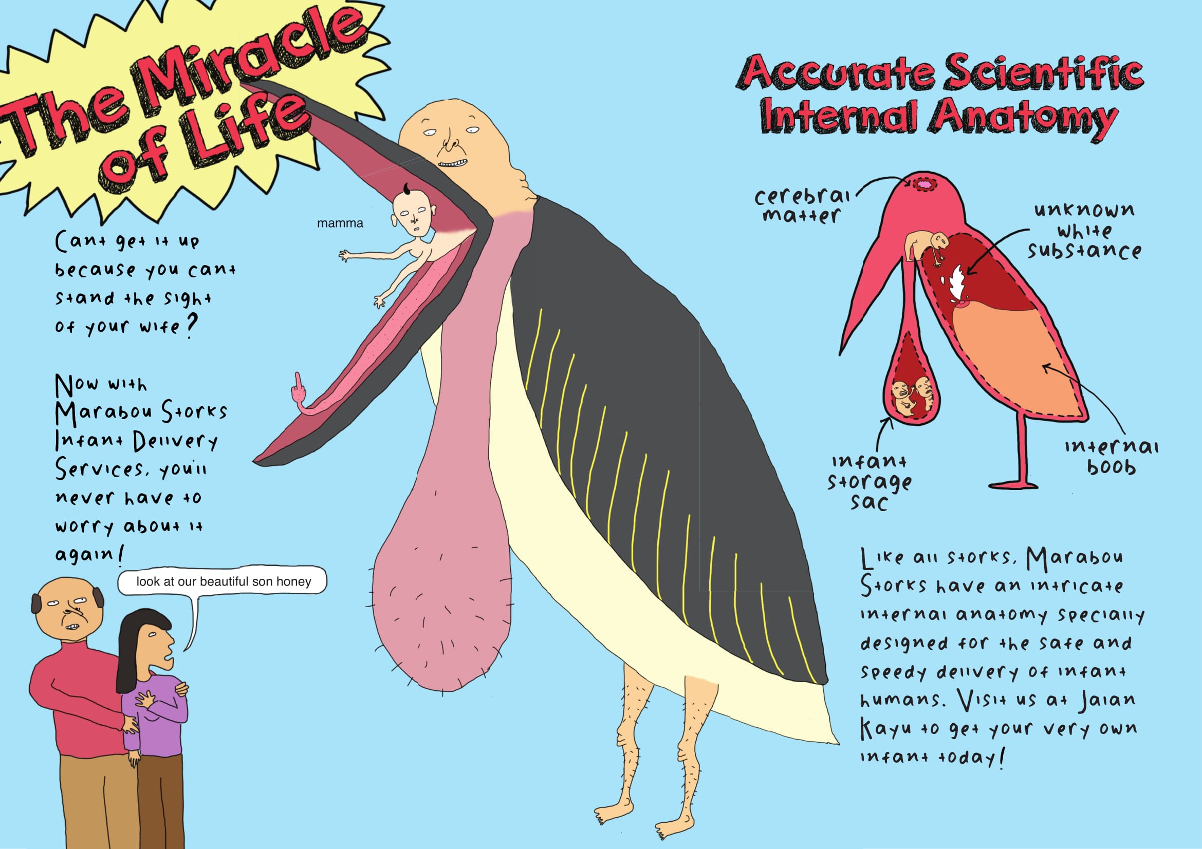
While I was drawing this bird, I suddenly randomly though of the movie “Storks” and it reminded me that storks are associated with delivering babies to parents. Hence I decided to include this concept as part of my zine storyline, and created the following:
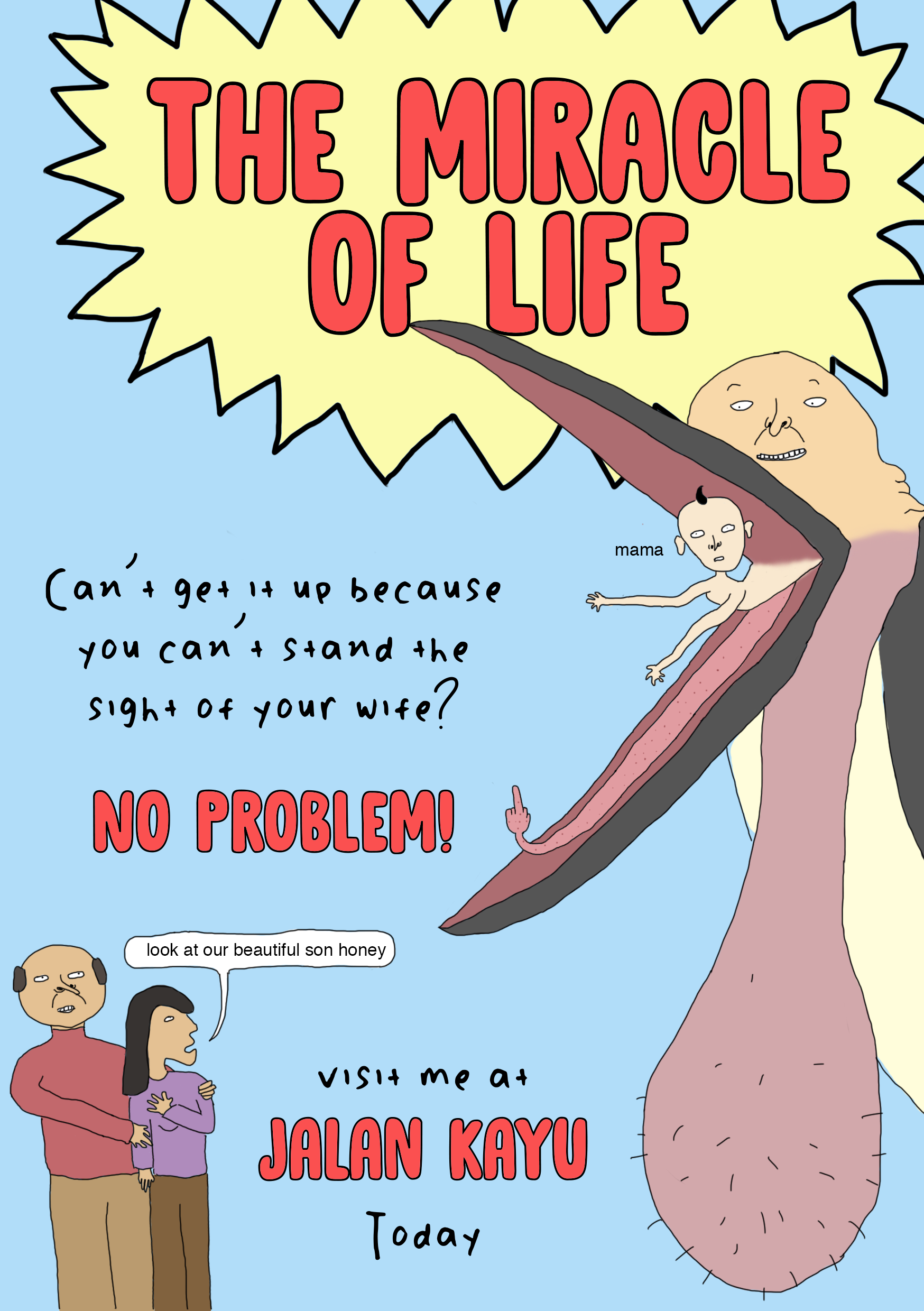
I was hoping to use these 2 pages as a spread in my zine. When I showed it to my friends it received a lot of good feedback but during consultation Shirley told me that the font was inappropriate and the spread lacked structure and hierarchy, and gave me advice on how to arrange the different elements properly. At this point I realised that to make my design more readable and cohesive, I should make use of the grid system in my zine and from here on I found that arranging the copy and images of the zine was a lot simpler.

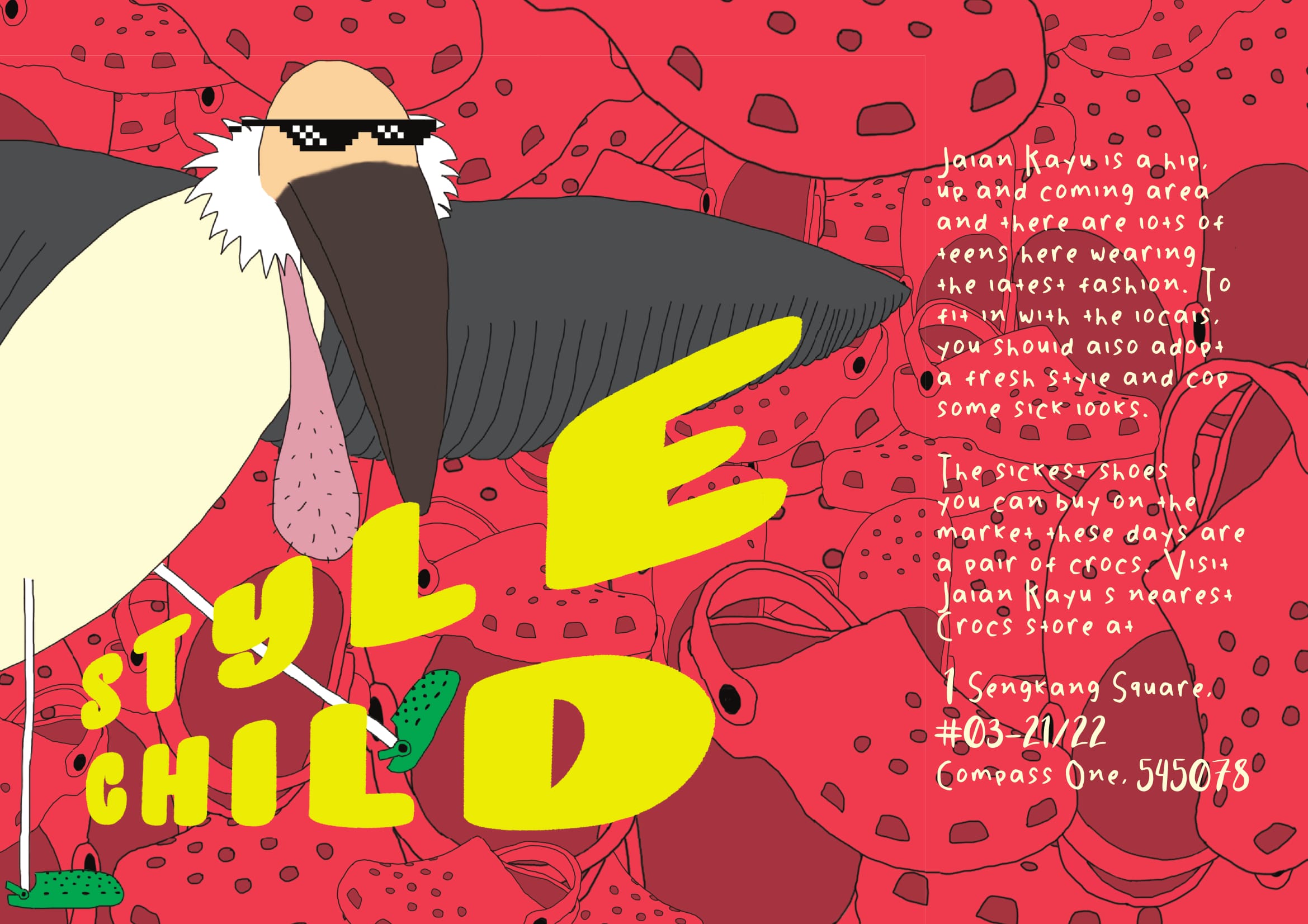
Another one of the first spreads I came up with was the one above. The idea behind it is that I wanted to create a joke “fashion guide” for people visiting Jalan Kayu since it is somewhat considered a “hipster” area and people visiting that area would usually dress nicely. I personally own 2 pairs of crocs and I think they’re great shoes but people are always giving me shit for wearing them which was why I decided to use something that is perceived as unstylish and unfashionable in contrast to the stylishness of Jalan Kayu. Shirley suggested that instead of using photos of crocs I should just illustrate the crocs to create a more cohesive illustrated style in the entire zine.
As you can see from the 2 spreads above I decided to go for a very bright colour palette with the use of a lot of primary colours. This is because I wanted my zine to have a bold, cartoon-like look, almost like it is a children’s book but upon actually reading the zine the reader is like oh my god this is totally not for children
When I showed Shirley these 2 spreads, she suggested that my zine should also include a map of the Animal Resort or at least a sort of introduction to it since that’s where the ballsack bird resides. Hence I came up with the following illustration to use on my first 2 pages:
Throughout the entire process of making the zine, I constantly asked for feedback from my peers and kept changing my zine according to their advice and comments. I feel that this is important because as a designer/artist when we have been staring at our own design for too long it can become very mentally draining and we may start to miss out small mistakes or other discrepancies in our design. So it is always good to have someone else look at your work from time to time.
Artistic references
I did not really reference many artists or designers for this project. Since a zine is about self expression, I felt that it was more appropriate to just work in my own style in order to create a more authentic end product rather than to reference so many other artists that the zine is hardly even my own.
In my OSS post for project ego in sem 1 I mentioned several artists who heavily influenced my personal style. In the past few months I have came across more artists who I greatly admire and I guess have also served as an inspiration for this project.
Toshio Saeki


Toshio Saeki is a Japanese erotic illustrator who is known for his highly controversial and bizarre artworks. I actually wasn’t sure if I should include him in my OSS post because a lot of his work is really quite disturbing and the ones above are already some of the milder ones but I am a huge fan of the colour palettes used in his illustrations as well as the use of bizarre dark humour. The use of bold primary colours is something I also emulated in my own zine.
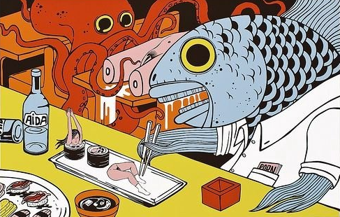
Joan Cornella

Last semester one of my classmates told me that my work resembles Joan Cornella’s so I checked him out and I am now a huge fan. I love nonsensical black humour and his art is just so full of it. He honestly has the weirdest brain I have ever encountered in my life and has become one of my greatest artistic inspirations.
Final Product
Here is the final product saved as spreads for your reading pleasure (: When I saved the postscript as spreads it created white boxes around all the different indesign elements which was a bit annoying because it wasn’t there in my print booklet version. I googled this and some forum said that it’s because of the PDF reader on Mac computers or something so I guess it just goes to show that sometimes life gives you lemons and things don’t go as planned but what can you do (:


Hey everyone! As Project 1 of Foundation 2D II is coming to a close, here are my thoughts and process as well as my final outcomes.
The name I have chosen to use in all 4 compositions is “BRDGL”. It is basically a short form of my name “Bridgel” without the vowels. I chose to use Brdgl because it has a special meaning to me, it is my nickname with my best friends and they will call me that when we are texting.
Job 1: Meth Cook
This was the job which I was most excited to try out! Those of you who have watched Breaking Bad will be familiar, a meth cook is someone who makes meth (a drug).
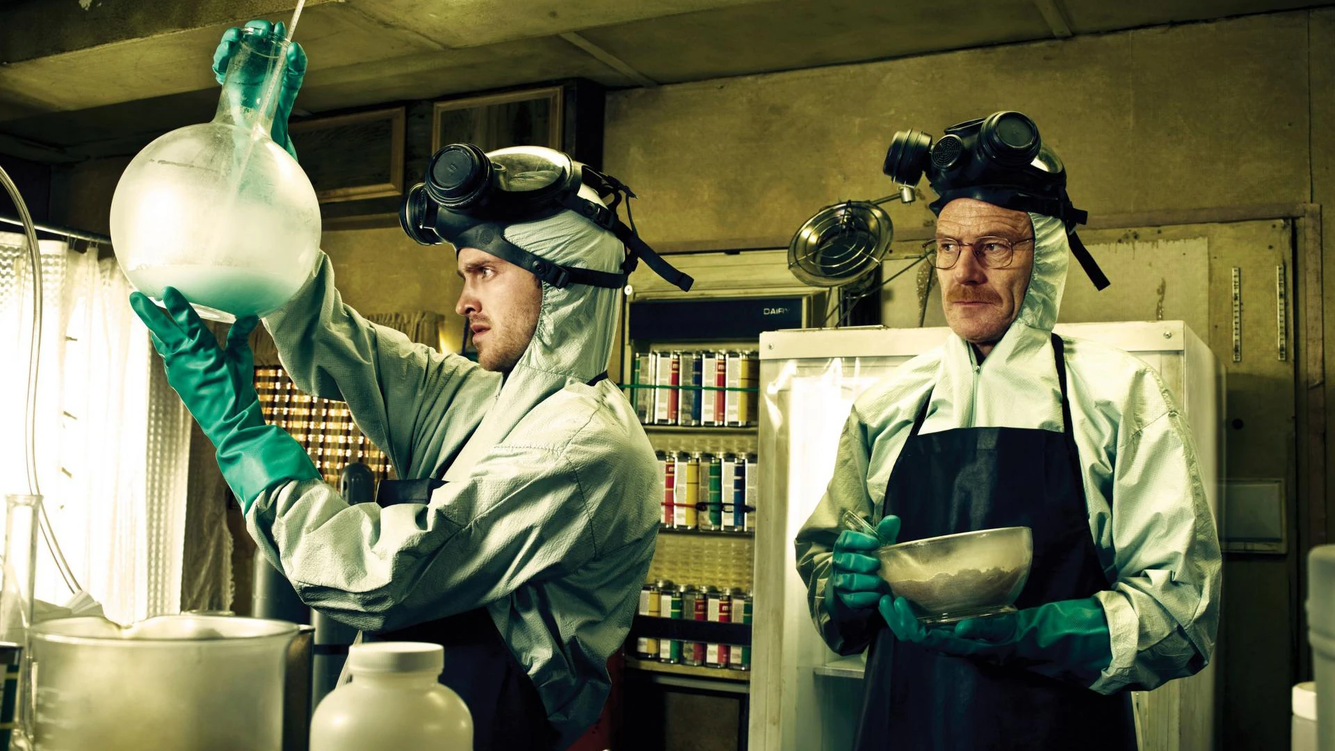
Breaking Bad is one of my favourite shows of all time and it is about a chemistry teacher who turns into a meth cook because he has cancer and wants to be able to provide for his family. His partner-in-crime is one of his ex students and ever since watching the show I have always secretly hoped that one day a teacher from my JC will approach me out of the blue and invite me to be a part of their new shady “business operation”.
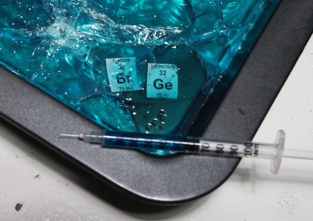
Here is the final composition! “My name is Bridgel and I am a Meth Cook”. It is 2 elements of the scientific Periodic table which have been printed and cut out, then suspended in blue candy which I have made myself. This is because the drug meth is blue in colour when it is created at a high percentage of purity (scionce 101). There is also an injection syringe in the shot to further push the idea of drugs in the composition and the crystal candy has been cracked to show that this is a wayward and dangerous profession.
Even though it would a bit tough to get the technique down and find the ingredients, I still decided to use blue candy which was self made. My initial plan was to use blue ice but then I realised it would get wet and soggy very fast. My other plan was to use blue jelly and encase the elements inside but I realised it would also get soggy and I wouldn’t be able to get the cracked effect that was shown in the picture.
This is the tutorial I used to create the candy!
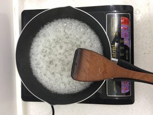
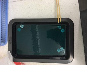
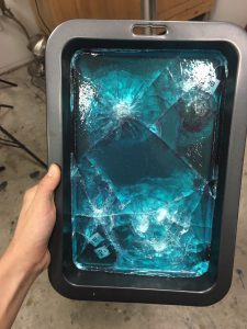
Here are some pictures of my process! Cooking the sugar solution, leaving it to cool in the pan with the elements inside, and finally shattering it with a hammer for the cracked effect.
Job 2: Gardener
This is a job that I have taken up recently as my hall has recently started a new Edible Gardening club and I was asked to be the chairperson! As a new gardener I feel like I have an immense passion for plants and gardening and I would like to show that through my 2D work hence I picked gardener as one of my jobs. Although it was not a calling I chose but was thrown upon me, I still embrace gardening with every atom of my body.
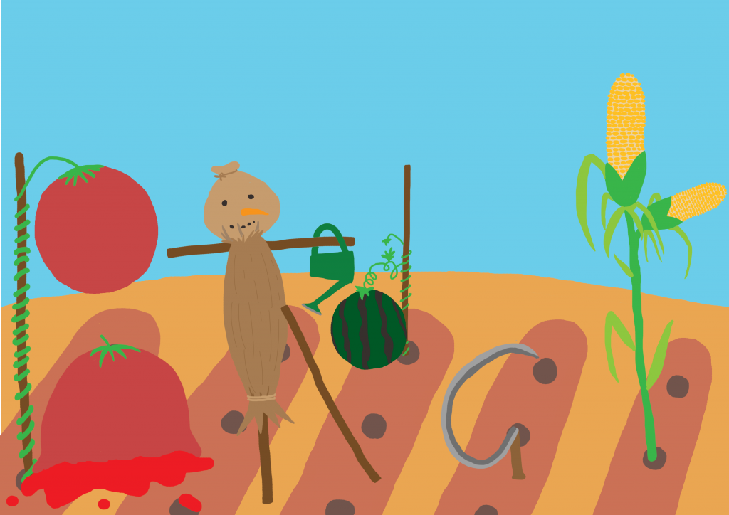
This is my final composition! I tried out an illustration for this piece. I have used different elements of gardening such as tools and scarecrow to make my name and it was done on photoshop. This illustration was actually based on a previous illustration I did for my gardening club:
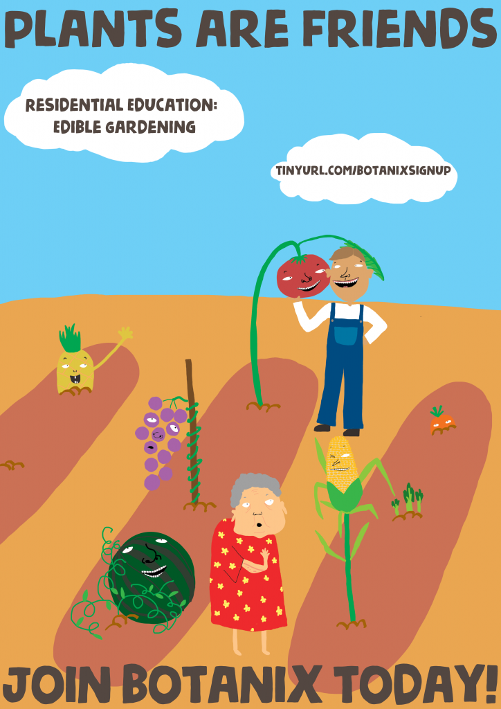
Feel free to join if you are a Hall 10 resident LOL
Job 3: Crossword Champion
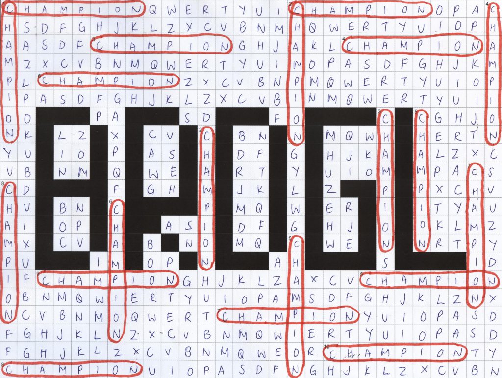
Over the December holidays I represented my hall in the inter hall Boggle competition as a team member and even though we came in first (from the back), it has ignited a passion for words in me and I would definitely take part again next year! After joining the Boggle competition I have taken an interest in crosswords and word search as well and would like to be a champion in word games, hence this design.
To create this composition I used a grid and filled in the squares with the paint tool that I wanted to be black, which make out my name. Then I printed it and wrote the letters in with pen, circling the word “champion” to show that I want to be a champion. Then I scanned it and adjusted the brightness and contrast before re-printing again.
Job 4: Hacker
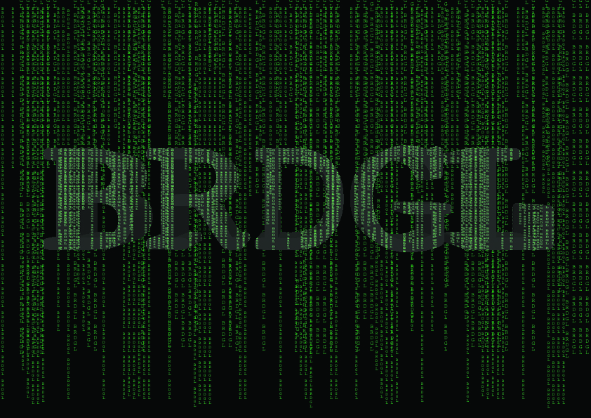
When I was in JC for a period of time my best friend and I wanted to become hackers because we thought that hackers were like those cool people that you see on the Matrix LOL.
This composition was created by making a 3D font on photoshop and overlaying a Matrix effect over it. If you look closely, the Matrix actually says “BRDGL” repeatedly as well.