


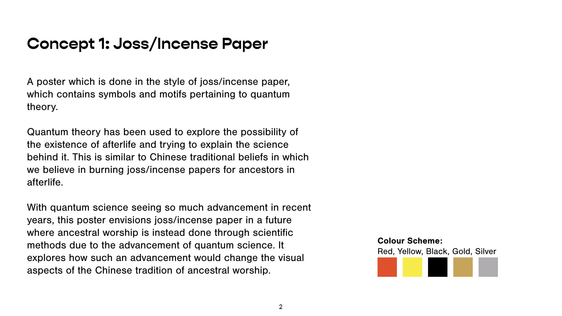
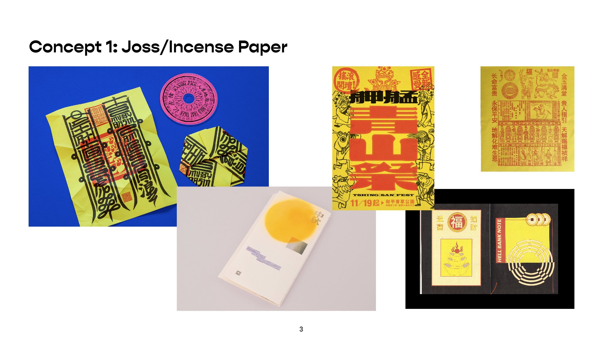


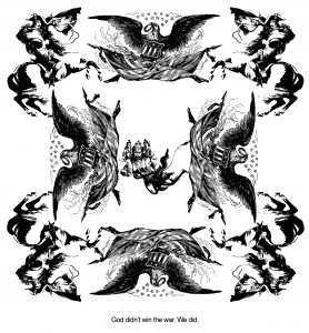
Final:

There are 11 posts filed in My Work (this is page 1 of 2).
Final:

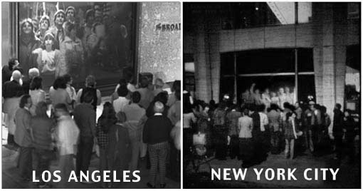
For this final project, I aim to explore and question the concept of public surveillance, especially with regards to surveillance cameras. At what point does public surveillance cross over the boundaries from being a security and safety feature, to becoming something intrusive that strips us of our personal freedom and privacy?
The topic of public surveillance is one that has been heavily debated, especially recently with the announcement of a social credit system to be implemented in China. The system will place citizens under heavy surveillance via their digital footprint, as well as physically via facial recognition on public surveillance cameras. The social credit system has sparked worldwide outrage and debate on various topics such as whether personal privacy is a human right, and the possibility of a dystopian Black Mirror-esque future where Big Brother has control over all our actions and thoughts.
As undesirable as it would seem to live in a surveillance state, would it truly be different from how we live now? In this day and age where almost everyone willingly posts their personal information on social media, can we really fault the government for putting an eye on us when anyone else can also do so? As stated in the above video by Chinese citizen Fan Dandan:
For me, the Social Credit System isn’t a totally new thing. I think it’s always been there. Now it’s just in a more efficient format. An online or digital format. But it’s based on the system we already have.

Even devices which are supposedly used for security purposes are not safe from infiltration from other parties. My project is largely inspired by my research on IP cameras, which have largely replaced CCTVs as the choice of surveillance camera as they are able to be accessed remotely via network connection. They are widely used, not just in public but also in private spaces like offices or homes. However, they can pose a serious threat to one’s personal privacy if not used correctly; IP cameras are notoriously susceptible to hacking, giving rise to websites such as Insecam which feature live footage gleaned from unsecured IP cameras around the world. As shocking as it may be to realise that strangers could be unknowingly watching you in your private spaces, this is the reality of our world today and this kind of voyeuristic surveillance is what we make ourselves susceptible to whenever we use such devices.
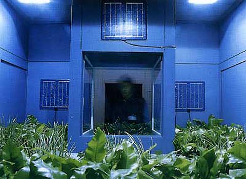
Through the use of a disguised camera placed somewhere with high human traffic, I aim to give my live-stream viewers an opportunity to see things through the eyes of the voyeur, to experience being the person behind the camera rather than being the unsuspecting passer-by in front of it. Drawing reference from Ai Weiwei and Herzog & de Meuron’s installation Hansel and Gretel, and Kashmir Hill and Surya Mattu’s article The House That Spied on Me, I aim to use face-recognition via Processing linked to the webcam to show the audience the ease of which they can be “spied” on.
Click here for my presentation slides!


Telematic Dreaming by Paul Sermon is a video-based installation first produced in 1992.
Randall Packer describes Third Space as a space where both physical and imaginary or mental worlds collide, coming together into a network space which can be inhabited by multiple users. In the case of Telematic Dreaming, I would argue that the “third space” exists not as a place where the physical and mental worlds are combined, but rather a place where the 2 aforementioned worlds can be temporarily forgotten.
To highlight my point, we can contrast Telematic Dreaming against the installation Hole in Space which was discussed several weeks back. In HIS, the third space is taken to the extreme in terms of the sheer number of participants who are roped into it. It is evidently very much in line with Packer’s interpretation of a third space, with his definition of it being a communal and shared space among multitudes of people from differing backgrounds. In contrast, as per Sermon’s synopsis, Telematic Dreaming aims to put two strangers into a very private and intimate setting, which is only possible through the following factors of the installation:
In my opinion this seems to be different from Packer’s interpretation of the third space. To me, Telematic Dreaming seems to exist in a fourth space, separate from what Packer described; in this space, everything ceases to exist apart from the moment shared between the 2 participants, leaving them with a unique experience which cannot be recreated in any other setting. Perhaps the fourth space exists as an offshoot of the third space, or it is something which we will need to explore further as artists to understand and define.
Erik Samakh – Grenouilles communicantes, 1991
Erik Samakh is a contemporary artist who describes himself as a “hunter-gatherer” of images and sounds, which he has captured, recorded and exhibited for over 25 years in natural settings. His work is focused on our dialogue with nature through the combination of new technologies and natural elements. In the above installation which is one of his earlier works, Samakh encourages viewers to have “strange conversations” with frogs living in the installation’s habitat through the use of modules in the space which emit sounds to the frogs.
Ernesto Neto – Célula Nave
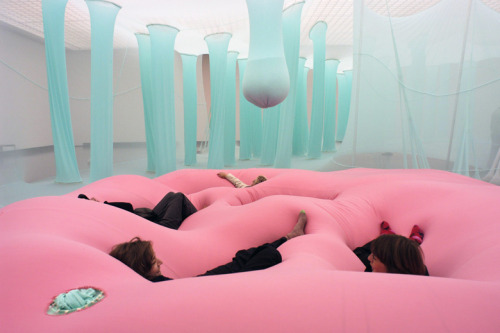
Ernesto Neto is one of the installation artists that I admire the most because I think his work embodies the essence of interactive art (to me): the element of fun. Every one of his installations is immersive and interactive and he is not afraid to let the audience go all out with his works. As you can see from the image above, the audience will jump on the installation, allow it to engulf them and fully immerse themselves in the art.
This is a huge contrast to a lot of artworks we see which are interactive but have many limitations. Often when we see an exhibit we see signs stating things like “Please do not touch” or “Please do not enter”; while as artists we have to protect the works which we spent a lot of effort on, I also feel that there should be a mutual bond of trust and respect between the artist and the audience and Neto’s works has taught me that this artist-audience relationship is possible to have.
Célula Nave is the first work of Neto’s that I had come across and it is the most outstanding to me because I am attracted by the bright, fun colours used and the soft biomorphic shapes in the installation.
NEW MOON: Caitlind r.c. Brown & Wayne Garrett

NEW MOON is an interactive light sculpture which allows the viewer to shift between the different phases of the moon. What stood out to me about NEW MOON was that the lights used in the installation are all recycled light bulbs. The realm of recyclable art is something I would like to explore in my further works because I sometimes think that we do have too much in this world and we are so engrossed in creating new things that we neglect things we already have. Using recycled/recyclable materials does not necessarily have to diminish the quality of an artworks; taking NEW MOON into example, it is interactive and engaging and also visually elegant in spite of its use of recycled materials.

As I mentioned during my slides presentation in the middle of the project, I decided to do a fully illustrated zine in my usual humorous, tongue-in-cheek style because I think it represents my style best and people seem to like it ((((:
Concept
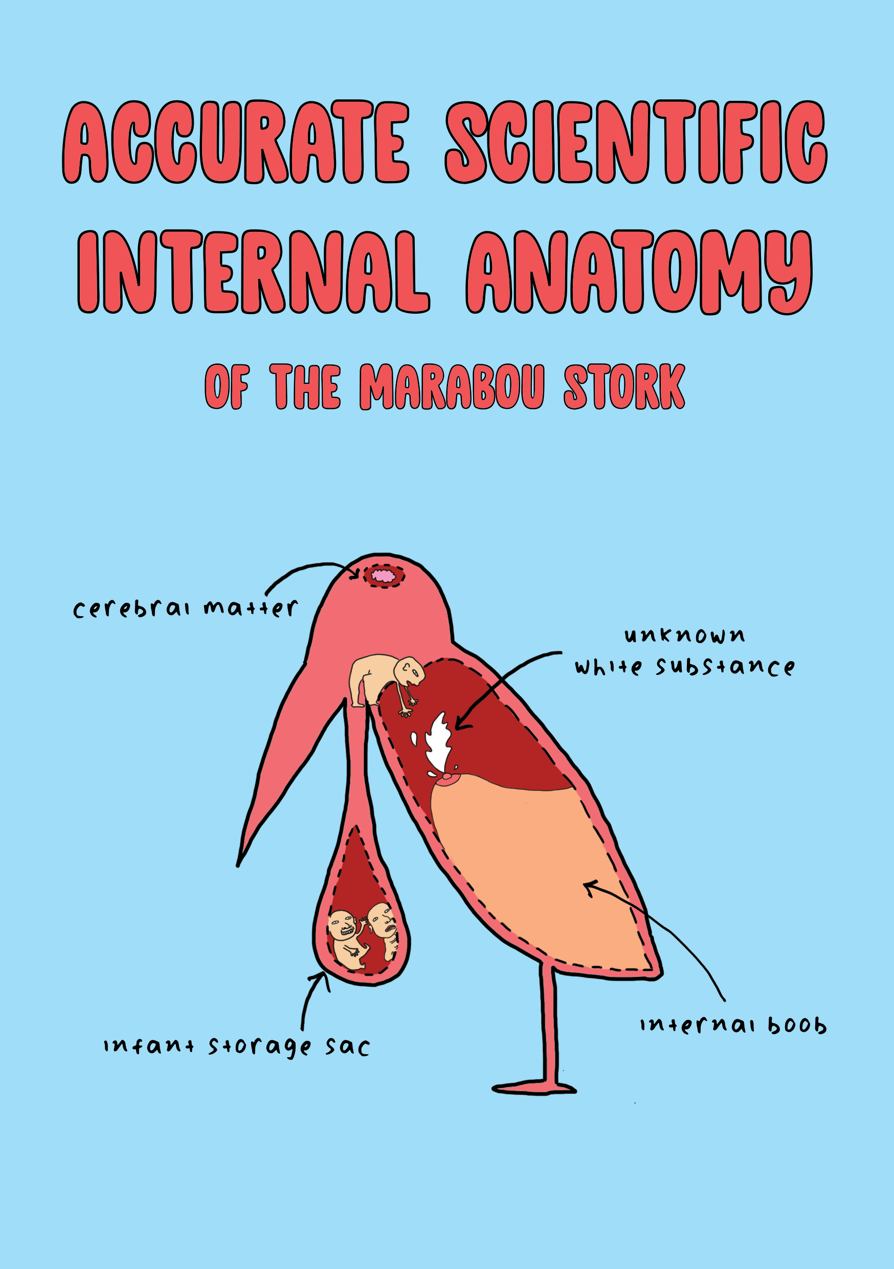
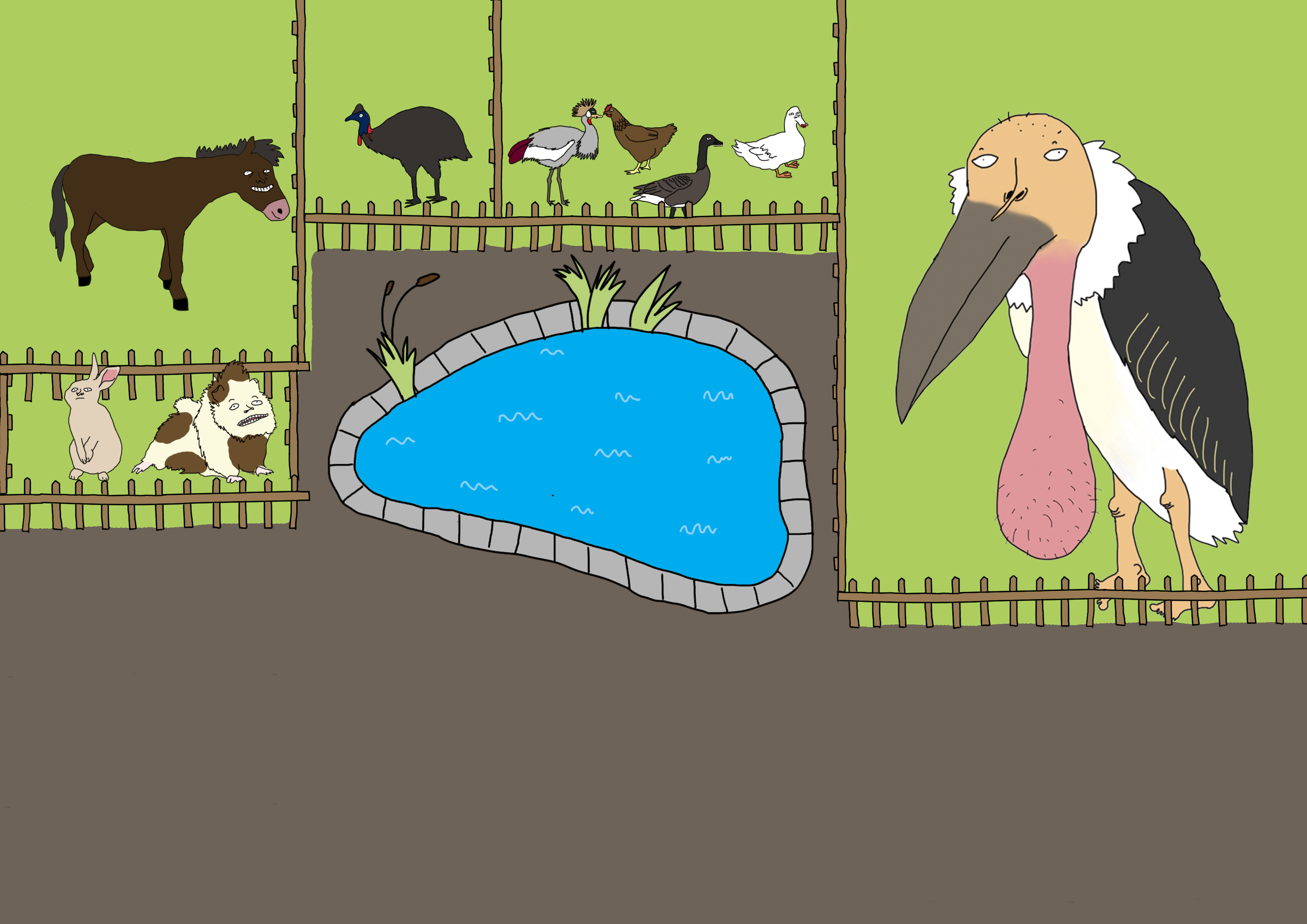
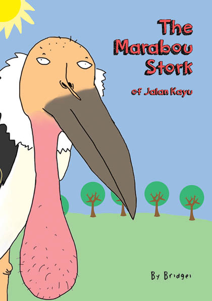
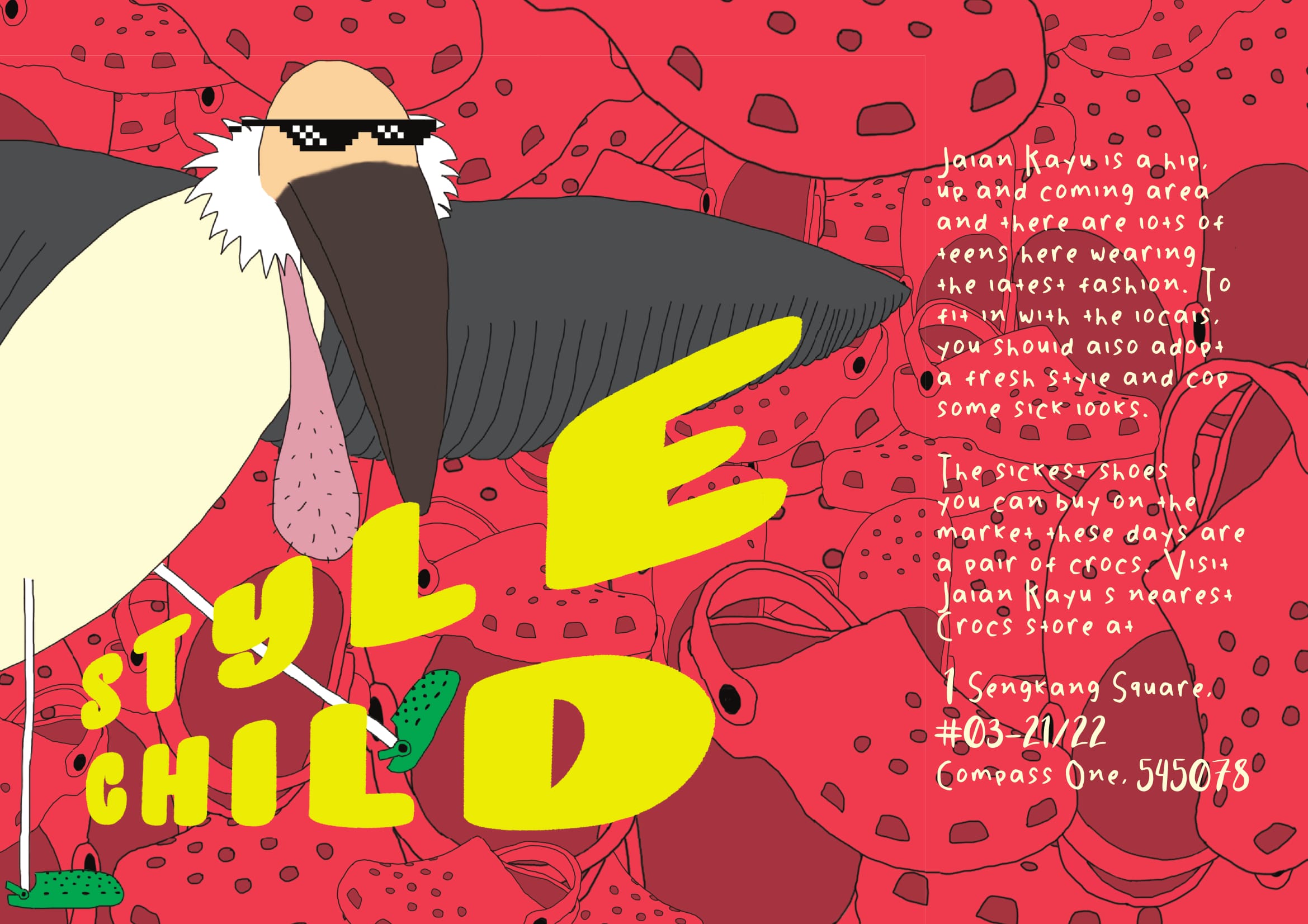
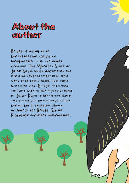
I decided to use the Marabou Stork (aka “ballsack bird”) which I found at the Animal Resort at Jalan Kayu as the main focus of my zine. This is because when I told people that I was doing the zine on Jalan Kayu, everybody was like “ROTI PRATA” and “SHOPHOUSES!!!!” so I immediately decided I was gonna do something different because if the roti prata is really that famous then it doesn’t need a zine to tell people that it exists lol.
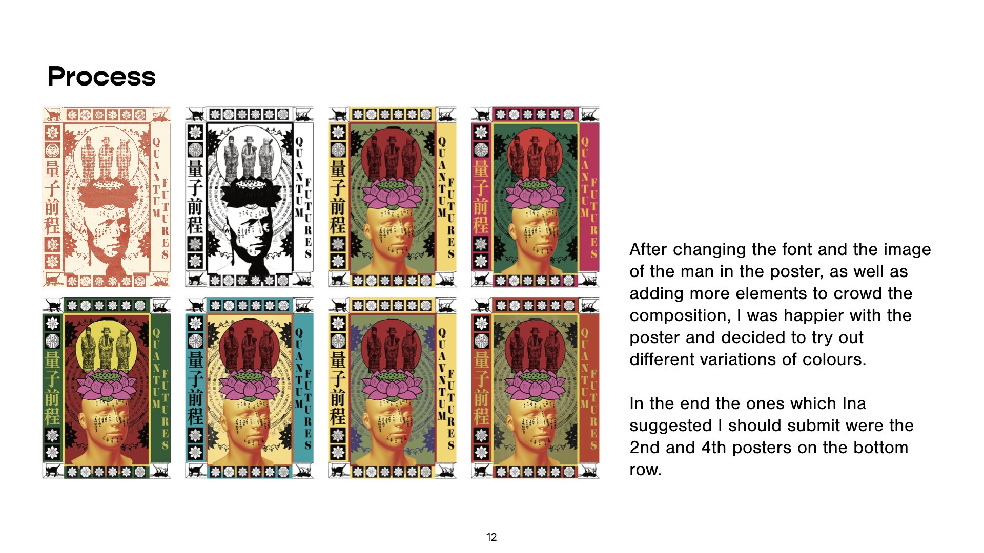
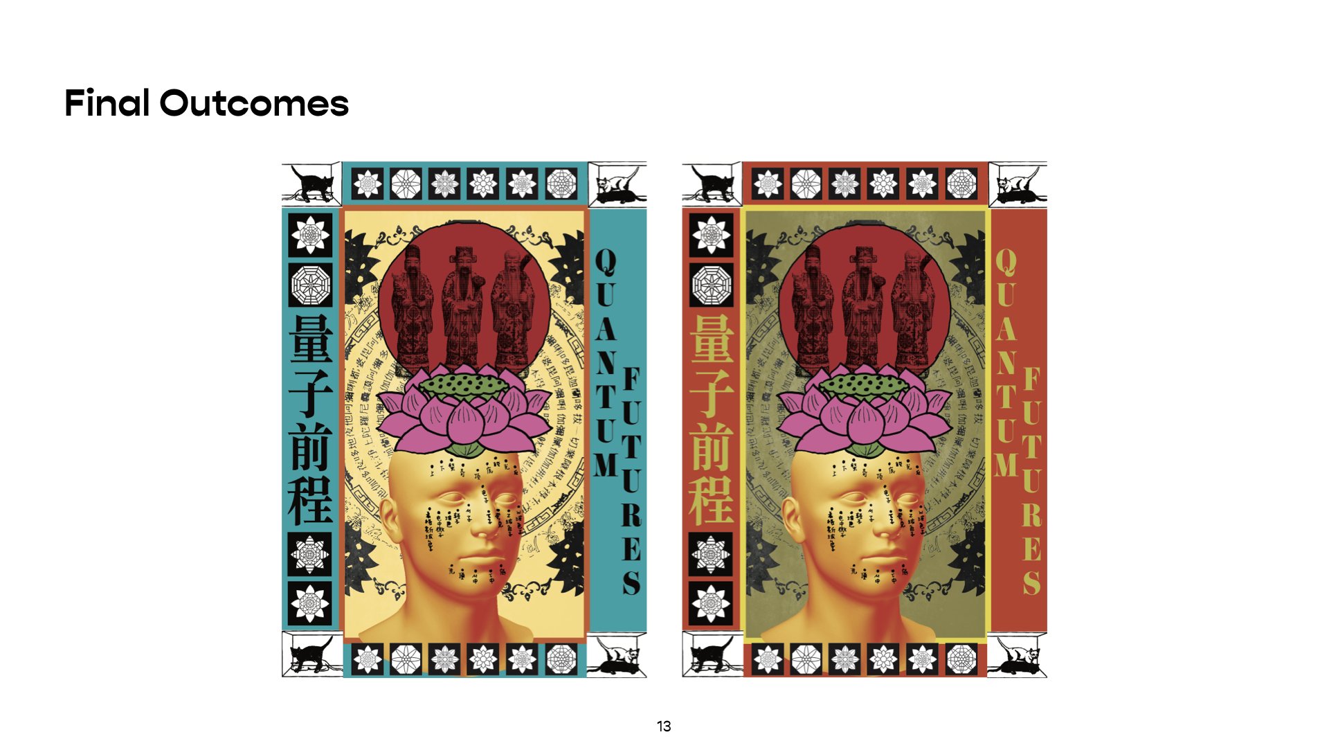
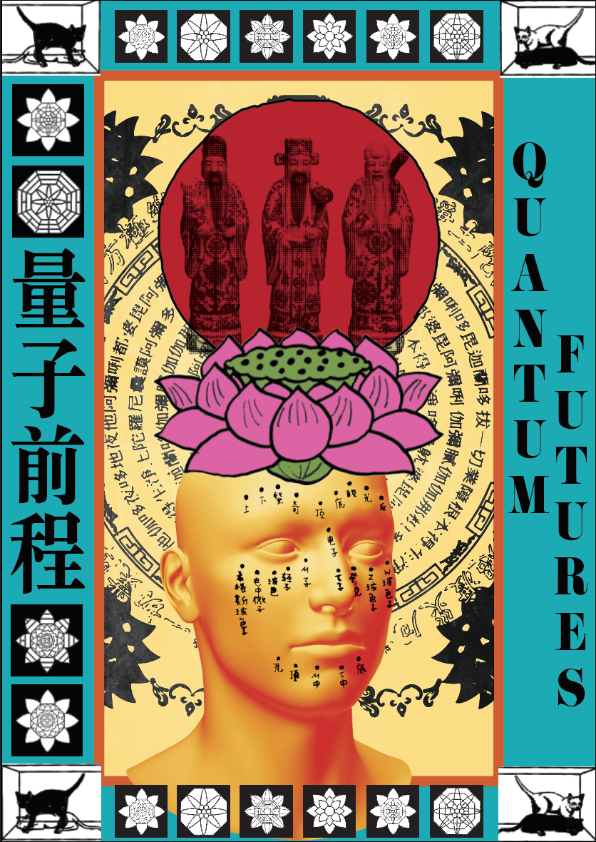
Process
I had a lot of crazy ideas for what to do to my zine but most of them weren’t really good ideas. Since I wanted the zine to be funny I wanted to make the content as nonsensical as possible but I was reminded by Shirley during consultation that the content still has to relate to Jalan Kayu somehow. To get more ideas rolling, I decided to just open photoshop and just freely draw the ballsack bird in different poses and situations.
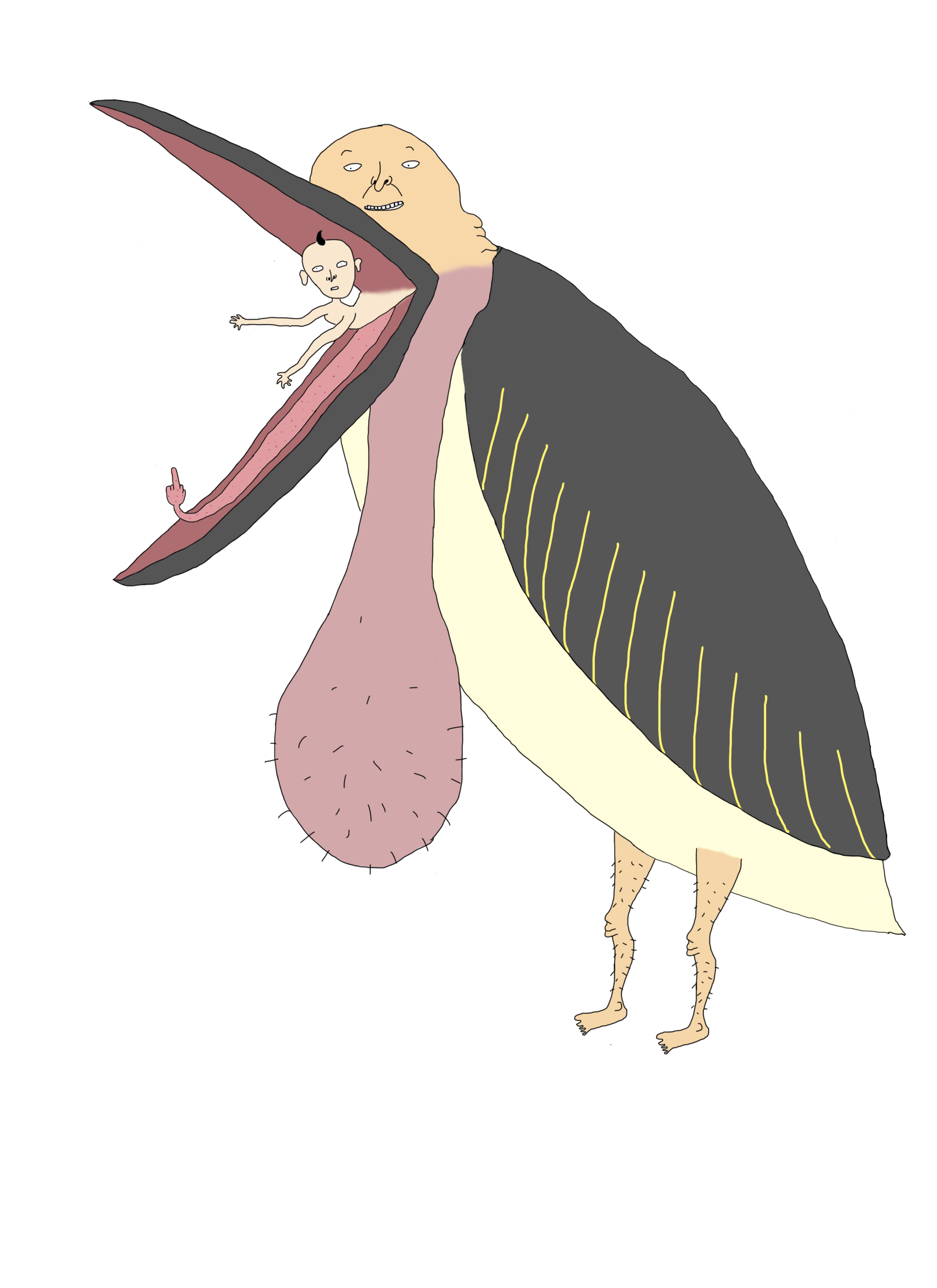
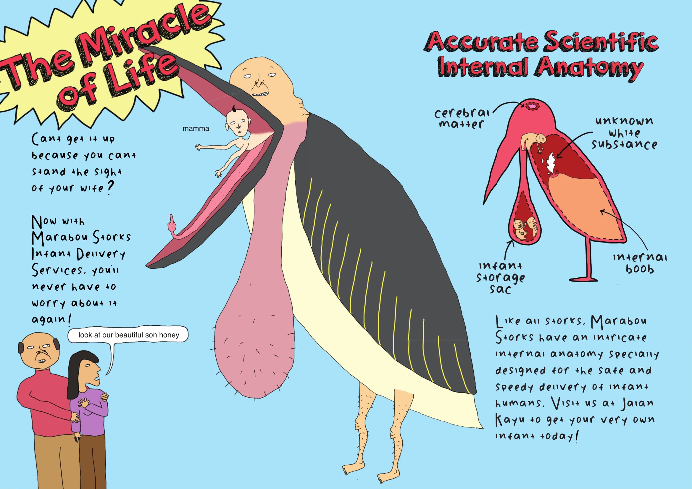
While I was drawing this bird, I suddenly randomly though of the movie “Storks” and it reminded me that storks are associated with delivering babies to parents. Hence I decided to include this concept as part of my zine storyline, and created the following:
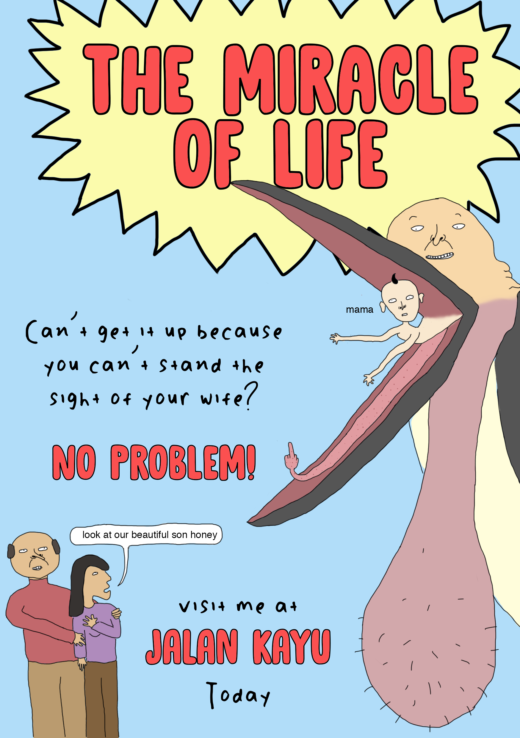
I was hoping to use these 2 pages as a spread in my zine. When I showed it to my friends it received a lot of good feedback but during consultation Shirley told me that the font was inappropriate and the spread lacked structure and hierarchy, and gave me advice on how to arrange the different elements properly. At this point I realised that to make my design more readable and cohesive, I should make use of the grid system in my zine and from here on I found that arranging the copy and images of the zine was a lot simpler.

Another one of the first spreads I came up with was the one above. The idea behind it is that I wanted to create a joke “fashion guide” for people visiting Jalan Kayu since it is somewhat considered a “hipster” area and people visiting that area would usually dress nicely. I personally own 2 pairs of crocs and I think they’re great shoes but people are always giving me shit for wearing them which was why I decided to use something that is perceived as unstylish and unfashionable in contrast to the stylishness of Jalan Kayu. Shirley suggested that instead of using photos of crocs I should just illustrate the crocs to create a more cohesive illustrated style in the entire zine.
As you can see from the 2 spreads above I decided to go for a very bright colour palette with the use of a lot of primary colours. This is because I wanted my zine to have a bold, cartoon-like look, almost like it is a children’s book but upon actually reading the zine the reader is like oh my god this is totally not for children
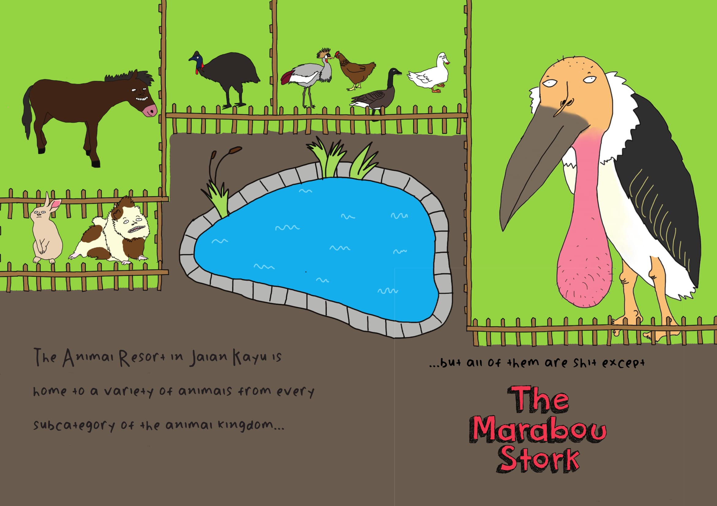
When I showed Shirley these 2 spreads, she suggested that my zine should also include a map of the Animal Resort or at least a sort of introduction to it since that’s where the ballsack bird resides. Hence I came up with the following illustration to use on my first 2 pages:
Throughout the entire process of making the zine, I constantly asked for feedback from my peers and kept changing my zine according to their advice and comments. I feel that this is important because as a designer/artist when we have been staring at our own design for too long it can become very mentally draining and we may start to miss out small mistakes or other discrepancies in our design. So it is always good to have someone else look at your work from time to time.
Artistic references
I did not really reference many artists or designers for this project. Since a zine is about self expression, I felt that it was more appropriate to just work in my own style in order to create a more authentic end product rather than to reference so many other artists that the zine is hardly even my own.
In my OSS post for project ego in sem 1 I mentioned several artists who heavily influenced my personal style. In the past few months I have came across more artists who I greatly admire and I guess have also served as an inspiration for this project.
Toshio Saeki


Toshio Saeki is a Japanese erotic illustrator who is known for his highly controversial and bizarre artworks. I actually wasn’t sure if I should include him in my OSS post because a lot of his work is really quite disturbing and the ones above are already some of the milder ones but I am a huge fan of the colour palettes used in his illustrations as well as the use of bizarre dark humour. The use of bold primary colours is something I also emulated in my own zine.
Joan Cornella

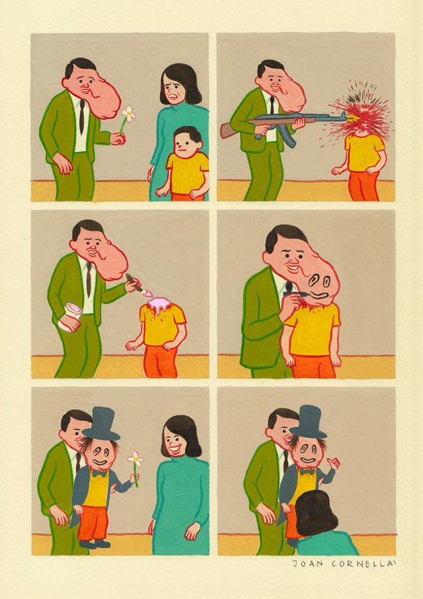
Last semester one of my classmates told me that my work resembles Joan Cornella’s so I checked him out and I am now a huge fan. I love nonsensical black humour and his art is just so full of it. He honestly has the weirdest brain I have ever encountered in my life and has become one of my greatest artistic inspirations.
Final Product
Here is the final product saved as spreads for your reading pleasure (: When I saved the postscript as spreads it created white boxes around all the different indesign elements which was a bit annoying because it wasn’t there in my print booklet version. I googled this and some forum said that it’s because of the PDF reader on Mac computers or something so I guess it just goes to show that sometimes life gives you lemons and things don’t go as planned but what can you do (:
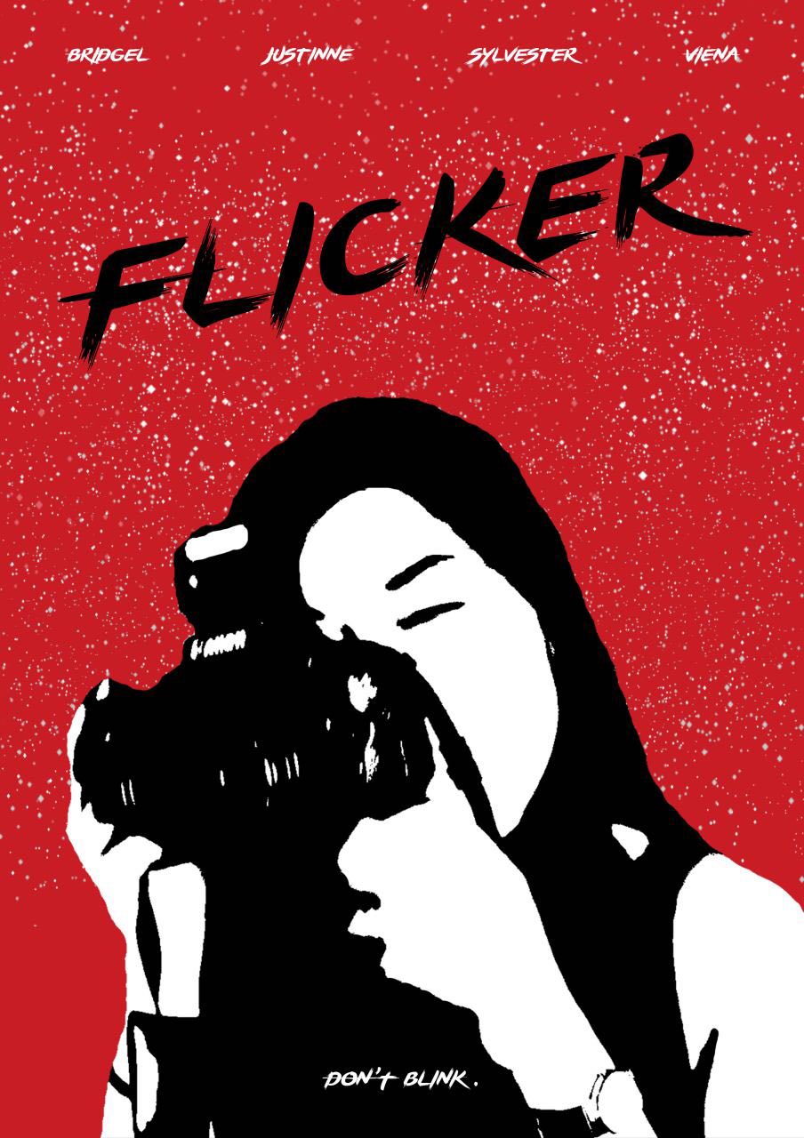
Concept
Immediately after receiving the project brief, our group (consisting of myself, Justinne, Sylvester and Viena) began researching on possible fairy tales/nursery rhymes that we could possibly base our film on. We came across the full version of the popular nursery rhyme Twinkle Twinkle Little Star, which is as follows:
Twinkle, twinkle, little star,
How I wonder what you are.
Up above the world so high,
Like a diamond in the sky.
Twinkle, twinkle, little star,
How I wonder what you are!
When the blazing sun is gone,
When there’s nothing he shines upon,
Then you show your little light,
Twinkle, twinkle, through the night.
Twinkle, twinkle, little star,
How I wonder what you are!
In the dark blue sky so deep
Through my curtains often peep
For you never close your eyes
Til the morning sun does rise
Twinkle, twinkle, little star
How I wonder what you are
Twinkle, twinkle, little star
How I wonder what you are
Most of us are only familiar with the first stanza of the song, but looking at the rest of the lyrics, it’s actually really creepy and stalker-ish! When reading the lyrics alone was able to send shivers down our spines, our group knew that this was the nursery rhyme we would be working on.
Storyboard

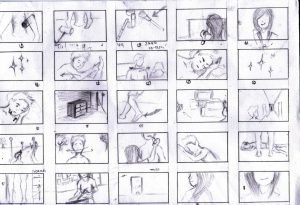
While the drawing of the storyboard was done by Justinne, all of us came together to think of the actual plot and elements of our story. Based on the lyrics of TTLS, we knew that the story would be based on the theme of obsession and stalking/voyeurism. Very quickly, we came up with the basic storyline of a girl stalking a guy who ends up kidnapping him. Seems simple but to us, the important thing was not about having a convoluted and complex story but rather in how we set the mood and visuals of our shots.
When doing the storyboard, it is also important to take note of things like location and props. After we came up with our storyboard, we began to come up with a list of props and equipment that we would need while shooting. Most of the equipment or props was either our own or rented from ADM, but some of it had to be borrowed from friends. Location wise, we had decided that our film would mostly be in a home/apartment setting hence I asked my aunt if we would be able to film at her place since I knew it would be vacant and she kindly agreed. Since she lived in an area where there were a lot of junction-like paths and hidden roads, we decided that we would also film the running scenes downstairs as it would create a maze-like effect when viewed in the film.
Research/Inspiration/References
Animals-Maroon 5
This was one of the major inspirations for our film. From it, we gleaned the motifs of using a camera as a tool for stalking, as well as the idea of the stalker taking photos of his/her “prey” as they are sleeping.
American Beauty
From this trailer, we referenced 2 things. Firstly, the use of the camera as a symbol of stalking and voyeurism (similar to the first video). As you can see, the use of cameras is very prevalent in stalker/obsession movies hence why we decided to incorporate it into our own film.
The next thing we referenced from this trailer was its beginning. In the beginning of the trailer, the setting is painted as a very peaceful and tranquil day-to-day scene, like you would see in any other neighbourhood. We did something similar in our own film by showing the 2 characters going about a regular morning, and as the film progresses more and more seems to be amiss.
American Psycho
From this iconic movie trailer, we matched its pacing and momentum by having the start of the film seem quite slow paced and normal, however it very quickly and suddenly spirals into madness.
Shmutz – Let It Rot (Feat. M Rose)
Some of the key scenes that is in the video is referenced from this video we stumbled upon from this film. We particularly like the colour (which we developed in our film as the red room scene), and the toilet roll scene.
Snap out of it – Arctic Monkies
From this music video, we observed how the actress is able to show her obsession through her facial expressions. Also, we tried to emulate the lighting and placement of items in the kitchen scenes in the music video.
Challenges
I think that for us, the biggest challenge we faced was time constraints. Our individual commitments and schedules meant that we were only able to film on the weekends, and we were unable to let our filming drag over several days as we had used my relatives’ houses as our filming locations and did not want to inconvenience them too much. Because we were filming with natural daylight, our filming time was limited and there were certain scenes which we would have liked to have gotten more takes of but were unable to. Nevertheless, we managed to make it work by compromising in some ways such as by filming certain scenes (e.g. carpark and lift scenes) in school, which was more convenient for all of us.
Equipment wise, one thing which was initially a setback but turned out to be a success was our use of red plastic bags over lights to create a red lighting effect. We knew that we wanted to have a “red room” scene in our film because it would really add to the haunting and unsettling effect and, knowing we wouldn’t be able to get that effect using colour correction, we tried to obtain red transparency paper but were unable to do so.

As we were setting up the scene of our filming, Viena had the idea to use a red plastic bag which we had found on the spot to cover the lighting in order to create the effect that we initially wanted.

It worked! In fact on hindsight we think that it turned out better than it would have if we used red transparency paper as the transparency paper would have let too much light through and wouldn’t give us the muted red colour that we were trying to achieve.
The last challenge we faced was with regards to our lighting. We had filmed in 2 different apartments, and while most of the filming was done at my aunt’s place, some scenes such as the balcony scenes and the male character’s breakfast scene were filmed at my grandma’s place. Initially we wanted it to look as if the 2 characters were living in the same house in the beginning of the film so we tried to get the lighting in the 2 scenes to be as similar as possible.

We tried whatever tactics we could to get the lighting to be the same, including using a reflector as shown above. However, it didn’t turn out the same as one of the houses was very well lit with a lot of windows and natural light while for the one shown above, it was more dark and we were relying mostly on artificial lights. I guess it goes to show that natural and artificial light just isn’t the same.
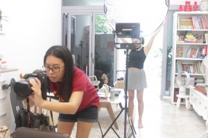
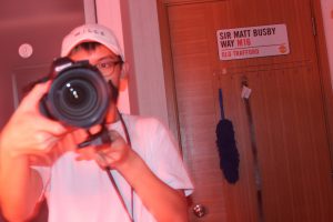
Process/setup photos
Here are some photos of our filming setups and journey (:


Video link and final reflections
Here it is! I hope that whoever you are you will give it a watch and enjoy it (:
While creating this film was challenging and tiring, both mentally and at times even physically, the satisfaction of seeing our final product has definitely made all the effort pay off.
We were also lucky as our group dynamics were really good. We rarely had conflicts or disagreements, or if we did we were always able to quickly come to a compromise. This is probably owed to the fact that we had done all our research of reference videos together so we had a common view of what we wanted our end product to be, which goes to show the importance of research before embarking on any project.

Hi everyone! Here are my compositions for project 2 (: Out of the 4 quotes, I chose to use 2 which were the following:

In this film, Benedict Cumberbatch plays Alan Turing, a scientist who was hired by the British government during World War II to decrypt German intelligence codes. Those who are fans of the gorgeous Benedict Cumberbatch (immortalised above in all his glorious beauty) will be familiar with this film. The reason I chose it was that although I am not usually one to get emotional while watching a movie, this one was so heartbreaking that it really made me cry. Not a good movie to watch if you have makeup on.
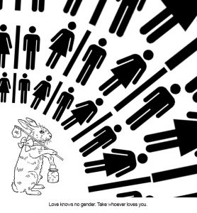
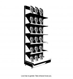
2. “Love has no gender. Take whoever loves you.”
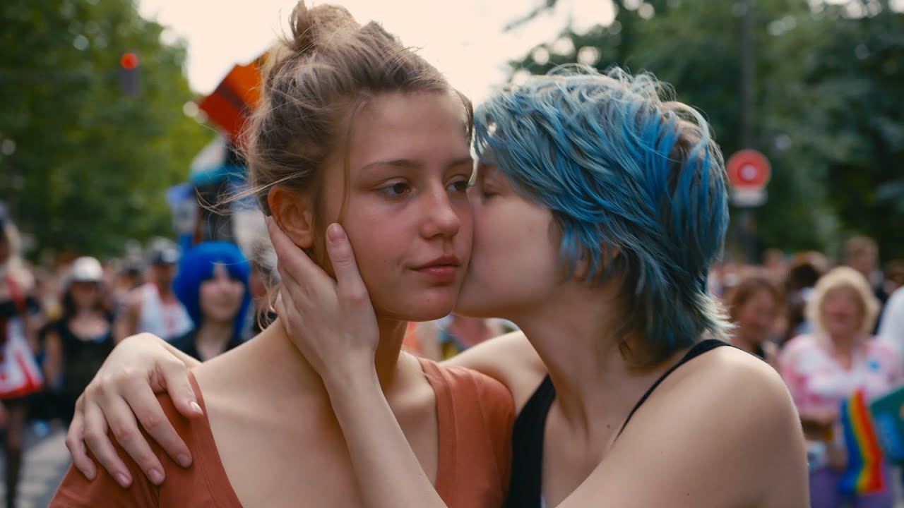
This quote comes from the film Blue is the Warmest Colour, better known by most as “that French lesbian movie”. While it is not really my type of film and I have watched much better, I felt that a lot of the quotes in the film struck a chord with me and were very meaningful and this is one of them.
I actually had a lot of fun sourcing for images to use for this project! One thing I enjoyed doing was mixing different styles of images to come up with the pieces, such as mixing vintage graphics with more contemporary modern ones. To my surprise, it sometimes did work out extremely well which I did not expect it to. It’s good to try new things.
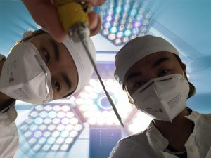
Hi guys! Here is the video for my photo story titled “Self Discovery“.
For this video, I mainly wanted to explore the idea of fear of oneself (captured in the scene where I am looking up at the surgeons defiling my body who also happen to be me) and the idea of self discovery, not just in the emotional and mental sense but in a literal physical way (entering my own body through a wound and swimming through my organs). However, at the same time I wanted to make it funny and humorous to reflect my own personality as I am not a very deep or dark person in general.
In the front of my video, I am shown in a nightclub/party scenario with looks of disdain on my face, followed by myself falling off a building. I was actually trying to emulate the above video, which is the introductory credits to an adult cartoon called Bojack Horseman which is one of my favourite shows of all time. Instead of following it exactly I decided to add my own twist to it by having different facial expressions, as well as having myself in different parts of the shot rather than just a full frontal shot all the time.

One of the more prominent scenes is the surgery scene where I am looking up at the surgeons, both of which are myself. I was inspired by the album cover of the album Seven Second Surgery by Faber Drive, which was one of my favourite albums when I was young.


My personal favourite part of the video would be the sequence in which I am swimming through the bloodstream. My inspiration was actually the cartoon, The Magic School Bus, which I had watched many years ago as a small child. In this cartoon, the school bus is able to shrink to a microscopic size while the teachers and children are still inside, allowing them to enter the human body through the nose or mouth to explore it which they do on many occasions. This idea of physical self discovery has been prominent in my mind all this time and I have always found it fascinating and simply amazing that the human body is so complex and beautiful and yet it is all contained within ourselves.
Do watch the video and I hope you found it humorous and enjoyable!

For this project, the object that I used was my iBanking token. I thought it would be an interesting item to photograph because who doesn’t love money and most importantly, spending it?
Object as icon
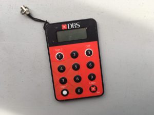
For this set, the first photo I took was of the token against a plain background, showing it as merely an inanimate object which on the surface is not very meaningful
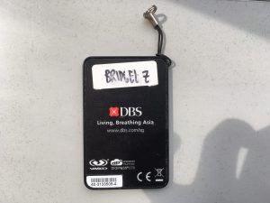
Then, I chose to take a photo of the back part of the token. The interesting thing about this token is that at the back of it there is a sticker with my name on it. It was put there by my best friend when I passed it to her for safekeeping a while ago, and she labelled it so that it would not be mixed up with her own token which looks exactly the same as this.
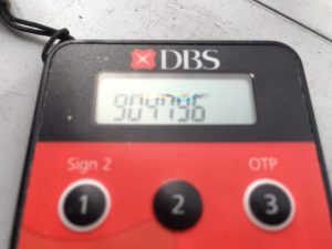
A photo of the token performing its primary function, which is to display a random set of number allowing people to access their money on their devices.
Object as signifier
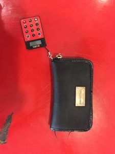
I wanted to show the token as a decorative item, in this case a keychain attached to the wallet. The token is representative of money, and using it as a decorative item represents how people tend to flaunt their money and show their wealth to their world, especially when they have a lot of it. The fact that it’s attached to a wallet also gives it a double meaning, as it contrasts the wallet which represents traditional money (cash, coins etc.) with “digitised” money which has only come about in recent years (iBanking, electronic banking etc.)
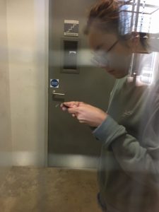
This photo was taken with help from a classmate and it shows me hiding in the stairwell behind the door, trying to use the iBanking token. I tried to convey a sense of secrecy by having it taken through the small glass panel on the door, kind of like a paparazzi taking a secret photo of somebody HAHA. The photo is to represent the secrecy that a lot of people have about their money, for instance one might try to hide it from others if they have a spending or gambling problem or are financially unstable, as some people feel there is a stigma against those who are financially disadvantaged.
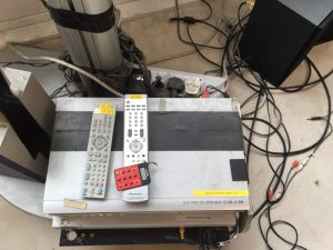
This photo is a shot of the token lying among other electronic devices which I found in the 4D room. Like the remotes and DVD player, the token is also an electronic device and I thought it would be interesting to juxtapose them together since in a way, the token is also like the “remote control” of one’s money.