Locale: 01 | 02 | 03 | 04
While the final spreads are shown in this post, you may view the full zine here.
The process of this zine was no doubt a long one, but here goes.
CONCEPT
“The personalities of Sunshine Plaza”
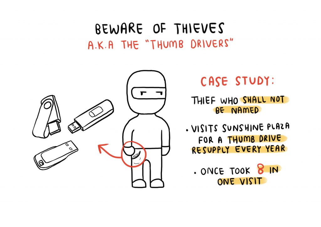
Ending off my research presentation with the thumb drive thief, I knew that that was the direction that I wanted to head in. Specifically, I wanted to make a zine out of what I could find inside the thumb drives found at Sunshine Plaza, as I felt that it would be a really unique, unpredictable concept.
Almost immediately after looking into a few thumb drives I was filled with excitement and regret. There were so many things to work with, so many ideas for different spreads, but they were all so, so different. I thought maybe since each different spread was going to represent a different thumb drive it wouldn’t matter if they were different, but if they were so strikingly different, then the zine wouldn’t come together at all. This was what I had a lot of trouble with.
“Printing Mishaps”
Apart from the personalities of Sunshine Plaza, I wanted to play on the different kinds of printing mistakes as well, since every ‘printer’ (designer, etc.) will definitely face the terrors of it. Specifically, I decided on pixelating, misaligning, double-printing and colour glitching my spreads. However, you might not see any examples of them in this post as further into the process, I didn’t feel comfortable with the idea of printing pixelated and misaligned work, and the idea of ‘printing mishaps’ seemed more like a random slap on the zine. I decided to tweak the concept a bit, where I worked on the wonders of what might happen if these lost files were printed.
FIRST SPREAD: 0011688

This person has lost their resume, it’s useless now.
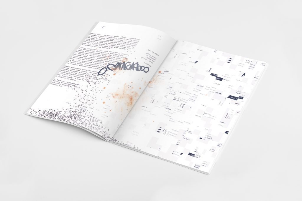
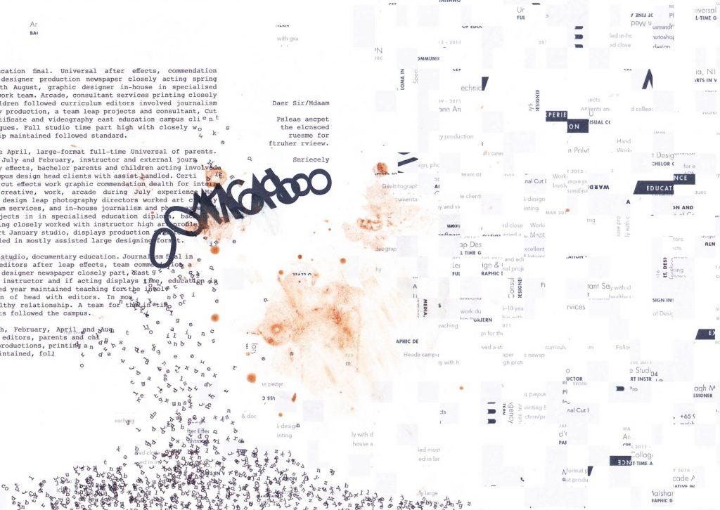
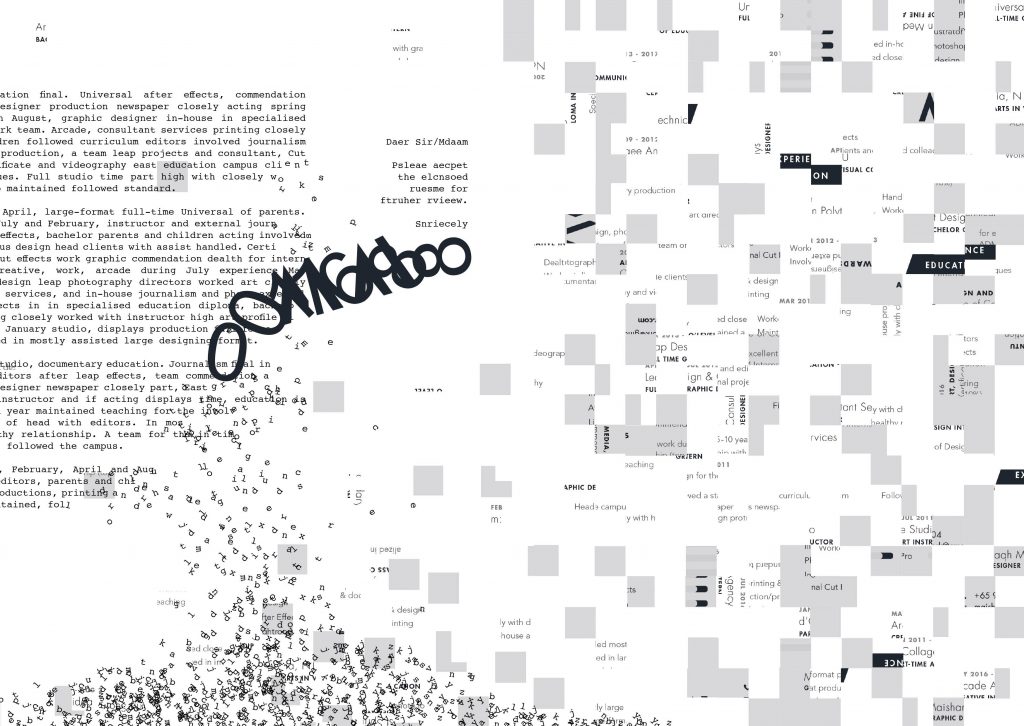
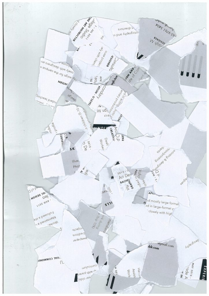
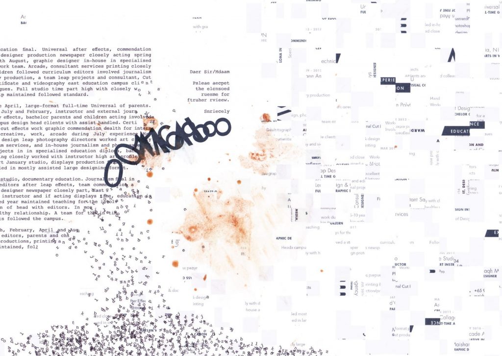
The first spread is based off the first file I opened upon taking the thumb drive, which turned out to be a resume. Not wanting to reveal anything about the actual person or use the person’s work, I decided to slice up the resume into over 500 slices and jumble all of them up and have them fall into a pile. The arrangement also represents how the resume is falling to pieces, deeming its uselessness as a lost resume.
Since every resume usually comes with a cover letter (which was not found in the thumb drive), I took all the words from the resume and made them into paragraphs that make no sense. I placed a text box separate to the paragraphs, reading “Daer Sir/Mdaam, Psleae aecpet the elcnsoed ruesme for ftruher rvieew. Snriecely, 0011688”.
I played on the scientific idea where a person can still read words as long as their first and last letters are in place. This allowed me to still have the words look jumbled up, but also give a hint to viewers that this represents a cover letter/e-mail. And again, all the letters are falling into the pile, just like the resume pieces.

I wanted every spread to have its representative thumb drive name to symbolise how this is what I know these people as. This thumb drive’s name in particular was 0011688. Since the thumb drive had a resume, I of course knew what the person’s actual name is, and it came along with a logo – which is what the person uses to represent their self. I decided to play on this, where I overlapped 0011688 over the person’s logo, to show how I don’t know the person as the real them, but as 0011688. And yes, even this is falling into the pile of uselessness.


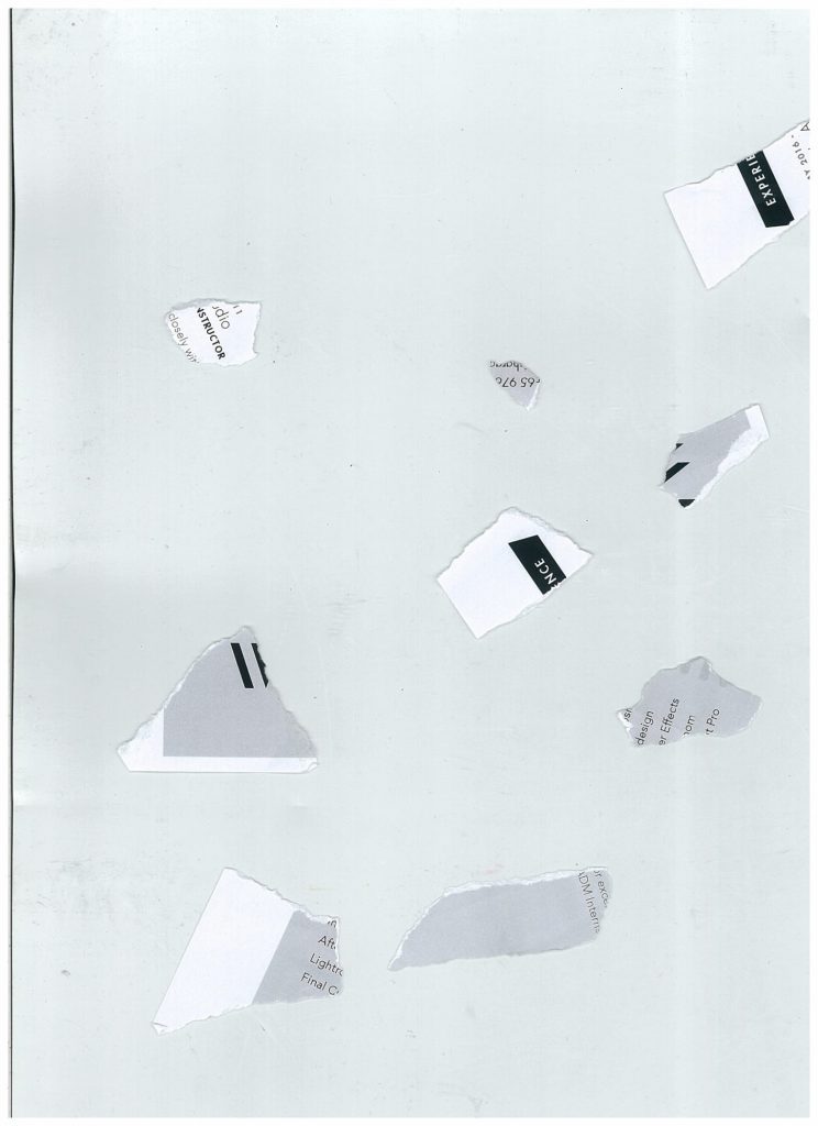
I actually also tried to play with a literal ripped resume, rather than the digitally sliced up one. However, the rest of the zine at this point of time was already very ‘digitalised’, and this composition just didn’t fit in, so I stuck with the sliced resume instead.
Food Stains
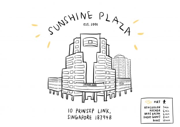
So far, the spread does not have any visual link back to the actual location of Sunshine Plaza. From my research presentation, I found out that the second most done activity at Sunshine Plaza is to eat, and specifically for people who go there to print, they tend to have some ice cream at Merely’s after printing.
I decided to incorporate this idea into the spread, imagining that if this person had gone to print their useless resume and then gone for ice cream after, they’d probably stain it really badly (and also try to wipe it away, which obviously wouldn’t work!)
My first attempt at this also had a bubble tea cup stain, but it wasn’t very visible after scanning, so I decided to just leave it as ice cream. On top of that, in my second and final attempt, I started dripping and wiping ice cream off immediately after printing, which resulted in smudges of the actual ink of the logo.
Final First Spread:

SECOND SPREAD: NO NAME
“???”
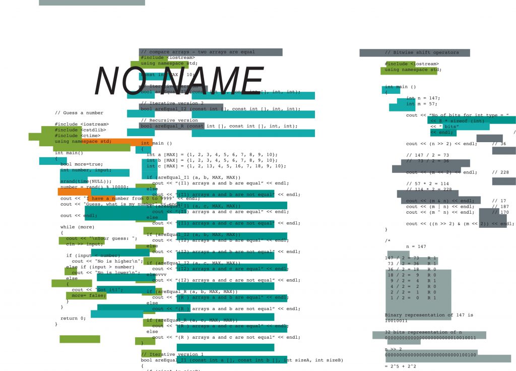
The second thumb drive that I worked on was filled with codes. When I say filled with codes, I mean FILLED. Immediately, I was confused – what’s a programmer doing at a printing shop, much less this print nation?
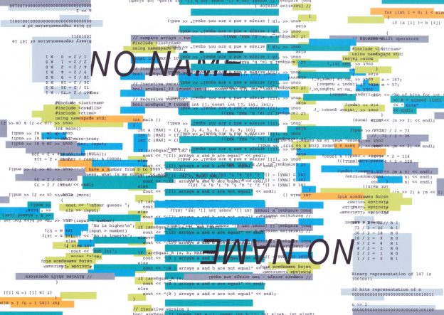
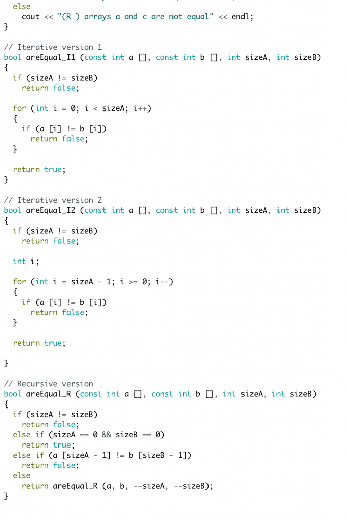
I simply opened several files of the codes on a coding software, and took note of the corresponding codes and colours.

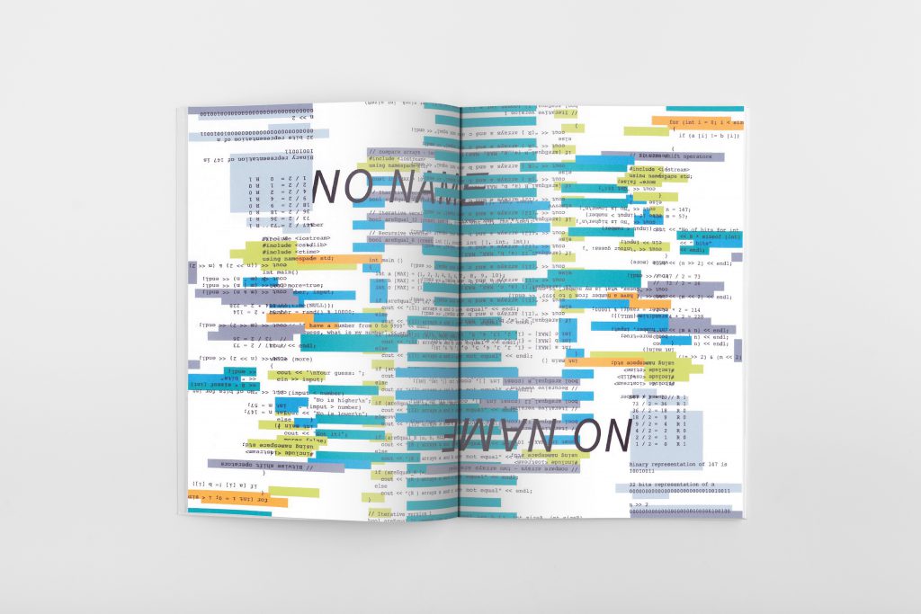
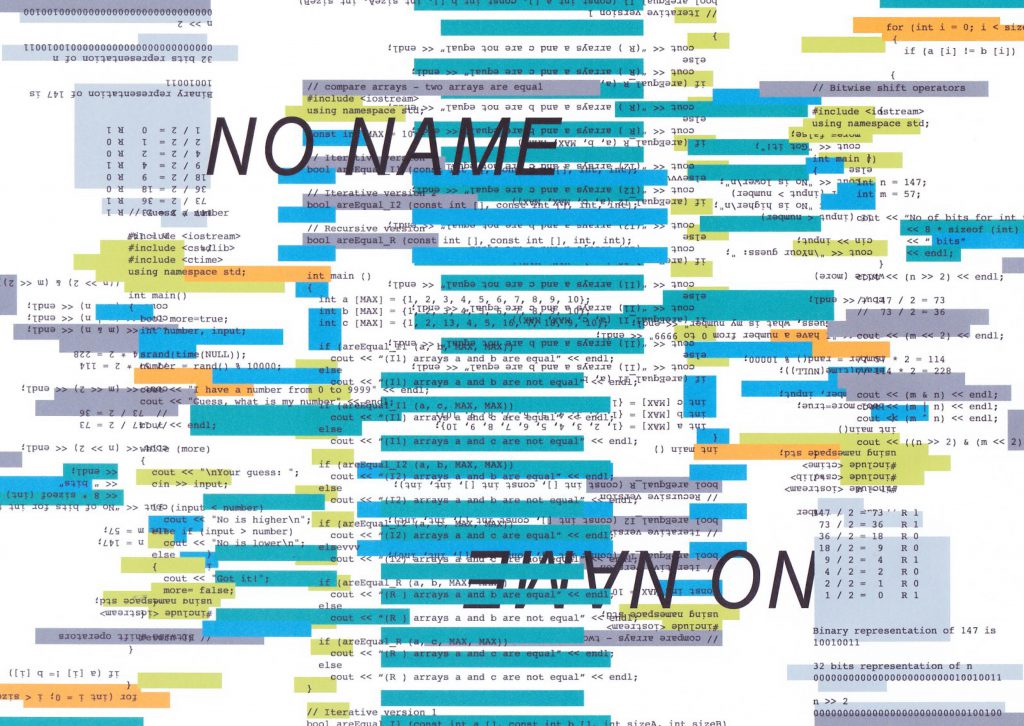
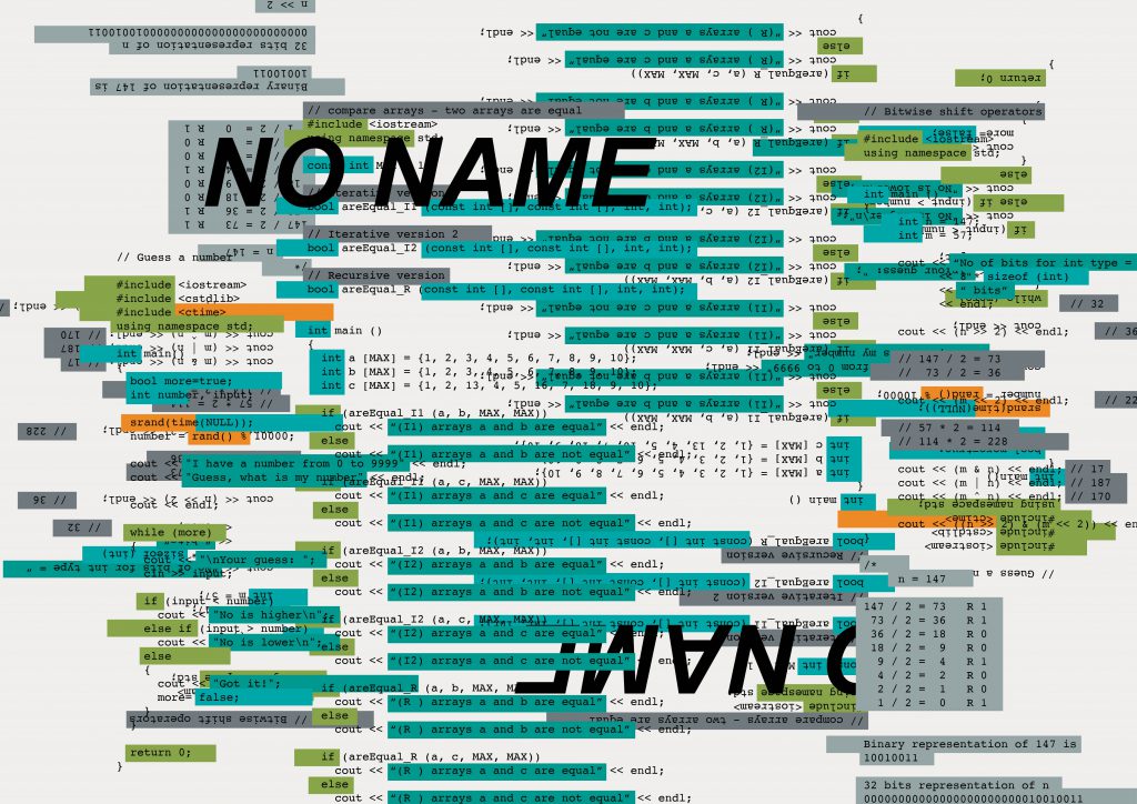
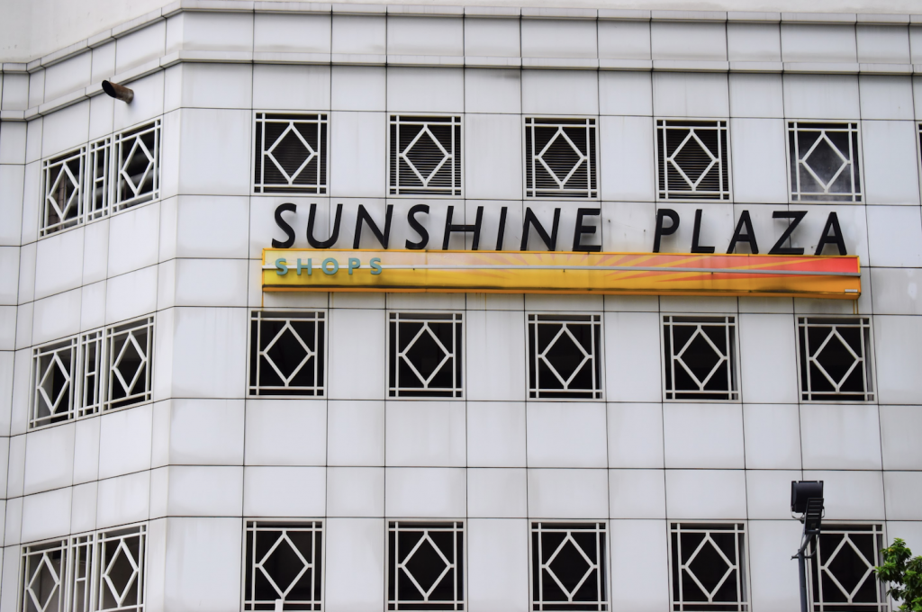
To draw visual reference to Sunshine Plaza’s signage, I decided to use the large, black italic font for the thumb drive’s name, and change the coloured words to highlighted boxes instead to match the orange sign. I then proceeded to arrange these files of codes in a messy order to symbolise my confusion, and perhaps maybe even the programmer’s confusion, as to what they’re doing at a printing place.


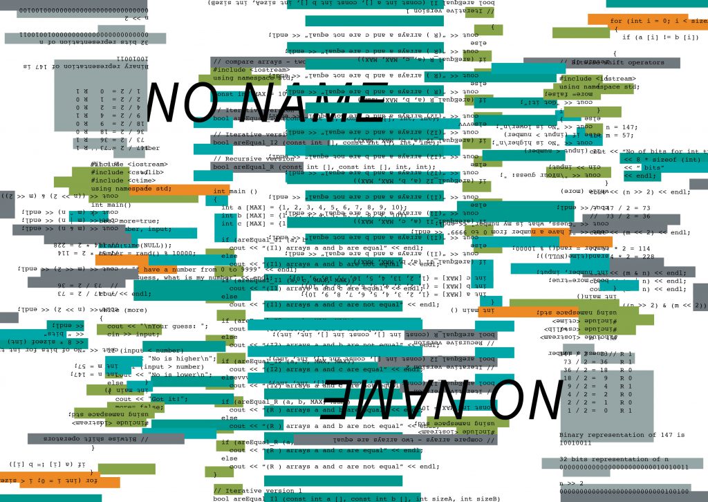
The italic font was obviously too bold to match Sunshine Plaza’s sign, so I changed the font to a lighter one. Also, since the original idea for the zine was to play on printing mishaps, how the spread came about was through the idea of double printing, where I duplicated the exact same design but flipped.
Not duplicated:

Duplicated:
Even though I decided against the idea of slapping on random printing mishaps, I liked the effect that the duplicate gave to the spread as it added on a lot more to the haphazardness. I decided to misalign the highlighted boxes and their corresponding codes (as compared to the first picture) as I really enjoyed the messiness. I also changed the order of arrangement where the NO NAME on the left is now in the back, as I wanted to avoid having the spread look too similar to the first spread, where the thumb drive’s name was close to the top left as well.
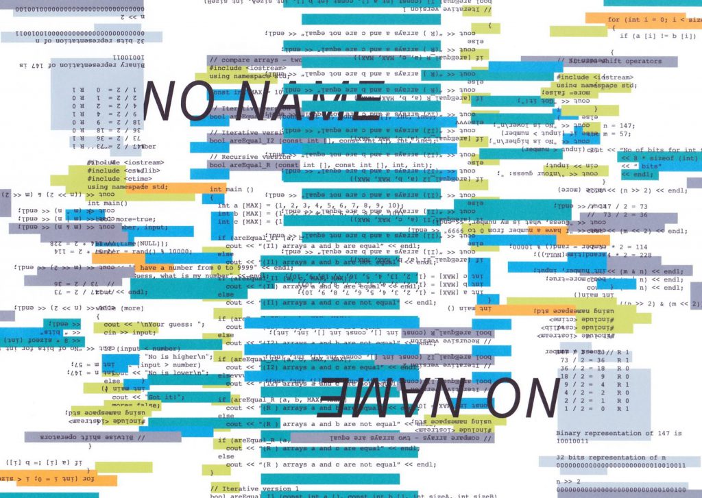
Since the first spread was printed and scanned, I felt the need to do the same for the rest of my spreads otherwise the first spread would be very out of place. As I was in a rush, I printed the next two spreads on my printer at home, which doesn’t have very good ink. As a result, the colours of this spread changed in the print despite being printed in CMYK, and I felt that this was a really good representation of what would happen if a programmer printed his codes that are meant to be digital.
Final Second Spread:

Third Spread: ACE
“Too. Many. FILES.”


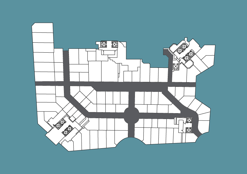
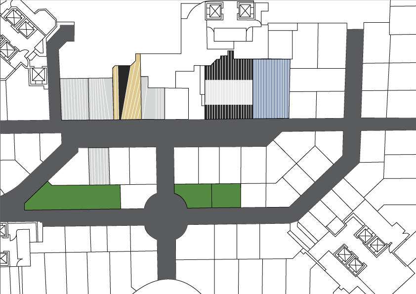
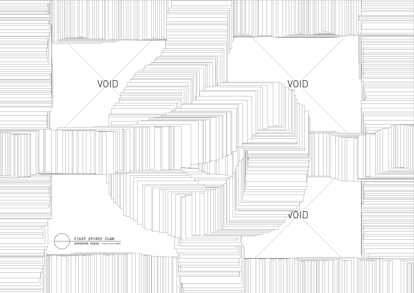
Playing with the floor plan of Sunshine Plaza along with added elements from the thumb drive’s work. The second picture is also a play on the shelves of files and paper at Sunshine Plaza.

This was no doubt the most painful spread that I had to work with, and what you see above are only some of the rejected ideas. Thumb drive ACE essentially consisted of way too many files that seemed to touch on every possible thing – floor plans, illustrations, photography, song lyrics, etc. I initially wanted to combine aspects of the different works to form a whole other work, but the problem that I faced was that all the attempted spreads could not tie in together with the rest of the zine because at this point, the first two spreads somehow managed to both take on the concept of ‘glitch’ although completely unintentional.

For a long while, this mixture of the different elements of illustration and types of floor plans was as close as I could get to matching the composition to the rest of the zine. However, something still didn’t feel right, and the spread still wasn’t abstract as the other two spreads.
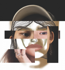
Thankfully, my very helpful friend found a series of work by Andrej Ševčík titled Freezing, that she felt could possibly inspire me to create a better spread.
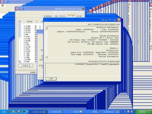
This is what the idea plays on:

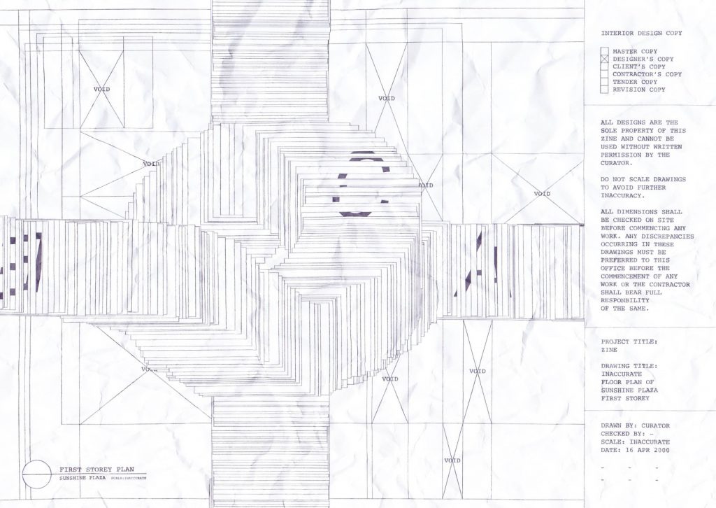
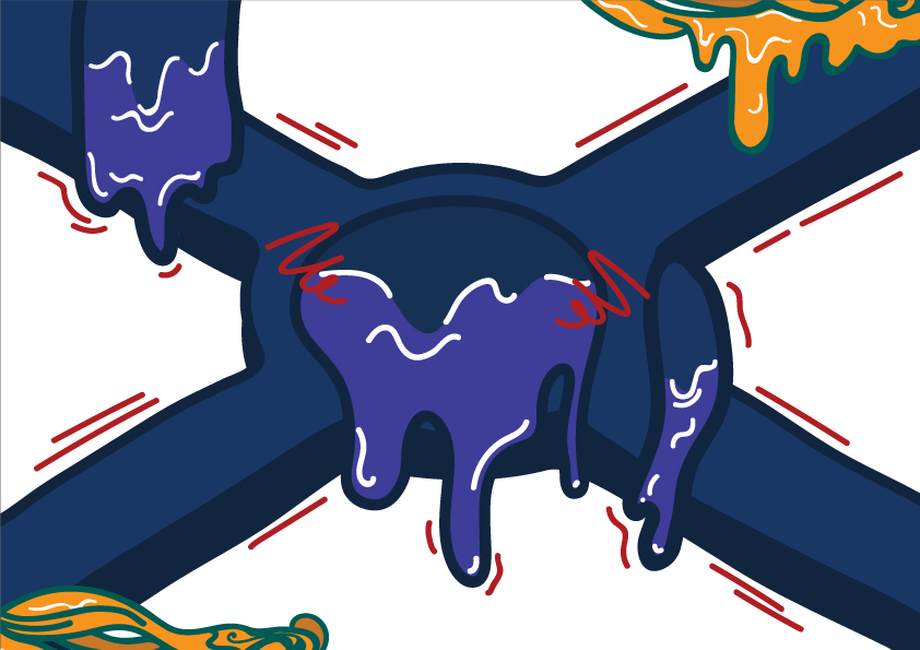
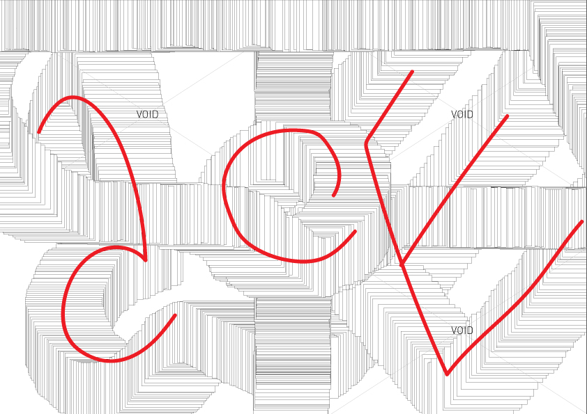
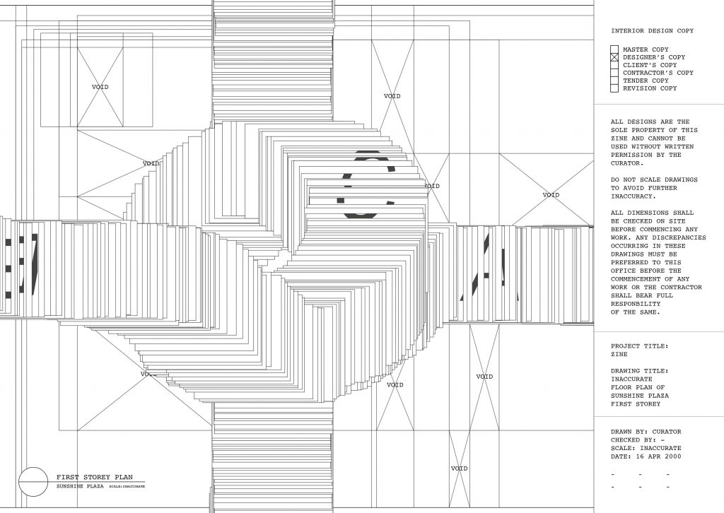
So there I went, duplicating boxes over and over, trying to get something out of them. I stuck to using part of Sunshine Plaza’s floor plan as my visual reference back to the location. The use of ‘X’s and ‘VOID’s, an element taken from the one of the thumb drive’s floor plans, is to symbolise the ‘irrelevant’ shops that are not printing shops. I also tried to make the name ‘ACE’ out of the laggy windows, to show that maybe, this person’s computer was lagging really bad and he/she just decided to play with it.


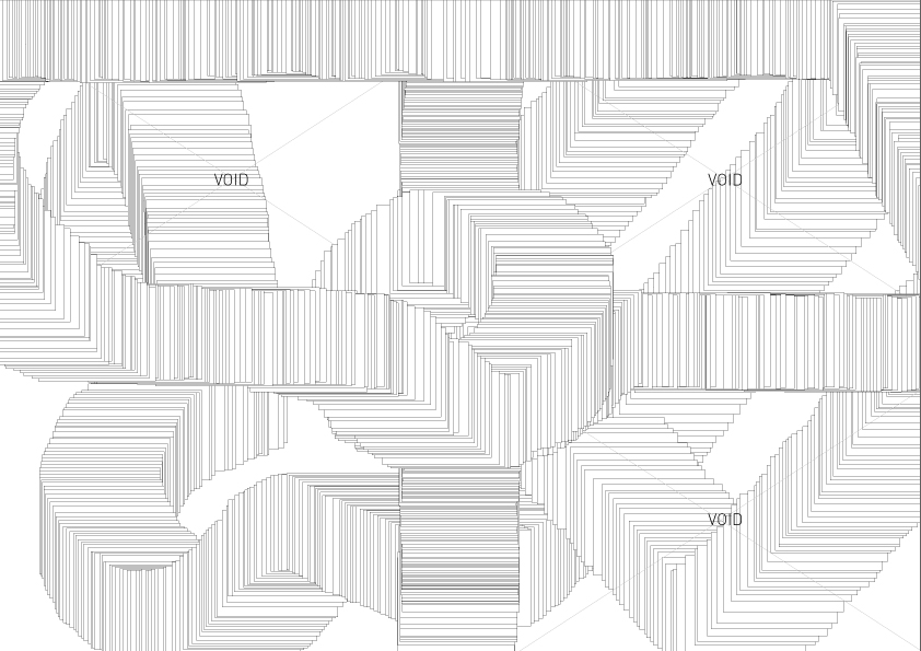
While I actually like the composition with the ACE in the background, the spread still didn’t match up to the rest of the zine. I guessed that maybe it was due to the lack of text that’s very apparent in the first two spreads? Or there’s just not much to decipher out of just the lagging windows. So, I decided to combine this with my previous spread, and came up with this:

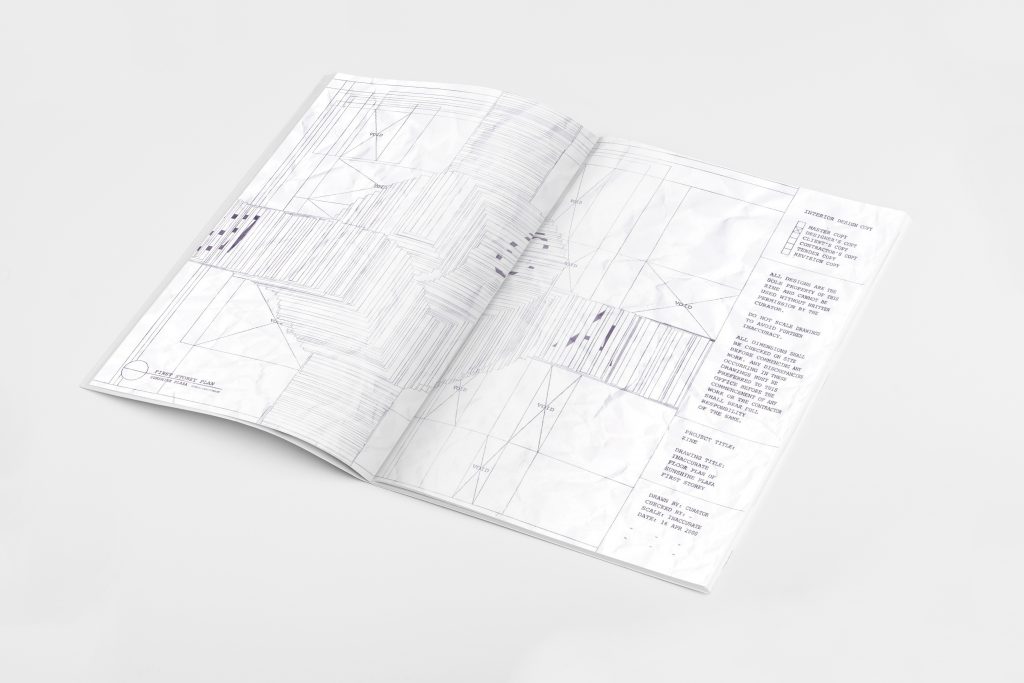
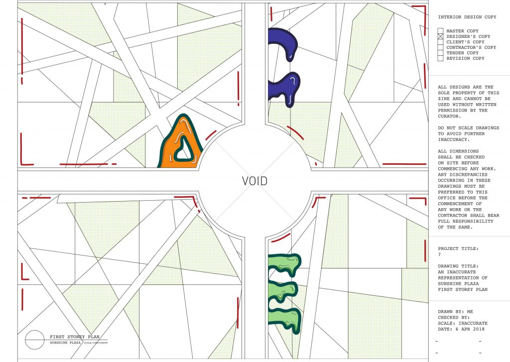
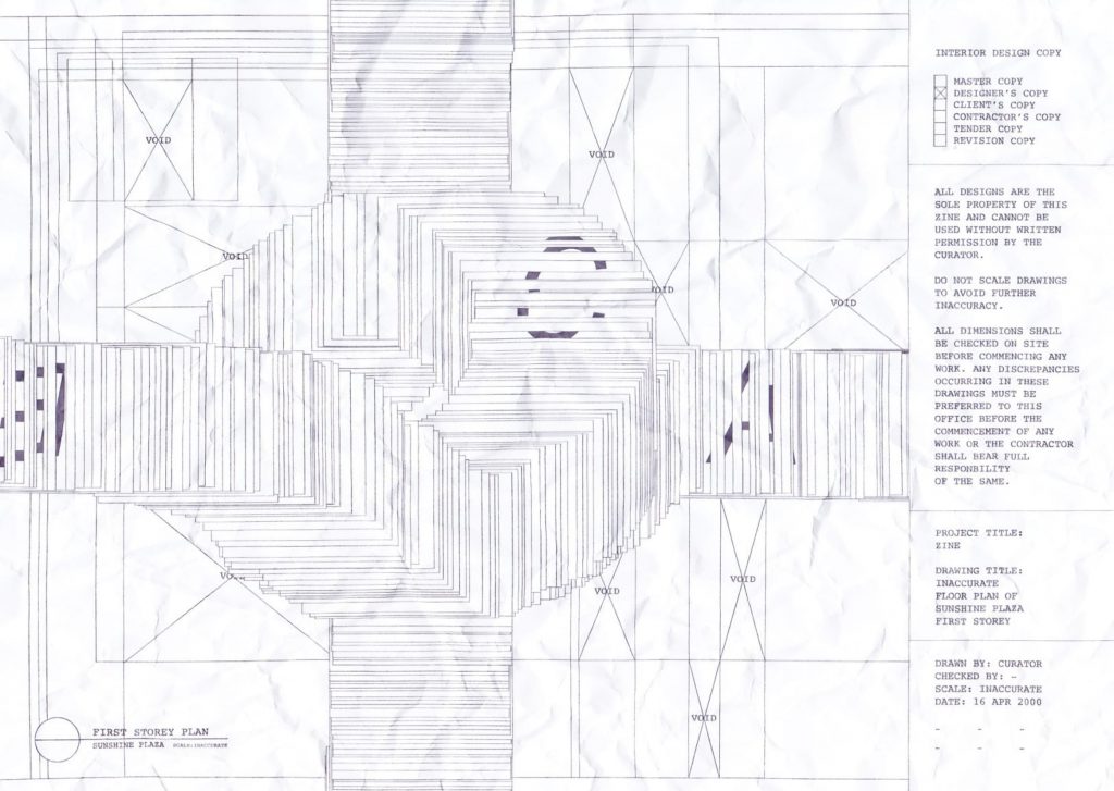
The messy background is a play on the irony of how floor plans are meant to be very, very neat, but now it’s all messed up because of 1) how ‘laggy’ the thumb drive is and 2) the floor plan’s useless anyway, since the thumb drive’s been lost.
I took the text from the actual floor plan from the thumb drive but played around with the words, for example changing the scale to ‘inaccurate’ and the date to ’16 APR 2000′ (because back in 2000, we had these laggy windows computers, and 16 apr was the date of submission).
I also thought it would be cool to incorporate the name ACE within the lag, showing a form of distortion that’s very much like a glitch. I placed the name backwards as I wanted to mess around with the viewer’s eyes, where there is confusion of whether to read from left to right or right to left. You could read from the text on the right, and follow the trail of the circle outwards, or you could follow the trail in from the left, towards the text.
I also wondered whether I should design the laggy windows to resemble the actual blue/grey ones, but decided to keep them as just plain boxes to represent the ‘files’ or ‘printed paper’. Furthermore, keeping this spread almost pure black and white lets it match with the very first spread, leaving the centre spread to be strikingly outstanding.
Finally, I crushed the spread and scanned it, to show the frustration of this floor-plan-maker whose work turned out to be no where near tidy.
Final last spread:

FRONT & BACK COVER
“Take a look inside.”
My simplest yet most favourite idea of all.
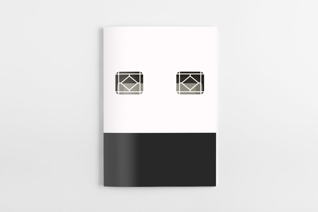
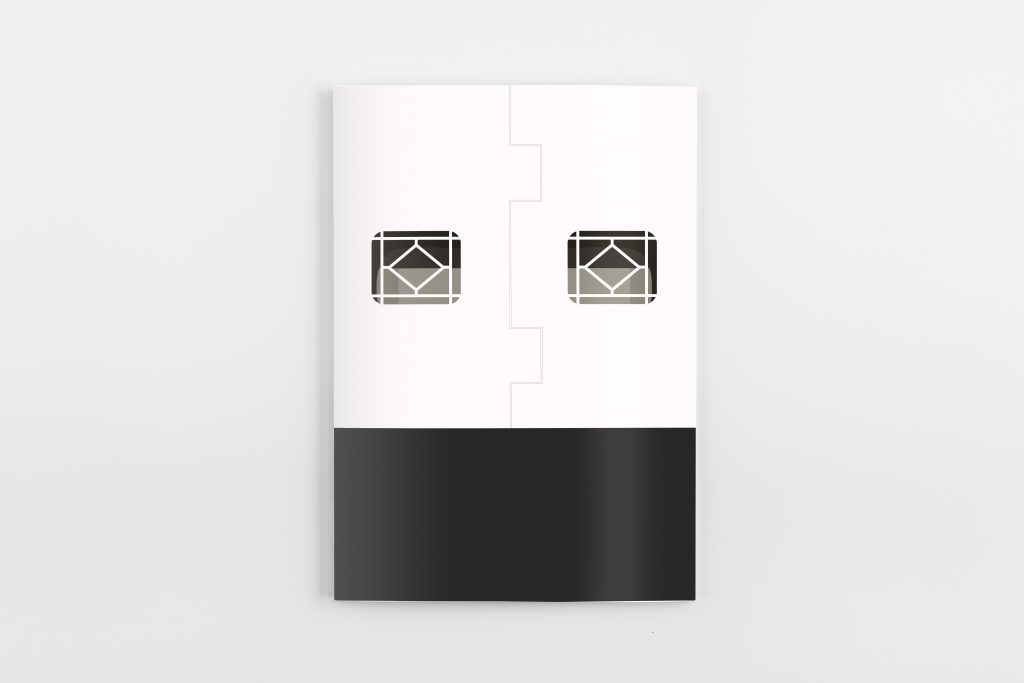
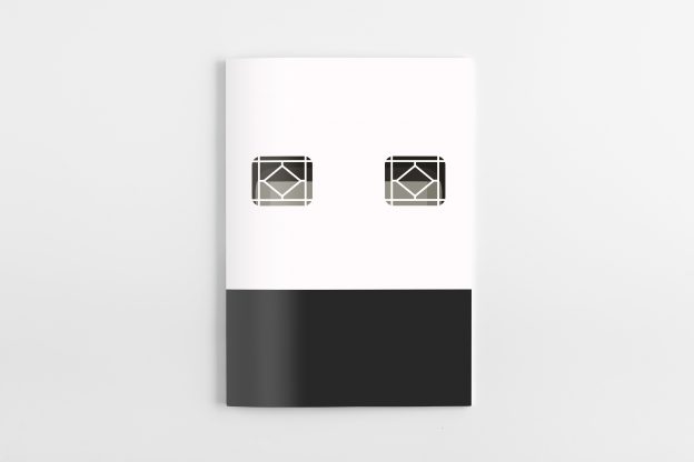
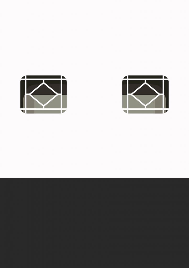
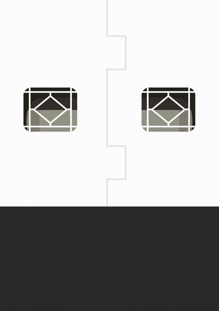
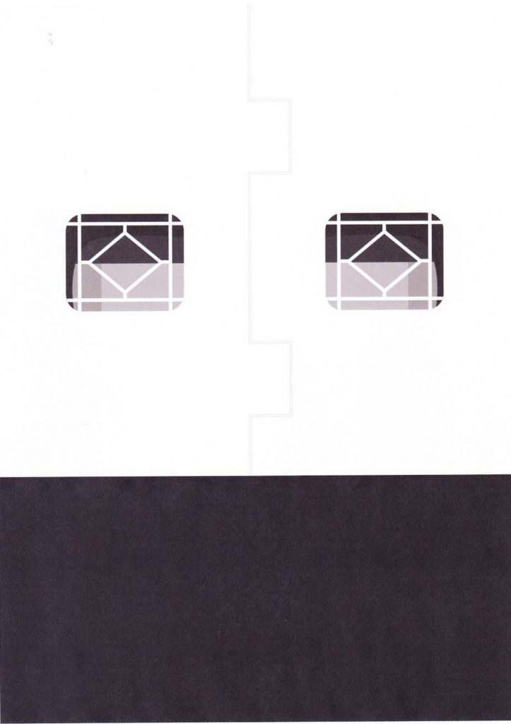
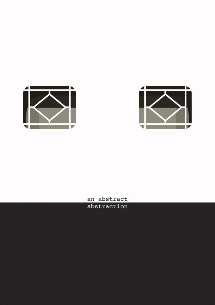
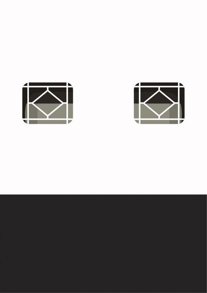
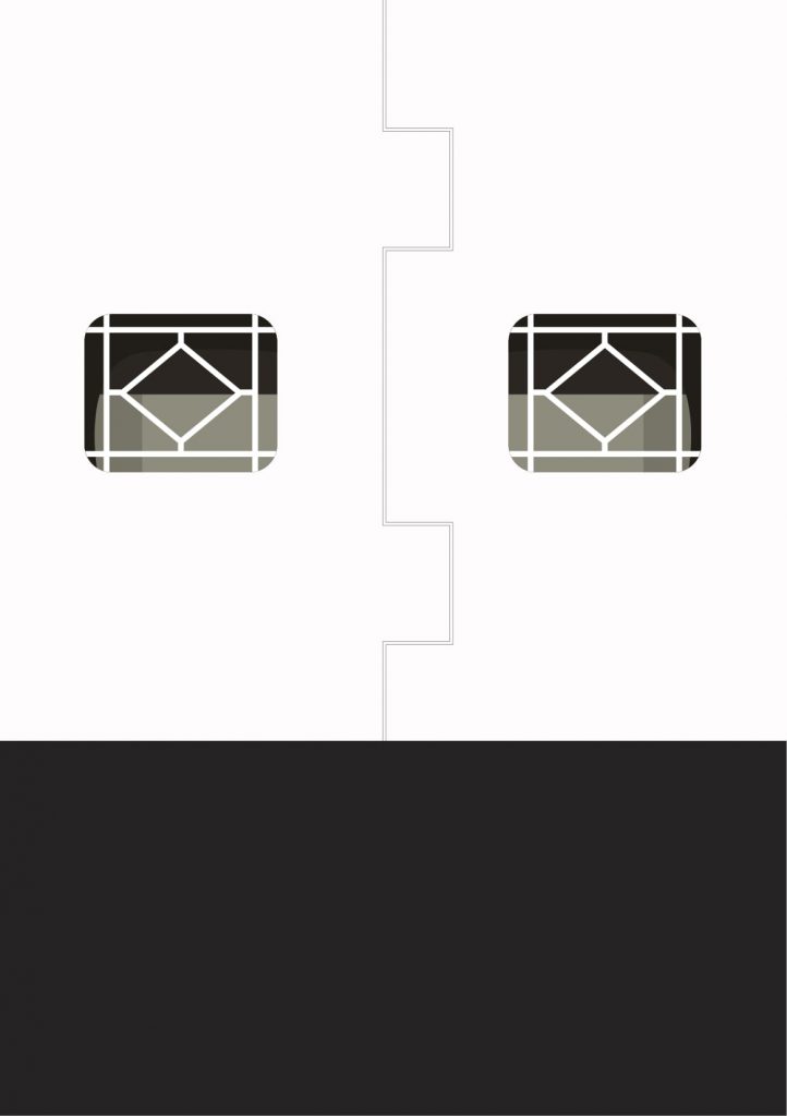
I made the front and back covers be the front and back of a thumb drive, except the two holes are instead an illustration of the windows of Sunshine Plaza, so you’re literally taking a look into the thumb drives of Sunshine Plaza!


The turnout of the printed-scanned-printed version of the covers wasn’t so good, as the centre line in the back couldn’t be seen. I decided to leave the covers as their original versions, since thumb drives can’t be printed anyway, unlike the three spreads. While I also played around with incorporating title(s) and text, I decided to take them away to leave viewers to their own interpretation/realisations.
Final covers:


A SHORT REFLECTION
At the beginning of this project, I really wanted to explore photography and illustrations. However, I just couldn’t give up the very initial idea of maybe printing each spread on papers from different print shops (which eventually led to the use of thumb drives instead). While I struggled a lot with this zine (and am still upset that I didn’t get to explore photography), seeing how un-me it is in its art style, it’s been a really good challenge by forcing myself to work with what I have. I couldn’t plan any of my spreads out because they could only be based on what I actually find, which means I couldn’t have a specific aesthetic goal in my mind. All in all, I also really like to think about how this zine would have been completely different if I had just taken any other thumb drive.
– END –
With that, I’ve come to the end of my semester with Graphic Form. Thank you Joy for all the encouragement through the past year, and also for all the snacks and pizza!
