The research below will explore various witty typography techniques, some of which blew my mind.
digital illustration

Dummy text is lettered by the mustard and ketchup sauce. The letters are arranged in neat, diagonal rows. There are no angular lines, every corner and turn travels on a curve that weaves and overlaps with one another. This piece is definitely something I want to own on my wall. Aesthetics 11/10.

A really imaginative piece that has a lot of potential for typography. The food suspended in the air form an S. The stool spells OK. The cord of the lamp forms an M.
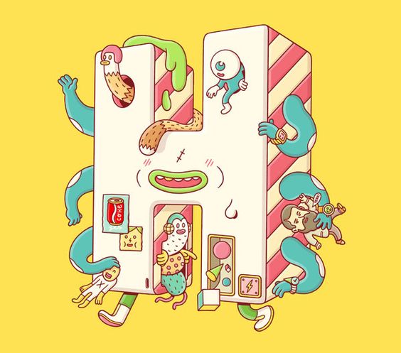
Personifying the letter H as a cute monster. There are a lot of imaginary elements in this piece, such as having 6 arms hold onto toys, chicken and eyeball coming out of the eye sockets, etc.
found objects / raw material / handmade

A typeface created using minced meat packed in styrofoam. Possible messages that arise from using this font to create typography could be mass production culture, animal cruelty, slaughter house conditions, etc.


The words appear to be made out of nylon threads. Thick wads of it is bent and moulded to form the letters. Only one colour is used for the typography – a rather striking bluish purple – against a black and white environment. This colour pop technique makes the typography stand out from the background. Aesthetic 10/10.

The series conveys the message about transitioning from student to professional identities, through the key words: fear, opportunity, pressure, and excitement. Colourful clay models were used to create imagery and type. I like the overall aesthetic, and the hands on aspect of it.
2D perspective

This work reminds me of a crossword puzzle. The letter forms fit uniformly into a square, and are aligned vertically and horizontally with each other on an invisible grid. It’s almost like plotting pixels to form an image. The work only uses 2 colours – black as the positive and red as the negative.

This typeface forms letters on fences using duct tape. The fence acts as a grid for the letters to fall into place. I’ve always thought that the quick brown fox jumped over the fence HAHA. I think there’s a lot of potential for the typography on the fence to embody a powerful message. Possible themes could be trespassing, safety, freedom, etc.

The Chinese characters are made up of minimalist lines. I’m really impressed by how they form the image of a floor plan or house of some sort, which is related to the meaning behind the words. Level of genius 11/10.
3D perspective

Inspired by IKEA’s instruction manual, rectilinear volumes are fitted together to form the words. Some corners are rounded while others are more angular. Overall illustration and composition is quite simple and low-key minimalist.

The words “in the shadows deep in my mind” are formed by many cubes, some bigger some smaller. But cubes that are a part of the same word are always uniform in size. The letters are arranged in a zig zag manner, mirroring the perspective of its adjacent neighbour. This creates a sort of mine craft maze and optical illusion for the viewer. Random cubes of different sizes also float amongst the typography, which I interpret as other grey matter in the artist’s mind. 3 different monotone colours – white, grey and black – are used to differentiate highlights, mid tones and shadows. I think the overall execution of the work is quite apt to the theme and meaning behind the words.

The Chinese characters are made up of multiple repeated circles that create this 3D, see-through effect. The colours used blended well together to achieve a sort of therapeutic mood. Aesthetics 11/10.
Positive + negative space

The typography above is created by the artist’s designed typeface called “Echo and Smoke” by engraving wood. The letter forms exist in the negative spaces, which I thought was quite interesting.