I view this book as the gateway into the world of User Experience and design. It gives us – budding designers a glimpse of the problems which consumers face when dealing with day to day interactions. Be it physical objects and apparatus, or using software or complex hardware, we as designers have to ensure that what we create has to be as intuitive and as easy to use, much like how we would use it.
This reading encapsulates human centered design as it covers the main components which make up a good user experience. A user’s experience can range from the sense of touch, sight, smell and sound, which would be covered with more depth along the reading.
“Good design is actually a lot harder to notice than poor design, in part because good designs fit our needs so well that the design is invisible, serving us without drawing attention to itself. Bad design, on the other hand, screams out its inadequacies, making itself very noticeable.”
We begin with breaking down the elements which make a good design and user experience.
Firstly, affordance – it refers to the relationship between a physical
object and a person. Affordance is the immediate response an individual receives when they first interact with an object. The user may intuitively be able to use the object based on interactions with similar objects in the past. These can be as simple as a bottle cap, a door handle or a light switch. However, as the design of these simple mechanisms can change, and when that happens, it disrupts any form of perception the user may have of the product.
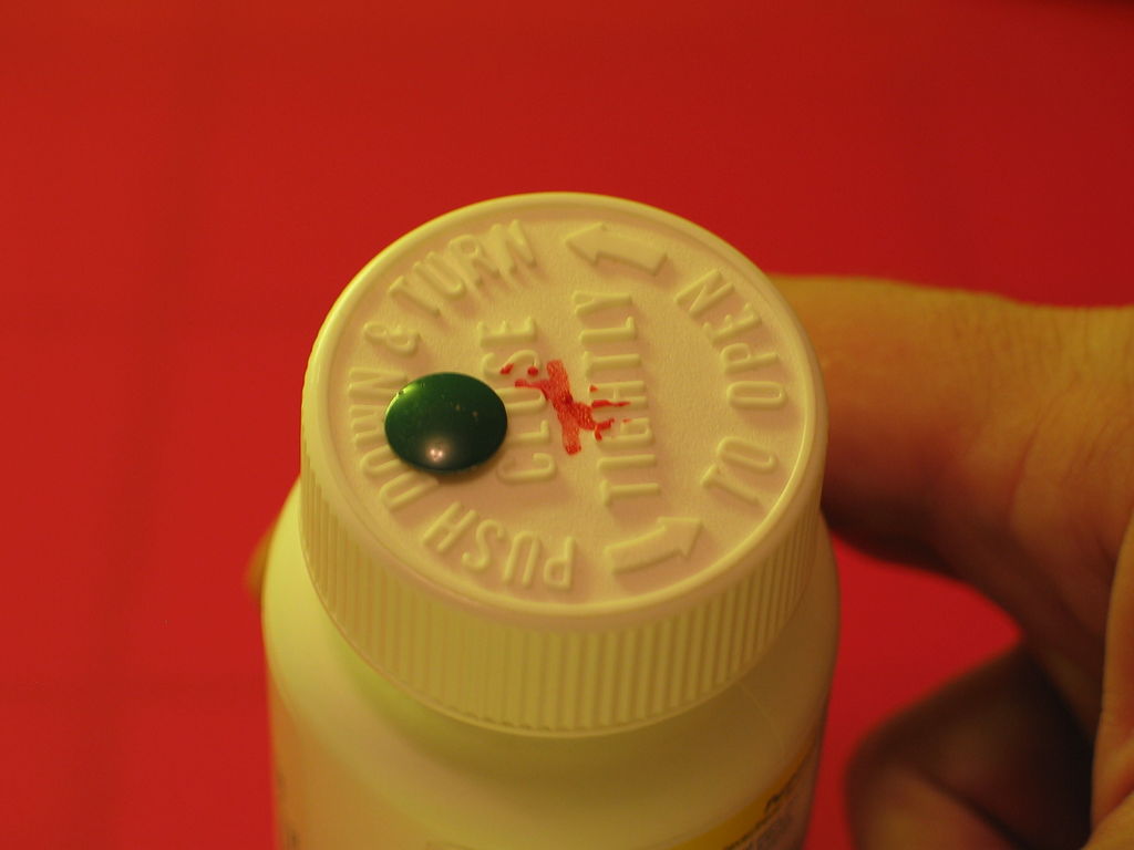
A good example of this disruption would be bottle caps used on containers which store medication. These caps require the user to push down on the lid before applying the twisting motion to open the container. This disruption is especially useful when it comes to preventing children and toddlers from accessing the contents of the container. However, an additional signifier would be required to inform the users of the additional feature which this cap contains.
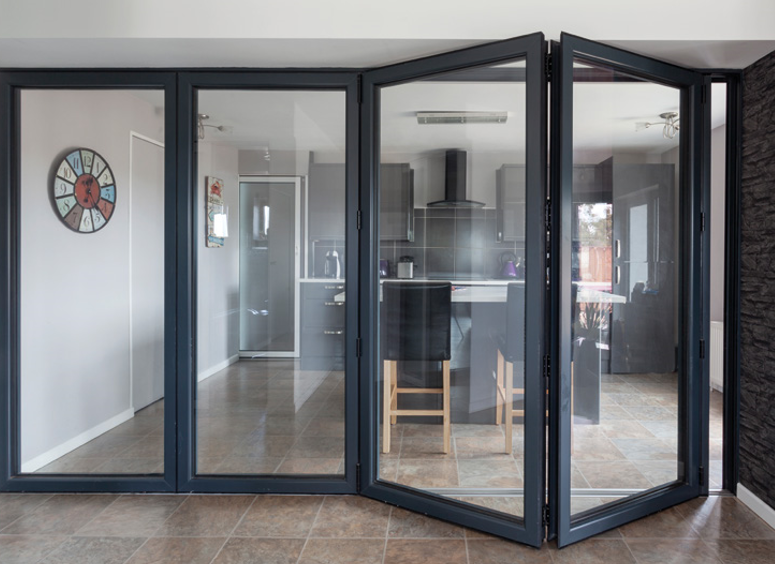
Other example would be sliding or folding doors. These can often disrupt the user as they would be unsure what direction would be needed to operate the door. This is especially confusing if the hinges of the door is not visible, thus the user would not be able to deduce the direction needed to open the door. In many of these cases, when there is a deviation from conventional design, and additional signifier would be required.
Signifiers – they are there to fill up the gaps where affordances may lack. They provide additional information to the user on how to operate a product or mechanism. This would often come in the form of texts or images, targeting the confusion users may face. Signifiers can also be incorporated into the design by considering the size or colour of different segments of the object.
For example, colours can be used to draw attention to a specific part of an object. Whether or not it is to deter users from accessing or interacting with that area, or it could encourage users to interact with it depends on the choice of colour and it would also be subjective to the object.
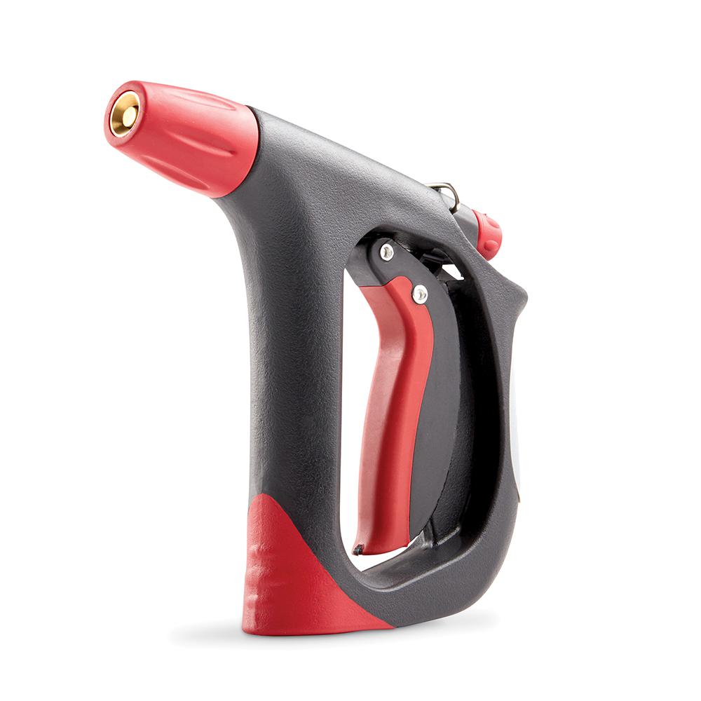
This water hose is an example of colours and shapes being used as signifiers for the usability of an object. The red would highlight the importance of that handle, while the cut out of the device would signify that it could accommodate a hand.
Mapping & feedback are especially important when it comes to designing complex systems such as control consoles or a website. Mapping refers to the linking of a control or adjustment feature to an object. This could be light switches or the buttons on a steering wheel – whereby, due to the various number of potential outcomes which could happen in an event of pushing these buttons, it is important that the user is able to identify the result of pushing any of these buttons.
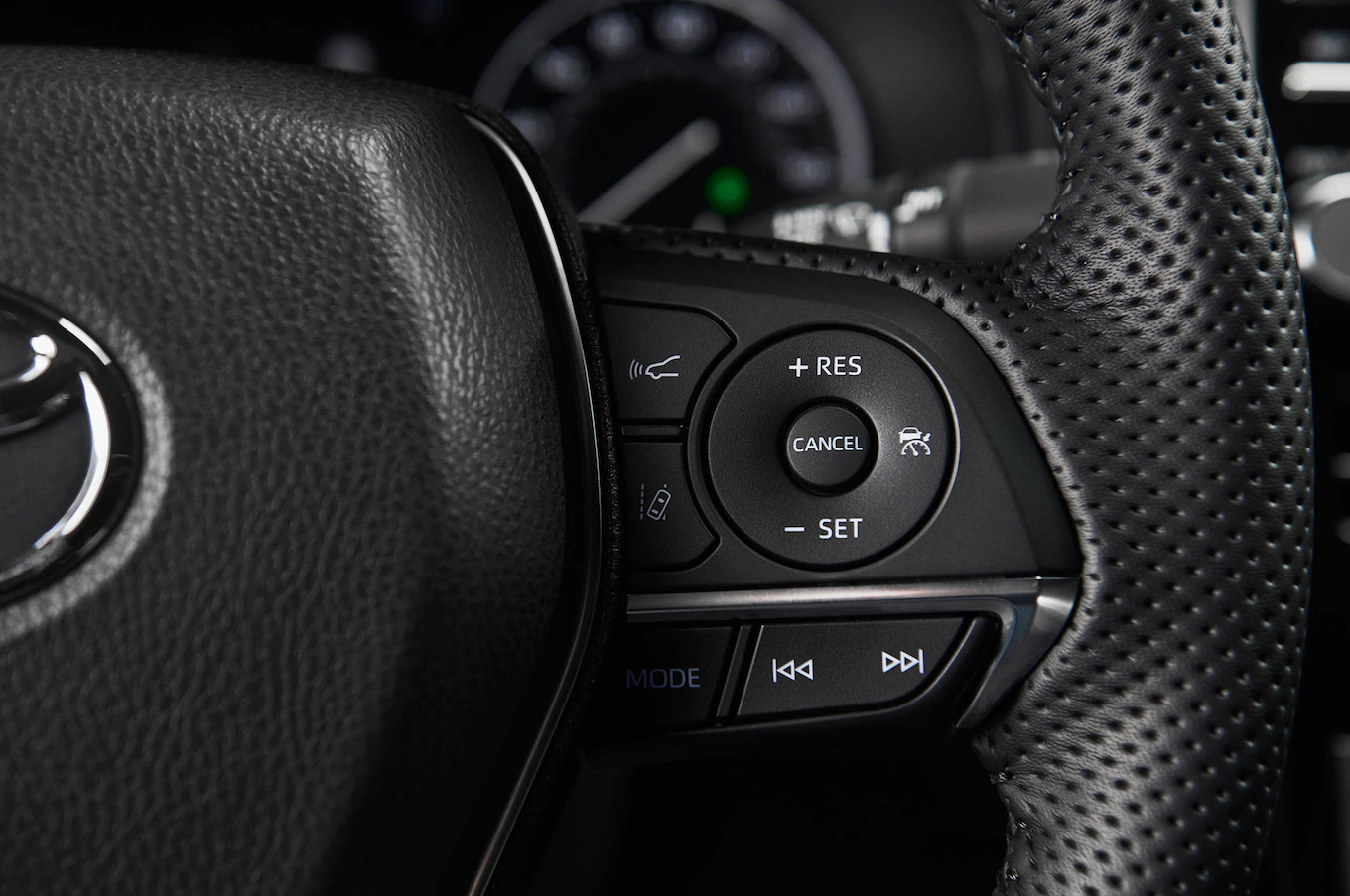
Feedback is often overlooked in designing these systems as it signifies to the user that the interaction is successful. It completes the experience for the user and leaves them with a peace of mind that the task is complete. More often than not, when we do not receive any feedback from an interaction, it is common for us to continue interacting with the object till some form of acknowledgement can be seen. Feedback can be in the form of sounds such as a beep. Sight, which could include information displayed on screen or a small LED lighting up. The sense of touch can also be used through vibrations. Companies are starting to better utilise the vibration motors in phones introducing the feature of haptic feedback for interactions such as, typing on the keyboard or sending a text message.
Overall, I find myself becoming more critical and analytical to my surroundings. These skills can be transferable from the physical world to digital when it comes to designing an interactive site or application as these minute details would further enhance the experience of the user when they interact with the page. I must understand that when I design a system, I must ensure that despite it being usable to me, it may not hold true for others as functionality and affordance can differ from people.