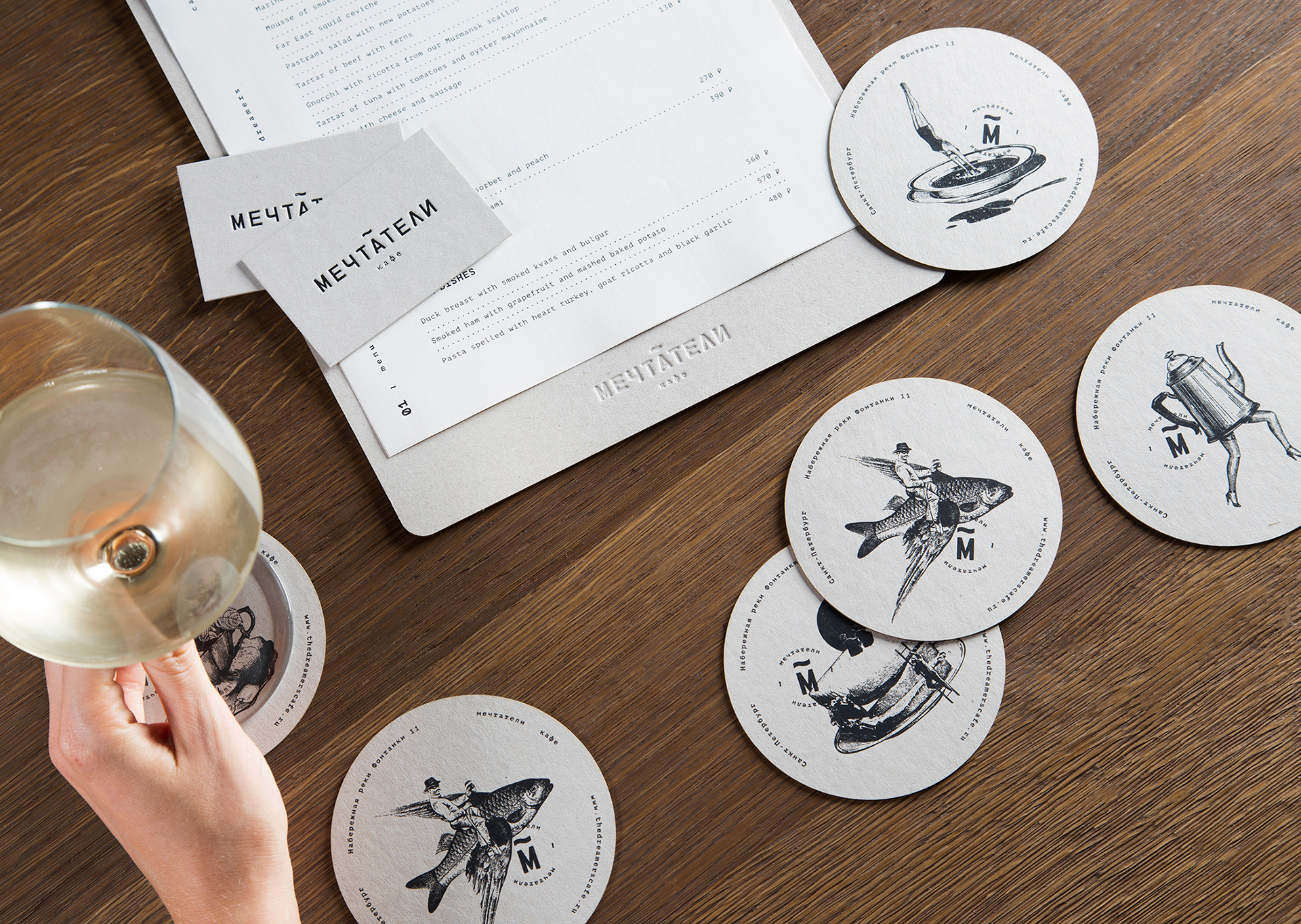
Overall, I was pleased with the outcome of my zine! It was definitely a great learning experience seeing how paper can really affect the mood of the entire zine. Having only 8 pages to work with, which is essentially 3 spreads, I had to make every element of my design work.
Of course, there is still a lot I can work on, mainly the exploration of my idea and concepts as I felt I did not step out of my design comfort zone during this assignment.
Looking back, I could have pushed the concept of using buildings as a representation of worship or prayer for a religion, similar to how I used the pearl bank apartments as joss sticks.
The aesthetics of my zine could be more cohesive as my last spread could have included an illustration, similar to the rest of the spreads. The choice of font could be more neutral as my classmates commented that the typeface used is representative for chinese calligraphy, creating confusion for the spreads on Hindu and muslim culture.
Thank you Mimi once again for your patience and guidance through my foundation year! I will definitely apply these skills and knowledge learnt to improve my future projects.
Hello! Now begins the most exciting part of my zine, the creation!
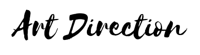
I first began looking into the different religions I wanted to break down. As mentioned in my research, I looked at the different elements which made their art unique. Be it the use of lines, colours or shapes.
I started to sketch out these elements and I looked at the images I took to see what I could use.
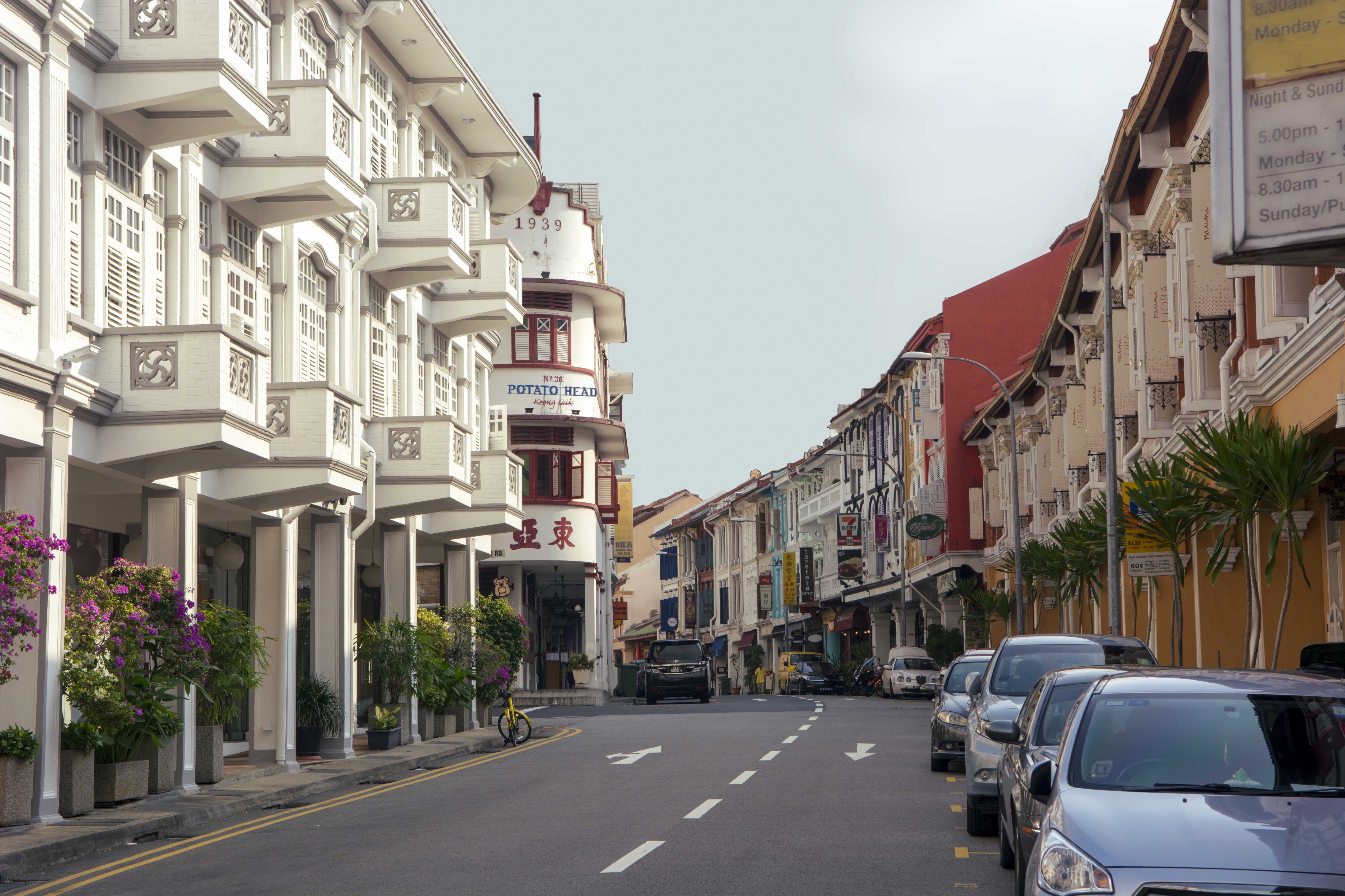
I settled for these 4 images to be used.
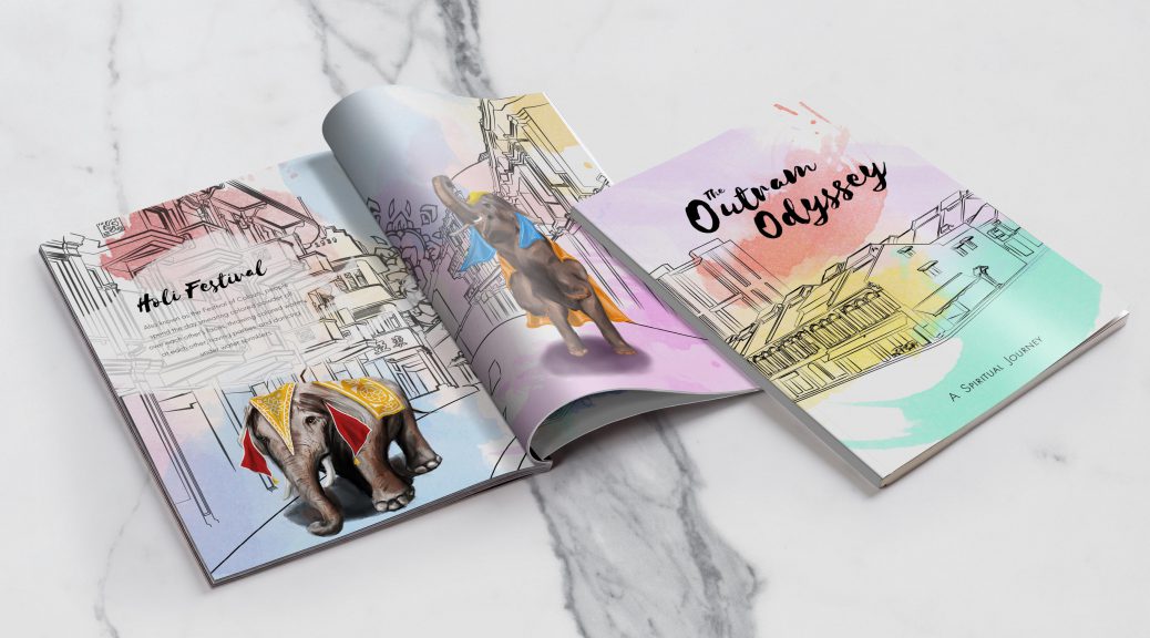
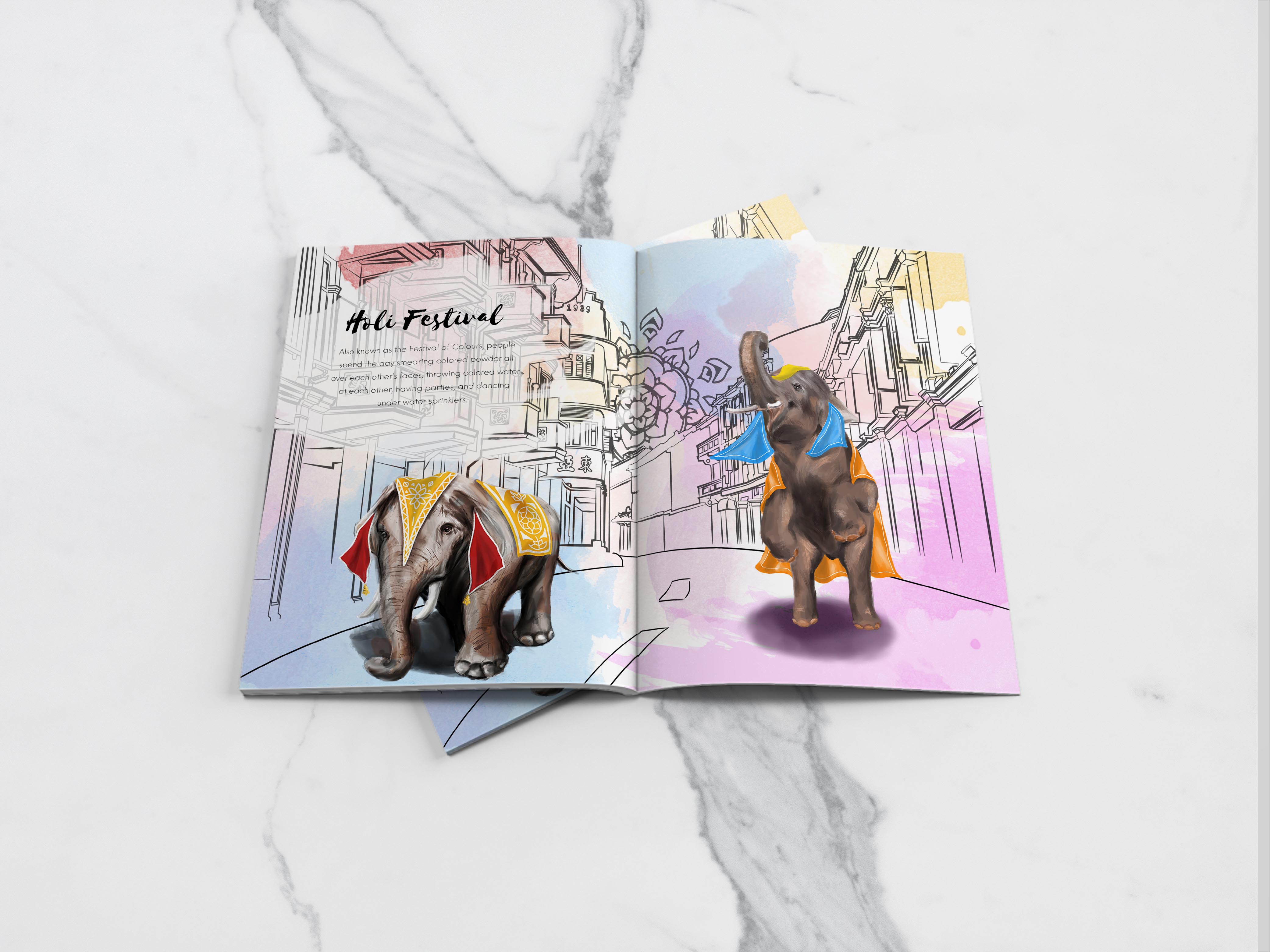
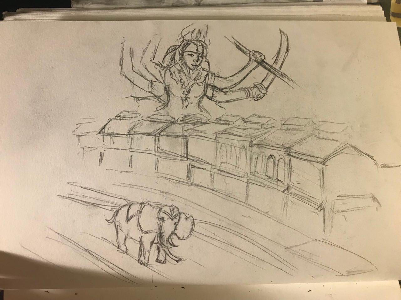
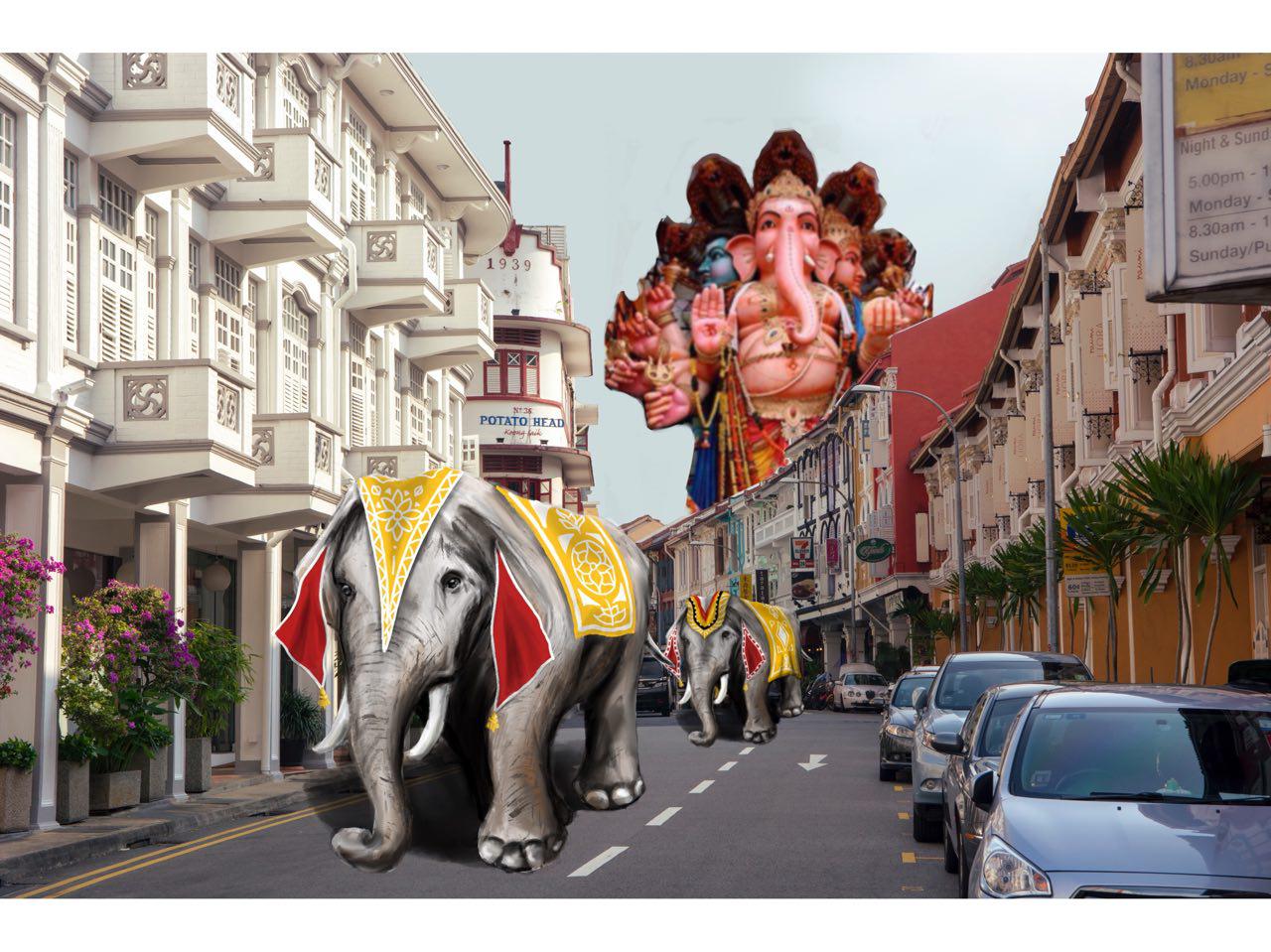
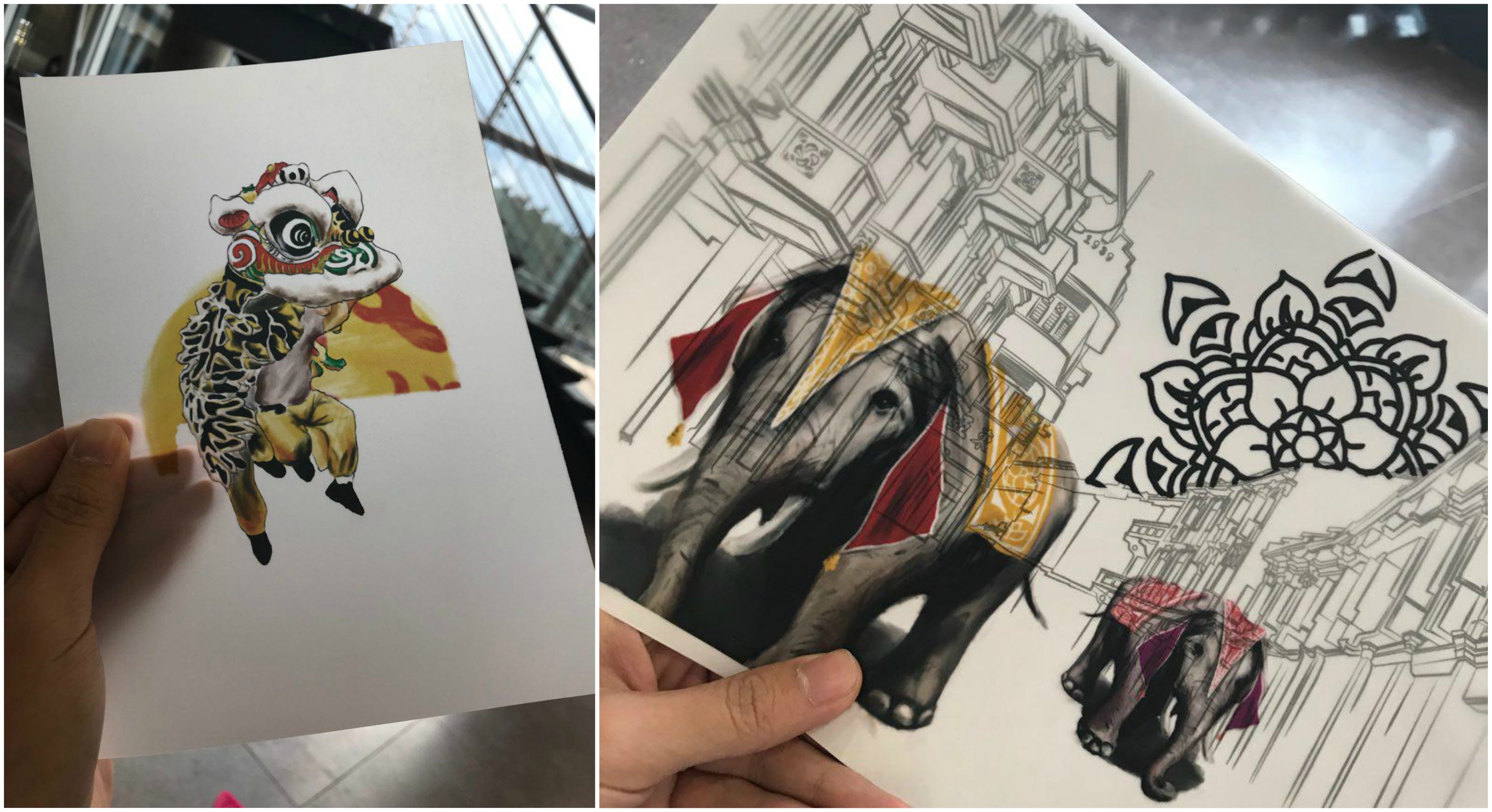
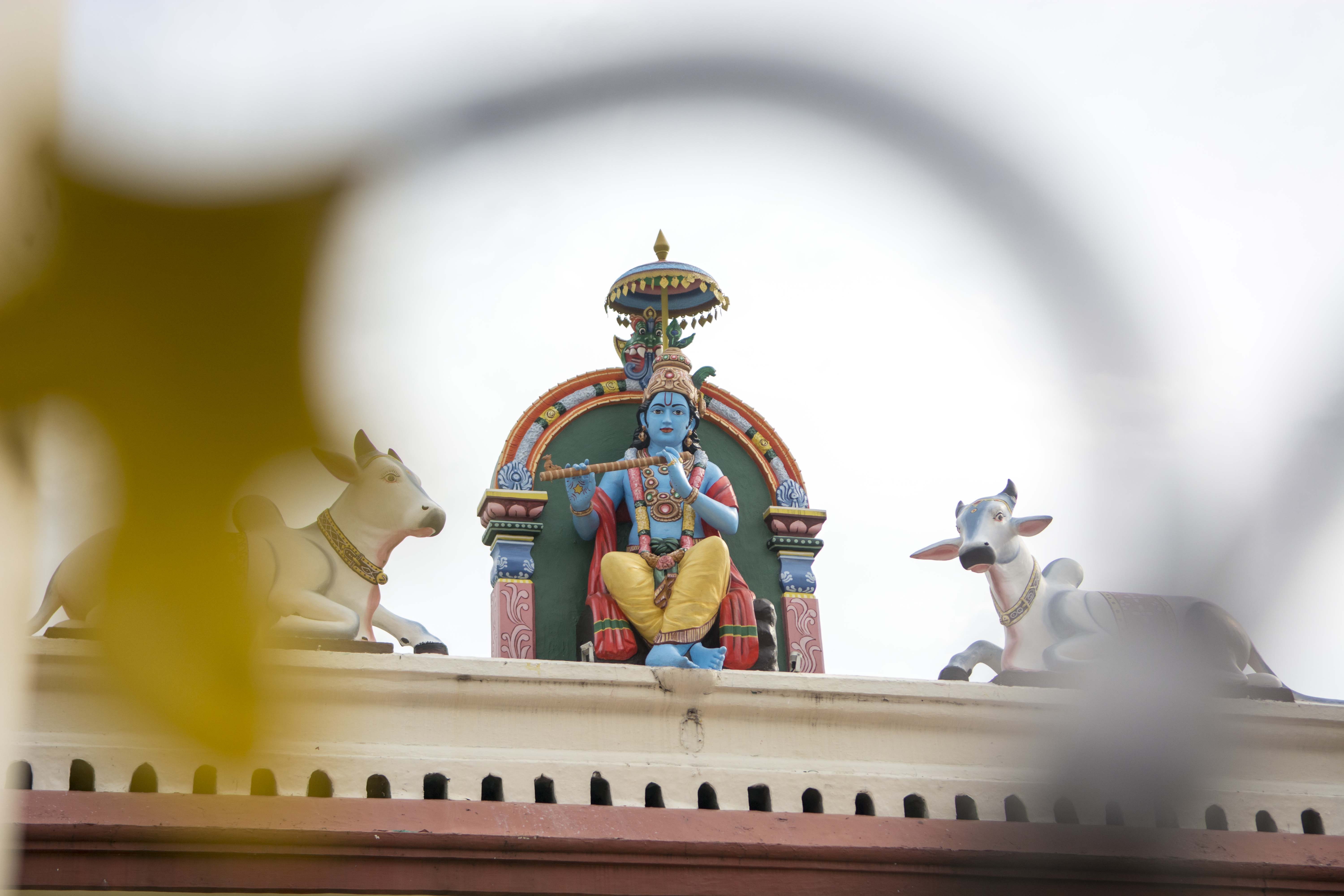
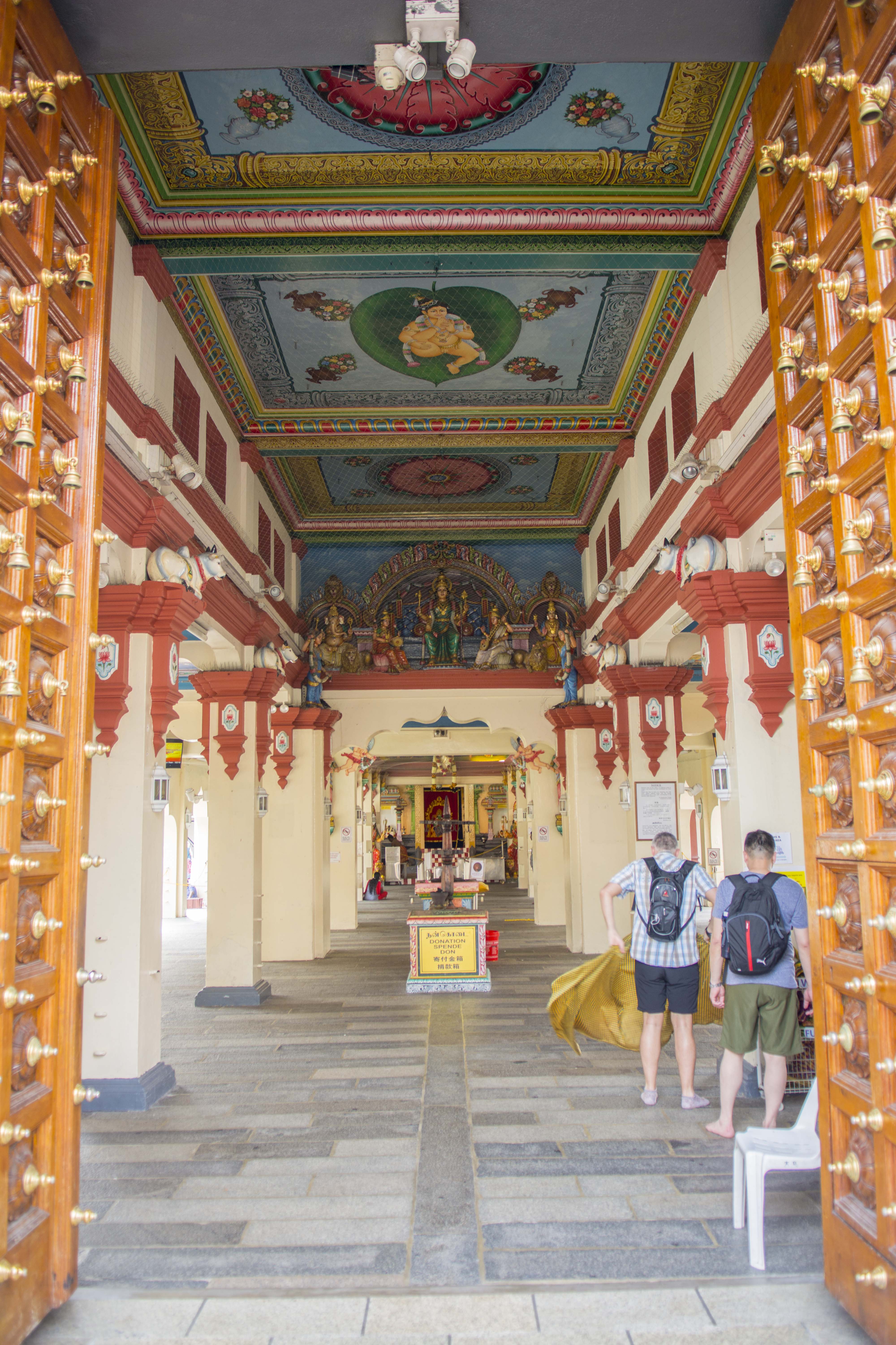
I began with Hindu art first, after being inspired by our Art History Tutorials and lectures, I wanted to make use of the Hindu Gods in my illustrations to give a glimpse into their religion. During my site visit, I noticed the common use of human figures, animals and various gods in their composition.
This was my initial composition – in the background, you can see the goddess Durga with her many arms and weapons. She fends off evil spirits and Gods with her destructive capabilities and strength.
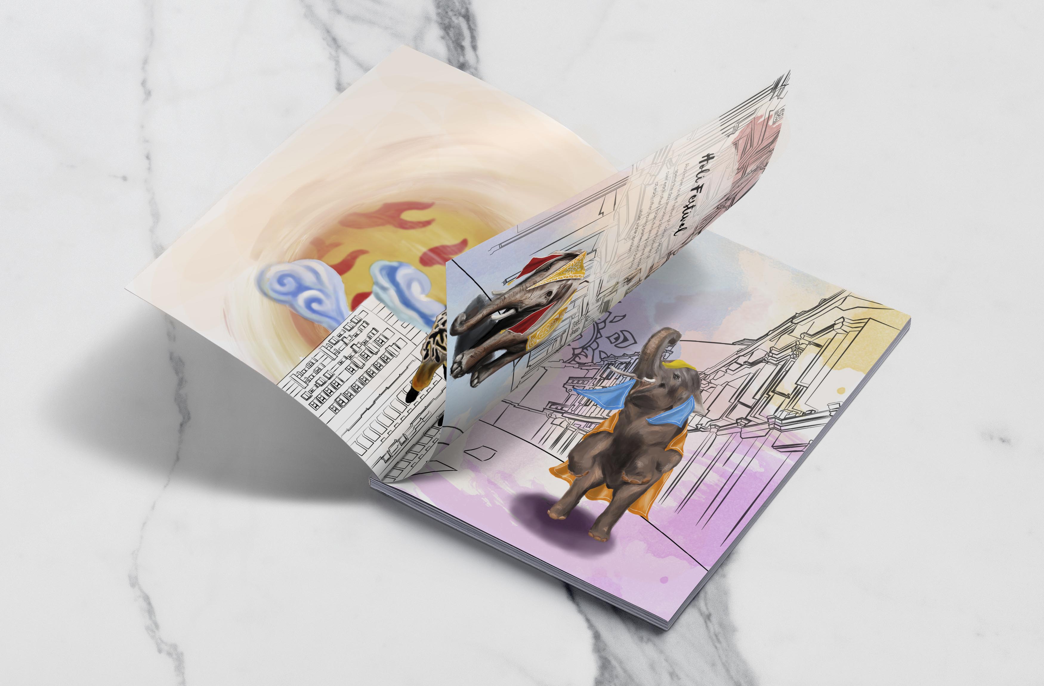
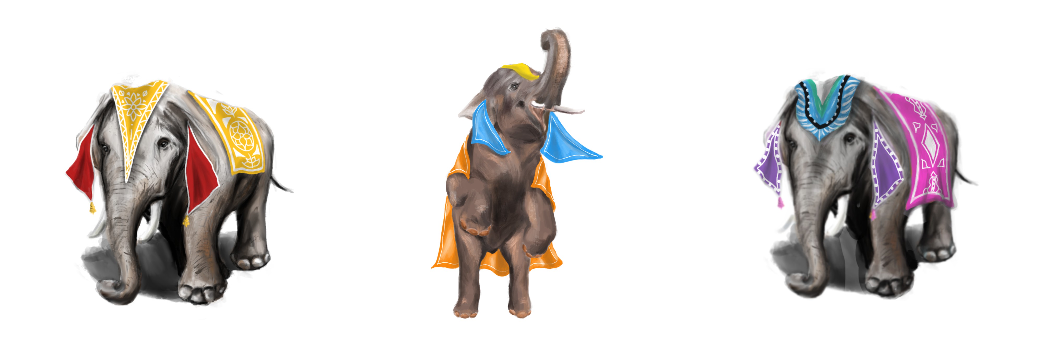
I wanted to use elephants in my composition as India celebrates Holi, the Festival of Colours. In this festival, the streets of India would be packed with people throwing coloured powder on each other, and elephants would be parading down the streets in their festive costumes during this vibrant festival.
However, I felt that the composition would be spread too far out and it would be difficult to identify the main focus of the spread. Thus, I decided to choose a different image.
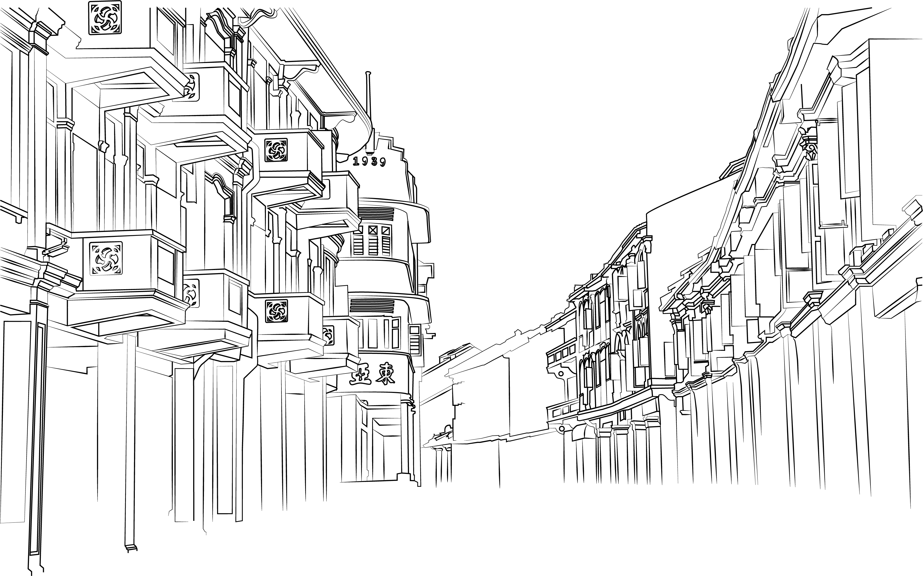
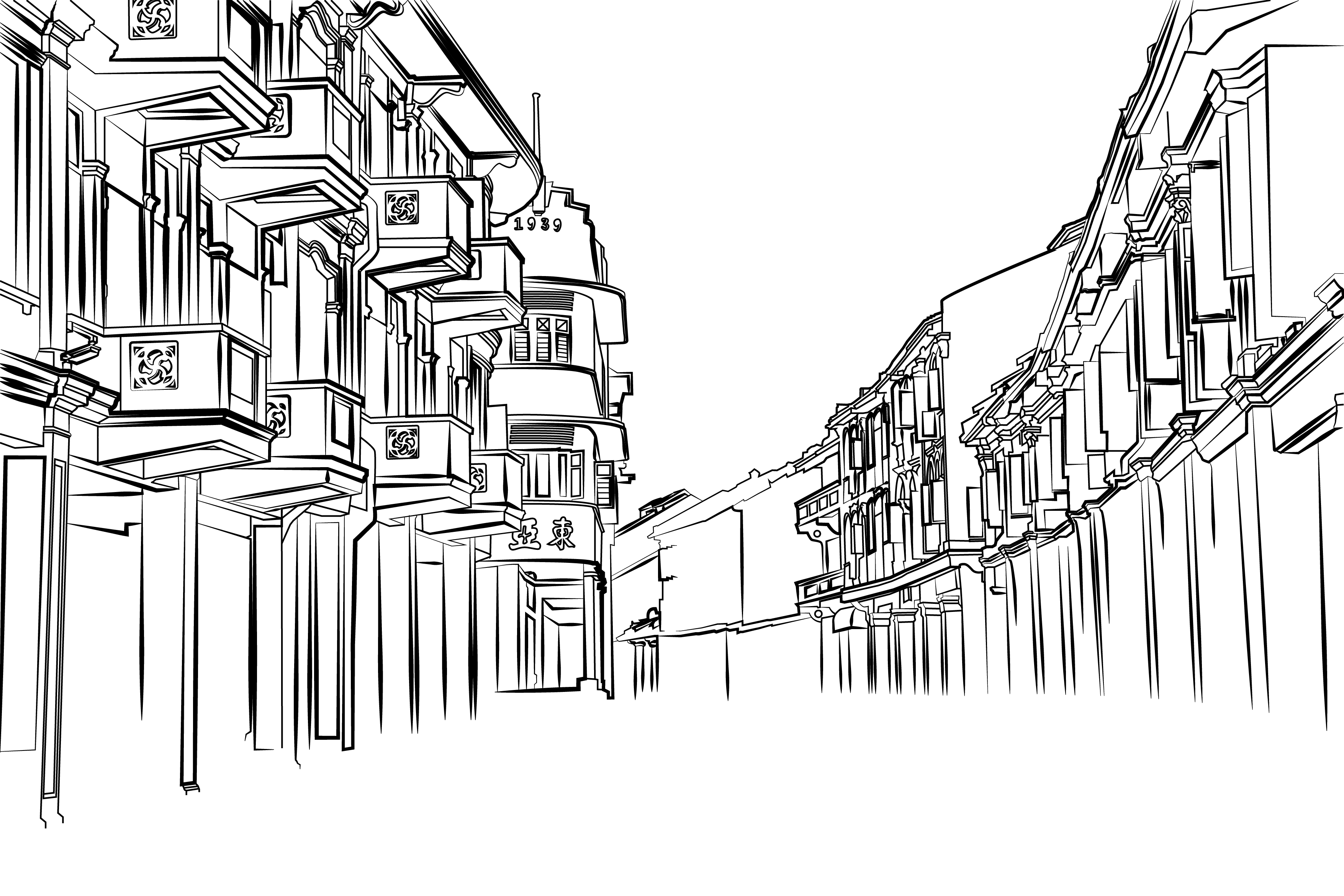
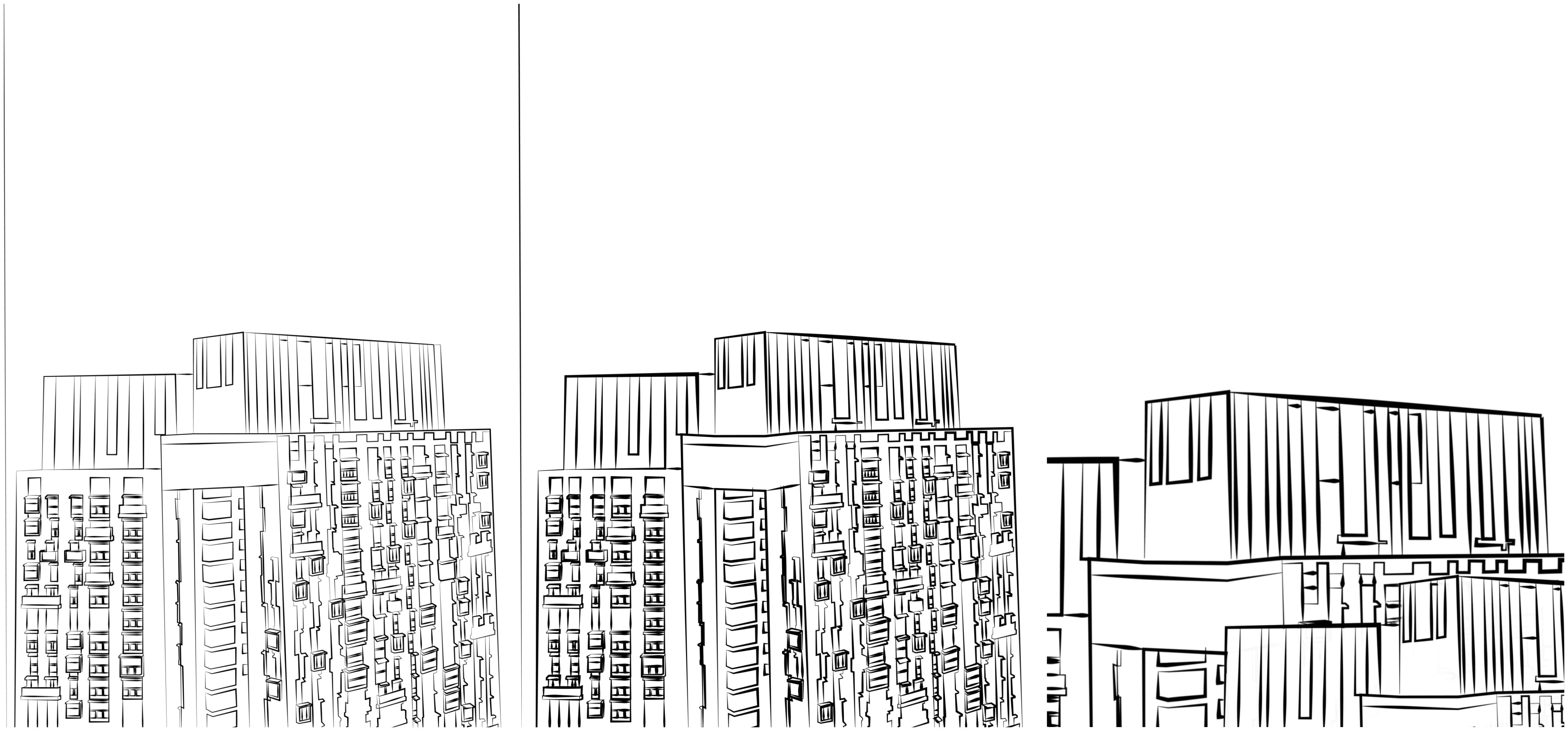
After I showed Mimi this composition, she commented that it was too messy due to all of the colours and the cars in the background. She told me to render down the buildings to their basic elements such as the line strokes.
Thus began the process of vectorizing the image!
Mimi commented that my initial strokes were too thin and it looked too architectural, lacking the artistic aspect. I went to manipulate certain stroke widths to ensure variation, similar to how a watercolour illustration sketch would be.
This created a more interesting and natural composition, which I was pleased with.
I illustrated several elephants to be used in the composition.
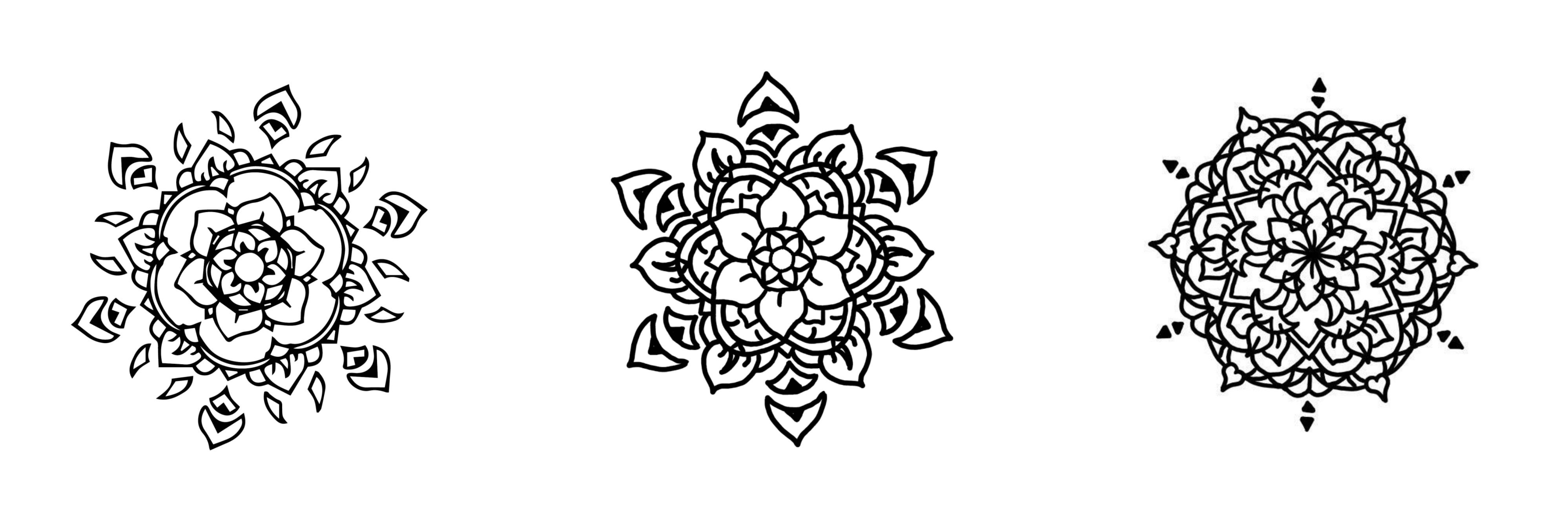
Other than elephants, a distinctive graphic element of Hindu art is the mandala, which is why I wanted to illustrate them as well. I experimented with various line widths to be used in the composition.
Piecing everything together,
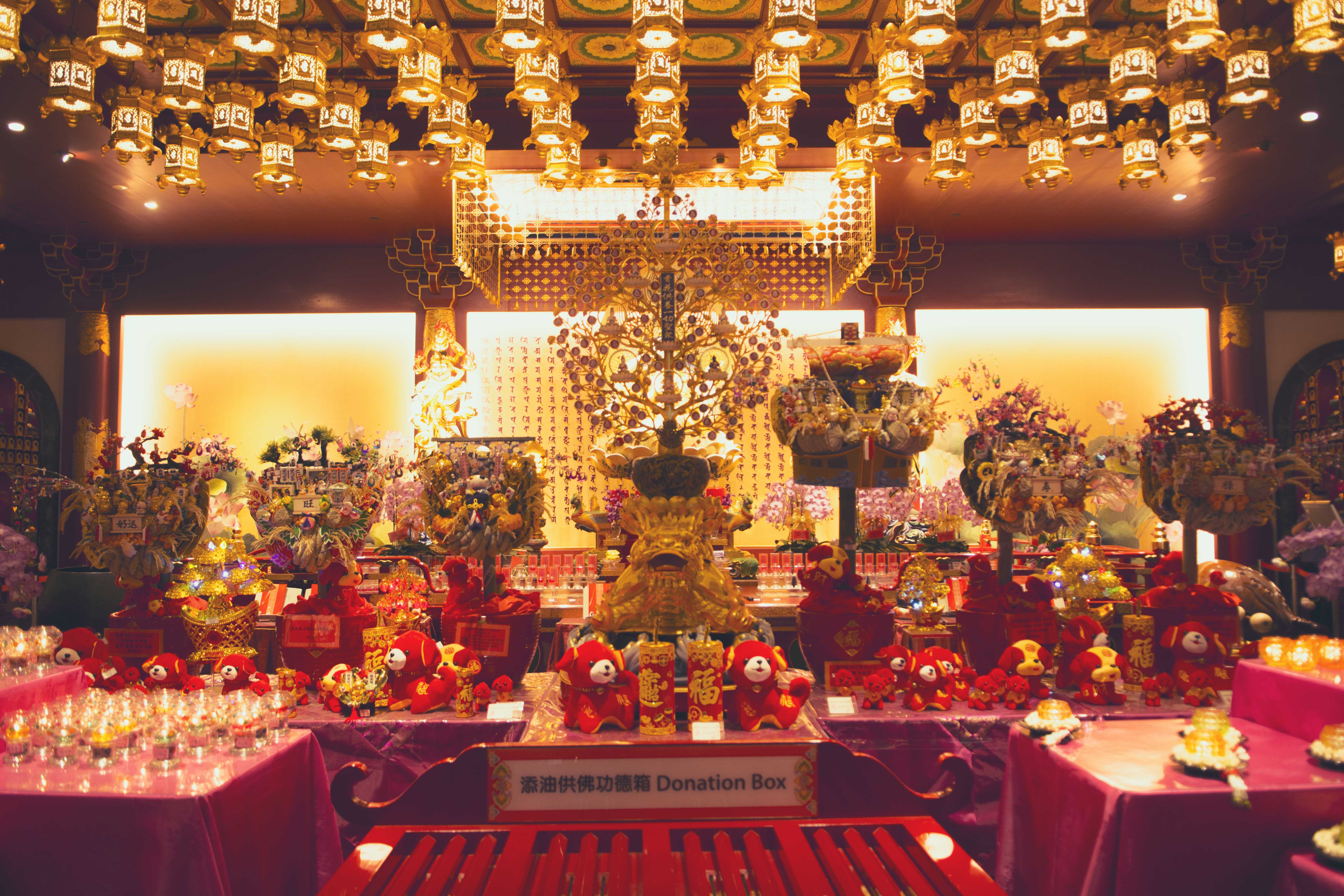
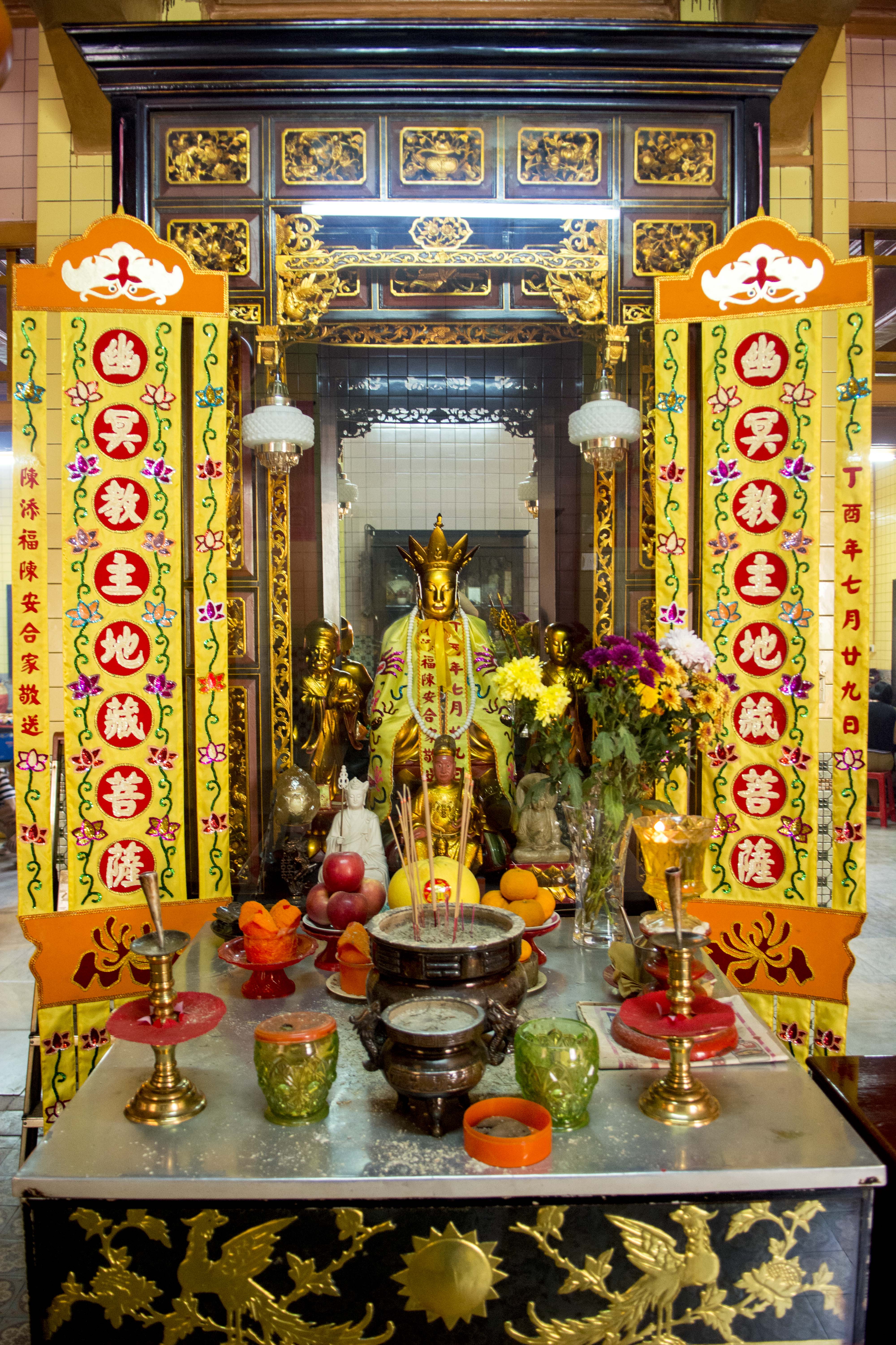
Next was Buddhist Art. These are a few graphic elements I picked up during my visits to the various temples along the way.
Key motifs such as the lotus, joss sticks and various lanterns all symbolise worship for Buddhists. I illustrated Guan Gong, the God that chases away evil spirits, in hopes that I would be able to incorporate him into my zine!
I experimented with juxtaposing architecture with buddhism as a religion, looking at ways which I can convey the idea of worship.
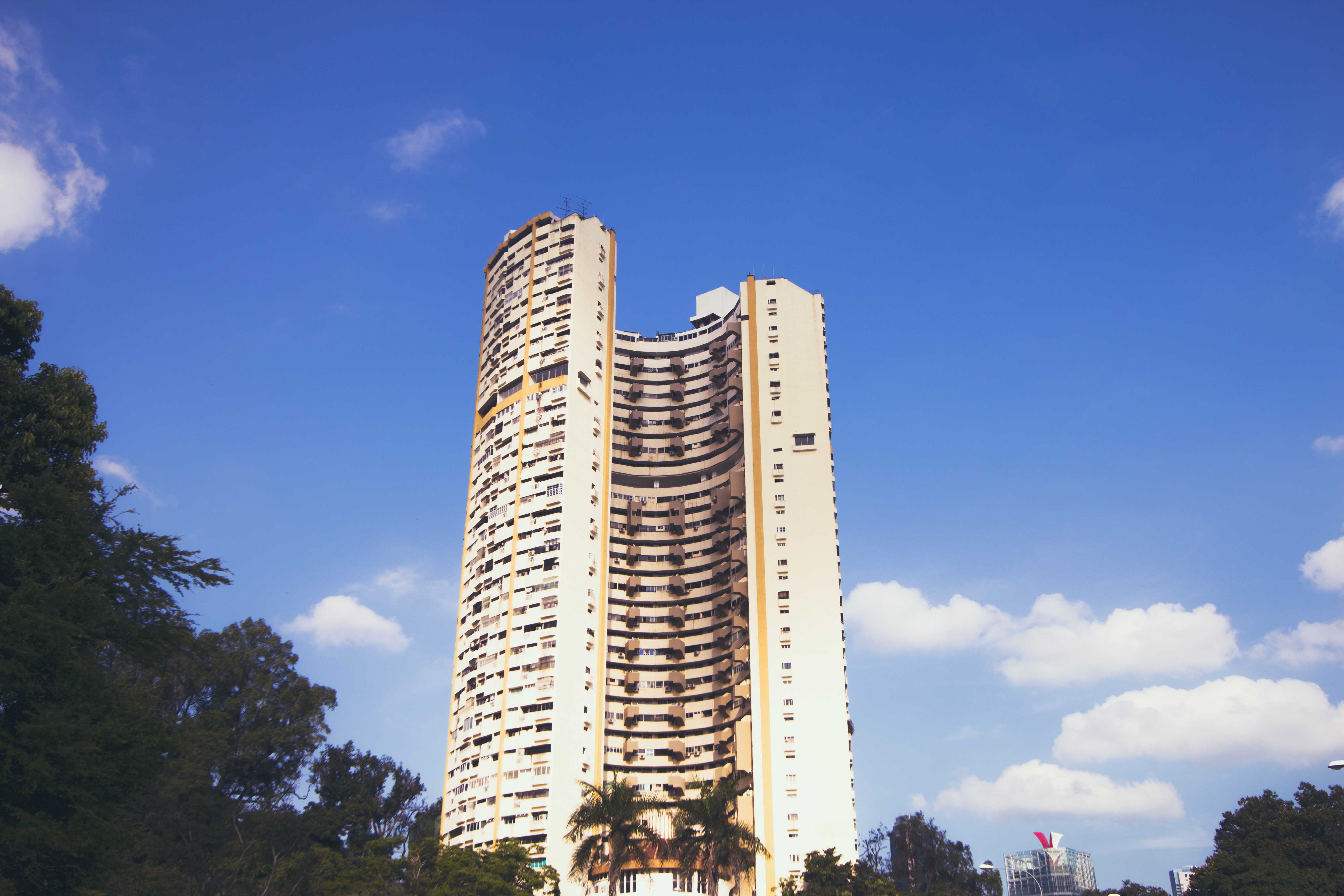
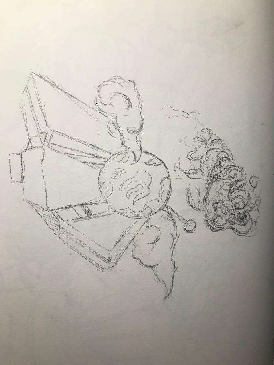
I envisioned the Pearl Bank Appartments to resemble Joss Sticks. I felt like it would have created an interesting and controversial visual for the audience. It achieves a surrealism visual, however I felt that it resembled too much like 9/11 and it was also challenging to explore similar visuals for the rest of the religions.
This is a second sketch I made to try and incoporate surrealism into architecture. I made sure to use the graphic style similar to Buddhist art when composing the frame. This would include the clouds, fire and the sun. This is a timelapse of my illustration.
However, I felt that it was not an engaging composition as it did not evoke much sense of surrealism.
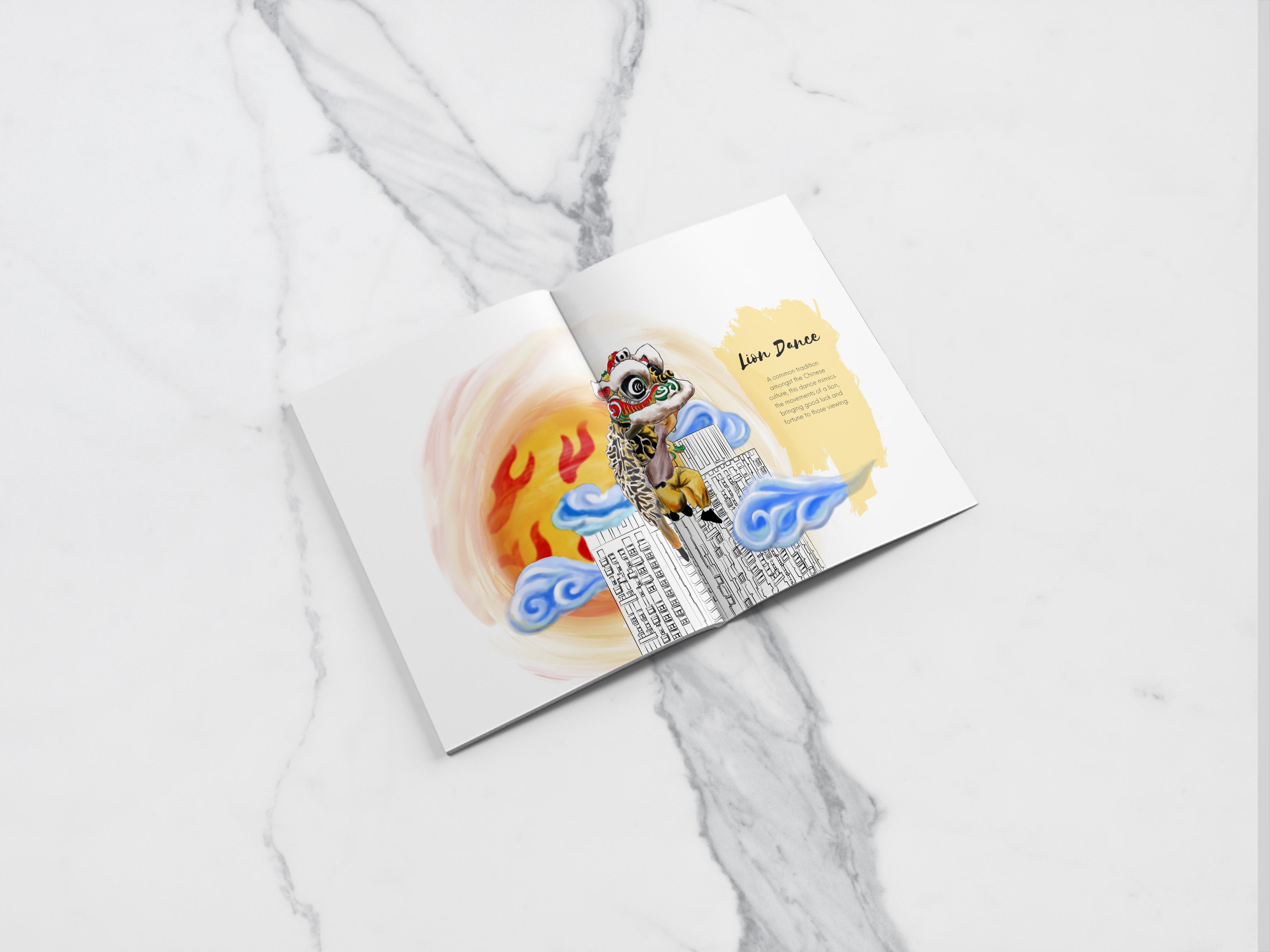
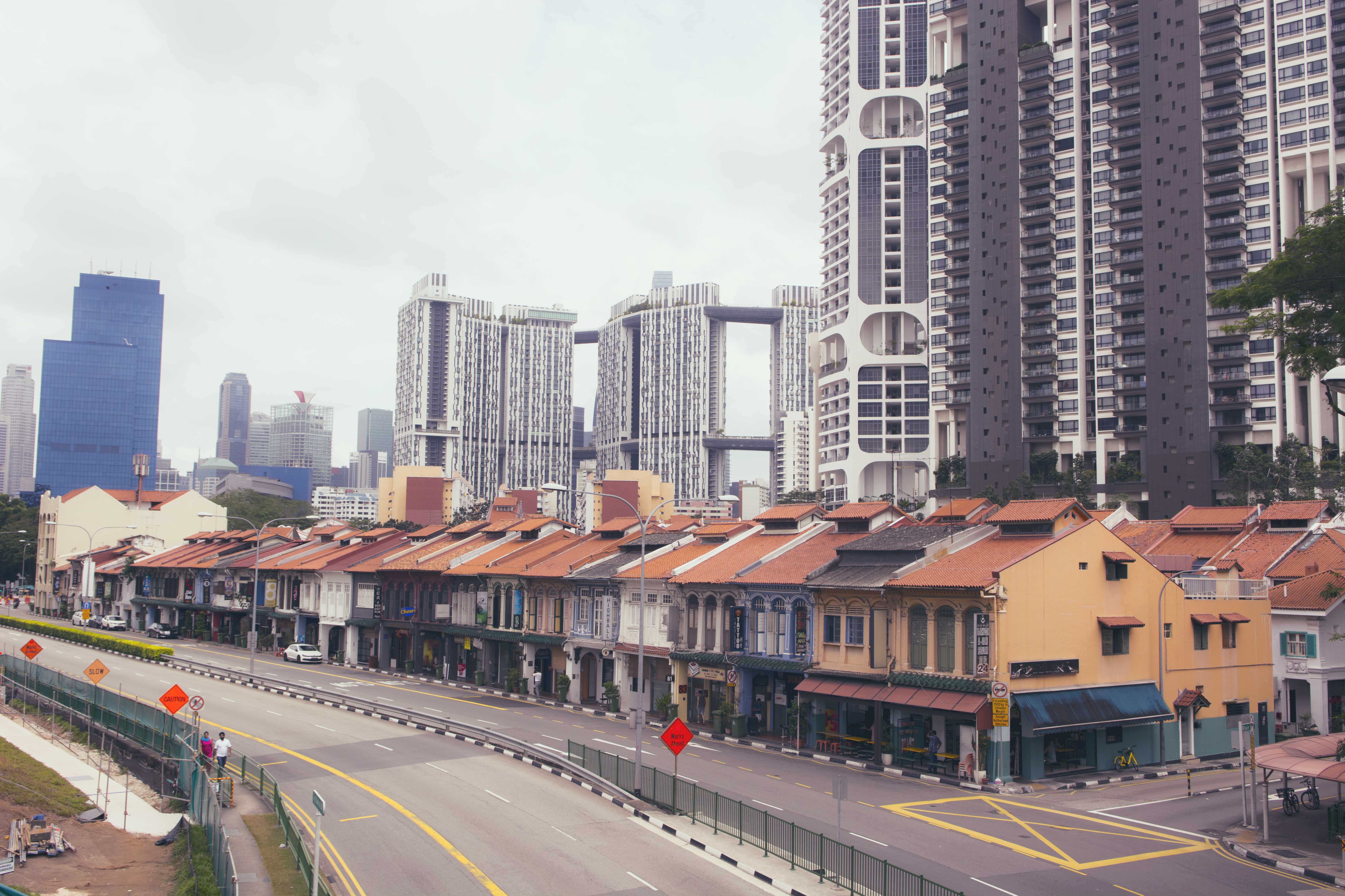
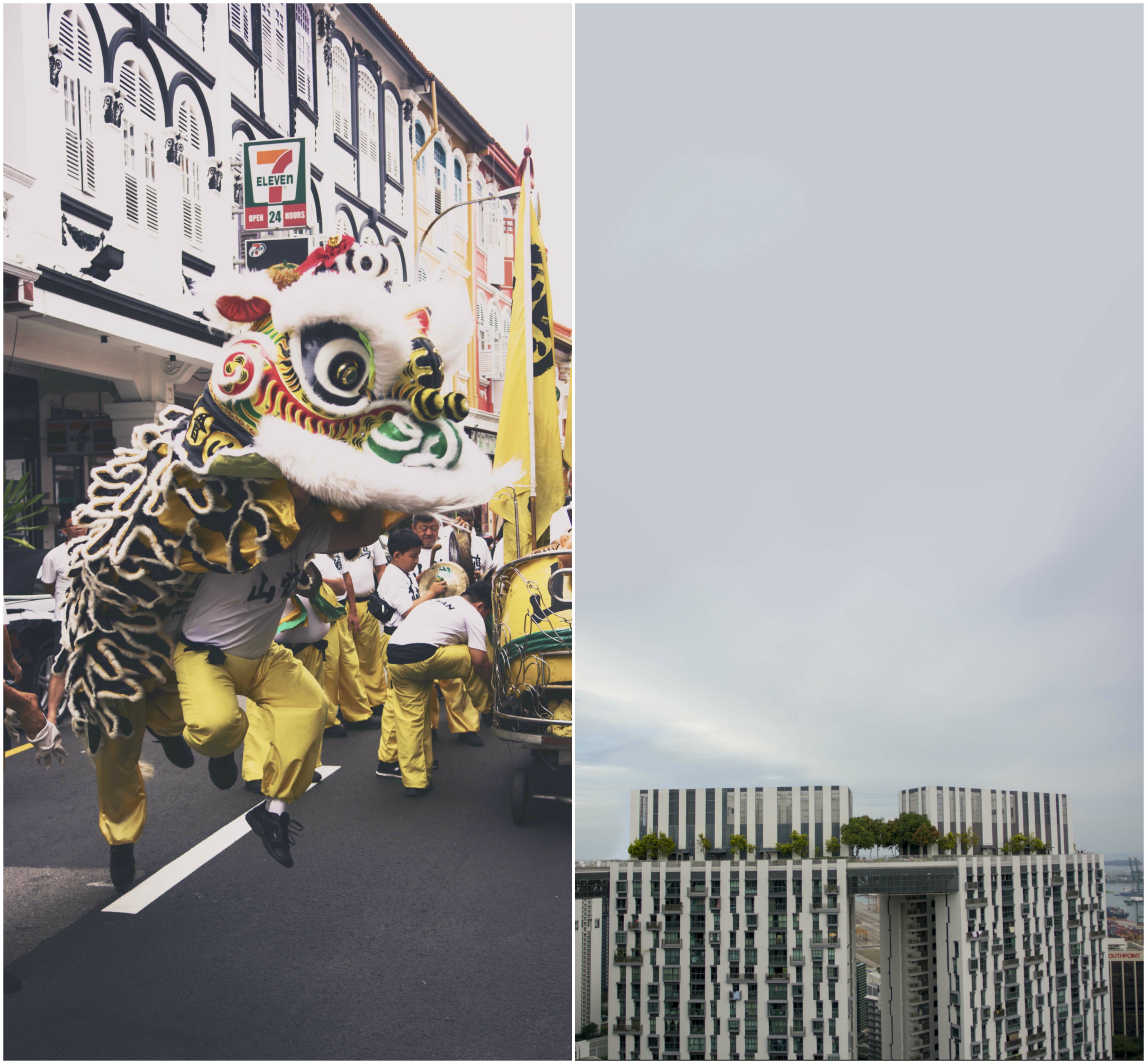
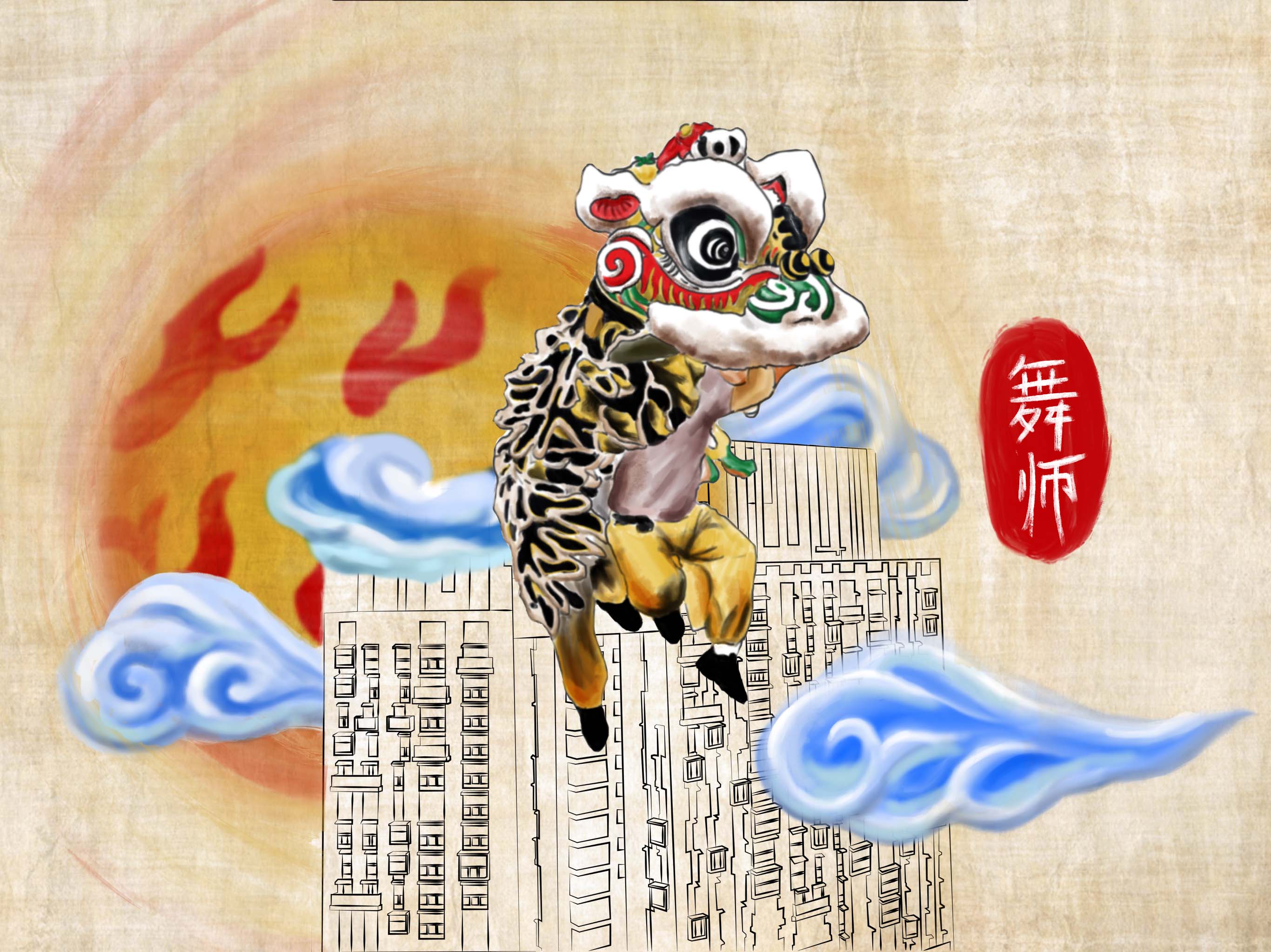
This is my third idea – instead of using religions representations, I also thought of using cultural ones such as traditional practices. Thus, I wanted to make it seem as though the lion dancer was jumping across platforms. Similar to my second idea, I made use of the same elements found in buddhist art.
I played around with the composition of the buildings as I did not want a simple flat design, thus I overlapped the buildings to give the composition more depth. I also changed the framing of the composition as it was initially meant to be half a spread. However, I felt that the composition was suffocating, thus I made it a whole spread.
I brought this composition to Mimi, and she told me that there could be further improvements to be made, such as a brief description of what the significance of this spread was, rather than full graphics. The chinese characters means ‘Lion Dance’.
I faced the most challenge when thinking of a composition for Muslim art due to the lack of illustrative visuals, unlike the other religions. I consulted Mimi on the issue, initially wanting to use the Quran Scriptures and text to create graphics, however, she recommended me against it because it may be offensive to manipulate these holy scriptures.
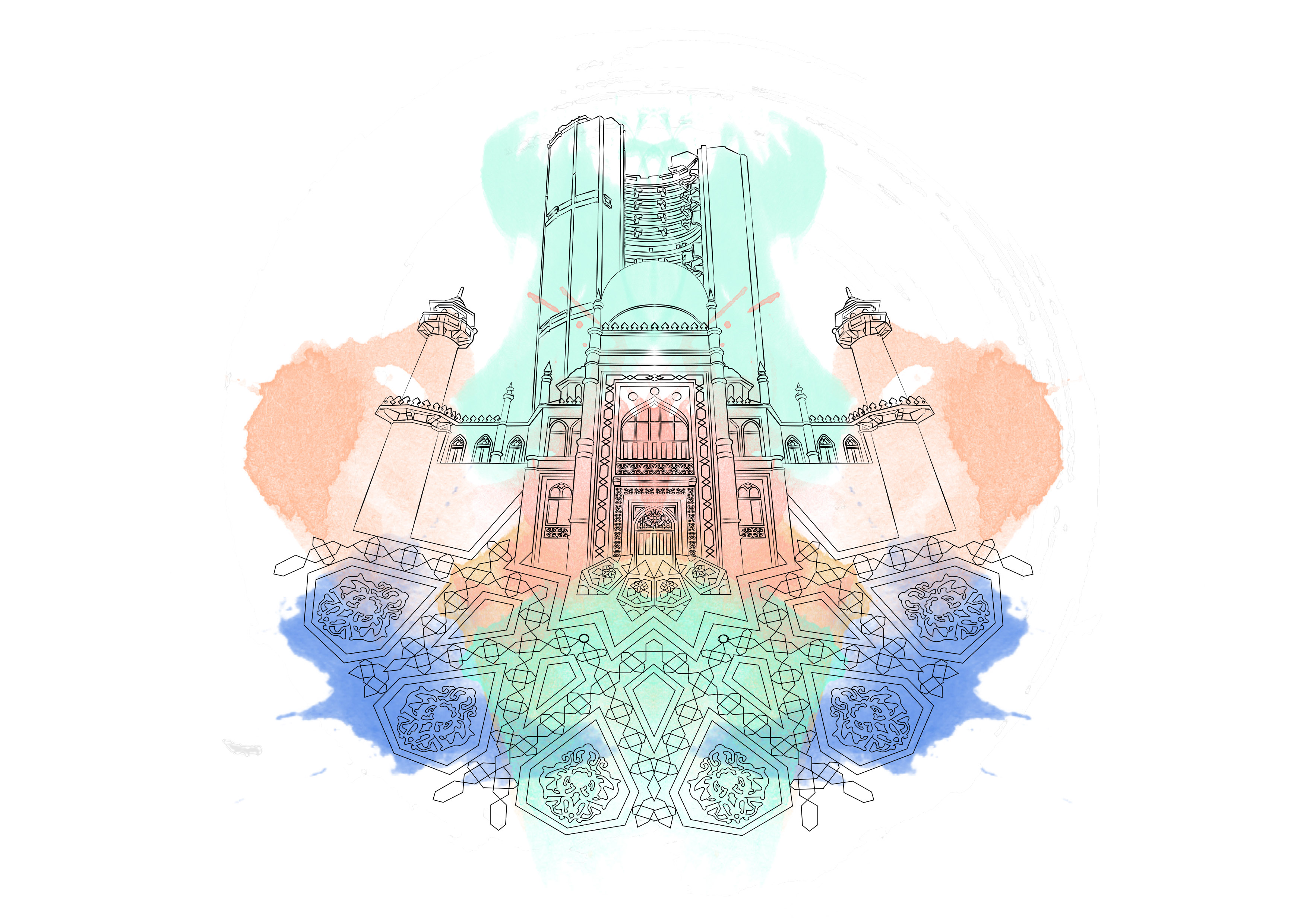
Mosques have distinctive architectural features such as the Moon and the star, minahrets as well as the use of geometric patterns for grand entrances.
I started studying these geometric patterns to try and incorporate it into my design. I started to vectorise these geometric shapes to put them together, segment by segment as they were mostly symmetrical.
Stitching these pieces together:
I had trouble placing the geometric patterns as I wanted it to be of equal focus in the composition. This was the initial design, however i felt that it was really messy.
I decided to have it at the bottom of the mosque to have a radiating effect on the structure.
Now for the colours!
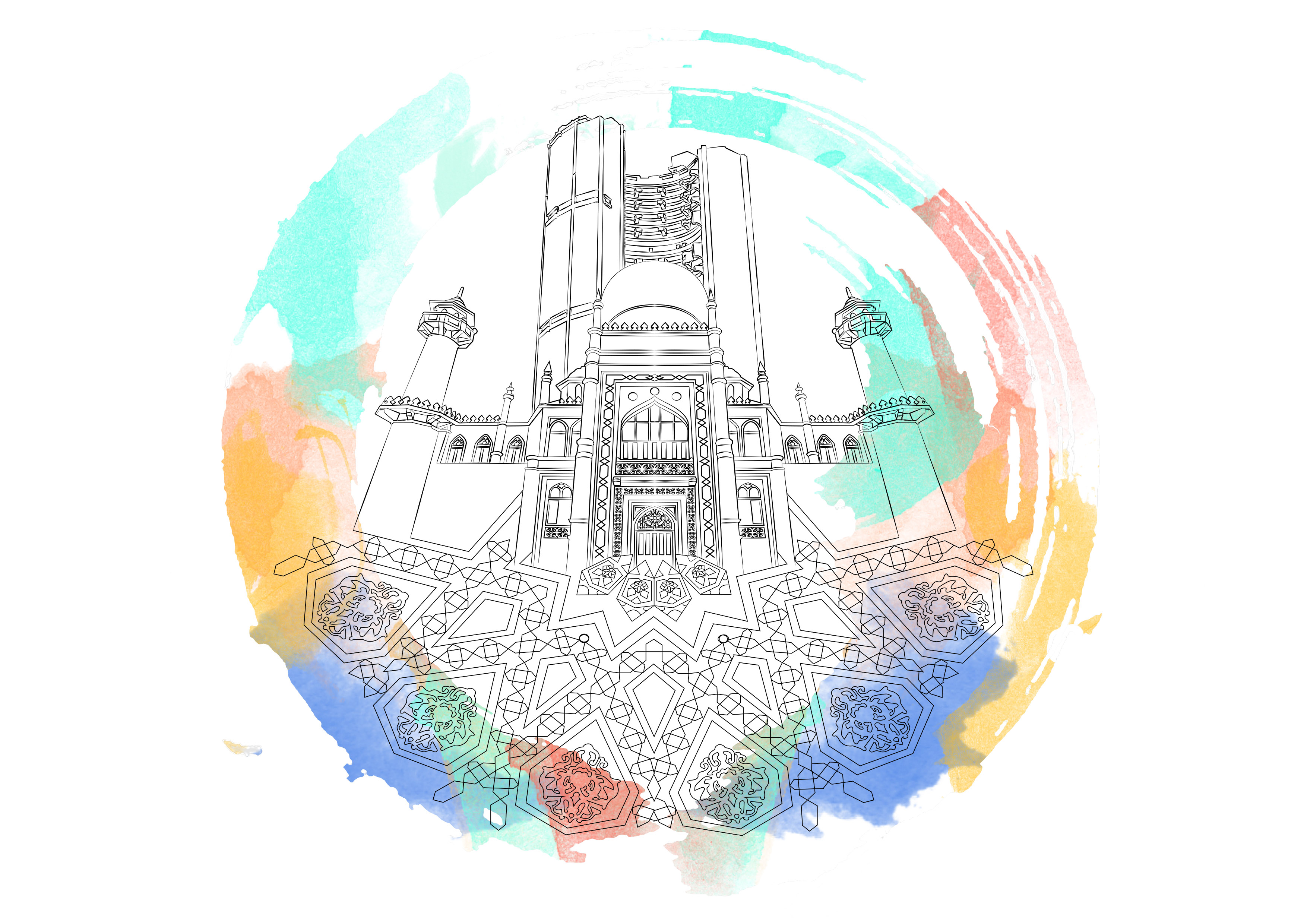
This was my initial composition using colours I found when studying different mosques.
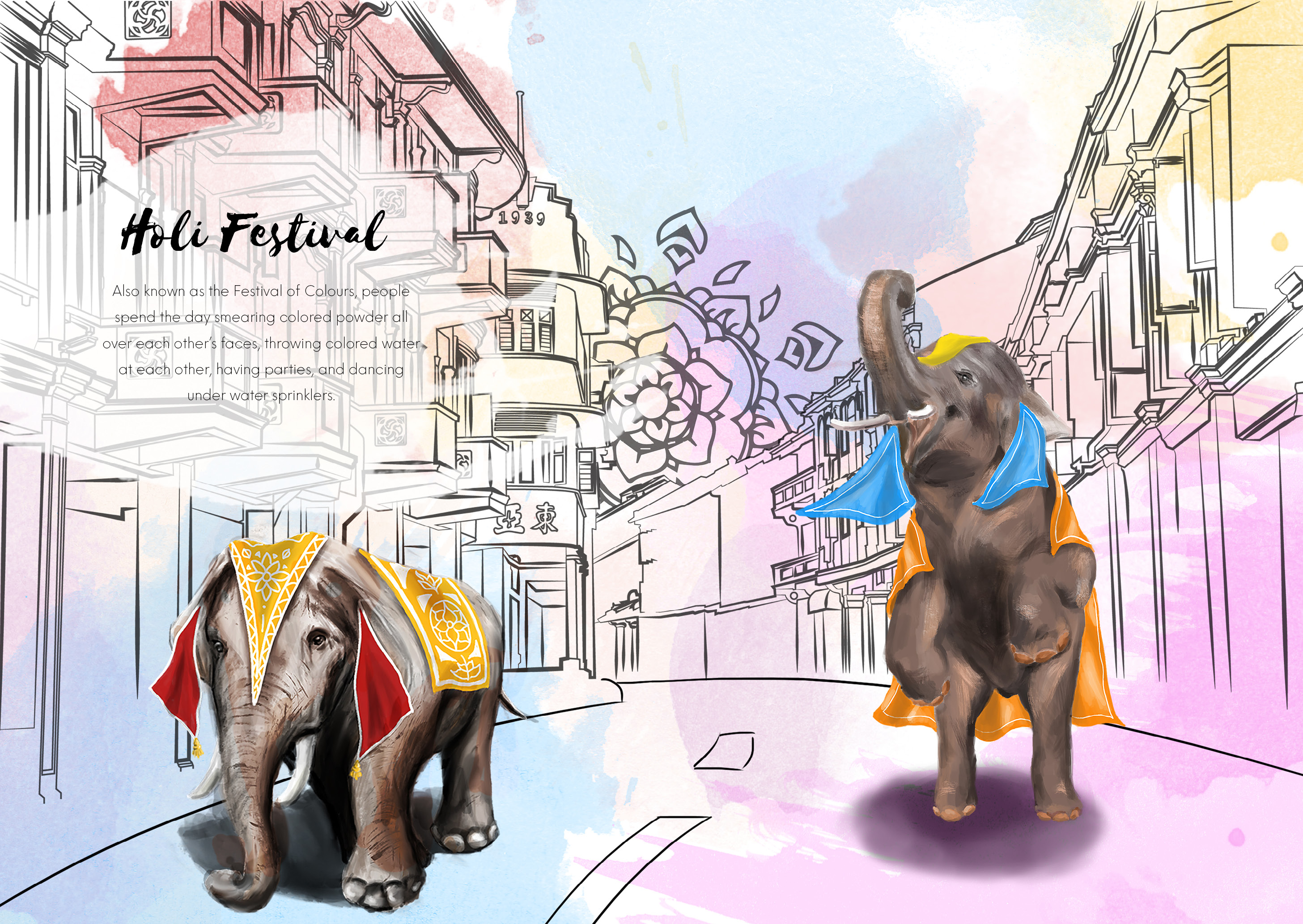
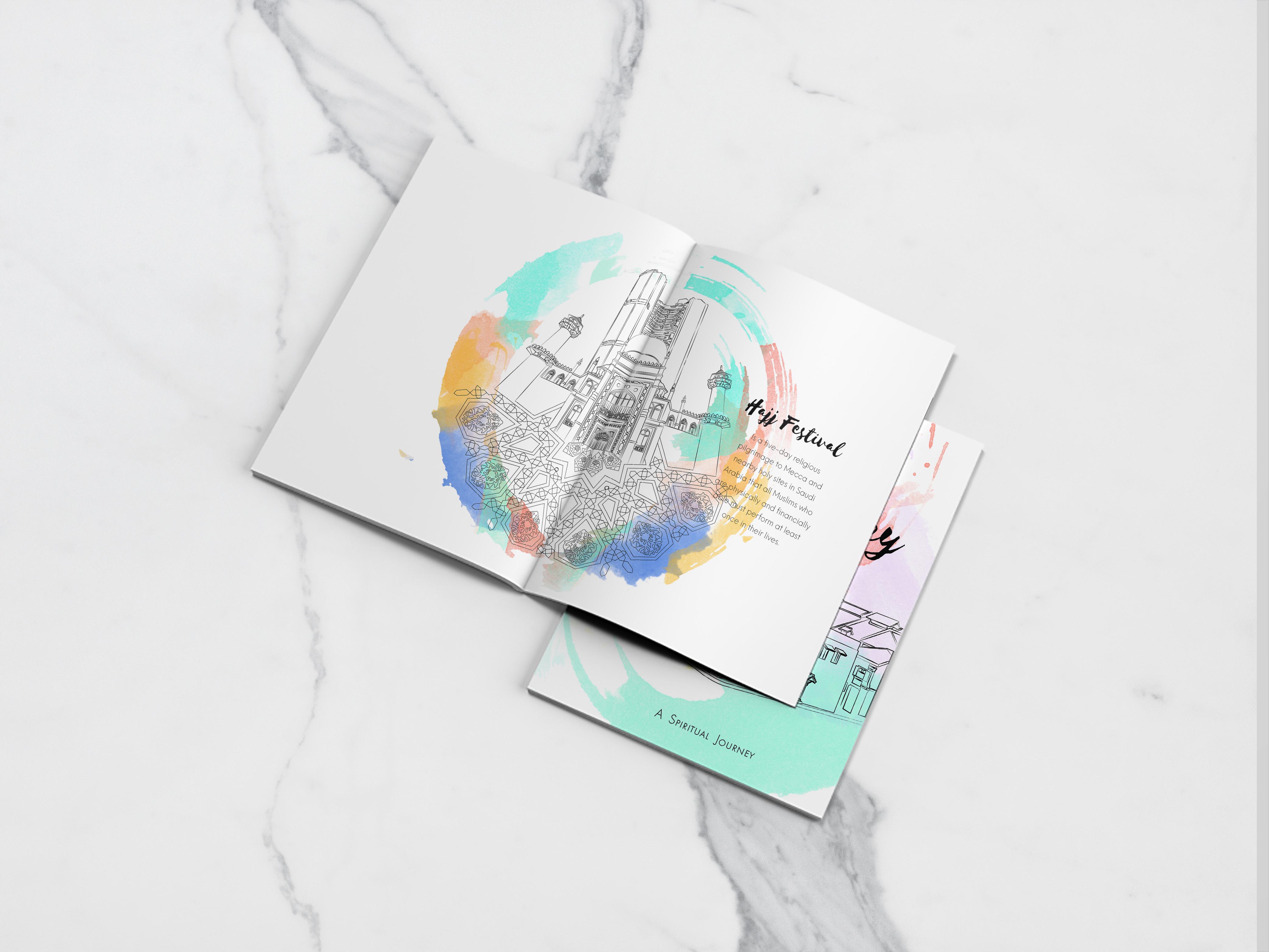
I was not happy with the initial design of this spread as I felt I did not have any symbolism of the religion. I started looking at festivals celebrated by Muslims and I thought of their annual pilgrimage called Hajj.
During this festival, worshipers circle around the Kaaba (the cube-shaped building and the direction of prayer for the Muslims) walking counter-clockwise seven times around. I wanted to incorporate the circular element of this holy ritual into my composition.
I decided to forgo the Moon and Star above the Pearl Apartment buildings as I felt it would disrupt the composition by having 2 circular elements.
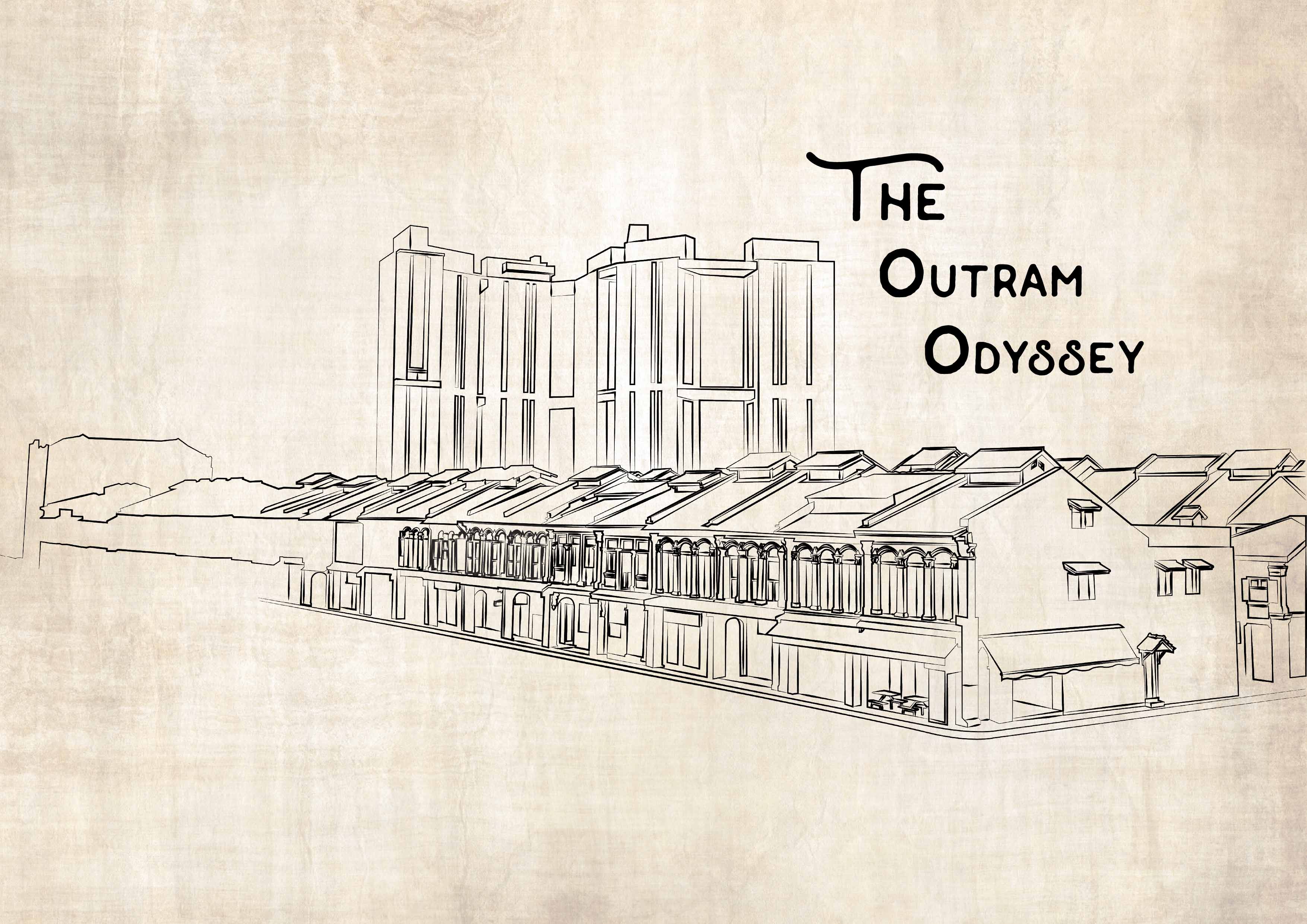
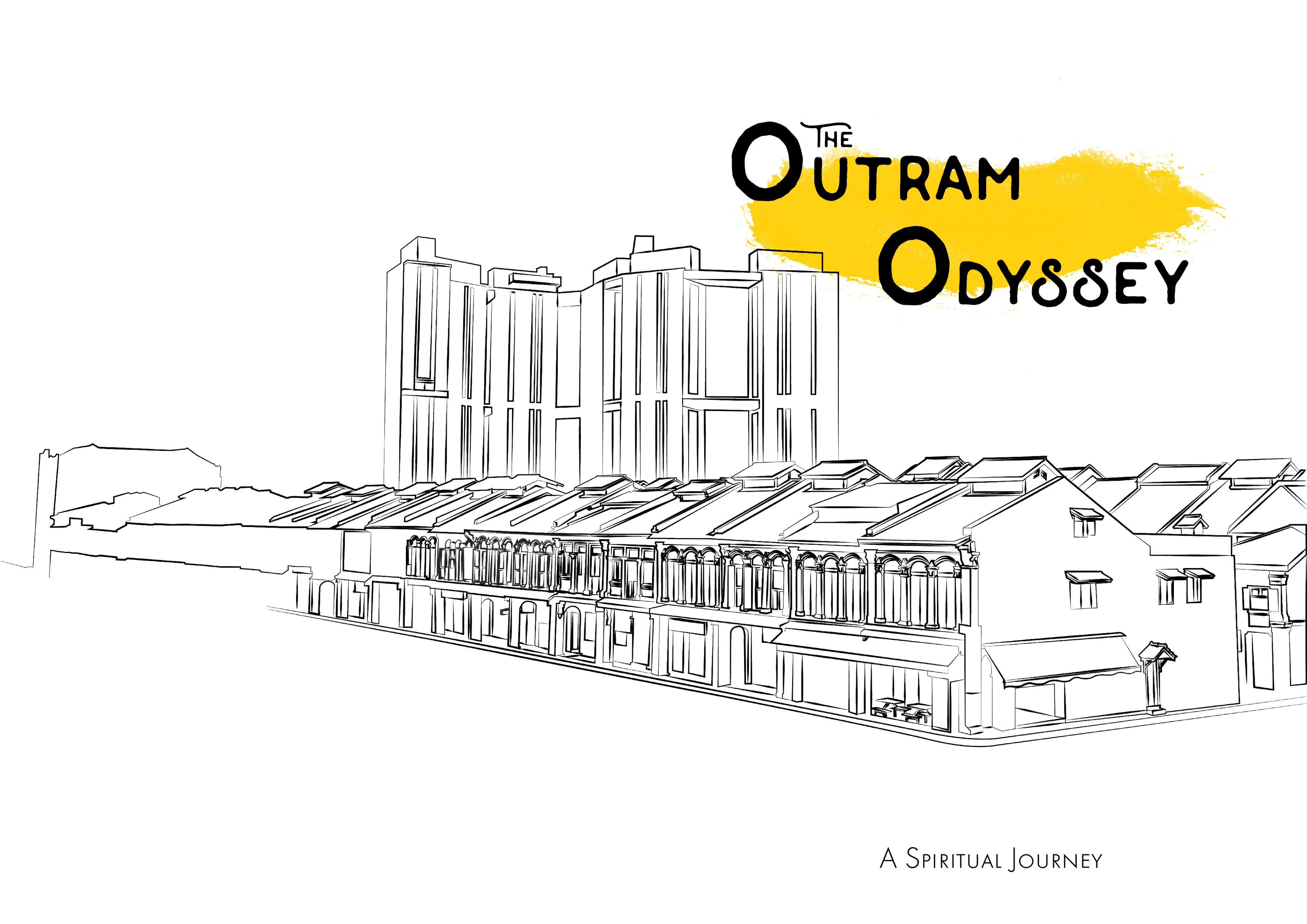
I did not want my cover page to reveal everything about my zine as I felt it should be an experience or uncovering a journey. Thus, it should only give a glimpse into the direction of the zine.
The first draft of the cover page shows was minimal, but Mimi commented that the font was too predictable, which does not make the cover stand out.
I played around with the fonts as well as adding some colour into the composition to make it more dynamic. However, I was still not pleased with the overall composition as I felt that it did not depict my zine.
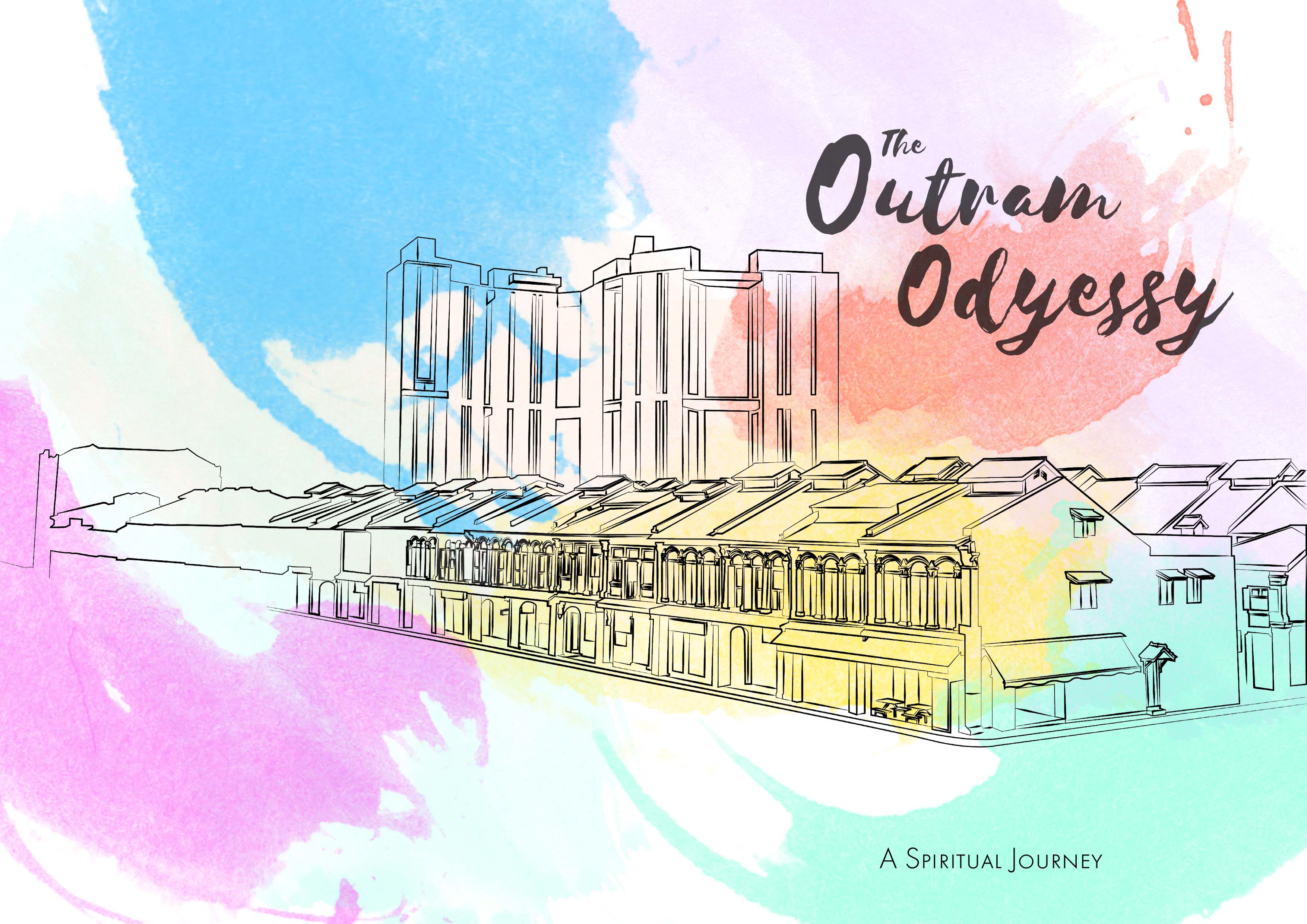
This is my final composition which involves colours which I thought represented each of the following religions, with some colours becoming common amongst religions.
I consulted Mimi on the Idea of using transparencies for my zine and I was excited to explore that option of printing as I was curious to see how the colours would turn out.
I could not incorporate the element of using a transparency into my zine as I did not have enough pages to do so.
I did however, manage to get a couple of test prints to see how the results would turn out. I was surprised how the colours turned out on the transparency as I was more vibrant than I’d expected.
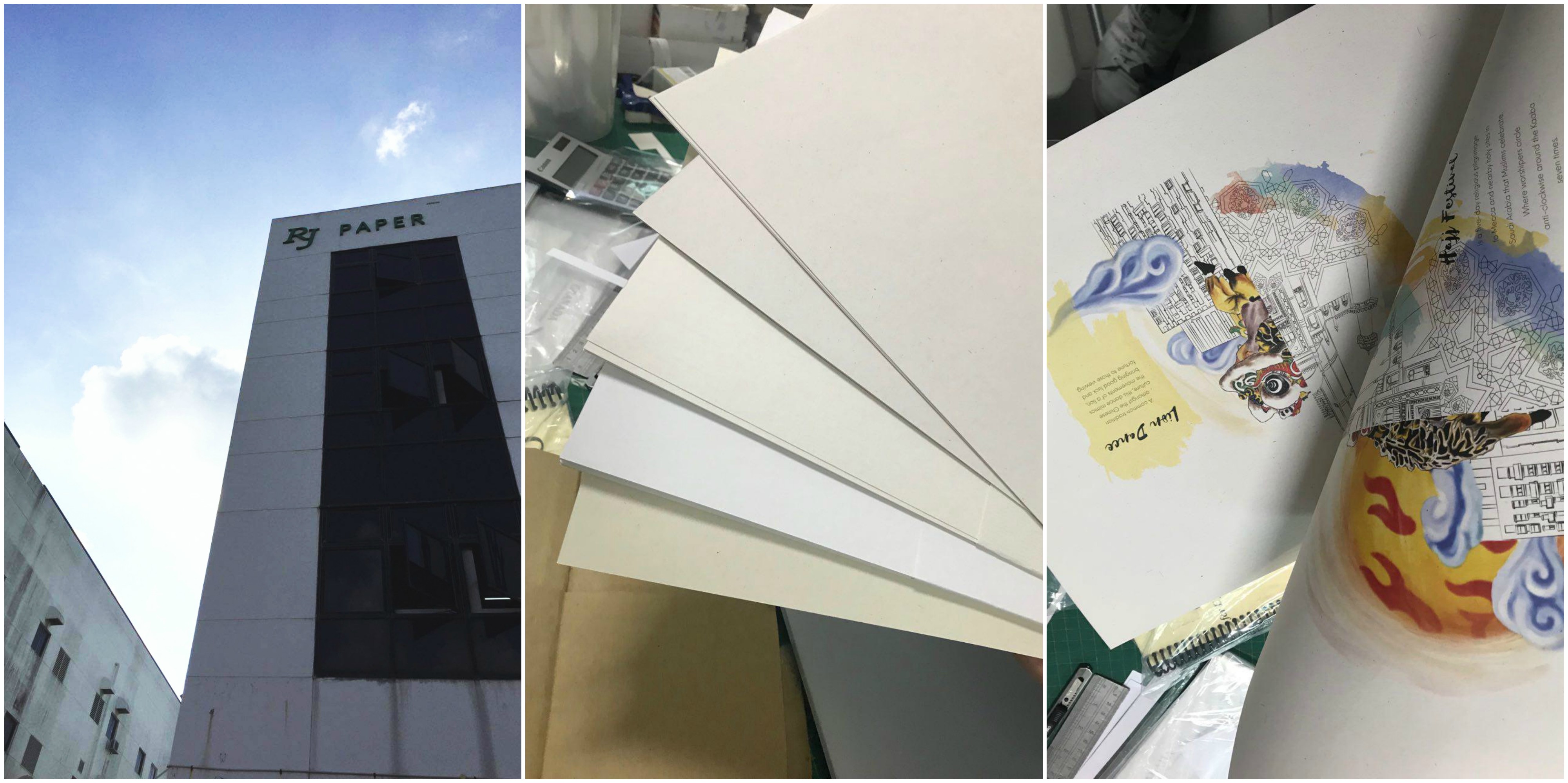
Mimi also suggested that we head over to see what RJ paper had to offer in terms of paper choices. In all honesty, I was skeptical about going all the way to Hou Gang just to buy paper. The papers at the printing shops at Sunshine Plaza seemed to be sufficient for me… till I saw the collection RJ paper had.
Overwhelmed would be an understatement to the choices they had! There were so many variations of papers to the extent that I don’t think I can ever consider using the papers at regular printing shops any more.
I ended up buying at least 5 different types of paper to try on! Needless to say, I would be coming back in the future.
Special Mentions:
I experimented with photo editing to try and achieve different tones and moods from the images. I wanted to mimic the rizograph printing effect using harsh hues of pink.
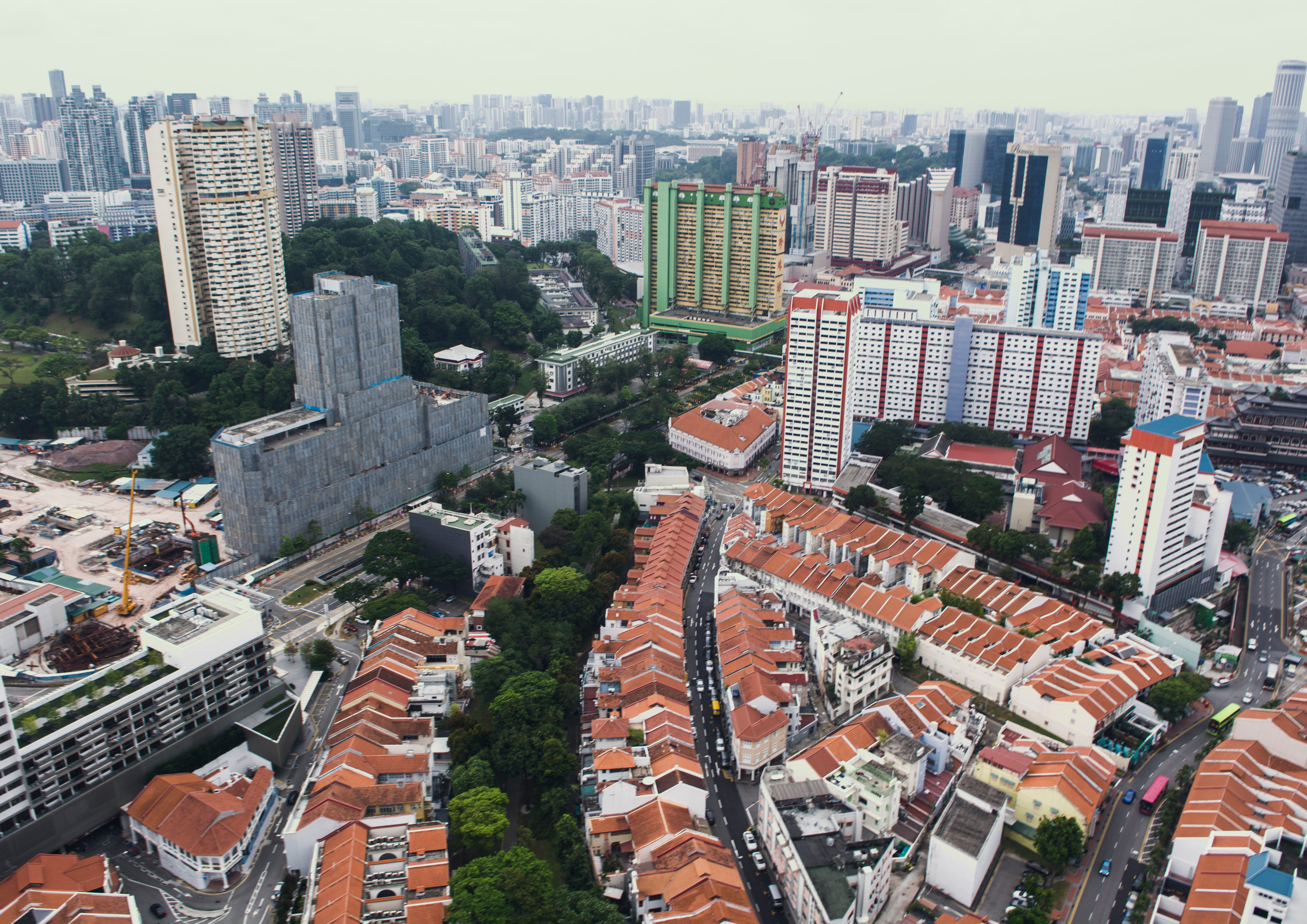
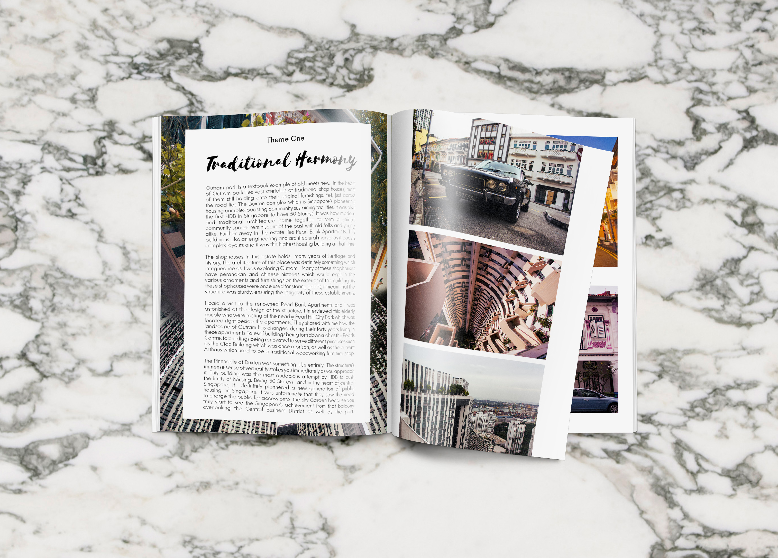
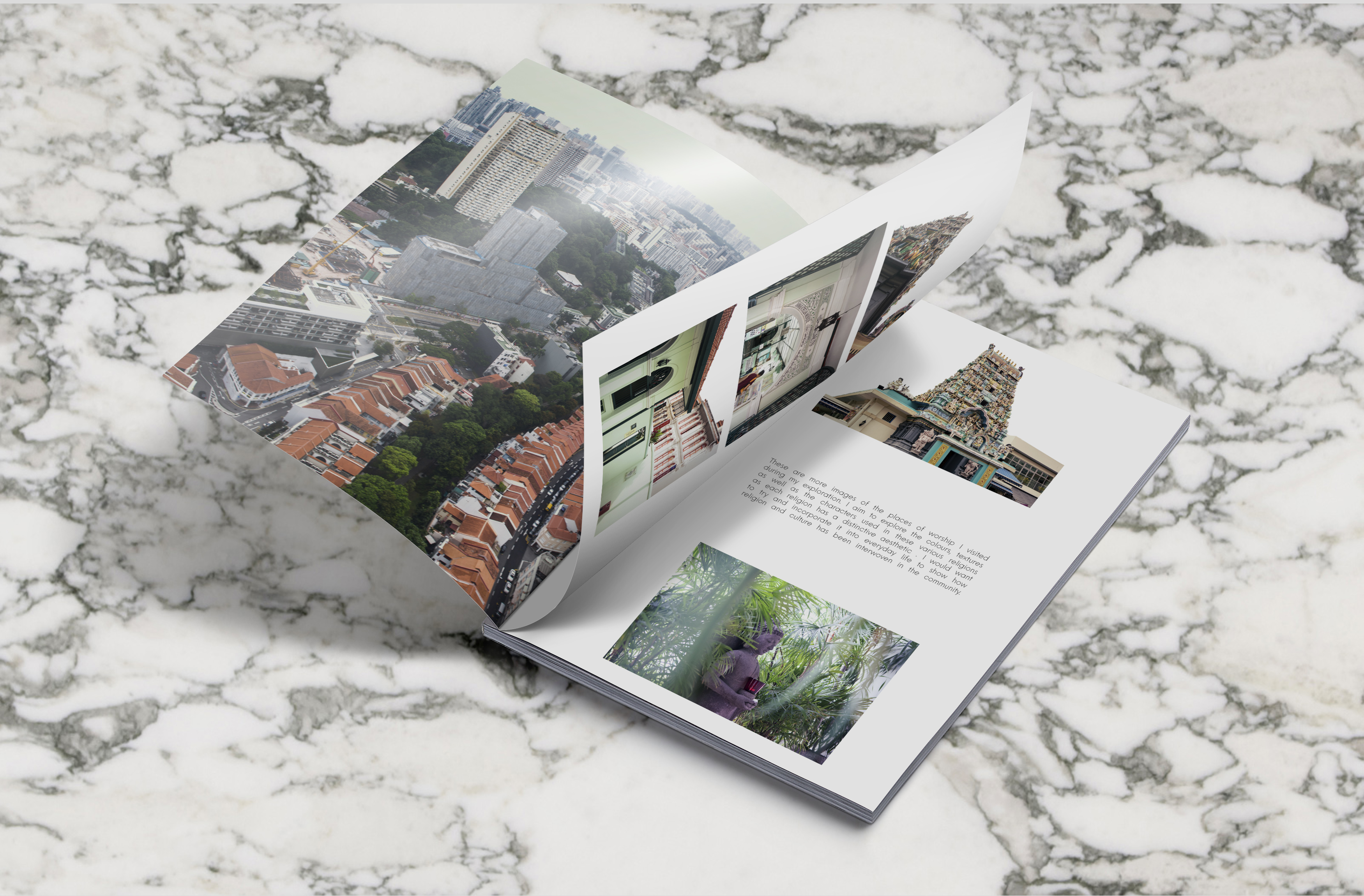
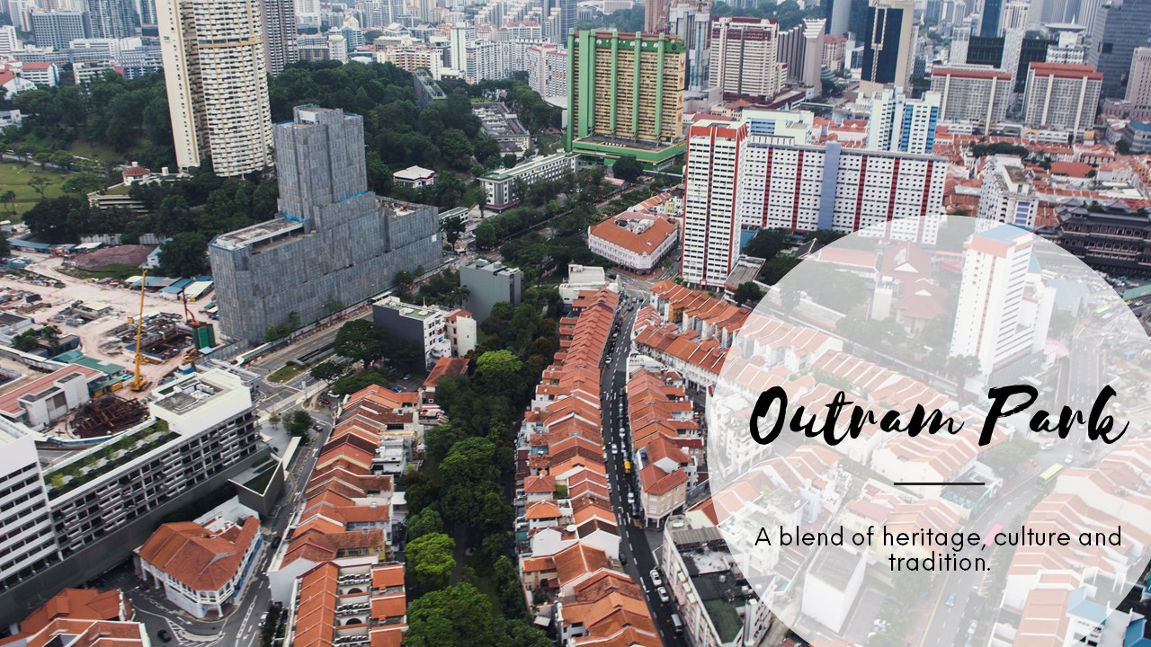
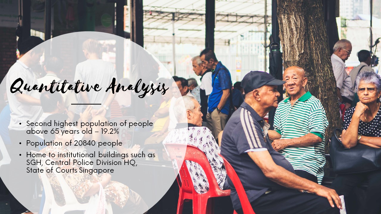
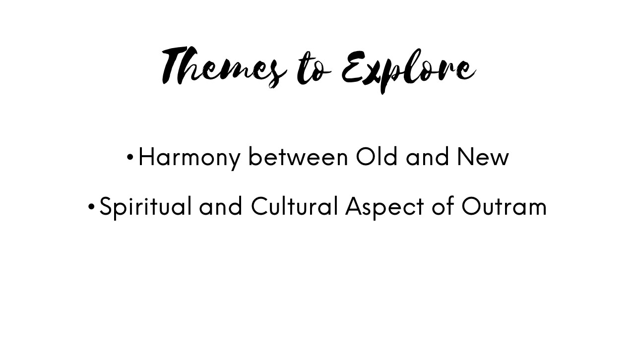
In my previous research post, I narrowed down my scope of design, focusing mainly on the spiritual and cultural aspect of Outram Park.
To begin, I started to identify and dissect the elements of design in different religions based on their art as well as structures. This would provide me with a better understanding of their cultures and symbolism.
I will categorize these into their representations and their overall aesthetics which would include colour and design styles.
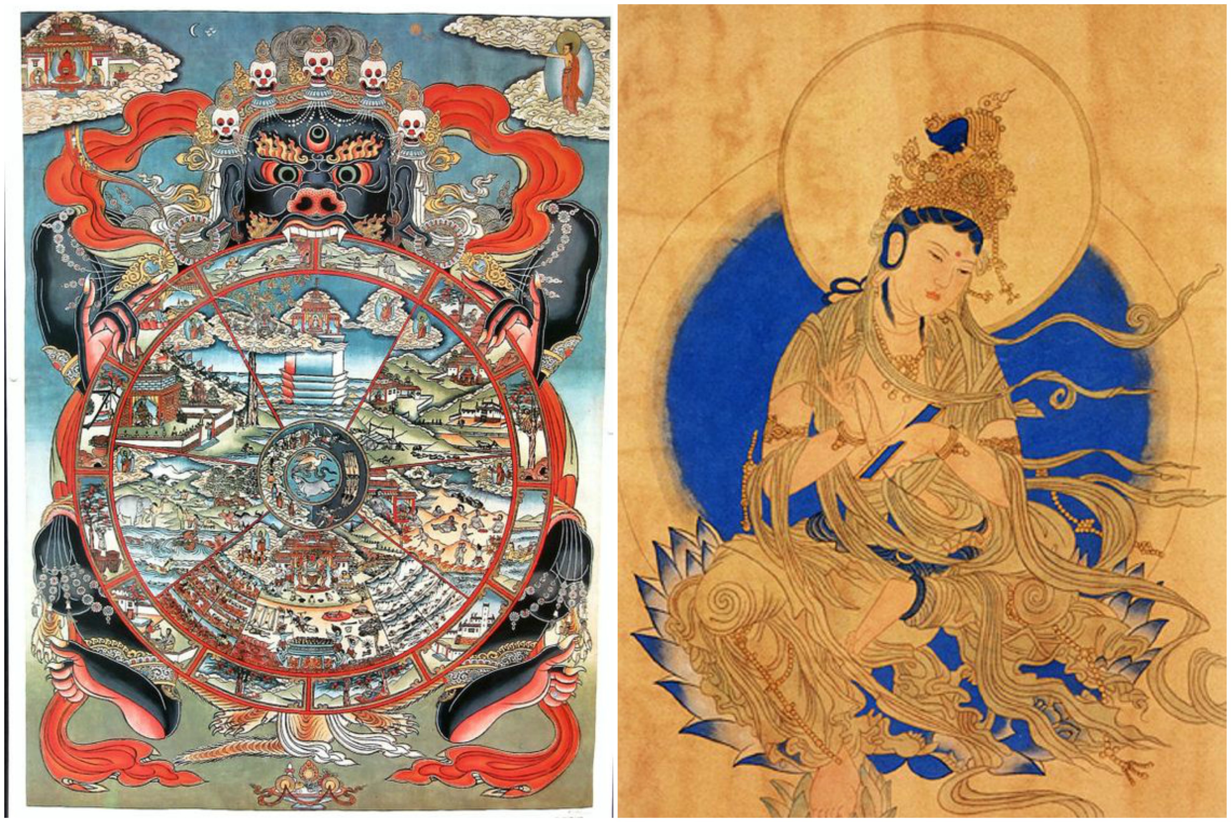
Buddhist generally features many mythical creatures and imagery of the different gods, including: Buddha, Guan Yin and Guan Gong. Other design elements that accompany these gods would be:
Joss Sticks
Red Lanterns and lights in the shape of a lotus
Gold Embellishments
Aesthetics
Gold, red, orange, yellow tones. Thick stokes to outline their drawings
Similar to Buddhist art, Hindu art offers a myriad of Gods, including Siva and Vishnu. They also have other natural elements such as the bodhi tree, the use of oxen and elephants. Human figures also make up a large part in the overall composition of their temples.
Imagery of Vishnu and oxen
The use of nature, human figures
Aesthetics
Blue, Gold, yellow, green. Mandalas and the use of nature. Hindu illustrations of the Gods do not often have borders, and tend to be more realistic in nature.
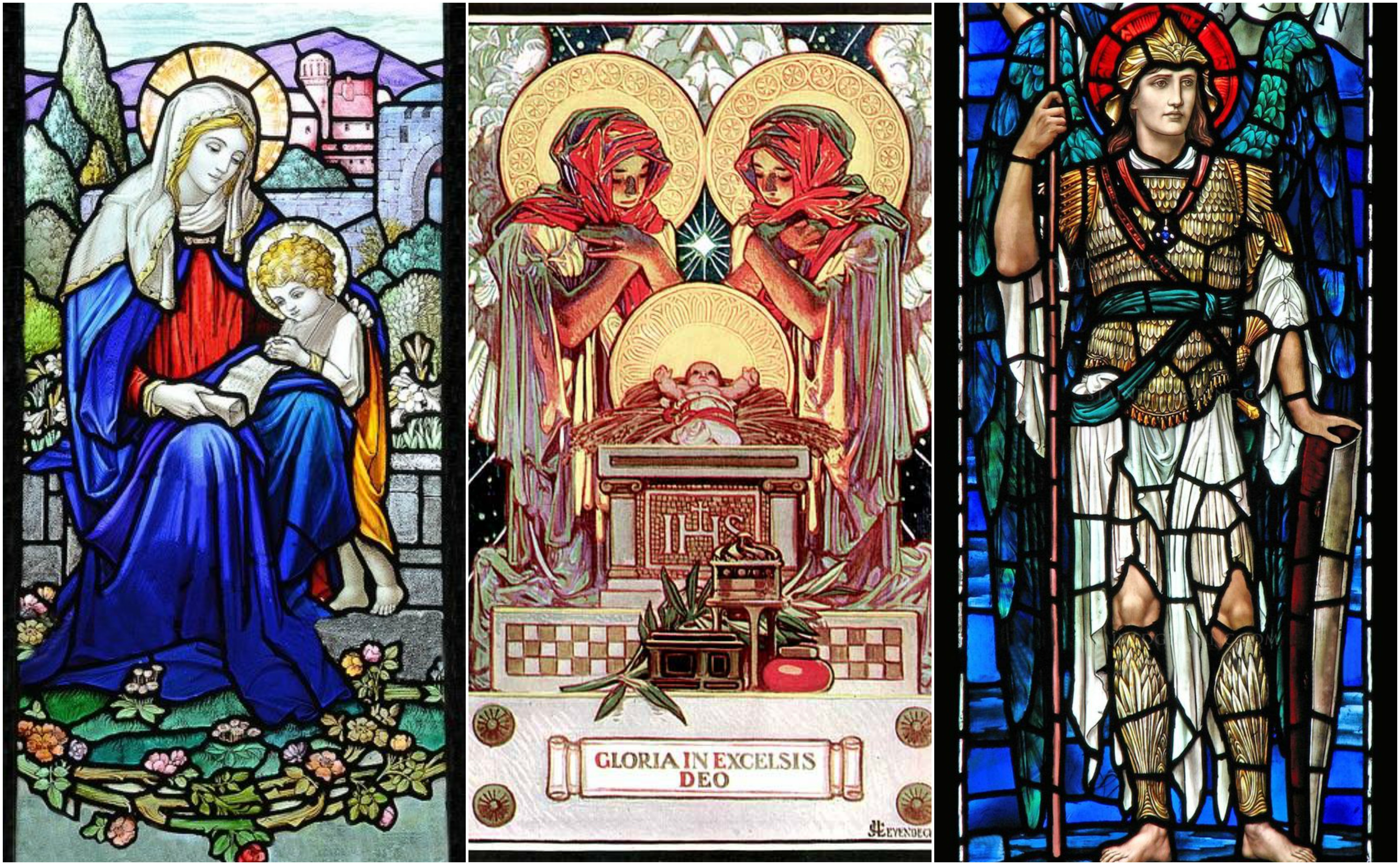
I had trouble finding much artistic styles from the pictures which I took on that day. The main symbol I could identify for christian art was Jesus and the cross. I began to look online for more styles and representations of Christianity.
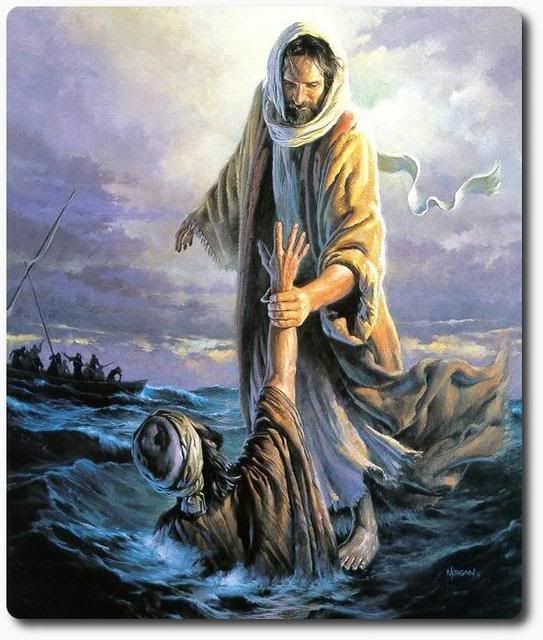
The main symbol of Christ is the cross
Doves
Walking on water
Aesthetics
The image of Christ has always been associated with the colour white as it symbolises purity and gold/yellow to symbolise his glory and magnificence. I started to look for more christian art online and stained glass windows seemed to strike me to have a prominent art style. Characterised by thick outlines, vibrant use of colours and a ‘fragmented’ composition.
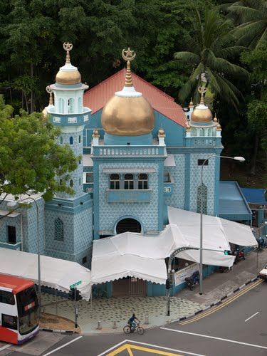
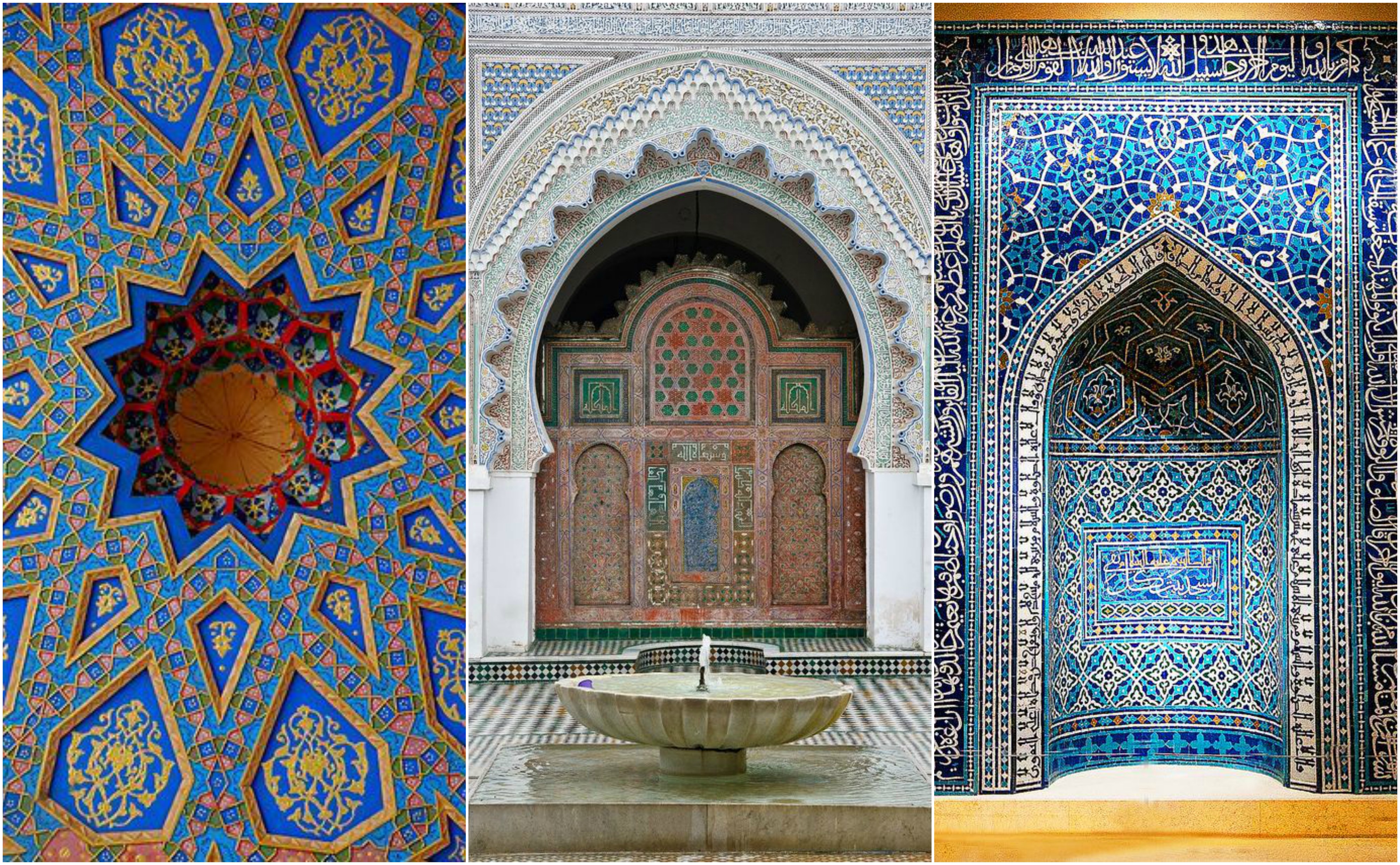
I encountered the most trouble finding suitable design styles for Muslim art it is most often recognized through their inscriptions and writings. I consulted Mimi on this and she advised me to look deeper into the structure of other mosques.
Holy Inscriptions from the Quran
Another distinctive feature was the colour of teal green
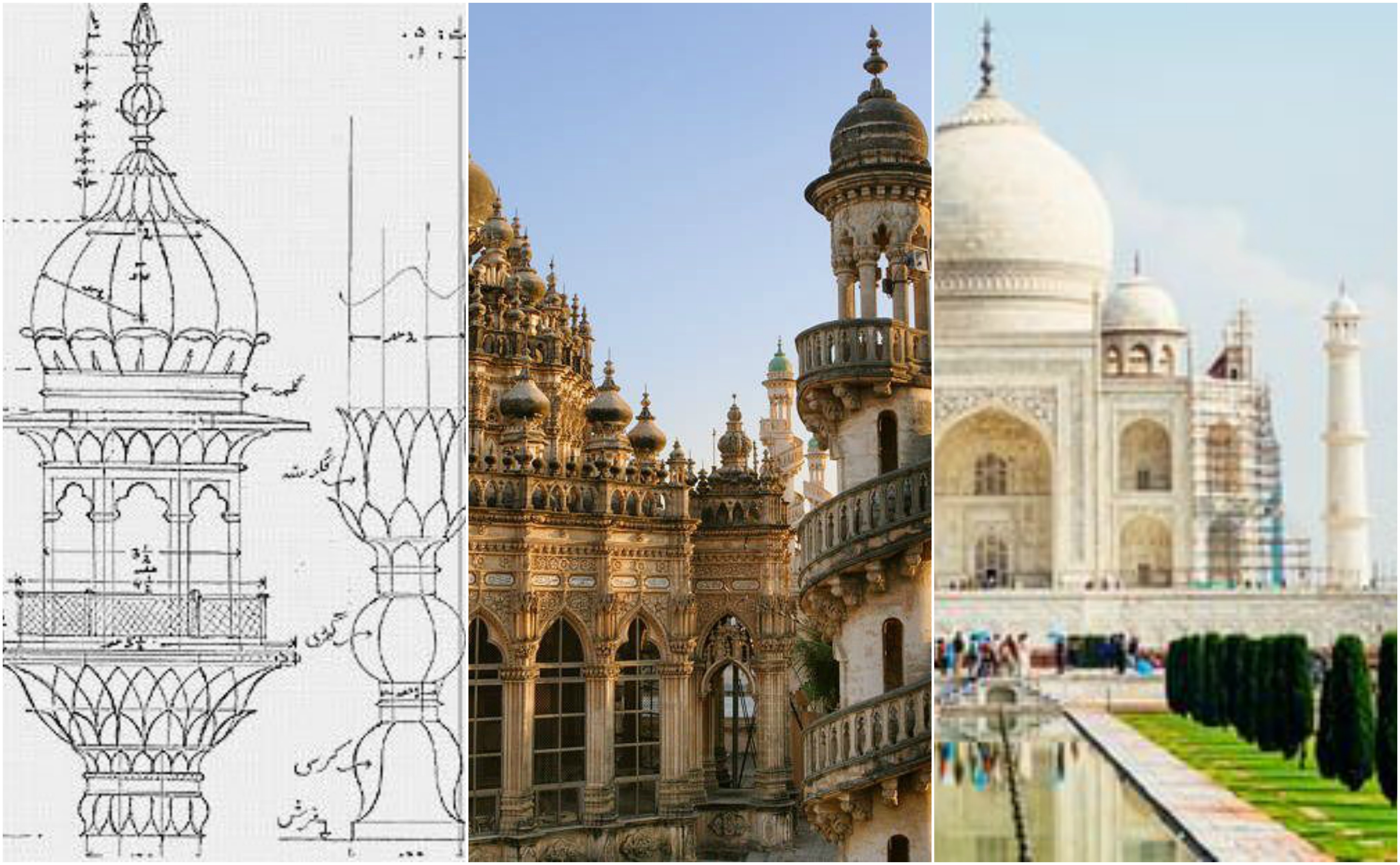
As I searched online for more images of mosques from around the world and Singapore, I noticed the distinctive use of minarets.
More examples of the use of minarets in mosques overseas
Not only did I examine the structure of these Mosques, I also managed to find images of the interior of these majestic monuments. The use of intricately painted tiles in geometric fashion are a unique trait of Muslim art.
Aesthetics
Gold, blue, yellow and teal. Geometric tessellations with white or gold borders.
Common design aesthetics:
I noticed that the use of gold is prominent in all of the artistic styles of the different religions. Gold is often used to portray something in a grand or luxurious fashion, which is understandable why all of these religions would use it.
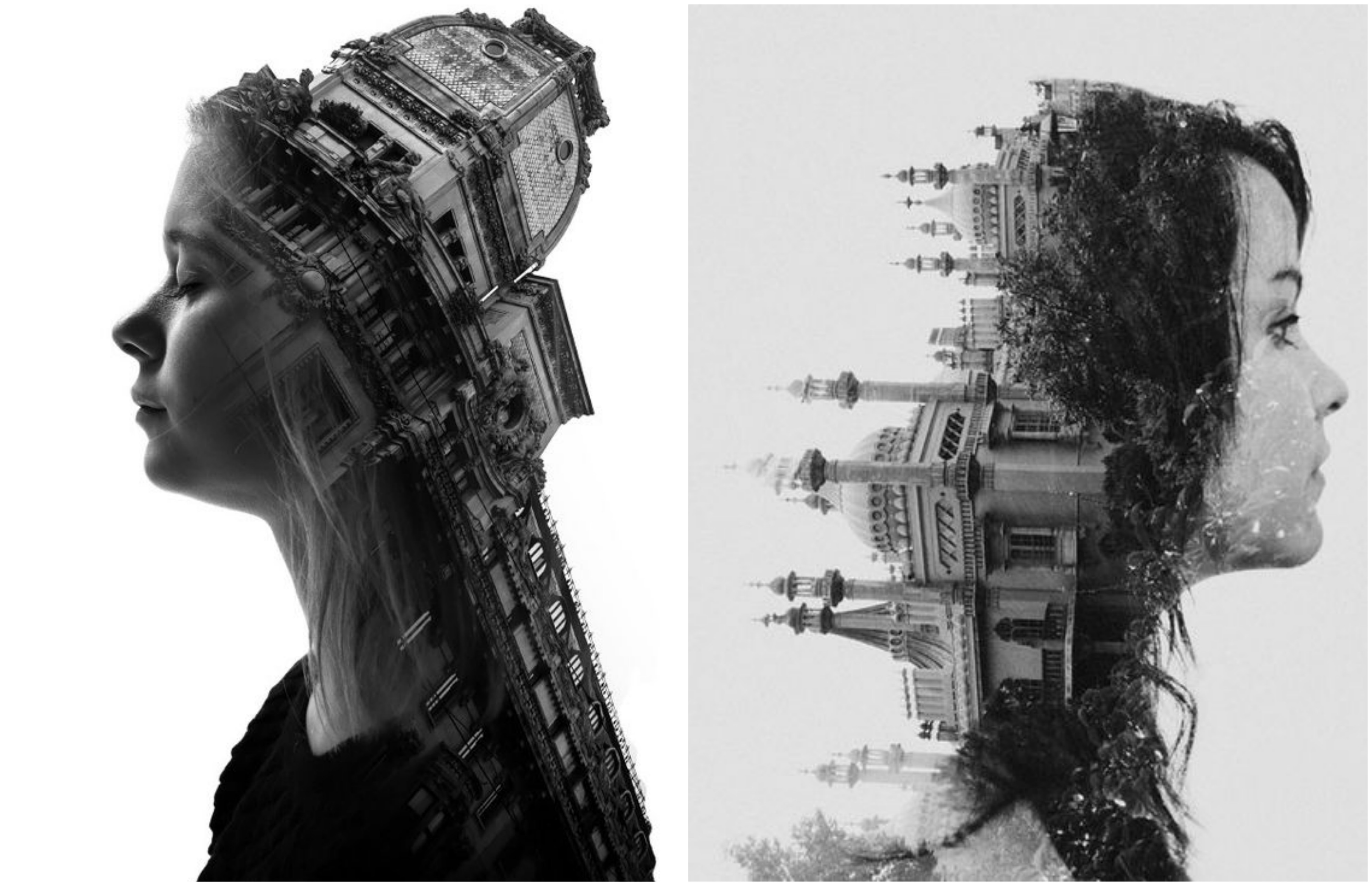
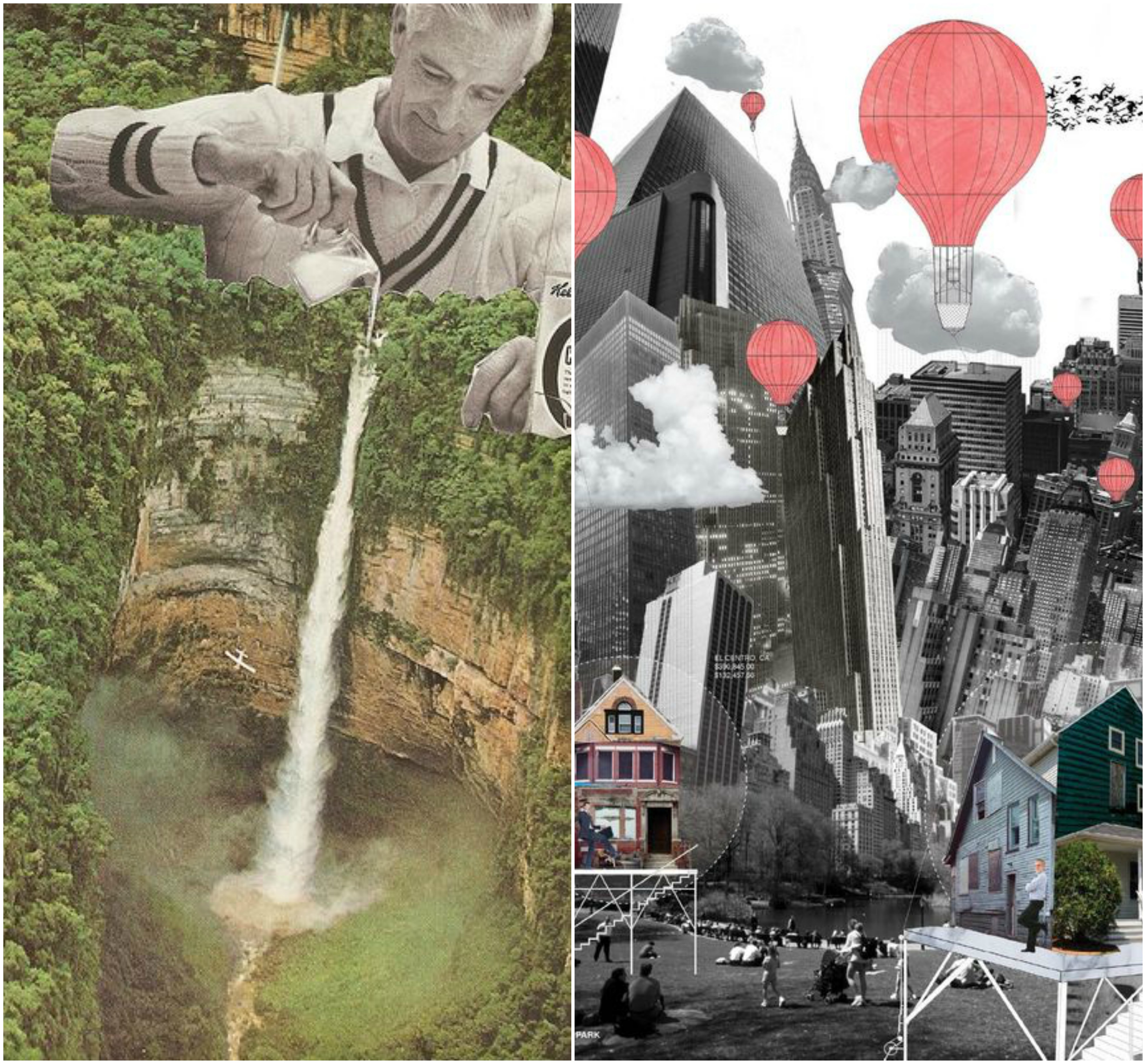
The concept I had in my mind was to juxtapose everyday life with religion as Outram is teaming with spiritual connections. As I wanted to combine illustration with photography, I sought the help of the internet to help me.
I really resonate with using ink and watercolour in illustrations which is why I want to explore this style in my zine.
This is an interesting concept I came across. These double exposure shots juxtaposed of architecture with humans could be adapted into my illustrations.
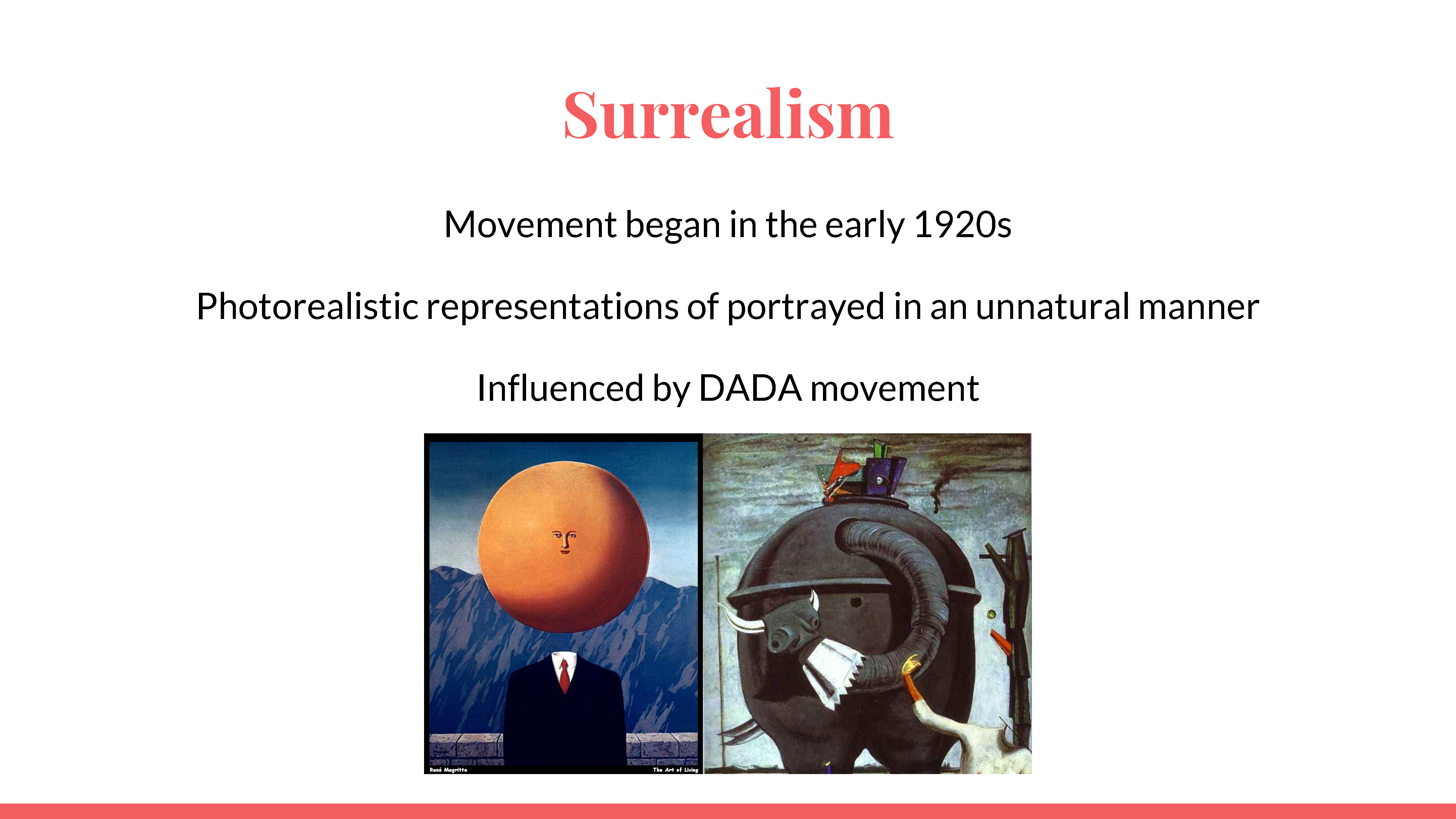
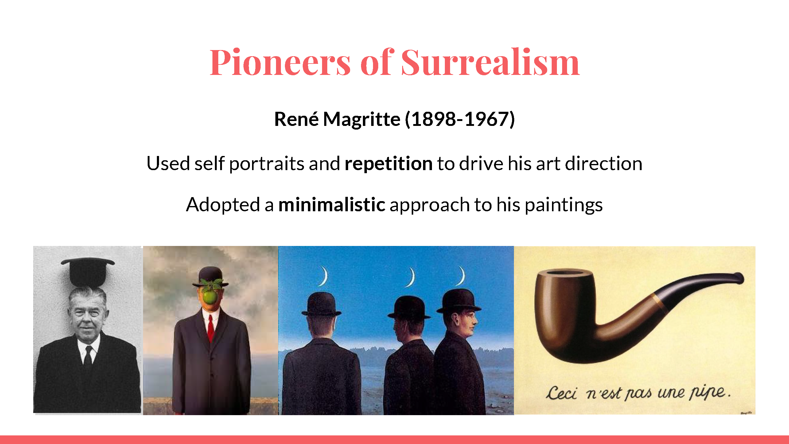
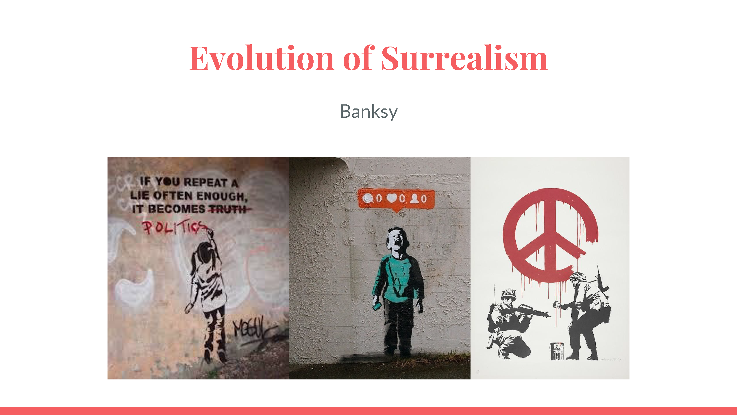
I feel like Surrealism would be the most suited to illustrate my ideas as it would be able to incorporate all of the different styles I have identified as the imagery of mythical creatures and Gods are widely used in these religions.
I found some interesting compositions I could explore during the creation of my Zine!
To start off, this is my proudest piece as I had the chance to explore a medium which I was passionate in, which is the use of mixed media such as inks and digital painting.
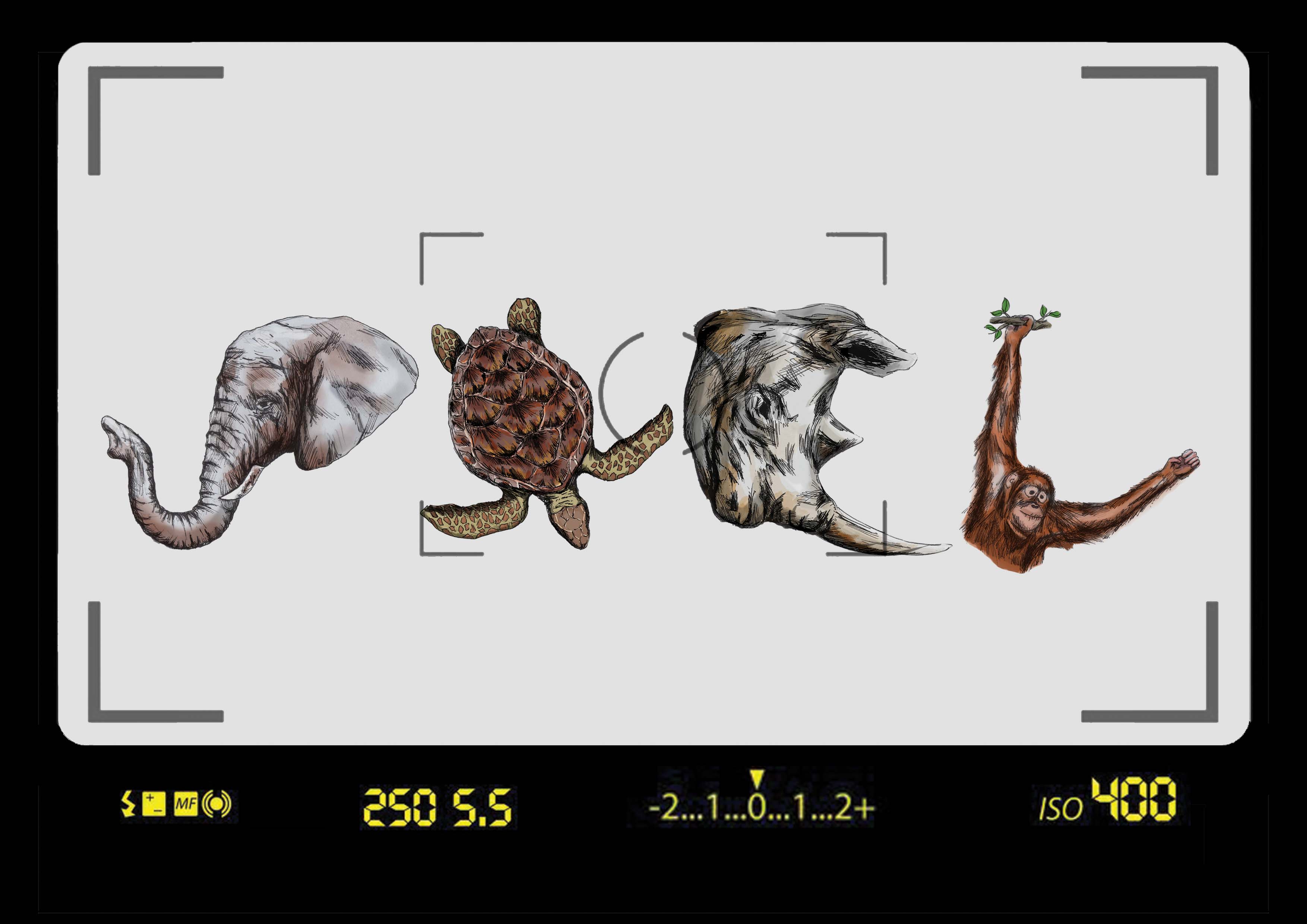
The animals represented in this piece are critically endangered animals – this brings about a more pressing message that we have to treasure the animals and the environment around us as they are slowly disappearing.
In this composition, I used semiotics such as the camera viewfinder to portray the look of a photographer.
Handyman
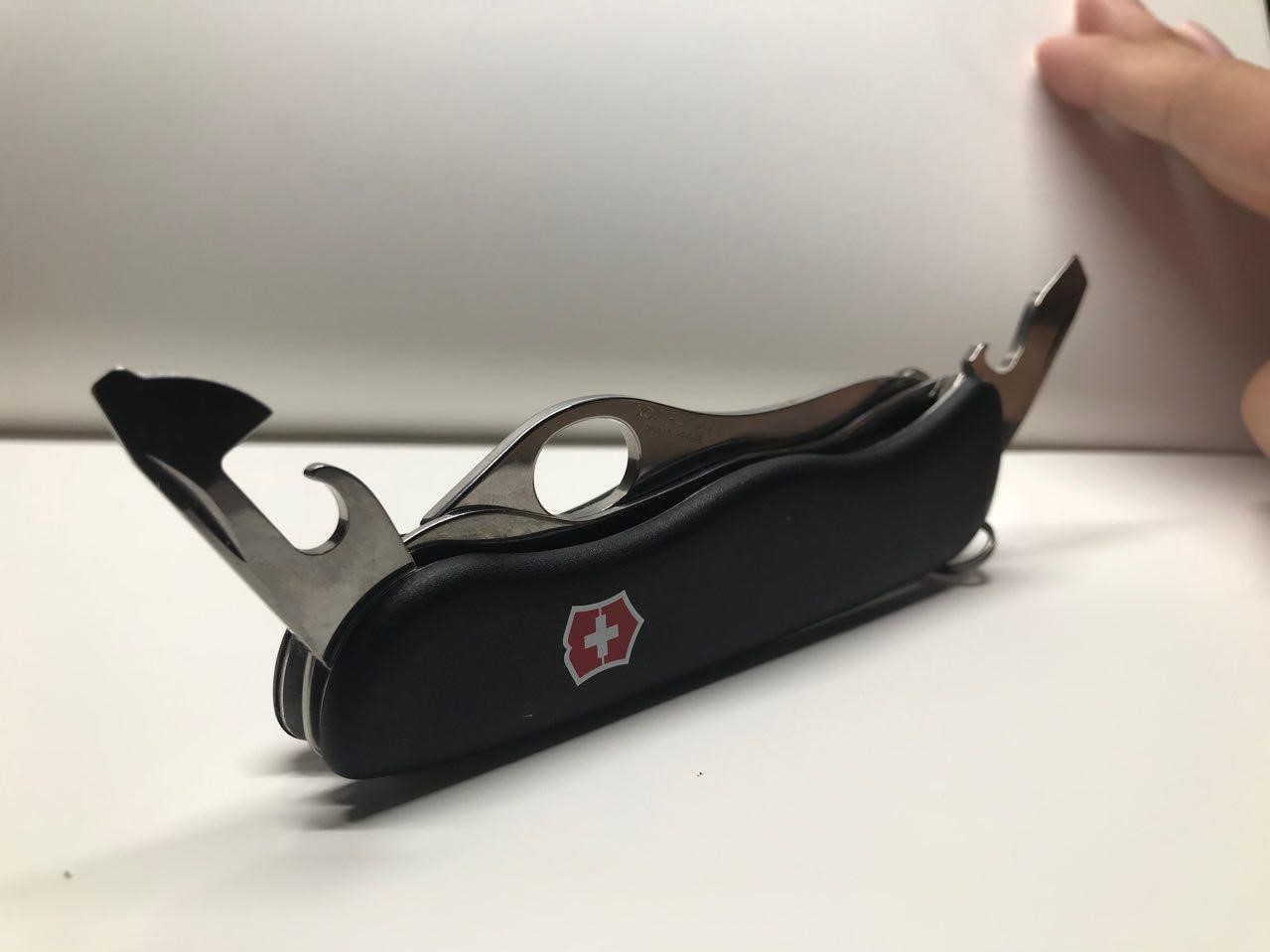
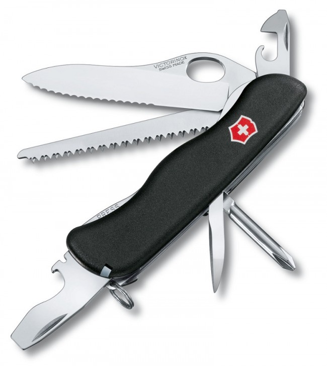
As mentioned during the presentation, I strive to be useful in all situations and to adapt well in new environments. To show this, I used a Swiss Army Knife as it is versatile and readily accessible.
The background is mustard yellow/orange (as some of you may see it) to represent the construction tools and the idea of utility.
Sleep Enthusiast
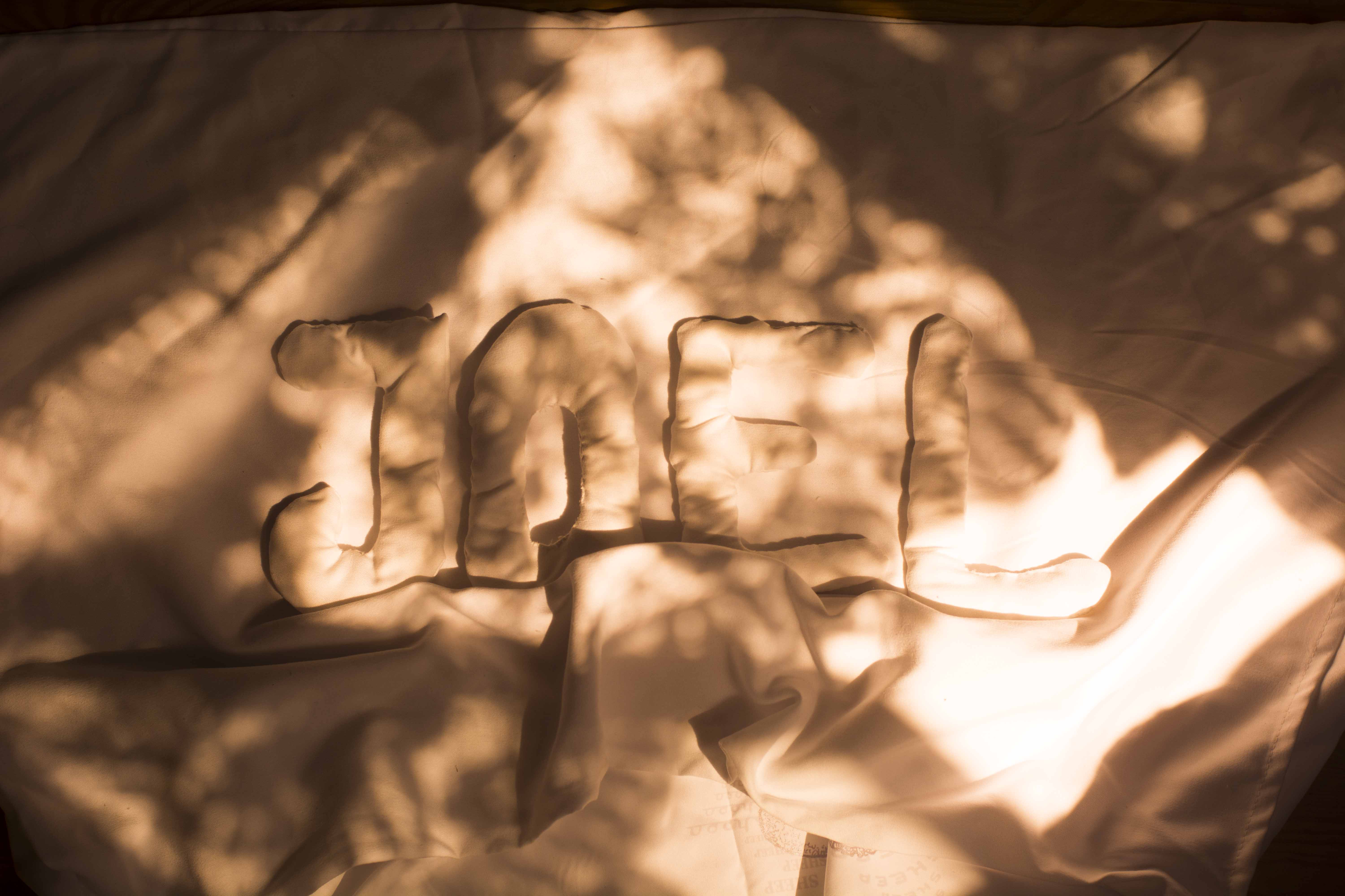
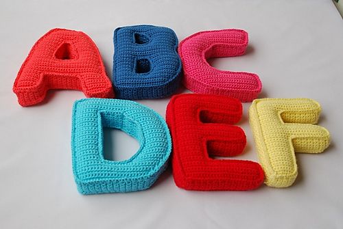
I finally settled upon this composition as it best portrays the amount of time I spend in bed! How I am still able to remain in bed even though the sun is shining into my face.
The warm colours brings about calm and bliss emotions, meant to make the viewer feel at ease. I also wanted to capture the comfort of my bed which is portrayed by the pillow alphabets and soft tones.
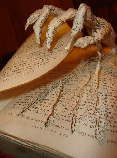
Bookworm
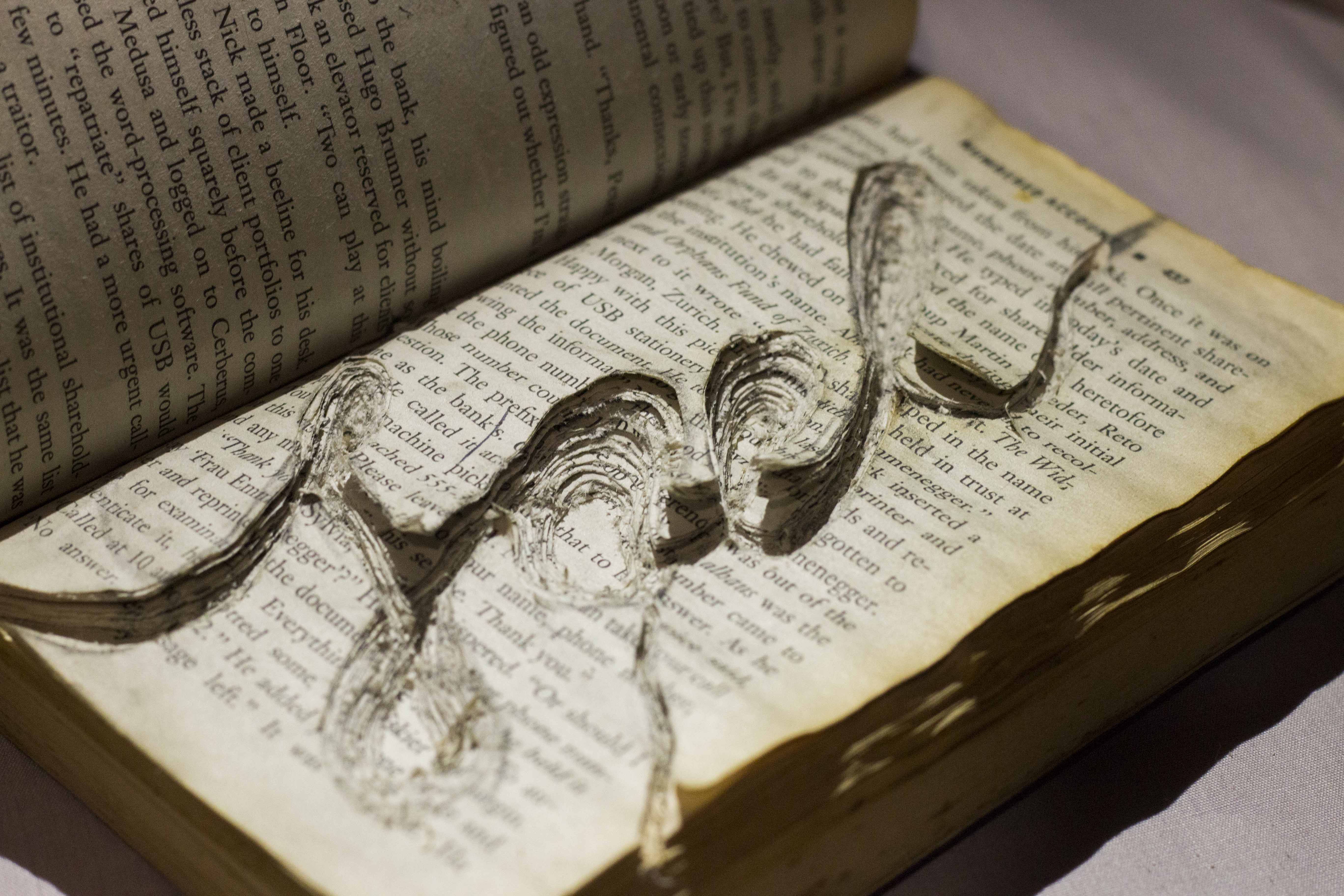
This was the piece which I was most uncertain about, and yet also most pleased with the outcome. I managed to capture the essence of a worm burrowing through a book, similar to how I tend to get so engrossed in novels that I completely lose track of the time.
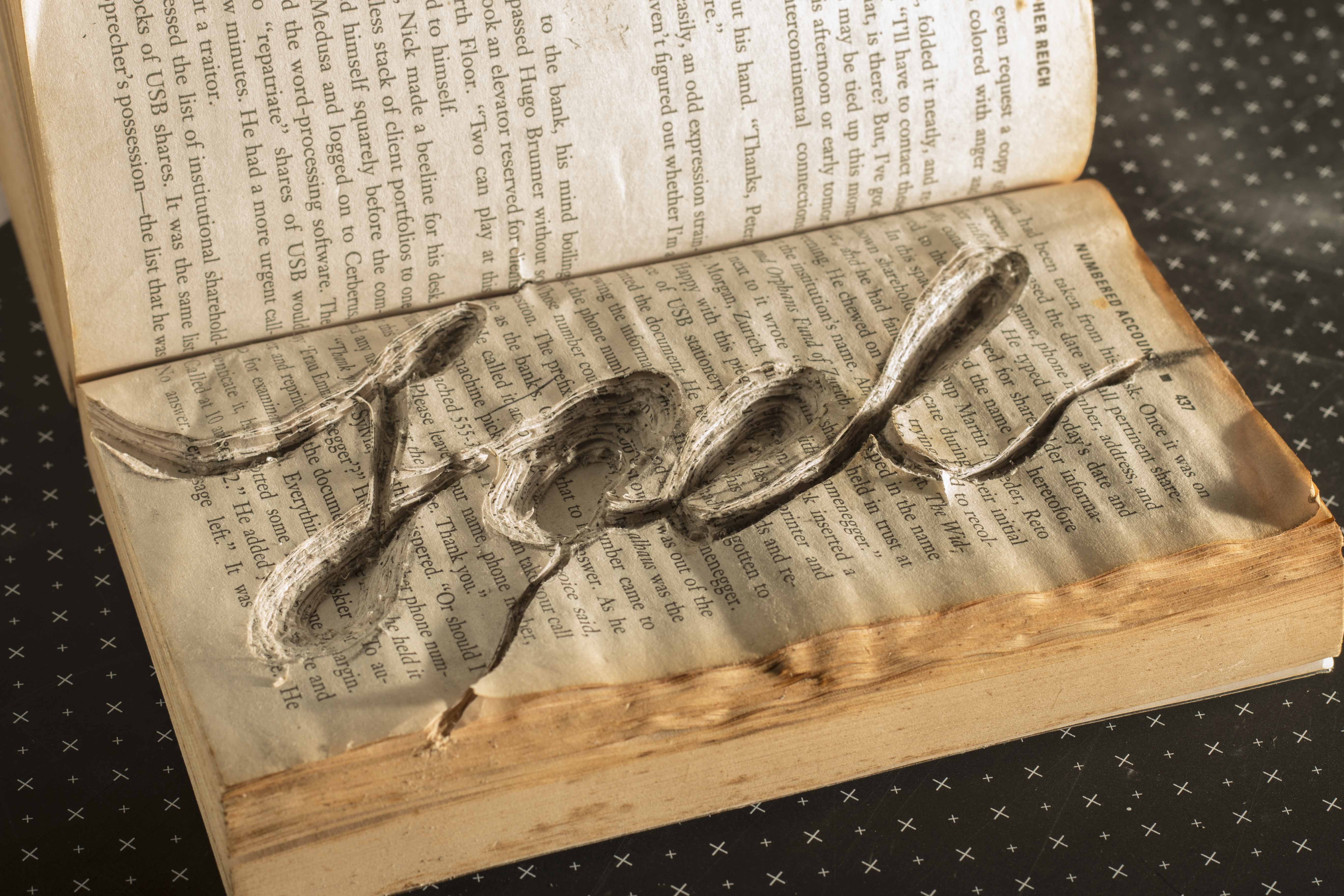
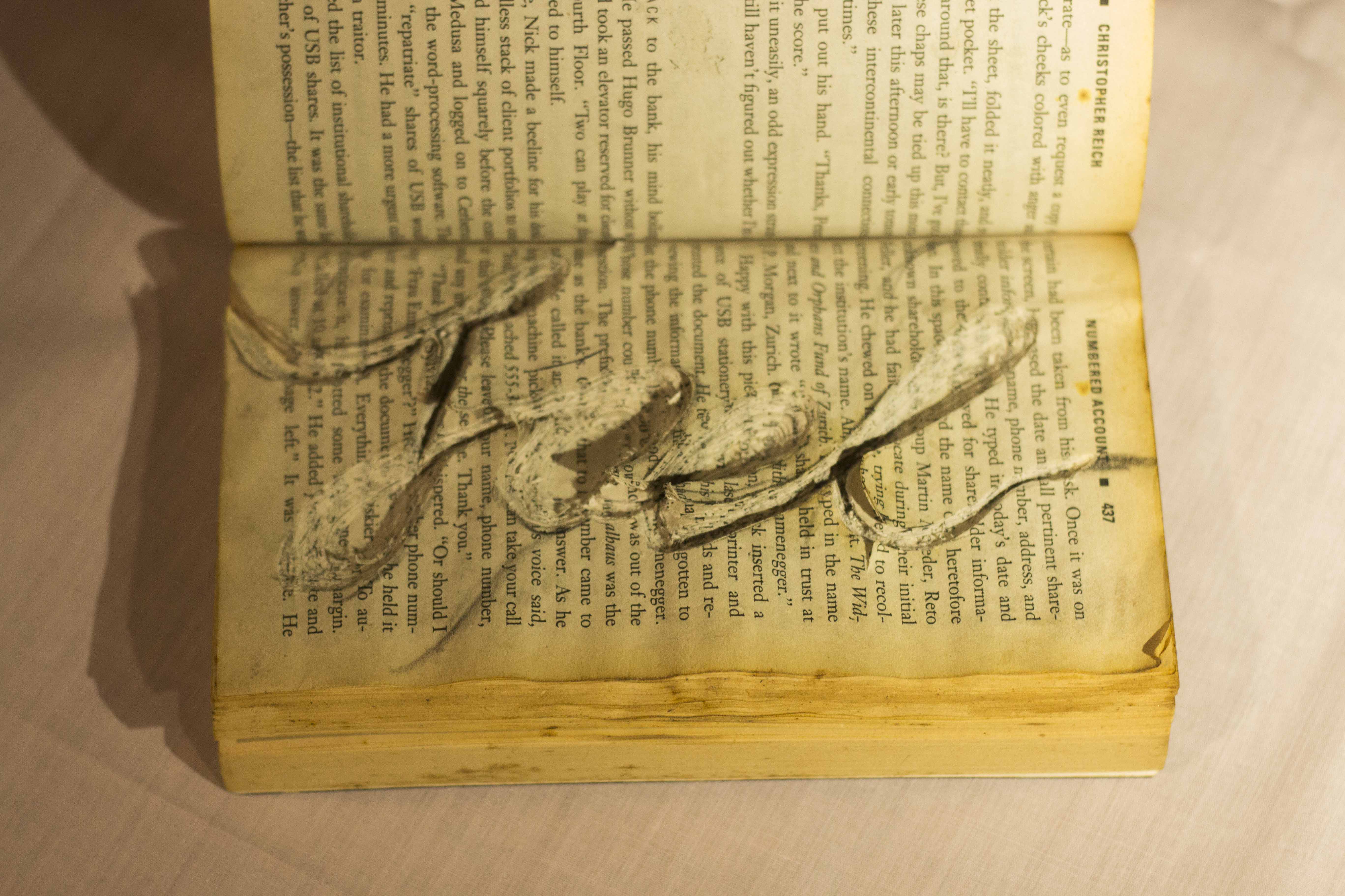
The worn look of the book also adds the context that this book has been well read.
Overall, I am proud of the outcome of these pieces! I wanted to explore new mediums of art as I wanted to push the limits of my creativity and gain some experience in working with physical objects.
I was thrilled to explore this style as I enjoyed the aesthetics of it and I wanted to see how it would turn out. I was glad that Mimi agreed upon this concept as I am aware that it could come off as too pictorial.
I wanted to have a message behind this piece, other than trying to convey my job. Instead of using any types of animals, I specifically chose animals which are endangered. This would create more meaning behind my work as it brings forward a very pressing issue we face.
I explored the idea of several different animals in my CPJ, but eventually boiled down to using an elephant, Sea Turtle, rhinoceros and an Orangutan.
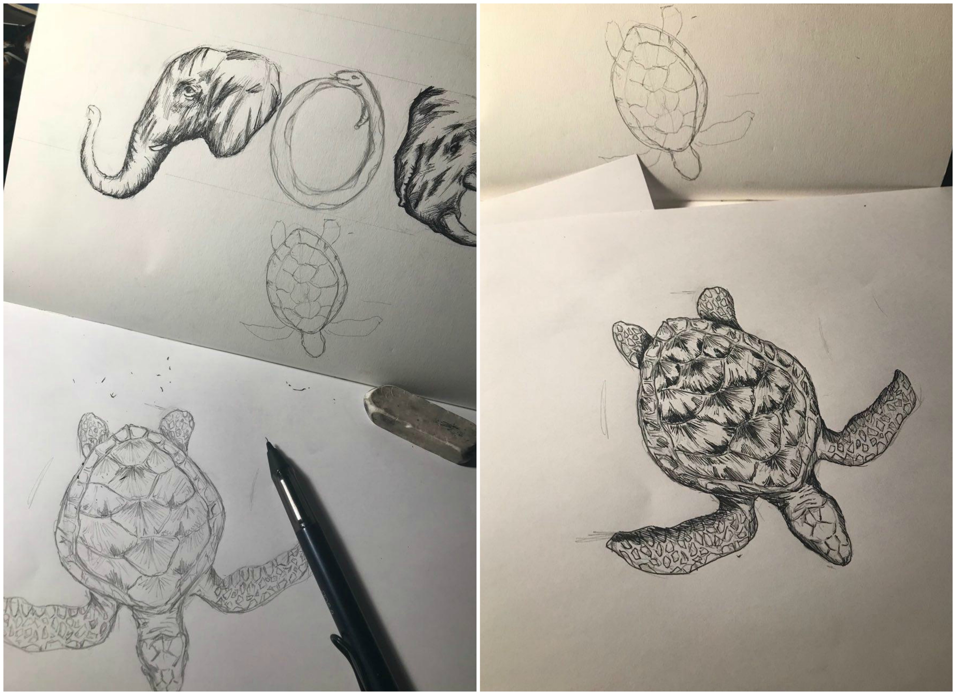
I would first begin by sketching out the animals, followed by inking them using my pen.
After which, I would scan these drawings into Photoshop for colouring. This is a snippet of my colouring process.
After which, convey the idea of a wildlife photographer, I used the inside of a camera viewfinder to portray this. The viewfinder layout was also yellow which enabled the audience to draw the link to a National Geographic Photographer.
Handyman
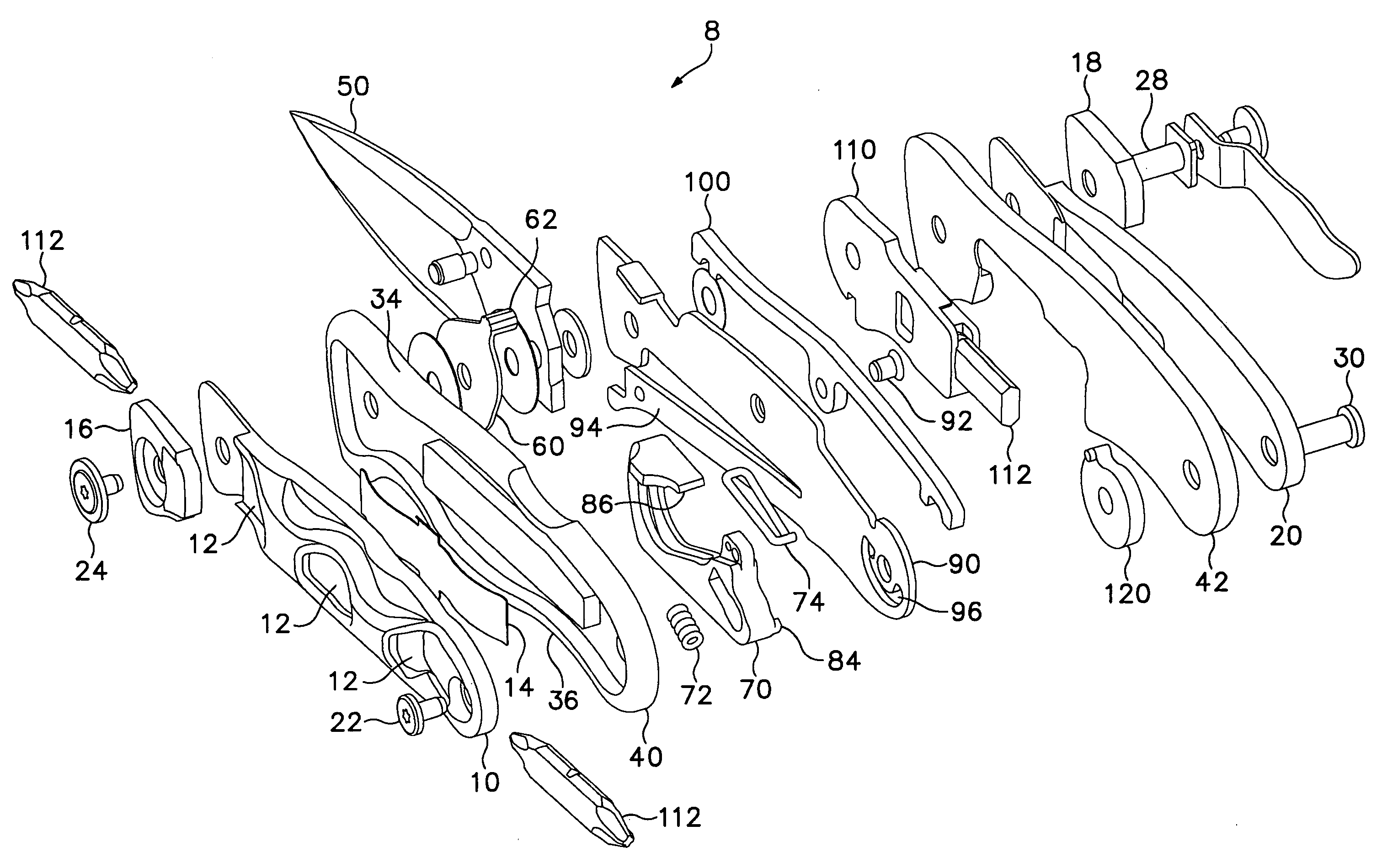
For this occupation, I explored many different perspectives, trying create a composition which would best represent my name using the tools of the Swiss Army Knife.
Thankfully, I had the help of my trusty Swiss Army Knife to help me get a good perspective and to help me visualise the arrangement of the tools.
I chose this perspective as it was much more dynamic than the flat lay which I did on my CPJ.
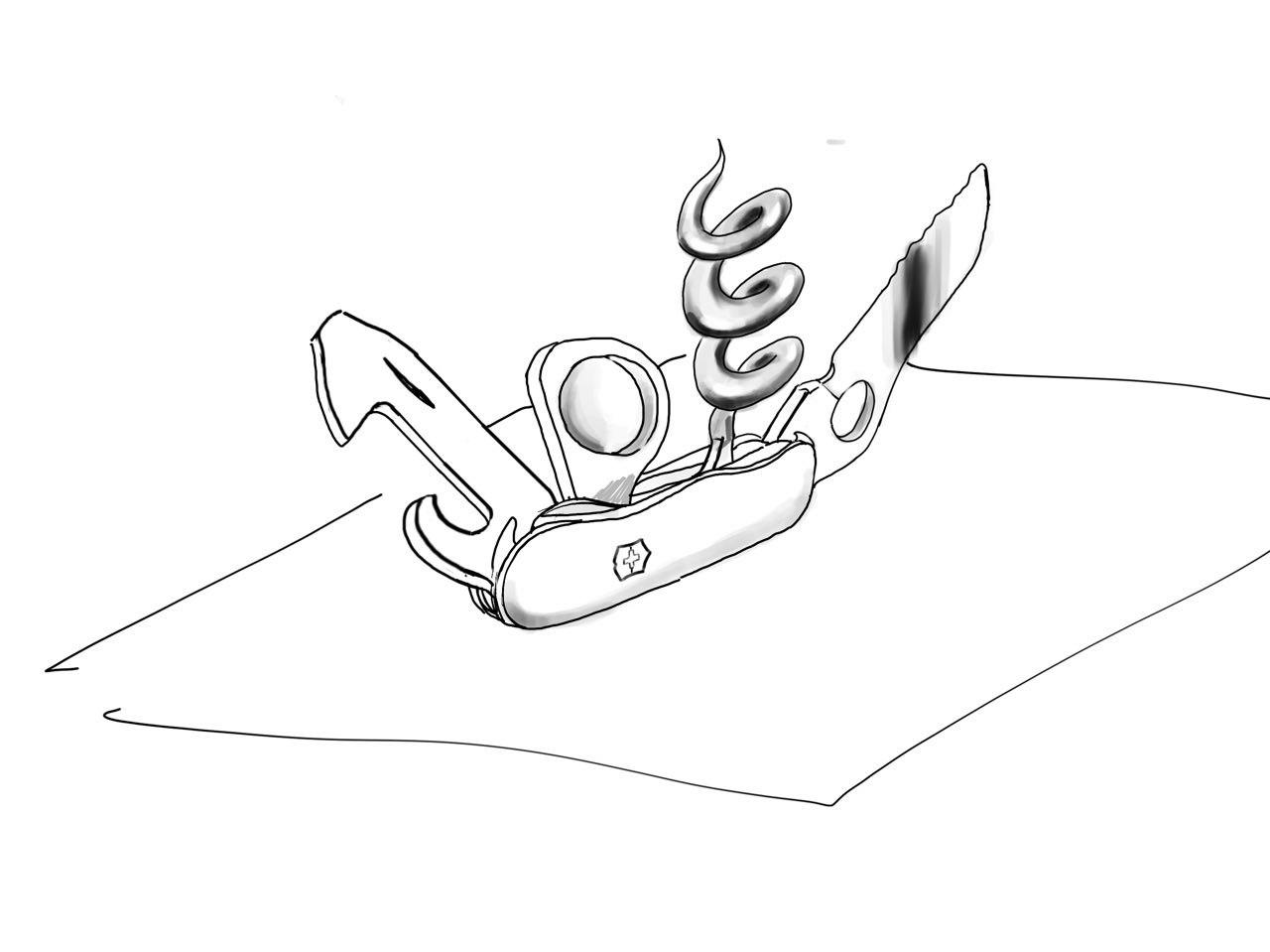
I then began by tracing the image on my iPad, which I then transferred onto illustrator to create a cleaner graphic.
I used yellow for the backdrop because I wanted to convey the message of utility. I started to look for places which holds tools and I found something in common.
Thus, I felt that yellow tied in well with the theme of this piece and it also brought across my message well.
This is a process of me rendering the object. I added gradients to the blade as I did not want the image to look too flat and unrealistic.
Mimi also told me that some of the elements had to be edited as the composition was a little uncomfortable or out of place. I made the magnifying glass larger to fill in the negative spaces between the tools.
Bookworm
I felt like this was the piece which I had the most challenge making as there was just so much uncertainty surrounding the outcome. I experimented on several books before I managed to get the result i desired.
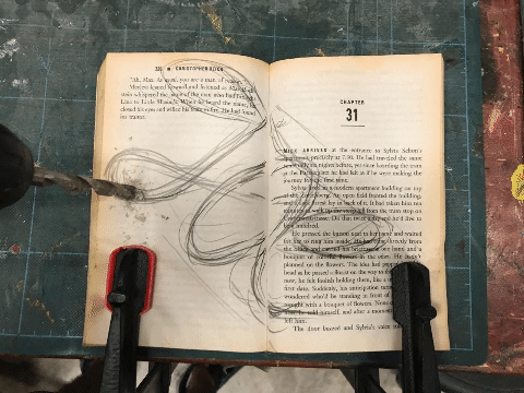
I first begin by sketching out my name onto the piece of paper. I had to create an illusion that a worm was burrowing through the book. Initially to create such a composition, I used a drill to create the holes in the book.
The result turned out to be very messy, as the swirling drill bit dislodged and frayed the paper in chunks, making it loose and haphazard. I experimented with different sizes of drill bits and i even had to use clamps to hold down the book.
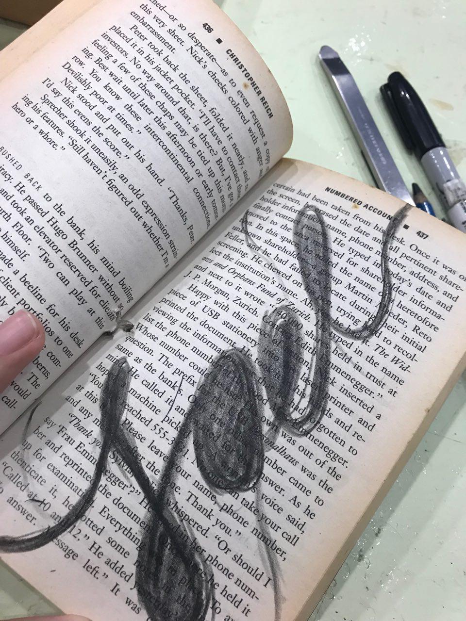
After that failed attempt, I decided to go with the slower and more tedious approach which was to slowly carve out the pages using a penknife. This method proved to be more controlled as well as precise, giving me more confidence in the outcome. I decided not to have my name spread across both sides of the book as the spine prevented the seamless transition I was looking for.
An issue I came across was the paper not staying in place as it was thin and it would shift whenever I attempted to cut it. To solve this, I glued the pages together using an old-school glue stick to ensure that the paper remains intact.
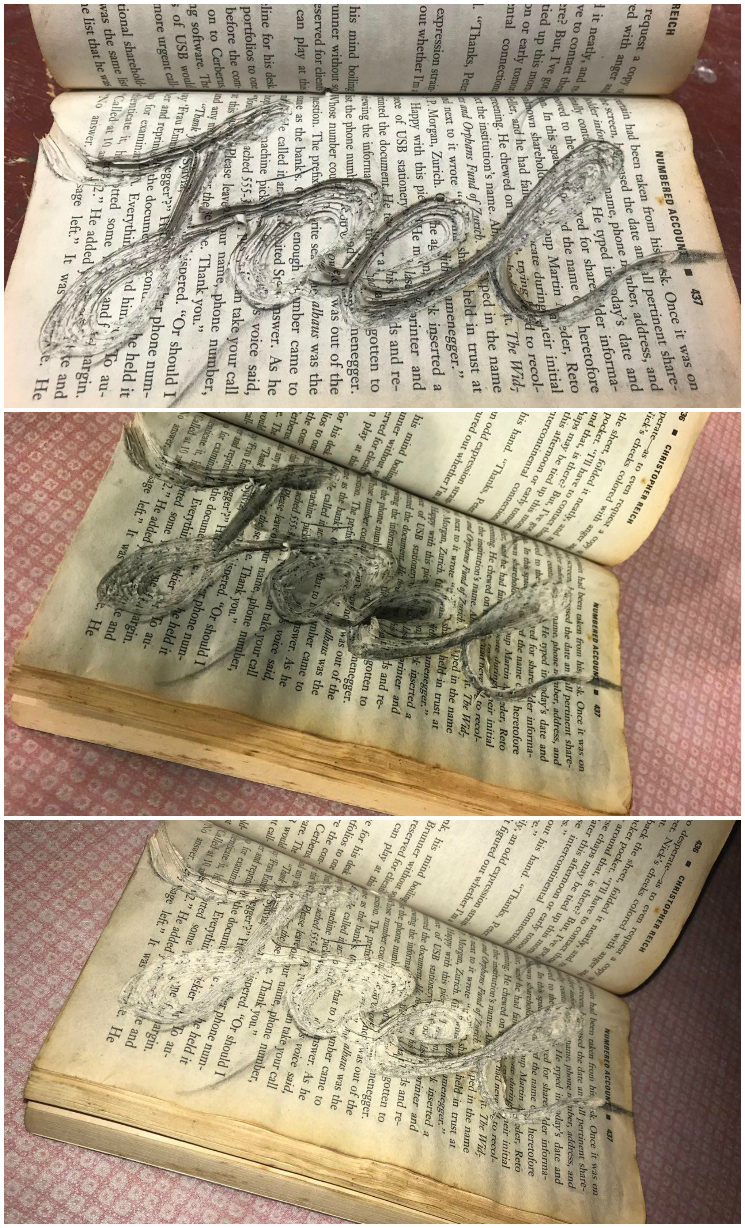
After several arduous of cutting through at least 50 pages, I was finally pleased at the depth and the outcome of the piece! These are some sample shots I took with my phone. I had to experiment with different camera angles as well as lighting angles due to the nature of the composition.
If taken from top down, the image would look too flat as you would not be able to see the layers of the book.
Here are more behind the scenes of my friends helping me to find the correct lighting and angle.
Some of the camera shots:
Sleeping enthusiast
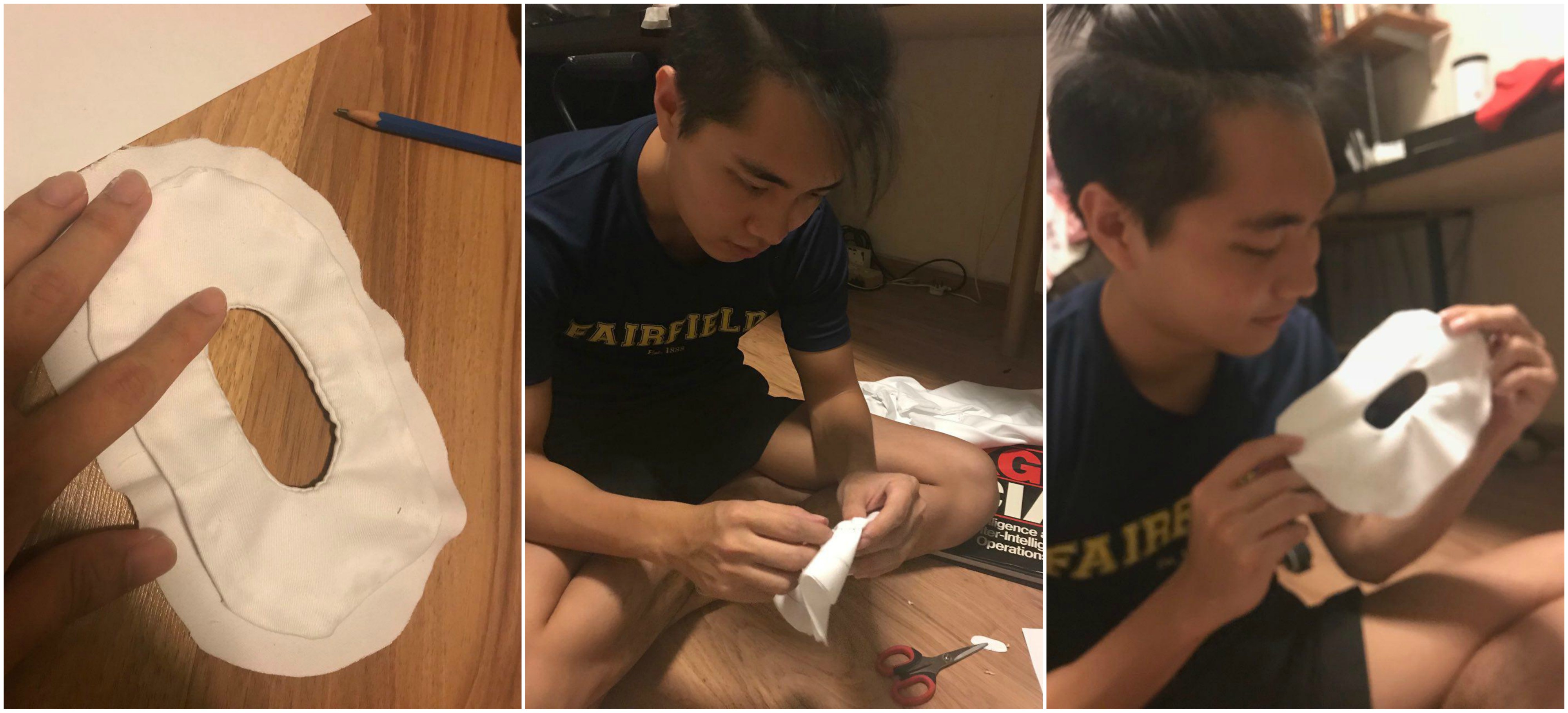
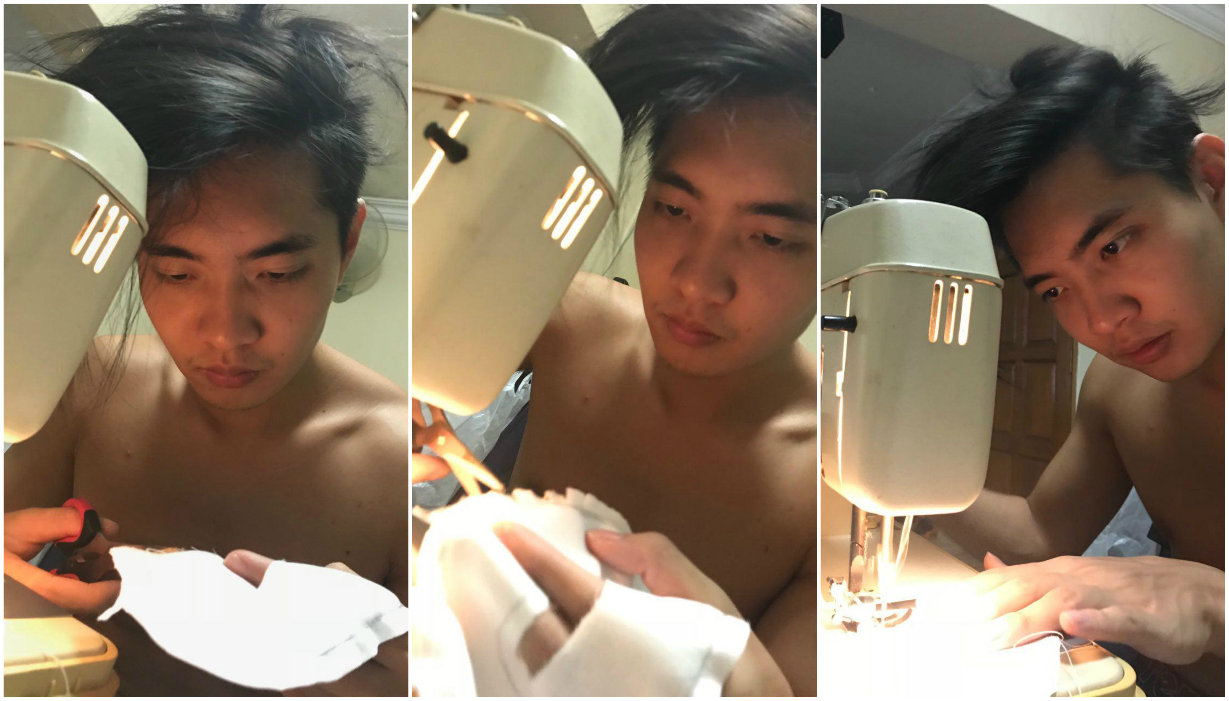
Sewing was a literal pain as I must’ve pricked myself more than 5 times when my mom was teaching me how to sew. It is an incredibly arduous process as I was really slow at the beginning (not any much faster now, but thankfully, I’ve improved)
I cut out paper letters to act as a guide for my cloth, after which I used a pencil to trace the image.
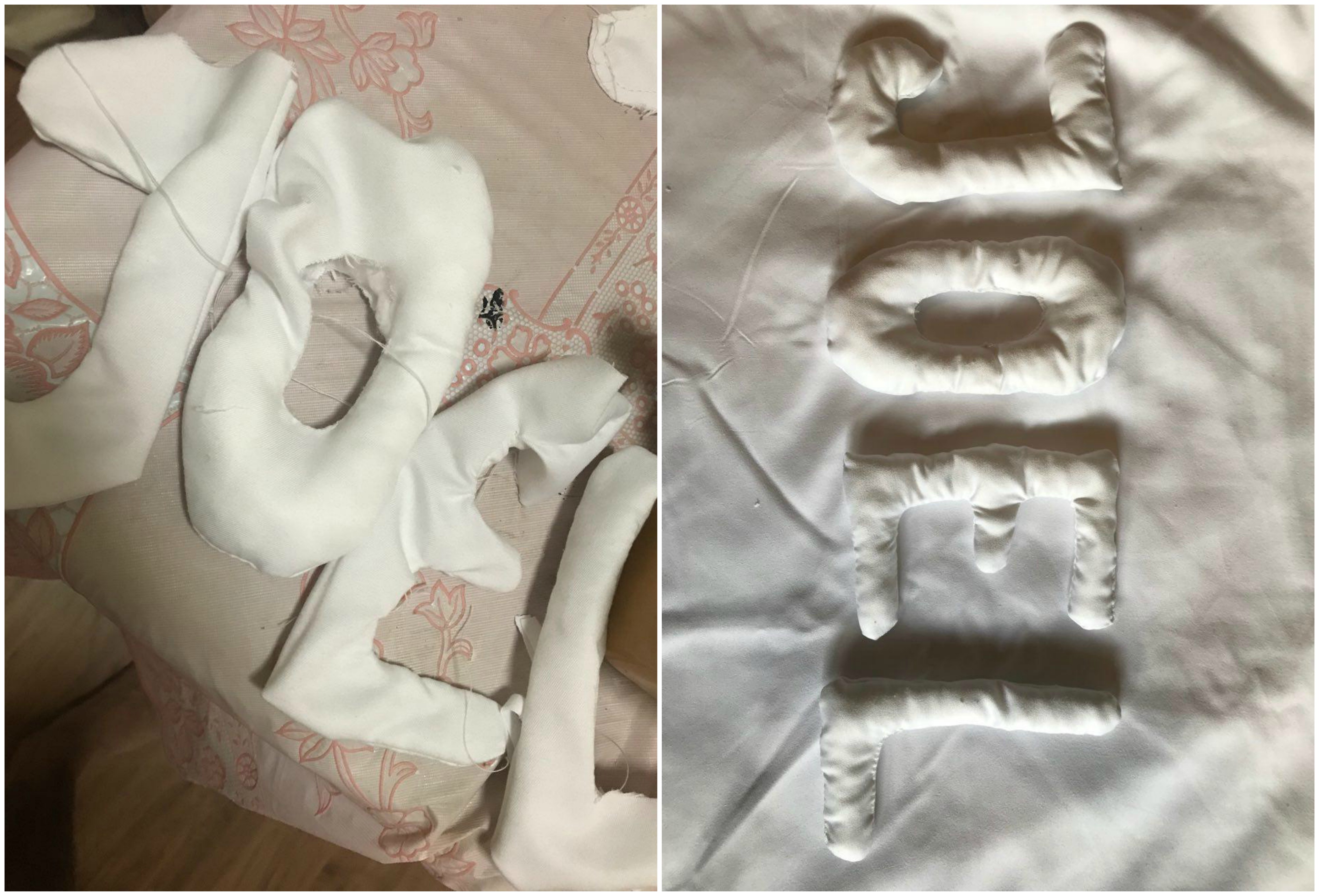
Initially when I sewed this O, I sewed it on the inside first. However, as I had to invert the cloth to stuff the cotton, I realised that it could not be done. Thus, reluctantly, I had to redo the entire O.
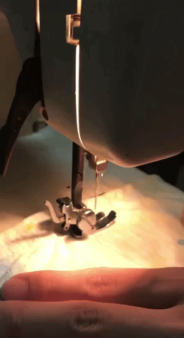
Seeing how it took me 2 hours to finish one alphabet, I pleaded with my mom to teach me how to use her sewing machine. As complicated as it is, once it was running, progress was much faster.
This was a test done on scrap cloth!
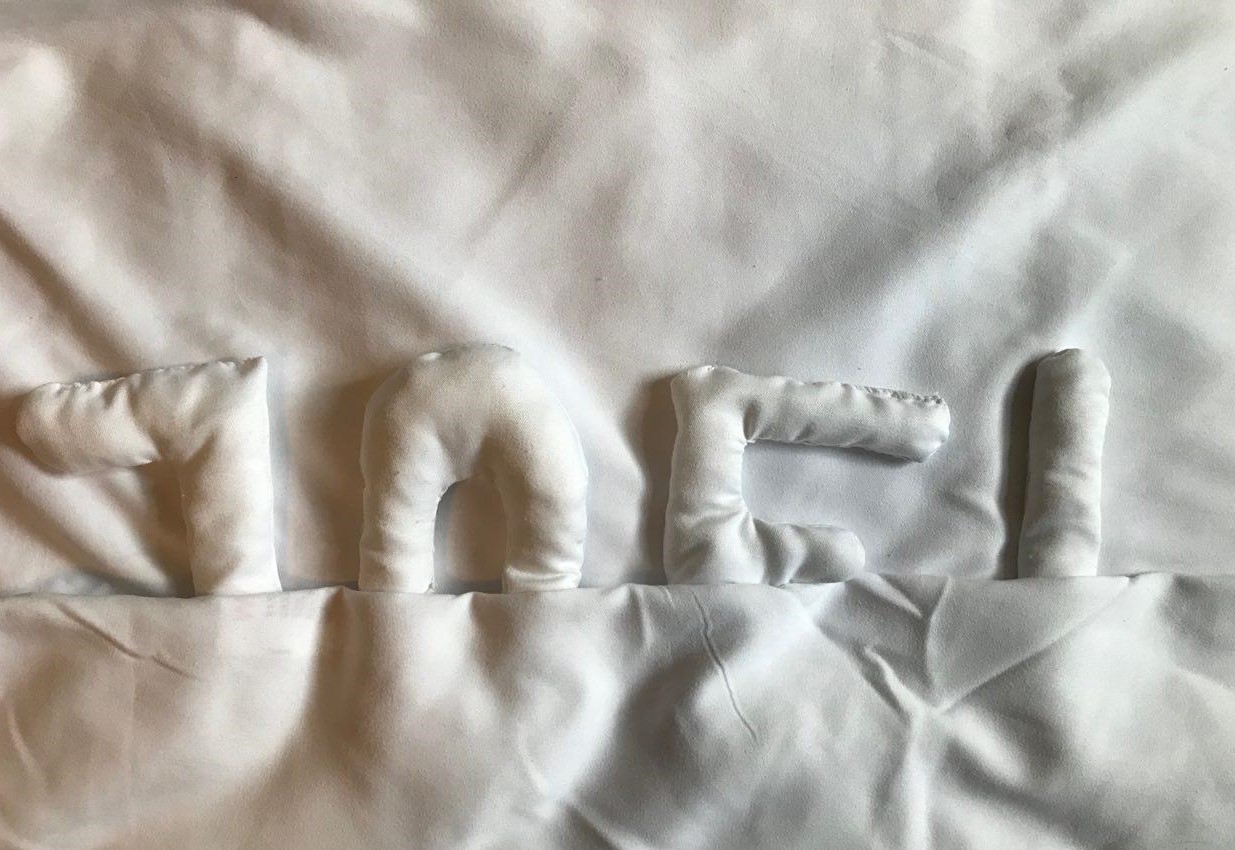
Here are some shots of me trying my best not to screw up the alphabets as well as my fingers!
Before and after stuffing with cotton!
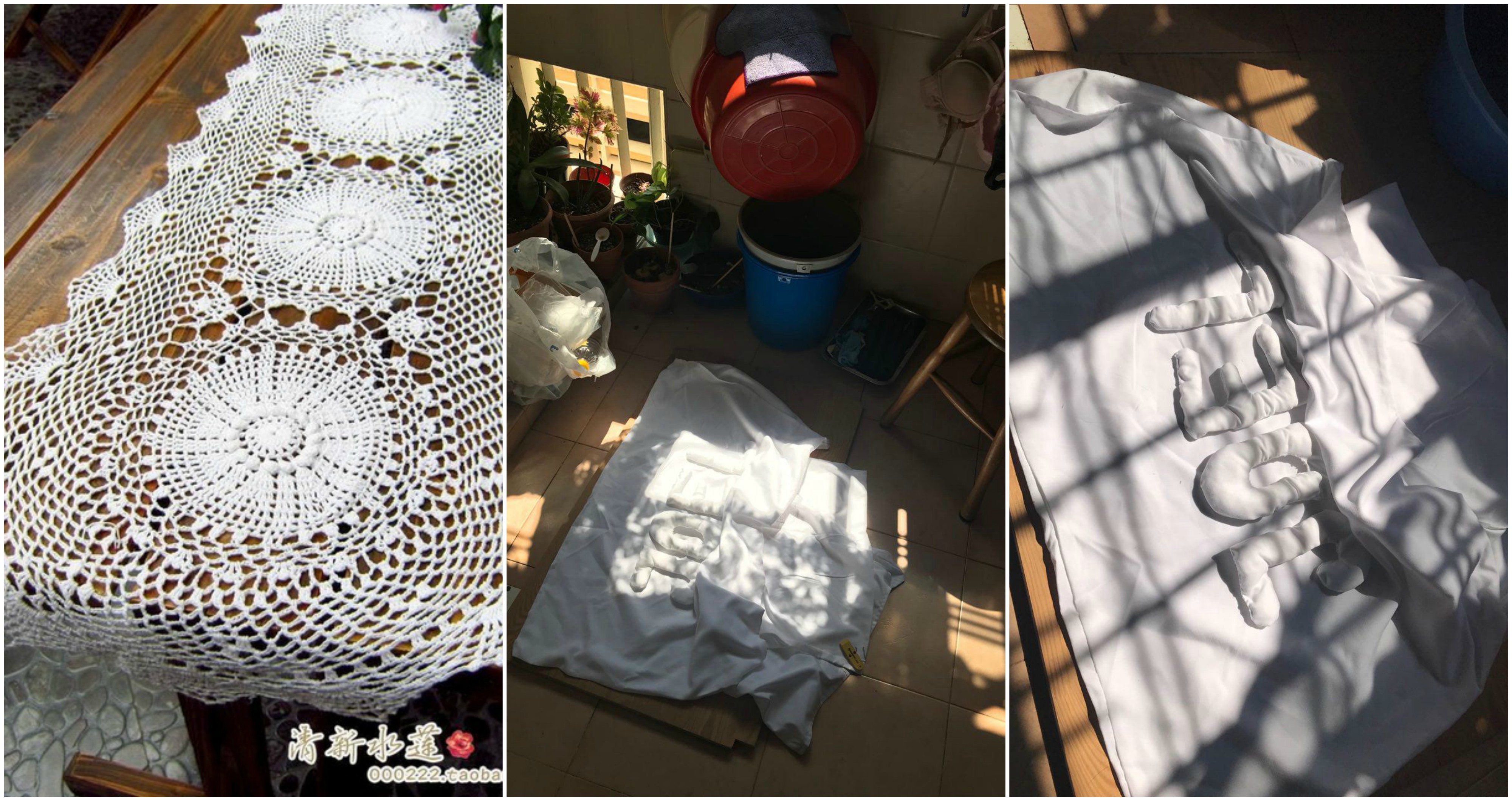
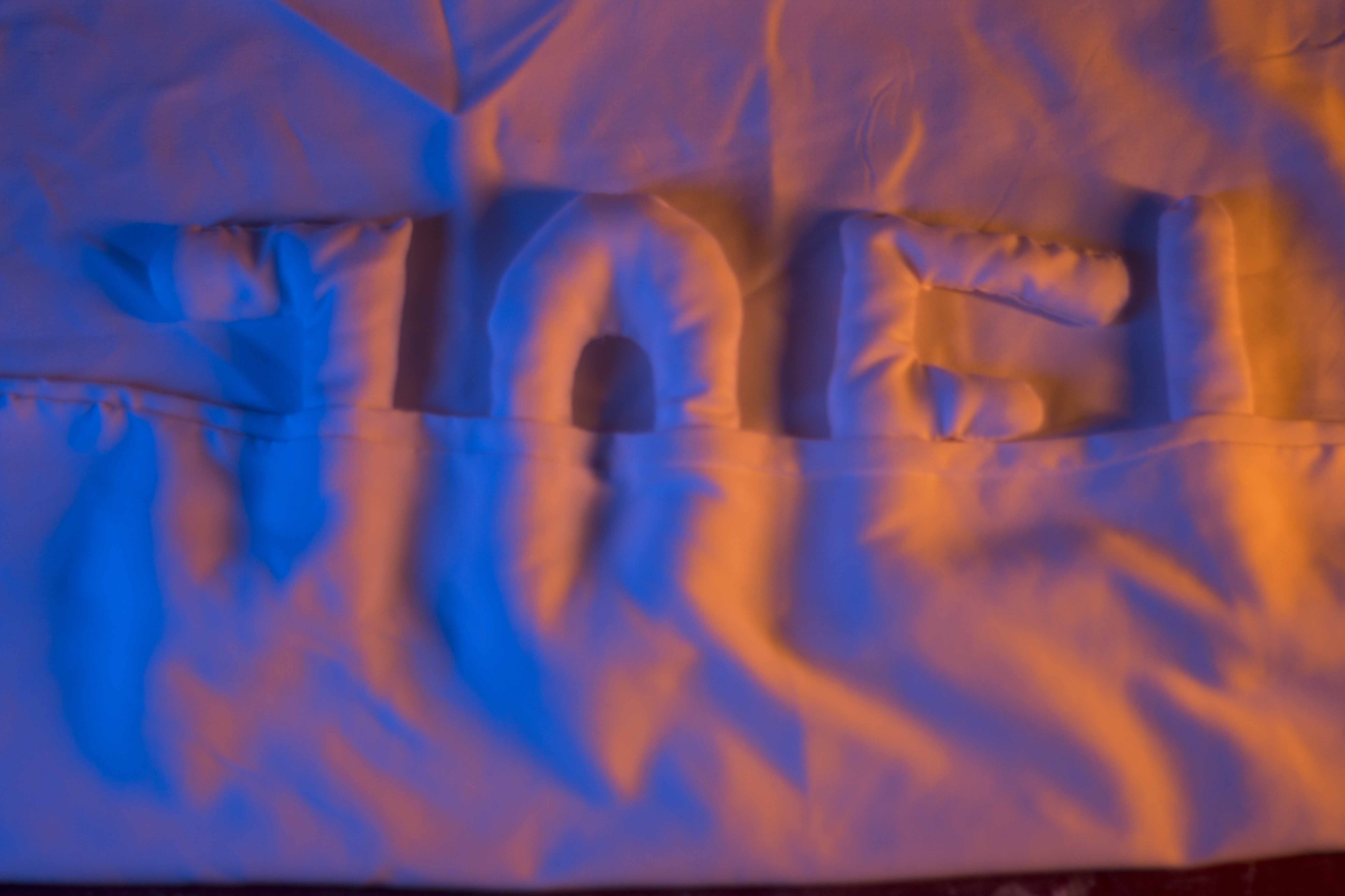
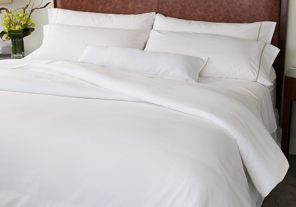
Next, I experimented with framing and lighting of the image. Initially, I wanted the letters to look like they were under the duvets.
However, Mimi commented that it made it difficult to see the my name. Thus, I went with a more minimal approach, only making use of lighting to create the mood.
I had several props used to try and recreate the look of a bed room.
I do not have an exact picture of the table cloth I used, but it was similar to this first picture where by it was embroiled with holes.
Here are some of the many experimental shots.
I played around with different camera angles as I wanted to get the feeling of the letters being ‘tucked’ into bed. I also moved the sheets around to try and see which position best captures the look.
Lighting played a crucial part in this composition as it would ultimately set the mood and feeling of the piece. I experimented with warm and cool colours to create a contrast, however, I felt that it was too saturated and it drew attention and focus away from the pillows.
I came up with several occupations which were explored in my CPJ.
The jobs that I came up with are ones that I felt would represent me best by my personality, or something which I was passionate about.
I filtered most of it to 5 jobs which i thought would be interesting to explore.
National Geographic Photographer
Sleeping Enthusiast
Handyman
Bookworm
Research
National Geographic Photographer
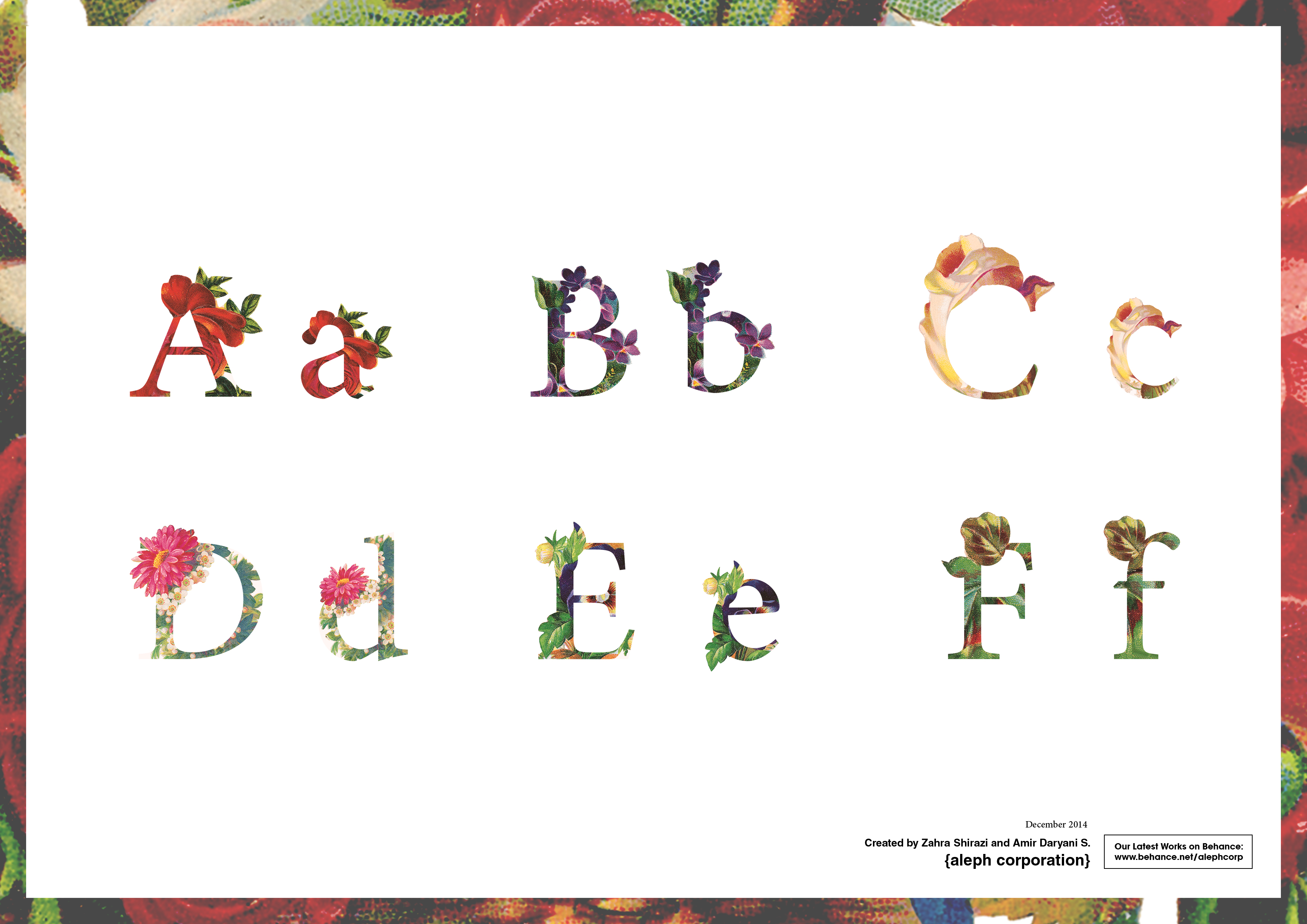
I came across this typeface several years back on behance and I have not forgotten how beautifully crafted the font face is. It juxtaposes floral elements into the Serif typeface in such a stylized way to create a very aesthetically pleasing composition.
I wanted to adopt a similar technique for this occupation as I thought it would be fun to merge animals into the fonts, similar to how flowers are merged here.
Vintage Font by be.net/alephcorp
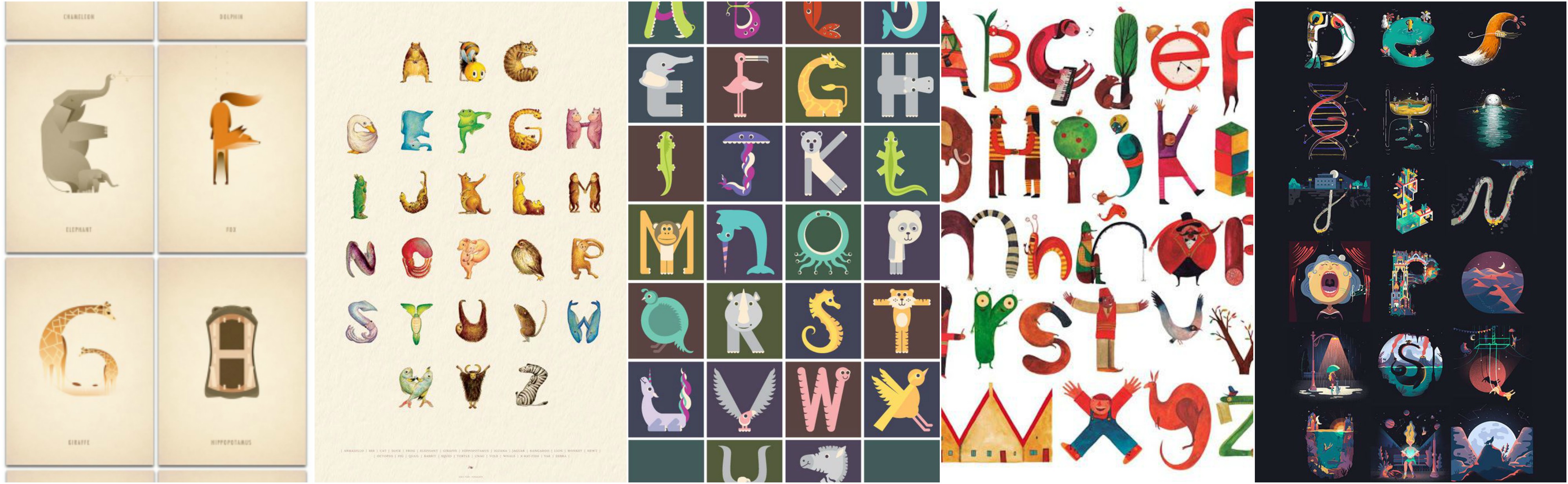
Upon consultation with Mimi, I started to look at illustrations on children’s books for alphabets and how animals are portrayed to help children develop.
These were creative representations of wildlife, however, I felt that I should give a more realisitic representation of wildlife as I was supposed to be a wildlife photographer.
I then began to look at an art style which I have always had interest in which was inking animals using a hatching shading technique.
I also did something similar for my portfolio submission into ADM.
Thus, I decided to adopt this style into my work.
Handyman
One thing I pride myself in being is the ability to adapt to my surroundings. Thus, I hope that others would see me as someone who is useful in all situations, similar to a Swiss Army Knife.
It is one thing I often carry around with me as you’ll never know when you will need it.
I started looking at different ways I could portray myself as a Swiss Army Knife.
There were different perspectives and ways to draw and breakdown a Swiss Army Knife, however, none of which caught my interest.
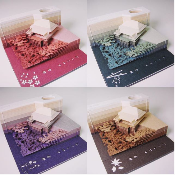
Bookworm
Books form an integral part of my life as I am an avid reader. The smell of books have always delighted me. A book has the ability to transport you to different worlds and similar to a worm, I enjoy digesting all of these details and immersing myself in the book.
I started to look at how people created art with books.
This concept is extremely fascinating, however, I wanted to take it a step further to incorporate the look of something burrowing through the book.
I also came across this incredible laser cut post it note which originated from Japan.
This is not a direction I would like to head in however I found it to be extremely intriguing.
Sleeping Enthusiast
I try, to my best ability, to ensure that I have at least 7 hours of sleep every night to allow my body to recuperate and repair itself. This 7 hour cycle is so deeply ingrained in my habit to the extent that I cannot sleep past 7 hours, no matter how exhausted I was the day before.
As naps are a luxury now that the semester has begun again, I’ve learned to treasure it more. Because of this, I wanted to explore different mediums for which I can represent sleep. What better way to start than a bed?
I had the idea to sew pillows together in my composition to form my name. I started to look for inspiration online.
I wanted a cleaner composition as I feel that the best sleep is often one where there isn’t a single worry or care on your mind, something where you can experience during holidays. The best representation I could think of was a hotel bed.
Ahhh, this image just screams comfort. Being tucked under those thick duvets, without a care in the world.
I then begin to explore these ideas, which can be seen in my CPJ as well as my process post.