Category Archives: Typography 1 – G3

Archetypes Process

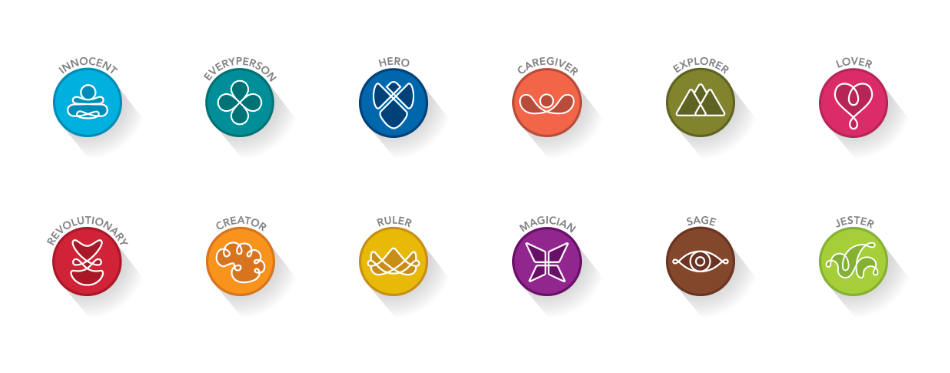
It’s time for our final submissions already? The focus of this final assignment was archetypes – these are fundamental concepts which are widely used in the realms of corporate branding as each brand needs to have a distinctive character of their own, to appeal to their target audience. There is a myriad of archetypes out there, variations of the initial 12 created by world renown Clinical psychologist,
Carl Jung.

Conceptualization

My initial concept was some sort of an accordion fold, and this would give me more than enough space to showcase each archetype, spread across two panels.

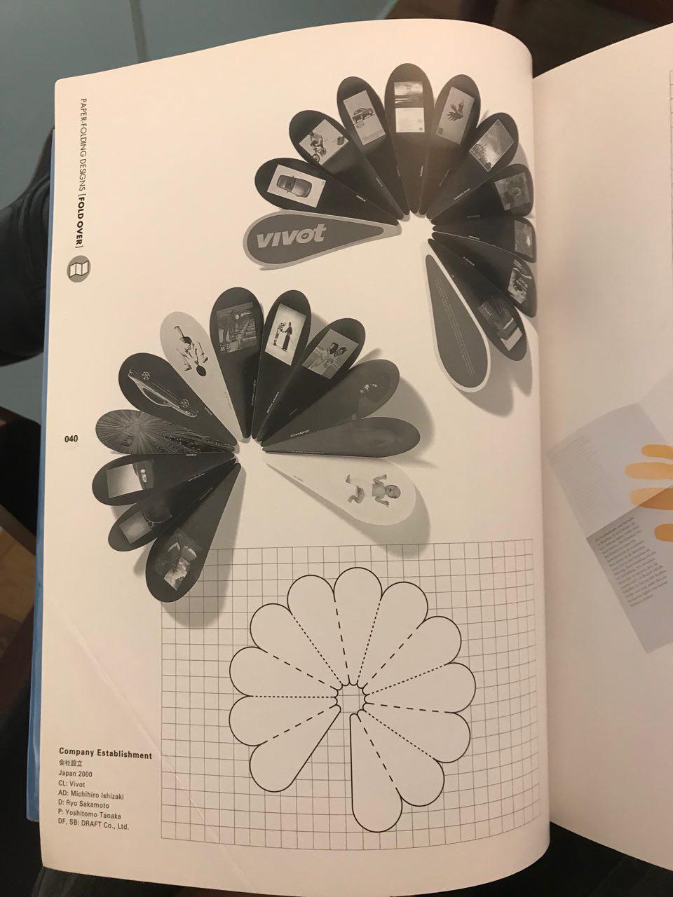
However, when i brought this concept to Lisa, she warned me of the difficulties in using such a fold as laying out the content would be challenging because of the shape of each page, thus I would need to find a die-cut template for it. She then suggested I went with a more straight forward, yet stronger approach of using something similar to a swatch booklet.

Based on her comments, I started to adapt my concept to something similar to a swatch booklet, whereby each archetype would be accompanied by a colour palette, reflecting their characteristics.

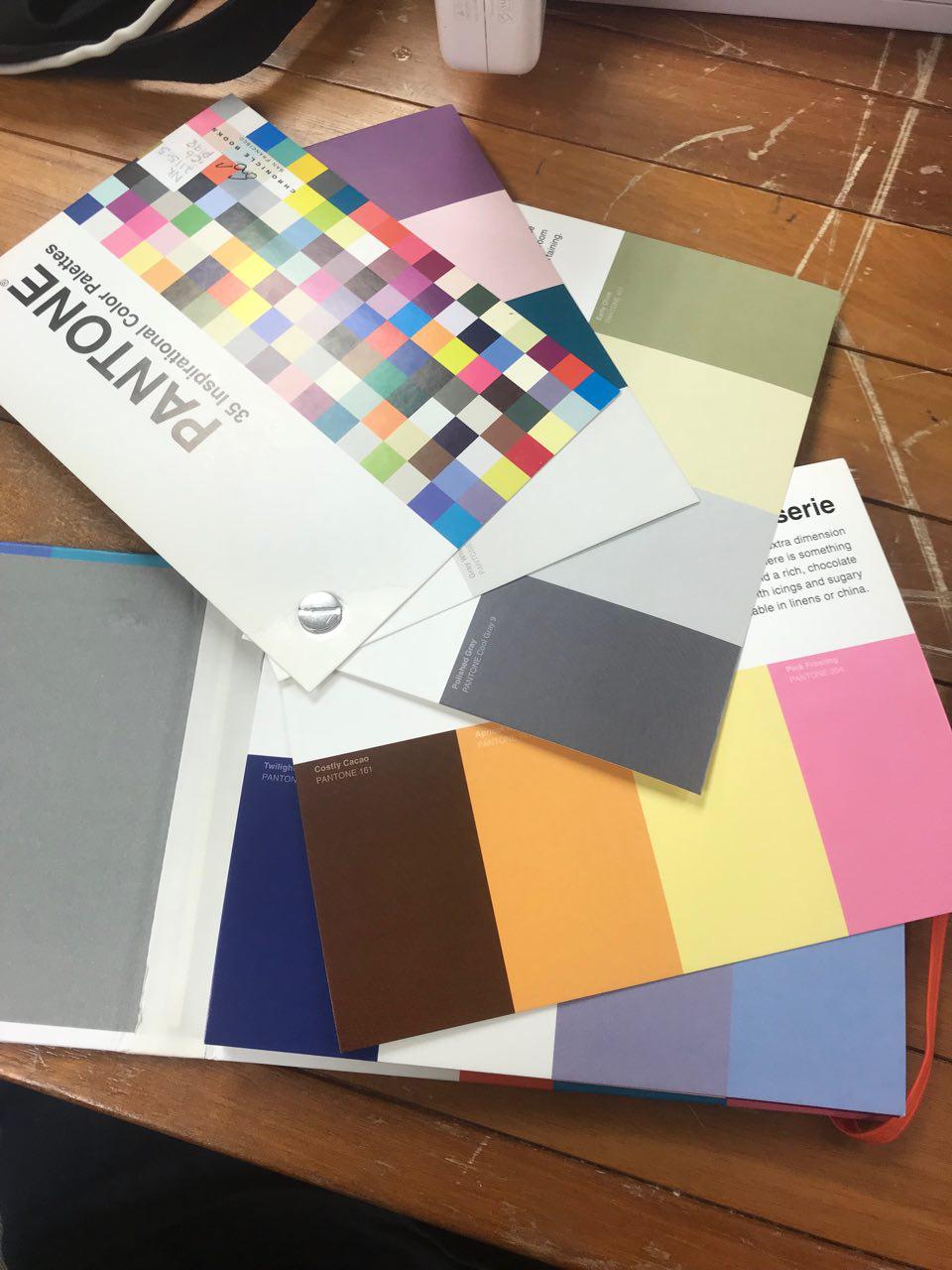
These were the initial layouts of my designs. I had to decide on the title font as well as a font for the body text and caption. As we were not allowed to use images or supporting graphics, I explored manipulating shapes to create more depth and life into my work. Legibility was an issue with my layout, thus I had to restructure my layout as well as tweak a few colours to make it less jarring. I turned to actual Pantone swatches to observe how they laid out their  colour palates.

Execution

Once I had a better direction, I tweaked my designs to make it more legible and I compressed my cards so that it could comfortably rest in one’s hand. I made sure the graphics did not interfere with the body text and I gathered the colours so that they looked seamless and more cohesive.

I had to source for various colour palettes to represent each different archetype. I turned to online sources such as Adobe Colour, Colourlovers.com and pinterest. Colours in nature also helped with the selection of colour.

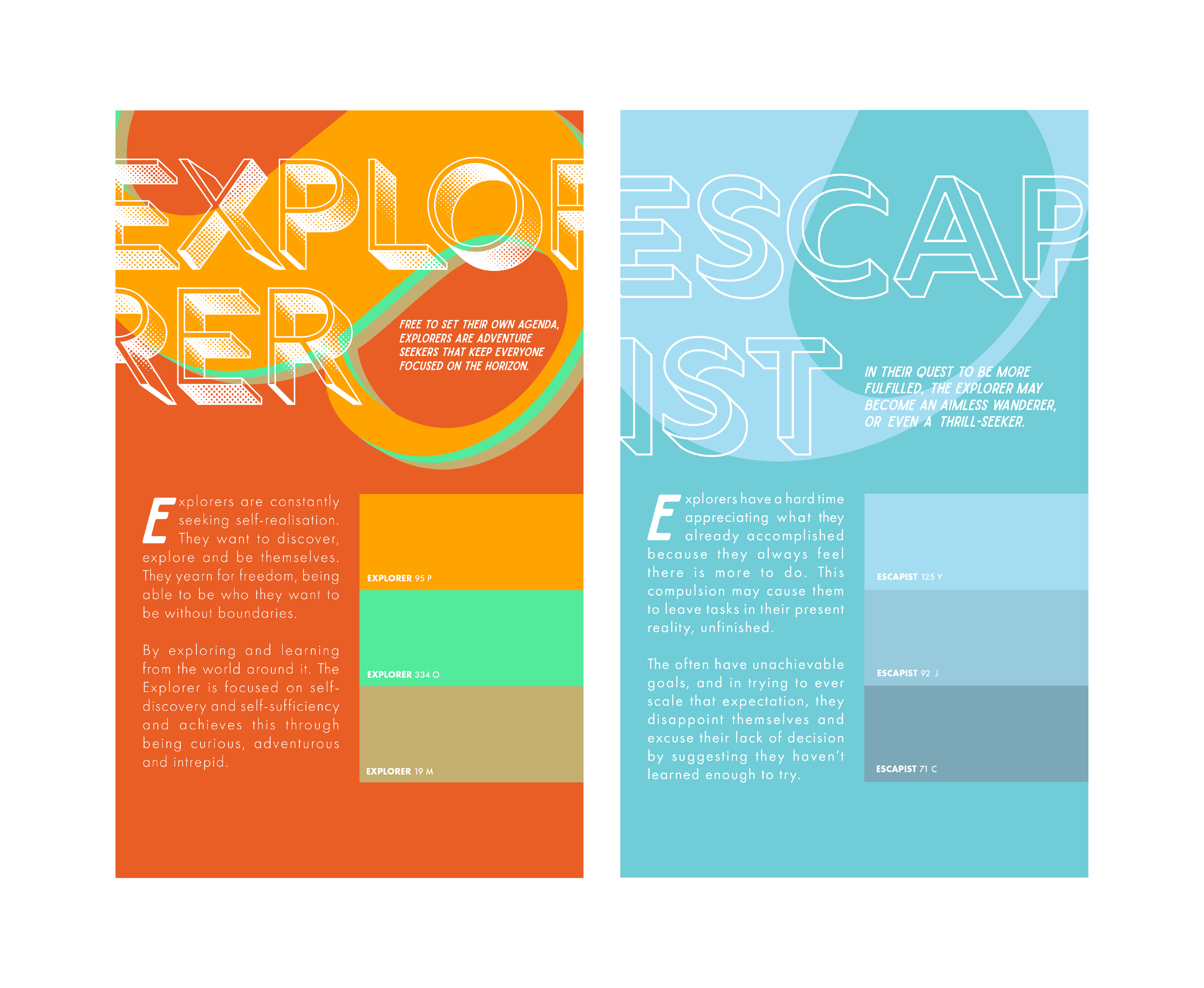
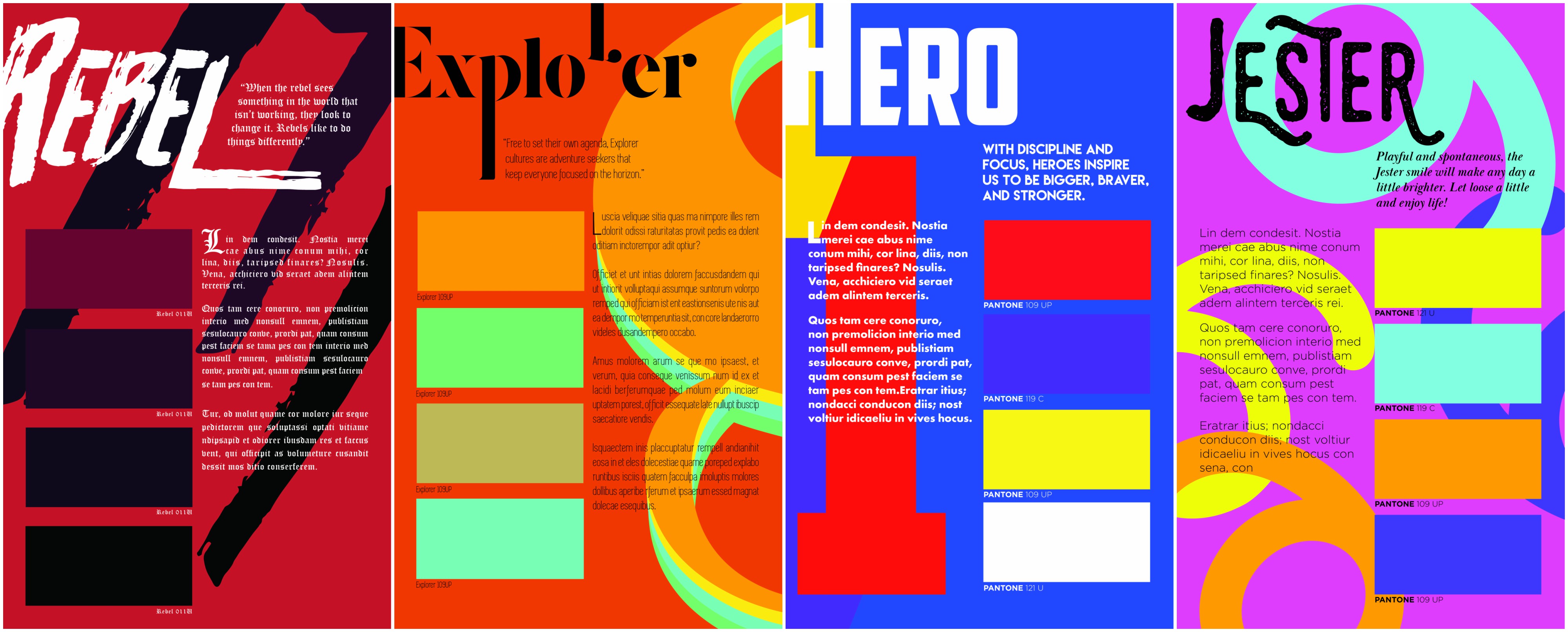
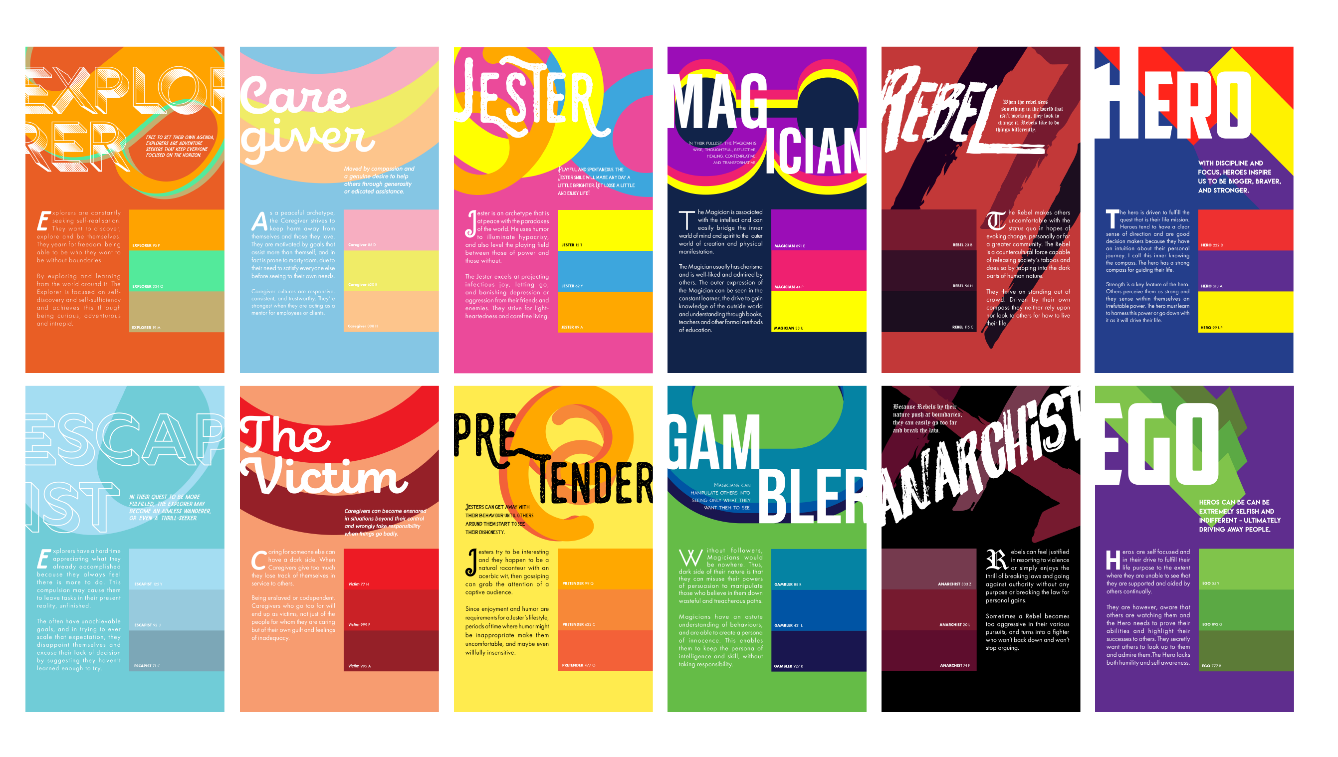
The possibilities for this archetype are endless because of the nature of explorer. An archetype representing someone who is always keen for new experiences, I had to try and convey movement in this composition. After looking at various forms of numbers, I chose the number 8 because it was similar to that of an infinity sign. Explorers are known to be relentless in their pursuit of something new and infinity seems to convey that idea perfectly. However, this drive can also be their downfall.

This leads to their shadow archetype, the Escapist. Explorers are quick to move on to their next adventure, leaving past ones without any sense of responsibility or accountability. People around them tend to suffer from this absence as they have to pick up the pieces these Explorers leave behind. To convey this message, the title font is hollowed out and I used light shades of blue to represent the feeling of absence. I cropped the 8 to make it look like a 0 to show that the archetype is no longer present.

This archetype was something which I initially did not want to do because I felt that I would not be able to explore many ideas with it.  However, as I began to play around with the colours and typography, I began to fall in love with it. Caregivers are gentle and nurturing in nature, thus I went for a more rounded script font for the title, and for the body text, I chose a bold and rounded font to make it seem more welcoming and friendly. Pastel colours accurately describe this archetype as the soft hues make it so much more loving and gentle. I used the number 0 due to its soft curvature – the rounded edges brings about a sense of wholeness, just like a nice hug.

However, on the flip side, Caregivers tend to care TOO much for their loved ones and they often get hurt if they refuse to let go or accept the toxic nature of their relationships. For this, I used a palette more representative of skin, and I changed the colours of the 0 to look like scratch marks and blood.

I chose this archetype because I feel it resonates with my character! As I was researching on this archetype I felt a connection. The Jester is a fun loving archetype and I wanted it to be whimsical and a burst of colours. The accents used in the font for the title accurately depict the nature of this archetype by being spontaneous and random! I used the the number 6 as it looks like swirls, making you feel as though you are dizzy from all of the fun you’re having.

On the flip side, jesters can appear to come off as fake (I’m obviously not) as they try their best to be involved in everything, and sometimes they even partake in gossip just to feel included. Their jokes can often be in bad taste if they take it too far, thus reflecting bad on their character.  I made use of the number 6 to form something signifying a ear, always listening, searching for the next piece of juicy information to gossip about. The colour yellow was chosen because… yes, yellow is the colour of liars.

Thought to be a visionary and a wise character. This is a bold archetype as they hold so much wisdom and they are able to envision the future. Yet at its core, the magician is a practical and straightforward character. Thus, I used a San Serif font to represent it, one without too much shenanigans. I used the number 5 for this composition and formed it into something resembling a binoculars (visionary) but also because it looks like shackles, a key prop in a magician’s show.

However, magicians are known to be strong headed in their ideas, often taking it too far by investing too much into their vision. If their peers do not see eye to eye with them, magicians can even manipulate people into doing their deeds or making people join them in their futile adventure.  Thus, I manipulated the 5 to make it seem like a table counter and I used the colour scheme of green and blue to make it look like a casino.

This archetype is notorious in branding as it appeals to only a handful of people. Rebels can be seen as the outcasts of society as they often go against the flow. However, they can be seen as revolutionaries and instill a sense of vigor in people. I used a grungy typeface for the title and for the body text, I used Blackletter as many trends associate these characters with someone who is rebellious or non-traditional (how ironic). I used the number 7  because I like the bold strokes it makes, representing something very rugged and edgy – it does not try to conform and be liked. The colour palette is also swapped to show that the rebel…

DOES NOT CONFORM TO GRID STRUCTURES.

As you would’ve expect, Rebels can sometimes take it too far, as their ideas may be too extreme for society. This would lead them to become anarchists if their values or believes are not kept in check. This composition shows uprising and destruction of an individual. The black background just empathizes how much negativity this shadow archetype has.

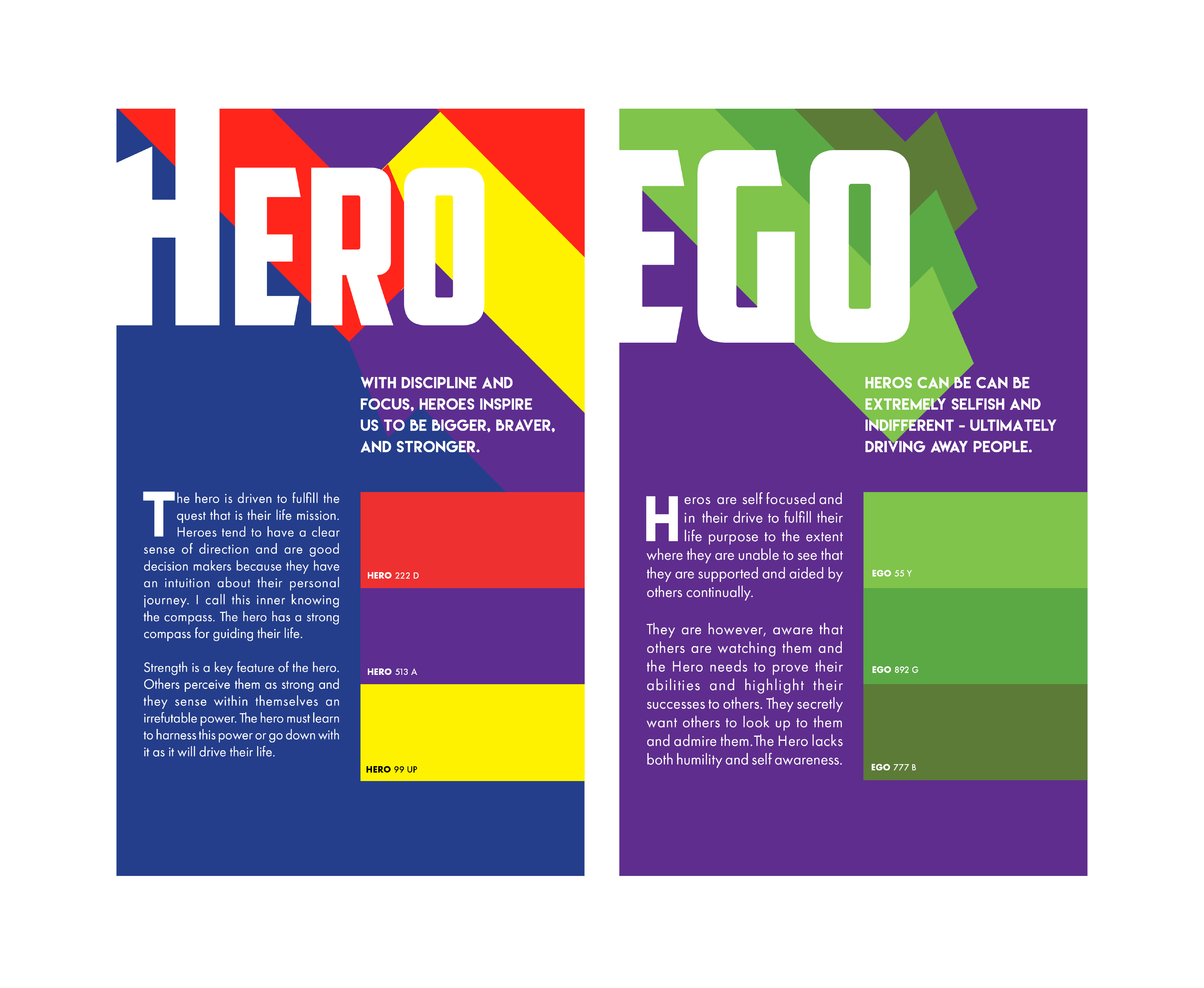
And lastly, we have the Hero. Something most people aspire to be! Who doesn’t like a heartwarming story of a hero saving those in distress? Heroes are bold in their actions and they command respect from their peers. Thus, I chose a heavy font for the title to give it that presence. Undoubtedly, I used the number 1 to represent the Hero. To command that kind of respect, one has to be the best in their field. I depicted the 1 rising above, similar to how superheros would fly! Strong colours are used in this composition to enhance the strength of the composition.

However, as to all the archetypes, Heroes have a weakness which is their ego. They tend to be so headstrong to the point whereby they start to push people away even if they know that the path they are taking is wrong, or not in favour with their peers. I depicted this by tilting the 1 in a downward angle to show its downfall, and the repeated 1’s show the motion of it. Having too much of an ego makes one disgusting and thus, I went with the colour green and purple to represent envy and pride.


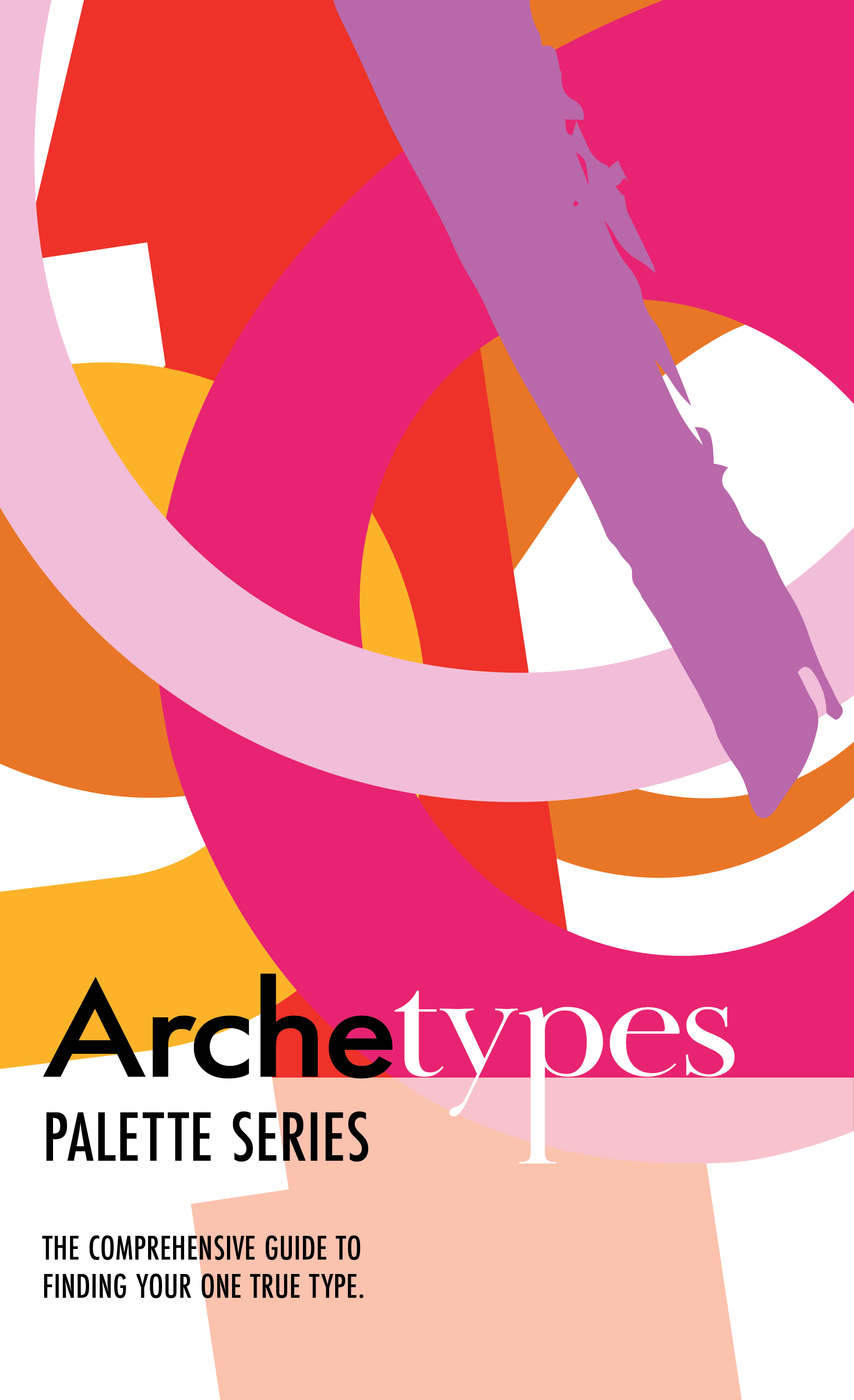
This is the cover page used for my palettes. It features all of the forms used in the various compositions and the San Serif typeface used is futura, which I kept consistent for all of the body texts in the palettes. I decided to change ‘types’ to a serif font to show emphasis on that these palettes would also focus on typography.

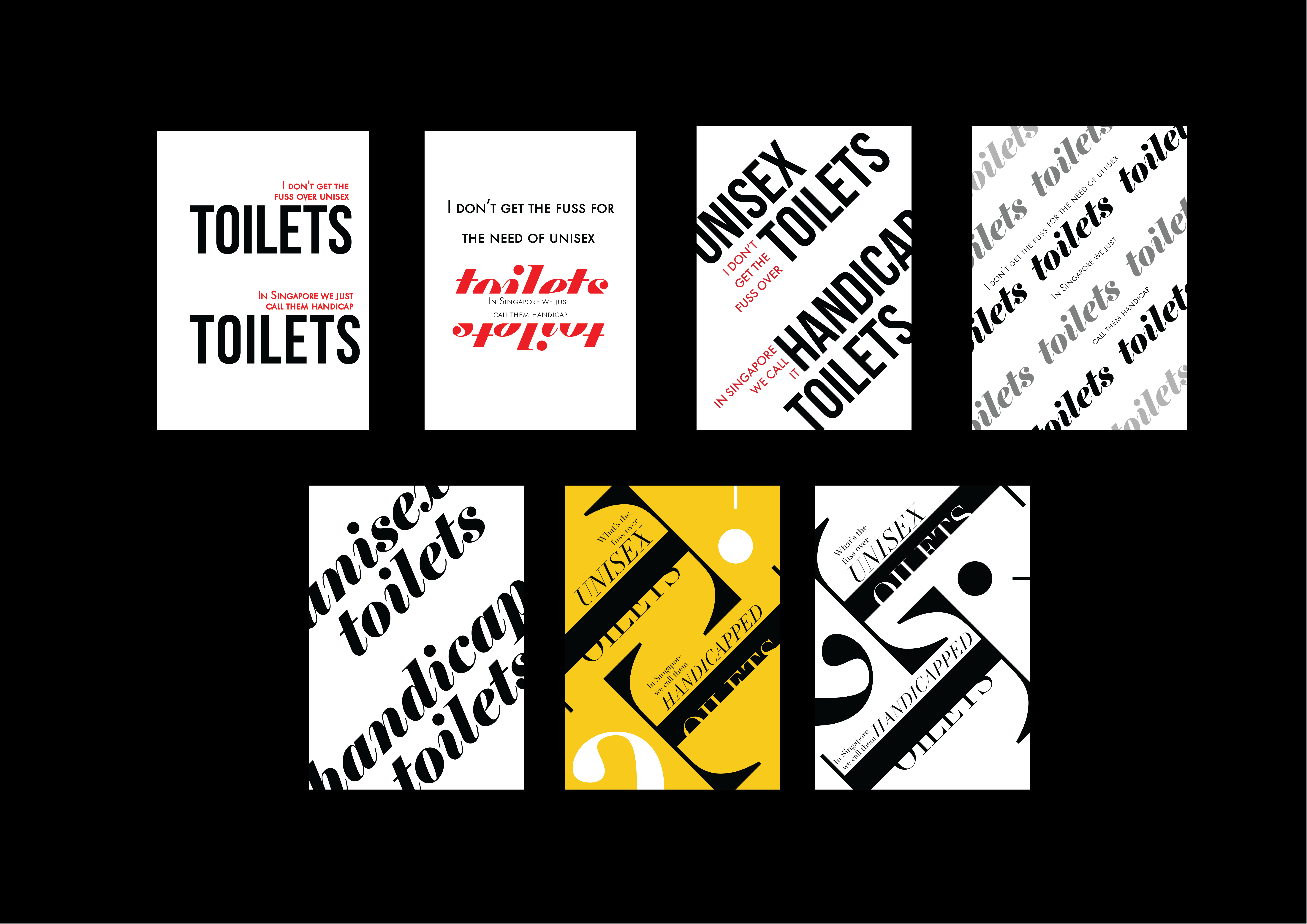
Final cards all laid out!


Honorable mentions


I wanted to try the technique of replicating type to form a structure. However, the composition ended up really messy and it was very distracting, thus I was not able to incorporate it into my design.

Typographic Designer of the Week – Herb Lubalin

Scrolling through Herb Lubalin’s extensive portfolio page, I can see where he gains his reputation as Art Director of the year in 1962 because of his absolutely phenomenal and iconic work. From the film, The Sound of Music, to the classic Avant Garde logo, his work has definitely shaped the aesthetics of the late 19 century. Yet, his designs remain timeless and they could seamlessly fit into the design landscape of today.  He was bold enough to shed the popular swiss modernist styles which were highly popular in the 1960s for more expressive typography which definitely suited the vibrant and changing landscape of America.

I dare say, his work is the one which I have most enjoyed amongst the past few typographers of the week. This is due to how stunning the graphics look. A simple tweak in a font, the change of a kerning and weight can transform an existing font into something so decorative and timeless… and I am probably rambling on. I was so intrigued by his work that I even looked for his book online but it was sold out!

“If a word was a beautiful word, it wasn’t the sound of the word that intrigued me but the look of the word. I saw each letterform as a piece of design.”

Paula Scher takes a similar approach to creating beautiful graphics using type as these two artists treat letter forms as a brush stroke or element, to design their graphics. They are also not afraid to manipulate these forms to fit the look of their graphics.

With the amount of stature Herb Lublin deserves, he fundamentally designs for the people and often keeps the community in mind. In the article written by Ellen Shaprio, she stated that Herb would often hire women as well as minority groups such as the blacks in the rougher parts of the states to give them a chance to hone their abilities in the creative field. His designs became the voice of the minority and as a progressive, he was doing his part to change the views on these minority groups.

Upping your Type Game – Reading response

Reading through this article, I find myself guilty of committing the crime of sticking to one font for most of my designs, especially when it comes to choosing a font for the body text. The analogy Jessica Hische gave was thinking of fonts as clothes. Sure, you can use a single font for your entire website, however, it would look too overpowering and dull. She highlights the importance of choosing a font family as well as a family with different weights would offer you much more flexibility when it comes to designing a cohesive page. I’ve only recently discovered font super families and despite how different their styles are, they work seamlessly and can fit many different situations.

Choosing font families which offer different widths such as narrow, condensed, regular, extended would give you more flexibility in designing body texts as these can be used interchangeably whether you have too little or too much space to work with.

Amongst the many considerations when selecting a typeface, she also pointed out the x-height. Initially, I was skeptical as to how this minute detail could affect the overall aesthetics of the layout, however, when placed in comparison to a font with a much shorter X-height, the difference becomes apparent as it makes your content look a lot smaller.

“We read best what we read most.” 

Our countless texts through our years of existence has made some fonts more legible than others and it is crucial that we use this to our advantage. By using serif fonts as body texts and sans serif fonts as headers, it would significantly help with the digestion of information, as well as to exhibit hierarchy in the design.

Undoubtedly, the most important and frankly, the one I have most issues with is font pairing. I read those paragraphs with eager eyes, with hopes of some wise words of wisdom. And deliver did she! I have attained more skills under my belt when it comes to selecting font pairs as some of the techniques I can use include: Using fonts from a Super Family, Fonts designed by the same typographer, fonts which have similar characteristics – more specifically the skeleton, meat and clothes. While using fonts from the same typographer is situational, all of the other advice given are extremely useful!

I have to keep in mind that all of this process is just choosing typefaces! What a monumental task and if only more people could appreciate the thought process gone behind choosing the characters on their screen. I myself have a long way to go in terms of researching for the appropriate font choice as I tend to skip this entire process, only to mindlessly scroll through my font library to find something which would fit my design. This is a bad habit as if anyone asks for the rationale behind my font choice, I barely have anything to offer, other than, “oh because it looks nice.”

Reading Assignment: Archetypes in Branding

Sometimes I am just baffled by the amount of detail which goes through branding and I start to question myself, how much of the subconscious is tapped in whenever we view an advertisement or come across a product?

The use of archetypes in branding is no doubt, one of the strongest tool a designer can use to create influence in their work. The ability to reach into the sub conscious of people, enticing them into your product – it could be mistaken for a super power.

However, designing a strategy based on archetypes is no small feat as it requires heavy research into the characteristics of your demographic and it also forces you to think of how your product would be useful for your audience – specific to their lives. A brand has to have a consistent archetype strategy as deviating away from the chosen archetype can reflect as a company not being sure of their personality and character.

The use of symbols and colours also play a large role in designing an archetypal identity for a brand. With more curved and smooth corners, coupled with a pastel colour scheme would signify a calmer and more approachable brand, whereas a brand with sharp edges and cool or intense tones would signify an aggressive brand, destined to rise to the top.

I would say, the selection of typography also attributes to the characteristics of an archetype. For example, a script font may be used to represent a creative or caregiving archetype because of the elegance and fluidity, whereas a BOLD San serif font could be used to represent the Ruler or Hero Archetype because of the intensity and strength of the fonts.

After reading this article, I find myself slowly categorizing fonts and also identifying various brands and what might be the archetypes they might be representing.

Assignment Two: The Walls Have Ears – Process

My first ever typography module! Typography has always been my weakest link as I have problems ensuring that my composition has hierarchy and  is legible. After going through the lectures on the do’s and don’ts of typography, I embarked on my journey to create my first type posters. However, I struggled tremendously as my designs tend to look very stagnant and unappealing, lacking the ‘wow’ factor.

I constantly referred back to the brief to try and incorporate the elements which Lisa wanted to see in our composition. These includes: Hierarchy, balance, scale, contrast, repetition and cropping. These helped me make my posters more attractive as I began to use type more as shapes and forms, rather than a collective element. Similar to what Paula Scher said, she uses the elements of typography as brush strokes to create her composition. With that in mind, I began to become more bold with my typography, exploring ways in which I can make use of these forms to create a more compelling design.

My first quote is, “I don’t get the fuss for the need of unisex toilets. In Singapore, we just call them handicapped toilets.”

As a predominantly conservative country, the government does not dwell too much into engaging the voice of the LGBTQ community. ( not to say that they have completely ignored the existence of them, which is why we have the Pink Dot event) But I digress, I feel Singaporeans are adaptable and practical – meaning, we do not see the need to specifically have unisex toilets. Handicapped toilets have the same functions as unisex toilets and no one has any issues!

Evidently, my initial posters looked as though they were taken off motivational posters, where they lacked any real exploration of the use of type. As the word ‘toilet’ appears twice within this quote, I wanted to make it the subject of the poster. Considering the use of repetition to evoke that message. I also wanted to try and explore the use of type to form toilet signs (male and female), however, I felt that it would create unnecessary graphics and it would be too forced and literal.

One of my initial font choices was ‘Elephant Italic’. I chose this serif typeface as I felt its decorative feel and elegant strokes would convey a sense of refinement and class in my design. However, as I did more research on toilet signs, more often than not, they would avoid the use of such decorative fonts as people would want something immediately legible. Thus, I chose a classic font to increase the legibility of my design. I felt that Didot fit the bill for what I required as it had legibility as well as the posh feel I wanted to have. I started to angle the type to create a more dynamic poster as well as to play around with the scale of it.

This is the layout which I settled for, however, there were still aspects of it I wanted to change.

My friend commented that the quote is not immediately legible as people would commonly read from left to right, and you would end up reading the bottom half first before the other half.

Thus, I rearranged the layout in hopes that it would be more legible, and to a certain extent it was easier to read, however I had to compromise on my design and the result was that the design did not look cohesive as the elements were floating and not interacting with each other. As a result, I reverted back to my initial design.

The final layout would be displayed below!

The second quote is, “I have turned myself into a boring person and I love it.”

I heard this quote in a supermarket and I could not fathom why would anyone want to become a boring person. This quote literally stopped me in my tracks as I had to process what I just heard. I would think that people are attracted to interesting people with different talents and hobbies. I decided to listen on to their conversation and to no surprise, his friend was also baffled at his comment. Turns out, this individual is working as a programmer and his life has been just revolving around work, so much so that he does not have time for anything else. Well, at least he enjoys his work….

I played around with the use of repetition in my initial posters to convey the idea of being BORING. As you would imagine someone droning on and on about a topic which you are not interested in. I also used a very ‘boring’ and standard san serif font which is futura bold to represent the idea of being uniform and proper. Something which lacks interest.

However, as I continued to explore more into using the forms of type, I wanted to have a different take towards this quote. One with more sass and with a little tongue and cheek humor in it to highlight the absurdity of the comment. I broke up ‘BORING’ and used ‘Elepant Italic’ mixed with Regular to form this interesting composition. I scaled it up to make BORING be the center of attention (the irony) and I worked around that graphic. To add balance to the composition, I rearranged the words ‘I LOVE IT’ in a similar fashion, so that the poster would not be too top heavy, as well as to emphasize how much this individual enjoys this state.

For supporting elements, I added in the curly brackets commonly used in coding to create more depth in my poster. I also experimented with using 1’s and 0’s the basis of all computing language, however, it was difficult to convey the message that it is programming related. I played around with colours such as blue to signify ‘boring’ however as I wanted it to be ironic, I used a vibrant colour instead to contrast the actual nature of it.

In this poster, Lisa commented that the straight bracket at the top was piercing the graphics above, diverting attention away from the main element. Thus, I removed it and replaced it with another curly bracket to maintain balance.

My last quote is, “I like rich bitches but I can’t afford them.”

This is a quote which my friend said and I found it hilarious. He has this tendency to gravitate towards more wealthy girls for some reason, however, it always takes a toll on his wallet. Not all girls expect the guys to pay (kudos to these champions) but my friend insists on paying whenever he brings these girls out. As a result, despite how much these wealthy girls offer to go dutch, he would still end up paying for their expensive outings.

Because of all this, I wanted to make money take center stage in this design. I started out with a basic layout and progressed to something which resembled more of the dollar. In the second layout, I made the path of the sentence to form the dollar and I used an outlined ‘I’ to complete the $ sign. I tried using a script font as cheques require signature and script fonts convey the look of luxury as well. This was a stepping stone onto my final design which involved the use of the literal dollar sign. To create more depth, I had smaller dollar signs spiral behind it to show how money was being depleted and washed down a sink. I used didot again as it had all the language of someone who is wealthy and it also has luxury associated with it.

To make the composition more dynamic, I fit ‘rich bitches’ into the form of the $ sign so that it would look more incorporated into the design, as opposed to merely being planted into the composition.

I had to tweak the element a little to give it more breathing space as it feels uncomfortable to read because it was bleeding into the background. I also made sure to tweak the kernings in between each letter to ensure that they were not clashing into one another.

EXPERIMENTING WITH THEME

I played around with the use of drop shadow for all of my compositions, adding them to key elements and words of my poster to try and make them feel more like a series. However, Lisa commented that it would look too over done and it would lose its uniqueness. I also changed all of the fonts in the various compositions to Didot to retain the continuity and theme.

FINAL LAYOUT


Typographer of the week – Erik Spikermann

My first impression of Erik Spikermann came from the movie on the study of the typeface – Helvetica. His views towards this typeface was far from conventional as he outright criticized the over-usage of the font to the extent where it became boring and lacking of any real character. He has every right to make such a bold statement as he has crafted countless numbers of popular fonts over the course of his career as a typographer.

His most notable fonts include:

FF Meta


FF Info Display

ITC Officina Sans 

And my personal favourite,

HWT Artz

He runs one of the world’s most influential design and branding companies called MetaDesign and I hope that one day I would be able to work in such a prestigious firm. Most of his company’s branding work is focused on using photography and mainly typography to convey the message. Having crafted marketing campaigns for multi-national companies such as Volksvagen and New York Philharmonic, Spikermann hopes to challenge assumptions, by design. 


As I was doing more research on Erik Spikermann, I came across an article he published on Medium.com, commenting on how UX (User experience) has become such a hot button topic to talk about and he is baffled by the ignorance of the market as they deem this denomination of design is something new.

Erik claims that typographers have been doing since the dawn of editorial design, making sure the content is legible and has a coherent flow to enable the audience to smoothly consume the media as succinctly as possible. As I aspire to study more about User experience and design, I found this stand particularly intriguing as I never viewed typography in this manner. Using the various methods of presenting our typography such as hierarchy, scale, weight, etc… we are essentially subtly telling the readers the steps to consume the media or design which we created.

This is the article:

https://artplusmarketing.com/again-and-again-i-am-pleasantly-surprised-that-as-an-older-designer-69-now-and-computer-literate-343a76e2b2c2 

Type as shapes and patterns

I found this technique to be fascinating as I have always been attracted to the aesthetics of mandalas and their symbolism. I find it extremely pleasing to design mandalas and before I knew about this technique, I have always been designing them on my iPad.

I adapted this graphic into something which would resemble constellations as these forms look extra terrestrial and could represent the orbiting of planets.

Here are some of the designs which I’ve done in my free time exploring this technique. If I could collate all of the doodles I done during my awful lectures in school, I could probably create a graphic book of sorts! With this in my arsenal, I definitely look forward to more ways which I can apply this technique!