
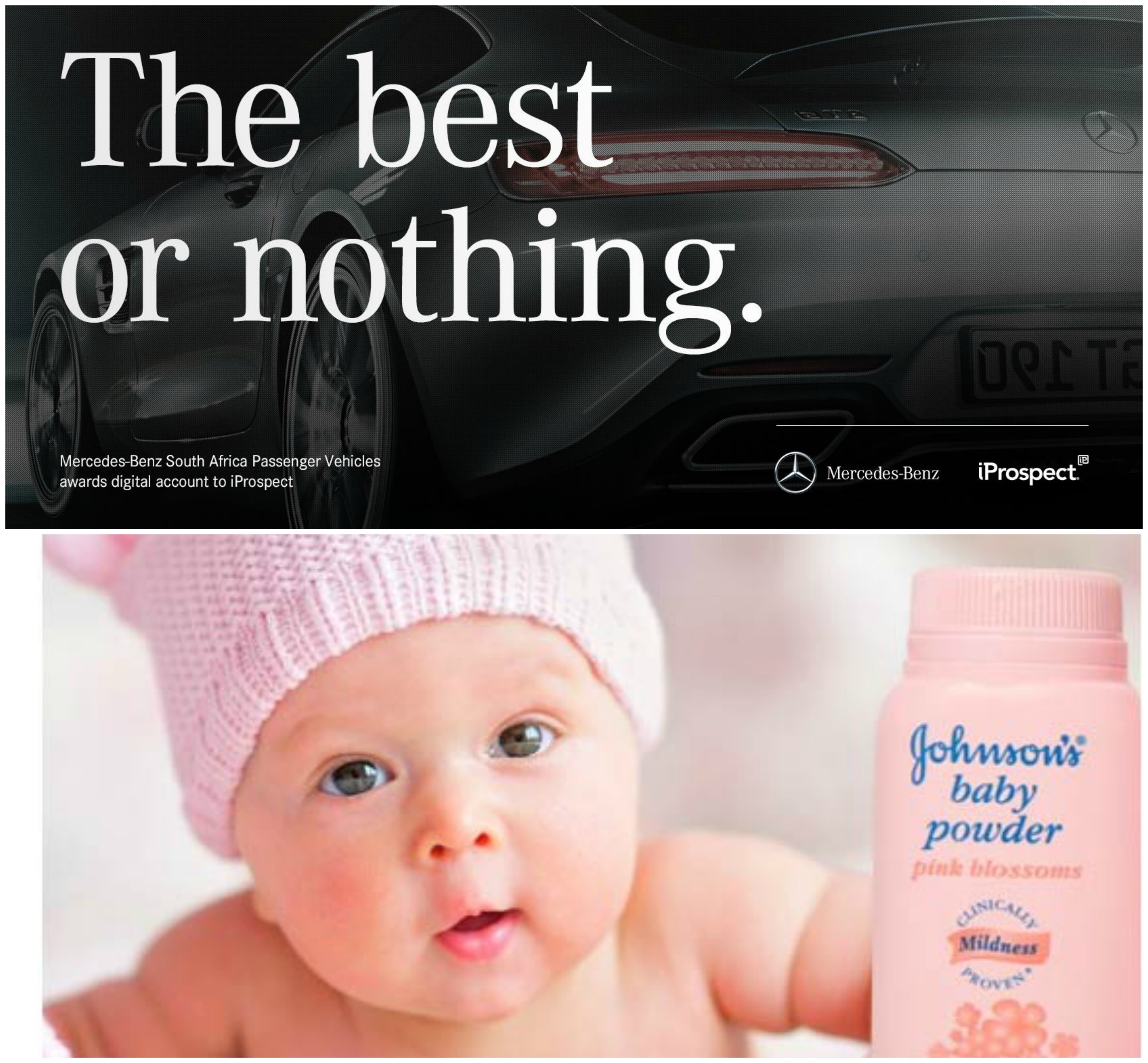
Sometimes I am just baffled by the amount of detail which goes through branding and I start to question myself, how much of the subconscious is tapped in whenever we view an advertisement or come across a product?
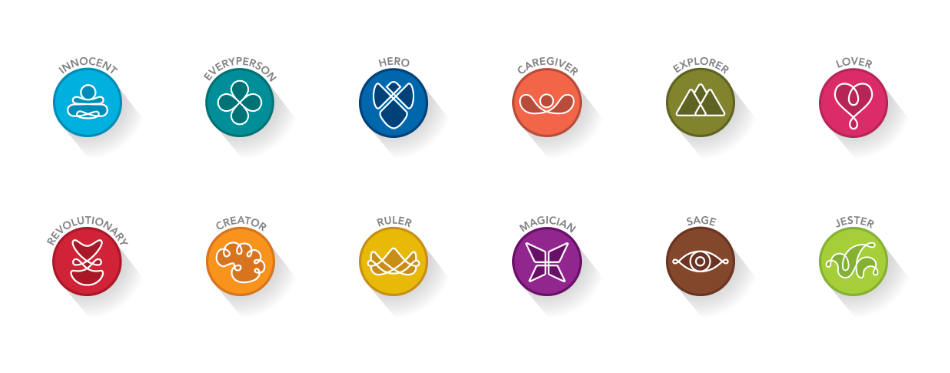
The use of archetypes in branding is no doubt, one of the strongest tool a designer can use to create influence in their work. The ability to reach into the sub conscious of people, enticing them into your product – it could be mistaken for a super power.
However, designing a strategy based on archetypes is no small feat as it requires heavy research into the characteristics of your demographic and it also forces you to think of how your product would be useful for your audience – specific to their lives. A brand has to have a consistent archetype strategy as deviating away from the chosen archetype can reflect as a company not being sure of their personality and character.
The use of symbols and colours also play a large role in designing an archetypal identity for a brand. With more curved and smooth corners, coupled with a pastel colour scheme would signify a calmer and more approachable brand, whereas a brand with sharp edges and cool or intense tones would signify an aggressive brand, destined to rise to the top.
I would say, the selection of typography also attributes to the characteristics of an archetype. For example, a script font may be used to represent a creative or caregiving archetype because of the elegance and fluidity, whereas a BOLD San serif font could be used to represent the Ruler or Hero Archetype because of the intensity and strength of the fonts.
After reading this article, I find myself slowly categorizing fonts and also identifying various brands and what might be the archetypes they might be representing.