
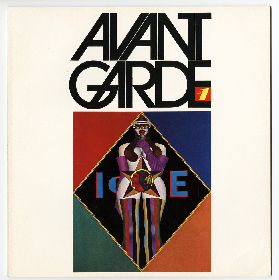
Scrolling through Herb Lubalin’s extensive portfolio page, I can see where he gains his reputation as Art Director of the year in 1962 because of his absolutely phenomenal and iconic work. From the film, The Sound of Music, to the classic Avant Garde logo, his work has definitely shaped the aesthetics of the late 19 century. Yet, his designs remain timeless and they could seamlessly fit into the design landscape of today. He was bold enough to shed the popular swiss modernist styles which were highly popular in the 1960s for more expressive typography which definitely suited the vibrant and changing landscape of America.

I dare say, his work is the one which I have most enjoyed amongst the past few typographers of the week. This is due to how stunning the graphics look. A simple tweak in a font, the change of a kerning and weight can transform an existing font into something so decorative and timeless… and I am probably rambling on. I was so intrigued by his work that I even looked for his book online but it was sold out!
“If a word was a beautiful word, it wasn’t the sound of the word that intrigued me but the look of the word. I saw each letterform as a piece of design.”

Paula Scher takes a similar approach to creating beautiful graphics using type as these two artists treat letter forms as a brush stroke or element, to design their graphics. They are also not afraid to manipulate these forms to fit the look of their graphics.
With the amount of stature Herb Lublin deserves, he fundamentally designs for the people and often keeps the community in mind. In the article written by Ellen Shaprio, she stated that Herb would often hire women as well as minority groups such as the blacks in the rougher parts of the states to give them a chance to hone their abilities in the creative field. His designs became the voice of the minority and as a progressive, he was doing his part to change the views on these minority groups.